
 ?Mathematical formulae have been encoded as MathML and are displayed in this HTML version using MathJax in order to improve their display. Uncheck the box to turn MathJax off. This feature requires Javascript. Click on a formula to zoom.
ABSTRACT
This paper reports on a controlled experiment evaluating how different cartographic representations of risk affect participants’ performance on a complex spatial decision task: route planning. The specific experimental scenario used is oriented towards emergency route-planning during flood response. The experiment compared six common abstract and metaphorical graphical symbolizations of risk. The results indicate a pattern of less-preferred graphical symbolizations associated with slower responses and lower-risk route choices. One mechanism that might explain these observed relationships would be that more complex and effortful maps promote closer attention paid by participants and lower levels of risk taking. Such user considerations have important implications for the design of maps and mapping interfaces for emergency planning and response. The data also highlights the importance of the ‘right decision, wrong outcome problem’ inherent in decision-making under uncertainty: in individual instances, more risky decisions do not always lead to worse outcomes.
1. Introduction
Many fundamental spatial tasks involve decisions about an uncertain future. Uncertainty about future traffic conditions, for example, impacts the conduct and success of route planning tasks. Any such impacts are only amplified by safety-critical or emergency applications.
This paper examines how the choice of map-based representation affects the conduct and success of route planning, specifically in an emergency flood application. In our experiment, participants put themselves in the position of an emergency responder during a flood with important supplies that have to be delivered from an origin point ‘A’ to a destination at point ‘B’ as quickly as possible. Using six different map-based representations, participants are required to construct a multi-segment route between points ‘A’ and ‘B,’ while minimizing the likelihood of the route being blocked, in order to maximize the chance of successful delivery. The six map-based representations are chosen to cover a range of visual variables commonly used to depict uncertainty, including colors, shapes, sizes, and patterns. The chosen representations also contrast abstract versus metaphorical or mimetic symbolizations.
Our experimental design uses performance-based incentives, common in experimental economics to better control the choice environment and motivations of experimental participants (Bardsley et al. Citation2010). Our results show that participants do indeed make different route choices, which incur statistically significant different levels of risk, using the six different types of map. Accordingly, the discussion and conclusions provide insights into the likely effects of choosing different types of map-based representation for emergency response and planning decisions. In particular, the results throw contrast onto the choices of abstract versus metaphorical or mimetic representations of risk on a map; on participant preferences versus participant performance; and on faster versus slower participant decisions.
The paper also aims to make two broader methodological contributions, building on previous work (Cheong et al. Citation2016). First, our methodology distinguishes clearly between the participant decision and eventual outcome, an important distinction for risk and planning about uncertain futures (the so-called ‘right decision, wrong outcome problem’). Second, our methodology again points to the important role of performance-based incentives for experiments exploring map-based decision-making under uncertainty.
2. Background
This paper is concerned with spatial decision-making under uncertainty. More specifically, it concerns spatial decisions based on visual communication of map-based information about risk – that is, the probability of a particular event occurring. Risk, then, gives rise to uncertainty in the mind of the decision-maker (cf. definitions of uncertainty in Worboys and Duckham Citation2004) about the possible outcomes resulting from any decision.
There exists a significant research literature that explores the different mechanisms available to cartographers for communication of risk and uncertainty, surveyed in Cheong et al. (Citation2016), Kinkeldey et al. (Citation2014). Rather than revisit these recent and extensive reviews, this current paper briefly recaps the key findings below, taking Bertin’s visual variables as its anchor point (Section 2.1). For further background on cartographic depiction of risk and uncertainty – in particular on the experimental evidence (and in some cases, lack of evidence) to support conclusions about the efficacy of the different options – the reader is referred to Cheong et al. (Citation2016), Kinkeldey et al. (Citation2014).
This background section focuses, instead, on two alternative topics in cartography, but with direct relevance to this study. First, we introduce a design distinction, orthogonal to the choice of visual variables: abstract versus metaphorical cartographic symbolization (Section 2.2). Both types of symbols are frequently found on emergency maps and are explicitly contrasted in our experiment. Second, we highlight the importance of these different cartographic choices in their application to emergencies, such as earthquakes, landslides, wildfires, and flooding. The relevant research literature, in particular in the area of emergency situational awareness, supports the idea that cartographic choices do indeed matter to the usability and effectiveness of emergency mapping (Section 2.3). Finally, Section 2.4 introduces the background to the specific experimental approach adopted by the experiments following in Section 3.
2.1. Cartographic symbolization of risk and uncertainty
Cartographic symbolization is founded on Bertin’s six visual variables: color hue and value, size, shape, pattern, and orientation (Bertin Citation1983). Maps operate by encoding geographic information graphically using these different visual variables (MacEachren Citation1995). Mapping the level of risk or certainty associated with geographic information must similarly be founded on visual variables. For example, a substantial body of previous work has explored cartographic encoding of risk or uncertainty through color value (e.g. Schweizer and Goodchild Citation1992, McGranghan Citation1993, Van Der Wel et al. Citation1994, Leitner and Buttenfield Citation2000, Aerts et al. Citation2003, Edwards and Nelson Citation2012), color saturation (color ‘purity’ or ‘intensity’ as distinct from color value) (e.g. MacEachren Citation1992, Buttenfield Citation1993, MacEachren et al. Citation1998, Scholz and Lu Citation2014), and pattern (e.g. Howard and MacEachren Citation1996, Leitner and Buttenfield Citation2000). The effects of using symbol shape and arrangement (pattern) have similarly been explored for cartographic encoding of risk and uncertainty (Howard and MacEachren Citation1996, Pang et al. Citation1997, Pang Citation2001, Cliburn et al. Citation2002).
In most cases, however, information about risk and uncertainty is additional or secondary to the primary mapped information (i.e. the geographic information with which uncertainty or risk is associated). For instance, in a responders’ map of areas impacted by wildfire, information about the (most likely) locations impacted will usually occupy primary cartographic position, above secondary information about the certainty of impact at that location. In order to leave graphical room for encoding primary geographic information using Bertin’s visual variables, other visual variables have been proposed and explored for encoding risk and uncertainty. Focus, fog, blur, and crispness were explored by MacEachren (Citation1992). Fog, for example, can be used as an ‘atmosphere’ through which the map is viewed: the thicker the fog, the more uncertain the information. Similarly, blur was used successfully by Scholz and Lu (Citation2014) to improve decision-making under uncertainty. Their experiments found blur created the least confusion for participants when compared with other visual variables tested, including shape and color saturation. Viard et al. (Citation2011) also evaluated transparency of pattern as a metaphor for uncertainty.
2.2. Abstract versus metaphorical symbolization
The cartographic literature on visual variables makes a distinction between abstract and metaphorical (also termed mimetic iconic, or pictographic) symbolization (Slocum et al. Citation2008). For example, MacEachren et al. (Citation2012) explored a range of icons, including targets and smiley-face icons, to represent accuracy, precision, and trustworthiness of data. The authors argue that abstract, geometric symbols using a single visual variable are well suited to tasks that require preattentive processing – that is, very rapid, subconscious processing (Healey et al. Citation1996). Iconic symbols, on the other hand, are associative or pictorial, prompting metaphors. MacEachren et al. (Citation2012) argue that iconic symbols are potentially advantageous to use with qualitative aspects of data, such as uncertainty. In the same vein, Senaratne et al. (Citation2014) discussed metaphorical ‘thumbs up’ and smiley face icons for presenting uncertainty of power levels in data from smart grids. Notably, Bisantz et al. (Citation1999), Finger and Bisantz (Citation2002) also used smiley-face icons in their landmark studies of decision-making under uncertainty. However, in this case the icon itself was used to encode the primary information (whether a potential target was hostile or friendly) while degraded resolution (i.e. akin to focus, above) was used to communicate the level of certainty.
In addition to iconic symbols, other visual variables have natural metaphorical associations with risk and uncertainty (e.g. Kardos et al. Citation2005). For example, red color hue is often associated with high risk or danger. Ash et al. (Citation2014) used a red color scheme to visualize tornado warnings, and evaluated the effect on participants’ fear levels. Red and green together were discussed as a potential encoding of risk in the context of landslides and slope stability in Davis and Keller (Citation1997). In combination with red and green, amber can provide a ‘stoplight’ metaphor for encoding low (green) through moderate (amber) to high (red) risk or uncertainty. Griffin et al. (Citation2014) tested the stoplight color scheme for representing uncertainty in combination with underlying map data, although in that case users found the combination confusing.
Visual ‘sketchiness’ is a more recent metaphorical approach to communicating certainty. ‘Sketchiness’ involves texturing graphics in a way designed to convey a hand-drawn or unfinished look to graphics (Tenneti and Duffy Citation2005). Increased ‘sketchiness’ tends to convey decreased certainty and confidence. A less sketchy, more precise ‘look’ tends to communicate higher levels of certainty and authoritativeness. Initial results explored by Wood et al. (Citation2012) showed an increase in engagement and positive attitudes to participation with visualizations that were portrayed using sketchiness. In a follow-up study by Boukhelifa et al. (Citation2012), sketchiness was found to be as intuitive as blur for communicating uncertainty, although participants expressed a preference for dashing over sketchiness and blurring. Other studies have begun to explore sketchiness as a mechanism for communicating uncertainty in maps, including Griffin et al. (Citation2014) and Harris et al. (Citation2016).
Despite this previous work, metaphorical or mimetic representations of risk and uncertainty have been less frequently studied than their abstract counterparts (Kinkeldey et al. Citation2014). One reason may be that associations with metaphors may vary culturally. For example, while red is commonly associated with hazard or danger in Western society, East-Asian cultures traditionally associate red with happiness and prosperity (He Citation2011). Hence, the results of testing metaphorical symbolizations may not generalize globally or between cultures. Acknowledging this limitation, this paper uses an experimental setting to explore the suitability of a variety of abstract and metaphorical symbolizations, including encodings using color associations, icons, and sketchiness.
2.3. Applications to emergency management and response
Effective decision-making in the presence of risk is essential to emergency management and response. Location is critical to effective emergency response (Kevany Citation2005). Accordingly maps are acknowledged as a fundamental tool in understanding and assessing risk in emergency situations (Fraser Citation2010). Numerous previous studies have examined different techniques for mapping and geovisualisation of uncertainty and risk for decision-making in emergency applications, including landslides (Davis and Keller Citation1997), earthquakes (Goda and Song Citation2016), extreme weather (Cox et al. Citation2013, Burston et al. Citation2015), flooding (Frick and Hegg Citation2011, Seipel and Lim Citation2017), and wildfires (Cao et al. Citation2016, Cheong et al. Citation2016).
Mapping and geovisualisation have an especially important role to play in creating situational awareness for emergency managers and responders (Tomaszewski and MacEachren Citation2012). Situational awareness is concerned with assisting humans to make effective and timely decisions in complex, dynamic, and often stressful scenarios, such as emergencies and other safety-critical applications (Endsley Citation1995). As the volume and variety of big data streams generated during emergencies grows, so too does the need for systems to support improved situational awareness. (cf. Virrantaus et al. Citation2009, Tomaszewski et al. Citation2011, Robinson et al. Citation2017).
As a consequence, a significant body of research is concerned with the design of spatial information and visual analytics interfaces to facilitate situational awareness. This research addresses a diversity of advanced interface issues such as supporting collaboration between multiple stakeholders (for example, collaboration between emergency response teams in the field and emergency managers in the operations center, Resch et al. Citation2007, Fuhrmann et al. Citation2008); taking advantage of multiple interface modes, including tangible interfaces, speech, and gesture recognition (Rauschert et al. Citation2002, Hofstra et al. Citation2009); and virtual globes (Tomaszewski Citation2011) and mobile interfaces (Kim et al. Citation2007).
Nevertheless, despite the importance of such advanced interface designs, conventional maps remain a fundamental tool in supporting situational awareness in emergencies. MacEachren et al. (Citation2011) report that 45 out of 46 experienced emergency managers regarded printable maps as an important function of a crisis management tool when emergency data is derived from social media. It follows that the design of cartographic products for situational awareness in emergencies remains an important research topic. The choice of map symbols, for example, is acknowledged to have an important role in the effectiveness of maps in emergencies (Friedmannová Citation2010, Robinson et al. Citation2011). The effectiveness of different map styles (e.g. choropleth and dot map) and use of map legends has been investigated by Stachoň et al. (Citation2010). Similarly, the outcomes of this current paper aim to help inform cartographic design choices in maps for situational awareness and emergency decision-making scenarios.
2.4. Experimental approach
Spatial decision-making has been characterized as a process involving first retrieving information about the environment from a map; then weighing up decision alternatives; before applying a decision strategy to implement a decision (Gärling and Golledge Citation2000). The bulk of existing previous research work, discussed above, has tended to focus on the first step in that process, value retrieval tasks (Kinkeldey et al. Citation2015), rather than applying decisions. In a survey of 86 research articles on uncertainty visualization, Hullman et al. (Citation2019) found that an order of magnitude more literature focused on the accuracy of information retrieved, as compared to some ground truth, rather than on the quality of actions or decisions resulting from the visualization. Further, relatively few studies evaluate empirically the outcomes of map-based decision-making under uncertainty (Kinkeldey et al. Citation2014).
Importantly, this distinction – between retrieving information from a map and making a decision based on that information – is fundamental to investigations of visualization of risk and uncertainty (as argued in Cheong et al. Citation2016, with reference to Kirschenbaum and Arruda Citation1994, Andre and Cutler Citation1998, Finger and Bisantz Citation2002, Kirschenbaum et al. Citation2013, Mason et al. Citation2014). The importance of this distinction is exemplified by the ‘right decision, wrong outcome’ problem: under uncertainty, a rational, low-risk decision that makes best use of the available information may, by chance, not result in the desired outcome. Conversely, a few high-risk decisions may, by chance, not be punished with undesired outcomes. In this environment, the representations of risk that facilitate information retrieval might not facilitate optimal decisions.
The experimental approach adopted in this paper explicitly aims to redress this balance. Our experimental design is drawn from experimental economics, using performance-based incentives to elicit from human participants quantitative data on the performance of emergency decision-making, not simply map-reading performance. Our approach draws on and extends earlier work by Cheong et al. (Citation2016), which presented the results of a series of experiments in which participants were asked to make decisions about whether to ‘stay’ or ‘leave’ a location under threat of impact by a wildfire. The experiments compared one textual and five different map-based cartographic encodings of the level and spatial distribution of wildfire risk. The study revealed that the different representations of risk can significantly impact the pattern of participants’ decisions and the success of the outcomes resulting from those decisions.
This prior work also observed that the level of difficulty of the decision-making task can have a defining influence on the degree to which the choice of cartographic representation ‘mattered.’ With sufficient time and without distraction, participants tended to perform equally well in their decisions, irrespective of how the information about risk was presented to them. However, the same decision task under time-pressure did reveal systematic differences in participant performance (for example, maps encoding risk using a spectrum of hues outperformed more principled cartographic representations, such as color value ramps, Cheong et al. Citation2016).
Hence, this current paper aims to investigate the cartographic communication of information about risk in a complex spatial decision-making task: route-planning. Instead of the single, simple ‘stay’ or ‘leave’ decision in Cheong et al. (Citation2016), participants must construct a safe route between pairs of locations through a road network, while minimizing the risk of being impacted by flooding.
3. Emergency route-planning experiment
Human participants were presented with an emergency decision-making task related to planning a route through a road network at risk of blockage by flooding. The experiment employed a within-subject design. Each subject was exposed to six treatment conditions. Treatment conditions involved different cartographical representations of the risk of blockage by flood across the road network.
3.1. Participants
Fifty-eight participants were selected from an ORSEE database (Online Recruitment System for Economic Experiments, Greiner Citation2015). Students studying geography or closely related disciplines were excluded to focus on students without specialized knowledge of map-reading. Participants of any previous experiments in a related study were also excluded from this experiment. The mean age of participants was 23.62 years of age, ranging in age from 18 to 55 years of age. The majority of participants had no experience with floods. All participants taking part in the experiment were undergraduate or postgraduate students, with an even distribution between male and female participants. Approximately 50% of participants listed English as their first language and the remainder were of Asian, South East Asian, or European descent. All participants had a good grasp of mathematics and none had formally studied GIS or cartography. Two participants out of fifty-eight had a known color vision deficiency.
3.2. Stimuli
Participants were presented with a series of route-planning tasks. In each task, participants had to plan and construct a route through a road network between two specified locations minimizing the likelihood that their route would be blocked.
shows the experimental participant interface with an example stimulus. The interface was designed to be easy to use with minimal instruction; easily adapted and modified for multiple experimental setups; and easy to deploy in a range of experimental labs. JavaScript, D3.js, and PHP were used to construct the browser-based interface. Each road-map stimulus was stored as an image with GeoJSON used to store the road network and connectivity.
Figure 1. Participant interface used to present stimuli to participants and receive decisions.
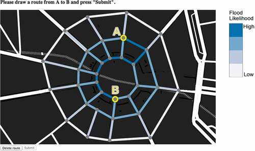
For each stimulus, participants had to plan and construct their route from the marked origin ‘A’ to destination ‘B’ by tracing their route along the existing road network using their computer mouse. Two action buttons were displayed at the bottom of the screen. Participants used the ‘submit’ button when they were ready to submit their route and move on to the next task. Participant could also use the ‘Delete route’ button at any point before submission to redesign their route. On submission, their route and any associated data captured was stored in the secure experimental database.
In designing the interface, the maps were given the largest possible proportion of the screen and placed in the center of the participant’s view. A legend showing flood likelihood was also included to the right of the image ().
3.3. Treatment conditions
The experiment compared six different graphical representations of the likelihood of blockage (risk) along each segment of the route. Six was chosen as the maximum feasible number of treatment conditions given our controlled experimental design, which involves eight different stimuli per treatment condition (discussed further in Section 3.4).
The six representations of risk were chosen to cover a range of different symbolizations reviewed in Section 2.1. Three of Bertin’s six visual variables were used to depict level of risk: color value, size, and pattern. These visual variables are well suited to encode relative quantity and to communicate a ‘magnitude message’ (i.e. more likelihood of blockage) (Mackinlay Citation1986). One of Bertin’s visual variables, orientation, was omitted from our study, in case participants were confused by the orientation of symbols in the context of the inherently oriented nature of the experimental task: route-planning from ‘A’ to ‘B’ through a road map.
Bertin’s remaining two visual variables, shape and color hue, are better suited to encoding qualitative differences rather than quantitative differences. As discussed in Section 2.2, an objective of this work was to evaluate abstract versus metaphorical encodings of risk. Color hue and shape were therefore varied to create metaphorical versus abstract representations of risk. These variations in hue and shape were overlaid across the color value, size and pattern treatments, creating a total of six treatment conditions.
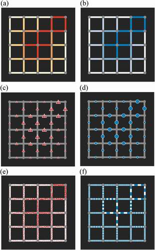
The six treatment conditions are summarized in and detailed below. First, three treatment conditions using metaphorical associations with risk were designed (), covering our three quantitative visual variables: color value, size, and pattern (, respectively). Red color hue was chosen as an element in the design of all the metaphorical treatment conditions: as discussed previously, red hue has strong semantic association with warnings in many (although not all) cultures.
Red color value, in which increasing ‘redness’ indicated increasing risk of flooding (). The color ramp was chosen using ColorBrewer (Brewer Citation2019) to be colorblind safe. There has been some recent discussion in the literature about whether darker or lighter colors better communicate more uncertainty to users (i.e. whether darker is more strongly associated with more certainty or more uncertainty, cf. Seipel and Lim Citation2017, Johannsen et al. Citation2018). However, in this case, increased risk of a flood blockage event seems natural to represent with darker, more intense colors.
Red warning icons (shape), in which increasing size of a familiar warning symbol indicated increasing risk (). A red warning symbol with a white exclamation mark was chosen as a common metaphorical warning icon that can easily be associated with a clear ‘magnitude message’ (increasing the size of icon indicating increased flood risk). Symbol size (area) carries a highly effective magnitude message (Stevens Citation1975, Mackinlay Citation1986, MacEachren Citation1992, Munzner Citation2014).
Red ‘sketchy’ lines (pattern), in which increasing ‘sketchiness’ of lines indicated increasing risk (). As already discussed in Section 2.2, graphical ‘sketchiness’ has been suggested as an intuitive mechanism for metaphorical communication of uncertainty (Tenneti and Duffy Citation2005, Wood et al. Citation2012).
Three corresponding abstract representations were designed as further treatment conditions, using blue color hue in the design of all the abstract treatment conditions (). Selecting blue as our experiment’s abstract alternative hue to red involved balancing a number of different options and considerations. First, our experimental design, already containing treatments comparing color value, size, and pattern in both abstract and metaphorical representations, necessitated that a single, consistent color be chosen for all three abstract representations. Gray-scale was considered first as a neutral alternative to red. However, gray-scale was found to be too low-contrast to be effective and easily distinguishable, in the context of the map backdrop and network elements required to enable participants to complete the routing task. Other color hues, such as green, were also considered. However, blue does have a relevant semantic association: with flooding and water. On the one hand, these semantic associations weaken the case for blue as an abstract alternative to red. On the other hand, those same semantic associations make blue a natural choice of hue for participants in our flooding example. Further, blue does not have relevant semantic associations with risk and danger, the salient focus of our experiment. Ultimately, blue was selected as the best compromise between these different options and considerations. We return to any potential effects of this choice in the discussion.
Blue color value, in which increasing ‘blueness’ indicated increasing risk of flooding () was chosen as an abstract alternative to metaphorical, red color-value (). The blue color ramp used was selected using ColorBrewer and is colorblind safe.
Blue circle symbols (shape), in which increasing size of a blue circle symbol indicated increasing risk () as abstract alternative to the metaphorical warning icon (). A round symbol was chosen for ease of distinguishing different sizes of symbols (Stevens Citation1975, Mackinlay Citation1986, Munzner Citation2014). As discussed above, changing symbol size is known to be an intuitive and effective visual variable for making ordinal distinctions (MacEachren Citation1992).
Blue texture (pattern), in which increasing coarseness of blue stripes provides an abstract indication of increasing risk (). The blue texture was chosen as an abstract alternative pattern to the red ‘sketchy’ pattern ().
Figure 2. Examples of the six treatment conditions, each representing the risk of road blockage due to flood: Color hue red (a); Color hue blue (b); Symbol warning (c); Symbol circle (d); Pattern ‘sketchy’ (e); Pattern texture (f).
3.4. Scenarios
The spatial configuration of particular combinations of road network structures and origin/destination points had the potential to confound our results. Recognizing this as an extraneous factor, each treatment condition was tested across eight different ‘scenarios.’ Each scenario involved one of two road network layouts: a grid road network () or a radial road network (). These road networks were designed to look as natural as possible, inspired by the cities of Melbourne and Paris, respectively.
Figure 3. Example of two road network types used in the experiment: Grid network (a) and Radial network (b).
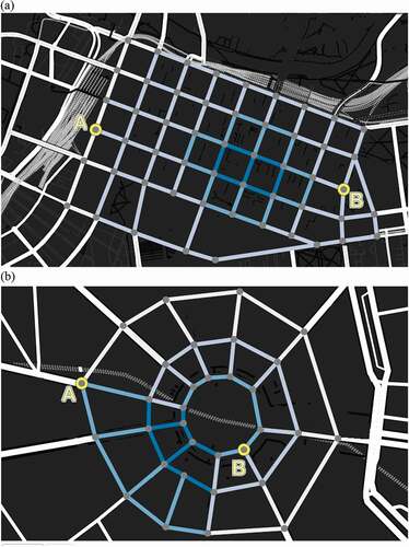
Further, four different pairs of origin ‘A’ and destination ‘B’ locations were tested with both grid and radial road layouts. In total, each participant therefore planned routes for 48 different map stimuli: eight scenarios (4 A-B locations 2 networks)
6 treatment conditions, with different graphical representations of risk.
3.5. Participant payment structure
User studies, like this one, offer an opportunity to gather large samples of quantitative data on participants’ use of maps and their deliberative process. Unfortunately, there are many reasons that user studies might yield biased or noisy data. User studies are time-consuming, effortful, and potentially boring, increasing the chances of thoughtless or noisy responses.
Experimental economists have developed protocols that are designed to overcome these problems, by both compensating participants for their time with a flat fee and awarding additional performance-based incentive payments. Incentive-based payments create a tangible link between the outcomes of decisions in the experiment, and outcomes for the participant. These procedures are acknowledged to offer particular advantages when used in studies involving risk (Bardsley et al. Citation2010). Hence, performance-based incentives are increasingly common in studies on visualization and decision-making involving risk and uncertainty, such as Cheong et al. (Citation2016), Merrill et al. (Citation2019).
In our experiment each participant was paid a flat $7 participation fee. Participants could earn additional payments up to the value of $9.60 in performance-based payments. Participants were informed that they would receive $0.20 on each task if their selected route was not blocked, and $0 otherwise. In keeping with the narrative of a flood emergency, participants were also advised to keep their route as short as possible, although the financial rewards did not directly depend on the length of participants’ routes. Performance-based payments could potentially amount to more than the participation fee, creating a clear incentive to invest effort in each task. In practice, the maximum amount earned by any participant was $13.60 AUD, the average payment was $11.94 AUD, and the minimum payment was $10.00 AUD.
3.6. Procedure
The experiment was conducted at the experimental economics laboratory at the University of Melbourne, Australia. Participants were invited into the laboratory and asked to sit an individual booth with a desk and a computer. Each booth also contained consent forms, information regarding human ethics approval and the handling of de-identified data, together with a statement of instructions for completing the experiment.
The instructions informed participants about the payment schedule (see Section 3.5) and advised that the experiment would likely take between 30 and 35 min to complete. After participants read and signed the forms, and had read the instructions (Appendix), the experiment commenced.
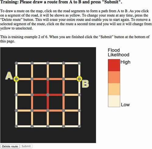
Participants were first given a series of six training exercises to familiarize them with what to expect. The training exercises were similar to the scenarios in the experiment, except using a more simplified grid-based road network (see ).
Figure 4. Interface showing simplified pre-experiment training exercise.
After completing the training exercise participants began the full experiment, constructing routes in response to the 48 different stimuli. Participants encountered each decision-making task only once. The order of tasks was randomized to mitigate against any systematic learning effects. Participants were not given a time limit to complete the experiment. A preliminary study, conducted when designing the experiment, suggested that the route-planning task was already sufficiently difficult without additional time pressure. However, while no timer was visible to participants, participants’ time taken to make decisions were still recorded by our experimental system.
To minimize the effect of progress on performance, participants were not shown their earnings until the end of the experiment. At the end of the experiment, participants also completed a short questionnaire which included demographic questions, participant preferences for different representations of risk, and an opportunity to make any general comments. Participants were also asked about mathematical and map-reading abilities, flood experience, and whether they had a known color vision deficiency.
3.7. Calculation of risk along a route
Participants needed to infer the risk of an entire route remaining unblocked based on the combined risk of blockage along the selected segments that make up the route. The combined level of risk for each route was calculated as follows.
The chance of being blocked at any point along road segment is
. The chance of being unblocked at every point along segment
is therefore
. If the segment has length
, the chance of traveling along
without being blocked is therefore
. Across a sequence of segments
, the overall chance of a route being unblocked is therefore:
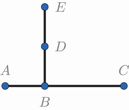
provides a simple example. This road network includes five nodes and four edges, and the probability of being blocked is 0.3 at every point. Route includes two segments and Route
includes three segments. Segments
,
and
are all the same length, while Segment
is twice as long. Both routes are the same length and therefore have the same chance of being unblocked: using EquationEquation (1)
(1)
(1) , if
, then
, and the chance of being unblocked along route
is
. The chance of route
being unblocked is
, which also equals
.
Figure 5. Example network illustrating the normalized risk measure for routes.
Notice that participants can compare routes without knowing the absolute length of segments. To maximize the chance of being unblocked, a participant needs to weigh up the relative length of segments alongside the probability of being blocked at every point along these segments. Participants visually gauge the relative length of different segments as they would under day-to-day map-reading circumstances.
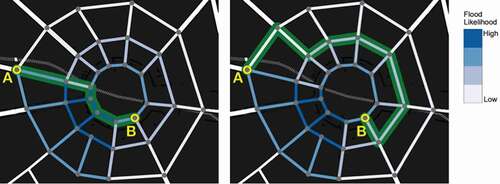
demonstrates two potential strategies for maximizing the chance of being unblocked. In the shortest route has been chosen with a length of 240 m, but this route passes through a zone with a high chance of being blocked. There is a 43% chance of being blocked. In contrast, the route in passes through a zone with a lower chance of blockage, but it is longer (575 m). It has a 57% overall chance of being blocked.
Figure 6. Example of two different strategies to navigate through a network: short route through high risk (left) and longer route through lower risk (right). In this case, the second route has a higher risk of blockage.
Using this calculation, each of the participant’s chosen routes was determined to be blocked or unblocked based on the total risk encountered over the route. Participants were paid the $0.20 AUD performance incentive for all unblocked routes (see Section 3.5). This scheme means on average participants’ performance will translate into increased incentive payments. However, note that it is not necessarily the case that any good (i.e. low risk) individual choice will result in a unblocked route, or vice versa. As in life, when making risky decisions about uncertain futures, chance plays a role in the individual outcome: sometimes good decisions go unrewarded bad decisions go unpunished. We argue that this feature (termed the ‘right decision, wrong outcome’ problem in Cheong et al. Citation2016) is at the core of evaluating decision-making tasks, rather than evaluating simply map-reading tasks.
4. Results
4.1. Performance analysis: risk
The first set of results inform the hypothesis that different cartographic representations of risk lead to differences in the levels of risk in the routes chosen by participants. presents the distribution of risk incurred in each treatment condition. While the risk profiles follow a similar pattern, treatment-specific differences are evident. The red color-value treatment condition, for example, has a longer tail of high-risk routes (risk 0.7) not evident under other treatment conditions. The texture treatment had the lowest maximum level of risk (risk of
0.7). The warning icon had a second peak of low-risk routes.
Figure 7. Histograms showing distribution of risk for each representation: Color hue red (a); Color hue blue (b); Symbol warning (c); Symbol circle (d); Pattern ‘sketchy’ (e); Pattern texture (f).
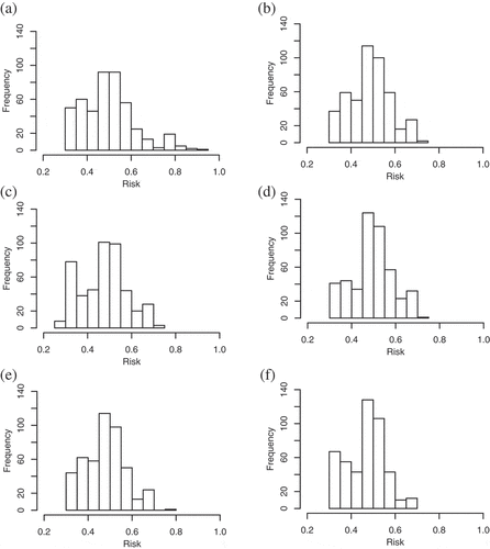
The highest-risk route was selected under the red color-value treatment with a risk of 0.932. This was considerably higher than the second-highest risk route of 0.774 for the sketchy treatment. The route with the lowest level of risk was chosen under the warning treatment, with a risk of 0.300. Participants in the red color-value treatment incurred the most risk, on average, followed by participants in the circle, blue color-value, sketchy, then warning treatments. Participants using the texture treatment selected routes with the lowest mean and median level of risk.
Analysis of variance (ANOVA) indicated that the level of risk did differ statistically across treatment conditions (-value
0.01). Hence, the results supported the hypothesis that participants selected routes with systematically different levels of risk when using different cartographic representations. This was investigated further using a post-hoc Tukey multiple pairwise comparison (Tukey honest significant differences). The results are presented in .
Table 1. Pairwise comparison of difference in mean risk by treatment condition. * denotes -values
0.05, ** denotes
-values
0.01 and *** denotes
-values
0.001. Numbers indicate differences in mean risk between row and column treatment condition (e.g. sketchy treatment exhibited mean risk 0.018 less than red treatment, significant at the 5% level.).
Thus, shows participants incurred significantly higher levels of risk using the red color-value treatment when compared to the sketchy, warning, and texture treatments; using the circle-symbol treatments when compared to the warning-symbol and texture treatments; and using the blue color-value treatment when compared to the texture treatment. The data exhibited no significant differences in risk taken when comparing abstract representations (blue, circle, texture treatments) and metaphorical representations (red, warning symbol, and sketchy treatments).
4.2. Performance analysis: outcomes
Given statistically significant differences in the mean level of risk accepted by participants’ choosing routes across different treatment conditions (above), a next step is to assess whether these differences in risk levels lead to meaningful differences in the outcomes associated with different treatment conditions. Route outcomes not only reflect the average level of risk incurred under each treatment condition, but also the variation inherent in the risky process.
Our hypothesis was that the choice of cartographic representation (treatment condition) can affect participants’ success in routing. Logistic regression analysis was used to evaluate whether the differences in route outcomes are statistically significant. The odds ratios of being unblocked are presented in . Logistic regression requires one treatment condition be selected as the benchmark. In , the blue color-value treatment is used as the benchmark treatment condition, as it has the lowest overall routing success.
Despite some differences in odds ratios (e.g. that red color-value treatment was 1.2 times more likely to result in successful, unblocked routing than the blue color-value treatment), none of the observed differences were statistically significant (). Aggregating by representation type (color value versus symbol versus pattern) and by representation style (abstract versus metaphorical) similarly exhibited no statistically significant differences. Hence, overall, even though the mean levels of risk taken in different treatment conditions were significantly different, the data did not support our hypothesis that cartographic representation affected overall routing success.
Figure 8. Logistic regression: Odds ratios for route traversal success a. under each treatment condition, relative to blue color-value treatment (left); b. for all treatment conditions, with odds ratio for grid (‘Melbourne’) network, relative to the radial (‘Paris’) network (right). Bars describe 95% confidence interval. * denotes -values
0.05, ** denotes
-values
0.01 and *** denotes
-values
0.001.
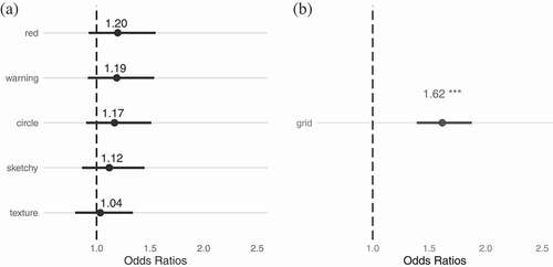
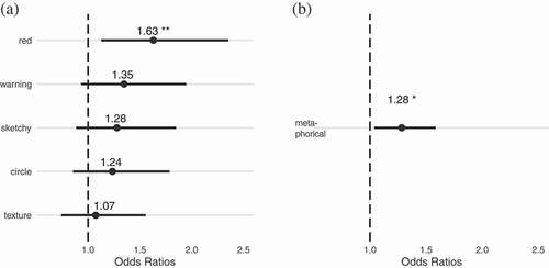
However, it was noticed that participants planning routes exhibited significantly higher chances of success (1.62 times, significant at the 99.9% level) using the grid network layout when compared with the radial network layout (). Restricting the analysis to scenarios using the more challenging radial network layout only, participants were found to be 1.63 times more likely to route successfully using the red color-value treatment, when compared with the blue color-value treatment (0.01, ). Aggregating together the metaphorical representations (red color value, warning symbol, and ‘sketchy’ pattern treatments), participants were also 1.28 times more likely to successfully identify an unblocked route (
0.05, ).
Figure 9. Logistic regression: Odds ratios for route traversal success for radial (‘Paris’) network only, a. under each treatment condition, relative to blue color-value treatment (left); b. for metaphorical-style treatment conditions (red color-value, red warning sign, red ‘sketchy’) relative to abstract-style treatment conditions (blue color-value, blue circle, blue texture) (right). Note: * denotes -values
0.05, ** denotes
-values
0.01 and *** denotes
-values
0.001.
Hence, these results do lend qualified support our hypothesis – that cartographic representation affects routing success – at least in the case of routing using the radial network. This tentative result is examined more closely in the context of other results in the discussion, in Section 5.
4.3. Performance analysis: time
The third set of results related to the hypothesis that cartographic representation also affects the time taken by participants to plan their route. An analysis of variance supported this hypothesis, revealing that differences in the mean time taken by participants to plan a route under each treatment condition were statistically significant (-value
0.001). A post-hoc Tukey pairwise comparison presented in shows where these differences lie. Participants’ route-planning was up to 5.1 s faster when the information was represented using color-value (blue and red color-value treatments), when compared with other treatment conditions (
-values
0.001). Participants were slowest in their decision-making when risk was represented using the texture representation (up to 7.8 s slower on average than the blue color value representation.).
Table 2. Pairwise comparison of difference in mean time taken in seconds by participants by representation type: color (treatment conditions blue and red color-value); symbol (treatment conditions circle and warning symbol); and pattern (treatment conditions texture and sketchy). * denotes -values
0.05, ** denotes
-values
0.01 and *** denotes
-values
0.001. Numbers indicate differences in mean time between row and column treatment condition (e.g. symbol-based treatments exhibited required on average 4.3 s longer to decide than color-value treatments, significant at the 99.9% level.).
However, the data again exhibited no significant differences when comparing the time taken to decide using abstract representations (blue, circle, texture treatments) versus metaphorical representations (red, warning symbol, and sketchy treatments).
As the experiment progressed, the mean time taken to plan routes became progressively faster across the cohort. Treatment-scenario combinations were shown in a randomized order, such that learning effects across the experiment were balanced; this suggests that participants progressively acquired route-planning skills that were not treatment-specific.
4.4. Participant preferences
summaries participants’ most-preferred methods for representing risk. The chart shows the frequency with which participants selected a representation as most preferred (light gray shaded bar) and least preferred (dark gray shaded bar). The blue and red color-value treatments were the most-preferred, with much lower preferences for the other treatments.
Figure 10. User preferences for representation of risk. The chart compares for each treatment condition the number of participants who selected that representation as their most preferred (light gray shaded bar) and least preferred (dark gray bar).
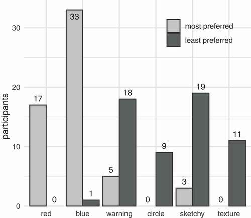
The summary in shows only participants’ most and least preferred representations. To include all rankings in comparing participant preference, the complete set of all rankings were combined into a single aggregate preference ranking using the Condorcet method. The Condorcet method combines multiple rankings on the basis of pairwise preferences between options. The analysis yielded an overall preference ranking, most to least preferred, of: blue, red, circle, texture, warning, sketchy treatments.
4.5. Grid versus radial network
The two network types, grid and radial, were included as extraneous (confounding) factors. The results presented in Section 4.2 and shows, however, that network type had an impact upon routing success. Further investigation of this unexpected result was warranted. Accordingly, presents the frequency histograms for the risk levels of the routes chosen by participants using the grid and radial networks. The distributions indicate higher overall levels of route risk and slightly lower variability in risk using radial network routing tasks (mean 0.533, standard deviation 0.080), when compared with routing using the grid network (mean 0.429, standard deviation 0.083).
Figure 11. Frequency histograms of risks taken by participants across all treatments for: a. grid (‘Melbourne’) network (left); and b. radial (‘Paris’) network (right).
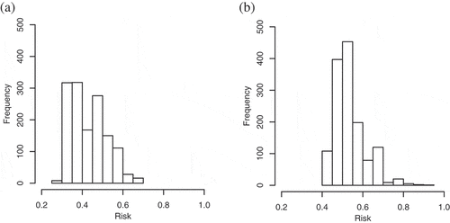
From , it appears participants found it more challenging to consistently identify lower-risk routes through the radial network than the corresponding task in the grid network. A likely explanation for this observed difficulty routing through the radial networks is the additional difficulty of comparing road segments with a wider variety of lengths. Judging the relative risk of two route segments is easier if both segments are the same length (i.e. compare only flood-likelihood level) or if both segments are the same flood-likelihood level (i.e. compare length). Judging the risk of two route segments of different lengths and different flood-likelihood levels is inherently harder because participants must integrate both length and flood-likelihood level. Generally, the radial network has a wider variety of route segments lengths (cf. ) which arguably added to the overall difficulty of the task of routing through the radial network. Further experiments would be valuable for exploring this contention.
4.6. Summary of results
A summary of key results is presented in . The table ranks the mean risk, median time, and number of blocked routes by treatment condition, as well as the user preferences, ranked by Condorcet method (Section 4.4), for each treatment condition. The mean time taken was distorted by a small number of slow, deliberative decisions (in some cases up to 3 min). Hence, median time was a more faithful descriptor of central tendency for the skewed distribution of times.
Table 3. Summary of mean risk of route, median time to decision, number of blocked routes, and participant preference, ranked.
There was a strong correlation between the median time taken to make a decision and the mean risk incurred along the chosen route. Higher risk routes were associated with faster decisions (). The Spearman’s rank-order correlation between mean risk incurred and median time taken was −0.83 (). Hence, color-value based representations of risk were associated with faster decision-making together with higher levels of risk. At the other extreme, participants generally planned less risky routes and took longer to plan those routes when they encountered the texture and warning treatments.
There is also a moderate correlation between user preference and time taken (Spearman’s rank-order correlation 0.77, ). Hence, the representations participants prefer are associated with faster decision-making. The correlation between user preference and mean risk was slightly weaker (−0.6, not significant). No significant correlations were observed between outcomes (blocked routes) and risk, time, or preference.
5. Discussion
Clear patterns do emerge in participants’ route-planning according to the method used to represent risk on a map. However, some of the patterns of difference ran somewhat counter to our expectations. In particular, a pattern of difference between abstract and metaphorical representations was expected (Section 2.2). For example, increasing red color-value might be expected to encourage more cautious decisions, as a result of its semantic associations with danger. Similarly, the sketchy and warning sign representations might be expected to prompt associations with risk and danger more readily, and hence increase performance. The results confound this expectation with no systematic differences observed between metaphorical and abstract representations in terms of levels of risk or time taken to decide.
Instead, the results tend to highlight a difference in performance between color value (red and blue) and circle size representations on the one hand; and texture, sketchy, and warning symbols on the other. The former three representations tend to result in faster, more risky decisions; the latter three slower, less risky decisions (). Completing this picture is the further observation that users’ less preferred representations also followed a similar pattern. Color value and circle size were most preferred; sketchy, texture, and warning least preferred ().
A likely explanation for this distinction is that color value (red and blue) and circle size are visually simpler, and so more intuitive to interpret. By contrast, patterns (texture and sketchy) and mimetic warning symbols are more visually complex, and so more effortful for participants to interpret. These more visually complex, effortful representations of risk might induce participants to pay closer attention to the map, and to consider their decisions more carefully. These results suggest that there may be some benefits to complexity. Such ‘desirable difficulty’ (also termed ‘perceptual interference’ effects) are already well known in psychological studies of human learning (Bjork Citation1994, Yue et al. Citation2013). While unduly complex maps would be undesirable, it may not necessarily be optimal to minimize complexity for the emergency spatial decision-maker.
With this in mind, it was surprising to find that the red color-value treatment and metaphorical representations were associated with significantly better performance in terms of outcomes in one specific case: the radial network layout (Section 4.2). For the radial network layout only, the red color-value treatment was 1.63 times more likely to result in an unblocked route than the corresponding blue color value map, significant at the 99% level (). The metaphorical representations taken together, which include the red color-value treatment, were also 1.28 times more likely to result in an unblocked route than abstract representations, significant at the 95% level ().
This apparent improvement in decision outcomes is initially puzzling, because red color-value representations were also associated with significantly higher levels of risk taken (see above). Further investigation indicated that while statistically significant, these results are not a reliable basis for drawing conclusions. Closer examination of the data revealed that a handful of cases (fewer than 20) of high-risk routes (risk of blockage between 70% and 80%) selected by participants through the radial network using the red color-value treatment happened, by chance, to be successful (30–40% blockage in outcome). Hence, in a small number of cases, the increased difficulty of routing through the radial network layout (Section 4.2) combined with the increased tendency of participants to select more risky routes using the color-value representations (Section 4.6) led, by chance, to better than expected outcomes.
In large samples, the rate of blockage should approach the level of risk incurred, as it does for the whole data set. This statistically significant result using 50% of the data (radial network layout) is therefore an effect of chance in a relatively small sample, rather than an instance of more risky decisions leading to better outcomes. Thus, even though in terms of routing success in the radial network layout the red color-value outperformed blue color-value treatment, and metaphorical outperformed abstract representation, these differences should be attributed to chance rather than a meaningful effect of representation. This is a concrete example of the difficulty evaluating the quality of decision-making when facing uncertainty in the form of the ‘right decision, wrong outcome’ problem – or in this instance, the ‘wrong decision, right outcome’ problem.
6. Conclusion
This study set out to investigate whether the methods used to visualize map risk can make a significant difference to people’s decision-making performance. The approach extended that of Cheong et al. (Citation2016), who tested a simple, binary stay-or-leave emergency decision scenario, by investigating decision performance on a much more complex spatial task: emergency route-planning. Participants were asked to plan routes through a road network minimizing the chance of blockage by flooding. The results indicate that the map-based graphical representation of uncertainty do indeed have a significant effect upon the level of risk taken by participants in choosing their route.
The results further indicate a relationship between the increased length of time participants took to come to a decision, decreased participant preferences for the different graphical representations tested, and increased decision performance, in terms of total level of risk for a route. This is suggestive of a possible causal link: the cost of complex graphical representations in terms of the time, effort, and attention demanded of users may be compensated by increased decision performance using such representations.
These results tend to lend support to growing body of work that suggests most preferred visualization is not, in general, a good proxy for best performing visualization (cf. Wilkening Citation2009, Quispel and Maes Citation2014, Cheong et al. Citation2016). As discussed above, there is a ready mechanism potentially to explain this observation. Arguably, more visually complex representations may demand more attention, thus more time and effort to use, and consequently be less preferred. Participants’ most-preferred treatments tend to closely reflect the speed of decision-making, rather than the quality of decision. However, the additional attention, time, and effort demanded but less-preferred representations may in certain circumstances promote more considered, better decisions.
If so, this finding has particular relevance to decisions in safety-critical and emergency applications. In certain situations, speed may be paramount. In other situations, the magnitude of differences in decision speed – up to 8 s on average in our experiment, but potentially up to several minutes in individual instances, see Section 4.3 – and the likely impact of adverse outcomes in safety-critical situations may mitigate towards decision quality over decision speed. Overlaid on top of considerations of both decision quality and decision speed is that of decision outcome. The ‘right decision, wrong outcome’ problem observed in our experiment (Section 5) again underlines that, under uncertainty, high quality, low-risk, slower, and more deliberative decisions can be only relied upon to lead to better outcomes on average, and not in individual instances.
There may also be more subtle influences of the ‘right decision, wrong outcome’ problem on participants’ performance. This problem is expected to make it harder for participants to receive clear feedback on which representations facilitate better decision-making, whether in experiments or real decision scenarios. In turn, this scrambling of feedback may promote more transparent considerations, such as time, rather than decision quality in the preferences of map users. The results of this experiment would seem to fit such a pattern. Some representations, such as red and blue color value maps, were associated with systematically more risky decisions by participants. The role of chance, as evidenced by instances of high-risk choices performing well in the red color-value radial maps, may inhibit users’ ability to identify poor performance and learn from it. Future research might productively examine this question more explicitly: do different cartographic representations help or hinder learning from past performance in spatial decision-making under uncertainty?
Overall, our results tend to support those previous studies in which texture (Leitner and Buttenfield Citation2000), sketchy (Wood et al. Citation2012), and iconic or pictorial warning symbols (MacEachren et al. Citation2012) have been suggested as good cartographic choices for representing uncertainty for decision-makers. Although these representations were less preferred by participants and led to slower decisions, they tended to lead to significantly lower-risk route choices. Of course, results from quantitative psychometric experiments, such as described here, are notoriously difficult to tie tightly to practical high-level emergency applications. Bridging the gap between realistic visualization scenarios and the precise experimental control required for robust empirical results remains a challenge (Kinkeldey et al., Citation2014, Kinkeldey et al., Citation2015, Lickiss et al., Citation2017, Hullman et al., Citation2019). Consequently, further work is needed to explore further these results in more realistic decision scenarios than can be achieved using controlled laboratory experiments. Nevertheless, these initial results would seem to warrant such further practical and application-oriented exploration.
Data and codes availability statement
The data and codes that support the findings of this study are available in Figshare with the identifier: https://doi.org/10.6084/m9.figshare.11307083.v1.
Acknowledgments
This research was partially supported through the Australian Research Council’s (ARC) Discovery Projects funding scheme (project DP120100072) and by the German Academic Exchange Service (DAAD). The authors gratefully acknowledge Dr Kevin Tolhurst, Dr Tom Wilkening, Dr Amy Corman, Prof Allison Kealy, and Prof Alexander Klippel for their advice and assistance in developing this research.
Disclosure statement
No potential conflict of interest was reported by the authors.
Additional information
Funding
Notes on contributors
Lisa Cheong
Lisa Cheong graduated with a PhD in Geospatial Sciences from RMIT University in 2018. She is a Senior Spatial Information Officer in the Queensland Government Department of Natural Resources, Mines and Energy, and has previously worked as a Senior Spatial Analyst for Victoria Police.
Christoph Kinkeldey
Christoph Kinkeldey is a Postdoctoral Researcher at the Institute of Computer Science, Freie Universität Berlin. His previous positions include researcher at INRIA and visiting researcher at the University of Melbourne, Australia and the Pennsylvania State University (PSU), USA. Christoph holds a PhD in Geovisual Analytics from HafenCity University (HCU) Hamburg.
Ingrid Burfurd
Ingrid Burfurd is a lecturer in economics at RMIT University. Ingrid holds a PhD in experimental economics from the University of Melbourne. She has a background in environmental policy and has previously worked as an economist for Victorian State Government and on a UN FCCC High-Level Panel.
Susanne Bleisch
Susanne Bleisch is a professor in geovisualization and visual analytics at the Fachhochschule Nordwestschweiz (University of Applied Sciences and Arts, Northwestern Switzerland). She has previously worked at the University of Melbourne, and holds a PhD in Geovisualization from City University, London, UK.
Matt Duckham
Matt Duckham is professor of geographic information science and Associate Dean Geospatial Sciences in the School of Science, RMIT University, Melbourne, Australia. His previous positions include professor of GIScience at the University of Melbourne, Australia, and Postdoctoral Researcher at the NCGIA, University of Maine, USA.
Related Research Data
References
- Aerts, J.C., Clarke, K.C., and Keuper, A.D., 2003. Testing popular visualization techniques for representing model uncertainty. Cartography and Geographic Information Science, 30 (3), 249–261. doi:10.1559/152304003100011180.
- Andre, A. and Cutler, H., 1998. Displaying uncertainty in advanced navigation systems. Proceedings of the Human Factors and Ergonomics Society, 42 (1), 31–35. doi:10.1177/154193129804200108.
- Ash, K., Schumann, R., and Bowser, G., 2014. Tornado warning trade-offs: evaluating choices for visually communicating risk. Weather, Climate and Society, 6 (1), 104–118. doi:10.1175/WCAS-D-13-00021.1.
- Bardsley, N., et al., 2010. Experimental economics: rethinking the rules. Princeton: Princeton University Press.
- Bertin, J., 1983. Semiology of graphics: diagrams, networks, maps. Madison: University of Wisconsin Press.
- Bisantz, A., et al., 1999. Human performance and data fusion based decision aids. In: Proc. 2nd international conference on information Fusion (FUSION’99), 6–8 July. Sunnyvale, CA, 918–925.
- Bjork, R., 1994. Memory and metamemory considerations in the training of human beings. In: J. Metcalfe and A. Shimamura, eds. Metacognition: knowing about knowing. Cambridge, MA: MIT Press, 185–206.
- Boukhelifa, N., et al., 2012. Evaluating sketchy lines for the visualization of qualitative uncertainty. Technical report PR-7910, INRIA. doi:10.1094/PDIS-11-11-0999-PDN.
- Brewer, C.A., 2019. ColorBrewer 2.0. [online] Available from: http://www.ColorBrewer.org [Accessed 14 Mar 2019].
- Burston, J., Ware, D., and Tomlinson, R., 2015. The real-time needs of emergency managers for tropical cyclone storm tide forecasting: results of a participatory stakeholder engagement process. Natural Hazards, 78 (3), 1653–1668. doi:10.1007/s11069-015-1794-7.
- Buttenfield, B., 1993. Representing data quality. Cartographica, 2 (2–3), 1–7. doi:10.3138/232H-6766-3723-5114.
- Cao, Y., Boruff, B.J., and McNeill, I.M., 2016. Is a picture worth a thousand words? Evaluating the effectiveness of maps for delivering wildfire warning information. International Journal of Disaster Risk Reduction, 19, 179–196. doi:10.1016/j.ijdrr.2016.08.012
- Cheong, L., et al., 2016. Evaluating the impact of visualization of wildfire hazard upon decision-making under uncertainty. International Journal of Geographical Information Science, 30 (7), 1377–1404. doi:10.1080/13658816.2015.1131829.
- Cliburn, D., et al., 2002. Design and evaluation of a decision support system in a water balance application. Computers and Graphics, 26, 931–949. doi:10.1016/S0097-8493(02)00181-4.
- Cox, J., House, D., and Lindell, M., 2013. Visualizing uncertainty in predicted hurricane tracks. International Journal for Uncertianty Quantification, 3 (2), 143–156. doi:10.1615/Int.J.UncertaintyQuantification.2012003966.
- Davis, T. and Keller, C., 1997. Modelling and visualizing multiple spatial uncertainties. Computers and Geosciences, 23 (4), 397–408. doi:10.1016/S0098-3004(97)00012-5.
- Edwards, L. and Nelson, E., 2012. Visualizing data certainty: A case study using graduated circle maps. Cartographic Perspectives, 38, 19–36.
- Endsley, M., 1995. Toward a theory of situation awareness in dynamic systems. Human Factors, 37 (1), 32–64. doi:10.1518/001872095779049543.
- Finger, R. and Bisantz, A., 2002. Utilizing graphical formats to convey uncertainty in a decision-making task. Theoretical Issues in Ergonomics Science, 3 (1), 1–25. doi:10.1080/14639220110110324.
- Fraser, D., 2010. Cartography and geoinformation for early warning and emergency management. lecture notes in geoinformation and cartography. In: M. Konečný, S. Zlatanova, and T.L. Bandrova, eds. Geographic information and cartography for risk and crisis management: towards better solutions. Berlin: Springer, 319–334.
- Frick, J. and Hegg, C., 2011. Can end-users’ flood management decision making be improved by information about forecast uncertainty? Atmospheric Research, 100 (2–3), 296–303. doi:10.1016/j.atmosres.2010.12.006.
- Friedmannová, L., 2010. Designing map keys for crisis management on the regional operational and informational centre level: monitoring transport of dangerous goods via contextual visualisation. lecture notes in geoinformation and cartography. In: M. Konečný, S. Zlatanova, and T.L. Bandrova, eds. Geographic information and cartography for risk and crisis management: towards better solutions. Berlin: Springer, 425–437.
- Fuhrmann, S., MacEachren, A., and Cai, G., 2008. Geoinformation technologies to support collaborative emergency management. In: H. Chen, et al., eds. Digital government: E-government research, case studies, and implementation. Berlin: Springer, 395–420.
- Gärling, T. and Golledge, R.G., 2000. Spatial decision-making. In: R. Kitchin and S. Fre- Undschuh, eds. Cognitive mapping: past, present, and future. Psychology Press, chap. 4. Routledge, 44–65.
- Goda, K. and Song, J., 2016. Uncertainty modeling and visualization for tsunami hazard and risk mapping: a case study for the 2011 Tohoku earthquake. Stochastic Environmental Research and Risk Assessment, 30 (8), 2271–2285. doi:10.1007/s00477-015-1146-x.
- Greiner, B., 2015. Subject pool recruitment procedures: organizing experiments with ORSEE. Journal of the Economic Science Association, 1 (1), 114–125. doi:10.1007/s40881-015-0004-4.
- Griffin, A., et al., 2014. Supporting planners’ work with uncertain demographic data. In: Workshop on visually-supported reasoning with uncertainty, GIScience 2014. Vienna, Austria.
- Harris, P., et al., 2016. Modelling, interpreting and visualizing uncertainties for the North Wyke Farm Platform baseline field surveys. In: Proc. spatial accuracy 2016, Montpellier, France, 18–23.
- He, G., 2011. A comparative study of color metaphors in English and Chinese. Theory and Practice in Language Studies, 1 (12), 1804–1808. doi:10.4304/tpls.1.12.1804-1808.
- Healey, C.G., Booth, K.S., and Enns, J.T., 1996. High-speed visual estimation using preattentive processing. ACM Transactions on Computer-Human Interaction (TOCHI), 3 (2), 107–135. doi:10.1145/230562.230563.
- Hofstra, H., et al., 2009. Multi-user tangible interfaces for effective decision-making in disaster management. In: S. Nayak and S. Zlatanova, eds. Remote sensing and GIS technologies for monitoring and prediction of disasters. Berlin: Springer, 243–266.
- Howard, D. and MacEachren, A., 1996. Interface design for geographic visualization: tools for representing reliability. Cartography and Geographic Information Systems, 23 (2), 59–77. doi:10.1559/152304096782562109.
- Hullman, J., et al., 2019. In pursuit of error: a survey of uncertainty visualization evaluation. IEEE Transactions on Visualization and Computer Graphics, 25 (1), 903–913. doi:10.1109/TVCG.2945.
- Johannsen, I., Fabrikant, S.I., and Evers, M., 2018. How do texture and color communicate uncertainty in climate change map displays? In: A.G. Stephan Winter and M. Sester, eds. Proc. 10th international conference on geographic information science (GIScience 2018), Leibniz international proceedings in informatics. Dagstuhl, Germany: Schloss Dagstuhl – Leibniz Center for Informatics, 37:1–37:6.
- Kardos, J., Moore, A., and Benwell, G., 2005. The visualisation of uncertainty for spatially referenced census data using hierarchical tessellations. Transactions in GIS, 9 (1), 19–34. doi:10.1111/j.1467-9671.2005.00203.x.
- Kevany, M.J., 2005. Geo-information for disaster management: lessons from 9/11. In: P. van Oosterom, S. Zlatanova, and E.M. Fendel, eds. Geo-information for disaster management. Berlin: Springer, 443–464.
- Kim, S., et al., 2007. Visual analytics on mobile devices for emergency response. In: Proc. IEEE symposium on visual analytics science and technology (VAST), Sacramento, CA, 35–42.
- Kinkeldey, C., et al., 2015. Evaluating the effect of visually represented geodata uncertainty on decision making: systematic review, lessons learned, and recommendations. Cartography and Geographic Information Science, 44 (1), 1–21. doi:10.1080/15230406.2015.1089792.
- Kinkeldey, C., MacEachren, A., and Schiewe, J., 2014. How to assess visual communication of uncertainty? A systematic review of geospatial uncertainty visualisation user studies. The Cartographic Journal, 51 (4), 372–386. doi:10.1179/1743277414Y.0000000099.
- Kirschenbaum, S., et al., 2013. Visualizing uncertainty: the impact on performance. Human Factors, 56 (3), 509–520. doi:10.1177/0018720813498093.
- Kirschenbaum, S. and Arruda, J., 1994. Effects of graphic and verbal probability information on command decision making. Human Factors, 36 (3), 406–418. doi:10.1177/001872089403600302.
- Leitner, M. and Buttenfield, B.P., 2000. Guidelines for the display of attribute certainty. Cartography and Geographic Information Science, 27 (1), 3–14. doi:10.1559/152304000783548037.
- Lickiss, M., et al., 2017. Developing a quick guide on presenting data and uncertainty. Weather, 72 (9), 266–269. doi:10.1002/wea.2017.72.issue-9.
- MacEachren, A., 1995. How maps work: representation, visualization and design. New York: Guilford Press.
- MacEachren, A., et al., 2012. Visual semiotics and uncertainty visualization: an empirical study. IEEE Transactions on Visualization and Computer Graphics, 18 (12), 2496–2505. doi:10.1109/TVCG.2012.279.
- MacEachren, A.M., 1992. Visualizing uncertain information. Cartographic Perspectives, 13 (Fall), 10–19. doi:10.14714/CP13.1000.
- MacEachren, A.M., et al., 2011. SensePlace2: geoTwitter analytics support for situational awareness. In: Proc. IEEE conference on Visual Analytics Science and Technology (VAST), Providence, RI, 181–190.
- MacEachren, A.M., Brewer, C.A., and Pickle, L.W., 1998. Visualizing georeferenced data: representing reliability of health statistics. Environment and Planning A, 30 (9), 1547–1561. doi:10.1068/a301547.
- Mackinlay, J., 1986. Automating the design of graphical presentations of relational information. Acm Transactions On Graphics, 5 (2), 110–141. doi:10.1145/22949.22950.
- Mason, J., Retchless, D., and Klippel, A., 2014. Dimensions of uncertainty: a visual classification of geospatial uncertainty research. In: Workshop visually-supported reasoning with uncertainty, in conjunction with GIScience 2014, Vienna, Australia.
- McGranghan, M., 1993. A cartographic view of spatial data quality. Cartographica, 30 (2–3), 8–19. doi:10.3138/310V-0067-7570-6566.
- Merrill, S., et al., 2019. Decision- making in livestock biosecurity practices amidst environmental and social uncertainty: evidence from an experimental game. PLoS ONE, 14 (4), e0214500. doi:10.1371/journal.pone.0214500.
- Munzner, T., 2014. Visualization analysis and design. Boca Raton, FL: CRC Press.
- Pang, A., 2001. Visualizing uncertainty in geo-spatial data. In: Proc. Workshop on the intersections between geospatial information and information technology, Washington, D.C.
- Pang, A., Wittenbrink, C., and Lodha, S., 1997. Approaches to uncertainty visualization. The Visual Computer, 13, 370–390. doi:10.1007/s003710050111
- Quispel, A. and Maes, A., 2014. Would you prefer pie or cupcakes? Preferences for data visualization design of professionals and laypeople in graphic design. Journal of Visual Languages, 25, 107–116. doi:10.1016/j.jvlc.2013.11.007
- Rauschert, I., et al., 2002. Designing a human-centered, multimodal GIS interface to support emergency management. In: Proc. 10th ACM international symposium on advances in geographic information systems (ACMGIS) ACM, McLean, VA, 119–124.
- Resch, B., Schmidt, D., and Blaschke, T., 2007. Enabling geographic situational awareness in emergency management. In: Proc. 2nd geospatial integration for public safety conference, New Orleans, LA, 15–17.
- Robinson, A.C., et al., 2017. Geospatial big data and cartography: research challenges and opportunities for making maps that matter. International Journal of Cartography, 3 (sup1), 32–60. doi:10.1080/23729333.2016.1278151.
- Robinson, A.C., Roth, R.E., and MacEachren, A.M., 2011. Understanding user needs for map symbol standards in emergency management. Journal of Homeland Security and Emergency Management, 8 (1). doi:10.2202/1547-7355.1811.
- Scholz, R. and Lu, Y., 2014. Uncertainty in geographic data on bivariate maps: an examination of visualization preference and decision making. ISPRS International Journal of Geo-Information, 3 (4), 1180–1197. doi:10.3390/ijgi3041180.
- Schweizer, D. and Goodchild, M., 1992. Data quality and chloropleth maps: an experiment with the use of color. In: Proc. GIS/LIS ’92 Washington, D.C.: ACSM & ASPRS, 686–689.
- Seipel, S. and Lim, N.J., 2017. Color map design for visualization in flood risk assessment. International Journal of Geographical Information Science, 31 (11), 2286–2309. doi:10.1080/13658816.2017.1349318.
- Senaratne, H., et al., 2014. Uncertainty visualization for crisis management in smart grid environments. In: Proc. Eighth international conference on geographic information science (GIScience 2014), Vienna, Austria.
- Slocum, T., et al., 2008. Thematic cartography and geographic visualization. 3rd ed. Upper Saddle River, NJ: Prentice Hall.
- Stachoň, Z., Šašinka, V., and Talhofer, V., 2010. Perceptions of various cartographic representations under specific conditions. lecture notes in geoinformation and cartography. In: M. Konečný, S. Zlatanova, and T.L. Bandrova, eds. Geographic information and cartography for risk and crisis management: towards better solutions. Berlin: Springer, 349–360.
- Stevens, S., 1975. Psychophysics: introduction to its perceptual, neural, and social prospects. Hoboken, NJ: Wiley.
- Tenneti, R. and Duffy, A., 2005. Identifying requirements for rendering in conceptual design. In: Proc. 15th international conference on engineering design (ICED), Melbourne, Australia, 712.
- Tomaszewski, B., 2011. Situation awareness and virtual globes: applications for disaster management. Computers & Geosciences, 37 (1), 86–92. doi:10.1016/j.cageo.2010.03.009.
- Tomaszewski, B., et al., 2011. Supporting geographically-aware web document foraging and sensemaking. Computers, Environment and Urban Systems, 35 (3), 192–207. doi:10.1016/j.compenvurbsys.2011.01.003.
- Tomaszewski, B. and MacEachren, A., 2012. Geovisual analytics to support crisis management: information foraging for geo-historical context. Information Visualization, 11 (4), 339–359. doi:10.1177/1473871612456122.
- Van Der Wel, F., Hootsmans, R., and Ormeling, F., 1994. Visualization of data quality. In: A. MacEachren and D. Fraser-Taylor, eds. Visualization in modern cartography. New York: Elsevier, 313–331.
- Viard, T., Caumon, G., and Levy, B., 2011. Adjacent versus coincident representations of geospatial uncertainty: which promote better decisions? Computers and Geo- Sciences, 37 (4), 511–520. doi:10.1016/j.cageo.2010.08.004.
- Virrantaus, K., Mäkelä, J., and Demšar, U., 2009. Supporting the development of shared situational awareness for civilian crisis management with geographic information Science: research plan. In: A. Krek, et al., eds. Urban and regional data management. Boca Raton, FL: CRC Press, 229–242.
- Wilkening, J., 2009. User preferences for map-based decision making under time pressure. In: C. Davies, ed. Proceedings of the doctoral colloquium at the 9th international conference on spatial information theory (COSIT). L’Aber Wrac’h, France, 91–97.
- Wood, J., et al., 2012. Sketchy rendering for information visualization. IEEE Transactions in Visualization and Computer Graphics, 18, 2749–2758. doi:10.1109/TVCG.2012.262.
- Worboys, M. and Duckham, M., 2004. GIS: a computing perspective. London: CRC Press.
- Yue, C.L., Castel, A.D., and Bjork, R.A., 2013. When disfluency is—and is not—a desirable difficulty: the influence of typeface clarity on metacognitive judgments and memory. Memory & Cognition, 41 (2), 229–241. doi:10.3758/s13421-012-0255-8.
Appendix.
Instructions to Participants
Welcome!
Please read the following information carefully.
Overview
During the course of this experiment you will be shown a series of interactive images. The images show maps that depict the likelihood of road blockages in the event of a flood.
Activity
For each image, you are an emergency responder at location A with important supplies that have to be delivered to location B as fast as possible. You will be asked to choose/decide and draw a route (using your computer mouse). The route you select should be as short as possible whilst also having a low likelihood of being blocked.
When you have drawn a complete route from A to B, you should then press on the Submit button to save your chosen route. Once you have clicked on the Submit button, you cannot change your decision.
Time
In total, you will be shown approximately 48 images and should expect the experiment to take approximately 30 – 35 min to complete.
Payment schedule
You will be paid a base rate of $7.00 for participating in the experiment. You can earn up to an additional $9.60 depending on the route you have drawn. When you have drawn a route when the road is not blocked you earn an additional experimental payment of $0.20. You will not earn any additional payment when the road is blocked. A summary of the payments is shown below.
Questionnaire
After completing the series of scenarios, you will be presented with a short questionnaire to complete.
The total accumulated amount you will be paid, including any additional payments, will appear on the screen after you have completed the questionnaire at the end of the experiment.
If at any point you do not wish to continue the experiment, please inform the experiment staff and you will be paid the base rate of $7.00.
Thank you for your participation in this experiment.
Training Examples
When you are ready please click the ‘Start training’ button at the bottom of this page. You will be taken to an example scenario for pre-training before the experiment begins.