
ABSTRACT
Although the audience as an industrial media product has been scrutinised by scholars for decades, the visual presentation of the audience has been nearly absent from scholarly analysis. This article examines the interfaces that Facebook uses to present its audience to three different user groups (ordinary Facebook members, publishers, and finally advertisers) using a social semiotic analytical framework to analyse visuals, interactive elements and desired user paths. The interface displayed to ordinary users, the Facebook Friends page, uses a visual language with roots in the college yearbook, showing rows of faces with minimal available interactivity. This interface preserves the humanity of the audience, suggesting egalitarian social structures and timeless space outside Facebook’s ordinary flow. The interfaces displayed to institutional users, Page Insights and Audience Insights, for publishers and advertisers respectively, are quite different, characterised by a multiplicity of charts and high interactivity, with a clear path for the user that ends in ‘boosting’ your page or ‘buying’ your audience. The Audience Insights pages for advertisers feature advanced interactive tools which use the conventions of experimental science. These two interfaces do significant rhetorical work, dehumanising and abstracting audiences into data quantities which can be packaged as products, and encouraging publishers to focus on the production of data measuring engagement. Both the promotion of the value of data and the elision of audience work and surveillance, graphically represented in the different interfaces, help platform businesses like Facebook strategically, by increasing the value of their data and by suppressing audience concerns about surveillance.
Introduction: seeing the audience
In 2018, the way in which Facebook shared and revealed audience data to other actors came under fire as users became aware of Facebook’s role in releasing ordinary user data to developers in the Cambridge Analytica scandal. At nearly the same time the scandal of targeted political ads on Facebook paid for by Russian actors revealed how little the general public knew about Facebook’s advertisers. In this paper, Facebook’s presentation of audiences serves as a case study in the examination of the strategic use of audience visualisations as a site of discursive power and an element of company strategy.
Audiences and audience creation are central to media businesses and to the study of media, and audience metrics have been the subject of many important studies (e.g., Ang, Citation1991; Napoli, Citation2010; Turow & Draper, Citation2014). Nevertheless, the visual representation of the audience within this institutional context has rarely been discussed, even while in practice many publishers, media buyers and advertisers interact extensively with audience data through graphs and charts and other forms of data visualization.
It has been clear for some time that industrial approaches to the audience are changing. Napoli (Citation2010, p. 149) argues that we are entering a ‘post-exposure audience marketplace’ where a long-standing industrial understanding that it was the number of people exposed to a message (or ‘eyeballs’) that determined the price of an advertisement is giving way to an approach that includes alternative analytical approaches, which are said to capture other aspects such as audience engagement, appreciation, interest, and response (c.f. also Kosterich & Napoli, Citation2016 who describe this as a ‘market information regime’). Notwithstanding much excellent scholarship on the origin and development of audience research (e.g., Ang, Citation1991; Ettema & Whitney, Citation1994) the visual representation of the audience, the literal ‘who gets to see what’ within this institutional context is rarely discussed. As audience metrics have expanded and transformed with digital media, growing to include social media information and other big data sources and developing measurements such as ‘customer engagement,’ ‘sentiment’ or ‘behavior,’ (Kosterich, Citation2016; Napoli, Citation2010, Citation2016) these metrics in the literature are formless and shapeless, even as, in practice, these concepts have been instantiated as interactive visualisations.
Scholars working in the critical cartography and critical visualisation studies traditions (e.g., Crampton & Krygier, Citation2006; Harley, Citation1989) repeatedly point out the way visualisations and visualisation production are intimately connected to power and power relations. These works question who is allowed to create the map, to draw boundaries, to include and exclude, to name and group, to highlight and downplay. Visualisations inevitably represent aspects of the data and obscure others, and designers work within a series of established conventions as they create their visualisations (Kennedy et al., Citation2016).
Further, the visualisations available today are not just static pictures, but have interactive qualities such as the ability to click, zoom, rotate, select and filter, change perspective, colour, and so on – in other words, they are potentially visual tools for users, both within more formal industrial settings and in informal audience/producer settings. Thus modern audience visualisations and metrics are linked to, but not limited to, earlier types of static audience metrics and measurements, but are more engaging for the users and may therefore extend the influence of the data, even as the data which is tracked and measured extends. Interactive elements are also often designed to trace a particular route or lead the user through a story (Fast et al., Citation2017), structuring the preferred route.
This study examines the audience representations of Facebook. Facebook is the most widely-used social network and there is more research about Facebook and in particular about its audience visualisations available to give context to the researcher. From an economic theory perspective, platform businesses are defined as mediating between different sides of a market; in Facebook’s case, for example, the sides are users, advertisers, content developers, webmasters of other websites, and so forth (Van Couvering, Citation2017). The platform’s role is to connect the different sides of the market, and it sets a price for doing so. Often, one side of the market receives services for free, while the other side subsidises the costs. In the case of Facebook, this has generally meant revealing information about users (who receive the service for free) to the other sides of the market (who pay for the information).
This article first reviews the media audience as a concept and the role of the audience and audience metrics in platform media businesses. It then offers the apparatus of social semiotic analysis as a way to concretely examine how members of Facebook are represented to different categories of Facebook users (ordinary users, advertisers, and publishers) through the Facebook interfaces of Friends, Page Insights, and Audience Insights, in hopes that this analysis will contribute to our understanding of the management of the audience as a central aspect of platform strategy.
The contribution of this paper is first, to add to the literature of audience-making studies by examining the visual and interactive rhetoric of audience-making; second, to critical interface analysis to extending the visual methodology of social semiotics into the discursive critique of interfaces, by linking this critique to interactivity; and third, to a deepened understanding of platform interfaces as sites of power.
Audiences, platforms and power
Scholars studying media ratings have argued consistently that audiences are socially constructed, rather than any particular set of people (Ang, Citation1991; Ettema & Whitney, Citation1994; Napoli, Citation2012). Certainly, studies of media producers from television entertainment to journalists to blog writers have shown that it has been this ‘imagined audience’ to which producers respond (Brake, Citation2012; Gitlin, Citation1994; Marwick & boyd, Citation2011). Furthermore, it is this packaged audience ‘product’ or commodity which advertisers buy (Smythe, Citation1977).
As a product, the audience must be measured and defined before it can be effectively sold. Historical studies have convincingly shown that the creation of the ‘mass audience’ was a central element of the creation of mass media. Only with the development of measurement techniques to show audience sizes were advertisers persuaded to advertise on radio (Beniger, Citation1986). A ‘desperate’ search for control, in particular control of the audience, characterised the television industry in 1991 (Ang, Citation1991). Nor has the work of measuring and defining audiences lessened in the digital media age – far from it. As more and more businesses operate in the intersection of retail and media or service and media, audiences (rather than ‘customers’) have become more important to more kinds of businesses. Thus, writing more than 25 years after Ang, Kennedy (Citation2016) describes a similar thirst for numbers in her book on social media. Ang identifies television audience measurement as innately political, part of a politics of knowledge in which the ‘audience’ is rendered as a controllable, objective other (Ang, Citation1991).
In Facebook’s case, user interactions with the platform (such as producing content, liking others’ content, forming groups, etc.) are instantly recorded and transformed into data which is delivered to other users of the platform, as well as to partners. As Gerlitz and Helmond (Citation2013) describe in relation to Facebook, this occurs also with decentralised Facebook features such as the like button, positioning Facebook at the centre of an online information infrastructure. This data about users acquires its value as a method of directing advertising and tailoring content in a focused and directed way, and is communicated through interactive visuals.
Reading audience interfaces
This paper examines three dynamic audience visualisations or interfaces available on Facebook. The first visualisation is that given to ordinary FB members who are not acting as publishers or advertisers, which is shown on the Facebook Friends page. The Friends page is chosen rather than the newsfeed because it is the interface through which the ordinary user can see and potentially manage the audience of their posts and profile information. The second two visualisations are contained in Facebook’s planning and analysis tools, and are used by advertisers and publishers (‘owners’ of FB pages). Facebook has different types of tools available to advertisers and also to Facebook page owners (ordinary people and local groups and clients of a service called Facebook Business). Both publishers and advertisers have access to interfaces which allow them to evaluate their efforts, called the Page Insights and Audience Insights pages respectively. Publisher and advertiser pages allow for the dynamic linkage of user profile information, user behaviour information, and content provided by publishers and advertisers. In addition, further data linked to profile information and behaviour may be drawn from related data sources, whether purchased by Facebook or provided by publishers. Thus for example the online browsing patterns of Facebook members (purchased from an external data supplier) may be linked to offline retail purchases (provided by the publisher from their internal data), and both of those can be linked to behaviour on Facebook, such as ad response or response to Facebook page content.
In order to analyse these interfaces, this paper adopts a social semiotic approach. Social semiotics examines the use of signs for power and persuasion in a social context, considering visual representations as ‘resources’ for social use. In this it differs from, for example, critiques of web pages that focus on usability or reliability of content (Nielsen, Citation1999; Norman, Citation2013). In its critical nature, it is similar to the walkthrough methods proposed by Light et al. (Citation2018), which focus on ‘screens, features and flows of activity’ but the social semiotic perspective attends more specifically to the symbolic resources which define particular interfaces. These resources are ambiguous and may be used by different groups for different purposes, but their use is not a ‘free for all’ (Van Leeuwen, Citation2005). Rather, the designer acts deliberately, choosing particular images, compositions, colours and texts. For example, the search box on the Google page sits surrounded by white space at the center of the screen. While the page affords other uses (such as signing in to the Google account), the search box is both literally and figuratively the most important part of the. Social semiotics views the sign – in this case the search box and its placement – as a rhetorical act, that is, as an act with ‘an intent to persuade with all means possible those who pass by and notice it.’ (Kress, Citation2004), rather than merely a potential or possible action, as might be implied by the theory of affordances (Gibson, Citation1979/2014). The focus on rhetoric or persuasive expression makes social semiotics a natural choice for my analysis, drawing attention as it does to power and persuasive techniques, as well as the role of the designer (see also de Souza (Citation2005) for an account of purposeful use of semiotics in engineering design).
Social semiotics is not typically used for interface analysis or analysis of interactivity, because of its lingering association with still images and photographs. Nevertheless, it provides an excellent foundation for critical analyses of interfaces. As Manovich (Citation2001) points out, images on computers have a dual role. On the one hand their role is as an image, with the legacy of representation and interpretations we give to images; and on the other hand their role is as a ‘tool for computer control,’ whether as a ‘control panel’ or as an ‘instrument’ with which to affect physical reality. In this context, the analysis of the visual representation of the audience shown through Facebook’s images must also be an analysis of the interactive potentials of that representation.
Within social semiotics, a central concept is the idea of’ ‘multimodality,’ or the way different aspects of a text (such as visuals, written elements, or even music) work together to build up meaning. Each ‘mode’ can be assessed in its own terms as well: for example, writing works in a linear fashion so that one thing follows another; whereas relations in graphical material are made through composition, colour, and shape, and photographs, particularly photographs of people, may be examined for expressions, gazes, and narratives within both represented participants and readers/viewers (Rose, Citation2016; Van Leeuwen, Citation2005). In expanding on these ideas, Kress (Citation2004) examined a static HTML page, pointing to its ‘entry point’ and the ‘reading path’ one might take in following it. Kress’s analysis implies that both author narratives (the way elements are represented and related on the page) and user choices are part of the semiotics of interactivity. Thus, the relations between the interactive elements (drop-downs, sliders, buttons, links, and so forth) and their response to user choices, the graphical elements in informational visualisation, and the textual labelling of the interface – the three modes of interactive, visual, and textual – all contribute to the overall rhetorical intent of the page. Together they shape what I will call the desired path of the user, who enters the page, looks at the images, reads, clicks, and eventually exits the page. A ‘path’ comprises not merely reading (as in Kress’s (Citation2004) text) but also examination of images and use of interactive features. Our understanding of each of these modes is shaped by our understanding of the conventions of representation, which designers rely on to help them convey their message (de Souza, Citation2013; Kennedy et al., Citation2016).
The next sections will examine the Friends, Page Insights, and Audience Insights interfaces in turn, focusing first on the visual entities or ‘represented participants’ (c.f. Kress & Van Leeuwen, Citation1996) and the relations between those entities, and then on the path of the page. In addition, the ‘interactive participants’ (i.e., the viewers/users) are discussed as the interactive nature of the interface comes into play.
Visualising the audience: Facebook for users
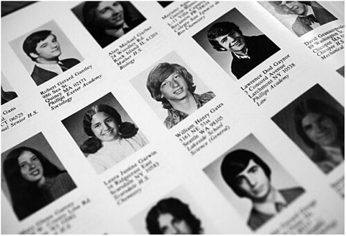
Since audiences are often defined institutionally, there is no one page which represents the audience to ordinary users. However, the Friends page represents other members of Facebook to whom the user is connected and who may (in certain contexts) see the user’s contributions, without definitively representing who is the audience for that user’s content. For example, if a user comments or posts on a public page, non-friends can see that content. Mark Zuckerburg originally created Facebook with his roommate to function as an online ‘facebook’ or yearbook while studying at Harvard. For the ordinary user, Facebook visually retains many features of the yearbook. The image below in shows the Harvard Yearbook of 1973.
Figure 1. Screenshot of 1973 Harvard Yearbook, Harvard Yearbook Publications, available at https://news.harvard.edu/gazette/story/2013/09/dawn-of-a-revolution/.
On Facebook, the dedicated audience interface page for ordinary users is the Friends page, which is reached by clicking on your profile photo and selecting the tab ‘friends’ from under the header. shows a screenshot of this interface shared by an Facebook user on his blog.Footnote1 Clear parallels with the yearbook style are visible: the rows of photos in boxes labelled with names are nearly unchanged. This yearbook style image is depicted below user’s header image, when the friends tab is selected.
Figure 2. Facebook Friends interface. Downloaded from https://www.m2osw.com/delete-deactivated-facebook-friends on March 9, 2018. Alexis Wilke 31/12/2017.
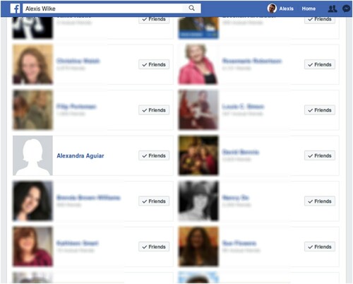
Facebook’s decision to show profile pictures of the users’ friends results in a patchwork of faces staring for the most part directly at the user. Profile pictures are chosen by individual users, so it would certainly be possible for users to choose non-photographic pictures or pictures where they are hidden, but this is uncommon. Rather, users often spend time crafting an image on their profile photos, and this image is often what might be considered to be a standard portrait: ‘inactive, posed, appropriate, and only including the subject’ (Hum et al., Citation2011). In other words, this page will often display just such an interface as we see above with faces which gaze at their ‘friend,’ the user.
Each portrait of a friend is enclosed in a light grey box, grouping it with textual labels (the person’s name and their friend or mutual friend count) and a box indicating their status (the grey friends button with the green tick). Visually, this main ‘friends’ window is characterised by rectangular shapes and the use of white space, and the friend boxes or cards are arranged into two columns. In this interface the corporate blue and grey colours of Facebook, the white space, and the defined and rational boxes in neat rows, coexist and visually manage the wide range of colours from the user-created profile pictures.
The space appears well-ordered, yet the organising principle is not obvious to the ordinary user (although many users have theories which they discuss online). Unlike a yearbook, it is not alphabetical, nor by association (e.g., class year). It is not in order of when you added the friends. In fact, while the faces are visually connected by proximity and position, this connection is generated not by human connection but by an algorithm which assigns a friend ranking number that controls the order (Sreedharan, Citation2016). Within the interface, there is no ability to interactively drag and drop and or re-sort or re-order the friend cards; they remain in their algorithmically determined order despite user changes. A contradiction exists, therefore, between the visual and the other modes: this interface interposes a very strong visual order on an obscurely ordered set of personal representations. The lack of obvious ordering creates a sense of uncertainty or even disorientation.
When the user hovers their mouse over a friend card, a window appears, showing more information about the friend. This information shows the user their relation to the friend (in terms of how many mutual friends they have) and a snippet of information about them, which could come from the interactions they’ve had with Facebook content (such as likes or joining groups) or from their profile (as is the case of , showing former employers).
Figure 3. Facebook expanded card with classification options (image blurred for privacy).
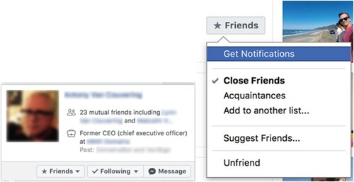
On this expanded friend card, as well as the original friend card, there is a button which allows you to classify your friend as to degree (‘Close Friend,’ ‘Acquaintance,’ or another list), to suggest other friends to them that they may know, to remove them from your list (‘unfriend’), or to be instantly notified when they take certain actions (such as status updates). Essentially then this option, although containing different logical elements, enables you to be less or more engaged with your friend. The icon on the button changes from a tick mark to a star when the user changes the person’s classification to ‘close friend’ or to a business card when they select ‘acquaintance.’ In this way, the user has a visual overview of their friend pool in these three categories as they review the cards, even though the categories are not grouped.
Taken as a whole, the interface is very simple, a list of faces. The desired path of the page is ambiguous. The page can be entered from the user’s home page or from a ‘see all friends’ button on another page. Once on the page, the user may perhaps navigate to a friend (if they can find them) and click to see more about them (moving off the page), or perhaps curate their collection of friends, assigning them to different levels or categories, or removing them. These curatorial changes may result in the addition or removal of friend cards or changes in icons, but will not dramatically change the interface. There is no clear exit point, although people can exit using the standard links on their header. In terms of a desired user path, the page exhibits no clear direction.
Facebook for publishers: page insights
Facebook’s Page Insights interface, available to content publishers such as Facebook page owners, has a different desired path than the Friends page examined in the previous section. It shares with the Friends page the strong division into boxes, white space, and cool corporate colours, but this time instead of faces we are presented with charts. Once again, the page is devoid of text presented in sentences: text on this page has a labelling or identifying function. This interface is also much more interactive, with a stronger sense of functionality and path. If the Friends interface is a yearbook, focused on reflection and curation, the Page Insights interface is more of a viewer or scope, with many windows and tabs which can be displayed or withdrawn.
shows the starting view of the Page Insights interface, which Facebook calls Overview, displayed within the overall Facebook interface context. The top stripe is the generic Facebook menu bar, followed by the page menu bar with the Insights tab selected, which in turn shows the Page Insights interface, composed of a menu with a series of selectable tabs (selection is indicated by an underline), a long box showing the date range, and three small charts, each in its own white box, floating on a pale grey background. This type of interface is called a ‘dashboard,’ a visual metaphor transferred over in the 1990s from automobile dashboards to computerised systems (cf Microsoft’s ‘digital dashboard’ functionality of 1999 (Thurrott, Citation1999), but now widely used in data visualisation (e.g., Few, Citation2006)). Beneath these dashboard charts, there is a final graphic which summarises user reaction to the content owners’ last five posts is just below the screenshot.
Figure 4. Page insights interface, top part, image from https://yoast.com/facebook-page-insights/ downloaded Mar 8, 2018.
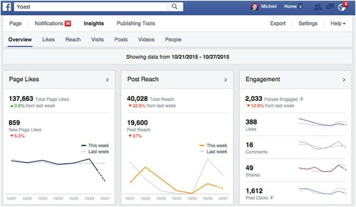
The charts in the Overview are called ‘sparklines’ (Tufte, Citation2006) and are simplified, indeed remarkable for their lack of detail (for example, the y-axis is unlabeled), conveying an impression rather than inviting detailed exploration. However, the charts are not without what Kress and Van Leeuwen call narrative or implied action, even in their stark simplicity: in each chart, grey lines indicating previous periods, as well as green/red arrows indicating whether performance (reported in large bold numbers) has gone up or down. The viewer is invited to compare and indeed judge the data contained in the two lines. In the live interface, the chart also responds to user attention, springing alive when the user moves the mouse over it, providing detailed data for the time period over which the mouse hovers. If even more data is wished for, each dashboard panel also contains a small arrow, which opens the Insights tab most directly related to it, although not all tabs are represented in dashboard graphics.
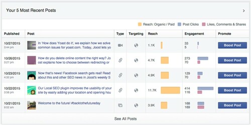
In the ‘most recent posts’ box of the Overview, located below the dashboard charts, we see something different (see , below). Here Facebook posts are represented in tabular format. Although the extremely simplified charts are still present, they are contained within the table, and there are no large performance number or green/red arrows. For the first time, non-corporate colours are introduced in the images identifying each post.
Figure 5. Lower part of page insights interface, retrieved from Yoast https://yoast.com/facebook-page-insights/
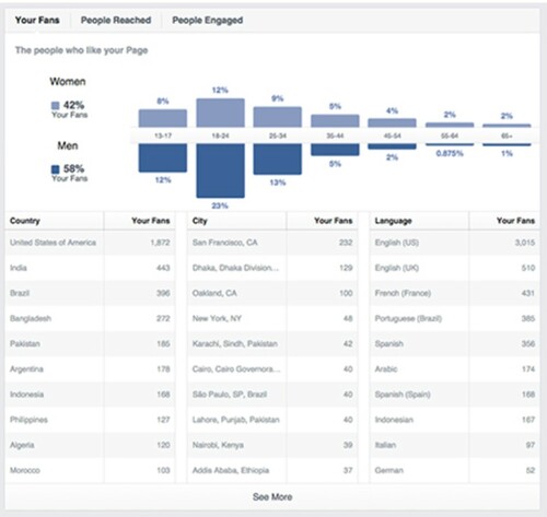
Most of the dashboard tabs (Likes, Reach, Visits, Videos etc) contain comparative information about user action rather than user demographics (for example, how many users liked or unliked your page or post). However, one tab, People, refers once again to demographics. This People tab (see below) shows a similar graphic to that offered by the Audience Insights interface. This page, however, has no controls on the left-hand side. Instead, it offers the suggestion ‘target your Boosted Posts to your most engaged audience to keep them interested.’
Figure 6. People interface within Page Insights. Source: FB marketing materials.
According to Wexler et al., the purpose of the dashboard is to ‘monitor conditions and/or facilitate understanding’ (Citation2017, p. xiv). The Page Insights interface invites the interactive participant to monitor the audience’s reaction to the content based on their interaction with it.
The desired path of the Page Insights interface is more narrow than that of Friends; the interactive participant may gaze on different views on how and when other users touch their content; but equally participants may feel that the simplified charts contained on the overview dashboard are sufficient. One might exit this interface to attend to the Publishing Tools or to one’s managed page or notifications, export the data for further viewing, or even return to Facebook as an ordinary user. Alternatively, the participant may exit by choosing to ‘boost’ posts using the audiences identified on the People tab.
Facebook advertising insights
Using the Facebook Audience Insights interface, prospective advertisers are able to see a range of detail about any particular audience they are interested in and compare it to the main FB interface. , below, is a screenshot of the interface included in page where they introduce the interface to prospective advertisers (Facebook, Citation2014).
Figure 7. Audience Insights interface. https://www.facebook.com/business/news/audience-insights March 25, 2018.
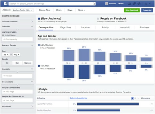
This page is divided into range of boxes of different sizes: menu bars, control panels, headers, visualisation panes, as well as nested boxes that function as buttons and text entry boxes. Most of the page consists of interactive elements in the form of menus layered across the top, down the sides, and in each of the header elements of each section.
This highly abstract and highly interactive page contains a clear path between different aspects, one in which the user is directly addressed and required to behave in a particular way in order for the story to progress. The menu bars to the left, offset in light grey, contain a series of darker grey boxes, which appear when the left arrow is clicked. The dark grey boxes offer a range of interactive potentials – white boxes (into which text should be entered); buttons (which should be pushed); drop-down lists (which should be selected). In each case a sample answer is given in case the user is confused as to their role.
The path of the page then continues in the large white boxes or panes at the right of the page. In the screenshot in we see two such panes. The one in the centre, entitled ‘Age and Gender,’ shows a bar graph consisting of representations of overall Facebook audience (the grey bars), and the selected audience (the light and dark blue bars). The same colour coding applies to the second ‘Lifestyle’ pane partially visible below. The full page contains other panes such as ‘Relationship Status,’ ‘Educational Level,’ and ‘Employment’, each using the same convention of grey/blue audience comparison. Once the user has successfully interacted with the control panel, the bar graph changes to show a comparison between the selected audience and the overall Facebook audience. The user is invited to inspect these panes in detail, and then, potentially, to repeat the operation of the controls in the menu bar until they are satisfied. The six white buttons above the demographic panes show the user that we looking at panes related to ‘demographics,’ and invite the user to gaze through other windows at the audience’s tastes, location, behaviour, household, and buying habits, each of which can be adjusted through the interactive panel at the left.
As the user studies the audience representations in the panes, they are confronted by boxes in cool colours – light blue for women, dark blue for men or the whole population, depending on the pane. The boxes are reactive, shrinking or growing depending on the user’s actions, and marked by percentages and labels. The header of each pane contains a title and sourcing information. There is an abundance of white space, a ‘clean’ aesthetic – no axes or gridlines or ‘chart junk’ (Tufte, Citation2001). The boxes give a mechanistic rather than organic feel (Kress & Van Leeuwen, Citation1996). The cool colour scheme – white, blue, grey – carries a double meaning as both rational (Kress & Van Leeuwen, Citation1996) and of course as corporate, branded in the Facebook colours. Corporate brands give a sense of reliability and reassurance (Arvidsson, Citation2006). The labelling and sourcing give a sense of ‘facticity’ and ‘scientific-ness’ (Kennedy et al., Citation2016) and the white space a sense of transparency. Overall the user is led to feel that this is real, true, reliable information.
When considering the whole desired path, the interactive participant’s role in relation to this page may be likened to that of an experimental scientist, operating complex equipment while observing the effect of their operations. Once the user is satisfied with their operations, their final task is to click ‘Save’ in the white toolbar nested below the main Facebook toolbar. Their audience is then ready to use further by clicking the ‘Create Ad’ button completing the path of the page. On the Create Ad page, the audience can then be purchased as the target of a specific advertisement, or the exit point in the interactive chain.
Gazing, measuring, and experimenting
Facebook has designed distinctly different audience interfaces for different groups of users. One kind of interface – Friends – is nothing but personal, while the other kind – Insights – is nothing but abstract. You have faces, or charts, and each of these communicates the position of the user differently and exert a different type of rhetorical power, drawing on different sets of cultural resources.
The visual language of the yearbook which characterises the Facebook Friends page reflects a cultural form whose chief functions are those of the documentation of relationships, the communication of inclusion and exclusion, the construction of meaning through friends and relationships, and the building of social and cultural capital (Good, Citation2013; Hoffman, Citation2002, Citation2004; Panayotidis & Stortz, Citation2010). There is nothing to ‘do’ with Friend photographs except, perhaps, sort them into groups. The visual language is emotional and personal; the absence of time information creates a space outside of the ordinary ‘flow’ of Facebook’s timeline; and the user is invited to consider themselves as one of the faces. The lack of conceptual order suggests a world without hierarchy, in which each of us equally display our face (literally, in most cases) to the world. Interactively, the lack of a clear exit also suggests a page outside of flow, used primarily (perhaps) for contemplation.
For publishers and advertisers, the situation is different. Rather than contemplation or a time outside the flow, the user of these pages has an active role. The visual language the charts and tools of the Insights interfaces are heir to is a different cultural form embedded in managerial and scientific discourse. For example, the information about audience reaction to each piece of content provided to publishers has much in common with the tradition of continuous response research, stemming from the influx of social scientists, particularly media scholars like Herzog and Stanton, into the advertising and broadcasting world (Klaus & Seethaler, Citation2016; Levy, Citation1982). Users of the Page Insights interface occupy a position that is akin to a researcher, with abstract visuals borrowed from the media studies tradition, examining the audience and discovering facts about their behaviour and their responses to content, then adjusting their content to achieve particular reactions.
The visual language of the Advertiser Insights interface draws from the scientific tradition as well, where physical scientists in recent years have used visuals not only to present conclusions but to carry out scientific analysis directly (Friendly, Citation2008). The graphs reify the data and give the impression of transparency and objectivity (cf Kennedy et al., Citation2016). The included time series give the idea of immediacy and responsiveness. The user of this interface is positioned as the person who manipulates the variables in order to arrive at the truth, or to use Manovich’s (Citation2001) words, as the person at the helm of the ‘control panel’ or ‘instrument’. The visual emphasis is on rational processes, and the addition of scales, figures, numbers etc. adds to the use of semiotic resources from physical science. Using tool-like visuals, the user can carry out experiments on different audiences to understand audience characteristics and reactions. The buy and boost exits of this interface show that the user is involved in a commercial process, and the audience is thus positioned both as data and product. Napoli (Citation2016) suggests that the datafication of audiences in modern media is a historical trend, an ongoing process of Weberian rationalization in which the refinement of calculation and the enhancement of specialist control develop further and further in the search of rational control over social processes, leading to a depersonalization of social relationships (or in Ang’s terms, the creation of a controllable ‘other’).
Making data powerful – the rhetorics of the interface
The management of the process of data extraction from one audience followed by the productization and sales of that data to a second audience is the central business process of the media platform (Van Couvering, Citation2017; Van Dijck & Poell, Citation2013; Gerlitz & Helmond, Citation2013; Helmond, Citation2015). In order for platforms to profit, they must obtain data from audience members, ideally as much data as possible, from each and every audience member. And in order to achieve maximum profit, each of the different markets the platform serves must play its part: the users must be willing to give up data about themselves and their actions; the publishers must create content that extracts maximum data; and the advertisers must be willing to pay for the data. The different audience measurement interfaces that Facebook provides support these goals.
First, the Friends interface obscures the extent of Facebook’s data collection for ordinary users. One could argue that the Friends page interface is not very important to the Facebook experience of social interaction (unlike the Audience Insights interface which is central advertiser interaction with Facebook). This is precisely the point: the dedicated audience interface is nearly pointless, off the beaten track, unimportant. Ordinary members lack an interface through which to see who sees and interacts with the texts and pictures they create (their audience), much less the behavioural data which Facebook collects and stores.
Although users create content primarily to share with their friends, in reality friends may or may not see a user’s posts, and posts users make in groups or on public pages may be seen by people who are not friends with that user. The discrepancy between user understandings and reality occurs not by chance, but because of conscious design choices. Bernstein and his co-authors based at Facebook Data Science discuss the invisibility of audience information to social media users as a ‘design decision’ (Bernstein et al., Citation2013). Relatedly, research has shown that changing the interface could create difficulties for Facebook: when De Wolf et al. (Citation2015) conducted a series of tests in which young adult Facebook users were asked to evaluate a series of potential alternative audience visualisations, which more clearly showed friendship maps and activity, users were ‘surprised’ and thought the visualisations were ‘scary.’ As users in this study came to realise how much they could see in these experimental interfaces, they also reflected on how others would see them. This disquiet is also echoed in studies showing consumer concerns when confronted with the information about them that is used to personalise ads (Aguirre et al., Citation2015; Zarouali et al., Citation2017). No such difficult feelings arise faced with the pleasant parade of faces in the Friends interface.
The role of the publisher interface is to encourage content creators to develop content that elicits behavioural responses that Facebook can track. Audience approval and response have always been important to creators, but in the Facebook interface the clear visual signals are that more engagement means better content. The draw of the interactive, graphical interface is also important for publishers, who suddenly have access to detailed information on all types of content, historically possible for only the largest publishers like TV networks, who were able to commission research firms. When added to user comments available on pages in the main feed, the combination of qualitative data, quantitative data, and audience characteristics is nearly irresistible. Kennedy and Hill (Citation2018), indeed, point to the ways in which we become emotionally engaged with data visualisations. Finally, the addition of interactivity to the existing language of audience data is a formidable rhetorical move, placing the user of the interface in a position of control that is difficult to realise in any other way.
The advertising interface acts, finally, to make visible the enormous amount of Facebook data and to magnify its value. The sheer scope and complexity of the tools suggest that advertising in other places would be a shot in the dark – only with Facebook can you be absolutely sure your message is going to exactly the right people. It is in the strategic interest of platforms like Facebook to make data valuable, because only a very few companies have extensive, real-time audience data and the ability to provide reassuringly professional interfaces with which to manipulate it.
While this paper has concentrated on Facebook, many of the arguments made here extend to other large social media platforms. For example, Twitter and Google, as well as its subsidiaries Instagram and YouTube, all maintain a similar set of advertiser and publisher ‘tools’ vs audience ‘viewer’ interfaces. Google’s original search model required no audience data, only behavioural data (Van Couvering, Citation2008). To compete with Google’s near-monopoly on click-based Internet advertising, Facebook developed and used its data about audience demographics and preferences in addition to behavior to create an alternative model that had the benefit of being more familiar to traditional advertisers.
In this article, I have argued that the interactive visualisations present in the audience data interfaces that Facebook provides form a powerful rhetorical element in their business strategies. Datafication of human behavior and surveillance are two sides of the same coin; privacy scandals will remain a consistent threat to the platform business model, and an increasing threat lies in advertiser boycotts and the responses of regulators in response to perceived data misuse for other advertisers (Hsu & Lutz, Citation2020). Ordinary people are uneasy about providing the quantity of information platforms demand; and thus the platform softens the blow by providing visual interfaces that obscure surveillance, while at the same time encouraging content resulting in the production of platform data, presenting the data as ethically neutral, and encouraging its use as powerful and necessary.
Acknowledgements
This work was made possible with the support of the Anne-Marie & Gustav Ander Foundation for Media Research.
Disclosure statement
No potential conflict of interest was reported by the author(s).
Additional information
Funding
Notes on contributors
Elizabeth Van Couvering
Dr Elizabeth Van Couvering is a Lecturer in Strategic Communications at the Department of Geography, Media and Communications at Karlstad University, Sweden. She has written about the political economy and culture of platforms, including a techno-economic history of search engines and a discussion of the discursive frames of search engine construction. [email: [email protected]]
Notes
1 Both text and pictures have been blurred on this screenshot of an image published on an ordinary user’s blog, and I have chosen this image specifically to discuss the interface without violating the privacy of the user’s friends.
References
- Aguirre, E., Mahr, D., Grewal, D., de Ruyter, K., & Wetzels, M. (2015). Unraveling the Personalization Paradox: The effect of information collection and Trust-building strategies on online advertisement Effectiveness. Journal of Retailing, 91(1), 34–49. https://doi.org/10.1016/j.jretai.2014.09.005
- Ang, I. (1991). Desperately seeking the audience. Routledge.
- Arvidsson, A. (2006). Brands: Meaning and value in media culture. Psychology Press.
- Beniger, J. R. (1986). The control revolution: Technological and economic Origins of the information society. Harvard University Press.
- Bernstein, M. S., Bakshy, E., Burke, M., & Karrer, B. (2013, April 27–May 2). Quantifying the Invisible audience in social networks. Proceedings from CHI 2013, Paris, France.
- Brake, D. R. (2012). Who do they think they’re talking to? Framings of the audience by social media users. International Journal of Communication, 6, 1056–1076. https://ijoc.org/index.php/ijoc/article/view/932/747
- Crampton, J. W., & Krygier, J. (2006). An introduction to critical cartography. ACME: An International e-Journal for Critical Cartographies, 4(1), 11–33.
- de Souza, C. S. (2005). Semiotic engineering: Bringing designers and users together at interaction time. Interacting with Computers, 17(3), 317–341. https://doi.org/10.1016/j.intcom.2005.01.007
- de Souza, C. S. (2013). Semiotic perspectives on interactive languages for life on the screen. Journal of Visual Languages & Computing, 24(3), 218–221. https://doi.org/10.1016/j.jvlc.2013.03.002
- De Wolf, R., Gao, B., Berendt, B., & Pierson, J. (2015). The promise of audience transparency. Exploring users’ perceptions and behaviors towards visualizations of networked audiences on Facebook. Telematics and Informatics, 32(4), 890–908. https://doi.org/10.1016/j.tele.2015.04.007
- Ettema, J. S., & Whitney, D. C. (1994). Audiencemaking: How the media create the audience. Sage Publications.
- Facebook. (2014, May 8). Learn more about the people that matter to your business with Facebook Audience Insights. Facebook Business. Retrieved December 1, 2017, from https://www.facebook.com/business/news/audience-insights
- Fast, K., Ryan Bengtsson, L., & Ferrer Cornill, R. (2017). Geographies of free labor: Conceptualizing and Analyzing the ‘Transmediascape’ Paper presented at 67th Annual ICA Conference. May 25-29, San Diego, USA.
- Few, S. (2006). Information dashboard design: The effective visual communication of data. O'Reilly Media, Inc.
- Friendly, M. (2008). A brief history of data visualization. In C. Chen, W. Hardle, & A. Unwin (Eds.), Handbook of computational statistics: Data visualization (Vol. III, pp. 16–48). Springer.
- Gerlitz, C., & Helmond, A. (2013). The like economy: Social buttons and the data-intensive web. New Media & Society, 15(8), 1348–1365. https://doi.org/10.1177/1461444812472322
- Gibson, J. J. (1979/2014). The ecological approach to visual perception: Classic edition. Psychology Press.
- Gitlin, T. (1994). Inside Prime time. University of California Press.
- Good, K. D. (2013). From scrapbook to Facebook: A history of personal media assemblage and archives. New Media & Society, 15(4), 557–573. https://doi.org/10.1177/1461444812458432
- Harley, J. B. (1989). Deconstructing the map. Cartographica, 26(2), 1–20. https://doi.org/10.3138/E635-7827-1757-9T53
- Helmond, A. (2015). The platformization of the web: Making web data platform ready. Social Media + Society, 1(2). https://doi.org/10.1177/2056305115603080
- Hoffman, L. M. (2002). Why high Schools Don’t change: What Students and their Yearbooks Tell Us. The High School Journal, 86(2), 22–37. https://doi.org/10.1353/hsj.2002.0022
- Hoffman, L. M. (2004). We’re So Diverse: How Students Use their high School Yearbooks to Bridge the Gaps. American Secondary Education, 33(1), 4–25.
- Hsu, T., & Lutz, E. (2020, August 1). More than 1,000 companies boycotted Facebook. Did it work? The New York Times. https://www.nytimes.com/2020/08/01/business/media/facebook-boycott.html
- Hum, N. J., Chamberlin, P. E., Hambright, B. L., Portwood, A. C., Schat, A. C., & Bevan, J. L. (2011). A picture is worth a thousand words: A content analysis of Facebook profile photographs. Computers in Human Behavior, 27(5), 1828–1833. https://doi.org/10.1016/j.chb.2011.04.003
- Kennedy, H. (2016). Post, mine, repeat: Social media data mining becomes ordinary. Springer.
- Kennedy, H., & Hill, R. L. (2018). The feeling of numbers: Emotions in everyday engagements with data and their visualisation. Sociology, 52(4), 830–848. https://doi.org/10.1177/0038038516674675
- Kennedy, H., Hill, R. L., Aiello, G., & Allen, W. (2016). The work that visualisation conventions do. Information, Communication & Society, 19(6), 715–735. https://doi.org/10.1080/1369118X.2016.1153126
- Klaus, E., & Seethaler, B. (2016). Crossing the borders: Herta Herzog’s work in communication and marketing research. In P. Simonson & D. Park (Eds.), The International history of communication study (pp. 237–255). Routledge.
- Kosterich, A. (2016). Reconfiguring the “hits”: The new portrait of television program success in an era of big data. International Journal on Media Management, 18(1), 43–58. https://doi.org/10.1080/14241277.2016.1166431
- Kosterich, A., & Napoli, P. M. (2016). Reconfiguring the audience commodity: The Institutionalization of social TV Analytics as market information regime. Television & New Media, 17(3), 254–271. https://doi.org/10.1177/1527476415597480
- Kress, G. (2004). Reading images: Multimodality, representation and new media. Information Design Journal + Document Design, 12(2), 110–119. https://doi.org/10.1075/idjdd.12.2.03kre
- Kress, G. R., & Van Leeuwen, T. (1996). Reading images: The grammar of visual design. Psychology Press.
- Levy, M. (1982). The Lazarsfeld-Stanton Program Analyzer: An historical Note. Journal of Communication, 32(4), 30–38. https://doi.org/10.1111/j.1460-2466.1982.tb02516.x
- Light, B., Burgess, J., & Duguay, S. (2018). The walkthrough method: An approach to the study of apps. New Media & Society, 20(3), 881–900. https://doi.org/10.1177/1461444816675438
- Manovich, L. (2001). The language of New media. MIT Press.
- Marwick, A. E., & boyd, D. (2011). I tweet honestly, I tweet passionately: Twitter users, context collapse, and the imagined audience. New Media & Society, 13(1), 114–133. https://doi.org/10.1177/1461444810365313
- Napoli, P. M. (2010). Audience Evolution: New Technologies and the Transformation of media audiences. Perseus Books.
- Napoli, P. M. (2012). Audience Economics: Media Institutions and the audience marketplace. Columbia University Press.
- Napoli, P. M. (2016). Special issue introduction: Big data and media management. The International Journal on Media Management, 18(1), 1–7. https://doi.org/10.1080/14241277.2016.1185888
- Nielsen, J. (1999). Designing web usability: The practice of simplicity. New riders publishing.
- Norman, D. (2013). The design of everyday things (Revised and expanded edition). Basic Books.
- Panayotidis, E. L., & Stortz, P. (2010). Contestation and conflict: The University of Toronto student yearbook as an ‘appalling Sahara’, 1890–1914. History of Education, 39(1), 35–53. https://doi.org/10.1080/00467600802356728
- Rose, G. (2016). Visual methodologies: An introduction to researching with visual materials (4th ed.). Sage.
- Smythe, D. W. (1977). Communications: Blindspot of western Marxism. Canadian Journal of Political and Social Theory, 1(3), 1–27.
- Sreedharan, A. (2016). Find your Facebook friends ranking score! Arjunsreedharan.org Retrieved May 16, 2018, from https://arjunsreedharan.org/post/65979958297/find-your-facebook-friends-ranking-score
- Thurrott, P. (1999, September 20). Microsoft announces digital dashboard initiative. ITPro Today. https://www.itprotoday.com/windows-78/microsoftannounces-digital-dashboard-initiative
- Tufte, E. R. (2001). The visual display of quantitative information (Vol. 2). Graphics press.
- Tufte, E. R. (2006). Beautiful evidence. Graphics Press.
- Turow, J., & Draper, N. (2014). Industry Conceptions of audience in the digital space: A research agenda. Cultural Studies, 28(4), 643–656. https://doi.org/10.1080/09502386.2014.888929
- Van Couvering, E. (2008). The history of the Internet search engine: Navigational media and the traffic commodity. In A. Spink & M. Zimmer (Eds.), Web search (pp. 177–206). Springer.
- Van Couvering, E. (2017, January 4–7). The political economy of new media revisited: Platformisation, mediatisation, and the politics of algorithms. Proceedings of the 50th Annual International Conference on systems science (HICSS) (pp. 1812–1819).
- Van Dijck, J., & Poell, T. (2013). Understanding social media logic. Media and Communication, 1(1), 2–14. https://doi.org/10.17645/mac.v1i1.70
- Van Leeuwen, T. (2005). Introduction to social semiotics. Routledge.
- Wexler, S., Shaffer, J., & Cotgreave, A. (2017). The big book of dashboards: Visualizing your data using real-world business scenarios. John Wiley & Sons.
- Zarouali, B., Ponnet, K., Walrave, M., & Poels, K. (2017). “Do you like cookies?” Adolescents’ skeptical processing of retargeted Facebook-ads and the moderating role of privacy concern and a textual debriefing. Computers in Human Behavior, 69, 157–165. https://doi.org/10.1016/j.chb.2016.11.050