
ABSTRACT
Data and data visualisations – in the forms of graphs, charts and maps – are becoming an increasingly important feature of social, public and political life. Yet within existing scholarship, the democratic significance of data visualisations has thus far received minimal attention. This article offers a first systematic attempt to make sense of and scrutinise the role of data visualisation in democracy. We apply deliberative systems theory in the analysis of three original case studies to elucidate how data visualisation can integrate into the overall anatomy of democracy, and to normatively assess how data visualisation contributes towards key democratic ideals. Conclusively, we highlight how critical perspectives on power, ideology and epistemology problematise any simplistic account of how data visualisation matters for democracy.
Introduction
Data and data visualisations are becoming increasingly important in a variety of domains of western societies (Couldry & Hepp, Citation2016; Van Dijk, Citation2014), including journalism, strategic communication and public information, as well as in a number of professional domains. As argued by Beer and Burrows (Citation2013), we are witnessing ‘a visualisation of culture’ in which a growing number of cultural domains are datafied and then represented as graphs, charts and maps. As such, data visualisation matters for democracy. As pointed out by Kennedy et al. (Citation2016, p. 715) ‘ … data are becoming increasingly valued and relied upon, as they come to play an ever more important role in decision-making and knowledge about the world’. Consider, for instance, the recent COVID-19 crisis and how visualisations of infection rates laid premise for both public discourse and crisis management. Or consider how visualisations of global mean temperatures inform public climate discourse and policy-making. Also on a more routine basis, data visualisations address issues of major societal importance, with the capacity to convey or support arguments (Amit-Danhi & Shifman, Citation2018). Data visualisation is also part of discourse in a huge variety of the forums that together form the backbone of democracy. These span from the politically empowered institutionalised forums of bureaucracy, courts and parliament, to mediated public debate, the professional contexts of workplaces and even to the informal settings of citizens’ homes. Data visualisation is thus part of the process through which society as a whole deliberate about issues of common concern.
There is already a burgeoning body of critical scholarship on data visualisation in society. This literature offers important perspectives concerning power, ideology and epistemology. One perspective emphasises how the production of data visualisations is mainly confined to elite- or expert actors (e.g., D'Ignazio & Bhargava, Citation2020). Addressing the ideological nature of data visualisation, other scholars make evident how data visualisations are not mere objective accounts of reality; they also contain narratives of the social and political world (e.g., Kennedy & Hill, Citation2017). As pointed out by others, the increasing pervasiveness of data visualisations can in itself be seen as a manifestation of a datafication of society, augmenting an uncritical trust in numbers (e.g., Beer, Citation2016). As we will show, these perspectives have profound implications for any discussion of how data visualisation matters for democracy. Yet, they provide little basis for systematic investigation of how and to what effect. There is thus an urgent need for critical perspective on how data visualisation integrates into the workings of democratic politics, and for normative consideration of the work that data visualisation does as part of public and political life.
In response to this need, this article, first, outlines a deliberative systems approach to the study of data visualisation in democracy. Representing the ‘third wave’ of deliberative democratic theory, we argue that deliberative systems theory (Mansbridge et al., Citation2012) makes up a promising and updated starting point for critically gauging the democratic significance of data visualisation. Deliberative systems theory premises that deliberation – the fact-based interchange of arguments – constitutes the legitimate basis for democratic politics. Yet, it departs from earlier conceptions of deliberative democracy by emphasising the need to take into account the workings of the deliberative system as a whole, rather than concentrating on discourse in single forums. A systemic perspective thus invites considerations of how data visualisation operates in and across a variety of forums, and to what effect. Further, a systemic perspective provides standards for normative evaluation of deliberative practices. It invites normative assessment of how data visualisation contributes towards key discursive ideals, such as the informational quality of discourse (the degree to which the presented information is correct and relevant), the inclusion of plural voices and mutual respect between citizens. As this article will demonstrate, deliberative systems theory thus offers both an architecture of democracy and normative standards through which we can better understand and problematise the democratic significance of data visualisations.
Second, we apply a deliberative systems approach in the analysis of three empirical case studies. These are drawn from an original and extensive body of research on data visualisation. The cases are selected to illustrate how data visualisation can be embedded in public and political life, and encompass the visualisation of environmental conditions, crime statistics and mental health problems. Through our case analysis, it is shown how data visualisation operates in and across a range of discursive forums, often working as a highly enabled means of transmission between the various parts of a deliberative system. We further highlight how data visualisation can contribute both positively and negatively towards the key democratic ideals of informational quality, inclusion of plural voices and respect in between citizens.
Finally, we discuss our insights in light of key critical perspectives offered by the existing scholarship on data visualisation. We here consider how data visualisation can be embedded in uneven power relations and privilege certain world-views and particular epistemologies. We argue that these perspectives complement the deliberative systems approach advocated in this study. As will be shown, these perspectives have profound implications for how we conceive of the role of data visualisation in democracy. Taken together, our effort offers a theoretically founded and operationalised approach to the study of data visualisation in democracy. In this way, the aim of this article is to offer much-needed critical perspective on the democratic workings of data visualisations, and further, to introduce a deliberative systems approach to the critical toolbox of data visualisation scholarship.
Data visualisation as communicative form and practice
Data visualisations are graphical representations of (most often) numerical data. We meet them in the forms of graphs, charts and maps in journalism, public information, strategic communication as well as in other professional domains. In online environments, data visualisations are often dynamic and interactive. Data visualisations represent a multimodal semiotic resource, most often combining abstract graphical forms (lines, circles, rectangles, etc.) and colours with words and numbers (Kirk, Citation2019). Sometimes they include simple pictorial elements representing numbers of humans, buildings or similar. Like words and photos, data visualisations are semiotic material, well suited to explain, persuade and tell stories (Cairo, Citation2019). By such means, data visualisation has the potential to function as a deliberative practice, aimed to convey or to support arguments. Some data visualisation types, like the line graph, the bar chart and the sector (or cake) diagram are widely used in public contexts, for both information and persuasion (Cairo, Citation2019). Further, while data visualisation is commonly conceived of as a means of transmitting information, it also has the capacity to evoke emotions and appeal to identity (Kennedy & Hill, Citation2017). As Kennedy and Hill comment (Kennedy & Hill, Citation2017), feelings can be evoked by many triggers; the content of the visualisation, the aesthetics of it, or the experience of mastery or falling short in the process of reading. This duality is important to our analysis. It points to the capacity of data visualisation to not only convey information and messages but also to evoke feelings of inclusion and exclusion, respect and disrespect – key normative features of a deliberative system.
Whereas data visualisations often present themselves as objective representations of particular conditions, they are nonetheless products of human choices. Data visualisations are the results of production process often hidden for the readers (Cairo, Citation2019; Kennedy et al., Citation2020). At each stage of the process, the producers – often a team representing competences within data handling, graphic design as well as storytelling techniques (Engebretsen et al., Citation2018) – are faced with a set of choices, each representing certain critical issues: Where do we find the data? Is the data set complete and reliable? What relevant information do the data reveal? Which part of the data set do we want to visualise? Which data visualisation type is best suited to express the message that we want to communicate? (cf. Kirk, Citation2019). Choices regarding scale, intervals, colours and density of information all contribute to the shaping of the total message of the data visualisation. This set of options underlines the potential of data visualisation to function as a form of deliberation. Yet, as Cairo (Citation2019) reminds us, it also warrants critical consideration.
Critical perspectives on data visualisation in society
In the critical scholarship on data visualisation, several contributions point out the important inherently ideological nature of data visualisations (for an early contribution, see Barnhurst, Citation1994). Kennedy and Hill (Citation2017, p. 4) argue that data visualisations do ideological work as they ‘ … are not windows onto data, they privilege certain viewpoints, perpetuate existing power relations and create new ones … ’. The proliferation of data visualisation must also be seen against the backdrop of tendencies towards an overall datafication of society. Datafication, according to Mayer-Schoenberger and Cukier (Citation2013) who coined the term, refers to the profound transformation in how society is ordered, decisions are made and citizens are monitored through ‘big data’, which in turn allows for predictions about individuals and collectives. From this perspective, data visualisations can be seen as both a manifestation of and force for datafication.
Along these lines, scholars have addressed how the proliferation of data visualisation augments an uncritical trust in numbers and a belief in numerical ordering. As argued by David Beer (Citation2016, p. 114) ‘ … how metrics look and how they are visualized can dictate their impact. In each case, these metrics have the capacity to create realities’. For Beer, then, data visualisation emerges as a catalyst for what he terms ‘numerical thinking’, which in turn paves the way for neoliberal governance. Similarly, Boehnert (Citation2016, p. 3) argues that data visualisation involves a type of ‘quantitative reasoning’ that runs the risk of ‘ … flattening out all phenomena to what can be captured by numbers’.
There are also a few studies evidencing how data visualisation has been put to work for political ends. Valarakis (Citation2014) shows how the Republican party in the US used data visualisation to put a partisan spin on the Democratic health-care proposal. In the context of journalism, Dick (Citation2015) traces British newspapers’ use of infograms and visualisations to promote the political agenda of their owners. Also, Author has outlined how global climate policy constitutes a context in which data visualisation is instrumental to policy outcomes. These studies indicate that data visualisations do political work in a variety of contexts. As such, they also underline the need for critical perspectives through which we can better understand and problematise the significance of data visualisations for democracy.
Data visualisation and deliberative democracy: a systemic approach
In response to this need, we mobilise deliberative systems theory to develop what we term a systemic approach to study data visualisation in democracy. We argue that this approach allows for both the elucidation of how data visualisation integrates into the overall anatomy of democracy, and for normative assessment of the democratic work that data visualisation does as part of public and political life. In the following, we first outline the key tenets of deliberative systems theory. Thereafter we outline and qualify what we term a systemic approach to the study of data visualisation.
Representing what has come to be known as the ‘third wave’ of deliberative democratic theory, deliberative systems theory offers an updated and promising version of democratic theory. Surveying the historical development of theories of deliberative democracy, Owen and Smith (Citation2015) comment that whereas the first wave of theory focused on refining and establishing the ideal of deliberation within a democratic framework, the second wave, the ‘empirical turn’, focused on deliberation in specific forums such as mini-publics, courts and parliament. The third wave, then, was born out of dissatisfaction with the second wave’s tendency to prioritise ‘ … discrete instances of deliberation with little attention to their relationship with the system as a whole’. (Mansbridge et al., Citation2012, p. 25). Consequently, in what has come to be known as the ‘systemic turn’, focus is now on how deliberation plays out in and across the variety of sites that makes up a deliberative system. This systemic, or ‘ecological’, line of thinking, however, is not entirely new within democratic theory. The systems approach is prefigured by holistically oriented models, such as Habermas’ (Citation1996) centre-periphery model of deliberative democracy.
Yet, only a few studies of media and communication have systematically employed a systemic perspective. Holst and Moe (Citation2021) mobilise a systems approach to discuss the democratic credentials of social media discourse. Boswell (Citation2013) makes the case that discursive narratives – facilitated by the media – constitute a crucial device that connects different domains in society. Yet, as argued by Mansbridge (Citation1999), there is still a need to broaden the scope of the systems approach in terms of both the practices and sites considered relevant to deliberation. By including data visualisations into the scope of inquiry, our study thus has the potential to contribute to such a broadening.
The most influential articulation of the systemic approach is found in Mansbridge et al.’s (Citation2012) essay ‘A systemic approach to deliberative democracy’, sometimes simply referred to as the manifesto (e.g., Owen & Smith, Citation2015). In their formulation, the systemic approach emphasises both deliberative, systemic and normative dimensions of communication. We argue that all three dimensions are of high relevance to the study of data visualisations. Outlining the deliberative dimension, Mansbridge et al. (Citation2012, pp. 4–5) posit that ‘A deliberative system is one that encompasses a talk-based approach to political conflict and problem-solving – through arguing, demonstrating, expressing, and persuading.’ As such, a systemic approach necessitates critical attention to how and if communicative practices – in our case data visualisation – are characterised by such modes of communication. Outlining the systemic dimension of deliberative democracy, Mansbridge et al. (Citation2012, p. 4) further stipulates:
To understand the larger goal of deliberation, we suggest that it is necessary to go beyond the study of individual institutions and processes to examine their interaction in the system as a whole. We recognize that most democracies are complex entities in which a wide variety of institutions, associations, and sites of contestation accomplish political work ( … ).
Highlighting the normative dimension, Mansbridge et al. (Citation2012, p. 4) posit that institutions and practices must be assessed according to how well they perform vital systemic functions. They suggest the following three functions. The first is the epistemic function (sometimes referred to as the ‘informational function’), which in a deliberative system is to produce preferences, opinions and decisions that are appropriately informed by facts and logic, and to ensure informational quality, i.e., correctness and relevance. The second function they call the ethical function; to promote mutual respect among citizens – both as an intrinsic value in itself and to lubricate effective communication. The third they call the democratic function, which designates the inclusion of multiple and plural voices, interests and concerns, to promote an overall inclusive political process. Crucially, the fulfilment of these functions ensures the legitimacy of the democratic system overall. We argue that the systemic approach makes up a fruitful starting point for a consideration of the normative credentials of also data visualisations, which may enhance, or impede, all of these functions.
A systemic approach to data visualisations, we then argue, needs to take into consideration the following three key issues. First, we need to establish if and how data visualisation at all constitutes some form of deliberative practice. As we have already clarified in the introduction, data visualisation can be characterised in light of modes of communication such as arguing, demonstrating, expressing, and persuading. Thus, it clearly has the potential to function as a form of deliberation. Second, we need to illuminate how data visualisations integrate into the overall anatomy of deliberative systems. Based on empirical case studies, we will in this article therefore illustrate how data visualisations form part of discourse in a variety of forums, spanning from everyday interaction, mediated discourse to institutional forums, and how data visualisation serves to connect such forums. Third, we need a critical understanding of how data visualisations, through their salience in and across various deliberative contexts, contribute to the epistemic, ethical and democratic functions of the deliberative system. Consequently, we will in this article use empirical case studies to illustrate and discuss how data visualisations may strengthen or impede informational quality, mutual respect among citizens and inclusive deliberative processes. We acknowledge that each of these issues in their own right warrant systematic and comprehensive attention that would far extend the limits of a single article. By developing and applying a systemic approach, the ambition of our endeavour is to offer an analytical starting point and initial insights that could point the way for future research into the democratic ramifications of data visualisation.
Methodology: a multi-case interpretative approach
To operationalise deliberative systems theory in empirical research, this study applies a multi-case interpretative approach. Deliberative systems are complex entities with fleeting boundaries, comprising a range of actors, discourses and arenas, between which there can be a number of possible connections. This makes deliberative systems challenging to research empirically. Whereas previous empirical studies of deliberative systems have predominantly been naturalistic in their approach, concerned with hypothesis-testing and causal relationships (see Ercan et al., Citation2017), we in this study employ an interpretative approach. An interpretative approach designates a non-deductive, qualitative approach both geared towards context specific explorations and towards holistic consideration of how the discourses, actors, sites work together. As argued by Ercan et al. (Citation2017, p. 197), ‘ … an interpretative orientation provides the methodological tools to capture the “fuzzy” concepts of the deliberative system and its various components and linkages, rendering them amenable both to empirical analysis and normative assessment’. In our analysis, we take inspiration from their work to both situate the workings of data visualisations within the framework of deliberative systems and to consider their normative credentials.
To do this, we employ a multi-case design (see Boswell et al., Citation2016 for a similar multi-case-based approach to deliberative systems). We analyse three cases strategically selected to illustrate the diversity, in terms of both topic and visualisation methods, through which data visualisation may be relevant to a deliberative system. Further, the cases are selected to illustrate how data visualisation may matter in a variety of socio-political and geographical contexts. Our first case concerns an environmental NGO’s use of data visualisation to address citizens and decision-makers about an environmental problem. Our second case concerns the visualisations of sociodemographic crime statistics. Whereas data visualisation in these two first cases is situated within the realm of institutional political discourse, the third case concerns a private person’s visualisation of her own mental health problems. This last case can be characterised as an ‘extreme case’ (Flyvbjerg, Citation2006), suitable to illuminate both how data visualisation can work to transmit private and subjective experiences into the deliberative system, and to show the significance of innovative visualisation methods. Our selection of cases is by no means intended to exhaust the possible ways in which data visualisations are relevant to deliberative systems. The aim is rather to offer an initial substantiation of the ways in which data visualisations, across topics, methods and contexts, can integrate into the dynamics of deliberative systems and suggest how such integration can be considered in normative terms.
The cases are drawn from an extensive and original body of research generated through the research project Innovative Data Visualisation and Visual-Numeric Literacy. This body of research includes case studies from a variety of societal contexts, exploring both semiotic, receptive and political aspects of data visualisation. The first and third of the cases are reported in the anthology Data visualisation in society (Engebretsen & Kennedy, Citation2020). These two cases were not originally developed within the framework of deliberative systems. Yet both are rich and empirically detailed cases that make them well-suited for re-interpretation from a systemic perspective. The second case is not previously reported in scientific publications and is developed for the purpose of this study. Operationalising the systemic approach, for each case we flesh out (1) how data visualisations become manifest in and across deliberative sites, (2) the ways in which data visualisations work to connect different parts of the deliberative system and (3) how these processes work to impede or enhance epistemic, ethic and democratic functions of the system.
Data visualisation in and across deliberative systems
Case one: environmental NGOs and the visualisation of haze outbursts
Our first case concerns environmental NGOs’ use of data visualisation to address decision-makers about an environmental problem. The case illustrates how data visualisation originating from one part of the deliberative system can engage other parts of the system, including both the politically empowered forums of policy-makers and the forums of regular citizens. Berti Suman (Citation2020) describes a situation in South-East Asia, where NGOs like Greenpeace and World Resources Institute have engaged local communities in a process of registering incidents of poisonous haze outbursts – caused mainly by illegal burning of forests and peatlands – and plot them on a digital map. The initiative is a response to weak efforts from the responsible governmental institutions to map the problem of illegal burning of forests, inform the communities about it and take action to minimise it. The digital maps (see , for example) are gradually updated with new geospatial data concerning illegal burning and haze outbreaks.
Figure 1. Concentration of forest fires, Indonesia.
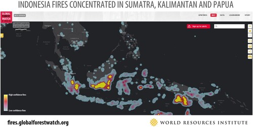
The haze-case exemplifies an instance in which data visualisation became manifest across deliberative contexts. Suman describes a situation where a crowd-sourced data visualisation works as a catalyst for local engagement, giving members of local communities the opportunity to take an active role in the care-taking of their own environment. As one of the NGOs state, the maps ‘offers on-the-fly analysis’ to show ‘where fires occurs’ and ‘who might be responsible’ in order to ensure that ‘those who are illegally burning are held accountable’ (Global Forest Watch Fires). Elaborating the legal-institutional ramifications of these data visualisation efforts, Berti Suman (Citation2019) documents how these efforts were instrumental in promoting multilateral governance – a widening of stakeholder engagement in dealing with the haze problem. She documents both how forest fires maps were presented as evidence in the State Court of Palangakaraya where the Indonesian government was found guilty of negligence, and how these mapping efforts opened debate among institutional stakeholders, including NGOs and the Indonesian Central Information Commission.
This example further highlights how data visualisation served to connect different parts of the deliberative system. It highlights how a matter of civic importance was detected in one part of the system, and then through the visualisation of crowd-sourced data transmitted to other parts of the system. It illustrates how data visualisations engaged, on the one, hand regular citizens, and on the other, judicially and politically empowered forums. As such, this case illustrates a process in which the employment of data visualisations was instrumental in promoting a deliberative process sensitive to various parts of the system, and also in inciting political change. Although the framework is fed with data from regular citizens, providing numeric and geospatial information, it cannot simply be characterised as a bottom-up-process, as the initiative and the data visualisation framework was developed NGOs located in civil society.
Finally, this case indicates also how data visualisation can enhance key normative systemic functions. For one, the case highlights how data visualisation, when originating from a trustworthy source employing reliable methods, entailed informational quality that enhanced epistemic functions. By visualising empirical observations, data visualisations here strengthened the informational quality of the discourse about the haze-problem. Crucially, data visualisations here served to translate analysis conducted by experts and make it accessible to both citizens and decision-makers. Second, we can assume that data visualisations, in this case, enhanced the ethical function. By making the public aware of the hardship experienced by those affected by the haze outbursts, data visualisation is here likely to have facilitated respect for their concerns as citizens. Third, the case illustrates how data visualisations can enhance democratic functions. The public discourse about the haze problem, in which data visualisation was a vital part, appears to be inclusionary. Data visualisations here functioned as a means to air the concerns of regular citizens affected by haze. Moreover, the production of data visualisations was itself participatory as it was based on data generated by the affected citizens themselves.
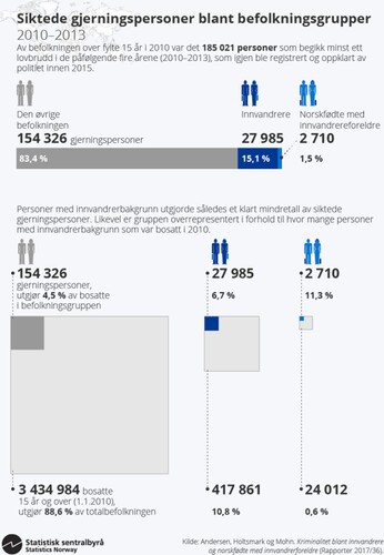
Case two: the visualisation of sociodemographic crime statistics
Our second example, previously un-reported and drawn from the context of Norway, concerns the visualisation of demographic crime statistics. Like the first case, this case also illustrates how data visualisations originating from one part of the system (experts) engaged other parts of the system, including regular citizens and politicians. Yet, in contrast to the first case, this case highlights how data visualisation can generate inter-systemic deliberations that impede rather than enhance systemic functions. It also illustrates how data visualisations can be shaped by social actors to do ideological and political work.
In 2017 Statistics Norway published a report (Andersen & Mohn, Citation2017) containing a visualisation that compared the prevalence of registered offenders among people of immigrant background to the remaining population. Statistics Norway is the national statistical institute of Norway and the main producer of official statistics. It is responsible for collecting, producing and communicating statistics related to the economy, population and society at national, regional and local levels. These statistics are produced by experts, mainly social scientists, frequently visualised, and are meant to ensure factual basis both for policy-makers and public discourse (Statistics Norway, Citation2019).
The visualisation () is made up of two parts. The first shows the overall number of offenders and the percentage of each demographic. It shows that 1.5% of the offenders are Norwegian-born persons with two immigrant parents, 15.1% are immigrants and 83.4% are from the remaining population. Thus, the visualisation indicates that citizens of immigrant background make up a clear statistical minority among offenders overall. The second part shows the proportion of offenders within each demographic. This visualisation shows that 11.3% of Norwegian-born persons with two immigrant parents have been charged of crimes. The same status counts for 6.7% among immigrants, and for 4.5% of the remaining population. Thus, the visualisation reveals that crime committers are overrepresented among people of immigrant background.
Figure 2. Legally charged offenders in Norway.
The same day of the publication of this report, Sylvi Listhaug, a politician from the right-wing populist Progress Party (and at the time minister of immigration and integration), published a revisualisation on her own Facebook page. This visualisation () focused on the proportion of offenders in each demographic and was visualised in bar graphs, based on the numbers from Statistics Norway. There were, however, several features that served to reframe these numbers. First, the percentage partition in the visualisation only goes up to 15, thus making the differences between the demographics look bigger and more dramatic. Second, both the heading (‘Immigrants far more criminal’), the background picture (the back of a police officer) and the increasing intensity of the bar graph colours, firmly anchors the meaning within the Progress Party’s alarmist discourse on immigration. Third, the accompanying text, re-emphasises the simple message that immigrants are much more criminal than the rest of the population, and thus further situate the visualisation in the context of anti-immigration discourse.
Figure 3. Sylvie Listhaug, Facebook post.
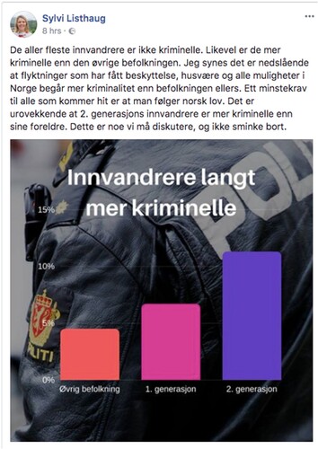
The Facebook post received extensive engagement from citizens, the press and experts. At the time, Listhaug’s Facebook page counted 140,000 followers. The post received around 8000 likes, 2200 comments and was shared around 1400 times (Skiphamn, Citation2017). Moreover, the post was widely reported in the media, where it was also criticised by a number of commentators and experts. As one commentator noted, Listhaug’s visualisation ‘functions as political ammunition, but not for insight’. Listhaug, on her side, responded that adjusting the numbers ‘ … does not help the victims (of crime)’, and that there is no help in ‘ … glossing over the core of the problem’ (Skiphamn, Citation2017).
This conflict over data visualisations unfolded as part of a longstanding controversy over both Sylvi Listhaug’s rhetorical style as Minister of Immigration and Integration, and the political leanings of Statistics Norway. A few months later, Listhaug was pressured to resign – as a direct consequence of her aggressive visual rhetoric in social media. In Statistics Norway, the director relegated one of the researchers that produced demographic statistics about immigrants and subsequently had to resign herself as a consequence of political pressure.
This case exemplifies how data visualisation can manifest across deliberative contexts: as a focal point for discourse on Facebook-forums, in the press, and in political debate. Further, it exemplifies how data visualisation can serve to connect different parts of the deliberative system. In this case, data visualisations engaged experts (from where the visualisations originated), politicians, citizens and the media, centring on the same issue brought to attention through data visualisation.
Yet, whereas such multi-site discourse in ideal is democratically desirable, this case highlights how data visualisations may also impede systemic functions. For one, data visualisations and their public circulation can in this case be seen to have contributed to the impediment of the epistemic functions. The official mandate of Statistics Norway as an expert institution is indeed closely linked to the epistemic function – their mandated task is to strengthen the informational quality of both public and political deliberations. Yet, whereas Statistic Norway’s visualisation was based upon methodologically robust statistical analysis, and thus can be seen to present valid information, it was nonetheless subjected to partisan re-interpretations in other parts of the system, resulting in distorted rather than facts-based deliberations. Second, the case highlights how data visualisations can contribute to the impediment also of ethical functions. The alarmist re-visualisation that Listhaug published, was clearly not intended to promote respect for citizens of immigrant background. It quite likely had the opposite effect. We none the less argue that data visualisation in this case strengthened a vital democratic function: the inclusion of a multitude of voices. As the number of likes, comments and shares suggest, Listhaug’s post both voiced and nurtured immigration sceptic sentiments held by a significant number of citizens. Moreover, the public aftermath, in which the visualisation and Listhaug’s politics were debated, engaged broad publics. As such, this case highlights how visualisation-driven discourse can both impede and strengthen system functions at the same time.
Case three: the visualisation of mental problems
Our last case involves a markedly different type of data visualisation practice, as well as a different type of subject matter. It concerns a private person’s visualisation of her own experience of a mental health problem. As an extreme case, it serves to illustrate how the visualisation of private experiences can engage publics in and across the forums that constitute a deliberative system. It also serves to illuminate the significance of the aesthetic and emotional affordances of data visualisation.
In her article ‘Visualizing data – a lived experience’, Simpson (Citation2020) presents a hand-drawn, small-data visualisation depicting her own experience of obsessive-compulsive disorder (OCD). OCD refers to a mental disorder involving a compulsive tendency to check and recheck things a number of times, causing distress and anxiety in everyday life of those affected. Her aim was to address people who had never experienced mental disorder, in an engaging and personal manner, making them understand how much time and distress such a disorder costs for those affected. She started the process by recording all incidents of checking and rechecking during a normal day – how many times she checked and if the compulsion was repeated a specific number of times. This record made it possible for her to detect patterns and trends in her checking behaviour, also to create a drawn visualisation of the data she had collected. She shaped her data visualisation in the form of a human brain, in order to communicate the idea of mental illness as something physical, an embodied, lived experience (see ). Using a coding system based on coloured bubbles of different sizes and positions, the data visualisation informs about the nature and varying intensity of checking and rechecking during one day.
Figure 4. A day of OCD – conscious acts of checking.
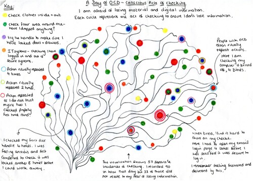
The choice of a hand-drawn style instead of applying digital tools, was deliberate. She writes: ‘( … ) drawing may appear to be incompatible with data visualisation. However, drawings are particularly good at expressing “emotion, experience, and feeling”, all important elements in developing a narrative’ (Simpson, Citation2020, p. 165). Thus, in her project, Simpson combines the informative affordances of data visualisation with the emotional and aesthetical affordances of drawing.
The power of this combination was possibly the reason why this highly personal and unconventional data visualisation spread across several discursive forums. It was first published in May 2017 in the online magazine openDemocracy.net, under the title ‘Visualising Mental Illness’. The magazine editors tweeted about the data visualisation to their 60,000 followers, which was followed by a lot of re-tweets, embedding the data visualisation in the tweets. The data visualisation further spread to the magazine Scientific American in the US, which featured the data visualisation on its visual blog. It also caught the attention of a national newspaper in Australia, which featured the visualisation in an online article on mental health (Simpson, Citation2020).
This case thus exemplifies how data visualisation can serve to connect different parts of a deliberative system. Most importantly, the case highlights how data visualisation can facilitate the transmission of individual experiences of mental health problems from the private to the public sphere, engaging both general and scientific publics. Also this case illustrates how data visualisation can be relevant to systemic functions. The contribution of this visualisation to the epistemic function is less clear-cut than in our other two cases. It is based upon subjective experiences rather than scientific method. Yet the systematic gathering of experiential data and the subsequent visualisation of these gives, compared to other personal accounts of mental problems, a vivid and accountable vision of how such problems are experienced. Further, this case illustrates how data visualisations can contribute to the ethical function of deliberative systems. The visualisation of OCD experienced at private level, and its transmission into the public realm, is likely to promote respect for citizens who suffer mental health problems, and to a deeper understanding of their conditions and experiences. In this case, data visualisation can also be seen to have strengthened the democratic function. By giving voice to otherwise marginalised experiences, the spread of this visualisation invites discursive inclusivity.
Complicating matters: power, ideology and epistemologies
Through our analysis, we have elucidated how data visualisations have the capacity to address and engage publics in a variety of forums in and across deliberative systems. We have also shown how data visualisation can both strengthen and impede key systemic functions. Yet there are critical perspectives that complicate our analysis. As the critical scholarship on data visualisation reminds us, data visualisation can be embedded in uneven power relations, can privilege certain world-views and particular epistemologies (i.e., Boehnert, Citation2016; Kennedy & Hill, Citation2017). Our selection of cases and analytical approach does not allow for a systematic case-to-case consideration of these critical perspectives. Yet, in the following, we would like to briefly outline what we consider to be general yet profound implications of these perspectives.
For one, the elite- or expert-driven nature of data visualisation has profound implications for democratic inclusiveness. We have, through our cases, highlighted how data visualisations can facilitate inclusivity, by engaging broad publics and including plural voices. Yet, the advanced skills and the resources it takes to produce credible data visualisations (Cairo, Citation2019) limit the ambit of data visualisation as an accessible deliberative practice. It must be noted that data visualisation is increasingly also practiced by non-experts (exemplified by our third case), and also used as a rhetorical tool by non-experts to advocate extreme or reactionary viewpoints (cf. Hill, Citation2020). Yet overall, data visualisation remains a vehicle for voicing the concerns and interests of the few and resourceful, rather than the many. And, as Kennedy et al. (Citation2020) point out, the ‘look of objectivity’ characterising many data visualisations, and the complexity of the production process may conceal the subjective choices made at the various stages, and, by this concealment, inhibit non-expert scrutiny and critique of the claims made through data visualisation.
Second, the metric nature of data visualisation may impoverish the quality of deliberations. In capacity of visualising metric and ‘objective’ data, the claims made through data visualisations are often seen as authoritative. As argued by Kennedy et al. (Citation2016), this authority is connected to a growing trust in numbers – a central feature of ‘dataism’ (Van Dijk, Citation2014). Yet, as argued by several theorists of democracy (e.g., Young, Citation1996), good deliberation should also be informed by rich and potentially complicating accounts of people’s experiences and viewpoints – modes of deliberation rarely afforded by data visualisation (for exception, see our third case example). Thus, the uncritical reliance on numeric data and their visualisation, runs a risk of reducing deliberations to a matter of numbers and statistics, on the expense of other and potentially enriching input.
Last, by means of representing people metrically, data visualisation may have profound implications for how we conceive of distant others as citizens. As argued by Beer (Citation2016) an increasingly salient feature of contemporary life is the counting, ordering and sorting of people and various aspects of their lives. As such, the visualisation of such metrics may involve reductive and objectivising accounts of fellow citizens that are at odds with key democratic ideals, such as mutual respect and empathy (Goodin, Citation2003).
Conclusion: towards a critical understanding of data visualisation in democracy
We started this article by addressing the need for a critical understanding of how data visualisations matter to democracy. We specified the need for both a clearer understanding of how data visualisation is integrated in the anatomy of democracy, and for normative assessment of the work that data visualisations do as part of public and political life. Mobilising deliberative systems theory, we have undertaken this task by first outlining a systemic approach to the study of data visualisation in democracy, and then applying this approach in the analysis of selected case studies. For each case, we have operationalised our approach through the following procedure: first, by analysing how data visualisations become manifest in and across deliberative sites, second, the ways in which data visualisations work to connect different parts of the deliberative system, and finally, how these processes work to impede or enhance epistemic, ethic and democratic functions of the system.
Through our case analysis, we have elucidated how data visualisations have the capacity to address and engage publics in a variety of forums in and across deliberative systems, about matters of collective importance. Our forums have spanned from politically empowered forums such as bureaucracy and courts, to NGOs and expert organisations, to mediated public debate, to workplaces and to the informal settings of citizens’ homes and private lives. Matters have spanned from environmental conditions to immigration and crime to mental health problems. From all three of our cases, it emerges that data visualisation constitutes a highly enabled means for transmission between the various parts of a deliberative system. This is a key insight from our study. As the overall normative legitimacy of a democratic system rests upon the broad and multi-site engagement about given issues, effective means for transmission between these sites become vital (Boswell et al., Citation2016). Through our analysis, we have shown how data visualisation functions as a vehicle for such transmission.
Further, we have offered an initial analysis of the normative credentials of data visualisation. Through our multi-case analysis, we have shown how data visualisation can contribute to both the strengthening and the impediment of key systemic functions. In general, we have highlighted how data visualisation is capable of strengthening systemic functions, the epistemic in particular, when the informational quality of the visualisation is high. The informational quality, however, relies on the trustworthiness and agenda of the source, the robustness of analysis, and the validity of data that are visualised. Albeit in quite different capacities, the analysis of the cases dealing with poisonous haze and mental disorder suggests that data visualisations were instrumental in strengthening the informational quality of deliberations, and in promoting mutual respect among citizens and the inclusion of multiple voices. Our analysis of the crime statistics case, on the contrary, highlights how data visualisations, despite seemingly high informational quality, can impede systemic functions. This latter case highlights how data visualisations, particularly in the context of entrenched partisanship, may be subjected to rhetorical manipulation suited to impede the informational quality of deliberations as well as incite disrespect in between citizens.
We have also sought to complement our systemic approach with perspectives from the critical scholarship on data visualisation. In our discussion, we have highlighted how issues connected to power, ideology and epistemology fundamentally problematise our account of the role of data visualisation in democracy. We have argued that the often elite-driven nature of data visualisation threatens to limit the credentials of data visualisation as an inclusive deliberative practice. We have argued that the often complex and hidden process of data visualisation production inhibit scrutiny and critique. We have further argued that the metric nature of data visualisation may impoverish deliberation by reducing deliberations to a matter of numbers, at the expense of other and potentially enriching input. And, we have argued that by means of representing people metrically, data visualisation may involve reductive and objectivising accounts of fellow citizens.
Our study has limitations. For one, the key analytical concept in our analysis, a deliberative system, remains unclear. What exactly constitute a system, its parts and boundaries also remain contested within democratic theory (see for instance Owen & Smith, Citation2015). None the less, and as we have shown, a systemic approach invites much-needed attention to the work that data visualisations do, not only in specific sites but also across the various domains of society. Second, our analysis is limited by its reliance on a small number of cases. Consequently, our study provides only initial insights into how data visualisations matter for democracy. More empirical research is needed, in terms of both contexts, issues and forms of visualisation. Third, the implications we draw from the perspectives offered by the critical scholarship on data visualisation are only rudimentary. The overarching goal of this article has been to address and open up what stands out as an urgent, yet, neglected field of inquiry – namely the role of data visualisation in democracy. And notwithstanding the above limitations, by developing and trying out a deliberative systems approach to data visualisation, our study offers a starting point for future investigations into this field of research.
Disclosure statement
No potential conflict of interest was reported by the author(s).
Additional information
Funding
Notes on contributors
Torgeir Uberg Nærland
Dr. Torgeir Uberg Nærland is a senior researcher at Norwegian Research Center (NORCE), with a PhD from the University of Bergen about music in deliberative democracy. He has authored number of articles, both empirical and theoretical, exploring the intersections between culture and politics, including in journals such as Journalism, European Journal of Communication, Popular Music, Television and New Media and Popular Communication.
Martin Engebretsen
Martin Engebretsen is Professor of Language and Communication at the University of Agder, Norway. His research areas include text and discourse studies, multimodality, digital journalism and visual communication. He is the author of a number of books and articles exploring the intersection between semiotics and media studies, in recent years focusing on the application of data visualization in journalistic contexts.
References
- Amit-Danhi, E. R., & Shifman, L. (2018). Digital political infographics: A rhetorical palette of an emergent genre. New Media & Society, 20(10), 3540–3559. https://doi.org/10.1177/1461444817750565
- Andersen, S. N., & Mohn, S. B. (2017). Innvandrere mindre overrepresentert blant siktede enn før. Statistics Norway. Accessed 30.10.2019. https://www.ssb.no/sosiale-forhold-og-kriminalitet/artikler-og-publikasjoner/innvandrere-mindre-overrepresentert-blant-siktede-enn-for
- Barnhurst, K. G. (1994). Seeing the newspaper. St. Martin’s Press.
- Beer, D. (2016). Metric power. Palgrave Macmillan.
- Beer, D., & Burrows, R. (2013). Popular culture, digital archives and the new social life of data. Theory, Culture & Society, 30(4), 47–71. https://doi.org/10.1177/0263276413476542
- Berti Suman, A. (2019). The role of information in multilateral governance of environmental health risk: Lessons from the equatorial Asian haze case. Journal of Risk Research, https://doi.org/10.1080/13669877.2019.1617338
- Berti Suman, A. (2020). Making visible politically masked risks: Inspecting unconventional data visualisation of the Southeast Asian haze. In Data visualisation in society (pp. 425–457). Amsterdam University Press.
- Boehnert, J. (2016). Data visualisation does political things, DRS2016. (Downloaded 12.04.2021 from: https://www.drs2016.org/387)
- Boswell, J. (2013). Why and how narrative matters in deliberative systems. Political Studies, 61(3), 620–636. https://doi.org/10.1111/j.1467-9248.2012.00987.x
- Boswell, J., Hendriks, C. M., & Ercan, S. A. (2016). Message received? Examining transmission in deliberative systems. Critical Policy Studies, 10(3), 263–283. https://doi.org/10.1080/19460171.2016.1188712
- Cairo, A. (2019). How charts lie: Getting smarter about visual information. Norton & Company.
- Couldry, N., & Hepp, A. (2016). The mediated construction of reality. Polity Press.
- Dick, M. (2015). Just fancy that: An analysis of infographic propaganda in The Daily Express, 1956-1959. Journalism Studies, 16(2), 152–174. https://doi.org/10.1080/1461670X.2013.872415
- D'Ignazio, C., & Bhargava, R. (2020). Data visualisation literacy: A feminist starting point. In M. Engbretsen & H. Kennedy (Eds.), Data visualisation in society (pp. 207–223). Amsterdam University Press.
- Engebretsen, M., & Kennedy, H. (Eds.). (2020). Data visualization in society. Amsterdam University Press.
- Engebretsen, M., Kennedy, H., & Weber, W. (2018). Data visualization in Scandinavian newsrooms: Emerging trends in jouranlistic visualization practices. Nordicom Review, 39(2).
- Ercan, S., Hendriks, C., & Boswell, J. (2017). Studying public deliberation after the systemic turn: The crucial role for interpretive research. Policy & Politics, 45(2), 195–212. https://doi.org/10.1332/030557315X14502713105886
- Flyvbjerg, B. (2006). Five misunderstandings about case-study research. Qualitative Inquiry, 12(2), 219–245. https://doi.org/10.1177/1077800405284363
- Goodin, R. (2003). Reflective democracy. Oxford University Press.
- Habermas, J. (1996). Between facts and norms: Contributions to a discourse theory of Law and democracy. Polity Press.
- Hill, R. (2020). What is at stake in data visualisation? A feminist critique of the rhetorical power of data visualisations in the media. In M. Engebretsen & H. Kennedy (Eds.), Data visualisation in society (pp. 391–406). Amsterdam University Press.
- Holst, C., & Moe, H. (2021). Deliberative systems theory and citizens’ use of online media: Testing a critical theory of democracy on a high achiever. Political Studies, 69(1), 129–146. https://doi.org/10.1177/0032321719890809
- Kennedy, H., & Hill, R. (2017). The pleasure and pain of visualising data in times of data power. Television and New Media, 18(8), 769–782. https://doi.org/10.1177/1527476416667823
- Kennedy, H., Hill, R., Aiello, G., & Allen, W. (2016). The work that visualisation conventions do. Information, Communication and Society, 19(6), 715–735. https://doi.org/10.1080/1369118X.2016.1153126
- Kennedy, H., Weber, W., & Engebretsen, M. (2020). Data visualization and transperency in the news. In Engebretsen, M. & Kennedy, H. (Eds.), Data visualization in society. Amsterdam University Press.
- Kirk, A. (2019). Data visualisation. A handbook for data driven design (2nd ed.). Sage.
- Mansbridge, J. (1999). Everyday talk in the deliberative system. In S. Macedo (Ed.), Deliberative politics: Essays on democracy and disagreement (pp. 211–242). Oxford University Press.
- Mansbridge, J., Bohman, J., Chambers, S., Christiano, T., Fung, A., Parkinson, J. R., Thompson, D. F., & Warren, M. E. (2012). A systemic approach to deliberative democracy. In J. Parkinson & J. Mansbridge (Eds.), Deliberative systems: Deliberative democracy at the large scale (pp. 1–27). Cambridge University Press.
- Mayer-Schoenberger, V., & Cukier, K. (2013). Big data. A revolution that will transform how we live, work, and think. John Murray Publishers.
- Owen, D., & Smith, G. (2015). Survey article: Deliberation, democracy, and the systemic turn. The Journal of Political Philosophy, 23(2), 213–234. https://doi.org/10.1111/jopp.12054
- Simpson, J. (2020). Visualizing data – a lived experience. In M. Engebretsen & H. Kennedy (Eds.), Data visualisation in society (pp. 157–168). Amsterdam University Press.
- Skiphamn, S. S. (2017, December 13). Innsikt: ‘Innvandrere langt mer kriminelle’, skrev Listhaug og viste til ujusterte tall. Faktisk.no. Accessed 21.11.2020 from https://www.faktisk.no/artikler/By/innvandrere-langt-mer-kriminelle-skrev-listhaug-og-viste-til-ujusterte-tall
- Statistics Norway. (2019). Mission statement. Retrieved 30.10.2019. https://www.ssb.no/omssb/om-oss/ssbs-virksomhet-tall-som-forteller
- Valarakis, A. (2014). On data visualisation: Rhetoric and the revival of the body politic. University of Amsterdam.
- Van Dijk, J. (2014). Datafication, dataism and dataveillance: Big Data between scientific paradigm and secular belief. Surveillance & Society, 12(2), 197–208. https://doi.org/10.24908/ss.v12i2.4776
- Young, I. M. (1996). Communication and the other: Beyond deliberative democracy. In S. Benhabib (Ed.), Democracy and difference: Contesting the boundaries of the political (pp. 120–136). Princeton University Press.