
Abstract
Risk communication is increasingly recognised as an integral component of preventative medicine. However, only a limited number of studies have focused on the experience and understanding that an individual has on receiving personalised risk information in relation to Type 2 Diabetes. In this article we aim to fill one critical gap in our knowledge – how is this risk information being perceived by the receiver, and what differences exist when the format is numerical or visual? Type 2 Diabetes was used as the case disease, due to its increasing global prevalence and protracted asymptomatic period, which is shared with other non-communicable diseases. We conducted 15 semi-structured interviews in a socio-economically disadvantaged area of Stockholm. The interviews incorporated a ‘think-aloud’ discussion of participants’ responses to their ‘Finnish Diabetes Risk Score’ (FINDRISC) and self-developed visual aids that illustrated this score. The theme ‘Incorporating Self in the Realisation of Risk’ was developed, informed by three categories that captured a transition from: Risk as interpreted as separate to; related to; and finally, part of the self. The findings suggest that visuals, in addition to numerical information, add a heightened sense of emotion to perceptions of risk, which gave participants a heightened sense of their susceptibility to disease. The data highlight how simple illustrations, as an adjunct to numbers, may engage both cognitive and emotive stems of thought to ‘incorporate self’ in the realisation of risk.
Introduction
Risk calculators are increasingly used by health providers to identify individuals at risk of developing non-communicable diseases (Lucaroni et al., Citation2019), with the aim that the communication of these risks will motivate people to act so as to delay or halt the development of disease. However, people do not always respond to risk information in the way healthcare professionals intend. The rational model of risk communication describes a flow of knowledge from the expert to the lay person (Alaszewski, Citation2005; Renn et al., Citation2000). Yet, factors such as social context, trust, and personality are argued to shape behaviours that occur in response to risk information differently from the rational manner in which experts expect (Alaszewski, Citation2005). It is well established by risk analysts that people base their judgment and decision-making processes not only on rational thought, but also on how they feel, due to the influence of ‘affect’ (Slovic et al., Citation2004). Furthermore, the response to risk information has been said to be reliant, at least in part, on how it is conveyed (Fagerlin et al., Citation2007). For example, the understanding of numbers used to communicate risk is impeded by i) the recontextualization of numbers by the persons involved, and ii) their level of numeracy (Gigerenzer et al., Citation2007; Nelson et al., Citation2008; Zikmund-Fisher et al., Citation2007a). Finally, visual images are suggested to be more accessible to those with lower numeracy (Garcia-Retamero & Cokely, Citation2013; Hildon et al., Citation2012). In this article, we therefore seek to explore how community members with no previous diagnosis of Type 2 Diabetes (T2D) perceive their risk of developing this disease when it is presented in a numerical format alone or when supported by graphic illustrations.
Numbers and visuals in risk communication
When risk is portrayed in numbers, various formats are used including ratios, percentages and graphs. Some of these are easier to grasp than others. There is evidence that people find ratios easier to digest when displayed per unit population based on fixed decimal multiples (i.e. denominators of 10, 100, or 1000 etc), as opposed to a shifting denominator (such as 1 in 6 combined with 1 in 25; De Bruin et al., Citation2013; Woloshin et al., Citation2000). Confusion often occurs following the introduction of the phenomenon of probability. Probability is an ambiguous concept to many and is suggested to be interpreted in one of two ways, based on ‘objective facts’ or on ‘opinions and beliefs’ (Lipkus, Citation2007). For example, a ‘50% chance of rain tomorrow’ could be interpreted as ‘it will rain for 12 hours tomorrow’, or ‘there is a possibility it might not rain at all tomorrow’(Gigerenzer & Galesic, Citation2012). Relative risks are frequently misinterpreted on both sides of the risk communication dialogue, due to an absence of a clear baseline risk (Bodemer et al., Citation2014).
The interpretation of a message containing numerical risk information is also deemed to be subject to the receiver’s level of numeracy (Zikmund-Fisher et al., Citation2007b). Broadly speaking, health numeracy encompasses an aptitude for using numerical, quantitative, and probabilistic health information and the ability to attach meaning to these numbers in order to make effective health-related decisions (Cokely et al., Citation2012; Fagerlin et al., Citation2007; McNaughton et al., Citation2011). There is some evidence that low health numeracy, within the construct of health literacy, may be one factor that limits a persons’ understanding of health information, and subsequently constrains their ability to make informed decisions regarding their health (Nelson et al., Citation2008; Reyna et al., Citation2009; Rothman et al., Citation2008). The level of numeracy of the communicator also plays an important role in how risk information is conveyed. Gigerenzer et al. (Citation2007) discuss how the problem of ‘collective statistical illiteracy’ exacerbates the problem of effective risk communication. If a healthcare provider frames statistical information in a certain way, either due to lack of insight on their part, or because of a subconscious desire to affect a certain outcome, this will impact on how the receiver perceives the information.
Visual images can help to improve comprehension, recall and subsequent adherence to prescribed treatment plans, in particular for those with low health literacy skills (Houts et al., Citation2006; Citation2001). Pictures are more familiar and minimise medical jargon (Houts et al., Citation2006), which may explain the preference many patients have for risk to be expressed in a visual format (Goodyear-Smith et al., Citation2008). Examples of simple designs used to depict tailored risk information included coloured grids of smiley/sad face icons and graphs (Nolan et al., Citation2015; Ahmed et al., Citation2012). However, careful consideration into the design of illustrations to communicate risk is necessary. Schapira et al. (Citation2001) and Ancker et al. (Citation2006) suggest that graphics using smiley/sad face icons or human figures, as opposed to geometric shapes such as lines or circles, can have increased impact on the user, as it further contextualises risk by providing an identifiable and personal comparison. The placement of these icons or figures is also important and research by Schapira et al. (Citation2001) demonstrated that people had a preference for, and increased understanding of risk, when ‘at-risk’ icons were displayed in a clustered, consecutive format as opposed to scattered amidst the grid. Finally, the colour red is well documented to be associated with danger or risk (Gnambs et al., Citation2015; Pravossoudovitch et al., Citation2014).
Type 2 diabetes and conceptual framework
Risk communication is increasingly relevant in the strategy to avert the global increase in non-communicable diseases (NCDs). Diabetes contributes significantly to this burden, its prevalence having doubled since the 1980s, with the figure now reaching 8.5% of the global population (World Health Organization, Citation2016). The International Diabetes Federation (Citation2019) predicts that 520 million people worldwide will be living with T2D by the year 2030, one in every ten adults. The relatively protracted and often asymptomatic period of the disease makes risk communication all the more relevant to this condition since, in the absence of discernible symptoms, patients often do not seek medical attention or proactively engage in behaviour to prevent developing the disease. The concept of ‘prediabetes’ adds further complexity to risk communication, as although originally created as a subcategory to highlight those most at-risk of T2D, it is now perceived as an independent lifestyle disease in its own right (Hindhede, Citation2014).
In the field of health communication, despite an increase in the use of visual aids that are constructed from statistical information, limited qualitative research has been conducted to explore how users respond to graphical depictions of numerical risk when applied to real-life health situations (Garcia-Retamero & Cokely, Citation2013; Garcia-Retamero & Galesic, Citation2010; Lipkus, Citation2007).
Our conceptual framework was devised by means of adapting a novel theoretical framework, which was created to explore the perceptions of ‘fear appeal’ in message delivery to a pre-diabetic population in Oulu, Finland (Enwald et al., Citation2013). This original framework was chosen for adaptation as it explored the interplay between the mode of health communication (specifically ‘fear appeal’ versus ‘feedback’) and user characteristics (‘health status’ and ‘psychological factors’) as these relate to the perception of the risk information. For the purposes of the current study, the mode of risk communication was adapted to ‘numerical and visual’ and we adjusted the user characteristics in terms of the ‘FINDRISC score’ and ‘demographic factors’. This adapted conceptual framework allowed us to consider of the context of the user’s individual risk score and social circumstances.
Methodology
Setting
This study was conducted in the Stockholm region in Sweden, a high-income country in Scandinavia. Of all adults in the Stockholm region, 6.2% are diagnosed with diabetes and management mainly takes place in primary care (Diabetes i primärvården Citation2013, 2014). Registered patients with T2D receive subsidised care from the Primary Healthcare centre of their choice, which involves consultation, lifestyle education, and medication. As in many other high-income countries, large discrepancies in health outcomes of patients with T2D have been recognised in different areas of Stockholm, with those in migrant and socioeconomically-disadvantaged populations disproportionately affected (threefold higher prevalence of T2D in non-European immigrants than native Swedish born; Diabetes i primärvården Citation2013, 2014; Montesi et al., Citation2016; Wändell & Gåfvels, Citation2007).
Participants were recruited via voluntary community screening days for T2D organised as an aspect of the SMART2D (‘Self-Management Approach and Reciprocal Learning’) project. SMART2D is a collaborative research group based in Sweden, Uganda, and South Africa focusing on the timely and effective diagnosis and management of this disease, particularly in vulnerable groups (Guwatudde et al., Citation2018). Screening stations were conveniently placed in socio-economically disadvantaged communities in collaboration with the primary healthcare and municipality local offices. The screening process itself involved the completion of a ‘Finnish Diabetes Risk Score’ (FINDRISC) questionnaire and an on-the-spot HbA1c blood test. FINDRISC is a validated tool used to calculate a person’s statistical risk of developing T2D in the next ten years (Lindström & Tuomilehto, Citation2003). It is based on the answers to eight weighted questions pertaining to: age; clinical metrics; family history of T2D; previous hyperglycaemia, high blood pressure, physical exercise, and daily intake of fruit and vegetables. The summation of these points provides the FINDRISC score, which can range from zero to twenty-five (International Diabetes Federation, Citationno date; Lindström & Tuomilehto, Citation2003; Zhang et al., Citation2014) and is categorised into five groups, from low to high risk (). Participants were asymptomatic and had no, or very minimal, knowledge of their risk of diabetes prior to screening. After screening, participants were verbally told their FINDRISC score by the SMART2D researchers and provided with a brief explanation of what this signified, both verbally (such as ‘you are high risk’) and as a ratio (for example, 1 in 3), as seen in the first three columns of . Those scoring above 13 points met the criteria for a HBa1c blood test (Guwatudde et al., Citation2018). The visual images were not part of the normal SMART2D or FINDRISC protocol and were created solely for the interviews.
Table 1. Finnish Diabetes Risk Score (FINDRISC).
Sampling and data collection
In the current study, participants were recruited to interview by the first author, after screening by the SMART2D team. The interviewer attended screening sessions as an independent researcher (the distinction made by not dressing in the SMART2D uniform) and approached potential recruits after their individual screening. As this study aimed to increase the understanding of an individual’s perception of their risk of developing T2D, independent of the actual level of risk, purposive sampling was used to ensure a balance of risk scores; specifically, a minimum of two participants from each of the five FINDRISC categories in a heterogeneous sample. Although conflicting explanations exist as to why, it has been largely accepted by risk-analysts that gender plays a role in risk perception and thus a gender-balanced sample was selected (Gustafsod, Citation1998). The purposive sample sought neither to include, nor to exclude, persons based on their ethnicity, age, country of origin, or amount of time living in Sweden, to incorporate an intercultural approach (see ; Cantle, Citation2012).
Table 2. Participant Characteristics.
A semi-structured interview guide, that employed a ‘think-aloud’ approach was used to encourage a response from participants in ‘real time’ as they reflected upon the numerical and visual stimuli (Van Someren et al., Citation1994). The ‘think-aloud’ technique has been used in qualitative interviews to encourage participants to verbalise their implicit or taken-for-granted cognitive responses to a mental or physical task (Charters, Citation2003; Eccles & Arsal, Citation2017; Ernstsson et al., Citation2020). The interviewer applied this technique to stimulate a dialogue in which the individuals could express how they felt as they discussed their risk score in its different numerical and visual formats.
The interview was piloted prior to data collection and, following the transcription of the initial interview, was revised to improve the flow of the interview format. Discussion of the participants’ 1) FINDRISC numerical score, 2) Risk score converted to a statistical percentage and, 3) Risk score presented in two visual formats were posed sequentially to all participants.
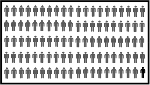
The visuals used in the interview were designed by the first author based on a combination of theories and suggested best practices for conveying health risks in a visual format, which are described above. They consisted of a ten-by-ten grid of coloured red and blue smiley/sad-faced icons and a ten-by-ten greyscale grid of human figures, which were shown successively (see, ). All FINDRISC scores were converted to a denominator of 100. This provided a baseline 10 × 10 grid for the icons. Simple face icons and human figures were used to contextualise risk and ‘at-risk’ icons were displayed in a clustered, consecutive format. The colour red was assigned to the ‘at-risk’ sad-faced icons and was positioned opposite blue to ensure consideration for people with a potential red-green colour deficiency. A greyscale image with human figures was also provided to promote further discussion.
Figure 1. Visual in coloured smiley/sad-faced icon format (created by author).
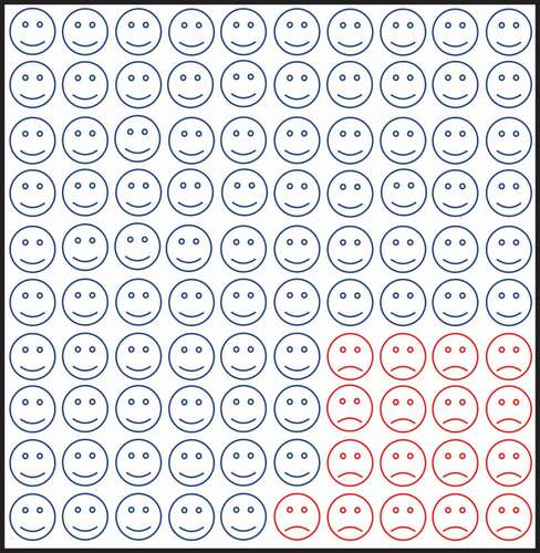
Figure 2. Visual in greyscale human figure format (created by author).
The interview was the first-time participants received their FINDRISC score as a converted percentage and viewed a visual representation of that same risk. Observations beyond the spoken dialogue of each transcript, such as facial expressions, body postures, and changes in mood or atmosphere, were recorded as memos and incorporated into the finished transcripts.
We conducted 15 interviews. The majority were held in a private room of the local municipality office whilst a few took place in local cafés. The interviews were conducted primarily by the first author, in English, an Irish female with a background in medicine. A Spanish/Swedish interpreter was present for three interviews to aid with language barriers as required. Interview sessions lasted between 25 and 54 minutes. We recorded all interviews on a portable Dictaphone device and transcribed verbatim by the interviewer.
Data analysis
We analysed the data following a thematic approach (Braun & Clarke, Citation2006) to facilitate a flexible approach to thematic analysis, that was unbounded by theoretical commitments. Facilitated by using NVivo 11.0, we discerned patterns from within and across the transcripts from smaller building blocks (codes) and organised these into central themes. No pre-defined codes, sub-categories, categories, or themes were established prior to analysis, but rather in vivo codes and insights were derived from the new data which we had collected. Analysis of the data occurred simultaneously to the process of inquiry. The first author and main interviewer acted as the primary data coder, with transcripts and codes discussed with and reviewed by co-researchers during the analysis. Latent meanings were derived directly from the participant statements. Statements were compared and contrasted both vertically (within the same transcript), and horizontally (with segments of different interviews), paying particular attention to patterns pertaining to persons who had been given high and low FINDRISC scores.
Research ethics
Formal ethical clearance was given by the Regional Ethics Review Board in Stockholm (2018–239-82). Written consent was gained from all participants before the interviews. Any health concerns expressed by the participants during the interview were relayed back to the SMART2D or Primary Healthcare team. Participants received two complimentary cinema tickets as a token of gratitude for their time and involvement.
Findings
The analysis we present below is based around a core, central theme which we identified during the analysis of our data. We refer to this theme as ‘Incorporating self in realisation of risk’ and found it to be composed of three main categories: 1) Risk as separate from self, 2) Risk as related to self and, 3) Risk as part of self. Through these categories we highlight how participants’ insight into their risk changed as the interview progressed, following the representation of this risk via different mediums. This process of a development in self-awareness of their risk was expressed by 13 of the 15 participants. Of the other two participants, one expressed a strong viewpoint that they were not going to get diabetes, and the differing mediums did not affect their view. The other reported no alteration in the perception of their risk of developing T2D as the interview progressed. provides an extract from our coding tree to demonstrate the development of this theme.
Table 3. Coding Tree.
Risk as separate from self
Participants struggled to find meaning in the FINDRISC score that was attributed to them. As highlighted in the quote below, this number held little or no meaning to the majority of participants, with the absence of a clear range or scale acting as a prominent hindrance to understanding.
I think the numbers are just numbers, they don’t mean anything
(ID#03: Female, 24 years, FR 11)
Generally, the assigned number of FINDRISC points did not add clarity to the participants’ understanding of their risk of developing T2D. This was illustrated on a number of occasions by comments that substitution of their current risk score with another number would have been of no consequence to the understanding of their risk of developing T2D. As illustrated in the quote below, hearing their FINDRISC score did not impact much upon the participants, or provide clarity.
If they had said 7 or if they had said 58 it wouldn’t have meant anything to me, because I don’t know the difference (ID#04: Male 64 years, FR 13)
Some participants mentioned that they lacked confidence in the FINDRISC score and would rather be provided with a more definitive answer, such as the ‘yes/no’ response from a blood test. To some, this blood test was viewed as a more trustworthy and definitive mechanism for understanding their risk of developing or having T2D, independent of their risk score. A small number of participants viewed the FINDRISC points solely as a means to get a HbA1c blood test. Of these, not all were aware that 13 points was the cut-off for the blood test, but even those who were aware of the cut-off, often tried to persuade the SMART2D team to do a blood test regardless. The participant quoted below emphasised this lack of trust in the abstract risk-score, and an ultimate preference for seeking certainty about their level of risk with a blood test.
I would rather have my finger pricked so that I could be really sure … That’s more definite. Either you have it, or you don’t … (ID#05: Male, 62 years, FR 8)
Most participants expressed a lack of understanding during the screening process, yet divulged that they seldom asked for further clarification from the SMART2D team member. Nearly half of the participants reflected that, although not aware of this at the time of screening, they had subconsciously proceeded to make assumptions about what this number signified. The lack of clarity led to assumptions about their level of risk that were not always in keeping with their attributed risk score. This included creating their own range or scale and assuming that they were ‘low risk’ as it was a ‘low number’ (although the number ‘14’ might be considered a low number in some circumstances, in the context of FINDRISC it constitutes a ‘moderately elevated’ risk of developing T2D – see, ). These observations were shared only when the participant was encouraged to consciously reflect upon their initial response to their FINDRISC score.
Although familiar with the overall outcome of the screening process on a verbal level of risk (‘high’ or ‘low’ and the like), a few participants did not initially recall the range of the FINDRISC scores in which their individual score fell until reminded by the interviewer. This may highlight a weakness in some of the communication between the SMART2D team member and the screening recipient.
Risk as related to self
For nearly all participants, the perception of their risk began to alter once their FINDRISC score was communicated in the format of a statistical percentage. At this point, three participants commented that the percentage left the ‘same’ impression as the FINDRISC points. In all other cases, obtaining their risk score as a percentage induced a remarkably different reaction than the points alone. A few participants audibly exclaimed this apparent shift in terms of disbelief. These participants were surprised by the percentage since it was not what they had expected based on the assumptions they had made about their FINDRISC score, and it was not aligned with their understanding of the magnitude of their risk. This response was split nearly equally in two ways – whilst some cases were more reassured, others became more worried. Of note, those with lower risk scores were initially more reassured (for example, 6 FINDRISC points converted to a ‘smaller’ number when represented as a percentage, a 1% risk of developing T2D in the next 10 years), whereas those with higher risk scores were more worried (for instance, 14 FINDRISC points converted to a ‘higher’ number when represented as a percentage, a 17% risk of developing T2D in the next 10 years – see, ).
When provided with the risk score in a more familiar percentage format, most participants expressed that they could now see their risk in the context of the population as a whole. A few participants openly expressed their familiarity with the range and described their awareness that a percentage means a scale from ‘1 to 100’. The quote from the next participant expresses how he could ‘grasp’ and give meaning to his risk as a percentage, whilst for him the risk score lacked any meaning. The individual appropriation of risk began at this part in the interview process.
Numbers like [a] percentage I can grasp … whereas with the number 6 … what can I do with that? How am I to have that meaning to a 6, it’s like ok what does that mean? Not anything. But 1% actually means something (ID#14: Male, 24 years, FR 6 points)
Once provided with a more familiar framework, specifically that of a percentage, the participants began to draw comparisons and relate their risk to that of the population as a whole. In the majority of cases, this altered their interpretation and engagement with the FINDRISC score. The reaction to this new information appeared to shift perceptions in nearly all cases. On questioning, only one respondent attempted to suggest how the FINDRISC points corresponded with the percentage. Two young male participants asked for more mathematical information in order to figure out the relationship between the FINDRISC score and the risk of developing T2D in the next 10 years as a per cent. All other participants saw no connection between the two numbers. Despite the uncertainty of the relationship between the two numbers, the majority of participants accepted the percentage as their ‘risk’. In this sense it seemed that when their risk was communicated in a more familiar format, they appeared to trust it more, therefore appearing to appropriate this risk to themselves.
Risk as part of self
In memos recorded from the interviews, a significant change in the atmosphere or tone of the interview was noted on the presentation of the visual images. Several participants gasped, sighed, placed their hand on their heart or widened their eyes as though in disbelief. Tears were apparent in the eyes of two participants. Other participants acted unmoved by the images, with one participant handing it back to the interviewer almost immediately, as though completely disinterested. As the discussion went on, however, and this participant considered the image more closely, they reflected that it added some more meaning to them than the numerical information alone.
Many did not initially trust that the images were a truthful representation of the percentage risk they had been assigned. In response, a few participants physically counted out the number of red sad-faced icons on the page before being satisfied that this correctly corresponded to their assigned statistical risk.
Presentation of the participant’s statistical risk in a visual format led to the revelation that the visual made the magnitude of risk appear ´bigger´ than either the percentage or points alone. This observation was made by participants across the spectrum of all risk categories – from people with low (1%), moderate (17%), and high risk (33%). Even those in low-risk categories expressed that this made them feel the need to focus on improving their health behaviour more. The following quote demonstrates the effect that the graphical representation could have on the participants as compared with the same risk communicated as a percentage.
Yes, after a time I looked at this I can see that it is a little higher risk. The risk looks higher than to hear 17 per cent … it is very near 25 per cent if I see it like this [represented pictorially].
(ID#11: Male, 39 years, FR 13)
Some participants suggested that the smiley-faced icons gave them hope for the future and demonstrated a positive direction for change in their lifestyle. They suggested that, on completing the FINDRISC score again in the future, they would like to see the number of ‘happy blue smileys’ increase, or at least that these would remain at the current level. Participants frequently expressed a desire to increase the number of smiley-faced icons they had been assigned.
Many described that their risk was made more real when viewed as a visual representation. A few participants used bodily terms in their expression of how the image connected with them, such as how it got more ´into their bones´ or ´heart´. Some people physically interacted with the smiley/sad-faced icons, using touch and gestures to signal attempts to shrink the number of ‘bad smileys’, while some even tried to ‘pick’ the sad-faced icons off the page. Upon being questioned about what they would do differently in the future to gain more smiley-faced icons, participants referred back to questions in the FINDRISC questionnaire about ‘eating healthier’ and ‘exercising more’. Here, a participant illustrated how, when seeing the visual representation of their score, it caused an emotive process, that the numerical format did not.
This picture went straight to my emotions and to my heart, the numbers were also very good but it’s another level here (pointing at image), when I hear 14, when I hear 17 per cent it is more like I am back in school having maths, you know, I start thinking in another way and this (pointing at image) is a more emotional way when I look at a picture … It touches my heart more when I see this. (ID#08, Female, 54 years, FR 14)
Only two participants reported that there had been no impact or usefulness in either image. Of these two, one expressed that no matter the risk, nor the method by which it was communicated, they were not going to, nor indeed would they ever, worry about developing diabetes. This opinion appeared impervious to hypothetical risk score, conversion to a percentage, or on the viewing of the graphics.
Discussion
It is important to analyse how risk information is interpreted by users, in order to optimise future risk communication dialogues that are rooted in human experience. The findings of this study echo some of the existing theories in the field of risk communication while also adding some novel insights.
First, participants struggled to find meaning in the initial FINDRISC score and expressed they would have more faith in the results of a blood test. This may relate to the typical concern of ‘am I sick or not?’ and the assurance that a biological test can provide ‘real truth’ and provide evidence of ones good health, something that risk questionnaires or discussion about risk with a health practitioner cannot (Adelswärd & Sachs, Citation1996; Van Bokhoven et al., Citation2006). This phenomenon was reflected in our findings, whereby some participants requested a HbA1C test even if their FINDRISC score did not meet the criteria. Trust is importantly and intricately connected with risk perceptions (Alaszewski, Citation2003; Citation2005), and the focus of some participants on the blood-test, and lack of trust in the abstract figures, may reflect this complex relationship. Our findings also illustrate the pressures often seen in clinical practice, where public uncertainty in the absence of definitive testing can influence health professionals to perform tests in order to meet patient expectations (Watson et al., Citation2017).
After the conversion of their FINDRISC score into its corresponding statistical percentage, participants noted that the risk either ‘felt bigger’ and more worrisome or, ‘felt smaller’ and thus found this more reassuring. Eibner, Barth, Helmes and Bengel (Citation2006) discuss that women’s estimation of their perceived risk of breast cancer depended on the type of scale used, and that overestimation of risk was made on percentage and visual analogue scales. Although a different methodology was applied, our study found that perceptions of magnitude shifted mainly based on the original starting value.
These reactions could reflect a cognitive bias known as anchoring, where ‘different starting points yield different estimates, which are biased toward the initial values’ (Tversky & Kahneman, Citation1974). Those in low-risk categories were originally ‘anchored’ to a small number, which converted to an even smaller number as a percentage (6 FINDRISC points corresponds to a 1% statistical risk). Although these indices depict the same risk of developing T2D in the next ten years, participants perceived the magnitude of risk as different. Conversely, those with higher FINDRISC scores found that they were at a higher risk of developing T2D than they had initially assumed (15 FINDRISC points corresponds to a 33% statistical risk).
When translated to the visual format, some individuals perceived the risk to be higher than with the numerical score and percentage. Even those in the low-risk categories described an increased intention to act and increase healthy behaviours on visualising the score. This highlights how visual representations of risk potentially cause people to overestimate the likelihood of developing disease. Therefore, graphical depictions of risk, like statistical figures, may have outcomes other than those intended (Gigerenzer et al., Citation2007). Interestingly, Schapira et al. (Citation2001) found that graphics that used larger denominator sizes (100 or 1000) conjured a sense of lower risk. Although only 100 icon arrays were used, this conflicts with our general findings on the magnitude or risk, which was deemed as larger.
This study echoes the findings of Schapira and colleagues that using human figures to depict risk can give a more impactful message, as this draws on a person’s emotional experience (Schapira et al., Citation2001). Risk is often perceived as a very abstract concept, and the participants´ use of corporal descriptors, such as the risk becoming embodied ‘in their bones’ and ‘touching their heart’, highlights how the graphical illustrations made the risk more real (Aweko et al., Citation2018). At this point in the interview, there was an apparent engagement of participants’ experiential systems and a heightened state of emotion was emphasised by the many non-verbal cues including sighs, gasps and the physical movement of hands to chests (Slovic et al., Citation2004).
When asked, some participants articulated that they would repeat the FINDRISC questionnaire sooner (in one year, as opposed to five or ten) if the results involved smiley/sad-faced icons as opposed to numbers alone. At this stage of the interview there was also an increased optimism for change, and many suggested that they felt they could reduce the number of ‘sad-faced icons’ sooner by engaging in healthy behaviours to decrease their risk. This preference could reflect the process of incorporating the self in risk, with the expression of reinforced intention to change and improve their behaviours evolving as the interview progressed.
Communicating uncertainty is a complex and dynamic process and therefore needs to be carefully considered. One of the proposed reasons for tailored health messages leading to stronger reactions and subsequent action-taking behaviours is the enhanced use of emotional processing, or a person´s ‘experiential system’, over the logic and reason of the ‘analytical system’ (Hawkins et al., Citation2008; Slovic et al., Citation2004). Nolan et al. (Citation2015) found that T2D patients responding to their cardiovascular risk profiles via an online risk calculator, including visual representations, were seen to understand information when received in conjunction with health communication from a professional. This theory is echoed in the findings of Ancker et al. (Citation2006), in a review of the design features of graphs used in risk communication, that realised that the interpretations of graphic information was based not solely on the design features, but were also dependent upon the instructions provided, and the level of expertise of the communicator. We know that the level of numeracy of the recipient and communicator both play an important role in how risk information is conveyed and interpreted (ibid.).
We now move to develop some methodological considerations. Our study sample size was guided by the concept of information power which suggests that the more relevant the information held by the sample, the fewer the number of participants are required (Malterud et al., Citation2016). According to the model, five elements are used to ascertain if sufficient power has been achieved. The aim of this study was narrow with clear research questions; participants were specifically targeted to include varying levels of risk; the discussion guide was informed by previous theory in the discipline of risk communication, numeracy, and visuals; the dialogue was rich as a result of the use of specific and tailored visual stimuli in all interviews to encourage a reflective discourse on participants´ actual risk scores. When possible, non-native English speakers were encouraged to speak in their own language if they appeared to be struggling for words to express themselves, or the interpreter aided, a tactic used to encourage the ‘thinking-aloud’ expressions of thought processes, without impeding the natural flow of the interview (Van Someren et al., Citation1994).
This study was unable to assess the influence of the order of the two modalities (numeric versus visual) as the participants had already been exposed to their FINDRISC points by the SMART2D team before the interviews. By altering the sequence, that is showing the visual form first, and then the numerical format, it is possible that we may have developed different findings. Risk communication is an interactive process and it is a limitation of the study that our interviews were only sought from screening participants and not from the screening team who communicated the FINDRISC scores. Although the screening team followed a protocol, this study was unable to assess how the differing perceptions, level of numeracy, and communication skills of the providers influenced how the risk information was perceived by each participant. We cannot assume that these human interactions were identical in nature, or that variation in the quality of communication did not exist. Conducting these same interviews with healthcare providers (those located on the other side of the dialogue) is an important area for future exploration.
Conclusion
In this study we have shown that format matters when it comes to the communicating of risk scores. The use of ‘risk calculators’ alone can lead to misinterpretation by the user or a lack of meaningful engagement with the numbers. Numbers, such as FINDRISC scores, have an important role in the communication of risk but must be put into perspective if they are to be more thoroughly engaged with by users. However, the role that the communicator plays in this interaction cannot be ignored and is an area for further research. This project has highlighted a potentially simple way of communicating these numbers that gets to the heart of the human experience. We suggest that, through the combined use of numerical and visual aids, there is potential to communicate risk in a manner that evokes the experiential system, thus increasing the likelihood of positive behavioural change in the fight against T2D.
Acknowledgements
We would like to express our sincere gratitude to all of the participants, who shared their time and opinions for this research. A special note of thanks also to the participants, Stockholm Council citizen hosts and to Linda Timm and Juliet Aweko of the SMART2D team for facilitating the platform for the interviews.
Disclosure statement
No potential conflict of interest was reported by the author(s).
Data availability statement
Data not available due to ethical restrictions. Data is restricted as it may reveal the identity or location of participants through deductive disclosure. As a result, making it public is not ethical as it could pose privacy and confidentiality concerns.
Additional information
Funding
References
- Adelswärd, V., & Sachs, L. (1996). The meaning of 6.8: Numeracy and normality in health information talks. Social Science and Medicine, 43(8), 1179–1187. https://doi.org/10.1016/0277-9536(95)00366-5
- Ahmed, H., Naik, N., Willoughby, H., & Edwards, A.G.K. (2012). Communicating risk. BMJ. 344(June), e3996. https://doi.org/10.1136/bmj.e3996
- Alaszewski, A. (2003). Risk, trust and health. Health, Risk and Society, 5(3), 235–239. https://doi.org/10.1080/13698570310001606941
- Alaszewski, A. (2005). Risk communication: Identifying the importance of social context. Health, Risk and Society, 7(2), 101–105. https://doi.org/10.1080/13698570500148905
- Ancker, J. S., Senathirajah, Y., Kukafka, R., & Starren, J. B. (2006). Design Features of graphs in health risk communication: A systematic review. Journal of the American Medical Informatics Association, 13(6), 608–619. https://doi.org/10.1197/jamia.M2115.Introduction
- Aweko, J., De Man, J., Absetz, P., Östenson, C.-G., Swartling Peterson, S., Mölsted Alvesson, H., & Daivadanam, M. (2018). Patient and provider dilemmas of type 2 diabetes self-management: A qualitative study in socioeconomically disadvantaged communities in Stockholm. International Journal of Environmental Research and Public Health, 15(9), 1–18. https://doi.org/10.3390/ijerph15091810
- Bodemer, N., Meder, B., & Gigerenzer, G. (2014). Communicating relative risk changes with baseline risk: Presentation format and numeracy matter. Medical Decision Making, 34(5), 615–626. https://doi.org/10.1177/0272989X14526305
- Braun, V., & Clarke, V. (2006). Using thematic analysis in psychology. Qualitative Research in Psychology, 3(2), 77–101. https://doi.org/10.1191/1478088706qp063oa
- Cantle, T. (2012). Interculturalism: For the era of globalisation, cohesion and diversity. Political Insight, 3(3), 38–41. https://doi.org/10.1111/j.2041-9066.2012.00124.x
- Charters, E. (2003). The use of think-aloud methods in qualitative research an introduction to think-aloud methods. Brock Education. 12(2), 68–82. 10.26522/BROCKED.V12I2.38
- Cokely, E. T., Galesic, M., Schulz, E., Ghazal, S., & Garcia-Retamero, G. (2012). Measuring Risk Literacy: The Berlin Numeracy Test. Judgment and Decision Making, 7(1), 25–47. Retrieved 20 February 2018 https://journal.sjdm.org/11/11808/jdm11808.pdf
- De Bruin, W. B., Stone, E. R., Gibson, J. M., Fischbeck, P. S., & Shoraka, M. B. (2013). The effect of communication design and recipients numeracy on responses to UXO risk. Journal of Risk Research, 16(8), 981–1004. https://doi.org/10.1080/13669877.2013.788055
- Diabetes i primärvården 2013. (2014).
- Eccles, D. W., & Arsal, G. (2017). The think aloud method : What is it and how do I use it ? Qualitative Research in Sport, Exercise and Health, 9(4), 514–531. https://doi.org/10.1080/2159676X.2017.1331501
- Eibner F., Barth J., Helmes A., & Bengel J. (2006). Variations in subjective breast cancer risk estimations when using different measurements for assessing breast cancer risk perception. Health, Risk & Society, 8(2), 197–210. https://doi.org/10.1080/13698570600677407
- Enwald, H., Kortelainen, T., and Leppäluoto, J. (2013). Perceptions of fear appeal and preferences for feedback in tailored health communication: An explorative study among pre-diabetic individuals. Information Research, 18(3), 584. Retrieved February 152018, from http://www.informationr.net/ir/18-3/paper584.html#.WoVOQZPwbBI.
- Ernstsson, O., Burström, K., Heintz, E., & Mølsted Alvesson, H. (2020). Reporting and valuing one’s own health: A think aloud study using EQ-5D-5L, EQ VAS and a time trade-off question among patients with a chronic condition. Health and Quality of Life Outcomes, 18(1), 1–12. BioMed Central. https://doi.org/10.1186/s12955-020-01641-4
- Fagerlin, A., Zikmund-Fisher, B. J., Ubel, P. A., Jankovic, A., Derry, H. A., & Smith, D. M. (2007). Measuring numeracy without a math test: Development of the subjective numeracy scale. Medical Decision Making, 27(5), 672–680. https://doi.org/10.1177/0272989X07304449
- Garcia-Retamero, R., & Galesic, M. (2010). Who proficts from visual aids: Overcoming challenges in people’s understanding of risks. Social Science and Medicine, 70(7), 1019–1025. Elsevier Ltd. https://doi.org/10.1016/j.socscimed.2009.11.031
- Garcia-Retamero, R., & Cokely, E. T. (2013). Communicating health risks with visual aids. Current Directions in Psychological Science, 22(5), 392–399. https://doi.org/10.1177/0963721413491570
- Gigerenzer, G., Gaissmaier, W., Kurz-Milcke, E., Schwartz, L. M., & Woloshin, S. (2007). Helping doctors and patients make sense of health statistics. Psychological Science in the Public Interest, Supplement, 8(2), 53–96. https://doi.org/10.1111/j.1539-6053.2008.00033.x
- Gigerenzer, G., & Galesic, M. (2012). THE ART OF RISK COMMUNICATION: Why do single event probabilities confuse patients. BMJ, 344(7839), 30. https://doi.org/10.1136/bmj.e245
- Gnambs, T., Appel, M., Oeberst, A., & Wan, X. (2015). Red color and risk-Taking behavior in online environments. PLoS ONE, 10(7), 1–12. https://doi.org/10.1371/journal.pone.0134033
- Goodyear-Smith, F., Arroll, B., Chan, L., Jackson, R., Wells, S., & Kenealy, T. (2008). Patients prefer pictures to numbers to express cardiovascular benefit from treatment. Annals of Family Medicine, 6(3), 213–217. https://doi.org/10.1370/afm.795
- Gustafsod, P. E. (1998). Gender differences in risk perception: Theoretical and methodological perspectives, Risk Analysis,18(6), 805–811. https://doi.org/10.1111/j.1539-6924.1998.tb01123.x
- Guwatudde, D., Absetz, P., Delobelle, P., Östenson, C.-G., Olmen Van, J., Alvesson, H. M., Mayega, R. W., Ekirapa Kiracho, E., Kiguli, J., Sundberg, C. J., Sanders, D., Tomson, G., Puoane, T., Peterson, S., & Daivadanam, M. (2018). Study protocol for the SMART2D adaptive implementation trial: A cluster randomised trial comparing facility-only care with integrated facility and community care to improve type 2 diabetes outcomes in Uganda, South Africa and Sweden. BMJ Open, 8(3), 1–11. https://doi.org/10.1136/bmjopen-2017-019981
- Hawkins, R. P., Kreuter, M., Resnicow, K., Fishbein, M., & Dijkstra, A. (2008). Understanding tailoring in communicating about health. Health Education Research, 23(3), 454–466. https://doi.org/10.1093/her/cyn004
- Hildon, Z., Allwood, D., & Black, N. (2012). Impact of format and content of visual display of data on comprehension, choice and preference: A systematic review. International Journal for Quality in Health Care, 24(1), 55–64. https://doi.org/10.1093/intqhc/mzr072
- Hindhede, A. L. (2014). Prediabetic categorisation: The making of a new person. Health, Risk and Society, 16(7–8), 600–614. Routledge. https://doi.org/10.1080/13698575.2014.969688
- Houts, P. S., Witmer, J. T., Egeth, H. E., Loscalzo, M. J., & Zabora, J. R. (2001). Using pictographs to enhance recall of spoken medical instructions II. Patient Education and Counseling, 43(3), 231–242. https://doi.org/10.1016/S0738-3991(00)00171-3
- Houts, P. S., Doak, C. C., Doak, L. G., & Loscalzo, M. J. (2006). The role of pictures in improving health communication: A review of research on attention, comprehension, recall, and adherence. Patient Education and Counseling, 61(2), 173–190. https://doi.org/10.1016/j.pec.2005.05.004
- International Diabetes Federation. (2019). IDF Diabetes Atlas, 9th Edition. https://www.diabetesatlas.org
- International Diabetes Federation. (no date). Test2Prevent – Know your risk of type 2 diabetes. Retrieved April 14, 2018, from https://www.idf.org/type-2-diabetes-risk-assessment/
- Lindström, J., & Tuomilehto, J. (2003). The diabetes risk score: A practical tool to predict type 2 diabetes risk. Diabetes Care, 26(3), 725–731. American Diabetes Association. https://doi.org/10.2337/DIACARE.26.3.725
- Lipkus, I. M. (2007). Numeric, verbal, and visual formats of conveying health risks: Suggested best practices and future recommendations. Medical Decision Making, 27(5), 696–713. https://doi.org/10.1177/0272989X07307271
- Lucaroni, F., Cicciarella Modica, D., Macino, M., Palombi, L., Abbondanzieri, A., Agosti, G., Biondi, G., Morciano, L., & Vinci, A. (2019). Can risk be predicted? An umbrella systematic review of current risk prediction models for cardiovascular diseases, diabetes and hypertension. BMJ Open, 9(12), 1–12. https://doi.org/10.1136/bmjopen-2019-030234
- Malterud, K., Siersma, V. D., & Guassora, A. D. (2016). Sample size in qualitative interview studies: Guided by information power. Qualitative Health Research, 26(13), 1753–1760. https://doi.org/10.1177/1049732315617444
- McNaughton, C., Wallston, K. A., Rothman, R. L., Marcovitz, D. E., and Storrow, A. B. (2011). Short, subjective measures of numeracy and general health literacy in an adult emergency department. Academic Emergency Medicine : Official Journal of the Society for Academic Emergency Medicine, 18(11), 1148–1155. https://doi.org/10.1111/j.1553-2712.2011.01210.x
- Montesi, L., Caletti, M. T., & Marchesini, G. (2016). Diabetes in migrants and ethnic minorities in a changing World. World Journal of Diabetes, 7(3), 34–44. Baishideng Publishing Group Inc. https://doi.org/10.4239/wjd.v7.i3.34
- Nelson, W., Reyna, V. F., Fagerlin, A., Lipkus, I., & Peters, E. (2008). Clinical implications of numeracy: Theory and practice. Annals of Behavioral Medicine, 35(3), 261–274. https://doi.org/10.1007/s12160-008-9037-8
- Nolan, T., Dack, C., Pal, K., Ross, J., Stevenson, F. A., Peacock, R., Pearson, M., Spiegelhalter, D., Sweeting, M., & Murray, E. (2015). Patient reactions to a web-based cardiovascular risk calculator in type 2 diabetes: A qualitative study in primary care. British Journal of General Practice, 65(632), e152–e160. https://doi.org/10.3399/bjgp15X683953
- Pravossoudovitch, K., Cury, F., Young, S. G., & Elliot, A. J. (2014). Is red the colour of danger? Testing an implicit red-danger association. Ergonomics, 57(4), 503–510. Taylor & Francis. https://doi.org/10.1080/00140139.2014.889220
- Renn, O., Jaeger, C.C., Rosa, E.A., & Webler, T., (2000). The Rational Actor Paradigm in Risk Theories: Analysis and Critique. In M.J. Cohen (Ed.), Risk in the Modern Age. London: Palgrave Macmillan, 35–61. https://doi.org/10.1007/978-1-349-62201-6_2
- Reyna, V. F., Nelson, W. L., Han, P. K., & Dieckmann, N. F. (2009). How numeracy influences risk comprehension and medical decision making. Psychological Bulletin, 135(6), 943–973. https://doi.org/10.1037/a0017327
- Rothman, R. L., Montori, V.M., Cherrington, A., & Pignone, M.P., et al. (2008). Perspective : The role of numeracy in health care. Journal of Health Communication, 13(6), 583–595. https://doi.org/10.1080/10810730802281791
- Schapira, M. M., Nattinger, A. B., & McHorney, C. A. (2001). Frequency or probability? A qualitative study of risk communication formats used in health care. Medical Decision Making, 21(6), 459–467. https://doi.org/10.1177/02729890122062811
- Slovic, P., Finucane, M. L., Peters, E., & MacGregor, D. G. (2004). Risk as analysis and risk as feelings: Some thoughts about affect, reason, risk, and rationality. Risk Analysis, 24(2), 311–322. https://doi.org/10.1111/j.0272-4332.2004.00433.x
- Tversky, A., & Kahneman, D. (1974). Judgment under uncertainty: Heuristics and biases. Science, 185(4157), 1124–1131. https://doi.org/10.1126/science.185.4157.1124
- Van Bokhoven, M. A., Pleunis-van Empel, M. C., Koch, H., Grol, R. P., Dinant, G.J, & van der Weijden, T.(2006). Why do patients want to have their blood tested? A qualitative study of patient expectations in general practice. BMC Family Practice, 7(75). https://doi.org/10.1186/1471-2296-7-75
- van Someren, M. W., Barnard, Y. F., & Sandberg, J. A. C. (1994). The think aloud method: A practical guide to modelling cognitive processes. (Knowledge Based Systems).Academic Press.https://hdl.handle.net/11245/1.103289
- Wändell, P. E., & Gåfvels, C. (2007). High prevalence of diabetes among immigrants from non-European countries in Sweden. Primary Care Diabetes, 1(1), 13–16. https://doi.org/10.1016/j.pcd.2006.06.001
- Watson, J., de Salis, I., Banks, J., & Salisbury, C. (2017). What do tests do for doctors? A qualitative study of blood testing in UK primary care. Family Practice, 34(6), 735–739. https://doi.org/10.1093/fampra/cmx051
- Woloshin, S., Schwartz, L. M., Byram, S., Fischhoff, B., & Welch, H. G. (2000). A new scale for assessing of chance: Study. Medical Decision Making: an International Journal of the Society for Medical Decision Making, 20(3), 298–307. https://doi.org/10.1177/0272989X0002000306
- World Health Organization. (2016) Global report on diabetes. Isbn, 978, p. 88. 978 92 4 156525 7.
- Zhang, L., Zhang, Z., Zhang, Y., Gang, H., & Liwei, C. (2014). Evaluation of Finnish diabetes risk score in screening undiagnosed diabetes and prediabetes among US adults by gender and race: NHANES 1999-2010. PLoS ONE, 9(5), e97865. https://doi.org/10.1371/journal.pone.0097865
- Zikmund-Fisher, B. J., Smith, D. M., Ubel, P. A., & Fagerlin, A. (2007a). Validation of the subjective numeracy scale: Effects of low numeracy on comprehension of risk communications and utility elicitations. Medical Decision Making, 27(5), 663–671. https://doi.org/10.1177/0272989X07303824
- Zikmund-Fisher, B. J., Smith, D. M., Ubel, P. A., & Fagerlin, A. (2007b). Validation of the subjective numeracy scale: Effects of low numeracy on comprehension of risk communications and utility elicitations. Medical Decision Making, 27(5), 663–671. https://doi.org/10.1177/0272989X07303824