
Abstract
Design students, professionals, and academics often use design labels, such as social design, co-design, and sustainable design, to position or explain their work. We argue that the labels are insufficient for a clear and nuanced approach to describing design practices, and suggest a way to say a bit more. Seventy design labels were collected and categorized, yielding five clusters. Four clusters derive their name from a necessary element of a design project, namely resources, outcomes, criteria, and methods. The fifth cluster indicates application domains. The discussion explores the clusters and the related elements. We conclude that the labels are often insufficient to clarify a position, that the elements can assist in describing and planning a design practice. But that the labels remain valuable: although these do not describe or explain how these practices are conducted, they do serve to identify specialist communities, and highlight new directions in the field.
© 2024 The Author(s). Published by Informa UK Limited, trading as Taylor & Francis Group
Introduction: Design labels
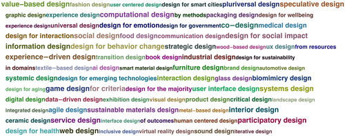
Design is becoming increasingly varied, with new specialisations, approaches, and methods emerging all the time, often in collaborative, participatory, and interdisciplinary settings. Increasingly, design practitioners, students, and academics have to explain what they do to others with whom they do not work on a daily basis (stakeholders, clients, participants, other designers, other academics, …). Often, they introduce their work with design labels such as ‘product design’, ‘service design’, or ‘interaction design’. shows 77 of these labels. These labels can be effective at conveying a position to (close) colleagues who are at home in the nuanced varieties in the field. For them the label implies attitudes, methods, and expected outcomes. But for an outsider, the label may suggest only part of these, or maybe something quite different.
Figure 1. These 77 ‘design labels’ sampled from academic and professional presentations exemplify the sometimes confusing and overlapping ways in which design work is situated or explained.
The authors have witnessed this confusion of shorthand labels in over twenty years each of doing design research and education, in discussions with companies and clients, and within design teams. A speaker (or writer) will introduce ‘we use an agile design approach’ or ‘we take a social design perspective’, and seemingly assumes the listener knows what that entails. But under each of these labels lies a variety of practices, perspectives, and techniques, some of which can be quite different.
In this paper we draw attention to a very practical communication challenge for students, professionals and academics alike when they face a new audience, and explore a practical way to overcome that challenge. The work started with a presentation and discussion at the October 2023 conference of the European Academy of Design (Citation2024), in a session addressing the needs and values of the doctorate in design. That presentation (Stappers, Sleeswijk Visser, and van Boeijen Citation2023) called for a more robust conversation about how we frame, label, and reference design in academia, education, and practice. The conference paper presented the clusters of labels and their interpretation as elements of a design project. Based on the feedback from the conference, and the generous suggestions of reviewers of this paper, a further grounding in the literature was added, and observations from a workshop in which designers and design researchers use the elements to introduce their work.
Our goal is not to create a taxonomy or typology of how design is done, or to determine what the correct definitions of the labels should be. Rather, we look at the confusion that using ‘mere design labels’ bring about, indicate how a variety of meanings is covered or suggested by them, and advocate that designers should convey more elements to introduce their work to others: in practice, in education, and in the increasingly varied academic contexts.
Audiences
As design is gaining recognition and is applied in ever wider circles, there are increasingly many outsiders involved in design these days, who can interpret the label from little more than its name. The general public may mistake the ‘distinctive word’ of a label as a definition of why and how the design is done. They may interpret different labels to imply different ways of working. Kolko (Citation2018), Iskander (Citation2018), and Cross (Citation2023) warn about the spectacular rise of interest in ‘design thinking’ causing a rift between an academic understanding of the term (focusing on cognition, method, and process) and a consultancy light conception based around simplistic tools. Cross warns that when the dust settles, the latter form may be the one most people associate with the term.
Those in search of an education get their first impression of a design school through the name of its design programme. Questions of identity surface with regularity at many schools: should the word ‘industrial’ be dropped from industrial design because students have moved to designing experiences, and interactions rather than mass-manufactured physical products? Or should design schools drop ‘product’ from product design because they now emphasize services and social design? Reasons to keep a label can vary. At an engineering university, experience design may be understood as too artsy for the colleagues in adjacent disciplines. Dropping an established name as product design and replace it by design may alienate the alumni whose diplomas still carry that name, and fresh alumni may have difficulty to explain their skills to future employers.
In many of these cases, from consultant explaining to client, school to prospective student, student to peers or future employers, the label is among the first parts of an introduction. Our goal with this paper is to provide a foothold to help explain ‘what it is that we do’ rather than ‘what flag we wave’.
Meanings of words have often not settled
Over the past decades, design (sub)disciplines have rapidly evolved, not only in content and methods, but also in the labels used to identify them. We have seen new positions defining themselves by how they differ from predecessors and emphasizing differences while remaining quiet about overlaps: functional design was rejected by user-centred design was rejected by human-centred design, and is now dropped for planet-centred design, more-than-human design, because in its turn it is seen as narrow, biased, and insufficiently responsible (Voûte et al. Citation2020). The differences are emphasized, the common core is left tacit. Similarly in commercial practice, when a new emphasis such as service design or design thinking emerged, it was important for design agencies to claim it as part of their business offer, even before they changed their ways of working. And some practitioners had worked in similar ways while not (yet) claiming that label.
Several authors have mapped the diverse ‘types of design’, trying to identify how the profession develops, how it takes on different challenges. For instance, Buchanan’s (Citation2001) Four Orders of Design started a discussion about the rising complexity of challenges that designers address and outcomes they produce, from being defined by the outcomes (from mass-produced products to corporate strategies, to systemic interventions), indicating that design happens at many levels, and professionals may work at one of those levels, or sometimes across them (Joore and Brezet Citation2015; van der Bijl-Brouwer and Malcolm Citation2020). One of the reviewers of this paper warned that comparing types of design is ‘comparing apples and pears […because…] systemic design operates on one level, while books are designed on another’, indicating that a taxonomy of types of design needs to acknowledge multiple, interrelated levels at which these practices operate. However, the aim in this paper is more modest: not to taxonomize the practices, but address the practical matter of explaining one’s work.
Design labels can suggest a position in one of those taxonomies, but when people use the same label, how they unpack it may depend heavily on the context. For example, a decade ago Sleeswijk Visser (Citation2013, 11) mapped seven contemporary interpretations of ‘service design’. Business and design consultants used the label to indicate ‘Design Thinking’ in general, or to mean ‘design in the present-day context of a service economy’. Young design professionals calling themselves service-designers emphasized ‘a holistic, human-centred, integrated look at supply and delivery of a service’. Product design professionals entering the new market took the term as referring to an outcome: ‘the design of services’ as opposed to physical products. Economists referred to ‘delivering value in use’ (Vargo and Lusch 2004). In experience design and interaction design contexts the focus of service design was on designing for the broader contexts of use surrounding a product (Kimbell Citation2011). Consultants from social sciences and communication background interpreted the term as ‘serving people in their needs’. Seven different ways of working, different results, under the same label. Similar variations in meaning can be found for ‘interaction design’ (Hallnäs and Redström Citation2006), ‘social design’ (Tromp and Vial Citation2022), and ‘systemic design’ (van der Bijl-Brouwer and Malcolm Citation2020). Each of these labels covers different practices, and likewise one practice may be associated with multiple labels.
Guidance beyond a label
Using merely a label can highlight one aspect of an approach yet remain vague about other ingredients. For a student or practitioner, positioning by a label can prove lacking in guidance during the work. In 2008, the Institute without Boundaries developed the ‘design dashboard’ to provide guidance by making certain ‘elements’, such as outcomes or intentions, explicit. The dashboard (Stevens and Watson Citation2008) was a digital display on which designers make a choice from options for three elements:
‘involvement’ how they involve the client (prescribe, menu, co-create, assist, DIY),
‘form’ what form of outcome they aim for (communication, environment, product, service, system), and
‘intention’ the criteria for that outcome (social, ecological, economic).
The dashboard was published as a beautifully crafted parody of a digital product on which you selected buttons (with no other result than your selection being visible), complete with a user manual providing explanations, instructions, and theory. For a while, the dashboard was a ‘hit’ on the internet, with various physical ‘products’ appeared, and instructions how to laser cut the ‘product’. It showed a jocular yet serious to express and maintain focus in a design project.
In this study we look at a larger collection of design labels that are in common use, and cluster them according to the elements they suggest. And, like the design dashboard, we suggest that being explicit about multiple elements can alleviate the ambiguities of the design labels.
Method: Gathering and clustering design labels
A set of design labels was collected, starting from methods books for design students and practice (Kumar Citation2012; Martin and Hanington Citation2012; van Boeijen, Daalhuizen, and Zijlstra Citation2020), and continuing with internet searches. We stopped at 177 terms, getting no more ‘suprising new finds’, and feeling confident we had a manageable set to do clustering. After clustering, we removed terms that seemed mere textual variations of others, refered to specific product parts (e.g. engine design), or new academic directions that weren’t prevalent in general practice (e.g. more-than-human design). The terms that were deemed familiar to a broad audience and had been encountered frequently in mentioned method books were retained, leaving 77 terms, shown in .
The set of labels was clustered over a series of conversations between the authors, at first regarding confusions around some new labels, such as service design and systemic design which we had witnessed in education. Informed by these discussions, and with the literature mentioned above in our background, we clustered the labels by what one might call amateur etymology: ‘why does a label carry those words?’ Whereas this way of collecting would be too sloppy to make a taxonomy of design, we found it covered sufficient variety and size to do a sensemaking exploration along the lines of elements like those used in the design dashboard. We acknowledge the limitations of this process, which was based on informed common sense. Informed in the sense that all three authors have been working in a single large design department for twenty years, taking part in research, education, and interacting with design practice. Our background has limitations, as we may not adequately represent, e.g. the areas of art & design, architecture, or fashion; or pluriverse perspectives. However, we assume that similar patterns could emerge with other selections of labels. We did not aim to create a comprehensive dictionary, or to determine a consensus in the field about the meanings of terms. Rather, we try to distinguish general patterns in how labels are used to indicate how designers do what they do.
Results and discussion: Five clusters of design labels
We found five clusters of labels, and tagged each with a preposition to indicate the ‘element’ to which it refers: by, of, for, from, and in. The box-and-arrow diagram in places them as arrows relative to the ‘design project’ box in the center. shows that diagram with the tags and clusters of labels. We now go by the clusters in turn, starting with by, of, and for, which are similar to the ones in the design dashboard.
Figure 2. The labels of arranged as five clusters.
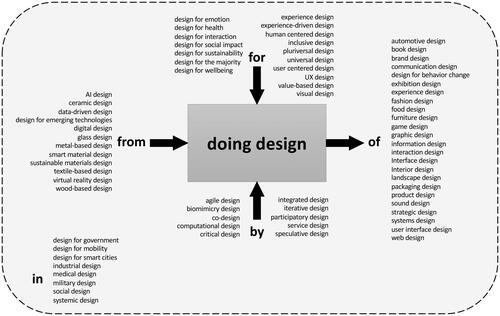
Table 1. Five cluster tags, visualized as a box-and-arrow diagram.
The cluster by a method highlights the methods that are used in doing design. Examples are speculative design, critical design, agile design; several of the recent methods emphasize that design these days is less the traditional image of the sole creative sitting at his drawing board but involves increasingly more actors in different roles: participatory design, co-design can be applied across purposes and outcomes. We take this broader than the ‘involvement’ element of the dashboard, including both tools, techniques and the participation of various actors which are often highly connected.
The cluster of an outcome feels the most traditional: the terms product design and fashion design raise specific expectations of the form of the proposals and implementations to come out of the effort: products and clothing.
The cluster for an intention refers to the dimensions that are used to make decisions. Design for wellbeing, design for sustainability can deal with any types of outcomes and inputs. Their defining quality is on the intentions, impacts strive for and decisions that are based on these criteria.
The clusters from a resource reflects another ‘traditional’ industrial design practice, where designers worked with industries who manufactured a relatively stable category of products (cars, furniture, household appliances) from relatively stable resources (metal, wood, plastic, print). Other examples are respectively data-driven design, and digital design), which viewed by themselves suggest solutions looking for a problem.
Finally, the cluster in a domain contains labels which refer to a larger application area or context where the design will be manifested, such as healthcare design, design for government. Within such a domain, there can be several outcomes, resources, and methods, but there usually is an identifiable set of stakeholders and actors, regulations and locations that keep the various projects together. Note that the preposition used in a label does not always match the preposition used to describe a cluster: e.g. design ‘for’ healthcare is placed under in a domain.
Although the general clustering went straightforward, justifying whether a label should go in this cluster or that one remains somewhat arbitrary.
Unpacking a label by relating to the elements
A historical example from product design helps to introduce the elements: the Thonet chair was designed in interior design, results of chairs made from wood and gluing techniques for comfort, aesthetics, and price, by using information about human body sizes, cultural context, and iterative prototyping.
But for new and emerging practices, one label can cover multiple types of work, and refer to different elements. We saw this for service design above. Likewise, Design for sustainability (a.k.a. sustainable design without the ‘for’) encompasses both material-oriented engineering approaches to optimize production and reclaim, and human-oriented campaigns for behavior change. These approaches share goals of sustainability (for) for a variety of outcomes (of) but employ very different methods and stakeholders (by).
Three more examples illustrate how different practices are conducted under the labels. In , social design is placed under in a domain of social or societal problems. This emphasizes ‘where’ the practice is performed. Others would place it under for a criterium because of the intended social contribution. Currently we see a rise of systemic design (van der Bijl-Brouwer and Malcolm Citation2020; Jones Citation2021), explained sometimes as a domain tackling large societal challenges such as climate change or diversity in collaborative efforts involving many stakeholders (in). Sometimes it is regarded as a method (the combination of systems thinking and design thinking (by). And many who use the label emphasize especially the criteria (for) that are used to decide which outcomes are. Likewise, the current surge in Artificial Intelligence impacts on several sides AI design can refer to ‘designing services that run on AI’ (from), ‘finding more efficient algorithms’ (of), ‘designing AI so it becomes usable for people’ (for), ‘designing in the context of AI-induced developments in society’ (in). One lesson is that someone who introduced their work with a label ‘AI design’ can be asked to be more precise by considering what elements they are referring to.
We do not pretend that the above does justice to the academic depth in each of the variants. The exploration is to show that each label highlights only one element of a design practice, but each design practice must deal with all the elements, not just the one that is highlighted. The first main takeaway from this is the variety of practices and elements that goes hidden behind each of the labels. The second is that addressing the ‘other’ elements can clarify what one does or where one stands within that variety.
Unpacking all elements
Based on this collection and clustering, we propose that when presenting a design project, at least two or more elements are addressed, in the way the design dashboard required its users to express intentions, outcomes, and methods. Taken together, the elements help to tell more of the story of a given design practice. Although labels may suggest a 1:1 correspondence of label to only one element, a practice employs elements ‘on all sides of the box’ and occurs in a context. Here are three lessons about how the elements relate to a design practice:
The story of a design practice can start from any element but must address all others. Some design projects start with the need for an outcome (of an ambulance service), others with a way to use waste materials (from leftovers). For a design agency specialising in co-design, the by a method is the reason they are called in. But in each of these projects, there must be resources, criteria, method, outcomes, and a domain in which the design will be situated. Some are defined at the start of the project; others get filled in along the way. Some may not be mentioned but will still be there in some way.
Labels can emphasize a single element and imply (combinations of) other elements. For example, social design addresses a specific type of situation (in a society), uses certain criteria (for human wellbeing) for its decisions, and often, but not always, is done by participatory methods.
Each of the elements can change or be replaced during the design process. A project may have started from a brief to create a product or an interface, but then change to producing a service around it (of). That may in turn bring in new criteria (for), and methods (by), and resources such as IT (from). As insights grow during a project, the stakeholders’ value orientation may shift from, for example, economy to sustainability, and the related practices, for example, from using scarce materials to less scarce ones. The design team may find that their initial evaluations require more intensive study of the context (in), bringing in more stakeholders, and managing a more complex collaboration (by).
As a bottom line, when designers, design researchers, and educators communicate about how to do design, present a project, offer consultancy services, or explain an educational program, they do well to address more than one element of the model.
Using the diagram to trigger explanations with elements
The diagram is intended to enable a robust conversation about how we frame, label, and reference design in the future. We expected the diagram might have an evocative value to bring out a description of a (proposed) design project a bit similar to the ubiquitous Double Diamond (Design Council Citation2005): it is readily interpreted, can be presented without using specific jargon, and makes for a structured story that addresses a complex whole, although it ignores part of the complexity.
In a one-hour focus group session 15 designers, design educators, and design researchers from our department used the diagram as a presentation starter. The workshop started with a brief explanation (10 min) of the diagram of elements and clusters of labels (using and ). Participants were then given a template showing box-and-arrows with the five tags. They were asked to fill it with a design (research) project from their own experience. After about fifteen minutes, the resulting diagrams were presented to and discussed with the group.
We looked at which elements were most used to explain their projects, the order in which the elements were addressed, and what was explained for each element.
All participants regarded the diagram as helpful, and could fill in a project from memory, but they did so in different ways. One participant used all five elements, but most others filled in three or four elements, indicating during the discussion that they ‘had not considered presenting that’ or ‘had no covering description’ of the ingredients to that element.
Designers and design researchers use the elements differently. Designers tended to begin with the criteria (for) and outcomes (of). Design researchers often started with the domain (in; e.g. ‘in healthcare’) and the research and design methods involved (by; e.g. co-creation).
The element related to resources (from) was mentioned the least, possibly because that is either assumed obvious or considered among the variables of choice. This may also reflect the growing interest for framing and impact (namely ‘impact fixed, manifestation open’) in design discourse (van Boeijen, Daalhuizen, and Zijlstra Citation2020, 14–15).
All participants indicated they liked the diagram as a way to start their design project description, or a trigger to ask ‘what about that other element?’, but not as a template that provides a description. Like all simplifications it serves as a start, but does not capture the whole. Likewise, the double diamond emphasizes a general sequence and the alternation of divergent and convergent actions, but hides the iterative nature of design processes, and is easily misunderstood as a four-stage waterfall process.
To conclude, the diagram has evocative value, and helps designers, design educators and design researchers think about and explicate their project beyond one design label tag. The elements are regarded as valuable triggers for explanation; but they do not form a classification scheme.
Conclusion: How can we explain our projects?
This exploration started from a practical observation: we often introduce our work by mentioning a design label, but such a label may not be understood, or even misunderstood. We explored the mismatch by collecting and clustering design labels, which illustrates the limited explanatory power of these labels to convey the depth and nuances of design practices. And we suggest that presenters, be they design students, academics, and design professionals when they say ‘I do interaction design’, ‘I do co-design’, or ‘I do design for sustainability’ follow this up by addressing a few of the five elements. Within their immediate communities (schools, departments, companies), with whom they share their practices, the label may be enough. But to other audiences (broad conferences, aspiring applicants looking to enrol in a design programme, new clients and stakeholders, the broader audiences) the labels are less helpful.
We acknowledge that the above exercise has not been conducted with the academic rigor that allows us to make claims about what each label does or should mean. Neither do we claim that the five-element model completely captures all that matters (e.g. we do not address the multiple layers mentioned in the literature). Yet we have confidence that ‘addressing the elements’ can be a valuable heuristic for ‘telling a clearer story’.
So, there are two main lessons. One lesson is to not rely on labels alone: be aware that the labels can be confusing, even misleading. Instead ‘talk the walk’, address (more of) the different elements that help to tell what is done, how, with whom, and why this way. The diagram can certainly help start that conversation, but probably is not helpful to conclude with a definition.
The other lesson is that labels remain relevant, not so much for explanation, as for indicating groups of practitioners. Some labels identify communities of practice, with connected network, shared values, methods and language, and dedicated conferences and journals. Examples are the Service Design Network (Citation2024), the Participatory Design Conference (Citation2024), and the journal CoDesign (CoDesign journal Citation2024) as well as the traditional professional organisations of product developers. Some labels are brands, flags that people wave to indicate where they stand (especially if it is in a trendy, new place), and set the agenda for development of policies, curricula, or service offerings, both in academia and commercial contexts.
But for explanation we can do better than wave a flag. We can explain what the expected outcome or impact of the project is, what criteria are considered, what output to expect, what resources are expected, and what methods are used by which actors. And we may have to make clear that some of these elements may need to change during the project, and that decisions about one element can have implications for the other elements.
Design education may be the first place to start with how we frame, label and reference design in the future. We should support our design students to develop a vocabulary for their future design roles and argue about the engagements, outcomes and intentions when doing design. Not just by ‘waving a flag’ but by clarifying how they do what they do, … and why.
Acknowledgements
This study was carried out as part of the DoCS4Design (Doctoral Courses System for Design) project, co-funded by the Erasmus + Programme of the European Union. This paper builds on an earlier conference paper at EAD 2023 Conference in Espoo, 2023. A short video (TUDelft Citation2024) was produced to clarify the point to a broader (design education) audience; it is included with this article.
Disclosure statement
The authors declare that they have no known competing financial interests or personal relationships that could have appeared to influence the work reported in this article.
Additional information
Notes on contributors
Pieter Jan Stappers
Pieter Jan Stappers is professor of Design Techniques at the faculty of Industrial Design Engineering at Delft University of Technology. His research and teaching focus on co-design (bringing users into design) and research through design (bringing designers into research).
Froukje Sleeswijk Visser
Froukje Sleeswijk Visser is associate professor Service Design at Delft University of Technology. Her research focuses on integration of human perspectives in designing for societal issues. Froukje is also an independent design researcher.
Annemiek van Boeijen
Annemiek van Boeijen (A.G.C.) works in her role of assistant professor in the field of design, culture & society at the Faculty of Industrial Design Engineering, Delft University of Technology. Her aim is to develop methods and tools that support designers for a culture-sensitive approach.
References
- Buchanan, Richard. 2001. “Design Research and the New Learning.” Design Issues 17 (4): 3–23. https://doi.org/10.1162/07479360152681056.
- CoDesign journal. 2024. Accessed June 2, 2024. https://www.tandfonline.com/journals/ncdn20.
- Cross, Nigel. 2023. “Design Thinking: What Just Happened?” Design Studies 86: 101187. https://doi.org/10.1016/j.destud.2023.101187.
- Design Council. 2005. “The Double Diamond: A Universally Accepted Depiction of the Design Process.” Accessed June 2, 2024. https://www.designcouncil.org.uk/our-resources/the-double-diamond/.
- European Academy of Design. 2024. Accessed June 2, 2024. https://eadresearch.org.
- Hallnäs, Lars, and Johan Redström. 2006. Interaction design: Foundations, Experiments. Textile Research Centre, Swedish School of Textiles, University College of Borås and Interactive Institute
- Iskander, Natasha. 2018. “Design Thinking is Fundamentally Conservative and Preserves the Status Quo.” Harvard Business Review 5 (09). https://hbr.org/2018/09/design-thinking-is-fundamentally-conservative-and-preserves-the-status-quo.
- Jones, Peter. 2021. “Systemic Design: Design for Complex, Social, and Sociotechnical Systems.” In Handbook of Systems Sciences, 787–811. Singapore: Springer Singapore.
- Joore, Peter, and Han Brezet. 2015. “A Multilevel Design Model: The Mutual Relationship between Product-Service System Development and Societal Change Processes.” Journal of Cleaner Production 97: 92–105. https://doi.org/10.1016/j.jclepro.2014.06.043.
- Kimbell, Lucy. 2011. “Designing for Service as One Way of Designing Services.” International Journal of Design 5: 41–52.
- Kolko, Jon. 2018. “The Divisiveness of Design Thinking.” Interactions 25 (3): 28–34. https://doi.org/10.1145/3194313.
- Kumar, Vijay. 2012. 101 Design Methods: A Structured Approach for Driving Innovation in Your Organization. Hoboken, NJ: John Wiley & Sons.
- Martin, Bella, and Bruce Hanington. 2012. Universal Methods of Design: 100 Ways to Research Complex Problems, Develop Innovative Ideas, and Design Effective Solutions. Gloucester, MA: Rockport Pub.
- Participatory Design Conference. 2024. Accessed June 2, 2024. https://pdc2024.org.
- Service Design Network. 2024. https://www.service-design-network.org
- Sleeswijk Visser, Froukje. 2013. Service Design by Industrial Designers. TU Delft. https://research.tudelft.nl/en/publications/service-design-by-industrial-designers.
- Stappers, P. J., Froukje Sleeswijk Visser, and Annemiek van Boeijen. 2023. “Design Labels: The Words That Divide and Unite Us.” 15th International Conference of the European Academy of Design, October 19, Espoo, Helsinki, 728–736. https://doi.org/10.5151/ead2023-4ESP-01Full-04Pieter-Jan-Stappers-et-al.
- Stevens, Mark, and Mark Watson. 2008. Dashboard User Guide. Toronto, Canada: Institute Without Boundaries.
- Tromp, Nynke, and Stéphane Vial. 2022. “Five Components of Social Design: A Unified Framework to Support Research and Practice.” The Design Journal 26 (2): 210–228. https://doi.org/10.1080/14606925.2022.2088098.
- TUDelft. 2024. Accessed June 2, 2024. https://youtu.be/kw6K90A8Zcg.
- van Boeijen, Annemiek, Jaap Daalhuizen, and Jelle Zijlstra, eds. 2020. Delft Design Guide: Perspectives, Models, Approaches and Methods. Amsterdam: BIS Publishers.
- van der Bijl-Brouwer, Mieke, and Bridget Malcolm. 2020. “Systemic Design Principles in Social Innovation: A Study of Expert Practices and Design Rationales.” She Ji: The Journal of Design, Economics, and Innovation 6 (3): 386–407. https://doi.org/10.1016/j.sheji.2020.06.001.
- Vargo, Stephen, and Robert Lusch. 2008. “Service-Dominant Logic: Continuing the Evolution.” Journal of the Academy of Marketing Science 36 (1): 1–10. https://doi.org/10.1007/s11747-007-0069-6.
- Voûte, Ena, Pieter Jan Stappers, Elisa Giaccardi, Sylvia Mooij, and Annemiek van Boeijen. 2020. “Innovating a Large Design Education Program at a University of Technology.” She Ji: The Journal of Design, Economics, and Innovation 6 (1): 50–66. https://doi.org/10.1016/j.sheji.2019.12.001.