
ABSTRACT
This paper presents an overview of emerging research at the Manifest Data Lab a collective of artists and climate scientists who employ climate data experimentally in public settings. We discuss one of our projects The Carbon Chronicles, a reverse-engineered climate data set, projected on prominent public buildings in London during the period of COP26. Our approach examines the potential of climate data visualisations to operate as a public form that surface issues of climate justice and historic responsibilities. We report on the project’s methodological framing, production and associated artistic strategies.
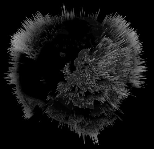
GRAPHICAL ABSTRACT
Introduction
We present early research results from the Manifest Data LabFootnote1 a collective of artists, climate scientists and programmers. Our work takes the form of models, moving image, public interventions and workshops that examine the cultural affordances of climate data and the conceptual, critical and aesthetic problematics of developing cultural forms from its knowledge.
Climate models, graphs and other technical visual forms are the methods of choice employed by science to parlay knowledge of the climate crisis into the public domain. This work is heavily used in policy environments but has been critiqued in geography and science communication disciplines which argue that outside of specialist domains the general public respond poorly to information-heavy diagrams, seeing little connection between the abstract data values they represent and the climate they experience (Rowe and Frewer Citation2005). Shapiro, Zakariya, and Roberts (Citation2017), go further arguing that these enumerative forms invite apprehension as they operate as bulwarks of specialist expertise which propagate universalist hierarchies of knowledge and power which foreclose richer conceptions of human–environment relations.
As we have discussed elsewhere, these techno-scientific forms provide insights into a range of invisible phenomena describing vast geological timescales, complex systems, atmospheres, biotics and other planetary inscriptions (Corby et al. Citation2022). However, they also carry the imprints of power relations, colonial histories, and other social and cultural elements. Important research by Brönnimann and Wintzer (Citation2019) has revealed distributions (and accompanying lacunae) of colonial era meteorological weather stations across South Asia that were originally sited to inform conditions of trade for colonial powers. This has important ramifications into the current era as information from some of these resources still make up part of the climate data records used today within climate modelling. This legacy injects structural uncertainties and a history of injustice into contemporary actions on climate change as model outputs are used to inform discussion on climate mitigation at events such as COP26 held in Glasgow, which have traditionally disadvantaged the Global South (2019). Climate data therefore is representative of natural processes but also carry the traces of political, colonial, mercantile and social forces, which are not emphasised in the current practices of climate science which we argue should be a necessary precondition for its production and public distribution.
In our approach we discussed below, we discuss how we have developed practical and critical approaches to the use of climate data a visualisation that draw out these obscured elements and devise ways of making them public.
This work aligns with a rich seam of artistic works that have variously sought to develop activist strategies that reveal the power and infrastructure networks of carbon production (Platform London), emphasise indigenous knowledge traditions (Camille Seaman), and produce affective and emotional experiences of climate knowledge (Cape Farewell). To this work, a growing body of artist practice has specifically focused on the atmosphere and its connections to the air we breathe (Tomas Saraceno, We Do Not All Breathe the Same Air, 2019–2022), drawing inspiration from the evolution of the climate justice movements from campaigns to the right to breath clean air (Schlosberg and Collins Citation2014), and conceptual interventions that draw attention to the relationship between power, climate change and data, including our own previous work (Cyclone, 2006).
Our work at MDL builds from these exemplars, albeit with a specific focus on how the predominantly scientific data of climate change encompasses both environmental knowledge but also complex hidden histories of dispossession and responsibility to reveal what we describe as the ‘political atmospherics’ of climate data. Through this approach, we experiment with situations, materials and events that examine the agency of these predominantly techno-scientific infrastructures to operate as imaginative and social forms which can increase understanding hidden processes in the data and provoke conversations about the wider implications and responsibilities for the climate crisis.
Materials and methods
The Carbon Chronicles animates the location and distribution of CO2 emissions to make a point about the historic responsibility for climate change.Footnote2 The data underpinning it derives from the Community Emissions Data System (CEDS) a publicly available archive used to parameterise climate models.Footnote3 CEDS describes the fluxes of historic carbon dioxide from a variety of emitting sources including agriculture; energy; industry; transport; shipping; solvents; waste; aircraft and residential behaviours.
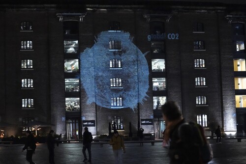
On a foggy dark November evening in London, we loaded a van, disguised as a road repair vehicle with projection equipment and a laptop to carry out a guerrilla projection of the animation at Tate Britain (), the House of Commons ( and 4) and other prominent locations in London.Footnote4 The sites were chosen due to their connections with fossil fuel interests and associations with colonial legacies.Footnote5 The Animation was projected for a minimum of 1-hour at each location, but this varied according to interventions by the Metropolitan Police or other security services. On occasion, we had to quickly find cover and this was aided by the employment of lookouts who provided an early warning system. As seen in , at one of the sites at Kings Cross we were forcibly stopped by private security guards despite the intervention of watching members of the public as the pavement we had sited our rig on was the ‘property’ of a private development company. Large areas of London have been privatised as lures for commercial property developers and these are often indistinguishable from publicly owned space. Projections of the type we employ are still legal in the United Kingdom (UK) as they are protected by the Human Rights Act as legitimate public protest; however, these privately owned spaces are subject to hidden regulations that represent legal grey areas that are untested in law. Our trespassing showed that works of this type can also function to reveal hidden codices and public–private boundary areas, which also conceptually read across to aspects of power and geography addressed in the animation.
Figure 1. Guerrilla projection, climate data, Tate Britain, London, 10 November 2021 (photograph Tom Corby).
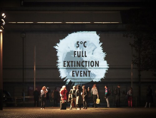
Figure 2. Guerrilla projection, climate data, House of Commons, London, 10 November 2021 (photograph Tom Corby).
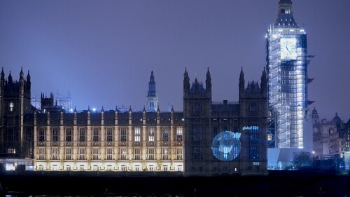
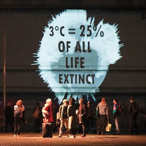
Figure 3. Guerrilla projection, climate data, Central Saint Martins, London, 10 November 2021 (photograph Tom Corby).
Production proceeded in three broad phases: (i) researching existing climate data sets to explore scope and coverage; (ii) ‘reading critically’ to identify hidden or overlooked elements in the data (‘political atmospherics’); (ii) iterative programming, modelling and visual experiments open to creative process-led discoveries.
Using Python,Footnote6 we explored and filtered the CEDS data which alongside its geochemical characteristics, contained information on the origin points and amounts of CO2 expressed from the 1750s to the present day. This revealed that beginning with the UK in the 1750s, emissions from coal started enveloping the planet, other regions in Europe and North America soon followed. By the late 1800s through to the current period, growing industrial and extractivist activity in the Global North was responsible for 92% of CO2 with 8% coming from the Global South. These modifications of the planet’s atmospheric girdle are unevenly distributed geographically and in terms of immediate impacts, raising important issues in regard the role and capabilities of climate knowledge and historic legacies of exploitation.
In doing this, we transformed the CEDS data by mapping it into a mesh globe, whose surface height was displaced and shaded according to the value of the emissions at each grid location. We experimented with its visual look and feel extrapolating forms that dramatised the inequalities revealed in it, whilst staying true to the original source. We animated the globe and overlaid it with additional contextual information detailing the yearly rate of CO2. Further developments in the work were driven by the requirements of external projection as fine detail gets obscured when beamed onto building facades so bold typographic statements were cut into the animation describing the effects and impacts of CO2 emissions. These graphical elements also increased the punchiness of the work elevating its rhetorical form ().
Figure 4. Guerrilla projection, climate data, House of Commons, London, 10 November 2021 (photograph Tom Corby).
Discussion
The Carbon Chronicles visualises a planet, under the pressure of the industrial production and extraction of CO2. It reveals responsibility for these emissions in ways that can inform the need for equitable solutions to the climate crisis, that are mindful of the historic consequences of carbon exploitation and its impacts. Reading and re-using the data through a critical lens enabled a methodological framing of the potential of climate visualisations to operate as a critical and public form that bring into view other issues of concern and which recognise the capability of data visualisation to express a point of view (Viégas and Wattenberg Citation2007).
Hannah Knox has described a shift in how the borders between politics, climate science and the public are blurring in response to the ever more pressing requirements for political action. This process is forcing a reorientation of the role of climate data and an ontological crisis, which questions it as a purely objectivist form concerned with tracking issues of scientific certainty, toward a public mode of knowledge that can inform sites of political action (Citation2020). Our experiments with climate data and methods of ‘critical reading’ are sympathetic to these arguments as the problem of climate change is not only scientific but philosophical, political and cultural and in these complex intersections of forces can only truly be solved holistically. Our practice research seeks to bring out additional affordances of climate data that can make visible issues of concern and can contribute to these debates. This approach is amplified by our guerrilla projections that bought these issues into direct contact with symbolic sites of colonial power and carbon extraction thereby making them public.
Acknowledgements
This work was carried out with advice from the British Antarctic Survey and access to their archives and data resources
Disclosure statement
No potential conflict of interest was reported by the author(s).
Additional information
Funding
Notes on contributors
Tom Corby
The authors make up Manifest Data Lab, Central Saint Martins, University of the Arts London. Tom Corby is an artist and professor of interdisciplinary art; Gavin Baily is senior visiting research fellow; Jonathan Mackenzie is an artist and post-doctoral research fellow; Giles Lane is an artist and designer and specialist researcher in art-science; Erin Dickson is an artist and post-doctoral research fellow; Louise Sime is a paleoclimate modeller at the British Antarctic Survey, Cambridge, and George Roussos is a professor of pervasive computing at Birkbeck College, University of London.
Notes
1 Further details are available at: https://www.manifest-data.org.
2 Documentation can be found at: https://vimeo.com/manage/videos/645456132.
3 Information on CEDS can be found here: http://www.globalchange.umd.edu/ceds/.
4 Our thanks to Media Gang for providing necessary equipment, advice and support.
5 See for example: https://www.theguardian.com/artanddesign/2016/mar/11/bp-to-end-tate-sponsorship-climate-protests.
6 A programming language. Further information can be found at: https://www.python.org.
References
- Brönnimann, Stefan, and Jeannine Wintzer. 2019. “Climate Data Empathy.” WIRES Climate Change 10 (2), doi:10.1002/wcc.559.
- Corby, Tom, Gavin Baily, Jonathan Mackenzie, Giles Lane, Erin Dickson, Louise Sime, and George Roussos. 2022. “The Data Imaginaries of Climate Art: The Manifest Data Project.” Leonardo 55, 125–129. doi:10.1162/leon_a_02136.
- Knox, Hannah. 2020. Thinking Like a Climate, Governing a City in Times of Environmental Change. Durham: Duke University Press.
- Rowe, Gene, and Lynn J. Frewer. 2005. “A Typology of Public Engagement Mechanisms.” Science, Technology & Human Values 30: 251–290.
- Schlosberg, David, and Lisette B. Collins. 2014. “From Environmental to Climate Justice: Climate Change and the Discourse of Environmental Justice.” WIRES Climate Change 5: 359–374. doi:10.1002/wcc.275.
- Shapiro, Nicholas, Nasser Zakariya, and Jody Roberts. 2017. “A Wary Alliance: From Enumerating Environments to Inviting Apprehension.” Engaging STS 3: 575–602. doi:10.17351/ests2017.133.
- Viégas, Fernanda, and Martin Wattenberg. 2007. “Artistic Data Visualization: Beyond Visual Analytics.” In Online Communities and Social Computing, edited by Douglas Schuler, 182–191. OCSC 2007. Lecture Notes in Computer Science, 4564 vols. Berlin: Springer. doi:10.1007/978-3-540-73257-0_21.