
 ?Mathematical formulae have been encoded as MathML and are displayed in this HTML version using MathJax in order to improve their display. Uncheck the box to turn MathJax off. This feature requires Javascript. Click on a formula to zoom.
ABSTRACT
This paper argues for a “human-centered” approach to knowledge discovery from movement data through the use of visualization and mapping. As movement data becomes more available and diverse in dimension and resolution, mapping becomes particularly important in the exploratory analysis of movement trajectories and for capturing patterns and structures in large origin-destination flow data sets. Movement phenomena (e.g. ranging from micro-movements of humans and animals to macro-level mobility, to migration flows, to spread of viruses) are complex dynamic processes which are realized in a multidimensional location-time-context space. This paper provides a comprehensive overview of various visualization techniques for mapping movement through the lens of cartography and with a special focus on the “human user” (e.g. data scientist, analyst, domain expert, etc.). We systematically characterize and categorize available techniques based on their visual specifications and functional capacities for human control, map-interaction, and design flexibility. These elements are beneficial to enhance the user’s capacities for map reasoning and knowledge discovery. Trends and gaps in the literature on movement visualization over the past 10 years are discussed. Our review suggests that future research should focus more on the role of the “human” in the development of human-centered visual analytic and exploratory tools, while providing functionalities for mapping uncertainty and protecting individual privacy in knowledge discovery of movement. These tools should be guided by a cartographic framework and visual principles specifically pertinent to movement.
1. Introduction
More than half a century ago the quantitative revolution in the social sciences brought about paradigmatic change in methods and tools used by geographers to study spatiotemporal phenomena. Several decades later in a similar manner the evolution of location-aware technologies (LATs) including Global Positioning Systems (GPS), ubiquitous computing, and big mobility data culminated in the development of an integrated science of movement to study and understand the behavior of moving individuals or phenomena in space and time (Demšar et al., Citation2021; Dodge, Citation2021; Miller et al., Citation2019). This emerging interdisciplinary field is dominated by topics in human mobility and animal ecology focusing on computational and visualization techniques for capturing, exploring, analyzing, and modeling movement phenomena at both individual and aggregate level using massive amounts of tracking data. The goal is to construct knowledge and learn about the underlying mechanisms governing individuals’ movement across the disciplinary boundaries (Laube, Citation2014; Miller et al., Citation2019). This article takes a systematic look at the techniques used for mapping and visual analysis of movement trajectories and flows, and provides a perspective on the opportunities and future outlook of cartographic research in this area. The focus is on the way in which these tools aid human quantitative and visual reasoning for knowledge discovery. This article considers movement data that are collected at both individual and aggregate levels in the forms of trajectories and Origin-Destination (O-D) flows. These data can include GPS and telemetry trajectories of humans or animals, the general path of infectious diseases through the spread of viruses across different geographic areas, the aggregate flow counts of people or goods transported from one place to the other, or the trajectories of hurricanes recorded as the geographic location of the eye center over time.
Fundamentally, the study of movement involves multiple processes as described in Demšar et al. (Citation2021) and Dodge (Citation2021): In bottom-up approaches, data-driven analytics tools transform raw movement data into useful symbolic representations to help us understand movement and its underlying mechanisms. Top-down approaches use theories and expert knowledge to model and predict movement. In both approaches, mapping, data visualization, and communication with domain experts are fundamental for meaningful knowledge construction, reasoning, and validation of methods and outcomes. More specifically, visualization tools are the primary means of visual exploration and communication, in essence supporting computational movement analysis and simulation. Mapping serves an integral role in the visual communication of movement, enabling the “human” users to explore and gain insight from large amount of tracking data. The use of theoretically grounded visualization techniques and cartographic approaches can enhance the exploratory analysis of movement data (Andrienko, Andrienko, Chen et al., Citation2017), communication between method developers and domain experts in interdisciplinary collaborations, as well as the dissemination of geographic knowledge (Maceachren & Brewer, Citation2004).
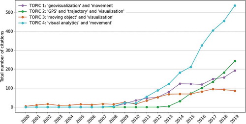
With the increasing availability of movement tracking data since the early 2000s, there has been a steady rise in research focusing on the development of (geo)visualization and visual analytics methods to map movement (see ). However, after 20 years of research in this area and significant achievements in the representation of complex movement patterns and origin-destination flows, there are still persistent challenges to the effective graphical representation of movement, especially for large movement data sets (Andrienko, Andrienko, Chen et al., Citation2017; Cöltekin et al., Citation2017, Citation2018). A number of scholars have provided state-of-the-art reviews in this area (see, for example, Andrienko, Andrienko, Chen et al. (Citation2017), Goncalves et al. (Citation2015), and He et al. (Citation2019)). There is no one standard way to structure or categorize geovisualizations and visual analytic methods for movement. He et al. (Citation2019) provide an exhaustive overview of visualization techniques and methods for moving objects, yet these methods are not contextualized in broader implications for Cartography and current state of the field. Other reviews mainly focused on the synthesis of research in visual analytics and methods of analysis from movement ecology and human mobility with a varying degree of interest in visualization (Andrienko, Andrienko, Chen et al., Citation2017; N. Andrienko & Andrienko, Citation2013; Bach et al., Citation2017; W. Chen et al., Citation2015; Demšar et al., Citation2015; Edelhoff et al., Citation2016; Goncalves et al., Citation2015; Long & Nelson, Citation2013; Seidel et al., Citation2018; Shamoun-Baranes et al., Citation2012; Stein et al., Citation2017).
Figure 1. Total number of citations for topics in movement visualization by year in refereed journals and conferences reported in the Web of Science. The keywords used to extract the information are: TOPIC 1 (shown in purple) “geovisualization” and “movement”; TOPIC 2 (shown in green) “GPS” and “trajectory” and “visualization”; TOPIC 3 (shown in orange) “moving object” and “visualization”; TOPIC 4 (shown in blue) “visual analytics” and “movement” (source: Web of Science)
This paper aims to achieve three objectives: First, to describe a framework for a “human-centered” approach to knowledge discovery from movement data highlighting the importance of visualization and mapping in data-driven movement analytics (Section 3). Second, to identify the fundamental characteristics – including both cartographic specifications and functional capacities – that are essential to empower the user and increase human performance for reasoning and knowledge discovery using movement data (Section 4). Third, to characterize and categorize existing movement visualization techniques through a systematic clustering approach based on their key cartographic and functional characteristics (Section 5). Using examples from the literature we discuss different categories of movement visualization techniques based on their functional purpose (Ward et al., Citation2010): presentation (to convey and present information), exploration (to explore data and generate hypothesis), analysis and confirmation (to assist in the analysis of data and test a hypothesis). Finally, we provide an overview of current trends, research gaps, and opportunities for the future research on movement visualization.
2. Background
2.1. Visualization in movement research
The early graphic representations of movement dating back to the 1800s (Friendly & Denis, Citation2001; Steiner, Citation2019) include the flow map created by Harness depicting the transportation of passengers in Ireland, and the map of Napoleon’s Russian campaign made by Charles Minard (Kraak, Citation2014). Later works by geographers like Ullman (Citation1957) and Berry (Citation1968) utilized visualization of flows to identify the structure of regional spatial interactions through the analysis of commodity flows. Hägerstrand (Citation1970) offered a different illustration of human movement with the notions of space-time paths and prisms using a three-dimensional representation, in which the horizontal plane represents geographic space and the vertical dimension represents time and boundaries represent spatiotemporal constraints on travel. Hägerstrand provided an individual perspective of human activity space which can be used to model accessible locations along the individuals’ travel paths considering their movement mode and available time (Miller, Citation1991).
Among the earliest computer-drawn flow maps are those compiled by Kern and Rushton (Citation1969), Wittick (Citation1976), and Tobler (Citation1981). These maps were generated based on aggregate origin-destination (O-D) flows – often collected in matrix forms – representing banknote circulation, Census, movement and migration counts between different locations. Flow maps are typically used to represent aggregate movement, transport or social networks. Trajectory maps are a more granular version of flow maps depicting the travel paths of individuals as a series of line segments connecting tracking points. With the advent of civilian GPS receivers and other LATs, tracking movement became cheaper and more ubiquitous by the 2000s. Detailed movement data of individuals are now available at finer granularity. The greater availability and variety of tracking data sparked the development of computational movement analytics. This simultaneously gave rise to visualization techniques and (geo)visual analytic approaches for movement in support of computational research as seen in . The figure displays this concurrent rise in research interest, using results from the citation report tool in the Web of Science for the four sets of keywords as shown in the legend.
A review of recent literature suggests that interest in topics relevant to movement visualization has been rising since 2007, especially in terms of geovisualization and visual analytic approaches (see ). These visualizations range from simple maps of trajectories in static displays to more complex dynamic and interactive visualizations representing movement patterns at different granularities in space and time. Following the pioneering illustrations of Harness, Minard, and Tobler, flow maps (represented as flow lines and vectors) and flow density maps have been the dominant methods for the visualization of movement between places, often at the aggregate level. Movement visualizations of discrete trajectories represented as a set of time-ordered points connected with polylines in two- and three-dimensional spaces were transpired by the introduction of moving object and space-time paths models for trajectory databases (Güting et al., Citation2000; Hornsby & Egenhofer, Citation2002). Although visual analytics has dominated the visualization literature since 2007, most of these complex spatiotemporal representations of movement are not easily interpreted or navigable due to the inherent complexity of movement processes. Complexity of movement visualization generally depends on several factors, including overall number of moving objects (or movement flows), context variables, and representation dimensions. In the Section 4, we provide more information on these variables and discuss how they are mapped.
2.2. Mapping movement: location, time, attributes
Movement is spatiotemporal in nature and as such it can be mapped using location-based and time-based representations (Yuan et al., Citation2014). The location of a moving entity at the individual level is often represented as an object-based representation, commonly using a moving point or line objects (Güting et al., Citation2000; Peuquet, Citation1994). For aggregate movement, location is often represented via an underlying geographic map, tessellation, or a raster grid. For example, see for different representations.
Figure 2. Mapping a GPS trajectory of a Galapagos Albatross using (a) 2D spatial, and (b) 3D space-time cube representations. A series of points over time represents the (a) spatial locations and (b) spatio-temporal coordinates of recorded GPS fixes. A line connecting the points in the order of time represents the bird’s path as a) a 2D trajectory and (b) a 3D space-time path. In (a), a simple canvas map (white areas representing water and gray areas representing land) is used as a geographic frame of reference. In (b), a gray line represents the geographic footprint of the 3D space-time path. Tailwind support as an environmental context variable is represented using graduated colors. The albatross was tracked during June–September 2008 with a temporal sampling rate of 90 minutes (Dodge et al., Citation2013). The permission to re-use this figure is granted to the author through the Creative Commons Attribution License 4.0
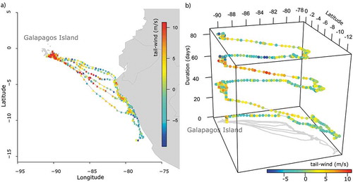
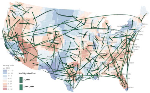
Figure 3. Mapping movement flows: A set of flow lines represents net migration flows between different regions in the US. Flow lines are overlaid on top of a density map representing the net migration rates (source: Guo and Zhu (Citation2014)). The permission to use this figure is granted by IEEE
The simplest two-dimensional spatial representation of a moving object, a GPS track, contains a series of points (fixes), where geographical information is encoded as a longitude-latitude pairs over time. By default the information that can be communicated via such display is rather scarce, but one can generate more informative visualizations by connecting these fixes into vectors (line segments) and altering their display parameters, like width, color, opacity and directionality (see ). This presentation however is insufficient to communicate information about time (duration, start, end time) and direction. Following the model proposed by Hägerstrand (Citation1970), a three-dimensional space-time cube (STC) representation of movement paths has been used to illustrate the progression of movement through time ()). The STC representation adds a time component to the spatial axes of the geovisualization ()). In doing so, this representation adds complexity on top of the basic geographic representation: converting a 2D line into a 3D space-time path, and likewise a polygon – e.g. a location uncertainty buffer or an activity space – into a 3D space-time geometry – e.g. a cylinder or a prism–. Space-time prisms may also be viewed as representations of inherent uncertainty about a trajectory of a moving object (i.e. possible locations accessible along the path), linking geovisualizations to probabilistic tools from statistics and movement ecology, like the Brownian bridge, for home range and space utilization estimation (Buchin et al., Citation2012; Kie et al., Citation2010; Tracey et al., Citation2014). Overall, the cube has been an integral part of interactive visual environment within GIS, and has gone through multiple implementations over the last two decades (Demšar & Virrantaus, Citation2010; Gatalsky et al., Citation2004; Kapler & Wright, Citation2005; Kraak, Citation2003; Lins et al., Citation2013).
Figure 4. A framework for human-centered knowledge discovery from movement data, where computational data-driven analytics and modeling are facilitated by cartographic maps and interactive and exploratory visualizations to empower the “human” for enhanced quantitative and visual reasoning
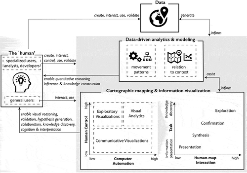
Figure 5. A pyramid model for the representation of movement, modified from Kraak (Citation2014)
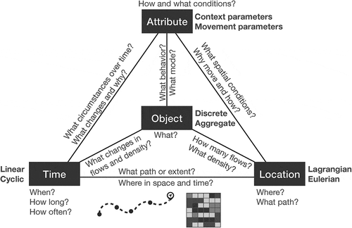
Figure 6. Summary characteristics of visualization techniques for movement. Clusters are denoted by colored nodes (![]()
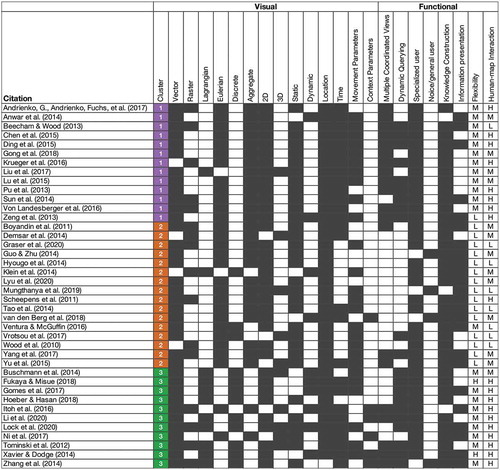
Figure 7. Network graphs of functional and visual clustering results. (a) Clustering on visual elements (Cluster V1 in red, Cluster V2 in blue). (b) Clustering on functional elements (Cluster F1 in red, Cluster F2 in blue). (c) Clustering on visual and functional elements combined
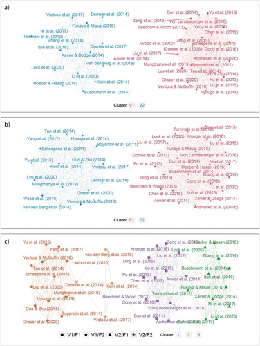
Figure 8. The aggregated number of papers per element per cluster
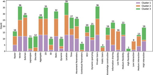
Figure 9. Example of Visualizations for Cluster 1: (a) Cluster result window as presented by Von Landesberger et al. (Citation2016); and (b) TravelDiff interface (Krueger et al., Citation2016). Permission to use the figures is granted by IEEE
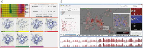
Figure 10. Examples of Visualizations for Cluster 2: (a) Movement of people from Kawasaki station. Amoeba representation (Hyougo et al., Citation2014). Permission to use the figure is granted by IEEE; (b) Stacked space-time density for a single bird using a linear decay function (Demšar et al., Citation2014). The figure and permission to use is obtained from Dr. Demšar; and (c) County-to-county migration as an OD map (Wood et al., Citation2010). Permission to use this figure is granted by Dr. Wood
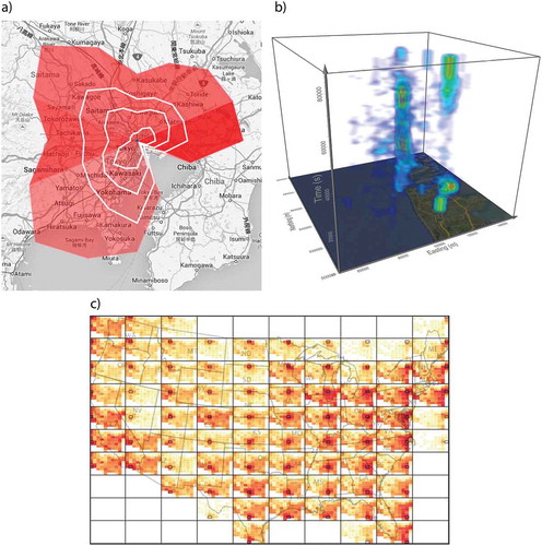
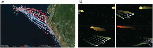
Figure 11. Examples of Visualization for Cluster 3: (a) The last frame of an animated map representing GPS trajectories of nine Galapagos Albatrosses and the impact of tail-head wind speed (shown in graduated blue-red colors) on their movement speed (represented as line thickness) (Xavier & Dodge, Citation2014), and (b) Two frames of an animated map visualizing vessel trajectories with corresponding collision risk values (represented with proportional “HalfMoon” symbols) over time. (Fukaya & Misue, Citation2018). Permission to use figure b) is granted by IEEE
Visualizations at this level of abstraction (as in ) work well for the path of a single object, but they quickly become cluttered and/or occluded when the number of objects increases, or more contextual parameters are represented. To simplify the display for multiple objects, various analytical techniques such as filtering, clustering, and aggregation may be applied. Flow maps are often used to communicate movement information of groups of entities between different locations. These maps may depict volume and direction of flows in the form of density maps or using vector lines with varying graphic characteristics, such as line width, line color and directionality (see, for example, ). The color here is used to convey information about the magnitude of migration flows between different regions.
The STC (as seen in )) is only one approach to spatio-temporal representation in geography (Vasiliev, Citation1997). Another way is the timeline approach, in which movement events are connected to a timeline in the order in which they occur (Kraak et al., Citation2014). To communicate the additional complexity inherited from temporal layering, cartographers utilize interactivity (Kwan, Citation2000) and animation (Harrower et al., Citation2008; Xavier & Dodge, Citation2014). Indeed, these visual displays make it possible to convey the information about dynamic properties of a moving object more efficiently. As for aspatial representations of time, they typically come from the field of information visualization. Aigner et al. (Citation2011) surveys the most common visualization techniques for time-oriented data categorizing them into six main categories, including the frame of reference (abstract vs spatial), number of variables, arrangement of axes (linear, polar, branched), time primitives, exploratory capability of display (static, dynamic, interactive), and visualization environment (i.e. dimensionality).
A single 2D or 3D display is quite limited in the amount of information that it can convey on multifaceted movement data (i.e. tracking data geo-enriched with behavioral and environmental information). Coordinated multiple views (G. Andrienko & Andrienko, Citation2007; Roberts, Citation2007) enable several visual displays to work in unison, by providing a user with several different types of representation (both spatial and aspatial). A number of existing work utilize this concept in prototyping visual analytics and exploratory tools (W. Chen et al., Citation2018; Pu et al., Citation2014; Shi et al., Citation2017). Ultimately, the effectiveness and efficiency of geovisualization and spatio-temporal inference making are determined by the choice of visual variables and types of graphic displays (Fabrikant et al., Citation2010; Garlandini & Fabrikant, Citation2009).
In this paper, we characterize different techniques for the visualizations of movement by describing important cartographic and functional elements utilized in those visualizations. We mainly focus on research published between 2010–2020 in geography, computer science, and movement ecology. This paper adds to some of the earlier reviews such as the work by N. Andrienko and Andrienko (Citation2013) focusing on earlier approaches offered in the 2000s and prior to 2013 for mapping and visual analytics of movement, and Kraak (Citation2014)’s book focusing on different techniques to mapping time and space-time processes.
3. Human-centered knowledge discovery from movement data
In geographic knowledge discovery (GKD) (Miller, Citation2008) we rely on raw observations collected and archived mainly in digital formats to identify novel and useful geographic knowledge that is hidden in the data using analytical tools such as machine learning, artificial intelligence (AI), and other data science methods. Empowered by GKD approaches, movement data science has emerged as an interdisciplinary research field in which various users including data owners, analysts, developers of methods, domain experts, and data scientists collaborate together in order to combine raw observation with expert knowledge using computational techniques to generate data-driven insights on movement (Dodge, Citation2021). Computational movement analytics involve methods developed for processing movement data, trajectory analysis, movement pattern mining, analyzing the associations between movement and its embedding context, machine learning, classification and quantification of movement behaviors, to name but a few (Dodge, Citation2021; Laube, Citation2014). These approaches rely on data-driven analysis to enable the “human” (i.e. user) to infer useful knowledge about the behavior of movement phenomena and the associations with their embedding environment from raw observations. The outcomes of these approaches are often numerical and categorical values representing different types and frequencies of movement patterns, or characterizing forms and densities of movement flows that are captured in the data. If the data and the outcomes of computational algorithms are not properly mapped or communicated in visual forms, they can be cognitively incomprehensible, making it very challenging for the “human” to generate useful knowledge and interpret the results, especially in cases which involve large complex data and collaborative work in interdisciplinary data science research (Maceachren & Brewer, Citation2004; Sacha, Citation2018). Therefore, we need to couple computational methods with suitable mapping and visualization techniques to enhance knowledge construction through visual reasoning (MacEachren et al., Citation2004). To do so, we argue for a “human-centered” approach to knowledge discovery of movement. We base our model on the Human-Centered Artificial Intelligence (HCAI) framework proposed by Shneiderman (Citation2020) to increase human performance through various levels of control on the tools and computer automation. Based on the HCAI model, it is essential that depending on the task or the purpose of the analysis and the desired interaction level, our computational and visualization tools provide optimal capacities for human control and computer automation to enhance human ability for a reliable knowledge discovery. A human-centered approach ensures that the “human” has a central role in knowledge construction, and the process is not fully automated through machine learning and AI algorithms. Besides data collection, method development and validation, the participation of the “human” spans a range of important tasks including visual reasoning, hypothesis generation, inference, interpretation, and knowledge creation, as well as visual validation of outcomes.
Inspired by Sacha (Citation2018) and the HCAI framework (Shneiderman, Citation2020), illustrates our proposed framework for a “human-centered approach” to knowledge discovery from movement data. In this framework, the “human” – ranging from public to specialized users – plays a key role in different stages of data-driven science (DiBiase, Citation1990) by creating, utilizing, validating, controlling or interacting with analytical and visualization tools for quantitative and visual reasoning. By incorporating different levels of user control and automation – as described in Shneiderman (Citation2020) – cartographic mapping and information visualization tools can assist our computational approaches and enable the “human” to interact with the map and accomplish different tasks in the process of knowledge discovery. Human’s visual and quantitative reasoning performance can be enhanced and facilitate through properly designed communicative and exploratory visualizations and visual analytic tools. Using these tools, the framework follows the Cartography Cube (MacEachren, Citation1994) to emphasize the level of human interaction with the map and the purpose of visualization for presentation and synthesis of information, generation and confirmation of hypotheses, and exploration of data, as described in detail in Roth (Citation2013). These tools support movement data science and knowledge discovery in several ways, as follows ():
Communicative Visualizations are normally designed with a lesser capacity for human control but various degrees of automation (examples range from paper maps to interactive web maps). These visualizations are used to map data to convey and present information about the subject phenomena and support synthesis of information regarding structures and anomalies captured in the data (e.g. trends, spatial and temporal extents, outliers, simple patterns, etc.). They also enable the presentation and delivery of analytical outcomes and constructed knowledge in a form that is easy to visually perceive and understand (e.g. maps, animations, graphs). Communicative Visualizations can also facilitate validation of computational methods by providing the means to monitor the work of algorithms and simulations. These visualizations form the building blocks of more complex and interactive exploratory visualizations and visual analytic tools.
Exploratory Visualization tools leverage interactive interfaces and communicative visualizations to empower users by offering a high degree of control over what is mapped and how it is represented through flexible designs. These tools enable visual exploration of the data to reveal unexpected or hidden patterns and movement-context dependencies in observations. Therefore, they can be used as data-driven hypothesis generation and confirmation tools to facilitate knowledge construction.
Visual Analytics tools enable knowledge discovery often from large and complex movement data and supported with a high level of human-map interaction and exploratory functions. Compared to exploratory visualizations, visual analytics tools are often designed to provide a higher degree of computer automation and a relatively lesser degree of human control over design by offering a predefined set of computational algorithms and visualization forms. All three categories of mapping and visualization tools support human visual reasoning to infer and interpret knowledge about the underlying processes and behaviors captured in the data.
In the process of knowledge discovery from movement data, cartographic mapping and information visualization of movement facilitate human visual reasoning and inference to construct knowledge on the behavior of movement processes. The “human” component in this framework applies mapping and information visualization in different capacities: (1) data owners, analysts, or general users often apply communicative and exploratory visualizations to explore data, present information, gain insights into the behavior of moving phenomena, and perhaps confirm scientific hypothesis using mapped results; (2) data scientists and domain experts use different types of visualizations to develop or test hypotheses, explore data and discover patterns, and interpret the outcomes of computational approaches, (3) more specialized data scientists and developers of methods use or develop exploratory and visual analytic tools to construct data-driven knowledge. They also use visualization to monitor the work process of algorithms and validate outcomes. Depending on the research setting these different roles can be taken by a single individual or multiple individuals in a collaborative research. Visualization can significantly facilitate analytical reasoning and provide means for interdisciplinary collaborations between method developers and domain experts in complex scientific discovery projects (MacEachren et al., Citation2004).
4. Fundamental characteristics of movement visualizations
This section describes the key concepts that are essential in the cartography of movement. We use these concepts to characterize existing movement visualizations. A set of fundamental visual (Section 4.1) and functional (Section 4.2) elements are described to set the stage for a systematic assessment and classification of different visualization approaches to the cartography of movement. The classification is then provided in Section 5.1.
4.1. Visual elements
4.1.1. Movement data and visualization perspectives
Movement like any other spatiotemporal phenomena can be captured through two different perspectives: Eulerian (e.g. cross-sectional snapshots of space at different timestamps) and Lagrangian (e.g. time-series of locations over time) (Laube, Citation2014). In the Eulerian perspective, movement of individuals and contextual information are recorded at fixed locations using sensing devices at certain times. For instance, surveillance cameras, Wi-Fi, Bluetooth, or check-in stations are used to record the presence of individuals as they pass within range of or interact with these stations. Summarized origin-destination matrices or check-in records (i.e. presence density) are the most common forms for this mode of movement data collection. In the Lagrangian perspective, as the individual moves, its movement is followed with a location-aware sensor attached to the individual over time. Trajectories (as time-ordered sequences of locations) are the most common form of representation for this mode of movement data collection, which is often conducted through GPS tracking, wearable sensors, radar telemetry, video tracking, and drones. Lagrangian representation employs the perspective of “following” a moving object and recording its locational information at a certain sampling rate (fixed or irregular). In contrast, the Eulerian representation entails tabulating locational data by monitoring the frequency of moving objects appearing at fixed observational points, also known as check-points (Laube, Citation2017; Turchin, Citation1998).
Existing movement visualizations offered in the literature can handle both Lagrangian and Eulerian data to varying extents (see ): Some visualizations map the path of moving phenomena in space over time (i.e. the Lagrangian perspective) and some provide an aggregated view of movement patterns (Andrienko, Andrienko, Fuchs et al., Citation2017; Wood et al., Citation2010) or a summary of movement flows (Guo & Zhu, Citation2014; Yang et al., Citation2017) at different locations based on O-D matrices (i.e. Eulerian perspective). Visualization can also be used to transfer data obtained from one perspective into another. For instance, GPS trajectory data collected using the Lagrangian approach can be translated to an Eulerian view of aggregated speeds over different segments of the road network (Andrienko, Andrienko, Chen et al., Citation2017). Similarly, depending on the data granularity, check-in and O-D records can be used to reconstruct the path of moving entities over (S. Chen et al., Citation2016; Ma et al., Citation2020). In this paper, we focus on the movement perspective of the visualizations rather than the perspective of their input data set.
4.1.2. Movement components captured
Movement is realized in a multidimensional space including location, time, and context. For a meaningful representation of movement, therefore various components need to be considered. Following Kraak (Citation2014), we use the pyramid framework proposed in Mennis et al. (Citation2000) to describe different components of movement for mapping and visualization purposes (See ).
Object: what is captured? Mennis et al. (Citation2000, p. 500) describes “object” as “a geographic conceptual entity that has a unique and cohesive identity, and is related to a specific combination of observational data stored in the location, time, and theme perspectives.” Here, “object” may represent moving entities (e.g. humans, animals, vehicles, viruses), the paths of spatiotemporal processes (e.g. hurricanes, migration, commuting), or events (e.g. activities, stop episodes, move episodes, movement patterns, flows) which can be derived from movement data. In the study of movement, we are sometimes interested in mapping movement paths of one or a few discrete objects (e.g. )), but more often the goal is to map movement path or flow counts of a large groups of moving entities or their aggregate patterns (N. Andrienko & Andrienko, Citation2013). For example, see ) capturing migration flows between US counties or states, respectively.
Location: what path or where? Location describes the position of the moving object in a geographic or abstract space or the spatial extent of the movement. It is often in the form of two (i.e. ,
, where
is the longitude
is the latitude of the point) or three-dimensional coordinates (i.e.
,
). The location can also be represented as a convex hull or a bounding box enclosing all tracking points captured over a period of time. The path of discrete moving objects are often represented through the Lagrangian perspective using trajectories or flow lines. In aggregated movement maps using the Eulerian perspective, the location is embedded in the density or O-D maps. It can also be represented by the underlying grid that is used to aggregate the counts. It is important to note that the granularity of the grid representing the space impacts the aggregation outcomes ().
Time: when, how long or how often? Time represents the timestamp () or the duration (
) of movement. Time can be conceptualized as a linear process (e.g. moving forward along a trajectory) or a cyclic process (e.g. daily commutes, seasonal patterns of migratory birds). Time can be mapped in different forms: as an attribute label to movement features, as a linear timeline, as a third dimension (e.g. in space-time cube), or using animation (Kraak, Citation2014).
Attributes: how and what conditions? Attributes describe the characteristics of movement (e.g. mode, movement parameters) or the conditions and circumstances within which the movement happens. These attributes can be categorized into two different types of parameters: (1) Movement parameters are measurable quantities of movement which can be derived from raw trajectories or obtained directly using sensors (Dodge et al., Citation2008). Examples of movement parameters include speed, acceleration, turn angle, and direction; (2) Context parameters are variables describing the state of the moving entity and the characteristics of the embedding environment as described in Section 2.2.
It is important to note that we consider information on behavior, movement events, and activity types under context parameters. Bertin’s visual variables (Bertin, Citation1973) are often used in the form of charts or thematic maps to represent various aspatial aspects of movement data including movement parameters (e.g. speed, acceleration, flow counts, travel distance, etc.) and context parameters (e.g. weather condition, behavioral mode) (Bernard et al., Citation2013; Dodge et al., Citation2013; Wu et al., Citation2016). The geographic context of movement is often captured by overlaying movement visualization on a geographic map or satellite imagery of the area (Xavier & Dodge, Citation2014).
4.1.3. Movement data representation forms
Regardless of the movement perspective used in data collection or for visualization, movement can be captured using both vector or raster representations:
Vector representation uses a set of primitive visual forms: points, lines, and polygons. Points use custom symbols of different shapes, sizes, colors, and so on to represent the locations of moving entities (in the Lagrangian perspective) or recording stations (in the Eulerian perspective) on maps or scatter plots (Andrienko, Andrienko, Fuchs et al., Citation2017; Q. Liu et al., Citation2018; Scheepens, Van de Wetering et al., Citation2014). Lines are relevant to the representation of trajectories (Lagrangian), and to flow lines and vector fields (Eulerian) representing a path or direction of movement (Guo, Citation2009; Tobler, Citation1981). A trajectory is commonly represented as a set of lines connecting a time-ordered sets of locations (). Polygons are used in movement data as density contours (Scheepens, Wetering et al., Citation2014), bounding boxes, and convex hulls mainly representing the activity space of moving entities which can be derived from both Lagrangian and Eulerian data sets.
Raster representation uses regular grids or irregular tessellations to capture density of movement flows (Zhu et al., Citation2019), such as variations in movement parameters or traffic counts (Andrienko, Andrienko, Fuchs et al., Citation2017). In this case, the cell values capture movement parameters in an aggregate form in space.
Both vector and raster representations can be displayed using a two- or three-dimensional reference system (Dübel et al., Citation2014). Movement patterns are often visualized using these basic forms and thematic representations by applying computational analytic techniques such as segmentation, aggregation, and clustering to summarize commonalities or variations in movement parameters within geographic or environmental context (N. Andrienko & Andrienko, Citation2013).
4.1.4. Cartographic features
Most visualizations of movement trajectories or movement patterns are categorized under thematic multivariate cartographic representations depending on the number of movement components captured in the visualization. Often a combination of visual variables (e.g. position, color value and hue, shape, size, orientation, texture) is used to portray different movement or context parameters over vector and raster representations (Demšar et al., Citation2014; Xavier & Dodge, Citation2014), for example, as shown in . Since we are interested in how movement is visualized in cartographic environments and graphic displays, we further introduce the following axes of comparison to characterize different visualization approaches:
Cartographic space (2D versus 3D) describes the dimensionality of the cartographic environment used to map movement. This can include two-dimensional maps for geographic representation of movement, charts for aspatial and temporal representations of movement and context parameters and three-dimensional space-time cubes for spatiotemporal representation of movement.
Display forms (static versus dynamic) describe the type of output visualization in terms of static or dynamic representations. Static displays provide a snapshot of movement at a single timestamp or an aggregation of movement patterns or flows over a period of time. Static displays are better suited for visualizing the Eulerian perspective of movement (viewing movement or patterns from a fixed location). Dynamic displays provide a time-lapse of movement phenomena by representing movement and changes in movement patterns over time. Dynamic displays are useful for visualizing the Lagrangian view of trajectories or for illustrating an animated view of temporal changes in movement patterns using the Eulerian perspective.
4.2. Functional elements
4.2.1. Dimensions of the cartography cube
In cartography, maps fulfill both communicative and exploratory functions. With development of Geographic Information Systems (GIS), computer graphics and scientific visualization, the role of interactivity increased, giving rise to a new type of visualization, geovisualization, where a user plays a more proactive role in knowledge creation and discovery (Cöltekin et al., Citation2018). Central to this term, is the conceptual framework of the Cartography Cube (so-called Cartography3) developed by MacEachren (Citation1994) and MacEachren et al. (Citation2004). This model extended an earlier Swoopy diagram (DiBiase, Citation1990) of human-map interaction paradigm, in effect, amending a thinking-communicating continuum and the corresponding research steps (explore, analyze, synthesize, present). We utilize this Cartography3 framework here to categorize the surveyed visualization tools along the three continua:
Users (specialized – public or novice). Many of the (geo)visualizations in the reviewed corpora are designed by researchers for specialized users, such as other researchers or practitioners. Generally, some domain knowledge is required to make inferences, but the capabilities of interaction and sense-making are available for both novice and amateur users. Most of the reviewed papers and visualizations are specifically tailored for academic journals, and are therefore primarily used by private users.
Interaction (low – medium – high). Cartographic interaction implies a dialog between a map and a user instrumentalized through a digital device (Roth, Citation2013). User interaction is facilitated by functions for zooming, panning, data manipulation, rotation, change of perspective, brushing, and highlighting. The higher the interaction capability, the more varied cartographic representations can be generated to support different forms of visual thinking. We score papers that had multiple coordinated views and dynamic querying capabilities as high, whereas pan-only and zoom-in/out functionality corresponded to lower interaction.
Task (knowledge construction – information presentation). This measures the primary purpose of a visualization along the continuum of discovery and construction of knowledge or presentation of information. Visual analytic and geovisualization tools are clustered around knowledge construction by offering advanced interactive tools to enhance the user’s performance for data exploration, identification and interpretation of patterns. Static maps and non-interactive dynamic displays are traditionally used for presentation and to convey information.
4.2.2. Advanced exploratory functions
Exploratory functions encompass different interactive elements enabling user to interact with the visualization tools and the data (see Section 4.2.1). Besides basic interaction functions, most exploratory and visual analytic tools provide an advanced visual interface, which incorporates multiple coordinated views (MCV) and navigation functions to query and visualize different perspectives, filter and highlight a subset of data, or the captured variables (G. Andrienko & Andrienko, Citation2007; Roberts, Citation2007; Robinson et al., Citation2017). The interface often includes a combination of 2D maps, 3D space-time cube, parallel coordinate plots, tabular view, 2D or 3D charts, circular flow maps, etc. (Itoh et al., Citation2016; Tominski et al., Citation2012; Wu et al., Citation2016; Zhang et al., Citation2014). These interactive interfaces incorporate both dynamic and static displays as well as 2D or 3D cartographic environments. We denote two advanced exploratory functions in the assessed visualizations in the summary table: MCV and dynamic querying (brushing, filtering, highlighting, etc.). These advanced interactive tools provide the “human” user with more control to alter the visualization parameters and use it to construct knowledge. While other primitive map-interaction tools (e.g. zoom/pan) offer limited capacities for the users to interact with the map content.
4.2.3. Design flexibility
Having flexible tools that enable users to generate different visualizations of the same data is essential in human-centered movement data science. Here, “design flexibility” encapsulate both dimensions of the HCAI model (Shneiderman, Citation2020) where the design can provide various levels of human control or computer automation. A more flexible design offers advanced interactive tools such as MCV and other exploratory tools and functions that can be controlled by the user to alter the visualization as desired. However, a less flexible design involves more automated analytics and is often accompanied by a set of predefined visualization forms that cannot be customized by the user. The functions for flexible visualization are rarely seen in advanced visual analytic tools. In most existing tools, the user has limited control over the visual elements and the analytical functions (see section 4.1) incorporated in the tool. Often the output visualization method, movement perspective, and visual variables representing movement components are predefined and cannot be changed by the user. The user capability mainly lies in changing the query or selecting different subsets of the data to visualize rather than manipulating the visualization display itself. A few exploratory tools offer some flexibility in terms of changing visual variables in displaying movement parameters (Xavier & Dodge, Citation2014).
5. Classification of movement visualizations
5.1. Methods
We use 40 relevant papers published during 2010–2020 in leading journals including Cartography and Geographic Information Science (CaGIS), Information Visualization, Geographic Information Science, IEEE Transaction on Visualization and Computer Graphics, as well as transportation and movement ecology journals to provide a classification of different types of movement visualizations. The techniques offered in the papers are evaluated and scored along the 21 visual and functional elements described above (). A graphical summary of the scores for each paper is provided in . In order to provide a systematic classification of the techniques for mapping and visualization of movement, the surveyed papers are then clustered using the identified elements.
Table 1. An overview of the visual and functional elements used to characterize movement visualizations. For the binary variables, the encoding value 1 means that the variable is applied or is present in the visualization
Since different methods of unsupervised clustering may produce divergent configurations, we minimize such tendencies via consensus clustering. Consensus clustering refers to the procedure in which potentially conflicting partitions are aggregated to produce a more robust clustering. A two-step process is employed (see in Supplementary Materials): First, the papers are clustered separately based on the visual and functional elements. Second, the groupings are aggregated to produce a common visual-functional clusters. The Gower’s distance is used as it is better suited for mixed type binary and categorical variables used for the classification. The optimal number of clusters is identified via NbClust R package (Charrad et al., Citation2014). The final clusters are delineated based on community detection analysis and consensus clustering. A more detailed specification of the clustering approach is provided in the Supplementary Materials.
5.2. Clustering on visual elements
The clustering on visual elements resulted in two very well-pronounced clusters: Cluster V1 (red, n = 25 papers) and Cluster V2 (blue, n = 15 papers) in ). Cluster V1 is characterized by the following criteria: 1) 24 out of 25 papers utilize Eulerian representation of movement; 2) 24 of 25 papers represent an aggregate of moving objects. In contrast, Cluster V2 is characterized predominantly by Lagrangian representations of discrete objects. Furthermore, Cluster V2 includes six papers that visualize some form of contextual movement parameters. None of the other elements appear to be important to the clustering on visual components.
5.3. Clustering on functional elements
Clustering on functional variables ()) produced two clusters: Cluster F1 (red, n = 24 papers) and Cluster F2 (blue, n = 16 papers). Cluster F1 appears to include many more visualizations with multiple coordinated views (17 versus 3) as well as dynamic querying capabilities (19 versus 2) as compared to cluster F2. Furthermore, the interactivity score for Cluster F1 is within the range of medium to high, whereas there is only one paper in Cluster F2 which scored “high” on interactivity. On the flexibility scale, 15 out of 16 papers within Cluster F2 scored low.
5.4. Combined visual-functional clustering
The final combined grouping of papers based on both visual and functional elements is illustrated in ). Overall, there are three discernible clusters denoted by number and color (‘1ʹ purple, n = 13 papers; ‘2ʹ brown, n = 16 papers; ‘3ʹ green, n = 11 papers). Summarized statistics on the elements for each visual-functional cluster are provided in (also see in the Supplementary Materials).
5.4.1. Cluster 1: interactive visual analytic of aggregate movement
Cluster 1 (denoted in purple, n = 13 papers) is monocentric, as only V1/F1 groupings are present (). Most of the visualization techniques employ the Eulerian perspective (12 papers) and aggregate (13 papers) representations of a moving object. Interestingly, this cluster contains papers with the highest percentage of visualizations that are two-dimensional (13 papers), and provide representations of time (13 papers) and movement parameters (10 papers). On the functional side, almost the entire cluster has either MCV (12 papers) or offer dynamic querying (9 papers) capabilities. In this cluster, 12 papers rank “medium” on the flexibility scale, and eight papers score “high” on interaction. This cluster is representative of traditional visual analytic tools.
One example member of this cluster is Von Landesberger et al. (Citation2016), which utilizes a graph-based representation, named MobilityGraphs ()), to analyze variation in spatio-temporal traffic flows over a longer time series data. Their work demonstrates a visualization tool that is based on Eulerian perspective as well as aggregate representation of a moving object and is both 2D and static. On the functional side, multiple coordinated views and dynamic querying capabilities are available. It offers a high level of user interaction, while its flexibility is medium. That is, the data views and representation forms are fixed, but interface functionality allows the user to actively engage in the exploratory data analysis. Another indicative example in this category, Krueger et al. (Citation2016), constructs trajectories from geo-tagged tweets to derive aggregate movement patterns ()). The authors employ a complex interface that enables the users to utilize both MCV and dynamic querying to effectively inspect the aggregated data visually.
5.4.2. Cluster 2: communicative visualization methods to map aggregate movement
Cluster 2 (brown, n = 16 papers) is duocentric (). It amalgamates papers that were previously classified as V1/F2 and V2/F2. The papers in this category are principally concerned with visualization methods presentation rather than exploratory data analytics. These visualizations are more rigid in their form, which is denoted by lower flexibility score and single view interfaces. Aggregate representations of moving objects are much more common in this cluster (13 papers), as well as Eulerian representations (15 papers). Only five papers have embedded the time component in visualization, and two papers have dynamic movement representations (see in the Supplementary Materials).
The number of papers offering MCV and dynamic querying is lowest among this cluster: three and two papers, respectively. Moreover, the number of papers that have low flexibility is the highest (15 papers). On user interaction, the cluster is evenly divided between low and medium interactivity levels. A representative sample of work in this cluster is illustrated in . These techniques (Demšar et al., Citation2014; Demšar & Virrantaus, Citation2010; Guo & Zhu, Citation2014; Hyougo et al., Citation2014; Wood et al., Citation2010) utilize static representations of aggregated flows and trajectories at different spatial scale. Of the four illustrated papers only (Demšar et al., Citation2014) has an embedded time component, as well as 3D representation ()). None of the four offers an MCV or real-time brushing/filtering.
5.4.3. Cluster 3: exploratory and dynamic visualization of trajectories
Cluster 3 (denoted in green, n = 11 papers) combines the techniques clustered under V2/F1 (). This cluster is characterized by visualizations based on the Lagrangian movement perspective (9 papers) of discrete moving objects (9 papers), and the highest proportion of dynamic visualizations (6 papers) with contextual movement attributes (5 papers). On the functional side, 10 papers feature visualizations with dynamic querying capabilities. Furthermore, this cluster has the only two papers that rated “high” on the flexibility scale: (Fukaya & Misue, Citation2018; Xavier & Dodge, Citation2014), and 10 papers rank “high” on user interaction. It is worth noting, that due to the high interactivity and exploratory characteristics of these tools, there is some overlap between Cluster 3 and Cluster 1, with the majority of interlinks centered on the work of Anwar et al. (Citation2014), X. Liu et al. (Citation2017), and Tominski et al. (Citation2012).
Two representative examples (Fukaya & Misue, Citation2018; Xavier & Dodge, Citation2014) dynamically visualize movement trajectories of discrete objects by utilizing multiple visual variables, including location, time, movement and context parameters (). Both tools score high on interactivity and flexibility, as alterations in symbology can be used to amend data exploration tasks.
6. Discussion: trends and gaps in movement visualization
As shown in this paper, visualization of movement has remained a popular field over the past 10 years. A variety of methods and tools corresponding to the outlined groups has been developed in different areas for a human-centered knowledge discovery from movement data: communicative visualization (mainly reflected in Cluster 2), exploratory visualization (majority located in Cluster 3), and visual analytic tools (predominantly in Cluster 1). In this section, we discuss these categories in the light of the identified visual and functional elements, and highlight trends and gaps.
6.1. Human-centered visualization tools
The classification has identified important criteria in delineating visualization techniques, namely the visual and functional elements (). Among the elements, functions for user interaction capabilities and general flexibility providing more control for the human user are extremely important in designing tools for “human-centered” exploratory data analysis. These capabilities enable a higher level of human-map interaction for knowledge discovery from movement data. We view flexibility in design and functions for integration of different visual elements to be central in the future development of movement visualizations.
Our comparative review of exploratory and visual analytic tools () suggests that exploratory visualization tools enable users with more flexibility and user-control in terms of how the data can be visualized, while visual analytic tools often provide a predefined view of data that is created using automated computational analysis and that the user is not able to modify. We propose that the future of visualization in movement data analysis should move toward human-centered visual analysis – a combination of exploratory and visual analytic groups of tools with more optimum functionalities in terms of user-control and automation that would enable switching between Lagrangian and Eulerian movement perspectives, as well as between different representations of a moving object. This new generation of visualizations would be equally capable of real-time filtering of large volumes of data and at the same time flexible enough to put users in control of visual display to alter graphic variables as they see fit. This assembly would alleviate the rigidity of form, function and representation prevalent in most contemporary tools.
Additionally, this would contribute to further personalization of analytical tools, where the ultimate focus of the design is not data and/or function, but also visual appearance and user preferences. The design and production of such tools would require large computational capacity, as well as optimized software to enable flexible real-time knowledge discovery. And while some of the surveyed papers offer methods that utilize GPU rendering for real-time filtering and brushing of large volumes of data, it is unclear how other tools would scale-up with the increase in volume of data, or whether modularity can be used to create a universal tool. Two scenarios are possible: development of these capabilities within existing GIS platforms (ArcGIS, QGIS, GRASS GIS, etc.) or the creation of a new open-source platform for movement analysis, most likely web-based, with embedded functionality to mix and match computational algorithms and visual displays for both types of Eulerian and Lagrangian data.
6.2. Trends in mapping movement context
Our review suggests that with the exception of a few works (Itoh et al., Citation2016; Li, Wang et al., Citation2020; Ni et al., Citation2017; Van den Berg et al., Citation2018; Xavier & Dodge, Citation2014; Zhang et al., Citation2014), of which five are located in the exploratory visualization group (see ), the focus of most visualizations is on movement and its patterns rather than conveying information about the relationships between movement and its context. It is important to integrate more context parameters in the multivariate representation of movement to contextualize observed patterns and explore associations between context and movement parameters. It seems logical that these five visualizations employ the Lagrangian perspective, because context parameters are more easily mapped on discrete representations of moving objects (trajectories) as a series of locational fixes. In the Eulerian representations, where the origin-destination links are already presented in aggregate forms, the spatial and temporal attribution of contextual information may prove difficult, especially when the aggregating location and time window (filter) is large. Today’s generation of multifaceted movement data obtained using multi-modal sensors poses a challenge to the traditional point and line representations of movement as isolated geometric moving point or trajectory objects. Therefore, more fundamental research is needed to identify or devise more plausible and meaningful movement visualizations capable of capturing its different facets including location, time, and context in the cartography of movement (Dodge, Citation2021; Miller et al., Citation2019). For example, Dodge et al. (Citation2013) and Xavier and Dodge (Citation2014) showed by applying multivariate representation of trajectory data enriched with movement speed and wind information, one can explore weather and movement dependencies and learn how tailwind support drives albatrosses foraging flights (see )).
6.3. Generic and broadly applicable movement visualization tools
Our review suggests that there is still a very noticeable difference between the visualizations from movement ecology, Cartography, GIScience, or Information Visualization communities. This mainly stems from both differences in tools and methodologies utilized by the disciplines, as well as the underlying scientific questions and the hypotheses motivating the research. On the other hand, the most interesting and experimental visualizations appear at the intersection of these fields, where new sensors and visualization tools are coupled with one another. While most of the visualizations are tailored toward the use by other researchers, specialists, practitioners and decision-makers, there are some tools that are surprisingly well suited to be used for communication in broader application domains (S. Chen et al., Citation2016; Demšar et al., Citation2014; Guo & Zhu, Citation2014; Xavier & Dodge, Citation2014). In future research, it is important to come up with more generic visualization tools capable of handling both animal movement and different forms of human movement data. This reaffirms the importance of the functional and representational flexibility of tools for movement analysis. Ideally, more flexibility should help bridge the gap between the domains of application.
6.4. Flexibility for multi-scale movement representations
Movement occurs at multiple scales over space and time (Dodge, Citation2021). Movement patterns are formed through a cascade of embedded movement ranging from micro movements at local scales to more complex behavioral patterns at larger geographic scales and over longer time periods. In developing visualizations, the tendency is often to provide a single fixed scale representation of the data, although with zoom and pan functions or time sliders the user is able to change the geographic and temporal extents of the representation. This, however, does not change the granularity of what is being presented in the visualization. In order to fully benefit from visual analytic and exploration tools, the future generation of visualizations should enable users to re-scale movement representations. This is a challenging task that has been taken up by cartographers in the context of geographic mapping through automatic generalization approaches for automatic and seamless changing of the level of details (Brassel & Weibel, Citation1988; Brewer & Buttenfield, Citation2007; Howard et al., Citation2008; Weibel, Citation1995). However, movement visualizations have yet to provide support for a seamless multi-scale representation. Examples of existing work to attempt this include methods for multi-scale mapping of movement flows (Yin et al., Citation2016) and activity patterns (Zhao et al., Citation2008). Similar techniques should be adopted by the movement visualization community to seamlessly change the granularity of mapped patterns and movement information as the visualization scale changes in space and time. This is especially important for large movement data sets of long term and complex trajectories or O-D matrices.
6.5. Call for a cartographic framework to guide cognitive evaluation and usability studies
Although visualization of movement is grounded in well-established methods from (geo)visualization and (geo)visual analytics, there are still persistent challenges to effective graphical representation, particularly with regard to design principles (Cöltekin et al., Citation2017, Citation2018). Like other cartographic research, usability studies are central to the development and evaluation of cognitively plausible visualizations. In envisioning the future of cartographic research, Griffin et al. (Citation2017) argue that “understanding how maps are insightful is more important than ever” as we continue to utilize larger and more diverse spatial and temporal datasets. This will also be critical in the future of movement visualization as movement datasets become larger and finer in spatial and temporal granularity. Most of the reviewed papers in this article lack a thorough and systematic investigation of the cognitive understanding and usability of the representations or the visual exploratory and analytical tools. Evaluations are often conducted based on the specific group of expert users for whom the visualizations are created. This may lead to limited applicability of the developed techniques for a broader audience. It is therefore important to develop a generic cartographic framework describing a set of visual principles for mapping movement, which can then be used to guide the evaluation of movement visualizations in different applications. In the era of ever-increasing data volume and detail, design principles must be assessed with an understanding of cognitive implications, such as decluttering visual-spatial displays to reduce cognitive load (Amini et al., Citation2015; Fabrikant et al., Citation2010; Hegarty, Citation2011). Furthermore, these principles must be extended to human-computer interaction to address the dynamics of cartographic environments and usability issues (MacEachren & Kraak, Citation2001; Slocum et al., Citation2001).
7. Conclusion and future work
This paper highlights the role of cartography and data visualization in computational movement analytics. We argue for a human-centered approach to knowledge discovery from movement data, in which visualization techniques and visual analytic tools are designed to provide various levels of human control and automation to support data-driven analytics and enhance human visual and quantitative reasoning. Through a systematic comparison of techniques used in mapping and visualizing movement, this paper reviews the advancements, functionalities, and gaps in the current state of movement cartography. In doing so, we also provide a set of recommendations for future research in this field. We use 40 research papers published between 2010–2020, to characterize and categorize different techniques developed for mapping movement data. Based on the similarities in the characteristics of different visualization techniques we applied a clustering approach to group the papers and assign them into the three main categories of movement visualizations: communicative visualizations, exploratory visualization of trajectories, and visual analytic tools for aggregate movement. We also identified crucial elements that are central to differentiating between the groupings, namely movement perspective (Lagrangian/Eulerian), representation view of a moving object (discrete/aggregate), presence of contextual parameters, multiple coordinated views, dynamic querying capability, interactive functionality, and flexibility.
We propose that human-centered visualization flexibility is crucial in the transition from knowledge presentation to knowledge discovery, as it provides an investigator with the tools to tell more than one story with a data set. Typically, visualizations are developed for one specific use case or as a proof of concept. Once the algorithm is programmed and the interface is laid out, the user can only go so far with the inferences. Thus, it is critical to strike a balance between an instantiation and generalizability in the design of visual analytic tools. More transferable tools with open-ended questioning is required to answer the call of knowledge discovery in the age of big data and spatial data science. Recognizing the significance and in response to the identified gap in the literature, our future research will focus on the development of a cartographic framework for mapping movement.
Supplemental Material
Download PDF (1.7 MB)Acknowledgments
The authors wish to thank the editor, the anonymous reviewers, and Crystal Bae for their valuable feedback.
Supplemental data
Supplemental data for this article can be accessed here.
Disclosure statement
No potential conflict of interest was reported by the author(s).
Additional information
Funding
References
- Aigner, W., Miksch, S., Schumann, H., & Tominski, C. (2011). Visualization of time-oriented data. Springer Science & Business Media. https://doi.org/10.1007/978-0-85729-079-3
- Amini, F., Rufiange, S., Hossain, Z., Ventura, Q., Irani, P., & McGuffin, M. J. (2015). The impact of interactivity on comprehending 2D and 3D visualizations of movement data. IEEE Transactions on Visualization and Computer Graphics, 21(1), 122–135. https://doi.org/10.1109/TVCG.2014.2329308
- Andrienko, G., & Andrienko, N. (2007). Coordinated multiple views: A critical view. In Fifth International Conference on Coordinated and Multiple Views in Exploratory Visualization (CMV 2007) (pp. 72–74). IEEE. https://doi.org/10.1109/CMV.2007.4
- Andrienko, G., Andrienko, N., Chen, W., Maciejewski, R., & Zhao, Y. (2017). Visual analytics of mobility and transportation: State of the art and further research directions. IEEE Transactions on Intelligent Transportation Systems, 18(8), 2232–2249. https://doi.org/10.1109/TITS.2017.2683539
- Andrienko, G., Andrienko, N., Fuchs, G., & Wood, J. (2017). Revealing patterns and trends of mass mobility through spatial and temporal abstraction of origin-destination movement data. IEEE Transactions on Visualization and Computer Graphics, 23(9), 2120–2136. https://doi.org/10.1109/TVCG.2016.2616404
- Andrienko, N., & Andrienko, G. (2013). Visual analytics of movement: An overview of methods, tools and procedures. Information Visualization, 12(1), 3–24. https://doi.org/10.1177/1473871612457601
- Anwar, A., Nagel, T., & Ratti, C. (2014). Traffic origins: A simple visualization technique to support traffic incident analysis. In 2014 IEEE Pacific Visualization Symposium (pp. 316–319). https://doi.org/10.1109/PacificVis.2014.35
- Bach, B., Dragicevic, P., Archambault, D., Hurter, C., & Carpendale, S. (2017). A descriptive framework for temporal data visualizations based on generalized space-time cubes. Computer Graphics Forum, 36(6), 36–61. https://doi.org/10.1111/cgf.12804
- Beecham, R., & Wood, J. (2014). Exploring gendered cycling behaviours within a large-scale behavioural data-set. Transportation Planning and Technology, 37(1), 83–97. https://doi.org/10.1080/03081060.2013.844903
- Bernard, J., Wilhelm, N., Krüger, B., May, T., Schreck, T., & Kohlhammer, J. (2013). MotionExplorer: Exploratory search in human motion capture data based on hierarchical aggregation. IEEE Transactions on Visualization and Computer Graphics, 19(12), 2257–2266. https://doi.org/10.1109/TVCG.2013.178
- Berry, B. J. L. (1968). Interdependency of spatial structure and spatial behavior: A general field theory formulation. Papers of the Regional Science Association, 21(1), 205–227. https://doi.org/10.1007/BF01952730
- Bertin, J. (1973). Sémiologie graphique. Les diagrammes Les réseaux Les cartes (2nd ed.). Gauthier-Villars.
- Boyandin, I., Bertini, E., Bak, P., & Lalanne, D. (2011). Flowstrates: An approach for visual exploration of temporal origin-destination data. Computer Graphics Forum, 30(3), 971–980. https://doi.org/10.1111/j.1467-8659.2011.01946.x
- Brassel, K. E., & Weibel, R. (1988). A review and conceptual framework of automated map generalization. International Journal of Geographical Information System, 2(3), 229–244. https://doi.org/10.1080/02693798808927898
- Brewer, C. A., & Buttenfield, B. P. (2007). Framing guidelines for multi-scale map design using databases at multiple resolutions. Cartography and Geographic Information Science, 34(1), 3–15. https://doi.org/10.1559/152304007780279078
- Buchin, K., Sijben, S., Arseneau, T. J. M., & Willems, E. P. (2012). Detecting movement patterns using Brownian bridges. In Proceedings of the 20th international conference on advances in geographic information systems (pp. 119–128). ACM. https://doi.org/10.1145/2424321.2424338
- Charrad, M., Ghazzali, N., Boiteau, V., & Niknafs, A. (2014). NbClust: An R package for determining the relevant number of clusters in a data set. Journal of Statistical Software, 61(6), 1–36. https://doi.org/10.18637/jss.v061.i06
- Chen, S., Yuan, X., Wang, Z., Guo, C., Liang, J., Wang, Z., Zhang, X. L., & Zhang, J. (2016). Interactive visual discovering of movement patterns from sparsely sampled geo-tagged social media data. IEEE Transactions on Visualization and Computer Graphics, 22(1), 270–279. https://doi.org/10.1109/TVCG.2015.2467619
- Chen, W., Guo, F., & Wang, F.-Y. (2015). A survey of traffic data visualization. IEEE Transactions on Intelligent Transportation Systems, 16(6), 2970–2984. https://doi.org/10.1109/TITS.2015.2436897
- Chen, W., Huang, Z., Wu, F., Zhu, M., Guan, H., & Maciejewski, R. (2018). VAUD: A visual analysis approach for exploring spatio-temporal urban data. IEEE Transactions on Visualization and Computer Graphics, 24(9), 2636–2648. https://doi.org/10.1109/TVCG.2017.2758362
- Cöltekin, A., Bleisch, S., Andrienko, G., & Dykes, J. (2017). Persistent challenges in geovisualization – A community perspective. International Journal of Cartography, 3(sup1), 115–139. https://doi.org/10.1080/23729333.2017.1302910
- Cöltekin, A., Janetzko, H., & Fabrikant, S. I. (2018). Geovisualization. BMC Springer Nature.
- Demšar, U., Buchin, K., Cagnacci, F., Safi, K., Speckmann, B., Weghe, N. D., Weiskopf, D., & Weibel, R. (2015). Analysis and visualisation of movement: An interdisciplinary review. Movement Ecology, 3(1), 5. https://doi.org/10.1186/s40462-015-0032-y
- Demšar, U., Buchin, K., Van Loon, E. E., & Shamoun-Baranes, J. (2014). Stacked space-time densities: A geovisualisation approach to explore dynamics of space use over time. GeoInformatica, 19(1), 85–115. https://doi.org/10.1007/s10707-014-0207-5
- Demšar, U., Long, J. A., Benitez-Paez, F., Brum Bastos, V., Marion, S., Smolak, K., Sekulić, S., Martin, G., Zein, B., & Sila-Nowicka, K. (2021). Establishing the integrated science of movement: Bringing together concepts and methods from animal and human movement analysis. International Journal of Geographical Information Science, 1–36. https://doi.org/10.1080/13658816.2021.1880589
- Demšar, U., & Virrantaus, K. (2010). Space–time density of trajectories: Exploring spatio-temporal patterns in movement data. International Journal of Geographical Information Science, 24(10), 1527–1542. https://doi.org/10.1080/13658816.2010.511223
- Di Biase, D. (1990). Visualization in the Earth Sciences. Earth and Mineral Sciences, Bulletin of the College of Earth and Mineral Sciences (vol. 59, pp. 13–18). Pennsylvania State University.
- Ding, L., Yang, J., & Meng, L. (2015). Visual analytics for understanding traffic flows of transport hubs from movement data. In Proceedings of the international cartographic conference (pp. 19–21).
- Dodge, S. (2021). A data science framework for movement. Geographical Analysis, 53(1), 92–112. https://doi.org/10.1111/gean.12212
- Dodge, S., Bohrer, G., Weinzierl, R., Davidson, S. C., Kays, R., Douglas, D., Cruz, S., Han, J., Brandes, D., & Wikelski, M. (2013). The environmental-data automated track annotation (Env-DATA) system: Linking animal tracks with environmental data. Movement Ecology, 1(1), 3. https://doi.org/10.1186/2051-3933-1-3
- Dodge, S., Weibel, R., & Lautenschütz, A. K. (2008). Towards a taxonomy of movement patterns. Information Visualization, 7(3–4), 240–252. https://doi.org/10.1057/PALGRAVE.IVS.9500182
- Dübel, S., Röhlig, M., Schumann, H., & Trapp, M. (2014). 2D and 3D presentation of spatial data: A systematic review. In 2014 IEEE VIS International Workshop on 3DVis (3DVis) (pp. 11–18). https://doi.org/10.1109/3DVis.2014.7160094
- Edelhoff, H., Signer, J., & Balkenhol, N. (2016). Path segmentation for beginners: An overview of current methods for detecting changes in animal movement patterns. Movement Ecology, 4(1), 1–21. https://doi.org/10.1186/s40462-016-0086-5
- Fabrikant, S. I., Hespanha, S. R., & Hegarty, M. (2010). Cognitively inspired and perceptually salient graphic displays for efficient spatial inference making. Annals of the Association of American Geographers, 100(1), 13–29. https://doi.org/10.1080/00045600903362378
- Friendly, M., & Denis, D. J. (2001). Milestones in the history of thematic cartography, statistical graphics, and data visualization. [Web document]. http://www.datavis.ca/milestones/index.php?group=1800\%2B
- Fukaya, S., & Misue, K. (2018). Visualization techniques representing effects of coordination of vessels’ movements. Information Visualisation -biomedical Visualization, Visualisation on Built and Rural Environments and Geometric Modelling and Imaging, IV, 2018, 19–25. IEEE. https://doi.org/10.1109/iV.2018.00013
- Garlandini, S., & Fabrikant, S. I. (2009). Evaluating the effectiveness and efficiency of visual variables for geographic information visualization. In K. S. Hornsby, C. Claramunt, M. Denis, & G. Ligozat (Eds.), Spatial information theory (pp. 195–211). Springer. https://doi.org/10.1007/978-3-642-03832-712
- Gatalsky, P., Andrienko, N., & Andrienko, G. (2004). Interactive analysis of event data using space-time cube. In Proceedings: Eighth International Conference on Information Visualisation, 2004. IV 2004 (pp. 145–152). IEEE. https://doi.org/10.1109/IV.2004.1320137
- Gomes, G. A., Santos, E., & Vidal, C. A. (2017). Interactive visualization of traffic dynamics based on trajectory data. In 2017 30th SIBGRAPI Conference on Graphics, Patterns and Images (SIBGRAPI) (pp. 111–118). https://doi.org/10.1109/SIBGRAPI.2017.21
- Goncalves, T., Afonso, A. P., & Martins, B. (2015). Cartographic visualization of human trajectory data: Overview and analysis. Journal of Location Based Services, 9(2), 138–166. https://doi.org/10.1080/17489725.2015.1074736
- Gong, R., Teng, Z., Han, M., Wei, L., Zhang, Y., & Pu, J. (2018). Transevis: A visual analytics system for transportation data sensing and exploration. In International conference on cooperative design, visualization and engineering (pp. 1–10). Springer. https://doi.org/10.1007/978-3-030-00560-3_1
- Graser, A., Schmidt, J., Roth, F., & Brändle, N. (2019). Untangling origin-destination flows in geographic information systems. Information Visualization, 18(1), 153–172. https://doi.org/10.1177/1473871617738122
- Griffin, A. L., Robinson, A. C., & Roth, R. E. (2017). Envisioning the future of cartographic research. International Journal of Cartography, 3(sup1), 1–8. https://doi.org/10.1080/23729333.2017.1316466
- Guo, D. (2009). Flow mapping and multivariate visualization of large spatial interaction data. IEEE Transactions on Visualization and Computer Graphics, 15(6), 1041–1048. https://doi.org/10.1109/TVCG.2009.143
- Guo, D., & Zhu, X. (2014). Origin-destination flow data smoothing and mapping. IEEE Transactions on Visualization and Computer Graphics, 20(12), 2043–2052. https://doi.org/10.1109/TVCG.2014.2346271
- Güting, R. H., Böhlen, M. H., Erwig, M., Jensen, C. S., Lorentzos, N. A., Schneider, M., & Vazirgiannis, M. (2000). A foundation for representing and querying moving objects. ACM Transactions on Database Systems, 25(1), 1–42. https://doi.org/10.1145/352958.352963
- Hägerstrand, T. (1970). What about people in regional science? Papers of the Regional Science Association, 24(1), 6–21. https://doi.org/10.1007/BF01936872
- Harrower, M., Fabrikant, S. I., & Dodge, M. (2008). The role of map animation in geographic visualization. In M. Dodge, M. McDerby and M. Turner (Eds.), Geographic visualization: Concepts, tools and applications (pp. 49–65). Wiley. https://doi.org/10.1002/9780470987643.ch9
- He, J., Chen, H., Chen, Y., Tang, X., & Zou, Y. (2019). Diverse visualization techniques and methods of moving-object-trajectory data: A review. ISPRS International Journal of Geo-Information, 8(2), 63. https://doi.org/10.3390/ijgi8020063
- Hegarty, M. (2011). The cognitive science of visual-spatial displays: Implications for design. Topics in Cognitive Science, 3(3), 446–474. https://doi.org/10.1111/j.1756-8765.2011.01150.x
- Hoeber, O., & Ul Hasan, M. (2018). A geovisual analytics approach for analyzing event-based geospatial anomalies within movement data. Information Visualization, 17(2), 91–107. https://doi.org/10.1177/1473871617693040
- Hornsby, K., & Egenhofer, M. J. M. (2002). Modeling moving objects over multiple granularities. Annals of Mathematics and Artificial Intelligence, 36(1), 177–194. https://doi.org/10.1023/A:1015812206586
- Howard, H. H., McMaster, R. B., Slocum, T. A., & Kessler, F. C. (2008). Thematic Cartography and Geovisualization. Cartographica: The International Journal for Geographic Information and Geovisualization, 44(4), 305-308. https://doi.org/10.3138/carto.44.4.305
- Hyougo, Y., Misue, K., & Tanaka, J. (2014). Directional aggregate visualization of large scale movement data. In 2014 18th International Conference on Information Visualisation (pp. 196–201). IEEE. https://doi.org/10.1109/IV.2014.34
- Itoh, M., Yokoyama, D., Toyoda, M., Tomita, Y., Kawamura, S., & Kitsuregawa, M. (2016). Visual exploration of changes in passenger flows and tweets on mega-city metro network. IEEE Transactions on Big Data, 2(1), 85–99. https://doi.org/10.1109/TBDATA.2016.2546301
- Kapler, T., & Wright, W. (2005). Geotime information visualization. Information Visualization, 4(2), 136–146. https://doi.org/10.1057/palgrave.ivs.9500097
- Kern, R., & Rushton, G. (1969). Mapit: A computer program for production of flow maps, dot maps and graduated symbol maps. The Cartographic Journal, 6(2), 131–137. https://doi.org/10.1179/000870469786933974
- Kie, J. G., Matthiopoulos, J., Fieberg, J., Powell, R. A., Cagnacci, F., Mitchell, M. S., Gaillard, J.-M., & Moorcroft, P. R. (2010). The home-range concept: Are traditional estimators still relevant with modern telemetry technology? Philosophical Transactions of the Royal Society B: Biological Sciences, 365(1550), 2221–2231. https://doi.org/10.1098/rstb.2010.0093
- Klein, T., Van der Zwan, M., & Telea, A. (2014). Dynamic multiscale visualization of flight data. In 2014 International Conference on Computer Vision Theory and Applications (VISAPP) (Vol. 1, pp. 104–114.
- Kraak, M.-J. (2003). The space-time cube revisited from a geovisualization perspective. In Proceedings 21st International Cartographic Conference (pp. 1988–1996).
- Kraak, M.-J. (2014). Mapping time: Illustrated by Minard’s map of Napoleon’s Russian campaign of 1812 (1st ed.). Esri Press.
- Kraak, M.-J., Köbben, B., & Tong, Y. (2014). Integrated time and distance line cartogram: A schematic approach to understand the narrative of movements. Cartographic Perspectives, 77(77), 35–44. https://doi.org/10.14714/CP77.1234
- Krueger, R., Sun, G., Beck, F., Liang, R., & Ertl, T. (2016). Traveldiff: Visual comparison analytics for massive movement patterns derived from twitter. In 2016 IEEE Pacific Visualization Symposium (PacificVis) (pp. 176–183). https://doi.org/10.1109/PACIFICVIS.2016.7465266
- Kwan, M.-P. (2000). Interactive geovisualization of activity-travel patterns using three-dimensional geographical information systems: A methodological exploration with a large data set. Transportation Research Part C: Emerging Technologies, 8(1), 185–203. https://doi.org/10.1016/S0968-090X(00)00017-6
- Laube, P. (2014). Computational movement analysis (1st ed.). Springer International. https://doi.org/10.1007/978-3-319-10268-9
- Laube, P. (2017). Representation: Trajectories. In D. Richardson, N. Castree, M. F. Goodchild, A. Kobayashi, W. Liu and R. A. Marston (Eds.), International encyclopedia of geography (pp. 1–11). Wiley. https://doi.org/10.1002/9781118786352.wbieg0593
- Li, W., Funk, M., Eikelboom, J., & Brombacher, A. (2020). Visual exploration of movement relatedness for multi-species ecology analysis. [cs]. Retrieved April 20, 2020, from http://arxiv.org/abs/2001.11163
- Li, W., Wang, S., Zhang, X., Jia, Q., & Tian, Y. (2020). Understanding intra-urban human mobility through an exploratory spatiotemporal analysis of bike-sharing trajectories. International Journal of Geographical Information Science, 34(12), 1–24. https://doi.org/10.1080/13658816.2020.1712401
- Lins, L., Klosowski, J. T., & Scheidegger, C. (2013). Nanocubes for real-time exploration of spatiotemporal datasets. IEEE Transactions on Visualization and Computer Graphics, 19(12), 2456–2465. https://doi.org/10.1109/TVCG.2013.179
- Liu, Q., Wang, Z., & Ye, X. (2018). Comparing mobility patterns between residents and visitors using geo-tagged social media data. Transactions in GIS, 22(6), 1372–1389. https://doi.org/10.1111/tgis.12478
- Liu, X., Huang, Q., Li, Z., & Wu, M. (2017). The impact of mtup to explore online trajectories for human mobility studies. In Proceedings of the 1st ACM SIGSPATIAL workshop on prediction of human mobility (pp. 1–9). https://doi.org/10.1145/3152341.3152348
- Lock, O., Bednarz, T., & Pettit, C. (2021). The visual analytics of big, open public transport data–a framework and pipeline for monitoring system performance in greater sydney. Big Earth Data, 5(1), 134–59. https://doi.org/https://doi.org/10.1080/20964471.2020.1758537
- Long, J. A., & Nelson, T. A. (2013). A review of quantitative methods for movement data. International Journal of Geographical Information Science, 27(2), 292–318. https://doi.org/10.1080/13658816.2012.682578
- Lu, M., Wang, Z., Liang, J., & Yuan, X. (2015). OD-wheel: Visual design to explore OD patterns of a central region. In 2015 IEEE Pacific Visualization Symposium (PacificVis) (pp. 87–91). https://doi.org/10.1109/PACIFICVIS.2015.7156361
- Lyu, Y., Liu, X., Chen, H., Mangal, A., Liu, K., Chen, C., & Lim, B. (2020). OD morphing: Balancing simplicity with faithfulness for OD bundling. IEEE Transactions on Visualization and Computer Graphics, 26(1), 811–821. https://doi.org/10.1109/TVCG.2019.2934657
- Ma, D., Osaragi, T., Oki, T., & Jiang, B. (2020). Exploring the heterogeneity of human urban movements using geo-tagged tweets. International Journal of Geographical Information Science, 34(12), 2475–2496. https://doi.org/10.1080/13658816.2020.1718153
- MacEachren, A. M. (1994). Visualization in modern cartography: Setting the agenda. Visualization in Modern Cartography, 28(1), 1–12. https://doi.org/10.1016/B978-0-08-042415-6.50008-9
- MacEachren, A. M., & Brewer, I. (2004). Developing a conceptual framework for visually-enabled geocollaboration. International Journal of Geographical Information Science, 18(1), 1–34. https://doi.org/10.1080/13658810310001596094
- MacEachren, A. M., Gahegan, M., Pike, W., Brewer, I., Cai, G., Lengerich, E., & Hardistry, F. (2004). Geovisualization for knowledge construction and decision support. IEEE Computer Graphics and Applications, 24(1), 13–17. https://doi.org/10.1109/MCG.2004.1255801
- MacEachren, A. M., & Kraak, M.-J. (2001). Research challenges in geovisualization. Cartography and Geographic Information Science, 28(1), 3–12. https://doi.org/10.1559/152304001782173970
- Mennis, J. L., Peuquet, D. J., & Qian, L. (2000). A conceptual framework for incorporating cognitive principles into geographical database representation. International Journal of Geographical Information Science, 14(6), 501–520. https://doi.org/10.1080/136588100415710
- Miller, H. J. (1991). Modelling accessibility using space-time prism concepts within geographical information systems. International Journal of Geographical Information Science, 5(3), 287–301. https://doi.org/10.1080/02693799108927856
- Miller, H. J. (2008). Geographic knowledge discovery. In S. Shekhar & H. Xiong (Eds.), Encyclopedia of GIS (pp. 363). Springer. https://doi.org/10.1007/978-0-387-35973-1-468
- Miller, H. J., Dodge, S., Miller, J., & Bohrer, G. (2019). Towards an integrated science of movement: Converging research on animal movement ecology and human mobility science. International Journal of Geographical Information Science, 33(5), 855–876. https://doi.org/10.1080/13658816.2018.1564317
- Mungthanya, W., Phithakkitnukoon, S., Demissie, M. G., Kattan, L., Veloso, M., Bento, C., & Ratti, C. (2019). Constructing time-dependent origin-destination matrices with adaptive zoning scheme and measuring their similarities with taxi trajectory data. IEEE Access, 7, 77723–77737. https://doi.org/10.1109/ACCESS.2019.2922210
- Ni, B., Shen, Q., Xu, J., & Qu, H. (2017). Spatio-temporal flow maps for visualizing movement and contact patterns. Visual Informatics, 1(1), 57–64. https://doi.org/10.1016/j.visinf.2017.01.007
- Peuquet, D. J. (1994). It’s about time: A conceptual framework for the representation of temporal dynamics in geographic information systems. Annals of the Association of American Geographers, 84(3), 441–461. https://doi.org/10.1111/j.1467-8306.1994.tb01869.x
- Pu, J., Liu, S., Ding, Y., Qu, H., & Ni, L. (2013). T-watcher: A new visual analytic system for effective traffic surveillance. 2013 IEEE 14th International Conference on Mobile Data Management, 1, 127–136. https://doi.org/10.1109/MDM.2013.23
- Pu, J., Liu, S., Xu, P., Qu, H., & Ni, L. M. (2014). MViewer: Mobile phone spatiotemporal data viewer. Frontiers of Computer Science, 8(2), 298–315. https://doi.org/10.1007/s11704-013-3009-2
- Roberts, J. C. (2007). State of the Art: Coordinated multiple views in exploratory visualization. In Fifth International Conference on Coordinated and Multiple Views in Exploratory Visualization (CMV 2007) (pp. 61–71). IEEE. https://doi.org/10.1109/CMV.2007.20
- Robinson, A. C., Peuquet, D. J., Pezanowski, S., Hardisty, F. A., & Swedberg, B. (2017). Design and evaluation of a geovisual analytics system for uncovering patterns in spatio-temporal event data. Cartography and Geographic Information Science, 44(3), 216–228. https://doi.org/10.1080/15230406.2016.1139467
- Roth, R. E. (2013). Interactive maps: What we know and what we need to know. Journal of Spatial Information Science, 2013(6), 59–115. https://doi.org/10.5311/JOSIS.2013.6.105
- Sacha, D. (2018). Knowledge generation in visual analytics: Integrating human and machine intelligence for exploration of big data [Doctoral dissertation], University of Konstanz. http://nbn-resolving.de/urn:nbn:de:bsz:352-2-163cdymlht22d9
- Scheepens, R., Van de Wetering, H., & Van Wijk, J. J. (2014). Non-overlapping aggregated multivariate glyphs for moving objects. In IEEE Pacific Visualization Symposium (pp. 17–24). https://doi.org/10.1109/PacificVis.2014.13
- Scheepens, R., Wetering, H. V. D., & Wijk, J. J. V. (2014). Contour based visualization of vessel movement predictions. International Journal of Geographical Infor- Mation Science, 28(5), 891–909. https://doi.org/10.1080/13658816.2013.868466
- Scheepens, R., Willems, N., Van de Wetering, H., & Van Wijk, J. J. (2011). Interactive visualization of multivariate trajectory data with density maps. In IEEE Pacific Visualization Symposium 2011, PacificVis 2011-Proceedings (pp. 147–154).IEEE. https://doi.org/10.1109/PACIFICVIS.2011.5742384
- Seidel, D. P., Dougherty, E., Carlson, C., & Getz, W. M. (2018). Ecological metrics and methods for GPS movement data. International Journal of Geographical Information Science, 32(11), 2272–2293. https://doi.org/10.1080/13658816.2018.1498097
- Shamoun-Baranes, J., Van Loon, E. E., Purves, R. S., Speckmann, B., Weiskopf, D., & Camphuysen, C. J. (2012). Analysis and visualization of animal movement. Biology Letters, 8(1), 6–9. https://doi.org/10.1098/rsbl.2011.0764
- Shi, L., Jiang, T., Zhao, Y., Zhang, X., & Lu, Y. (2017). UrbanFACET: Visually profiling cities from mobile device recorded movement data of millions of city residents. ArXiv. http://arxiv.org/abs/1707.04210
- Shneiderman, B. (2020). Human-centered artificial intelligence: Reliable, safe & trustworthy. International Journal of Human-Computer Interaction, 36(6), 495–504. https://doi.org/10.1080/10447318.2020.1741118
- Slocum, T. A., Blok, C., Jiang, B., Koussoulakou, A., Montello, D. R., Fuhrmann, S., & Hedley, N. R. (2001). Cognitive and Usability Issues in Geovisualization. Cartography and Geographic Information Science, 28(1), 61–75. https://doi.org/10.1559/152304001782173998
- Stein, M., Janetzko, H., Seebacher, D., Jäger, A., Nagel, M., Hölsch, J., Kosub, S., Schreck, T., Keim, D., & Grossniklaus, M. (2017). How to make sense of team sport data: From acquisition to data modeling and research aspects. Data, 2(1), 2. https://doi.org/10.3390/data2010002
- Steiner, E. (2019). Flow Maps. In J. P. Wilson (Eds.), The Geographic Information Science & Technology Body of Knowledge(4th Quarter 2019 Edition). https://doi.org/10.22224/gistbok/2019.4.10
- Sun, G., Liang, R., Qu, H., & Wu, Y. (2017). Embedding spatio-temporal information into maps by route-zooming. IEEE Transactions on Visualization and Computer Graphics, 23(5), 1506–1519. https://doi.org/10.1109/TVCG.2016.2535234
- Tao, S., Rohde, D., & Corcoran, J. (2014,). Examining the spatial–temporal dynamics of bus passenger travel behaviour using smart card data and the flow-comap. Journal of Transport Geography, 41, 21–36. https://doi.org/10.1016/j.jtrangeo.2014.08.006
- Tobler, W. R. (1981). A model of geographical movement. Geographical Analysis, 13(1), 1–20. https://doi.org/10.1111/j.1538-4632.1981.tb00711.x
- Tominski, C., Schumann, H., Andrienko, G., & Andrienko, N. (2012). Stacking-based visualization of trajectory attribute data. IEEE Transactions on Visualization and Computer Graphics, 18(12), 2565–2574. https://doi.org/10.1109/TVCG.2012.265
- Tracey, J. A., Sheppard, J. K., Lockwood, G. K., Chourasia, A., Tatineni, M., Fisher, R. N., & Sinkovits, R. S. (2014). Efficient 3D movement-based kernel density estimator and application to wildlife ecology. In Proceedings of the 2014 Annual Conference on Extreme Science and Engineering Discovery Environment (pp. 1–8). ACM. https://doi.org/10.1145/2616498.2616522
- Turchin, P. (1998). Quantitative analysis of movement. Sinauer assoc.
- Ullman, E. (1957). American commodity flow. a geographical interpretation of rail and water traffic based on principles of spatial interchange. University of Washington Press.
- Van den Berg, J., Köbben, B., Van der Drift, S., & Wismans, L. (2018). Towards a dynamic isochrone map: Adding spatiotemporal traffic and population data. In P. Kiefer, H. Huang, N. Van de Weghe, & M. Raubal (Eds.), Progress in location based services 2018 (pp. 195–209). Springer International. https://doi.org/10.1007/978-3-319-71470-710
- Vasiliev, I. (1997). Mapping time. Cartographica: The International Journal for Geographic Information and Geovisualization, 34(2), 1–51. https://doi.org/10.3138/D357-234G-2M62-4373
- Ventura, Q., & McGuffin, M. J. (2014). Geo-topo maps: Hybrid visualization of movement data over building floor plans and maps. In Proceedings of graphics interface 2014 (pp. 159–166). CRC Press. https://doi.org/10.1201/9781003059325-21
- Von Landesberger, T., Brodkorb, F., Roskosch, P., Andrienko, N., Andrienko, G., & Kerren, A. (2016). MobilityGraphs: Visual analysis of mass mobility dynamics via spatio-temporal graphs and clustering. IEEE Transactions on Visualization and Computer Graphics, 22(1), 11–20. https://doi.org/10.1109/TVCG.2015.2468111
- Vrotsou, K., Fuchs, G., Andrienko, N., & Andrienko, G. (2017). An interactive approach for exploration of flows through direction-based filtering. Journal of Geovisualization and Spatial Analysis, 1(1–2), 1. https://doi.org/10.1007/s41651-017-0001-7
- Ward, M. O., Grinstein, G., & Keim, D. (2010). Interactive data visualization: Foundations, techniques, and applications. CRC Press.
- Weibel, R. (1995). Map generalization in the context of digital systems. Cartography and Geographic Information Systems, 22(4), 259–263. https://doi.org/10.1559/152304095782540285
- Wittick, R. I. (1976). A computer system for mapping and analyzing transportation networks. Southeastern Geographer, 16(1), 74–81. https://doi.org/10.1353/sgo.1976.0003
- Wood, J., Dykes, J., & Slingsby, A. (2010). Visualisation of origins, destinations and flows with OD maps. The Cartographic Journal, 47(2), 117–129. https://doi.org/10.1179/000870410X12658023467367
- Wu, W., Xu, J., Zeng, H., Zheng, Y., Qu, H., Ni, B., Yuan, M., & Ni, L. M. (2016). Tel-CoVis: Visual exploration of co-occurrence in urban human mobility based on telco data. IEEE Transactions on Visualization and Computer Graphics, 22(1), 935–944. https://doi.org/10.1109/TVCG.2015.2467194
- Xavier, G., & Dodge, S. (2014). An exploratory visualization tool for mapping the relationships between animal movement and the environment. In Proceedings of the 2nd ACM SIGSPATIAL International Workshop on Interacting with Maps (pp. 36–42). https://doi.org/10.1145/2677068.2677071
- Yang, Y., Dwyer, T., Goodwin, S., & Marriott, K. (2017). Many-to-many geographically-embedded flow visualisation: An evaluation. IEEE Transactions on Visualization and Computer Graphics, 23(1), 411–420. https://doi.org/10.1109/TVCG.2016.2598885
- Yin, J., Gao, Y., Du, Z., & Wang, S. (2016). Exploring multi-scale spatiotemporal Twitter user mobility patterns with a visual-analytics approach. ISPRS International Journal of Geo-Information, 5(10), 187. https://doi.org/10.3390/ijgi5100187
- Yu, L., Wu, W., Li, X., Li, G., Ng, W. S., Ng, S. K., Huang, Z., Arunan, A., & Watt, H. M. (2015). IVizTRANS: Interactive visual learning for home and work place detection from massive public transportation data. In 2015 IEEE Conference on Visual Analytics Science and Technology, VAST 2015 –Proceedings (pp. 49–56). https://doi.org/10.1109/VAST.2015.7347630
- Yuan, M., Nara, A., & Bothwell, J. (2014). Space – Time representation and analytics. Annals of GIS, 20(1), 1–9. https://doi.org/10.1080/19475683.2013.862301
- Zeng, W., Fu, C.-W., Arisona, S. M., & Qu, H. (2013). Visualizing interchange patterns in massive movement data. Computer Graphics Forum, 32(3pt3), 271–280. https://doi.org/10.1111/cgf.12114
- Zhang, Q., Slingsby, A., Dykes, J., Wood, J., Kraak, M.-J., Blok, C. A., & Ahas, R. (2014). Visual analysis design to support research into movement and use of space in Tallinn: A case study. Information Visualization, 13(3), 213–231. https://doi.org/10.1177/1473871613480062
- Zhao, J., Forer, P., & Harvey, A. S. (2008). Multi-scale and multi-form visualization of human movement patterns in the context of space, time and activity: From timeline to ringmap. In AGILE 2008 Conference, Girona, Spain.
- Zhu, X., Guo, D., Koylu, C., & Chen, C. (2019). Density-based multi-scale flow mapping and generalization. Computers, Environment and Urban Systems, 77, 101359. https://doi.org/10.1016/j.compenvurbsys.2019.101359