
 ?Mathematical formulae have been encoded as MathML and are displayed in this HTML version using MathJax in order to improve their display. Uncheck the box to turn MathJax off. This feature requires Javascript. Click on a formula to zoom.
ABSTRACT
The mapping of cultural ecosystem services through online public participation GIS (PPGIS) has predominantly relied on geographic entities, such as points and polygons, to collect spatial data, regardless of their limitations. As the potential of online PPGIS to support planning and design keeps growing, so does the need for more knowledge about data quality and suitable geographic entities to collect data. Using the online PPGIS tool, “My Green Place,” 449 respondents mapped cultural ecosystem services in Ghent by using all three geographic entities: point, polygon, and the novel “marker.” The three geographic entities’ accuracy was analyzed through a quadrat analysis, regressions against the collective truth, the Akaike information criterion, and a preference test based on the survey’s outcomes. The results show that the point reflects the weakest the collective truth, especially for mapping dynamic cultural practices, and the marker reflects it the strongest. The polygon’s performance compares to that of the marker’s, albeit slightly weaker. The marker delivers a more nuanced image of the respondents’ input, is simpler to use, and has less risk of spatial errors. Therefore, we suggest using the marker instead of the point and the polygon when collecting spatial data in future cultural ecosystem services research.
Introduction
Schroeder (Citation1996, p. 28) defines public participation geographic information systems (PPGIS) as “a variety of approaches to make GIS and other spatial decision-making tools available and accessible to all those with a stake in official decisions.” Since its establishment, PPGIS has metamorphosed into a multi-disciplinary concept involving multiple stakeholders and goals (Sieber, Citation2006). Much of the early PPGIS research collected spatial data through physical, low-tech methods, relying on printed maps or physical models; these are straightforward and do not require any IT skills (Brown & Reed, Citation2000; Poole, Citation1995; Rambaldi, Citation2010). However, such methods are more expensive, have a higher turnaround time and engaging with large groups of individuals can be more challenging than digital methods. Moreover, there is a higher probability of operational spatial error when digitizing the data (Brown & Reed, Citation2009).
Throughout its constitution, PPGIS has gone through five waves of changes regarding how people use and understand it (Pánek, Citation2016). Recent technological advancements have enabled the so-called “fifth wave” (Pánek, Citation2016), which has shifted the field of participatory mapping toward digital approaches for data collection. Moreover, PPGIS tools tapping into various geoweb platforms and social media have turned PPGIS into a cost-effective approach that offers the general public the possibility to co-create and analyze spatial data (Chilton, Citation2020; McCall et al., Citation2015; Pánek, Citation2016). This synergy between PPGIS and social media (e.g. Facebook, Instagram, and Twitter) has created a positive feedback loop, whereby they maximize the channels in which neocartographers can create content (Atzmanstorfer et al., Citation2014). Consequently, in the last 15 years, awareness of the potential spatial data holds has grown, and with it, the generation of new tools to collect and visualize it (Corbett & Cochrane, Citation2020).
Cultural ecosystem services (CES) is one field that has harnessed geoweb tools, such as PPGIS, for mapping and assessment (Brown & Fagerholm, Citation2015). CES are “all the ways that living systems contribute to or enable cultural benefits to be realized” (Haines-Young & Potschin, Citation2018, p. 18). This classification allows to distinguish between what people do and feel (“cultural practices”) from the ecosystem that enables, facilitates, or supports those activities or feelings (“environmental spaces”)(Church et al., Citation2014, p. 5). Hence, this study will focus on mapping cultural practices in environmental spaces that fall under the definition of “green open spaces” rather than all types of environmental spaces. In line with Bundesministerium für Umwelt Naturschutz Bau und Reaktorsicherheit (BMUB) (Citation2015), p. 7), we define green open spaces as “all forms of vegetated areas such as parks, cemeteries, allotments, brownfields, areas for sports and playing, street vegetation and street trees, vegetation around public buildings, areas of nature protection, woodlands and forests, private gardens, agricultural areas, green roofs, and green walls as well as other open spaces.” Due to the strong presence of water in the case study, our definition also includes water bodies and their nearshore environments such as streams, lakes, ponds, artificial swales, and stormwater retention ponds.
In this study, we concentrate on mapping CES, the most anthropocentric and challenging ecosystem service type (Gliozzo, Citation2018). CES depend on the human and socio-cultural values that people attach to spaces in contrast to other ecosystem services that rely on monetary or biophysical metrics (Kelemen et al., Citation2016). As a result, they are extremely complex to research and are often part of a broader analysis rather than the main focus (Milcu et al., Citation2013). However, PPGIS tools that rely on deliberate and analytic components offer possibilities for deeper insights into human-nature relationships, making them suitable for assessing CES (Kelemen et al., Citation2016).
The growing use of online PPGIS in planning and design (McCall & Dunn, Citation2012) has drawn attention to the methodological and cartographical challenges in data quality (e.g. respondents’ capabilities to use GIS tools and create accurate, high-quality data). Positional accuracy is a commonly used technique to assess map quality, which has shown “collective intelligence.” Collective intelligence relies on the premise that collections of individual contributions are better than existing spatial data resources (Spielman, Citation2014). However, designing participatory mapping tools with a focus on data quality and accuracy is a complex endeavor since “quality data” is difficult to determine.
Spielman (Citation2014) suggests a better way to achieve data quality is to ensure that the tools and systems are “well-designed.” Based on his premise, a well-designed tool allows a large group of respondents to easily provide input, thereby ensuring the end product’s quality: the collective dataset. This premise implies that a geographic entity (GE) in the tool must be user-friendly enough for neocartographers to foster high-quality input while equally providing accurate and detailed information up to practitioners’ standards. (Pánek, Citation2016). However, in pursuit of data quality, the relation between the mapping of subjective attributes and accuracy must not be forgotten, and neither the extent to which respondents’ input accuracy can or needs to be measured. McCall and Dunn (Citation2012, p. 87) pointed out that neocartographers’ input “cannot be directly compared with spatially precise lines from technical surveys.” Moreover, they argued that “high spatial accuracy does not necessarily mean alignment between local perceptions or problems in the use of resources.” Their remarks bring to light that, in some instances, like creating mental maps or mapping cultural values, accuracy is not as critical as other factors.
Authors such as Brown and Fagerholm (Citation2015), Gómez-Baggethun et al. (Citation2018), and Cheng et al. (Citation2019) have argued that the potential for uniqueness and fuzziness among respondents’ input is what makes PPGIS such a suitable tool for mapping the subjective and abstract. Thus, any application of GIS tools should recognize that “different information needs correspond to different degrees of locational ambiguity or certitude” (McCall & Dunn, Citation2012, p. 87). In the case of CES, “fuzziness, ambiguity, and lesser certitude” are not only expected but sometimes encouraged since these factors can also become valuable data when mapping abstract constructs (McCall & Dunn, Citation2012, p. 87).
It is essential to highlight that even a well-designed digital PPGIS tool can complicate the data collection process. Respondents can be prevented from sharing their knowledge due to the “digital divide” (Corbett & Cochrane, Citation2020, p. 134) and unfamiliarity with the mapping mechanisms (ICT Update, Citation2005). Factors that influence this complexity include, but are not limited to, the nature of the mapped attribute, the quality of the mapping environment, and the respondents’ map literacy (Brown & Pullar, Citation2012). It could be argued that the quality of the mapping environment, which is directly connected to user-friendliness, has an inverse relation to respondents’ map literacy. If PPGIS is to succeed in bridging GIS between professionals and the general public, it has to be easy, efficient, and enjoyable to work with, and there is no doubt that a suitable GE is crucial, especially when map/computer literacy is low (Nielsen, Citation2003).
Literature has over-relied on the point and the polygon as the preferred GEs for mapping a diversity of attributes in the past 20 years, both in physical and digital means (Brown & Fagerholm, Citation2015; Corbett & Cochrane, Citation2020; Jaligot et al., Citation2018). However, these geographic primitives come with tradeoffs that have not been widely discussed. Their perpetuation by authors like Brown, Fagerholm, and others as defaults without further questioning their suitability to map specific attributes fosters the negative attitude toward the quality of content created through these tools. Thus, data collection alternatives are required that allow to “build confidence among academics and decision-makers alike, promoting the adoption of such tools as an improvement to the decision-making process in a multitude of research areas” (Huck et al., Citation2014, p. 8)
The spraycan is a rare GE alternative that indicates fuzzy areas and hot spots through density variation (Evans & Waters, Citation2003; Huck et al., Citation2014). While the respondents’ opportunity to vary their spray density is an asset, it does come with some downsides. Evans and Waters (Citation2003) have discussed how the processing of density surfaces (rasters) is demanding in regards to data storage, transfer, and analysis. The tool simultaneously collates multiple user entries over the web, making the process lagged, creating frustration for respondents, and discouraging use of the tool (Darejeh & Singh, Citation2013). Huck et al. (Citation2014) addressed this processing issue by using a spraycan with a “multi-point-and-attribute” data structure that is vector-based, making it lighter to input and process.
Although several graphic software packages include airbrush-like tools, people with low computer literacy or motorial limitations, such as the elderly, novices, or people with mental or physical disorders, may find it unfamiliar and complex (Gottwald et al., Citation2016). Moreover, the density variation of the spraycan provides a greater level of input customization that may be only seized by those who are more map/computer literate, while in those who are not, it can play a critical role in preventing them from even using the tool.
Following Evans and Waters (Citation2003), this paper investigates a fourth option, namely, the marker: a GE that is a free – hand drawing polyline. When processing the data, this polyline with a certain width is transformed into a polygon, which allows for easy analysis, manipulation, and storage (Jensen & Jensen, Citation2013).
The marker in our online PPGIS aims to mimic the smooth drawing of a real marker on a paper surface. Such smooth drawing fits in with the well-established and evolutionary human preference for smooth curvatures instead of the sharp angular lines, two-dimensional shapes, and complex objects produced by the polygon (Bertamini et al., Citation2016; Cotter et al., Citation2017). Furthermore, the rise in mobile device touchscreen usage has provided respondents with limited computer literacy or motorial impairments to be both faster and more accurate than they would with a mouse (Hussain et al., Citation2017; Statista, Citation2020). Dragging motions like the one used by the marker are smoother and more intuitive on a touchscreen than the polygon’s segmented style (Findlater et al., Citation2013). This means it provides a similar level of information to that of the polygon while been easier to handle.
Aim of the study and research questions
This study’s main research question is which GE (point, polygon, or marker) is the most suitable to map CES in green open spaces. Therefore, this paper compares the three GEs to gain insights into their strengths and weaknesses concerning their accuracy when mapping cultural practices in Ghent’s green open spaces. Ghent has a population of 263,927, is the third largest city in Belgium and the capital of the East Flanders province (STATBEL, Citation2021). Thus, the following five sub-questions were formulated: 1) How accurately do point, polygon, and marker map aggregated cultural practices across the city? 2) How does the nature of the cultural practices (static versus dynamic activities) affect the accuracy of these GEs? 3) How accurately do point, polygon, and marker map cultural practices at the park scale 4) Which GE has the highest spatial error? 5) Which GE do respondents believe provides the most accurate representation of their input?
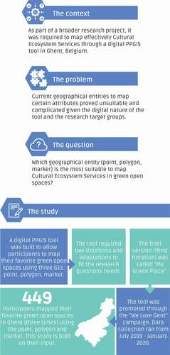
The aforementioned research questions are part of a broader research project that seeks to improve PPGIS practices and to better incorporate them in the planning and management of green open spaces. This study is one of its components (see ).
Figure 1. Infographic describing the research design.
To address research questions 1 to 4 this paper draws on the overlap counts of each GE through a combination of quadrat analysis, linear regressions, and the Akaike information criterion for each GE. For research question 5 the paper builds on the survey results and the confidence interval method to test the statistical preference of each GE by the respondents.
Methods
Data collection
For this study, the online PPGIS tool “My Green Place” was used from July 2019 to January 2020 to collect data about cultural practices in green open spaces within Ghent, a city located in the north of Belgium. To do so, a local campaign called “We Love Gent” was launched. The campaign shared a link to the tool (http://cartogis.ugent.be/mimi/welove/) with Ghent’s inhabitants via social media and e-mails. Anyone with a link could access the tool via smartphone, tablet, or computer.
Although several channels were used to approach the three target groups (teenagers, migrants, and the elderly), the university delivered most of the 449 respondents, hence the high number of teenagers and young adults in the sample (see ). Likewise, the sample also shows a majority of Belgian respondents (89%), as opposed to expat respondents (see Annex 1 in Supplementary Materials). These target groups were chosen based on discussions with local and regional planning agencies, which agreed that these were the most common groups their participation methods did not reach.
Table 1. Sample distribution by age group
“My Green Place” is a web-based PPGIS tool created with PHP that uses Leaflet JS for the maps, open street map as a background layer, and Postgres/PostGIS as a database. It runs on a virtual server in Apache, hosted by Ghent University. The layout was made using bootstrap CSS, and data can be examined via PgAdmin or QGIS.
Respondents using “My Green Place” were asked to indicate one favorite green open space at a time using all three GEs, namely, point, polygon, and marker. The order in which respondents used the three GEs was randomized to prevent any bias toward a particular GE. Once they used all three GEs to draw their one favorite place, they could move on to the second section about their activities. Respondents could select from a list of 18 different cultural practices based on the classification presented by Church et al. (Citation2014; see ).
Table 2. Distribution of the respondents’ selection of cultural practices categorized according to Church et al. (Citation2014)
After indicating the activities, respondents were asked about the attributes of the place they had marked via sliders that included, for example, pleasant view, tranquility, safety, and cleanliness. To triangulate the accuracy, respondents were asked which GE they believe to provide the most accurate representation of their input. Finally, the tool collected basic information on the respondents’ age, gender, nationality, and neighborhood.
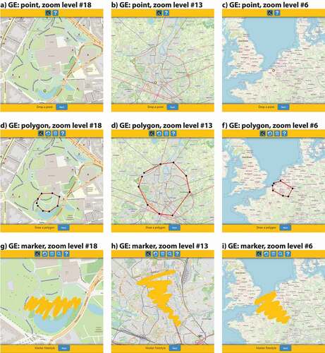
The three GEs are dependent on the zoom the respondent uses when drawing (see ). The size of points, as well as the width of the polygons’ and markers’ lines, adjust automatically based on the open streets map zoom levels and the default zooming capabilities of Leaflet. Therefore, points and lines always appear at the same size on a respondent’s screen. When retrieved from the database, the widthless marker lines must be buffered to their respective width – to reflect what each participant drew – which turns them into polygons.
Figure 2. Comparison of the dynamic adjustment and zoom levels in “My Green Place” tool of the point, polygon, and marker at different scales. Figures a)–c), d)–f), and g)–i) display each GE at a park, city, and global scale, respectively. Figures g)–i) compare the dynamic width for the marker. Figure g) shows an urban park view with great detail at zoom level #18. Figure h) shows the city scale at zoom level #13, while Figure i) shows a part of Europe at zoom level #6. In all images, the marker’s width drawn in yellow appears to be the same size regardless of the map’s scale, demonstrating the tool’s automatic adjustment.
Data analysis
To test each GE suitability for mapping CES, we compared the three data sets, namely, the aggregation of points, polygons, and markers, to a “true” representation of respondents’ favorite green open spaces per type of cultural practices. We measured each GE’s accuracy, that is, the closeness of each observation to a true value (or one accepted as true; DCDSTF, Citation1988, p. 28). Ideally, this measure of the truth would be exogenous to our measurements. However, in CES’s particular case, and considering our measurements’ localized nature, we had to rely on user-generated data. Therefore, an estimation of that “true” representation, denoted as the “collective truth,” was built using our data (Brown & Pullar, Citation2012). This collective truth approach is unlike the one used by Brown and Pullar (Citation2012) which compared points and polygons from different respondents against each other, rotating them as “the truth,” whereas our approach builds on the three GEs’ inputs, provided by each of the 449 respondents.
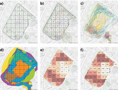
We built our spatial “collective truth” by aggregating the average of points, polygons, and markers drawn by all 449 respondents using the quadrat analysis method (QA). QA examines the spatial arrangement of point locations through a grid, counting the points occurring in various parts of an area (McGrew & Monroe, Citation2009). The procedure was relatively simple; each QA has three grids, one for each GE. When the overlap counts of each GE were obtained, they were compiled in one single spreadsheet file. The specific overlap counts for each GE per quadrat cell were averaged, providing a “collective truth” value for that particular quadrat cell (see ). Finally, QA with quantile maps and regression analyses were used to measure spatial differences between each GE’s data set and the collective truth. As all GEs contributed to our collective truth, they all demonstrated some degree of association with it. Therefore, we assessed accuracy by focusing on the differences in this association’s quality and strength.
Figure 3. Figures a)–f) show the progression of calculating the collective truth at a park scale, which is replicable in the other scales across the study. Figures a)–b) show the overlaps per quadrat cells of points and polygons (outline) within Citadelpark. Figure c) shows the marker input without width, as it comes from the database. Figure d) shows the marker input after buffering to its respective width and overlap counts per quadrat cell. Figures e)–f) show the collective truth value per quadrat cell by averaging the overlap counts of Figures a), b), and d). Figure e) shows the average number without standardization, and f) shows the standardized version.
In what follows, we explain the methodology used to answer questions 1–4 in more detail. First, we defined the analysis area, followed by a calculation of the quadrat cells’ dimensions, the aggregation of the point, polygon, and marker counts, and our approach to dealing with quadrats without any input. Subsequently, quadrats with counts in clusters were grouped onto quantile maps. Next, we measured accuracy using a simple linear regression, the Akaike information criterion (AIC), and global surface comparison.
The QA procedure overlays a regular square grid over the analysis area, counting the number of points, overlapping polygons, and markers that fall within each cell or quadrat (see Annex 2 in Supplementary Materials). Since points may denote an area beyond its x, y coordinates, authors like Brown and Pullar (Citation2012) have used a kernel density approach to analyze them. This study, however, does not make such assumptions about a point’s outer reach as they seem riskier than simply accepting the point’s limitations. Especially so since there was no direct reference from the respondent’s intent. This missing confirmation, plus the impossibility of excluding fixed attributes (e.g. bench, statue, tree), is why we limited the points’ reach to their x,y coordinates, and quadrat cells. Thus, by using the QA, the variation in the positional uncertainty of the three GEs was removed allowing a more homogeneous comparison regardless of the GEs’ variable properties and without having to recur to kernel calculations. Moreover, QA provides frequency distribution maps that can be compared to our collective truth pattern (Lee et al., Citation2001; De Smith et al., Citation2007). To obtain the optimal quadrat size, we used Griffith et al.’s (Citation1991, p. 131) formula:
where is the surface of the study area, and
is the number of points in the distribution; this leads to an ‘Ι‘ appropriate square size width:
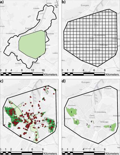
The three layers containing respondents’ points, polygons, and markers were merged into one single polygon to refine the city’s analysis area without potential bias caused by spaces with no input. This provided an analysis area of 82.44 km2 with a quadrat size of 605 m for research question 1 and 697 m for research question 2, ensuring the inclusion of each input (see ). To answer research question 3, the parks’ polygons were used as analysis areas, resulting in quadrat cell sizes of 176 m and 73 m for Blaarmeersen and Citadelpark, respectively. For research question 4, Blaarmeersen B25, and L1 pseudo-QAs, we used the park’s and lake’s polygon, respectively, as analysis area. Once each quadrat cell was calculated, and the grid was in place, each GE was spatially joined to its quadrat grid, providing its respective frequency distribution map.
Figure 4. a) Analysis area (green) in the city of Ghent. b) Analysis area with quadrat cells of 605 × 605 m. c) The total input of points, polygons, and markers within the analysis area. d) Parks across Ghent with high input clusters: 1) Bourgoyen-Ossemeersen, 2) Blaarmeersen, 3) Citadelpark, 4) Zuidpark, 5) Gentbrugse Meersen.
The three frequency distribution maps were consolidated into one layer, providing an overlap count per column for each GE. At this stage, quadrats with “absolute zeros” (AZ) were removed from subsequent analysis. AZ quadrats were never selected by any respondent using any of the GEs and are typically areas without or very little CES. To distinguish between selected and unselected quadrats, the three GEs will perform similarly for reasons that have nothing to do with their ease of use or their suitability for mapping cultural practices; rather, it is for reasons that are closely related to the nature of the area (e.g. an industrial zone is hardly marked). Therefore, to avoid such a distortion in our analysis and evaluation of the three GEs, we dropped all quadrats with AZ and focused on those marked at least once. Within this set of quadrats, we investigated whether the same or different quadrats have significant counts between the three GEs. After eliminating AZ, the collective truth was calculated through the average of each quadrat for the number of points, polygons, and markers in the analysis areas.
The GEs and collective truth scores were rescaled to lie between 0 and 1 to improve the interpretation of the consolidated frequency distribution map. The typical min-max normalization formula was used for this purpose, which kept the shape of the underlying distribution unaffected. Once the data was rescaled, we followed INSEE’s guidelines to set the quantile maps’ classes and groups (INSEE – National Institute of Statistics and Economic Studies, Citation2018). This method provides easy-to-read maps, which groups the quadrats in equal numbers per class while equally distributing the colors in the key. Moreover, it allows for the easy identification of the quadrats in the highest and lowest-rated categories. This method facilitates a direct comparison of the relative hierarchy between the quadrats produced by the three GEs. The disadvantage of using quantiles is that quadrats with the same scores for the GE and collective truth could end up in different classes. Given the variation of scores between the quadrats in our dataset, this is a minor concern (see Annex 3 in Supplementary Materials).
We kept the frequency distribution maps on the same scale with clear classes and grouping methods, which allowed us to compare each GE against the collective truth at the same level and for quadrats of the same size. This approach provided a graphical visualization of the degree of accuracy to which the points represent the collective truth per quadrat cell. The resulting table with all frequency distribution maps was then statistically analyzed.
Using simple linear regression, we determined which of the three GEs had the strongest association with the collective truth. By using the collective truth as our best estimate of the latent “true” suitability of the quadrat for CES, we were able to use the collective truth’s latent value as a benchmark to evaluate the points, polygons, and markers. In doing so, we must keep in mind there are general differences between the parks as well as differences in quadrat size when analyzing these different parks. Larger quadrats typically lead to a stronger match between the GE. Even though the quadrat size was set exogenously to the comparative analysis, such differences prevent us from running a pooled analysis on all parks combined. Therefore, for each park separately, we ran three regressions (see below), each with collective truth as the dependent variable and one of three GEs as the independent variable. We expected strong and positive correlations between collective truth and all separate GEs. Therefore, we additionally compared their relative performance by looking at each model AIC. The AIC is a scale-free indicator of the amount of information in the outcome that is lost by modeling it in different ways. Between models estimated for the same park, lower values of the AIC indicate a better fit (less information lost). Instead of looking at the R-squared values (percent variance explained), per park we thus used the AIC to develop an immediate sense of how the three GEs rank among each other in their relationship to the collective truth. If the AIC of any two models, estimated for the same park, differed by more than 10 points, the model with the lower AIC was considered significantly better (Burnham & Anderson, Citation2004). Thus, QAs’ results are only valid compared to the sets of regressions with the same quadrat size.
To address questions 2 and 4, the sample was divided into groups depending on the selected cultural practices respondents. The first group was dynamic cultural practices (D1) and included those respondents who selected one or more of the following dynamic cultural practices: biking, running, walking, and walking the dog. The second group, static cultural practices (S1), included those respondents who selected one or more of the following cultural practices: sitting, reading, relaxing, meeting with friends, picnic/BBQ, meditation, and fishing; they did not select any of cultural practices mentioned in D1. The third group, water (W1), refers to those respondents who selected one or more of the following water-related cultural practices: fishing, paddling, and swimming.
W1 was used to address question 4, and it is limited to Blaarmeersen, which was the only place in the sample with a water section and a relatively “high” point count. However, it is essential to remark that data inputs obtained in this model were limited, making them unsuitable for statistical estimations of “accuracy” or generalization to larger populations (Brown et al., Citation2014; Brown & Kyttä, Citation2014). Therefore, the analysis was of a more qualitative, explorative nature. The quadrat size in these pseudo-QAs (25x25 m) was calculated not following Griffith’s formula but a heuristic judgment based on the quantity of mapped data and a spatial scale that visually provided more nuanced frequency distribution maps. Two sets of three frequency distribution maps were created. The first was based on Blaarmeersen and its 56 respondents (B25), and the second was based only on the lake section (L1).
For the lake analysis (L1), from Blaarmeersen’s respondents (56), we removed those who were not in the lake area and those in the W1 group. Thus, the remaining respondents (27) did not select any water-related cultural practices, yet their input was within the lake boundaries. Subsequently, their polygon and marker inputs were clipped using the lake’s polygon. The outcome was then spatially joined to the grid, providing two frequency distribution maps for visual analysis. As for their tables, a segregated comparison per respondent was carried out between the polygon and marker area that fell within the lake versus the original surface. By subtracting these 29 respondents, only those who did not intend to mark the water parts remained; in so doing, we could check if their inputs fell in the water section and their surface within it (spatial error).
The fifth research question focuses on triangulating GEs’ accuracy via the respondents’ inquiry.Footnote1 We used the survey’s qualitative results to address it, in which respondents were asked which of the three GEs they believed to provide the most accurate representation of their input. We statistically tested the respondents’ preference for a particular GE through the confidence interval method.
Results
show the results of the QA. The color-coded frequency distribution maps illustrate the spatial overlap per quadrat cell for points, polygons, markers, and the collective truth. These frequency distribution maps visualize the distribution of CES across the city of Ghent according to the three different GEs. Regression tables are also provided to compare each of the GE’s R-square scores and performances versus the collective truth.
Figure 5. Standardized frequency distribution maps from a)–d) for the Ghent QA 605 m and Ghent dynamic QA 697 m from e)–f). From a) to d) and e) to h), overlap counts of points, polygons, markers, and collective truth are shown, respectively. Scale 1:200,000.
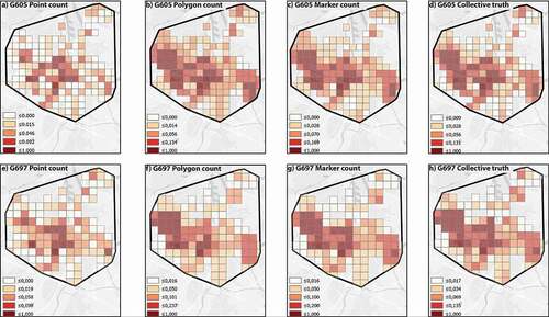
Figure 6. Standardized frequency distribution maps for the Blaarmeersen QA 176 m at 1:30,000 (up) and Citadelpark QA 73 m at 1:12,000 (down). From a) to d) and e) to h), overlap counts of points, polygons, markers, and collective truth are shown, respectively.
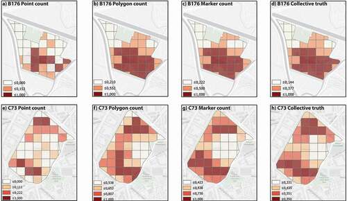
Figure 7. From a) to c), standardized frequency distribution maps for Blaarmeersen B25. d) Shows main clusters of cultural practices resulting in the marker frequency distribution map and reference to a satellite image of the park and its corresponding physical landmarks, Scale 1: 20,000.
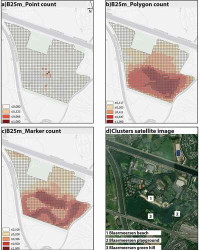
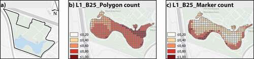
Figure 8. a) Shows reference to the lake’s position within the Blaarmeersen boundaries at scale 1: 40,000; b) and c) shows standardized frequency distribution maps for Blaarmeersen L1 at scale 1: 20,000.
RQ1: how accurately do the point, polygon, and marker map aggregated cultural practices across the city?
The 605 m QA shows a clear spatial convergence along the west (at Bourgoyen-Ossemeersen and Blaarmeersen), the center (at Citadelpark and Zuidpark), and the east (Gentbrugse Meersen) of Ghent; it highlights the main CES clusters and provides a panoramic view of the difference between each GE’s frequency distribution map (see ). Visually and statistically comparing each GE against the collective truth allowed us to figure out how accurately each of them reflects it.
At this scale, points cover the main CES’ clusters to a limited extent. This can also be verified when comparing points statistically against the collective truth. shows the results of the linear regressions of points, polygons, and markers count per quadrat on collective truth.Footnote2 First, the results show a highly significant and positive relation between collective truth and points count. The R-square indicates that points count explains 84.5% of the variation in collective truth. The results also show that between polygons and markers, the marker best captures the collective truth. These models, too, are highly significant, with substantially higher R-square values than the point count model (96.3% and 97.9% of variance explained, respectively). These models are strong since points, polygons, and markers counts were used to generate the collective truth. Therefore, we compared the models using the AIC rather than R-square (Burnham & Anderson, Citation2004). The AIC for the marker count model is the lowest, by a significant margin, compared to the polygon count model, which performs significantly better than the point count model.
Table 3. Ghent 605 m QA regressions results
RQ2: how do the nature of the cultural practices (static versus dynamic activities) affect the accuracy of these GEs?
Mapping dynamic cultural practices that entail constant displacement across green open spaces, such as running, walking, and biking, reveal the limitations of points. In such situations, two-dimensional GEs, such as the polygon or the marker, can clarify for what and how the space is used.
The second QA, Ghent 697 m, addressed this hypothesis by dividing respondents’ inputs into two categories: dynamic (D1) and static (S1). Of the 449 respondents, 339 were in the D1 group and 97 in the S1 group. Similar to the Ghent 605 m QA, the points’ frequency distribution map differ considerably from the collective truth (see ). A linear regression (see ) showed that the capability of points to reflect the collective truth for the dynamic case is slightly lower than the 605 m QA. The R-square in the dynamic case, using points, is 81.7% compared to 84.5% from the Ghent 605 m QA (see ).
Table 4. Ghent 697 m QA regressions results
Table 5. Park scale QAs regressions results
Similarly, polygons and markers also exhibit lower performance in the dynamic variety than the 605 m QA scores, looking at the R-square values. Marker performance in the dynamic case comes closest to its performance for the sample as a whole. For the models on the dynamic cultural practices, we found the same hierarchy between points, polygons, and markers as noted above; looking at AIC, the marker outperforms them all (see ).
Table 6. Segregated comparison of each respondent’s polygon and markers surface in and out of the water section
When comparing both QA regressions, points exhibit the weakest performance, and markers show the strongest performance. Since 75% of the sample is in the dynamic group, the point would score lower R-square values than the polygon and the marker.
However, if a sample was mainly composed of static cultural practices, the frequency distribution map of points, polygons, and markers should look fairly similar due to the focalization of cultural practices. This would yield smaller drawings that fall under the same quadrat cell and are not scattered across several ones, as seen with dynamic cultural practices. A QA was conducted that included the 97 respondents whose input was in the static group to provide a better understanding. Unfortunately, the amount of information was insufficient to produce an ideal quadrat size that would allow drawing any concrete inferences. Hence, the static frequency distribution maps from S1 were omitted from this study.
Both QA analyses identify CES’s main clusters and the respondents’ preference for dynamic or static cultural practices at the city scale. Nevertheless, the quadrat size is so large that it fails to provide a clearer visualization of the respondents’ input in relatively small green open spaces. This finding reveals the importance of critical sample size and scale when choosing a suitable GE for a specific CES.
RQ3: how accurately do the point, polygon, and marker map cultural practices at the park scale?
To address research question 3, we downsized the QA to the park scale, focusing on Ghent’s two parks with the highest input count, Blaarmeersen and Citadelpark (see ). Compared to the city level results (where R-square = 84.5%), the point count model for Blaarmeersen 176 m QA shows a considerably lower R-square value of 59.9%. Conversely, the polygon and the marker models continue to have high R-square values (97.7% and 98.3%, respectively), comparable to the city’s level performance. The AIC for the Blaarmeersen marker count model is the lowest, by a small but significant margin, compared to the polygon model.
The point model AIC is substantially larger, indicating a lower quality of fit. Citadelpark 73 m QA showed a similar pattern compared to the city level models as the R-square values for the points are substantially lower. In contrast, the R-square values for the polygon and marker models are also lower but by a much smaller extent (87.7% and 90.3%). Likewise, in a previous QA, the marker’s AIC was again the lowest, followed closely by the polygons’ AIC and with the points’ AIC, the highest loss of information. Thus, we can conclude that the marker best captures the collective truth.
Based on these results, it can be argued that the marker best captures the collective truth at both the city (see RQ1) and the park scale (see RQ3), even though at the park level, the polygon performance is quite close. Conversely, the point model exhibits the most substantial information loss out of the three, particularly at the park level. Therefore, we may also conclude that the relative ranking of point, polygon, and marker, as reported in this analysis, does not depend on whether we consider the whole of Ghent or these specific parks and whether we specifically focus on dynamic cultural practices.
RQ4: which GE has the highest spatial error?
A smaller quadrat cell provides detail on the differences and similarities between polygons and markers that the larger quadrat cells did not capture due to the sample size limitations. Blaarmeersen B25 shows that when respondents use the polygon, the drawn area tends to be more extensive and less defined than with the marker (see ). Although the polygon’s frequency distribution map shows that the lake is an important cluster of cultural practices, the coarse image it delivers makes it impossible to determine if these cultural practices happen within the lake (water-related cultural practices) or around the lake (dynamic or static inland cultural practices).
However, when looking at the marker frequency distribution map, there are three clear areas where respondents’ cultural practices take place: north of the water body (1), east of the water (2), and south of the water body (3); it does not show that they take place within the water, as suggested by the polygon frequency distribution map. These frequency distribution maps show that the marker provides a more nuanced image of the responses than the polygon. Additionally, it draws attention to the high flux of cultural practices around the body of water, which presents a unique opportunity to check the spatial error through the L1 model.
Blaarmeersen L1 (see ) contains input from 27 respondents whose polygons and marker drawings covered different water surface areas despite having not selected any direct water-related cultural practices. These potential activities are the remaining 15 in , once fishing, paddling, and swimming are removed. Both polygon and marker drawings from 16 out of the 27 respondents covered water sections. Four out of the 27 covered water sections with markers only, and one with the polygon. From those who marked the water section with both GEs, 14 out of 16 times, the polygon surface was larger than the marker. Globally, the total surface of polygon and markers on the water section was 1.72 km2 and 0.72 km2, respectively.
Likewise, the average percentage of the entire surface of polygons and markers on the water section is 45.38% and 22.43%, respectively. This result indicates an almost 50% reduction in spatial error when mapping with the marker rather than the polygon (see ).
The quality of the mapping environment, which in the case of online PPGIS tools can be translated to the used device, in addition to the respondents’ map literacy, directly affects the respondent’s preference and handling of different GEs. A GE that is easier to use can make respondents feel more comfortable while drawing, thereby providing more accurate mapping. Conversely, a less intuitive and more difficult GE might cause respondents to draw less accurately and yield different spatial results across GEs.
Based on this assumption, we not only compared respondents’ input in the L1 model against a physical element, such as the lake, but we also compared the aggregated polygon and marker surfaces from the Ghent, Blaarmeersen, and Citadelpark QA (see ). Through the three scales, the polygons’ surfaces are consistently larger than the markers, with a difference ranging from 22% to 37%.
Table 7. Comparison of aggregated areas of polygons and markers at different scales
RQ5: which GE do respondents believe provides the most accurate representation of their input?
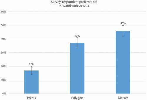
The tool asked respondents which GE allowed them to best represent the input of their favorite green open space. The results are summarized according to age group in and through the confidence interval method in . shows that even though points are the easiest GE for respondents to use, they were the least popular for all ages (N = 76, 17%). Overall, the marker was the preferred GE (N = 206, or 46%), followed by the polygon (N = 167, or 37%). The difference between the three GEs is significant at the 90% confidence level.
Table 8. Survey results per age group to the question “Which GE allowed you to best represent the input of your favorite green open space?.”
Figure 9. Respondents’ preferred GE, in percentages of the total response. Error bars represent a 90% confidence interval.
Discussion
This study found that the marker is a more suitable GE for mapping CES than the point and the polygon. It systematically compared and analyzed three GEs (point, polygon, and marker), two types of cultural practices (static versus dynamic), and two scales of analysis (city and park) using QA, regressions, and a confidence interval method. The study improves our understanding of geographic information analysis and the use of maps that were created through online PPGIS tools such as “My Green Place.”
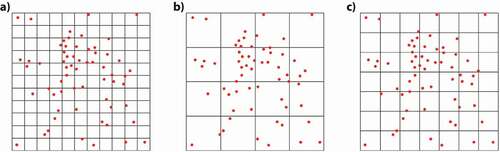
In the QA analysis, points exhibit the weakest performance for reflecting the collective truth, especially for dynamic cultural practices (low R-square and high AIC values). Although they are generally easy for respondents to use, they were the least preferred GE across all age groups. Nonetheless, points might be suitable if they are meant to provide a general identification of clusters or if the focus is on static cultural practices. If research focuses on analyzing static cultural practices, the sample size may need to be relatively larger to achieve “spatial convergence” compared to one based on polygons (Brown & Pullar, Citation2012). This need for a larger sample aligns with the collective intelligence concept (and collective truth), in which the quality of the end map is related to the number of respondents; the more respondents and contributors, the better the product (Haklay et al., Citation2010; Lévy, Citation1997; O’Reilly, Citation2005). This sample aspect is particularly relevant for the QA and quadrat size calculation (Griffith et al., Citation1991, p. 131). If the relation between the number of points and the analysis area is disproportionate in the formula, it can lead to the modifiable area unit problem (MAUP) (Mitchell, Citation2005). Fewer points equal large quadrat sizes, and thus many cells can result with equal or similar counts, whereas many points equal small cells leading to many cells containing no points (see ).
Figure 10. a) Many quadrats contain no points. b) Quadrats have close to the same number of points. c) Quadrats are large enough, so many contain at least one point but small enough to provide a range in the number of points per quadrat cell.
The sample’s constitution and size are critical for the QA but also for the overall results of the study, given its digital nature. Its distribution across age groups is strongly linked to aspects like computer literacy and dexterity. Especially since one could argue that the predominance of teenagers and young adults in the sample could skew the GEs’ preference results because they are more computer literate than the other groups (Roman, Citation2017).
Our findings also suggest that if the goal is to analyze how that hotspot is being used comprehensively, the polygon and the marker are better suited and provide a more fine-scale analysis of CES, especially with dynamic cultural practices. While it is evident that the polygon and marker yield similar frequency distribution maps, the marker’s frequency distribution maps provide a more nuanced image than the polygon’s. In contrast, the polygon’s bulkiness produces coarse features that are less accurate and more extensive than the marker’s. This contrast may depend more on respondents’ skills to use the tool and its interface (thus their accuracy and ability to represent what they mean) instead of the polygon’s inherent properties. For example, one could argue that a map and computer literate respondent could provide highly detailed input with the polygon and the marker. However, based on our sample and the tool’s user-friendliness, we argue that the marker is an easier GE for mapping CES across all age groups, leading to a more homogeneous data quality.
This study showed that when zooming into the park scale, the respondents’ polygons repeatedly included water sections, even when their cultural practices were not water-related. This explorative section, although limited, offers insight into the potential of analyzing spatial error against landscape features as means of positional accuracy in online PPGIS tools such as “My Green Place.” Unfortunately, this deeper test of positional accuracy could not be covered in this study due to limited data at the park scale, but it certainly deserves further examination.
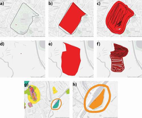
Though the marker compensates for certain limitations of the polygon, there are still some tradeoffs. While the polygon is at risk of spatial error due to coarser shapes that extend beyond the respondents’ intent, the marker faces the opposite issue. The way respondents draw can lead to incorrect assumptions when they mark the entire area by drawing a perimeter without filling it in. In the previous iterations of “My Green Place,” we identified this problem and tried to address it in the Ghent version by providing additional instructions to the respondents. Before they started mapping, we asked them (through an instructional video) to paint all the areas they visited or liked. We also added a message on the screen while people were using the marker, reminding them that they should leave paint voids only if they intended to. However, even with these precautions and reminders, some people only drew a circumference. In these cases, we had to assume that the voids were intentional (see ).
Figure 11. Figures a)–c) and d)–f) show the input of the point, polygons, and markers of respondents ID_282 and ID_390, respectively. In both series, respondents’ marker input (Figures c) and f)) was drawn with a perimeter and its respective fill. The black lines in both figures show the motion that resulted in the red marker drawing. Figure g) shows the marker input of several respondents and an example of a participant who only drew a circumference (orange) without fill. Figure h) shows the point, polygon, and marker input provided by the same participant in Figure g) to contrast how they covered the whole park surface with the polygon instead of only the circumference with the marker.
shows a close-up example, and while the data was insufficient to draw any conclusions, their mapped attributes were consistent with running and walking activities. This case would benefit from further research that uses the collective truth and swarm intelligence to compare perimeter doodles vs. filled doodles.
Figure 12. Marker input of three different respondents (purple, orange, green) in a perimeter-like fashion around the Watersportbaan. Watersportsbaan is a rowing lane in the west of Ghent, indicated with a black dashed line and a blue fill. [two-column].
![Figure 12. Marker input of three different respondents (purple, orange, green) in a perimeter-like fashion around the Watersportbaan. Watersportsbaan is a rowing lane in the west of Ghent, indicated with a black dashed line and a blue fill. [two-column].](/cms/asset/a748555e-8e6d-4ac5-9942-4b0d1f291553/tcag_a_1949392_f0012_c.jpg)
Regarding data collection efforts across GEs, they vary. With polygons, fewer are needed to draw conclusions; however, they entail a considerable data collection effort (Brown & Pullar, Citation2012). In addition, using polygons tends to be more complicated for respondents with limited computer/map literacy. In such scenarios, it is common that sessions include “face-to-face” interactions, such as structured interviews, group-administered surveys, or workshops, where the researcher helps the respondent maintain inherent spatial errors to a minimum (Brown & Pullar, Citation2012; Gottwald et al., Citation2016).
Until recently, data collection has mostly relied on points and, to a lesser extent, polygons (Brown & Fagerholm, Citation2015). Brown and Pullar argued that “points and polygons will necessarily be the two primary GEs for collecting PPGIS attributes” (Brown & Pullar, Citation2012, p. 13). Based on our results, however, we identified a third practical GE alternative: the marker. While all GEs exhibit tradeoffs between user-friendliness and mapping accuracy, the marker offers a middle ground between the point’s and polygon’s capabilities and limitations, making it a solid GE alternative for mapping CES. It appears to be relatively user-friendly. It is not as simple as dropping a point, but it is far less complex than drawing a polygon. It offers an easier and more intuitive alternative for abstract and simplified attributes that conveys cultural practices’ essential qualities more effectively than a point. Furthermore, the marker was overall the GE chosen by most respondents as the one that best represented their input.
In contrast to the nonlinear relationship between the number of contributors and the quality of data found by Brown (Citation2012, p. 15) and Haklay et al. (Citation2010), our exploratory research on the water section suggests a positive relationship between marker observations and more nuanced images of mapped spaces and attributes. However, our data is limited; therefore, further research with a larger sample is required to clarify these two factors’ relationship. Conversely to Brown’s (Citation2012) alternation of truth between points and polygons, in this study, we built a baseline truth (collective truth) drawn from the triple input of each of the 449 respondents. This allowed us to compare the variations in accuracy and representation of the three GEs with a higher degree of confidence than Brown’s Montecarlo simulation which drew on GEs provided by different respondents.
We acknowledge that the concept of collective truth is far from perfect, especially since there is the risk of correlation among its components. An ideal way to compensate for this risk would be to have a collective truth based entirely on exogenous information. However, given the available data within this study, this was not possible. Therefore, we suggest further research to focus on gathering data to create a collective truth based on exogenous information.
While the truth itself is a critical element in mapping and cartographic representation, Godfrey and Mackaness (Citation2017) has argued that recognition and meaning can have a greater influence on spatial representations’ effectiveness than factors like distortion and accuracy. Researchers that focus on mapping human or societal values like CES through PPGIS should not seek an absolute objective truth since CES are “a collection of human cultural perceptions,” and as such, they are inherently subjective.
Brown (Citation2012), Spielman (Citation2014), Brown et al. (Citation2015), and Czepkiewicz et al. (Citation2017) agreed that for certain spatial attributes collected with PPGIS, such as environmental quality perceptions, positional accuracy might not be critical for integrating the outcomes within planning processes. This suggested subordination of positional accuracy is also in line with McCall and Dunn (Citation2012), who argue that holding inherently subjective data to quality standards used for traditional spatial data might not be beneficial.
Conclusions
In this study, we examined the suitability of GEs to map CES. We compared the point, polygon, and marker in terms of accuracy and respondents’ preference. After examining the input of 449 respondents in Ghent’s green open spaces, our quadrat and statistical analyses concluded that the point in our tool performed the weakest in reflecting the collective truth while the polygon and the marker did so better. The marker always showed consistent advantage across all models, especially when mapping dynamic cultural practices. Although previous literature suggested the point and, to a lesser degree, the polygon as preferred GEs to map CES, our study demonstrates that the marker is a suitable candidate – even preferable – to map CES with the potential to compensate the gaps points and polygons face. The marker may not be as easy as a point, but it is easier than a polygon while retaining a richer level of information that the point cannot provide. Moreover, further research should consider more extensive and more representative samples across all age groups to test all three GEs’ performance better, explore methodologies beyond the QA, and the possibility of a collective truth based on exogenous information. Lastly, we suggest future studies explore the marker’s filled doodles versus only perimeters dilemma to better understand the maker’s behavior.
As technological developments keep making GIS more accessible to the masses, the potential for online PPGIS continues to grow, and with it, the need for better options to collect spatial information. The marker in this study offers an alternative to the current options but is not a panacea for PPGIS or CES mapping, and its selection as a GE should always be at the researcher’s discretion. Selecting a GE will always come with trade-offs, and it is the researcher’s task to choose the most acceptable one within the research context.
Data and codes availability statement
The data that supports the findings of this study is openly available in Zenodo at the following link: 10.5281/zenodo.4347404
Supplemental Material
Download PDF (7.9 MB)Acknowledgments
We, the authors, would like to thank Mr. Bart de Wit for his invaluable help in coding the tool that was the centerpiece of this study.
Disclosure statement
No potential conflict of interest was reported by the author(s).
Supplemental data
Supplemental data for this article can be accessed here.
Correction Statement
This article has been republished with minor changes. These changes do not impact the academic content of the article.
Additional information
Funding
Notes
1. In the social sciences, triangulation refers to the application and combination of several research methods in the study of the same phenomenon; do not confuse it with GIS triangulation.
2. Note that in this regression, the original scores rather than the rescaled ones were applied. This did not affect the results for the R-square and AIC.
References
- Atzmanstorfer, K., Resl, R., Eitzinger, A., & Izurieta, X. (2014). The GeoCitizen-approach: Community-based spatial planning - An Ecuadorian case study. Cartography and Geographic Information Science, 41(3), 248–259. https://doi.org/https://doi.org/10.1080/15230406.2014.890546
- Bertamini, M., Palumbo, L., Gheorghes, T. N., & Galatsidas, M. (2016). Do observers like curvature or do they dislike angularity? British Journal of Psychology, 107(1), 154–178. https://doi.org/https://doi.org/10.1111/bjop.12132
- Brown, G. (2012). An empirical evaluation of the spatial accuracy of public participation GIS (PPGIS) data. Applied Geography, 34, 289–294. https://doi.org/https://doi.org/10.1016/j.apgeog.2011.12.004
- Brown, G., Donovan, S., Pullar, D., Pocewicz, A., Toohey, R., & Ballesteros-Lopez, R. (2014). An empirical evaluation of workshop versus survey PPGIS methods. Applied Geography, 48, 42–51. https://doi.org/https://doi.org/10.1016/j.apgeog.2014.01.008
- Brown, G., & Fagerholm, N. (2015). Empirical PPGIS/PGIS mapping of ecosystem services: A review and evaluation. Ecosystem Services, 13, 119–133. https://doi.org/https://doi.org/10.1016/j.ecoser.2014.10.007
- Brown, G., & Kyttä, M. (2014). Key issues and research priorities for public participation GIS (PPGIS): A synthesis based on empirical research. Applied Geography, 46, 122–136. https://doi.org/https://doi.org/10.1016/j.apgeog.2013.11.004
- Brown, G., & Pullar, D. V. (2012). An evaluation of the use of points versus polygons in public participation geographic information systems using quasi-experimental design and Monte Carlo simulation. International Journal of Geographical Information Science, 26(2), 231–246. https://doi.org/https://doi.org/10.1080/13658816.2011.585139
- Brown, G., & Reed, P. (2000). Validation of a forest values typology for use in national forest planning. Forest Science, 46(2), 240–247. https://doi.org/https://doi.org/10.1093/forestscience/46.2.240
- Brown, G., & Reed, P. (2009). Public participation GIS: A new method for national park planning. Landscape and Urban Planning, 55(2), 166–182. https://doi.org/https://doi.org/10.1016/j.landurbplan.2011.03.003
- Brown, G., Weber, D., & De Bie, K. (2015). Land use policy is PPGIS good enough? An empirical evaluation of the quality of PPGIS crowd-sourced spatial data for conservation planning. Land Use Policy, 43, 228–238. https://doi.org/https://doi.org/10.1016/j.landusepol.2014.11.014
- Bundesministerium für Umwelt Naturschutz Bau und Reaktorsicherheit (BMUB). (2015). Grün in der Stadt − Für eine lebenswerte Zukunft. BMUB. https://bit.ly/2NsZ8qA
- Burnham, K. P., & Anderson, D. R. (2004). Multimodel inference: Understanding AIC and BIC in model selection. Sociological Methods and Research, 33(2), 261–304. https://doi.org/https://doi.org/10.1177/0049124104268644
- Cheng, X., Van Damme, S., Li, L., & Uyttenhove, P. (2019). Evaluation of cultural ecosystem services: A review of methods. Ecosystem Services, 37(June2018), 100925. https://doi.org/https://doi.org/10.1016/j.ecoser.2019.100925
- Chilton, S. (2020). Neocartography and OpenStreetMap. In A. J. Kent & P. Vujakovic (Eds.), The Routledge handbook of mapping and cartography (1st ed., pp. 618). Routledge. https://bit.ly/3bN7sut
- Church, A., Fish, R., & Haines-Young, R. (2014). UK national ecosystem assessment follow-on. Work package Report 5: Cultural ecosystem services and indicators. UNEP-WCMC, LWEC, UK.
- Corbett, J., & Cochrane, L. (2020). Geospatial Web, participatory. In International encyclopedia of human geography (Vol. 6, 2nd ed., pp. 131–136). Elsevier. https://doi.org/https://doi.org/10.1016/b978-0-08-102295-5.10604-3
- Cotter, K. N., Silvia, P. J., Bertamini, M., Palumbo, L., & Vartanian, O. (2017). Curve appeal: Exploring individual differences in preference for curved versus angular objects. I-Perception, 8(2), 1–17. https://doi.org/https://doi.org/10.1177/2041669517693023
- Czepkiewicz, M., Jankowski, P., & Młodkowski, M. (2017). Geo-questionnaires in urban planning: Recruitment methods, participant engagement, and data quality. Cartography and Geographic Information Science, 44(6), 551–567. https://doi.org/https://doi.org/10.1080/15230406.2016.1230520
- Darejeh, A., & Singh, D. (2013). A review on user interface design principles to increase software usability for users with less computer literacy. Journal of Computer Science, 9(11), 1443–1450. https://doi.org/https://doi.org/10.3844/jcssp.2013.1443.1450
- DCDSTF. (1988). Definitions and references. The American Cartographer, 15(1), 21–31. https://doi.org/https://doi.org/10.1559/152304088783887134
- De Smith, M. J., Goodchild, M. F., & Longley, P. (2007). Quadrat sampling and analysis. In Geospatial analysis: A comprehensive guide to principles, techniques and software tools ( illustrate, pp. 394.). Troubador Publishing Ltd. https://bit.ly/3eWsyJ5
- Evans, A. J., & Waters, T. (2003). Tools for web-based GIS mapping of a “fuzzy” vernacular geography. Proceedings of the 7th international conference on GeoComputation. https://bit.ly/3rO3JT0
- Findlater, L., Froehlich, J. E., Fattal, K., Wobbrock, J. O., & Dastyar, T. (2013). Age - Related differences in performance with touchscreens compared to traditional mouse input (pp. 343–346). Human Factors in Computing Systems. https://doi.org/https://doi.org/10.1145/2470654.2470703
- Gliozzo, G. (2018). Leveraging the value of crowdsourced geographic information to detect cultural ecosystem services. (Issue January). University College London. https://bit.ly/3qSdcrl
- Godfrey, L., & Mackaness, W. (2017). The bounds of distortion: Truth, meaning and efficacy in digital geographic representation. International Journal of Cartography, 3(1), 31–44. https://doi.org/https://doi.org/10.1080/23729333.2017.1301348
- Gómez-Baggethun, E., Barton, D. N., Berry, P., Dunford, R., & Harrison, P. A. (2018). Concepts and methods in ecosystem services valuation. In M. Potschin, R. Haines-Young, R. Fish and R. K. Turner (Eds), Routledge handbook of ecosystem services (pp. 99–111). Routledge. https://doi.org/https://doi.org/10.4324/9781315775302-9
- Gottwald, S., Laatikainen, T. E., & Kyttä, M. (2016). Exploring the usability of PPGIS among older adults: Challenges and opportunities. International Journal of Geographical Information Science, 30(12), 2321–2338. https://doi.org/https://doi.org/10.1080/13658816.2016.1170837
- Griffith, D. A., Amrhein, C. G., & Desloges, J. R. (1991). Statistical analysis for geographers (1st ed.). Prentice Hall. https://amzn.to/2OVGBDx
- Haines-Young, R., & Potschin, M. (2018, January). CICES V5. 1. Guidance on the application of the revised structure. Fabis consulting (pp. 53).
- Haklay, M., (Muki), Basiouka, S., Antoniou, V., & Ather, A. (2010). How many volunteers does it take to map an area well? The validity of Linus’ law to volunteered geographic information. The Cartographic Journal, 47(4), 315–322. https://doi.org/https://doi.org/10.1179/000870410X12911304958827
- Huck, J. J., Whyatt, J. D., & Coulton, P. (2014). Spraycan: A PPGIS for capturing imprecise notions of place. Applied Geography, 55, 229–237. https://doi.org/https://doi.org/10.1016/j.apgeog.2014.09.007
- Hussain, I., Khan, I. A., Khan, I. A., & Hussain, S. S. (2017). A survey on usage of touchscreen versus mouse for interaction. Journal: The Science International (Lahore) 29(1), 83–88. http://www.sci-int.com/pdf/636433916377569179.pdf
- ICT Update. (2005, September). Participatory GIS. CTA Technical Centre for Agricultural and Rural Cooperation (ACP-EU) (pp. 1–8). https://bit.ly/3qSeVNg
- INSEE - National Institute of Statistics and Economic Studies. (2018). Handbook of spatial analysis: Theory and practical application with R. (Issue October). European Statistical Programme.
- Jaligot, R., Kemajou, A., & Chenal, J. (2018). Cultural ecosystem services provision in response to urbanization in Cameroon. Land Use Policy, 79(March), 641–649. https://doi.org/https://doi.org/10.1016/j.landusepol.2018.09.013
- Jensen, J. R., & Jensen, R. R. (2013). Introductory geographic information systems (Illustrate). Pearson. https://bit.ly/3eIxb9f
- Kelemen, E., García-Llorente, M., Pataki, G., Martín-López, B., & Gómez-Baggethun, E. (2016). Non-monetary techniques for the valuation of ecosystem services. In M. Potschin-Young (Ed), OpenNESS ecosystem services reference book (pp. 1–5). ECNC-European Centre for Nature Conservation. http://www.openness-project.eu/library/reference-book/sp-ecosystem-service-trade-offs-and-synergies
- Lee, J., & Wong, D. W. S. (2001). Pattern detectors. In Wiley (Ed.), Statistical analysis with ArcView GIS (pp. 208). Wiley. https://bit.ly/3liWDDJ
- Lévy, P. (1997). Collective intelligence: Mankind’s emerging world in cyberspace. Plenum Trade. https://www.worldcat.org/title/collective-intelligence-mankinds-emerging-world-in-cyberspace/oclc/37195391
- McCall, M. K., & Dunn, C. E. (2012). Geo-information tools for participatory spatial planning: Fulfilling the criteria for “good” governance? Geoforum, 43(1), 81–94. https://doi.org/https://doi.org/10.1016/j.geoforum.2011.07.007
- McCall, M. K., Martinez, J., & Verplanke, J. (2015). Shifting boundaries of volunteered geographic information systems and modalities: Learning from PGIS. Acme, 14(3), 791–826. https://acme-journal.org/index.php/acme/article/view/1234
- McGrew, C. J., Jr., & Monroe, C. B. (2009). An introduction to statistical problem solving in geography: Second edition (2nd ed.). Waveland Press.
- Milcu, A. I., Hanspach, J., Abson, D., & Fischer, J. (2013). Cultural ecosystem services: A literature review and Prospects For Future Research. Ecology and Society, 18(3), art44. https://doi.org/https://doi.org/10.5751/ES-05790-180344
- Mitchell, A. (2005). Identifying patterns. In The ESRI guide to GIS analysis, Volume 2: Spatial measurements and statistics (pp. 252). https://esripress.esri.com/display/index.cfm?fuseaction=display&websiteID=86&moduleID=1
- Nielsen, J. (2003). Usability 101: Introduction to usability. Nielsen Norman Group. https://bit.ly/3rObGHQ
- O’Reilly, T. (2005). Design patterns and business models for the Next Generation of Software. https://bit.ly/3bR7u4H
- Pánek, J. (2016). From mental maps to GeoParticipation. The Cartographic Journal, 53(4), 300–307. https://doi.org/https://doi.org/10.1080/00087041.2016.1243862
- Poole, P. (1995). Land-based communities, geomatics and biodiversity conservation. Cultural Survival Quarterly, 18(4), 1–4. https://bit.ly/3eRhywa
- Rambaldi, G. (2010). Participatory Three-dimensional modelling: Guiding principles and applications. In ACP-EU technical centre for agricultural and rural cooperation (CTA) (2010th ed., Issue January 2010, pp. 26–46). ACP-EU Technical Centre for Agricultural and Rural Cooperation (CTA). https://bit.ly/38NdkCe
- Roman, S. (2017). Millennials are tech savvy. Gen Z’s are tech native. Top Employers Institute. https://www.top-employers.com/en/insights-old/millennials-are-tech-savvy-gen-zs-are-tech-native-shaara-roman/
- Schroeder, P. (1996). Criteria for the Design of a GIS2. In National Center for Geographic Information and Analysis (NCGIA). https://doi.org/https://doi.org/10.1016/B978-008044910-4.00694-5
- Sieber, R. (2006). Public participation geographic information systems: A literature review and framework. Annals of the Association of American Geographers, 96(3), 491–507. https://doi.org/https://doi.org/10.1111/j.1467-8306.2006.00702.x
- Spielman, S. E. (2014). Spatial collective intelligence? Credibility, accuracy, and volunteered geographic information. Cartography and Geographic Information Science, 41(2), 37–41. https://doi.org/https://doi.org/10.1080/15230406.2013.874200
- Statista. (2020). Market share of mobile phone touch screens worldwide from 2013 to 2020. Statista Inc. https://bit.ly/3cyXTP3
- The Belgian statistical office (STATBEL). (2021). Population by place of residence, nationality. STATBEL. https://bestat.statbel.fgov.be/bestat/crosstable.xhtml?view=3ebe4ddc-27e6-4d3d-a6c0-3121df828953