
 ?Mathematical formulae have been encoded as MathML and are displayed in this HTML version using MathJax in order to improve their display. Uncheck the box to turn MathJax off. This feature requires Javascript. Click on a formula to zoom.
ABSTRACT
Dashboards are an increasingly popular form of data visualization. Large, complex, and dynamic mobility data present a number of challenges in dashboard design. The overall aim for dashboard design is to improve information communication and decision making, though big mobility data in particular require considering privacy alongside size and complexity. Taking these issues into account, a gap remains between wrangling mobility data and developing meaningful dashboard output. Therefore, there is a need for a framework that bridges this gap to support the mobility dashboard development and design process. In this paper we outline a conceptual framework for mobility data dashboards that provides guidance for the development process while considering mobility data structure, volume, complexity, varied application contexts, and privacy constraints. We illustrate the proposed framework’s components and process using example mobility dashboards with varied inputs, end-users and objectives. Overall, the framework offers a basis for developers to understand how informational displays of big mobility data are determined by end-user needs as well as the types of data selection, transformation, and display available to particular mobility datasets.
Key policy highlights
Defines essential components of big mobility dashboards for stakeholders to understand key considerations and data management/pre-processing needs
Clarifies the differences between dashboards and visual analytics applications
Provides guidance for gathering information from end-users to ensure displays are fit-for-purpose
Illustrates the application of the conceptual framework for dashboard design by discussing several examples of mobility data dashboards
Introduction
Large volumes of individual mobility data have become available with the advent and prevalence of location aware technologies in recent years. While providing unprecedented detail about the ways that people and vehicles move through space, the nature of mobility data combined with their volume present a number of visualization challenges. Displaying massive mobility data quickly becomes visually overwhelming, thus making it difficult to understand patterns and behaviors and make informed decisions.
Dashboards have become a popular form of data visualization and interaction in a variety of domains including healthcare, community organizations, urban informatics, business, and education (Kitchin & McArdle, Citation2017; Li et al., Citation2020; Rivard & Cogswell, Citation2004; Sarikaya et al., Citation2018). The overall aim in deploying dashboards is to improve information comprehension and decision making, while synthesizing large or disparate data types and sources (Few, Citation2013). However, there is a gap between large and disparate data inputs and an effective dashboard output. Facing complex mobility data, developing a dashboard involves more than visualizing data with existing methods. Many additional aspects need to be considered, such as data type, volume, frequency of updates, the dashboard’s purpose, and intended user base (Li et al., Citation2020; Stehle & Kitchin, Citation2020). Thus, bridging the gap between data inputs and usable dashboard outputs requires an analytical and systematic framework to guide dashboard development and design.
Dashboard design is data- and task-dependent; in light of the challenges and opportunities associated with mobility data, we set out to address issues related to dashboard design in a mobility data context. To this end, we outline a conceptual framework for developing and designing dashboards for mobility data, and illustrate the use of the conceptual framework in six examples of dashboard applications. More specifically, our scientific contributions include: 1) We delineate the key differences between visual analytics and dashboards; 2) we clearly define developer versus user roles, including inputs required from user and domain experts, in the dashboard context; and 3) the proposed framework provides recommendations for the data selection, transformation, comparison, visualization, and assembling process, while considering the specific structure and properties of mobility data that require specific kinds of processing and specific ways of presentation to users.
Background
A dashboard is a visual display that combines elements such as graphs, charts, text, maps, icons, and other images to provide visual information that can be interpreted and comprehended quickly to facilitate understanding (Few, Citation2013; Stehle & Kitchin, Citation2020; Wexler et al., Citation2017). When displaying geographic data, dashboards are often map-based, making use of the web mapping technologies (mainly web map APIs) (P. Fu, Citation2022). Overall, dashboard design is a function of the data that are displayed as well as its intended use in terms of both purpose and user base (Pappas & Whitman, Citation2011; Young & Kitchin, Citation2020; Young et al., Citation2021). Visual dashboards are comprised of elements arranged to provide a simple view of data and information, and thus provide the least levels of interaction, while functional dashboards incorporate interactive and dynamic or real-time data elements (Sarikaya et al., Citation2018). Functional dashboards provide decision-support and are classed as strategic, analytical, or operational, though these categories are not mutually exclusive within a single dashboard (Few, Citation2013; Sarikaya et al., Citation2018). Dashboard design varies within these classes in terms of their associated timeframe, graphic elements and presentation, user interactivity, and update frequency (Pappas & Whitman, Citation2011). Dashboard users’ experience should be considered in terms of both their domain knowledge (i.e. novice or general knowledge through expert) and literacy for evaluating visual elements; low experience and literacy require basic visualizations while increased experience and comprehension can take advantage of increasingly complex figures and interactions (Sarikaya et al., Citation2018; Young et al., Citation2021).
Despite widespread use of dashboards in practice, dashboard design still remains subject to a variety of challenges – many of them common to visualization in general. Some recurring problems in dashboard design are issues relating to poor use of space, superfluous, or conversely, insufficient information, and unaesthetic visual elements (Few, Citation2013). There are also concerns that dashboards may actually limit interpretation and decision-making because they present fixed information that is perceived as being comprehensive and trustworthy, thus requiring considerations for end-user flexibility (Sarikaya et al., Citation2018).
Mobility analytics is one area that stands to benefit from dashboard development. The ubiquity of positioning technologies, including personal devices and smartphones with GPS receivers, has led to an abundance of detailed mobility data for both animate objects such as humans and animals, as well as inanimate moving objects such as vehicles. The broader interest or task in analyzing mobility data is understanding or predicting movement and mobility patterns and behaviors (N. Andrienko & Andrienko, Citation2013). With a focus on human movement, examining how people move within built- and natural environments is relevant to a variety of disciplines concerned with the day-to-day activities that people carry out (e.g. work, shopping, recreation) and many typical use-cases of mobility data visual analytics relate to transportation, including vehicle movement, bicycles, and pedestrians within routes or transport systems and other interactions with built- and natural environments. It is possible to visualize smaller sets of trajectories as collective individual lines or density estimates of trajectory bundles, e.g. in space-time cubes (Demšar & Virrantaus, Citation2010), though large and complex movement data become visually overwhelming, and visualization alone is insufficient for making inferences about movement behaviors or patterns (N. Andrienko & Andrienko, Citation2013). While the problem of large data volumes and overwhelming visual displays has been addressed by work in visual analytics, dashboards require additional consideration in developing at-a-glance views that highlight relevant mobility results. For instance, Haranwala et al. (Citation2022) present a dashboard-like tool that supports the selection and parameterization of appropriate pre-processing techniques for mobility trajectory data. Further to data volume issues, displays of individual movement are often impacted by privacy concerns wherein individuals or sensitive locations might be identified (N. Andrienko et al., Citation2016; Chou et al., Citation2019), which indicates that mobility data inputs must be processed before being made available to dashboard users.
Differentiating dashboards and visual analytics systems
Both visual analytics (VA) and dashboards facilitate analytical reasoning and decision-making by simplifying problems and communicating results visually. However, a dashboard display differs from a VA platform along three key aspects (). The first key difference is the input data that underlie the visualization and information display outputs. VA platforms are information processing systems that can handle raw, unprocessed, and unstructured data from heterogeneous sources, whereas dashboards provide a user interface that is based on data that are often already standardized (i.e. cleaned and integrated) and transformed (e.g. aggregated, or re-aligned into a data cube) for display. Data handling and wrangling are therefore part of the VA pipeline, whereas those tasks precede dashboard interaction and are not directly performed by the end-user.
Figure 1. Comparison of visual analytics platforms and dashboards in the three key dimensions: input data, analytical complexity, and user interaction for output display.
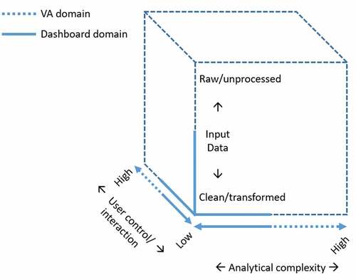
The second key difference between VA and dashboards relates to their analytical complexity. The tools and analytical processes that produce insights from large, complex datasets lie specifically within the VA domain and outside the scope of typical dashboard applications, which focus on informational displays rather than analyzing and manipulating input data. At the broadest level, VA provides analytical tools to uncover deep and complex insights that reveal new knowledge and facilitating analytical reasoning is one of the key features of VA (Keim et al., Citation2008). These tools and analytical procedures involve complex activities, including in-depth analysis and data mining, that reveal the unknowns and new knowledge as an iterative or looping process. Dashboards, on the other hand, often do not employ analytical tools beyond selection, filtering, and comparison as part of a visual display (Few, Citation2013; Kitchin & McArdle, Citation2017; Stehle & Kitchin, Citation2020). It is essential to make the related distinction that VA platforms allow users to set their own workflow and logic to answer questions and generate specific knowledge outputs at the data and analytical level, whereas dashboards are typically restricted to established objectives (e.g. monitoring a process) and displaying predefined knowledge outputs (i.e. results). As mentioned, data wrangling tasks such as cleaning and transformation underlie dashboard displays but are not part of their purpose and user interface; the distinguishing task for VA is therefore data analytics as a primary and iterative process that exploits the system to examine the data more deeply for knowledge discovery and hypothesis testing. Within the movement data context, VA could handle exploratory and computational movement analysis alongside visualization, while dashboards are often only capable of displaying the attribute information derived from those analyses (e.g. average speed, trajectory density, delays in transit networks).
This leads to the third key difference between VA and dashboards: user interaction and output display. Dashboards emphasize at-a-glance views and monitoring for only relevant data points, whereas VA is meant to provide deep understanding and knowledge discovery. The dashboard’s end user, therefore, does not need to have the technical and analytical knowledge to produce results or conduct analyses, though they may have an understanding of the objective or domain knowledge in the application area (Young et al., Citation2021). Dashboards typically focus on a fixed aim (e.g. monitoring key performance indicators, KPIs), with standard tasks that are performed repeatedly. Even if the task complexity is high, the tasks are known in advance with an output display that is predicated on analytical results and limited to predefined graphical elements (Stehle & Kitchin, Citation2020). On the other hand, the user interface for a VA platform involves interaction between an analyst and the results and visualizations that are produced through the analytical process (Keim et al., Citation2008). VA platforms, therefore, must enable high flexibility as an analyst determines which processes and functions are appropriate, subsequent to previous outputs and current understanding.
Dashboard design requires a simplified information display with controllable complexity for both the developer and end-user. Some elements of dashboard design are similar to visualization pipelines (e.g. filtering, transformation), which characterize the process of generating visual representations from raw data (Moreland, Citation2012), but visualization pipelines are utilized to guide a higher level of processing than dashboards and are focused on creating graphical elements without differentiating between an analyst, developer, and end-user. Related visualization pipelines typically focus on singular representations rather than including elements explicitly related to distributing or arranging visual information among multiple complementary views. While existing frameworks and design guides for dashboards highlight key aspects that have universal applicability (Few, Citation2013), they should be extended to capture the complexity associated with particular types of data or domains and provide more granular display recommendations within the general framework.
Mobility data have specific structure and properties that differentiate them from other types of spatial and spatiotemporal data. Dashboards for analyzing mobility data are not yet as common as for the other data types. Guidelines for the process of preparing mobility data, assembling, organizing, and constructing meaningful visualizations and interactions that enable users’ understanding within particular application domains are still lacking. Mobility data are demanding in terms of visualization because of their size, complexity, and privacy concerns (N. Andrienko et al., Citation2016; Li et al., Citation2020) and therefore a framework for mobility data dashboard design is needed to lend efficiency to design decisions, while ensuring that information is communicated clearly for at-a-glance evaluations.
Conceptual framework
The preceding background information on mobility data and dashboard design highlights requirements and challenges that are relevant to both. Even moderate amounts of movement and mobility data may be visually overwhelming and difficult to interpret with any immediate recognition of patterns or behavioral trends. To allow for quick comprehension of the relevant information and patterns of raw data, mobility dashboards need to employ design elements that alleviate information overload and provide clear and understandable visualizations, in which abstraction and aggregation play an important role. In the following section, we outline a conceptual framework that extends general dashboard design principles to guide the mobility data application scenario.
Overview of the conceptual framework
shows the proposed conceptual framework for big mobility data dashboard design and development. Regardless of the end-user’s level of interaction with a dashboard display, the proposed framework places raw data solely within the developer’s domain. This suggests that the only dashboard inputs are generalized trajectory data (), while data processing tasks should be implemented in a backend information system (). A generalized trajectory is a chronological sequence of geographic features, such as a raw GPS trajectory, an aggregated trajectory from a raw GPS trajectory (e.g. merged or grouped trajectories as in (N. Andrienko & Andrienko, Citation2011), flows representing collective movement, a trajectory of places (e.g. POIs, AOIs, land parcels, etc.), or even simply a pair of origin and destination locations, which can represent an object’s movement in space and time. Note that generalized trajectory in this context refers to a data output rather than operations related to simplifying and abstracting trajectories such as compressing or approximating trajectory data.
Figure 2. Conceptual framework for big mobility data dashboard design and development.
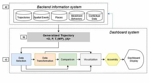
The backend information system outputs one or more generalized trajectory datasets for the dashboard input. Therefore, data manipulation, processing, and modeling procedures, such as semantic enrichment, data mining, and pattern recognition (Parent et al., Citation2013), should be conceptualized and implemented in the backend information system (), as they are typically computationally intensive and thus outside the functional scope of a mobility dashboard. Separating the backend information system and the dashboard is based on a computational load and control perspective. Heavy load and complex modeling tasks should be handled by a specialized system (the backend information system, such as a GISystem) rather than the dashboard, along the same lines as data inputs and analytical tasks that differentiate VA from a dashboard. Limiting dashboard inputs to generalized trajectory data also provides a bounded focus on the perspective of big mobility data dashboards, rather than an overly broad information dashboard.
As stated, displaying big mobility data can be visually overwhelming, and privacy concerns may require individual movement to be anonymized. Utilizing a backend information system to aggregate the raw mobility data should be necessary for most use-cases. The data providers in the backend information system are platform-free and are therefore not limited to conventional database management systems and file systems; they can also be used with distributed computing systems such as Spark (https://spark.apache.org/) and real-time processing systems such as Kafka (https://kafka.apache.org/). Operations modifying the input trajectory sets, such as adding a new set of features, adding a new set of trajectories, deleting data entries, etc. should also be carried out through an administrative workflow using the backend information system (marked as blue dashed line in ), interfacing with the dashboard developers, rather than end-users modifying inside the scope of the dashboard system. This design aligns with the key differences between VA and dashboards that we have identified, reinforces the single-direction data transition from the backend information system to the dashboard, and differentiates the dashboard from an all-encompassing information processing system. From a high level of abstraction, a mobility dashboard thus accepts the generalized trajectory sets as input, and outputs a series of visual displays of relevant information, consolidated and arranged on a single screen, or multiple screens with different functional themes, to provide an overview of the most essential information. Importantly, this overview display enables near-immediate recognition and interpretation of that essential information.
We suggest five essential components commonly existing (see for example, knowledge discovery in databases (Fayyad et al., Citation1996) for mobility dashboard development) ():
Data Selection extracts a relevant subset of movement and contextual data from the pre-processed and standardized data in the backend information system, based on the end-user’s desired output. This is often done using multiple query conditions that refer to moving objects, spatial, temporal, thematic, and contextual aspects, or any combination thereof. The selection criteria can be predefined by the developers at the development phase or provided by the end-user via user interfaces (e.g. time sliders, checkboxes, buttons, drop-down menus).
Data Transformation (Abstraction and Aggregation) converts the selected mobility and contextual data to a form matching the output goals of the dashboard or specific requirements of the visualization widgets that will be employed. Abstraction and aggregation are similar but do have a nuanced difference: Abstraction refers to the process of hiding the details of the raw data while retaining the essential characteristics, while aggregation refers to summarizing several items as a single unit (N. Andrienko & Andrienko, Citation2011). The role of data transformation is to simplify the selected data into a reasonable size that fits into display elements that can be visually evaluated at a proper analysis scale.
Comparison enables users to compare two or more subsets of the movement and contextual data to discover additional insights. It might involve viewing graphical elements side-by-side, overlaying, or combining graphical elements, or computing differences among selected situations over all aspects resulting from Data Transformation.
Visualization encodes the Data Selection, Data Transformation, and Comparison results into visual displays. Depending on data types, visualization widgets such as cartographic maps (e.g. heat maps, flow maps, choropleth maps, dot density maps, proportional symbol maps or even cartograms), bar charts, histograms, and other forms can be applied. Animation can also be introduced to visualize changes over the temporal dimension, which is a key feature for viewing big mobility data. The visualization widgets that are applied are often predetermined by the developer during the development phase. However, the end-users might also be given the flexibility to select their preferred widget from a predefined list. Additional customization and interaction can be enabled within widgets. For example, informational depth may be added using pop-up attribute information via mouse-over, comparison by selecting/activating a map element or data item, or by modifying visual representation (e.g. changing colors or symbolization).
Assembly consolidates all of the graphical elements and controls (supporting user interactions) on a single screen to form a dashboard. The default arrangement of elements at the assembly stage may be predetermined in the development phase, based on principles underlying ease of interpretation or where the most important information should be located, though flexibility for end-users to alter the dashboard display’s arrangement might also be enabled.
Depending on the purpose of the dashboard, different paths over these components might be employed (). For example, when a visual display in the dashboard only depicts trajectories on a map, the Data Transformation and Comparison process can be skipped while implementing the visual display. If another graphical element visualizes the general origin-destination flows in a city, then the Comparison component can be ignored unless it is required, for example, to compare the flow volumes in different time periods. We describe each component of the conceptual framework in more detail in “Components of the conceptual framework.”
Developer vs. end-user roles
The dashboard workflow involves two roles: that of the developer and that of the end-user. Depending on the goals of the dashboard, different levels of end-user interaction can be provided. At the lower end of interaction, the display content and appearance might be fully predefined by the developers, resulting in a dashboard with rudimentary interaction techniques (e.g. zoom, tooltips on mouse-over) and no end-user control. At the higher end, the dashboard can provide greater flexibility allowing the end-user to select which data and graphical elements to display and perhaps how they are arranged in the display.
The dashboard developer first needs to identify the intended purposes and end-users of the dashboard. After identifying purpose and end-users, aspects related to data selection, data transformation (abstraction and aggregation), data comparison, visual representation, and display assembly, as well as their interactivity level for the end-users, can be further specified and implemented.
Components of the conceptual framework
Data input: a generalized trajectory model
A generalized trajectory () is conceptualized as the combination of five feature groups that are derived from the backend information system ():
moving object features (O)
georeferenced position features (P)
temporal features (T)
movement parameter features (MP)
other enriched semantic attributes (A)
Of these, the first three (O, P, T) are mandatory, while the latter two feature groups (MP, A) are optional ().
The moving object features (O) identify whom the trajectory represents, which can be an ID for a single moving object or a set of IDs for representing a group of moving objects as an integrated entity such as a fleet of trucks or flock of birds. The moving object features may also be identified by attributes of the moving objects, for example, types of vehicle or vehicle owners. The georeferenced position features (P) are entities with location information, such as GPS waypoints, spatial events, road segments, POIs, cellular tower sites, etc. Time features (T) are time stamps, time periods, or time characteristics (e.g. weekday or weekend days, holidays, peak traffic hours, etc.). The movement parameter features (MP) are those that can be directly derived from the spatio-temporal features of the trajectory per se, such as speed, acceleration, turning angle, etc. (Dodge et al., Citation2008). The other enriched semantic attributes (A) are those contextual information items that are attached to the data entries based on spatio-temporal relationships, such as weather conditions, nearby POIs, trip purposes, etc. It should be noted that some semantic attributes may share the same source with the georeferenced position features but contribute differently to the desired generalized trajectory dataset. For example, if a raw GPS waypoint dataset is enriched by each waypoint’s nearest POI, the POIs are conceptualized as a semantic attribute (A). However, if the same GPS waypoint dataset is then transformed such that waypoints sharing the same POI are aggregated as one entity and therefore use the POI as the representative location of the aggregated waypoints, the transformed sequence of POIs should be categorized as a georeferenced position feature (P). The transformed sequence of POIs should also be differentiated as an independent trajectory set from the original GPS waypoint set.
Data selection
The initial consideration around which a mobility dashboard is designed is the focus and data selection, which can cover different aspects of movement. Specifically, movement data can be analyzed from perspectives centering on moving objects and their trajectories, movement events, space, and time (G. Andrienko et al., Citation2011, Citation2013). Based on this framework and further developments in mobility analytics (in particular, research on semantic interpretation of movement (N. Andrienko & Andrienko, Citation2018; Parent et al., Citation2013), we suggest the five feature groups of the generalized trajectory set to be addressed in dashboard design (). Apart from movement data, a dashboard can also process and present other conventional types of geographical information, in particular information showing the context in which movement takes place, though the details about processing and demonstrating those data types are out of the scope of the current paper.
Data selection queries can be restricted to functions that generate subsets of any of the previously mentioned feature groups within an input trajectory dataset. The selection criteria can be one of the feature groups, or any of their combinations. For example, given some raw GPS trajectories that are denoted as T1 <o,p,t> where o is an object ID, p is a tuple of GPS coordinates, and t is a timestamp. Here we use a notation → Z to represent selection queries, where on the left of the arrow are input feature groups with selection conditions and the right are output feature groups. For example,
→
can represent queries such as “Select the waypoints p between the start timestamp ts and end timestamp te” and “Select the waypoints at timestamp tq.” Similarly, the function
→
can represent the query “Select the waypoints within the bounding box b.”
Data transformation (abstraction and aggregation)
When the selected dataset (either pre-selected by the developers or selected by the end-users on the fly) is too big in terms of volume or complexity to be visualized by the desired display elements, data transformation should be involved. Unlike the fully functional data transformations in visual analytics as in (G. Andrienko et al., Citation2011, Citation2013), the functional focus of data transformation in the dashboard context is preparing data for visual display. For example, simplifying trajectories by abstracting the waypoints and aggregating trajectories into clusters or restructuring data so that it is fit for purpose. Nevertheless, the modeling process is the same as the full VA transformation such as deriving new thematic attributes (e.g. average travel speed), simplifying trajectories, and aggregation over the five groups of feature dimensions.
Two forms of aggregation can be considered in designing mobility-centered dashboards: grouping-based and binning-based. The former means organizing data items, such as trajectories, into groups (clusters) according to some similarity criteria, and representing each group by summary statistics and/or a single spatial or spatio-temporal object reflecting the common attributes of the group members (e.g. as the average trajectory of a group of trajectories) or including the group as a whole (e.g. as a buffer or convex hull around a group of trajectories or events) (G. Andrienko & Andrienko, Citation2010; Buchin et al., Citation2013; Lee et al., Citation2007; Pelekis et al., Citation2011). Binning-based aggregation can be based on spatial, temporal, and thematic dimensions/attributes, as well as any of their combinations. The value domains of dimensions or attributes used for the aggregation are partitioned into suitable bins – e.g. a grid of regularly- or irregularly-sized cells (C. Fu et al., Citation2021) or irregularly shaped cells such as Voronoi cells (N. Andrienko & Andrienko, Citation2011) and administrative regions (Gao et al., Citation2020; Hu et al., Citation2021) — and the data are summarized by these bins or combinations of bins when two or more dimensions or attributes are used. The result consists of summary attributes associated with the bins or combinations. The dimensions or attributes used for the aggregation may be discrete or continuous. In the discrete case, each value can be taken as a bin. A continuous domain requires discretization, i.e. partitioning into intervals or compartments. By applying different sizes of spatial or temporal bins, data can be aggregated by different scales and unique characteristics at certain scales and transition patterns between scales can be investigated via visualization. Binning can also be used for a particular form of data abstraction, namely, replacing point locations by areas and time moments by intervals. In addition to these, the approach to aggregation can vary by the operation applied. These aggregation operations may include counts, functions over attribute values (e.g. max, mean, median), and functions over time-series (e.g. alignment and reduction, change between periods, sums) and/or space (e.g. summary statistics by spatial trend).
The outputs of the selection-transformation pipeline in the dashboard framework are temporary results that are dependent on specific queries by different end-users. However, certain instances of the selection-transformation pipeline can be recast as fixed inputs if the corresponding queries are commonly requested for efficiency. In such cases, the queries need to be implemented in the backend information system and their results become the input of the dashboard system.
Comparison
In advance of representing and assembling the dashboard’s graphical elements, the selected or transformed mobility data can be compared to discover additional insights or choose between decision options (). The comparison operation involves two aspects: What and How. “What” is compared refers to multiple selections, transformed data, or collective mobility patterns or behaviors, as compared to one another or some baseline or other referents (e.g. average, typical, predicted movement). What to compare is limited by the attributes of the trajectory datasets produced via the Selection and Transformation pipeline, which includes one or multi-dimension of the <o, p, t, a > .“How” the selection is compared refers to juxtaposing (i.e. data are placed side by side for comparison), superimposing (e.g. data are placed together in a single graphical display element), or computing differences between collective movement behaviors or patterns (Gleicher et al., Citation2011). Beyond comparing simple data selections (i.e. comparing the shape of multiple trajectories), an abstraction comparison produces differences in extracted features, while an aggregation comparison results in differences between multiple collections of trajectories (i.e. patterns or behaviors).
Visualizations
Visualizing the outputs resulting from the Selection-Transformation-Comparison pipeline is the final element moving toward dashboard assembly (). Spatial and temporal dimensions are inherent to movement and mobility data. A major advantage of mobility data dashboard design emerges when multiple data dimensions are displayed together to tell the full “where, what, and when” story associated with spatio-temporal data (G. Andrienko et al., Citation2013; Lundblad & Jern, Citation2013; Peuquet, Citation1994). Typical graphical display elements for mobility data vary according to whether they highlight space, time, or movement attributes (N. Andrienko & Andrienko, Citation2013; G. Andrienko et al., Citation2011; W. Chen et al., Citation2015), which is summarized in .
Table 1. Mobility data types and suggested visualization elements in a mobility dashboard.
Within the dashboard framework, these elements are combined either within a single visualization element, or with multiple display elements that convey separate dimensions. For example, using a static spatial selection of OD flows, one could transform the data such that the subsequent dashboard display would be a flow map if the spatial element is retained, small multiples if the temporal element is retained, or an OD heatmap if space is abstracted in favor of retaining relational elements (N. Andrienko & Andrienko, Citation2013; W. Chen et al., Citation2015; Zhou et al., Citation2019). Since movement data can be visually overwhelming if too many additional attributes are portrayed in a single graphic, separate graphical elements could instead be linked within the dashboard framework. A flow map could represent movement from one location to another using edge thickness to represent flow volume. Then a linked graphic could be used to display characteristic elements of the same data that allow a user to drill down into further information, such as a bar chart comparing trip purposes for the same links or a histogram showing trip durations between links/nodes.
Assembly of individual graphical elements and end-user interaction
Finally, dashboard implementation involves assembling individual graphical elements or visualization widgets, as well as creating the interface for end-user interaction. Assembly is about grouping, ordering, and arranging of individual graphical elements on a screen to serve the end-users’ information needs. It should consider both aesthetics and functionality. It is the art of guiding the end-users’ visual attention to effectively and efficiently obtain the information they need. Several guidelines on interface design can be followed (Tidwell et al., Citation2020): consideration of visual hierarchy (i.e. “the most important content should stand out the most, and the least important should stand out the least”), designing the visual flow to lead the end-users’ eyes, and grouping and alignment.
Another important aspect to consider in finalizing the dashboard implementation is end-users’ interaction with the dashboard. Such interaction might include changing the appearance of the dashboard layout (e.g. end-users might resize, rearrange, and re-group graphical elements to customize the dashboard layout to better suit their usage habits); updating the appearance of individual graphical elements (e.g. map zooming and panning, changing colors); re-selecting data for visualization, transformation, and/or comparison. Additional interfacing elements (e.g. buttons, drop-down lists, input boxes), placed either on top of the graphical elements or together with the graphical elements, are sometimes needed to facilitate end-user interaction (Sarikaya et al., Citation2018). Responses to end-user interactions may occur as interface- or workflow-oriented actions. For interface-wise interactions, the layout of the graphical elements may be reorganized and reassembled based on the preference of end-users. For example, a user may enlarge a map element to show a larger extent while exploring the spatial layout of a trajectory cluster. This operation does not cause communication between the browser and the server but still requires predefined rules for the reorganization, e.g. placing the other graphical elements to the side or bottom of the display, with or without resizing the other graphical elements. Workflow-wise interaction means that the interaction also involves queries to the backend information systems for new data feeding into the interface. What end-user interaction is allowed, beyond purely looking, depends on the intended use and type of the dashboard.
Depending on the levels of end-user interaction that a dashboard allows, a continuum between communication dashboards and analytical dashboards exists. A communication dashboard offers a predefined view of information and therefore operates with the maximum level of developer control, with no or very limited elements left to user control and interaction. The end-user of a communication dashboard can be limited to access the Dashboard Display module () only as a receiver of the information predefined by the developer, according to the existing business cases. In contrast, analytical dashboards would maximize user interaction and therefore have a greater degree of parity between user and developer control of what information is displayed. They might therefore approach the capabilities typical of a visual analytics platform, though they fall short of allowing complete control over input data and analytical capabilities. In terms of Data Selection, end-users might be allowed to define selection criteria via user controls, such as sliders that define temporal ranges or check boxes that filter a subset of data (e.g. select trajectory data based on trip purpose). Similarly, dashboards with higher levels of end-user interaction might allow control for generating comparisons by selecting whether elements should be compared against a baseline, average, or as juxtaposing views. Development complexity of dashboards increases as more end-user interaction is allowed. Therefore, it is important to carefully study the end-users’ needs during the dashboard design process.
Data protection and privacy
One critical feature of mobility dashboards that differentiates them from many other dashboards is the issue of data privacy and protection, as trajectories can be used to identify individuals (N. Andrienko et al., Citation2016; Chou et al., Citation2019) or may be commercially sensitive. Four possible options can be taken to protect privacy in a mobility dashboard along a workflow following our proposed conceptual framework. The first option is applied in the backend information system () where critical places such as home locations, either reported or modeled, can be masked by removing trajectory waypoints near those critical places. The second option is applied to the Data Selection module combining administrative rules that certain dashboard end-users can only select trajectories that they are authorized to access. For example, an analyst supporting the Italian market can only access trajectories within the boundary of Italy but no other countries. The third option happens in the Data Transformation module. Using Abstraction, trajectories can be summarized into schematized trajectories, which makes identifying individuals more difficult. Waypoint groups can also be abstracted as representative points or polygons, which can help to reduce the spatial details of the original trajectory. Privacy protection techniques such as differential privacy (Monreale et al., Citation2013) can be further applied to the the abstracted trajectories. Aggregation can merge trajectories from different moving objects and make it more difficult to identify individuals as well, for example, k-anonymity (Ghasemzadeh et al., Citation2014; Monreale et al., Citation2010; Rao et al., Citation2021) that mixes k similar trajectories so no individual trajectories can be identified. The fourth and last option can be applied in the Visualization module, where visualization widgets can be set to control the minimal granularity for displaying data. One example is to set up a minimum zoom level for the web mapping widgets on a mobility dashboard. All the options can be applied individually or as an integrated solution based on specific requirements for the mobility dashboard.sgfgsgs
Sample implementations
To illustrate the effectiveness of the proposed conceptual framework, we demonstrate several sample dashboards (), drawn from different sources. The first three sample dashboards are drawn from the European Horizon 2020 project Track & Know (https://trackandknowproject.eu), which aimed at developing toolboxes and software stacks for big mobility data analytics, with applications in car insurance, vehicle fleet management, and healthcare management. We briefly introduce how they were designed to meet the business requirements and implemented by employing the proposed conceptual framework. The fourth dashboard provides real-time public transportation information to the public, which has a broader user group than the others. The fifth dashboard provides the trajectories of ocean floats over the world. The last dashboard demonstrates a visualization solution of O-D flows. With these three examples, we show the potential of our proposed conceptual framework to reconstruct the design process that results in the complex visual and functional design of the dashboard interface.
Figure 3. A dashboard for a vehicle insurance company to monitor driver behaviors.
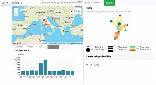
Figure 4. A dashboard for a fleet management company to monitor the activity of trucks. a) the view for fleet operators; b) the view for high-level managers.
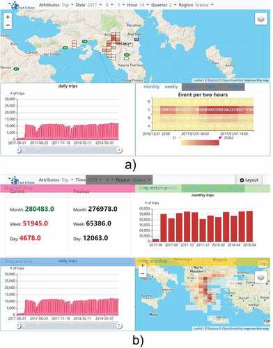
Figure 5. A dashboard for a hospital to evaluate resource-allocation model results.
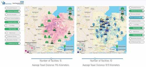
Figure 6. Interface of Toronto Transit dashboard (https://totransit.ca/).
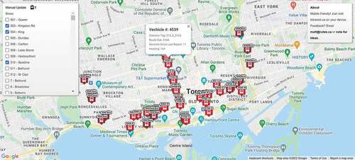
Figure 7. Interface of Euro-Argo project dashboard (https://fleetmonitoring.euro-argo.eu/dashboard).
Dashboard 1: vehicle insurance and driver behaviors
In Dashboard 1 (), the map on the up-left displays aggregated trajectories of a selected vehicle. The graph chart on the up-right shows the transitions between major locations as an individual mobility network. The lower-left bar chart shows the number of crashes per month for the whole region. And the lower-right text box shows the predicted crash risk of the selected vehicle by a risk model output from the backend information system.
End-user
Data analysts of a vehicle insurance company
Main tasks
Dashboard 1 was developed for a vehicle insurance company to monitor driver behaviors for pay-how-you-drive (PHYD) insurance policies. The company is interested in helping analysts monitor a selected driver’s risk score reported from machine learning models learned from historical data. The analysts will also combine other performance features such as driving events in the past days and the driver’s individual mobility network (IMN) (Rinzivillo et al., Citation2014) to have a comprehensive understanding of the driver’s performance and make the final decision regarding pricing.
Input data
There are several trajectory related data for each insurance policy: GPS records of vehicle trajectories with driving events attached and GPS records of crash events, and IMN derived from a monthly aggregation model using the vehicle trajectories. All three data sets can be conceptualized as a generalized trajectory <O, P, T, A> (). There are additional non-trajectory-related data, such as monthly risk scores forecasting the possibility of being involved in a car accident, but we focus on the design details for the mobility data.
Table 2. Main input data sources and their generalized trajectory models for Dashboard 1.
Design process
Four out of the five proposed essential components in the conceptual framework, i.e. selection, transformation, visualization, and assembly, are employed to build the dashboard.
First, selection functions are applied to the elements of the generalized trajectory model using lists of options, including the type of attribute such as insurance policy ID (O), month (T), and region to examine the risk score (O, P), IMN (O, T), driving events (O, P, T), the location of trips (O, P, T), total crash events in a past period (P, T), etc. This selection function controls the content displayed and allows the end-user to tailor their data display to the particular aspects of driver behavior they want to explore.
The map function annotations discussed in our “Data selection” section can help to guide the data selection processes and match them to proper visualization elements. The information in the four visualization elements in the screenshot is selected by three types of selection map functions ().
Once selected, non-spatial data are primarily pre-processed in the backend information system thus are visualized to display non-spatial movement parameters such as the volume of daily trips as bar charts or heatmap and IMNs as graph charts.
Spatial data will need further transformation on the client side for some applications. For example, if the end-user would like to check all locations of one driver’s braking events in a month, the dashboard will send the query parameters including the insurance policy ID, the month, and the target data name, i.e. location of trips, to the backend information system. The returned trips are organized as a quadtree where GPS waypoints of the trips have been pre-aggregated into hierarchical spatial bins. Therefore, the end-user must be able to select among any given set of query parameters.
The received quadtree will be further selected, given the geographical extent of the map. Then the selected spatial bins will be further transformed based on the zoom level of the map using binning-based aggregation and visualized as grids on map, such as the case on the upper-left map in .
Table 3. Data selection processes for Dashboard 1.
With the dashboard, the data analysts of the vehicle insurance company can monitor the performances of each driver by checking the driving event change, place visitation pattern, and forecasted risk score month by month to have a good understanding.
Dashboard 2: fleet management
End-user
The fleet management company identified two user groups: non-managers such as fleet operators and technicians who need a detailed view, and managers who need a high-level overview of the business.
Main tasks
Dashboard 2 () was developed for a fleet management company. The non-manager group needs more detailed spatial and temporal information that may even be associated with single trips. They needed cross-scale aggregate information, such as per quarter, per day, per week, and per month statistics about the trajectories and indicators modeled from the trajectories such as downtime and proportions of trip in different weather conditions, from the temporal perspective, and per road comparison for identifying unusual driving routes as detailed as a 100-meter spatial resolution. To protect privacy, the trajectories of a fleet are summarized into schematized trajectories represented as spatial bins so that no individual vehicle can be identified. The manager group needs simple information mainly related to cost and fleet downtime. Such information is more based on monthly reports. The managers at this level also pay more attention to performance comparisons.
Input data
The input for Dashboard 2 is rather simple: GPS records of vehicle trajectories with driving events, engine statuses attached, and modeled indicators from other fleet management models, as a generalized trajectory <O, P, T, A> ().
Table 4. Main input data sources and their generalized trajectory models for Dashboard 2.
Design process
The dashboard consists of two views for the two targeted user groups ( for fleet operators and for high-level managers, respectively). This dashboard uses many of the same selection functions and transformations/visualizations for non-spatial information as Dashboard 1 (), however it applies a different transformation for big mobility data.
In this dashboard, the web map displays waypoints of a set of trajectories that are aggregated and visualized using a quadtree (C. Fu et al., Citation2021) to show hot spots of the vehicles in space. A quadtree generated from waypoints is represented in the maps in which regions with denser waypoints are represented by smaller spatial bins with darker brown while regions with sparser waypoints are represented by larger spatial bins with lighter brown. Regions with no waypoint are not visualized although they are modeled in the quadtree. The minimal size of the spatial bin is associated with the zoom level even though smaller spatial bins toward the leaf nodes in the quadtree exist for regions with dense waypoints. Zooming in the maps will result in visualizing the smaller spatial bins. This visualization protects privacy while satisfying the business’s requirement of understanding where and how many waypoints are located across the area with the finest spatial resolution at 100 m (), while the manager’s view provides a coarser spatial resolution ().
As managers prefer simple aspatial indicators for evaluating business performance, this dashboard further employs comparison functions by way of a text display, for example, by comparing current trip volumes to the previous quarter’s outcomes in the upper left corner of .
Assembly happens at the design stage of the dashboard where widgets with different sizes are placed in different locations of the dashboard view.
However, end-users with particular priorities for information display will require customized assembly. The developer therefore enables more advanced functionalities, such as reorganizing widgets on-the-fly so the end-user can move the most important widget for their needs to the upper-left corner (Buscher et al., Citation2009).
As an example, in the assembly of this dashboard, shows the default view, while shows a reorganized layout by an end-user using the drag-and-drop function.
Table 5. Data selection processes for Dashboard 2.
Dashboard 3: resource-allocation model evaluation in healthcare
End-user
Decision-makers in a respiratory specialized hospital
Main tasks
Dashboard 3 () was aimed at assisting hospital decision-makers in evaluating resource-allocation model results, where the medical devices might move around between different places. The specific need was understanding the distribution of medical devices relative to the needs of the community, as measured by risk- or population-based demand.
Input data
The inputs for Dashboard 3 are population/patient density, the current spatial distribution of mobile facilities, and the proposed facility distribution in various scenarios, as a generalized trajectory <O, P, T, A> (). In this case, the patients’ privacy is protected by aggregation before transferring to the backend information system so that no personal information is stored in the dashboard system itself.
Table 6. Main input data sources and their generalized trajectory models for Dashboard 3.
Design process
This dashboard visualizes origin-destination pairs output from location-allocation optimization models, given varied demand models and the resulting scenarios of proposed facility locations compared to current facility locations. Decision-makers need to try different numbers of facilities as the input on the dashboard and visually compare the location-allocation results.
Selection functions in this display are controlled by buttons on either side of the map-based visualizations. Using the buttons, the end-user can control the information that populates the map, including the type of demand (A), current facilities’ locations (<O, P>) and/or the optimized location-allocation results for facility locations (<O, P>), and additional contextual information such as population or patient density in the area of interest (<P, A>). Additionally, the number of facilities included can be controlled via a slider below a map widget. Different combinations of values from the button items and slider will be sent to the backend information system to query pre-computed location-allocation results.
The facilities, either the current scenario or the proposed scenarios, are visualized as point elements with different icons for visualization. Population maps and demand maps are visualized as hexagon-based choropleth raster layers whose hues suggest different themes. Note that in this instance a hexagonal grid was used to protect patient privacy by obscuring home locations when generating OD trajectories in an initial data-manipulation stage and has therefore been carried through to the final dashboard design; in the current framework, this is a backend output.
The display has implemented further comparison functionality as the left and right components are duplicates to each other’s functionality. Hospital administrators, managers, and other stakeholders can use this dashboard to examine the resource-allocation results of different access and mobility scenarios side-by-side for comparisons. The number of facilities included and the resulting optimized facility distributions are displayed on the map, while the resulting change to average travel distance is updated. In the example shown in , the end-users are comparing the impact of locating 15 optimal facilities versus the status quo of current testing facility locations, based on potential patient demand derived from known risk factors for respiratory illness. This makes the decision-making process easier and more efficient by providing displays that allow for at-a-glance scenario examination based on varying conditions in either map widget.
The three previous examples demonstrate that the proposed framework can be applied to develop dashboards with different levels of complexity or user interactivity. They also illustrate how mobility dashboards can be used within a variety of application domains, with varied needs for the type of information shown for multiple types of end-users, and multiple types of generalized trajectory inputs and supported tasks.
Dashboard 4: Toronto Transit dashboard
We include the following two examples to demonstrate aspects of the conceptual framework that did not play a role in Dashboards 1–3. The examples are presented briefly without including all design decisions but rather focus on differences from the previous examples and further illustration that different paths over the framework components, and excluding some, is still possible. The Toronto Transit dashboard () provides real-time positions of streetcars and buses in Toronto to the public.
The dashboard elements consist of selection, visualization, and assembly only. No explicit transformation or comparison is observed. This may be due to the fact the transit dashboard as a public service has no backend or frontend transformation on the location needed for privacy concerns, which is different from the context of Dashboards 1 and 2. The data input of the dashboard can be summarized by our generalized trajectory model as .
Table 7. Inferred input data and their generalized trajectory models for Dashboard 4.
It can be inferred that the selection for this dashboard happens mainly on the function that given a queried Vehicle ID (O) and the current location of the vehicle (P), the location of the vehicle is selected. The past trajectory of each vehicle is not displayed as lines; instead, vehicles are visualized as points with icons, whose positions on the map are updated every a few seconds.
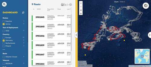
Dashboard 5: dashboard for Monitoring the Oceans and Climate Change with Argo (MOCCA)
The MOCCA project places floats into the ocean to collect physical characteristics of the seawater. Each float can drift with every 9-day cycle in the ocean before communicating with the satellite to report the temperature and salinity as well as the depth and direction of the float. The project published the trajectories of the floats to the public on a dashboard ().
Within the proposed framework, this dashboard consists of selection, visualization, comparison, and assembly elements. No obvious transformation can be observed. The data input of the dashboard can be summarized by our generalized trajectory model as outlined in .
Table 8. Inferred input data and their generalized trajectory models for Dashboard 5.
It can be inferred that the selection for this dashboard happens mainly by the annotation of . For example, trajectories of floats (P) can be addressed by the combination of their ID (O), country (A), active status (A), and the year of deployment (T) can be queried. There are no queries on spatial or temporal information. Float trajectories are visualized as simple lines. Comparison of trajectories is achieved by displaying trajectories with different colors with the currently focused trajectory as red and other trajectories as gray.
Dashboard 6: jobs in the Netherlands
The Jobs in the Netherlands dashboard demonstrates job statistics in the Netherlands’ municipalities per se as well as the commuting flows among the municipalities (). The dashboard is a good example of visualizing place-to-place interactions.
Figure 8. Interface of jobs in the Netherlands dashboard (https://dashboards.cbs.nl/v1/commutingNL/).
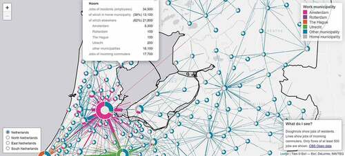
This dashboard consists of selection, visualization, and assembly elements. We also do not observe obvious transformation given the interface of the dashboard. The data input of this dashboard can be summarized by our generalized trajectory model as outlined in .
Table 9. Inferred input data and their generalized trajectory models for Dashboard 6.
It can be inferred that the selection for this dashboard happens mainly by the annotation of . For example, the O-D flows (P) and flow properties such as jobs (A) are mainly queried by region (A). Flows are visualized as simple lines, which use different colors for identifying inbound and outbound flows and different line widths for qualifying volumes of jobs.
Conclusions
Dashboards are one visual approach that may help generate effective displays of mobility data. However, for this capacity to accrue, development and design principles specific to mobility data need to be identified to facilitate the process of clearly communicating and interpreting mobility information. Our conceptual framework systematizes the approach to presenting movement and mobility data in a dashboard development context. This approach defines and takes into account the differences between dashboards and visual analytics platforms. The key points of difference involve input data, analytical complexity, level of user interaction and resulting information display and, as a consequence, the roles, responsibilities, and capacities of the developer and the user. Further delineating the bounds of dashboards as tools (i.e. dashboards vs. VA), developer and end-user roles, as well as detailing essential components, should facilitate developing mobility dashboards that improve interpretability and fit-for-purpose design.
The examples we highlighted demonstrate the process and effectiveness of applying the conceptual framework when designing and implementing dashboards for big mobility data, including various application domains, levels of complexity, or user interactivity. We have defined key decision points in development, which revolve around the essential components of data selection, transformation, comparison, visualization, and assembly. We have also defined the tasks necessary to construct these components. Many of the processes that underlie the components are well-established and commonly used. Thus, we have instead focused on the component details and explained how they function within dashboard development, rather than explicating the processes themselves.
Within the proposed framework, analysis and manipulation of raw data are a developer rather than an end-user task. For this reason, we also limit mobility dashboard input data to the generalized trajectory model. This standardized input requires that raw data are already pre-processed while also ensuring that meaningful movement information is not lost to overly restrictive efforts to anonymize or otherwise simplify overwhelming amounts of data. The framework remains adaptable by emphasizing feature groups that might comprise varied sources and types of mobility data. In applying the framework, the developer can determine what information needs to be restricted or emphasized according to requirements and constraints in a given application context. These decisions may relate to data privacy and protection, end-users’ knowledge and abilities, quantity, and variety of information needed for at-a-glance interpretation and time pressures.
As shown in the examples, the proposed conceptual framework can help dashboard developers understand design and implementation as a comprehensive process, and determine the technical details of the different components. When applying the conceptual framework in actual development, the dashboard developers must always try to better understand the needs and preferences of the intended end-users at a very early stage. Meanwhile, a user-centered and interactive approach might also be employed, e.g. by involving end-users at different stages of the development. All of these will help to ensure higher usability of the resulting dashboards.
Acknowledgments
The authors also appreciate the comments of four anonymous reviewers which helped improve the paper.
Disclosure statement
No potential conflict of interest was reported by the author(s).
Data availability statement
Data used for Dashboard 1, 2, and 3 are not available due to both legal and commercial restrictions. Dashboard 4, 5, 6 are from third-party authors who are not affiliated with this manuscript. Data availability of Dashboard 4, 5, and 6 is subject to the creators of the dashboards.
Additional information
Funding
References
- Andrienko, G., & Andrienko, N. (2010). A general framework for using aggregation in visual exploration of movement data. The Cartographic Journal, 47(1), 22–40. https://doi.org/10.1179/000870409X12525737905042
- Andrienko, N., & Andrienko, G. (2011). Spatial generalization and aggregation of massive movement data. IEEE Transactions on Visualization and Computer Graphics, 17(2), 205–219. https://doi.org/10.1109/TVCG.2010.44
- Andrienko, N., & Andrienko, G. (2013). Visual analytics of movement: An overview of methods, tools and procedures. Information Visualization, 12(1), 3–24. https://doi.org/10.1177/1473871612457601
- Andrienko, N., & Andrienko, G. (2018). State transition graphs for semantic analysis of movement behaviours. Information Visualization, 17(1), 41–65. https://doi.org/10.1177/1473871617692841
- Andrienko, G., Andrienko, N., Bak, P., Keim, D., Kisilevich, S., & Wrobel, S. (2011). A conceptual framework and taxonomy of techniques for analyzing movement. Journal of Visual Languages & Computing, 22(3), 213–232. https://doi.org/10.1016/j.jvlc.2011.02.003
- Andrienko, G., Andrienko, N., Bak, P., Keim, D., & Wrobel, S. (2013). Visual analytics of movement. Springer Science & Business Media.
- Andrienko, N., Andrienko, G., Fuchs, G., & Jankowski, P. (2016). Scalable and privacy-respectful interactive discovery of place semantics from human mobility traces. Information Visualization, 15(2), 117–153. https://doi.org/10.1177/1473871615581216
- Buchin, K., Buchin, M., Van Kreveld, M., Löffler, M., Silveira, R. I., Wenk, C., & Wiratma, L. (2013). Median trajectories. Algorithmica, 66(3), 595–614. https://doi.org/10.1007/s00453-012-9654-2
- Buscher, G., Cutrell, E., & Morris, M. R. (2009, April). What do you see when you’re surfing? Using eye tracking to predict salient regions of web pages. In Proceedings of the SIGCHI Conference on Human Factors in Computing Systems (pp. 21–30). New York, NY, United States: Association for Computing Machinery.
- Chen, S., Andrienko, G., Andrienko, N., Doulkeridis, C., & Koumparos, A. (2019). Contextualized analysis of movement events. International Workshop on Visual Analytics, 49–53. https://doi.org/10.2312/eurova.20191124
- Chen, W., Guo, F., & Wang, F. Y. (2015). A survey of traffic data visualization. IEEE Transactions on Intelligent Transportation Systems, 16(6), 2970–2984. https://doi.org/10.1109/TITS.2015.2436897
- Chen, S., Wang, Z., Liang, J., & Yuan, X. (2018). Uncertainty-aware visual analytics for exploring human behaviors from heterogeneous spatial temporal data. Journal of Visual Languages & Computing, 48, 187–198. https://doi.org/10.1016/j.jvlc.2018.06.007
- Chou, J. K., Wang, Y., & Ma, K. L. (2019, February). Privacy preserving visualization: A study on event sequence data. Computer Graphics Forum, 38(1), 340–355. https://doi.org/10.1111/cgf.13535
- Demšar, U., & Virrantaus, K. (2010). Space–time density of trajectories: Exploring spatio-temporal patterns in movement data. International Journal of Geographical Information Science, 24(10), 1527–1542. https://doi.org/10.1080/13658816.2010.511223
- Dodge, S., Weibel, R., & Lautenschütz, A. K. (2008). Towards a taxonomy of movement patterns. Information Visualization, 7(3–4), 240–252. https://doi.org/10.1057/PALGRAVE.IVS.9500182
- Fayyad, U., Piatetsky-Shapiro, G., & Smyth, P. (1996). From data mining to knowledge discovery in databases. AI Magazine, 17(3), 37-37.
- Few, S. (2013). Information dashboard design: Displaying data for at-a-glance monitoring (Vol. 5). Analytics Press.
- Fu, P. (2022). Getting to know web GIS (5th ed.). Esri Press.
- Fu, C., Huang, H., & Weibel, R. (2021). Adaptive simplification of GPS trajectories with geographic context–a quadtree-based approach. International Journal of Geographical Information Science, 35(4), 661–688. https://doi.org/10.1080/13658816.2020.1778003
- Gao, S., Rao, J., Kang, Y., Liang, Y., & Kruse, J. (2020). Mapping county-level mobility pattern changes in the United States in response to COVID-19. SIGSpatial Special, 12(1), 16–26. https://doi.org/10.1145/3404820.3404824
- Ghasemzadeh, M., Fung, B. C. M., Chen, R., & Awasthi, A. (2014). Anonymizing trajectory data for passenger flow analysis. Transportation Research Part C: Emerging Technologies, 39, 63–79. https://doi.org/10.1016/j.trc.2013.12.003
- Gleicher, M., Albers, D., Walker, R., Jusufi, I., Hansen, C. D., & Roberts, J. C. (2011). Visual comparison for information visualization. Information Visualization, 10(4), 289–309. https://doi.org/10.1177/1473871611416549
- Haranwala, Y. J., Haidri, S., Tricco, T. S., da Fonseca, V. P., & Soares, A. (2022). A dashboard tool for mobility data mining preprocessing tasks. 23rd IEEE International Conference on Mobile Data Management (MDM) (pp. 278–281). IEEE.
- Hu, S., Xiong, C., Yang, M., Younes, H., Luo, W., & Zhang, L. (2021). A big-data driven approach to analyzing and modeling human mobility trend under non-pharmaceutical interventions during COVID-19 pandemic. Transportation Research Part C: Emerging Technologies, 124(December 2020), 102955. https://doi.org/10.1016/j.trc.2020.102955
- Keim, D. A., Mansmann, F., Schneidewind, J., Thomas, J., & Ziegler, H. (2008). Visual analytics: Scope and challenges. In S. J. Simoff, M. H. Böhlen, & A. Mazeika (Eds.), Visual data mining (pp. 76–90). Springer.
- Kitchin, R., & McArdle, G. (2017). Urban data and city dashboards: Six key issues. In R. Kitchin, G. McArdle, & T. Lauriault (Eds.), Data and the city (pp. 111–126). Routledge. https://osf.io/preprints/socarxiv/k2epn/
- Koylu, C., & Guo, D. (2017). Design and evaluation of line symbolizations for origin-destination flow maps. Information Visualization, 16(4), 309–331. https://doi.org/10.1177/1473871616681375
- Kveladze, I., & Agerholm, N. (2020). GeoVisual analytics for understanding the distribution of speeding patterns on arterial roads: Assessing the traffic safety of vulnerable road users. Journal of Location Based Services, 14(3), 201–230. https://doi.org/10.1080/17489725.2020.1823497
- Kveladze, I., Kraak, M. J., & van Elzakker, C. P. J. M. (2019). Cartographic design and the space–time cube. The Cartographic Journal, 56(1), 73–90. https://doi.org/10.1080/00087041.2018.1495898
- Lee, J. G., Han, J., & Whang, K. Y. (2007, June). Trajectory clustering: A partition-and-group framework. In Proceedings of the 2007 ACM SIGMOD International Conference on Management of Data (pp. 593–604). Association for Computing Machinery: New York, NY, United States.
- Li, W., Batty, M., & Goodchild, M. F. (2020). Real-time GIS for smart cities. International Journal of Geographical Information Science, 34(2), 311–324. https://doi.org/10.1080/13658816.2019.1673397
- Lundblad, P., & Jern, M. (2013, July). Geovisual analytics and storytelling using HTML5. In 2013 17th International Conference on Information Visualisation (pp. 263–271). IEEE.
- Monreale, A., Andrienko, G., Andrienko, N., Giannotti, F., Pedreschi, D., Rinzivillo, S., & Wrobel, S. (2010). Movement data anonymity through generalization. Transactions on Data Privacy, 3(2), 91–121.
- Monreale, A., Wang, W. H., Pratesi, F., Rinzivillo, S., Pedreschi, D., Andrienko, G., & Andrienko, N. (2013). Privacy-preserving distributed movement data aggregation. In D. Vandenbroucke, B. Bucher, & J. Crompvoets (Eds.), Geographic information science at the heart of Europe (pp. 225–245). Springer. https://doi.org/10.1007/978-3-319-00615-4_13
- Moreland, K. (2012). A survey of visualization pipelines. IEEE Transactions on Visualization and Computer Graphics, 19(3), 367–378. https://doi.org/10.1109/TVCG.2012.133
- Pappas, L., & Whitman, L. (2011, July). Riding the technology wave: Effective dashboard data visualization. In M. J. Smith, & G. Salvendy (Eds.), Symposium on human interface (pp. 249–258). Springer.
- Parent, C., Spaccapietra, S., Renso, C., Andrienko, G., Andrienko, N., Bogorny, V., Damiani, M. L., Gkoulalas Divanis, A., Macedo, J., Pelekis, N., Theodoridis, Y., & Yan, Z. (2013). Semantic trajectories modeling and analysis. ACM Computing Surveys, 45(4), 42:1-42:32. https://doi.org/10.1145/2501654.2501656
- Pelekis, N., Kopanakis, I., Kotsifakos, E. E., Frentzos, E., & Theodoridis, Y. (2011). Clustering uncertain trajectories. Knowledge and Information Systems, 28(1), 117–147. https://doi.org/10.1007/s10115-010-0316-x
- Peuquet, D. J. (1994). It’s about time: A conceptual framework for the representation of temporal dynamics in geographic information systems. Annals of the Association of American Geographers, 84(3), 441–461. https://doi.org/10.1111/j.1467-8306.1994.tb01869.x
- Rao, J., Gao, S., & Zhu, X. (2021). VTSV: A privacy-preserving vehicle trajectory simulation and visualization platform using deep reinforcement learning. In Proceedings of the 4th ACM SIGSPATIAL International Workshop on AI for Geographic Knowledge Discovery (Vol. 1, pp. 43–46). ACM. https://doi.org/10.1145/3486635.3491073
- Rinzivillo, S., Gabrielli, L., Nanni, M., Pappalardo, L., Pedreschi, D., & Giannotti, F. (2014). The purpose of motion: Learning activities from individual mobility networks. 2014 International Conference on Data Science and Advanced Analytics (DSAA) (pp. 312–318). IEEE.
- Rivard, K., & Cogswell, D. (2004). Are you drowning in BI reports? Using analytical dashboards to cut through the clutter. Information Management, 14(4), 26.
- Sarikaya, A., Correll, M., Bartram, L., Tory, M., & Fisher, D. (2018). What do we talk about when we talk about dashboards? IEEE Transactions on Visualization and Computer Graphics, 25(1), 682–692. https://doi.org/10.1109/TVCG.2018.2864903
- Stehle, S., & Kitchin, R. (2020). Real-time and archival data visualisation techniques in city dashboards. International Journal of Geographical Information Science, 34(2), 344–366. https://doi.org/10.1080/13658816.2019.1594823
- Tidwell, J., Brewer, C., & Valencia, A. (2020). Designing interfaces: Patterns for effective interaction design. O’Reilly Media, Inc.
- Wang, Q., Lu, M., & Li, Q. (2020). Interactive, multiscale urban-traffic pattern exploration leveraging massive GPS trajectories. Sensors, 20(4), 1–16. https://doi.org/10.3390/s20041084
- Wexler, S., Shaffer, J., & Cotgreave, A. (2017). The big book of dashboards: Visualizing your data using real-world business scenarios. John Wiley & Sons.
- Young, G. W., & Kitchin, R. (2020). Creating design guidelines for building city dashboards from a user’s perspectives. International Journal of Human-Computer Studies, 140, 102429. https://doi.org/10.1016/j.ijhcs.2020.102429
- Young, G. W., Kitchin, R., & Naji, J. (2021). Building city dashboards for different types of users. Journal of Urban Technology, 28(1–2), 289–309. https://doi.org/10.1080/10630732.2020.1759994
- Zhou, Z., Meng, L., Tang, C., Zhao, Y., Guo, Z., Hu, M., & Chen, W. (2019). Visual abstraction of large scale geospatial origin-destination movement data. IEEE Transactions on Visualization and Computer Graphics, 25(1), 43–53. https://doi.org/10.1109/TVCG.2018.2864503