
ABSTRACT
The globally increasing frequency of flood events highlights the importance of effective flood risk communication. The influence of the viewing perspective of mapped flood events on human risk perception has not yet been a research focus of the geovisualization community. This empirical study aims to fill this gap by investigating how the viewing perspective of flood risk maps, that is, 2D orthographic vs. 2.5D oblique views, influence human flood risk perception and decision-making. Results on how viewing perspective might influence measured risk perception are in line with prior inconclusive research on the utility and usability of adding a third viewing dimension on static maps. Unlike prior research would have suggested, we find that the individual risk attitude of our participants had no direct influence on their risk ratings in the context of this study. With additional empirical evidence on how static 2D and oblique 2.5D hazard maps might influence the public’s risk perception and decision-making, we hope to further inform policy and decision makers on the critical importance of well-designed cartographic displays for effective and efficient hazard and risk communication. We also provide an open-source code repository for making reproducible experiments with our static maps.
1. Introduction
The growing frequency of significant flood events observed in recent years – as one of the effects of global climate change – suggests an increased importance of using appropriate hazard communication methods to inform the general public about potential risks to human life and to the environment (Hagemeier-Klose & Wagner, Citation2009). In the UK, for example, only 45% of the population living in flood risk areas are indeed aware of this hazard (Rollason et al., Citation2018). To raise public flood risk awareness, authorities typically produce 2D flood hazard maps. Perhaps current 2D flood hazard maps have limited impact in raising public risk awareness because the target audience may have difficulty in interpreting abstract, static, 2D, planar displays of a dynamic volumetric (3D) process (Haynes et al., Citation2007)? Current research is still undecided on whether static, abstract 2D, or more realistic, interactive 3D visualizations should be used to communicate environmental hazards or risk (Leskens et al., Citation2017; Macchione et al., Citation2019; Simpson et al., Citation2022). We aim to move a step closer toward closing this research gap, by empirically studying how the display perspective of flood events alone, depicted in 2D flood risk maps commonly used by authorities, influences human risk perception, thus purposefully excluding interactivity, virtual reality, and any other 3D visualization options. More specifically, we set out to first, empirically assess human risk perception of static, orthographic perspective (2D in ) and oblique perspective (2.5D in ) flood maps in a between-subject design, and secondly, as a novel methodological contribution, how individual risk attitudes might interact with map user’s risk perception of the visualized floods.
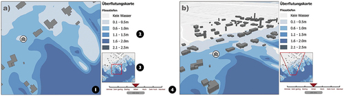
Figure 1. a) Orthographic 2D flood map stimulus, b) perspective 2.5D flood map stimulus.
As the severity and frequency of floods is increasing, and flood risk communicated using maps is often misinterpreted, it is urgent to better understand how the general public interprets flood risk maps and how respective long-standing map design choices might affect the public’s perception of risk.
We hypothesized that map users sampled from the public would perceive flood risks shown on planar, orthographic 2D maps to be smaller compared to those shown in oblique 2.5D (Macchione et al., Citation2019), and that study participants would take less time for their risk assessments for the 2.5D oblique perspective maps, because of the lower cognitive load and the lesser need for interpretation compared to the more abstract, orthographic 2D maps (Leskens et al., Citation2017).
2. Background
In the next section, we first review prior work related to the need for communicating flood risks and respective activities by authorities to raise people’s awareness for this natural hazard and its potential damaging implications. Following this, we briefly overview ongoing debates on or against the use of two-dimensional (2D) vs. three-dimensional (3D) depictions of geographic phenomena and processes. This is followed by an overview of the state-of-the-art on how the visualization community has already responded to the flood risk communication need with respective flood risk displays.
2.1. The societal need for communicating flood risks
Evans et al. (Citation2014) suggest that rainfall and storm events are likely to occur more frequently and with greater intensity due to climate change. As a consequence, there is an increasing need by authorities, spatial planners, and the general public to assess potential threats posed by such kinds of natural hazards (Evans et al., Citation2014; Seipel & Lim, Citation2017). The already increasing frequency of flood events as a result of increasing rainfall intensities around the world shows the importance of precise and extensive information to protect and prevent people from damage (Hagemeier-Klose & Wagner, Citation2009). Many researchers acknowledge that flood events are considered as one of the most significant natural disasters and that their frequency also to increase in the future as a result of climate change (De Moel et al., Citation2009; Evans et al., Citation2014; Hagemeier-Klose & Wagner, Citation2009; Kellens et al., Citation2011; Lieske et al., Citation2014; Seipel & Lim, Citation2017; van Ackere et al., Citation2016).
To support the management of flood risk, the EU, for example, has adopted a Directive (EU 2007/60/EC) for member states to map flood risks on their territory (De Moel et al., Citation2009). Flood risk maps have become a widely used tool for risk communication, aimed at increasing people’s risk awareness and to taking preventive actions. As a consequence, risk communication has an influence on people’s general perception of flood risk (Macchione et al., Citation2019). Kellens et al. (Citation2011) contend that understanding people’s risk perception and its determining factors is key for improving public risk communication and respective effective risk mitigation policies. Subjective risk perception is recognized as an important aspect of flood risk management, as risk perception often determines people’s willingness to take precautionary actions. To what extent static flood risk maps can and do influence people’s risk perception is still an open research question which we aim to address with this research.
2.2. Beyond flatland
The question of how many display dimensions should be leveraged to communicate geographic information efficiently and effectively to people has been ongoing for decades (Abbott, Citation1884/1992). Hence, long before computer graphics technology has allowed to generate fully immersive, interactive, and dynamic three-dimensional spaces with high fidelity in virtual reality environments (see e.g., Friendly, Citation2008). Alongside rapid technological advances and respective cost reductions, growing enthusiasm for highly realistic 3D visualizations has emerged (Duebel et al., Citation2014; Fabrikant et al., Citation2014; Ware & Plumlee, Citation2005; Wilkening & Fabrikant, Citation2013). The naïve intuition being, that highly realistic 3D displays are preferable to abstract 2D displays, because they appear to be closer to reality, and therefore depicted information is easier to apprehend and to comprehend by their viewers (Hegarty et al., Citation2009). This argument is supported by the congruence principle of good graphics, put forward by cognitive psychologists (Tversky et al., Citation2002), who posit that the (external) structure and content of a graphic representation should match the (internal) structure and content of the desired mental representation of the viewer. However, 3D displays are also in direct conflict with the second principle of good graphics, apprehension, according to which a depiction should be readily and accurately perceived by viewers (Tversky et al., Citation2002). While a 3D visualization might look more realistic and thus appear more beneficial for understanding at first glance, this comes at a cost of additional perceptual and cognitive demands, including technological requirements (Ware & Plumlee, Citation2005). Perhaps as a consequence, there is no research to date to suggest empirical evidence that 3D visualizations are clearly superior to 2D graphics. This, is indeed impossible to achieve at the outset, in spite of the large body of literature that has attempted in doing so, as the success of any designed artifact, and thus also any geovisualization, will be dependent on 1) the characteristics of the human viewing the display, including their preferences, attitudes, expertise, individual, and group differences, technical skills, etc., 2) the data characteristics of the phenomenon to be displayed and respective well matching design properties of the display, 3) the users’ tasks, and 4) the use context of the display (Savage et al., Citation2004; St. John et al., Citation2001). Most importantly, as Ware (Citation2022) suggests, just because we live in a 3D world, it does not mean that we can readily perceive the world in 3D. This author also offers that it would be an overstatement to say that human perception is even 2.5D. This is because the amount of information humans can gather forward or away from their vision field is much less than from the other two planar axes, i.e., right/left or up/down in the visual plane (Ware, Citation2022, p. 97). To compensate for or rather to augment humans’ perceptual and cognitive limits, mechanisms for human-display interactions (costs) with the visual scene need to be considered by display designers (Wilkening & Fabrikant, Citation2013). That is, to apprehend a 3D scene fully, either a viewer needs to be able to move their eyes or head or to physically move through the depicted 3D space. If this is not possible, then displayed 3D space needs to be movable, and thus display interaction tools need to be offered by the display designer to simulate eye, head, and body movements (i.e., pan, zoom in/out, rotate, tilt, etc.). Ware (Citation2022) also posits that even if the data characteristics would suggest a fully 3D display, 2.5D design principles still need to be applied, as the viewer’s perspective or viewpoint affects apprehension of the entire scene. In other words, the visibility of the displayed 3D structure in the image plane remains a two-dimensional plane where indeed 2D depiction principles still apply (Bertin, Citation1967). Next, we turn to the visualization of dynamic flood events.
2.3. Prior visualization solutions of flood events and flood risks
Graphic depictions, ranging from static two-dimensional (2D) paper maps to interactive digital map displays and immersive three-dimensional (3D) interactive visualizations, also play an important role in people’s risk perception (Lieske et al., Citation2014). In their technological comparison, Roth et al. (Citation2015) surveyed 25 U.S.-based map-based water level visualization tools from authorities, research centers, and the private sector. These tools are aimed to depict the exposure or flooding of land by historical and current storm events or future events as a result of climate change. Most, if not all, comparable tools are built on state-of-the art, available interactive orthographic 2D web-map technology. These authors list and rank the predominant means of visual data encodings of flood event information, that is, the applied visual variables in the studied maps ordered by their frequency of use (most to least): location, size, shape, color hue, and color value (Roth, Citation2009).
Rapid technological progress in computer graphics encouraged the development and implementation of new visualization types beyond 2D risk maps, including 2.5D visualizations which add elevation and height information (e.g., relief, buildings, etc.) to static 2D maps, large-screen interactive 3D visualizations, highly realistic immersive virtual reality (VR), and even small-screen and in-situ augmented reality (AR) (Simpson et al., Citation2022; Zhang et al., Citation2011). For example, Evans et al. (Citation2014) suggest 3D flood event visualization with high fidelity to raise awareness of flood risk, because effective communication of flood risk is a challenging task, especially for lay communities with infrequent flood experiences. These authors report that their 3D visualizations served as a “wake-up call” for the local community in Exeter (UK). The people viewing these 3D views indicated that the visualization raised their flood risk awareness (Evans et al., Citation2014).
Hence, while web-based, 2D mapping tools are still most frequently employed for the visual communication of flood risks for policymakers and the general public (Charrière et al., Citation2012), many people still prefer 3D visualizations, because they are believed to be easier to read and to comprehend (Kemec et al., Citation2010; Leskens et al., Citation2017; Macchione et al., Citation2019). This is the reason we aimed to empirically study how the display perspective of static flood maps might influence human risk perception, thus purposefully excluding interactivity and any other technologically advanced 3D visualization options, as explained in the preceding section. More specifically, we set out to first empirically assess (quantitatively) human risk perception of static, orthographic perspective (2D) and oblique perspective (2.5D) flood maps (between-subject), and secondly, how individual risk attitudes might influence risk perception of the visualized floods. We now turn to the present empirical study.
3. Experiment
The empirical portion of this research was conducted between October and November 2020, during the first year of the global COVID-19 pandemic.
3.1. Participants
Despite the global health situation, we were able to recruit 34 people (f = 14, m = 16; 16–47 yrs.; avg. = 26.2 yrs.) to participate in person during the COVID-19 pandemic, following safety regulations issued by country authorities. We aimed to invite participants with a diverse and non-specialized background to reflect the portion of the population likely to read flood risk maps. Hence, we had no specific inclusion requirements regarding age, education level, professional experience, etc. beyond two specific exclusion criteria: Firstly, participants have to be used to working with computers, and thus, we excluded those who did not meet this criterion including young children and the elderly with low vision, etc. to avoid any computer handling issues. Secondly, as the experiment instructions were in German, participants had to have a good working knowledge of the German language.
We also controlled for gender and age, balancing experimental groups, because prior work agrees that age and gender play a significant role in risk perception (Kellens et al., Citation2011; Lieske et al., Citation2014). All participants provided University ethical board approved informed consent prior to completing the task.
3.2. Materials
The maps shown in depict a set of test map stimuli of an identical flood event in Virginia Beach, USA, inspired by the U.S. Federal Emergency Management Agency (FEMA) Flood Risk Products.Footnote1 The map stimuli were developed with ArcGIS Pro 2.3.0 and ESRI’s Flood Impact Analysis package 1.0, using flood depth data obtained from FEMA’s flood risk database.Footnote2 The building footprints were downloaded from the City of Virginia Beach’s Open GIS Data Portal (2019). The map and inset map footprints extracted from the chosen geographic area were all of the same size and did not show the entire geographic area of the flood event. Some of the footprints were rotated and flipped to generate additional trials. Still, except for the viewing perspective, the information content was kept identical across the randomly ordered trials in each display condition ().
Seipel and Lim (Citation2017) suggest that aside from selecting a suitable visualization type the choice of an appropriate color scheme is crucial for comprehension and decision-making to avoid errors in data interpretation. Informal interviews these authors conducted with dozens of university students revealed that blue is most often related to water and flood status (Seipel & Lim, Citation2017). The same authors also conducted a survey of which 42% of the participants (N = 83) had seen a flood map before, and these had mostly seen flood maps with a blue color scheme to indicate flooded areas. This is to be expected, as the color blue, by long-standing cartographic convention, is typically used to show water bodies in topographic maps (Robinson, Citation1952). This is still somewhat surprising, as water seen in nature is rarely blue, especially not during flood events. Still, to keep cartographic conventions and thus risk map user expectations, we applied a sequential blue color scheme to our risk map stimuli, adapted from ColorBrewer so that it would work for the 2D orthographic and oblique 2.5D perspective. Aside from the classed flood depth levels (in meters) in blue, from lighter blue for shallower flood levels to darker blue showing deeper flood levels (nos. 1&2 in ), the map stimuli also contained a smaller scale inset map (no. 3 in ) in the same style. An interactive slider (no. 4 in ) allowed participants to indicate their risk assessments on a Likert-style scale ranging from “minimum” (= 1) to “maximum” (= 7) risk with respect to a house location marker shown in the map.
3.3. Procedure
Because of the global health pandemic, the experiment took place at a quiet location in participants’ homes, in and around city, country, accessible by car by the first author of the study. While the background questionnaire was run on participants’ chosen smart device, the map portion of the study was administered using PsychoPy on an ASUS ZenBook UX430UN-GV060T laptop, equipped with a 14”-color display, set to 1920 × 1080 pixel resolution. It took participants about 20–30 minutes to complete the experiment.
After filling in an online background questionnaire, accessible to participants through a web link sent with WhatsApp to their chosen smart device, participants completed a modified version of the Balloon Analogue Risk Task (BART) on the experiment laptop to assess their risk behavior (Lejuez et al., Citation2002). This task involves inflating digital balloons with different maximal inflation points using a virtual pump. Each pump action earns participants virtual money until the balloon reaches its maximal inflation point when it will explode, and all earned money is lost. Participants can decide to stop the game at any time and to keep the accrued money as long as the balloon does not pop. They were not told that their risk attitude was measured for this task, and they could take as much time as they needed. Following that, participants were randomly assigned (while assuring a gender and age balance across groups) to either the 2D or 2.5D condition to complete 16 map trials (plus two practice trials) and asked to rate the risk of building their home at a given house marker location () point 1). For this map portion of the experiment, participants were told that their response time was being recorded. They were instructed to not waste time on the map trials and that they did not have to feel pressured to respond quickly, as response quality mattered too. As soon as the participants had finished the map trials, they were asked to perform another four map trials. For this last session, response time and their risk ratings were not recorded, but the participants had to solve the map tasks while thinking aloud.
4. Data processing and data analysis
Both the processing of the data and the statistics of the experimental results were done with R (version 4.0.3). The data and code are available in an OSF repository at https://osf.io/meznc/. Data on the BART and the main experiment were recorded by PsychoPy and saved as a csv file. These csv files were then imported into R and merged with the results from the personal questionnaire. The risk scale was converted into integer values for further analysis; where “minimal risk” equals the number 1 and “maximum risk” equals the number 7:
We statistically analyzed participants’ risk ratings and decision times one by one running a Wilcoxon-Mann-Whitney test. We chose this non-parametric test irrespective of the data distribution characteristics, as this is more robust for rather small sample sizes (Nahm, Citation2016). On the one hand, with a non-parametric test, it is rather unlikely to draw wrong conclusions since assumptions about the distributions are unnecessary. On the other hand, because no assumptions are made about the distribution, the test has lower statistical power compared to parametric tests (Nahm, Citation2016). We additionally ran the parametric equivalent, the unpaired Student’s t-test, on our collected data. An assumption about the potential differences between the groups is, thus, made with both statistical tests.
We then performed a linear regression to investigate the influence of individual risk attitudes of the participants (i.e., BART scores) on their risk ratings (i.e., map trials). For this, we utilized a linear mixed-effect model, which is appropriate for testing hypotheses with nested data, in this case, trials within persons. This allows us to analyze a larger sample size and use all 480 (16 risk ratings × 30 participants) data entries and, at the same time, take potential variability within participants into account. A linear mixed-effect approach model leads to more statistical power (Oberg & Mahoney, Citation2007) compared to averaged group comparisons. A significance level α = .05 was set for all analyses. A deviation can be assumed nonrandom if it has a significance value p < .05.
The aim of the posttest think-aloud, applied after the map trials without any response time measurements, is to further investigate participants’ verbalized thought processes, based on user-specific reasoning strategies. This qualitative self-report data supplements the quantitative bottom-line risk rating and response time outcomes. The voice records were transcribed and then coded according to the reasoning strategies mentioned by participants. The purpose of this coding is data reduction, data organization, data exploration, and further data analysis, respectively (Cope, Citation2016). We tallied each risk rating-related strategy an individual participant mentioned during the think-aloud. If the same strategy (e.g., inspecting the flood depth at a specific house location) was mentioned several times by the same participant, it was counted only once. The reason for this was that a participant could have mentioned a particular strategy once and applied it for each of the think-aloud trials, without mentioning it again for the remaining trials. After coding participants’ think-aloud protocols in this way, we generated a frequency table containing the count for each verbalized strategy. We then exploratively compared the type and frequency of verbalized strategies across the experimental 2D and 2.5D groups.
5. Results
5.1. Risk perception and response time
The participants assigned to the 2D group rated their risk perception on average slightly more than medium (M = 4.33, SD = 0.49). Participants of the 2.5D group rated their risk perception on average just below medium (M = 3.94, SD = 0.53). The Wilcoxon-Mann-Whitney test showed no significant difference between the distribution of the average risk ratings of the 2D and 2.5D group for the 2D and 2.5D visualizations (p = .064, see ). While a t-test showed a slightly significant difference between the groups (p = .048), the difference is still not particularly meaningful or large, as both average ratings were around the same level of medium risk. Hence, it can be concluded that participants who viewed on a 2D flood visualization rated their risk perception slightly higher than participants who viewed on 2.5D flood visualization, but the significance of the difference can be debated.
Figure 2. Risk rating (y-axis), split by display perspective (2D vs. 2.5D). The white line in the box represents the median, thus 50th percentile of the data; the box edges represent the 25th (bottom) and 75th (top) quartiles, respectively.
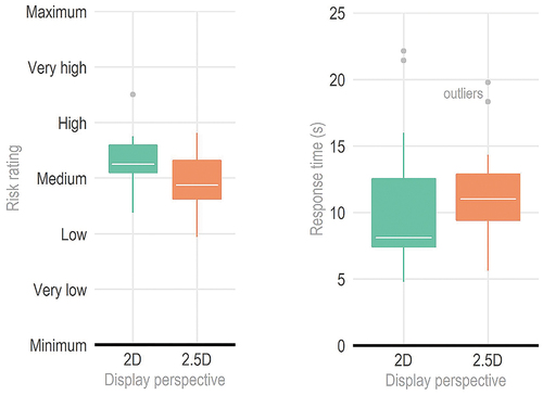
Turning now to response time, participants assigned to the 2D group needed on average 10.8 seconds (SD = 5.3 seconds) to rate their risk perception. Participants of the 2.5D group needed on average 11.5 seconds (SD = 3.9 seconds) to make a risk decision. According to the Wilcoxon-Mann-Whitney test, this difference is not significant (p = .46), also the t-test showed no significant difference (p = .71). In conclusion, although individuals viewing 2D flood visualizations had more variability in responses on average, they needed slightly less time than participants from the 2.5D group.
5.2. Effects of assessed risk attitudes on risk perception
As a reminder, a linear mixed-effect model was used to analyze the effects of risk attitudes on risk perception. We found a marginally significant effect of 2D group on risk attitudes, such that individuals in the 2D group viewed the visualizations as slightly riskier (.37 Likert points on average) than the 2.5D group, after controlling for risk attitudes (B = .37, p = .052 see ). However, the effect of risk attitude on risk ratings was estimated with an extremely flat slope (see ; B = −0.00, p = .68), indicating no positive or negative linear association.
Figure 3. Linear mixed-effect model: predicted values of average risk ratings across the experimental groups are not affected much by participants’ risk attitudes.
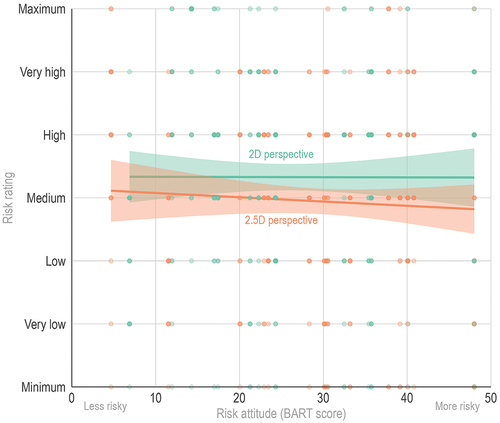
Table 1. No significant differences in risk taking behavior across experimental groups.
The graph in visualizes how much participants’ average risk ratings change as their risk attitudes increase across the experimental groups.
This linear mixed-effect model explains only 1.4% of the variance in risk decisions without considering random effects (marginal R2) and only up to 5.6% by taking random effects additionally into account (conditional R2). These low R2-values lead to the assumption that collected risk ratings are in general weakly influenced by individual participants’ risk attitudes.
5.3. Responses from the think aloud protocols
In the think-aloud part of the study, immediately following the map trials, nearly all participants mentioned that they looked up relevant flood depth classes in the legend that concerned the area closest to the home location to be assessed in each trial (93%). Fifty-three percent of the participants explicitly mentioned having closely inspected the zone around the home location with a marker that was in the vicinity of two or three flood depth classes. This prompted them to assign a higher rating of perceived risk for building a home at such a location. Approximately two out of three participants specifically mentioned having taken the displayed flood depth classes into account for their perceived risk assessment for building their home at a given house marker location. For almost half of the participants, the main map was not considered sufficient for their decision-making, as 40% of the participants mentioned that they also considered the inset map showing a larger footprint but at a smaller cartographic scale, for their risk assessments. Along the lines of Shneiderman’s (Citation1996) interactive information visualization mantra “overview first, zoom and filter, then details on demand”, some of the participants mentioned their decision-making strategy to first consult the inset map to get a general impression of the flood situation, before focusing more on the specific house locations in the main map. Last but not least, 26% of the participants also considered the topography of the flood zone and their respective water flow directions, to rate their perceived risk ().
Figure 4. The frequency of responses (x-axis) across experimental groups (2D vs. 2.5D), tallied and ranked from most (top) to least (bottom) in the bar chart, with respect to concepts elicited during participants’ think aloud. Visual inspection of the flood depth at the house marker location was mentioned most by participants during their think aloud.
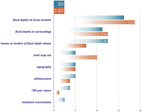
Specifically comparing responses across the 2D and 2.5D experimental groups (), home locations near or at the border of multiple flood depth classes were mentioned more often in the 2D group compared to the 2.5D group. The inset map was consulted more often in the 2.5D group compared to the 2D group. Inferences about the topography and flood water flow direction were equally considered across map conditions ().
6. Discussion
Given the growing popularity and enthusiasm of leaving flatland (Duebel et al., Citation2014; Friendly, Citation2008; Shepherd, Citation2008), we aimed specifically to empirically evaluate in this study how the display perspective of static 2D (orthographic) and 2.5D (oblique perspective) flood maps might interact with human risk perception. Because human factors have shown to matter even more in visualization than display design (Kübler et al., Citation2019; Wilkening & Fabrikant, Citation2013), we also included human risk attitudes in our study. We could not find any statistical differences related to risk perception and task response time across the experimental (2D vs. 2.5D display) groups. There is also only weak statistical support that ratings of perceived risk were influenced by participants’ risk attitudes, as hypothesized based on prior similar research (Kübler et al., Citation2019). Based on prior work, we know that not only design factors such as visual variable choices, dimensionality, map scale, and display size but also human factors including age, gender, level of education, or previous knowledge can have an effect on map-based risk perception (Kübler et al., Citation2019). In this study, however, we could not identify any significant differences across demographic variables of the experimental groups. This could be interpreted in many ways. Perhaps, even if there were statistical differences to be found, for example, with a larger participant sample, the effect size might be still small and thus not matter much. Beyond risk perception, and similarly to reviewed literature (e.g., Lieske et al., Citation2014), as discussed in Section 2.1, our results are again inconclusive regarding dimensionality or perspective view changes. We could not replicate the raised awareness effect suggested in prior related work by Evans et al. (Citation2014) and Macchione et al. (Citation2019) in the context of flood events. A possible reason for this is perhaps not related to the viewing perspective at all, but that the visualized flood and flood depth classes do not appear very realistic compared to prior research, e.g., Evans et al. (Citation2014) and Macchione et al. (Citation2019). Heightened realism or fidelity is also related to the volumetric depiction options of the flood water level in 3D compared to 2D views, because it offers direct visual input on the consequences of the flood height (Amirebrahimi et al., Citation2016; Leskens et al., Citation2017). Hence, one possible reason for the lower risk ratings of the 2.5D maps in our study could be related to the visibility of the water level height indicated on the facades of the buildings using the visual variables opacity and shading. In our study, the water levels were made less opaque so that the discrete depth classes in the 2D legend could be recognized by the apparent 2.5D shading and to ensure that perceptually similar color hues could be used in both visualization types. Possibly, the greater transparency resulted in lower visual contrast between the color of the house facade and the water level (flood class). This might have required closer, more careful inspection by participants to be able to distinguish water level classes in the map and the visual match in the legend. Nevertheless, with all made design decisions, we aimed to minimize perceptual differences between the two tested visualization types so that potential differences in risk perception could be attributed to the change in dimension. At this stage of the research, we thus cannot fully disentangle the effects of display design, human factors, and the context of the study. Future work could further study the influence of the visual level of detail in 2.5D oblique flood maps on risk perception. Furthermore, the effect of the additional value of showing water levels or other flood damage details on the house façade in 2.5D or immersive 3D visualizations compared to 2D orthographic flood maps could be analyzed in more detail.
While not statistically different, there is a trend that participants looking at 2.5D oblique flood maps needed more time for decision-making compared to the 2D orthographic flood risk maps. A reason for this might be more frequent consultation of the inset map, as was mentioned by several participants in their think aloud protocol. This could mean that the 2.5D map required additional information for the interpretation, compared to the 2D map, because of visual occlusion, for instance, or because the 2D map was preferred or more familiar to them. Perhaps, the “gist” of the scene (Oliva, Citation2005) was harder to apprehend in 2.5D compared to 2D, and thus a separate 2D inset map display is needed for this kind of display. This would give support to the cost/benefit argument mentioned earlier: The display designer must face a cost/benefit tradeoff when adding more display dimensions to a display beyond static 2D (Wilkening & Fabrikant, Citation2013). This includes the assessment of cognitive, perceptual, and technical costs against humans’ preferences, ease of use, ease of information apprehension, and information gain benefits (Ware, Citation2022).
A number of prior studies pointed to differences in response time between 2D and 3D visualization, depending on the type of map reading tasks (Savage et al., Citation2004; St. John et al., Citation2001). For instance, for simple 2D tasks that do not require elevation data, participants were faster and more accurate in responding using 2D visualizations, even if participants might have preferred 3D over 2D (Hegarty et al., Citation2009). However, for tasks that involved elevation information, the use of 3D visualizations resulted in faster response times compared to 2D visualizations (Savage et al., Citation2004). The question of task dependency for risk perception of a flood visualization should, therefore, also be taken into account in future empirical studies. According to the think aloud protocol analysis, participants verbalized to have mainly focused on the flood depths at or near the home marker locations, suggesting relative, distance-related assessment strategies when assessing respective flood risks. This was also found in related empirical map-based risk research, assessing the uncertainty of risks related to hurricanes (Ruginski et al., Citation2019) or the risks of landing a helicopter under time pressure (Korporaal et al., Citation2020). Many participants also mentioned the topography of the flood area and related water flow directions. In this study, thus, a mixture of planar, distance-related cartometric assessments for which 2D orthographic maps are more useful (and yield faster answers) was used together with surface topography and height assessments, where arguably 2.5D or 3D maps would yield faster and more accurate responses (St. John et al., Citation2001). This might have resulted in similar response times for both 2D and 2.5D flood maps in our study.
Collected think aloud data also reveal that the 2D inset maps – which provided an overview of the flood situation at a smaller cartographic scale – were mentioned more often in the 2.5D group compared to the 2D group. A possible explanation for the more frequent consultation of the inset map in the 2.5D group could be that a visual overview without any potential occlusion of overlapping cartographic symbols or flood depths is achieved more quickly with an orthographic 2D map than with the 2.5D oblique view. The orthographic 2D map is easier to read, and relative location judgments are more accurate compared to 3D oblique views (St. John et al., Citation2000). This could be a possible reason why participants in the 2.5D group mentioned the inset map more frequently than participants from the 2D group. One can further speculate whether a 2D or 2.5D oblique flood risk map would still be used today in a static format, given that interactive 2D and 3D displays are abundant and are easily accessible everywhere on most current smart phones (given power and an internet connection, of course). As mentioned earlier, interactivity is a necessary requirement for compensating for perceptual, cognitive, and technical costs to use either digital orthographic 2D maps (i.e., paning and zooming), 2.5D perspective views (i.e., additional tilting and rotating), or fully immersive 3D displays (i.e., additional stereoscopy, sound, and digital interaction devices). Our results show for a very particular task relating to risk perception of floods that 2D displays are not significantly worse in conveying flood risk compared to 2.5D. In fact, according to the think aloud protocols, the 2.5D map required an additional 2D overview map to be equally useful as the 2D map. In the sense of parsimony, static 2D displays are cheaper and faster to produce, easier and faster to disseminate, and faster to perceive than interactive 2.5D displays, so our results suggest that the intuited potential benefit of realistic oblique 2.5D, which would require interactivity to fully apprehend the 3D scene, would have to significantly outweigh the additionally introduced perceptual and cognitive costs that come with human-display interactions for displays that have more than two viewing dimensions (Wilkening & Fabrikant, Citation2013). Given that flood risk and flood event maps might be used in emergency situations and under time pressure – in the case of an evolving flood event, and possibly without any access to power or an internet connection – 2D static maps have still not lost their use value and benefit. A good example for this is the static 2D (image) map products by UNOSAT, produced in response to humanitarian emergencies related to disasters, etc. (e.g., https://unosat.org/products/). As Wilkening and Fabrikant (Citation2011) revealed in a study assessing 2D map types with different levels of realism, participants’ response accuracy and response confidence interact with users’ individual differences (i.e., spatial ability), group differences (i.e., gender), map use context (i.e., time pressure), and spatial inference making tasks (i.e., route selection). We thus recommend that future empirical work looks beyond display design characteristics, display dimensionality, and viewing perspective but focuses more on the human viewer, their tasks, and their display use contexts.
Finally, the think-aloud data served us well to also verify that participants understood the experimental task and avoid potential misunderstandings. For instance, Lieske et al. (Citation2014) suggested that additional cognitive effort to imagine a real-world flood situation with abstracted 2D or 2.5D depictions might lead to misunderstanding in the concepts being assessed. The think-aloud test ensured that only data from participants who had understood the task correctly were examined in the analysis.
6.2. Effects of risk attitudes on risk perception
Counter our hypothesis, this study revealed that the influence of individual risk attitudes on participants’ risk ratings is weak at best. A reason for this might be found in the type of risk assessment task (i.e., the BART) we used to assess risk attitude, which is different from prior related work (Korporaal et al., Citation2020; Kübler et al., Citation2019). There is a conceptual frame in the BART of balancing the potential for reward versus loss by players, that is, for each successful pump action click the balloon inflates incrementally and money is added up to the gain counter until some threshold, at which point the balloon is over inflated and explodes whereby all money is lost. Each sequential pump confers greater risk, but also greater potential reward in this context. The sequence character of the BART and the uncertainty of the gain and loss is different from the classic prospect theory proposed by Kahneman and Tversky (Citation1979). In their theory, a certain loss in a game is weighted more than a certain gain for a risk-averse person, that is, a risk-averse person chooses the safest sure win even though a prospective win could be higher. Possibly, the BART does not map well enough on to the risk rating trials, as there are no sure gains or losses (i.e., right or wrong answers), thus participants cannot win or lose anything specific. Perhaps, BART would be more appropriate in a serious game scenario, using map-based decision-making based on explicitly stated risks and rewards, similar to Holt and Laury (Citation2002) lottery choice game. The relationship between a participant’s risk attitude and their flood risk perception is possibly confounded by the fact that far fewer people own or build a home in Switzerland (less than 25% of the population in 2019),Footnote3 compared to renting dwellings, which might be a reason why some participants may not have perceived the risk to be real enough for them.
7. Conclusions and outlook
The severity of flood events, occurring with increasing frequency in many parts of the world with life-threatening consequences for vulnerable populations, underlines the importance for authorities to issue timely and comprehensible risk information (Hagemeier-Klose & Wagner, Citation2009). Technological progress allows for new visualization options to communicate flood risk. However, not everything that is technically feasible or preferred by people is useful or usable for them, or what users need for a given task at hand. Geographic information visualizations play an important role in people’s hazard risk perception (Lieske et al., Citation2014). Past empirical research typically evaluated hazard risk display usefulness with participants’ preferences and with simple decision tasks, including map reading accuracy and decision time (Franz et al., Citation2015). While 3D visualizations have become popular in the scientific flood hazard risk literature (Macchione et al., Citation2019), the effect of the graphic display dimension on viewers’ risk perception has not yet been considered systematically. The aim of our empirical study was thus to address this research gap by investigating how the change of display dimension would affect map viewer’s flood risk perception and how viewers’ risk attitude would influence their display-based decision-making. Extending previous inconclusive findings with various decision-making tasks, we also did not find any statistically significant differences in participants’ (N = 30) perceived flood risk ratings across the experimental 2D and 2.5D flood risk map conditions. We could not observe any influence on participants’ risk attitudes on their perceived flood risk ratings, as prior research would have suggested. These inconclusive results are in line with prior similar comparative studies on the use of 2D and 3D visualizations on various decision-making and preference tasks (Popelka & Brychtova, Citation2013; Savage et al., Citation2004; Schobesberger & Patterson, Citation2008; St. John et al., Citation2001). With the added qualitative think-aloud portion to our quantitative experimental outcome assessment, however, possible differences in decision-making processes across the 2D and 2.5D experimental groups could be revealed, including the relevance of distance from the assessed house location, and the need for a 2D overview map in an oblique perspective view.
Moving beyond display dimensionality, as evaluated here, it would be informative to further systematically investigate empirically how an increase of realism and the fidelity of 3D display thus possibly leveraging display immersiveness with multimodal virtual reality and augmented reality technology might affect people’s risk perception (Simpson et al., Citation2022). These contexts are more likely to elicit decision-making strategies closer to actual flood scenarios and would enable a more thorough investigation of how display immersiveness interacts with viewer’s affect and emotion using psychophysiological measurements. The think-aloud protocols revealed very useful information to help explain outcomes about participants’ decision-making processes. Augmented reality (i.e., smart device-based or head-mounted) coupled with human sensor technology (e.g., galvanic skin responses, EEG, eye tracking, etc.) and future mixed-method empirical studies run with human observers in the real world, offer exciting new avenues for exploring risk perception of natural hazards in situ. Understanding the determining factors of people’s risk perception is essential for improving risk communication (Kellens et al., Citation2011). The answers of this study thus further help to promote this understanding by illustrating the influence of changing dimensions in flood risk maps on people’s risk perception.
Acknowledgments
Without the willingness of our participants to be part of this empirical study during lockdown times in a global health pandemic, there would have been nothing to report at all. We thank you for taking the time and effort! We are indebted to the generous funding by the European Research Council (ERC) Advanced Grant GeoViSense, no. 740426.
Disclosure statement
No potential conflict of interest was reported by the author(s).
Data availability statement
The data that support the findings of this study are openly accessible at the OSF archive, available on the Web at: https://osf.io/meznc/.
Additional information
Funding
Notes
1 https://arcg.is/vjjf5, accessed 2021.
2 https://msc.fema.gov/portal/advanceSearch, accessed 2021.
3 SwissStats Webviewer (in German), on the Web at: https://www.swissstats.bfs.admin.ch/collection/ch.admin.bfs.swissstat.de.issue21000212100/article/issue21000212100-12 (accessed 2023).
References
- Abbott, E. A. (1884/1992). Flatland: A romance of many dimensions. (Dover Thrift ed.). Dover Publications Inc.
- Amirebrahimi, S., Rajabifard, A., Mendis, P., & Ngo, T. (2016, May 2–6). A planning decision support tool for assessment and 3D visualisation of flood risk to buildings. In International Federation of Surveyors (FIG) Working Week 2016: Recover from Disaster, Proceedings, Christchurch, New Zealand. International Federation of Surveyors (FIG).
- Bertin, J. (1967). Sémiologie graphique. Les diagrammes, les réseaux, les cartes. La Haye, Mouton, Gauthier-Villars.
- Charrière, M. K. M., Junier, S. J., Mostert, E., & Bogaard, T. A. (2012, November 20–22). Flood risk communication—Visualization tools and evaluation of effectiveness. In Comprehensive Flood Risk Management: Research for Policy and Practice, Proceedings, Comprehensive Flood Risk Management FLOODrisk 2012: The 2nd European conference on FLOODrisk management science, policy and practice: Closing the gap (pp. 367–368). CRC Press.
- Cope, M. (2016). Organizing and analyzing qualitative data. In I. Hay (Ed.), Qualitative research methods in human geography (pp. 373–392). Oxford University Press.
- De Moel, H., van Alphen, J., & Aerts, J. C. J. H. (2009). Flood maps in Europe – methods, availability and use. Natural Hazards and Earth System Sciences, 9(2), 289–301. https://doi.org/10.5194/nhess-9-289-2009
- Duebel, S., Roehlig, M., Schumann, H., & Trapp, M. (2014). 2D and 3D presentation of spatial data: A systematic review. In 2014 IEEE VIS International Workshop on, (3DVis), (pp. 11–18). IEEE. https://doi.org/10.1109/3DVis.2014.7160094
- Evans, S. Y., Todd, M., Baines, I., Hunt, T., & Morrison, G. (2014). Communicating flood risk through three-dimensional visualisation. Proceedings of the Institution of Civil Engineers - Civil Engineering, 167(5), 48–55. https://doi.org/10.1680/cien.13.00020
- Fabrikant, S. I., Maggi, S., & Montello, D. R. (2014). 3D network spatialization: Does it add depth to 2D representations of semantic proximity? LNISA, 8728, 34–47. https://doi.org/10.1007/978-3-319-11593-1_3
- Franz, M., Scholz, M., & Hinz, O. (2015). 2D versus 3D visualizations in decision support – The impact of decision makers’ perceptions. In International Conference on Information Systems 2015. Association for Information Systems (AIS).
- Friendly, M. (2008). A brief history of data visualization. In Handbook of data visualization (pp. 15–56). Springer. https://doi.org/10.1007/978-3-540-33037-0_2
- Hagemeier-Klose, M., & Wagner, K. (2009). Evaluation of flood hazard maps in print and web mapping services as information tools in flood risk communication. Natural Hazards and Earth System Sciences, 9(2), 563–574. https://doi.org/10.5194/nhess-9-563-2009
- Haynes, K., Barclay, J., & Pidgeon, N. (2007). Volcanic hazard communication using maps: An evaluation of their effectiveness. Bulletin of Volcanology, 70(2), 123–138. https://doi.org/10.1007/s00445-007-0124-7
- Hegarty, M., Smallman, H. S., Stull, A. T., & Canham, M. S. (2009). Naïve cartography: How intuitions about display configuration can hurt performance. Cartographica: The International Journal for Geographic Information and Geovisualization, 44(3), 171–186. https://doi.org/10.3138/carto.44.3.171
- Holt, C. A., & Laury, S. K. (2002). Risk aversion and incentive effects. American Economic Review, 92(5), 1644–1655. https://doi.org/10.1257/000282802762024700
- Kahneman, D., & Tversky, A. (1979). Prospect theory: An analysis of decision under risk. Econometrica: Journal of the Econometric Society, 47(2), 263–291. https://doi.org/10.2307/1914185
- Kellens, W., Zaalberg, R., Neutens, T., Vanneuville, W., & De Maeyer, P. (2011). An analysis of the public perception of flood risk on the Belgian coast. Risk Analysis, 31(7), 1055–1068. https://doi.org/10.1111/j.1539-6924.2010.01571.x
- Kemec, S., Zlatanova, S., & Duzgun, H. S. (2010). A framework for defining a 3D model in support of risk management. Geographic Information and Cartography for Risk and Crisis Management, 199539, 69–82. https://doi.org/10.1007/978-3-642-03442-8_5
- Korporaal, M., Ruginski, I. T., & Fabrikant, S. I. (2020). Effects of uncertainty visualization on map-based decision making under time pressure. Frontiers in Computer Science, 2. https://doi.org/10.3389/fcomp.2020.00032
- Kübler, I., Richter, K.-F., & Fabrikant, S. I. (2019). Against all odds: Multicriteria decision making with hazard prediction maps depicting uncertainty. Annals of the American Association of Geographers, 110(3), 661–683. https://doi.org/10.1080/24694452.2019.1644992
- Lejuez, C. W., Richards, J. B., Read, J. P., Kahler, C. W., Ramsey, S. E., Stuart, G. L., Strong, D. R., & Brown, R. A. (2002). Evaluation of a behavioral measure of risk taking: The balloon analogue risk task (BART). Journal of Experimental Psychology: Applied, 8(2), 75–84. https://doi.org/10.1037/1076-898X.8.2.75
- Leskens, J. G., Kehl, C., Tutenel, T., Kol, T., de Haan, G., Stelling, G., & Eisemann, E. (2017). An interactive simulation and visualization tool for flood analysis usable for practitioners. Mitigation and Adaptation Strategies for Global Change, 22(2), 307–324. https://doi.org/10.1007/s11027-015-9651-2
- Lieske, D. J., Wade, T., & Roness, L. A. (2014). Climate change awareness and strategies for communicating the risk of coastal flooding: A Canadian maritime case example. Estuarine, Coastal and Shelf Science, 140, 83–94. https://doi.org/10.1016/j.ecss.2013.04.017
- Macchione, F., Costabile, P., Costanzo, C., & De Santis, R. (2019). Moving to 3-D flood hazard maps for enhancing risk communication. Environmental Modelling and Software, 111, 510–522. https://doi.org/10.1016/j.envsoft.2018.11.005
- Nahm, F. S. (2016). Nonparametric statistical tests for the continuous data: The basic concept and the practical use. Korean Journal of Anesthesiology, 69(1), 8–14. https://doi.org/10.4097/kjae.2016.69.1.8
- Oberg, A. L., & Mahoney, D. W. (2007). Linear mixed effects models. In W. T. Ambrosius (Ed.), Topics in biostatistics. Methods in molecular biology (pp. 213–234). https://doi.org/10.1007/978-1-59745-530-5_11
- Oliva, A. (2005). Gist of the scene (chapter 41). In L. Itti, G. Rees, & J. K. Tsotsos (Eds.), Neurobiology of attention (pp. 251–256). Academic Press. https://doi.org/10.1016/B978-012375731-9/50045-8
- Popelka, S., & Brychtova, A. (2013). Eye-tracking study on different perception of 2D and 3D terrain visualisation. The Cartographic Journal, 50(3), 240–246. https://doi.org/10.1179/1743277413Y.0000000058
- Robinson, A. H. (1952). The look of maps. An examination of cartographic design. University of Wisconsin Press.
- Rollason, E., Bracken, L. J., Hardy, R. J., & Large, A. R. G. (2018). Rethinking flood risk communication. Natural Hazards, 92(3), 1665–1686. https://doi.org/10.1007/s11069-018-3273-4
- Roth, R. E. (2009). The impact of user expertise on geographic risk assessment under uncertain conditions. Cartography and Geographic Information Science, 36(1), 29–43. https://doi.org/10.1559/152304009787340160
- Roth, R. E., Quinn, C., & Hart, D. (2015). The competitive analysis method for evaluating water level visualization tools. In J. Brus, A. Vondrakova, & V. Vozenilek (Eds.), Modern trends in cartography. Lecture notes in geoinformation and cartography. Springer. https://doi.org/10.1007/978-3-319-07926-4_19
- Ruginski, I., Creem-Regehr, S. H., Stefanucci, J. K., & Cashdan, E. (2019). GPS use negatively affects environmental learning through spatial transformation abilities. Journal of Environmental Psychology, 64, 12–20. https://doi.org/10.1016/j.jenvp.2019.05.001
- Savage, D. M., Wiebe, E. N., & Devine, H. A. (2004). Performance of 2D versus 3D topographic representations for different task types. Proceedings of the Human Factors and Ergonomics Society Annual Meeting, 48(16), 1793–1797. https://doi.org/10.1177/154193120404801601
- Schobesberger, D., & Patterson, T. (2008, February 11–15). Evaluating the effectiveness of 2D vs. 3D trailhead maps a map user study conducted at Zion National Park, United States. In Proceedings of the 6th ICA Mountain Cartography Workshop (pp. 201–205). International Cartographic Association (ICA).
- Seipel, S., & Lim, N. J. (2017). Color map design for visualization in flood risk assessment. International Journal of Geographical Information Science, 31(11), 2286–2309. https://doi.org/10.1080/13658816.2017.1349318
- Shepherd, I. D. H. (2008). Travails in the third dimension: A critical evaluation of 3D geographical visualization. In M. Dodge, M. McDerby, & M. Turner (Eds.), Geographic visualization: Concepts, tools and applications (pp. 199–222). Wiley.
- Shneiderman, B. (1996). The eyes have it: A task by data type taxonomy for information visualizations. In Proceedings IEEE Symposium on Visual Languages (pp. 336–343). https://doi.org/10.1109/VL.1996.545307
- Simpson, M., Padilla, L., Keller, K., & Klippel, A. (2022). Immersive storm surge flooding: Scale and risk perception in virtual reality. Journal of Environmental Psychology, 80, 101764. https://doi.org/10.1016/j.jenvp.2022.101764
- St. John, M., Cowen, M. B., Smallman, H. S., & Oonk, H. M. (2001). The use of 2D and 3D displays for shape-understanding versus relative-position tasks. Human Factors, 43(1), 79–98. https://doi.org/10.1518/001872001775992534
- St. John, M., Smallman, H. S., & Cowen, M. B. (2000). Designing for the task: Sometimes 2-D is just plane better. Proceedings of the Human Factors and Ergonomics Society Annual Meeting, 44(21), 3-407–3–410. https://doi.org/10.1177/154193120004402108
- Tversky, B., Morrison, J. B., & Betrancourt, M. (2002). Animation: Can it facilitate? International Journal of Human-Computer Studies, 57(4), 247–262. https://doi.org/10.1006/ijhc.2002.1017
- van Ackere, S., Glas, H., Beullens, J., Deruyter, G., De Wulf, A., & De Maeyer, P. (2016). Development of a 3D dynamic flood WEB GIS visualisation tool. International Journal of Safety and Security Engineering, 6(3), 560–569. https://doi.org/10.2495/SAFE-V6-N3-560-569
- Ware, C. (2022). Visual thinking for information design (2nd ed.). Elsevier.
- Ware, C., & Plumlee, M. (2005). 3D geovisualization and the structure of visual space (chapter 29). In J. Dykes, A. M. MacEachren, & M.-J. Kraak (Eds.), International cartographic association, exploring geovisualization (pp. 567–576). Elsevier. https://doi.org/10.1016/B978-008044531-1/50447-4
- Wilkening, J., & Fabrikant, S. I. (2011). How do decision time and realism affect map-based decision making? In M. Egenhofer, N. Giudice, R. Moratz, & M. Worboys (Eds.), Spatial information theory. COSIT 2011. Lecture notes in computer science (Vol. 6899, pp. 1–19). Springer. https://doi.org/10.1007/978-3-642-23196-4_1
- Wilkening, J., & Fabrikant, S. I. (2013). How users interact with a 3D geo-browser under time pressure. Cartography and Geographic Information Science, 40(1), 40–52. https://doi.org/10.1080/15230406.2013.762140
- Zhang, N., Yasunari, T., & Ohta, T. (2011). Dynamics of the larch taiga–permafrost coupled system in Siberia under climate change. Environmental Research Letters, 6(2), 024003. https://doi.org/10.1088/1748-9326/6/2/024003