
ABSTRACT
Maps have served as authoritative and trustworthy sources of geospatial information for years. However, maps are increasingly being wielded to spread misinformation due to the democratization of mapmaking, advances in AI, and the emergence of post-truth politics. Trust plays a fundamental role in the spread of misinformation, but our understanding of trust in the context of maps is limited. In this paper, I examine the methodologies employed by empirical studies on trust in maps and synthesize the major findings of said studies. Most of the reviewed studies were experiments that utilized single-item self-reporting Likert-type measures to capture trust. I organized the findings of the studies into six major themes including source, metadata, transparency, uncertainty, design, and information modality. Additionally, I present a research agenda based on the findings and limitations of existing works. This agenda highlights methodological challenges to studying trust in maps and proposes opportunities in the form of research questions.
Introduction
Maps can play a pivotal role in communicating science when they are accurate and when people can trust their content. However, maps can also be used to weaponize misinformation if data classification, color schemes, symbology, and other design decisions are deliberately misused to fabricate a narrative. Many of these manipulations are challenging to detect even with extensive cartographic training, which makes maps potentially dangerous vessels for misinformation. The advent of Web Geographic Information Systems (GIS) and open-source mapping software have made it easier for maps to be quickly crafted and used to spread potentially false information (Field, Citation2014). Historically, mapmaking was a gatekept profession that required extensive training and access to resources few had, effectively limiting production to a small number of professionals. Now, mapmaking is easier and more accessible to nonprofessionals. The surge in user-generated maps has been met with concerns about map and data quality since untrained individuals can create professional-looking maps that go viral (Robinson, Citation2019), even though their content and design may not necessarily be trustworthy. Moreover, recent advances in artificial intelligence (AI) enable almost instantaneous generation of maps that are largely ridden with inaccuracies and visualize synthetic data (Kang et al., Citation2023)
Societal benefits from the democratization of mapmaking are important, but they could be overshadowed by their intersection with post-truth politics. The current post-truth era is characterized by the increased scrutiny of information and the erosion of trust in previously reputable institutions (Iyengar & Massey, Citation2019). Maps and other data visualizations can be used as tools in post-truth politics to spread unorthodox and controversial information that undermines trust in science (Lee et al., Citation2021). Maps warrant special attention as they can uniquely capture the spatial nature of phenomena, convey authority, and have a rich history of being used as rhetorical devices (Harley, Citation1989; Propen, Citation2007). Therefore, society and media creators must determine how to design maps that foster trust in science and how to curtail the impact that misleading maps may have. Researchers can contribute to this issue by seeking to better understand the cartographic design factors that influence trust in maps and by explaining the psychological mechanisms that may moderate people’s trust in maps. It is also important to examine how these factors are influenced by the social, cultural, political, and temporal contexts in which maps are produced and consumed.
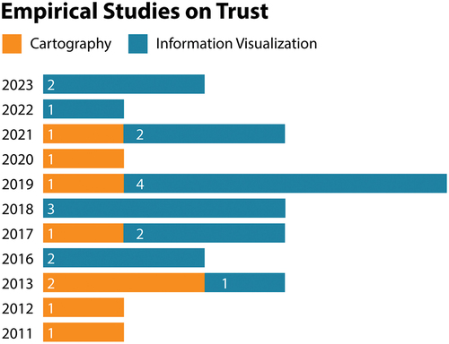
Researchers have begun unpacking these matters in recent years. Since 2011, 8 empirical studies on trust in maps have been conducted, and 17 studies have been conducted on trust in non-map visualizations. shows the trend toward more research on trust in maps and visualizations. I generated this corpus of work through Google Scholar searches using thematic keyword searches (e.g. trust, map, visualization). I did not use any filters regarding the publication outlet or year but I did filter the publications by reading the abstracts to make sure they met the following set of inclusion and exclusion criteria:
Figure 1. Empirical studies on trust in cartography and information visualization by published year.
Publications must explicitly study trust as it pertains to maps or have tangible applications to cartography.
Publications must be peer-reviewed.
Trust (or credibility, confidence, and belief) must be measured as a dependent variable.
After identifying an initial corpus, I used forward and backward snowballing to find research that cites publications from the corpus and research that is cited in the corpus, respectively. I also filtered the snowballed publications based on the inclusion and exclusion criteria, and I repeated the snowballing until no additional articles were added to the corpus, resulting in 25 publications. I grouped publications that used maps as their main stimuli and/or study framing into “cartography” studies whereas I grouped studies focusing on other kinds of visualizations (e.g. line graphs, pie charts) into “information visualization” studies.
While there is a substantive body of literature on trust in maps and visualizations, we lack a comprehensive overview of the current thinking on the topic. It is necessary to review the current state of science regarding trust in maps before proposing and pursuing a research agenda. This work aims to address this gap by reviewing the 25 aforementioned empirical works on trust in maps and visualizations that I identified when searching for literature.
The goals of this review are to characterize the methods used to study trust in maps and consolidate the major findings of empirical works on trust in maps. In doing so, I identify gaps in existing research and chart a research agenda that will address these gaps and advance our understanding of how people trust maps. Before outlining the review, I distinguish trust from credibility and define trust in the context of maps. The rest of the paper is comprised of a review that is structured into three major sections. First, I describe the research designs and measures employed to study trust in maps. Second, I synthesize the prevailing themes of results from empirical work on trust in maps. Finally, I present a research agenda that seeks to address lingering research challenges and limitations of prior studies on trust and maps.
Conceptualizing trust in maps
There is a much broader discourse about trust that spans multiple disciplines including psychology (Simpson, Citation2007), sociology (Lewis & Weigert, Citation1985), and economics (Hosmer, Citation1995), but covering this discourse is beyond the scope of this paper. Instead, I focus on how trust has been conceptualized in media studies, computer science, and cartography. A key point of contention in these fields is discriminating “trust” from “credibility” as the two terms are often used interchangeably in research on media (Kohring & Matthes, Citation2007), computer science (Fogg & Tseng, Citation1999), and cartography (Flanagin & Metzger, Citation2008; Griffin, Citation2020). Despite their synonymous treatment in the literature, these two words represent distinct concepts. Credibility refers to the believability and/or accuracy of information based on an evaluation at a single point in time (Fawzi et al., Citation2021). It is often operationalized in terms of expertise, trustworthiness, and attractiveness (Sundar & Venkatesakumar, Citation2013) and is studied in terms of three dimensions: source, message, and medium (Metzger et al., Citation2003). Conversely, trust describes the willingness to be vulnerable to information by relying on it based on positive expectations (McKnight & Chervany, Citation2001). Thus, credibility is a perceptual variable that is a product of an individual’s one-time subjective evaluation of the map whereas trust is a future-oriented state where a user relies on the map for information (Flanagin & Metzger, Citation2008). As Fogg and Tseng (Citation1999) concisely note: trust is equivalent to dependability whereas credibility is equivalent to believability.
Still, these concepts are closely related to each other. Sundar (Citation2008, p. 81) notes that “trust … is a key component of credibility” and Henke et al. (Citation2020) emphasize that trust and credibility are different concepts, but that they are inextricable from one another. Indeed, credibility has been demonstrated to correlate strongly with trust in advertisements (Soh et al., Citation2009), consumer behavior (Sichtmann, Citation2007), and people/organizations (Ganesan & Hess, Citation1997). Due to the similarities between trust and credibility and because of the limited amount of research on trust and credibility concerning maps and visualizations, this paper investigates research on both concepts. However, one of the major contributions of this paper – the research agenda – is framed in terms of trust, not credibility as trust is a future-oriented concept that more closely parallels map use.
A formal concept explication, the process of clarifying what a concept means, is needed to best define what trust in the context of maps entails (Chaffee, Citation1991). Still, for now, I provide a working definition of trust as follows: the willingness to rely on geospatial information interpreted from a map with the expectation that the information has been ethically and accurately represented by the cartographer. This definition was developed by incorporating three defining characteristics of trust in maps: willing reliance (Mayr et al., Citation2019; Skarlatidou et al., Citation2011), positive expectation (Lin & Thornton, Citation2021; Peck et al., Citation2019), and representation (McGranaghan, Citation1999; Muehlenhaus, Citation2012).
Methods for studying trust in maps and visualizations
In this section, I survey how trust in maps and visualizations has been empirically studied. I characterize three distinct groups of studies based on the type of research design and the measurement technique(s) used. One group consists of experiments that employed self-report measures, another group consists of experiments that used decision-oriented measures, and a final group consists of qualitative surveys, interviews, and observational studies. Since the goal of this section is to explore how researchers determine individuals’ trust in maps, I pay particular attention to similarities and distinctions in the measures employed. I chose to group the methods this way since one of the most challenging parts of studying trust is how to measure it. In the following section, I synthesize the results of this body of empirical works.
Experiments with self-reporting measures
Twenty of the twenty-five experiments that I reviewed operationalized trust as the self-reported degree to which an individual trusts a map/visualization. Self-report measurements function by having participants disclose their perceptions of feelings, attitudes, behaviors, etc., in response to one or more questions. There were two major categories of self-reporting measures: single-item and multiple-item. Single-item measures gauge trust by having participants respond to a single question or statement whereas multiple-item measures require participants to respond to two or more questions or statements. These statements often measure predictor variables of trust (i.e. perceived accuracy, believability, etc.).
Single-item measures
Single-item measures were the most prevalent form of self-reporting in studies investigating trust in maps/visualizations (see ). Most of these measures are Likert-type questions that consist of a single question or statement that is formatted to mimic one of the many items in a Likert Scale, a multi-item, bipolar scale originally designed to measure attitude (Likert, Citation1932). Thus, a Likert Scale consists of multiple statements and a Likert-type item is a single statement or question (Clason & Dormody, Citation1994; Likert, Citation1932).
Table 1. Self-report measures used in cartography and visualization studies on trust and related concepts. The table is organized hierarchically by the number of items, the concept captured, the type of question, the number of scale points, the year published, and whether the stimuli are visualizations or maps.
Likert-type measures ask individuals to indicate how much they trust x or how trustworthy x is (where x is, a map, visualization, data, etc.) on a scale from 1 to y where y is the number of points of the measure. For instance, Xiong et al. (Citation2019) measured trust by asking participants to rate the trustworthiness of maps on a five-point scale with five denoting more trust and 1 denoting less trust. In contrast, Lin and Thornton (Citation2021) asked participants to indicate how much they trusted visualizations based on a 7-point scale ranging from “not at all” to “extremely.” A different operationalization of trust was the self-reported confidence in the analysis result provided by the visualization on a five-point Likert scale (Dasgupta et al., Citation2017).
In addition to Likert-type questions, visual analog scales (VAS) were employed by Padilla et al. (Citation2023) by asking participants to drag a slider from 0–100 to indicate their trust in the visualization where 0 denotes “not at all trustworthy” and 100 denotes “completely trustworthy.” Burns et al. (Citation2022, p. 7) also used VAS by having participants move a slider to indicate how probable it was that a hypothetical organization selected one of two charts to use in a presentation for policymakers because it was the most persuasive and trustworthy. The measure was framed this way to encourage participants to reduce social desirability bias: the psychological tendency for respondents to select answers that they believe the researcher or society values as correct (Montello & Sutton, Citation2012).
Two other papers approached self-reporting measures differently. Muehlenhaus (Citation2012) asked participants to rank four different maps based on trust. Joslyn et al. (Citation2013) operationalized trust based on participants’ answering whether they would use a particular visualization again. Interestingly, all but one paper attempting to measure trust used single-item self-report measures.
Multiple-item measures
Conversely, multi-item measures that were formatted as Likert Scales were mostly employed to study credibility (). A Likert scale is composed of multiple Likert-type items (e.g. this map is accurate, this map is believable, this map is authentic) that participants respond to on some sort of scale that usually consists of 5–7 points (scale points). For instance, Zheng and Ma (Citation2022) measured the perceived credibility of stories featuring maps or visualizations using a seven-point Likert scale where 1 denotes strongly disagree, 4 denotes neither agree nor disagree, and 7 denotes strongly agree. Participants responded to five items (e.g. the visualization is accurate, the visualization is biased). Each of the studies using Likert Scales averaged the values of the different items to create a credibility/trust composite score which is an appropriate practice (Sullivan & Artino, Citation2013). Dasgupta et al. (Citation2017) was the only study to use a multiple-item trust measure. Here, trust in different visualization types of analytics tools was based on a three-item scale consisting of perceived accuracy, confidence, and comfort since these concepts are antecedents of human-machine trust.
Experiments with decision-based measures
Only four experiments used decision-based indicators of trust. These measures unobtrusively measure trust through substitution variables such as the chosen visualization an individual uses to complete a task or the decision made based on information acquired from a visualization. For example, Xiong et al. (Citation2019) measured trust by asking participants to choose which map they would use for a crisis-based decision task. In a similar case, trust in maps was inferred based on which map participants chose to rely on for a hypothetical home-buying situation (Kübler et al., Citation2020). In another case, Joslyn et al. (Citation2013) showed participants line charts forecasting weather conditions and asked participants 1) to decide whether to issue a freeze warming and 2) to predict the temperature lows/highs for an area. While the authors did not frame these as measures of trust, I argue that these two decision-based measures are indicative of trust in visualizations. For instance, if the line chart showed temperatures in the low thirties (Fahrenheit) and participants did not issue a freeze warning and predicted temperatures in the high thirties, these responses would indicate a lack of trust and vice versa.
Elhamdadi et al. (Citation2022) assessed the effectiveness of two behavioral measures for capturing trust in visualizations. First, perceptual fluency was measured, which is how quickly and correctly individuals can interpret a visualization. The accuracy of perception tasks and the self-reported effort were used to determine perceptual fluency. Second, a modified version of the Trust Game Measurement, which originates from the field of economics, was employed (Berg et al., Citation1995). Participants were shown charts visualizing two companies’ strategies for selling tickets to an event and were asked to allocate funds to one or more of the companies. The authors reasoned that the greater the allocation of funds, the greater the trust in the visualization. However, greater allocation of funds could also be interpreted as higher trust in the companies. Both measures were significant predictors of self-reported trust in the visualizations.
Qualitative studies
The remaining empirical studies used qualitative information to capture people’s attitudes toward trust in maps/visualizations. Accordingly, Skarlatidou et al. (Citation2011) administered a survey to measure opinions about online versus print maps and identify criteria for trustworthy maps. Qualitative data were primarily used along with some close-ended questions. Three studies (Peck et al., Citation2019; Platte et al., Citation2016; Schiewe & Schweer, Citation2013) conducted interviews to explore factors affecting trust in maps and visualizations. In each of these studies, trust was measured using behavioral observations in the form of recording what participants said. Major themes about trust were identified using qualitative content analysis.
Findings derived from empirical studies on trust
This section discusses the six major themes I derived from the findings of empirical works on trust in maps and visualizations. These themes include source, metadata, transparency, uncertainty, design, and information modality. For each of these themes, I identified specific variables that were demonstrated to affect trust. A topic was designated a theme if it was researched extensively across different papers. Therefore, not all the results of the papers were reflected in the themes. For instance, Kong et al. (Citation2019) explored the effects of misleading visualization titles on trust, but it was not discussed since it was the only study to do so.
Source
Before the advent of the internet, the credibility of maps was largely determined by evaluating the characteristics of the source of the map (i.e. who made the map). This was the case since only a small number of institutions had the expertise and resources to collect data and produce maps (Flanagin & Metzger, Citation2008; Goodchild, Citation2009). Today, almost anyone can become a map source by creating and/or sharing a map in the current Web 2.0 environment. Further, source layering is abundant in that sources are often concealed or embedded in other sources (e.g. a Tweet of a map by the New York Times is retweeted and captioned by a reader), making the identification of who truly is a source challenging (Henke et al., Citation2020). Still, source characteristics are an important peripheral cue that influences trust assessments (Fletcher & Park, Citation2017). Indeed, the following reviewed empirical works on trust in visualizations demonstrate that source affects trustworthiness.
When the authoring source of a map is perceived to be unbiased, it can improve a readers’ trust in visualizations. Participants in structured interviews cited the existence of an agenda by the source of a visualization as a primary criterion for judging its credibility (Platte et al., Citation2016). Universities and independent, government institutions were seen as more trustworthy as they lacked a specific agenda. In a similar exploratory study, Schiewe and Schweer (Citation2013) found that participants determined the trustworthiness of thematic maps by assessing whether an authoring source was biased. Maps produced by sources with partisan views were believed to reflect these views on their maps, thereby diminishing the perceived trustworthiness of the maps.
A common indicator for the source of a map is the inclusion of a logo corresponding to the organization where an author works at. Logos that convey the institution that produced a web map were shown to be valuable trust cues for non-expert users (Skarlatidou et al., Citation2013). Meier (Citation2017) also found that embedding maps with logos of a biased author (i.e. a sensationalistic tabloid) in a news article reduced perceived credibility compared to maps with logos created by a reputable source (i.e. Germany Department of Energy). However, the difference in credibility was not statistically significant. In a related experiment, Li et al. (Citation2018) demonstrated that charts about the nuclear fuel cycle were perceived as significantly less credible if they featured a logo of the US Department of Energy rather than a prestigious university. This relationship was even stronger for participants who trusted scientists more than government agencies. Overall, these experiments suggest the source serves as a powerful peripheral cue that can alter trust in maps depending on whether the source is perceived as neutral or not.
Perceptions of sources may also depend on political ideology. Peck et al. (Citation2019) conducted semi-structured interviews with rural Pennsylvania residents where participants ranked a set of visualizations (two maps and eight other visualizations) in terms of usefulness. The visualizations lacked source attribution at first, but the source was then revealed, and participants could change their rankings. Graphs made by universities and government entities that were originally not liked or seen as trustworthy were generally ranked higher (and vice versa) after the source was revealed. Qualitative responses indicated that these changes were driven by political beliefs changing the perceived trustworthiness, and consequently, the perceived usefulness of the visualizations. For instance, an overdose map made by the New York Times was ranked higher by liberal participants but lower by conservative participants after the source was revealed. Overall, trust in visualizations made by the government was relatively high, but certain government agencies like the Centers for Disease Control were seen as untrustworthy by conservative participants.
Metadata
The source of the data used on a map, and other types of metadata, may also affect trust. In an online survey designed to explore how web GIS design factors affect trust, participants were most concerned about whether maps communicate where data comes from and were less concerned about attributes such as color use, legend readability, and map size (Skarlatidou et al., Citation2011). In a follow-up experiment, participants ranked the importance of 10 different trust guidelines, and the inclusion of metadata was second in importance only to providing a clear legend (Skarlatidou et al., Citation2013).
Other studies on non-map visualizations underscore the role of metadata in inspiring trust. Platte et al. (Citation2016) highlighted metadata as a key factor in participant’s trust judgments of visualizations. Specifically, participants described the following three dimensions of metadata as important: how data was collected, who collected the data, and how up-to-date the data were. Indeed, the recency of a visualization is an especially important kind of metadata that influences trust. Non-expert web GIS users emphasized that how up-to-date data are on a web map is a key criterion for trustworthiness, though this information is rarely available to users (Skarlatidou et al., Citation2011). Being up-to-date is also important for static, one-off thematic maps as Schiewe and Schweer (Citation2013) found that participants viewed maps that were recently made as more trustworthy than older maps.
While exploratory research suggests that metadata affects trust in maps, the limited research that aimed to test this hypothesis shows mixed results. Meier (Citation2017) found no significant differences in perceived credibility between news stories that had maps with data sources versus news stories that had maps without data sources. However, Burns et al. (Citation2022) demonstrated that metadata bolstered trust in maps and other visualizations. When tasked to choose which of two visualizations-one with and one without metadata – was more trustworthy, participants chose visualizations with metadata significantly more often (Burns et al., Citation2022).
Transparency
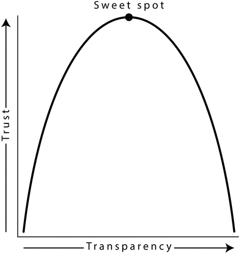
Transparency, defined not in terms of the visual variable but rather as the amount of information present on a map and how clearly it is presented, may affect trust. Xiong et al. (Citation2019) developed this definition by applying organizational trust and research to maps. The authors hypothesized that transparency exhibits a curvilinear relationship with trust. They propose that transparency fosters trust up to a point, but then additional transparency decreases trust in visualizations (). They reasoned that readers need enough information to understand and assess a map, but too much information can distract, confuse, or dissuade readers. Transparency was explicated in terms of four different dimensions: accuracy (i.e. correctness), clarity (i.e. readability), disclosure (i.e. amount of information), and thoroughness (i.e. showing alternative design representations).
Figure 2. Hypothesized relationship between transparency and trust (reproduced with permission from Xiong et al. (Citation2019).
Xiong et al. (Citation2019) explored whether trust is affected by researcher-manipulated transparency (i.e. exposing different participants to maps with varying levels of transparency) and subjective transparency (i.e. participants’ reported perceptions of transparency). Participants performed crisis-based decision tasks by assuming the role of a fire department dispatcher who needs to determine the fastest route to get to an ongoing fire using maps of varying transparency. The researchers manipulated transparency in the experiment through two conditions, simple and complex, with complex maps showing alternative routes and simple maps only showing recommended routes. Subjective transparency was measured by participants’ self-reported levels of the four aforementioned transparency dimensions.
Participants equally chose simple and complex maps when asked which map they would use in a crisis-based decision task. Further, the self-reported trust of simple maps was not significantly different than that of complex maps. These results indicate that trust was not affected by manipulated transparency when time-critical decisions were simulated. Subjective transparency showed some relationship with trust as three transparency dimensions (perceived clarity, disclosure, and thoroughness) were strong predictors of which interface participants chose. However, only perceived disclosure was also a strong predictor of trust which suggests that self-report measures of trust may not always align with decision-oriented measures. Overall, the authors were not able to provide evidence in support of the hypothesized curvilinear relationship between trust and transparency. They note that an experiment needs to test more than two levels of transparency to properly test this hypothesis.
Other work supports the hypothesized curvilinear relationship between transparency and trust (). Platte (Citation2016, p. 6) synthesized participant’s views on the amount of information that fosters trust in visualizations as follows: “There should neither be too much information nor too little.” In other words, visualizations should provide just enough information to allow people to understand them, but anything more can detract from the reading experience and erode trust. Padilla et al. (Citation2023) found a similar but distinct trend as visualizing more information increased trust in multiple forecast visualizations (that consisted of line charts) up to a point before leveling off.
Transparency is not only a product of the amount of information but also of the clarity of presentation. Elhamdadi et al. (Citation2022) tested whether scatterplots with the same amount of information but with different levels of clarity in the pattern would exhibit varying levels of trustworthiness. Participants were presented with two different scatterplots side-by-side that showed two different companies’ strategies for selling tickets. Participants perceived scatterplots that presented information more clearly as significantly more trustworthy (Elhamdadi et al., Citation2022). Clarity is key because people need to be able to read and understand a map to trust it.
Uncertainty
Uncertainty may modulate an individual’s trust in maps depending on if it is represented, how it is represented, and its magnitude. Uncertainty has many definitions but it is often defined in cartography as the discrepancy between an individual’s understanding of a geographic phenomenon and the geographic phenomenon in reality (Longley, Citation2005). Since all maps simplify reality in some way, uncertainty is an inherent feature of maps. However, many maps do not communicate uncertainty information, and those that do usually only convey one of the nine dimensions of uncertainty proposed by MacEachren et al. (Citation2005). The importance and prevalence of communicating uncertainty and assessing its impact on trust are emphasized in review papers on trust in cartography (Griffin, Citation2020) and information visualization (Mayr et al., Citation2019). Advances in our understanding of how uncertainty affects trust in maps/visualizations are covered in the remainder of this section.
Present or absence
Few empirical studies have examined whether visualizing uncertain information on maps affects trust. Kübler et al. (Citation2020) explored the effects of representing uncertainty on map-based decision-making. Non-expert map users engaged in a scenario in which they were presented with different maps that showed hazard risk levels, home locations, and sometimes uncertainty about the hazard risk levels. Participants were asked to select the house they would want to purchase when looking at the varying maps.
Surprisingly, participants were twice as likely to select houses in high-risk hazard areas when uncertainty was visualized versus if uncertainty was not visualized. Participants were also more likely overall to select houses on a map depicting uncertainty than a map without uncertainty. The authors postulate that the uncertainty information decreased participants’ trust in the risk level classification data layer, but trust in the map itself remained high. This finding is consistent with prior work demonstrating that nonexpert map readers downplay the dangers of the hazards since they tend to struggle with grasping uncertainty (Roth, Citation2009).
Other experiments have shown that depicting uncertainty boosts non-expert users’ trust in line chart forecast visualizations. Joslyn et al. (Citation2013) demonstrated that probabilistic weather forecasts, which convey uncertainty, were trusted significantly more than deterministic weather forecasts, which lack uncertainty information. Participants who viewed probabilistic forecasts were more than twice as likely to trust the line charts according to self-report measures. Participants also assumed the role of a weather service worker and had to read the chart’s forecast to 1) determine whether to issue a frost warning and 2) predict tomorrow’s low temperature. Participants viewing probabilistic line charts issued a significantly greater proportion of frost warnings and predicted temperatures more in line with the bounds of the forecast. This suggests greater trust in the probabilistic line charts. Participants in the probabilistic condition were also more certain in their temperature predictions. These tasks parallel use cases for weather maps and suggest that depicting uncertainty on small multiple or animated maps that forecast temperature could boost trust.
In a similar experiment, Padilla et al. (Citation2023) examined how the presence of uncertainty information affected trust in line charts visualizing forecasts of COVID-19 cases. Charts conveying uncertainty through confidence intervals were perceived as significantly more trustworthy than charts depicting no uncertainty by presenting just the median value.
Altogether, these studies suggest that representing uncertainty in visualizations can boost trust. However, this relationship may be moderated by the level of uncertainty, as indicated in the following section.
Level of uncertainty
In addition to examining how the presence of uncertainty affected trust in visualizations, Padilla et al. (Citation2023) examined how the magnitude (i.e. the level) of uncertainty affected trust. The magnitude of uncertainty was manipulated by the discrepancy between forecasts, with a larger discrepancy indicating higher levels of uncertainty. Visualizations with the greatest differences among forecasts were perceived as significantly less trustworthy than visualizations with greater agreement, which converged on a general trend line (exhibiting low to medium uncertainty). These results suggest that low and medium levels of uncertainty may foster trust. However, the strength of these results is limited by qualitative responses revealing that only a fifth of participants calibrated trust based on the discrepancy across forecasts. In other words, participants may not have responded to the independent variable as intended. Rather, most participants calibrated trust based on the number of forecasts, with more forecasts generally indicating trustworthiness. Therefore, it is unclear whether the differences in trust are a product of uncertainty or the number of forecasts.
Studies in visual analytics signal that lower levels of uncertainty foster trust. Zhao (Citation2022) operationalized uncertainty as the variance in a model’s prediction and assessed whether visualizing different levels of uncertainty would affect trust. Participants trusted models with visualizations depicting low uncertainty significantly more than models with visualizations depicting high uncertainty. Similarly, Guo et al. (Citation2019) conducted a small lab study of interns at a marketing company to investigate the effects of visualizing uncertainty levels and alternative predictions on an event-predicting analytics tool. Participants assumed the role of a marketer and were tasked with deciding which of two e-mails to send to a customer. To aid in this decision, participants examined two visualizations that showed predictions from a model about the most likely response of the customer and alternative responses of lower probability. The most likely responses were labeled with either low or high uncertainty. Visualizing the uncertainty of top predictions helped calibrate trust in the model as users considered alternative predictions more when the uncertainty of the top prediction was high. While the authors did not directly measure trust, examining differences in decision choices and confidence in said decisions based on different uncertainty conditions serves as a sound proxy for trust.
Design
As mentioned previously, credibility is often operationalized in terms of three dimensions: expertise, trustworthiness, and attractiveness (Sundar & Venkatesakumar, Citation2013). Attractiveness is a major peripheral cue that people use to determine how credible something is. Indeed, experiments frequently identify the visual design and other presentational aspects of information as key determinants of credibility and/or trust (Fogg et al., Citation2003; Lou & Yuan, Citation2019; Robins & Holmes, Citation2008; Wang & Scheinbaum, Citation2018). This may be a product of the halo effect: the tendency for an individual to perceive a single positive trait of something and extend this positive impression to other traits and their overall impression of something (Cooper, Citation1981). Thus, when something is perceived as attractive, people associate it with being trustworthy. Extending this theory to maps, more attractive (i.e. better-designed) maps may be perceived as more trustworthy than less attractive ones. In the following section, I synthesize research on this topic.
Style and aesthetics
A small body of work provides initial evidence that global design characteristics (i.e. aesthetics and professionalism) affect trust in maps. Muehlenhaus (Citation2012) investigated how designing maps according to four different rhetorical styles influences perceptions of trust, bias, and accuracy of the maps. The authoritative style resembled prototypical scientific visualizations that include lots of data and look official by adhering to cartographic best practices and including map elements. The propagandist style communicated a single message through repetition and structuring all elements to reinforce said message. The sensationalist style heavily featured illustrations and other embellishments to overload readers and evoke emotion. Finally, the understated style looked clean by adhering to a minimalistic design.
Participants ranked the authoritative map style as the most trustworthy. Interestingly, perceptions of bias and accuracy did not seem to correspond to trust judgments. Despite perceiving the sensationalist and propagandist maps as biased and somewhat inaccurate, participants trusted the sensationalist map the second most while the propagandist map was the least trusted of the four map styles. Conversely, the understated map had favorable ratings of bias and accuracy but was ranked as the second least trustworthy map. Overall, trust seems to be fostered by professional-looking designs that are detailed and follow cartographic best practices whereas trust is reduced by persuasive-appearing designs that are overly simple and/or extravagant.
The notion that individuals perceive professional maps as more trustworthy is backed up in other studies. In semi-structured interviews, participants frequently indicated that a map should look professional to be deserving of trust (Schiewe & Schweer, Citation2013). Likewise, a survey of web GIS users also revealed that a key determinant of trust is whether web GIS products look professional, but no clear criteria for what professional meant were identified (Skarlatidou et al., Citation2011).
An experiment by Li et al. (Citation2018) revealed that participants’ subjective assessment of a visualization’s design quality was a strong predictor of perceived credibility. However, causation between design quality and credibility could not be established since design quality was not manipulated as an independent variable. The authors postulated that design quality functioned as a heuristic cue for participants as they made quick, surface-level assessments of trustworthiness based on appearance. This extends the findings of a large body of literature demonstrating that individuals rely on quick heuristics such as design quality to ascertain the trustworthiness of web information (e.g. Fogg et al., Citation2003).
Another facet of design quality is beauty, which Lin and Thornton (Citation2021) define as visual appeal. A four-part study by Lin and Thornton (Citation2021) provided strong evidence that people trust beautiful visualizations to a greater degree than visualizations not deemed beautiful. The first three parts of the study demonstrated that the perceived beauty of visualizations exhibited a strong correlation with perceived trust across three different sources of maps (social media, news, scientific journals) and when controlling for confirmation bias, issue involvement, and readability. Maps were one of the many kinds of visualizations present in the sample. The beauty of visualizations was also strongly correlated with the popularity of visualizations on social media and in scientific journals. Therefore, beautiful visualizations may be more trustworthy and more popular.
The fourth part of Lin and Thornton’s (Citation2021) study was a factorial experiment designed to test if the beauty and the deceptiveness of a visualization exhibit a causal relationship with trust. Beauty was manipulated so more beautiful visualizations had a higher resolution, greater saturation, and more legible fonts than non-beautiful visualizations (Lin & Thornton, Citation2021). Deceptiveness was manipulated based on adherence to data visualization best practices. For example, maps were deceptive if they did not show countries typically found on a world map. Both beauty and deceptiveness had two different levels (more beautiful/deceptive and less beautiful/deceptive), resulting in four conditions. The authors improved the external validity of the experiment by testing each condition on six different visualization types (including maps) and six different topics.
Across the different stimuli, participants perceived the more beautiful visualizations as significantly more trustworthy than the less beautiful visualizations, but the level of deceptiveness did not have a significant impact on trust. Also, the relationship between beauty and perceived trustworthiness was fully mediated by participants’ self-reported perceived competence of the visualization creator. This suggests that more beautiful visualizations signal to individuals that the author is competent and credible, so they can trust the visualization. Sundar (Citation2008) describes this phenomenon as the authority heuristic which holds that when the source of information is an expert or authoritative person, the information will be viewed as having greater credibility.
Color
Color is one of the most common and powerful visual variables used in mapmaking, but its relationship to trust remains unclear. Lin and Thornton (Citation2021) determined that the three main color variables (hue, value, and saturation) explained the most variance in the beauty of visualizations. Vibrant colors were perceived as more beautiful whereas whites, blacks, grays, and reds negatively correlated with beauty. Since perceived beauty exhibited a strong correlation with perceived trust across three studies and causation across one study (Lin & Thornton, Citation2021), color may be an important design factor in affecting trust in visualizations.
Interestingly, Padilla et al. (Citation2023) found that grayscale visualizations were perceived as significantly more trustworthy than multi-hue visualizations. The authors posited that multiple forecast visualizations already conveyed a lot of information, so visualizing many lines in different colors added unnecessary visual complexity which thereby stifled trust.
Christen et al. (Citation2021) examined whether GIS scientists, neuroimagery personnel, and lay people would exhibit different levels of trust in maps based on the color scales used. They also measured if participants thought the color scheme was appropriate to use (suitability). Four continuous color scales were tested: rainbow, heated body, sequential green, and bipolar blue-red. GIS scientists rated the rainbow color scheme as unsuitable and the least trustworthy of the four-color schemes which suggests that they drew on their expertise in recognizing that the rainbow color scheme is problematic, especially for people who have color vision deficiencies (Borland & Taylor Ii, Citation2007; Crameri et al., Citation2020). Interestingly, across data domains, GIS scientists placed the highest trust in the heated body color scale, a white-orange-purple color scale widely used in functional neuroimaging, despite giving it only moderate suitability ratings. A different discrepancy between suitability and trust was found with neuroimagery personnel who scored the suitability of the heated body color scale significantly higher than any other scale but only placed modest trust in it. Instead, the neuroimagery personnel rated the rainbow color scheme as the most trustworthy. The high trust in the rainbow scheme may stem from the fact that domain experts with little cartographic/visualization training often use rainbow schemes (Gołębiowska & Çöltekin, Citation2022), so the rainbow scheme could cue the authority heuristic, thereby making a map seem more credible (Sundar, Citation2008).
The authors also examined if the background color of a map affects trust, but no significant differences in trust were noted between light and dark backgrounds. Moreover, laypeople’s perceptions of trust were not affected by different color schemes, perhaps because they did not know which color schemes were appropriate and which were not.
While legends have been mentioned as one of the most important indicators of trust in web GIS applications (Skarlatidou et al., Citation2011, Citation2013), a recent experiment suggests that legends do not have a large effect on credibility judgments (Meier, Citation2017). The perceived credibility of longform news stories featuring maps was not affected by the presence or absence of a corresponding legend, perhaps since the map could be read without the legend.
Information modality
A fundamental question that remains unanswered is whether maps are more trustworthy than other forms (i.e. modalities) of information such as text, images, video, and other visualizations. News stories featuring maps were perceived as more credible than text-only news stories and news stories featuring other visualizations or images (Meier, Citation2017). However, the differences between news stories with maps and the other modalities were not statistically significant. Tal and Wansink (Citation2016) demonstrated that pharmaceutical advertisements were perceived as significantly more believable if they included a chart compared to if they were text-based ads. However, the change in believability was found to be a product of the scientific aura that is not unique to visualizations as ads featuring a chemical compound formula were also perceived as more believable than text-only ones. Further, in a replication study that reran the Tal and Wansink experiment four times, the chart condition was not found to be significantly more believable than the text-only condition (Dragicevic & Jansen, Citation2018). The robust and consistent results across the replication trials suggest that charts do not boost the believability of pharmaceutical ads. Another experiment found that visualizations may negatively affect trustworthiness. Text-only reports about a college diversity program were perceived as significantly more trustworthy compared to ones with visualizations (Mason & Azzam, Citation2019). These findings were exacerbated by prior beliefs with people trusting reports with visualizations even less if their views contradicted the reports.
Research agenda
In this section, I first outline key research challenges for studying trust in maps. These challenges were identified based on repeating limitations of existing studies. Next, I propose several research opportunities in the form of research questions that can be answered in the near future. These opportunities are framed according to the six major themes of results outlined in the previous section. The deliverables in these sections attempt to fill in the gaps of existing research while propelling research on trust in maps in new directions.
Research challenges
Here, I introduce six high-level challenges to research on trust in maps that apply to most, if not all studies. These challenges aim to address the limitations of existing work on trust in maps/visualizations that span many studies. The following challenges represent long-term research design considerations that will help maximize the internal and external validity of the overall body of work on trust in maps.
Challenge: explicate trust in maps to establish a robust definition
Perhaps the greatest limitation of empirical works on trust in maps/visualizations is the lack of consensus on what trust is. Trust definitions vary widely from one study to another, or trust may not even be defined. This lack of consensus weakens the validity of synthesizing results across different studies since the measured variable, trust, may not mean the same thing.
Since trust has many different meanings across disciplines and cultures and even within the discipline of cartography, it is necessary to establish a robust and consistent meaning for trust in the context of maps. This ensures researchers are studying the same thing and using the correct terminology (Appelman & Sundar, Citation2016). A starting point is to conduct a concept explication that entails surveying the theoretical and operational definitions of a particular concept in the literature to identify commonalities and distinctions among definitions and to distill the concept into its defining characteristics (Chaffee, Citation1991). Additionally, researchers should explicitly define trust in articles and to participants to ensure that participants are answering the questions based on what researchers envision as trust.
A key part of the explication will be to determine if (and how) trust in maps is fundamentally different than trust in other entities (i.e. the news, people, statistical graphics). Trust in maps may be more nuanced as maps use symbols to represent real-world space. These symbols always simplify reality to some extent, and they are imbued with multiple layers of meaning (MacEachren, Citation1995). Thus, a unique characteristic of trust in maps is that the object of the trust is heavily dependent on the message(s)/insight(s) interpreted from the symbols.
Challenge: develop valid and reliable measures that capture trust in maps
If trust is unique in the context of maps, we need robust measures to properly study trust in maps. Most of the surveyed works rely on single-item measures of trust. While they are easy to implement, trust is a latent variable that should not be measured directly as it is a multidimensional construct (Evans & Revelle, Citation2008; Prochazka & Schweiger, Citation2019; Söllner & Leimeister, Citation2010). Indeed, Diamantopoulos (Citation2012) demonstrated that multi-item measures had higher predictive validity than single-item measures for fuzzy concepts like trust. Internal consistency is also a major concern of single-item measures as they are more prone to biases (Körber, Citation2019). Overall, single-item measures may suffer from low measurement validity and/or reliability, which can weaken the internal validity of studies.
Therefore, a pressing challenge is to identify which antecedent variables underlie trust. These antecedent variables can be utilized to develop a multi-item scale for trust in maps. Such a scale will enable researchers to use self-reporting to robustly measure trust and will improve the consistency across studies in terms of what is being measured. The scale should continue to be assessed and iterated upon to improve its performance.
Decision-based measures should also be refined and tested in conjunction with self-report measures. It is crucial to evaluate whether decision-based measures coincide with self-report measures. Therefore, the concurrent validity of self-report and decision-based measures should be calculated.
Challenge: craft experimental designs in a way that mimics typical map consumption environments
Maps are one of the most circulated forms of media (Hogräfer et al., Citation2020) and much of this circulation may take place on social media (Muehlenhaus, Citation2014; Robinson, Citation2019); however, social media consumption can vary widely depending on demographic and locational factors (Auxier & Anderson, Citation2021). The online map consumption environment is very different than the experimental settings of empirical works on trust in maps. When people are consuming content online, they predominantly ascertain the trustworthiness of something based on peripheral cues that do not require intensive cognitive effort (Metzger, Citation2007). Since typical experimental designs do not replicate these conditions, participants are more likely to evaluate content more systematically (critically) as they are motivated to be good study respondents. Consequently, the ecological validity of experiments is weakened as people consume media differently when in a controlled environment. Therefore, we need to design experiments in creative ways that mimic the typical map consumption environment. Simulating social media interfaces and using distraction tasks may help improve ecological validity. This context must be carefully controlled and systematically manipulated along with the maps to ensure that the effects of the environment and independent variable(s) can be distinguished from one another.
Challenge: engage underrepresented groups in research
Most empirical works in this review did not include underrepresented groups as participants were largely recruited using crowdsourcing platforms, most notably Amazon Mechanical Turk (e.g. Meier, Citation2017; Xiong et al., Citation2019) and Prolific (Padilla et al., Citation2023). Crowdsource workers tend to be younger, more tech-savvy, lower-income, White, and more liberal than population-based samples (Levay et al., Citation2016). If studies only recruit participants who represent a fraction of the true population of interest, results may not be generalizable.
Ensuring the sample is representative is especially important in studying trust in maps because so many people rely on maps for information, and the veracity of maps is increasingly contested due to the emergence of misinformation. Using representative probability samples, panel-based sampling techniques, and random sampling can help improve the representation of commonly excluded groups in research.
Challenge: practice stimulus sampling
Few empirical works on trust in visualizations engaged in stimulus sampling (e.g. testing whether transparency affects trust by including election, weather, and demographic maps), so they only tested a single stimulus per condition. Consequently, these works do not have high external validity as it remains unclear if the results can apply to other contexts (Wells & Windschitl, Citation1999).
Future studies on trust in maps should practice stimulus sampling by testing multiple different maps that vary in topic, scale, data distribution, etc. This will ensure that results are generalizable as maps can be created in countless ways.
Challenge: disentangle the effects of maps on trust with the effects of individual differences
While trust can be affected by characteristics of the map, it can also be affected by individual factors. Controlling for variables like political ideology, attitude, prior knowledge, and map literacy is an effective way to improve the internal validity of studies. However, controlling for too many variables can make it challenging to find significant results. We need to identify the most relevant and influential variables that can moderate the relationship between map traits and trust. Also, studies should use manipulation checks to ensure that the changes in the independent variable are being experienced by participants. For example, someone studying the effects of legend design on trust should ask participants if they read the legend or not.
Research opportunities
In the sections that follow, I propose avenues of research for each of the six major themes that were synthesized in the literature review.
Source opportunities
The influx of non-expert cartographers creating maps that can be easily shared on various forms of media (Field, Citation2014) beckons the question:
Are maps produced by authoritative sources more trustworthy than maps produced by non-authoritative sources?
Prior work in this area indicates that authoritative sources who are perceived as unbiased augment trust, but additional evidence is needed to support this. Also, visualizations are largely disseminated by individuals posting screenshots of visualizations made by news, government, and other reputable sources on social media (Lisnic et al., Citation2023). It remains unclear if the trustworthiness imbued to visualizations made by reputable sources persists even if someone else shares them. Research on this phenomenon, called source layering, suggests that people tend to base credibility evaluations on the most surface-level entity perceived as the source (Kang et al., Citation2011; Lee & Sundar, Citation2013). So, people may unjustifiably perceive social media posts of screenshotted visualizations as trustworthy even though these screenshots are almost always accompanied by a caption where the disseminator reframes the visualization according to their (mis)interpretation and biases (Lisnic et al., Citation2023). Therefore, another question related to the source is:
How do social media factors such as captions and source layering affect trust in maps?
Metadata opportunities
Metadata includes many dimensions including data sources, explanations of data processing, design choices, how to read the data, etc (Burns et al., Citation2022). Determining which dimensions of metadata have the greatest impact on trust perceptions of maps can help cartographers boost trust in maps and educate people to make more calibrated trust evaluations. Indeed, Gartner (Citation2023) highlights the importance of metadata in their research agenda on ethical considerations of trust in maps. With this, I ask:
Which dimensions of metadata have the greatest impact on trust in maps?
Despite exploratory works indicating that data sources are important to building trust, confirmatory experiments showed mixed results. Provided that, I ask:
Does communicating the data source(s) of a map affect trust?
Transparency opportunities
The amount of information and the clarity of that information are two key factors that affect transparency and thereby trust (Xiong et al., Citation2019). The clarity of maps is predominantly a product of visual hierarchy, so studies should assess:
Are maps that lack visual order/depth less trustworthy than maps with strong visual hierarchy?
Gartner’s (2023) research agenda on increasing the trustworthiness of maps takes a different approach to transparency by advocating for transparency in the form of cartographers documenting the design process and acknowledging uncertainties. In this vein, a pertinent research question is:
Can trust be calibrated by communicating the major production decisions and limitations behind a map?
Uncertainty opportunities
Map-specific research on uncertainty and trust is scarce, so the following fundamental research questions should be answered:
Are maps that visualize uncertainty more trustworthy than those that do not visualize uncertainty?
Do higher levels of uncertainty reduce trust whereas low levels of uncertainty foster trust?
Design opportunities
Two promising areas of research at the intersection of cartographic design and trust are color and overall aesthetics. Maps that use attractive colors to encode information may elevate perceptions of trustworthiness as a product of the halo effect. Attractiveness may be contingent on cultural color congruence in that the color used to encode data aligns with the map reader’s cultural associations of color (Cyr et al., Citation2010). For instance, an American election map visualizing Democrats in red and Republicans in blue may not be trusted as it is confusing and seen as unappealing. Future work should explore:
Can cultural color congruence modulate people’s trust in maps?
Many of the reviewed works found that professional-looking maps are perceived as more trustworthy. However, it remains unclear which specific design characteristics contribute to professionalism. To address this gap, I propose investigating:
What design traits make a map seem professional, and which of these traits impacts trust?
Modality opportunities
It remains unclear whether information presented as maps is perceived as more trustworthy than other modalities such as text or images. Future research should seek to answer:
Are maps more trustworthy than text, images, and other visualizations?
This can be taken a step further by identifying the innate traits of maps responsible for evoking trustworthiness. Approaching this problem through a psychology of communication technology perspective (Sundar, Citation2008) leads to the following question:
What are the psychological mechanisms underpinning the inherent trustworthiness of maps?
Limitations
There are several limitations to this review. The biggest limitation is that a greater proportion of empirical work studying trust in visualizations was reviewed compared to trust in maps. While maps have many parallels with most visualizations, they uniquely convey spatial information that requires special skills to understand. Many of the measures and results outlined in this paper were derived from studies that did not directly study maps, so there is a possibility that they do not extend to maps.
Likewise, I reviewed works that focus on credibility and trust under the assumption that credibility is distinct but highly related to trust. However, there is a possibility that the results of the surveyed findings may have been different if trust was measured instead of credibility. I recommend future studies do not use these terms interchangeably and continue to establish what distinguishes trust from credibility.
Another limitation stems from how I grouped the different kinds of studies and how I designated the themes of the findings from the studies. These categories were determined based on a thorough evaluation of all the articles by a single person. Future work should characterize the literature in different ways such as the kinds of participants recruited, the types of stimuli used, etc. Furthermore, most of the studies reviewed were quantitative, so a potential follow-up to this paper could dissect and explore qualitative methods utilized to study trust.
While the research agenda points to major challenges and key opportunities to trust in maps, it is framed to complement the findings of this review. Consequently, it does not define a systematic, single way forward for researchers but rather offers many entry points for advancing the state of science on trust in maps.
A final limitation is that trust is defined in and conceptualized in English. Different languages and cultures have different words and meanings for trust (Cole & Cohn, Citation2016). For instance, the character equivalent of trust in Chinese and Japanese can also indicate confidence. This variation in semantics can change the meaning of trust, so other people may interpret or approach research on trust in cartography differently depending on their native language and other cultural effects.
Conclusion
In this article, I review empirical research in cartography and related disciplines that concern trust in the form of three deliverables.
First, I characterize the methodological approaches to studying trust in maps. Most of the work on trust in maps/visualizations was experimental and utilized self-report measures to capture trust. Self-reporting largely consisted of single-item Likert-type measures, but multiple-item Likert scales were also used when credibility was the dependent variable of interest. Experiments also made use of decision-based measures such as the choice to rely on a map for a decision to gauge trust. Aside from experiments, interviews were the most common type of research design.
Second, I surveyed the results of prior empirical works on trust in maps/visualizations. The findings of these studies were organized into six major themes focusing on source, metadata, transparency, uncertainty, design, and information modality. For each of these themes, prevailing threads of knowledge were parsed out and synthesized. The following are high-level summaries:
Maps by authoritative, unbiased sources may enhance trust.
Maps with metadata, especially about data sources, may boost trust.
Visualizing a comprehensive but not excessive amount of information may elevate trust.
Visualizing uncertainty may elevate trust if the level of uncertainty is low, but high levels of uncertainty may stifle trust.
Beautiful and professional-looking maps may foster the impression of trustworthiness.
Maps may not be more trustworthy than other modalities of information.
Third, I build on the findings of the first two deliverables, which characterize the current state of science regarding trust in maps, to present a research agenda for understanding trust in maps. The first part of this agenda highlights methodological challenges to empirically studying trust in maps and discusses how researchers can tackle the challenges. These challenges were identified based on limitations of prior work and revolve around the nebulous nature of trust, ensuring ecological validity, and testing for confounding variables.
The second part of the agenda presents a series of research questions that revolve around the six prevailing themes of empirical work on trust in maps. Some of these questions identify new avenues of research that have not yet been explored. Other questions have preliminary answers but require additional work to ensure the results are correct and further our understanding of the topic.
Improving our understanding of trust in maps is vital in the current media climate that is characterized by ephemeral and fake information. This article has laid the groundwork for additional research on trust in maps by characterizing the current state of knowledge and presenting possibilities for future work.
I believe that studying trust in maps will identify ways that cartographers can improve trust in maps to revive trust in science while informing strategies to combat misinformation via maps. Future research should focus on understanding the factors that influence trust in maps, as well as developing methods for improving trust in maps. This research is essential for ensuring that maps continue to be a reliable source of information in the digital age.
Acknowledgments
The author would like to thank Anthony Robinson and Alan MacEachren for their extensive feedback on this paper. The author would also like to thank the reviewers for their insightful suggestions that improved the paper. Finally, the author would like to thank Lily Houtman for proofreading a draft of the paper.
Disclosure statement
No potential conflict of interest was reported by the author(s).
Data availability statement
The authors confirm that the data supporting the findings of this study are available within the article.
Additional information
Funding
References
- Appelman, A., & Sundar, S. S. (2016). Measuring message credibility: Construction and validation of an exclusive scale. Journalism & Mass Communication Quarterly, 93(1), 59–79. https://doi.org/10.1177/1077699015606057
- Auxier, B., & Anderson, M. (2021). Social media use in 2021. Pew Research Center, 1, 1–4.
- Berg, J., Dickhaut, J. & McCabe, K.(1995). Trust, reciprocity, and Social History. Games and Economic Behavior, 10(1), 122–142. https://doi.org/10.1006/game.1995.1027
- Borland, D., & Taylor Ii, R. M. (2007). Rainbow color map (still) considered harmful. IEEE Computer Graphics and Applications, 27(2), 14–17. https://doi.org/10.1109/MCG.2007.323435
- Burns, A., Lee, C., On, T., Xiong, C., Peck, E., & Mahyar, N. (2022). From invisible to visible: Impacts of metadata in communicative data visualization. IEEE Transactions on Visualization and Computer Graphics, 1–16. https://doi.org/10.1109/TVCG.2022.3231716
- Chaffee, S. H. (1991). Explication. SAGE Publications, Incorporated.
- Christen, M., Brugger, P., Fabrikant, S. I., & van den Berg, R. (2021). Susceptibility of domain experts to color manipulation indicate a need for design principles in data visualization. PLoS ONE, 16(2), e0246479. https://doi.org/10.1371/journal.pone.0246479
- Clason, D. L. & Dormody, T. J.(1994). Analyzing data measured by individual likert-type items. Journal of Agricultural Education, 35(4), 31–35. https://doi.org/10.5032/jae.1994.04031.
- Cole, L. M. & Cohn, E. S.(2016). Institutional Trust Across Cultures: Its Definitions, Conceptualizations, and Antecedents Across Eastern and Western European Nations. In E. Shockley, T. M. S. Neal, M. P. L., & B. H. Bornstein (Eds.), Interdisciplinary Perspectives on Trust: Towards Theoretical and Methodological Integration (pp. 157–176). Springer International Publishing. https://doi.org/10.1007/978-3-319-22261-5_9
- Cooper, W. H.(1981). Ubiquitous halo. Psychological Bulletin, 90(2), 218–244. https://doi.org/10.1037/0033-2909.90.2.218
- Crameri, F., Shephard, G. E., & Heron, P. J. (2020). The misuse of colour in science communication. Nature Communications, 11(1), Article 1. https://doi.org/10.1038/s41467-020-19160-7
- Cyr, D., Head, M., & Larios, H. (2010). Colour appeal in website design within and across cultures: A multi-method evaluation. International Journal of Human-Computer Studies, 68(1), 1–21. https://doi.org/10.1016/j.ijhcs.2009.08.005
- Dasgupta, A., Burrows, S., Han, K., & Rasch, P. J. (2017). Empirical analysis of the subjective impressions and Objective measures of domain scientists’ visual analytic judgments. In Proceedings of the 2017 CHI conference on human factors in computing systems (pp. 1193–1204). Association for Computing Machinery. https://doi.org/10.1145/3025453.3025882
- Dasgupta, A., Lee, J.-Y., Wilson, R., Lafrance, R. A., Cramer, N., Cook, K., & Payne, S. (2017). Familiarity vs trust: A comparative study of domain scientists’ trust in visual analytics and conventional analysis methods. IEEE Transactions on Visualization and Computer Graphics, 23(1), 271–280. https://doi.org/10.1109/TVCG.2016.2598544
- Diamantopoulos, A., Sarstedt, M., Fuchs, C., Wilczynski, P., & Kaiser, S. (2012). Guidelines for choosing between multi-item and single-item scales for construct measurement: A predictive validity perspective. Journal of the Academy of Marketing Science, 40(3), 434–449. https://doi.org/10.1007/s11747-011-0300-3
- Dragicevic, P., & Jansen, Y. (2018). Blinded with science or informed by charts? A replication study. IEEE Transactions on Visualization and Computer Graphics, 24(1), 781–790. https://doi.org/10.1109/TVCG.2017.2744298
- Elhamdadi, H., Padilla, L., & Xiong, C. (2022, September 28). Using processing fluency as a metric of trust in scatterplot visualizations. https://doi.org/10.48550/arXiv.2209.14340
- Evans, A. M., & Revelle, W. (2008). Survey and behavioral measurements of interpersonal trust. Journal of Research in Personality, 42(6), 1585–1593. https://doi.org/10.1016/j.jrp.2008.07.011
- Fawzi, N., Steindl, N., Obermaier, M., Prochazka, F., Arlt, D., Blöbaum, B., Dohle, M., Engelke, K. M., Hanitzsch, T., Jackob, N., Jakobs, I., Klawier, T., Post, S., Reinemann, C., Schweiger, W., & Ziegele, M. (2021). Concepts, causes and consequences of trust in news media – a literature review and framework. Annals of the International Communication Association, 45(2), 154–174. https://doi.org/10.1080/23808985.2021.1960181
- Field, K. (2014). A cacophony of cartography. The Cartographic Journal, 51(1), 1–10. https://doi.org/10.1179/0008704114Z.000000000120
- Flanagin, A. J., & Metzger, M. J. (2008). The credibility of volunteered geographic information. GeoJournal, 72(3), 137–148. https://doi.org/10.1007/s10708-008-9188-y
- Fletcher, R., & Park, S. (2017). The impact of trust in the news media on online news consumption and participation. Digital Journalism, 5(10), 1281–1299. https://doi.org/10.1080/21670811.2017.1279979
- Fogg, B. J., Soohoo, C., Danielson, D. R., Marable, L., Stanford, J., & Tauber, E. R. (2003). How do users evaluate the credibility of web sites? A study with over 2,500 participants. Proceedings of the 2003 conference on designing for user experiences, 1–15. https://doi.org/10.1145/997078.997097
- Fogg, B. J., & Tseng, H. (1999). The elements of computer credibility. Proceedings of the SIGCHI conference on human factors in computing systems, 80–87. https://doi.org/10.1145/302979.303001
- Ganesan, S., & Hess, R. (1997). Dimensions and levels of trust: Implications for commitment to a relationship. Marketing Letters, 8(4), 439–448. https://doi.org/10.1023/A:1007955514781
- Gartner, G.(2023). Towards a Research Agenda for Increasing Trust in maps and their trustworthiness. Kartografija i Geoinformacije, 21, 48–58. https://doi.org/10.32909/kg.21.si.4
- Gołębiowska, I., & Çöltekin, A. (2022). What’s wrong with the rainbow? An interdisciplinary review of empirical evidence for and against the rainbow color scheme in visualizations. ISPRS Journal of Photogrammetry and Remote Sensing, 194, 195–208. https://doi.org/10.1016/j.isprsjprs.2022.10.002
- Goodchild, M. (2009). NeoGeography and the nature of geographic expertise. Journal of Location Based Services, 3(2), 82–96. https://doi.org/10.1080/17489720902950374
- Griffin, A. L. (2020). Trustworthy maps. Journal of Spatial Information Science, 2020(20), 5–19. https://doi.org/10.5311/JOSIS.2020.20.654
- Guo, S., Du, F., Malik, S., Koh, E., Kim, S., Liu, Z., Kim, D., Zha, H., & Cao, N. (2019). Visualizing uncertainty and alternatives in event sequence predictions. Proceedings of the 2019 CHI conference on human factors in computing systems, 1–12. Association for Computing Machinery. https://doi.org/10.1145/3290605.3300803
- Harley, J. B. (1989). Deconstructing the map. Cartographica: The International Journal for Geographic Information and Geovisualization, 26(2), 1–20. https://doi.org/10.3138/E635-7827-1757-9T53
- Henke, J., Leissner, L., & Möhring, W. (2020). How can journalists promote news credibility? Effects of evidences on trust and credibility. Journalism Practice, 14(3), 299–318. https://doi.org/10.1080/17512786.2019.1605839
- Hogräfer, M., Heitzler, M., & Schulz, H.-J. (2020). The state of the art in map‐like visualization. Computer Graphics Forum, 39(3), 647–674. https://doi.org/10.1111/cgf.14031
- Hosmer, L. T. (1995). Trust: The connecting link between organizational theory and philosophical ethics. The Academy of Management Review, 20(2), 379–403. https://doi.org/10.2307/258851
- Iyengar, S., & Massey, D. S. (2019). Scientific communication in a post-truth society. Proceedings of the National Academy of Sciences, 116(16), 7656–7661. https://doi.org/10.1073/pnas.1805868115
- Joslyn, S., Nemec, L., & Savelli, S. (2013). The benefits and challenges of predictive interval forecasts and verification Graphics for end users. Weather, Climate, and Society, 5(2), 133–147. https://doi.org/10.1175/WCAS-D-12-00007.1
- Kang, H., Bae, K., Zhang, S., & Sundar, S. S. (2011). Source cues in online news: Is the proximate source more powerful than distal sources? Journalism & Mass Communication Quarterly, 88(4), 719–736. https://doi.org/10.1177/107769901108800403
- Kang, Y., Zhang, Q., & Roth, R. (2023). The ethics of AI-Generated maps: A study of DALLE 2 and implications for cartography. arXiv:2304.10743. arXiv. https://doi.org/10.48550/arXiv.2304.10743
- Kohring, M., & Matthes, J. (2007). Trust in news media: Development and validation of a multidimensional scale. Communication Research, 34(2), 231–252. https://doi.org/10.1177/0093650206298071
- Kong, H.-K., Liu, Z., & Karahalios, K. (2018). Frames and slants in titles of visualizations on controversial topics. Proceedings of the 2018 CHI conference on human factors in computing systems, 1–12. Association for Computing Machinery. https://doi.org/10.1145/3173574.3174012
- Kong, H.-K., Liu, Z., & Karahalios, K. (2019). Trust and recall of information across varying degrees of title-visualization misalignment. Proceedings of the 2019 CHI conference on human factors in computing systems, 1–13. Association for Computing Machinery. https://doi.org/10.1145/3290605.3300576
- Körber, M. (2019). Theoretical considerations and development of a questionnaire to measure trust in automation. In S. Bagnara, R. Tartaglia, S. Albolino, T. Alexander, & Y. Fujita (Eds.), Proceedings of the 20th congress of the international ergonomics association (IEA 2018) (pp. 13–30). Springer International Publishing. https://doi.org/10.1007/978-3-319-96074-6_2
- Kübler, I., Richter, K.-F., & Fabrikant, S. I. (2020). Against all odds: Multicriteria decision making with hazard prediction maps depicting uncertainty. Annals of the American Association of Geographers, 110(3), 661–683. https://doi.org/10.1080/24694452.2019.1644992
- Lee, J. Y., & Sundar, S. S. (2013). To tweet or to Retweet? That is the question for health professionals on twitter. Health Communication, 28(5), 509–524. https://doi.org/10.1080/10410236.2012.700391
- Lee, C., Yang, T., Inchoco, G., Jones, G. M., & Satyanarayan, A. (2021). Viral visualizations: How coronavirus skeptics use orthodox data practices to promote unorthodox science online. arXiv:2101.07993 [Cs]. https://doi.org/10.1145/3411764.3445211
- Levay, K. E., Freese, J., & Druckman, J. N. (2016). The demographic and political composition of mechanical turk samples. Sage Open, 6(1), 2158244016636433. https://doi.org/10.1177/2158244016636433
- Lewis, J. D., & Weigert, A. (1985). Trust as a social reality. Social Forces, 63(4), 967–985. https://doi.org/10.2307/2578601
- Li, N., Brossard, D., Scheufele, D. A., Wilson, P. H., & Rose, K. M. (2018). Communicating data: Interactive infographics, scientific data and credibility. Journal of Science Communication, 17(2), A06. https://doi.org/10.22323/2.17020206
- Likert, R. (1932). A technique for the measurement of attitudes. Archives of Psychology, 22(140), 1–55.
- Link, E., Henke, J. & Möhring, W.(2021). Credibility and enjoyment through data? Effects of statistical information and data visualizations on message credibility and reading experience. Journalism Studies, 22(5), 575–594. https://doi.org/10.1080/1461670X.2021.1889398
- Lin, C., & Thornton, M. A. (2021). Fooled by beautiful data: Visualization aesthetics bias trust in science, news, and social media. PsyArXiv. https://doi.org/10.31234/osf.io/dnr9s
- Lisnic, M., Polychronis, C., Lex, A., & Kogan, M. (2023). Misleading beyond visual tricks: How people actually lie with charts. Proceedings of the 2023 CHI conference on human factors in computing systems, 1–21. Association for Computing Machinery. https://doi.org/10.1145/3544548.3580910
- Longley, P. (2005). Geographic information systems and science. John Wiley & Sons.
- Lou, C., & Yuan, S. (2019). Influencer marketing: How message value and credibility affect consumer trust of branded content on social media. Journal of Interactive Advertising, 19(1), 58–73. https://doi.org/10.1080/15252019.2018.1533501
- MacEachren, A. M. (1995). How maps work: Representation, visualization and design. The Guilford Press.
- Mason, S., & Azzam, T. (2019). In need of an attitude adjustment? The role of data visualization in attitude change and evaluation influence. American Journal of Evaluation, 40(2), 249–267. https://doi.org/10.1177/1098214018778808
- Mayr, E., Hynek, N., Salisu, S., & Windhager, F. (2019). Trust in information visualization. EuroVis workshop on trustworthy visualization (TrustVis) (pp. 25–29). The Eurographics Association. https://doi.org/10.2312/trvis.20191187.
- McGranaghan, M. (1999). The web, cartography and trust. Cartographic Perspectives, 32, 3–5. https://doi.org/10.14714/CP32.624
- McKnight, D. H., & Chervany, N. L. (2001). What trust means in E-Commerce customer relationships: An interdisciplinary conceptual typology. International Journal of Electronic Commerce, 6(2), 35–59. https://doi.org/10.1080/10864415.2001.11044235
- Meier, S. (2017). Visualizations in online news—and their effect on perceived credibility. KN - Journal of Cartography and Geographic Information, 67(2), 74–83. https://doi.org/10.1007/BF03545380
- Metzger, M. J. (2007). Making sense of credibility on the web: Models for evaluating online information and recommendations for future research. Journal of the American Society for Information Science and Technology, 58(13), 2078–2091. https://doi.org/10.1002/asi.20672
- Metzger, M. J., Flanagin, A. J., Eyal, K., Lemus, D. R., & Mccann, R. M. (2003). Credibility for the 21st century: Integrating perspectives on source, message, and media credibility in the contemporary media environment. Annals of the International Communication Association, 27(1), 293–335. https://doi.org/10.1080/23808985.2003.11679029
- Montello, D., & Sutton, P. (2012). An introduction to scientific research methods in geography and environmental studies (Vol. 1). Sage.
- Muehlenhaus, I. (2012). If looks could kill: The impact of different rhetorical styles on persuasive geocommunication. The Cartographic Journal, 49(4), 361–375. https://doi.org/10.1179/1743277412Y.0000000032
- Muehlenhaus, I. (2014). Going viral: The look of online persuasive maps. Cartographica: The International Journal for Geographic Information and Geovisualization, 49(1), 18–34. https://doi.org/10.3138/carto.49.1.1830
- Padilla, L., Fygenson, R., Castro, S. C., & Bertini, E. (2023). Multiple forecast visualizations (MFVs): Trade-offs in trust and performance in multiple COVID-19 forecast visualizations. IEEE Transactions on Visualization and Computer Graphics, 29(1), 12–22. https://doi.org/10.1109/TVCG.2022.3209457
- Peck, E. M., Ayuso, S. E., & El-Etr, O. (2019). Data is personal: Attitudes and perceptions of data visualization in Rural Pennsylvania. Proceedings of the 2019 CHI conference on human factors in computing systems, 1–12. Association for Computing Machinery. https://doi.org/10.1145/3290605.3300474
- Platte, L., Freitag, S., Schubert, L., Molis, J., Valdez, A. C., & Ziefle, M. (2016). Trustworthiness of visualizations of mobility-induced CO2 emissions. Mensch Und computer 2016 – Workshopband. Human factors in information visualization and decision support system. https://doi.org/10.18420/muc2016-ws11-0006
- Platte, L., Freitag, S., Schubert, L., Molis, J., Valdez, A. C. & Ziefle, M.(2016). Trustworthiness of visualizations of mobility-induced CO2 emissions. Mensch Und Computer 2016 – Workshopband. Human Factors in Information Visualization and Decision Support System, Aachen, Germany. https://doi.org/10.18420/muc2016-ws11-0006
- Prochazka, F., & Schweiger, W. (2019). How to measure generalized trust in news media? An adaptation and test of scales. Communication Methods and Measures, 13(1), 26–42. https://doi.org/10.1080/19312458.2018.1506021
- Propen, A. (2007). Visual communication and the map: How maps as visual objects convey meaning in specific contexts. Technical Communication Quarterly, 16(2), 233–254. https://doi.org/10.1080/10572250709336561
- Robins, D., & Holmes, J. (2008). Aesthetics and credibility in web site design. Information Processing & Management, 44(1), 386–399. https://doi.org/10.1016/j.ipm.2007.02.003
- Robinson, A. C. (2019). Elements of viral cartography. Cartography and Geographic Information Science, 46(4), 293–310. https://doi.org/10.1080/15230406.2018.1484304
- Robinson, A. C., Chen, J., Lengerich, E. J., Meyer, H. G., & MacEachren, A. M. (2005). Combining usability techniques to design geovisualization tools for epidemiology. Cartography and Geographic Information Science, 32(4), 243–255. https://doi.org/10.1559/152304005775194700
- Roth, R. E. (2009). A qualitative approach to understanding the role of Geographic information uncertainty during decision making. Cartography and Geographic Information Science, 36(4), 315–330. https://doi.org/10.1559/152304009789786326
- Schiewe, J., & Schweer, M. K. W. (2013). Vertrauen im rahmen der Nutzung von Karten. KN - Journal of Cartography and Geographic Information, 63(2), 59–66. https://doi.org/10.1007/BF03546095
- Sichtmann, C. (2007). An analysis of antecedents and consequences of trust in a corporate brand. European Journal of Marketing, 41(9/10), 999–1015. https://doi.org/10.1108/03090560710773318
- Simpson, J. A. (2007). Psychological foundations of trust. Current Directions in Psychological Science, 16(5), 264–268. https://doi.org/10.1111/j.1467-8721.2007.00517.x
- Skarlatidou, A., Cheng, T., & Haklay, M. (2013). Guidelines for trust interface design for public engagement web GIS. International Journal of Geographical Information Science, 27(8), 1668–1687. https://doi.org/10.1080/13658816.2013.766336
- Skarlatidou, A., Wardlaw, J., Haklay, M., & Cheng, T. (2011). Understanding the influence of specific web GIS attributes in the formation of non-experts’ trust perceptions. Advances in Cartography and GIScience, 1, 219–238. https://doi.org/10.1007/978-3-642-19143-5_13
- Soh, H., Reid, L. N., & King, K. W. (2009). Measuring trust in advertising: Development and validation of the ADTRUST scale. Journal of Advertising, 38(2), 83–103. https://doi.org/10.2753/JOA0091-3367380206
- Söllner, M., & Leimeister, J. M. (2010). 15 years of measurement model misspecification in trust research? A theory based approach to solve this problem. European academy of management annual conference 2010, Rome, Italy.
- Sullivan, G. M., & Artino, A. R., Jr. (2013). Analyzing and interpreting data from likert-type scales. Journal of Graduate Medical Education, 5(4), 541–542. PubMed. https://doi.org/10.4300/JGME-5-4-18
- Sundar, S. S. (2008). The MAIN model: A heuristic approach to understanding technology effects on credibility. MacArthur foundation digital media and learning initiative.
- Sundar, S., & Venkatesakumar, R. (2013). Mood effects on celebrity credibility evaluation—A comparison of emerging and matured sport celebrities. Annamalai International Journal of Business Studies & Research, 5(1), 35–44.
- Tal, A., & Wansink, B. (2016). Blinded with science: Trivial graphs and formulas increase ad persuasiveness and belief in product efficacy. Public Understanding of Science, 25(1), 117–125. https://doi.org/10.1177/0963662514549688
- Wang, S. W., & Scheinbaum, A. C. (2018). Enhancing brand credibility via celebrity endorsement: Trustworthiness trumps attractiveness and expertise. Journal of Advertising Research, 58(1), 16–32. https://doi.org/10.2501/JAR-2017-042
- Wells, G. L., & Windschitl, P. D. (1999). Stimulus sampling and social psychological experimentation. Personality and Social Psychology Bulletin, 25(9), 1115–1125. https://doi.org/10.1177/01461672992512005
- Xiong, C., Padilla, L., Grayson, K., & Franconeri, S. (2019). Examining the components of trust in map-based visualizations. https://doi.org/10.2312/trvis.20191186
- Zhao, B. (2022). Humanistic GIS: Toward a research agenda. Annals of the American Association of Geographers, 112(6), 1576–1592. https://doi.org/10.1080/24694452.2021.2004875
- Zheng, C. & Ma, X.(2022). Evaluating the Effect of Enhanced Text-Visualization Integration on combating misinformation in data story. 2022 IEEE 15th Pacific Visualization Symposium (PacificVis). https://doi.org/10.1109/pacificvis53943.2022.00023