
ABSTRACT
Depicting the right amount of information on mobile maps is still challenging. With this research we investigate which of the three visual variables hue, value, and transparency optimally directs visual attention to the correct encoding of the geographic relevance of on small displays? We hypothesize that transparency is best suited to let users see symbols in the correct order of high to low relevance and that they intuitively understand this encoding of symbols for value and transparency, but not for hue. In a user study with 27 participants, we tested the suitability of the three visual variables for mobile maps with eye tracking. Results for a perceptual viewing task where no further knowledge or a task was provided, showed no significant differences between the three visual variables for time to first fixation and scanning the symbols in the correct order of relevance. A second search task for the most relevant restaurant, results showed that only transparency seems to reliably encode geographic relevance. “Darker is more” is only partially understood and the traffic light metaphor is unsuitable for encoding ordered geographic relevance on mobile maps. These results are in line with other work and offer guidelines for mobile map design.
Introduction
Mobile maps have become a commodity in the last decade. Despite the widespread use of mobile map apps, effectively presenting relevant geographically referenced information on small screens is still challenging. Surprisingly, not much research has been dedicated to mobile map design issues. By showing results from an empirical study on the suitability of the visual variables hue, value, and transparency for visually communicating the geographic relevance of points of interest (POI) on mobile maps, we aim to close this research gap. We intend to examine whether users of mobile maps intuitively understand such relevance encoding and if cartographic conventions like traffic light metaphor (red, orange, green hue) and “the darker value, the more” work in the context of mobile maps on small screens.
Our study conducted in 2011 hypothesizes that mobile map-viewing behavior is influenced by visual attention allocation. Two parallel processes control visual attention. The visual saliency of stimuli determines the perceptual, bottom-up process. The cognitive, top-down process depends on task, goal, prior knowledge, and training.
With the study, we address the following research questions: 1) which of the three visual variables (hue, value, and transparency) optimally directs visual attention on small screen maps to the correct encoding of the geographic relevance? 2) do users understand the encoding of the three visual variables into three levels of high, medium, and low geographic relevance of POI? and 3) do well established cartographic principles, such as using value (“the darker, the more”) and conventions, such as traffic light metaphor (green as a positive/higher value, yellow as a medium value and red as a negative/lower value) work on small displays? These research questions address POI symbols’ saliency, semantic understanding, and cartographic conventions. We expect to get insights into perceptual (bottom-up component of attention) and cognitive (top-down component of attention) understanding of geographic relevance encodings in mobile map displays.
To answer these research questions we designed a study, that investigates the identification and understanding of relevance-encoding symbols on mobile maps with eye tracking we formulate following hypotheses:
H1:
Without any task and a legend available, transparency is best suited to let users see symbols in the correct order of relevance, i.e. from highest to lowest.
H2:
Users do intuitively understand the encoding of symbols in the correct order of relevance, i.e. from highest to medium, to lowest, for value and transparency, but not for hue.
H3:
To encode degrees of relevance in mobile maps symbols, the convention “the darker, is more” works contrary to the traffic light metaphor.
Related work
The need for addressing the challenges of displaying maps on small mobile devices was recognized around the turn of the new millennium. The primary constraints of mobile maps are their vastly reduced display size, the highly variable context of use, and users’ limited attention because of their engagement in other activities (Goldsberry, Citation2007; Nivala & Sarjakoski, Citation2007; Reichenbacher, Citation2004, Citation2019).
Responsive map design is an approach to adapting web maps and mobile maps borrowed from general web design (Roth et al., Citation2018, Citation2015). Much research looked into the fundamental constraints and challenges related to mobile data visualization (Lee et al., Citation2022). In location-based services and cartography (Zipf, Citation2003), and (Raper, Citation2007) were the first to suggest geographic relevance to filter and visualize geographic information relevant to a specific situation. De Sabbata (Citation2013) developed and implemented a computational model for GR assessment based on the criteria topicality, spatio-temporal distance, directionality, cluster, and co-location.
Empirical studies suggest that relevance should be classified into several categories (for example, from “irrelevant” to “highly relevant”) to be understood by users (Cosijn & Ingwersen, Citation2000).
GR can be applied to mobile map design in a two-step process. First, GR scores of the geographic information objects can be used to filter information in the data model, thus reducing information content, providing simplicity, and enhancing the usefulness of a mobile map (De Sabbata & Reichenbacher, Citation2012). Second, the computed GR scores allow the classification of the geographic information objects according to their relevance and visually encode the different relevance classes, thus enhancing the usability of a mobile map. The second step is based on the thematic design principle to show the most important or relevant information in a thematic map in the most salient way (Fabrikant & Goldsberry, Citation2005). Visual perception is a complex process divided into an ascending, bottom-up, and a descending, top-down component (Corbetta & Shulman, Citation2002; Ware, Citation2008). The bottom-up process is stimulus-driven, and visual information is processed along a “where” pathway that processes the location of a received stimulus and a “what” path that processes information about the identity of an object with a high resolution (Ware, Citation2008). In the prefrontal cortex, the two pathways are merged and consciously processed. The properties of stimuli determine visual attention and the bottom-up process.
On the other hand, the top-down process is guided by pre-knowledge, e.g. if we know what to look for. Both processes are intertwined and simultaneous. In map design, the two components of visual perception can also be used to direct users’ attention to the relevant areas or objects on a map (Fabrikant & Goldsberry, Citation2005; Swienty et al., Citation2008). Map readers should quickly and easily detect relevant elements on the map, and the users must also understand their meaning.
For imbuing meaning, cartographers use the visual variables location, size, value, texture, color, orientation, and shape, as proposed and systematically studied by (Bertin, Citation1967, Citation2011). Later, other variables were suggested, such as color saturation (Morrison, Citation1974) or transparency and clarity (MacEachren, Citation1995).
Swienty et al. (Citation2008) have shown that it is possible to use transparency as a visual variable to encode GR in mobile maps. They designed a map display with a light base map in the background (with low brightness) and information POIs (restaurants, shopping centers, ATMs) encoded with variable transparency in the foreground. The most relevant features were shown with opaque symbols, and the less relevant features were almost transparent. With this design approach, they created a visual hierarchy of the map elements for a salient display of the most pertinent information.
In the context of uncertainty visualization MacEachren et al. (Citation2012) found in a study that the use of transparency for representing uncertainty was intuitively understood by participants and thus is an acceptable visual variable for visualizing discrete entity uncertainty on ordinal level of measurement. Participants rated the intuitiveness of the visual variable value even higher than transparency.
Empirical validation of the effectiveness and suitability of visual variables is still relatively sparse. Stachoň et al. (Citation2018) tested the influence of size, shape, and visual background on map perceptibility. The results bring a new perspective on the usage of shape, size, and presence/absence of background as graphic variables; results suggest that all examined variables influence the speed of processing. Respondents identified target stimuli faster without a map background, with larger stimuli, and with triangular and circular shapes. A common principle in cartography is to use the visual variable value to show “the darker, the more” (Dent, Citation1999; Garlandini & Fabrikant, Citation2009; MacEachren, Citation1995). However, there is little empirical evidence for the effectiveness of this convention (Garlandini & Fabrikant, Citation2009). An empirical study that has partially addressed the convention “the darker, the more” is conducted by Fabrikant et al. (Citation2004). In this study, researchers examined the metaphor of “distance-similarity” in the context of spatialization with the three variables of size, hue, and brightness. The results of this study show the usefulness of the visual variable brightness for coding ordinal data. This visual variable is thus capable of directing the attention of the subjects. This observation is consistent with Bertin’s principles (Bertin, Citation1967, Citation2011). In an online study with 260 participants Schiewe (Citation2019) investigated among others the dark-is-more bias (i.e. the intuitive ranking of color lightness with attribute values). Participants had to identify polygons in choropleth maps either representing the maximum or the minimum value. The results show that overall, 92.7% of maximum values and 85.4% of minimum values were correctly detected intuitively (that is without a legend displayed).
Moreover, brightness can influence the subjects’ decision-making. One must conclude, however, that the convention of “the darker, the more” is not clearly understood, and therefore a legend should be used.
In an experiment, Goldsberry (Citation2007) applies color hue to a map visualizing the current traffic situation on roads. Following the “traffic light metaphor,” red symbolizes congested roads with low speeds, yellow for slowdowns, and green for accessible routes with average velocities. Although this does not follow the cartographic principle stating that color hue only applies to categorical data, the experiment results show that the application of color hue to ordinal data (low, reduced, regular speed) seems to work. The results of this study show that cartographers need to consider context and semantic associations when choosing colors for their maps.
Methods
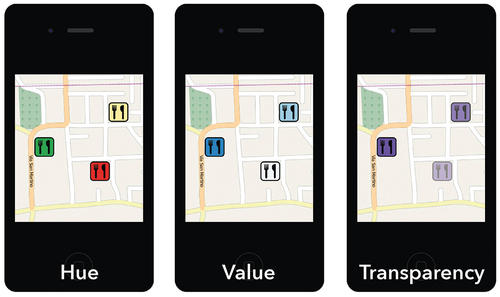
To evaluate the aptitude and effectivity of the three visual variables hue, value, and transparency for encoding classes of geographic relevance, we conducted a user experiment including eye – tracking in September 2011. We test the suitability of these visual variables to draw attention to the symbol on mobile maps and the intuitive semantic understanding of GR ().
Figure 1. Examples of map stimuli for the three visual variables hue, value, and transparency in Part I.
Participants
For the study, 33 participants (16 female, 17 male) between 18 and 43 years old were recruited. As tested in a pre-experimental questionnaire, they come from different socio-economic backgrounds and had no previous knowledge of cartography. Only a few participants indicated that they regularly use maps on mobile phones, and about 45% (15 respondents) own a smartphone. All participants provided their consent to participate voluntarily and without any remuneration in the study.
From the pool of 33 participants, two reported in the pre-experimental questionnaire to be color-blind and thus had to be excluded. Moreover, two participants experienced technical problems during the eye-tracking recording resulting in missing data. Finally, two participants lacked data in the areas of interest (AOI). Consequently, our final sample for the eye-tracking analysis in Part I consists of 27 participants (13 female and 14 male). For Part II of the experiment, one participant had to be excluded because he did not correctly understand the task and ordered the symbols according to their distance from the main road, as the answer about the strategy applied from the post-experiment questionnaire revealed. For the analysis of Part II, the sample thus was 26 participants.
Study design
Although it is impossible to disentangle the two components of visual attention (bottom-up and top-down), as they constantly interact, we tried to address them in two separate steps. Therefore, we split our experiment into two parts (see ).
Figure 2. Experiment design: Part I (bottom-up) and Part II (top-down).
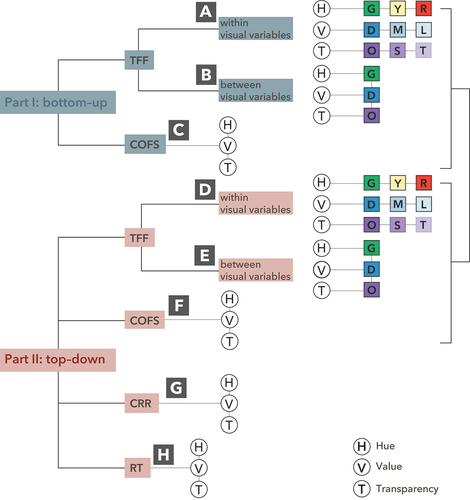
Part I (see , top) deals with the ascending component of attention, and participants have no prior knowledge about the shown maps. There scanning of the maps is recorded with eye-tracking. The study follows a within-subject design, i.e. each participant sees all three conditions (the three visual variables hue, value, and transparency). The independent variable (encoding of geographic relevance of the POIs) is further structured into three sub-levels according to three classes of geographic relevance (low, middle, and high). The dependent variables for Part I are the time to first fixation (TFF) and the correctness of the order of the fixated symbols (COFS), i.e. the proportion of maps for which participants looked at the POIs in the intended order. To measure TFF and COFS, areas of interest (AOIs) were drawn around the symbols that encode the GR. Knowing that TFF negatively correlates with the potential degree of salience of a symbol (Garlandini & Fabrikant, Citation2009), it can also be used to determine whether the symbol that encodes a high GR also represents a higher salience for a given visual variable.
Part II (see , bottom) investigates the descending component to test if participants understand the semantic coding of the visual variable. In a ranking task, participants had to order the POI symbols of the three restaurant symbols shown on the 18 maps from high to low relevance. The dependent variables for Part II are the correctness of the relevance ranking (CRR), i.e. the proportion of maps with correctly ranked relevancies (highly relevant to least relevant), and the response time (RT), i.e. the time needed to perform the ranking task. The higher the CRR, the better the understanding of the visual variable.
Different maps are used for each visual variable to deal with a potential learning effect due to the within-subject design. Three identical maps are used for the first series of maps, which only differ because of the visual variables present. The second row has the same maps and visual variables as the first. However, the position of the symbols is changed and differs compared to the first row. The base map, the symbols, and the three visual variables stay unchanged. Only the location of the symbols is varied and changes between the stimuli. In addition, the stimuli are arranged randomly. For this purpose, a random sequence generatorFootnote1 is used to create various map series. There are five map arrangements. Participant 1 sees map series 1, participant 2 sees map series 2, and so on until map series 5. The cycle starts again with participant 6. In this way, an attempt is made to minimize the learning effect.
Materials and apparatus
The stimuli for the study were a total of 18 mobile maps, six for each visual variable (hue, value, transparency), and were designed to fit an Apple iPhone 4 display (height 115,2 mm × width 58,6 mm; screen size 88,9 mm in diagonal). The base map, taken from OpenStreetMap, shows a road map of the Italian municipality of Trentola-Ducenta, unknown to the study participants (see ). The base map used in the experiment was designed to include only the street label of the main road. All other street names and labels were omitted. The base map is displayed without zoom and pan functionality. The restaurant symbol was designed after a review of major online mapping services. The variation (three levels) of the visual variables correspond to three classes of geographic relevance (high, medium, and low) (see ). The choice of the values for the three variables was tested in a pilot to see if the differences are perceptible. The base map and the three depicted POIs (restaurants) were the same for all maps; only the position of the POIs on the maps was modified (see ). Seven users tested and confirmed the general recognizability of the restaurant symbols in a pilot test.
Table 1. Mapping of GR classes to visual variables.
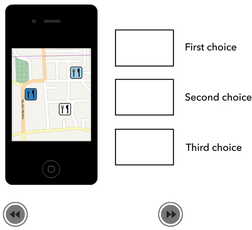
In Part II, participants are asked to arrange the restaurant symbols in a sequence (1st − 3rd choice). Accordingly, interactivity is implemented with Adobe Flash, allowing participants to drag the selected symbol into the desired box. shows an example of the task layout.
Figure 3. An example of a map for the visual variable value in Part II.
Participants’ gazes were recorded with a Tobii X120 eye tracker at a sampling rate of 60 Hz and a fixation filter with a radius of 50 pixels. The minimum fixation duration was set to 100 ms. Map stimuli were presented on a 20-inch flat-screen with a 1024 × 768 pixels resolution, and the recorded gaze data were analyzed with Tobii Studio software (version 2.3.0.0). The viewing distance was 60 cm. The light in the lab was a standard office lighting and was kept constant for all participants.
Procedure
The experiment started with a survey on educational background and frequency of mobile app use. Moreover, participants were tested for color blindness with isochromatic maps. Next, a nine-point calibration of the eye tracker was carried out. The 33 participants had no prior knowledge in Part I of the experiment. To ensure that participants understood the procedure of the experiment, they ran four test trials. Then, the 18 maps are presented to them on the screen scaled to the iPhone 4 size in randomized order. A blank white screen with a black cross in the center was shown to calibrate their gazes between each displayed map. A screen informed the subject when the first part of the experiment was finished.
In Part II of the experiment, participants had additional information in the form of a scenario. They had to imagine visiting a foreign city and looking for a restaurant. This framing should set a goal, invoke expectations, and address the top-down processing, allowing for testing the understanding of semantic coding. After a training phase, participants were asked to order the POI symbols displayed in the 18 maps with three symbols indicating the presence of restaurants from highly relevant to less relevant. Participants were not asked to solve this task as quickly as possible.
After completing Part II of the experiment, participants were asked to fill out a post-experiment questionnaire and rate the attractiveness and usefulness of the maps using a 5-point Likert (1: unattractive/useless; 5 very attractive/very useful). Participants were also asked to indicate their strategy for arranging the symbols. With this information, it could be determined during the data analysis whether participants had understood the task or had used other strategies (for example, distance from the center of the map, proximity to the road) to arrange the symbols. The experiment lasted about 25 minutes in total.
Results
Part I – ascending perceptual component
For the analysis of the gaze data recorded by the eye – tracker, areas of interest (AOI) were defined to include the location of the three POI symbols on the map display. This allows the calculation of the time to first fixation (TFF) metric, i.e. the time required by the participants to fixate a given symbol (i.e. its AOI) for the first time. The second metric, the correct order of the fixated symbols (COFS), is measured as the proportion of maps for which participants looked at the POIs in the right order. Each participant looked at four maps per variable. For correctly ordered fixations of the symbols (from highly relevant to not relevant), the map is assigned code 1, and in case of an incorrect order, code 0. Finally, a percentage of the number of correct fixations is calculated for each participant. TFF and COFS revealed no significant differences (α of 0.05), neither between nor within the three visual variables for Part I, where participants had no previous knowledge.
Part II – descending perceptual component
In Part II of the experiment, two additional dependent variables were measured in addition to the two variables (time to first fixation and correctness of the order of the fixated symbols) of Part I. The first of the two is the correctness of the relevance ranking (CRR) order of the symbols. It measures in percentage how often participants chose the correct order (highly relevant, relevant, less relevant) per visual variable. The second variable is response time, i.e. the time it took the participants to enter the answer or to drag the symbols into the three boxes (see ). It is measured as the time interval from the moment the map is displayed until the “Next” button is clicked.
Time to first fixation within and between visual variables (TFF)
summarizes the centrality and dispersion measures of the TFF for hue, value and transparency. For hue, the yellow symbol has the highest mean value compared to the red and green symbols. The red symbol is seen fastest on average. For the median, the green symbol has the lowest TFF value, while the yellow symbol has the highest value. However, as the standard deviation indicates, we have a high variation for hue and the distribution seems to be influenced by the outliers. Friedman’s non-parametric ANOVA shows significant differences in TFF (χ2 (2) = 7.79, p < .05) between the three symbols. The TFF for the green symbol is significantly shorter than for the yellow symbol (T = 12.25, p < .0167). The symbols yellow and red (T = 14.43, p > .0167) and the symbols green and red (T = 17.00, p > .0167) are not significantly different.
Table 2. Centrality and dispersion measures for time to first fixation (TFF) within the visual variables hue, value and transparency.
On average, the transparent symbol has the longest TFF, while the opaque symbol has the shortest. The standard deviation values indicate that the distributions of the data for opaque and medium-transparent symbols show some variability. The opaque symbol seems to be seen more quickly. The median has significantly lower values for the opaque and the highest values for the transparent symbol. A Friedman’s non-parametric ANOVA yields significant differences in TFF between the three symbols (χ2 (2) = 25.85, p < .05). The TFF for the symbol opaque is significantly shorter than for the medium-transparent symbol (T = 4.40, p < .0167). The opaque symbol has a significantly shorter TFF than the transparent symbol (T = 5.00, p < .0167). The medium-transparent symbol has a significantly shorter TFF than the transparent symbol (T = 10.63, p < .0167).
For the visual variable value, no significant differences were found for TFF between the symbols dark blue, medium blue, and light blue.
The high standard deviation values indicate that the outliers influence the data distribution.
A non-parametric Friedman test reveals significant differences in TFF between the three symbols (χ2 (2) = 18.30, p < .05). The TFF for the opaque symbol is significantly shorter than for the green symbol (T = 5.60, p < .0167). The opaque symbol has a significantly shorter TFF than the dark blue symbol (T = 7.30, p < .0167). Yet, the dark blue symbol does not have a significantly shorter TFF than the green symbol (T = 13.63, p > .0167).
Correctness of the relevance ranking (CRR)
In Part II, participants had the task of looking for a restaurant and deciding which symbol is the most relevant and which is the least relevant by arranging the symbols in the correct order regarding the visual variable (high GR, medium GR, low GR). For TFF, transparency was significantly shorter than for hue and value. However, the correctness of the order of the fixed symbols (COFS) was not significantly different.
The correctness of the relevance ranking (CRR) is, like COFS, measured as the proportion of maps with correctly ranked relevancies (highly relevant, relevant, less relevant) per visual variable. Hue yields the lowest CRR (43.89%), while transparency receives the highest CRR (80.67%). Value is between, with a CRR of 64.44% (see ). The standard deviation shows a very varied distribution for the three visual variables, especially for hue. The standard deviation is higher than the mean for the visual variables value and transparency. For hue, on the other hand, one gets a lower value compared to the mean.
Table 3. Centrality and dispersion measures of percentages of correct responses.
A non-parametric Friedman test (χ2 (2) = 15.36, p < .05) confirms significant differences between the three visual variables. The proportion of correct answers (CRR) is significantly higher for transparency than for hue (T = 4.23, p < .0167) and value (T = 2.75, p < .0167). Moreover, CRR is significantly higher for value than hue (T = 7.38, p < .0167).
Response time (RT)
The response time corresponds to the period between the fixation of the corresponding field on the screen until the next mouse click on the “Next” symbol, corresponding to the time needed to drag the three symbols to the respective fields. shows the centrality and dispersion measures of response time for the three visual variables.
Table 4. Centrality and dispersion measures of response time for the three visual variables.
On average, response time is highest for hue, whereas shortest for transparency. The standard deviations show apparent differences in the response time, which can be attributed to the outliers. A non-parametric Friedman test indicates significant differences in response time (χ2 (2) = 8.87, p < .05) between the three visual variables. Transparency has a significantly lower RT than hue (T = 10.89, p < .0167) and value (T = 10.89, p < .0167). However, RT for value is not significantly shorter than hue (T = 10.89, p < .0167). Although the 26 participants were assigned to one of five map stimuli sets with a randomized order of the 18 map stimuli, we could not exclude a possible learning effect in solving the task, i.e. getting faster in responding over time. Therefore, we were testing for possible linear trends in the time series of repeated measurements of response time. Nine participants showed a significant (α = 0.05) negative Mann – Kendall’s tau value, ranging from −0.41 to −0.72.
Comparison between Part I and Part II
Significant differences within visual variables are only found in the TFF between the symbols of value and transparency. presents the descriptive statistics for the TFF for each symbol of value and transparency (Part I and Part II). In general, participants spent on average more time looking at the symbol in the second part. If only the median is considered, this observation is valid for the medium blue and light blue symbols, whereas the dark blue symbol seems to be seen first in Part II. Standard deviations are overall higher in Part II, indicating a greater data variability. Participants fixated the opaque symbol on average faster and the symbol also gets a lower median in Part II. Except for the opaque symbol, the standard deviations of the TFF on transparency symbols are higher in Part II.
Table 5. Centrality and dispersion measures of time to first fixation for visual variable value and transparency.
The lowest values are similar between the two parts of the experiment. The highest values are almost equal for dark blue and medium blue symbols. The values for the light blue symbol are higher in the second part. The differences between the dark blue and medium blue symbols are not statistically significant. Therefore, only the statistical values of the light blue symbol are discussed further here. The data for the symbol light blue of Part I (D(27) = 0.85, p > .05) and the data of Part II (D(27) = 0.15, p > .05) are normally distributed.
The repeated-measure ANOVA shows that there is a significant difference in the TFF between the light blue symbol of Part I and Part II (F(1,26) = 5.211, p < .05). The TFF is shorter for the light blue symbol of Part I compared to Part II.
For the opaque symbol, a non-parametric Friedman test shows significant differences in the TFF (χ2 (2) = 4.48, p < .05). The symbol has a shorter TFF in Part II compared to Part I. The symbol medium-transparent, on the other hand, has a longer TFF in Part II, as confirmed by a non-parametric Friedman test (χ2 (2) = 7.54, p < .05). Finally, for the symbol transparent, TFF is longer in Part II (F(1,26) = 19.533, p < .05).
Discussion
In this section we discuss the results of the first and second part of the experiment, before we compare the two parts. We also indicate limitations of the study.
Part I – ascending perception component
Part I of our experiment yields no statistically significant differences between the three visual variables, for time to first fixation (TFF) and correctness of the order of the fixated symbols (COFS) which might be due to the lack of a concrete, goal-directed task. Therefore, none of the symbols had a higher salience than the other symbols when participants had no further information about the maps, prior knowledge, or a specific task.
Our results suggest that only the visual variable transparency encodes geographic relevance reliably and is intuitively and correctly perceived by participants. The results show that the opaque symbol has a lower TFF than the medium-transparent symbol, which in turn has a lower TFF than the transparent symbol. This means that the most relevant symbol (opaque) is the most salient of the three symbols, and the least relevant symbol (transparent) is the least salient. The coding of GR by transparency is thus intuitively perceived correctly. The result confirms the observations of Swienty et al. (Citation2008), who propose transparency as a visual variable capable of intuitively communicating the degree of relevance of a point of interest (POI) to a user. At a perceptual level, this visual variable is very suitable for coding GR.
For hue and value, participants could not consistently detect the symbol with the highest relevance score first. In the case of hue, reasons might be cultural or learned associations of participants. The green symbol is seen before the yellow one, but there are no significant differences between the green and the red or between the yellow and the red symbol. The most relevant symbol (green) for hue is not the most salient. This might be because the symbol representing low GR (red) is almost equally salient. For value, it appears that the saliency of stimuli varies depending on the contrast to the base map, i.e. simultaneous contrast, and hence fast detection is less predictable and stable.
Also, for the visual variable value, the most relevant symbol (dark) does not seem to be the most salient. The lack of difference between the TFF of the symbols can be explained by the phenomenon of simultaneous contrast (Ware, Citation2008). Depending on the background, the dark blue symbol in some stimuli may be more salient than a lighter symbol and vice versa. It could be that the light blue symbol in some stimuli is on darker areas of the map. However, the surrounding darker areas increase their apparent color value, making them appear brighter. This means that it could be partially more or less salient compared to other symbols.
Since the stimulus was a map at the extent of a smartphone, the displayed symbols were tiny and close together. It is possible that participants looked at them for a very short time, which led to minimal differences in TFF. Our analysis revealed that some participants constantly looked at the map’s center. These could be cases of covert attention, where the focus of attention is at a different point than the fixation (Wright & Ward, Citation2008), while participants would still perceive the symbols with parafoveal vision.
The TFF is also used for a comparison between the visual variables. The symbols that encode a high GR are compared with each other. The results show that the symbol opaque (transparency) has a lower TFF than the symbols dark blue (value) and green (hue). The highly relevant symbol of the variable transparency is more salient than the other highly relevant symbols. A plausible explanation for this result is that the opaque symbol is easier to localize in its variable than the other symbols (dark blue and green). This could be because the symbols are not equally recognizable in the other variables. In the case of hue, red is a strong competitor of green. Also, for value, the light blue symbol competes with the dark blue symbol depending on the background. In contrast, the opaque symbol is prominent and is less influenced by the transparent and medium-transparent symbols. This means apparent symbols can attract attention better than poorly visible ones.
For COFS, it is possible that the symbols were looked at in different order depending on their position on the maps. Without further instructions and tasks, participants could have looked at the symbols depending on their location on the map. Thus, it is impossible to consider one variable as best because the influence of location was too considerable.
Part II – descending perception component
Part II of our experiment, where participants were given additional information for the visual search task before the test, reflects a more realistic situation where people already know what to search for at the beginning.
For CRR, the visual variable transparency has the highest percentage of correct answers (on average more than 80%). Value has a ratio of correct answers of well over 50%, while hue is well below 50%. This means that transparency is best understood on a cognitive level and that the semantic decoding of geographic relevance with transparency works far better than for value and hue. This result is consistent with the results of Swienty et al. (Citation2008). The participants correctly understand the encoding of GR by transparency, and they seem to have little doubt in choosing the correct order. Participants understood that prominent symbols (opaque) encoded highly relevant objects, while poorly visible symbols (transparent) represented low relevance. This visual variable is thus understood both intuitively and cognitively. A possible problem with using transparency is that it is limited to a few classes (MacEachren, Citation1995).
The visual variable value seems to suffer from ambiguity in semantic understanding. It must be used with caution to encode the geographic relevance on mobile maps where space for a legend resolving ambiguity is restricted. The visual variable hue performed worst, perceptually as well as cognitively. The traffic light metaphor does not seem suitable for encoding geographic relevance and can be easily misinterpreted. So, the metaphor is likely to work only in a traffic context, as Goldsberry (Citation2007) shows. However, it is in line with research doubting the suitability of hue for encoding variations of non-categorical data (MacEachren, Citation1995).
Only about half of the participants intuitively understood the coding for value. This is consistent with the results of Fabrikant et al. (Citation2004) and Garlandini and Fabrikant (Citation2009), who assume an incomplete understanding of the visual variable value. For this variable, a legend is suggested to support the user’s understanding. However, on a small screen, the presentation of a legend is not suitable, as it interrupts the process of understanding the map (Nivala & Sarjakoski, Citation2007). Value can therefore only be used with restrictions, and the convention “the darker, the more” must also be used with caution for GR visualization since the most and least relevant objects can be perceived interchangeably.
The lowest response times are measured for the variable transparency, although the difference in the response time for value and hue is not significant. This result shows that participants needed the least time to respond to the variable that was best understood. It can be concluded from this that more time is taken in the case of uncertainty. Also, in this case, the visual variable transparency seems to be the most appropriate variable for coding the GR.
Comparison of Part I and Part II
Only in a few cases were differences found for the visual variables between Part I and Part II. In the case of the symbol light blue, the results in Part II show larger values for the TFF. Differences are also found for transparency. For the symbols medium-transparent and transparent, larger values for the TFF are measured in the second part. For the opaque symbol, on the other hand, lower TFF values occur in the second part.
According to Koch (Citation2004), the descending component is slower than the ascending component of visual perception. The results of this work are congruent with this thesis, except for the opaque symbol. One explanation for this observation is that in the second part, participants had the task of placing the symbols on the map in boxes on the page. With transparency, the opaque symbol is immediately recognized as the most relevant. So, the brain can activate neurons to instantly find the color purple (from the opaque symbol) (Ware, Citation2008). When the stimulus with transparency appears, the subjects’ eyes “knew” what to look for (purple). For the other visual variables, TFF might be higher in Part II because participants were unsure which symbol to position first. Also, for Part II, the visual variable transparency is the most appropriate for coding the GR.
In general, the difference between Part I and Part II is evidence of the vital role of the descending perceptual component regarding the visual process. It is crucial for users to decide where to look. These results are congruent with Ware’s (Citation2008) explanations. He suggests that the descending component directs human eyes to the useful features of a task at a given moment. The results show no differences between the TFF among the different symbols in the first part. In the second part, however, such differences become visible. After receiving prior knowledge (instructions), participants had a preconception of what the symbols might stand for. Thanks to these instructions, participants looked at the maps differently the second time. So, participants generally look in a different way at the stimuli when they have been given a particular task. Some coding seems intuitive (e.g. transparency), while others seem ambiguous (e.g. hue). Hence, using salient symbols to depict the most relevant information is fundamental. At the same time, it is crucial that the sequence of relevance degrees makes sense to the map user and leaves as little room as possible for ambiguities.
Our findings are confirming work by MacEachren et al. who concluded “transparency to be acceptable for visualizing discrete entity uncertainty reported at the ordinal level” (MacEachren et al., Citation2012). Our results suggest even a very good suitability for encoding ordered values. However, further tests are needed to see how robust the results are for a larger number of ordinal differences. Color hue has been long debated to be appropriate beyond nominal differences. Our results confirm the problem of consistently ordering even only for green, yellow, and red.
Limitations
Our study took place more than a decade ago. Not surprisingly, self-reporting showed that only 45% of participants owned a smartphone then. This would be very different today, with likely 100% smartphone possession rate. While the low number of smartphone owners does not affect the study itself, since we did not conduct a smartphone study per se and focused on symbol understanding in mobile maps, a repetition of the study would be valuable also from this perspective.
The simulation of a mobile map display on a larger screen, as well as the advancements in hardware of Smartphones, in particular the displays, might be considered as a limitation to our study. However, since we focused on color related properties of visual encoding, display size and resolution have a smaller impact than for instance studying visual variables, such as size, shape, orientation, or texture. Thus, we see color as a more fundamental property and is the results of our study still valid today. Nonetheless, a replication of the study with state-of-the-art Smartphone technology is worth to pursue.
For our experiment, we followed a within-subject design which bears the risk of learning effects. Participants might be faster in the second part because they performed similar tasks in Part I. Although we managed to minimize this effect by randomizing the order of the stimuli presented to the participants, it might have influenced our results for response time. As the results of a test for the existence of linear trends in the time series of repeated measurements of response time in Part II revealed, nine participants showed a negative trend in their response times. This could be interpreted as possible learning effects and needs to be mitigated in future tests.
In addition, before the eye tracker data is used, it is manually checked whether the fixations are plausible. For this reason, using the eye tracker with a 20-inch screen can be considered limiting. Moreover, the light conditions inside a lab are different from those in the field, and the reflection of a small screen is different from that of a computer. It would have been ideal to use a mobile eye tracker in a field study to achieve a higher ecological validity. For more control, it was decided to conduct the experiment in the laboratory. Visualizing a simulated iPhone 4 display on a large screen should provide a more realistic user experience.
There are more and less salient regions when using a complex background, such as a geographical map. The main road is marked with a wider line than the backstreets. If a symbol is close to this wide road, this fact could affect the view. Therefore, several maps are designed, with the position of the symbols varying. This way, an attempt is made to minimize the influence of the background.
We are well aware that hardware, especially smartphone display technology, has made significant advances in the last decade. Today’s smartphones have better resolution and color contrast. However, since the focus of our study was on the intuitive understanding of visual encoding of degrees of relevance, we consider this of minor importance. Nonetheless, it would be valuable to repeat the study with newest technology as we suggest in the next section.
Conclusion and future work
In this work, the three visual variables hue, value, and transparency have been empirically tested for the encoding of GR on small screens. Eye tracking is used as an evaluation method to analyze which visual variable is intuitively best received by the subjects. In addition, participants are asked to rank the restaurant symbols used in the stimuli so that information is obtained about their understanding of the coding of the three visual variables. The results show that transparency is the visual variable that is most applicable for understanding the coding of GR. Value is understood but has a lower percentage of correct answers. Hue is not suitable, according to the results. These results show that the convention “the darker, the more” should be used for inexperienced people with a legend.
On the other hand, the “traffic light metaphor” should only be used if it is closely related to the theme of the map. It is suggested that metaphors should only be used if they are strongly connected to reality. If the metaphor is applied to a subject with no concrete relation to reality (as in the case of the hue for coding the GR), it is more difficult to understand.
Our results show the importance of top-down processes in the visual cognition of mobile maps. After receiving prior knowledge, participants had a preconception of what the displayed symbols might stand for and looked at the maps differently. This is reflected in significant differences of TTF and COFS. Since the second part of the experiment represents a more ecologically valid use case, we can conclude that the excellent performance of the visual variable transparency should be considered when showing differences of geographic relevance on mobile map displays. However, as typical in cartography, the complex and varying background of the geographical base map generates more and less salient regions, which can have a significant influence on the perceptual processes.
Future work could include studying dynamic variables, combining the two variables transparency and hue, and testing more than three levels of geographic relevance encoding. In our work, we only tested the traffic light metaphor, and testing other visual metaphors could reveal even more usable representations of geographic relevance on mobile maps. Moreover, experiments with more complex tasks and realistic scenarios need to be performed to confirm the results. Also, a larger sample size would offer more robust statistical results. And finally, a similar experiment could be designed and conducted in an outdoor environment using a mobile eye – tracker and newest smartphone technology.
Disclosure statement
No potential conflict of interest was reported by the author(s).
Data availability statement
The data that support the findings of this study are available in anonymized form on the open repository OSF https://doi.org/10.17605/OSF.IO/NPGZC.
Notes
1. http://www.random.org/, accessed 10.08.2011
References
- Bertin, J. (1967). Sémiologie graphique. Mouton et Gauthier- Villars.
- Bertin, J. (2011). Semiology of graphics: Diagrams, networks, maps. ESRI Press.
- Corbetta, M., & Shulman, G. L. (2002). Control of goal-directed and stimulus-driven attention in the brain. Nature Reviews Neuroscience, 3(3), 215–229. https://doi.org/10.1038/nrn755
- Cosijn, E., & Ingwersen, P. (2000). Dimensions of relevance. Information Processing and Management, 36, 533–550. https://doi.org/10.1016/S0306-4573(99)00072-2
- Dent, B. (1999). Cartography: Thematic map design (5th ed.). WCB McGraw-Hill.
- De Sabbata, S. (2013). Assessing geographic relevance for mobile information services. https://doi.org/10.5167/UZH-89056
- De Sabbata, S., & Reichenbacher, T. (2012). Criteria of geographic relevance: An experimental study. International Journal of Geographical Information Science, 26(8), 1495–1520. https://doi.org/10.1080/13658816.2011.639303
- Fabrikant, S., & Goldsberry, K. (2005). Thematic relevance and perceptual salience of dynamic geovisualization displays. In Proceedings of the 22nd International Cartographic Conference, A Coruña, Spain.
- Fabrikant, S. I. Montello, D. R. Ruocco, M. & Middleton, R. S.(2004). The distance – similarity methaphor in network – display spatializations. Cartography and Geographic Information Science, 31(4), 237–252. https://doi.org/10.1559/1523040042742402
- Garlandini, S., & Fabrikant, S. I. (2009). Evaluating the effectiveness and efficiency of visual variables for geographic information visualization. In K. S. Hornsby (Ed.), Spatial information theory. COSIT 2009 (pp. 195–211). Springer (Lecture Notes in Computer Science).
- Goldsberry, K. (2007). Real-time traffic maps [ PhD Thesis]. University of California Santa Barbara.
- Koch, C.(2004). Selective visual attention and computational models. CNS/Bi, 186.
- Lee, B., Dachselt, R., Isenberg, P., & Choe, E. K., (Eds.). (2022). Mobile data visualization. CRC Press.
- MacEachren, A. M. (1995). How maps work representation, visualization, and design. Guilford Press.
- MacEachren, A. M., Roth, R E., O’Brien, J., Li, B., Swingley, D., Gahegan, M. (2012). Visual Semiotics & Uncertainty Visualization: An Empirical Study. IEEE Transactions on Visualization and Computer Graphics, 18(12), 2496–2505. https://doi.org/10.1109/TVCG.2012.279
- Morrison, J. (1974). A theoretical framework for cartographic generalization with the Emphasis on the process of symbolisation. In G.M. Kirschbaum & K.-H. Meine (Eds.), International yearbook of cartography (Vol. XIV, pp. 115–127). Kirschbaum Verlag, Bonn-Bad Godesberg.
- Nivala, A. M., & Sarjakoski, L. T. (2007). User aspects of adaptive visualization for mobile maps. Cartography and Geographic Information Science, 34(4), 275–284. https://doi.org/10.1559/152304007782382954
- Raper, J. (2007). Geographic relevance. Journal of Documentation, 63(6), 836–852. https://doi.org/10.1108/00220410710836385
- Reichenbacher, T. (2004). Mobile Cartography – Adaptive Visualisation of Geographic Information on Mobile Devices [ PhD Thesis]. Technical University Munich.
- Reichenbacher, T. (2019). Re-visiting Fundamental Principles of Mobile Cartography. In Joint ICA Workshop on User Experience Design for Mobile Cartography: Setting the Agenda, Beijing, China. https://use.icaci.org/wp-content/uploads/2018/11/Reichenbacher.pdf
- Roth, R. E., Donohue, R. G., Sack, C. M., Wallace, T. R., & Buckingham, T. M. A. (2015). A process for keeping pace with evolving web mapping technologies. Cartographic Perspectives, 0(78), 25–52. https://doi.org/10.14714/CP78.1273
- Roth, R., Young, S., Nestel, C., Sack, C., Davidson, B., Janicki, J., Knoppke-Wetzel, V., Ma, F., Mead, R., Rose, C., & Zhang, G. (2018). Global landscapes: Teaching globalization through responsive mobile map design. The Professional Geographer, 70(3), 395–411. https://doi.org/10.1080/00330124.2017.1416297
- Schiewe, J. (2019). Empirical studies on the visual perception of spatial patterns in choropleth maps. KN - Journal of Cartography and Geographic Information, 69(3), 217–228. https://doi.org/10.1007/s42489-019-00026-y
- Stachoň, Z., Šašinka, Č., Čeněk, J., Angsüsser, S., Kubíček, P., Štěrba, Z., & Bilíková, M. (2018). Effect of size, shape and map background in cartographic visualization: Experimental study on Czech and Chinese populations. ISPRS International Journal of Geo-Information, 7(11), 427. https://doi.org/10.3390/ijgi7110427
- Swienty, O., Reichenbacher, T., Reppermund, S., & Zihl, J. (2008). The role of relevance and cognition in attention-guiding geovisualisation. The Cartographic Journal, 45(3), 227–238. https://doi.org/10.1179/000870408X311422
- Ware, C. (2008). Visual thinking for design (1st ed.). Morgan Kaufmann.
- Wright, R., & Ward, L. (2008). Orienting of attention. Oxford University Press.
- Zipf, A. (2003). Die Relevanz von Geoobjekten in Fokuskarten - Zur Bestimmung von Funktionen für die personen- und kontextsensitive Bewertung der Bedeutung von Geoobjekten für Fokuskarten. In Angewandte Geographische Informationsverarbeitung XV. Beiträge zum AGIT-Symposium Salzburg 2003. Symposium für Angewandte Geographische Informationstechnologie. AGIT 2003, Salzburg, Austria.