
ABSTRACT
Changing societal needs means that new or existing maps need to be continuously developed. It is important that these maps are interpreted in the right way, to avoid misinterpretations and bad decision-making. The map design choices are based upon experience and cartographic theory, and in the end, are a product of expert opinions. This in-house research project aims to test and communicate the impact of these design choices to support the development processes for two Norwegian geoscience maps: Possibility of marine clay and the national Radon susceptibility map. Interviews were conducted with the map owners and based on known challenges with the maps, a web-based experiment was set up to measure intuitiveness for a series of map alternatives. A total of 450 participants, from novices to experts, took part in the experiment. By analyzing and visualizing amounts of correct answers, confidence in the map reading tasks and uncertainties, it was possible to conclude about map intuitiveness and how accessible the map is expected to be. The results show that including an experiment like this can improve cartographic work processes, support map design choices with empirical evidence, and that seemingly small improvements in design significantly improve the participant scores.
Key policy highlights
Map experiments performed as part of thematic map development processes give room for focus, learning, and advancement in cartographic work.
Minor differences in symbolization can have a significant impact on how easily the map is intuitively understood. Thus, the value of optimizing symbology to strictly follow cartographic rules should not be underestimated.
Introduction
“Major disasters cause massive disruption to societies and overburden national economic systems,” Altan et al. (Citation2013) states in a joint report on value of geoinformation for disaster and risk management. Report authors conclude that these major disasters “could be minimized and considerable losses of life and property could be avoided through improved risk assessment, early warning, and disaster detection and monitoring.” Geological surveys are among the governmental organizations that offer thematic maps to meet the demand for geoscience knowledge. Geoscience maps made to improve risk assessment include, but are not limited to, maps for seismic hazards, risk of rock-, clay-, landslides, subsidence, and radon gas. The maps are delivered through standardized map services as part of the national geospatial data infrastructure and The Norwegian Public Base of Geospatial Data. They are most often used in the end-user’s web maps and applications. Also, they are republished as screen captures by users in reports, such as planning documents, and newspaper articles. The map owner has limited control of these publications; for example, where the legend is found and how it is displayed. It is common to see news articles featuring a screen capture of a web map without the legend (for example Amundsen, Citation2017; NRK, Citation2020; Setså, Citation2020). There are examples in the media where susceptibility maps are misinterpreted, and conclusions are drawn from insufficient information. For example, a national media source (NRK, Citation2020) concluded an area has no quick clay, based on a map that only shows the potentially large, continuous masses of clay. In web maps, obtaining a legend is often not as straight forward as it is in traditional paper maps. Map owners express concerns about the potential for incorrect conclusions and actions, emphasizing the importance of optimizing symbolization to help the users. Nevertheless, it is common for the maps to be created without undergoing systematic user testing.
Xie et al. (Citation2021) concludes that “the difficulty of interpreting maps has been underestimated. This fact is especially problematic for thematic maps, the type of map that is finding increasing currency in discourse and the media.” Maps of the subsurface often use expert language and are riddled with uncertainties associated to mapping scale, expert interpretation, and measurements of the intangible and invisible subsurface (Bang-Kittilsen & Midtbø, Citation2021; Häggquist & Söderholm, Citation2015; Pérez-Díaz et al., Citation2020). Traditionally, geological maps have been made by experts for experts. A large gap exists between what a geologist can derive from, for instance, a bedrock map, compared to what a non-expert can discern (Häggquist & Söderholm, Citation2015). In response to the high demand for simplified map products, addressing specific societal challenges, maps are derived from data originally collected for different purposes, with no knowledge of the secondary application or potential users. However, it may be the best information available for addressing a particular question. The drawback with the derivation process, however, is that it may lead to increased uncertainties and generalizations. The simplified geoscience maps are, as a result, challenging to interpret and use effectively.
When faced with rapidly growing access to knowledge that could shed light on a societal challenge, particularly when dealing with complex knowledge, it is expected that heuristics and intuition assume a more significant role (Adinolfi & Loia, Citation2022). To support public administrators, the total number of maps in the public knowledge base in Norway was 148 in 2023 (Government, Citation2023). It cannot be expected that the average user will learn enough about geology or have the time to carefully read the map with all supporting information to ensure adequate understanding and use. It is expected that heuristics and intuition trump analytical reading: A typical user behavior can be quickly glance at the map, recognizing ordered colors from light to dark and immediately drawing conclusions about whether their location of interest being at risk or not. Therefore, it is important to understand how users perceive elements such as white or blank areas and how they recognize when data is uncertain.
Bertin (Citation2010) used the word “efficacy” to describe the success of a map, a synonym for effectiveness: “If, in order to obtain a correct and complete answer to a given question, all other things being equal, one construction requires a shorter observation time than another construction, we can say that it is more efficient for this question.” In this study, the focus is on the immediate understanding, the concept of intuitiveness is used. The definition used in this study, is slightly modified from Islam and Bouwman (Citation2016) to fit map symbols instead of web interface signs: An intuitive map sign or symbol is “easy and intuitive to interpret and that allows users to understand the referential meaning accurately. The referential meaning of [the map] symbol refers to the meaning (information, content and/or functions) as assigned by [the map owner].” Experience demonstrates that the concept of “intuitiveness” is readily understood by non-cartographers, and the concept embraces the fact that map reading is an individual process colored by the map user and their previous knowledge and experience. The concept of efficiency is perhaps more alienating, often associated with objectiveness and automation.
Within cartography, there has been significant scientific research on users, map use and map symbolization (Roth et al., Citation2017). Many are inspired by cognitive research, performed in laboratories where participants are observed while performing specific tasks (Bunch & Lloyd, Citation2006; Nelson, Citation2000). Time use and success rates are commonly measured, sometimes in conjunction with other methods such as eye-tracking and/or thinking aloud (Candela et al., Citation2022; Çöltekin et al., Citation2009, Citation2010; Dong et al., Citation2014; Koletsis et al., Citation2017; Ooms et al., Citation2012). This research is typically characterized by a high degree of experimental control, targeting generalizable cartographic issues, like map reading or usability of symbols, map types or map interfaces. Context-aware research, targeting specific users or contexts, is commonly done with qualitative methods (Opach & Rød, Citation2022; Perkins, Citation2008; Suchan & Brewer, Citation2000). This can involve interviews, observation of a few users and document analysis, to gain deep understanding that ensures relevance of the research questions, methods, and results. A recommended approach for user and usability studies is mixing methods (Ooms, Citation2016), for example combining quantitative methods with qualitative context-aware methods, so that researchers can leverage from the advantages of both approaches.
While there is extensive cartographic research on map use and users, their impact on map production can be questioned (Montello, Citation2002). A key factor may be the distance to actual map production communities, especially for thematic maps made by experts from other disciplines. Roth et al. (Citation2017) emphasizes the importance of case-studies to highlight the challenges within current practices. When specific users and contexts are targeted in cartographic research, this is typically performed using an external viewpoint with an outsider’s perspective. For controlled experiments, there can be an additional gap from real-life scenarios as they are challenging to reproduce in a lab environment (Lloyd, Citation2005). Controlled lab experiments increase the required time for each participant, which, in turn may limit the number of participants and reduce representativeness. In addition, participants are often employees and fellow students at the university. Roth et al. (Citation2017) calls for a shift from convenience participant sampling to purposeful sampling.
In the development of thematic maps, the map owners are experts in geology or other related fields. They maintain cartographic integrity by following the traditional practices of mapmaking within their respective fields of expertise. There can be limited opportunities to stay up to date with the latest developments in cartography. This may also be the case for the involved GIS and cartography experts. The rising demand for digitalization and standardization of data and maps for the national data infrastructure places a significant strain on available resources. The integration of cartographic research into map development is anticipated to provide opportunities for mutual learning and advancement.
This study distinguishes itself from most previous studies in that it includes elements of participatory action research. That is, the main researcher is an employee working within the map development teams with the aim of improving both the maps and the work processes. Meetings, informal interviews, and document analyses are integral components in addition to map experiments. This study is characterized by a high number of participants, purposeful participant sampling, and the use of officially published maps that are regularly updated. The study thus complements existing research in enlightening specific challenges and possibly identifying new, general challenges.
The goals for the study are both to make design decisions for the selected maps and to create opportunities for learning and development in the cartographic work at a geological survey. An empirical experiment was initiated in response to the map owners’ concern that the users might hastily form overly simplified conclusions, without appreciating the information complexity. To address the anticipated user behavior, which is dominated by heuristics and intuitiveness, the focus of the experiment is on assessing the immediate interpretation of the map symbols for two currently used map products.
Research questions:
What can be learned from applying map experiments into map development?
How intuitive are the map symbols without a legend present?
What increases and decreases intuitiveness?
How can map intuitiveness be measured, analyzed, visualized, and communicated to support design decisions?
This study presents a method for testing, visualizing, and analyzing how intuitive, and therefore how successfully a map is expected to communicate the information content without a legend. Including map experiments can aid the development of maps that are easier to understand and thus more accessible to broader user groups, and at the same time with a reducing risk of misinterpretation and poor decision-making. This case study will provide valuable insights into the significance of emphasizing map design and how this can be achieved. Such emphasis, in turn, has the potential to enhance land use management and facilitate informed decision-making.
Study design and method
The following steps were taken to set up the study, which will be described in more detail in this chapter.
Selecting maps and their challenges: Map owners were informally interviewed, and document analyzes were done throughout the study. The goal was to learn about why and for whom the maps were made, data limitations, why the existing symbology was selected and known challenges with the maps.
The selected maps were deconstructed and analyzed according to cartographic theory. For example, the number and length of information variables and whether they were correctly matched with visual variables. To get to know the data, experiments with alternative symbolization were done, and alternatives for the map experiment were selected.
A pilot study with 20 participants was conducted to ensure the test was understandable and that the resulting data was fit for analysis.
The final test scheme was designed, and a web experiment was published. Participants, from novices to experts, were invited.
Results were analyzed statistically together with visual data exploration.
The development team were shown the results for discussion, and action points for further development of the maps were set.
The method and results were evaluated for relevance outside this study.
The maps in the experiment
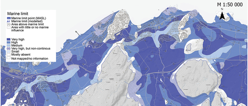
Marine clay is a type of surficial deposit that exists in previously ice-covered land areas. These are marine deposits, but because of land rise, the areas are now also above sea limit. Due to their typically flat terrain and the presence of a thick layer of topsoil, these areas are often converted into farmland or human settlement. When the salt is gradually washed out, certain marine clays can liquefy (turn quick) making the ground unstable. Under certain conditions, this poses a risk of landslides or slope failures (With et al., Citation2022). Examples of quick clay landslides with catastrophic consequences are the Rissa landslide in 1978 (Gregersen, Citation1981; L’Heureux & Solberg, Citation2013), Tuve and Småröd landslides in Sweden (Larsson & Jansson, Citation1982; Rosvall & Kjellberg, Citation2009), Mint Creek in Canada (Geertsema & Torrance, Citation2005) and Gjerdrum landslide in 2021 (OED, Citation2021). These all caused a loss of lives and property. Mapping and securing these deposits therefore have high national priority in the affected countries. Two of the maps that are used to help identify possible areas at risk are known as the “Possibility of marine clay” and the “Marine limit.” The former map must be used together with the latter to be complete. Marine clay occurs beneath the marine limit, the maximum level of the sea after the last ice age. The combination will from here on be called “Marine clay map.” The maps are delivered by the Geological Survey of Norway (NGU), see .
Figure 1. The marine clay map (possibility of marine clay map including marine limit), NGU (Citation2022).
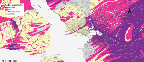
Radon is a natural gas generated from uranium and thorium in the underlaying bedrock. Long term exposure to radon in indoor air can cause lung cancer. Several national organizations have started mapping radon to prevent inhabitants being exposed to high levels of radon (Ielsch et al., Citation2010). The map selected for this study () was made on assignment from and in collaboration with the Norwegian Radiation and Nuclear Safety Authority by combining data for indoor measurements, radiometric data, as well as surficial deposits and bedrock maps (Smethurst et al., Citation2017; Watson et al., Citation2017). A new, improved map is under development by Wang et al. (Citation2023). It is of utmost importance that these maps communicate the information as accurately as possible, so they can effectively contribute to risk management.
Figure 2. The current radon susceptibility map (NGU, Citation2022).
A web-based experiment was set up to reach a high number of participants that represent a broad user-group, while also complying to COVID-19 restrictions. Also, there was a need for a method that later potentially could be used for low-threshold follow-up studies on the same or other maps.
Emphasis was placed on the success of a categorization-task, as there was a lack of control over time use and potential disturbances during the web experiment. The legend was removed as it can be challenging to find on web maps (Hagemeier-Klose & Wagner, Citation2009) and often missing in screen captures of web maps found in news articles. Also, the focus was on symbol intuitiveness, rather than the user’s ability to learn and complete a task with a legend provided.
The experiment was set up using a standard web tool for surveys to ensure randomization. In the beginning a brief guide was provided and the various map types were presented in random order. These measures were implemented to reduce the possible influence caused by initial participant uncertainty about the tasks in the experiment on the results. Each participant was randomly presented with only one map alternative for each of the map types. The participants were asked to provide information about their gender, age, education, knowledge levels in “geology” and “maps, GIS and cartography” and any previous knowledge of the maps. A translated copy of the survey is available at https://www.surveymonkey.com/r/readthemap and in the supplementary material on Dataverse (Bang-Kittilsen, Citation2024).
Pilot study
A pilot study with 20 participants was conducted within the map owner’s organization. Formulations and question alternatives were modified according to feedback and test analyzes of the results were conducted to ensure fit-for-use. The questions regarding uncertainty were revised to minimize potential misunderstandings and additional employment categories were included.
Inviting users
Users were invited through social media and e-mail, through both formal and informal channels. There were no restrictions to whom could participate. The informal channels included Facebook groups for students, planners, and teachers. The semi-formal invitation was sent through the social media accounts of the Geological Survey of Norway and NTNU’s intranet for engineering student groups. Also, colleagues and friends reposted both on Facebook and Twitter, in addition to forwarding the invitation through an e-mail.
Analyzes
To measure intuitiveness, the factors selected were task performance (categorization task) and detected information uncertainty (yes/no), together with participant uncertainty (yes/no) and confidence (0–100). Standard statistical analyzes were used to test whether there were statistically significant differences between the map alternatives (). When statistically significant differences were identified, a thorough examination of these results was conducted using descriptive statistics and graphical representations. Graphs were presented to discuss the results with the map owner and development team.
Table 1. Statistical tests and graphs used.
A simple intuitiveness score from 0 to 5 was calculated for each sample area. A correct answer that did not indicate participant uncertainty received the highest score of 5. A correct, but uncertain response gave a score of 4, close to correct (score of 3), further from correct (score of 2), incorrect and uncertain (score of 1). Finally, an incorrect answer not marked with uncertainty received a score of 0. The underlying idea was that even if many participants correctly guessed the category for “high risk,” the score would be lowered if a significant number of them also perceived this a safe area. If most participants had a correct and close to correct, this would give a better score. A calculated mean gave an overall score for the map alternative.
Results and discussion
Map analysis and test scheme
Marine clay map
Interviews with the map owner reveal challenges with the marine clay map. One issue brought forward was the cartography used for the marine limit. The geologists wanted a dashed line to communicate uncertainty, therefore thickness and interval length has been a topic of discussion. The area above marine limit is filled with diagonal lines to signalize it is not relevant as there in general is no overlying marine sediments.
The possibility of marine clay map is derived from the established Norwegian surficial deposits map, produced by the Geological Survey of Norway (Hansen et al., Citation2014). Breaking down the apparently single data variable “Possibility of marine clay” reveals that some categories are ordered in relation to one another, while others have a nominal relation. The ordered categories are “low,” “medium,” “high” and “very high possibility of clay occurrence.” The “very high” category has a variant: “thin or not continuous.” In addition, there are categories that indicate “not reported” and “not mapped.” As a result, a basic sequential color scale is not suitable. The original cartography uses an integral bivariate technique with shades of blue to show the probability of clay where the simple area fill is replaced by a diagonal line pattern fill to show the second variant “thin or not continuous.” The separation between the categories “not reported” and “little or no chance of marine clay” proved challenging. In the map, they are represented with respectively no or white fill and look similar in the legend. This obvious misinterpretation was not tested in the experiment but was communicated to the map development team. This complex categorization is caused by the heterogenous art of the data. Surficial deposits are mapped and categorized according to their origin for a general purpose. Therefore, according to the map owner, reclassification for the deducted clay map had to be done by manual interpretation of each of the over 70 types of surficial deposits in discussion with the other experts of the team. For example, the “deposits from flooding” gives a “high possibility of clay” and “marine mud deposit” gives a “very high possibility of clay” (NGU, Citation2022).
A copy of the dataset is published as a map service by The Norwegian Water Resources and Energy Directorate with a slightly different cartography, reusing the map layer together with the quick clay hazard map. For the marine limit, they use a solid, but thinner line with a lighter color.
Marine clay map test scheme
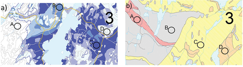
The interviews and map analysis resulted in a test scheme () and eight alternative images for the experiment (). The map alternatives were set up from different combinations of the symbolization from the two published map variants. Images from the map section were laterally reversed to make the location less recognizable. Map alternative 1 has the authoritative symbolization and map alternative 8 has the alternative symbolization as it is presented by the cooperating institution. The other map alternatives are different combinations of the two sets of visual variables. The map alternatives were set up to make it possible to use all participants in analysis of every variable tested.
Figure 3. Map alternatives for the marine clay theme.
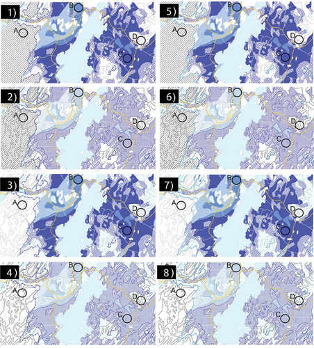
Table 2. Test scheme for the marine clay map.
Participants were asked to categorize four sample areas (A-D) in the following map categories: 1: Not mapped/no information, 2: Area above marine limit. 3: Mostly absent. 4: Low possibility of clay, 5: Medium possibility of clay, 6: High possibility of clay, 7: Very high possibility of clay.
Radon susceptibility map
The radon susceptibility map is based on a 1:250 000 bedrock map and 35 000 in-house measurements of radon and surficial deposits map in 1:50 000–1:250 000. Bedrock objects where buildings have high indoor concentrations of radon were categorized as “high” or “very high,” the remainder were “moderate or low.” The areas classified as uncertain/unknown in the radon susceptibility map lack sufficient indoor measurements, or the measurements are too uncertain to conclude. The current version of the map is shown in .
The visual variables used do not strictly follow the semiology of graphics, as they use hues for the “high” (pink) and “very high” (purple) categories that do not have a clear order. Also, a possible effect of the yellow area is that it may be perceived as “background,” while the pink and purple are perceived as “foreground.” In the yellow area, there can also be high concentrations of radon, although less common than in the other. A known challenge is that although the map is made for overview use only, some users conclude on a single residential property. This is not within the scope of this study, therefore it is not tested or discussed further.
Deconstructing the seemingly single information variable “radon susceptibility” reveals information in two dimensions: Three ordinal categories of susceptibility and one category for uncertain or unknown risk. The latter has a nominal relation to the other categories. Grey may be claimed to have a nominal relation to the other three colors used, being a color between black and white.
Radon susceptibility map test scheme
In this experiment, 8 map alternatives () were set up from different combinations from the existing map (, map alternative 1) with a map using typical susceptibility map colors (, map alternative 8) according to the test scheme (). The alternative map has a scale from yellow via orange to red, leaving out the green color, as it is not possible to conclude the area is free from radon. In addition, instead of a solid fill, diagonal line fill was used, which is used in the more known “Quick clay hazard map” (Havnen et al., Citation2017). The variables for testing were: Area fill for susceptibility categories (original map colors vs risk colors in diagonal line fill), area class for uncertainty (original solid gray, diagonal gray line fill) and map section (urban, rural). The categories the participants were asked to choose from were “no susceptibility,” “low susceptibility,” “medium susceptibility,” “high susceptibility” and “no information/not mapped.”
Figure 4. Map alternatives maps for the radon susceptibility map.
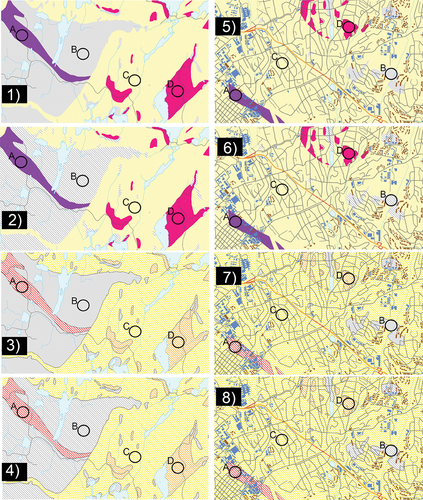
Table 3. Test scheme for the radon susceptibility map.
Experiment results
Participants in the experiment
A total of 598 participants started the survey and opened at least the start page, while 450 participants (76%) completed the whole experiment. The average time used was 12 minutes and 32 seconds. Only the completed surveys were included in the analysis. presents an overview of the participant demographics. There was a predominance of highly educated participants, slightly more men than women and a normal distribution across age categories, with a peak on 35–44 years. The participants predominantly reported low and intermediate knowledge levels in geology and maps/GIS and cartography. As ) shows, increasing knowledge in geology is followed by increased self-reported knowledge in maps, GIS, and cartography.
Figure 5. Graphs showing distribution of participants across a) age, b) gender, c) education level (completed), d) knowledge levels in geology and maps, GIS and cartography (self-reported), e) knowledge of NGU (activities) and f) previous knowledge of the maps in the experiment.
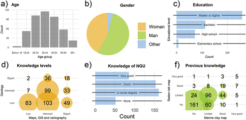
A few participants said they recognized the areas in some of the maps, a single participant even gave the right place name for one of the maps (Radon).
Marine clay map
The participants were asked to categorize four sample areas. The null hypothesis is that the differences in cartography do not create statistically significant difference in answers. The alternative hypothesis is that it does. The Fisher’s Exact test shows significant values for all sample areas (p-values <0.001). From this, the null hypothesis can be rejected.
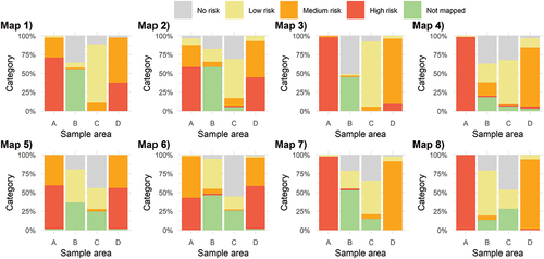
From the bar graphs in it can be observed that:
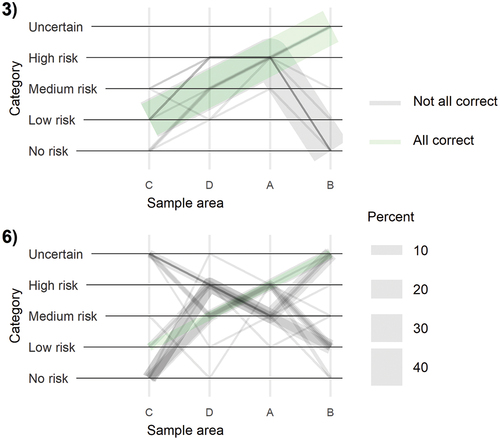
Figure 6. Bar graphs showing the percentage of answers for each category across map alternatives. The correct answers are A: Area above marine limit, B: High possibility for clay, C: Very high possibility, D: Mostly absent.
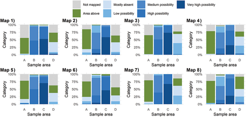
Participants generally think that the susceptibility is higher when stronger colors are used (map alternative 1,3,5,7), than with the hatched area fill.
More participants recognize the area above marine limit when this area is white (map alternative 3,4,7 and 8) and not when filled with diagonal lines.
The expected result was that most participants would be able to order the categories from low to high guided by the color value from light to dark. For the map alternatives with the solid fill colors with higher contrast between colors (map alternative 1,3,5 and 7), the results show more than 90% of the participants could do this. As shows, map alternatives 2,4,6,8 have fewer participants that answer correctly, the “butterfly” pattern reflects participants, who were struggling to order the sample areas. Many participants commented that they understood darker color represented higher possibility. For the alternative map, where the hatched area displays lower contrast between the colors, the number of correct answers was lower. For example, a participant commented that the colors are challenging to separate from each other, that they are too similar. For the two variants of area fill for low to high possibility of clay (map alternative 2,4,6,8 versus 1,3,5,7), the Fisher Exact test finds significant differences for B, C, and D (all p-values <0.001). There is higher participant uncertainty for sample area B (high possibility area sample) for map alternative with the hatched, lower contrast fill (map alternative 2,4,6,8).
Figure 7. Line graphs showing the set of answers for all participants. The green line represents the percent of participants with the correct set of answers. Categories for possibility of clay (y-axis) are 1: No data, 1: Area above marine limit, 3: Mostly absent, 4: Low, 5: Medium, 6: High, 7: Very high possibility of clay.
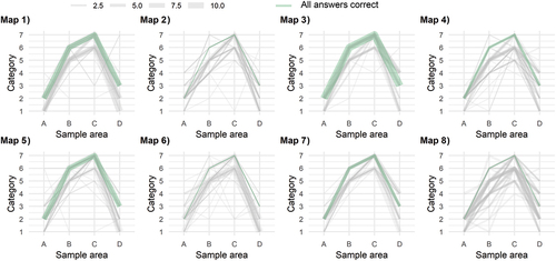
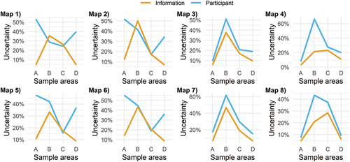
The area above marine limit is filled with diagonal lines in the authoritative map. This was selected with the purpose of communicating that this area mostly can be disregarded for the theme of the map, but the symbol has higher participant uncertainty score (, sample area A, map alternative 1,2,5,6, blue line) and information uncertainty score (orange line). The latter is incorrect; the uncertainty is higher for the areas below marine limit.
Figure 8. The line graphs show participant uncertainty (blue line) and information uncertainty (orange line) for the eight marine clay map alternatives.
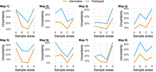
The same relative proportion of participants (64.9% and 65.3%) correctly think A is above the marine limit when the thick, dashed line is used as the thin, solid, light blue line. Marine clay map alternative 2 has a lot higher confidence score than map number 6 (see ) even though the only difference is that map alternative 2 uses the dashed, thicker blue line alternative. There is also high participant uncertainty for area A in map alternative 6. This map has a combination of diagonal line fill for both “above marine limit” and the categories for possibility of clay.
The result when quantifying the intuitiveness, shows map alternative 3 and 7 has the overall best scores for categorization, and a relatively high confidence score ().
Table 4. Intuitiveness and confidence scores for the marine clay map alternatives.
A higher confidence is found with the odd numbered maps where the strong, blue colors are used. There is an exception for map alternative 2, which is also high. A thick, strong-colored dashed line for marine limit seems to compensate for the lower scores of the alternative cartography (see , map alternative 2).
Experiment results - radon susceptibility map
See for a comparison of the answers to the categorization task for the map alternatives. The Fisher’s Exact test finds clear significant differences for all sample areas (all p-values <0.001).
Figure 9. Bar graphs showing the percentage of answers for each category and sample area across maps. Map alternative 3 has the most correct answers; “low” for sample area A, “not mapped/uncertain” for B, “high” for C and “medium” for D.
From the bar graphs () the following can be observed:
Participants struggle to order high (A) and medium susceptibility (D) for maps 1,2,5 and 6, with the currently used cartography.
Most participants think the gray area in area sample B (“not mapped”/“uncertain”) represents “no susceptibility.”
Participants often interpret “low susceptibility” as “no susceptibility” in urban areas (map alternative 5–8).
Using two more distinct visual variables for “uncertain” and susceptibility categories for map alternatives increases the number of correct answers (map alternative 2,3,6,7).
We can conclude from the bar graphs, supported by the p-values, that there is a relationship between map alternatives and participants choice of category. And the null hypothesis that the differences do not matter, can therefore be rejected.
The line graphs in show the percentage of participants who mark the area samples with either uncertainty in categorization or that the information category seem to contain more uncertain information than others (if any). Here, the following observations can be made:
Figure 10. Line graphs showing the percent of participants marking the sample areas with participant (blue line) and information uncertainty (orange line).
There are significant differences between map alternatives for which sample areas the participants were uncertain about.
Participant uncertainty is high for the medium and high categories when the strong pink and purple colors are used (map alternative 1,2,5,6).
For map alternative 3 and 8 both participant and information uncertainty are high for the uncertain/not mapped category.
Map alternative 3 has the overall best intuitiveness score (). This map alternative also has a high confidence score and an adequate line graph curve on uncertainty. Also, the line graph for map alternative 3 in shows a cleaner image with few outliers.
Figure 11. Line graphs showing all answers for the eight alternative radon map alternatives. The green line represents the percent of participants with the correct set of answers. The green line represents the group with all answers correct.
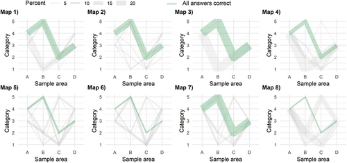
Table 5. Intuitiveness and confidence scores for the radon map alternatives.
On average, participants reported 52 in confidence (certainty about their answers on the categorization task) when solving the map task on a scale from 0 (low confidence) to 100 (high confidence). The maps with the lowest confidence scores are map 2 and 6. These maps have solid fill in yellow, pink, and purple for the susceptibility categories and hatched gray for “uncertain.” The maps with the opposite use of hatched fill and solid color fill, create the highest confidence levels.
Discussion
Marine clay map
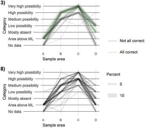
Comparing two marine clay maps (), the line graph for map alternative 3 is cleaner, has more correct answers (green line) and is thereby more intuitive than map 8. None of the participants presented with map alternative 8 had all the answers exactly right, and the parallel lines below the green in the line graph, shows that the participants more often think the possibility of clay is lower when lighter colors and less contrast are used. This result can be explained by heuristics: When using value as a visual variable, the use of the full scale from light to dark colors, is recommended to improve visual contrast (Itten, Citation1974). These results also suggest that participants expect to find dark colors for high-possibility categories.
Figure 12. Comparison of results for map alternative 3) and map 8) for marine clay.
Using hatched fill (map alternative 2,4,6 and 8) gives lower scores on the categorization task (). However, the use of the thick blue dashed line for marine limit in map alternative 2 gives notably higher confidence score (58.3) and a lower score for participant uncertainty, than map alternative 6 (45.1), all other symbols being equal. This can possibly be explained by higher contrasts in the map image overall. In conclusion, the dashed line is still preferred to make a distinct separation between clay-areas and not clay-areas as intended.
For the area above marine limit, leaving the area blank is the most favored alternative among the tested alternatives. However, to separate it from not mapped and uncertain categories is a necessity. Therefore, a new, but less prominent symbol is being considered for the next version of the map.
Radon susceptibility map
The Radon susceptibility map is a continuous map showing four non-overlapping area categories. Three of these have an internal order from “low” to “high susceptibility.” The fourth category is an area where it is not possible to categorize due to lack of data. This category has a nominal relation to the other three. This area has a gray color on the map, while the other categories are yellow, pink, purple displaying increasing susceptibility. Less than half of the participants intuitively identifies the “uncertain” sample area correctly in the Radon susceptibility map.
As expected, there is confusion about the order between the middle (D) and high susceptibility (A) categories when they are represented with pink and purple color, as in the existing map (map alternative 1,2,5 and 6). The used colors are too similar in value or darkness, and as a result none of them stands out as stronger than the other. As a result, about half of the participants put them in the wrong order.
In addition, the distance in color between pink, purple in one end of the scale and yellow on the other is too large for it to be perceived as an ordered scale: Especially when faced with the urban map sections, the yellow area is most often interpreted as “no susceptibility,” followed by “low susceptibility” and “uncertain” (see , map alternatives 5–8). This may be explained by a figure/ground-effect, where participants may perceive the yellow area as background, and this as “no susceptibility.” One difference between the urban and rural map sections is that the low susceptibility category covers a larger area in the urban map. This may increase the figure/ground-effect. The urban map also has more information like more roads and buildings. Cartographers have discussed the importance of their responsibility to help map readers quickly and accurately distinguish figure from ground (e.g. MacEachren & Mistrick, Citation1992). According to Vecera et al. (Citation2004), “These visual processes are important, because figures form the basis of much visual processing – humans are more likely to recognize and act upon figures than backgrounds.”
Finally, the results are better when a separate and distinct visual variable is used for the uncertain-category. For alternatives 4 and 8, 42.4% think the gray hatched area is “low susceptibility” compared to 15.9% that correctly think this is “uncertain.” Changing the “uncertain”-category to having a solid fill (maps 3 and 7) more than doubles the correct answers. Alternatively, changing the fill for the susceptibility categories to the original solid fill colors, and keeping the gray diagonal line fill for uncertain, makes an even better result for area sample B. Using solid fill for susceptibility, and diagonal line fill for “uncertain,” or the other way around, increases the correct answers from 29% to 51%.
Overall, map alternative 3 has the best results. See for a comparison between map alternative 3 and 6.
Figure 13. Comparing the answers from map alternative 3) and 6), where map alternative 3) has the overall best test results. For map alternative 6), participants struggle to order sample area for medium (D) and high susceptibility (A), and some also categorize the low susceptibility symbol as uncertain.
Presenting and discussing results
The results were presented to the map owners and map development team. The visualizations gave an opportunity for the geologists to also draw conclusions themselves and ask questions.
The line graph where the thickness of the lines was varying with the relative proportion of participants with the exact same set of answers was effective in engaging the team. The graph was easy to grasp, and it was easy to see that some graphs were less messy, and thus representing a better map alternative. The statistics, frequency diagrams and bar graphs were necessary for the analyses and to explain the results in-depth. For the visual analyses, the more iterations of graphs and groupings, the better to reveal possible relationships and explanations. These results were in turn discussed with the visualizations of the results.
Taking the time to carefully deconstruct the maps, gaining in-depth knowledge of the choices behind the existing product, and visualizing and discussing the test results, gave ground for appreciation of each other’s expert competence. The tests and following possible cartographic explanations gave room for common learning and development for the next versions of the maps. What was evident was that the geologists, being scientific employees, clearly appreciated the methodological input and scientific approach to the user-orientation of products.
Action points were jointly made. For both maps, there was now a request that prototypes based on the defined goals, were made by the cartographer for discussion, instead of the geologist. In addition, there is a demand for user studies for existing and new maps in other parts of the organization. There is an increasing demand in society and acknowledgment in the organization that the map products need to have high usability. Meetings, plans and resources must be set up to ensure user-oriented map development, where actual challenges with the maps can be identified and discussed, and new versions tested to reduce the risk of misinterpretation and misuse. To make better thematic maps, it is important to involve cartographic expertise early and foster the cross-disciplinary collaboration.
Generalizable results
The map experiment returned the following generalizable results:
Minor differences in symbolization have a significant impact on how easily the symbols are understood correctly.
Symbology should be tested as dependent of all other objects in a map, as the interplay of all objects in the map affects the result.
If map categories have a mix of ordered and nominal relations between them, the hierarchy and structure of the information should be communicated with a corresponding set of distinct visual variables with the same hierarchy and structure to ease understanding.
Contrast in the map image increases confidence.
The use of darker color scale (full contrast) in solid area fill makes map readers perceive a higher susceptibility than with the use of a color scale with light colors and less contrast.
In a society where map literacy is variable and individuals are overloaded with information, paying more attention to map design has the potential to give a large positive impact. A general challenge to the cartographic community is how to display uncertainty. Further research is needed on how different kinds of uncertainty, for example interpreted as opposed to measured, overview data as opposed to detailed, not mapped as opposed to no occurrence and “inadequate data” could be symbolized in an intuitive way simultaneously in the same map, alongside with the thematical classes. New symbol conventions need to be developed, preferably across fields.
Evaluation of the map experiment
The map experiment returned a rich data material that enlightened the understanding of how easily the maps are understood. It was especially fruitful to analyze the results visually, regrouping and reanalyzing with increasing knowledge. The line graphs made it easy to identify the differences between map alternatives. Therefore, these graphs were valuable to create engagement when presenting and discussing results with the map development team and others. Bar graphs depicting the relative proportion of all answers were used to identify and find explanations for the differences. Communicating map intuitiveness through visualization of confidence and uncertainty in addition to answers on categorization, gave a more solid base for conclusions. A confident, but wrong answer could reveal serious problems with the selected cartography.
Using a web-based survey and lowering the threshold for the experiment with ready-made categories and keeping the time to finish down to 10–15 minutes can have contributed to the high number of participants.
Conclusions
In this study, the first research question was what can be learned from applying map experiments into map development. Performing research within the mapping and map producing organization proved fruitful for appreciating each other’s expertise for common learning and development. The work resulted in a demand for more focus on map prototyping and testing.
The next research questions were how intuitive the map symbols are without a legend present, and what increases and decreases intuitiveness. This experiment gives evidence that even minor differences in symbolization can have significant impact on map intuitiveness. Two susceptibility maps were tested in the experiment, focusing on three variables for each map. Map intuitiveness was evaluated based on correct answers, confidence, and uncertainty evaluations. The most intuitive map alternatives are number 3 for both the marine clay and the radon susceptibility map ().
Figure 14. The two maps with the highest map intuitiveness scores.
Marine clay map alternative 3 has more correct answers, less diversification of answers and higher confidence scores. For the marine clay map, the conclusion is to keep colors with good contrast and find a new symbol for the area above marine limit. The diagonal fill area above marine limit created visual noise and is also confusing for the participants. Another action point is to simplify the categories, if possible, without losing essential information and to find symbols that more intuitively separates between a possibility of clay (uncertain) and not (unlikely).
For the radon map, the map with a diagonal line fill with a typical susceptibility color scale and a solid gray fill for “uncertain” (map alternative 3) proves most intuitive. This map uses standard risk-colors in diagonal line fill, with the uncertain category as a solid gray area. More participants perceive it alike and there are fewer outliers. The action points include selecting a better color scale for the susceptibility categories. Also, it is recommended to use a different, more distinct visual variable for the uncertain area. Finally, actions should be taken to reduce the risk for the “low”-category to be perceived as background, and therefore interpreted as uncertain or no susceptibility.
For the last research question, how map intuitiveness can be measured, analyzed, visualized, and communicated to support design decisions, this study exemplifies a way of doing this. A line graph where one line represented the amount of this set of answers, and where the line representing the correct was marked, proved especially effective to engage others in meetings and discussions, and to demonstrate that symbol choices can really make a significant difference.
Map experiments can improve the comprehensibility of the maps and potentially reduce the likelihood of premature conclusions, thereby mitigating misinterpretations. The visualized results supplied empirical evidence for knowledge-based discussions on further development of the maps. If the demands for an open and accessible public knowledge base are to be met, cartography should have a higher focus. Testing maps and their intuitiveness is one contribution to the democratization of maps to ensure adequate understanding and use of existing knowledge to solve societal challenges.
Ethics Declarations
The experiment was performed without collecting any personal identifying information.
Acknowledgments
We extend our sincere gratitude to the anonymous reviewers for their time, expertise, and constructive comments. Their insights and constructive feedback lead to significant enhancement and development of the content of this article. We also want to acknowledge the colleagues at the Geological Survey of Norway (NGU) for their cooperation and support. Especially, we would like to extend our sincere gratitude to co-supervisor Dr. Malin Andersson (NGU), Dr. Guri Venvik (NGU) and Senior Advisor Anne Liinamaa-Dehls (NGU) for their invaluable contributions. Malin Andersson and Guri Venvik have been important motivators and discussion partners, pushing the work forward, while Anne Liinamaa-Dehls conducted proofreading and corrected the English language, greatly enhancing the overall quality of this manuscript. Finally, we want to thank those who kindly participated in the experiment or assisted with its distribution.
Disclosure statement
No potential conflict of interest was reported by the author(s).
Data availability statement
The data that support the findings of this study are openly available in Dataverse at https://doi.org/10.18710/FS2QXK.
References
- Adinolfi, P., & Loia, F. (2022). Intuition as emergence: Bridging psychology, philosophy and organizational science. Frontiers in Psychology, 12, 12. https://doi.org/10.3389/fpsyg.2021.787428
- Altan, O., Backhause, R., Boccardo, P., Manen, N., Trinder, J., & Zlatanova, S. (2013). The value of geoinformation for disaster and risk management (VALID): Benefit analysis and stakeholder assessment. Joint Board of Geospatial Information Societies (JB GIS).
- Amundsen, B. 2017. Radon kan øke risikoen for dødelig hudkreft [online] [Radon may increase the risk for mortal skin cancer]. Retreived February 14, 2024, from https://www.forskning.no/fiskehelse-kreft-forebyggende-helse/radon-kan-oke-risikoen-for-dodelig-hudkreft/337767
- Bang-Kittilsen, A. (2024). Replication data for “Read the map. https://doi.org/10.18710/FS2QXK,/DataverseNO.
- Bang-Kittilsen, A., & Midtbø, T. (2021). Imaging the subsurface: How different visualizations of cross-sections affect the sense of uncertainty. Journal of Geovisualization and Spatial Analysis, 5(1), 1. https://doi.org/10.1007/s41651-020-00071-6
- Bertin, J. (2010). Semiology of graphics: Diagrams, networks, maps (1 ed.). Esri Press. ISBN 978-1589482616.
- Bunch, R. L., & Lloyd, R. E. (2006). The cognitive load of geographic information. The Professional Geographer, 58(2), 209–220. https://doi.org/10.1111/j.1467-9272.2006.00527.x
- Candela, T., Péroche, M., Sallaberry, A., Rodriguez, N., Lavergne, C., & Leone, F. (2022). Visualising post-disaster damage on maps: a user study. International Journal of Geographical Information Science, 36(7), 1364–1393. https://doi.org/10.1080/13658816.2022.2063872
- Çöltekin, A., Fabrikant, S. I., & Lacayo, M. (2010). Exploring the efficiency of users’ visual analytics strategies based on sequence analysis of eye movement recordings. International Journal of Geographical Information Science, 24(10), 1559–1575. https://doi.org/10.1080/13658816.2010.511718
- Çöltekin, A., Heil, B., Garlandini, S., & Fabrikant, S. I. (2009). Evaluating the effectiveness of interactive map interface designs: A case study integrating usability metrics with eye-movement analysis. Cartography and Geographic Information Science, 36(1), 5–17. https://doi.org/10.1559/152304009787340197
- Dong, W., Liao, H., Xu, F., Liu, Z., & Zhang, S. (2014). Using eye tracking to evaluate the usability of animated maps. Science China Earth Sciences, 57(3), 512–522. https://doi.org/10.1007/s11430-013-4685-3
- Geertsema, M., & Torrance, J. K. (2005). Quick clay from the Mink Creek landslide near Terrace, British Columbia: Geotechnical properties, mineralogy, and geochemistry. Canadian Geotechnical Journal, 42(3), 907–918. https://doi.org/10.1139/t05-028
- Government. (2023, January 18). The public map base (DOK). https://www.regjeringen.no/no/tema/plan-bygg-og-eiendom/plan_bygningsloven/planlegging/veiledning/plankart_planregister/dok/id2470662/.
- Gregersen, O. (1981). The quick clay landslide in Rissa, Norway (Vol. 135). NGI Publication.
- Hagemeier-Klose, M., & Wagner, K. (2009). Evaluation of flood hazard maps in print and web mapping services as information tools in flood risk communication. Natural Hazards and Earth System Sciences, 9(2), 563–574. https://doi.org/10.5194/nhess-9-563-2009
- Häggquist, E., & Söderholm, P. (2015). The economic value of geological information: Synthesis and directions for future research. Resources Policy, 43, 91–100. https://doi.org/10.1016/j.resourpol.2014.11.001
- Hansen, L., Høgaas, F., Sveian, H., Olsen, L., & Rindstad, B. I. (2014). Quaternary geology as a basis for landslide susceptibility assessment in fine-grained, marine deposits, onshore Norway. In J.-S. L’Heureux, A. Locat, S. Leroueil, D. Demers, & J. Locat (Eds.), Landslides in sensitive clays: From geosciences to risk management (pp. 369–381). Springer Netherlands. https://doi.org/10.1007/978-94-007-7079-9_29
- Havnen, I., Ottesen, H. B., Haugen, E. D., & Frekhaug, M. H. (2017). Quick-clay hazard mapping in Norway I. In V. Thakur, J.-S. L’Heureux, & O. A. Locat (Eds.), Landslides in sensitive clays: From research to implementation (pp. 581–591). Advances in Natural and Technological Hazards Research. Cham: Springer International Publishing. https://doi.org/10.1007/978-3-319-56487-6_50
- Ielsch, G., Cushing, M. E., Combes, P., & Cuney, M. (2010). Mapping of the geogenic radon potential in France to improve radon risk management: Methodology and first application to region bourgogne. Journal of Environmental Radioactivity, 101(10), 813–820. https://doi.org/10.1016/j.jenvrad.2010.04.006
- Islam, M. N., & Bouwman, H. (2016). Towards user–intuitive web interface sign design and evaluation: A semiotic framework. International Journal of Human-Computer Studies, 86, 121–137.
- Itten, J. (1974). The art of color: The subjective experience and objective rationale of color. Wiley.
- Koletsis, E., van Elzakker, C. P. J. M., Kraak, M. J., Cartwright, W., Arrowsmith, C., & Field, K. (2017). An investigation into challenges experienced when route planning, navigating and wayfinding. International Journal of Cartography, 3(1), 4–18. https://doi.org/10.1080/23729333.2017.1300996
- Larsson, R., & Jansson, M. (1982). The landslide at Tuve, November 30, 1977. Statens Geotekniska Institut.
- L’Heureux, J.-S., & Solberg, I.-L. (2013). Utstrekning og utløpsdistanse for kvikkleireskred basert på katalog over skredhendelser i Norge. NVE, Report.
- Lloyd, R. E. (2005). Attention on maps. Cartographic Perspectives, 52(52), 28–57. https://doi.org/10.14714/CP52.377
- MacEachren, A. M., & Mistrick, T. A. (1992). The role of brightness differences in figure-ground: Is darker figure? The Cartographic Journal, 29(2), 91–100. https://doi.org/10.1179/caj.1992.29.2.91
- Montello, D. R. (2002). Cognitive map-design research in the twentieth century: Theoretical and empirical approaches. Cartography and Geographic Information Science, 29(3), 283–304. https://doi.org/10.1559/152304002782008503
- Nelson, E. (2000). The impact of bivariate symbol design on task performance in a map setting. Cartographica: The International Journal for Geographic Information and Geovisualization, 37(4), 61–78. https://doi.org/10.3138/V743-K505-5510-66Q5
- NGU. (2022, October 12). Map viewers | Norges Geologiske Undersøkelse. https://www.ngu.no/en/topic/map-viewers.
- NRK. (2020, December 31). Bor du på kvikkleire? Her kan du sjekke. [Do You Live on Top of Quick Clay? Check Here]. https://www.nrk.no/norge/bor-du-pa-kvikkleire_-her-kan-du-sjekke-1.15308726.
- OED (Ministry of petroleum and Energy). (2021). Årsakene til kvikkleireskredet i Gjerdrum 2020 [ The reasons behind the quick clay landslide in Gjerdrum 2020]. Report. https://www.regjeringen.no/no/dokumenter/arsakene-til-kvikkleireskredet-i-gjerdrum-2020/id2872948/.
- Ooms, K. (2016) Cartographic user research in the 21st century: Mixing and interacting. In T. Bandrova, M. Konečný, & N. Malysheva (Eds.), Proceedings, 6th International Conference on Cartography and GIS. Albena, Bulgaria.
- Ooms, K., De Maeyer, P., Fack, V., Van Assche, E., & Witlox, F. (2012). Interpreting maps through the eyes of expert and novice users. International Journal of Geographical Information Science, 26(10), 1773–1788. https://doi.org/10.1080/13658816.2011.642801
- Opach, T., & Rød, J. K. (2022). A user-centric optimization of emergency map symbols to facilitate common operational picture. Cartography and Geographic Information Science, 49(2), 134–153. https://doi.org/10.1080/15230406.2021.1994469
- Pérez-Díaz, L., Alcalde, J., & Bond, C. E. (2020). Introduction: Handling uncertainty in the geosciences: Identification, mitigation and communication. Advances in Fission-Track Geochronology, 11(3), 889–897. https://doi.org/10.5194/se-11-889-2020
- Perkins, C. (2008). Cultures of map use». The Cartographic Journal, 45(2), 150–158. https://doi.org/10.1179/174327708X305076
- Rosvall, G., & Kjellberg, U. (2009). Rapport RO 2009:01 Jordskred vid vägbygge E6 i Småröd, O län, den 20 december [Landslide near roadwork E6 Småröd, O, December 20]. Swedish Accident Investigation Board (SHK).
- Roth, R. E., Çöltekin, A., Delazari, L., Filho, H. F., Griffin, A., Hall, A., Korpi, J., Lokka, I., Mendonça, A., Ooms, K., & van Elzakker, C. P. J. M. (2017). User studies in cartography: Opportunities for empirical research on interactive maps and visualizations. International Journal of Cartography, 3(sup1), 61–89. https://doi.org/10.1080/23729333.2017.1288534
- Setså, R. (2020, December 30). Midt i et rødt område [In the Middle of a Red Area]. Geo365. https://geo365.no/et-utsatt-omrade/.
- Smethurst, M. A., Watson, R. J., Baranwal, V. C., Rudjord, A. L., & Finne, I. (2017). The predictive power of airborne gamma ray survey data on the locations of domestic radon hazards in Norway: A strong case for utilizing airborne data in large-scale radon potential mapping. Journal of Environmental Radioactivity, 166, 321–340. https://doi.org/10.1016/j.jenvrad.2016.04.006
- Suchan, T. A., & Brewer, C. A. (2000). Qualitative methods for research on mapmaking and map use. The Professional Geographer, 52(1), 145–154. https://doi.org/10.1111/0033-0124.00212
- Vecera, S. P., Flevaris, A. V., & Filapek, J. C. (2004). Exogenous spatial attention influences figure-ground assignment. Psychological Science, 15(1), 20–26. https://doi.org/10.1111/j.0963-7214.2004.01501004.x
- Wang, Y., Paasche, H., Baranwal, V. C., Dumais, M. A., Stampolidis, A., Ofstad, F., Brönner, M. (2023). Extrapolating a country-scale uranium map for radon mapping in Norway. Submitted Manuscript.
- Watson, R. J., Smethurst, M. A., Ganerød, G. V., Finne, I., & Rudjord, A. L. (2017). The use of mapped geology as a predictor of radon potential in Norway. Journal of Environmental Radioactivity, 166, 341–354. https://doi.org/10.1016/j.jenvrad.2016.05.031
- With, C., Löfroth, H., Bastani, M., Persson, L., Rodhe, L., Hedfors, J., & Schoning, K. (2022). A methodology for mapping of quick clay in Sweden. Natural Hazards, 112(3), 2549–2576. https://doi.org/10.1007/s11069-022-05278-y
- Xie, M., Reader, S., & Vacher, H. L. (2021). Rethinking map literacy. Springer International Publishing.