
ABSTRACT
This tutorial explains how the human perception of color rendering arises, in terms of the underlying phenomena of light and vision, and using those concepts it presents a clear explanation of the CIE Color Rendering Index. The strengths and weaknesses of the CIE Color Rendering Index are reviewed and some common misunderstandings about color rendering are addressed. It is suitable for self-study, with learning outcomes stated at the beginning and a conceptual summary provided at the end.
Learning Outcomes
It is our intent that, after studying this article, the reader will:
1. be able to explain the basic concept of color renderingFootnote1—what is being measured, why is it important, and how it influences the design and selection of electric light sources;
2. feel familiar with basic concepts of optical science and color vision that are required to understand color rendering: spectral power distribution, correlated color temperature, chromaticity, spectral reflectance function, chromatic adaptation, color appearance;
3. be able to describe the basic concepts underlying color rendering: test illuminant, reference illuminant, test color samples, color shift, color difference;
4. understand that the current CIE method for calculating the General Color Rendering Index (Ra)Footnote2 is useful but not perfectly accurate: it is being updated to further improve its accuracy;
5. understand that Ra is a limited measure; by definition it overlooks important factors that may also warrant consideration by other methods:
(a) objects will sometimes appear a slightly different color when illuminated with lamps of different color temperature, even if both lamps have perfect color rendering;
(b) Special Color Rendering Index (Ri) values can provide information about how a lamp causes color shifts for specific test color samples; and
(c) beyond the concept of color rendering, there are other ways to summarize the color shifts that occur with lamps that have imperfect color rendering, which may be helpful for some lighting applications—in other words, color rendering does not tell the full story.
1 INTRODUCTION
This article is a tutorial written for those involved in the design of the luminous environment, including architects, interior designers, engineers, lighting designers, sustainability consultants, energy engineers, landscape architects, lighting product representatives, and lighting equipment manufacturers.
It has been prepared in response to three needs. First, the people listed in the preceding paragraph must deal with color and color rendering, yet few have received formal education in color science or the application of color science to lighting practice. They may therefore feel confined to read overly simplistic views of the topic, which are unlikely to promote deep comprehension. This article aims to be scientifically correct and sufficiently complete while also being accessible to non-scientists. Second, despite common simplistic treatments that suggest otherwise, color rendering is a complex and a subtle topic. Perhaps because color is so much a part of our lives, it is easy to take for granted or to misunderstand why and how our world is so colorful. This article is a step-by-step tutorial about how light sources cause objects to be perceived as having particular colors—taking into account the optical radiation generated by a source, the reflectance characteristics of the objects illuminated, and the nature of the human visual system. Third, color rendering is often misunderstood, even by some lighting experts, despite its fundamental importance in lighting design.
This tutorial builds on the basics—put simply, a lamp with excellent color rendering causes objects to appear the color we generally expect, whereas a lamp with poor color rendering causes the color of some objects to appear distorted. This is important because many people find this distortion effect unpleasant and even disturbing, and care and effort are required to avoid this problem. The purpose of this tutorial is not to discuss the importance of color rendering but, rather, to clearly explain how some sources distort the color of some objects and how the overall amount of distortion is assessed by the test sample method which is used in the CIE Color Rendering Index (CRI), which is comprised of 14 Special Color Rendering Indices (R1 − R14) and one General Color Rendering Index (Ra).
The tutorial begins with a brief review of the key ideas about optical science and color vision upon which color science is based. It then introduces the basic concepts that allow color rendering to be clearly defined. This is followed by a description of how the CIE CRI calculation is carried out, as well as a discussion of the levels of color rendering that are considered acceptable. The tutorial concludes with a discussion of common misunderstandings about the CIE CRI, as well as its limitations. Some of these limitations may be overcome with improvements that are currently under development, but others are intrinsic limitations that lie beyond the intended purpose of the CIE CRI. Despite these limitations, the CIE CRI is one of the most important concepts in the application of light and color.
2 SOME BASIC CONCEPT OF OPTICAL SCIENCE AND COLOR VISION: ILLUMINATION, REFLECTION, AND THE PERCEPTION OF SURFACE COLORS
Vision is initiated by optical radiation that enters the eyes. When radiation strikes the back surface of the retina, a cascade of resultant neurological activity allows the human brain to construct an image of the shapes, shadows, highlights, patterns, textures, and colors that make up our world.
Color, a perceptual response, is triggered by and related to optical radiation (a physical stimulus). Different mixtures of wavelengths of light usually cause different sensations of color. Perceptions of red, for example, occur when the optical radiation entering the eye–brain system is dominated by longer wavelengths (say, above 620 nm). Perceptions of green occur when a large fraction of the optical radiation is at middle wavelengths (around 530 nm). Perceptions of blue occur when the optical radiation is dominated by shorter wavelengths (around 450 nm). A mixture of long and medium wavelengths may appear yellow and a mixture of short and long wavelengths may appear magenta. It is helpful to distinguish between the color experience that occurs when a person looks directly at a light source, as opposed to the experience of viewing objects that reflect and scatter incident light.
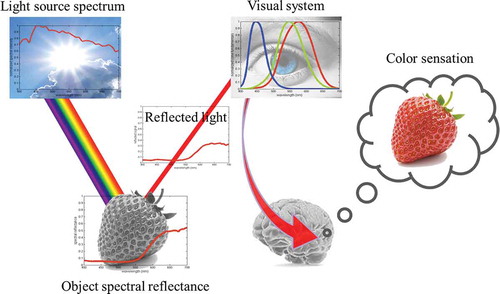
The perceived color of such objects is termed object color. The chain of events leading to the perception of object color begins with incident light generated by a light source (for example, sun, sky, fire, fluorescent lamps, light emitting diodes (LEDs), incandescent lamps, and metal halide lamps or some combination of these). This light is composed of optical radiation having a range of wavelengths, with a specific relative intensity at each wavelength, often called the spectral power distributionFootnote3 (SPD). Next, the optical radiation emitted is modified by an object’s absorption and reflection of light at each wavelength. For example, and as illustrated in , a red strawberry will reflect long wavelength energy while largely absorbing the light at most middle and short wavelengths. shows that the color stimulus function therefore depends upon both the light source and the object. Lastly, the reflected radiation is processed by the human visual system, with some of the processing occurring in wavelength-sensitive retinal cells, some in computational cells also within the retina, and much of it occurring in more sophisticated processing that takes place in the brain.
Fig. 1 Stages in the perception of a red strawberry.
It will now be helpful to mention briefly some underlying concepts of color vision that must be understood to fully grasp the concept of color rendering. Here we have kept the definitions as simple as possible for the purposes of this article.
2.1 Spectral Power Distribution, Blackbody Radiator
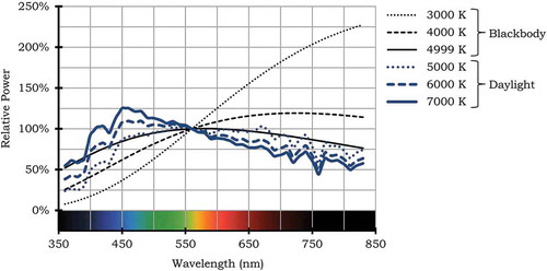
In general, when a light source emits light it does not do so equally at all wavelengths. The SPD of a light source specifies the amount of energy (or power) emitted at each wavelength; examples are shown in . Three of the curves in represent the SPDs of blackbody radiators, each at a different absolute temperature. A blackbody (or Planckian) radiator is a body that absorbs all radiation falling on it and reflects none. According to thermodynamics and quantum mechanics, such an object also emits radiation with an intensity Mc, defined as the amount of radiated power per unit area per unit wavelength interval (in units W m−3). Three of the curves in represent the SPDs of blackbody radiators, each at different absolute temperatures (3000, 4000, and 4999 K). The other three curves in show the spectral power distributions of different phases of natural daylight, described in terms of correlated color temperature (CCT), as discussed later in this tutorial. All of these curves are useful as reference sources for the CRI calculation.
Fig. 2 Spectral power distributions (SPDs) for some of the phases of the reference illuminants used in the computation of CRI. All SPDs are in relative units, normalized to have a value of 1.0 at 560 nm.
2.2 Spectral Reflectance Function
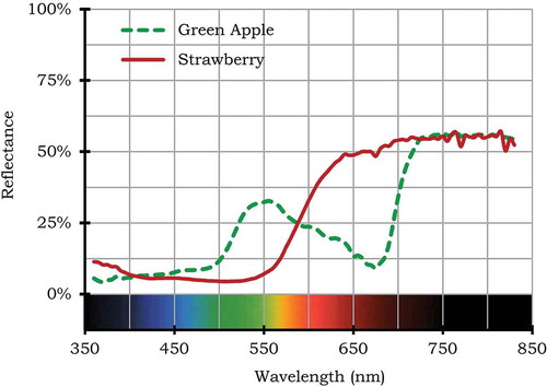
Generally, when light having a single wavelength strikes an opaque (that is, not light-transmitting) object, a certain fraction of that light is absorbed and the rest is reflected, with the reflected light having the same wavelength as the incident light. The size of the reflectance fraction is called the “spectral reflectance,” and it is always greater than or equal to zero and less than or equal to one. The spectral reflectance of an object usually varies with wavelength, and the form of the variation depends on the materials present in the object’s surface. For example, a green apple reflects mostly medium wavelength energy and absorbs energy at short and long wavelengths. A red strawberry reflects long wavelength energy but mostly absorbs anything below that, as depicted in the graphs in . Such a depiction may be called the “spectral reflectance function” or simply the “spectral reflectance.”
Fig. 3 Spectral reflectance functions for a green apple and strawberry.
2.3 Cone Fundamental Functions and Color Matching Functions
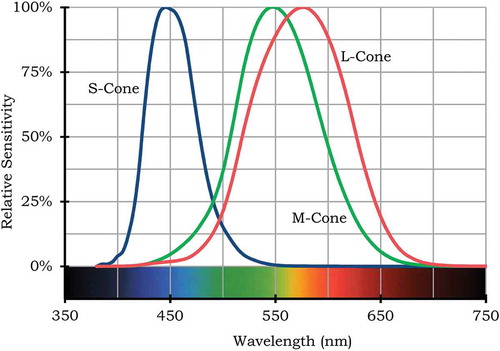
The retina in the human eye has numerous kinds of cells that detect light, though it is the three types of cone cells that are especially important to the experience of color vision. It is believed that when two stimuli produce the same cone signals under the same viewing conditions they will match in color. “Trichromacy” is the characteristic of vision whereby complex stimuli can be reduced to three visual signals. The three types of cones are sometimes labeled S, M, and L (for short, medium, long) based on the relative wavelengths of peak sensitivity, as shown in . In colloquial usage, they are also sometimes referred to as the blue, green, and red cones, again referring to the spectral regions of peak sensitivity.
Fig. 4 Net relative spectral sensitivity of the human eye’s three cone cell types.
In applied colorimetry, cone sensitivity functions are usually not used directly in color calculation. Instead, it is conventional to use color matching functions (CMFs), like the set of CMFs shown in known as the CIE 1931 2° Standard Observer. Although the cone sensitivity functions and the CMFs seem very different, it has been shown by Stockman and Sharpe [Citation1999] that it is possible to mathematically transform a proper set of cone fundamentals into color matching functions.
Fig. 5 The 1931 CIE 2° standard observer, including the , and
color matching functions (CMFs), sometimes also called the XYZ CMFs. For historical background, see MacAdam [Citation1970].
![Fig. 5 The 1931 CIE 2° standard observer, including the , and color matching functions (CMFs), sometimes also called the XYZ CMFs. For historical background, see MacAdam [Citation1970].](/cms/asset/4e86d8ed-e5be-4ae1-8dc6-deeb5454edf6/ulks_a_989802_f0005_oc.jpg)
2.4 Tristimulus Values, Luminous Efficacy of Radiation, Luminous Efficacy, Chromaticity, Correlated Color Temperature
The most common way to describe the color of a light source is to carry out a calculation in a number of wavelength bands spanning the visible spectrum, usually in 1-nm, 4-nm, 5-nm, or 10-nm intervals. In each band, one first multiplies the source’s irradiance (radiant power per unit area) within that band by the value of each of the three color matching functions for that band (available in tables from the CIE) and then sums the resulting products and multiplies each of the three sums by the appropriate constant, Km = 683 lm W−1, to obtain the tristimulus values X, Y, and Z for that source, in units of lumens per square meter (lm m−2, also called lux with the symbol lx).Footnote4 If two sources have the same tristimulus values, they will stimulate an observer’s visual system in very similar ways and will be visually indistinguishable when presented in the same viewing conditions.
The middle function, , of the CMFs also plays another role—it is also called the “luminous efficiency function,” V(λ), (which can be easily remembered because V is the first letter in the word “visibility” and the symbol λ, called “lambda” is almost universally used to denote wavelength). Thus, the second tristimulus value Y is the illuminance or the luminance of a light source; this is an advantage of the CIE CMFs that was valued in the precomputer era.
The term luminous efficacy of radiation (LER) is defined as the ratio of a light source’s emitted luminous flux to its emitted optical radiation power (or, equivalently, the ratio of its luminance to its radiance or its illuminance to its irradiance). The units of LER are lumens per watt (lm/W). The greatest possible value for LER is 683 lm/W. This value occurs only with monochromatic light having a wavelength of 555 nm, the wavelength at which has its peak value. For all other sources, the LER is less than 683 lm/W. LER is a useful ratio because it represents the relative overall effectiveness with which human color vision is stimulated by the distribution of wavelengths emitted by a light source.
In photometry, it is often more common to encounter the term “luminous efficacy,” which has a different, though related, meaning. Luminous efficacy is the ratio of the luminous flux emitted by a light source to its input electrical power. If we define the radiant efficiency of a light source to be the efficiency with which it converts electrical power into optical radiation, then luminous efficacy is obtained by multiplying radiant efficiency by the source’s LER. Overall, the luminous efficacy of a light source represents the relative effectiveness with which its electrical power input is able to stimulate human color vision.
It is helpful to separately evaluate the luminance of a light source, as measured by the Y tristimulus value, from information about the relative chromaticness of the perceived light. The latter information, which is dimensionless (meaning the measurement units need not be specified), is defined as chromaticity and is computed as follows:
As already mentioned, any given light source has a spectral power distribution, and by the process described above, in turn that source will have chromaticity coordinates x, y. shows what is called a chromaticity diagram that depicts the x, y coordinates for all possible monochromatic light sources and for various temperatures of blackbody radiators. The chromaticity coordinates of every source can be plotted somewhere in the diagram, and the approximate color appearance of sources in the different regions is as shown.
Fig. 6 CIE 1931 chromaticity diagram illustrating the location of the spectrum locus, purple boundary, blackbody locus, and several lines of constant CCT. Note that the background colors are more symbolic than literal because color appearance depends on several additional factors that are not included in this chart, such as luminance, background, and context.
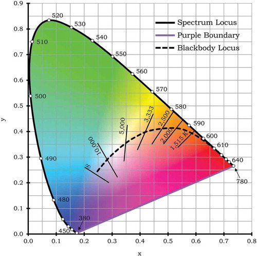
The curve shown in , labeled blackbody locus, shows the chromaticity coordinates for blackbody radiators of varying temperatures. It is generally agreed that, in most illumination situations, light sources should have chromaticity coordinates that lie on or near this curve. In the former case, another way to describe the chromaticity of the lamp is by identifying the blackbody radiator that has the temperature required for it to match the lamp’s chromaticity. It is also possible to extend this approach for lamps that are not quite on the blackbody curve, by specifying the blackbody radiator that has chromaticity coordinates closest to those of the test lamp. For this purpose, a mathematical procedure is used to determine the “closest” blackbody radiator [Ohno Citation2014]. This common lamp specification parameter is called the correlated color temperature. There is no real need to use CCT to describe the chromaticity of a lamp (because the x, y coordinates already do this); nevertheless, it has become a common practice. For this reason, a useful and complementary way to further describe the chromaticity is provided by a value called Duv, which is an indication of the degree to which a lamp’s chromaticity coordinate lies above the blackbody curve (positive Duv) or below it (negative Duv) [Ohno Citation2014].
2.5 Metamerism of Light Sources
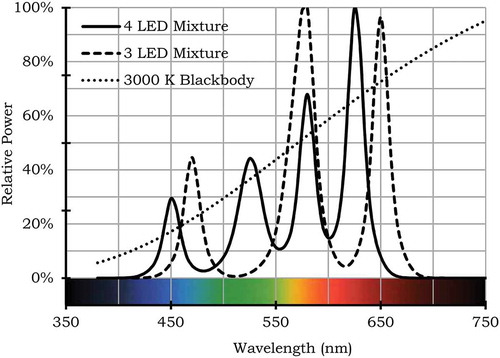
There is an interesting fact concerning light sources and the CIE chromaticity diagram that is also critical for understanding color rendering: Even though for each spectral power distribution there is one corresponding point in the chromaticity diagram, the reverse is not true—for most points in the chromaticity diagram, there are many possible SPDs that have exactly that same chromaticity. Different SPDs having the same chromaticity are said to be metameric. shows an example of three metameric SPDs—one is a blackbody radiator at 3000 K and the other two are composed of a small number of dominant spectral lines. The most common chromaticities for light sources for general illumination have values relatively close to those of the blackbody curve and with specific CCT values ranging from 2850 to 6500 K, but this still allows lamp manufacturers considerable freedom in designing SPDs due to this phenomenon of metamerism. For example, they may strive to maintain the same chromaticity but within that constraint to optimize the LER of the lamp’s SPD. As will be described shortly, excessive optimization of LER can lead to problematic distortions in the apparent colors of illuminated objects.
Fig. 7 Three SPDs that have the same chromaticity, which means that they are metameric. Because chromaticity is identical (0.4369, 0.4041), the CCT is also identical (3000 K in this example), yet these sources will render objects very differently. The CRI values are 34 for the three-LED mixture, 94 for the four-LED mixture, and 100 for the blackbody radiator.
2.6 Chromatic Adaptation
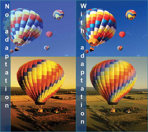
As mentioned earlier, the color appearance of an object is determined, in part, by the SPD of the light illuminating it. However, other factors also affect color appearance, and this helps to explain why object colors do not seem to change much as daylight transitions from slightly bluish at noon to reddish near sunset. It turns out that the human visual system has the ability to partially adapt to the color (and amount) of the illumination, thereby providing an approximately color constant object appearance under typical illumination conditions. For an example, see , which illustrates adaptation to an outdoor scene.
Fig. 8 Influence of adaptation on color appearance. Left: Two scenes, one at noon (top) and the other at sunset (bottom), as they would appear without chromatic adaptation. Right: The same two scenes as viewed with chromatic adaptation. Note that chromatic adaptation corrects, to a degree, for the slight bluish and yellowish color cast present in the top and bottom left images, respectively.
This ability, called “chromatic adaptation,” can occur at various stages of the visual processing. Compensation for chromatic adaptation is built into the calculation of CIE CRI, and it is mentioned here mainly because the existence of chromatic adaptation and its relationship with color rendering can be confusing. In the case of chromatic adaptation, a mild overall color tint in a scene is something we adapt to over a short period of time (of order a minute), so it becomes unnoticeable. In contrast, the color distortions that are the subject of a color rendering index are not something we can adapt to. They may be permanently bothersome, which is why it is important to quantify them and ensure that they are not excessive for a given lighting application.
2.7 Quantifying Color Appearance
Although the human cone response functions enable us to distinguish the color of one light source from another, and the associated mathematics allows us to specify the chromaticity of light sources in a clear unambiguous manner, these properties involve only a first stage of color vision. Higher level stages in the retina and in the brain allow sophisticated interpretation of the spectral reflectance characteristics of surfaces—a topic that will be addressed shortly.
From an evolutionary perspective, it is unlikely that human color vision evolved for the purpose of identifying colored light sources because that would have been rarely required. (There were no traffic signals in the prehistoric savanna.) Instead, the most important information that color vision provided over its evolution was actually data about the chemical nature of reflective surfaces [Palmer and Schloss Citation2010; Pinker Citation1997]. Just as chemists today learn a great deal about matter by studying the reflection of light as a function of wavelength, the spectral reflectance function for everyday objects provides important information for everyday life. For example, medical problems such as jaundice and anemia modify the spectral reflectance function of skin, and many fruits change their spectral reflectance function as they ripen. Spectral reflectance can be used to distinguish a poisonous berry from a nutritious one, fresh meat from rotten meat, and clean water from dirty water, to name but a few examples.
Though the human eye cannot measure light intensity at every wavelength, our color vision is able to detect broad variations in reflected light intensity within the long, medium, and short visible wavelengths regions. These three absolute signals, as well as their relative proportions, are processed within the eye–brain system and ultimately lead to perceptions of brightness and color.
However, there is a substantial challenge—as portrayed in , the light entering the human eye has been reflected from an object of interest, and at each wavelength this light is the mathematical combination of the illumination SPD and the object spectral reflectance function. If we do not know the SPD of the illumination, how can we determine what fraction of the incident light reflects from an object? The answer is that we cannot, at least not perfectly. However, often there is information in the visual scene that our color perception mechanisms use to at least partially resolve this problem. As one example, if the scene contains white objects and is relatively uniformly illuminated, then the SPD of the light reflected from those white objects may be quite similar to that of the light incident on the other objects. Several other illuminant estimation approaches are described in Smithson [Citation2005] and Foster [Citation2011].
Color appearance modeling is an attempt to mathematically predict the color perception arising as the human visual system carries out this complex processing of spectral inputs. That is, the goal is to quantify the color perceptual attributes such as chroma, hue, and brightness, which arise within the human visual system, in response to the spectral power distributions in the visual environment. This is important for the topic of color rendering, because, as described below, it requires assessment of the changes of the perceived color of objects that arise from changes in the SPD of the illuminant. When the CIE CRI was created, a very simple color appearance model was used for this purpose. Since then, the models have improved considerably. The latest model, called CAM02 UCS [Luo and others 2006], is quite good and will probably be used within the CIE CRI in the future. This more recent model builds in the concepts of color adaptation and various forms of nonlinearity in overall visual system response to yield results that agree well with the observations of test subjects, especially with their assessment of the magnitude of color differences.
3 THE BASIC CONCEPT OF COLOR RENDERING
Imagine a room lit by either a white lamp labeled “A” or a different white lamp, labeled “B,” that has the same color temperature as lamp A but that has a different SPD. The room contains a variety of familiar objects. When lamp A illuminates the room, most observers say that the colors of the objects appear as they would expect (). However, when lamp B illuminates the room, the observers might report that many of the object colors are distorted ().
Fig. 9 Cases “A” (left) and “B” (right), as described in the text, illustrating the same room illuminated with two different light sources that provide the same illuminance and have the same chromaticity but different spectral power distributions.

It is important to remember the illumination in cases A and B has identical chromaticity. That means that this phenomenon of imperfect color rendering is completely unlike a much more easily understood color changing concept with which we are all familiar, which could be called “color casting.” As an example of color casting, consider what happens when a theater follow spot operator colors the unit’s light output with a red filter, and its light is focused on the small portion of the stage occupied by an actor. In this case, the actor and nearby objects take on a reddish color appearance. People find this effect interesting but not surprising. In contrast, in the case of incorrect color rendering, a white light source will cause a white object to appear white, but some other objects will appear to have a different color than is normally the case.
The term “color rendering” is used throughout this tutorial, and it may be helpful to mention that readers will sometimes encounter similar sounding terms that sometimes lead to confusion. The official source of scientific definitions for terms involving light and vision is the International Lighting Vocabulary of the CIE [CIE Citation2014]. It defines the “color rendering of a source” as the “effect of an illuminant on the color appearance of objects by conscious or subconscious comparison with their color appearance under a reference illuminant.” (It is this meaning for this term that is used throughout this tutorial.) There are three similar sounding terms that are quite common (although they do not have official CIE definitions) but nevertheless are often used, sometimes inconsistently, by experts. They are the following:
“color rendition,” which is sometimes used to mean the same thing as “color rendering” but sometimes has a more general meaning that may not involve a reference source;
“color fidelity,” which generally means exactly the same thing as “color rendering” and is used to more clearly distinguish this meaning from that of “color preference,” as described next;
“color preference,” which refers to the aesthetic desirability of light sources, independent of a reference source.
For simplicity, we will use only the official term color rendering here. With these definitions clarified, let us return to the basic phenomenon of color shifts that arise from the imperfect color rendering of a light source. What could cause such a counterintuitive effect?
4 UNDERSTANDING HOW COLOR RENDERING ERROR OCCURS
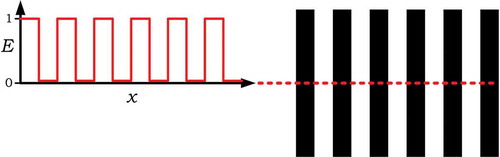
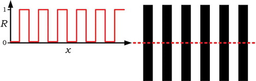
It turns out that the simplest way to understand this phenomenon is, at first, to temporarily forget about wavelength and color. Instead, consider a much more easily pictured situation in which light is spread out spatially, rather than in wavelength. shows such a spatial pattern of light intensity. On the right side of the figure there is a picture of the pattern and, on the left, a graph of the intensity of the illumination versus distance along the dotted line.
Fig. 10 Spatial illumination pattern (right) and its graphical depiction (left) showing illuminance (E) vs. position measured along the dotted line (x).
looks somewhat similar but actually shows a physically different pattern—in this case it is not a pattern in illumination but, rather, a pattern in reflectance on the right and, on the left, a graph of that reflectance, measured along the dotted line.
Fig. 11 Spatial reflectance pattern (right) and its graphical depiction (left) showing reflectance (R) vs. position measured along the dotted line (x).
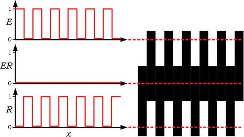
now combines and and shows some overlap. The overlap region shows the visual appearance of the light reflected by the reflection pattern, where the illumination pattern falls on it. The middle graph shows the intensity of that reflected light measured along the middle dotted line.
Fig. 12 Overlapping the illumination pattern of Fig. 10 onto the reflectance pattern of Fig. 11 and plotting the intensity pattern of the reflected light, which is the mathematical product of illuminance, E, and reflectance, R, thus denoted as ER. In this example, because of the relative spacing, there is no position that simultaneously has non-zero illumination and non-zero reflectance, so in this case no light reflects anywhere.
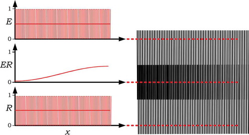
Now consider in which there is a slight variation from . The only change is that the spacing of the reflectance pattern has been very slightly increased. Interestingly, this same sort of phenomenon can occur even if the illuminance and reflectance pattern have a much finer scale as shown in . With such patterns, this effect is sometimes called the “moiré effect”—it is sometimes seen when fine fabrics overlap and when distant picket fences or chain link fences visually overlap.
Fig. 13 The same situation as in Fig. 12, except that the reflectance pattern has a slightly increased spacing, so that toward the right portion of the pattern regions of non-zero illumination overlap with regions of non-zero reflectance, so that there is considerable reflected light.

Fig. 14 The same situation as in Fig. 13, except that the illuminance and reflectance patterns are much finer. The same overall variation in reflected intensity is apparent.
The reader may understandably question the purpose of describing an effect that seems unconnected to wavelength and color. The answer is that all of the ideas that have been presented in the above four figures, which show radiant energy and reflected energy varying over a range of positions, also apply correctly if they instead vary over a range of wavelengths. As an example, consider , which is the “wavelength” version of .
Fig. 15 In analogy to Fig. 13, this shows an illuminant spectral power distribution that varies with wavelength, illuminating a surface whose spectral reflectance function also varies with wavelength. In this case the product ER is the spectral power distribution of the reflected light, often called the color stimulus function. ER displays, effectively, a moiré pattern in the wavelength domain.
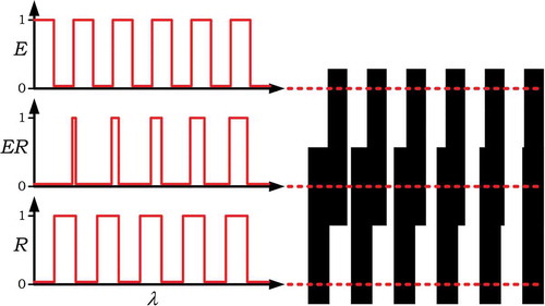
It is worth carefully considering the implications of , because it shows the fundamental essence of the problem that the CRI assesses, in the following sense: First, consider the illuminant SPD at the top of . It is easy to show that, to the human eye, it would appear perfectly white because the human color matching functions cannot resolve the fine detail in that illuminant SPD. Similarly, the spectral reflectance function shown at the bottom of , if illuminated by a conventional source such as daylight, would appear perfectly grey. However, now consider the color stimulus function ER shown in the middle of . It contains of a lot of long-wavelength light, some mid-wavelength light, and only a little short-wavelength light, which would yield a bright orange color appearance. Here we have a white light illuminating a grey surface, and that surface is perceived by a viewer to be bright orange. Although this example uses an extreme case to prove a point, lesser versions of this same effect are common—when white light sources illuminate real objects they can appear the wrong color. This can be disturbing, especially because our color perception is remarkably accurate, and so we are sensitive to even quite small color distortions. Having light sources that distort color is somewhat the equivalent of blurry vision—you may still be able to avoid major obstacles but important details are frustratingly unclear.
5 THE MEASUREMENT OF COLOR RENDERING WITH THE INTERNATIONAL COMMISSION ON ILLUMINATION COLOR RENDERING INDEX
Given the important information that color conveys, there is a clear need to assess the color rendering properties of light sources. At present this is done with the CIE CRI [CIE Citation1995], which assesses the accuracy with which the colors of a set of eight test samples (having CIE-defined spectral reflectance functions) when illuminated by a test light source, match their color when illuminated by a reference source (often called the reference illuminant) that is defined to have maximum color rendering. The term “color difference” describes the perceptual distance between two colors in chromaticity and lightness. It is calculated using formulas that have been shown, in numerous studies, to relate reasonably well to participants’ observed sizes of color differences. It is important to understand that the CRI does not assess the aesthetics of color differences. Aesthetic issues are much more complex and subjective. Many other indices have been proposed to evaluate the aesthetic aspects of the effect of a light source on the appearance of object colors [for reviews, see Guo and Houser Citation2004; Houser and others Citation2013; Smet and others Citation2011].
5.1 The Reference Source
According to the CIE, the reference light source is defined to be a blackbody radiator for color temperatures below 5000 K and a mathematical model of daylight for color temperatures at or above 5000 K and it must have the same CCT as the test source. Example SPDs for some of the reference sources are illustrated in . The CRI Ra value has a maximum of 100 and for lesser values the difference from 100 is proportional to the average size of the color differences. For example, a CRI Ra value of 60 indicates that the average color difference is four times greater than for a CRI Ra value of 90. It is also important to understand that differences of CRI Ra values that are less than about five points are usually not noticeable [CIE Citation1995]. For example, an observer comparing the color rendering accuracy of two lamps, one with Ra 85 and the other 89, will often be uncertain which causes the greater color error. Reference light sources are defined to have perfect color rendering, so they have an Ra value of 100 because they are, effectively, compared to themselves. Standard incandescent light sources, which closely match a blackbody radiator, have an Ra value of very nearly 100. Most other light sources have SPDs that differ from the corresponding reference source, and this often causes some degree of color difference and therefore a lower CRI value.
Several factors contributed to the selection of these particular reference sources. In the case of the daylight phases, they are similar to typical outdoor lighting conditions that are ubiquitous, natural, and universally liked—surely desirable characteristics for a reference source. Similarly, in the case of blackbody radiators, the standard is very similar to the light output of incandescent lamps and flames, which have historically dominated indoor residential lighting. From a practical perspective, both blackbody radiation and daylight illuminants can be mathematically reproduced, which is helpful for a mathematical index for color rendering. Fortunately, even though various phases of daylight and various incandescent lamps have different colors, these cause predictable shifts in the apparent colors of surfaces, so we have become accustomed to colors looking more or less as expected under a wide range of references from yellowish (for example, 2500 K) to bluish (for example, 7500 K). Of course, this does not mean that these references are “ultimately” the best light sources for human vision—indeed, if the spectral power distribution of daylight had been radically different, our visual expectations probably would have adjusted accordingly, so that would have become our standard for color rendering. Thus, our choice of reference standards is a logical consequence of the sources that have provided, and continue to provide, most human color vision experience.
5.2 Color Test Samples
At this point it is important to differentiate between two very different color rendering concepts. The first is termed the Special Color Rendering Index, producing a set of values Ri (where i = 1, 2, … , 14), each based on the calculated color appearance difference for a specified theoretical surface having a specified spectral reflectance function (based on measurements of a material that may contain a mixture of colorants). The second is termed the General Color Rendering Index, Ra, which is the average of the Ri values for a specified set of 8 of the 14 test samples. The Ri values are useful for experts who want detailed information about how a lamp type influences particular colors, but they are seldom used in routine lighting design work. In common practice it is the single, average Ra value that is published and specified. As a result, it has become common for the CRI Ra value to be described simply as the CRI value. This need not cause confusion; if there is no mention of Ri values, one can be sure the CRI value given is the average, Ra. It is important to remember that the Ra value is only an average and therefore it may leave out potentially useful information that would be provided by the individual Ri values.
5.3 Calculating Ra
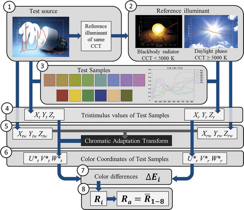
To calculate the value of Ra for a test source, the eight color sample types shown in are illuminated by the test source alone and then by the reference source alone. (In practice, this is done by simulation, by multiplying each source SPD by each of the specified surface spectral reflectance functions; there is no need to physically do the experiment.) For each color sample, the color appearance produced by each of the two color stimulus functions is evaluated and then their color appearance difference is calculated. The color appearance difference is converted into the special Ri value for that sample type by multiplying by a selected constant and subtracting the product from 100. Thus, a large color difference yields an Ri value far below 100, and small color difference yields an Ri value closer to 100. Finally, the first eight Ri values are arithmetically averaged to give the general index Ra.
Fig. 16 Eight color samples used to calculate Ra and the first eight Ri values.

Lamps producing a small average color shift as compared to the reference illuminant are said to exhibit good color rendering and have a high CRI. Lamps that produce significant color shifts have poor color rendering and a low CRI.
As mentioned above, the “special” Ri values are sometimes used by experts to develop a deeper understanding of how a lamp’s SPD influences specific colors. In addition to the eight test samples shown above (referred to as R1 to R8), the CIE specifies six additional samples, R9 to R14, as shown in . (It should be noted that these are not used in the calculation of the average Ra.) Four of these are saturated colors. In particular, the special index R9, for test sample 9 (a saturated red color), is sometimes listed individually as a supplement to the CRI general index Ra. There is no definitive explanation for why the inclusion of R9 is especially helpful, but it has been noted that the indices R1 through R8 have limited curvature in the red portion of the visible spectrum and thus may not provide much sensitivity for objects containing red pigments, such as the hemoglobin in human skin.
Fig. 17 Six color samples used to calculate Ri values 9 to 14.

summarizes the operation of the CRI calculation as discussed above. We can now consider how the CRI general index Ra is used in many lighting design decisions.
Fig. 18 Schematic of the CRI calculation.
5.4 Acceptable Levels of Color Rendering
A common question is, “Why not always use light sources that have a CRI of 100?” The answer is that though this is possible, it is often impractical with sources available today. Although incandescent sources (including quartz-halogen lamps) have a CRI of very nearly 100 and are relatively inexpensive, they have quite low LER (and therefore waste energy) and short life (and therefore expensive to maintain). For more efficient non-incandescent sources, there are two difficulties in achieving a high CRI. First, this requires careful adjustment of the SPD, which may increase the cost of manufacturing the lamp. Second, there is an intrinsic trade-off between the CRI of a light source and its LER. It is important, therefore, for designers and lamp manufacturers to thoughtfully balance color rendering with other factors such as light output, energy consumption, lamp cost, and lamp life.
When illuminated by a light source with a CRI of 80, some common surface colors appear distorted to most observers, especially in side-by-side comparisons to a high CRI lamp or to a CRI 80 lamp with a different SPD [Wei, Houser, David, and Krames Citation2014]. For sources with a CRI above 95, most people do not notice color shifts. In side-by-side comparisons, differences in CRI of one or two points are generally not noticeable to most people but a difference of five points is sometimes noticeable. A CRI of 80 is often considered the minimum acceptable value for applications where color is a consideration, including retail, residential, office, and hospitality settings. A CRI value of 80 is the minimum for the Environmental Protection Agency’s ENERGY STAR program for compact fluorescent lamp (CFL) and LED lamps and for some utility rebate programs. Some rebate programs have started requiring higher CRI values.
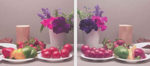
Increasingly, manufacturers are producing lamps with CRI values above 90. Along with more accurate color rendering come certain disadvantages, which may include higher cost and/or lower luminous efficacy. It is the designer’s responsibility to determine whether the noticeably improved color quality, as shown in , compensates for or outweighs these trade-offs. In addition, as lamp technology improves, these factors will change and such judgments may need to be revisited.
Fig. 19 The left box was illuminated with 100 CRI light (from two 60 W, 2750 K incandescent lamps) and the matching objects at right were illuminated with 80 CRI light (from two 13 W, 2750 K CFL lamps). They were photographed simultaneously in a single digital camera image. Compared to the left, at right the red pepper, strawberries, and tomatoes appeared less red, the wood looked slightly greenish, and the purple petunia and violet lobelia petals appeared blue. Other objects had smaller color shifts.
The need for color rendering varies according to lighting application. Better color rendering, in general, makes objects appear more similar to observers’ expectations and can increase the comfort level. Face-to-face interactions with people, handling of food, illumination of living spaces, reading and detail work, and all activities involving color selection or design will generally benefit from better color rendering.
6 FACTS ABOUT COLOR RENDERING AND SOME COMMON MISCONCEPTIONS
It is interesting to realize that color rendering is a high-level concept—it is built upon a handful of foundation concepts, which in turn rely on many basic concepts about light and color. It is no wonder that what seems like a simple index is widely misunderstood. Here we discuss some of the common areas of misunderstanding, both to help build the reader’s conceptual clarity and also to suggest ways to overcome these misunderstandings as they arise elsewhere.
6.1 The CIE Color Rendering Index Ra Is a Number Less Than or Equal to 100, but It Most Definitely Is Not a Percentage or a Fraction
The CIE calculates the Ra and Ri indices with a simple linear rescaling of, respectively, the average and individual sample color differences ΔE; that is, Ra = 100 − c*ΔEaverage. The scaling factor c (= 4.6) was chosen such that Ra is 51 for a specified illuminant (CIE illuminant F4, which is representative of the outdated halophosphate warm white fluorescent lamp) and the reference illuminant has a score of 100. It is clear that this particular linear rescaling does not have its minimum at zero but, instead—were one able to produce an infinite color error—at minus infinity. The important thing to remember is that it is the difference from 100 that matters—in other words, an Ra value of 60 means that there is four times the average color shift than is the case with an Ra value of 90.
6.2 Color Match May Be Lost When Switching between Two Lamps with the Same Chromaticity If One or Both Lamps Have a CRI Ra Value below 100
This is one of the key issues concerning color rendering. In design, people often select objects that have matching color, and they tend to think that such “color matching” is an absolute characteristic. In reality, matching color does not ensure that two objects have matching spectral reflectance functions—it is possible (and actually likely) that they will instead only be metameric. In other words, they may have very different spectral reflectance functions even though they produce the same color appearance under a reference illuminant. If the illumination is changed to a low CRI source, quite likely both of the matching objects will experience a color shift, and those color shifts may be quite different from one another, so the objects will no longer appear the same color. As a real-life example, imagine a color photograph of a small familiar object that perfectly matches the color of the object when viewed under a high CRI light source. (That is, when you place the object on the photo, both the image and the object have the same apparent color and brightness.) Now imagine that the illuminant is changed to a different one with the same chromaticity but low color rendering, and under this light the image no longer matches the object.
6.3 Lamps with the Same Scores for Ra May Cause Very Different Color Shifts
In a way this is obvious because the Ra is simply an average of the color shifts of a number of samples—so there are many different kinds of color distortion that can yield the same Ra score. What is not so obvious is that this implies that if society allows certain Ra values for lamps, as consumers replace lamps with various models from time to time, adjacent regions of rooms may experience color differences that are twice as great as the difference of an individual lamp from a reference source. Such effects can be disturbing to building occupants.
6.4 People Do Not Adapt to Poor Color Rendering
In contrast to a situation where there is an overall illuminant color tint, to which people quickly adapt through chromatic adaptation, the appearance of color shifts associated with poor color rendering do not subside over time.
6.5 Color Rendering Cannot Be Judged by Looking at a Light Source or at an Object with a Nonselective Spectral Reflectance—in Layman Terms, Most Gray Objects or a White Object—Illuminated by It
Instead, one must look at how light affects the color appearance of illuminated surfaces that have nonuniform spectral reflectance functions, as is the case with colored objects and certain gray objects.
6.6 Light Source Color Rendering Is a Completely Different Property Than Light Source Color
Chromaticity and CRI are independent ideas. Unfortunately, it is not uncommon for people to make a lamp purchase decision by viewing the lamp itself—but such an observation tells the consumer nothing about the color rendering properties of a lamp. A high color rendering lamp and a low color rendering lamp will often appear indistinguishable when viewed only directly.
6.7 Jagged Spectra Do Not Necessarily Imply Low Color Rendering, and It Is Possible for a Lamp Spectrum to Have No Missing Wavelengths and Yet Have a Very Low CRI
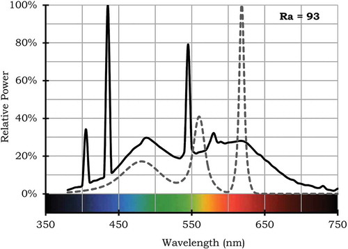
Generally speaking, many of the lamps that have quite high CRI Ra values have smooth-looking SPDs and, similarly, many of the lamps that have quite low CRI Ra values have comparatively jagged SPDs. However, these observations are not uniformly true. For reasons related to the typical scale of features in typical spectral reflectance functions, well-designed SPDs may be able to have sharp features and still score well. shows one interesting example that proves this point.
Fig. 20 Example of two fairly jagged SPDs that both have the same fairly high Ra value of 93. The SPD shown with a solid line is for a source with chromaticity of (0.3386, 0.3509) and CCT of 5250 K. The SPD shown with a dashed line is for a source with chromaticity of (0.3804, 0.3767) and CCT of 4000 K.
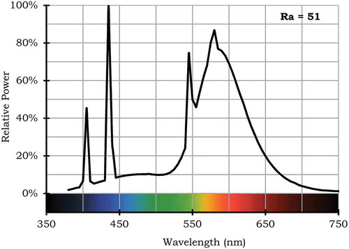
shows a converse example to that of .
Fig. 21 Example of a fairly complete SPD that has a fairly low Ra value of 51.
6.8 The CRI of Light Sources with (Very) Different Correlated Color Temperatures Cannot Be Compared
Light sources with two different CCT values will have different reference sources that both have a value of 100. However, the two reference sources can yield quite different color appearances for some objects, especially when their CCT values are very different. A clear example is CIE illuminants D65 versus A, representative of daylight and incandescent light, both of which are known to result in somewhat different object color appearances even after chromatic adaptation has taken place.
7 LIMITATIONS OF THE CURRENT CIE GENERAL COLOR RENDERING INDEX
As described in the Appendix, the CRI was introduced in 1965 and has undergone some improvements over the years (a significant one in 1974 and a minor one in 1995). The current CIE General Color Rendering Index is known to have several limitations [CIE Citation2007; DiLaura and others Citation2011]. These fall into three conceptually different categories.
7.1 Inaccuracies in Calculating Ra
Over the years, several suggestions have arisen for improving the accuracy of the Ra calculation itself. Currently, a CIE Technical Committee (TC1-90) is testing a proposed revision for solving these problems [CIE Citation2012]. An IES working group [Royer Citation2014] is also working in this area; the two groups have some members in common and are sharing ideas. Briefly, the issues being addressed are the following:
Inadequate test samples. The current CIE CRI test color samples were not selected or designed in such a way that the CRI would have an unbiased response throughout the visible spectrum, which is necessary for accuracy. It is now known that this is particularly difficult to achieve when such a small number of color test samples are used [David Citation2014; Smet and others Citation2013]. Some have expressed a different concern—they feel that it may be impossible to provide an accurate assessment of CRI using only test color samples that, like those currently used, are of moderate chroma. For most common light sources today, the problems with the current test samples are not too large, but as solid-state light sources with narrow spectral features come into more common use, the currently used samples would cause Ra values to be less representative of visual experience. The proposed solutions use a larger number of more carefully selected test samples in the calculation of a general color rendering index.
Arithmetic averaging. The CRI currently uses an arithmetic average of color differences, which may overly deemphasize large color differences if they occur with only a few samples. Today, it is generally agreed that it is better to use root mean square averaging in such psychometric calculations. This is a fairly minor change that is also simple to implement.
Outdated color difference calculation, color space, and chromatic adaptation calculation. The accuracy of color difference metrics and the underlying color space and chromatic adaptation calculation have all improved over the years. It is appropriate and straightforward to update the CRI with these recent improvements.
Avoiding negative CRI values. A simple mathematical correction can overcome the rare situations in which the color differences are large enough to yield a negative CRI value. Although this is not a problem, some would feel more comfortable if this were prevented.
Discontinuity at 5000 K. At 4999 K the reference is blackbody radiation and at 5000 K the reference is a phase of daylight; both of these references are show in . The practical implication is, for example, that a 5000 K source with an Ra of 100 would receive a lower Ra simply by decreasing its CCT to 4999 K. This is a small difference that is probably unimportant for most applications, but it is something that needs to be considered by those developing variable CCT light sources. As with the previous point, some would feel more comfortable if this issue were addressed.
There are currently efforts underway to correct the above listed known deficiencies. After correction, the CRI will be more accurate, and this section of this tutorial will no longer apply. All other content of this tutorial will remain equally relevant to the updated CRI color fidelity metric.
7.2 Limitations of a Single Average Value
Although the current CRI also provides 14 special Ri values, the associated sample colors are not organized within a uniform color space in a manner that is conducive to a simple graphic method for assessing them, and it is also felt that a greater number and wider variety of test samples for this purpose could be helpful. Various graphical representations of color rendering have arisen over the years [see, for example, Van der Burgt and Van Kemenade Citation2010], but none have been widely adopted.
7.3 Limitations of a Fidelity Metric
As a fidelity metric, by definition the CRI does not assess the relative desirability of various types of color difference in various situations. Likely there are numerous situations in which such aesthetic considerations will matter greatly yet a color fidelity metric does not assess them. Other attributes of color rendering include memory [Smet and others Citation2012], discrimination [Royer and others Citation2011], preference [Wei, Houser, Allen, and Beers Citation2014], and fluorescence effects [Houser and others Citation2014; Wei, Houser, David, and Krames Citation2014]. See Houser and others [Citation2013] for a recent review.
Even if and when the corrections mentioned in subsection 7.1 are made, the CIE General Color Rendering Index Ra will always have the limitations mentioned in subsections 7.2 and 7.3, which suggests that when there is a concern about the color effects provided by a light source, or the ability of that source to render the color of a specific material in a desired way, it may be unwise to rely on the CRI Ra score alone. Ideally a mock-up would be constructed so that the designer could make a decision based on actual performance. Additionally, designers may wish to consider other types of color quality metrics that are under development.
8 SUMMARY AND CONCLUSIONS
It was explained that understanding color rendering and its effects can be tricky in part because some of the ideas are counterintuitive. As an extreme example, a “gray” object illuminated with a “white” light source can in some cases appear brightly colored. Basic concepts needed for understanding the color rendering index were introduced—spectral power distribution, correlated color temperature, chromaticity, spectral reflectance function, chromatic adaptation, color appearance, test illuminant, reference illuminant, test color samples, color shift, and color difference. Color rendering is an objective measure, first introduced in 1965 and standardized by the CIE in 1974 as the CIE General Color Rendering Index Ra. It evaluates the color rendering of a white light source by comparing the color appearance of a number of test samples having specific spectral reflectance functions (the “test sample method”), each separately illuminated by the reference source and then by the test source. The significance and usefulness of the index Ra was discussed.
A variety of limitations of the color rendering index were also presented. For example, it is important to realize that the CIE reference source—a blackbody radiator or daylight phase of the same CCT as the test source—does not necessarily produce the SPD that people most prefer from various perspectives and in various conditions [Dikel and others Citation2014; Smet and others Citation2011]. Instead, the CIE reference source was chosen because of its widespread availability and use, its historic acceptance as an appropriate light source, and its clarity of definition.
Several common misunderstandings concerning the CRI were also addressed. For example, the CRI is not a percentage value or a fraction; it can have negative values; light sources with the same chromaticity and Ra value may cause very different color shifts; the CRI of two light sources with (very) different CCT cannot be compared because they have different reference sources; color rendering cannot be visually assessed by looking at the source directly, because its effects are related to object colors; light source color (CCT) is a completely different idea than color rendering; despite the ability of the human visual system to (partially) adapt to the color of the illumination it cannot adapt to poor color rendering; light source spectra with missing wavelengths do not necessarily have low CRI scores (although often they do); and, similarly, “complete” spectra do not necessarily have high CRI scores (although often they do).
Finally, the limitations of the current CIE color rendering index were discussed. A first set of limitations relates to inaccuracies in the current calculation method (which are expected to be solved soon). They are inadequate test samples that distort spectral sensitivity, arithmetic averaging, and the use of a now-outdated color space. A more fundamental limitation, which cannot be solved, arises from the use of a single average value to summarize the color rendering of a source; valuable information is lost when summarizing such a complex phenomenon with a single number. Although more detailed representations, such as color shift vector plots, are useful for lighting experts, they are unlikely to be widely used by the general public. A more subtle limitation, one that is commonly misunderstood, is that the CIE CRI was not intended to assess, and does not assess, the relative desirability of various types of color differences in various situations. The CRI is strictly an objective measure for assessing the noticeability of color rendering errors caused by a test source, relative to a reference source, without making any assumptions about the aesthetic impact of those observed color shifts. In other words, the noticeability of color shifts, as assessed by the CRI, will not necessarily correspond to the undesirability of those color shifts. The former is an objective matter, whereas the latter is a complex, subjective, situation-dependent, aesthetic matter that warrants considerably more research.
ORCID
Kevin Houser

Kevin Smet

FUNDING
K.S. was supported through a Postdoctoral Fellowship of the Research Foundation Flanders (FWO) (12B4913N). K.H., M.M., and L.W. completed this work without external support from any funding agency in the public, commercial, or not-for-profit sectors.
Notes
1. Definitions of terms that appear in italics are provided in Appendix A.
2. It is worth clarifying what can be confusing abbreviations. The CIE method for color rendering is known as the Color Rendering Index, abbreviated as CRI. The CIE method employs 14 test color samples. Each test color has its own CIE Special Color Rendering Index (note the use of the word “Special”), abbreviated as Ri, where i is an integer ranging from 1 to 14. The first eight values of Ri are averaged to compute the CIE General Color Rendering Index (note the word “General”), which is abbreviated as Ra. One way to remember this is that the subscript i denotes a selected integer and a denotes average. Frequently, the abbreviations Ra and CRI are used interchangeably, and context is usually enough to infer intent, but to be strict they are not the same. Any value of Ri is also a CRI. Don’t despair if this is confusing now—read it again and at the end of the tutorial it will make sense.
3. In quantitative work—for example, when using a spectral illuminance meter for measurement—the intensity is often first recorded in the radiometric measure of power per unit area per unit wavelength, which technically is W m−3 and more often is expressed as W m−2 nm−1 because wavelengths are usually expressed in nanometers. In other cases, the intensity may be first measured by a spectral irradiance meter and recorded in the radiometric measure of power per unit area per unit solid angle, which technically is W sr−1 m−3 or W sr−1 m−2 nm−1. These details will not matter to most users, especially because the SPD is most often expressed in relative terms by dividing by the peak radiometric value, which eliminates the need for units in quantifying the SPD.
4. In some cases the radiometric measure radiance is used (in units of W m−2 sr−1), in which case the output of the calculation is in units of luminance, lm m−2 sr−1 (also known as candela per m2, with the symbol cd m−2).
REFERENCES
- Bouma PJ. 1937. Colour reproduction in the use of different sources of “white” light. Philips Tech Rev. 2:1‐7.
- [CIE] Commission Internationale de l’Eclairage. 1948. Compte Rendu. CIE 11th Session. Paris (France). p. 5.
- [CIE] Commission Internationale de l’Eclairage. 1965. Method of measuring and specifying colour rendering properties of light sources. Paris (France): CIE. Publication No. CIE 13-1965. 34 p.
- [CIE] Commission Internationale de l’Eclairage. 1974. Method of measuring and specifying colour rendering properties of light sources. Vienna (Austria): CIE. Publication No. CIE 13.2-1974. 81 p.
- [CIE] Commission Internationale de l’Eclairage. 1995. Method of measuring and specifying colour rendering properties of light sources. Vienna (Austria): CIE. Publication No. CIE 13.3-1995. 16 p.
- [CIE] Commission Internationale de l’Eclairage. 2007. Color rendering of white LED light sources. Vienna (Austria): CIE. Publication No. 177:2007. 8 p.
- [CIE] Commission Internationale de l’Eclairage. 2012. Division 1: vision and color, meeting minutes. Taipei, Taiwan. p. 26-28.
- [CIE] Commission Internationale de l’Eclairage. 2014. International lighting vocabulary. <http://eilv.cie.co.at/ > Accessed 2014 July 30.
- David A. 2014. Color fidelity of light sources evaluated over large sets of reflectance samples. LEUKOS. 10(2):59‐75. doi: 10.1080/15502724.2013.844654
- Dikel EE, Burn GJ, Veitch JA, Mancini S, Newsham GR. 2014. Preferred chromaticity of color-tunable LED lighting. LEUKOS. 10(2):101‐115. doi: 10.1080/15502724.2013.855614
- DiLaura DL, Houser KW, Mistrick RG, Steffy GR, editors. 2011. The lighting handbook tenth edition: reference and application. New York (NY): The Illuminating Engineering Society. 1328 p.
- Foster DH. 2011. Color constancy. Vision Res. 51(7):674‐700. doi: 10.1016/j.visres.2010.09.006
- Guo X, Houser KW. 2004. A review of colour rendering indices and their application to commercial light sources. Lighting Res Technol. 36(3):183‐197. doi: 10.1191/1365782804li112oa
- Houser KW. 2011. Light, light, light. LEUKOS. 8(1):5‐7. doi: 10.1080/15502724.2011.10732153
- Houser KW, Wei M, David A, Krames MR. 2014. Whiteness perception under LED illumination. LEUKOS. 10(3):165‐180. doi: 10.1080/15502724.2014.902750
- Houser KW, Wei M, David A, Krames MR, Shen XS. 2013. Review of measures for light-source color rendering and considerations for a two-measure system for characterizing color rendering. Opt Express. 21(8):10393‐10411. doi: 10.1364/OE.21.010393
- [IES] Illuminating Engineering Society, Nomenclature Committee. 2010. ANSI/IES RP-16-10 nomenclature and definitions for illuminating engineering. New York (NY): Illuminating Engineering Society. 119 p.
- Luo MR, Cui G, Li C. 2006. Uniform colour spaces based on CIECAM02 colour appearance model. Col Res Appl. 31(4):320‐330. doi: 10.1002/col.20227
- MacAdam DL. Editor. 1970. Sources of color science. Cambridge (MA): The MIT Press. 282 p.
- Nickerson D, Jerome CW. 1965. Color rendering of light sources: CIE method of specification and its application. Illum Eng (IESNA). 60(4):262‐271.
- Ohno Y. 2014. Practical use and calculation of CCT and Duv. LEUKOS. 10(1):47‐55. doi: 10.1080/15502724.2014.839020
- Palmer SE, Schloss KB. 2010. An ecological valence theory of human color preference. P Natl Acad Sci USA. 107(19):8877‐8882. doi: 10.1073/pnas.0906172107
- Pinker S. 1997. How the mind works. New York (NY): Norton. 191 p.
- Royer MP. 2014. Color rendering metrics: an overview of ongoing work. <http://apps1.eere.energy.gov/buildings/publications/pdfs/ssl/royer_rendering_lightfair2014.pdf > Accessed 2014 July 22.
- Royer MP, Houser KW, Wilkerson AM. 2011. Color discrimination capability under highly structured spectra. Color Res Appl. 37(6):441‐449. doi: 10.1002/col.20702
- Smet K, Ryckaert WR, Pointer MR, Deconinck G, Hanselaer P. 2011. Correlation between color quality metric predictions and visual appreciation of light sources. Opt Express. 19(9):8151‐8166. doi: 10.1364/OE.19.008151
- Smet KAG, Ryckaert WR, Pointer MR, Deconinck G, Hanselaer P. 2012. A memory colour quality metric for white light sources. Energ Buildings. 49(C):216‐225. doi: 10.1016/j.enbuild.2012.02.008
- Smet K, Schanda J, Whitehead L, Luo R. 2013. CRI2012: a proposal for updating the CIE colour rendering index. Lighting Res Technol. 45(6):689‐709. doi: 10.1177/1477153513481375
- Smithson HE. 2005. Sensory, computational and cognitive components of human colour constancy. Philos T Roy Soc B. 360(1458):1329-1346. doi: 10.1098/rstb.2005.1633
- Stockman A, Sharpe LT. 1999. Cone spectral sensitivities and color matching. In Gegenfurtner K, Sharpe LT. Editors. Color vision: From Genes to Perception. Cambridge (UK): Cambridge University Press. p. 53-87.
- Van der Burgt P, Van Kemenade J. 2010. About color rendering of light sources: the balance between simplicity and accuracy. Color Res Appl. 35(2):85‐93. doi: 10.1002/col.20546
- Wei M, Houser KW, Allen GR, Beers WW. 2014. Color preference under LEDs with diminished yellow emission. LEUKOS. 10(3):119‐131. doi: 10.1080/15502724.2013.865212
- Wei M, Houser KW, David A, Krames M. 2014, in press. Perceptual responses to LED illumination with color rendering indices of 85 and 97. Light Res Technol. doi: 10.1177/1477153514548089
APPENDIX A: TERMS TABLE A.1 Definition of key concepts that support an understanding of color rendering
APPENDIX B BRIEF HISTORY OF THE CIE COLOR RENDERING INDEX
The CIE color rendering index Ra has a long history. In 1948, the CIE made a first recommendation [CIE Citation1948] for a color rendering index based on an eight-band method first proposed in 1937 [Bouma Citation1937]. The method divides the spectrum into eight bands and compares the spectral content of each band with that of a full spectrum radiator.
Later, in 1965, a Test Sample Method, based on the work of Nickerson and Jerome [Citation1965], was developed and adopted by the CIE [Citation1965].
The CIE CRI Ra is calculated as the average magnitude of the color appearance shift of a set of standard colored samples under a test and a reference illuminant. The reference illuminant is set as the source with optimum color rendering and any deviation from the color appearance under this reference illuminant is penalized.
At first, only eight moderate Munsell chroma samples were used. But in 1974 [CIE Citation1974], the method was revised to include six additional samples: a skin, a green leaf, and four high Munsell chroma samples. The method was further adjusted by including a revised von Kries–type chromatic adaptation and by a slight change in the calculation procedure.
However, soon after its publication in 1974 it became clear that further changes would be necessary. In the 1980s, a CIE technical committee tried to propose some improvements, but it was forced to close without any recommendations due to disagreements among its members. Despite some of the known problems, the CIE color rendering index has gained international acceptance and has been included in several standards and commercial lamp specifications.
In 1995, the CIE fixed some errors by publishing CIE 13.3 [CIE Citation1995], but no changes were made to the technical recommendations.