
ABSTRACT
Lighting design for art exhibitions has a significant impact on the enjoyment and understanding of the displayed artworks. In particular, the selection of the light sources and the design of the museum space affect the visitors’ visual perceptions of the artworks and their color appearance. This project investigated some of the potential factors—the correlated color temperature (CCT) of the illumination, the overall color content of the painting and the lightness of its background—affecting a painting’s color appearance and appreciation in a museum setting. The study involved a survey conducted in the laboratory with both naïve observers and lighting experts. The CCT of the lighting was found to be the main factor affecting the painting’s appearance and the observers’ overall preference for the lighting arrangements, whereas the overall hue content of the painting and the background lightness had a minor influence. Furthermore, it has been found that the perceived brightness increases along with the CCT.
1. Introduction
Contemporary approaches to museum lighting aim to strike an appropriate balance between two main topics: minimizing the potential damaging effect of light on artworks and obtaining the best visual impression through light (Ajmat Citation2011). Although museums must collect and preserve our cultural and artistic heritage, this function collides with the necessity to have light to make artworks visible to museum visitors. Current legislation classifies objects in accordance to their sensitivity to light and state illuminance levels and respective exposure times (CIE Citation2004; Cuttle Citation2000) but does not make suggestions about light source type or characteristics or about lighting setting. However, recent developments in solid-state lighting technology and in tunable lighting provide increased flexibility in lighting characteristics and settings (such as luminance level, correlated color temperature [CCT], or color rendering properties), all of which can have an impact on the visual impression of an artwork, whereby a wrong lighting arrangement could compromise its display.
1.1. Museum Lighting Approach
Although there are various publications providing basic guidelines for museum lighting (Cuttle Citation2007; Fördergemeinschaft Gutes Licht Citation2012; Garside et al. Citation2017; Thompson Citation1986), principles and standard procedures used by museum lighting designers and curators to select lighting arrangements and light sources are not adequately documented. There are three main criteria for selecting an artwork’s illumination (Carvalhal et al. Citation2005): (1) replicating the lighting configuration intended by the artist or the one under which the artist painted or sculpted the piece, (2) the specific effect or interpretation intended by the curators, or (3) the preference and visual impressions expressed by observers as tested in carefully controlled experiments. The first approach would be the most suitable and accurate but in most cases the true display intention of the artist is unknown, nor is the lighting setting of his studio. Lighting design aiming for the first criterion is therefore often based on nothing more than assumptions, and the second and third approaches are subjective. They depend respectively on the personal taste and artistic sensibility of the curator and the appraisal of naïve observers that is mostly founded on their subjective preferences.
1.2. Previous Studies on Museum Lighting
Triggered by the developments in solid-state lighting technology, in the past decade several studies (Carvalhal et al. Citation2005; De Graaf et al. Citation2014; Druzik and Michalski Citation2012; Feltrin et al. Citation2017; Leccese et al. Citation2018; Rea and Bierman Citation2014; Schanda et al. Citation2015) have investigated observer preference and visual impressions for museum lighting. Light emitting diode (LED)-based light sources can have a higher efficiency and better general color quality (naturalness, appreciation, attractiveness, preference) and minimal infrared and ultraviolet radiation content, and they can offer increased flexibility according to the tunability of their spectral power distribution. Moreover, LED spotlights can have a high directionality and, due to their small dimensions, can be less intrusive in exhibition spaces. Therefore, it is possible to tune the light sources, change their chromaticity, accurately set the beam direction, and, consequently, change the artworks’ visual appearance according to the intended effect. The results of these studies show that LEDs are a suitable solution for museum lighting in terms of energy consumption and sustainability, artwork damage prevention, and color rendering flexibility of the lighting system. Some researchers have investigated the preservation issue by analysing the new improvements granted by LEDs and by comparing the damage effect between them and traditional light sources. Piccablotto et al. (Citation2015) showed that LEDs can cause a slower color fade than halogen lamps, although LEDs with higher CCT lead to higher damage risk. Furthermore, Weintraub (Citation2010) found that white phosphor-based LEDs with low to intermediate CCT (2700 K—4000 K) are safe for the illumination of light-sensitive materials, if they are used at appropriate illuminance levels. On the same matter, Pinilla et al. (Citation2016) developed a spectral aging test to estimate the photochemical damage produced by LEDs on oil, acrylic, and gouache paintings; the model they developed provides useful information about the color shift caused by fading and could be used by museums to estimate the ideal exposure time for any painting.
With regard to artworks’ visual appearance, several studies have compared the perceptions of paintings under different lighting conditions in order to determine the best lighting arrangements. They have mainly focussed on light source CCT and illuminance level. Scuello et al. (Citation2004a, Citation2004b) conducted a survey using postcard reproductions of real paintings and halogen lamps, tuning the CCT from 2500 K to 7000 K, with the illuminance level set at 200–250 lx. Their results show that observers prefer artwork under illuminants of approximately 3600 K; according to the observers, these arrangements were neither too cold nor too warm. Note that the apparent tint of a 3600 K illumination is far from neutral or achromatic (achromatic lights have a CCT of approximately 6000 K(Smet et al. Citation2014)). Yoshizawa et al. (Citation2013) investigated LED lighting for visual evaluations of museum paintings in two different experiments, varying the CCT (2700 K–5000 K), the illuminance level (up to 400 lx) and the Color Rendering Index (CRI; equal to 59, 90, and 98). Multiple pairs of words were used to evaluate the paintings during the experiments and they found that the paintings were evaluated as more pleasant at lower CCTs and higher CRI. Luo et al. (Citation2013) performed a similar experiment in order to assess the impact of CCT, illuminance, and CRI on the visual evaluation of fine art paintings displayed in museum settings. They varied the CCT between 2700 K and 6500 K, varied the illuminance level up to 300 lx, and used three CRI values (82, 90, and 93). Their results concluded that all observers preferred high illuminance (300 lx) and a CCT range of 4000 K–5000 K. Nascimento and Masuda (Citation2014) studied the impact of CCT on the visual appearance of paintings. They analyzed two viewing conditions, a real one with a spectrally tunable light source and one simulated on a monitor, and multiple lighting configurations with different CCTs (3600 K–20,000 K). They concluded that the preferred CCT was approximately 5500–5700 K. Therefore, the preferred lighting arrangements had a much higher CCT than the traditional arrangements designed for museum exhibition with halogen lamps, like those used by Scuello and others. Similarly, Pinto et al. (Citation2006, Citation2008) investigated various lighting configurations, varying the CCT from 2856 K to 6000 K, and found that observer preference was maximum at 5100 K for 11 digitized images of paintings displayed at an average luminance of 330–350 lx. Their results agree with Nascimento and Masuda (Citation2014), suggesting that observers prefer an increased amount of bluish-white light rather than the yellowish light provided by the traditional museum lighting. Zhai et al. (Citation2015, Citation2016) investigated LED lighting arrangements considering Kruithof’s rule. They tested multiple lighting configurations with different CCTs (2850 K, 4000 K, 5000 K, and 6500 K) and illuminance values (50, 200, and 800 lx). They found that lighting configurations with a CCT between 2850 K and 4000 K and illuminance values between 200 and 800 lx can create a pleasant visual effect for LED lighting of paintings in museum environments and their results partially agree with Kruithof’s rule. Recently, Szabó et al. (Citation2017) investigated the optimal lighting conditions for museum lighting, varying both the illuminance (from 30 lx to 6000 lx) and the CCT (from 2850 K to 6500 K). The results show that CCTs of 4000 K and 5000 K along with higher illuminance values were the most pleasant arrangements, whereas lower CCTs were perceived as uncomfortable. In 2015, Chen and others investigated both CCT and illuminance and created visual perception and emotional zone maps. They carried out two experiments, one reproducing an exhibition cabinet in the laboratory and the other in a real museum. LED sources were used for both tests. It was found that all emotional scales could be reduced to two components: visibility and warmth, which were influenced respectively by illuminance and CCT. These two components are the same as those identified by Luo et al. (Citation2013).
In conclusion, the identification of perfect lighting for museum exhibition is complex and is affected by multiple factors including observers’ subjective feelings and emotions.
1.3. The Exhibition Space Design
In addition to lighting issues, due consideration must be given to the surround and the background of the exhibition space, which can have a huge impact on a visitor’s color perception of the artworks. The exhibits are observed in contrast to their background and surroundings, and this contrast can make artworks not just visible but also attractive. Background and surround also contribute to the proper atmosphere. The correct contrast ratio can be achieved by adequately balancing the accent lighting on the artworks and the ambient lighting of the exhibition space: a dark background/surround can make the exhibit appear brighter or more colorful, whereas a dim background/surround can create a softer atmosphere (Cuttle Citation2007). Therefore, planning the proper color and luminance contrasts between the exhibits and their background/surround plays an important role in art exhibitions’ design. Although the importance of the background color and lightness is clearly pointed out by the CIE (Citation2004), this parameter has not been investigated as extensively as the parameters related directly to light sources.
1.4. Project Goals
This study aimed to analyze some of the potential factors contributing to an observer’s visual (color) experience of paintings displayed under various lighting settings. Museum lighting is a complex topic with a large number of parameters. This study focused on three factors: the CCT of the accent lighting on the paintings, the lightness of the background wall, and the overall hue content of the paintings. The impact of color rendition is beyond the scope of the article. The aim of the study was to investigate the possibility that a painting, depending on its colors, could be better enhanced and perceived by viewers with a specific CCT of the accent lighting and a specific level of background lightness. Therefore, the study aimed to investigate the impact of CCT and background lightness for various selected paintings with different predominant colors and point out possible interactions between the parameters and preference patterns for each painting.
2. Methods
2.1. Experimental Setup
2.1.1. Museum setting
The experiment setup () was designed to reproduce a simple museum scene: it was composed of a background wall containing the paintings and two tilted walls, creating a broad and controlled field of view and the feeling of immersion for the observers. As wall material, curtains were chosen because they allow for a quick and easy change of background lightness (white, grey, and black). The experiment room itself had black walls, black floor tiles, and a black ceiling and the average temperature was 20°C.
The spotlight illuminating the painting was positioned at a height of 1.90 m and at a distance of 0.60 m from the background wall. It was tilted 30° in relation to the vertical plane. The ambient lighting was located directly above the observer position, at a height of 2.30 m and at a distance of 1.40 m from the background wall ().
Fig. 1. Sketch of the (a) experiment setup and photos of the experiment setup with three different backgrounds: (b) white, (c) grey, and (d) black. (Painting reproduction courtesy of Leonid Afremov/www.afremov.com)
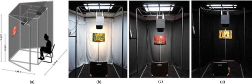
The design of the setup followed conventional guidelines for museum settings about distance and proportions between the exhibit, light source, and observer position (Fördergemeinschaft Gutes Licht Citation2012). Moreover, the design ensures that the interference of the ambient lighting with the spotlighting on the paintings was minimized (impact of 5% on the total illuminance on the paintings) while providing a non-dark surround, customary for museum exhibitions.
2.1.2. Light sources
The spotlight consisted of a tunable LED spotlight, which was used as accent lighting on the paintings, and the ambient (daylight) lighting was produced by fluorescent lamps behind a diffusor. The tunable LED spotlight has four channels: one fixed white phosphor-based channel (CCT of 3200 K) and three tunable R(ed), G(reen) and B(lue) channels, which made it possible to obtain specific values of CCT. As ambient lighting, four Philips dimmable fluorescent lamps were used, with a CIE color rendering index Ra value of 90 and correlated color temperature of 6500 K.
2.1.3. Lighting setting
The ratios of the spotlight RGB channels were optimized in order to obtain specific CCT values. Five CCTs were selected to be displayed in the experiment, from warmer to cooler light: 3000 K, 3500 K, 4000 K, 5000 K, and 6000 K. Each CCT lighting configuration was presented under three different background wall colors: white (average reflection factor β = 0.9), grey (β = 0.4), and black (β = 0.1). shows the optimized spectra of the LED spotlight for the various CCTs. The CCT optimization was achieved by optimizing at the same time the Duv factor—the distance from the Planckian locus in the CIE uv chromaticity diagram—in order to get it as close as possible to zero while keeping certain color rendition parameters as high and constant as possible across all CCT settings. Four color rendition metrics were considered: the CIE Color Rendering Index Ra (CIE Citation1995), the IES Color Fidelity Index Rf, Color Gamut Index Rg (David et al. Citation2015), and the Memory Color Rendition Index, Rm (Smet et al. Citation2012). Optimization target values were respectively Ra = 90, Rf = 90, Rg = 100 and Rm = 90. Note that the CIE 10° observer was used when calculating the CCT, Duv, and illuminance values, because the observing field was wider than 4°, and the measurement geometry was similar to the viewing geometry used in the experiments. Measured optimized lighting setting characteristics are listed in . All measurements were made at the painting position on a spectrally flat white sheet with the same dimensions as those of the selected paintings. As can be seen from , the magnitude of the Duv was kept sufficiently small (≤1 × 10⁻⁴) for all configurations and the color rendering parameters were all sufficiently high and constant (deviations ≤2 units).
Table 1. Measured lighting characteristics for the various lighting configurations.
Fig. 2. Left: Spectra of ambient, fluorescent lighting (thick solid line) and tunable LED channels: white (dashed line), red (solid line), green (dashed-dotted line), and blue (dotted line). Right: Optimized spectra of the LED spotlight for the five different CCTs: 3000 K (solid line), 3500 K (dashed line), 4000 K (dashed-dotted line), 5000 K (dotted line), and 6000 K (thick solid line).
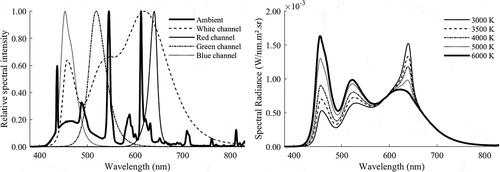
Finally, with regard to the ambient lighting, the fluorescent lamps were dimmed and reached 60% of their maximum luminous flux (equal to 700 lm). The measured CCT was equal to 5900 K, which is a bit warmer than the listed lamp CCT due to the presence of the diffusor. The illuminance level on a horizontal plane at 1.5 m height in front of the observers’ position provided by the ambient lighting was nearly 55 lx (standard deviation of 4 lx). Combined, the accent and ambient lighting provided an average vertical illuminance of 160 lx at the painting position. This illuminance value conforms to the limitations (E ≤ 200 lx) required for painted canvas, which is usually considered part of the “low responsive” category for artwork conservation (CIE Citation2004).
2.1.4. Paintings
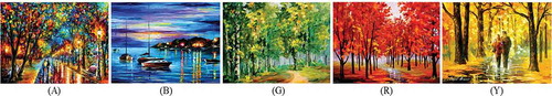
The overall hue content of the paintings was considered by selecting artworks with different predominant colors (hues). In order to avoid biasing the observers’ assessments with art style, five paintings with the same art style were chosen from among Leonid Afremov’s artworks (Afremov Citation2014): four paintings with a predominant hue (red, green, blue, and yellow) and one painting without a predominant hue but with a balanced combination of all four hues (). The color content of the five paintings was characterized in the CIELAB color space under LED spotlighting of 3000 K, 4000 K, and 6000 K, by taking photographs of a representative area (not lower than the 20% of the whole painting) with a calibrated camera (SONY ALPHA 5000 digital camera). Camera calibration was performed by creating a mapping between the image RGB values of each patch of a Macbeth ColorChecker card illuminated by each of the three spotlightings and their corresponding CIE 1964 10° X10, Y10, Z10 tristimulus values. The latter were obtained from spectral measurements with a spectroradiometer (OceanOptics QE65000, with a spectral bandwidth of 2.5 nm, coupled to a Bentham TEL301 Direct View Telescope). The white patch of the Macbeth card was used to obtain the spotlight white point for conversion of X10, Y10, Z10 to CIELAB L*a*b* values.
Fig. 3. Leonid Afremov’s paintings (2002–2016) used for the experiment: A: “When Dreams Come True”; B: “Mystery of the Night”; G: “Summer Forest”; R: “Pink Fog” ;and Y: “Happy Couple.”(Painting reproduction courtesy of Leonid Afremov/www.afremov.com)
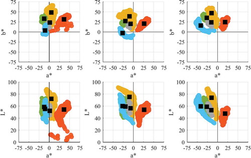
The a*, b* and a*, L* color distributions of the five paintings under the three spotlight conditions are illustrated in . The mean values are plotted as well. For the 4000 K condition, these are as follows: all: L* = 56.5, a* = −7.0, b* = 20.3; blue: L* = 59.9, a* = −26.3, b* = −2.5; green: L* = 59.1, a* = −19.5, b* = 27.0; red: L* = 53.8, a* = 26.3, b* = 21.0; yellow: L* = 75.4, a* = −9.4, b* = 38.8. As can be seen from , the average a*b* chromaticity tends to shift toward lower a* values as the CCT increases from 3000 K to 6000 K. For most paintings, shifts along the b* axis are less pronounced except for the red and blue paintings. L* also shows minor shifts, with the largest being approximately six units. The highest L* values tend to be reached for the 4000 K condition for all paintings, except for the red painting.
Fig. 4. Color distributions (a*b* and a*L*) of the five paintings illuminated by 3000 K (left graphs), 4000 K (middle graphs), and 6000 K (right graphs) spotlighting obtained using a calibrated camera. The colors of the plotted data denote the dominant hue of the painting: red: red painting; orange: yellow painting; green: green painting; blue: blue painting; and grey: all painting. The black squares are the mean colors of each distribution.
2.2. Experimental Procedure
Four series of experiments were conducted: one with the scene illuminated by both the spotlighting and the ambient lighting, one where the ambient lighting was turned off, a preliminary experiment investigating the impact of adaptation time on the results, and one examining the potential impact of small illuminance differences across different lighting settings.
2.2.1. Experiment A: Spot lighting on, ambient lighting on
In this experiment, the scene was illuminated by both the spotlighting on the paintings and the ambient lighting.
Prior to the start of the actual experiment, the observers were offered a brief explanation of the experiment and what was expected of them. The experiment itself consisted of assessing the five paintings under each of the five CCTs in three sessions, one for each background. Within a session, painting order and CCT order were randomized. Among observers, the order of the different background types (sessions) was also randomized.
In each session, once the background was set, the observers evaluated each painting at a time under the five randomized lighting configurations () on a bipolar 11-point scale (0–10) for the following quality factors: perceived warmth (cold/warm), perceived vividness (dull/rich), perceived brightness (dark/bright), and attractiveness of the (low/high) of the painting’s colors. They were also asked to evaluate their level of appreciation for the background color (low/high) and the overall appreciation of the arrangement (low/high). Note that in order to let the observers adapt to the average luminance level and to give them an idea of the variation between the lighting configurations, they were shown all lighting conditions in a random order prior to the start of the evaluation of a single painting.
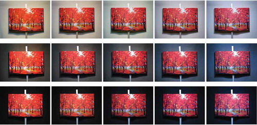
Fig. 5. Pictures of the red painting on the three backgrounds and under the five lighting configurations (from warmer light on the left to cooler light on the right).(Painting reproduction courtesy of Leonid Afremov/www.afremov.com)
After a single painting had been evaluated for all lighting configurations, observers were shown them once more (still in a random order) and were asked to rank them from most to least appreciated.
When assessing the configurations and their personal preference about the settings, observers were asked to consider only the color appearance of the paintings and to not base their preference on the subject of the paintings. The observers completed the experiment in about 90 min and were seated at a distance of 1.4 m from the paintings. Each of them assessed 90 configurations: 3 background lightness values × 5 paintings × 5 CCTs + 15 additional repeated configurations (randomly chosen among the previous 75) to assess the observer’s consistency.
2.2.2. Experiment B: Spot lighting on, ambient lighting off
After conducting experiment A using both the LED spotlight and the fluorescent lamps as ambient lighting (creating a dim surround in the experiment room), a second experiment was performed using just the spotlight, creating a complete dark surround for the observers. This second experiment meant to investigate the impact of the ambient and surround lighting condition and the contrast between the exhibit and the surround on color perception and lighting preference. The test procedure and the questionnaire were the same as in experiment A, but this time the configurations were shown just with the black background. The observers assessed the same five paintings under the same five CCTs, for a total of 25 configurations.
2.2.3. Preliminary experiment: Impact of chromatic adaptation on observer assessments
Before conducting experiments A and B, the impact of chromatic adaptation on observer assessments was investigated. Fairchild and Reniff (Citation1995) found that chromatic adaptation occurs in two phases, one extremely rapid (a few seconds) and the other slower (approximately 1 min). They concluded that chromatic adaptation reaches 90% of its steady-state level for a particular lighting condition after nearly 60 s.
On the one hand, A and B require an evaluation of the color appearance of the paintings under steady-state chromatic adaptation, in order to obtain reliable results. On the other hand, the experiment’s goal was to obtain people’s first impression of a painting’s appearance under the various configurations, because in art museums people usually walk around exhibition halls and will therefore rarely steadily adapt to the specific lighting conditions of every displayed artwork. Moreover, waiting 1 min for nearly chromatic adaptation to stabilize before letting the observer assess the configurations would have led to extremely long and tiring experiments for the participants, which could consequently lead to unreliable results.
A preliminary experiment with four people (two females and two males, aged between 23 and 29 years) was therefore conducted to verify the impact of the chromatic adaptation on people’s assessments. Two of the participants had no knowledge of lighting design and two were Ph.D. students at the Light&Lighting Laboratory. The observers completed the same questionnaire twice: once without waiting 1 min for chromatic adaptation to stabilize before evaluating the painting and lighting configuration (short mode) and once looking at the scene for 1 min before filling in the questionnaire (long mode). The preliminary experiments were performed assessing only the blue painting and the all colors painting on the white background under the five lighting arrangements. A white background was chosen to maximize possible effects of chromatic adaptation. The all colors painting and a painting with one predominant hue (blue) were selected to explore potential effects of painting color on chromatic adaptation. The two tests were performed on different days and with a balanced randomized order to avoid order bias.
To investigate the significance of chromatic adaptation on the assessments, the results of the preliminary experiment were analysed with a multivariate analysis of variance test using SPSS software, which showed no significant difference between the evaluations of the two sets of data (P = 0.23). Therefore, we concluded that chromatic adaptation did not have a relevant impact on observer assessments and, in order to reduce the duration of the whole experiment, the final experiments were performed in in short mode; that is, without waiting for fully stabilized chromatic adaptation.
2.2.4. Impact of small illuminance differences between illumination settings
The five lighting configurations set for the experiments, corresponding to the five different CCTs, did not have exactly the same illuminance level: between the warmest (3000 K) and the coolest (6000 K) configurations there was a difference of 15 lx on average, because optimization of the LED source allowed setting only two parameters. Hence, it was necessary to conduct an additional experiment to check whether small illuminance differences across illumination settings could have driven the results: observers could, for example, prefer settings with the highest illuminance.
In this experiment, optimization of the RGB channels of the LED spotlight was performed in order to set the CCT and the illuminance level, but it was not possible to obtain high values of the color rendering parameters. Therefore, the test was performed on a white sheet of the same dimensions replacing the painting. The test was designed as a paired comparison with forced choice: a random series of pairs of lighting configurations was shown to each observer, who had to indicate the brightest configuration. In paired comparison tests, the number of pairs used is n(n − 1), where n is the total number of different configurations, and each pair is shown twice, in a different order. The test was performed on the black background with the same ambient lighting and viewing geometry of experiment A and it was split into three parts. During the first part, the observers were submitted four different lighting configurations with the same CCT, equal to 3200 K, and different illuminance levels, equal to 140, 145, 150, and 155 lx. The gap of illuminance between the first and the last configurations was the same as the one occurring between the warmest and the coolest CCTs of experiment A. The second part involved configurations with the same illuminance level (150 lx) but different CCTs: 3000 K, 4000 K, and 5200 K (unfortunately, it was not possible to reach a CCT higher than 5200 K while keeping the illuminance level constant). Lastly, the third part involved arrangements with both different CCT and illuminance: three illuminance levels (140, 147, and 155 lx) and two CCTs (3000 K and 4000 K). The three different parts of the experiment made it possible to determine whether the small illuminance differences between the different CCT settings had a noticeable impact on the perceived brightness, which could, in turn, have biased the results obtained.
2.3. Observer Panel
Twenty-five observers (14 males and 11 females) participated in experiment A. Sixteen of them were naïve, with no prior knowledge of lighting, color perception, or art. All observers were color-normal as tested by the Ishihara 24 plate test (Ishihara Citation1972). Their ages ranged from 22 to 55 years old (average 29 years).
Eleven observers, randomly selected from the 25 participating in experiment A, participated in experiment B. Six were males and five were females and their ages ranged from 22 to 55 years old (average 31 years). The participants were both naïve and expert observers.
Thirteen observers, randomly selected from the 25 participating in experiment A, participated in the experiment investigating potential illuminance impacts. Seven were males and six were females (average age 30 years). The participants were both naïve and expert observers.
3. Results and Discussion
3.1. Intra- and Interobserver Variability
Intra-observer variability was assessed by calculating the average of the standardized residual sum of squares (STRESS) (Melgosa et al. Citation2011) values between each individual observer’s 15 repeated ratings and the average of those ratings for that observer. Interobserver variability was assessed by calculating the average (across observers) of the STRESS values between each observer’s 75 ratings and those of the average observer. The average observer was obtained by calculating the geometric mean, rather than the arithmetic mean, because it is less affected by extreme values and fluctuations in samples. The mean and standard deviations for the intra- and interobserver variability calculated for each quality factor—overall appreciation, background appreciation, warmth, brightness, vividness, and colors’ attractiveness—and for the total experiment are given in . As can be seen from , the mean STRESS values are acceptably low and the intra-observer STRESS values are slightly higher than the interobserver STRESS values. Furthermore, the overall agreement between observers was very similar for all quality factors, with possibly a slightly better agreement for the overall appreciation and warmth evaluation and with individual observers being slightly more consistent when evaluating warmth and brightness.
Table 2. Results for interobserver and intra-observer variability.
The same analysis was conducted to compare the evaluations obtained in experiment A of the naïve observers group (16 subjects) and the expert observers group (9 subjects), by calculating the interobserver variability. The STRESS indexes for the two groups are shown in . It is possible to notice that the mean STRESS values for the naïve observer group are very similar, especially considering the standard deviation, but that the expert observer group tends to show systematically slightly lower STRESS values, indicating slightly stronger agreement between experts than between naïve observers.
Table 3. Results for interobserver and intra-observer variability between naïve and expert observers.
3.2. Experiments A and B: Impact of Background Lightness, CCT, Hue Content of the Paintings, and Ambient Lighting
The results for the average observer for the red painting for the six quality factors are plotted as a function of CCT in , and graphs for the other four paintings are shown in Appendix A (see , , and ). The values of the geometric means; the standard error of the geometric mean, calculated as specified by Alf and Grossberg (Citation1979); and the median are given in Appendix B () for all combinations of painting/background/CCT.
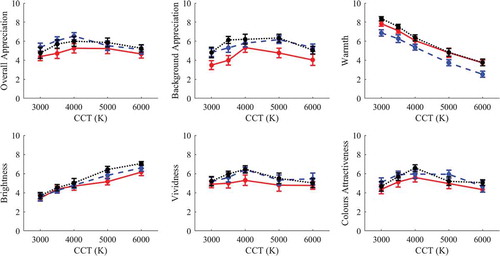
Fig. 6. Average observer results as a function of the CCT for the painting “Pink Fog” (R), experiment A. The solid red lines, dashed blue lines, and dotted black lines represent respectively the results for the white, grey, and black backgrounds, and the bars represent the standard errors. (a) Overall appreciation, (b) background appreciation, (c) warmth, (d) brightness, (e) vividness, and (f) and color attractiveness.
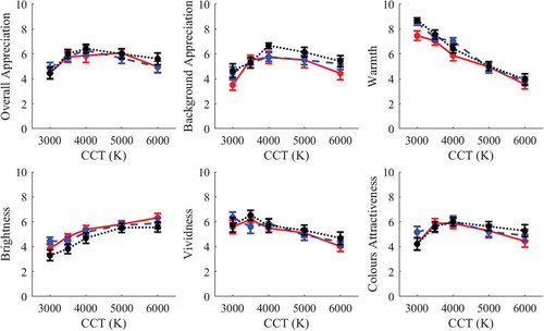
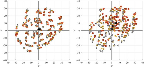
From it is clear that the trends for the three background types are quite similar for the red painting, indicating that the change in background lightness did not have a substantial impact on the observers’ assessments. Similar results were observed for the other paintings, as can be noticed from the average results shown in Appendix A, and were also reported by Pinto et al. (Citation2008), who found no substantial differences between a grey and black background. With regard to the impact of CCT, a close look at the overall appreciation/CCT graph () and the ranking results () shows that there is no clearly preferred CCT: although 4000 K tend to receive slightly higher ratings, the differences with 3500 K and 5000 K are small. However, the warmest (3000 K) and coolest (6000 K) were least preferred. Similar trends can be observed for the other background/painting combinations and are confirmed by the results of the ranking evaluation. The overall appreciation results could suggest that mid-range bias could have had an impact on the observers’ evaluations, because the most extreme lighting configurations were both perceived as the least pleasant, but this could not be verified either way. Because the five CCT lighting conditions were all characterized by very similar and high CRI values, it is expected that any differences in the appearance of the painting colors between the conditions should be small. No clearly preferred CCT could indeed be identified, except for the decreased preference for low (3000 K) and high (6000 K) CCT, which could be caused by differences in the degree of adaptation, D, compared to, for example, more intermediate CCT conditions. Chromaticity has indeed been found to affect the degree of adaptation (Smet et al. Citation2017a). The CAM02UCS J′a′b′ chromaticity coordinates of the 99 reflectance samples from David et al. (Citation2015) and IES (Citation2015), illuminated by the 3000 K, 4000 K, and 6000 K lighting conditions, are plotted in . In the left graph, the degree of adaptation was set to 1. As expected from the high color rendition values, the three lighting conditions show very similar color appearance coordinates. However, as can be seen from the right graph, incomplete adaptation (Smet et al. Citation2017b; Zhai and Luo Citation2018) (with D respectively set to, for example, 0.1, 0.3, and 0.6) leads to quite different J′a′b′ coordinates.
Table 4. Results of the ranking test for the most and least preferred lighting configurations. Values are the percentage of observers ranking a specific CCT as most/least preferred.
Fig. 7. Illustration of the effect of degree of adaptation on the color appearance of the 99 IES TM30-15 samples when illuminated by the 3000 K (red dots), 4000 K (yellow dots), and 6000 K (grey dots) spotlighting condition. Left: complete adaptation (D = 1); right: incomplete adaptation, respectively D = 0.1, 0.3, and 0.6.
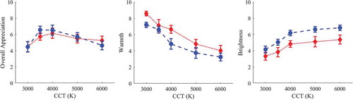
The results of experiment B confirmed the trends found in experiment A for CCT preference, and the overall appreciation results are very similar for each combination background/painting. Moreover, similar trends between the two experiments were found for vividness and color attractiveness. With regard to warmth and brightness, instead, it was noticed that, on average, the observers perceived the colors of the paintings as warmer with the ambient light on—although the ambient lighting was realized with cool light (5900 K)—and brighter with the ambient lighting off—although there was less light in the test room during the experiment. This outcome could be explained by chromatic adaptation to colder white lighting and the increase in contrast between the surround and the artworks during experiment B: because the surround of the experiment setup was completely dark, the artworks appeared brighter. The average results of overall appreciation, warmth, and brightness for the red painting are shown in .
Fig. 8. Average observer results for experiment A (red dotted lines) and experiment B (blue dashed lines) as a function of the CCT for the painting “Pink Fog” (R): (a) overall appreciation, (b) warmth, and (c) brightness.
The statistical significance (α = 0.05) of the observed effects of CCT, background lightness, painting color content, and ambient lighting setting was verified with six full-factorial (including interaction effects) repeated measures analysis of variance (ANOVA) tests, one for each quality factor. The tests were conducted with SPSS software. The results of the analyses are listed in .
Table 5. Results of repeated measures ANOVAs for each of the quality factors.
The repeated measures ANOVAs showed that there were no significant (α = 0.05) two-way or three-way interactions between the background, painting, and CCT factors (experiment A) or between the ambient, painting, and CCT factors (experiment B). The results for the main effects, listed in , show that the CCT had a significant effect (α = 0.05) for all quality factors, whereas painting, background, and ambient were significant for respectively three (background appreciation, warmth, and vividness), one (warmth), and two (brightness and warmth) quality factors. However, after a Bonferroni correction (α = 0.05/6 = 0.0083) to account for the multiple significance tests (one for each quality factor), no significant effect remains for the background lightness and for painting color; ambient lighting setting showed a significant effect for warmth, and CCT remained significant for all quality factors. Note that although people’s evaluations of their appreciation of the background in relation to the painting (background appreciation) did not show significant differences for background lightness (P = 0.12), at the end of the experiment a total of 23 people did indicate the black background as their most preferred background overall, with the remaining two observers choosing the grey one. With regard to experiment B, the ambient lighting was significant only for warmth and brightness, but after Bonferroni correction (α = 0.0083) a significant effect remained only for warmth.
The partial eta squared value (η2) gave some information about the effect size of each parameter—background, paintings, CCT, and ambient lighting—on the quality factors. From it is possible to notice that CCT had the major effect on the observers’ evaluations, almost twice as large as the painting effect (1.9 on average between the six quality factors). The effect size of the background, instead, is very low for the overall appreciation, vividness, and color attractiveness, but it had a greater effect on background appreciation, warmth, and brightness. Similarly, the ambient lighting had a minor effect on the overall appreciation, vividness, and color attractiveness, and a greater effect on the other quality factors, especially warmth. However, CCT had the major effect on observers’ evaluations for experiment B.
Post hoc tests for the significant main effects showed that all CCTs were significantly different for warmth, brightness, and vividness (P < 0.001). For overall appreciation, all CCTs were significantly different (P < 0.001), except 4000 K and 5000 K. Similar results were obtained for background appreciation and color attractiveness, except that in these cases the 5000 K and 6000 K CCTs were not significantly different. With regard to the ambient lighting in experiment B, the two lighting conditions were significantly different only for the warmth (P = 0.003) and brightness (P = 0.025) quality factors. All significant differences between the CCTs remain significant after applying a Bonferroni correction (α = 0.0083), whereas the differences between the backgrounds and the lighting condition for the brightness lose their significance.
3.3. Impact of Small Illuminance Differences between Illumination Settings
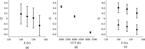
The results were analyzed using the Scheffé method (Scheffé Citation1952) and are shown in . The Scheffé scalings αi are also reported in , along with the yardstick for each test, Ye. The difference between the perceived brightness of two different lighting configurations is significant if the difference between the two αi scale values is higher than the yardstick. The results of part 1 of the experiment, where the illuminance varied for a fixed CCT of 3200 K, show, as expected, an increase in perceived brightness along with an increase in illuminance. However, for the illuminance levels investigated, the results indicate that illuminance differences of 5 lx and 10 lx are not noticeable, whereas the 15 lx gap was (α1–α4 > 0.3850). An analysis of part 2 of the experiment shows that for a fixed illuminance level of 150 lx, perceived brightness increases with increasing CCT. Both of the error bars shown in and the αi scale values show that the differences between the three lighting settings were clearly visible for all observers, especially the gap between 4000 K and 5200 K (α1–α2 > 0.0338 and α1–α3 > 0.0338). Lastly, the results of the third part of the experiment indicate that brightness perception, and whatever impact this might have on the evaluations of the different quality factors, is driven more by the changes in CCT than by the small changes in illuminance value occurring in our experiments when altering between lighting conditions in the previous. The results of part 3 show an increase in perceived brightness along with an increase in illuminance and CCT. The Scheffé test pointed out that the gap of 15 lx was noticeable at 3000 K (α1–α3 > 0.1863) but it was not noticeable at 4000 K (α4–α6 < 0.1863), whereas 5 lx and 10 lx gaps were not noticeable for both 3000 K and 4000 K at the luminance levels investigated. Furthermore, the difference between the lighting configurations with 3000 K and 4000 K were all clearly visible for all illuminance values. This outcome suggests that, at least for the illuminance levels investigated, small differences in illuminance become less noticeable when increasing the CCT, and lighting configurations with quite different CCT appear to have different brightness.
Table 6. Scheffé scalings αi and yardsticks Ye of the three parts of the experiment on brightness.
Fig. 9. Results of relative perceived brightness (Q) for (a) test A, (b) test B, and (c) test C (circles and triangles represent respectively 3000 K and 4000 K). The error bars represent the yardstick values for each test.
4. Conclusions
A psychophysical experiment was conducted to investigate lighting preference in museum settings including the influence of three factors: the CCT of the accent lighting, the background lightness, and the overall hue content of the paintings. Five paintings were displayed under various arrangements to 25 observers, who evaluated six quality factors: overall appreciation, background appreciation, warmth, brightness, vividness, and color attractiveness. Moreover, the impact of the ambient lighting—dim or dark—was investigated in a second psychophysical experiment performed by 11 observers.
Interobserver and intra-observer variability were assessed using the STRESS index, which showed that there was a good agreement between the evaluations of the different observers and that the individual test subjects showed good consistency. Furthermore, a comparison of the interobserver STRESS values of the naïve observers and the expert observers indicated that there was more agreement among the expert observers than among the naïve observers.
The visual data of all observers were analyzed by computing the geometric mean values for each configuration painting/background/CCT and plotting the results as function of the CCT. Then the averaged ratings were analyzed with a series of repeated measures ANOVAs. The analysis showed that the CCT had a significant effect (α = 0.05), even after applying a Bonferroni correction (α = 0.0083), on the evaluation of each of the quality factors. A significant effect of background lightness was only found for the assessments of warmth, but the effect was not significant after a Bonferroni correction. However, when asked to indicate their preferred background, a significant number of observers selected the black one. Hue content of the paintings was found to be significant for the background appreciation, warmth, and vividness evaluations, but after a Bonferroni correction the effect was significant for warmth only. Ambient lighting condition was significant for brightness and warmth before Bonferroni correction but only for warmth afterwards.
With regard to the CCT, the final ranking of the tests showed that both the warmest (3000 K) and the coolest (6000 K) configurations were least appreciated, regardless of the background and the colors of the painting, and the average results showed small differences between the evaluations of 3500 K, 4000 K, and 5000 K. However, post hoc tests on the overall appreciation data showed that there were no significant differences between the evaluations at 4000 K and 5000 K. Moreover, for all quality factors, the partial eta squared values (η2) showed that CCT had the largest impact on the evaluations of the observers, whereas the effect of background, painting colors, and ambient lighting was smaller.
The impact of the experimental differences in illuminance value among the different lighting settings was investigated in a paired comparison experiment with 13 observers and analyzed with the Scheffé method. The results showed that the small differences did not impact the former conclusions.
It is possible to conclude that the CCT had the largest effect on lighting preference for displays of paintings and their color perception, whereas the background lightness and hue content of the paintings had, overall, a minor impact, and the lighting condition of the surround was found to be not relevant with regard to the observers’ evaluations. CCTs of 4000 K and 5000 K resulted in the most preferred configurations for all combinations of painting/background. This outcome agrees well with the results of Luo et al. (Citation2013), Pinto et al. (Citation2006, Citation2008), Zhai et al. (Citation2015, Citation2016), and Szabó et al. (Citation2017), which showed that observers prefer more neutral lighting for museum displays.
An additional experiment should be conducted in the future to investigate the same parameters but in a real museum setting. In fact, the experimental procedure or setup could have affected the observers’ assessments about the surround and the background colors, because their position and point of view was fixed and they were not able to move about and thus have a better feeling of the space and the surround. Furthermore, it would be interesting to better understand how these parameters would be evaluated in larger spaces where multiple artworks are displayed at the same time. Finally, future studies could also investigate the impact of color rendition of the lighting and the overall saturation of the painting or its style (classic versus contemporary art, stylized versus naturalistic) on observer evaluations.
Disclosure statement
The authors report no declarations of interest.
Additional information
Funding
References
- Afremov L. 2014. Leonid afremov online gallery. www.afremov.com
- Ajmat R, Sandoval J, Arana Sema F, O’Donell B, Gor S, Alonso H. 2011. Lighting design in museums: exhibition vs. preservation. WIT Trans Built Environ. 118:195–206.
- Alf EF, Grossberg JM. 1979. The geometric mean: confidence limits and significance tests. Percept Psychophys. 26:419–21.
- Carvalhal JA, Linhares JMM, Nascimento SMC, Regalo MH, Leite MCVP (2005). Estimating the best illuminants for appreciation of art paintings. In Proceedings of the 10th Congress of the International Color Association, Granada, Spain, 8-13 May 2005, Edited by Nieves JL, Hernández-Andrés J, 2 Vols. and a CD-ROM (Granada, Spain: Comité Español Del Color, 2005). ISBN 84-609-5163-4, and 84, pp. 383–86.
- Chen HS, Chou CJ, Luo HW, Luo MR. 2016. Museum lighting environment: designing a perception zone map and emotional response models. Light Res Technol. 48:589–607.
- CIE13.3-1995. 1995. Method of measuring and specifying colour rendering properties of light sources. Vienna (Austria): CIE.
- CIE157-2004. 2004. Control of damage to museum objects by optical radiation. Vienna (Austria): CIE. Publication No. 15:2004; p. 34.
- Cuttle C. 2000. A proposal to reduce the exposure to light of museum objects without reducing illuminance or the level of visual satisfaction of museum visitors. J Am Inst Conserv. 39:229–44.
- Cuttle C. 2007. Light for art’s sake. Lighting for Artworks and Museum Displays.Amsterdam: Butterworth-Heinemann
- David A, Fini PT, Houser KW, Ohno Y, Royer MP, Smet KAG, Wei M, Whitehead L. 2015. Development of the IES method for evaluating the color rendition of light sources. Opt Express. 23:15888–906.
- De Graaf T, Dessouky M, Müller HFO. 2014. Sustainable lighting of museum buildings. Renew Energy. 67:30–34.
- Druzik JR, Michalski SW. 2012. Guidelines for selecting solid-state lighting for museums.: Canadian Conservation Institute (and Getty Conservation Institute). doi: 10.13140/RG.2.1.3347.2080
- Fairchild MD, Reniff L. 1995. Time course of chromatic adaptation for color appearance judgments. J Opt Soc Am. 12:824–33.
- Feltrin F, Hanselaer P, Leccese F, Smet K (2017). Analysis of painted artworks’ color appearance under various lighting settings. In Proc. of IEEE 2017—17th International Conference on Environment and Electrical Engineering, (Milan, Italy, 6-9 June 2017), pp. 1027–32.
- Fördergemeinschaft Gutes Licht. 2012. Good lighting for museums, galleries and exhibitions. Inf Light Appl. 18.p. 48
- Garside D, Curran K, Korenberg C, MacDonald L, Teunissen K, Robson S. 2017. How is museum lighting selected? An insight into current practice in UK museums. J Inst Conserv. 40:3–14.
- IES. 2015. IES-TM-30-15: method for evaluating light source color rendition. New York (NY): The Illuminating Engineering Society of North America.
- Ishihara S. 1972. Test for color-blindness (24 plates). Tokyo (Japan): Kanehara Shuppan Co.
- Leccese F, Salvadori G, Feltrin, Morozzi R, Nieri P. 2018. Study on the suitable lighting design of Beato Angelico’s artworks displayed at the National Museum of San Matteo in Pisa (Italy). IOP Conf Ser Mater Sci Eng. 364:12095.
- Luo HW, Chou CJ, Luo MR. 2013. Using LED technology to build up museum lighting environment. In AIC conference. Newcastle upon Tyne (UK); p. 1757–60.
- Melgosa M, García PA, Gómez-Robledo L, Shamey R, Hinks D, Cui G, Luo MR. 2011. Notes on the application of the standardized residual sum of squares index for the assessment of intra- and inter-observer variability in color-difference experiments. J Opt Soc Am. 28:949–53.
- Nascimento SMC, Masuda O. 2014. Best lighting for visual appreciation of artistic paintings - Experiments with real paintings and real illumination. J Opt Soc Am. 31:A214–A219.
- Piccablotto G, Aghemo C, Pellegrino A, Iacomussi P, Radis M. 2015. Study on conservation aspects using LED technology for museum lighting. Energy Procedia. 78:1347–52.
- Pinilla SM, Vàsquez D, Fernàndez-Balbuena AA, Muro C, Muñoz J. 2016. Spectral damage model for lighted museum paintings: oil, acrylic and gauche. J Cult Herit. 22:931–39.
- Pinto P, Linhares JMM, Carvalhal J, Nascimento SMC. 2006. Psychophysical estimation of the best illumination for appreciation of Renaissance paintings. Vis Neurosci. 23:669–74.
- Pinto P, Linhares JMM, Nascimento SMC. 2008. Correlated color temperature preferred by observers for illumination of artistic paintings. J Opt Soc Am A Opt Image Sci Vis. 25:623–30.
- Rea MS, Bierman A. 2014. Comparison of a solid-state luminaire to Tungsten-Halogen lamps for displaying museum objects. J Am Inst Conserv. 53:33–43.
- Schanda J, Csuti P, Szabó F. 2015. Colour fidelity for picture gallery illumination, Part 1: determining the optimum light-emitting diode spectrum. Light Res Technol. 47:513–21.
- Scheffé H. 1952. An analysis of variance for paired comparisons. J Am Stat Assoc. 47:381–400.
- Scuello M, Abramov I, Gordon J, Weintraub S. 2004a. Museum lighting: why are some illuminants preferred? J Opt Soc Am Opt Image Sci Vis. 21:306–11.
- Scuello M, Abramov I, Gordon J, Weintraub S. 2004b. Museum lighting: optimizing the illuminant. Color Res Appl. 29:121–27.
- Smet K, Deconinck G, Hanselaer P. 2014. Chromaticity of unique white in object mode. Opt Express. 22:25830–41.
- Smet KA, Zhai Q, Luo MR, Hanselaer P. 2017a. Study of chromatic adaptation using memory color matches, Part II: colored illuminants. Opt Express. 25:8350–65.
- Smet KAG, Ryckaert WR, Pointer MR, Deconinck G, Hanselaer P. 2012. A memory colour quality metric for white light sources. Energy Build. 49:216–25.
- Smet KAG, Zhai Q, Luo MR, Hanselaer P. 2017b. Study of chromatic adaptation using memory color matches, Part I: neutral illuminants. Opt Express. 25:7732–48.
- Szabó F, Kéri R, Csuti P (2017). The preferred conditions of LED lighting for fine art paintings : the influence of illuminance level and correlated colour temperature. In 1st International Museum Lighting Symposium, (London), pp. 50–52.
- Thompson G. 1986. The museum environment. London (UK): Routledge.
- Weintraub S. 2010. Using risk assessment tools to evaluate the use of LEDs for the illumination of light-sensitive collections comparison of relative damage potential. Am Inst Conserv News. 14–17.
- Yoshizawa N, Fujiwaea T, Miyashita T (2013). A study on the appearance of paintings in the museum under violet and blue LED. In CIE Centenary Conference - Toward a New Century of Light, Paris.
- Zhai Q, Luo MR. 2018. Study of chromatic adaptation via neutral white matches on different viewing media. Opt Express. 26:7724–39.
- Zhai QY, Luo MR, Liu XY. 2015. The impact of illuminance and colour temperature on viewing fine art paintings under LED lighting. Light Res Technol. 47:795–809.
- Zhai QY, Luo MR, Liu XY. 2016. The impact of LED lighting parameters on viewing fine art paintings. Light Res Technol. 48:711–25.
Appendix A: Results of Experiment a for the All Colors, Blue, Green, and Yellow Paintings
The following graphs show the average results of the six evaluated quality factors—overall appreciation, background appreciation, warmth, brightness, vividness, and color attractiveness—for the all colors, blue, green, and yellow paintings, as a function of CCT. The three different lines represent the average results of the white, grey, and black backgrounds, and the bars represent the standard errors.
Fig. A.1. Average observer results as a function of the CCT for the painting “When Dreams Come True” (A). The solid red lines, dashed blue lines, and dotted black lines represent respectively the results for the white, grey, and black backgrounds.
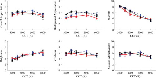
Fig. A.2. Average observer results as a function of the CCT for the painting “Mystery of the Night” (B). The solid red lines, dashed blue lines, and dotted black lines represent respectively the results for the white, grey, and black backgrounds.
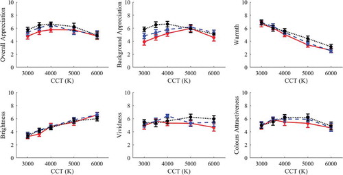
Fig. A.3. Average observer results as a function of the CCT for the painting “Summer Forest” (G). The solid red lines, dashed blue lines, and dotted black lines represent respectively the results for the white, grey, and black backgrounds.
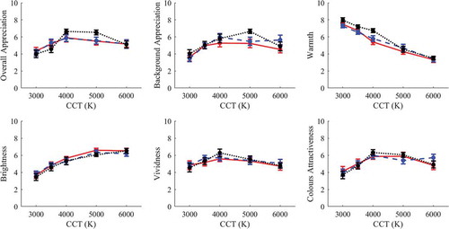
Fig. A.4. Average observer results as a function of the CCT for the painting “Happy Couple” (Y). The solid red lines, dashed blue lines, and dotted black lines represent respectively the results for the white, grey, and black backgrounds.
Appendix B: Average Results of Experiment A
Table B.1. Values of geometric mean, standard error of the geometric mean, and median for all combinations of painting (A, G, B, R, Y)/background (W, G, B)/CCT (3000 K–6000 K).