
Abstract
Introduction
Alcohol packaging can communicate alcohol-related health information, messaging and warnings. However, there is a dearth of research exploring awareness of, and engagement with, health information and messaging on alcohol packaging, and response to novel alcohol warnings.
Methods
Eight focus groups were conducted in Glasgow (Scotland) with current drinkers (n = 50), segmented by age (18–24, 25–35), gender (female, male) and social grade (ABC1, C2DE), to explore awareness and use of health information and messaging on existing packaging, and perceptions of novel front-of-package warnings differing in size (small, large), form (text-only, text and image) and message content (general, specific).
Results
Unaided recall of some health information and messaging was high (e.g. units, pregnancy symbols); however, most participants did not attend to or meaningfully engage with these, viewing them as unnoticeable, obscure and ineffective. Participants were skeptical of alcohol companies’ motivations with respect to health messaging on products. They were surprised to see the novel warnings on alcohol products but generally supported their inclusion. Most thought that these warnings could increase awareness of alcohol-related harms, particularly for younger or potential drinkers. Large, combined (text and image) warnings with specific messages on the front of packaging were considered most engaging and potentially effective.
Conclusions
The health-related information and messaging on alcohol packaging in Scotland is failing to inform consumers about the potential risks associated with alcohol use. Prominent warnings on alcohol packaging could help to capture attention, increase awareness of alcohol-related harms, and may support a reduction in consumption and alcohol-related harms.
Introduction
Globally, alcohol use is associated with substantial health, economic, and social burdens (Cukier et al. Citation2018; GBD Citation2016; Alcohol Collaborators Citation2018; Ranaweera et al. Citation2018), being a major contributor to disability-adjusted-life-years, injuries, and mortality (Rehm et al. Citation2017; Peacock et al. Citation2018). The harmful use of alcohol results in approximately 3 million deaths per year globally (WHO Citation2018). Europe has the highest level of alcohol consumption and lowest prevalence of abstainers worldwide (WHO Citation2020b). Alcohol misuse is a significant public health issue in the United Kingdom (UK) (Balakrishnan et al. Citation2009), as it is in many other countries, placing considerable strain on financial and medical resources (Williams et al. Citation2018). Within the UK, Scotland registered the highest rate of alcohol-specific deaths in 2018, with 20.8 deaths per 100,000 people (Office for National Statistics Citation2019). Alcohol consumption accounted for 8% of the burden of disease and an estimated 3,705 deaths in Scotland in 2015, with cancer and liver disease the top causes of alcohol-related deaths (Tod et al. Citation2018).
Alcohol packaging is often present at the point of purchase and the point of consumption, making it an appropriate medium for communicating drinking and health-related information to consumers (Calvert Citation2018). However, research suggests that the health-related information displayed on alcohol packaging is suboptimal (Petticrew et al. Citation2016; Coomber et al. Citation2018). Research in the UK found that most young drinkers, including almost half of higher-risk drinkers, did not recall seeing any health information, messages or warnings on alcohol packaging in the past month (Critchlow et al. Citation2019). Improving how this type of information is presented on packaging could help to increase awareness of, and reduce, alcohol-related harms (Royal Society for Public Health Citation2018).
Warnings on the packaging of potentially harmful consumer products are a particularly useful way of communicating these risks to the public (Rosenblatt et al. Citation2018). They are a low-cost, high-reach intervention that can allow consumers to make more informed choices. For example, health warnings on tobacco products – a key tobacco control tool required by most countries (WHO Citation2008; Moodie et al. Citation2020) – attract and hold attention, expand knowledge of smoking-related harms, and deter uptake among nonsmokers (Hammond Citation2011; Noar et al. Citation2016; Moodie et al. Citation2020). It is important to know whether warnings work, with effectiveness generally gauged across five domains: attention, reading and comprehension, recall, judgements, and behavioral compliance (Argo and Main Citation2004). Effectiveness may be affected by visibility, saliency, message content, and exposure (May et al. Citation2020). Improving the design of warnings on alcohol products, for instance by displaying a range of general and specific health-related messages, may help attract consumer attention, increase awareness of alcohol-related harms, improve engagement, and support a reduction in alcohol use (Miller et al. Citation2016; Wigg and Stafford Citation2016; Winstock et al. Citation2020; Hobin, Schoueri-Mychasiw, et al. Citation2020; Sillero-Rejon et al. Citation2020).
While research on warnings on alcohol products is growing, most studies have been quantitative (e.g. Gold et al. Citation2020). We used focus groups in Scotland to explore, in-depth, young adult drinkers’ awareness of the health information and messaging currently displayed on alcohol packaging, how it is perceived and if it is used, and also perceptions of novel health warnings.
Methods
Design and sample
Focus groups were conducted in Glasgow (Scotland) in September 2019 with 50 young adult past-month drinkers segmented by age (18–24, 25–35), gender (female, male), and social grade (ABC1, C2DE), see . Previous research has recommended that the impact of alcohol health warnings be investigated within different subgroups, such as age, gender or socio-economic position (Pechey et al. Citation2020). Participants with similar characteristics may feel more comfortable engaging in focus group discussions (Greenwood et al. Citation2014). Social grade was categorized by the occupation of the person in the household with the greatest income (National Readership Survey [Citationdate unknown]). This is an established classification system in the UK with grades A, B and C1 signifying higher and middle class groups and C2, D and E working class groups. Focus groups, which have previously been used to explore attitudes toward novel warnings on alcohol products (Thomson et al. Citation2012; Roderique-Davies et al. Citation2018; Vallance et al. Citation2018), allow participants to interact with, and discuss, realistic examples of alcohol packaging. We focused on young adults as an ongoing review of the trade press and gray literature in the UK shows that alcohol producers regularly target this age group when (re)designing packaging (Boggis Citation2008; Clark Citation2008; Bell Citation2020). They are also an important group for public health in terms of hazardous drinking (e.g. Patton and Boniface Citation2016). There was a mix of drinking behaviors within and between groups according to units consumed in the past week (National Health Service Citation2018). While almost all participants (n = 48) had drunk alcohol in the past week, the number of units consumed by past-week drinkers ranged from 2 to 80 with a median of 13.5 units (SD = 13.64), which is within the low-risk weekly drinking guidelines (i.e. below 14 units) (UK Chief Medical Officers (CMO) Citation2016).
Table 1. Age, gender, social grade, number of participants, median units in the past 7 days.
Procedure
Participants were recruited, face-to-face, in Greater Glasgow by a market researcher using a brief recruitment questionnaire (see Supplementary Material) which captured demographic and drinking information. Potential participants were asked ‘When was the last time you drank alcohol?’. Those who had consumed any amount of alcohol in the past 30 days were considered current drinkers, while those who answered ‘Never’ or ‘More than 30 days ago’ were deemed ineligible. At recruitment, participants were given information about the study and potential ethical concerns (e.g. confidentiality, anonymity, right to withdraw). Prior to each group, all of which were moderated by DJ, participants were asked to provide consent. It was explained at the start of each group that all contributions were valued and encouraged, and that participants could refrain from answering any questions for any reason. All groups lasted approximately 90 minutes and were audio-recorded. A semi-structured discussion guide was used to address the research aims and ensure commonality across groups.
Each focus group consisted of two sections: alcohol packaging as a promotional tool (not reported here); alcohol packaging as a health messaging tool. Participants discussed their unaided awareness of existing health information and messaging on alcohol packaging. Participants then discussed their knowledge of alcohol-related harms and sources of information, as well as perceptions and use of health information and messaging on current alcohol packaging.
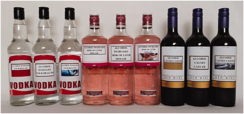
Participants were then shown nine alcohol products displaying mocked-up labels (see and Supplementary Material), featuring three warnings on the front differing in size (small, large), form (text-only, text and related image), and message content (general, specific). A range of warnings were used to exemplify general and specific alcohol-related health harms and explore responses. The general warning was ‘Alcohol damages your health’ (with the accompanying image showing a hospitalized patient in bed). Alcohol is a major cause of liver disease and cancer globally (Williams et al. Citation2018; WHO Citation2020a), hence the two specific warnings were ‘Alcohol increases risk of liver disease’ (with the accompanying image showing a person clutching their liver) and ‘Alcohol causes cancer’ (with the accompanying image showing a CT scanner). Although tobacco research suggests that warnings about long-term health problems have less resonance with younger people (Slovic Citation2000), we decided to use these warnings due to their applicability to the whole population and to maintain international relevance. Previous alcohol studies have used a similar range of warning designs, e.g. differing sizes (Al-Hamdani and Smith Citation2017), text-only and text-and-image (Clarke et al. Citation2020), general and specific content (Miller et al. Citation2016; Blackwell et al. Citation2018), liver and cancer messages (Sillero-Rejon et al. Citation2018; Weerasinghe et al. Citation2020). Participants were asked to imagine that the warnings could be used across a range of alcohol products and shown three bottles (vodka) displaying the general warning and asked to discuss these. They were then shown, and discussed, three bottles (gin) with the liver warning, and finally three bottles (wine) displaying the cancer warning. Following discussion of each warning set, the bottles remained on display to allow participants to make comparisons across sets. Participants were given time to inspect the products before discussing their perceptions of the various design elements and considering potential ways to improve them.
Figure 1. Alcohol packaging displaying warnings differing by size, form, and content.
Participants were given an oral debrief of the study, contact details for Drinkline (alcohol support), and £30 shopping vouchers for their time. DJ recorded audio notes after each group to note dominant speakers and impressions of group interaction. Ethical approval was granted by the General University Ethics Panel at University of Stirling (GUEP 668R).
Analysis
Audio recordings were transcribed by professional transcribers. Thematic analysis was conducted as per Braun and Clarke’s (Citation2006) guidelines using an inductive approach. The transcripts were reviewed for accuracy and familiarity by DJ, then examined by DJ and CM to identify initial thematic codes. Codes were developed inductively, based on initial observations that were summarized into conceptual categories and gradually refined and linked to other conceptual categories using NVivo 12 Pro. Codes were then collated into potential themes by DJ and reviewed by CM and RP to create a thematic framework. Five key themes were refined and defined by the research team (DJ, CM, RP, NF and RC): Knowledge of alcohol harms, and recall of health information and messaging on packaging; Awareness, perceptions and use of health information and messaging on packaging; Perceptions of alcohol companies’ approach to health messaging on packaging; Perceptions of novel warnings and impact on appeal; Effective warning design. These themes were examined to identify patterns across the groups. Representative quotations are provided in the Results to illustrate key themes. Where there are differences by age, gender or social grade, they will be identified in the text.
Results
Knowledge of alcohol harms, and recall of health information and messaging on packaging
Participants were generally knowledgeable of some of the potential harms of alcohol use, typically through social/familial connections, TV campaigns, newspapers, and medical centers. No participant mentioned alcohol packaging as a source of information about possible harms. When asked about the types of health information and messages on alcohol packaging, there was high unaided recall of unit information, pregnancy symbols, alcohol by volume (ABV), and drinking guidelines, with several groups also mentioning a responsible drinking message. There was low unprompted recall of nutritional information (e.g. calories), drink-driving and age-restriction messages, and ‘Drinkaware’ on packaging.
Awareness, perceptions and use of health information and messaging on packaging
Most did not use existing health information and messaging on alcohol packaging, some previously ‘struggled to find’ (18–24 F, ABC1) health information on packaging or were noticing it for the first time when interacting with alcohol products they were shown, e.g. ‘I’ve actually never noticed them’ (18–24 F, ABC1). For instance, one female participant mentioned being unaware of pregnancy symbols: ‘I didn’t even know about the pregnant lady. I never even noticed the pregnant lady’ (25–35 F, C2DE). There was also very low awareness of low-risk drinking guidelines (CMO; UK Chief Medical Officers Citation2016), and very few participants adhered to these.
People aren’t paying attention to it. I wasn’t aware of half the information on labels (25–35 F, C2DE)
What do they recommend for a week? (25–35 M, C2DE)
I went to my dentist recently and he was going through the questionnaire. He went, “how many units are you drinking a week?”. I went, “the recommended amount” and, in my head I’m going, “I don’t even know what the recommended amount is” (25–35 F, ABC1)
Some of the information on packaging was used to make healthier drinking choices. Several participants reflected upon the number of units in products before consuming alcohol or used ABV to determine the strength of alcoholic drinks to help them drink in moderation. However, most of those who used units did so the day after drinking to assess their suitability to drive, while most participants who used ABV used it to accelerate intoxication, choosing not to purchase alcohol ‘that’s under a certain percentage’ (25–35 F, C2DE).
The higher [the ABV] the better I suppose. The higher the percentage the more appealing it is (18–24 F, C2DE)
You are going to go and get the highest percentage so you can get there [intoxication] quicker (18–24 M, ABC1)
Participants explained that some information displayed on alcohol packaging created confusion, e.g. what constitutes a unit of alcohol and how units should be used to regulate drinking: ‘It’s not understood. It’s never been explained’ (18–24 F, C2DE). It was suggested that this information would be more useful and accessible if all packaging included unit information per serving.
Perceptions of alcohol companies’ approach to health messaging on packaging
All groups believed that alcohol companies seek to minimize the amount, saliency (e.g. font size, positioning), and effectiveness (e.g. content) of health information, messaging and warnings on alcohol packaging, e.g. ‘I think they don’t want to brand themselves as something that’s bad for you’ (25–35 F, ABC1). Some participants thought that the health information, messaging and warnings currently included on alcohol packaging are there because alcohol companies ‘just do, legally, what they’re supposed to’ (25–35 M, C2DE) rather than wanting to inform consumers.
It has to be put on there so they’ll make it as small and unnoticeable as possible because, let’s be honest, promoting the fact that you know you shouldn’t be drinking this isn’t going to sell bottles (18–24 F, ABC1)
They need to tick a wee box, and they’re not putting them [warnings] to stand out (25–35 F, ABC1)
It’s [health messaging] just there because they have to put it on isn’t it? They don’t care; they just want to sell it (18–24 F, C2DE)
I don’t think they take it [health messaging] seriously (18–24 M, C2DE)
Although recalled by several groups, the ‘please drink responsibly’ message was considered particularly confusing and met with disdain across all groups given the lack of clarity about what this actually means. Participants were cynical of this message, viewing it as unhelpful, ambiguous and unlikely to have any meaningful impact, with comparisons drawn to similar messages used in gambling advertisements.
Lots of the people that are going to be buying it are going to be drunk themselves which already lowers your inhibitions. So, I mean your definition of responsibility will change depending on how much you drink (25–35 M, ABC1)
For me, “please drink responsibly”, people have different perceptions. For me, drinking responsibly is thinking about are you going to be driving tomorrow? Do you need the car? Plan ahead. For other people drinking responsibly could mean something else (25–35 F, C2DE)
What is drinking responsibly? Is it not drinking a lot? Is it only drinking a couple of times a week? Is it drinking within your house? Is it drinking in a legalised environment? It’s quite vague but it’s like as if this is just covering its arse, the drink companies are like “well we told them to drink responsibly, so we can’t be blamed for them going out and causing fights and stuff” (25–35 M, ABC1)
One participant contended that the variant ‘please enjoy responsibly’ was positively framed to evoke positive feelings about drinking, further highlighting the mutability of ‘responsible drinking’ definitions.
I mean it’s a connotation isn’t it? It’s a positive experience, you’re never going to think, “oh that’s bad”. I’m going to enjoy that. To enjoy something is about the night that you’re going to have. The possibility of more (25–35 M, ABC1)
Perceptions of novel warnings and impact on appeal
The most common response to the alcohol products with mockup warnings () was unprompted mention of similarity to tobacco warnings; warnings are prominently displayed on tobacco packaging in many countries. Notwithstanding tobacco products setting a precedent, and most participants considering some form of warnings on alcohol products appropriate and potentially informative and useful, particularly for ‘teaching kids’ (25–35 M, C2DE) and younger people, the consensus was that they would nevertheless be surprised to see such warnings on alcohol products.
I think I would understand completely why, and I would welcome it (salient warnings). So, there’s going to be an impact, 100%; however, it’s not going to be life-changing, but I think it’s definitely a positive, 100% (25–35 M, ABC1)
Kids can look at that and understand wee bits and it would deter them (25–35 M, ABC1)
Well it would surprise me by the fact that it’s not normally there. Which is a really good point that you [another participant] brought up, because why is it on cigarettes when alcohol does as much damage? (25–35 F, C2DE)
Several participants made numerous unprompted comments about the myriad ways that the presence of these types of warnings on alcohol packaging could reduce appeal. The consensus was that warnings would make alcohol products unsuitable gifts, participants would be more reluctant to bring them to social gatherings, and they would look unattractive in the home. These impacts were not mentioned by participants in either of the 25–35-year-old male groups.
I think it would make people drink less. It wouldn’t if you were buying it to drink but if you were buying for a gift, you would maybe not buy for a gift (25–35 F, ABC1)
I think it would take away the glamorisation of it. People are saying if it looks fancier they would take it to a dinner party. I think if it looks like that and I was turning up to somebody’s house, I don’t think I would want to take that (18–24 F, C2DE)
My children might see it as well. That would be the other thing. If my children seen that bottle and read that label they would be like, “why are you doing that, Mum?” (25–35 F, ABC1)
It was suggested that social media ‘influencers’ would not include such products in their social media posts as prominent warnings would ‘interrupt the fun’ (18–24 F, ABC1) of socializing.
I feel they’ve just ruined my Saturday night (25–35 F, ABC1)
That’s just going to kill my buzz if I’m going out, I’m not going to be like, “class” (18–24 M, ABC1)
Participants within the male groups mentioned taking steps to avoid seeing warnings during consumption, such as peeling off or hiding the label (e.g. by putting bottles in sleeves). The reduced appeal caused by having warnings positioned on the front of packaging was also thought to extend to younger people, who may be put off when they see these products as litter.
It does put me off a little bit, but I would just take off the label (18–24 M, ABC1)
As soon as I bought it I’d rip it off. One hundred percent I would do that (25–35 M, C2DE)
When I was younger and I used to see cigarette packages sitting on the pavement or stuff like that, I would look at it and think, “I’m never going to smoke”. So, maybe young people would look at that and think, “I’m not going to drink” (18–24 M, C2DE)
Effective warning design
When considering the novel warnings, the general view was that size, positioning and type matters. Participants felt that larger text-only warnings were more eye-catching than small text-only warnings and required less effort on the part of the consumer as ‘it is just bold and it’s in your face’ (25–35 M, C2DE). Having warnings on the ‘front and centre’ (25–35 M, ABC1) of packaging was consistently viewed as the best position to make the warnings stand out. This was seen as the optimal location as it would be at eye-level on shelves in retailers, although a few participants also suggested placing warnings on the neck of bottles.
It’s where it needs to be to catch your eye (18–24 M, C2DE)
I think they need to be at the front because, like we’ve all said, you don’t really pay attention to the small text on the back. So, I think it needs to be big and on the front if people are going to pay attention to it (25–35 F, C2DE)
There was a preference for combined (text and image) warnings to help ‘visualise what could happen’ (18–24 F, C2DE). These were deemed more eye-catching and required less cognitive processing than text-only warnings as the message was reinforced by the image. It was also suggested that including an image could help ‘visual learners’ (18–24 F, C2DE) and people with reading difficulties.
The most effective will be the ones with text and image. I don’t personally like it. I don’t think it’s necessarily a great idea per se. But, I’d say that would be the most effective in deterring people (18–24 M, ABC1)
It’s definitely more effective having an image regardless. I don’t think the text does enough. I think people need to see that visual lead to go hand in hand with the text (18–24 M, ABC1)
You know what the damage is doing if you’re walking past it. You don’t need to put any effort into reading it (25–35 M, C2DE)
In addition to warning size, positioning and type, content was considered important with regards to potential effectiveness. While some considered ‘Alcohol damages your health’ too ‘basic’ (18–24 F, C2DE) and widely known to be effective, others felt it was the appropriate level of severity. Although several participants found the image of the hospitalized patient ambiguous, questioning ‘what’s actually happened’ (18–24 F, ABC1) to the patient, others thought it consolidated the message.
I think it’s more effective than asking people to “please drink responsibly”. It’s outright saying, “this can damage your health”, and if it can break through to people I think it’s kind of worth it (18–24 M, ABC1)
It’s not just a label that’s saying “it can damage your health”. It’s actually showing the impact of someone being taken to hospital through alcohol (18–24 F, C2DE)
The more specific health warnings (liver, cancer) received a lot of attention and were considered most impactful, with some taken aback by seeing them on alcohol products. The image of the person clutching their liver was generally viewed as more informative than the hospitalized patient because it ‘shows, to an extent, the damage it can do to you’ (18–24 M, ABC1). The CT scanner was perceived as the most attention-grabbing and thought-provoking image as it depicts what could be ‘waiting for you’ (18–24 M, ABC1). Most participants felt that warnings should incorporate ‘realistic information’ (18–24 F, C2DE), and noted the relatability of these warnings, particularly the cancer warning.
Cancer is a scary thing. I mean it affects a lot of people (18–24 M, ABC1)
Everybody knows somebody that’s suffered from cancer (25–35 M, ABC1)
Some participants preferred the liver message (‘Alcohol increases risk of liver disease’) as it felt more nuanced than the cancer message (‘Alcohol causes cancer’), allowing for individual differences such as drinking behavior and general health. Without statistics and ‘cut-off’ points, some questioned the likelihood of alcohol causing cancer, especially when consumed at moderate levels. Most groups suggested that it would be more useful if the type of cancer was specified, as well as the likelihood of developing cancer based on alcohol consumption.
I can see the point if you put “alcohol could cause cancer” but “causes cancer”? I don’t know if I would say that’s 100%, unless you’ve got proof that that is what it’s doing (18–24 F, C2DE)
If they are going to dedicate a space to it, like you [another participant] said, they are better doing something that’s going to capture your attention, so statistics or what exactly it’s going to affect. Not these standard words (25–35 F, ABC1)
Have stuff on the front like risks and what the statistics are – people actually have to look at them (18–24 M, ABC1)
Participants recommended other possible changes to the content of warnings that may help enhance stand out and impact, suggesting that they also display various short-term effects of alcohol consumption (e.g. impairments, nausea, hangovers) or highlight that alcohol is potentially addictive, and include information on available support (e.g. a helpline). Rotation was also viewed as necessary to reach a greater number of consumers and prolong impact.
Maybe each bottle could be different, like different messages (25–35 F, C2DE)
Variations of the image, variations of the message (18–24 M, ABC1)
Discussion
For our sample of current, mostly past-week, drinkers, most were not aware of, or did not attend to or meaningfully engage with, the health information, messaging and warnings currently on alcohol packaging. They were considered neither salient nor effective. The inclusion of prominent warnings was generally supported and thought to help ensure that consumers are more appropriately informed about alcohol-related risks at the point of purchase and consumption.
Participants were largely unaware of the current UK drinking guidelines (UK Chief Medical Officers (CMO) Citation2016), in line with previous research (Royal Society for Public Health Citation2018), and did not consider them useful. This is unsurprising given that guidelines are often presented in very small font sizes, more than 70% of alcohol labels do not include the current UK guidelines (UK Chief Medical Officers (CMO) Citation2016), and almost a quarter contain misleading, out-of-date health information (Alcohol Health Alliance UK Citation2020). Similarly, the ‘please drink responsibly’ message was typically seen as ambiguous and ineffective, supporting previous findings (Priory Group Citation2020). Research suggests that such industry-affiliated terms are strategically ambiguous (Smith et al. Citation2006; Maani Hessari and Petticrew Citation2018), and do not reduce consumption (Jones et al. Citation2017). Although frequently recalled, some participants were unsure of how to use existing unit information on packaging to moderate their drinking. ABV was primarily used as a guide for either drinking in moderation or to accelerate intoxication, with some participants choosing only to buy products (e.g. wine) above certain thresholds. Focus groups in Australia found that some young drinkers use standard drinks and ABV information to increase their alcohol consumption (Jones and Gregory Citation2009; Thomson et al. Citation2012). The present study suggests that the health information and messaging currently provided on alcohol packaging is failing to appropriately inform consumers of the risks associated with alcohol consumption.
The WHO recommends that, as a fundamental consumer right to information, warnings should reflect the harms associated with alcohol consumption (Jané-Llopis et al. Citation2020). A series of real-world quasi-experimental studies in Canada suggested that improving health messaging on alcohol products by varying highly visible labels (i.e. large and brightly coloured) with a variety of impactful messages (e.g. ‘Alcohol can cause cancer’) could be an effective population-level tool for increasing awareness and knowledge of national drinking guidelines (Schoueri-Mychasiw et al. Citation2020), improving knowledge that alcohol causes cancer (Hobin, Weerasinghe, et al. Citation2020), and reducing alcohol consumption (Zhao et al. Citation2020). Like these studies, the warnings in our study used serious health messages in different formats, which did attract and hold consumer attention.
Most participants were surprised at the idea of warnings on alcohol products, despite being accustomed to them on tobacco products, but felt they could help inform children and potential drinkers about alcohol-related harms. The novelty of being shown alcohol products displaying prominent warnings is likely to have influenced participants’ responses, but the general view was that they would reduce the appeal of alcohol products (whether in the home, at social gatherings, on social media), make them less appropriate as gifts, and negatively affect socializing and perceptions of drinking as glamorous and fun. While some male participants indicated that they would engage in avoidant behavior as a result of this reduced appeal, for warnings on tobacco products longitudinal research shows that avoidant behavior may be a marker of engagement with warnings (Thrasher et al. Citation2016) and is linked to quitting (Yong et al. Citation2014). Despite the surprise at seeing the warnings, there was some support for including them on alcohol packaging. Some past research has similarly found there to be support for warnings on alcohol packaging, for instance pregnancy warnings (Thomson et al. Citation2012; Dekker et al. Citation2020) and text-only warnings (Clarke et al. Citation2020; Vallance, Stockwell, et al. Citation2020), while other work has found low acceptability for warnings with graphic images (Pechey et al. Citation2020). Differences in support are most likely due to differences in the types of warnings being evaluated. In this study, those who supported introducing warnings maintained they should be noticeable, fact-based and relevant to real life. Most participants thought that including a range of rotating warnings on packaging (e.g. short- and long-term risks) could help to reach more consumer profiles and prolong impact.
Although cancer is a leading cause of death in the UK (Hydes et al. Citation2020), as it is elsewhere, and alcohol use is one of the largest modifiable cancer risk factors (Public Health Scotland Citation2020), some participants were unaware that alcohol causes cancer. Low awareness of the alcohol-cancer link has been found in other countries (Bates et al. Citation2018; Scheideler and Klein Citation2018; Thomsen et al. Citation2020; Weerasinghe et al. Citation2020), highlighting the potential role that well-designed warnings on alcohol packaging could have in improving awareness of alcohol-related harms and informing consumers (WHO Citation2020a). Cancer warnings are positively associated with consumers reading, thinking and talking about them, and self-reported intentions to reduce drinking (Hobin, Shokar, et al. Citation2020). Alcohol companies’ opposition to proposed cancer warnings on packaging has been well documented, for instance in Canada (Stockwell et al. Citation2020) and Ireland (Vallance, Vincent, et al. Citation2020), as they refute the evidence that alcohol is a carcinogen (Petticrew et al. Citation2018). The current study contributes to this earlier work and alcohol warning design theory in the following ways. Participants considered the cancer warning particularly relatable and supported the inclusion of ‘realistic information’ (18–24 F, C2DE) on alcohol packaging, highlighting the importance of clear and relevant message content. Most groups thought that the cancer warning would be more believable, informative and effective if the types of cancers caused by alcohol consumption were specified, which could help to improve awareness and knowledge of the alcohol-cancers link.
The groups displayed a level of suspicion and mistrust of alcohol companies. Some participants contended that alcohol companies would not want salient health-related information or warnings on alcohol packaging, viewing it as detrimental to sales and positive perceptions of drinking. This was evident in participants’ attitudes to responsible drinking messages, considered ambiguous and positively-framed, and the fact that other health-related messaging and information is seen as barely noticeable. Petticrew et al. (Citation2016) found that font and pregnancy logos on alcohol labeling were smaller than would be accepted on other potentially harmful products. One female participant noticed pregnancy symbols on alcohol packaging for the first time when examining products in the group. Similar to the gambling industry (Newall Citation2019), research suggests that alcohol companies use ‘dark nudges’ and ‘sludge’ tactics to encourage behavior that is not in consumers’ best interests and make behavior change more difficult, which can undermine scientific evidence by normalizing or encouraging alcohol consumption (Petticrew et al. Citation2020). In the present study, a sample of current alcohol consumers were acutely aware of such tactics and thought that alcohol companies would strongly oppose the inclusion of salient and effective warnings on alcohol packaging, to the detriment of consumers.
Participants in our study attended to the warnings and generally found them more engaging than the information currently provided on alcohol packaging, with some suggesting they may help to reduce consumption, in line with previous research (Hobin, Schoueri-Mychasiw, et al. Citation2020). They viewed large warnings, displaying images and text, and placed on the front of packaging as most likely to increase perceptions of the associated health risks and intentions to reduce selection and consumption or quit. This is consistent with research on alcohol warnings (Wigg and Stafford Citation2016; Vallance et al. Citation2018; Pechey et al. Citation2020) and tobacco warnings (Hammond Citation2011; Noar et al. Citation2016). Indeed, some participants questioned why alcohol, a product with high rates of morbidity and mortality, like tobacco, differed so much in terms of health messaging and warnings. In terms of content, specific warnings may change alcohol-risk beliefs and encourage a reduction in drinking intentions for high-risk drinkers (Jongenelis et al. Citation2018). Supporting previous alcohol research (Miller et al. Citation2016; Blackwell et al. Citation2018), participants found specific warnings more believable and potentially effective than general warnings.
While our study allowed current drinkers to engage with realistic warnings on physical alcohol products, forced exposure in focus groups is not as realistic as in a retail setting or drinking venue (e.g. Hobin, Weerasinghe, et al. Citation2020). The study is also unable to provide any insight into the potential impact of the warnings over time. Participants generally reported low-risk levels of past-week drinking; as Hassan and Shiu (Citation2018) note, further research is needed to determine whether drinking status should also be considered when assessing the efficacy of warnings on alcohol packaging. Another limitation is that although a range of views were encouraged and expressed, social desirability bias may have affected some responses. In addition, while focus groups facilitate meaningful exploration of a range of topics, they are not generalizable beyond the sample.
In conclusion, the health information, messaging and warnings currently on alcohol packaging in the UK is not adequately designed to meaningfully inform consumers about alcohol-related harms, let alone change their drinking behavior. Our findings are consistent with research from other countries with weak health messaging on alcohol packaging (e.g. Coomber et al. Citation2018; Jané-Llopis et al. Citation2020), and highlight the need for a more co-ordinated global response to warning design, as there is in the tobacco field.
Supplemental Material
Download Zip (726.5 KB)Disclosure statement
The authors report no conflicts of interest.
Correction Statement
This article has been corrected with minor changes. These changes do not impact the academic content of the article.
Additional information
Funding
References
- Alcohol Health Alliance UK. 2020. Alcohol health alliance interim research findings on alcohol labelling. Alcohol Health Alliance UK; [accessed 2020 Jul 21]. https://s3.eu-west-2.amazonaws.com/files.alcoholchange.org.uk/documents/AHA-labelling-interim-findings.pdf?mtime=20200306155355.
- Al-Hamdani M, Smith SM. 2017. Alcohol warning label perceptions: do warning sizes and plain packaging matter? J Stud Alcohol Drugs. 78(1):79–87.
- Argo JJ, Main KJ. 2004. Meta-analyses of the effectiveness of warning labels. J Public Policy Mark. 23(2):193–208.
- Balakrishnan R, Allender S, Scarborough P, Webster P, Rayner M. 2009. The burden of alcohol-related ill health in the United Kingdom. J Public Health (Oxf). 31(3):366–373.
- Bates S, Holmes J, Gavens L, de Matos EG, Li J, Ward B, Hooper L, Dixon S, Buykx P. 2018. Awareness of alcohol as a risk factor for cancer is associated with public support for alcohol policies. BMC Public Health. 18(1):688.
- Bell T. 2020. SkinnyBooze founder raises glass to increased calorie labelling on alcohol. SkinnyBooze; [accessed 2020 Aug 13]. https://www.skinnybooze.co.uk/blogs/news/skinnybooze-founder-raises-glass-to-increased-calorie-labelling-on-alcohol.
- Blackwell AK, Drax K, Attwood AS, Munafò MR, Maynard OM. 2018. Informing drinkers: can current UK alcohol labels be improved? Drug Alcohol Depend. 192:163–170.
- Boggis C. 2008 Apr 18. Beer & cider. Off Licence News. 39(8):p. 28.
- Braun V, Clarke V. 2006. Using thematic analysis in psychology. Qual Res Psychol. 3(2):77–101.
- Calvert E. 2018. Alcohol information: label vs. screen? The European Consumer Organisation; [accessed 2020 Feb 19]. http://www.beuc.eu/blog/alcohol-information-label-vs-screen.
- Clark L. 2008 Jun 13. Spirits. Off Licence News. 39(12):p. 34.
- Clarke N, Pechey E, Mantzari E, Blackwell AKM, De‐Loyde K, Morris RW, Munafò MR, Marteau TM, Hollands GJ. 2020. Impact of health warning labels communicating the risk of cancer on alcohol selection: an online experimental study. Addiction. 116(1):41–52.
- Coomber K, Hayley A, Miller PG. 2018. Unconvincing and ineffective: young adult responses to current Australian alcohol product warnings. Aust J Psychol. 70(2):131–138.
- Critchlow N, Jones D, Moodie C, MacKintosh AM, Fitzgerald N, Hooper L, Thomas C, Vohra J. 2019. Awareness of product-related information, health messages and warnings on alcohol packaging among adolescents: a cross-sectional survey in the United Kingdom. J Public Health. 42(3):e223–e230.
- Cukier S, Wettlaufer A, Jackson K, Minozzi S, Bartholow BD, Stoolmiller ML, Sargent JD. 2018. Impact of exposure to alcohol marketing and subsequent drinking patterns among youth and young adult. Cochrane Database Syst Rev, 2018(8):CD013087.
- Dekker MR, Jones A, Maulik PK, Pettigrew S. 2020. Public support for alcohol control initiatives across seven countries. Int J Drug Policy. 82;102807.
- GBD 2016 Alcohol Collaborators. 2018. Alcohol use and burden for 195 countries and territories, 1990–2016: a systematic analysis for the Global Burden of Disease Study 2016. Lancet. 392(10152):1015–1035.
- Gold N, Egan M, Londakova K, Mottershaw A, Harper H, Burton R, Henn C, Smolar M, Walmsley M, Arambepola R, et al. 2020. Effect of alcohol label designs with different pictorial representations of alcohol content and health warnings on knowledge and understanding of Low Risk Drinking Guidelines: a randomized controlled trial. Addiction. DOI:https://doi.org/10.1111/add.15327.
- Greenwood N, Ellmers T, Holley J. 2014. The influence of ethnic group composition on focus group discussions. BMC Med Res Methodol. 14:107.
- Hammond D. 2011. Health warning messages on tobacco products: a review. Tob Control. 20(5):327–337.
- Hassan LM, Shiu E. 2018. A systematic review of the efficacy of alcohol warning labels: insights from qualitative and quantitative research in the new millennium. JSOCM. 8(3):333–352.
- Hobin E, Schoueri-Mychasiw N, Weerasinghe A, Vallance K, Hammond D, Greenfield TK, McGavock J, Paradis C, Stockwell T. 2020. Effects of strengthening alcohol labels on attention, message processing, and perceived effectiveness: a quasi-experimental study in Yukon, Canada. Int J Drug Policy. 77:102666.
- Hobin E, Shokar S, Vallance K, Hammond D, McGavock J, Greenfield TK, Schoueri-Mychasiw N, Paradis C, Stockwell T. 2020. Communicating risks to drinkers: testing alcohol labels with a cancer warning and national drinking guidelines in Canada. Can J Public Health. 111(5):716–725.
- Hobin E, Weerasinghe A, Vallance K, Hammond D, McGavock J, Greenfield TK, Schoueri-Mychasiw N, Paradis C, Stockwell T. 2020. Testing alcohol labels as a tool to communicate cancer risk to drinkers: a real-world quasi-experimental study. J Stud Alcohol Drugs. 81(2):249–261.
- Hydes TJ, Williams R, Sheron N. 2020. Exploring the gap in the public's understanding of the links between alcohol and cancer. Clin Med (Lond). 20(1):4–7.
- Jané-Llopis E, Kokole D, Neufeld M, Hasan OS, Rehm J. 2020. What is the current alcohol labelling practice in the WHO European Region and what are barriers and facilitators to development and implementation of alcohol labelling policy? WHO Regional Office for Europe; [accessed 2020 Jul 29]. https://www.euro.who.int/en/publications/abstracts/what-is-the-current-alcohol-labelling-practice-in-the-who-european-region-and-what-are-barriers-and-facilitators-to-development-and-implementation-of-alcohol-labelling-policy-2020.
- Jones SC, Gregory P. 2009. The impact of more visible standard drink labelling on youth alcohol consumption: helping young people drink (ir)responsibly? Drug Alcohol Rev. 28(3):230–234.
- Jones SC, Hall S, Kypri K. 2017. Should I drink responsibly, safely or properly? Confusing messages about reducing alcohol-related harm. PLoS One. 12(9):e0184705.
- Jongenelis MI, Pratt IS, Slevin T, Chikritzhs T, Liang W, Pettigrew S. 2018. The effect of chronic disease warning statements on alcohol-related health beliefs and consumption intentions among at-risk drinkers. Health Educ Res. 33(5):351–360.
- Maani Hessari N, Petticrew M. 2018. What does the alcohol industry mean by ‘Responsible drinking'? A comparative analysis. J Public Health (Oxf). 40(1):90–97.
- May NJ, Eliott J, Crabb S, Miller ER, Braunack-Mayer A. 2020. Alcohol warning labels to reduce alcohol-related harm: a scoping review protocol. JBI Evid Synth. 18(1):186–193.
- Miller ER, Ramsey IJ, Baratiny GY, Olver IN. 2016. Message on a bottle: are alcohol warning labels about cancer appropriate? BMC Public Health. 16(1):139.
- Moodie C, O'Donnell R, Fleming J, Purves R, McKell J, Dobbie F. 2020. Extending health messaging to the consumption experience: a focus group study exploring smokers' perceptions of health warnings on cigarettes. Addict Res Theory. 28(4):328–334.
- National Health Service 2018. Alcohol units. National Health Service; [accessed 2019 Jul 15]. https://www.nhs.uk/live-well/alcohol-support/calculating-alcohol-units.
- National Readership Survey. [date unknown]. Social grade. National Readership Survey; [accessed 2019 Jul 15]. http://www.nrs.co.uk/nrs-print/lifestyle-and-classification-data/social-grade.
- Newall PWS. 2019. Dark nudges in gambling. Addict Res Theory. 27(2):65–67.
- Noar SM, Hall MG, Francis DB, Ribisl KM, Pepper JK, Brewer NT. 2016. Pictorial cigarette pack warnings: a meta-analysis of experimental studies. Tob Control. 25(3):341–354.
- Office for National Statistics. 2019. Alcohol-specific deaths in the UK: registered in 2018. Office for National Statistics; [accessed 2020 May 27]. https://www.ons.gov.uk/peoplepopulationandcommunity/healthandsocialcare/causesofdeath/bulletins/alcoholrelateddeathsintheunitedkingdom/2018.
- Patton R, Boniface S. 2016. Prevalence of hazardous drinking among UK 18–35 year olds; the impact of a revision to the AUDIT cut score. Alcohol Alcohol. 51(3):281–282.
- Peacock A, Leung J, Larney S, Colledge S, Hickman M, Rehm J, Giovino GA, West R, Hall W, Griffiths P, et al. 2018. Global statistics on alcohol, tobacco and illicit drug use: 2017 status report. Addiction. 113(10):1905–1926.
- Pechey E, Clarke N, Mantzari E, Blackwell AK, De-Loyde K, Morris RW, Marteau TM, Hollands GJ. 2020. Image-and-text health warning labels on alcohol and food: potential effectiveness and acceptability. BMC Public Health. 20(1):376.
- Petticrew M, Douglas N, Knai C, Durand MA, Eastmure E, Mays N. 2016. Health information on alcoholic beverage containers: has the alcohol industry's pledge in England to improve labelling been met? Addiction. 111(1):51–55.
- Petticrew M, Maani Hessari N, Knai C, Weiderpass E. 2018. How alcohol industry organisations mislead the public about alcohol and cancer. Drug Alcohol Rev. 37(3):293–303.
- Petticrew M, Maani N, Pettigrew L, Rutter H, Van Schalkwyk MC. 2020. Dark nudges and sludge in big alcohol: behavioral economics, cognitive biases, and alcohol industry corporate social responsibility. Milbank Q. 98(4):1290–1328.
- Priory Group 2020. Public calls for cancer warnings on alcohol as nearly 80% say Britain ‘has a drink problem’. Priory Group; [accessed 2020 Dec 4]. https://www.priorygroup.com/media-centre/public-calls-for-cancer-warnings-on-alcohol-as-nearly-80-say-britain-has-a-drink-problem.
- Public Health Scotland. 2020. Cancer incidence in Scotland (to December 2018). Public Health Scotland; [accessed 2020 Jul 11]. https://beta.isdscotland.org/media/4312/2020-04-28-cancer-incidence-report.pdf.
- Ranaweera S, Amarasinghe H, Chandraratne N, Thavorncharoensap M, Ranasinghe T, Karunaratna S, Kumara D, Santatiwongchai B, Chaikledkaew U, Abeykoon P, et al. 2018. Economic costs of alcohol use in Sri Lanka. PLoS One. 13(6):e0198640.
- Rehm J, Gmel GE, Gmel G, Hasan OS, Imtiaz S, Popova S, Probst C, Roerecke M, Room R, Samokhvalov AV, et al. 2017. The relationship between different dimensions of alcohol use and the burden of disease-an update. Addiction. 112(6):968–1001.
- Roderique-Davies G, John B, Jones S, Leeworthy S. 2018. Investigating the potential impact of changing health messages on alcohol products. Alcohol Concern; [accessed 2020 Feb 23]. https://www.alcoholconcern.org.uk/Handlers/Download.ashx?IDMF=5b710cef-70c3-4436-97aa-843d07cc7419.
- Rosenblatt DH, Bode S, Dixon H, Murawski C, Summerell P, Ng A, Wakefield M. 2018. Health warnings promote healthier dietary decision making: effects of positive versus negative message framing and graphic versus text-based warnings. Appetite. 127:280–288.
- Royal Society for Public Health. 2018. Labelling the point: towards better alcohol health information. Royal Society for Public Health; [accessed 2019 Dec 14]. https://www.rsph.org.uk/uploads/assets/uploaded/4ae31b49-c4d7-4355-ad94a660aba36108.pdf.
- Scheideler JK, Klein WM. 2018. Awareness of the link between alcohol consumption and cancer across the world: a review. Cancer Epidemiol Biomarkers Prev. 27(4):429–437.
- Schoueri-Mychasiw N, Weerasinghe A, Vallance K, Stockwell T, Zhao J, Hammond D, McGavock J, Greenfield TK, Paradis C, Hobin E. 2020. Examining the impact of alcohol labels on awareness and knowledge of national drinking guidelines: a real-world study in Yukon. J Stud Alcohol Drugs. 81(2):262–272.
- Sillero-Rejon C, Attwood AS, Blackwell AKM, Ibáñez-Zapata J-A, Munafò MR, Maynard OM. 2018. Alcohol pictorial health warning labels: the impact of self-affirmation and health warning severity. BMC Public Health. 18(1):1403.
- Sillero-Rejon C, Maynard OM, Ibáñez-Zapata J-A. 2020. Visual attention to alcohol labels: an exploratory eye-tracking experiment. Adicciones. 32(3):202–207.
- Slovic P. 2000. What does it mean to know a cumulative risk? Adolescents' perceptions of short‐term and long‐term consequences of smoking. J Behav Decis Making. 13(2):259–266.
- Smith SW, Atkin CK, Roznowski J. 2006. Are "Drink Responsibly" alcohol campaigns strategically ambiguous? Health Commun. 20(1):1–11.
- Stockwell T, Solomon R, O’Brien P, Vallance K, Hobin E. 2020. Cancer warning labels on alcohol containers: a consumer's right to know, a government's responsibility to inform, and an industry's power to thwart. J Stud Alcohol Drugs. 81(2):284–292.
- Thomsen KL, Christensen ASP, Meyer MKH. 2020. Awareness of alcohol as a risk factor for cancer: a population-based cross-sectional study among 3000 Danish men and women. Prev Med Rep. 19:101156.
- Thomson LM, Vandenberg B, Fitzgerald JL. 2012. An exploratory study of drinkers views of health information and warning labels on alcohol containers. Drug Alcohol Rev. 31(2):240–247.
- Thrasher JF, Swayampakala K, Borland R, Nagelhout G, Yong H-H, Hammond D, Bansal-Travers M, Thompson M, Hardin J. 2016. Influences of self-efficacy, response efficacy, and reactance on responses to cigarette health warnings: a longitudinal study of adult smokers in Australia and Canada. Health Commun. 31(12):1517–1526.
- Tod E, Grant I, Wyper G, Mesalles-Naranjo O, Stockton D, Robinson M, McCartney G, Fischbacher C, Dobbie R, Craig N. 2018. Hospital admissions, deaths and overall burden of disease attributable to alcohol consumption in Scotland. NHS Health Scotland; [accessed 2020 Aug 11]. https://www.scotpho.org.uk/media/1597/scotpho180201-bod-alcohol-scotland.pdf.
- UK Chief Medical Officers. 2016. UK Chief Medical Officers’ Low Risk Drinking Guidelines. Department of Health; [accessed 2019 Jul 15]. https://assets.publishing.service.gov.uk/government/uploads/system/uploads/attachment_data/file/545937/UK_CMOs__report.pdf.
- Vallance K, Romanovska I, Stockwell T, Hammond D, Rosella L, Hobin E. 2018. "We have a right to know": exploring consumer opinions on content, design and acceptability of enhanced alcohol labels.” Alcohol Alcohol. 53(1):20–25.
- Vallance K, Stockwell T, Zhao J, Shokar S, Schoueri-Mychasiw N, Hammond D, Greenfield TK, McGavock J, Weerasinghe A, Hobin E. 2020. Baseline assessment of alcohol-related knowledge of and support for alcohol warning labels among alcohol consumers in Northern Canada and associations with key sociodemographic characteristics. J Stud Alcohol Drugs. 81(2):238–248.
- Vallance K, Vincent A, Schoueri-Mychasiw N, Stockwell T, Hammond D, Greenfield TK, McGavock J, Hobin E. 2020. News media and the influence of the alcohol industry: an analysis of media coverage of alcohol warning labels with a cancer message in Canada and Ireland. J Stud Alcohol Drugs. 81(2):273–283.
- Weerasinghe A, Schoueri-Mychasiw N, Vallance K, Stockwell T, Hammond D, McGavock J, Greenfield TK, Paradis C, Hobin E. 2020. Improving knowledge that alcohol can cause cancer is associated with consumer support for alcohol policies: findings from a real-world alcohol labelling study. Int J Environ Res Public Health. 17(2):398.
- Wigg S, Stafford LD. 2016. Health warnings on alcoholic beverages: perceptions of the health risks and intentions towards alcohol consumption. PLoS One. 11(4):e0153027.
- Williams R, Alexander G, Armstrong I, Baker A, Bhala N, Camps-Walsh G, Cramp ME, de Lusignan S, Day N, Dhawan A, et al. 2018. Disease burden and costs from excess alcohol consumption, obesity, and viral hepatitis: fourth report of the Lancet Standing Commission on Liver Disease in the UK. Lancet. 391(10125):1097–1107.
- Winstock AR, Holmes J, Ferris JA, Davies EL. 2020. Perceptions of alcohol health warning labels in a large international cross-sectional survey of people who drink alcohol. Alcohol and Alcohol. 55(3):315–322.
- World Health Organization. 2008. Guidelines for implementation of article 11 of the WHO framework convention on tobacco control. World Health Organization; [accessed 2019 Jul 20]. https://www.who.int/fctc/guidelines/article_11.pdf?ua=1.
- World Health Organization 2018. Global status report on alcohol and health 2018. World Health Organization; [accessed 2020 Dec 5]. https://apps.who.int/iris/bitstream/handle/10665/274603/9789241565639-eng.pdf?ua=1.
- World Health Organization. 2020a. Alcohol and cancer in the WHO European Region: an appeal for better prevention. WHO Regional Office for Europe; [accessed 2020 Dec 5]. https://apps.who.int/iris/bitstream/handle/10665/336595/WHO-EURO-2020-1435-41185-56004-eng.pdf?sequence=1&isAllowed=y.
- World Health Organization 2020b. Fact sheet on the SDGs: alcohol consumption and sustainable development. WHO Regional Office for Europe; [accessed 2020 Dec 5]. https://www.euro.who.int/__data/assets/pdf_file/0008/464642/Alcohol-consumption-and-sustainable-development-factsheet-eng.pdf.
- Yong H-H, Borland R, Thrasher JF, Thompson ME, Nagelhout GE, Fong GT, Hammond D, Cummings KM. 2014. Mediational pathways of the impact of cigarette warning labels on quit attempts. Health Psychol. 33(11):1410–1420.
- Zhao J, Stockwell T, Vallance K, Hobin E. 2020. The effects of alcohol warning labels on population alcohol consumption: an interrupted time series analysis of alcohol sales in Yukon, Canada. J Stud Alcohol Drugs. 81(2):225–237.