Abstract
Network information on geographical entities such as cities is frequently analysed numerically, but seldom visualised in an appealing form. Reasons for this include the absence of powerful software that is capable of handling large-scale networks and the layout of this information without extensive visual clutter. In addition, classic network drawing algorithms (e.g. Fruchterman–Reingold) are not optimised for the representation of geographically fixed nodes, and the standard repertoire of cartography is not suited to mapping complex network information. To tackle these issues, a method-mediating circular layout is presented that (1) roughly preserves the geographical information, (2) allows for the drawing of less cluttered relations between the geographical entities, and (3) offers the possibility of including more information on the underlying node and edge attributes when compared to conventional two-dimensional layouts. The data used to show the capacity of the circular layout were devised by the Globalisation and World City (GaWC) research network of 2010, and represents the office networks of globalised advanced producer services firms.
1. Introduction
Networks are omnipresent in global socio-economic activities, and therefore a relevant object for geographical research and related cartographic mapping and visualisation. Such relational activities are based on connections (=edges) between actors (=nodes) that represent (parts of) underlying complex systems. Interestingly, most of these networks have an inherent geographical dimension, which is a constituent element of the nodes and strongly interferes with both the topology of the network (cf. Barthélemy, Citation2011) and the ability to visualise these systems for analytical purposes.
However, the most common method of analysing and visualising complex systems is based on the network position (e.g. centrality of a node) through algorithms that optimise the node positioning in order to reduce visual clutter, irrespective of geographical location. Examples of such layout algorithms include the force-directed layout Fruchterman–Reingold (Fruchterman & Reingold, Citation1991) and the entropy-minimising Kamada–Kawai algorithm (Kamada & Kawai, Citation1989). This is most appropriate for studying the topology and basic structures of scale-free networks that follow power-law degree distributions, i.e. a few nodes holding many linkages to other nodes and most of the nodes holding only a small number of linkages to other nodes. Scale-free-related properties are present in most socio-economic networks (Newman & Park, Citation2003). Additional information such as detailed node attributes are difficult to incorporate into the network-centred layouts (cf. .
Figure 1. Different layouts for displaying the world city network connectivity and centrality.
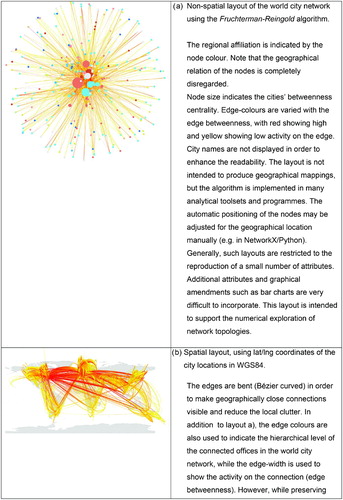
In contrast, conventional maps are intuitively interpretable with respect to spatial patterns. However, in cases where the nodes are drawn in their geographical position (cf. , the strong co-existence of spatial and network clustering (Hennemann, Rybski, & Liefner, Citation2012) produces heavy cluttering and poorly readable maps (cf. Ellis & Dix, Citation2007) unless filtering, edge-bending or other abstraction methods such as edge sampling (Rafiei & Curial, Citation2005) are used (cf. appendix 1 in Liefner & Hennemann, Citation2011, or Liu, Neal, & Derudder, Citation2012, for examples of fixed node conventional maps). Flow maps of this type have been used frequently since they were introduced in 1869 by Charles Joseph Minard. To compensate for the obstacles in the context of complex and dense relational information, flow maps are also co-presented along with other techniques such as line density raster maps (cf. Rae, Citation2009).
Flow maps that employ edge-bundling, i.e. those that combine and bend the edges to avoid visual clutter, reflect a recent development towards a combination of geographical location and networks attributes in conventional maps. However, most edge-bundled flow maps are still drawn by hand and only a small number of algorithms exist that are capable of reproducing complex systems in geographical spaces (cf. Holten & Van Wijk, Citation2009; Phan, Xiao, Yeh, & Hanrahan, Citation2005; Verbeek, Buchin, & Speckmann, Citation2011). Furthermore, flow maps are also restricted in their ability to reproduce dense complex networks and are mainly used to show an egocentric perspective, i.e. one main place of origin that interacts with many places.
Other approaches use significant abstraction on both the network information and the geographical information to produce cartograms of geographical networks (Derudder, Taylor, Witlox, & Catalano, Citation2003). One recent example of this type of reductionist and clear mapping of geographical information onto a network layout is provided by Vinciguerra, Taylor, Hoyler, and Pain (Citation2010). The authors use the famous medieval mappa mundi as an analogy to produce a clustered map of relations among global cities according to their intra-regional coherence and the importance of groups of cities for the global city network. However, the presentation is an abstraction of the relations and makes intensive use of reduction in order to maximise the readability. Therefore, the information provided on geographical order and positioning as well as the network information, is limited.
One alternative way to combine a coarse-grained geographical positioning and an information-rich layout is presented with the circular alignment of nodes according to their regional location (firstly, grouped by continent, and secondly sub-ordered according to the longitude from west to east, cf. . Usually, radial tree or circular layouts are not applied to reproduce geographical relations. They receive wider attention in social network analysis (e.g. U.S. Congress voting patterns in Porter, Mucha, Newman, & Warmbrand, Citation2005). Radial tree layouts are most frequently used to show ego networks (e.g. Social relations in Facebook, Chen & Yang, Citation2010). A recent example, very impressive due to its high information density, is the chord diagram that was introduced by Krzywinski et al. (Citation2009) to map genomes.
The relative simplicity of the layout and the similarity to cartographic polar projections can be used to combine location and network information in one visualisation in geographical mapping.
2. Methods
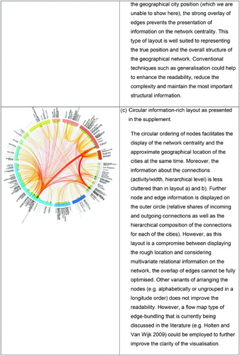
The method presented is based on data from the Globalisation and World Cities (GaWC) research network, which seeks to quantify city positions based on their position in the office networks of advanced producer services (APS) firms such as banks, insurance companies and consultancy firms (cf. Taylor, Citation2001 and the subsequent literature drawing on this method). The GaWC data are optimised for calculation as an interlocking network model (INM), which is essentially a bipartite/two-mode graph (Liu & Derudder, Citation2012). However, because one-mode graphs are much easier to handle numerically, two-mode graphs are often collapsed into one-mode graphs (cf. Figure 2), albeit at the expense of heavy density in terms of clustering and cross-connectivity (Newman & Park, Citation2003). Hennemann and Derudder (Citation2012) propose a primary linkage algorithm (PLA) that almost completely preserves the idea of firm networks making up the world city network along the lines of the INM. Instead of projecting the two-mode network, they use the metaphor of control and directive power in such firm networks in order to reduce the total number of (less meaningful) connections through a system in which two offices of a firm are connected only if they represent different hierarchical level functions (e.g. local country offices and global head-quarters). The connection is directed towards the higher hierarchical level in order to indicate a ‘reporting’ relation (i.e. lower-level offices report to higher-level offices). If, for example, the office of firm F1 in city C3 were the headquarters office location of the firm network, the PLA would only create connections from C1, C2 and C4 to C3 and would not fully cross-connect all city nodes (connections C1–C2, C1–C4 and C2–C4 would be skipped). The PLA would, therefore, not project all present links in for conceptual reasons, allowing for the different hierarchical levels of the firm nodes. This has numerical calculation advantages, but also reduces the visual clutter from the very beginning on the basis of a conceptual consideration rather than a visual reduction at arbitrary thresholds.
Figure 2. Example of a projected two-mode network into a one-mode network that contains the cities that are linked through common firms.
For the purpose of the circular mapping of the global city connectivity and network centrality, there were four main steps of data preparation following data gathering:
| 1. | The main information in the original data is the categorisation of the hierarchical levels of the offices in the 308 cities captured (see Taylor, Derudder, Hoyler, & Ni, Citation2012, for a detailed description of the dataset). To this end, the primary linkage algorithm of Hennemann and Derudder (Citation2012) was used to create a graph of global city office networks of 58 advanced producer service firms. | ||||
| 2. | This network was used to calculate all necessary parameters, such as the number of incoming/outgoing connections, as well as the degree and betweenness centrality of cities (using the algorithms suggested in Brandes, Citation2008). | ||||
| 3. | All 308 cities were aligned in a circular form according to their longitude coordinates, grouped according to their continental location and connected using the network information. The continental grouping acknowledges the spatial organisation principle of most multinational firms (cf. Hennemann & Derudder, Citation2012). The size/width, colour and opacity/transparency of nodes and edges were varied in order to reduce visual cluttering. Other node alignments (e.g. alphabetical order of cities, leaving out the continental grouping) did not produce more intuitive results, because the geographical information was either completely lost or distorted to a large extent (e.g. Minsk and Johannesburg are mapped next to each other). | ||||
| 4. | Additional information, such as the ratio of incoming and outgoing reports of each city and the level of the hierarchical connections, is displayed around the inner circle. | ||||
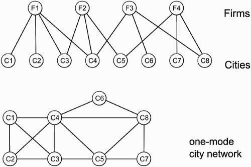
This leads to three distinct parts, as shown in . Firstly, there is the inner circle that contains the connections and uses a Bézier curve style. Secondly, there are the basic node attributes, such as connectivity (degree centrality) or influence (betweenness centrality). Thirdly, additional attributes of the nodes are displayed for deeper analytical purposes (e.g. the detailed fraction of incoming and outgoing connections based on the hierarchical level of the sender/receiver).
Figure 3. Basic structure of the information-rich circular layout for spatial network data.
All this information was drawn through to the scalable vector graphics (SVG) standard that easily allows for transforming (e.g. rotating) elements such as text, lines, boxes, or circles. Generally, SVG offers a broad variety of graphical elements for producing visualisations which can be further processed in many open-source and commercial programmes. SVG can handle static as well as dynamic images, and is highly modular and suited to interactive processing on websites, which is becoming increasingly important (cf. Peng & Zhang, Citation2004).
3. Conclusions
The problematic presentation of network data that include geographical properties requires new methods that are able to circumvent visual clutter and unappealing layouts. Pure network layouts cannot represent networks that go beyond simple node/edge information representation, while geographical maps are not a suitable vehicle either. Here, a mediating approach of reduced geographical accuracy was presented in a way that involves a grouped order of cities in global regions using the longitude value for the positioning of the cities on a full circle. The cities' network attributes (such as centrality measurements) are varied with the size of the city representations. The relational information of the city-to-city connections can then easily be drawn, avoiding too much clutter. This was supported by the use of semi-transparent Bézier curves. The most interesting feature of the circular layout is its capacity to put additional information in one or more outer rings of the core. In the case of any multivariate visualization exercise, however, it is necessary to challenge the information density of the presentation. This addresses the clarity of the layout as well as the number of variables displayed. But compared to a pure structural data presentation, relational and attribute data inherently have multiple dimensions that need to be accounted for to comprehend even the basic idea of the information.
Another challenging aspect is the overall appeal in a gestalt sense. The circular layout needs to be evaluated in order to prove its readability to a wider audience. This includes alternative arrangements of the nodes, such as alphabetically or purely according to longitude coordinate, as well as real cartography polar projections or three-dimensional layouts. Therefore, any application of similar design approaches to spatial networks is welcomed.
Taken together, a circular layout enables the analyst/researcher to put much more information on the geographical network into the static figure that is otherwise only possible with dynamic or three-dimensional layouts. However, this comes at the expense of largely hand-crafted production processes, since there is currently no out-of-the-box tool that has automatic production layouts. Moreover, the circular layout restricts the number of nodes which can be displayed to several hundred. The visualisation of several thousand nodes would require considerably higher abstraction or completely different approaches to the visualisation of geographical networks.
In this regard, Holten (Citation2006) provides an interesting solution for a non-geographical flow map that could be combined with the approach presented here.
Supplemental Material
Download PDF (1.4 MB)Acknowledgements
The author would like to thank Ben Derudder for sharing the dataset and for providing valuable comments on an earlier version of this article. The encouraging comments and suggestions of three reviewers are also very much appreciated.
Software
The data organisation and preparation (i.e. primary linkage algorithm), data analysis, network calculation (NetworkX) and SVG code generation were realised using Python.
The circular layout was inspired by works compiled in Manuel Lima's book on visual complexity mapping (Lima, Citation2011). Further file transformation was conducted using Inkscape. The final map was produced with Adobe Illustrator CS3.
Related Research Data
References
- Barthélemy, M. , 2011. Spatial networks , Physics Reports 499 (1) (2011), pp. 1–101, Retrieved from http://dx.doi.org/10.1016/j.physrep.2010.11.002.
- Brandes, U. , 2008. On variants of shortest-path betweenness centrality and their generic computation , Social Networks 30 (2) (2008), pp. 136–145, Retrieved from http://dx.doi.org/10.1016/j.socnet.2007.11.001.
- Chen, I.-X. , and Yang, C.-Z. , 2010. "Visualisation of social networks". In: Furht, B. , ed. Handbook of social network technologies and applications . 2010. pp. 585–610, Retrieved from http://dx.doi.org/10.1007/978-1-4419-7142-5_27.
- Derudder, B. , Taylor, P. J. , Witlox, F. , and Catalano, G. , 2003. Hierarchical tendencies and regional patterns in the world city network: A global urban analysis of 234 cities , Regional Studies 37 (9) (2003), pp. 875–886, Retrieved from http://dx.doi.org/10.1080/0034340032000143887.
- Ellis, G. , and Dix, A. , 2007. A taxonomy of clutter reduction for information visualisation , IEEE Transactions on Visualization and Computer Graphics 13 (6) (2007), pp. 1216–1223, Retrieved from http://dx.doi.org/10.1109/TVCG.2007.70535.
- Fruchterman, T. M. J. , and Reingold, E. M. , 1991. Graph drawing by force-directed placement , Software Practice and Experience 21 (11) (1991), pp. 1129–1164, Retrieved from http://dx.doi.org/10.1002/spe.4380211102.
- Hennemann, S. , and Derudder, B. , 2012. (2012), An alternative approach to the calculation and analysis of connectivity in the world city network, arXiv:1206.6214v1 [physics.soc-ph]. Retrieved from http://arxiv.org/abs/1206.6214v1.
- Hennemann, S. , Rybski, D. , and Liefner, I. , 2012. The myth of global science collaboration - Collaboration patterns in epistemic communities , Journal of Informetrics 6 (2) (2012), pp. 217–225, Retrieved from http://dx.doi.org/10.1016/j.joi.2011.12.002.
- Holten, D. , 2006. Hierarchical edge bundles: Visualization of adjacency relations in hierarchical data , IEEE Transactions on Visualization and Computer Graphics 12 (5) (2006), pp. 741–748, Retrieved from http://dx.doi.org/10.1109/TVCG.2006.147.
- Holten, D. , and Van Wijk, J. J. , 2009. Force-directed edge bundling for graph visualization , Computer Graphics Forum 28 (3) (2009), pp. 983–990, Retrieved from http://dx.doi.org/10.1111/j.1467-8659.2009.01450.x.
- Kamada, T. , and Kawai, S. , 1989. An algorithm for drawing general undirected graphs , Information Processing Letters 31 (1) (1989), pp. 7–15, Retrieved from http://dx.doi.org/10.1016/0020-0190(89)90102-6.
- Krzywinski, M., Schein, J., Birol, I., Connors, J., Gascoyne, R., Horsman, D., Jones, S. J., & Marra, M. A. (2009). Circos: An information aesthetic for comparative genomics. Genome Research, 19(9), 1639–1645. Retrieved from http://dx.doi.org/10.1101/gr.092759.109.
- Liefner, I. , and Hennemann, S. , 2011. Structural holes and new dimensions of distance: The spatial configuration of the scientific knowledge network of China's optical technology sector , Environment and Planning A 43 (4) (2011), pp. 810–829, Retrieved from http://dx.doi.org/10.1068/a43100.
- Lima, M. , 2011. Visual complexity: Mapping patterns of information . New York: Princeton Architectural Press; 2011.
- Liu, X. , and Derudder, B. , 2012. Two-mode networks and the interlocking world city network model: A reply to neal , Geographical Analysis 44 (2) (2012), pp. 171–173, Retrieved from http://dx.doi.org/10.1111/j.1538-4632.2012.00844.x.
- Liu, X. , Neal, Z. , and Derudder, B. , 2012. Featured graphic. City networks in the United States: A comparison of four models , Environment and Planning A 44 (2) (2012), pp. 255–256, Retrieved from http://dx.doi.org/10.1068/a44496.
- Newman, M. E. J. , and Park, J. , 2003. Why social networks are different from other types of networks , Physical Review E 68 (3) (2003), pp. 1–8, Retrieved from http://dx.doi.org/10.1103/PhysRevE.68.036122.
- Peng, Z.-R. , and Zhang, C. , 2004. The roles of geography markup language (GML), scalable vector graphics (SVG), and Web feature service (WFS) specifications in the development of Internet geographic information systems (GIS) , Journal of Geographical Systems 6 (2) (2004), pp. 95–116, Retrieved from http://dx.doi.org/10.1007/s10109-004-0129-0.
- Phan, D. , Xiao, L. , Yeh, R. , and Hanrahan, P. , 2005. Flow map layout (2005), Proc. IEEE Symposium on Information Visualization (INFOVIS '05), 219–224.
- Porter, M. A. , Mucha, P. J. , Newman, M. E. J. , and Warmbrand, C. M. , 2005. A network analysis of committees in the U.S. house of representatives , Proceedings of the National Academy of Sciences of the United States of America PNAS 102 (20) (2005), pp. 7057–7062, Retrieved from http://dx.doi.org/10.1073/pnas.0500191102.
- Rae, A. , 2009. From spatial interaction data to spatial interaction information? Geovisualisation and spatial structures of migration from the 2001 UK census , Computers, Environment and Urban Systems 33 (3) (2009), pp. 161–178, Retrieved from http://dx.doi.org/10.1016/j.compenvurbsys.2009.01.007.
- Rafiei, D. , and Curial, S. , 2005. Effectively visualizing large networks through sampling , 16th IEEE Visualization 2005 (2005), pp. 48–55, Retrieved from http://dx.doi.org/10.1109/VISUAL.2005.1532819.
- Taylor, P. J. , 2001. Specification of the world city network , Geographical Analysis 33 (2) (2001), pp. 181–194, Retrieved from http://dx.doi.org/10.1111/j.1538-4632.2001.tb00443.x.
- Taylor, P. J. , Derudder, B. , Hoyler, M. , and Ni, P. , 2012. New regional geographies of the world as practised by leading advanced producer service firms in 2010 , Transactions of the Institute of British Geographers, early view (2012), Retrieved from http://dx.doi.org/10.1111/j.1475-5661.2012.00545.x.
- Verbeek, K. , Buchin, K. , and Speckmann, B. , 2011. Flow map layout via spiral trees , IEEE Transactions on Visualization and Computer Graphics 17 (12) (2011), pp. 2536–2544, Retrieved from http://dx.doi.org/10.1109/TVCG.2011.202.
- Vinciguerra, S. , Taylor, P. J. , Hoyler, M. , and Pain, K. , 2010. Featured graphic. Contemporary Mappa Mundi: American exceptionalism in the world city network , Environment and Planning A 42 (6) (2010), pp. 1271–1272, Retrieved from http://dx.doi.org/10.1068/a4352.