Abstract
In mapping population characteristics, data are usually portrayed as accurate without error. However, many population datasets provide estimates derived from surveys or samples, and a certain level of uncertainty is associated with each estimate. Ignoring estimated uncertainty information in mapping may produce misleading maps and generate spurious spatial patterns. In this paper, we introduce a measure of separability to indicate the likelihood that units assigned to different classes are truly different statistically. A series of map symbolization techniques is proposed to communicate class separability to the cartographer or map reader, and presented in four series of maps of American Community Survey data on median household income for Iowa counties. These map series illustrate several different techniques: a legend designed to communicate separability between classes, graduated line symbols to communicate separability between individual map units, and a color scheme in which perceptual color differences are related to class separability. Each map series presents three alternative classifications to illustrating how the proposed symbolization techniques could assist a cartographer in choosing the more preferable classification scheme.
1. Introduction
Survey data, such as some of the decennial census data for 2000 and earlier, the American Community Survey (ACS) data and the Current Population Survey (CPS) data, all contain significant levels of uncertainty. Mapping these data without considering their levels of uncertainty may lead to erroneous conclusions and wrong decisions. In this paper, we develop a statistical measure and associated cartographic symbolization methods to display uncertainty in class boundaries on a choropleth map.
A primary motivation for this research is the recent changes that have occurred in the decennial census of the United States. The decennial census represents a major source of data describing demographic population and housing characteristics used by cartographers. Historically, magnitudes of error associated with US decennial census data have been relatively small as compared to other sources of demographic-population and socioeconomic data. However, the 2010 US Census marked a new era in that detailed socioeconomic and housing data were no longer gathered through the so-called ‘long-form’, which was received by approximately one in six households. Such data are now gathered through the ACS, a continuous measurement program that collects data from approximately 2% of US population each year.1 Similar to other population survey data such as CPS, or health survey data such as the National Health and Nutrition Examination Survey or the Behavioral Risk Factor Surveillance System data, ACS data provide finer temporal resolutions but at the expense of appreciated levels of uncertainty.
In most ACS data products, the 90% margin of error (MOE) for the estimate of each survey variable and each areal unit is provided to indicate the reliability of the estimate. Using these estimates should take into account the associated MOEs or similar reliability measures such as the coefficient of variation (CitationCitro & Kalton, 2007). However, when decennial census data are used to create choropleth maps, their quality is rarely questioned: areal units assigned to different classes are expected to have census estimates significantly different from each other, and spatial patterns are formed based upon these estimate differences. However, if estimates have varying levels of uncertainty, census units assigned to different classes may not be statistically separable and the spatial patterns of census variables exposed by the maps may be fictitious.
Communication of spatial patterns of variation is a key objective of choropleth maps. Therefore, choice of classification method should take into account the statistical degree of separation between classes. There have been some attempts to do this. Early researchers noted that the number of map classes should be limited, so as not to suggest more certainty than is warranted by the data (CitationJenks & Coulson, 1963). A formal method to determine the statistically significant number of class breaks was recently proposed (CitationNorth, 2009).
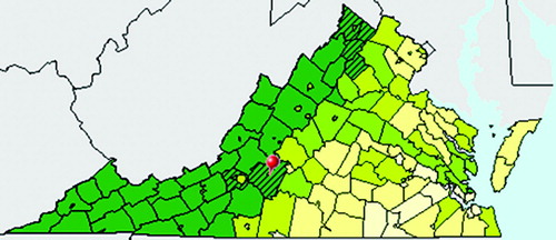
Techniques have also been developed to display the uncertainty associated with each map unit individually (CitationXiao et al., 2007). Many analysis tasks, however, involve comparison across two or more map units. The US Census Bureau's American FactFinder web mapping tool2 recently allowed users to view pairwise uncertainty associated with a predefined map unit (), but this requires designation of a single map unit of interest.
Figure 1. Choropleth map of Percent of Population who are White Alone, taken from the US Census Bureau American FactFinder web mapping tool. Counties with diagonal lines have values that are statistically indistinguishable from the user selected county, shown with a red pushpin.
Ideally, a map should allow users to determine if any given pair of map units has a statistically significant difference in values. This is difficult to achieve for every pairwise combination, but readers will generally infer that observations in different classes have significantly different values. Therefore, a statistical measure of the degree to which different classes have significantly different values may serve as a criterion with which to assess the quality of a classification scheme. For this reason, we develop a measure of the statistical separability between map classes that aims to help avoid misleading comparisons. We then develop associated symbolization techniques to communicate this statistical separability on a choropleth map.
One possible application of the proposed approach is to assist cartographers in choosing between alternative classification schemes. We illustrate this application by comparing class separability of census data for the state of Iowa using three different classification schemes: natural breaks, equal interval, and quantile. Although the original natural breaks algorithm maximizes class separation when data values are certain, it may not maximize separability when data values are uncertain (CitationSun and & Wong, 2010).
Although cartographers are sometimes reluctant to acknowledge potential map errors, uncertainty display can be useful in facilitating communication and task performance (CitationKronenfeld, 2005; Leitner and & CitationButtenfield, 2000, CitationKronenfeld 2005). Knowledge of uncertainty leads decision-makers to avert potential losses (CitationHope and & Hunter, 2007). In fact, uncertainty in maps is part of the larger issue of errors inherent in spatial data, something that we have to live with and was acknowledged more than two decades ago by CitationOpenshaw (1989). Many cartographers have proposed visualization methods for depicting uncertainty (e.g. CitationLeitner and & Buttenfield, 2000), but the development of representation methods appropriate to specific types of analysis and decision making remains an important challenge (CitationMacEachren et al., 2005).
2. Methods
2.1 Separability index definition
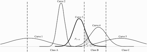
Previous research has defined the robustness of a classification as a function of the statistical confidence that the value of each spatial unit actually falls into the class interval to which it is assigned (CitationXiao et al., 2007). Rather than define uncertainty on a class-by-class basis, we sought to define a measure of separability between two classes A and B which could be used to visually enhance class breaks on the map and legend. We refer to this as a separability index. There are many ways that such a separability index could be defined. For the purposes of this research, the index is defined as the mean probability that observations assigned to A and B do not actually belong to the ‘“other’” class (i.e. that observations assigned to A do not actually belong to B, and vice versa).
Formally, given two classes A and B, let P (xi
: A↔B) denote the probability that observation i is assigned to class A but actually belongs to class B or vice versa (or zero if observation i is not assigned to either class). This probability is illustrated by the shaded area in for observation three, which is assigned to class A but has a significant probability of actually belonging to class B. In this case, A and B do not have to be adjacent classes. With nA and nB referring to the numbers of observations belonging to class A and class B respectively, then, our separability index is defined as the average of these areas for all observations:(1)
Figure 2. Illustration of probabilities used to define separability index. See text for details.
2.2 Cartographic symbolization
Three cartographic techniques were developed to communicate uncertainty as measured by separability index values between classes: (a) an augmented legend providing explicit information on class separability, (b) a color sequence whereby perceptual color differences signify separability, and (c) boundary symbolization using value and width to communicate separability between adjacent map units.
2.2.1 Legend augmentation
A map legend was designed to explicitly communicate separability values between adjacent classes. In addition to the standard information of matching colors to specific class values in a traditional legend design, we can include separability levels between adjacent classes derived from Equation. 1 into the legend design. Traditionally, ranges of values are on the right next to the color pallets in the legend. A logical approach is to show the separability index values on the left of the color pallet, but between two color boxes. Such legend design will communicate clearly how separable neighboring classes are.
2.2.2 Color definition
Ordinarily, colors on a choropleth map are chosen to maximize distinction between adjacent classes. Colors that are difficult to distinguish are considered an impediment to map interpretation. However, under conditions of data uncertainty, lack of distinguishability may itself be used as a communication method. This can provide a strong visual cue to the degree of separability, making some classes stand out while others blend together.
Formally, we defined a perceptual color gradient on a scale of 0 to 1 using the Lab color system. Let the q-1 sequential separability index values be denoted as S
1
, S
2
, …, S
q-1
. Then, the color assigned to each class k was determined by the following formula:(2) With this method, perceptually less distinct color differences signify a low separability index between classes, while high separability is marked by more distinct colors.
2.2.3 Boundary symbolization
Class separability was also communicated directly along boundaries between units assigned to different classes. Two approaches were tested: symbolization using darkness values, and symbolization using line thickness. To avoid interference between boundary colors and fill colors, symbolization using darkness values was implemented using grayscale.
2.3 Application to census data
To explore and illustrate the effectiveness of these methods in communicating data uncertainty information, we used the 2006–2010 five-year ACS data of median household income for Iowa counties. Each estimate in ACS data is accompanied by a margin of error (MOE) indicating the reliability of the estimate. Using the MOE, the probability distribution of each estimate was recreated, similar to the curves in . Three standard classification methods – natural breaks, equal interval and quantile – were applied to the data, and separability indices between all pairs of classes were calculated from the probability distributions.
Four map series were created to illustrate how different methods of symbolizing uncertainty would affect selection of an appropriate classification scheme. The colors for all classification schemes were based upon a well-known standard color scheme.3 The first map series was used to illustrate the decision-makers dilemma when no uncertainty information is presented. In this series, no information on class separability was displayed. The second map series applied legend augmentation and use of perceptual color difference to denote separability. For the third and fourth map series, legend augmentation was combined with symbolization of separability between map units using boundary darkness values and boundary width, respectively.
3. Discussion
The first map series may be regarded as standard map products without considering the reliability of the estimates. Readers will likely interpret that values of observations in each class are truly different from values of observations in other classes, and there is little information to assist in selecting among the three classification schemes.
The remaining map series use the same data and the same classification schemes, but incorporate estimated reliability information. Separability levels between each pair of sequential classes, computed using Equation (2), indicate the extent that values assigned to the two neighboring classes are really different. In general, the higher the level of separability, the more desirable is the classification scheme as observations are more likely to be classified correctly. The legend in each of these three map series was augmented by including separability index values on the left at each class break. This makes it apparent that different classification schemes produce classes with different levels of separability. Separability index values for the natural breaks, equal interval and quantile methods ranged from 55.56% to 70.71%, from 61.50% to 81.75%, and from 47.06% to 61.54%, respectively. These statistics suggest that the equal interval method gives us the highest overall certainty that observations are assigned to the correct classes. This conclusion is applicable to this particular data set only. Other factors that affect the performance of classification in assigning observations into the correct classes include, but not limited to the number of classes, and definitely how separability is evaluated.
The second map series further communicates separability by using colors to highlight which classes in each map are most separable. In the natural breaks classification, for example, the lowest two classes are displayed using very distinct colors, and are more easily distinguished than the lowest two classes of either of the other two classifications. The danger of this approach is that map readers may not be able to discern colors associated with two adjacent classes if they are not highly separable in a statistical sense. Another problem is that the rendering of perceptual coloring scheme is display-device dependent and difficult to replicate with precision.
In the third map series, boundary colors are scaled according to levels of separability so that boundaries with darker colors indicate that the two adjacent units belong to classes that are more statistically separable. This method cannot directly communicate the degree of uncertainty associated with non-adjacent pairs of map units, but is especially useful at the local level analysis when readers want to compare if neighboring units really have different values. The effectiveness of this symbolization is dependent on darker boundaries being visually more distinct than lighter boundaries, and one must be careful not to interpret light boundaries between dark map units as indications of high separability.
The fourth map series illustrates an alternative symbolization using varying boundary thickness rather than darkness. The message of separability is communicated clearly and boldly by this method, even if the thick lines may overpower other map elements. For instance, the bold lines indicate that the relatively high-median household income levels of several counties in south-central Iowa are very likely higher than the income levels of most surrounding counties. For both the third and fourth map series, an additional legend element displays the relationship between separability index values and boundary symbol.
4. Conclusions
Selection of an appropriate classification method is a key step in the production of choropleth maps, and one for which data uncertainty may affect the best outcome. However, current widely used mapping software programs do not communicate any information on classification uncertainty. The map series presented here illustrate several ways in which an index of separability between map classes can be used to differentiate classification schemes according to their ability to create statistically separate groups of map units. Appropriate use of map symbols can communicate specific regions that are better served by one classification scheme or another, providing more information than a single metric of overall separability or robustness.
The map series presented here utilize color separability, darkness values and line width individually to communicate separability. Further research is needed to explore ways to synchronize communication using multiple cartographic variables, as well as to assess the influence of cartographic symbolization of separability on map analysis and decision-making tasks.
Software
The census data were mapped using custom software built in Java using Geotools 8.0-M2. Computation and graphic procedures also utilized the Apache commons mathematics library 2.2, Java matrix package (Jama) 1.0.2, JCommons 1.0.6 and JFreeChart source code. Additional graphics editing was performed in Adobe Photoshop CS 5.1.
Supplemental Material
Download PDF (13.5 MB)Acknowledgements
The authors would like to thank the U.S. Census Bureau for its partial support of the research leading to the development of this paper. However, the authors are solely responsible for any errors contained herein.
Notes
http://factfinder.census.gov/home/saff/main.html, last accessed 12/21/2011
http://colorbrewer2.org/ (Brewer & Pickle 2002).
References
- Brewer, C. A. , and Pickle, L. , 2002. Evaluation of methods for classifying epidemiological data on choropleth maps in series , Annals of the Association of American Geographers 92 (4) (2002), pp. 662–681, Retrieved October 12, 2012, from http://dx.doi.org/10.1111/1467-8306.00310.
- Citro, C. F. , and Kalton, G. , 2007. Citro, C. F. , and Kalton, G. , eds. Using the American community survey: Benefits and challenges . Washington, DC: The National Academies Press; 2007.
- Hope, S. , and Hunter, G. J. , 2007. Testing the effects of thematic uncertainty on spatial decision-making , Cartography and Geographic Information Science 34 (3) (2007), pp. 199–214.
- Jenks, G. , and Coulson, M. , 1963. Class intervals for statistical maps , International Yearbook of Cartography 3 (1963), pp. 119–133.
- Kronenfeld, B. J. , 2005. Gradation as a communication device in area-class maps , Cartography and Geographic Information Science 32 (4) (2005), pp. 231–241, Retrieved October 12, 2012, from http://dx.doi.org/10.1559/152304005775194719.
- Leitner, M. , and Buttenfield, B. B. , 2000. Guidelines for the display of attribute certainty , Cartography and Geographic Information Science 27 (1) (2000), pp. 3–14, Retrieved October 12, 2012, from http://dx.doi.org/10.1559/152304000783548037.
- MacEachren, A. M. , Robinson, A. , Hopper, S. , Gardner, S. , Murray, R. , Gahegan, M. , and Hetzler, E. , 2005. Visualizing geospatial information uncertainty: What we know and what we need to know , Cartography and Geographic Information Science 32 (3) (2005), pp. 139–160, Retrieved October 12, 2012, from http://dx.doi.org/10.1559/1523040054738936.
- North, M. A. , 2009, August 14–16. A Method for implementing a statistically Significant Number of data classes in the Jenks Algorithm . Presented at Proceedings of the Sixth International Conference on Fuzzy Systems and Knowledge Discovery (FSKD ’09), Tianjin, China. 14–16, Aug, 2009, vol. 1, (pp. 35–38).
- Openshaw, S. , 1989. "Learning to live with errors in spatial Databases". In: Goodchild, M. F. , and Gopal, S. , eds. Accuracy of Spatial Ddatabases . London: Taylor and Francis; 1989. pp. 263–276, 263–276.
- Sun, M. , and Wong, D. W. S. , 2010. Incorporating data quality information in mapping American Community Survey data , Cartography and Geographic Information Science 37 (4) (2010), pp. 285–300, Retrieved October 12, 2012, from http://dx.doi.org/10.1559/152304010793454363.
- Xiao, N. , Calder, C. A. , and Armstrong, M. P. , 2007. Assessing the effect of attribute uncertainty on the robustness of Choropleth map classification , International Journal of Geographical Information Science 21 (2) (2007), pp. 121–144, Retrieved October 12, 2012, from http://dx.doi.org/10.1080/13658810600894307.