
Abstract
The assessment of natural events that can turn into disasters where people live is usually accompanied by maps visualising the specific topic in its spatial setting and putting the physical environment into the main focus. Such conventional mapping approaches, however, can often fail to give an intuitive understanding of the underlying quantitative dimension of the associated risk to people and a fuller appreciation of the interrelation between humans and their natural environment. The method presented here demonstrates an alternative way of mapping environmental risk. A gridded cartogram approach is introduced and illustrated with examples drawn from data documenting globally significant earthquakes that have occurred since 2150 BC. Gridded cartograms are a new map projection. They are created by starting with an equally distributed grid onto which a density-equalising cartogram technique is applied. Each individual grid cell is resized according to specific quantitative information. The underlying grid ensures the preservation of an accurate geographic reference to the real world. It allows gridded cartograms to be used as basemaps, new projections, onto which other information can be mapped. Earthquake intensity on a gridded population cartogram highlights those zones where most people live in these risk environments and minimises information about where earthquakes still occur, but where they matter less for human populations. Gridded cartograms also allow any other quantitative data to be used in the actual transformation. This is demonstrated with gridded cartograms from earthquake intensity data, resulting in very unusual depictions and new perspectives of the surface of the planet.
1. Introduction
Maps can be used as a crucial element in the description of the different spheres of human and physical geography. They can help to illustrate the phenomena that explain the environments we are living in. They can also hinder understanding. Physical space and conventional projections have in recent centuries been the starting point for the map depiction onto which phenomena such as earthquakes are normally mapped. But even simple physical space can adopt very different appearances in different conventional map forms, as the two-dimensional representation of a three-dimensional space requires certain compromises. Depending on the purpose of a cartographic depiction, the question of the appropriate map projection has always been an important element in the process of map making and has contributed to the changes that cartographic practice underwent in the course of its history.
Understanding the complex human-environment relationships through visualisation can be a central element of finding appropriate representations of the spaces in which these relationships happen. While map projections selection is often a search to find the best solution for translating the third dimension into a flat depiction of the earth, a focus on the cartographic display of space that looks beyond the constrained chains of the usual depictions of physical space can contribute to new insights and understandings of what CitationEhlers (2008) and others describe as the anthroposphere.
One increasingly popular way to visualise other aspects of space, not simply land area or compass direction, is to use area cartograms. There are many different ways to draw a cartogram, and basically – like other map projections – a cartogram is created by applying certain mathematical principles to transform a map or a map-like representation into the cartographic result. Design concepts for contiguous area cartograms are often particularly close to the wider field of other geographical map projections, because the transformation of the real geographical shape of an area stands in the centre of interest, and the relative geographical location remains preserved in some form. The implementation of algorithms that facilitate the digital creation of computer-generated contiguous cartograms has been demonstrated by a number of approaches since the first concepts were created at the GIS-pioneering institution of Harvard (CitationDougenik, Chrisman, & Niemeyer, 1985; CitationEdelsbrunner & Waupotitsch, 1997; CitationGastner & Newman, 2004; CitationGusein-Zade & Tikunov, 1993; CitationKocmoud & House, 1998; CitationTobler, 1986; CitationWolf, 2005).
2. Methods
The diffusion-based method for producing density-equalising maps published by CitationGastner and Newman (2004) describes one of the most substantial recent advances in the computer-generation of contiguous cartograms. Now over a decade old, this invention was dubbed as ‘one small step for two men, one giant leap for mapping’ by CitationDorling (Citation2006, p. 35). Their approach is based on principles of diffusion modelling in elementary physics which results in ‘useful, elegant, and easily readable maps’ (CitationGastner & Newman, 2004, p. 7499). Their so-called diffusion cartogram transfers the physics of a linear diffusion process into the process of a map transformation.
The diffusion equation used in Gastner/Newman's approach emulates what happens when a liquid flows from higher to lower densities to smooth out the differences. The density therefore is allowed to diffuse to create a uniform transition. In the map transformation, the same principle changes the shape of the geographical areas.
Gastner/Newman's method (like other cartogram approaches) is usually applied to countries or other larger administrative units. In a gridded cartogram as proposed in this paper, population (or another quantitative indicator) in an area is distributed onto an equally sized grid which is then resized according to the number of people in each small place while preserving the relative position of each grid cell towards its neighbouring cells. The key unit in the cartogram transformation thus is not an arbitrarily or artificially defined administrative or other area, but a defined section of a map, with each areal unit having the same geographical extent (see more details described in CitationHennig, 2013).
For a new gridded world population cartogram a 1/4° population grid was generated as the input data that is processed in the cartogram transformation. The number of grid cells covering the land area in this resolution totals up to 365,022 (out of an absolute number of 1,036,800 grid cells, which has been used in a separate approach covering the whole earth surface, much of this ocean). The actual cartogram transformation of the gridded data is then applied to the Gastner/Newman algorithm using a cartogram processing script in ArcMap (CitationGross, 2009).
Unlike conventional cartograms, gridded cartograms are capable of displaying additional layers of geographic information in exquisite detail because they are based on a very accurate and neutral areal unit. Any way of putting information on a conventional map can also be applied to putting information onto gridded cartograms. This can include any geographic subject with an allocation in the physical space, such as information about the risk environments that people live in.
3. Data
The occurrence of globally significant earthquakes is compiled in a database created by the National Geophysical Data Center of the US National Oceanic and Atmospheric Administration. The database
contains information on destructive earthquakes from 2150 B.C. to the present that meet at least one of the following criteria: Moderate damage (approximately $1 million or more), 10 or more deaths, Magnitude 7.5 or greater, Modified Mercalli Intensity X or greater, or the earthquake generated a tsunami.
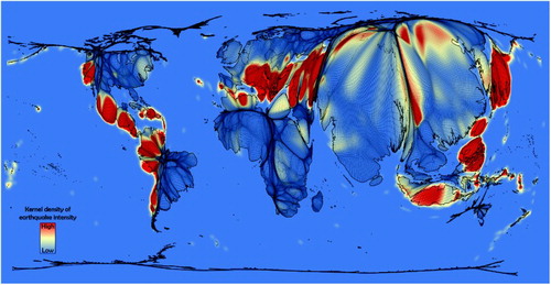
Using a kernel-density estimation, the probability of earthquake occurrence can be calculated from that data (CitationHengl, 2009). This method does not only help to define areas historically most exposed to seismic risk as demonstrated in seismological studies (see e.g. CitationDanese, Lazzari, & Murgante, 2008), but also helps to generate a consistent spatial layer of data over land. This layer contains information about the highest concentration of seismic activity based on these records. It is suitable for a visualisation of land areas globally that are most exposed to earthquake risk (see reference map in Main map). Due to the uncertain nature of historic records, the visualised information is generalised and distinguishes only between higher and lower intensities, rather than adding absolute values to the scale that may imply a misleading accuracy within the data. This layer of earthquake intensity can then be projected onto the gridded population cartogram.
In addition, the gridded cartogram approach has also been tested for its suitability to show the physical environment in cartogram-style maps with a sole focus on the quantitative nature of the physical space. Rather than using the earthquake intensity as an additional layer reprojected on a gridded population cartogram, the concept of the additional two map approaches uses the quantitative information of the historic earthquake occurrences within a grid cell as the defining indicator for the cartogram transformation. This has been realised in two ways: (1) using the earthquake data for the land area only (like in the gridded population cartogram), and (2) using a grid covering the whole earth surface including the sea areas.
In all three gridded cartogram approaches, the resulting map retains the contiguity of the grid cells and preserves their relative geographical location, while it also conserves its original geographical shape. The same principle works with any other geographical unit, and on any other geographical scale, as long as a consistent set of data is available (CitationHennig, 2013).
4. Map design
The visual presentation of a cartogram is a crucial element in the process of creating these maps. Because of their – compared to conventional maps – more unusual form, a conscious reflection on the design elements and the possibilities they offer is inevitable if we are to produce meaningful and understandable maps. In the visualisation of the gridded cartograms created in the context of the research that resulted in this paper, a special focus was put on criteria that take special consideration of density-equalising cartograms (as outlined by CitationOyana, Rushomesa, & Bhatt, 2011). Design decisions were also made with regard to the specific graphic features of the gridded cartograms and how these are implemented.
The design decisions were set in a consistent manner within the maps created for the whole research project to allow an easy comparison of all results and applications without a distorted view caused by changing design principles. The design principles were carefully evaluated before applying them (further details are outlined in detail in CitationHennig, 2013). The map orientation was oriented on the widely used conventional map projections. The Prime Meridian therefore stands in the centre of the north-south oriented map. The graticule was visualised to highlight its changing location on the distorted areas. As the key characteristic that explains where the physical space has been distorted to some extent, the visualisation of the grid is essential for the map understanding. Country boundaries and in two of the three maps colouring the administrative areas were used as design elements that support a faster orientation in the transformed map. The country colour scheme was adapted from the Worldmapper Project (CitationDorling, 2007; CitationSasi Research Group & Newman, 2006), which was used in all those maps where no additional thematic layer is shown. This allows an easier orientation in the map by distinct country colours and similar colour hues for the major world regions. Furthermore, bathymetric information (of the topography of the oceans) was included in the visualisation of earthquake intensity over land to enhance the visual appeal and enhance the readability by retaining a certain element of familiarity in the map.
5. Results
Gridded population cartograms as presented in the Citationmain map and show land area distorted to the extent that every human being living on that surface is given the same amount of space on the map. The global earthquake intensity reprojected using a gridded population cartogram transformation highlights those zones where most people live in these risk environments, while less populated earthquake-risk zones get less space as they are less relevant when it comes to human populations being affected by an earthquake event. The first map () visualises these vulnerable populations in their real quantitative extent in relation to the global earthquake intensity (as included in conventional form as a reference in the main map of this paper).
Figure 1. Global earthquake intensity on a gridded world population cartogram.
When transforming additional layers of geographic information, the topics being highlighted can be interpreted accordingly and thus provide a deeper understanding of the topic in relation to the world population. In areas with few people, this additional layer is reduced in size because it does not relate directly to a larger amount of people. However, it is important to understand that the underlying information is not removed in these areas of low population, but reduced in size. All original grid cells are still part of the resulting transformed map.
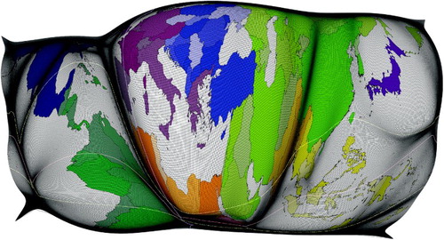
Gridded cartograms are not limited to using population as a base but allow any quantitative geospatial data to be used in the actual transformation. Creating gridded cartograms from historic earthquake records results in an unusual depiction of these spaces. Such maps were created in two ways, firstly using a grid over the land area and over the whole earth surface as input areas for the cartogram transformation.
The transformed map restricted to land area () shows some very extreme distortions while the second visualisation based on an overall global grid including the sea areas () is even more abstract because the areas in most of the oceans and the seas (where no historic earthquake records exist) disappear completely. Only the seas in coastal areas directly adjacent to land are shown here. Despite the unusual appearance of the world in this image some familiar country shapes like Italy or Japan remain recognisable in both maps and help viewers to read it once accustomed to the underlying mapping concept.
Figure 2. Gridded cartogram of earthquake intensity over land.
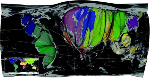
Figure 3. Gridded global earthquake intensity cartogram.
6. Conclusions
Displaying the natural environment as an additional layer upon the human space reverses the idea of conventional maps. A conventional map often shows the social space transformed onto the physical space. The gridded cartogram approach presented in this paper shows the physical space transformed onto the social space of humanity, as well as the physical space transformed to an extent that makes other spatial quantities than land area visually comprehensible. This can be of value when trying to understand the relationship between human actions and their surrounding environment. It can help to see a clearer picture of how humanity is influenced and affected by its natural environment, and it can also be valuable to form a better understanding of how quantitative information compares in its spatial dimensions.
The underlying information about risk-prone areas visualised in these maps adds to the way we see earthquake hazards and how we assess their differing quantitative extents across the continents. Using a gridded population cartogram as a basemap provides an alternative way of highlighting the most populated spaces and helps to understand the interrelation of environmental risks and human populations in a newly enlightened visual way, one that conventional map projections simply cannot show. These cartographic innovations broaden the spectrum of how geospatial information can be both shown in different ways and understood in different ways.
Whether this approach is more or less useful depends a lot on what the purpose of the cartographic display is. Gridded population cartograms are not simply, of themselves, a better way of visualising data, but they can be appropriate when the relation between high population densities and other spatial information require to be demonstrated in a visual way, reducing the almost wasted space of unpopulated areas in the map.
There are weaknesses and constraints to this new mapping. Data need to be carefully evaluated and processed before they are suitable for a gridded cartogram transformation. Gridded cartograms allow no gaps or inconsistencies in the underlying basedata, as this would result in a misrepresentation. Missing data therefore is not acceptable for this approach. The level of detail shown in a map of earthquake intensity remains limited due to its global scale, which is not unique to the cartogram display and a common (and wanted) feature of global depictions in other map types. Nevertheless, where additional space is created in the most densely populated areas more detail becomes visible compared to a mere physical map (while in turn, detail of the sparsely populated areas gets lost).
The most extremely distorted maps presented here that go beyond visualising earthquake risk in relation to population may appear very unusual and provocative to the reader. Partly, this can be explained with the novelty of the approach taken, and the current rarity of gaining sight of such maps in most academic as well as other works. There is a very general problem of acceptance as well as the less common reading skills that people, especially many cartographers, have of cartograms. Furthermore, the technique described here may be regarded as a rather conceptual exercise and some of the discussion may be perceived to be of a more theoretical nature. Both limitations show the need for the further case studies into the practical use of the method and its application in academic and also professional works (discussed in further detail in CitationHennig, 2013).
CitationTobler (Citation2004) dismisses suggestions of a difficulty in reading cartograms (see e.g. CitationRoth, Woodruff, & Johnson, 2002) but sees problems with the general manner that many people approach cartograms. He emphasises that some of these difficulties vanish when cartograms are seen as a map projection, rather than a graphic representation of data. He also refers to techniques to augment additional information onto different types of cartograms to enhance readability, but also to increase the analytical value, and calls for additional efforts in advancing the visual and analytical capabilities of cartograms. A map reader who sees these maps just as any other map projection and is able to understand the grid patterns intuitively and read the maps for their content rather than unusual shape, will more often than not succeed in understanding why the depictions shown here are revealing patterns that conventional maps simply cannot reveal.
Gridded cartograms go beyond the diagrammatic character of conventional cartograms because of their ability to use the cartogram as a basemap, a new projection, and being able to display accurate and geographically correct thematic layers. Preserving topology accurately is a rare feature in most cartogram types, which explains some of the widely perceived limitations. These limitations are overcome with the technique proposed here, so that the focus of the visualisation can move on to the wider applicability of such maps. Earthquake risk is an example that demonstrates the versatility by connecting issues of human and physical geography in cartogram form, which could not be achieved in this form before.
The complaint that these are merely theoretically interesting maps but of little practical use should be dismissed. This is especially the case with the already more advanced example of the gridded population cartogram. With improved increased map literacy the problem of decrypting the actual map shapes can be overcome when the map-reader becomes more familiar with the map shape. We learn how to read conventional maps. To make more sense of gridded cartograms, we have to equally learn where places are and what the map tells us. Gridded cartograms are not meant to guide us from A to B (although there may be possibilities to apply this technique so it becomes useful for this purpose as well), but to guide our understanding of the world, so that one major purpose of such mapping approaches should be seen as an educational tool that can raise our awareness for our relation to the environment.
While a conventional map shows the physical distribution of earthquake intensity, many of the most intense earthquakes occur in remote areas. The Citationmain map introduced in this paper shows the exposure of global populations to earthquake risk without overemphasising those spaces where only few people live (another possibility would be the reverse image of an earthquake risk map of remotest places). Both this and the more unconventional approaches are valid and useful, but look at the issue from very different angles that provide valuable visual material for use in teaching and education of geographic literacy and understanding.
We are living in an age where human action and interaction with their natural environment plays a key role in the future fate of the planet and of our species. Nature is not only put at risk by human action, but nature can also put human lives and livelihoods at risk (CitationRowe, 2011). The gridded population cartogram can be used to display the direct risk under which most people are living. Many natural factors are relevant in this regard, and for each natural event such risk maps can be drawn and shown in such novel way.
The examples presented here demonstrate, that cartograms are more than just a diagram-style tool relevant in social science, but can also be a powerful base map for the human as well as natural environment in all their minute details. Gridded cartograms are not proposed as a means of replacing existing map projections and map concepts, but are presented as a complementation to the existing techniques to visualise quantitative data. However, there is some value to imagining that there could in future be an option for a conventional map to being reprojected using a gridded cartogram approach and consider the usefulness of the changing perspective simply by pressing a button, just as it is possible today to change a map projection with just a few clicks.
Using a population cartogram as a basemap can add a valuable dimension that allows further interpretation when the human environments want to be better understood in map form. At a global scale this gives a much more immediate picture of where a natural event such as an earthquake has the potential to become a disaster, and hence where the risk of affecting larger number of human populations is highest. The gridded cartograms of other quantitative data represent more special and one could argue also much more conceptual or theoretical cases, but demonstrate the versatility of the technique. The resulting maps provide unusual insights into the physical geography of the world and make quantitative data gathered from the environment understandable in a different way without losing their geographical reference and accuracy. The maps shown here introduce concepts which have the potential to provide new understandings of the patterns that the physical and social environments create.
Gridded cartograms shed a different light on the question of how risk can be visualised and understood differently. They give a different representation of the highest earthquake risk areas on the planet in a way that has not been shown like this before.
Software
Major methodological works have been undertaken with the software ArcGIS, using the release 9.3 in most cases, and the latest release 10.0 in some of the finalising works. Various components of ArcGIS 9.3 and ArcGIS 10 have been used throughout this research study, and were the main tools for the map drafts in this work. The main applications used from ArcGIS were ArcMap, ArcCatalog and ArcToolbox. XTools Pro 8 and the Cartogram Geoprocessing Tool (CitationGross, 2009) were used as external ArcGIS extensions for some advanced geoprocessing tasks. The main software used for the final design was the Adobe Creative Suite Premium (Adobe CS6), particularly the applications Acrobat, Photoshop and InDesign to generate high-resolution versions of the produced maps, enhance their layout and produce the final visualisations.
Main Map: Mapping People at Risk: Global Earthquake Intensity and Population Distribution
Download PDF (58.9 MB)Acknowledgements
The research was undertaken as part of a project funded by the Leverhulme Trust.
Related Research Data
References
- Danese, M., Lazzari, M., & Murgante, B. (2008). Kernel density estimation methods for a geostatistical approach in seismic risk analysis: The case study of Potenza Hilltop Town (Southern Italy). In O. Gervasi et al. (Ed.), Computational science and its applications – ICCSA 2008, (pp. 415–429). Berlin/Heidelberg: Springer.
- Dorling, D. (2006). New maps of the world, its people, and their lives. Society of Cartographers Bulletin, 39(1–2), 35–40.
- Dorling, D. (2007). Worldmapper: The human anatomy of a small planet. PLoS Medicine, 4(1), 13–18. doi: 10.1371/journal.pmed.0040001
- Dougenik, J. A., Chrisman, N. R., Niemeyer, D. R. (1985). An algorithm to construct continuous area cartograms. The Professional Geographer, 37, 75–81.
- Edelsbrunner, H., Waupotitsch, E. (1997). A combinatorial approach to cartograms. Computational Geometry, 7, 343–360.
- Ehlers, E. (2008). Das Anthropozän. Die Erde im Zeitalter des Menschen, Darmstadt: Wissenschaftliche Buchgesellschaft.
- Gastner, M. T., Newman, M. E. J. (2004). Diffusion-based method for producing density equalizing maps. Proc. Natl. Acad. Sci. USA, 101, 7499–7504. doi: arXiv:physics/0401102v1 [physics.data-an]
- Gross, T. (2009). Cartogram geoprocessing tool version 2. Retrieved January 6, 2011, from http://arcscripts.esri.com/details.asp?dbid=15638
- Gusein-Zade, S. M., Tikunov, V. S. (1993). A new technique for constructing continuous cartograms. Cartography and Geographic Information Systems, 20(3), 167–173.
- Hengl, T. (2009). A practical guide to geostatistical mapping (2nd ed.). Amsterdam: University of Amsterdam.
- Hennig, B. D. (2013). Rediscovering the world: Map transformations of human and physical space, Heidelberg/New York/Dordrecht/London: Springer. doi: 10.1007/978-3-642-34848-8
- Kocmoud, C., & House, D. (1998). A constraint-based approach to constructing continuous cartograms. Paper presented at the 8th International Symposium on Spatial Data Handling, Vancouver.
- National Oceanic and Atmospheric Administration (NOAA). (2011). The significant earthquake database. Retrieved January 6, 2011, from http://www.ngdc.noaa.gov/nndc/struts/form?t=101650&s=1&d=1
- Oyana, T. J., Rushomesa, R. I., Bhatt, L. M. (2011). Using diffusion-based cartograms for visual representation and exploratory analysis of plausible study hypotheses: The small and big belly effect. Journal of Spatial Science, 56(1), 103–120.
- Roth, R. E., Woodruff, A. W., Johnson, Z. F. (2002). Value-by-alpha maps: An alternative technique to the cartogram. The Cartographic Journal, 47(2), 130–140.
- Rowe, M. (2011). The search for answers. Geographical, 76(5), 34–41.
- Sasi Research Group, & Newman, M. (2006). Worldmapper. Retrieved January 6, 2011, from http://www.worldmapper.org
- Tobler, W. R. (1986). Pseudo-cartograms. Cartography and Geographic Information Science, 13(1), 43–50.
- Tobler, W. R. (2004). Thirty-five years of computer cartograms. Annals of the Association of American Geographers, 94(1), 58–73.
- Wolf, E. B. (2005). Creating contiguous cartograms in ArcGIS 9. Proceedings of the 25th Annual International ESRI User Conference, San Diego, CA.