Abstract
In a cartogram, the map elements are purposely modified with respect to an attribute. A time cartogram is a type of cartogram in which the geographic-distance between locations is replaced by a time-related attribute such as travelling-time, deforming the geography accordingly. This study concentrates on centred time cartograms that visualize travelling-times from a fixed starting location to other locations in the region. Several methods to construct time cartograms have been proposed, however these methods are not entirely satisfactory. In particular, none of them describes how to deform both the network and the map's boundaries based on travelling-times, which is necessary to maintain recognizability. In many cases, homeomorphism and topology are not maintained. The resultant maps from such methods are highly deformed and are difficult to read. Some of these methods are computationally demanding, while the procedures of others are not fully described. We present a method to construct time cartograms for the visual representation of scheduled movement data using the Dutch railways network as a case study. The method was developed by approaching the construction of time cartograms as a two-step process. In the first step, vector calculus is used to displace the train stations according to travelling-times from a fixed starting station. In the second step, moving-least-squares based affine deformation is applied to deform the railroads and the map's boundaries accordingly. To enhance understanding, concentric circles are drawn from the starting station to depict travelling-times. The method maintains homeomorphism and topology and yields time cartograms that are easily recognizable.
1. Introduction and background
Currently, a huge amount of geographical data is available, of which a large share has a temporal component. Temporal data are often related to movement. This could be along fixed networks, such as rail or road networks, or free movement by animals or birds. The movement along fixed networks can be either scheduled or non-scheduled (CitationCauvin, 2005). A scheduled movement is tied to time-tables (e.g. travelling by train, bus or airplane), while a non-scheduled movement is not tied to time-tables (e.g. travelling by private car or bicycle).
Interactive geovisual analytical representations need to be designed in order to produce useful insights about phenomena and processes represented by the data (CitationDiansheng, Jin, MacEachren, & Liao, 2006). Many diagrams and map-like representations exist to visualize these data. Most of these deal very well with the locational and attribute components of data, whereas options that also deal with the data's temporal component have not been sufficiently developed (CitationAndrienko, Andrienko, Dykes, Kraak, & Schumann, 2010; CitationLi & Kraak, 2008).
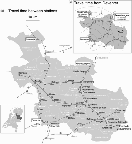
When travelling, people tend to think more in time than distance. To know the duration of a trip is more interesting than the actual distance. The current geographic (distance-scaled) maps might give a false impression of the travelling-time between two locations. For example, (a) shows a geographic map of the Dutch railways in the province of Overijssel. Travelling by train from Deventer to Gramsbergen takes longer time than travelling from Deventer to Steenwijk (55 minutes vs 48 minutes) because of a slower connection, even though Gramsbergen is closer to Deventer along the tracks than Steenwijk (72 kilometres vs 73 kilometres). In situations like above, visualizing a transport network using time as a distance measure between two geographic phenomena might even make the geographic space more understandable. The geography remains recognizable and true travelling-times can be measured from the map. This can be seen in (b) where geographic-space (distance) is exchanged for time-space (travelling-time).
Figure 1. Overijssel's railways. (a): Travel time between the stations. The numbers along the railroad segments show the travelling-times in minutes. (b): A time cartogram showing travelling-times represented by the concentric circles with a 10 minutes interval from Deventer to other destinations in the Overijssel.
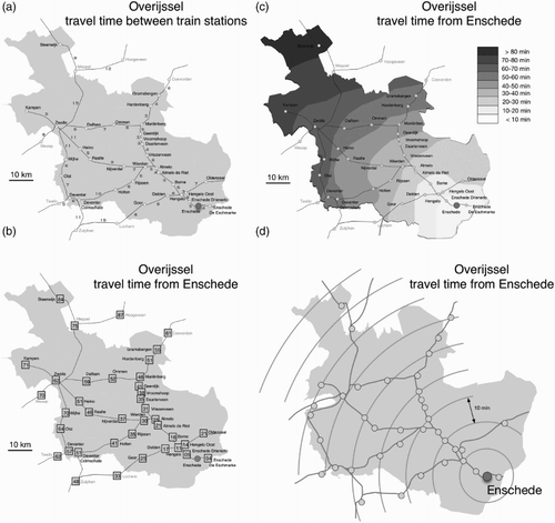
Travelling-times can be conveyed in a number of ways. A table can be provided to show travelling-times, in which case a user lacks the geographic context. Another approach is to use labels attached to each line segment. In such a case, a user has to read labels to derive travelling-times (see (a)). Also, labels take up space and can make the map crowded. In (b), all stations to be reached from Enschede have a label with the number of minutes it takes to reach the station. In (c), 10 minutes isochrones have been drawn and time zones between the lines have been filled with color, applying the visual variable value. The darker the zone, the more travelling-time needed to reach that zone. These methods do not deform the map. In (d), a time cartogram is shown. One could argue that the isochrones from (c) have been transformed into circles. The time cartogram modifies the geographic locations or spatial relationships to suit the travelling-times and thereby emphasizes the travelling-times over the other map content. In addition, it also represents a comprehensive view of the entire network. One can instantly see which stations are the closest and which stations are the farthest from Enschede. The time cartogram, therefore, is an effective method compared to the other methods showing travelling-times using labels or visual variables.
Figure 2. Mapping travel times from the city of Enschede to other parts in the province of Overijssel. (a): Labels along the netwrok segments. (b): Labels at destinations. (c): Isochrones. (d): A time cartogram.
A cartogram is a technique for representing quantitative data visually. In a cartogram, the map elements (i.e. areas, lines and points) are intentionally modified based on an attribute such as election result, population or travelling-time. Some researchers consider cartograms as a highly effective tool (e.g. CitationBhatt, 2006; CitationDent, 1975; CitationDorling, 1996; CitationInoue & Shimizu, 2006; CitationKocmoud & House, 1998; CitationShimizu & Inoue, 2009; CitationWu & Hung, 2012), while others have doubts about their effectiveness because of the possible deformation in shape (e.g. CitationFotheringham, Brunsdon, & Charlton, 2000; CitationGriffin, 1980; CitationGriffin, 1983; CitationRoth, Woodruff, & Johnson, 2010; CitationTobler, 2004; CitationYau, 2008). In recent years, cartograms have become an increasingly popular tool due to their captivating design (CitationBhatt, 2006; CitationKocmoud, 1997; CitationShimizu & Inoue, 2009), and also due to the availability of tools to create them automatically. A cartogram emphasizes attributes over geographic locations or spatial relationships, thereby attracting greater attention from readers and creating a strong visual impact (CitationWu & Hung, 2012).
Based on the modification of the map elements, three types of cartograms can be identified: area, line and point cartograms. Of the three types of cartograms, line and point cartograms are well-suited to visualize temporal data related to movement along paths with stops. In a line cartogram, lengths of line segments could be modified according to a time-related attribute such as travelling-time. In case of a point cartogram, the points could be displaced based on travelling-times. Both line and point cartograms could be integrated to create strong visual effects. In the previous studies (e.g. CitationAhmed & Miller, 2007; CitationAxhausen, Dolci, Fröhlich, Scherer, & Carosio, 2008; CitationBies & Kreveld, 2013; CitationCampbell, 2001; CitationCampenhout, 2010; CitationGoedvolk, 1988; CitationSpiekermann & Wegener, 1994; CitationTyner, 1992; CitationShimizu & Inoue, 2009; CitationKaiser, Walsh, Farmer, & Pozdnoukhov, 2010; CitationRamaer, 2011; CitationWu & Hung, 2012), line and/or point cartograms are often used to visualize travelling-times and are referred to as distance cartograms, distance-by-time cartograms, time-space maps or travel-time maps. However, some of these studies only describe how to deform the network according to travelling-times (e.g. CitationShimizu & Inoue, 2009), while others only explain how to deform the map's boundaries based on travelling-times (e.g. CitationBies & Kreveld, 2013). Some methods produce maps that are not easily recognizable (e.g. CitationAhmed & Miller, 2007), while others are computationally expensive. The procedures of some methods are not fully described (e.g. CitationGoedvolk, 1988). Therefore, it is difficult to reproduce and apply these methods to other datasets.
In this study, the term time cartogram is used and is defined as follows: a type of cartogram in which the geographic-distance between locations is replaced by a time-related attribute (e.g. travelling-time) and the geography is deformed accordingly. Two types of time cartograms exist: centred and non-centred. The centred time cartogram shows travelling-times from a fixed starting location to all other destinations in the region. Concentric circles are drawn from the starting location to indicate travelling-times, and the geography is deformed accordingly by moving other locations either away or closer to the starting location. The non-centred time cartogram depicts travelling-times between all pairs of locations.
This study presents an alternative method to construct centred time cartograms for scheduled movement data. A case of the Dutch railways network is used to illustrate the method. The method was developed by approaching the construction of the time cartograms as a two-step process. In the first step, vector calculus is used to displace the train stations according to travelling-times from a fixed starting station. In the second step, moving-least-squares based affine deformation is applied to deform the railroads and the map's boundaries accordingly. Concentric circles are drawn from the starting station to indicate travelling-times. The length of the straight line from the starting station to a particular station represents the amount of time to reach it. The deformation of both the railroads and the map's boundaries – ignored in the previous studies – maintain recognizability in the resultant maps. With the railroads, a user can still see the connectivity between stations. The map's boundaries help a user to recognize the regions. The method produces continues and smooth deformations resulting in visually elegant time cartograms. The method also maintains homeomorphism and topology (except for some cases explained in one of the next sections). The homeomorphism does not push stations outside the borders, while the topology avoids the regions to overlap. Both help a user to better recognize the output maps. For each of the two steps in the construction procedure, closed-form expressions that are easy to implement for visualizing other datasets of the same sort are provided.
The remainder of this paper is organized as follows: Section 2 presents the time cartogram construction method. In Section 3, we apply the method to the Dutch railways network and discuss the results and the limitation of the method. Section 4 discusses the design of the Main Map. Finally, conclusions and guidelines for future work end the paper.
2. The time cartogram construction method
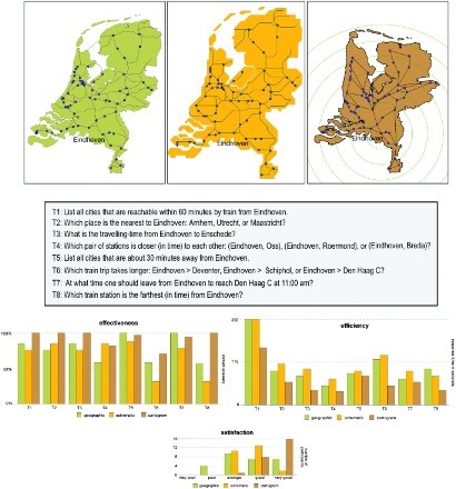
Before starting the work on time cartograms construction method, a survey was conducted to get an impression of the effectiveness of time cartograms for visualizing scheduled movement data. To this purpose, a time cartogram was compared with a geographic map and a schematic map. The survey consisted of eight temporal questions related to tasks like identify, locate and compare in time. Overall, the time cartogram performed the best when the questions had a dominant time-related component (see Appendix – a publication on the usability of the time cartograms is in progress).
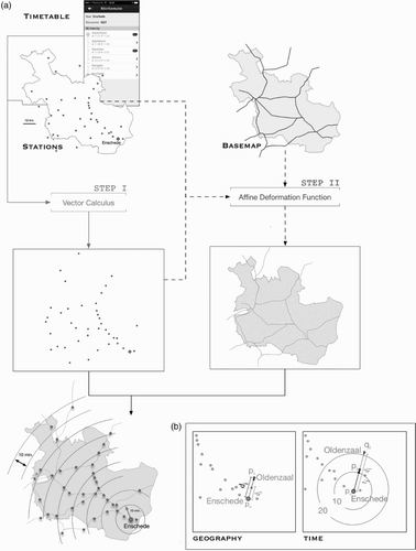
After getting a better notion of its usability, a two-step method for the construction of time cartograms was developed. A dataset of the railroad network of the Dutch railways was used to illustrate the method. The dataset consisted of the intercity and regular train station and the trains’ time-tables as of 2010 plus an administrative map of the Netherlands. The method can be formulated as follows (a graphical representation is shown in ):
Figure 3. The construction of a time cartogram. (a): The two-step approach involving vector calculus and moving-least-squares based affine deformation. (b): Displacing a train station according to its travelling-time from the starting station. p0 is the geographical position of the starting station, di is the direction vector between the starting station and the destination station, while êi is the corresponding unit vector. pi represents the geographical position of the destination station, while qi is the corresponding deformed position. The destination station either moves farther away or comes closer to the starting station depending upon its travelling-time ti . The concentric circles indicate the travelling-times (in minutes) from the starting station.
Table
3. Results and discussion of the time cartogram construction method
To test the applicability of the method, several time cartograms were created using a subset of the Dutch railways network in the province of Overijssel. In 2010, this network had 33 train stations and is shown in (a). Travelling-times (in minutes) between stations are indicated by numbers along the railroad segments. This was followed by the construction of the Main Map for the whole Netherlands, including the provincial boundaries.
Time cartograms were constructed for six different starting stations, equally spread over the province. They included Enschede, Deventer, Raalte, Gramsbergen, Steenwijk, and Zwolle (). To construct these cartograms, the shortest-path distances by stop trains (i.e. trains that stop at all stations along the route) were considered. Travelling-times along the railroad segments (as shown in (a)) were used, and the waiting or transfer time was not taken into account.
Figure 4. Time cartograms for six different cities in Overijssel, constructed for the starting stations indicated on each map. The concentric circles depict the travelling-times in steps of 10 minutes from the starting station. (a): Steenwijk. (b): Gramsbergen. (c): Raalte. (d): Zwolle. (e): Deventer. (f): Enschede.
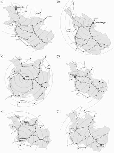
As apparent from the output maps in , the method produces continues and smooth deformations. The method uses vector calculus to ensure that the relative positions of the stations are maintained. This helps a user to recognize the various stations on the map after the deformation. The background map, including the railroads, is deformed to preserve the connectivity between stations. To indicate travelling-times, concentric circles are drawn around the starting station. A straight line from the starting station to a particular station indicates the time it takes to reach it.
These time cartograms help to explore certain temporal patterns that are not instantly visible otherwise. For instance, the time cartogram for Deventer in (e) reveals an interesting pattern. The city of Raalte is closer to Deventer (49 kilometers) than Ommen (54 kilometers) on a geographic map, but travelling from Deventer to Raalte takes about the same time as travelling from Deventer to Ommen (see also (a and b)). In the time cartogram for Raalte in (c), the map inflates, showing lower accessibility to the stations in time than the other maps. This pattern is not visible while looking at a geographic map.
These time cartograms can also be used as a visual analytical tool to see the differences in the level of railway services. Consider the time cartograms shown in (a–c). To construct the cartograms in (a and b), the shortest-path distances via stop trains were used. In (a), the waiting or transfer time was not taken into account, while in (b), the transfer time was included in the calculations. To construct the cartogram in (c), the shortest-path distances were considered, including the transfer time, but now using intercity trains only (i.e. trains that stop only at major or intercity stations along the route). The cartograms show some interesting patterns. The cities of Hengelo, Almelo and Deventer come closer in time to the city of Enschede while travelling by intercity trains. On the other hand, the cities of Zwolle and Steenwijk take longer by intercity trains. Travelling by stop trains to Zwolle or Steenwijk takes shorter despite stopping at all stations along the route. (e) illustrates the changes in the shape of the time cartograms in all three cases.
Figure 5. Cartograms and time. (a): Travelling from Enschede by stop train, not including transfer time. (b): Travelling from Enschede by stop train, including transfer time. (c): Travelling from Enschede by intercity train, including transfer time. (d): The geographic map. (e): An overlay of the cartograms from (a), (b) and (c).
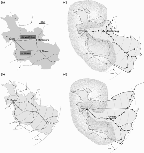
The method adapts to any scenario provided the time-distances are realistic (i.e. the travelling-time from A to B must be lower than the travelling-time from A to C if they fall along the same route with B preceding C). To test its adaptability, three time cartograms were constructed for the city of Zwolle by considering three different routes (i.e. three different trains or time-tables). In the first cartograms, the shortest-path distances between stations were taken into account (the resulting time cartogram is shown in (b) which equals to (d)). In the second cartogram, the route via Mariënberg to reach Almelo was considered (see (c)). In the third cartogram, shown in (d), the route via Almelo was used to reach Mariënberg. The output maps show how elegantly the method adapts to all three scenarios. For the route via Mariënberg, the stations along the route and those reachable via Mariënberg are displaced and all others remain unaffected. The map's boundary also deforms accordingly. Similarly, for the route via Almelo, the stations along the route and those reachable via Almelo are displaced and all others stay put. The map's boundary also scales accordingly, reflecting the change in the route.
Figure 6. Travelling from Zwolle. (a): The different routes from Zwolle. (b): Time cartogram based on the shortest travel times. (c): Preference for the route via Mariënberg. (d): Preference for the route via Almelo. In (c) and (d), only the stations along the preferred route are displaced and the geography is deformed accordingly. The stations in the blurred area are not affected.
To find out if the method maintains homeomorphism and topology, we used again the railroad network in the Overijssel, but this time including the municipal boundaries. A time cartogram was constructed with the city of Enschede as the starting station (shown in (a)). The result shows that both homeomorphism and topology are maintained (compare (a and d)). In the time cartogram, a station inside the Overijssel's municipality remains inside after the deformation. Also, the municipalities only grow or shrink in size according to the travelling-times, but do not overlap.
3.1. Limitations of the method
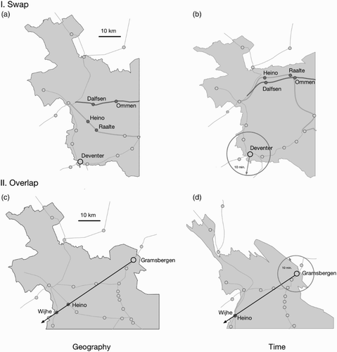
Despite the above positive claims, the method has some shortcomings. A first shortcoming of the method is the crossing of the railroads which might hinder a user to recognize various stations on the map. This problem arises when one set of stations is closer to the starting station as the crow flies than the other set of stations, but farther away time-wise when following the railroads. This is illustrated in (a). The cities of Heino and Raalte are closer to Deventer as the crow flies than Dalfsen and Ommen, but are farther away in time. This causes the two railroads to cross each other in the time cartogram as shown in (b). By the definition of a time cartogram, this crossing cannot be avoided. A second shortcoming is the overlap of stations that can happen when two or more stations with equal travelling-times have the same direction vector. For instance, Heino and Wijhe have equal travelling-times from Gramsbergen and they also have the same direction vector with respect to Gramsbergen as illustrated in (c). As a result, they overlap in the time cartogram for Grambergen as seen in (d).
Figure 7. Limitation of the method. (a): The geographic situation before swap. (b): The swapping of the railroads in the time cartogram. (c): The geographic situation before overlap. (d): The overlapping of the stations in the time cartogram.
4. The main map
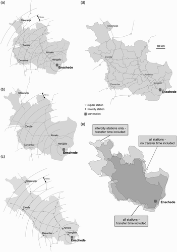
For the Main Map, time cartograms were constructed for the whole network of the Dutch railways. Seventy-three train stations, well-spread over the country, were used to construct the cartograms. Six train stations (i.e. Schiphol, Utrecht, Enschede, Middelburg, Eindhoven and Maastricht) were selected as the starting stations. The background map included the provincial boundaries. The lower left map in the Main Map shows a geographic view of the Dutch railroad network and highlights the stations selected to construct the time cartograms. The upper six maps in the Main Map give the results. Besides visualizing the travelling-times, these cartograms also show how accessible the selected cities are. The smaller the country, the better accessible the selected city is.
Visually, the deformation of the railroads and map's boundaries is continues and smooth. Also, the deformation is homeomorphic and does not violate the map's topology. The results confirm that the method works equally well for larger and more difficult scenarios.
The inset in the Main Map presents a case of the discussed limitations. It occurs in situations where the network and the geography have a clear ‘mismatch’, e.g. if a short geographic-distance requires a long time-distance due to a long detour around a lake. Compare Enkhuizen in the geographic map and in the time cartogram. One has to detour the lake IJsselmeer to travel to Enkhuizen. Also, Hoorn, Zaandam and Leiden are on the same direction vector but the geographic-distances and the time-distances are each other's reverse. This results in overlapping of the stations and flipping of the land in the time cartogram.
5. Conclusions and future work
In this paper, a two-step method for the construction of the time cartograms was presented. A case of the Dutch railways network was used to illustrate the method. In the first step, the deformed positions of the train stations were calculated using vector calculus. In the second step, moving-least-squares based affine deformation was applied to deform the railroads and the map's boundaries accordingly. For each of the steps in the construction procedure, we provided simple closed-form expressions that are easy to implement for visualizing other similar datasets. Visually, the method preserved the characteristic or global shape: a user can still recognize the study area. As opposed to other solutions, we deformed both the railroads and the map's boundaries. Both are important to maintain the recognizability of the output maps. The method produced fast deformations, which can be performed in real-time. The method also maintained homeomorphism and topology and generated time cartograms that are continues, smooth and easy to interpret.
The time cartograms can be helpful to discover patterns within the data that would, if mapped otherwise, be obscured. It is believed that they can help a user to use and understand the data better.
A comprehensive usability study is currently in progress to investigate the effectiveness, efficiency and satisfaction of these cartograms. In the future, we intend to develop algorithms and create cartograms for temporal data related to free movement.
Main Map: Travelling the Dutch Railroads
Download PDF (3 MB)Related Research Data
References
- Ahmed, N., & Miller, H. J. (2007). Time-space transformations of geographic space for exploring, analyzing and visualizing transportation systems. Journal of Transport Geography, 15(1), 2–17. doi: http://dx.doi.org/10.1016/j.jtrangeo.2005.11.004. doi: 10.1016/j.jtrangeo.2005.11.004
- Andrienko, G., Andrienko, N., Dykes, J., Kraak, M.-J., & Schumann, H. (2010). GeoVA(t) – Geospatial visual analytics: Focus on time. Journal of Location Based Services, 4(3–4), 141–146. doi: 10.1080/17489725.2010.537283.
- Axhausen, K. W., Dolci, C., Fröhlich, P., Scherer, M., & Carosio, A. (2008). Constructing time-scaled maps: Switzerland from 1950 to 2000. Transport Reviews, 28(3), 391–413. doi: 10.1080/01441640701747451.
- Bhatt, L. M. (2006). Investigating the appropriateness of Gastner-Newman's cartogram versus conventional maps in visual representation and modeling of health data. Carbondale: Southern Illinois University.
- Bies, S., & Kreveld, M. (2013). Time-space maps from triangulations. In W. Didimo & M. Patrignani (Eds.), Graph drawing (Vol. 7704, pp. 511–516). Springer Berlin Heidelberg.
- Campbell, J. (2001). Map use & analysis. McGraw-Hill.
- Campenhout, M. (2010). Travel time maps. Eindhoven: Technical University.
- Cauvin, C. (2005). A systemic approach to transport accessibility. A methodology developed in Strasbourg: 1982–2002. Cybergéo: European Journal of Geography [Online], Systems, Modelling, Geostatistics, document 311, Online since 10 May 2005, connection on 26 June 2014. http://cybergeo.revues.org/3425; doi: 10.4000/cybergeo.3425
- Dent, B. D. (1975). Communication aspects of value-by-area cartograms. The American Cartographer, 2(2), 154–168. doi: 10.1559/152304075784313278.
- Diansheng, G., Jin, C., MacEachren, A. M., & Liao, K. (2006). A visualization system for space-time and multivariate patterns (VIS-STAMP). IEEE Transactions on Visualization and Computer Graphics, 12(6), 1461–1474. doi: 10.1109/tvcg.2006.84.
- Dorling, D. (1996). Area cartograms: Their use and creation (concepts and techniques in modern geography). Norfolk, UK: Environmental Publications.
- Fotheringham, A. S., Brunsdon, C., & Charlton, M. (2000). Quantitative geography: Perspectives on spatial data analysis. SAGE Publications Ltd.
- Goedvolk, A. (1988). De nieuwe relatieve afstand voor het openbaar vervoer. Nieuwe Geografenkrant, 10, 6–7.
- Griffin, T. L. C. (1980). Cartographic transformation of the thematic map base. Cartography, 11(3), 163–174. doi: 10.1080/00690805.1980.10438102.
- Griffin, T. L. C. (1983). Recognition of areal units on topological cartograms. The American Cartographer, 10(1), 17–29. doi: 10.1559/152304083783948258.
- Inoue, R., & Shimizu, E. (2006). A new algorithm for continuous area cartogram construction with triangulation of regions and restriction on bearing changes of edges. Cartography and Geographic Information Science, 33(2), 115–125. doi: 10.1559/152304006777681698.
- Kaiser, C., Walsh, F., Farmer, C. Q., & Pozdnoukhov, A. (2010). User-centric time-distance representation of road networks. In S. Fabrikant, T. Reichenbacher, M. Kreveld, & C. Schlieder (Eds.), Geographic information science (Vol. 6292, pp. 85–99). Springer Berlin Heidelberg.
- Kocmoud, C. J. (1997). Constructing continuous cartograms: A constraint-based approach. Texas A&M Visualization Laboratory, Texas A&M University, College Station, Texas.
- Kocmoud, C., & House, D. (1998). A constraint-based approach to constructing continuous cartograms. Paper presented at the 8th International Symposium on Spatial Data Handling, Vancouver, BC.
- Li, X., & Kraak, M.-J. (2008). The time wave. A new method of visual exploration of geo-data in time-space. The Cartographic Journal, 45(3), 193–200. doi: 10.1179/000870408X311387
- Ramaer, L. (2011). De vervaardiging van temporele kartogrammen. 100 Jaar veranderingen in de reistijd per trein in beeld. Geo-Info, 2011-10/11, 11–13.
- Roth, R. E., Woodruff, A. W., & Johnson, Z. F. (2010). Value-by-alpha maps: An alternative technique to the cartogram. The Cartographic Journal, 47(2), 130–140. doi: 10.1179/000870409X12488753453372
- Shimizu, E., & Inoue, R. (2009). A new algorithm for distance cartogram construction. International Journal of Geographical Information Science, 23(11), 1453–1470. doi: 10.1080/13658810802186882
- Spiekermann, K., & Wegener, M. (1994). The shrinking continent: New time-space maps of Europe. Environment and Planning B: Planning and Design, 21(6), 653–673. doi: 10.1068/b210653
- Tobler, W. (2004). Thirty five years of computer cartograms. Annals of the Association of American Geographers, 94(1), 58–73. doi: 10.1111/j.1467-8306.2004.09401004.x
- Tyner, J. A. (1992). Introduction to thematic cartography. Englewood Cliffs, NJ: Prentice Hall.
- Wu, Y.-H., & Hung, M.-C. (2012). Non-connective linear cartograms for mapping traffic conditions. Cartographic Perspectives, 65, 33–50.
- Yau, N. (2008). Alternative to cartograms using transparency. FlowingData, Retrieved from http://flowingdata.com/2008/11/13/alternative-to-cartograms-using-transparency/
Appendix: Preliminary User Survey
The survey consisted of eight temporal questions related to tasks like identify, locate and compare in time. 35 persons from 21 different nationalities participated in the survey. The participants were MSc and PhD students form the Faculty of Geo-Information Science and Earth Observation at the University of Twente in the Netherlands and were frequent users of maps. Most of them were occasional users of the Dutch trains with limited knowledge about the geography of the Netherlands.
The survey was executed using the online Lime Survey tool (www.limesurvey.org). Before proceeding to the survey, the participants were given a brief introduction about the three types of maps and the nature of tasks to avoid any learning biases. The participants were then asked to work with any two (selected randomly to avoid potential learning biases) of the three types of maps to perform the temporal tasks. We collected participants' accuracy, response time and satisfaction. The survey results are summarized in the diagrams below.