
ABSTRACT
This paper presents a method of development concerning maps of changes in the population distribution in Poland after the Second World War (1946–2012). The phenomenon is presented by means of isolinear maps based of the population density index. The resulting maps illustrate the population distribution in intervals of approximately 10 years. Moreover, the changes themselves are presented in balance maps corresponding to periods between the selected dates. The maps highlight spatial changes in the population distribution in Poland. The key task was to develop a method of preparing maps providing an objective and comparable image of the population distribution. This was obtained by means of the isoline method with the application of a multipoint representation of administrative units (basic fields) differing in terms of area and shape. Comparability was also achieved through the appropriate preparation of standardised map legends (colour scales and isoline interval). The maps were prepared in scales of 1:8,000,000 (state maps) and 1:400,000 (change/balance maps).
1. Introduction
The subject of this paper involves changes in the population distribution in Poland in the years 1946–2012. Over the study period, political and economic factors resulted in considerable changes in the population distribution. Maps are an invaluable tool of the analysis and visualisation of such changes. The cartographic presentation permits a fast assessment of the rate and direction of changes by the reader. In order for the authors to create such maps, relevant statistical data were prepared, and appropriate analyses and methods of cartographic presentation were applied in order to obtain maps illustrating changes in the population distribution in an objective manner.
The prepared maps were included in a sheet with features of a cartographic monograph regarding changes in the population distribution in Poland after the Second World War. They can be divided into two groups. The first group includes eight state maps, presenting the population distribution for the years: 1946, 1956, 1965, 1975, 1989, 1996, 2006, and 2012. The second group includes change/balance maps. Two sub-groups can be distinguished among the latter. The first one includes maps presenting changes occurring in consecutive periods between dates selected for the state maps (1946–1956, 1956–1965, 1965–1975, 1975–1989, 1989–1996, 1996–2006, and 2006–2012). Three additional maps were prepared, constituting the second sub-group (see Main Map). They also present changes in the population distribution, but in longer periods, and over the entire study period. The first map shows changes in the years 1946–1989, that is, when Poland was a socialist country. The second one concerns the years after the political system transformation (1989–2012). The third and the fourth maps illustrate changes that occurred over the entire study period (persons per square kilometre and percentage).
2. Methods
The presented phenomenon of population density was assumed to have a continuous distribution. However, the choropleth method, the most frequently applied (due to the relative simplicity of structure and facility of preparation) type of maps for presenting socio-economic data (CitationKraak & Ormeling, 2011), was not used in this case. The advantage of the choropleth method is that it fulfils the role of a record of separate statistical facts referred to area units and presented in a ‘stepped’ manner. In contrast to the discrete nature of choropleth maps, isopleth maps present the tendency in a continuous manner, that is, detailed directions in which values of the phenomenon increase or decrease. Such a presentation involves mathematical and visual ordering and integration of the values of the phenomenon presented in the map. The integration and ordering results in the synthesis of the spatial phenomenon, presented in the form of smoothed statistical surface. In this scope, isoline maps function better than choropleth maps (CitationKraak & Ormeling, 2011; CitationMościbroda, 1999). Therefore, all of the resulting maps were prepared by means of the isopleth method, constituting a variation of isolines.
They are developed at a uniform scale of 1:8,000,000, except for the three synthetic maps illustrating changes before and after the political system transformation (after 1989), and the map presenting changes over the entire study period. The four maps were developed at a scale twice as high as the remaining ones (1:4,000,000). The sheet includes additional graphs supplementing the maps with information permitting a fuller understanding of changes in the population occurring in Poland over the last 66 years. The sheet also includes legends, separate for the state maps and change/balance maps (see Main Map).
The presentation of changes in the population distribution applied the population density index, illustrating the phenomenon in a synthetic manner. The index refers the size of the population to area units. The size and shape of the basic fields largely affects the degree of generalisation of the phenomenon, and results from the methodology of collecting information adopted by statistical institutions (administrative entities) (CitationKraak & Ormeling, 2011).
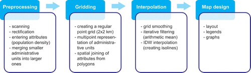
The process of development of the maps included four stages (), namely data collection and pre-processing (geodatabase), data transformation (gridding), the preparation of isopleth maps (interpolation), and their editorial review and determination of their layout on the sheet (map design).
Figure 1. Stages of data processing.
2.1. Data pre-processing
The first stage, involving data collection and processing, was very labour-intensive. First, data regarding boundaries of administrative units in Poland in years selected for the state maps were collected. The data were obtained from archival administrative maps issued by the Head Office of Geodesy and Cartography in Warsaw (for the first five maps). The scanned maps were subject to rectification to Albers Equal Area Conic projection. Then, the administrative boundaries of communes were vectorised. The resulting geometry of administrative units was supplemented with the population density attribute. Vector bases disclosed by the Central Statistical Office in Warsaw were used for the last three study years. Moreover, in the first five vectorised maps, the same administrative units had different shapes and areas. This resulted from several reforms of the country's administrative division, concerning not only the course of the boundaries themselves, but also changes in the number of degrees of division. The lack of coherence in administrative divisions resulted in the necessity of their modification. The resulting state maps were based on comparable basic fields, eventually corresponding with the modern administrative division of Poland into districts. Next, smaller units were merged into larger ones, approximate in their shape and area to those functioning in the modern times. The collected data were transformed and introduced to the processed vector base, and the calculated population density index was entered.
2.2. Gridding
The second stage involved the transformation of vector polygons with introduced population density information into a grid of points with regular distribution, with the actual dimensions of 2 km per 2 km. Points representing the areas provided the basis for the interpolation of the statistical area, consequently presented as an isoline map. Such a procedure has a positive effect on the volumetric properties of the final map. It introduces the variable of the area and shape of irregular basic fields into the interpolation process. Such an approach differs from the traditional method of development of isopleth maps, where a single basic field (e.g. administrative unit) is represented by one point which, attributed with the index value, participated in the interpolation of the statistical area. This may cause considerable volumetric distortions, reducing the value of the resulting map (CitationCebrykow, 2005; CitationMościbroda, 1999; CitationRase, 2001). The generated grid was smoothed (filtered) by means of a matrix calculus with the application of a 3 × 3 moving window. The arithmetic mean was applied for the purpose, permitting preserving the volume of the phenomenon. The smoothing process was iterative repeated five times. This smoothing method was applied for grids describing states. Grids referring to changes were subject to stronger smoothing with a 5 × 5 matrix, repeated 20 times. The objective of data smoothing was to generalise the statistical surface, which was necessary for obtaining a synthetic image of population distribution in the maps.
2.3. Interpolation
At the third stage, the interpolation of grid points corresponding to eight selected time slices was first performed. The interpolation process applied the Inverse Distains Weight algorithm, providing credible results in the case of evenly distributed points participating in the interpolation (CitationMorrison, 1969, Citation1970). The exponent value was set to 1. Such a procedure provided the linear character of the interpolation, and additionally permitted the avoidance of volumetric errors (CitationMościbroda, 1999). The obtained statistical areas provided the basis for calculating the area of changes between states from selected years, as well as changes at longer temporal scales. All of the surfaces were presented as an isolinear map with a predefined isoline cut. The resulting maps were exported to a format permitting further graphic processing.
The fourth stage involved the graphic design of the maps and their layout on the sheet, as well as preparing map legends and charts of population changes in Poland, facilitating the interpretation of the maps.
2.4. Map design
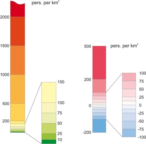
The last, fourth stage involved the preparation of all of the maps for publication. Coherent colour scales were introduced, separately for the state maps and change/balance maps. In the state maps, differences in the distribution of the population inhabiting rural and strongly urbanised areas were emphasised by the application of isoline with irregularly varying interval, however uniform for all of the maps. The same procedure was applied to the change/balance maps in order to visualise changes with low absolute rate, but significant for areas with low inhabitancy. The distribution variance was emphasised by the introduction of colour scales. For the state maps, instead of a monochromatic scale, a scale based on a gradient transition from green through yellow to red was applied. In the case of the change/balance maps, the colour scale was based on two colours, namely cold (blue) and warm (red) (). Growing saturation of blue corresponds to negative changes, and higher saturation of red suggests population growth. The prepared legends not only assigned colour codes to ranges of values, but also provided orientation in the scope of all of the ranges of values (CitationPasławski, 1992). The layout of the maps on the sheet was designed. It was supplemented with diagrams illustrating changes in mean population density, urbanisation index, and size of population in Poland. A graph was also included illustrating the cumulated distribution of the population density index in relation to the area of Poland for the years 1946 and 2012. The entire sheet was prepared for print in the CMYK system.
Figure 2. Legends of state and change/balance maps.
3. Conclusion
The application of the isopleth method for the presentation of the state and changes in the spatial distribution of population is a good solution, more suitable than the popular choropleth method. The prevalence of the application of isopleths is particularly observed when authors of maps are forced to use data organised in differing systems of basic fields. The obtained isolinear maps ensure a simple and quick orientation in the phenomenon distribution. A map devoid of a rigid system of boundaries of basic fields provides a more synthetic image, facilitating their comparison with the situation presented in other maps.
Moreover, the application of the method of presentation preserving the volumetric value of the size of population of the presented area contributed to higher credibility of such maps.
In addition to the obtained image of changes in population distribution in Poland in the years 1946–2012, the conclusion of the article may be the recommendation of a wider application of the isopleth method in presentation of distribution of various spatially continuous phenomena and their changes.
Software
The processing of data for the maps included several stages with the application of varied software. The rectification of archival data was performed in the Erdas Imagine 2011 software. The data base and grid were created in the ArcGIS 10.0 software. The process of data interpolation was conducted in the Surfer 12.0 software. The graphs were developed in the Grapher 8.0 software. The sheet with the maps was designed in the Corel Draw x4 software.
Changes in the population distribution in Poland in the years 1946-2012
Download PDF (10.8 MB)Acknowledgements
The map was prepared in the scope of statutory research of the Department of Cartography and Geomatics, Faculty of Earth Sciences and Spatial Management, Maria Curie-Skłodowska University in Lublin, Poland. The study subject: ‘Application of the isopleth method in studies on variability of phenomena based on the example of demographic issues.’
Disclosure statement
No potential conflict of interest was reported by the authors.
Related Research Data
References
- Cebrykow, P. (2005). Metoda wygładzania kartogramu jako alternatywa dla tradycyjnych sposobów wykonywania map izopletowych [Choropleth map smoothing method as an alternative for traditional methods of preparing isopleth maps]. Polish Cartographic Review, 37(1), 3–12.
- Kraak, M. J., & Ormeling, F. (2011). Cartography. Visualization of spatial data. New York, NY: Guildford Press.
- Morrison, J. L. (1969). Control point spacing as an indicator of the accuracy of isarytmic maps. Proceedings of the American Congress on Surveying and Mapping, 29th Annual Meeting, Washington, DC.
- Morrison, J. L. (1970). A link between cartographic theory and mapping practice: The nearest neighbour statistic. Geographical Review, 60(4), 494–510. doi: 10.2307/213770
- Mościbroda, J. (1999). Mapy statystyczne jako nośnik informacji ilościowej [Statistical maps as a carrier of quantitative information]. Lublin: Maria Curie-Sklodowska University Press.
- Pasławski, J. (1992). Kartogram jako forma prezentacji kartograficznej [Choropleth map as a form of cartographic presentation]. Warsaw: Dissertationes Universitatis Varsoviensis.
- Rase, W-D. (2001). Volume-preserving interpolation of a smooth surface from polygon-related data. Journal of Geographical Systems, 3, 199–213. doi: 10.1007/PL00011475