
ABSTRACT
HazMatMapper is an online and interactive geographic visualization tool designed to facilitate exploration of transnational flows of hazardous waste in North America (http://geography.wisc.edu/hazardouswaste/map/). While conventional narratives suggest that wealthier countries such as Canada and the United States (US) export waste to poorer countries like Mexico, little is known about how waste trading may affect specific sites within any of the three countries. To move beyond anecdotal discussions and national aggregates, we assembled a novel geographic dataset describing transnational hazardous waste shipments from 2007 to 2012 through two Freedom of Information Act requests for documents held by the US Environmental Protection Agency. While not yet detailing all of the transnational hazardous waste trade in North America, HazMatMapper supports multiscale and site-specific visual exploration of US imports of hazardous waste from Canada and Mexico. It thus enables academic researchers, waste regulators, and the general public to generate hypotheses on regional clustering, transnational corporate structuring, and environmental justice concerns, as well as to understand the limitations of existing regulatory data collection itself. Here, we discuss the dataset and design process behind HazMatMapper and demonstrate its utility for understanding the transnational hazardous waste trade.
1. Introduction
Conventional narratives around the hazardous waste trade, such as the pollution or waste haven hypotheses (CitationKellenberg, 2012; CitationRauscher, 2005), suggest that wealthier countries (e.g. Canada and the United States [US]) export waste to poorer countries (e.g. Mexico) to improve economic efficiency and escape from regulatory burdens. However, despite their differential economic status, all of the countries of North America import significant amounts of hazardous waste (CitationJacott, Reed, & Winfield, 2004). Indeed, developed countries around the world frequently trade waste with one another, even if treaties like the Basel Convention, the primary international environmental agreement governing and tracking the international waste trade, only seek to limit dumping on poorer nations (CitationLepawsky, 2015). The significant trade between the US, Canada, and Mexico is due in part to trade agreements like the North American Free Trade Agreement (NAFTA) that promote the movement of commodities across international borders (CEC, Citation2003). Unfortunately, the complex geographic, economic, and regulatory drivers and effects of the transnational hazardous waste trade are poorly understood.
The paucity of knowledge about the geographic pattern of transnational waste flows is due in part to the poor availability of data describing international waste shipments, particularly among North American countries (CitationCommission for Environmental Cooperation [CEC], 2007; CitationJacott et al., 2004). The US is the world’s largest producer of hazardous waste, but has not ratified the Basel Agreement. The US Resource Conservation and Recovery Act of 1976 (RCRA) provides a domestic US mechanism for tracking the waste trade, and while RCRA requires ‘cradle-to-grave’ documentation of all waste classified as hazardous as it enters or leaves the US, the data remain difficult to acquire and utilize. RCRA-related reporting was paper-based until 2012 and paper forms were often stored in regional offices rather than central archives, limiting their exchange across both national and sub-national regulatory jurisdictions. Moreover, inconsistencies in reporting (e.g. waste managers inconsistently categorize waste types) and in geocoding import and export facilities have made hazardous waste data difficult to map.
Yet, mapping is often a crucial component of understanding waste flows and identifying potential environmental justice (EJ) research and interventions (e.g. CitationMcEntee & Ogneva-Himmelberger, 2008; CitationPulido, 2000), including questions related to locations producing, processing, and depositing hazardous waste (see CitationUnited Church of Christ [UCC], 1987 for an early geographic investigation). Despite progress in theorizing the main drivers of waste flows (e.g. Davies, Citation2012), existing studies (e.g. CitationLepawsky & McNabb, 2010; O’Neill, Citation2000) and interactive mapping applications (e.g. CitationBasel Convention, 2011) of the hazardous waste trade are limited to country-level datasets. Such methodological nationalism (CitationBeck & Sznaider, 2010) means that attention to trade between nations has come at the expense of analysis of specific sites within nations (i.e. communities, cities, or municipalities) that receive hazardous waste from foreign destinations. Furthermore, while several online utilities exist for mapping waste at multiple scales (e.g. CitationEJ SCREEN, 2015; CitationSinger, 2015; TOXMap, Citation2015), these tools rarely bring together demographics and waste flows in a way that clarifies site-to-site transactions of specific materials.
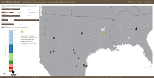
In this paper, we describe HazMatMapper (Main Map, ), an online and interactive geographic visualization tool designed to facilitate exploration of transnational flows of hazardous waste in North America (http://geography.wisc.edu/hazardouswaste/map/), specifically, US imports from Canada and Mexico. To move beyond anecdotal discussions and national-level analyses, we assembled a novel geographic dataset tracking transnational hazardous waste shipments from documents collected through Freedom of Information Act (FOIA) requests to the US Environmental Protection Agency (EPA). We obtained records for nearly 18,000 import shipments from Canada and Mexico to over 60 US processors between 2007 and 2012. HazMatMapper supports multiscale and site-specific visual exploration of US imports, enabling academic researchers, waste regulators, and the general public to construct a data-supported understanding of regional clustering, transnational corporate structuring, and EJ concerns, as well as to understand limitations of existing regulatory data collection itself. HazMatMapper cannot statistically ‘confirm’ environmental injustices and does not support sophisticated geospatial analysis. For researchers interested in investigating hazardous waste trade relationships and patterns using spatial analysis techniques, we have made our compiled data available in a user-friendly format for download within HazMatMapper. Using HazMatMapper, we identified key geographic hypotheses for examination in a larger research project on the international waste trade. We have obtained data on US exports to Canada and Mexico over a similar time frame, but these data are not available in sufficient quality to be mapped alongside imports.
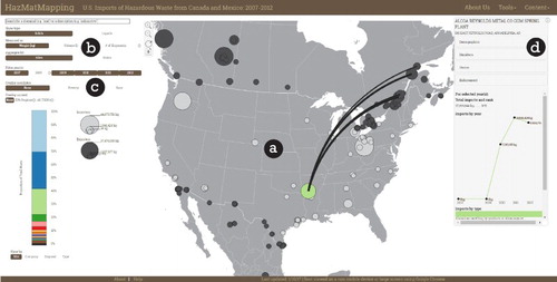
Figure 1. HazMatMapper in action: (a) central map; (b) configuration controls; (c) advanced context controls; and (d) information panel.
2. Data compilation
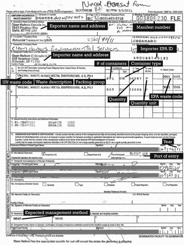
We received the EPA’s hazardous waste records for HazMatMapper as 971 scanned PDFs of regulatory forms. Each PDF contained an average of seven manifests or bundles of unique shipments. A shipment is a collection of waste containers made discrete by its United Nations waste type classification, the kind of container holding the waste, or the intended processing method. Each manifest recorded anywhere from 1 to 74 – but most frequently only one – shipment(s) of waste. For instance, a manifest might contain three shipments, with the first shipment comprising four metal drums of flammable waste paint, the second comprising two metal drums of material containing mercury, and the third comprising three burlap bags of the same mercury-containing material. To assemble a spatial database of the shipments records, we first separated each manifest into unique shipments and then hand-coded each shipment with the common attributes included in the PDFs: exporter name, address (geocoded using the Bing Maps batch geocoding service), port of entry, importer name and address, waste type and container, and planned processing method (see ).
Figure 2. Sample RCRA manifest. Information coded into the spatial database is highlighted. Personal information is screened.
Over 118,000 containers of waste were imported into the US between 2007 and 2012 as recorded by the nearly 10,000 manifests. We maintain a separation between solid and liquid waste in HazMatMapper, given ambiguity in conversions between different hazardous elements. While this distinction is useful for analysis of the dataset, it does not reflect the regulatory definition of hazardous waste, which hinges on complex legal, rather than physical, notions of ‘solid’ (40 USC. Sec 261.2. 2012). We use the same classification of waste as solid or liquid as is used in the manifests. In other contexts, ‘waste’ and ‘solid waste’ can refer to municipal garbage. Throughout this paper, we use the term ‘waste’ as a shorthand for hazardous waste.
The shipment records exhibited three kinds of uncertainties that limit the dataset in scope and internal consistency (see CitationMacEachren et al., 2005 for discussion). Uncertainties include (1) inconsistencies in how waste types or importer names are spelled; (2) ambiguities concerning waste measurements, and (3) missing attribute information. We have captured these uncertainties as additional facets in the spatial database for mapping in future work (). Ambiguous and incomplete data are not mapped in HazMatMapper. Additionally, the EPA has not yet provided import records for 2008; the 2008 import data will be integrated into HazMatMapper once the EPA is able to respond to our follow-up FOIA request. Therefore, our conclusions about trends in North American waste trade are conservative.
Table 1. Uncertainties in the hazardous waste dataset.
Finally, we acquired additional geographic data on local covariates for HazMatMapper to support exploration of EJ questions. We acquired data on poverty rates and racial composition from the US Census’s American Community Survey (http://factfinder.census.gov/faces/nav/jsf/pages/download_center.xhtml) and the EPA at four scales (one-mile radius, census tract, zipcode, and state). Unfortunately, detailed socioeconomic data is only available for the past decade or so. We acquired administrative boundaries at the state and province levels for Canada, Mexico, and the US from Natural Earth (http://www.naturalearthdata.com). We include overlays of the EPA’s regional jurisdictions and all RCRA-governed transport, storage, and disposal facilities involved in domestic hazardous waste trading.
3. Interactive map design
Our design of the HazMatMapper interactive map integrates tenets of exploratory geographic visualization with emerging usability expectations in web mapping. Coordinated, multi-view, and highly interactive geovisualization has been lauded for over two decades for its role in visual thinking about complex geographic datasets, supporting ideation in basic science and reasoning during decision-making (CitationAndrienko et al., 2007; CitationDiBiase, 1990; CitationMacEachren, 1994). Today, interactive mapping is a common web design solution for making geographic information publicly available (Muehlenhaus, Citation2013; Peterson, Citation2014).
Interactive mapping can be a powerful way for enabling the public to participate in local decision-making (CitationSieber, 2006), a priority for the EJ movement. Cartographers and activists alike suggest that the digital tools available in the ‘web 2.0’ era – including volunteered geographic information, map mashups, and user-generated content – can help individuals and communities address deficits in what they know about their vulnerabilities to social and ecological harms (CitationElwood, 2009; CitationCrampton, 2009; CitationHaklay, Singleton, & Parker, 2008). By offering an ‘exploratory engagement with content,’ mapping ‘apps’ emphasize and legitimize the role of the amateur, redefining expertise and potentially allowing previously marginalized people to gain access to decision-making processes (CitationElwood & Leszczynski, 2013, 10).
We designed HazMatMapper to support users of varying backgrounds, expertise levels, and interests, ranging from expert researchers and policy-makers to community leaders and the general public. To support a range of potential users while facilitating visual thinking, designers increasingly consider the usability of the interactive map (CitationRobinson, Chen, Lengerich, Meyer, & MacEachren, 2005), with large-screen design conventions moving toward a clear entry point into a central map that spans as much of the screen as possible, and a separation of interface controls in the layout by those configuring the interface and those providing additional context for advanced exploration (CitationRoth, 2015). HazMatMapper includes four primary interface components: (a) a central map, depicting sites as proportional symbols scaled by imported hazardous waste with trade connections depicted as flow lines, or states as color-shaded choropleth maps (CitationDent, 1999; CitationSlocum, McMaster, Kessler, & Howard, 2009). We use curved lines to depict shipments of waste between hazardous waste importers and exporters, following recommendations from Jenny et al. (Citation2016); (b) configuration controls, allowing users to re-express the dataset by site level or state level, and toggle between solid or liquid waste (each potentially measured as kilograms or liters); users also can search for specific wastes; (c) advanced context controls providing a stacked histogram overview of the dataset by percentage, overlays related to EJ concerns, and temporal filtering controls; and (d) an information panel providing details about a geographic feature selected in the map (see ). Following CitationShneiderman (1998), HazMatMapper users first configure an overview map at the site level or state level, zoom and filter the map to explore patterns across space and scale, and then retrieve details about specific geographic features and attributes deemed interesting through interactive exploration, ultimately downloading the original manifest PDF scans to relate unique records to potential EJ concerns. The following section describes the HazMatMapper interface in greater detail by walking through a hypothetical use case scenario.
4. Use case scenario
4.1. User
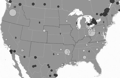
The following scenario describes the use of HazMatMapper by a permit manager working at an EPA regional office, an important user profile identified in early stages of our research. Our hypothetical RCRA permit manager supports regulation in the EPA’s Region 6 office (covering the south-central US, including New Mexico, Texas, Oklahoma, Arkansas, and Louisiana; see ), coordinating with state-level agencies on renewing and approving permits for facilities that handle or dispose of hazardous waste. She lacks a synoptic view of the waste flows between these facilities and finds it difficult to compare and rank different sites by waste volume or to discover patterns and irregularities in trade. She also finds that there are few tools to relate site-specific EJ concerns with broader patterns and trends in the waste trade. Information deficits like these potentially undermine many regulatory goals, such as ensuring compliance and pursuing EJ mandates (i.e. EPA’s EJ Agenda 2020 and Executive Order 12898). She often uses the EPA’s CitationEJSCREEN (2015), which is targeted toward regulators and citizens who have a specific neighborhood in mind and who want to explore various indices of vulnerability. In using HazMatMapper, however, she aims to make outliers at the state level and site level more visible and to connect regional patterns to local EJ concerns, both to enable facilitating regulatory oversight across Region 6 and building awareness about EJ at specific sites within Region 6.
Figure 3. EPA regions.
4.2. Central map
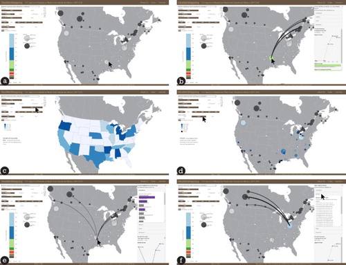
Upon arriving at HazMatMapper, the permit manager is greeted with a site-level overview using proportional symbols to depict the import volume of solid waste at each site in the US. She begins visual analysis by looking for regional-level patterns in solid waste imports, comparing Region 6 to other EPA regions. From the proportional symbol map, she ascertains that Region 6 has the second largest concentration of solid hazardous waste imports after Region 5 (covering the Great Lakes). She then zooms into her region by clicking on the zoom icon and panning ((a)). Looking at the map, she can see that there is one site in Arkansas that imports substantially more solid hazardous waste than any other site in the region, and overall it is one of the largest importers of solid waste in the country. The permit manager hovers over this site to retrieve its name: Alcoa Reynolds Metal Co., Gum Spring Plant. She then clicks on the proportional symbol to view the flows of waste to this site. The resulting flow lines show heavy trade between the Arkansas site and several export sites in Quebec, Canada ((b)). This pattern surprises the permit manager: given her jurisdiction in the south-central US, she expected most of the waste to come across the US–Mexico border.
Figure 4. Using HazMatMapper through the four different interface controls: (a) proportional symbols of waste sites are the default view on the central map; (b) clicking on a site draws flow lines between exporters and importers; (c) accessing the configuration controls allows users to draw choropleths of waste imports binned by state; (d) users overlay poverty statistics through the advanced context controls; (e) clicking on a site retrieves further EJ-relevant site data in an information panel; (f) selecting ‘manifests’ in the informational panel lets the user download copies of the site’s waste trade forms.
4.3. Configuration controls
Intrigued by the site-level patterns, the permit manager next wants to see how the pattern in solid waste imports holds at a state level, and how this pattern relates to what she knows about state-by-state and regional variation in hazardous waste regulation. She selects the ‘states’ option in the map configuration controls, re-expressing the central map into a state-level choropleth map colored using a five-class color scheme ((c)). From the state view, the manager notices that Arkansas is the leading importer of solid hazardous waste in her region. This is surprising, since Texas has a larger number of individual waste importing facilities, and thus occupies a larger portion of her day-to-day regulatory oversight. In aggregate, the amount of waste imported is larger in Arkansas due mainly to the Gum Spring Plant. The permit manager moves the cursor over the state to retrieve information about its imports: the three sites in Arkansas imported nearly 30 million kilograms of waste. Using the same controls, she switches to viewing liquid waste imports, measured as liters, and finds a different pattern holds: Arkansas is a negligible importer of liquid waste (less than 80,000 L), although still the largest importer in Region 6. The difference in Arkansas’ solid and liquid waste flows is hard to track in a synoptic way through paper forms alone because manifests do not clearly demarcate which listed wastes are solids and which are liquids. Because there are many more Region 6 facilities importing solid rather than liquid waste, the permit manager concludes that she should focus her immediate attention on flows of solid waste into her region.
4.4. Advanced context controls
Through the choropleth map, the permit manager determines that the state of Arkansas bears a disproportionate burden of waste management in the region relative to its size and population. Returning to the site-level proportional symbol map, the permit manager begins to assess potential drivers of the inequality in waste hazard within Arkansas, particularly as it may relate to socioeconomic inequalities in surrounding communities. Using the advanced context controls to the left of the map ((c)), the permit manager toggles overlays of poverty and race data for all import sites, which shade the site proportional symbols according to the selected socioeconomic attribute, supporting direct visual comparison between the volume of imported hazardous waste (by symbol size) and surrounding demographics (by symbol color) ((d)). She finds potentially troubling associations between waste hazard and demographics at two of the three waste processing sites in Arkansas. At both the Gum Spring Plant and the smaller Clean Harbors Inc. El Dorado facility, the surrounding communities have populations with a larger percentage in poverty and larger percentage of minorities than the average across all processing plants in the US. The potential EJ concerns are particularly exacerbated for the El Dorado site, as the surrounding community falls in the highest quintile (top 20%) across all US import sites regarding poverty. As a result of this visual analysis, the permit manager makes a note to look into any previously voiced concerns from members of the local community regarding EJ as it relates to the burden of hazardous waste.
4.5. Information panel
To help with her investigation at El Dorado, the permit manager needs to characterize the unique kinds of waste the Clean Harbors company brings to the community in order to understand the specific health risks imposed by the waste management. The permit manager clicks on the Clean Harbors El Dorado site, producing a flow map showing a range of export sites in Canada and activating an information window providing a statistical breakdown of the hazardous waste transactions ((e)). In the information panel, she sees that Clean Harbors El Dorado imported over 1 million kilograms of waste from 2007 to 2012, making it the ninth largest importer in the US during that time. Scanning the bar charts that illustrate imports by type, the permit manager notices that most of Clean Harbors El Dorado’s imports are ‘environmentally hazardous substances’ and ‘flammable solids,’ but that the company brings in a staggering array of different waste types. She hovers the cursor over each type and finds that many of these are often processed at the site using multiple disposal methods, making aggregate tracking difficult from paper records alone. For her, the complexity of Clean Harbors’ operations merits further regulatory inspection into best practices for waste processing and disposal.
4.6. Application: exploring EJ
Given the permit manager’s understanding about the types of waste Clean Harbors El Dorado imports and her initial understanding about the surrounding community, she is interested in clarifying whether the site places an unfair burden of hazardous waste disposal upon its neighbors. She wants to build on the summary data she has acquired to determine how Clean Harbors disposes of its waste and the extent to which the population near the facility differs from other communities in the area, the state, and across the country. She is interested in whether the facility’s practices and location prove exceptional, and thus warrant investment of time and resources for an investigation to improve site policy and local conditions. This requires interacting across all four interface components ((a–d)).
To start, the permit manager filters the map by waste type and toggles ‘Disposal’ in the advanced context controls on the left ((c)). Selecting ‘Disposal’ re-expresses the stacked histogram to depict the relative frequency of solid waste disposal methods used across all sites (). The permit manager then can brush this histogram to get a sense of which disposal methods are used at a specific site or set of sites, as hovering over a disposal category highlights the map to show only those sites making use of the selected disposal method (CitationRobinson, 2011). From brushing the stacked histogram, the permit manager notices that Clean Harbors El Dorado has the greatest diversity in disposal methods across the three sites in Arkansas, engaging in two of the top five disposal methods by weight. Importantly, the permit manager discovers that Clean Harbors El Dorado disposes waste under the code ‘H040,’ or ‘Incineration’ (), a method associated with environmental and public health concerns (CitationOttinger, 2013; CitationUCC, 1987).
Figure 5. Users can filter the map, shading it by waste processing types. Investigating the kinds of waste disposal methods for EPA Region 6, the user might first shade the map by the sites planning to process waste under the code ‘H040,’ which indicates ‘Incineration’.
Armed with the knowledge that the Clean Harbors El Dorado site incinerates waste, and it is one of the few sites in the region to do so, the permit manager returns to the information panel ((d)) to further explore El Dorado’s socioeconomic characteristics. In the demographics tab, she confirms that the site is located in a relatively poor neighborhood. This is true when looking at the site’s zipcode, but even more pronounced when looking by census tract and at a one-mile radius around the site, a finer geographic resolution giving a more precise picture of the population closest to the site. By census tract, the area’s poverty rate (30.3%) is significantly higher than that across all importers (17.5%), Arkansas in general (20.8%), and the country overall (15.8%). A similar pattern holds for race, with the census tract measure showing a much higher percentage of minorities living around the site. From this visual analysis, the permit manager decides to notify relevant colleagues at the EPA and at Arkansas regulatory agencies about EJ concerns in El Dorado. Before leaving the application, she downloads PDF records of all manifests collected for Clean Harbors El Dorado from 2007 to 2012 for a more comprehensive review ((f)).
5. Conclusions and future work
Geographic visualization provides a number of opportunities for understanding the dataset on hazardous waste imports that we have assembled. Perhaps most importantly, the HazMatMapper interactive map enables map users to switch between context and detail, in the vein of CitationShneiderman’s (1998) design mantra and in line with our attempt to overcome methodological nationalism. Users are presented with a broad overview of import and export sites, which allows them to filter and then retrieve task-relevant, more detailed information all the way down to the original manifest records. Furthermore, publishing both the map and data openly to the web supports a diverse range of users, from researchers and regulators to community leaders and the general public. To this end, the HazMatMapper tool supports exploration and awareness of transnational flows of hazardous waste in North America, ultimately supporting a richer discussion about waste regulation and EJ that is more inclusive of all individuals impacted by the waste trade.
Moving forward, we have four goals. First, as we use HazMatMapper to generate and test hypotheses about waste sites, we would like to incorporate visual stories linked from the map. As CitationPulido (2000) demonstrated, environmental racism can be structural, historical, and unconscious. In other words, the chicken or the egg question concerning correlation and causation in EJ research is beside the point as the same economic processes that ultimately devalue land, leading to the siting of toxic facilities in an area also lead to the increased concentration of minority and poor populations in those same spaces (CitationPulido, 1996). Adding more detailed, qualitative narratives can help us better address questions of the historical and structural contexts that shape contemporary and local concerns related to transnational EJ. Already, we have begun implementing a ‘Stories’ tab within the information panel for each importer, which contains news articles and other documents we have collected through case study research. Second, following theorizations of waste’s geographies (CitationLepawsky & Mather, 2011; CitationMoore, 2012), we would like to visualize the complete spatial and temporal transit of waste shipments rather than just their origin and final destination. Manifests provide information on ports of entry and railcar numbers, and going back to a select set and coding for date of arrival at processing plants would also give us a better view for the temporal rhythms of the industry and make visible inter- and intra-annual patterns that may be useful for industry oversight. Third, in keeping with our interest in overcoming methodological nationalism, we would like to access socioeconomic data for sites in Canada and Mexico. In national terms, the US–Canada trade may seem harmless from an EJ perspective – rich countries dumping waste on each other. But preliminary analysis suggests that in at least some cases, it is relatively poor places in each country that are managing waste. Finally, we will be making headway on visualizing and operationalizing the various forms of uncertainty in the data (see ). Most importantly, we are developing solutions for communicating environmental and public health hazards associated with waste in probabilistic terms based on its toxicity.
We believe our experiences in designing and implementing HazMatMapper are generalizable to other complex socio-environmental issues. Interactive maps can foster ranking, visual comparison, and the generation of broader hypotheses, at the same time they reflexively offer insights into the (often circumspect) quality of the data itself. HazMatMapper went live in October of 2016 and has been frequently updated since then. While it remains unclear whether greater transparency and accessibility to waste or socio-environmental data themselves lead to improved oversight and heightened activism (CitationElwood & Leszczynski, 2013), we believe that awareness is a first step.
Software
HazMatMapper is built with D3 (Data-Driven Documents) (CitationBostock, Ogievetsky, & Heer, 2011; http://www.d3js.org), an open source JavaScript library for information visualization and interactive mapping (CitationSack, Donohue, & Roth, 2014). D3 extends JavaScript to include native functions for accessing and manipulating data as users interact with it in browser. D3 also provides the added benefit of housing built-in algorithms for projecting and interacting with geographic datasets.
HazMatMapper: An online and interactive geographic visualization tool for exploring transnational flows of hazardous waste and environmental justice.zip
Download Zip (406.6 KB)HazMatMapper: An online and interactive geographic visualization tool for exploring transnational flows of hazardous waste and environmental justice.mp4
Download MP4 Video (107 MB)Acknowledgements
The authors also thank Carl Sack for client-side development insight and support, and Matt Bougie and Robin Tolochko for server-side insight and support.
Disclosure statement
No potential conflict of interest was reported by the authors.
Additional information
Funding
Related Research Data
References
- Andrienko, G., Andrienko, N., Jankowski, P., Keim, D., Kraak, M.-J., MacEachren, A., & Wrobel, S. (2007). Geovisual analytics for spatial decision support: Setting the research agenda. International Journal of Geographical Information Science, 21(8), 839–857. doi:10.1080/13658810701349011
- Basel Convention. (2011). Data visualization tool for the basel convention on the generation, export and import of hazardous wastes and other wastes. Retrieved from http://www.basel.int/Countries/NationalReporting/DataVisualizationTool/tabid/3216/
- Beck, U., & Sznaider, N. (2010). Unpacking cosmopolitanism for the social sciences: A research agenda. The British Journal of Sociology, 61, 381–403. doi:10.1111/j.1468-4446.2009.01250.x
- Bostock, M., Ogievetsky, V., & Heer, J. (2011). D3: Data-Driven Documents, IEEE Transactions on Visualization and Computer Graphics. IEEE Press.
- Commission for Environmental Cooperation (CEC). (2003). Crossing the Border: Opportunities to improve tracking of transboundary hazardous waste shipments in North America. Working Paper. Montreal, Canada: CEC.
- Commission for Environmental Cooperation (CEC). (2007). Tracking hazardous waste: Improving the transboundary tracking of hazardous waste in North America: A regional approach to a global effort. Retrieved from http://www3.cec.org/islandora/en/item/3637-tracking-hazardous-waste-improving-transboundary-tracking-hazardous-waste-in-north-en.pdf
- Crampton, J. W. (2009). Cartography: maps 2.0. Progress in Human Geography, 33, 91–100. doi: 10.1177/0309132508094074
- Davies, A. (2012). Geography and the matter of waste mobilities. Transactions of the Institute of British Geographers, 37(2), 191–196. doi: 10.1111/j.1475-5661.2011.00472.x
- Dent, B. D. (1999). Cartography: Thematic map design. New York, NY: McGraw-Hill.
- DiBiase, D. (1990). Visualization in the earth sciences. Bulletin of the College of Earth and Mineral Sciences, 59, 13–18.
- EJSCREEN. (2015). US Environmental Protection Agency. Retrieved from http://ejscreen.epa.gov/mapper/
- Elwood, S. (2009). Geographic information science: New geovisualization technologies – emerging questions and linkages with GIScience research. Progress in Human Geography, 33, 256–263. doi: 10.1177/0309132508094076
- Elwood, S., & Leszczynski, A. (2013). New spatial media, new knowledge politics. Transactions of the Institute of British Geographers, 38, 544–559. doi: 10.1111/j.1475-5661.2012.00543.x
- Haklay, M., Singleton, A., & Parker, C. (2008). Web mapping 2.0: The neogeography of the GeoWeb. Geography Compass, 2, 2011–2039. doi: 10.1111/j.1749-8198.2008.00167.x
- Jacott, M., Reed, C., & Winfield, M. (2004). The generation and management of hazardous wastes and transboundary hazardous waste shipments between Mexico, Canada and the United States Since NAFTA : A 2004 Update. Austin, TX.
- Jenny, B., Stephen, D. M., Muehlenhaus, I., Marston, B. E., Sharma, R., Zhang, E., & Jenny, H. (2016). Design principles for origin-destination flow maps. Cartography and Geographic Information Science, doi: 10.1080/15230406.2016.1262280
- Kellenberg, D. (2012). Trading wastes. Journal of Environmental Economics and Management, 64, 68–87. doi: 10.1016/j.jeem.2012.02.003
- Lepawsky, J. (2015). Are we living in a post-Basel world? Area, 47, 7–15. doi: 10.1111/area.12144
- Lepawsky, J., & Mather, C. (2011). From beginnings and endings to boundaries and edges: Rethinking circulation and exchange through electronic waste. Area, 43(3), 242–249. doi: 10.1111/j.1475-4762.2011.01018.x
- Lepawsky, J., & McNabb, C. (2010). Mapping international flows of electronic waste. The Canadian Geographer/Le Géographe canadien, 54(2), 177–195. doi: 10.1111/j.1541-0064.2009.00279.x
- MacEachren, A. M. (1994). Visualization in modern cartography: Setting the agenda. In A. M. MacEachren, & D. Taylor (Eds.), Visualization in modern cartography (pp. 1–12). Oxford: Pergamon.
- MacEachren, A. M., Robinson, A., Hopper, S., Gardner, S., Murray, R., Gahegan, M., & Hetzler, E. (2005). Visualizing geospatial information uncertainty: What we know and what we need to know. Cartography and Geographic Information Science, 32, 139–160. doi:10.1559/1523040054738936
- McEntee, J. C., & Ogneva-Himmelberger, Y. (2008). Diesel particulate matter, lung cancer, and asthma incidences along major traffic corridors in MA, USA: A GIS analysis. Health & Place, 14, 817–828. doi: 10.1016/j.healthplace.2008.01.002
- Moore, S.A. (2012). Garbage matters: New geographies of waste. Progress in Human Geography, 36, 780–799. doi: 10.1177/0309132512437077
- Muehlenhaus, I. (2013). Web cartography: Map design for interactive and mobile devices. Boca Raton, FL: CRC Press.
- O’Neill, K. (2000). Waste trading among rich nations: Building a new theory of environmental regulation. Cambridge, MA: MIT Press.
- Ottinger, G. (2013). Refining expertise: How responsible engineers subvert environmental justice challenges. New York, NY: NYU Press.
- Peterson, M. (2014). Mapping in the Cloud. New York, NY: Guilford Press.
- Pulido, L. (1996). A Critical review of the methodology of environmental racism research. Antipode, 28(2), 142–159. doi: 10.1111/j.1467-8330.1996.tb00519.x
- Pulido, L. (2000). Rethinking environmental racism: White privilege and urban development in Southern California. Annals of the Association of American Geographers, 90, 12–40. doi: 10.1111/0004-5608.00182
- Rauscher, M. (2005). International trade, foreign investment, and the environment. In K. G. Maler & J. R. Vincent (Eds.), Handbook of Environmental Economics, Volume 3 (pp. 1403–1456). Amsterdam: Elsevier.
- Robinson, A. (2011). Highlighting in geovisualization. Cartography and Geographic Information Science, 38, 374–384.
- Robinson, A. C., Chen, J., Lengerich, E. J., Meyer, H. G., & MacEachren, A. M. (2005). Combining usability techniques to design geovisualization tools for epidemiology. Cartography and Geographic Information Science, 32, 243–255. doi:10.1559/152304005775194700
- Roth, R. E. (2015). Interactivity and cartography: A contemporary perspective on UI/UX design from geospatial professionals. Cartographica: The International Journal for Geographic Information and Geovisualization, 50, 94–115. doi: 10.3138/cart.50.2.2427
- Sack, C.M., Donohue, R.G., & Roth, R.E. (2014). Interactive and multivariate choropleth maps with D3. Cartographic Perspectives, 78, 57–76.
- Shneiderman, B. (1998). Designing the user interface: Strategies for effective human-computer interaction. (3rd ed.). Reading, MA: Addison-Wesley.
- Sieber, R. (2006). Public participation geographic information systems: A literature review and framework. Annals of the Association of American Geographers, 96, 491–507. doi: 10.1111/j.1467-8306.2006.00702.x
- Singer, B. (2015). ToxicSites. Retrieved from http://www.toxicsites.us/
- Slocum, T. A., McMaster, R. B., Kessler, F. C., & Howard, H. H. (2009). Thematic cartography and geovisualization (3rd ed.). Upper Saddle River, NJ: Prentice Hall.
- TOXMap. (2015). TRI and Superfund Environmental Maps. Retrieved from https://toxmap.nlm.nih.gov/toxmap/
- United Church of Christ [UCC] Commission for Racial Justice. (1987). Toxic wastes and race in the United States. Retrieved from http://www.ucc.org/about-us/archives/pdfs/toxwrace87.pdf