
ABSTRACT
Recent advances in global population data are enabling new cartographic and analytical opportunities. The Global Human Settlement Layer is the first sub-1 km cell resolution global population density product released as open data, with many applications in the fields of global population dynamics, urban studies and natural hazard risk. There are several cartographic challenges with visualising this dataset due to the range of spatial scales that are of interest, and the extensive variation in the density of settlements patterns that exist across different regions of the globe. These challenges are tackled here using interactive mapping, allowing navigation from global to city-region scales. A detailed classification and colour scheme is developed to distinguish a wide range of densities at multiple scales. Additionally, interactive statistics are presented for direct numerical comparisons at both country and city scales, further enabling global density comparisons. The interactive map produced has received 30,000 users in four months, indicating the widespread interest in understanding global population density.
1. Introduction
There have been considerable recent advances in the quality of global population density spatial datasets (CitationDoxsey-Whitfield et al., Citation2015). By integrating census data with detailed global maps of land use derived from remotely sensed imagery, census populations can be disaggregated using dasymetric techniques (CitationDoxsey-Whitfield et al., Citation2015). LandScan was one of the first products to achieve a global population dataset at a detailed resolution of approximately 1 km grid cells (i.e. 1 km width by 1 km height raster cells) (CitationDobson, Bright, Coleman, Durfee, & Worley, Citation2000). The recent Global Human Settlement Population Layer (GHSL) produced by the European Commission Joint Research Council (CitationPesaresi et al., Citation2016) using population data from the Centre for International Earth Science Information Network (CIESIN) at Columbia University (CitationFreire, Doxsey-Whitfield, MacManus, Mills, & Pesaresi, Citation1990) is a further advance due to its availability at several spatial resolutions (the population density data is available at 1 km and 250 m cell resolutions) and availability for multiple points in time (1975, 1990, 2000 and 2015). The GHSL built-up area data is calculated using supervised classification methods based on symbolic machine learning (CitationPesaresi et al., Citation2016), and these results have been combined with Gridded Population of the World data produced by CIESIN (CitationDoxsey-Whitfield et al., Citation2015) to create the population layers. Note this process does produce some errors related to misidentification of buildings (CitationPesaresi et al., Citation2016). The GHSL data has been released under a fully open data license, with the methodology openly published (CitationPesaresi et al., Citation2016).
There are many applications of global population density datasets, with particular relevance for urban and regional research, international development and natural hazard risk. This paper describes the creation of an interactive map of the GHSL data to allow researchers and the general public to quickly and intuitively view spatial patterns and statistics from the dataset. The interactive map is viewable at http://luminocity3d.org/WorldPopDen. The aim of the map is to be relevant for a range of users who are interested in a variety of study areas and scales of analysis. This scale flexibility is a strength of interactive mapping (CitationSmith, Citation2016).
The cartographic solution implemented here was firstly to use the multiple data scales available in the GHSL data for different zoom levels in the interactive map. Secondly, a carefully designed data classification and colour scheme was developed to differentiate the main rural, suburban, urban and super-urban density patterns in the dataset. And lastly, interactive statistics are provided at both national and city level scales displaying numerical comparisons in population and density, including change over time statistics using the temporal GHSL data.
2. Methods
2.1. Data scale range
The aim of the global population density map is to clearly display density patterns across a range of spatial scales, specifically from continental perspectives to more detailed national and city-region scales. This range of scales is intended to take advantage of the high-resolution data available in the GHSL, expanding the variety of users and applications that the map is relevant to.
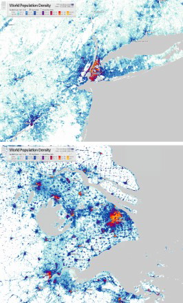
Two GHSL raster data products are included in the map: the 1 km cell resolution 2015 population data and the more detailed 250 m cell resolution 2015 population data. The different data resolutions are used at different viewing scales to improve data legibility. The 1 km data is used for continental and national scale maps, as shown in for the examples of Europe and East Asia. The 250 m data is used for regional scale maps, as shown in for the examples of New York City and Shanghai. In interactive mapping terms, the datasets are assigned to different zoom levels, with 1 km data used for zoom levels 4–6, and 250 m data for zoom levels 7–10. At the most aggregate zoom levels where the entire globe is visible on-screen, the 1 km resolution cells represent much smaller areas than the on-screen pixels and are no longer visible in the map; thus, an additional 5 km resolution aggregation was produced for zoom levels two to three to improve legibility.
Figure 1. Global population density sub-continental scale examples at 1 km cell resolution: Europe (top) and East Asia (bottom).
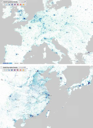
Figure 2. Global population density mega city-region examples at 250 m cell resolution: New York (top) and Shanghai (bottom).
The consistency of the GHSL methodology across the different resolutions aids the transition between zoom levels. The same data classification (described in the next section) was applied to all the population data layers.
2.2. Classification and colour scheme
There is a huge variation in population density represented in the GHSL data, from less than one person per square kilometre in the most remote wildernesses to over 50,000 people per square kilometre in the highest density cities. Within this wide data range, there are several population transition phases that the map aims to differentiate, specifically the transition from wilderness to rural densities; from rural to suburban densities; from suburban to urban densities; and from urban to super-urban densities. Related to the variation in densities, there is wide variation in settlement patterns across the globe, reflecting differences in economic geography, physical geography, history and culture. This diversity translates into very different density levels for urban and suburban land uses in different countries. For example in many parts of the USA urban centre densities are lower than 5000 persons per square kilometre, while in countries with very large rural populations like India and Indonesia the densities of small rural towns can exceed 5000 persons per square kilometre, and the densities of cities in India and Indonesia generally exceed 20,000 persons per square kilometre. An exploratory approach to the GHSL data with a high number of density classes has been implemented to try and avoid tailoring the classification to one particular global region to the detriment of another.
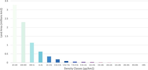
Standard numerical classification methods such as Jenks, Equal Interval and Quantile were tested with the GHSL data. These classification methods did not adequately differentiate the required spatial patterns in density, particularly in relation to urban and super-urban densities at the higher end of the distribution. The problem is that urban land uses represent very small proportions of global land area (thus relatively few raster cells in the dataset) despite representing hundreds of millions of people. A manual method was instead developed using 16 classes, based on a modified Jenks classification. The Jenks classification was modified to include more classes at the higher end of the density scale to capture changes in urban and super-urban density patterns, and to have similar global population totals within each class. The global population and land area totals for each of the classification groups is shown in and .
Figure 3. Global population totals by density class (1 km cell resolution).
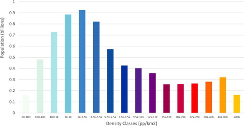
Figure 4. Global land area totals by density class (1 km cell resolution).
As shown in , there are eight classes with values above 9500 persons per square kilometre. These classes represent higher density urban land uses, and are useful for the comparative urban analysis of major cities, as illustrated for New York and Shanghai in . There are three classes in the lower-middle of the distribution covering 1k–5k persons per square kilometre which have large total populations of around 800 million people. The large population size of these groups indicates that the classification scheme is weaker at differentiating these semi-rural and suburban land uses. The differentiation of these land uses was judged to be less of a priority for this more urban focussed mapping application.
Two classes are included at the very lowest end of the distribution to highlight areas where low-density human habitation begins. Although relatively small in terms of total population, these classes have huge land areas which increase their visual prominence in the maps. Note an arbitrary cut-off of 20 persons per square kilometre has been applied for the lowest class, meaning that densities lower than this value are rendered as white and become part of the map background. Although not included in and , this effectively creates a white background class with a population of around 47 million and a vast land area of over one hundred million square kilometres.
The high number of classes included and the highly uneven land cover of these classes is challenging for developing a legible colour scheme. Cartographers typically recommend avoiding having high numbers of classes because the associated symbols can be difficult for users to distinguish. This rule has been broken here in favour of a greater number of classes to identify more varied spatial patterns. The colour scheme implemented is shown in , and is essentially a combination of two colour schemes. The first eight classes are based on a commonly used light-to-dark green-to-blue transition which covers rural-suburban-urban land cover changes (20 persons per square kilometre to 9500 persons per square kilometre). These eight classes cover 98.5% of the classified cells globally at the 1 km cell resolution (excluding cells with lower than 20 persons per square kilometre), and so comprise the vast majority of classified cells on the map. This point is emphasised in , where the first eight classes cover nearly all the European and East Asian maps, except for the centres of the largest cities.
The next eight classes represent the change from urban to super-urban densities (9500 persons per square kilometre to 80,000 persons per square kilometre) based on a multi-spectral transition from blue to very high saturation orange and yellow. This is designed to highlight density differences between the largest cities and city-regions. Multi-spectral colour schemes are generally not recommended in cartography for quantitative data due to colour hue being a visually ambiguous way to order classes, and the uneven luminescence perception of different hues in the human visual system, with yellows and greens being perceived as the highest luminescence (CitationBrewer, Citation1997). This phenomenon gives visual prominence to some classes over others, affecting map legibility. It is possible, however, to design a colour scheme that uses yellow as the most important value, attracting the eye to the most significant features, which in this map design are high-density city centres, as illustrated for the New York and Shanghai regions in . Note that the uneven luminescence perception also makes the greens and cyan classes at the lower end of the colour scale more prominent, and these are not intended to be a focus of the map design. This effect has been offset by the very low saturation colours used for the lowest classes.
The colour scheme has been tested in the Vischeck software (http://www.vischeck.com/vischeck/) to identify legibility issues for colour-deficient users. The map is legible for users with the most common types of colour vision deficiency. The use of red in the colour scheme is not ideal for red–green deficient users and results in a loss of contrast for identifying urban areas, but these areas are still visible due to the differences in luminescence in these classes.
2.3. Interactive statistics
In addition to the map visualisation provided, users should have quick access to descriptive statistics that provide numerical information for regions of interest (CitationSmith, Citation2016). For reasons of clarity, the statistics provided are relatively basic, including built-up area, average population density and total population. Examples of the statistics window included on the interactive map are shown in and .
Figure 5. Interactive national statistics examples for USA and India.
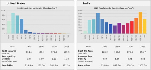
Figure 6. Interactive city statistics examples for Washington, DC and Mumbai.
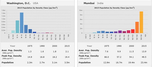
The density statistics are net density calculations using built-up area only, based on the built-up area layer from GHSL at 1 km cell resolution. These were calculated using the zonal statistics tool in ESRI ArcMap with the data in the original GHSL projection of Mollweide. The reason for applying the net density built-up area approach is to avoid density measures becoming influenced by large wilderness features such as deserts and mountain ranges. Large unpopulated features have a significant effect on national gross density measures and can obscure information about average settlement patterns for many countries. The density information is also shown in graph form in the interactive statistics window, displaying the total population for each class group in the map, as shown in and . This is helpful in providing a quick overview of the population distribution, highlighting the contrasts between global regions.
One of the richest features of the GHSL data is that it contains information for multiple points in time, with four data years provided: 1970, 1990, 2000 and 2015. The change over time information has not been included in the Main Map visualisation, and so it has been included in the interactive statistics to add a temporal change perspective to the map.
One final aspect of the descriptive statistics to consider was the range of scales that the map data is being displayed at. National statistics are largely effective for viewing the map at continental scales (although there are some problems in relation to smaller nation-states), but when users zoom in to view city-regions then more disaggregate statistics are needed to correspond to the user’s map extent. The solution applied here was to provide two data scales for the statistics: national and city-region statistics, and to have the map switch automatically between these scales as the user zoom level changes. The urban boundaries used for the city-region statistics are derived from the GHSL built-up area layer. A further improvement would have been to give the user the option of changing the urban boundary system used, as urban boundaries inevitably introduce modifiable areal unit problem effects, where the choice of boundaries influences the aggregate statistics that are calculated (CitationOpenshaw, Citation1984). The map could also have been improved by introducing intermediate statistical geographies for very large nation-states such as the USA and Russia. There was, however, a lack of time to implement these more sophisticated options. Additionally, a user interface button is provided to switch the interactive statistics on and off to help users customise their experience.
2.4. Software used
A number of different software programs were used for the different cartographic tasks. The original data was organised in ESRI ArcMap, and ArcMap was also used to calculate the density statistics and develop the data classification. The final web map is based on raster map tiles which were produced using Mapbox Tilemill (note the latest development release of Tilemill is required for raster support). Tilemill benefits from an intuitive stylesheets approach to cartographic design. It is, however, limited to the commonly used Web Mercator projection in its outputs. The population density datasets were reprojected from their original Mollweide projection into Web Mercator using bilinear resampling in ArcMap. The well-known Web Mercator problem of areal distortions at high latitudes is a shortcoming for this application. Although human activities are concentrated at lower latitudes, an alternative equal area or lower areal distortion projection would have been a considerable improvement, though would require a different software workflow to achieve.
The web mapping software Carto (http://www.carto.com) was used to generate the city labels layers, based on data from the UN World Urbanisation Prospects (CitationUnited Nations, Department of Economic and Social Affairs, Citation2015) which was used for city names and to define label hierarchies based on city population. Carto is also the underlying mechanism for triggering the interactive statistics when the user places their cursor over map features. Finally the statistics graphs shown are generated using a Javascript library called Dimple.js, which is based on the D3 library (CitationBostock, Ogievetsky, & Heer, Citation2011).
3. User response
While detailed user surveys have not been undertaken for this interactive map, some assessments can be made from aggregate web statistics and social media responses. The site has received over 30,000 unique users in the four months since its release in December 2016, demonstrating the considerable interest in the GHSL data. Social media posts have been positive with images of cities and regions of interest shared, highlighting the benefits of the flexible interactive mapping approach that allows users to choose their regions of interest.
An introductory guide was included to provide an overview for users unfamiliar with global population density maps, with some users highlighting this feature as being helpful. Multiple language support would be a valuable addition for future versions. The majority of users are from English-speaking countries (mainly USA, UK and Canada) and from countries with relatively high levels of English speakers (including Spain, Italy and Taiwan). Presumably there would have been more diverse international users had multiple language options been available.
4. Conclusions
An interactive map has been produced for visualising the GHSL, which is the first sub-1 km cell resolution global population density product available as open data. There were several cartographic challenges with visualising this dataset due to the range of spatial scales that are of interest, and the huge contrasts in the density of settlements patterns that exist across different regions of the globe. An interactive mapping approach was taken to allow user navigation from global to city-region scales; and a detailed classification and colour scheme was developed to aid the exploration of a wide range of population densities across the globe. Additionally interactive statistics are presented for direct numerical comparisons at both country and city scales, further enabling global density comparisons.
The map has been successful in generating user interest and is particularly useful for basic international comparisons of urban density. Future improvements to the map should include the ability to map multiple time periods to show changes in population density over time; the ability to change boundaries for the interactive statistics; a change in the map projection to reduce areal distortion and finally multiple language support.
World_Population_Density_Interactive_Map_by_Duncan_Smith.mp4
Download MP4 Video (66.2 MB)WorldPopulationDensity_JoMSupplementary_VectorRGB.pdf
Download PDF (35 MB)Acknowledgements
This project was made possible due to the European Commission JRC and CIESIN support for open data.
Disclosure statement
No potential conflict of interest was reported by the author.
Additional information
Funding
Related Research Data
References
- Bostock, M., Ogievetsky, V., & Heer, J. (2011). D3 data-driven documents. IEEE Transactions on Visualization and Computer Graphics, 17(12), 2301–2309. doi: 10.1109/TVCG.2011.185
- Brewer, C. A. (1997). Spectral schemes: Controversial color use on maps. Cartography and Geographic Information Systems, 24(4), 203–220. doi: 10.1559/152304097782439231
- Dobson, J. E., Bright, E. A., Coleman, P. R., Durfee, R. C., & Worley, B. A. (2000). Landscan: A global population database for estimating populations at risk. Photogrammetric Engineering and Remote Sensing, 66(7), 849–857.
- Doxsey-Whitfield, E., MacManus, K., Adamo, S. B., Pistolesi, L., Squires, J., Borkovska, O., & Baptista, S. R. (2015). Taking advantage of the improved availability of census data: A first look at the gridded population of the world, version 4. Papers in Applied Geography, 1(3), 226–234. doi: 10.1080/23754931.2015.1014272
- Freire, S., Doxsey-Whitfield, E., MacManus, K., Mills, J., & Pesaresi, M. (1990). Development of new open and free multi-temporal global population grids at 250 m resolution. Population, 2000(2014), 250 m.
- Openshaw, S. (1984). The modifiable areal unit problem. Geo Abstracts University of East Anglia.
- Pesaresi, M., Ehrlich, D., Ferri, S., Florczyk, A., Carneiro Freire Sergio, M., Halkia, S., & Syrris, V. (2016). Operating procedure for the production of the global human settlement layer from landsat data of the epochs 1975, 1990, 2000, and 2014 (EUR – Scientific and Technical Research Reports). Publications Office of the European Union. Retrieved from http://publications.jrc.ec.europa.eu/repository/handle/111111111/40182
- Smith, D. A. (2016). Online interactive thematic mapping: Applications and techniques for socio-economic research. Computers, Environment and Urban Systems, 57, 106–117. doi: 10.1016/j.compenvurbsys.2016.01.002
- United Nations, Department of Economic and Social Affairs. (2015). World urbanization prospects: The 2014 revision (No. ST/ESA/SER.A/366). New York, NY: United Nations. Retrieved from http://esa.un.org/unpd/wup/Publications/Files/WUP2014-Report.pdf