
ABSTRACT
Creating resilience for urban water supply systems requires innovative thematic visualizations of the interface between infrastructure, ecology, and culture to viscerally engage lay audiences in the policy making process. Sankey maps (a hybrid Sankey diagram/flow map) embed the systemic accounting of flows between sources and sinks into a spatial framework. This allows a hierarchy of visual variables to encode environmental conditions and historical data, providing a rich multivariate context supporting public discourse, policy making, and system operations. The article features a Sankey map of the Los Angeles Aqueduct system (California, USA) (not to scale).
1. Introduction
Creating compelling visualizations of the interface between infrastructure, ecology, and culture that are accessible to the public and experts (policy makers, regulators, and system operators) is crucial for society to become more resilient and sustainable. Creating static depictions of the dynamic conditions of ecotechnical infrastructural systems (such as urban water supply systems) are cartographic conundrums; a cartographer must balance between spatial accuracy and simplified visualizations that are legible to a wider audience. Sankey maps, which are hybrids of Sankey diagrams and flow maps, provide a thematic framework for spatially (and temporally) visualizing real-time conditions together with related multivariate environmental and historical data, data that is essential to providing a context for lay audiences and experts to understand the system.
This article explores design concepts and esthetics used to produce the Sankey map of the Los Angeles Aqueduct (LAA) system (Main Map & ), created for an exhibit marking the 2013 centennial of the LAA by the Aqueduct Futures (AF) Project at California State Polytechnic University, Pomona (2012–2015). AF featured a series of courses and events engaging an interdisciplinary team of faculty and one hundred and 53 baccalaureate and master level students, mapping and indexing the nexus of water, energy, ecology, and culture created by the LAA (CitationLehrman, Delgado, & Alm, 2013). Student work was incorporated into the design of the AF exhibit (6 November–6 December 2013) and the After the Aqueduct group exhibition (4 March–12 April 2015) at Los Angeles Contemporary Exhibitions, Hollywood, California ().
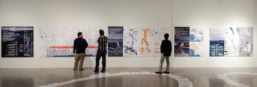
Figure 1. Installation of the Los Angeles Aqueduct Sankey map (center) as part of the After the Aqueduct exhibit at Los Angeles Contemporary Exhibitions, Hollywood, California. Photo by author.
1.1. Mapping the water systems of Los Angeles
Over the course of the twentieth century, Los Angeles, California created one of the most complex and extensive inter-basin water supply systems in the world (), enabling the entire metropolitan region to prosper, despite the drought-prone semi-arid Mediterranean climate. CitationLehrman (2016a, Citation2016b) covers the environmental history of Los Angeles’ water supply system and the LAA’s impacts on the Owens Valley.
Figure 2. Aqueductshed (watersheds and aqueducts) supplying metropolitan Los Angeles, with average annual precipitation in the watersheds, annual average river flow, dates of completion for the aqueducts and water agency. Indicating spatial extents of Figures 3 and 4. Albers projection, NAD27. By the author. Sources: (CitationEngelbert & Scheuring, 1984; CitationFranken, Verdin, Worstell, & Greenlee, 2003; CitationHeberger, 2013; CitationLehrman, 2008; CitationLos Angeles Bureau of Engineering, 2015; CitationUnited States Natural Resources Conservation Service, 1997; CitationPhizzy, 2009; CitationPoppenga & Worstell, 2008; CitationUnited States Geological Service, 2004, Citation2005). Note: Complexity of this figure was optimized for onscreen viewing and print, refer to the full-size supplemental map for all the nuanced graphic tactics discussed in the article.
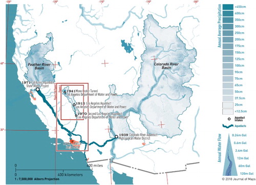
Today, three massive aqueducts supply Los Angeles with most of the water needed for the metropolis to thrive ():
Los Angeles (Owens River) Aqueduct, completed in 1913 and expanded in 1941 and 1970, once provided over 50% of the city’s water but now delivers just 29%, by gravity from the Eastern Sierra watersheds of Mono Lake and the Owens River. It is owned and operated by the Los Angeles Department of Water and Power.
Metropolitan Water District’s Colorado River Aqueduct, completed in 1939, provides 9% of the city’s water from the over-allocated and heavily litigated Colorado River Basin, an area that encompasses 5 states.
California Aqueduct (also known as the State Water Project, as it is operated by the State of California), built 1963–1972, supplies 48% of the City’s water from Northern California watersheds via massive pumps elevating the water from sea level to 600+ meters, to cross the Tehachapi Mountains.
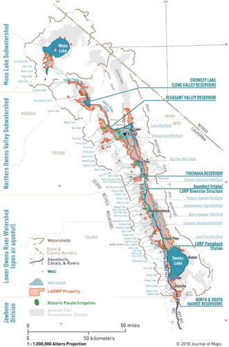
Mapping these aqueducts and their associated aqueductsheds using conventional cartographic methods (as in the simple lines on a map seen in and ) fails to viscerally convey the quantities of water being transferred or provide contextual data to evaluate the Aqueduct’s status and environmental impacts.
Figure 3. Map of Los Angeles, its Aqueduct, and the expanse of property owned by the LADWP in Owens Valley, California. By the author. Albers projection, North American Datum 1927. Sources: (CitationCalifornia Department of Water Resources, 2013; CitationCalifornia Fire and Resource Assessment Program, 2002; CitationJones, 1999; CitationLABOE (Los Angeles Bureau of Engineering), 2015; CitationLos Angeles Department of Water and Power & Ecosystem Sciences, 2010, fig. 5.2; CitationLos Angeles Department of Water and Power, 2010, fig. 8C; CitationMetropolitan Water District of Southern California, 2012; CitationRaumann, Stine, Evans, & Wilson, 2002; Sauder, Citation1994, fig. 8.2; CitationUnited States Geological Service, 2003). Note: Complexity of this figure was optimized for onscreen viewing and print, refer to the full-size supplemental map for all the nuanced graphic tactics discussed in the article.
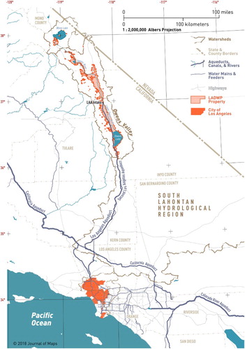
Figure 4. Tributaries and sources of the Los Angeles Aqueduct, in the Eastern Sierras: aquifers, wells and well fields, and areas irrigated by the Paiute. By the author. Sources: (CitationCalifornia Department of Water Resources, 2013; CitationDanskin, 1998; CitationFRAP, 2002; CitationLos Angeles Department of Water and Power, & Ecosystem Sciences, 2010, fig. 5.2; CitationMorrow, 2014; CitationMulholland, 1916; CitationSauder, 1994, fig. 8.2; CitationNational Park Service, 2015; CitationRaumann et al., 2002). Note: Complexity of this figure was optimized for onscreen viewing and print, refer to the full-size supplemental map for all the nuanced graphic tactics discussed in the article.
Of the various historic maps delineating the route of the LAA, a few are significant for their beauty and craft: the City of Los Angeles Board of Water and Power Commissioners’ (Citation1908) topographic map, Mulholland’s plan and section (Citation1916, Plates No. 4 & 5) which charted construction progress, and The California Water Atlas’s (CitationKahrl, 1979, pp. 34–35) comparison of the LAA with the Colorado River Aqueduct. Except for Kahrl’s, these maps lack flow and temporal data (such as peak and average flows, or capacity). Likewise, AF’s initial catalyst for designing a compelling and visceral quantitative spatial visualization of the Aqueduct was the indecipherable diagrams provided by the Los Angeles Department of Water and Power (LADWP) on the real-time Aqueduct data web page (CitationLos Angeles Department of Water and Power, 2013). LADWP’s ‘dashboard’ is all-but-indecipherable through poor design and a lack of units (to say nothing of providing historical context or attempting to make visible the quantities).
1.1.1. Mapping time
In Desimini & Waldheim’s (Citation2016) curated catalog of the cartographic techniques in representations of landscape features, there is a scarcity of maps that feature temporality, despite the fascination of landscape urbanist theorists (such as Waldheim) with emergent ecological conditions. Time is implicit in their discussion of the stratigraphic columns of geologic maps, but this is the limit of their coverage.
CitationAigner, Miksch, Schumann, and Tominski (2011) introduce their comprehensive survey of ‘time-oriented’ visualization methods with a history of time-based graphs, from Jacques Barbeu-Dubourg’s carte chronographique (1753) and Playfair’s Atlas (1786) to Charles Joseph Minard’s 1861 chart of Napoleon’s 1812–1813 failed campaign into Russia (see the next section). Of the 101 contemporary typologies included in Aigner et al., only 11 provide any degree of spatial organization (Flow Map, GeoTime, Helix Icons, Icons on Maps, Pencil Icons, Small Multiples, Space–Time Path, Time-Oriented Polygons on Maps, Time-Varying Hierarchies on Maps, Value Flow Map, and Vis-Stamp); the rest utilize abstract empirical or ordinal frames. All 11 (and most of the 101) appear to serve a narrow, expert audience; they fail to provide the qualities of legibility a lay audience needs, such as good graphic design.
1.1.2. Flow maps
Minard’s chart is the most frequently (but undeservedly) cited example of a flow map, thanks to the prolific graphic evangelizing of CitationTufte (2001). Flow maps were pioneered by Henry Drury Harness (1804–1883), with his 1837 map of travel around Ireland (CitationJenny et al., 2017). Flow maps have matured into a common means to visualize population migration, transfers of goods, or economic indicators at a continental or global scale. As high-level abstractions, they condense nuanced spatial origins and destinations to a few centroids of geographic/political regions, or cities. While flow maps may implicitly reveal movement along highways, railroads, or air networks, visualizing net transfers is the focus, not the functionality of the networks and infrastructure.
Much of the contemporary research into flow maps falls into either legibility/visual preferences studies (CitationJenny et al., 2016, Citation2017; CitationJohnson & Nelson, 1998; CitationKoylu & Guo, 2017), or the development of automated mapping algorithms (CitationBoyandin, Bertini, Bak, & Lalanne, 2011; CitationBuchin, Speckmann, & Verbeek, 2011; CitationGuo, 2009; CitationPhan, Xiao, Yeh, & Hanrahan, 2005; CitationStephen & Jenny, 2017), which are both outside the scope or aims of this paper. CitationKoylu and Guo (2016) attempt to resolve the conflicting findings of prior research in visual preferences and the efficacy of origin/destination flow map design tactics. CitationSoundararajan, Ho, and Su (2014) analyze the efficacy of design features in flow maps, but their discussion about visual comprehension and communicating with the public is weak and underdeveloped.
1.1.3. Sankey diagrams
What would otherwise be known as ‘flow diagrams’ bear the eponymous designation of Matthew Henry Phineas Riall Sankey (1853–1926), the steam power engineer who first published a diagram accounting for the energy flows in a steam engine (CitationSankey, 1898; CitationSchmidt, 2008a). CitationSchmidt (2008b) follows up his history of Sankey (flow) diagrams with a review of the contemporary variants and applications but fails to delve into their esthetics or attributes that contribute to visual comprehension. While CitationMeadows (2008), in her Thinking in Systems, does not touch on the etymology of her vocabulary of ‘sources’, ‘sinks’, ‘reservoirs’, and ‘limits’, are implicitly linked to Sankey’s work.
Today, Sankey diagrams are frequently deployed to visualize regional or national energy use, or to accompany life-cycle accounting of industrial commodities. Direct precedents to our LAA map include US Army Corp of Engineers' (1958) Project Design Flood Hypo-Flood 58A and CitationMeade’s (1995) diagrams of the Mississippi River system. Colorado Water Conservation Board’s Citation2017 map juxtaposes scaled arrows of stream flow for wet and dry years – though it does not provide a legend for the arrow widths as numeric quantities are annotated. Lawrence Livermore National Laboratory has produced a series of Sankey diagrams visualizing all water use for the nation and each state (CitationSmith, Belles, & Simon, 2011), but their abstract accounting is entirely removed from the geographic and ecological context. CitationCurmi et al. (2013) covers the adoption of Sankey diagrams for visualizing the energy-water nexus for northern and central California and makes the case that Sankey diagrams are effective means to communicate with resource managers and policy makers.
Hybrid diagrams and maps are another means to balance conflicting heuristics through the design process, such as the richness discussed by CitationFathulla (2008). CitationLupton and Allwood (2017) define a ‘hybrid’ Sankey diagram for multi-dimensional data by hierarchically aggregating flows to improve comprehension, but their resulting examples are visually awkward.
1.2. Esthetics and legibility of water supply system diagrams
Maps are a form of visualization (CitationMacEachren, 2004) in which esthetics are critical to supporting the comprehension and persuasiveness of exploratory and expository data visualization (CitationLang, 2010). In our case of mapping inter-basin water transfers, there are quantitative, qualitative, spatial, and temporal aspects to visualize, requiring the visualization to provide both exploratory and expository functions. CitationBennett, Ryall, Spalteholz, and Gooch (2007) emphasizes readability and comprehension as the key esthetic heuristics for graphs (including Sankey diagrams), with syntactical and semantic issues contributing to visceral, behavioral, and reflective processing. CitationBuchin et al. (2011) discuss the qualities that make a flow map ‘good’, but their criteria are simplistic: reduced visual clutter, minimizing the crossing of flows, and using curved lines. Flow map design principles proposed by CitationJenny et al. (2016) are also reductive: use curved flow lines; use arrows instead of tapers; and provide nodes to identify sources and sinks.
Buchin et al. and Jenny et al. ignore the principles of ‘good’ graphic/artistic composition that CitationTufte (2001) broadly applies to information design. These compositional rules include: dynamic visual balance (to keep the viewer engaged); clear hierarchies (so the viewer knows what is significant); use of proportions and a clear visual language (so everything works together); and interplay between the figure and ground (to keep it interesting), otherwise called ‘soundness’, ‘attractiveness’, and ‘utility’ (CitationVande Moere & Purchase, 2011). These graphic/artistic esthetic composition criteria are not the same as ‘graph drawing esthetics’ where minimizing edge crossings, limited bends to edges, creating local symmetries, and maximizing the angle between edges at nodes are significant factors for creating legibility (CitationPurchase, Pilcher, & Plimmer, 2012). Both have relevance when designing for legibility and accessibility by the public.
Human–computer interface research into persuasive displays has identified how viscerally clear, legible and playful graphic grammar (CitationChen et al., 2009; CitationPearce, 2008; CitationValkanova, Jorda, & Vande Moere, 2015) enable the public to connect to and comprehend complex data visualizations. Designing visceral and playful glyphs and graphics requires engaging the indexical (CitationAtkin, 2013; CitationMoere & Patel, 2009; CitationOffenhuber & Orkan, 2015) to bridge between the phenomena being mapped and the glyphs being used to represent the conditions.
1.2.1. Visual variables
Visual variables (dash styles, size, value, texture, color, orientation, and shape) provide the means to encode multivariate data into flow diagrams/maps (CitationBertin, 1983; CitationWilkinson, 1999). CitationHolten, Isenberg, Wijk, and Fekete (2011) explores how visual variables, including curvature/sinuosity, hue, tone, value, line taper, line dashes, arrowheads, and glyphs (or decals) impact the legibility of connections between nodes in depictions of networks as graphs. CitationAgrawala, Li, and Berthouzoz’s (2011) methodology for visualization design principles (identify, instantiate, and evaluate) supports using variables that relate to the subject of the map as a means to create a visceral and compelling visualization. CitationBlok (2005) explores how dynamic visual variables can depict changing conditions in animated maps, where several of the practices identified are also effective means to indicate changed conditions on static two-dimensional maps.
Most of the studies citied so far are flawed by their reductive scholarship studying isolated (and simplified) aspects of graphs and maps; they overlook the power of visual richness and good graphic design to engage the public. This is also the point at which to distinguish between research into automated data visualization techniques/human–computer interface (not to diminish this work in general), and the qualitative and intuitive realm of esthetics and graphic design. Intuitive graphic choices by an experienced designer are not ‘arbitrary or capricious’ [per Robinson as quoted in CitationMacEachren (2004)] when grounded in both scientific methodology and esthetics. An experienced designer can help create graphic legibility that cannot be replicated by algorithms or distilled from visual legibility studies.
2. Designing the LAA Sankey map
Our initial plan for the AF exhibit and website was to create a series of flow diagrams for the water supply of Los Angeles covering each decade between 1851 and 2010 (the range of our data set). Due to limited time and space constraints, our ambition was curtailed to creating the single flow diagram depicting the average conditions for 2001–2010. While the Sankey map for the Los Angeles City Hall exhibit was printed on a 40 × 60-inch (102 × 152-centimeter) panel, we strove to design a diagram that would remain legible when scaled down to fit on a computer screen as a rasterized image.
The Sankey map shared the exhibit’s CMYK color palette, typographic styles, and AF logo/word mark designed by M. Noriega (a 4th year baccalaureate graphic design student in Prof. Lee’s AF project-sponsored ART499) and the author. Initial development of the Sankey map was the endeavor of two BSLA students, S. Bhalinge and A. Placido, in the author’s spring 2013 Exhibit Design Practicum. The final version of the map included in the Los Angeles City Hall exhibition was created by the author in the fall of 2013. The version accompanying this article includes revised line widths and geometry created by the author for the 2015 After the Aqueduct exhibit () and the project’s website.
To enhance the overall visual clarity and to match the granularity of the available data, we used a simplified depiction of the hydrology (see ) by aggregating all the tributary streams feeding Mono Lake and Owens River (see ) into a few nodes representing each watershed, and clustering the nine Owens Valley wellfields into northern and southern nodes. These design decisions align with research into flow map visual preferences that aggregation of flow paths (CitationKoylu & Guo, 2017; CitationPhan et al., 2005; CitationStephen & Jenny, 2017) and clustering of edges in graphs (CitationCui, Zhou, Qu, Wong, & Li, 2008; CitationPurchase et al., 2012) enhances comprehension.
Figure 5. Simplified Sankey map of the Los Angeles Aqueduct (LAA) visualizing average annual flows from 2003 to 2013. Color gradients distinguish between sources and sinks, pumped groundwater and surface flow. Conduit capacity and historic averages are embedded in the visualization to provide temporal context. See the featured map for the glyphs that convey velocity, streams versus pipes, and evaporation. Not to scale. See Figure 2 for the regional context of the LAA, while Figures 3 and 4 provide geographic details of aqueduct system. By the author and the Aqueduct Futures project. Sources: (CitationBotkin, 1988; CitationBureau of Los Angeles Aqueduct, 1907, Citation1908, Citation1909, Citation1910, Citation1911; CitationUnited States Bureau of Reclamation, 2012; CitationLee, 1912; CitationLee, 1906; CitationCalifornia Department of Public Works, 1923, Citation1930, Citation1937; CitationChristopher, 1930; CitationDanskin, 1998; CitationDepartment of Sanitation, 2006; CitationHoffman & Stern, 2007; CitationHyde, 1915; CitationInyo County & City of Los Angeles, 1990; CitationKahrl, 1976, Citation1979; CitationKelly, 1913; CitationLos Angeles Department of Sanitation, 2015; CitationLos Angeles Department of Water and Power & Ecosystem Sciences, 2010; CitationLos Angeles Department of Water and Power, 1976, Citation1978, Citation1979, Citation1980, Citation1986, Citation2010, Citation2015, Citation2017; CitationLos Angeles Water Commissioners, 1902–1910; CitationLos Angeles Department of Water and Power, 2015; CitationLyon & Sutula, 2011; CitationMetropolitan Water District of Southern California, 2016; CitationMulholland, 1906, Citation1916; CitationOrme & Orme, 2008; CitationOrstrom, 1950; CitationQuinton, Code, & Hamlin, 1911; CitationRaumann et al., 2002; CitationRogers, 1987; CitationSanitation Districts of Los Angeles County, 2013; CitationSteward, 1933; CitationTrowbridge, 1911). Note: Complexity of this figure was optimized for onscreen viewing and print, refer to the full-size supplemental map for all the nuanced graphic tactics discussed in the article.
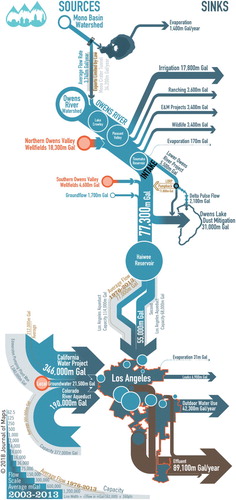
While our final Sankey map is not strictly drawn at a specific spatial scale, it was designed using a 1:375,000 base map of the Aqueduct and surrounding terrain. We chose to retain the distinctive outlines of Mono Lake (with bathymetry), Owens Lake (with dust mitigation), and the border of Los Angeles as recognizable landmarks, while all other features were stylized. For legibility, specific geometric features were manually enlarged or reduced to convey their significance (such as the distinctive trace of the LAA around the perimeter of Antelope Valley), while also adhering to the self-imposed convention of locating all water sources on the left, water sinks (end users, evaporations, and leaks, e.g.) on the right, and for water to flow from top (north) to bottom (south) of the panel. Fidelity to these rules required locating the Colorado River Aqueduct (which enters the city from the east), and the California Aqueduct (entering from the north) on the left side of Los Angeles, so tails were added to the arrow that indicated the direction.
2.1. Visual variables
Regarding color, the palette developed by M. Noriega designated colors for each data type/geographic typology (stream, lake/reservoir, or aqueduct, e.g.). These colors were the basis for developing tonal color gradients indicating the progression from source (lighter tone) to sink (darker tone). Sanitary sewer flows were coded to brown, which was blended in a ramp with the blue sink color.
In reference to line widths, as the flow volumes ranged across several orders of magnitude (a few thousand to tens of millions of gallons), we developed a pseudo-logarithmic scale to ensure the thinnest lines would remain visible at a lower resolution on screens. After experimenting with various algorithms to generate our line widths, we arrived at a final formula: Square Root (Flow in mGal/162,000) × 160 points. Our non-linear flow scale required significant finessing of the intersections between sources, sinks, and the main flow lines that proved to be problematic, so the author will utilize a linear scale in future iterations.
In the case of glyphs (decals), we intended to depict the LAA system for a public audience, so several stream attributes were developed into visceral design elements. Natural streams and rivers are indicated by varying the sinuosity of arrow glyphs, inspired by the eddies and meandering nature of streams. Laminar flows are observed in the aqueduct, and canals are depicted with parallel arrows glyphs. The speed of the flow (based on the slope/topography) was indicated by the length of the glyphs. Quantities were reinforced by varying the line width/arrow head size of the glyphs. For flows into sinks, liquid flows are solid lines, while evaporation is indicated by dashed glyphs. Retrospectively, these design choices for our glyphs can be affirmed by CitationWare, Kelley, and Pilar’s (2014) research into best design practices for displaying wind patterns and water currents.
2.2. Data aggregation and processing
Aggregating the data was the purview of the author (not the student design assistants). Annual water flow data from historic and contemporary sources were compiled into a single Excel spreadsheet via manual data entry, or as copied and pasted from Portable Document Format (PDF) files after using Acrobat Pro’s OCR tool as needed. Contemporary water and environmental data were aggregated from text files, .csv files, or PDFs into the Excel file from agency websites and reports. In the end, our flow data for the Los Angeles River and Zanja Madre system covers 1851–2010; Owens River and tributaries, 1899–2012; Mono Basin, 1941–2011; and groundwater pumping in the Owens Valley, 1941–2012. Sources for historic and contemporary data used to generate the Sankey map are listed following the article’s bibliography.
2.2.1. Unit conversion and temporal alignment
Volumetric data was converted into million Gallons (mGal) (3785 cubic meters) from contemporary sources that use a mix of Acre-Feet and cubic feet per second (CFS or ‘second feet’ by CitationMulholland, 1916); a few of the historic sources reported flows using archaic ‘miner’s inches’ (defined by Wikipedia as 0.025 CFS in northern California or 0.020 CFS in southern California). Imperial quantities were converted to SI unit for this article (except those graphically embedded in a flow diagram). All numeric data used in the exhibition was manually rounded to three significant units.
Data used to create the flow diagram were based on the average annual quantities collected for 2001 through 2010. Temporal alignment was required as data were provided in a mix of ‘water year’ per the USGS as October 1st to September 30th (three-month offset/12 months = 25% difference), fiscal year (varying per jurisdiction), and calendar year intervals. Data intervals got normalized to calendar years by tallying the average quantities per decade (three-month offset/120 months = 0.025% difference).
Annual data for Owens Valley runoff, ground water pumping, and ground flow into the LAA/Owens River required unit conversion and normalizing different time reporting time frames. Well field pumping quantities and stream flows were aggregated geographically into three (sub)watersheds: Mono Basin, Northern Owens Valley (above Tinemaha Reservoir), and Southern Owens Valley. Delivery totals to the City of Los Angeles required unit conversion and normalization of temporal intervals.
2.2.2. Sinks calculations
Evaporation from reservoirs and lakes was calculated by multiplying surface area by evaporation rates interpolated from CitationGoodridge (1979). For open-air reaches of the LAA, surface areas were calculated using the cross-section widths from CitationMulholland (1916). Evaporation rates and the surface areas of the Owens River and tributaries were not computed, as groundwater inflow rates exceed evaporation by an order of magnitude. Base flow and groundwater recharge from unlined portions of the Aqueduct were gleaned from various sources. Dust mitigation water use on Owens Lake was sourced from LADWP documents, then converted from Acre-Feet to mGal units. Customer water usage percentages are sourced from LADWP annual reports and multiplied by the total water deliveries to calculate totals per customer types. Sewage treatment quantities from Los Angeles Bureau of Sanitation and Los Angeles County required only unit conversion.
3. Conclusion: transcending the ecotechnical-societal interface
We live in a society enabled by complex water, energy, communication, and logistical systems that are challenging even for experts to visualize. Public comprehension of our fracture-critical water supply systems is essential (CitationPincetl et al., 2015) in order to enable all stakeholders to engage the technocratic and insular water policy makers (at least in California) on issues of social and environmental justice, ecological water use, sustainability, recreational access, and urban/rural issues. Thus, it is a worthy challenge to design visualizations and diagrams aimed to inform and engage the public about their functions, impacts, or benefits – the essence of urban visualization. CitationGrainger, Mao, and Buytaert (2016) identify the ‘science-society interface’ where well-designed visualizations and thematic maps are underutilized to legibly communicate complexity in the environment to the public. Equally, the engineering/society interface, the policy maker/regulator/society interface, and the utility operator/society interface are similarly deficient in their efficacy to convey nuance and complexity to the public. AF pursued crossing this technocratic interface by fostering collaborations between the author, a landscape architect/artist/graphic designer; students; and scientists/engineers to create what CitationGough, De Berigny Wall, and Bednarz (2014) call ‘Non-Expert User Visualisation’ to effectively engage the public.
There is a correlation between the myopic focus of policy makers and engineers who evaluate and visualize a limited set of technical criteria, and the continued construction of single-purpose infrastructure serving limited societal and ecological needs (CitationLokman, 2017; CitationLovell & Taylor, 2013), along with decision making that impedes the creation of resilience (CitationGrainger et al., 2016).
The first step towards influencing conservation behavior is providing the public with means to understand the impacts of their lifestyle choices (CitationAttari, DeKay, Davidson, & Bruine de Bruin, 2010). If a picture is indeed worth a thousand words, developing effective visualizations and mapping methods to convey environmental and cultural impacts needs to be a priority. Visualization for persuasion requires additional research into visual comprehension of system diagrams, developing cartographic methods to depict temporal changes in the landscape and the water-energy nexus.
Software
Design and creation of the maps and exhibition materials was in Adobe Illustrator™ (6, 7, and CC). Geospatial shapefiles were exported for editing in Illustrator with ESRI ArcGIS™ (various versions) into PDFs. Adobe Photoshop™ (6, 7, and CC) was used for image editing, compositing, and producing halftones. Adobe Acrobat Pro™ (various versions) provided Optical Character Recognition (OCR) of scanned texts. Aggregation of numeric and text data, converting units, and the other calculations were done with Microsoft Excel™ (various versions). Writing, grammar, and spell checking was handled in Illustrator or Microsoft Word™.
Geolocation information
The maps accompanying this article encompass the following counties in California (north to south): Mono, Inyo, Kern, San Bernardino, and Los Angeles.
Significant locations of the LAA:
The northern-most point, Lee Vining Creek Intake (Mono County, CA): 37°56′10.27″N, 119° 8′4.15″W.
Owens River intake for the LAA (near Independence, Inyo County, CA): 36°58′32.52″N, 118°12′38.15″W.
‘Owensmouth’ Terminus of the Aqueduct, Sylmar (City of Los Angeles), CA: 34°19′28.99"N, 118°29′51.76″W.
Visualizing Water Infrastructure with Sankey Maps: a Case Study of Mapping the Los Angeles Aqueduct, California.pdf
Download PDF (2 MB)Acknowledgements
I wish to thank Journal of Map’s editors and reviewers for their valuable comments and assistance. Caroline Traugott of Birdhouse-Editing.com for her copy-editing prowess and speed. Each of the 153 participants in the Aqueduct Futures course, my colleagues who assisted teaching these courses, and all the Owens Valley and Mono Basin workshop participants. Exhibition design assistants: JL, CF, JT, KY, AJ, AN, AP, and RR. Kim String fellow for her ongoing encouragement and for inviting me to participate in the After the Aqueduct exhibit. Everybody who visited the Aqueduct Futures and After the Aqueduct exhibits, and the project website www.aqueductfutures.com. My muses MA & EK, and my inspiration to make the world a better place: SL. Los Angeles Department of Cultural Affairs, and Council District 4 for facilitating and installing the first Aqueduct Futures Exhibit at Los Angeles City Hall, November – December, 2013. Metabolic Studio and Dean Michael Woo for the freedom to grow with the Aqueduct Futures Project. College of Environmental Design at Cal Poly Pomona for supporting the Aqueduct Futures Project, and covering, including the Open Access Publishing fee for this article.
Disclosure statement
No potential conflict of interest was reported by the author.
ORCID
Barry Lehrman http://orcid.org/0000-0001-9639-112X
Additional information
Funding
Related Research Data
References
- Agrawala, M., Li, W., & Berthouzoz, F. (2011). Design principles for visual communication. Communications of the ACM, 54(4), 60–69. Retrieved from http://dl.acm.org/citation.cfm?id=1924439 doi: 10.1145/1924421.1924439
- Aigner, W., Miksch, S., Schumann, H., & Tominski, C. (2011). Visualization of time-oriented data. London: Springer-Verlag. Retrieved from https://www.springer.com/us/book/9780857290786
- Atkin, A. (2013). Peirce’s theory of signs. In E. N. Zalta (Ed.), The Stanford encyclopedia of philosophy (summer 2013). Stanford, CA: Metaphysics Research Lab, Stanford University. Retrieved from https://plato.stanford.edu/archives/sum2013/entries/peirce-semiotics/
- Attari, S. Z., DeKay, M. L., Davidson, C. I., & Bruine de Bruin, W. (2010). Public perceptions of energy consumption and savings. Proceedings of the National Academy of Sciences, 107(37), 16054–16059. doi:10.1073/pnas.1001509107.
- Bennett, C., Ryall, J., Spalteholz, L., & Gooch, A. (2007). The aesthetics of graph visualization. Presented at the computational aesthetics 2007: Eurographics workshop on computational aesthetics in graphics, visualization and imaging, Banff, Alberta, Canada, June 20–22, 2007. Banff, Alberta: The Eurographics Association. doi:10.2312/COMPAESTH/COMPAESTH07/057-064
- Bertin, J. (1983). Semiology of graphics: Diagrams, networks, maps. Madison: University of Wisconsin Press.
- Blok, C. (2005). Dynamic visualization variables in animation to support monitoring. Utrecht University. Retrieved from https://www.researchgate.net/publication/228620328_Dynamic_visualization_variables_in_animation_to_support_monitoring
- Boyandin, I., Bertini, E., Bak, P., & Lalanne, D. (2011). Flowstrates: An approach for visual exploration of temporal origin-destination data. Computer Graphics Forum, 30(3), 971–980. doi: 10.1111/j.1467-8659.2011.01946.x
- Buchin, K., Speckmann, B., & Verbeek, K. (2011). Flow map layout via spiral trees. IEEE Transactions on Visualization and Computer Graphics, 17(12), 2536–2544. doi: 10.1109/TVCG.2011.202
- Chen, M., Ebert, D., Hagen, H., Laramee, R. S., van Liere, R., Ma, K. L., & Silver, D. (2009). Data, information, and knowledge in visualization. IEEE Computer Graphics and Applications, 29(1), 12–19. doi: 10.1109/MCG.2009.6
- Colorado Water Conservation Board. (2017). Statewide summary of observed wet-and-dry surface water hydrology. [Map]. Denver, CO: Department of Natural Resources. Retrieved from https://drive.google.com/file/d/0B-bDzxQjaZmhcWRsaWxranhqVDQ/view
- Cui, W., Zhou, H., Qu, H., Wong, P. C., & Li, X. (2008). Geometry-based edge clustering for graph visualization. IEEE Transactions on Visualization and Computer Graphics, 14(6), 1277–1284. doi: 10.1109/TVCG.2008.135
- Curmi, E., Fenner, R., Richards, K., Allwood, J. M., Bajželj, B., & Kopec, G. M. (2013). Visualising a stochastic model of Californian water resources using Sankey diagrams. Water Resources Management, 27(8), 3035–3050. doi: 10.1007/s11269-013-0331-2
- Desimini, J., & Waldheim, C. (2016). Cartographic grounds: Projecting the landscape imaginary. New York, NY: Princeton Architectural Press.
- Fathulla, K. (2008). Symbolic, spatial, mapping (SySpM): A framework for interpreting maps. The Cartographic Journal, 45(4), 304–311. doi: 10.1179/174327708X347809
- Goodridge, J. (1979). Bulletin 73–79: Evaporation from water surfaces in California. Sacramento, CA: Department of Water Resources. Retrieved from http://www.water.ca.gov/waterdatalibrary/docs/historic/Bulletins/Bulletin_73/Bulletin_73__1979.pdf
- Gough, P., De Berigny Wall, C., & Bednarz, T. (2014). Affective and effective visualisation: Communicating science to non-expert users. In 2014 IEEE pacific visualization symposium (PacificVis) (pp. 335–339). doi:10.1109/PacificVis.2014.39
- Grainger, S., Mao, F., & Buytaert, W. (2016). Environmental data visualisation for non-scientific contexts: Literature review and design framework. Environmental Modelling & Software, 85(Suppl. C), 299–318. doi: 10.1016/j.envsoft.2016.09.004
- Guo, D. (2009). Flow mapping and multivariate visualization of large spatial interaction data. IEEE Transactions on Visualization and Computer Graphics, 15(6), 1041–1048. doi: 10.1109/TVCG.2009.143
- Holten, D., Isenberg, P., Wijk, J. J. v., & Fekete, J. D. (2011). An extended evaluation of the readability of tapered, animated, and textured directed-edge representations in node-link graphs. In 2011 IEEE Pacific Visualization Symposium (pp. 195–202). doi:10.1109/PACIFICVIS.2011.5742390
- Jenny, B., Stephen, D. M., Muehlenhaus, I., Marston, B. E., Sharma, R., Zhang, E., & Jenny, H. (2016). Design principles for origin-destination flow maps. Cartography and Geographic Information Science, 1–15. doi:10.1080/15230406.2016.1262280.
- Jenny, B., Stephen, D. M., Muehlenhaus, I., Marston, B. E., Sharma, R., Zhang, E., & Jenny, H. (2017). Force-directed layout of origin-destination flow maps. International Journal of Geographical Information Science, 31(8), 1521–1540. doi: 10.1080/13658816.2017.1307378
- Johnson, H., & Nelson, E. S. (1998). Using flow maps to visualize time-series data: Comparing the effectiveness of a paper map series, a computer map series, and animation. Cartographic Perspectives, 0(30), 47–64. doi: 10.14714/CP30.663
- Kahrl, W. L. (1976). The politics of California water: Owens Valley and the Los Angeles aqueduct, 1900–1927. California Historical Quarterly, 55(1), 2–25. doi: 10.2307/25157605
- Kahrl, W. L. (Ed.). 1979. The California water atlas. Sacramento, CA: Governor’s Office of Planning and Research.
- Koylu, C., & Guo, D. (2017). Design and evaluation of line symbolizations for origin–destination flow maps. Information Visualization, 16(4), 309–331. doi: 10.1177/1473871616681375
- Lang, A. (2010). Aesthetics in information visualization. In D. Baur, M. Sedlmair, R. Wimmer, Y.-X. Chen, S. Streng, S. Boring, & A. Butz (Eds.), Trends in information visualization (pp. 8–14). Munich: University of Munich. Retrieved from http://141.84.8.93/pubdb/publications/pub/baur2010infovisHS/baur2010infovisHS.pdf
- Lehrman, B. (2016a). Los Angeles aqueductsheds & energysheds. In E. Monoian, & R. Ferry (Eds.), Powering places: Land art generator initiative, Santa Monica (pp. 28–37). New York, NY: Prestel.
- Lehrman, B. (2016b). Reconstructing the void: Owens Lake. In S. McDowell (Ed.), Water index: Design strategies for drought, flooding and contamination (1st. ed., pp. 224–237). New York, NY: ACTAR.
- Lehrman, B., Delgado, D., & Alm, M. (2013). Aqueduct as muse: Educating designers for multifunctional landscapes. ARID: A Journal of Desert Art, Design and Ecology, 2. Retrieved from http://aridjournal.com/aqueduct-as-muse-lehrman-delgado-alm/
- Lokman, K. (2017). Cyborg landscapes: Choreographing resilient interactions between infrastructure, ecology, and society. Journal of Landscape Architecture, 12(1), 60–73. doi: 10.1080/18626033.2017.1301289
- Los Angeles Department of Water and Power. (2013). Los Angeles Aqueduct – real time data. Retrieved from http://wsoweb.ladwp.com/Aqueduct/realtime/norealtime.htm
- Los Angeles Water Commissioners. (1908). Topographic map of the Los Angeles Aqueduct and adjacent territory. [Map] Los Angeles, CA: City of Los Angeles. Retrieved from https://www.loc.gov/item/2006626012/
- Lovell, S. T., & Taylor, J. R. (2013). Supplying urban ecosystem services through multifunctional green infrastructure in the United States. Landscape Ecology, 28(8), 1447–1463. doi: 10.1007/s10980-013-9912-y
- Lupton, R. C., & Allwood, J. M. (2017). Hybrid Sankey diagrams: Visual analysis of multidimensional data for understanding resource use. Resources, Conservation and Recycling, 124, 141–151. doi: 10.1016/j.resconrec.2017.05.002
- MacEachren, A. M. (2004). How maps work: Representation, visualization, and design. New York, NY: Guilford Press.
- Meade. (1995). Contaminants in the Mississippi River 1987–92 (Circular No. 1133). Washington, DC: USGS. Retrieved from https://pubs.usgs.gov/circ/1995/1133/report.pdf
- Meadows, D. H. (2008). Thinking in systems: a primer. D. Wright (Ed.). White River Junction, VT: Chelsea Green.
- Moere, A. V., & Patel, S. (2009). The physical visualization of information: Designing data sculptures in an educational context. In Visual information communication (pp. 1–23). Boston, MA: Springer. doi: 10.1007/978-1-4419-0312-9_1
- Mulholland, W. (1916). Complete report on construction of the Los Angeles Aqueduct: With introductory historical sketch; illustrated with maps, drawings and photographs. Los Angeles, CA: Department of Public Service. Retrieved from https://books.google.com/books?id=CoU5AQAAMAAJ
- Offenhuber, D., & Orkan, T. (2015). Indexical visualization – the data-less information display. In U. Ekman, J. D. Bolter, L. Diaz, M. Sondergaard, & M. Engberg (Eds.), Ubiquitous computing, complexity and culture (pp. 286–299). Routledge.
- Pearce, M. W. (2008). Framing the days: Place and narrative in cartography. Cartography and Geographic Information Science, 35(1), 17–32. doi: 10.1559/152304008783475661
- Phan, D., Xiao, L., Yeh, R., & Hanrahan, P. (2005). Flow map layout. In IEEE Symposium on Information Visualization, 2005. INFOVIS 2005 (pp. 219–224). doi:10.1109/INFVIS.2005.1532150
- Pincetl, S., Glickfeld, M., Cheng, D., Cope, M., Naik, K., Porse, E., & Kuklowski, C. (2015). Water management in Los Angeles County; a research report (p. 35). Los Angeles, CA: University of California, Institute of the Environment and Sustainability. Retrieved from https://www.ioes.ucla.edu/publication/water-management-los-angeles-county-research-report/
- Purchase, H. C., Pilcher, C., & Plimmer, B. (2012). Graph drawing aesthetics - created by users, not algorithms. IEEE Transactions on Visualization and Computer Graphics, 18(1), 81–92. doi: 10.1109/TVCG.2010.269
- Sankey, H. R. (1898). Plate 5. Introductory note on the thermal efficiency of steam-engines. In Minutes of Proceedings of the Institution of Civil Engineers. The Institution of Civil Engineers. Retrieved from https://books.google.com/books?id=D3UMAAAAYAAJ&pg=PA281#v=thumbnail&q=plate%205
- Schmidt, M. (2008a). The Sankey diagram in energy and material flow management - part I: History. Journal of Industrial Ecology, 12(1), 82–94. doi: 10.1111/j.1530-9290.2008.00004.x
- Schmidt, M. (2008b). The Sankey diagram in energy and material flow management - part II: Methodology and current applications. Journal of Industrial Ecology, 12(2), 173–185. doi: 10.1111/j.1530-9290.2008.00015.x
- Smith, C. A., Belles, R. D., & Simon, A. J. (2011). Estimated water flows in 2005: United States (No. LLNL-TR-475772). Berkeley, CA: Lawrence Livermore National Laboratory. Retrieved from https://e-reports-ext.llnl.gov/pdf/475370.pdf
- Soundararajan, K., Ho, H. K., & Su, B. (2014). Sankey diagram framework for energy and exergy flows. Applied Energy, 136, 1035–1042. doi: 10.1016/j.apenergy.2014.08.070
- Stephen, D. M., & Jenny, B. (2017). Automated layout of origin–destination flow maps: U.S. county-to-county migration 2009–2013. Journal of Maps, 13(1), 46–55. doi: 10.1080/17445647.2017.1313788
- Tufte, E. R. (2001). The visual display of quantitative information. Cheshire, CT: Graphics Press.
- Valkanova, N., Jorda, S., & Vande Moere, A. (2015). Public visualization displays of citizen data: Design, impact and implications. International Journal of Human-Computer Studies, 81, 4–16. doi: 10.1016/j.ijhcs.2015.02.005
- Vande Moere, A., & Purchase, H. (2011). On the role of design in information visualization. Information Visualization, 10(4), 356–371. doi: 10.1177/1473871611415996
- Ware, C., Kelley, J. G. W., & Pilar, D. (2014). Improving the display of wind patterns and ocean currents. Bulletin of the American Meteorological Society, 95(10), 1573–1581. doi: 10.1175/BAMS-D-13-00135.1
- Wilkinson, L. (1999). The grammar of graphics. New York, NY: Springer.
- Cartographic Data Sources:
- Botkin, D. B., & California Water Resources Center. (1988). The future of Mono Lake: Report of the community and organization research institute ‘blue ribbon panel’ for the legislature of the state of California. Santa Barbara: University of California.
- Bureau of Los Angeles Aqueduct. (1907). First annual report (Vol. 1). Los Angeles, CA: City of Los Angeles. Retrieved from https://books.google.com/books?id=eG8Ml13CjD0C
- Bureau of Los Angeles Aqueduct. (1908). Third annual report (Vol. 3). Los Angeles, CA: City of Los Angeles. Retrieved from https://books.google.com/books?id=kMc2AQAAMAAJ
- Bureau of Los Angeles Aqueduct. (1909). Fourth annual report (Vol. 4). Los Angeles, CA: City of Los Angeles. Retrieved from https://books.google.com/books?id=dHQZAQAAIAAJ
- Bureau of Los Angeles Aqueduct. (1910). Fifth annual report (Vol. 5). Los Angeles, CA: City of Los Angeles. Retrieved from https://books.google.com/books?id=dHQZAQAAIAAJ
- Bureau of Los Angeles Aqueduct. (1911). Sixth annual report (Vol. 6). Los Angeles, CA: City of Los Angeles. Retrieved from https://books.google.com/books?id=REdSAQAAIAAJ
- Bureau of Reclamation. (2012). Bureau of reclamation: Lower Colorado region – Colorado river basin water supply and demand study. Washington, DC: Bureau of Reclamation. Retrieved from http://www.usbr.gov/lc/region/programs/crbstudy/finalreport/
- California Department of Public Works (CA DPW). (1923). BULLETIN No. 5: Flow in California Streams, Appendix ‘A’ to Report to the Legislature of 1923 on the Water Resources of California (No. 5). Sacramento, CA. Retrieved from http://www.water.ca.gov/waterdatalibrary/docs/historic/bulletins.cfm
- CA DPW. (1930). BULLETIN no. 21-A: Report on irrigation districts in California for the year 1929 (No. 21–A). Sacramento, CA: Author. Retrieved from http://www.water.ca.gov/waterdatalibrary/docs/historic/bulletins.cfm
- CA DPW. (1937). Report on irrigation districts in California for the year 1936 (bulletin No. 21–H). Sacramento, CA: Author.
- CA DWR (California Department of Water Resources). (2013). California water plan layered map. Sacramento, CA: Department of Water Resources, Strategic Water Planning Branch. Retrieved from http://www.water.ca.gov/waterplan/gis/index.cfm
- Christopher, W. C. (1930). Preliminary report, Owens Valley Aqueduct extension required for supply of water to possible reservoir sites adjoining Southwestern San Fernando valley. Los Angeles, CA: Metropolitan Water District of Southern California.
- Danskin, W. R. (1998). Evaluation of the hydrologic system and selected water-management alternatives in the Owens Valley (USGS Water Supply Paper No. 2370–H). Bishop, CA: US Geological Service. Retrieved from https://ca.water.usgs.gov/owens/report/reporthome.html
- Department of Sanitation. (2006). Wastewater collection system capacity report and plan. Los Angeles, CA: Department of Public Works.
- Engelbert, E., & Scheuring, A. (1984). Water scarcity. Berkeley, CA: University of California Press. Retrieved from http://publishing.cdlib.org/ucpressebooks/view?docId=ft0f59n72f&chunk.id=d0e404&toc.depth=1&toc.id=d0e404&brand=ucpress;query=river%20flow#1
- Franken, S., Verdin, K., Worstell, B., & Greenlee, S. (2003). Mean annual stream flow – elevation derivatives for national applications (EDNA) [Poster]. Presented at the U.S. Geological Survey, Earth Resources Observation and Science (EROS), Topographic Science. doi:10.13140/RG.2.1.1459.0323
- FRAP (California Fire and Resource Assessment Program). (2002). CALWATER – a standardized set of watersheds. [Map: Albers Projection]. Sacramento, CA: California Forestry and Fire Prevention. Retrieved from http://frap.fire.ca.gov/data/frapgismaps/frapgismaps-calwater_download
- Heberger, M. (2013). American rivers: A graphic. [Map: Albers equal-area conic projection]. Oakland, CA: Pacific Institute. Retrieved from http://pacinst.org/american-rivers-a-graphic/
- Hoffman, A., & Stern, T. (2007). The Zanjas and the pioneer water systems for Los Angeles. Southern California Quarterly, 89(1), 1–22. doi: 10.2307/41172351
- Hyde, C. G. (1915). Report upon the sanitary quality of the Owens River water supply delivered to consumers in Los Angeles through the Los Angeles Aqueduct system. Los Angeles, CA: Board of Public Service Commissioners. Retrieved from https://books.google.com/books?id=YgsOAAAAYAAJ
- Inyo County, & City of Los Angeles. (1990). Green Book for the Long-Term Groundwater Management Plan for the Owens Valley and Inyo County. Independence, CA.
- Jones, D. (1999). California irrigation management information system reference evaportanspiration. [Map: Lambert Conformal Conic Projection, NAD27]. Sacramento, CA: Department of Water Resources. Retrieved from http://wwwcimis.water.ca.gov/App_Themes/images/etozonemap.jpg
- Kahrl, W. L. (1976). The politics of California Water: Owens Valley and the Los Angeles aqueduct, 1900–1927. California Historical Quarterly, 55(1), 2–25. doi: 10.2307/25157605
- Kahrl, W. L. (Ed.). (1979). The California water atlas. Sacramento, CA: Governor’s Office of Planning and Research.
- Kelly, A. (1913). Historical sketch of the Los Angeles Aqueduct … . Los Angeles, CA: Times-Mirror Printing and Binding house.
- LADWP (Los Angeles Department of Water and Power). (1976). Final environmental impact report on increased pumping of the Owens Valley groundwater basin (Vol. 1). Los Angeles, CA: Author. Retrieved from https://books.google.com/books?id=hfxCAAAAIAAJ
- LADWP (Los Angeles Department of Water and Power). (1978). Draft environmental impact report on increased pumping of the Owens Valley groundwater basin. Los Angeles, CA: Author. Retrieved from https://books.google.com/books?id=YSU9AQAAIAAJ
- LADWP (Los Angeles Department of Water and Power). (1979). Increased pumping of the Owens Valley groundwater basin: Final E.I.R. Los Angeles, CA: Author. Retrieved from https://books.google.com/books?id=vfpCAAAAIAAJ
- LADWP (Los Angeles Department of Water and Power). (1980). Owens Valley ground water investigation, phase 1: Appendix C. Los Angeles, CA: Author. Retrieved from https://books.google.com/books?id=lLw5AQAAMAAJ
- LADWP (Los Angeles Department of Water and Power). (1986). Water, power, and the growth of Los Angeles: A 100-year perspective. Los Angeles, CA: Author. Retrieved from https://books.google.com/books?id=SEi8AAAAIAAJ
- LADWP (Los Angeles Department of Water and Power). (2010). Urban water management plan. Los Angeles, CA: Author. Retrieved from http://www.water.ca.gov/urbanwatermanagement/2010uwmps/Los%20Angeles%20Department%20of%20Water%20and%20Power/LADWP%20UWMP_2010_LowRes.pdf
- Los Angeles Department of Water and Power. (2015). Urban Water Management Plan. Los Angeles, CA: Department of Water and Power. Retrieved from https://wuedata.water.ca.gov/public/uwmp_attachments/3381116569/2015%20Urban%20Water%20Management%20Plan-LADWP.pdf
- LADWP (Los Angeles Department of Water and Power), & Ecosystem Sciences. (2010). Final Owens valley land management plan. Los Angeles, CA: Author. Retrieved from http://www.inyowater.org/wp-content/uploads/2013/11/Owens-Valley-Land-Management-Plan-Final.pdf
- Lee, C. H. (1912). An intensive study of the water resources of a part of Owens Valley, California (USGS numbered series No. 294). Washington, DC: Government Printing Office. Retrieved from http://pubs.er.usgs.gov/publication/wsp294
- Lee, W. (1906). Geology and water resources of Owens Valley, California. Washington, DC: Government Printing Office. Retrieved from http://pubs.er.usgs.gov/publication/wsp181
- Lehrman, B. (2008). Reconstructing the void [Owens Lake]. In K. Varnelis (Ed.), The infrastructural city: Networked ecologies in Los Angeles (pp. 20–33). Barcelona: ACTAR.
- Los Angeles, Bureau of Engineering. (2015). Annexation and detachment Map, City of Los Angeles. [Map]. Los Angeles, CA: City of Los Angeles. Retrieved from http://navigatela.lacity.org/common/mapgallery/pdf/annex34x44.pdf
- Los Angeles Department of Sanitation. (2015). Sewer system management plan (SSMP). Los Angeles, CA: Department of Sanitation. Retrieved from https://planning.lacity.org/eir/CrossroadsHwd/deir/files/references/M216.pdf
- Los Angeles Department of Water and Power. (2017, March 13). LADWP Water Supply in Acre Feet (1970–2016). [Data] Retrieved 14 August 2017, from https://data.lacity.org/A-Livable-and-Sustainable-City/LADWP-Water-Supply-in-Acre-Feet/qyvz-diiw
- Los Angeles Water Commissioners. (1902–1910). Annual report of the board of the water commissioners (Vol. 1–9). Los Angeles, CA: Press of the West. Retrieved from https://books.google.com/books?id=DlFKAQAAMAAJ, https://books.google.com/books?id=usk1AQAAMAAJ, and https://books.google.com/books?id=DlFKAQAAMAAJ
- Los Angeles Water Commissioners. (1908). Topographic map of the Los Angeles Aqueduct and adjacent territory. [Map]. Los Angeles, CA: City of Los Angeles. Retrieved from https://www.loc.gov/item/2006626012/
- Lyon, G., & Sutula, M. (2011). Effluent discharges to the Southern California bight from large municipal wastewater treatment facilities from 2005 to 2009. Costa Mesa, CA: Southern California Coastal Water Research Project. Retrieved from http://ftp.sccwrp.org/pub/download/DOCUMENTS/AnnualReports/2011AnnualReport/ar11_223_236.pdf
- Morrow, C. P. (2014). Reconstructing Owens Valley Paiute Indian irrigation networks: GIS mapping and hydraulic modeling of surface flows for appropriative water rights [Thesis (Masters of Science)]. University of California, Davis, CA.
- Mulholland, W. (1906). Water commissioners report for the year ending November 30, 1905 (Vol. 4). Los Angeles, CA: Press of the West. Retrieved from https://books.google.com/books?id=MdY1AQAAMAAJ
- Metropolitan Water District of Southern California. (2012). Major water conveyance facilities in California. [Map]. Los Angeles, CA: Author. Retrieved from http://www.mwdh2o.com/Who%20We%20Are%20%20Fact%20Sheets/6.4.2_Maps_Major_Water_Conveyance.pdf
- Metropolitan Water District of Southern California. (2016). Water tommorrow: 2015 urban water management plan (p. 447). Los Angeles, CA: Author. Retrieved from http://www.mwdh2o.com/PDF_About_Your_Water/2.4.2_Regional_Urban_Water_Management_Plan.pdf
- NPS (United States National Park Service). (2015). Sequoia and Kings Canyon national parks. [Map: Geospatial PDF]. Denver, CO: Author. Retrieved from https://www.nps.gov/seki/planyourvisit/upload/SEKImap1_2015.pdf
- NRCS (United States Natural Resources Conservation Service). (1997). Map 2143: 8-digit hydrologic unit boundaries. [Map: Albers equal-area conic projection]. Washington, DC: Department of Agriculture. Retrieved from https://www.nrcs.usda.gov/Internet/FSE_DOCUMENTS/nrcs143_012312.pdf
- Orme, A. R., & Orme, A. J. (2008). Late Pleistocene shorelines of Owens Lake, California, and their hydroclimatic and tectonic implications. Geological Society of America Special Papers, 439, 207–225. doi: 10.1130/2008.2439(09)
- Orstrom, V. (1950). Government and Water: A Study of the Influence of Water Upon Governmental Institutions and Practices in the Development of Los Angeles. [Dissertation]. Bloomington, IN: Indiana University.
- Phizzy. (2009, April 16). Map of Urban Areas and Urban Clusters of the United States. [Map]. Wikipedia. Retrieved from https://commons.wikimedia.org/wiki/File:USA-Urban-Areas.svg
- Poppenga, S., & Worstell, B. (2008). USGS scientific investigations report 2008–5153: Elevation-derived watershed basins and characteristics for major rivers of the conterminous United States. Washington, DC: USGS. Retrieved from https://pubs.usgs.gov/sir/2008/5153/
- Quinton, J. H., Code, W. H., & Hamlin, H. (1911). Report upon the Distribution of Surplus Waters of the Los Angeles Aqueduct. Los Angeles, CA. Retrieved from https://books.google.com/books?id=DlFKAQAAMAAJ&pg=RA7-PA39#v=twopage&q&f=false
- Raumann, C., Stine, S., Evans, A., & Wilson, J. (2002). Digital bathymetry model of Mono Lake, California. [Map MF-2393: Universal Transverse Mercator projection, Zone 11, NAD83]. Denver, CO: USGS. Retrieved from http://geopubs.wr.usgs.gov/map-mf/mf2393/
- Rogers, L. S. (1987). Overview of water resources in Owens Valley, California (No. 86–4357). USGS. Retrieved from https://pubs.er.usgs.gov/publication/wri864357
- Sanitation Districts of Los Angeles County. (2013). Sewer system management plan (SSMP) (No. 20548303). Whittier, CA: Los Angeles County. Retrieved from https://dpw.lacounty.gov/smd/smd/ssmp.pdf
- Sauder, R. A. (1994). The lost frontier: Water diversion in the growth and destruction of owens valley agriculture. Tuscon, AZ: University of Arizona Press.
- Steward, J. (1933). Ethnography of the Owens Valley Paiute. Berkeley, CA: University of California Publications in American Archaeology and Ethnology. 33(3), 233–258.
- Trowbridge, A. C. (1911). The terrestrial deposits of Owen Valley, California. Chicago, IL. Retrieved from http://hdl.handle.net/2027/mdp.39015066907885
- United States Geological Service (USGS). (2003). California - federal lands and Indian reservations. [Map: Albers equal-area conic projection]. Reston, VA: National Atlas. Retrieved from https://nationalmap.gov/small_scale/printable/images/pdf/fedlands/CA.pdf
- United States Geological Service (USGS). (2004). [US] Rivers and Lakes (unlabeled). [Map: Albers equal-area conic projection]. Reston, VA: National Atlas. Retrieved from https://nationalmap.gov/small_scale/printable/images/pdf/outline/rivers_lakes(u).pdf
- United States Geological Service (USGS). (2005). [US] Precipitation. [Map: Albers equal-area conic projection]. Reston, VA: National Atlas. Retrieved from https://nationalmap.gov/small_scale/printable/images/pdf/precip/pageprecip_us3.pdf