
ABSTRACT
This article describes one aspect of the history, invention and use of contour lines. We present a case that Charles Hutton – working for the Greenwich Royal Observatory – might have created one of the first accurate and useful contour maps, based on a survey of Schiehallion in Perthshire, Scotland. Hutton’s description of this map and his calculations (used to determine the density of the Earth) were published by the Royal Society in 1778. The map is missing; however, this paper provides all the information, based on the surveyors’ measurements, to create a fairly accurate contour map of Schiehallion. Our collaboration, between mathematician and artist, led to a visual reinterpretation of the data based on the original calculations in Hutton’s paper, and his other maps. In this article, we document our re-creation of the map of Schiehallion and subsequent and corresponding three-dimensional contour models of the mountain.
1. Introduction
Who invented contour lines? This should be a straightforward question, but it soon transpires that there is no definitive answer. The story that we tell here starts with some research into the history and geology of Arran, Scotland. As ‘artist in residence’, one of us (Rann) was working with the National Trust for Scotland (CitationRann, 2013/2014); this led to the need to obtain information about James Hutton (1726-1797), a famous geologist. However, an internet search produced another Hutton – Charles Hutton (1737-1823) – apparently the ‘inventor of contour lines’, which was an intriguing claim. Clearly, this required further investigation, but cursory research seemed not to support this claim. Nevertheless, it provided the start of a new project: an investigation into the history of con- tour lines and to learn what role, if any, Charles Hutton had played (Rann, Citation2016c). The results of this investigation, and a description of the various associated spin-off projects that involved collaboration with a mathematician (Johnson), are presented here.
2. A brief history
Contour lines join locations of equal elevation. Their precursor was the isobath i.e. lines of constant water depth; these appear to have been invented a number of times (but always in response to a particular problem such as flooding events or issues of navigation). For example, in Citation1584, Pieter Bruinsz (or Bruinszoon, 1550–1600) created a small manuscript map depicting a navigation channel for the River Spaarne in North Holland. Along several sections of the river, an ‘underwater pathway’ is indicated by dotted lines with the wording ‘7 voet’ appearing at regular intervals, which could be read as ‘route recommendation’ (rather than ‘isobath’). Whether others produced similarly ‘dotted’ manuscript maps is unknown but none are recorded until Citation1697 when Pierre Ancelin created a series of exceptional manuscript maps of the River Maas, the largest of which is nearly two metres wide (). Drawn freehand, lines of pencil and coloured ink washes are used to colour code the isobaths. Traversing the river, the routes of the soundings – taken to gauge depth – are added with ruled lines and number sequences. There are also triangulation lines originating from depicted high points (such as the ‘Franken Kirk’). Unusual for this time, nothing appears in relief – all the buildings are drawn from a bird's eye view. How Ancelin came to devise isobaths appears to be another story that needs investigation, as no other cartographers employing them prior to him have been identified.
Figure 1. One of Pierre Ancelin’s isobath maps (courtesy of Rotterdam Stadsarchief).
In attempting to connect the geological continuity of mountain chain with seabed features, the Italian Luigi Marsigli (1658–1730) published a map (CitationMarsigli, 1725) which shows a single freehand isobath-as-escarpment (rather than a series of lines to denote variable depth). Although, Pierre Ancelin’s maps are older, it is unlikely that Marsigli – working in France – would have known of his work. Notwithstanding Ancelin’s earlier work, Nicolaas Kruik (or Cruquius) (1678–1754) wrote extensively about the use of isobaths (in about Citation1730) and is the person most often associated with their invention (CitationKonvitz, 1987, p. 68). Yet it is clear that he had seen Ancelin’s beautiful manuscript maps and also met with Marsigli (CitationMcConnell, 1989). He was, nevertheless, the first to promote their use; his exquisite printed maps were widely available throughout Europe.
The leap from mapping lines beneath water (isobaths) to those on dry land is a harder story to untangle even though it appears to be an obvious extension. The difficulty lay in the methods employed for measuring water (river and sea) depth: these could not easily be utilised for altitude and, in any event, there were less compelling reasons for ascertaining the altitude or for thinking about lines of constant height. The French were certainly investigating a land-based version of these ideas as early as the 1770s. Indeed, in 1771 ‘du Carla created the first contour map of an imaginary island’ (CitationImhof, 1982, p. 12). In 1775, when Hutton enters the story, he was not attempting to create a new visual cartographic representation; rather, he was exploring a method for representing visually a wealth of surveyor’s data. His post at this time was as a mathematician working with the astronomer royal, Nevil Maskelyne (1732–1811). CitationMaskelyne (1775) describes how he was engaged in an:
astronomical experiment of the attraction of a mountain, as what could hardly fail of throwing light on the principle of universal gravitation, and was likely to lead to new discoveries concerning the constitution of the earth which we inhabit, particularly with respect to the density of its internal parts.
3. Schiehallion and the astronomical experiment
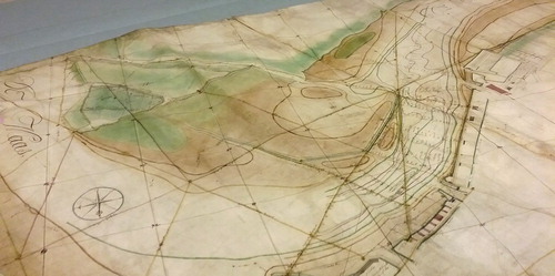
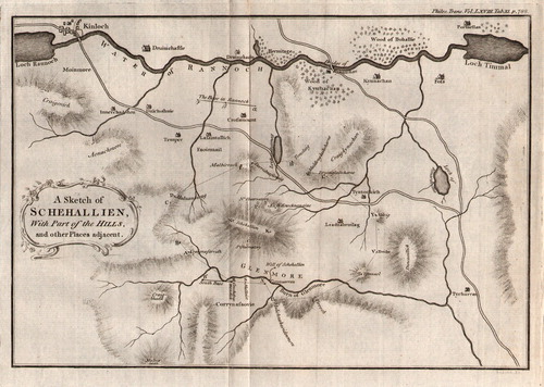
In 1773, Charles Mason (of the Mason-Dixon line; see CitationDanson, 2006) was tasked with finding a suitable mountain for Maskelyne’s experiment. After searching in the Peak and Lake Districts of England he ventured into Scotland. Lying between Loch Tay and Loch Rannoch, Schiehallion () was selected for its height, east–west axis, and its distance from other mountain chains that might interfere with the gravitational pull.
Figure 2. Hutton’s sketch of the mountain Schiehallion and the surrounding land (courtesy of the National Map Library of Scotland).
The title of Nevil CitationMaskelyne’s, 1775 paper is wonderfully evocative: ‘An Account of Observations Made on the Mountain Schehallien for Finding its Attraction’. It is indeed a visually attractive mountain, but the aim of the experiment was to ‘weigh the world’ (see CitationDanson (2006) for an overview of this intriguing problem). Maskelyne was successful, with his provisional conclusion noting that:
… the mean density of the earth is at least double of that at the surface … the great density of the internal parts of the earth, is totally contrary to the hypothesis of some naturalists, who suppose the earth to be only a great hollow shell of matter; supporting itself from the property of an arch, with an immense vacuity in the midst of it. (CitationMaskelyne, 1775, p. 533)
The result quoted above was based on a set of rough estimates, but Maskelyne put in place a comprehensive survey of the mountain that would lead to a more accurate result. This survey was conducted during 1775 through 1776, and the detailed computations were left to Hutton, whose own paper appeared in 1778. The main principle that underpins this astronomical experiment – often referred to as the ‘Schiehallion experiment’ – is described below.
The swing, and the deviation when stationary, of a pendulum is controlled by the attraction of the mass of the pendulum bob to that of the surrounding matter. So a pendulum hanging close to a mountain is slightly attracted to it. What Maskelyne proposed was to measure the angle of a suspended pendulum far away from any mountains; this he did by determining the angle relative to the stars (accounting for the effects of the curvature of the Earth, its precession and nutation, and the aberration of light from the stars).
Schiehallion’s steep northern and southern flanks allowed the pendulum to be sited relatively close to the centre of the mountain at two temporary observatories whose positions were determined accurately. The pendulum – sited first at the southern observatory – was seen to be slightly attracted (bent) toward the mountain, as compared with the angle measured well away from the mountain. The angle of deviation was about half of that expected, and so Maskelyne concluded that the density of the Earth is approximately twice that of the mountain.
However, any accurate estimates required the mass of the mountain to be found, and this is why Hutton was involved. It is unlikely that he ever visited Schiehallion; his task was to carry out the computations on Maskelyne’s topographic survey measurements. It was unfortunate that he could neither oversee their collection, nor advise on the best survey points. Nevertheless, he was able to use the data to calculate the volume of the mountain and then, with an average density of rock, the mass. It was this experiment, and its need for a precise knowledge of the shape and volume of Schiehallion, that led Hutton to use the idea of a contour line (required to estimate heights at missing data points) and so to lay one of the foundations for the introduction of contour lines.
4. Charles Hutton and the beginnings of an art-science collaboration
Hutton was born into a mining family in Newcastle-upon-Tyne and likely would have followed his father into the mines except for an accident as a child that left him with a damaged arm (CitationBruce, 1823). Sent to school instead, he excelled at mathematics and was soon producing popular school text books, with illustrations by Thomas Bewick (1753–1828):
… various jobs … fell exclusively to my lot to execute … [including] the Mathematical Figures for Charles Hutton. This frequently drew him into the Room, in which I worked, to inspect what I was doing – he was always very civil but seemed to me to be of a very grave or shy deportment … (CitationBewick, 1862, p. 54)
Hutton won the Copley Medal of the Royal Society – one of the highest scientific honours of his day – for his research into the force of fired gunpowder. Whilst his work on the Schiehallion experiment is long forgotten, we are still fascinated by the exquisite skill seen in Bewick’s woodprints. Marble busts of both men reside in Newcastle’s Literary and Philosophical Society. Thomas Bewick appears dapper in waistcoat and cravat with ‘heroic’ hair; Hutton, all scrunched up, tightly swaddled – as though he had no arms – the massive expanse of forehead suggesting both deep thought and a touch of sadness, as though already knowing that his star would wane.
One of us (Rann) had been using the library’s resources since discovering Hutton. An aim was to create a version of Hutton’s map – unfortunately missing – as the centre piece for a planned exhibition; however, this aim was thwarted by uncertainty regarding translation of the charts and tables that constituted Hutton’s calculations into useable figures. Long before the notion of ‘mean sea level’, Hutton represented Schiehallion’s summit as ‘ground zero’, this being just one of the many complications that these calculations would entail. Relaying this situation to the Head Librarian of the Literary and Philosophical Society, she suggested the involvement of a retired applied mathematician (Johnson). The library subsequently became the setting for us to meet and it is also where the finished, reconstructed map and related materials were first exhibited (Rann, Citation2016b).
Furnished with a copy of Hutton’s original publications, we began to investigate the possibility of interpreting and extracting the relevant information. At first sight it appeared to be a considerable task – due to large amount of data and quaint presentation and explanation – but, in principle, it was possible.
Much of the data that Hutton used – and a description of his method – appears in an edition of the Philosophical Transactions (CitationHutton, 1778), but, as noted above, the map that he describes is missing; this, he writes, included a few faint pencil lines that were needed to complete his calculations, drawn between points of constant height (i.e. contour lines – see section below). Through the research element of the project (see Rann, Citation2016c), Rann had observed first-hand various ‘rules’ employed by cartographers regarding the introduction of isobaths to their maps, and was now curious to envisage how this early contour map would have been drawn.
Aside from making the calculations, our discussions helped us both to understand how the mathematical elements fitted within the historical context. Johnson researched Hutton’s background and subsequently gave talks on him, including one at the Literary and Philosophical Society to accompany the exhibition that presented the finished contour map.
This was an unusual project; as an artist Rann’s work normally ‘responds’ to place, rather than to the history of a concept (see www.karenrann.co.uk). In a bid to make connections between the drawn and etched lines and symbols on maps and their corresponding locations, visits were made to many of the sites depicted in the early maps that were being researched. Whereas the precursors to contours (e.g. hachures and relief outline) were drawn to express the relative position and scale of a mountain, the swirl of modern Ordnance Survey (OS) contours across a map can appear ‘primarily fictitious in character’ (CitationImhof, 1982, p. 12). This ‘fictitious’ or ‘abstract’ quality is most apparent in mountainous regions where their density, on occasion, echoes the mesmerising effects of ‘Op-Art’ (causing valleys to ‘flip’ in the mind’s eye and momentarily appear as peaks). Apparent abstraction is offset against their facility to succinctly contain accurate information regarding form, volume and elevation. This is the quality that eventually led to their superseding all previous techniques to depict altitude.
Regardless of their ‘fictitious’ or ‘abstract’ qualities, contour lines can be visualised within a landscape, perhaps by a path that continues in a horizontal direction – neither climbing nor dropping – or by the appearance of low-lying cloud, the flat, lower surface of which seems to delineate a contour around the mountain.
To trace a steep ascent using finger on map, imagining the mountain whilst sitting comfortably at a desk, suggests both a precision and perfection to the line’s depiction – an effect that is often lost when at altitude on a mountainside. Stumbling knee-deep in bog, with the summit that one is seeking lost behind a crag, it is hard to keep in mind a vision of the mountain that is so neatly represented on a map. This portrayal is a useful analogy when considering how differently Maskelyne and Hutton would have perceived Schiehallion. Hutton was working from tables, notebooks and charts whilst sat at a desk, with ‘the mountain’ representing ‘geometric space’ to be measured. For Maskelyne, the mountain was a real place of ‘constant storm’ (CitationMaskelyne, 1775, p. 503) and other hardships. Under the circumstances, it is forgivable that the data he brought back from Schiehallion for Hutton to work from were so inaccurate in places.
I … selected out of them such one as from various circumstances I judged it safest to rely upon as nearest the truth. (CitationHutton, 1778, p. 713)
CitationFinnegan’s (2008) exploration of the ‘spaces of science’ notes the ‘messy particularities’ of fieldwork, in contrast with the ‘placeless places’ or ‘homogenous world’ of the laboratory. With regard to Maskelyne’s experiment and a subsequent, arguably more successful, ‘laboratory’ experiment by Henry Cavendish (1731–1810) to ‘determine the density of the earth’ (1798), it is interesting to note that, had Cavendish’s experiment come first, Hutton would not have needed to devise a ‘new’ type of line.
For our collaborative project, whilst Johnson per- formed desk-based calculations in Newcastle, Rann undertook her own survey of Schiehallion (Rann, Citation2016a). The summit is an easy climb, but the visits were tailored to the locations of features that appear on Hutton’s published tables, diagrams and sketch maps. The areas of higher ground skirting the mountain (which appear as a dotted line in ) would have been used to position the theodolite. With the support of the John Muir Trust, the locations of Maskelyne’s two temporary observatories that housed the pendulum, and the bothies where he slept, were identified on the southern and northern flanks of the mountain. The mystery of a mathematical delta symbol drawn by Hutton in some of his figures was resolved; above the southern observation site, there was a large cairn-like feature that presumably the surveyors had used as a visual aid for measuring angles that were not obtainable by line-of-sight to the observatory itself.
5. The calculations
To gain an insight into how the original map might have looked, it was necessary to be as accurate as possible, though Hutton himself acknowledged that mistakes are a part of any process:
I had frequently the mortification to find that the several values of the same lines would differ so greatly from one another, that I was often very doubtful whether I could rely on any of them. (CitationHutton, 1778, p. 712)
Furthermore, Hutton also found that some crucial data points were missing i.e. they had never been obtained by the surveyors. This required him to devise a procedure for dealing with these missing data. There is just one paragraph which makes clear that he is crafting a new type of line:
This method was the connecting together by a faint line all the points which were of the same relative altitude … the relative altitude of all the parts being known; and as every base or little place had several of them passing through it, I was thereby able to determine the altitude belonging to each space with much ease and accuracy. (CitationHutton, 1778, p. 756)
Without doubt, Hutton introduced and used a contour line. With the additional information so obtained, he produced a large map (now missing) with all the data included. He describes it thus:
… a very large and accurate plan of the whole survey was constructed, forming a map of four feet long by four feet broad, which was verified in every part by the measures of the computed lines … The use of this large map was to receive and admit of the distinct and accurate exhibition of the figures in their true places, expressing the number of feet in elevation or depression with respect to each observatory of every point and section of the ground whose elevation or depression might be observed. (CitationHutton, 1778, p. 714)
Although Hutton did not produce – as far as we know – what we now would recognise as a contour map (even though he had already used the idea to fill some of the gaps in the data), all the information to do so was available. His original plan had all the surveyors’ poles marked on it (), and each could be identified from the tables of measurements. These gave the bearing and elevation of each pole relative to a known position (of which there were 32), with positions and elevations of these 32 positions also being known relative to a point (labelled N) on the western extremity of the ridge along Schiehallion. It was thus a matter of working through the data, from N to each of the 32 reference positions and then to each pole position (of which there were over 800). This enabled the plan marking the position of each pole to have the altitude of each pole added (), which we surmise is what Hutton would have done on his missing map. Finally, lines of equal height could be sketched (). Using all these data, we transformed Hutton’s results into a contour map.
Figure 3. Hutton’s original plan of the positions of all the surveyors’ poles (courtesy of the National Map Library of Scotland).
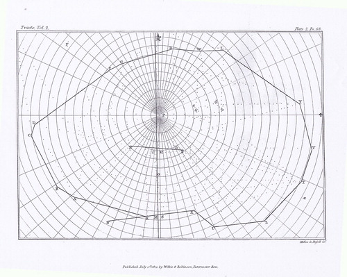
Figure 4. A version of Hutton’s map made by Rann, with the elevations written against each pole position.
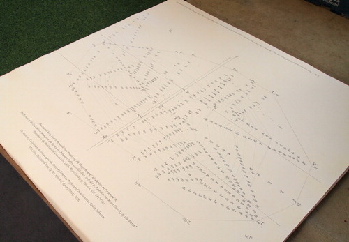
Figure 5. Close up of Rann’s map showing some of the pole positions, elevations and contour lines.
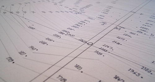
Specifically, the elevation calculations were added to an A2-scale copy of Hutton’s pole position plan against the dots of the surveyor’s pole positions. Scaling up from A2, Rann added the data to a specially prepared paper ‘four feet long by four feet broad’, corresponding to the dimensions of Hutton’s missing map. It was straightforward to locate enough points to mark lines at every 100 ft of elevation, and in many places those for 50 ft. However, either not all his results were published, or it was a claim too far when Hutton states:
In this estimation I could generally be pretty sure of the altitude to within ten feet and often within five feet. (CitationHutton, 1778, p. 757)
Indeed, a small number of errors were found, where there were blatant inconsistencies between closely adjacent points on the mountain.
In collaboration, we were able to incorporate all the methods mentioned by Hutton, including lines he describes as first adding then erasing. However, decisions to use current conventions for contours (such as not allowing lines to bifurcate, which was common on both Ancelin’s and Kruik’s (Cruquius’s) isobath maps), plus the use of continuous lines, has resulted in a map that appears uncannily modern. It is, of course, highly unlikely that Hutton would have drawn contours that circumnavigated the mountain, since he was using them simply to interpolate in areas for which he had no data. The intention here was to create a map, using Hutton’s data, from which a three-dimensional model could be derived. The contour lines were, however, drawn with a ruler; we might also reasonably suppose that Hutton would not have entertained interpolation through free-hand sketching (as all the isobath cartographers mentioned earlier had done).
6. The models
Hutton may not have climbed mountains but – possibly from his mining background – he possessed the facility to imagine their internal structure. He needed a suitable visualisation (model) of the mountain in order to complete his calculation of the volume, and he imagined the interior of Schiehallion:
… divided by vertical planes, forming an imaginary group of vertical columns, something like a set of basaltine pillars, or like the cells in a piece of honey-comb. (CitationHutton, 1778, p. 748)
That is, Hutton perceived Schiehallion as ‘vertical planes’ travelling down through the mountain, thereby producing a large number of prisms. He even mooted a further experiment:
procuring holes to be bored … for by such operations it is known what kind of strata the borer is passed through. (CitationHutton, 1778, p. 782)
Hutton did realise that the mountain was not necessarily composed of the same rock throughout, although for the final calculation of mass, the density of the rock was taken to be uniformly 2500 kg/m3.
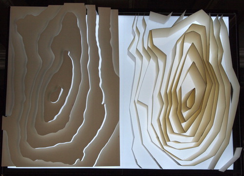
To help us visualise further the accuracy of Hutton’s map, two models were constructed: one based on the contours drawn from Hutton’s data, the other using current OS contours. For Hutton’s map, the idea of vertical columns down through the mountain was emphasised; for the modern (more accurate) version, horizontal planes were employed. Both sit on perspex bases () and thus can be placed on top of the paper map; whilst both models are the same scale, contours are depicted in 200 ft intervals for Hutton’s map and in 100 m intervals for the OS version. The outcomes demonstrate only minor discrepancies in height and volume between the two models, despite being based on calculations made approximately 240 years apart.
Figure 6. The two models created by Rann: modern OS on the left with Hutton’s on the right.
7. Conclusion
This article has attempted to throw some light on an aspect of the history of the introduction of the contour line by interpreting the work done by Charles Hutton. This has involved a description of the ‘Schiehallion experiment’ and the associated calculations. Of course, the intention has not been to present a definitive history of this aspect of map making, but rather to explore the role that Hutton might have played.
Even this story is not straightforward, particularly in light of Hutton’s missing map which, we surmise, included a limited use of contours that he invented for the purpose of filling gaps in the data. We have argued that he had all the information necessary for the production of a contour map of Schiehallion. The investigation and interpretation of the data used by Hutton has been the main thrust of our project. The project has involved the collaboration of a mathematician and an artist: the former for the relevant calculations (producing useable heights) and the latter for a suitable representation of the rewritten data. The result is a contour map of Schiehallion and a corresponding three-dimensional model.
We cannot see into the mind of Hutton; being so far removed in time, and with our current knowledge and understanding, it is difficult to grasp why he did not see the significance of promoting contour lines beyond his initial map. One obvious answer is that he (and others), at the time, could see no use for a contour map, although with hindsight, it can be argued that a contour map would have provided a different way to calculate the volume of a mountain, and, quite possibly, a simpler way.
What Hutton’s map looked like, and how many ‘lines of equal altitude’ he drew upon it, is open to conjecture. We have, we suggest, presented convincing arguments for the proposal that Hutton was not only one of the earliest to introduce contour lines (even using them in a limited sense) but that he also had available all the data necessary for the construction of a complete contour map of the mountain. It is a testament to the data used by Hutton, and his interpretation, that the resulting contour map of Schiehallion is surprisingly accurate.
This has been an intriguing investigation, combining the history of maps, and the necessity to perform calculations within the background story of the Schiehallion experiment, leading to the creation of a version of Hutton’s missing map. There are still many avenues worth exploring in this story alone. Who saw Hutton’s map before it disappeared? What is the story behind its disappearance? Did it contain a significant number of contour lines? Did anyone from the Royal Society, or the French equivalent, write about it? We can hope that this article might prompt some further investigation, enabling us to have an even clearer picture of Hutton’s place in the story of the contour line.
Acknowledgements
The Great Lines art project, from which this article stems, received financial support from Arts Council England and VARC (Visual Arts in Rural Communities). The research was aided by the following organisations: The National Library of Scotland Map Library; The Lit. & Phil., Newcastle; The British Library; The Royal Society Archives, London; the Royal Greenwich Observatory archives (held by Cambridge University Library); Rotterdam City Archives; Amsterdam University; Leiden University; The Hoogheemraadschap van Rijnland, Leiden; and The John Muir Trust, all of which were very generous with their support. We would also like to thank the reviewers and editors for their engagement and critical insights.
Disclosure statement
No potential conflict of interest was reported by the authors.
References
- Ancelin, P. (1697). Kaart van de waterdiepten in de Nieuwe Maas. Retrieved from http://collecties.stadsarchief.rotterdam.nl/publiek/detail.aspx?xmldescid=877384&tag=&view=lijst&volgnummer=1&positie=40&beschrijvingssoort=157879244&doc_beschrijvingssoort=157879244&a_z=%255BARGS_PLACEHOLDER%255D
- Bewick, T. (1862). A memoir of Thomas Bewick Newcastle-on-Tyne. Robert Ward for Jane Bewick. London: Longman, Green, Longman, and Roberts.
- Bruce J. (1823). A memoir of Charles Hutton, LL.D. F.R.S. Hodgson T. & J. Newcastle
- Bruinsz, P. (1584). Bescriuinge der diepte vant Sparen … Retrieved April 7, 2016, from https://www.archieven.nl/nl/zoeken?miadt=319&mizig=42&miview=ldt&milang=nl&micols=1&misort=last_mod|asc&mires=0&mif3=485822&mip1=A-0324
- Cruquius, N. (1730). Cruquius Map of the Merwede. Retrieved April 7, 2016, from http://bc.library.uu.nl/cruquius%E2%80%99-map-merwede-cartographic-masterpiece.html
- Danson, E. (2006). Weighing the world. New York: Oxford University Press.
- Finnegan, D. A. (2008). The Spatial Turn: Geographical Approaches in the history of science. Journal of the History of Biology, 41, 369. Retrieved from https://doi.org/10.1007/s10739-007-9136-6
- Hutton, C. (1778). An Account of the calculations made from the survey and measures taken at Schehallien, in order to Ascertain the mean density of the earth. By Charles Hutton, Esq. F. R. S. Philosophical Transactions of the Royal Society of London, 68, 689–788. Retrieved from http://www.jstor.org/stable/106344 doi: 10.1098/rstl.1778.0034
- Imhof, E. (1982). Cartographic relief presentation. Berlin: Walter de Gruyter.
- Konvitz, J. (1987). Cartography in France 1660–1848. London: University of Chicago Press.
- Marsigli L.F. (1725). Histoire Physique de la Mer. Amsterdam
- Maskelyne, N. (1775). An Account of Observations made on the mountain Schehallien for finding Its attraction. By the Rev. Nevil Maskelyne, B. D. F. R. S. And astronomer Royal. Philosophical Transactions (1683-1775), 65, 500–542. Retrieved from http://www.jstor.org/stable/106220 doi: 10.1098/rstl.1775.0050
- McConnell, A. (1989). A profitable visit: Luigi Fernando Marsigli’s studies, commerce and friendships in Holland, 1722-23. In C. S. Maffioli, & L. C. Palm (Eds.), Italian scientists in the Low Countries in the XVIIth and XVIIIth centuries (pp. 189–206). Amsterdam: Rodopi.
- Rann, K. (2013/2014). Nature of Change, Artist Residency with the National Trust for Scotland [artist blog]. Retrieved from https://natureofchange.wordpress.com/the-residency/
- Rann, K. (2016a). The Great Lines Project [artist blog]. Retrieved from https://thegreatlinesproject.wordpress.com /
- Rann, K. (2016b). The Great Lines Project [Exhibition]. The Lit. & Phil. Newcastle Upon Tyne [June 2 to 24, 2016 ].
- Rann, K. (2016c). The Great Lines. Publication ISBN 978-0-9933496-2-1.
Appendix
The main results – the calculations leading to the construction of the contour map and the models – have led to a number of outcomes and associated by-products. Of particular note is the publication ‘The Great Lines’ (Rann, Citation2016c), describing this project and its background in some detail; but see also the related ‘blog’: https://thegreatlinesproject.wordpress.com/the-great-lines-project/
In addition, the work has been presented in various exhibitions: The Literary and Philosophical Society, Newcastle, June, 2016; GeoConnect, ExCel, London, October 2016; publication launch (2nd edition), VARC Visual Arts in Rural Communities, April 2017; British Cartographic Society Conference, Durham, September 2017; Cultural Significance of Place Research Group, Newcastle University, December 2017. The exhibition travelled to the John Muir Wild Space's Gallery in Pitlochry, April 2018 (where related talks and events were also programmed). Also, in conjunction with the Newcastle Exhibition (June 2016), there was a talk by Johnson entitled ‘Charles Hutton: scientist, mathematician and the density of the Earth’.