
 ?Mathematical formulae have been encoded as MathML and are displayed in this HTML version using MathJax in order to improve their display. Uncheck the box to turn MathJax off. This feature requires Javascript. Click on a formula to zoom.
ABSTRACT
The United States is a diverse and heterogeneous place. Accurately organizing and mapping the U.S. into different regions based on characteristics such as wealth, race, education, language, and occupation is a complicated and arduous task. This paper demonstrates the application of affinity propagation to map socio-economic patterns and identify representative exemplars. Affinity propagation clusters data based on representative exemplars and considers all data points as potential cluster exemplars. We use socio-economic data from the United States census to cluster zip codes tabulation areas and identify representative locations of socio-economic diversity of the United States. The 11 socio-economic clusters were mapped individually and together using area-based generalization. Mapping the results illustrated distinct regionalization and historical migration trends within the United States as well as national urban/suburban/rural patterns. Future applications of this technique may be useful for data-driven socio-economic analysis and purposive sampling.
1. Introduction
The identification, investigation, and comparison of ‘regions’ is one of the most recurring themes throughout geography (CitationHazzi et al., 2018; Paasi Citation2002; CitationSidaway & Hall, 2018; CitationWeaver & Holtkamp, 2016). Countries are normally diverse and heterogeneous agglomerations of places, whose differences and similarities span across various metrics (CitationCulcasi, 2010; CitationLiesch, 2008; CitationSemian, 2016). Accurately organizing countries into different regions based on characteristics of wealth, race, education, language, and occupation is a complicated and arduous task (CitationCulcasi, 2010; CitationSidaway & Hall, 2018). Other scholars have used these and similar demographic categories to create typologies for different socioeconomic regionalizations of rurality in Europe (CitationDicka et al., 2019; CitationHedlund, 2016; CitationVan Eupen et al., 2012). Socioeconomic data illuminates patterns previously harder to spot; regions derived this way normally have different spatial extents than what vernacular regional boundaries might suggest (CitationChinni & Gimpel, 2010; CitationHedlund, 2016). In so doing, socioeconomically-delineated groupings of places make possible new research questions and further, can inform policy application with regard to specific socioeconomic areas (CitationCasellas & Galley, 1999; CitationDicka et al., 2019; CitationVan Eupen et al., 2012). The organization of socio-economic data centers around two objectives: grouping similar administrative units together and the selection of representative administrative units for each group. Knowing the locations that best represent the U.S. and its people can be beneficial to scholars, policymakers, and market analysts alike (CitationCasellas & Galley, 1999; CitationGreen et al., 1967), especially for mixed methods research in which only a few typical or representative locations are examined (Teddlie and Yu, Citation2007).
The goal of clustering or selecting representative communities can be traced back to Lynd and CitationLynd (1929), whose classic study sought to explore lifestyles within a typical American community. In their study, the authors used basic demographic and observation data to identify Muncie, IN as ‘Middletown’, a city that shared characteristics with the widest group of communities.
Clustering analysis, a form of data mining, involves the analysis and extraction of patterns previously unknown due to the size of the data set (CitationKopanakis & Theodoulidis, 2003). Jonathan Robbin was one of the first to employ geodemographics, a subfield which uses certain social, economic, and behavioral statistics to create a prediction model for marketers to identify geographic areas that are best suited for their product (CitationGoss, 1995; CitationRobbin, 1980). He created a computer program (PRIZM) that used census data and consumer surveys to group U.S. zip codes into forty lifestyle clusters (CitationWeiss, 1989). CitationWeiss (1989) followed up on Robinson’s work by visiting a place in each of the forty clusters to interview members of the community and determined of the accuracy of Robbin’s program. CitationWeiss (1989) concluded that the majority of locations he visited matched the cluster description of which they were a part. Similar contemporary research has focused on identifying and mapping types or classes of communities (CitationBrookfield et al., 2005), cities (e.g. CitationBibby & Brindley, 2017; CitationBolton & Hildret, 2013), counties CitationChinni and Gimpel (2010) and rural areas (CitationCopus, 2015), whether using multi-criteria, user-defined indexes, pattern-seeking techniques, or user-defined threshold-base characterizations.
CitationCardille and Lambois (2010) used cluster analysis to identify signature landscapes of the continental U.S. Their purpose was to aid an increasing interest of ecosystem management and other research that would benefit from finding study areas that exemplify land-use/land-cover (LU/LC) distribution at larger sub-national regional scales. The algorithm resulted in 17 distinct landscapes, recognizing the role of human influence, which can be considered as the most expressive landscapes of the continental U.S.A. This cluster analysis was possible due to the application of a novel clustering algorithm, Affinity Propagation (AP).
AP was created in Frey Labs at the University of Toronto as a tool to help identify unforeseen patterns in large data sets by creating subsets of similar features within the data (CitationDueck & Frey, 2007). It is an effective clustering algorithm for large data sets and outperforms the commonly used k-centers algorithm (Frey & Dueck, Citation2007). AP considers all data points as possible exemplars and iterates through all scenarios until the sum of the dissimilarity between each data point and the exemplar of their cluster is the least. This process is similar to the Fisher-Jenks algorithm for optimal classification in that every possible grouping or class break is considered until the ideal is determined (CitationSlocum, 2009). A major difference is that AP does not restrict the grouping into a predefined number of clusters as the Fisher-Jenks classification does. The number of output clusters for AP is influenced by a parameter called the preference value. CitationFrey (2009) typically recommends using the median value of the dissimilarities between data points, but can result in a medium to large number of exemplars. For fewer exemplars, CitationFrey (2009) recommends starting with the lowest dissimilarity value, but notes that the preference value can be altered to either increase or decrease the number of clusters. This characteristic gives AP an advantage over other clustering algorithms such as k-centers which groups the data into a predefined number of clusters.
The objective of this paper is to demonstrate the application of affinity propagation to identify, map, and analyze the patterns of socio-economic clusters in the U.S.A. Specifically, we cluster zip codes based on selected United States Census Bureau (hereafter ‘Census’) socio-economic characteristics, identify the exemplar or representative zip codes for each cluster, and examine the distinguishing characteristics of each exemplar. Finally, we illustrate the results using maps of the exemplars and clusters to examine spatial patterns.
2. Methods
2.1. Data
The data used in this project was publicly available 2010 Census and 2008–2012 five-year estimates from their American Community Survey (ACS), partitioned into 32,989 Zip Code Tabulation Areas (ZCTAs) (United States Census Bureau, Citation2010; United States Census Bureau, Citation2011). The Census assembled data from 2010 census blocks into 32,989 ZCTAs which are summarized representations of United States Postal Service zip code areas. ZCTAs are created based on Census block group boundaries—a collection of census blocks—and do not include large areas with no population or areas of only water. ZCTAs do not have a uniform geographic size. Their geographic extent is based on largely upon population, where larger ones, located in rural areas, contain sparser population, while smaller ZCTAs, primarily located in urban areas, contain denser population. The geographic boundaries of the ZCTAs used in the final map will be provided by the Census website as Topologically Integrated Geographic Encoding Referencing (TIGER) shapefiles.
The selection of enumeration area (i.e. zip codes) was a tradeoff between spatial resolution and data volume. Due to the nature of AP, as the number of data points increase, the amount of space needed for computation increases exponentially. For example, with 32,989 ZCTAs there are 32,989 × 32,989 pairwise dissimilarities. If census tracts were used there would be 73,057 × 73,057 pairwise dissimilarities: about double the number of data points but five times as many dissimilarity pairs. While previous studies have used counties for enumeration units, we chose to avoid that level of aggregations due to their highly variable population and size, especially within urban areas and western states.
Forty attributes were extracted from the decennial census and the ACS that describe the sociodemographic profile of ZCTAs (see ). For this study, we limited attributes to those that described people and population, although additional census and non-census attributes describing the economic activities, land use, or climate could be incorporated. All attributes were continuous values.
Table 1. List and description of data used from the United States Census.
2.2. Preprocessing
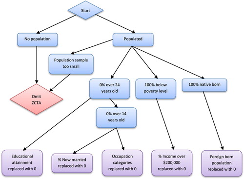
Approximately 20% of the ZCTAs contained some form of missing or omitted data. illustrates the decision tree addressing these issues. Some of the missing data was due to uncalculated zero values. For example, if 100% of the population in a zip codes was below the poverty line, the percent income greater than $200,000 was left blank. However, the majority of data omission was due to ‘data for this geographic area cannot be displayed because the number of sample cases is too small.’ (United States Census Bureau / American FactFinder 2010). To ensure consistency within the data, several steps were taken to address these issues. We eliminated 271 ZCTA with zero population. ZCTAs with 100% of the population younger than 25 with a particular level of educational attainment at zero or too small to report had blank educational values replaced with a 0. Two ZCTAs with 100% of the population younger than 16 had blank values for married and occupation replaced with a 0. 6,174 ZCTAs had 100% native born population with blanks in the foreign born categories and were converted to 0s. 144 ZCTAs with zero population were eliminated from the analysis. 404 (1.22%) ZCTAs were eliminated due to the data omitted due to privacy issues.
Figure 1. Flowchart of data preprocessing to address missing or omitted data.
Additionally, the study area was restricted to the Continental United States. We acknowledge that both Hawaii and Alaska have unique characteristics not captured by the Census due to their geographic location. Preliminary results that included Alaska and Hawaii found that while Hawaii was largely a distinct cluster, clustering in Alaska was inconsistent often due to large geographic areas inherent in the ZCTAs, that is, ZCTAs were too large because of low population, covering vast, unpopulated territories. In spite of these corrections, 32,115 final ZCTAs existed after preprocessing (97.35%).
In order to standardize the attributes for the dissimilarity calculation, all data were transformed into z-scores. A principal component analysis (PCA) was run on the z-scores using the R statistics software package FactoMineR (CitationLe et al., 2008) to eliminate correlated attributes and reduce data size. The results of PCA found that 94.64% of the data could be represented by just 26 components, a 35% reduction in data size which allowed the entire dataset to be run on a server with 128GB of RAM.
2.3. Affinity propagation (AP)
AP was used to cluster and identify exemplar ZCTAs. The R package APCluster was used to run the actual algorithm (CitationBodenhofer et al., 2011). AP requires two parameters as input, a dissimilarity matrix and a preference value. The dissimilarity matrix quantitatively defines how different two locations are. The values of the dissimilarity matrix are user-generated and defined. The dissimilarity matrix was generated from the PCA results. A negative weighted Euclidean distance equation based on each component’s eigenvalue percentage of variance was used to calculate the dissimilarity between every point. EquationEquation (1)(1)
(1) shows a standard negative weighted Euclidean distance (CitationGreenacre, 2005):
(1)
(1) where J is the number of components used from the PCA results and w is the eigenvalue percentage of variance for each j.
AP cannot accept a predetermined number of clusters as a parameter. Rather, the number of output clusters for AP is influenced by a parameter called the preference value. Typically, the preference value is a common value such as the median value of the dissimilarities, although other times it can be the minimum dissimilarity value (CitationDueck & Frey, 2007). The preference value can be altered to either increase or decrease the number of clusters, but it is not a linear relationship. Initially, the minimum dissimilarity value was selected as the preference value, but it resulted in over 200 clusters. The goal of this work was to produce a more generalized representation of socio-economic zip codes suitable for small sample sizes used in mixed methods; a large number of clusters with few, minor differences from each other, would not serve well for the purposes of generalization and any subsequent detailed research. As a general guideline, the selection of the preference value should match the needs of the specific research, and can be modified to include more or fewer exemplars and clusters. To select the appropriate level, the preference value was doubled until the number of clusters did not change between intervals. The final preference value was −464.51 (22 times the minimum dissimilarity value) resulting in 11 clusters.
2.4. Mapping
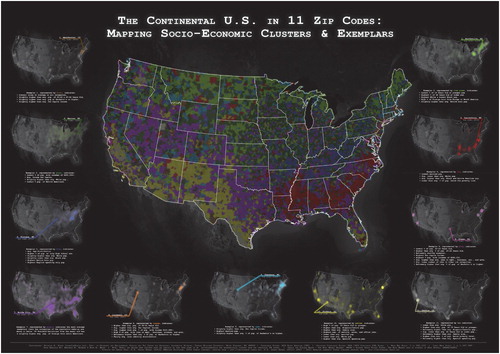
Affinity propagation clustering generalized socio-economic census data from 40 continuous variables to 11 clusters and exemplars. The map produced contains a mapped area with all clusters visualized as well as 11 inset maps that illustrate the point-density of each cluster and the location of the exemplar. The colors for the maps were created using Color Brewer (CitationBrewer, 2019) as a starting point, with adjustments suitable to the dark background. Due to the inherent scale issues of ZCTAs, they were generalized by creating a fishnet and assigning the cluster number with the greatest population to a given cell, based on population density of the ZCTA times the area of the given ZCTA in that cell. The gridded data was then converted to centroids for aesthetic purposes. Note that some of the centroids fall outside of the national boundaries as we chose to keep fishnet cells and their centroids as long part of the cell intersected with national landmass. The point density inset maps were generated using the point density tool in ArcGIS Pro using a circle neighborhood with the default radius. The map background is a color desaturated ‘blue marble’ image from NASA. We chose to omit some common map elements such as a north arrow and graticules given how ubiquitous national U.S. maps are in the popular media and these elements would interfere with the aesthetics of the map.
3. Results
3.1. Exemplars
lists the 11 exemplars with basic characteristics (population and area) and the standardized z-scores for all of the input variables. While the population of the exemplar ZCTAs ranged from 2,496 (65713 – Niangua, MO, Cluster 5) to 53,697 (92570 -Perris, CA, Cluster 11), the population density was relatively consistent between the exemplars, except Cluster 9 (82009 – Cheyenne, WY). The notable variations have been compiled into a list of distinctive characteristics in . As shows, each exemplar represents several distinct characteristics of the U.S. population based on age distribution, income, wealth, race, language, and occupation. In many cases, socio-economic patterns are correlated and grouped together. For example, 28352 (Laurenburg, NC, Cluster 4), is the exemplar for the cluster that represents the highest levels of poverty, as well as higher percentages of African American and Native American residents. Wolfe, TX, Cluster 7 (75496) is the most average exemplar, with most factors near the statistical mean.
Table 2. List of preference values tested and number of resulting clusters. Bold indicates the preference value selected.
Table 3. Census data for each cluster exemplar. Bold = highest value of variable. Underline = lower value of variable. Dark gray = greater than 1 standard deviation (positive); Light gray = greater than 1 standard deviation (negative).
Table 4. Summary of the distinct features of each cluster.
3.2. Maps
The final map illustrating the clusters and exemplars is shown in . Many clusters show a strong regionalization. For example, cluster 4, which represents higher levels of poverty and African American and Native American residents, is most prevalent in the ‘Deep South’, with pockets in the American West as well as (post) industrial centers in the Midwest as a result of the early twentieth Century Great Migration from the Deep South to industrial centers in the North (CitationGibson & Jung, 2002). Clusters 10 and 11, which represent higher percentages of Latin American and Spanish speaking residents, are concentrated in the American Southwest. Cluster 5, which represents areas with higher percentages of white residents with lower education levels, corresponds mostly with the Appalachian and Ozark regions, as well as northern woodlands of the Midwest. Not all clusters have broad regional patterns. Several have spatial patterns that correspond to urban-rural differences in development. Clusters 6 and 9 are found near many urban areas including the Boston–Washington Corridor, the Bay Area, Los Angeles, and major urban centers of the Midwest. Based on the point density maps, we see that the New York metropolitan areas is among the densest areas for several exemplar illustrating both the overall population density of that region, but also highlighting sociodemographic diversity.
Figure 2. Map of the affinity propagation clusters and exemplars.
4. Discussion and conclusions
The United States is socially and economically diverse, and this diversity manifests itself at varying spatial scales. The generalization of the U.S. helps establish insight into particular characteristics and geographic patterns, while still maintaining an enlightening level of detail. CitationChinni and Gimpel (2010) presented a portrait of America with 12 community types and revealed many regions and patterns across the U.S. Many regions from this study matched closely with regions in Chinni and Gimpel’s study, including the region across southern states, the region along the Mexico-U.S. border, and the suburbs that stretch between D.C. and Boston. It should be mentioned that this analysis is limited to the data available in the Census; thus it omits some potentially important cultural factors such as religion, politics, social norms, dialect, and voting patterns (CitationChinni & Gimpel, 2010). Although data does exist for these factors, the finest resolution for this data tends to be at the county level. Counties can be subject to the modifiable unit areal problem because of their inherent inequalities in area and population (CitationNorman, 2006; CitationNorman, 2015; Openshaw, Citation1984), and that major urban centers normally sprawl across several counties. Additionally, since religion and political data are not part of the Census, their survey methods vary and accordingly are subject to the modifiable areal unit problem.
Our results show 11 distinct socio-economic clusters and provide a representative exemplar for each cluster. As previously discussed, purposive sampling has many advantages over random sampling, particularly for mixed-methods research. These exemplars are well suited to further in-depth studies and comparisons for research, especially mixed-methods and qualitative research. In these types of research designs, smaller number of cases to compare is not only more practical, but often more useful, for example when using methods such as focus groups, surveys, or participant observation. AP is also a powerful tool in overcoming issues with threshold-based values. For example, recent research has attempted to expand the concepts of rurality and urbanity for regions of varying spatial extents (CitationBibby & Brindley, 2014; CitationCopus, 2015; CitationDicka et al., 2019; CitationNelson & Rae, 2016; CitationVan Eupen et al., 2012; CitationWaldorf, 2006), often attempting to overcome the unrealistic clear dichotomy created by these terms. Used within those contexts, AP can provide a data-defined basis for determining new values for rural/urban indexes, investigating the major factor differentiating (equating) localities at various scales, or re-shaping interaction areas, like regional urban systems (CitationBurger et al., 2014), based on multiple metrics. Affinity propagation can further help in identifying study areas for comparative studies, highlighting the areas upon which similitudes could be investigated, an invaluable asset in today’s polycentric urban analytical frameworks (CitationPeck, 2015). The exemplars and clusters can also be used to select site locations for experimental design where the socio-economic factors included in the affinity propagation analysis need to be controlled.
Spatially, some of the exemplars seemed geographically removed from regions with the highest density of a given cluster. For example, Cluster 9’s exemplar is Longmont, CO, but the point density maps show high density of cluster 9 in the Boston–Washington corridor. Data-wise, the exemplars are the most representative ZCTA for a given cluster and spatial location was not included in the input data for clustering (i.e. we did not consider if a given ZCTA was similar to its neighbors and the exemplar selection did not consider if the exemplar was located in a region with a high concentration of that cluster). The potential role of spatial autocorrelation in the clustering and selection of exemplars is a potentially interesting area of future research.
While enhancing well-established geographic patterns at national and local scales, the AP analysis illuminates new relationships among communities at the zip code level. For example, higher percentages of Black residents are found in both the Deep South and key industrial centers of the Midwest and the Northeast, which uncovers some of the Great Migration’s lasting effects (CitationFligstein, 1981), thereby influencing the emergence of a new cluster. Another example is the higher percentages of Latino and Spanish-speaking residents in the Southwest due to colonial and post-colonial Hispanic migration patterns alike (CitationHudson, 2002; CitationMines, 1981; CitationRouse, 1991). Economically-defined regions like the ‘Corn Belt’ are also easily discernable and match remarkably well with spatial delineations of the region found in previous studies (CitationHart, 1967; CitationHudson, 2002). At metropolitan scales, legacy cities’ urban cores starkly contrast with their suburban counterpoints. In Michigan, for example, the inner-city ZCTAs of Detroit, Flint and Saginaw fall into cluster 4 and stand out as areas of high poverty, low white populations, high self-defined black populations, and lower educational attainment, while the surrounding suburbs are part of cluster 8 and are highlighted as areas of high educational attainment, higher income and higher white populations. The close proximity of cluster 3 and cluster 8 can also be seen in Chicago, Cleveland, Dallas, Buffalo, Raleigh and numerous others (Main Map). These urban/suburban patterns create ‘closer’ socio-demographic distance between physically far places.
The methodology provides a unique approach to clustering and exemplar selection, but the method used is computationally intensive, especially in terms of RAM requirements. The relationship between the number of units of analysis and RAM is exponential – somewhere between the 3rd and 4th power. This relationship limited the scale of analysis in this study to ZTCA rather than a finer level of analysis such as Census tracts. Using a Windows-based server with 128Gb of RAM, the ∼32,000 ZCTA was the limit of our computational capabilities without using some sort of sampling approach. The AP algorithm is also sensitive to the preference value given. The preference value does not linearly correspond to the number of output clusters. Furthermore, even small changes in the preference value that results in the same number of clusters may result in slightly different clusters compositions and different exemplars. In this sense, AP can be seen as providing sets of potential exemplars for generating clusters within the data, rather than selecting a fixed sub-set of clusters. Further research is needed to investigate the impact of the preference value on exemplar and clustering results.
This study has demonstrated to potential applications of affinity propagation to typify socio-economic data and illustrate the results cartographically. This approach addresses major methodological and cartographic challenges of working with high dimensional socio-economic data. The resulting map illustrates interesting spatial socio-economic patterns as a result of complex socio-historical processes and help visualize the heterogeneous nature of the continental U.S. population. Applications of this approach are broad in the areas of market analysis and social research using mixed methods.
Software
Microsoft Excel was used to clean and format the census data. R with the packages FactoMineR (CitationLe et al., 2008) and APCluster (CitationBodenhofer et al., 2011) were used to run the principle component analysis and affinity propagation, respectively. Initial mapping and generalization was done using ArcGIS Pro 2.2 with final cartography done in Acrobat Photoshop CC.
Combo_Map_Vector_3.pdf
Download PDF (51.2 MB)Acknowledgements
The authors would like to thank Dr. David Patton at Central Michigan University for providing feedback on the manuscript, as well as the students in the Advanced Cartography class at Central Michigan University for their feedback on early drafts the map and John Nelson at ESRI for inspiration in the map aesthetics and the use of the desaturated ‘blue marble’ Earth imagery. We would like to thank the reviewers for their comments and useful feedback.
Disclosure statement
No potential conflict of interest was reported by the author(s).
Additional information
Funding
References
- Bibby, P., & Brindley, P. (2017). Rural-Urban classification of local authority districts in England: User Guide. Office of National Statistics.
- Bodenhofer, U., Kothmeier, A., & Hochreiter, S. (2011). APCluster: An R package for affinity propagation clustering. Bioinformatics (oxford, England), 27(17), 2463–2464. https://doi.org/10.1093/bioinformatics/btr406
- Bolton, T., & Hildret, P. (2013). Mid-sized cities: Their role in England’s economy. Centre for Cities. http://www.centreforcities.org/wp-content/uploads/2014/08/13-06-18-Mid-Sized-Cities.pdf
- Brewer, C. A. (2019). http://www.ColorBrewer.org, Accessed 1 May 2019
- Brookfield, K., Gray, T., & Hatchard, J. (2005). The concept of fisheries-dependent communities - A comparative analysis of four UK case studies: Shetland, Peterhead, north shields and lowestoft. Fisheries Research, 72(1), 55–69. https://doi.org/10.1016/j.fishres.2004.10.010
- Bureau, U. S. C. (2010). American factfinder, 2010 census. Sex by Age. http://factfinder2.census.gov
- Bureau, U. S. C. (2011). 2007–2011 American community survey. Household Type (Including Living Alone). http://factfinder2.census.gov
- Burger, M. J., Meijers, E. J., & Van Oort, F. G. (2014). The development and functioning of regional urban systems. Regional Studies, 48(12), 1921–1925. https://doi.org/10.1080/00343404.2014.979782
- Cardille, J. A., & Lambois, M. (2010). From the redwood forest to the Gulf Stream waters: Human signature nearly ubiquitous in representative US landscapes. Frontiers in Ecology and the Environment, 8(3), 130–134. https://doi.org/10.1890/080132
- Casellas, A., & Galley, C. C. (1999). Regional definitions in the European Union: A question of disparities? Regional Studies, 33(6), 551–558. https://doi.org/10.1080/00343409950078242
- Chinni, D., & Gimpel, J. (2010). Our patchwork nation: The surprising truth about the “real”america. Gotham Books.
- Copus, A. K. (2015). The new rural Economy and macro-scale patterns. Territorial Cohesion in Rural Europe: the Relational Turn in Rural Development, 76, 11–34.
- Culcasi, K. (2010). Constructing and naturalizing the Middle East. Geographical Review, 100(4), 583–597. https://doi.org/10.1111/j.1931-0846.2010.00059.x
- Dicka, J. N., Gessert, A., & Snincak, I. (2019). Rural and non-rural municipalities in the Slovak Republic. Journal of Maps, 15(1), 84–93. https://doi.org/10.1080/17445647.2019.1615010
- Dueck, D., Frey, B. J., & Ieee. (2007, Oct 14-21). Non-metric affinity propagation for unsupervised image categorization [Paper presentation]. 11th IEEE International Conference on Computer Vision, Rio de Janeiro, BRAZIL.
- Fligstein, N. (1981). Going north, migration of blacks and whites from the South, 1900–1950. Academic Press.
- Frey, B. (2009). Affinity Propagation FAQ. http://www.psi.toronto.edu/affinitypropagation/faq.html
- Frey, B. J., & Dueck, D. (2007). Clustering by passing messages between data points. Science, 315, 972–976. doi: 10.1126/science.1136800
- Gibson, C., & Jung, K. (2002). Historical census statistics on population totals by race, 1790 TO 1990, and By Hispanic Origin, 1970 TO 1990, for the United States, regions, divisions, and states. United States Census Bureau. https://www.census.gov/content/dam/Census/library/working-papers/2002/demo/POP-twps0056.pdf
- Goss, J. (1995). We know who you are and we know where you live: The instrumental rationality of geodemographic systems. Economic Geography, 71(2), 171–198. https://doi.org/10.2307/144357
- Green, P. E., Frank, R. E., & Robinson, P. J. (1967). Cluster analysis in test market selection. Management Science, 13(8), B-387–B-400. https://doi.org/10.1287/mnsc.13.8.B387
- Greenacre, M. (2005). Weighted metric multidimensional scaling. New Developments in Classification and Data Analysis, 141–149. https://doi.org/10.1007/3-540-27373-5_17
- Hart, J. (1967). Change in the Corn Belt. Geographical Review, 76(1), 51–72. https://doi.org/10.2307/214784
- Hazzi, N. A., Moreno, J. S., Ortiz-Movliav, C., & Palacio, R. D. (2018). Biogeographic regions and events of isolation and diversification of the Endemic Biota of the Tropical Andes. Proceedings of the National Academy of Sciences, 115(31), 7985–7990. https://doi.org/10.1073/pnas.1803908115
- Hedlund, M. (2016). Mapping the socioeconomic landscape of rural Sweden: Towards a typology of rural areas. Regional Studies, 50(3), 460–474. https://doi.org/10.1080/00343404.2014.924618
- Hudson, J. (2002). Across this land: A regional geography of the United States and Canada. Johns Hopkins.
- Kopanakis, I., & Theodoulidis, B. (2003). Visual data mining modeling techniques for the visualization of mining outcomes. Journal of Visual Languages and Computing, 14(6), 543–589. https://doi.org/10.1016/j.jvlc.2003.06.002
- Le, S., Josse, J., & Husson, F. (2008). Factominer: An R package for multivariate analysis. Journal of Statistical Software, 25(1), 1–18. doi: 10.18637/jss.v025.i01
- Liesch, M. (2008). A region of hope, a region of despair: Print media, geographical imagination, and the gogebic iron range mining boom. Historical Geography, 36(1), 182–207.
- Lynd, R. S. (1929). Middletown: A study in American Culture. Harcourt, Brace, & Co.
- Mines, R. (1981). Developing a community tradition of migration to the United States: A field study in rural Zacatecas, Mexico, and California settlement areas. Program in United States-Mexican Studies, University of California.
- Nelson, G. D., & Rae, A. (2016). An economic geography of the United States: From commutes to megaregions. Plos One, 11(11), e0166739. https://doi.org/10.1371/journal.pone.0166739
- Norman, P. D. (2006). Sociodemographic spatial change in the UK: Data and computational issues and solutions. GIS Development - Asia Pacific, 10(12), 30–34.
- Norman, P. D. (2015). The changing geography of deprivation in Britain: Exploiting small area census data 1971 to 2011. In N. Malleson, N. Addis, H. Durham, A. Heppenstall, R. Lovelace, P. D. Norman, & R. Oldroyd (Eds.), GISRUK 2015 Proceedings. 23rd GIS research UK Conference (GISRUK 2015), 15–17 Apr 2015 (pp. 465–474). University of Leeds.
- Openshaw, S. (1984) Ecological fallacies and the analysis of areal census-data. Environment and Planning A, 16, 17–31. doi: 10.1068/a160017
- Paasi, A. (2002) Place and region: Regional worlds and words. Progress in Human Geography, 26, 802–811. doi: 10.1191/0309132502ph404pr
- Peck, J. (2015). Cities beyond compare? Regional Studies, 49(1), 160–182. https://doi.org/10.1080/00343404.2014.980801
- Robbin, J. (1980). Geodemographics: The new magic. Campaigns and Elections, 1(1), 25–45.
- Rouse, R. (1991). Mexican migration and the social space of postmodernism. Diaspora: A Journal of Transnational Studies, 1(1), 8–23. https://doi.org/10.1353/dsp.1991.0011
- Semian, M. (2016). Region in its complexity: A discussion on constructivist approaches. AUC Geograpica, 51(2), 179–188. https://doi.org/10.14712/23361980.2016.15
- Sidaway, J. D., & Hall, T. (2018). Geography textbooks, pedagogy, and disciplinary traditions. Area, 50(1), 34–42. https://doi.org/10.1111/area.12397
- Slocum, T. A. (2009). Thematic cartography and geovisualization (3rd ed.). Pearson Prentice Hall.
- Teddlie, C., & Yu, F. (2007). Mixed methods sampling A typology with examples. Journal of Mixed Methods Research, 1, 77–100. doi: 10.1177/1558689806292430
- Van Eupen, M., Metzger, M. J., Perez-Soba, M., Verburg, P. N., Van Doorn, A., & Bunce, R. G. H. (2012). A rural typology for strategic European policies. Land Use Policy, 29(3), 473–482. https://doi.org/10.1016/j.landusepol.2011.07.007
- Waldorf, B. S. (2006). A Continuous Multi-dimensional Measure of Rurality: Moving Beyond Threshold Measures. https://ideas.repec.org/p/ags/aaea06/21383.html
- Weaver, R., & Holtkamp, C. (2016). Determinants of Appalachian identity: Using vernacular traces to study cultural geographies of an American region. Annals of the American Association of Geographers, 106(1), 203–221. https://doi.org/10.1080/00045608.2015.1090266
- Weiss, M. J. (1989). The clustering of America (1st Perennial Library ed.). Perennial Library.