
ABSTRACT
Recent progress in computation and the spatio-temporal richness of data obtained from new sources have invigorated Time Geography. It is now possible to visualise and represent movements of people in a dual spatial–temporal dimension. In this work, we use geo-located data from the social media platform Twitter to show the value of new data sources for Time Geography. The methodology consists of visualising space–time paths in 2D and 3D in four study zones, with different land-use profiles, based on tweets compiled over the course of two years. The results provide a view of behaviours occurring in the areas of study throughout the day, with complementary data to show the population's main activity at different times.
1. Introduction
An individual's daily mobility is structured around the need to conduct different activities that require being in certain locations as specific times (CitationMiller, 2005). Space is not completely separated from time. Rather, the two of them are intertwined, so location in space cannot be separated from the moment in time (CitationHägerstraand, 1970). Time Geography is an approximation that aims to understand activities within this double space–time component, recognising that people can only physically be in one location and at one specific time (CitationMiller, 2017).
Daily data on activities conducted by samplings of individuals in a period of time have acted as a data source for many studies on human spatial–temporal activities. Thanks to Information and Communication Technologies (ICT), it is easier to collect mass and individual data samples during daily activity, with high space–time details, long periods and at a reduced cost. This opens up the possibility of viewing and exploring samples on activities at an individual level within a space–time context (CitationChen et al., 2011; CitationHuang & Wong, 2015). One noteworthy new data source is Twitter, since it contains data based on coordinates where a specific event occurs. This provides for an analysis to be carried out at different scales, with an enhanced spatio-temporal resolution (CitationGarcía-Palomares et al., 2018; CitationMiller, 2017).
With developments in computation and Geographic Information Systems (GIS), it is possible to map processes occurring in space at different moments in time. The space–time path is a representation tool that measures the movement of an individual in a three-dimensional space, placing space on a horizontal plane and time in perpendicular direction, based on a list of control points that are strictly ordered in time (CitationMiller, 1991; CitationMiller, 2005). Twitter data do not generate space–time paths, but rather a time sequence of locations that are used to build the path. With these points, it is possible to represent space–time paths for each individual and use these trajectories to analyse the location and time when each activity is conducted (CitationYin et al., 2011).
Although previous works have shown space–time paths based on transport networks or surveys (CitationChen et al., 2011; CitationChen et al., 2013; CitationDemšar & Virrantaus, 2010; CitationFang et al., 2012; CitationFarber et al., 2013; CitationKwan & Lee, 2011; CitationLee & Miller, 2018; CitationMiller et al., 2016; CitationRen & Kwan, 2007; CitationShaw et al., 2008; CitationTong et al., 2015; CitationYu & Shaw, 2008), there are few works with paths based on new data sources. CitationShen et al. (2013) used GPS data to illustrate movement patterns in the city of Beijing; Kang et al., (Citation2010), used mobile telephone data to represent individual mobility patterns in a large Chinese city; Keskin, Dogru, Çeli, Doğru, & Pakdil (2014), designed a mobile application to obtain space–time data from 10 participants from the Technical University of Istanbul to view their paths within the campus; and CitationFarber et al. (2015), combined mobile telephone data with GPS in the metropolitan area of Detroit (USA) to measure the potential of social interaction at a metropolitan scale, and to develop a methodology to understand the impacts of spatial structure on individuals’ opportunities for social contact.
Several works have been conducted with Twitter data with a space–time perspective (CitationGarcía-Palomares et al., 2018; Antoine, Jatowt, Wakamiya, Kawai, & Akiyama, 2015; Blanford, Huang, Savelyev, & MacEachren, 2015; CitationNetto et al., 2015; CitationBirkin et al., 2014; CitationCiuccarelli et al., 2014), but to the extent of our knowledge, only one work has used this social network to visualise space–time paths (CitationHuang & Wong, 2015).
In this work, we seek to delve further into visualisation of space–time paths built with Twitter. Twitter data capture time and location, but do not collect more detailed information, such as the kind of events and activities carried out (CitationHuang & Wong, 2015). One methodological improvement brought by this work to offset this disadvantage is combining a map of space–time paths with land-use data. Linking land use data with the activity recompiled by Twitter has the potential to provide further insight to the way Twitter users interact with space.
2. Area of study
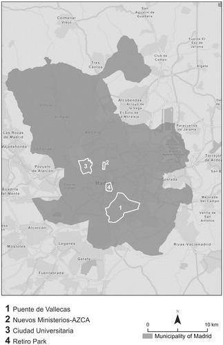
This work uses the Madrid metropolitan area as a study area on weekdays. Four zones were selected within the city of Madrid, which attempt to show spaces specialised in different types of activities. The activity of Twitter users linked to these spaces was collected, according to the types of dominant activities ().
Puente de Vallecas District. – This is a majority residential area, and one of the most densely populated zones in the city of Madrid. To collect Twitter users associated with this residential space, we selected users who normally tweeted in this district at night-time (8 PM to 9 AM), such that we can believe they are users who reside in this space.
Nuevos Ministerios-AZCA Complex. – This is one of the main business and financial districts in Madrid, with a high number of jobs. In this case, we selected Twitter users who normally tweeted in this zone during the morning (8 AM to 3 PM), considering that these must be users whose job is in the area.
Ciudad Universitaria Area. – This is the city's main university campus. Once again, Twitter users were selected based on users who tweeted in this space during the morning (8 AM to 3 PM).
Retiro Park. – This is one of the most-used recreational zones in the city. In this case, Twitter users associated with the park are those who normally tweeted during the afternoon and evening (4 PM to 9 PM).
Figure 1. Study zones to be analysed within the municipality of Madrid. Source: Own elaboration.
3. Data and methods
The database initially downloaded based on Twitter's API contains 2,229,253 geo-referenced tweets, produced by 171,927 users. These tweets were collected over the course of two years (from 1 June 2016 until 31 May 2018). Each tweet has identifying information on the user: username, latitude and longitude, date and time, language and hashtags included in the tweet.
3.1. Cleaning and enriching data
This article worked with tweets posted on weekdays, eliminating those posted during weekends or holidays (weekdays tend to have regular mobility behaviours, while mobility on weekends is more erratic). During the filtering process, the following user accounts were also eliminated:
Bots: accounts with over 1,000 tweets, all located at the same coordinates.
Users with low Twitter activity: posting less than 20 tweets on workdays.
Users whose tweets have no spatial mobility: all their tweets are located within a radius of under 50 metres.
Users who posted all their tweets in a period less than two consecutive weeks: these users are normally associated with visitors and tourists.
Users whose messages have a difference in time distribution equal to, or less than 8 h. In this case, the intent was to have users who posted tweets throughout the 24 h of the day, so as to obtain users who can be followed throughout the range of a day.
This database was enriched by crossing locations of tweets with data on land-use activities from the 2017 Land Registry (National Cadastral Data), which contains high spatial frequency information. Work was then conducted at transport-zone level, following CitationGarcía-Palomares et al. (2018) methodology to obtain the location of Twitter users at a specific place and a specific time.
3.2. Calculating space–time paths and building the map
To improve the time resolution of the Twitter data, tweets from multiple days are added, in order to obtain sufficient specific locations within a 24-hour sequence and thus design each user's daily space–time paths (CitationHuang & Wong, 2015). Based on each tweet's dates, and working with a total of 516 workdays, the number of days that each user had tweeted at one specific time and place was calculated.
For each user, the hour number and the identifier of the transport zone of each one of their tweets was added. In cases where a user has tweeted from more than one area in the same time slot, the transport zone where the user tweeted the highest number of days at said time was selected. If the maximum frequency of days at a given time matches more than one transport zone, the zone was selected by using the zones where the user had most frequently tweeted the hour before and after the hour in question as a reference.
This methodology of working with grouped data for the ensemble of days reveals regular user activity patterns, but can also include irregular activities, generating noise or uncertainty (CitationHuang & Wong, 2015). To calculate space–time paths with a recurring route, the time the user remained in each one of the time slots was defined for transport zone locations where the user tweeted for at least 3 workdays. Next, users were selected for each one of the study zones, based on their presence in said zones in the established time slots. shows the number of valid users for whom space–time paths were obtained in the different study zones.
Table 1. Number of users in each study zone.
The paths and locations of users over the 24 h can be mapped in both 2D and in 3D. 2D representations are better to illustrate the spaces visited by each user. However, they do not provide a view of time-based information (Keskin, Dogru, Çelik, Doğru, & Pakdil, 2014). On the other hand, there are several difficulties to consider when representing in 3D, such as orientation. Therefore, we decided to design a 3D view for each area of study, supported by a 2D-view base map, to complement the advantages of each visualisation. To represent space–time paths in 3D, each point was given a height value equal to the hour number, multiplied by an exaggeration factor of 200. With these values, line layers were built to represent the space–time paths.
Since the tweets were crossed previously with Cadastral data, each point of the spatio-temporal paths also has information on land use. The percentage of users on weekdays was calculated by hour and by land use over the total sample. In this way, it is possible to visualise the main land uses in the study areas during the day.
4. Results
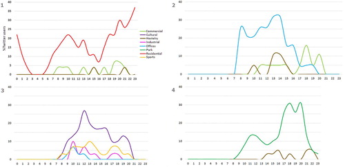
The results obtained show user behaviour at different times throughout the day, in accordance with the main activities in each one of the study zones. The Puente de Vallecas residential zone shows a greater user presence during the evening time slot, a characteristic of its residential nature. In the Nuevos Ministerios-AZCA office area, there is a greater concentration of users throughout the morning, and a downturn in users in the afternoon. Ciudad Universitaria is relatively similar, although the percentage of users increases more sharply first thing in the morning, and decreases more slowly in the afternoon. In Retiro Park, the percentage of users constantly rises during the day, with predominance during the afternoon (). The time distribution of users, based on land-use type within the study zones, corroborates this situation ().
Figure 2. Distribution of users on weekdays by hour in Puente de Vallecas (1), Nuevos Ministerios-AZCA (2), Ciudad Universitaria (3) and Retiro Park (4). Source: Own elaboration, based on Twitter data.
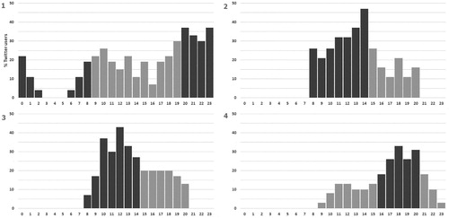
Figure 3. Distribution of users on weekdays by land use in Puente de Vallecas (1), Nuevos Ministerios-AZCA (2), Ciudad Universitaria (3) and Retiro Park (4). Source: Own elaboration, based on Twitter data.
The visualisation of space–time paths (Main map and and ) shows the travel destinations for residents in the Puente de Vallecas residential space and the starting points of workers in the AZCA office zone, students in Ciudad Universitaria and users in the Retiro Park. The 3D visualisation shows that the residents detected in Puente de Vallecas leave the neighbourhood preferably in the morning, and mainly travel to the nearby Atocha train station, from whence they move to other points in the city (mainly the centre areas of the city, which concentrate the city's activity). We also observe certain movements between 2PM and 4PM, users returning to their place of residence for lunch, then coming back to work, and returning to the neighbourhood after 8PM. In parallel fashion, we see internal movement of users who are travelling through the neighbourhood over the course of the day, showing the dynamic nature of a neighbourhood that also has internal work and recreation activity.
Figure 4. Space-time paths throughout the day (2D) in Puente de Vallecas (1), Nuevos Ministerios-AZCA (2), Ciudad Universitaria (3), and Retiro Park (4). Source: Own elaboration, based on Twitter data.
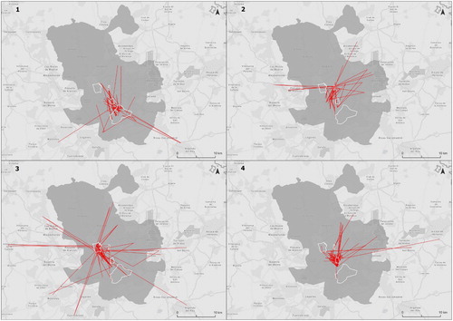
Figure 5. Space-time paths throughout the day (3D). Source: Own elaboration, based on Twitter data.
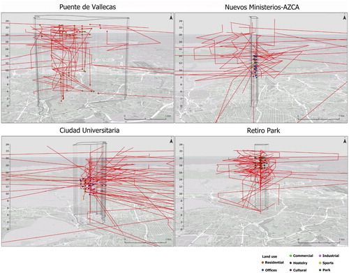
Meanwhile, the Nuevos Ministerios-AZCA office zone receives users during morning hours who mainly come from the city's train stations (users of the metropolitan area who travel to the zone by train) and from the east of the city or adjoining municipalities to the west. Additionally, we observe dispersed paths to the rest of the city in the afternoon (users returning to their residence). Something similar occurs with Ciudad Universitaria, where a high number of paths go from train stations to the university during morning hours and leave the university in the afternoon. In this case, we observe an important path flow coming from residential zones to the west and south of the metropolitan area.
In the Retiro Park, we observe movements in the zone throughout the entire day, mainly coming from spaces near the north and the east of the city, and with greater frequency during afternoon hours. The 2D visualisation shows that its visitors’ area of influence is smaller in comparison with the two aforementioned office and university zones.
5. Conclusions
Over the past few years, the evolution of GIS and the emergence of new data sources have propitiated a new stage in Time Geography. One of the most widely-used tools in this field is the space–time path designed by Hägerstraand. This type of analysis was traditionally limited to data availability. However, the data from mobile telephones or geo-located social media now provide for processing space–time paths with high space and time resolution.
In this article, we worked with Twitter data. We sought to investigate the opportunities posed by these data and tools and visualisations, necessary to discover the mobility of users in different kinds of urban spaces. While there are previous works that have created space–time paths, or that have used Twitter as a data source to analyse mobility, there are hardly studies that have used Twitter to build space–time paths. This work sought to combine these two aspects.
The mapping both in 2D and in 3D shows the usefulness of Twitter as an alternative for building space–time paths. Twitter data have the advantage of high spatial resolution, with coordinates (x,y), unlike telephone data, and provide the possibility of obtaining low-cost data. What is more, these data can be enriched with complementary data, such as Cadastral land-use data, to study the main spatial–temporal activity of users. We can visualise how Puente de Vallecas behaves as a travel generator area, also owning local trips. On the other hand, the other three areas are travel attractors, but with differences in the time of these attractions and the distances of the zones from which these users arrive. In Nuevos Ministerios and Ciudad Universitaria, Twitter users arrive from distant zones. In Ciudad Universitaria arrivals are concentrated in time (mainly in the morning and the first hour in the afternoon), while the arrivals to Nuevos Ministerios are more diversified in time. Meanwhile, Retiro Park also attracts travellers, but these are users who come from nearby spaces, mainly in afternoon hours. 3D visualisations show these different patterns very well.
This work encountered several challenges and aspects to improve in the future. The main issue is the limited sample, because most users don’t enable geotagging in Twitter. As result, geolocated tweets are estimated 1–5% of all tweets (CitationGraham et al., 2014). Another limitation is Twitter's bias; the younger population mainly uses this social media platform, which is shown in the work by the greater number of university students captured, as opposed to the number of workers. Another challenge is that while there are normally daily activities that the population carries out in a few habitual locations (home, work, etc.), that can be occasionally carried out at alternative locations. Moreover, an individual may carry out one same activity at different times depending on the day, or may go to one same location via an alternative route (CitationHuang & Wong, 2015).
Using filters in data based on the number of days a user has been at spatial and temporal coordinates can help to offset these limitations by eliminating random points. An increased time period for the sample would provide for collecting more users or more precise space–time paths, with a greater number of locations available. However, an increased sample size also entails a greater risk of obtaining random points. Indeed, another improvement could be increasing the maximum number of days during which a user has tweeted in one location at one time to decrease the probability of obtaining random points, providing for the increased sample size to increase the filter. Finally, although the basic Twitter data used were limited to the use of coordinates, a semantic analysis of tweets regarding the temporal environment and land-use of the spatial location could be another future line of research.
This investigation has studied regular mobility on weekdays, so non-regular users like tourists have been removed. While there are works that analyse tourist distribution and patterns (CitationGarcía-Palomares et al., 2015; CitationSalas-Olmedo et al., 2018), the visualisation of spatio-temporal paths for these users is a potential future line of investigation using the methodology proposed in this article.
Software
The map was created by using ArcGIS Pro and Adobe Illustrator CS6. Twitter API was used with the Python code to download tweets, and the NoSQL database MongoDB for storage.
TJOM_1778549_Main Map.pdf
Download PDF (56 MB)Acknowledgements
The authors are grateful for funding received from the Community of Madrid (SOCIALBIGDATA-CM, S2015/HUM-3427), from the Ministry of Education, Culture and Sport (Programa FPUAP2015-0147), and from the Ministry of Economy and Development and the European Regional Development Fund (ERDF) (Project DynAccess, TRA2015-65283-R).
Disclosure statement
No potential conflict of interest was reported by the author(s).
Correction Statement
This article has been republished with minor changes. These changes do not impact the academic content of the article.
Additional information
Funding
References
- Birkin, M., Harland, K., Malleson, N., Cross, P., & Clarke, M. (2014). An Examination of personal mobility patterns in space and time using Twitter. International Journal of Agricultural and Environmental Information Systems, 5(3), 55–72. https://doi.org/10.4018/ijaeis.2014070104
- Chen, B. Y., Li, Q., Wang, D., Shaw, S. L., Lam, W. H. K., Yuan, H., & Fang, Z. (2013). Reliable space-time Prisms under travel time uncertainty. Annals of the Association of American Geographers, 103(6), 1502–1521. https://doi.org/10.1080/00045608.2013.834236
- Chen, J., Shaw, S.-L., Yu, H., Lu, F., Chai, Y., & Jia, Q. (2011). Exploratory data analysis of activity diary data: A space–time GIS approach. Journal of Transport Geography, 19(3), 394–404. https://doi.org/10.1016/j.jtrangeo.2010.11.002
- Ciuccarelli, P., Lupi, G., & Simeone, L. (2014). Visualizing the data city: Social media as a source of knowledge for urban planning and management. Springer. http://doi.org/10.1007/978-3-319-02195-9
- Demšar, U., & Virrantaus, K. (2010). Space-time density of trajectories: Exploring spatio-temporal patterns in movement data. International Journal of Geographical Information Science, 24(10), 1527–1542. https://doi.org/10.1080/13658816.2010.511223
- Fang, Z., Shaw, S. L., Tu, W., Li, Q., & Li, Y. (2012). Spatiotemporal analysis of critical transportation links based on time geographic concepts: A case study of critical bridges in Wuhan, China. Journal of Transport Geography, 23, 44–59. https://doi.org/10.1016/j.jtrangeo.2012.03.018
- Farber, S., Neutens, T., Miller, H. J., & Li, X. (2013). The social interaction potential of metropolitan regions: A time-geographic measurement approach using joint accessibility. Annals of the Association of American Geographers, 103(3), 483–504. https://doi.org/10.1080/00045608.2012.689238
- Farber, S., O’Kelly, M., Miller, H. J., & Neutens, T. (2015). Measuring segregation using patterns of daily travel behavior: A social interaction based model of exposure. Journal of Transport Geography, 49(December), 26–38. https://doi.org/10.1016/j.jtrangeo.2015.10.009
- García-Palomares, J. C., Gutiérrez, J., & Mínguez, C. (2015). Identification of tourist hot spots based on social networks: A comparative analysis of European metropolises using photo-sharing services and GIS. Applied Geography, 63, 408–417. https://doi.org/10.1016/j.apgeog.2015.08.002
- García-Palomares, J. C., Salas-Olmedo, M. H., Moya-Gómez, B., Condeço-Melhorado, A., & Gutiérrez, J. (2018). City dynamics through Twitter: Relationships between land use and spatiotemporal demographics. Cities, 72, 310–319. https://doi.org/10.1016/j.cities.2017.09.007
- Graham, M., Hale, S. A., & Gaffney, D. (2014). Where in the World are you? Geolocation and language identification in Twitter. The Professional Geographer, 66(4), 568–578. https://doi.org/10.1080/00330124.2014.907699
- Hägerstraand, T. (1970). What about people in regional science? Papers in Regional Science, 24(1), 7–24. https://doi.org/10.1111/j.1435-5597.1970.tb01464.x
- Huang, Q., & Wong, D. W. S. (2015). Modeling and visualizing regular human mobility patterns with uncertainty: An example using Twitter data. Annals of the Association of American Geographers, 105(6), 1179–1197. https://doi.org/10.1080/00045608.2015.1081120
- Kang, C., Gao, S., Lin, X., Xiao, Y., Yuan, Y., Liu, Y., & Ma, X. (2010). Analyzing and geo-visualizing individual human mobility patterns using mobile call records. In 2010 18th International Conference on Geoinformatics, Geoinformatics 2010. http://doi.org/10.1109/GEOINFORMATICS.2010.5567857
- Kwan, M., & Lee, J. (2011). Visualisation of Socio spatial isolation based on human activity patterns and social networks in space time. Tijdschrift Voor Economische En Sociale Geografie, 102(4), 468–485. https://doi.org/10.1111/j.1467-9663.2010.00649.x
- Lee, J., & Miller, H. J. (2018). Measuring the impacts of new public transit services on space-time accessibility: An analysis of transit system redesign and new bus rapid transit in Columbus, Ohio, USA. Applied Geography, 93(September 2017), 47–63. https://doi.org/10.1016/j.apgeog.2018.02.012
- Miller, H. J. (1991). Modelling accessibility using space-time prism concepts within geographical information systems. International Journal of Geographical Information Systems, 5(3), 287–301. http://doi.org/10.1080/02693799108927856
- Miller, H. J. (2005). Necessary space - time conditions for human interaction. Environment and Planning B: Planning and Design, 32(3), 381–401. https://doi.org/10.1068/b31154
- Miller, H. J. (2017). Time Geography and space-time Prism. International Encyclopedia of Geography: People, the Earth, Environment and Technology, 1–19. https://doi.org/10.1002/9781118786352.wbieg0431
- Miller, H. J., Raubal, M., & Jaegal, Y. (2016). Geospatial data in a changing world. (T. Sarjakoski, M. Y. Santos, & L. T. Sarjakoski, Eds.) Springer International Publishing. http://doi.org/10.1007/978-3-319-33783-8
- Netto, V. M., Pinheiro, M., Meirelles, J. V., & Leite, H. (2015). Digital footprints in the cityscape: Finding networks of segregation through Big Data. International Conference on Location-Based Social Media Data, (March), 1–15.
- Neutens, T., Van de Weghe, N., Witlox, F., & De Maeyer, P. (2008). A three-dimensional network-based space - time prism. Journal of Geographical Systems, 10(1), 89–107. https://doi.org/10.1007/s10109-007-0057-x
- Ren, F., & Kwan, M.-P. (2007). Geovisualization of human hybrid activity-travel patterns. Transactions in GIS, 11(5), 721–744. https://doi.org/10.1111/j.1467-9671.2007.01069.x
- Salas-Olmedo, M. H., Moya-Gómez, B., García-Palomares, J. C., & Gutiérrez, J. (2018). Tourists’ digital footprint in cities: Comparing big data sources. Tourism Management, 66, 13–25. https://doi.org/10.1016/j.tourman.2017.11.001
- Schwanen, T., & Kwan, M. P. (2008). The Internet, mobile phone and space-time constraints. Geoforum; Journal of Physical, Human, and Regional Geosciences, 39(3), 1362–1377. https://doi.org/10.1016/j.geoforum.2007.11.005
- Shaw, S. L., Yu, H., & Bombom, L. S. (2008). A space-time GIS approach to exploring large individual-based spatiotemporal datasets. Transactions in GIS, 12(4), 425–441. https://doi.org/10.1111/j.1467-9671.2008.01114.x
- Shen, Y., Kwan, M.-P., & Chai, Y. (2013). Investigating commuting flexibility with GPS data and 3D geovisualization: A case study of Beijing, China. Journal of Transport Geography, 32, 1–11. https://doi.org/10.1016/j.jtrangeo.2013.07.007
- Tong, L., Zhou, X., & Miller, H. J. (2015). Transportation network design for maximizing space-time accessibility. Transportation Research Part B: Methodological, 81, 555–576. https://doi.org/10.1016/j.trb.2015.08.002
- Yin, L., Shaw Shih-Lung, S. L., & Yu, H. (2011). Potential effects of ICT on face-to-face meeting opportunities: A GIS-based time-geographic approach. Journal of Transport Geography, 19(3), 422–433. https://doi.org/10.1016/j.jtrangeo.2010.09.007
- Yu, H., & Shaw, S. (2008). Exploring potential human activities in physical and virtual spaces: A spatio-temporal GIS approach. International Journal of Geographical Information Science, 22(4), 409–430. https://doi.org/10.1080/13658810701427569