
 ?Mathematical formulae have been encoded as MathML and are displayed in this HTML version using MathJax in order to improve their display. Uncheck the box to turn MathJax off. This feature requires Javascript. Click on a formula to zoom.
ABSTRACT
Bivariate choropleth mappings are proposed in this paper as an effective GIS-based approach that supports the monitoring of Sustainable Development Goals, listed in the Agenda 2030, namely build-up area expansion and population dynamics, the Tier II indicator for SDG 11 (11.3.1). This paper focuses on the application of a multidimensional approach to mapping land use efficiency in Poland between 2006 and 2018. The resulting data are assigned to counties and visualized as choropleth maps categorizing the counties based on the strength of land cover intensity and population growth. The proprietary class interdependence index (CII) based on the relationship between these two variables is used to evaluate class ranges of the bivariate choropleth map. The proposed cartographic presentation might be a useful and important tool in SDG monitoring as it provides information about the relation between population and land consumption rate, portraying the most correlated data in classes along the diagonal.
1. Introduction
The existing subject literature on cartography focuses mainly on univariate maps that portray only one attribute of the geographic information set (CitationBrewer, 1994; CitationHai & Guo, 2009; CitationPokonieczny et al., 2020). Meanwhile, bivariate choropleth maps are a powerful way to convey information about related geographic phenomena. Their functional purpose is to reveal spatial relationships and patterns between two variables (CitationDunn, 1989; CitationTyner, 2009). Visualizing geographic relationship on a single map is more effective than using two side-by-side univariate maps and provides an insight into understanding the mapped phenomena (CitationCarstensen, 1984). This is an important advantage, especially since the correct visual comparison of maps is a task that often exceeds the perceptual capabilities of the average user (CitationLeonowicz, 2002a). However, a bivariate map is more visually complex than a univariate map, which makes it quite difficult for the user to process information. Additionally, designing bivariate choropleth maps successfully is challenging due to the density of added information (CitationLeonowicz, 2006; CitationWeiner & Francolini, 1980).
A common method of creating bivariate choropleth maps is the superimposition of two choropleth maps (CitationDunn, 1989). The first maps developed with this method were published in the 1970s by the US Bureau of the Census, using techniques called overlay, crisscross, merge, or crossing to combine two choropleth maps along with their colour schemes. As a result, a bivariate map with a new set of colours was produced (CitationMonmonier, 1989; CitationOlson, 1981). However, such two-dimensional maps produced ambiguous representations that conveyed information poorly, being too difficult to interpret. In 1980, Wainer and Francolini paid particular attention to the difficulties in interpreting their legends. Indeed, the legend of these choropleth maps contained as many as 16 (4 × 4) value classes, and the adoption of the colour system was controversial (CitationDunn, 1989; CitationFienberg, 1979). The interpretation of bivariate maps was more difficult than of univariate ones, but not because of the adopted method of cartographic presentation, but because incorrect graphic solutions were used. These doubts, therefore, led many researchers to undertake studies on the readability of multivariate cartograms (CitationLeonowicz, 2002a). CitationCuff and Mattson (1982) and CitationTrumbo (1981) analysed the nature of a bivariate colour map legend and compared it to the easily understandable scatterplot diagram. The next study focused on the effectiveness of the used colours schemes and proved that they could significantly improve the readability of maps (CitationEyton, 1984; CitationMacEachren et al., 1999; CitationRoth et al., 2010). According to CitationKraak and Ormeling (2011), colour is the main visual variable. The most standard way of colouring choropleth maps is the approach of CitationBrewer et al. (2015), which includes two-dimensional colour map strategies.
CitationLeonowicz (2002b) claimed that there must be a relationship between the variables selected for analysis, about which the map reader will be informed. Since the essence of the method is the simultaneous presentation of two related geographical phenomena, their choice cannot be accidental. This relationship should be visible in the image of the spatial distribution of both variables. The first type of dependency that can be represented on a bivariate choropleth map is the coexistence of certain phenomena, and a special case here is a cause-and-effect relationship (CitationNusrat et al., 2018). As CitationLeonowicz (2002b) points out, there is also a second type of dependency, which occurs when two independent variables describe one phenomenon that is presented on a bivariate choropleth map. However, when choosing variables, one should not be guided by the size of the correlation between the phenomena. Despite a lack of purely statistical dependence, their presentation on a multivariate cartogram may contain information quite relevant to the reader (CitationCarstensen, 1984; CitationStevens, 2015). Thus, even when the overall correlation is low, there may be a strong relationship between phenomena in individual regions. CitationTrumbo (1981) claimed that most correlated data are in classes along the diagonal, while non-correlated data are presented outside the diagonal.
What information the map provides depends on the method of presentation and the colour scales (CitationBrewer et al., 2015; CitationCalka & Cahan, 2016; CitationStrode et al., 2020; CitationTrumbo, 1981). Bivariate maps can make use of a variety of symbol strategies such as shaded proportional symbols, shaded cartograms, split symbols, shaded isolines, or star plots (CitationFriendly, 2008; CitationKimball & Kostelnick, 2017). Colour combinations are the most popular method, which is also used in this article (CitationCybulski et al., 2020). Combining two sets of data requires the appropriate selection of classes. So far, literature has provided several methods for defining bivariate map class divisions, such as quantiles, equal intervals, standard deviation, maximum breaks, optimal classification, the Jenks natural breaks method, or regression analysis (CitationCalka, 2018; CitationLeonowicz, 2002b). These methods are based on classifying both datasets separately. Nevertheless, there is still a lack of analyses that would study the relationship between data and assess the selection of cartogram classes based on this relationship.
The essence of the bivariate cartogram method is to show the values of two geographical phenomena within the boundaries of the spatial division units on the map. Although they can represent any pairing of thematic variables, they are typically employed to examine the relationships between socioeconomic phenomena. With growing urbanization, the sustainability of cities has become increasingly important. Pursuing a universal approach, Agenda 2030 identifies European countries that need transformation towards sustainability (CitationUnited Nations General Assembly, 2015). Although cities have been using indicators for a long time, it has only been in recent decades that attempts have been made to compile these indicators into sets that reflect many different aspects required to assess a city’s sustainability (CitationMelchiorri et al., 2019; CitationVenables, 2017). One of the most important aspects of analysis is the expansion of built-up areas and population dynamics, i.e. land use efficiency, listed as a Tier II indicator for SDG 11 (11.3.1) (CitationAnderson et al., 2017; CitationCai et al., 2020; CitationPaganini & Petiteville, 2018). Citation(2019) used area cartograms and tile maps to present SDG indicator data also visualized as world choropleth maps (CitationRoser, 2018). The capacity to monitor the SDGs requires a wealth of open, reliable, and globally comparable data (CitationCalka & Bielecka, 2020; CitationNowak Da Costa et al., 2017; CitationWalford & Kurek, 2016). When designing land use efficiency maps, one needs to focus on several factors, including the clarity of the information and spatial relationships as well as patterns between the two variables. Nevertheless, the cartographic presentation of data relationships is still not sophisticated enough.
The aim of the paper is to develop a choropleth map of land use efficiency in Poland for 2006–2018. A bivariate choropleth map was designed to present the relationship between changes in population number and built-up areas in a clear and legible way. In addition, a class interdependence index (CII) was developed to evaluate the class ranges that were used to create the bivariate choropleth. The developed map can help policymakers and planners ensure that cities remain economically productive and environmentally sustainable. This map can also be extremely useful in monitoring land resources in urban planning or disaster management.
2. Study area
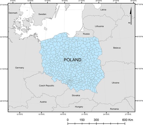
The research covers Poland, a country located in Eastern Europe (). It is the 10th most populated country in Europe and the 63rd in the world. Recently, the population number has slightly decreased to 38,268,000 at the end of 2020. It reached its maximum so far of 38,538,000 at the end of 2011. Since then, the number has been declining because of economic, demographic and cultural reasons. The Central Statistical Office (GUS) reports that this decline, in addition to the general trends observed before (e.g. a decrease in the number of births) was significantly influenced by an increase in the number of deaths, also caused by the COVID epidemic (CitationGUS, 2020).
Figure 1. Poland. Second level of administrative units (counties).
A significant decline in the population can be observed in the outlying areas of towns, municipalities, regions, and in the borderlands. According to the Central Statistical Office, between 2005 and 2019 the population growth was negative in 7 out of 16 provinces of Poland. In 2019, an increase in population was recorded in only four provinces. An analysis of the 2002–2018 statistics shows that there was population decline in the majority of outlying and peripheral counties of north-east, east, south-west, west, and central Poland. On the other hand, real population growth almost invariably occurs mainly in suburban areas of large cities.
The size of built-up areas is constantly on an upward trend. According to GUS data, over the last 10 years, the total number of flats and houses in Poland has increased from 13.3 million to 14.8 million, but this increase was very uneven. In some areas, there was a ten-year increase of more than 30–40%. The number of flats and houses grew the fastest in larger cities and their neighbouring counties. In many cities, the phenomenon of suburbanization can be observed, which means a decisive development of suburban regions (CitationGUS, 2020).
3. Data and methods
3.1. Data
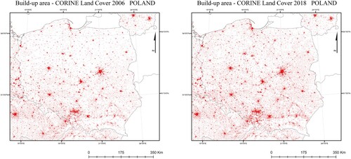
The research used data of the Coordination of Information on the Environment (CORINE) Land Cover, obtained from the Chief Inspectorate of Environmental Protection (https://clc.gios.gov.pl). Land cover is defined as the physical state of the land surface, and, as noted by CitationFisher et al. (2005), is determined by direct observation. CORINE Land Cover data are available for most countries in Europe for 1990, 2000, 2006, 2012, and 2018. Land cover data are widely used both at the European Union level, in its environmental, agricultural, and regional development policies, as well as at the level of individual countries and even regions. The CORINE Land Cover is the only source of geospatial data on the state of land cover and its changes that took place in the European territory between 1990 and 2012 (CitationBielecka & Jenerowicz, 2019). The methodology for land cover inventory and updating was based on visual interpretation of satellite images. These images have been acquired by Landsat TM (1990), Landsat ETM (2000), SPOT 4/5, IRS P6 LISS III and RapidEye (2006 and 2012). Many studies have shown that CORINE Land Cover datasets can be used to monitor urbanization, especially in terms of land use efficiency and monitoring the Sustainable Development Goals (CitationBielecka et al., 2020; CitationGenel & Guan, 2021; CitationKocur-Bera & Pszenny, 2020). Data about build-up area for 2006 ((a)) and 2018 ((b)) were used in the analyses. The population number data related to counties were obtained from the Central Statistical Office.
Figure 2. Build-up areas in Poland. (a) 2006, (b) 2018.
3.2. Methods
The methodology for SDG 11.3.1 is established and referenced in the SDG indicators Metadata Repository managed by UNDESA (https://unstats.un.org/sdgs/metadata). The indicator is classified as a Tier II indicator, meaning that SDG 11.3.1 is conceptually clear with a methodology for its monitoring. However, data for calculating this indicator are not regularly produced or available, presenting challenges for monitoring despite the established methodology. To estimate land use efficiency (LUE), first, it is necessary to calculate the land consumption rate (LCR) and the population growth rate (PGR), according to Equations (1) and (2). To perform the experiments, the established methodology was applied using the CORINE Land Cover as input data. LUE monitors the ratio of land consumption rate to population growth rate. It is used to quantify the sustainable land at the time of urban growth, both in demographic and economic terms.
(1)
(1) where Popt – total population in the initial year for a spatial unit; Popt+n – total population in the final year for a spatial unit; t – the number of years between the two measurement periods.
(2)
(2) where Urbt – total area extent of the built-up area for a spatial unit for the initial year using CORINE Land Cover data [km2]; Urbt+n – total area extent of the built-up area for a spatial unit for the final year using CORINE Land Cover data [km2]; t – the number of years between the two measurement periods.
To develop a land use efficiency bivariate choropleth map a diagonal model was used. The model provided information on the relationship between built-up area changes and population number changes. A bivariate map with 9 classes (3 × 3) was proposed, as suggested by CitationBrewer (1994), because a smaller number of classes is more suitable. Using a sequential colour scheme at a 45-degree angle, this model shows the progression of correlated data (CitationSlocum et al., 2005). To present the differences between the areas on either side of the main diagonal, different colour schemes are used on the opposite sides of the diagonal (CitationTrumbo, 1981). The proposed model attempts to show data correlation along the diagonal using a grey colour scheme, while non-correlated data are shown in complementary colours outside the diagonal. This diagonal model provides information on land use efficiency, i.e. the relationship between the rate of land consumption and the population growth rate. Different shades of blue represent different population growth rates (e.g. bigger changes in populations between 2006 and 2018 are marked darker than others) and different shades of red represent different land consumption rates. The use of shades from light gray to dark gray along the diagonal in the proposed colour schemes allows for a clear presentation of classes related to the sustainable development of the population and the growth of built-up areas. The darker the blue colour, the more uneven increase in the population growth rate is in relation to the growth of built-up areas. The darker the red colour, the greater the growth of built-up areas is in relation to an increase in population. These are areas diverging from sustainable development and requiring improved planning.
Establishing the class ranges is an important step in the development of bivariate choropleth maps. For better visualization of areas with negative ratios of land consumption rate to population growth rate, a range of values of up to one was adopted for both variables to show areas for which there was a decrease in population and built-up areas between 2006 and 2018. The remaining class ranges were selected on the basis of the value of the developed class interdependence index (CII) calculated iteratively using the Python script. The values of the class ranges with the maximum value of the index was adopted for the development of bivariate choropleth maps. It reflects the situation when the data on diagonals are the most correlated, and the data in other classes have the lowest correlation coefficient. This index is based on Pearson’s correlation coefficient (Cnn) calculated for the data in each class and can be applied to an array of any size n × n ().
Figure 3. Correlation matrix for classes of bivariate choropleth map.
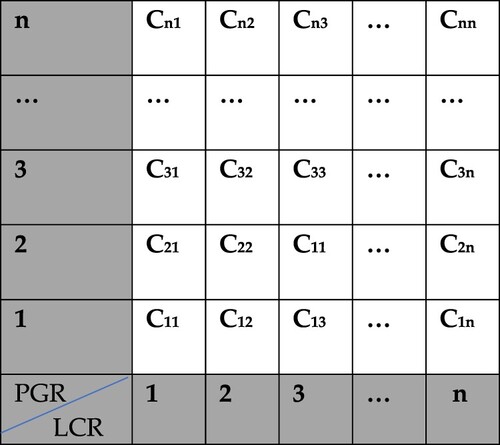
The class interdependence index was computed according to the Equation (3):
(3)
(3) where C11 – Pearson correlation coefficient value for class with PGR<1 and LCR<1; Cii – Pearson correlation coefficient value for other classes on diagonals; Cij – Pearson correlation value for other classes outside the diagonals; n – dimensional matrix; i – row number in correlation matrix; j – column number in correlation matrix.
The class interdependence index assumes values from <0,n>. A higher index value indicates a greater correlation of the PGR and LCR values in diagonal and a smaller value in other classes. The developed method is universal, and the index developed here can be used for arrays with any number of rows and columns.
3.3. Results
Three thematically related maps for the 2006–2018 period are presented in this paper. The main map depicts land use efficiency across Polish counties. This map is meant to illustrate the relationship between the rate of land consumption (LCR) and the population growth rate (PGR). It provides a general-purpose and easy-to-understand overview of the changes that took place in Poland between 2006 and 2018. The first class, for the values of LCR<1 and PGR<1, contains only 7 objects. These are counties with a similar decrease in the number of people and in built-up areas over time. Counties marked in blue, indicating population growth, make up only 7% and are mainly concentrated near large cities. Classes marked with shades of grey apply to 106 counties, accounting for almost 27%, where an increase in the number of people and buildings is fairly similar. Counties marked with shades of red with an increase in the number of buildings and a decrease in the number of people constitute a majority of 55%.
The first class of the choropleth map (PGR<1 LCR<1) was determined arbitrarily. The highest CII index of 2.33 was obtained for the cartogram with the class values of PGR<1.05 and LCR<1.15. For the sake of comparison, the index was also calculated using standard classification methods. For the Quantile method, the CII index was 1.21, while for the Natural Breaks Method it was 0.41. The univariate maps located below the bivariate map present LCR and PGR information using the same colour schemes and class ranges.
4. Conclusions
The use of a bivariate choropleth map makes it possible to show the relationship between the rate of population change and land consumption rate in Poland in 2006–2018. The map makes it possible to display these two variables simultaneously with the use of a single colour scheme. Additionally, the resulting two-dimensional map allows the users to assess the land use efficiency in Poland and could be useful in Sustainable Development Goals monitoring. Due to the forecasts that predict that the population of inhabitants of urban areas will grow to 5 billion by 2030, current trends focus on implementing effective town planning and urban area management practices that will help us overcome the challenges resulting from urbanization. The developed map allows for an easy identification of areas characterized by an even increase in the population and built-up areas, but it also enables the user to identify problem areas that require improvements in spatial planning quickly and easily. These are mainly areas that are subject to rapid urbanization processes, where the number of inhabitants increases dramatically, but also those with strongly expanding built-up areas yet a relatively low increase in population.
However, this method is not without limitations. Firstly, the method presented here requires the availability of reliable data on the population and size of built-up areas. An important aspect is that these data must refer to the area units for which a bivariate choropleth map will be developed. An appropriate data preparation process should, therefore, be carried out. Additionally, for the map to be legible, the number of classes should be limited and an appropriate colour scheme should be selected. The selection of class ranges is an essential issue in developing a bivariate colour scheme. The CII index proposed in this article makes it possible to develop the class ranges of bivariate choropleth maps in an innovative way, considering both variables at the same time. The inclusion of the index in the process of developing bivariate choropleth maps can speed it up and improve it, and at the same time showing the relationship of the presented variables in a more effective way.
To develop a map the functional aspects should be considered. The resulting maps can be interpreted to provide information about land use efficiency. The application of bivariate choropleth maps for the evaluation of land use may support decision-making for promoting the sustainability of land management. Further research will focus on conducting an experiment with the participation of map users that will then be analysed in order to compare univariate and bivariate choropleth maps in terms of the clarity of information in the monitoring of Sustainable Development Goals.
Software
Correlation analysis was calculated using the STATISTICA 13.1. and Python 3.9.2. The map was generated in ArcMap 10.6.1 for Desktop by ESRI. Final map sheet design was performed using CorelDRAW 2018 and Adobe Photoshop CS6.
TJOM_2009925_SUPPLEMENTARY_MATERIAL
Download PDF (14 MB)Disclosure statement
No potential conflict of interest was reported by the author(s).
Data availability statement
CORINE land cover data that support the findings of this study are openly available from the Chief Inspectorate of Environmental Protection web page https://clc.gios.gov.pl.Boundaries of the administrative division was gained from the Head Office of Geodesy and Cartography web page http://www.gugik.gov.pl/pzgik/dane-bez-oplat/dane-z-panstwowego-rejestru-granic-i-powierzchni-jednostek-podzialow-terytorialnych-kraju-prg. The population number data related to counties were obtained from the Central Statistical Office https://stat.gov.pl/obszary-tematyczne/ludnosc/. The data presented LCR and PGR indexes are openly available in Zenodo athttps://doi.org/10.5281/zenodo.4716614, reference number 4716614. The data are available under the CC BY-SA 4.0 license.
Additional information
Funding
References
- Anderson, K., Ryan, B., Sonntag, W., Kavvada, A., & Friedl, L. (2017). Earth observation in service of the 2030 agenda for sustainable development. Geo-Spatial Information Science, 20(2), 77–96. https://doi.org/10.1080/10095020.2017.1333230
- Bielecka, E., & Jenerowicz, A. (2019). Intellectual structure of CORINE land cover research applications in web of science: A Europe-wide review. Remote Sensing, 11(17), 2017. https://doi.org/10.3390/rs11172017
- Bielecka, E., Jenerowicz, A., Pokonieczny, K., & Borkowska, S. (2020). Land cover changes and flows in the Polish Baltic coastal zone: A qualitative and quantitative approach. Remote Sensing, 12(13), 2088. https://doi.org/10.3390/rs12132088
- Brewer, C. A. (1994). Color use guidelines for mapping and visualization. In A. M. MacEachren, & D. R. Fraser Taylor (Eds.), Modern cartography. Vol. 2: Visualization in modern cartography (pp. 123–147). Elsevier Science. https://doi.org/10.1016/B978-0-08-042415-6.50014-4
- Brewer, C. A., Harrower, M., Sheesley, B., Woodruff, A., & Heyman, D. (2015). ColorBrewer: Color advice for cartography. Retrieved December 22, 2020. http://www.ColorBrewer.org
- Cai, G., Zhang, J., Du, M., Li, C., & Peng, S. (2020). Identification of urban land use efficiency by indicator-SDG 11.3.1. PLoS One, 15(12), e0244318. https://doi.org/10.1371/journal.pone.0244318
- Calka, B. (2018). Comparing continuity and compactness of choropleth map classes. Geodesy and Cartography, 67(1), 21–34. https://doi.org/10.24425/118704
- Calka, B., & Bielecka, E. (2020). GHS-POP accuracy assessment: Poland and Portugal case study. Remotely Sensing, 12(7), 1105. https://doi.org/10.3390/rs12071105
- Calka, B., & Cahan, B. (2016). Interactive map of refugee movement in Europe. Geodesy and Cartography, 65(2), 139–148. https://doi.org/10.1515/geocart-2016-0010
- Carstensen, L. (1984). Perceptions of variable similarity on bivariate choropleth maps. The Cartographic Journal, 21(1), 23–29. https://doi.org/10.1179/caj.1984.21.1.23
- Cuff, D. J., & Mattson, M. T. (1982). Thematic maps: Their design and production. Methuen.
- Cybulski, P., Wielebski, Ł, Medyńska-Gulij, B., Lorek, D., & Horbiński, T. (2020). Spatial visualization of quantitative landscape changes in an industrial region between 1827 and 1883. Case study Katowice, southern Poland. Journal of Maps, 16(1), 77–85. https://doi.org/10.1080/17445647.2020.1746416
- Dunn, R. (1989). A dynamic approach to two-variable color mapping. The American Statistician, 43(4), 245–252. https://doi.org/10.1080/00031305.1989.10475669
- Eyton, J. R. (1984). Map supplement: Complementary-color, two-variable maps. Annals of the Association of American Geographers, 74(3), 477–490. https://doi.org/10.1111/j.1467-8306.1984.tb01469.x
- Fienberg, S. (1979). Graphical methods in statistics. The American Statistician, 33(4), 165–178. https://doi.org/10.1080/00031305.1979.10482688
- Fisher, P., Comber, A. J., & Wadsworth, R. (2005). Land use and land cover: Contradiction or complement. In P. Fisher, & D. Unwin (Eds.), Re-Presenting GIS (pp. 85–98). John Wiley & Sons, Ltd.
- Friendly, M. (2008). The golden age of statistical graphics. Statistical Science, 23(4), 502–535. https://doi.org/10.1214/08-sts268
- Genel, ÖA, & Guan, C. (2021). Assessing urbanization dynamics in Turkey’s Marmara region using CORINE data between 2006 and 2018. Remote Sensing, 13(4), 664. https://doi.org/10.3390/rs13040664
- GUS. (2020). Powierzchnia i Ludność w Przekroju Terytorialnym w 2020 roku. Główny Urząd Statystyczny.
- Hai, J., & Guo, D. (2009). Understanding climate change patterns with multivariate geovisualization. In Y. Saygin, J. X. Yu, W. W. HillolKargupta, S. Ranka, P. S. Yu, & X. Wu (Eds.), 2009 IEEE International Conference on Data Mining Workshops (pp. 217–222). IEEE. https://doi.org/10.1109/ICDMW.2009.91
- Kimball, M. A., & Kostelnick, C. H. (2017). Visible numbers: Essays on the history of statistical graphics. Routledge.
- Kocur-Bera, K., & Pszenny, A. (2020). Conversion of agricultural land for urbanization purposes: A case study of the suburbs of the capital of Warmia and Mazury, Poland. Remote Sensing, 12(14), 2325. https://doi.org/10.3390/rs12142325
- Kraak, M. J., & Ormeling, F. J. (2011). Cartography visualization of spatial data. Guildford Press.
- Leonowicz, A. (2002a). Z problematyki porównywalności kartogramów. Polski Przegląd Kartograficzny, 34(1), 22–33.
- Leonowicz, A. (2002b). Prezentacja zależności zjawisk metodą kartogramu złożonego. Polski Przegląd Kartograficzny, 34(4), 273–285.
- Leonowicz, A. (2006). Two-variable choropleth maps as a useful tool for visualization of geographical relationship. Geografija, 42(1), 33–37.
- MacEachren, A. M., Wachowicz, M., Edsall, R., Haug, D., & Masters, R. (1999). Constructing knowledge from multivariate spatiotemporal data: Integrating geographical visualization with knowledge discovery in database methods. International Journal of Geographical Information Science, 13(4), 311–334. https://doi.org/10.1080/136588199241229
- Melchiorri, M., Pesaresi, M., Florczyk, A. J., Corbane, C., & Kemper, T. (2019). Principles and applications of the global human settlement layer as baseline for the land use efficiency indicator-SDG 11.3.1. ISPRS International Journal of Geo-Information, 8(2), 96. https://doi.org/10.3390/ijgi8020096
- Monmonier, M. (1989). Interpolated generalization: Cartographic theory for expert guided feature displacement. Cartographica, 26(1), 43–64. https://doi.org/10.3138/V700-H680-077Q-6503
- Nowak Da Costa, J., Bielecka, E., & Calka, B. (2017). Uncertainty quantification of the global rural-urban mapping project over Polish census data. Environmental Engineering 10th International Conference, Vilnius Gediminas Technical University, Lithuania, 27–28 April 2017. https://doi.org/10.3846/enviro.2017.221
- Nusrat, S., Alam, M. J., & Kobourov, S. (2018). Evaluating cartogram effectiveness. IEEE Transactions on Visualization and Computer Graphics, 24(2), 1105–1118. https://doi.org/10.1109/TVCG.2016.2642109
- Olson, J. M. (1981). Spectrally encoded two-variable maps. Annals of the Association of American Geographers, 71(2), 259–276. https://doi.org/10.1111/j.1467-8306.1981.tb01352.x
- Paganini, M., & Petiteville, I. (2018). Satellite earth observations in support of the sustainable development goals, Special 2018 ed.; CEOS-ESA: Paris, France.
- Pirani, N., Ricker, B. A., & Kraak, M. J. (2019). Alternate thematic maps to visualize United Nations Sustainable Development Goal indicator data. Paper presented at 29th international Cartographic Conference, ICC 2019 (pp. 1–8), Tokyo, Japan. https://www.proc-int-cartogr-assoc.net/2/101/2019/ica-proc-2-101-2019.pdf
- Pokonieczny, K., Calka, B., Bielecka, E., & Kaminski, P. (2020). Modeling spatial relationships between geodetic control points and land use with regards to polish regulation. Proceedings of 2016 Baltic Geodetic Congress (BGC Geomatics) (pp. 176–180), Gdansk, Poland, 2016, 10.1109/BGC.Geomatics.2016.39.
- Roser, M. (2018). Our world in data. Retrieved January 8, 2021, from https://ourworldindata.org/
- Roth, R. E., Woodruff, A. W., & Johnson, Z. F. (2010). Value-by-alpha maps: An alternative technique to the cartogram. The Cartographic Journal, 47(2), 130–140. https://doi.org/10.1179/000870409X12488753453372
- Slocum, T. A., McMaster, R. B., Kessler, F. C., & Howard, H. H. (2005). Thematic cartography and geographic visualization. Pearson Prentice Hall.
- Stevens, J. (2015). Bivariate choropleth maps: A how-to guide. Retrieved January 24, 2021. http://www.joshuastevens.net/cartography/make-a-bivariate-choropleth-map
- Strode, G., Morgan, J. D., Thornton, B., Mesev, V., Rau, E., Shortes, S., & Johnson, N. (2020). Operationalizing Trumbo’s principles of bivariate choropleth map design. Cartographic Perspectives, (94), 5–24. https://doi.org/10.14714/CP94.1538
- Trumbo, B. E. (1981). A theory for coloring bivariate statistical maps. The American Statistician, 35(4), 220–226. https://doi.org/10.1080/00031305.1981.10479360
- Tyner, J. (2009). Principles of map design. Guilford Press.
- United Nations General Assembly. (2015). Transforming our world: The 2030 agenda for sustainable development A/RES/70/1. United Nations.
- Venables, A. J. (2017). Breaking into tradables: Urban form and urban function in a developing city. Journal of Urban Economy, 98, 88–97. https://doi.org/10.1016/j.jue.2017.01.002
- Walford, N., & Kurek, S. (2016). Outworking of the second demographic transition: National trends and regional patterns of fertility change in Poland, and England and Wales, 2002–2012. Population, Space and Place, 22(6), 508–525. https://doi.org/10.1002/psp.1936
- Weiner, H., & Francolini, C. M. (1980). An empirical inquiry concerning human understanding of two-variable map. The American Statistician, 34(2), 81–93. https://doi.org/10.1080/00031305.1980.10483006