
 ?Mathematical formulae have been encoded as MathML and are displayed in this HTML version using MathJax in order to improve their display. Uncheck the box to turn MathJax off. This feature requires Javascript. Click on a formula to zoom.
ABSTRACT
The COVID-19 pandemic has had a dramatic impact on the demand of public transport systems. Nevertheless, the global decrease and recovery of users has been uneven both in time and space. It is important to understand the extent of the unequal resilience of service areas with different characteristics. The objective of this study is to map the patterns of variations in the use of public bus at different scales, urban and regional. The data used were collected by an Automated Fare Collection system based on the use of smart travel cards in the Camp de Tarragona region (Southern Catalonia, Spain). Our approach has the potential to be applied in multiscale studies in other areas with similar data sources. This study also illustrates the potential that data generated by Automated Fare Collection systems have for a better understanding of uneven spatial and temporal patterns of public bus ridership during crises such as a pandemic.
Key Policy Highlights
Data collected by Automated Fare Collection systems allow longitudinal analyses to be carried out at different scales and resolutions.
Such analyses are key to understanding unequal territorial patterns and the evolution of the public bus system.
Automated Fare Collection data can be used to measure the resilience of public bus to disruptions such as the COVID-19 pandemic.
The construction of data visualizations can provide new insights in mobility studies, making them useful tools in the decision-making process.
1. Introduction
In recent decades, great progress has been made in promoting public transport, but the path towards more sustainable mobility can be compromised by the recent impact of the pandemic in public transport demand (Eisenmann et al., Citation2021; Gutiérrez et al., Citation2021; Jenelius & Cebecauer, Citation2020; Liu et al., Citation2020). COVID-19 deeply modified human behaviour and everyday activities. Mobility suffered major impacts during lockdown periods and also during the return to the ‘new normal’ (Almlöf et al., Citation2021; Dong et al., Citation2021; Jenelius & Cebecauer, Citation2020; Vickerman, Citation2021). In this sense, to determine the needs for transport policies and planning, it is important to analyse and understand the process of recovering mobility during the reopening phase (Gkiotsalitis & Cats, Citation2021). Moreover, it is necessary not only to understand the variations in the number and type of travellers, but it is also of great interest to analyse the spatial and temporal variability of trips during the pandemic (Orro et al., Citation2020).
Fortunately, there are various data sources for the study of mobility during the different phases of the pandemic, and there have even been interesting initiatives to facilitate access to data. Mobile phone data has been proven to be successful in gathering the evolution of mobility during the pandemic (Hu et al., Citation2021), though it still has the drawback of difficulty identifying modes of transport (Chin et al., Citation2019). In the case of mobility using public transportation, few sources provide a more detailed approximation than data from Automated Fare Collection (AFC) systems using smart travel cards (Miravet et al., Citation2021). Among the advantages of AFC as a data source, its completeness and quality stand out. However, as it is the case of other technology-based data sources, to maintain the anonymity of the users there is an almost total absence of socioeconomic data or in most cases the data has to be anonymized or summarized before the analysis. Access to this sort of data is normally restricted for these reasons and different types of agreements are necessary to use these data for research (B. Zaragozí, Trilles, Gutiérrez, et al., Citation2021).
The main objective of this study is to produce new maps that facilitate analysing the large amount of information collected by AFC and help to understand the spatial and temporal patterns of the variation in public bus ridership during the different phases of the COVID-19 pandemic. According to this, the specific objectives of our study are as follows:
| (1) | To create an easily readable visual resource that technicians, researchers and citizens can use to track the public bus system recovery. | ||||
| (2) | To introduce a new data visualization system that combines a bivariate choropleth map, a graduated symbols map and the use of sparklines facilitating the understanding of changes in ridership in different temporal and spatial scales. | ||||
| (3) | To showcase the potential value of the data collected by AFC systems. | ||||
2. Study area, data and methodology
2.1. Study area
The study area corresponds to the region in Southern Catalonia, Spain, where public transport services are managed by the Camp de Tarragona Public Transport Consortium (ATMCdT). The ATMCdT coordinates the public transport service – mainly bus – in 132 municipalities, that according to the data of the statistical records of Idescat (Institute of Statistics of Catalonia) had a total population in 2021 of 640,928 inhabitants and an area of 2999.02 km. Tarragona (136,496 inhabitants) and Reus (106,168 inhabitants) are the major cities of the area, while the region also includes other smaller coastal cities, characterized by an intense seasonal activity associated with tourism. About 73% of the population of the area is concentrated in these two main cities and in the 13 remaining coastal municipalities.
By focusing on the Camp de Tarragona, we aimed to explore the consequences of the COVID-19 pandemic in a high tourist area where the extreme effects of tourism shrinkage were predictable. This region was chosen due to its well-studied nature prior to the pandemic and the availability of comprehensive data (Anton Clavé, Citation2010; Anton Clavé & Wilson, Citation2017). Additionally, the region's dependence on tourism, coupled with temporary regulations imposed by the EU and Spanish authorities – Regulation (EU) 2021/953, further accentuated the impact of the pandemic on public transportation. Previous studies have analysed public bus ridership in this region under normal conditions, particularly focusing on seasonal variations driven by sun-and-beach tourism (Domènech et al., Citation2020; Gutiérrez et al., Citation2020; Gutiérrez & Miravet, Citation2016). Recent research has also explored the impact of the COVID-19 pandemic on public bus ridership, with specific attention given to tourist behavior and its relation to residents' safety perceptions (Delclòs-Alió et al., Citation2022; Vich et al., Citation2022).
The ATMCdT offers a range of transport passes that can be used on urban and interurban buses of the Camp de Tarragona. The system favours frequent travellers, as the price per journey is much lower for the fares that allow a larger number of journeys. The range of fares entails T-MES (unlimited use of public transport for 30 days); T-50/30 (50 journeys in 30 days); T-10/30 (10 journeys in 30 days); T-10 (10 journeys through the end of the year). The rest of the options, single tickets in the case of the interurban buses and transport passes, are run by local transport operators of urban buses of Tarragona and Reus, and fall into the category TP. While T-MES, T-50/30, and T-10/30 are unipersonal, and hence, they can only be used by one person, T-10 allows the use of the passes by groups. This characteristic together with the lack of time limitations make T-10 the transport pass most frequently chosen by tourists. Single tickets are also used by tourists due to a lack of time limitations (Gutiérrez et al., Citation2020).
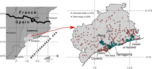
shows that there are 423 interurban bus stops in the area, 207 urban bus stops in Reus and 398 urban bus stops in Tarragona. The ATMCdT also manages 65 urban bus stops in the municipalities of Vendrell and Roda de Berà, but these records have been discarded on the main maps due to their limited representativeness in the dynamics of the study area.
Figure 1. Context maps of bus stops managed by ATMCdT.
In this study, we define ‘transactions’ as the recorded instances when a user validates their ticket or pass while boarding a bus, indicating their utilization of the public transportation service. The ATMCdT recorded 21,661,014 transactions in the study area in 2019, while these fell to 10,724,511 in 2020 – a decrease of 49.51% – mainly due to the health emergency caused by the pandemic. The greatest decrease in absolute terms occurred in the month of April 2020, with 1,590,879 transactions less compared to the same month in 2019 (−80.37%). These decreases are mainly related to the declaration of the First State of Alarm throughout the Spanish territory to deal with the health emergency situation caused by COVID-19. This First State of Alarm was extended until 21 June 2020, with the arrival of the so-called ‘New Normal’ period. However, shortly after, the Government of Spain approved a Third State of Alarm for the entire Spanish territory on 25 October 2020, which lasted until 9 May 2021. It can be mentioned that the Second State of Alarm is not mentioned here because it only comprised a few Spanish regions. In 2021, the number of transactions started to recover, but still were far from the figures of 2019. Besides, this recovery was uneven across the territory. The overall number of journeys that were registered in 2021 was 14,586,810, which still was 33.38% below the transactions registered in 2019.
During the COVID-19 pandemic, adjustments were made to the number of bus services and vehicle capacity. The nature of these adjustments varied depending on the stage of the pandemic. Initially, from March to June 2020, there were significant reductions in the number of buses as a logical response to the lockdown. Subsequently, as the situation evolved and certain restrictions were lifted, bus lines gradually began to restore their pre-pandemic service levels. Therefore, from July 2020 until the end of 2021, adjustments primarily focused on limiting vehicle capacity to mitigate the risk of contracting the illness on-board. These measures were in line with public health guidelines and aimed to ensure the safety of both passengers and staff. According to the data provided by the ATMCdT, in 2019 the number of seat-kilometers offered were 1070.3 M. This figure shrank by 33.9% to 707.5 M seat-kilometers in 2020. In 2021, it grew to 973.1 M, but still remained 9.1% below the 2019 levels.
Although demand levels remained significantly below those of 2019, service provision was not optimized to minimize operators' losses. Instead, the focus was on preserving individuals' right to use public transport. It is important to note that mobility restrictions continuously changed based on the incidence rates of COVID-19 cases, resulting in fluctuations in bus ridership. Nevertheless, the adjustments made during this period prioritized public health considerations. Service reductions only occurred if there was a substantial drop in demand; otherwise, services were maintained despite the significant decrease in ticket revenue.
2.2. Data
To comply with current regulations on the protection of personal data – Regulation (EU) 2016/679 – the ATMCdT provided a data set aggregated by stops and by months, organized in 14 columns, distinguishing the dimensions of space, time, type of stop and the type of rate used (see ).
Table 1. Description of the variables contained in the dataset facilitated by ATMCdT.
This data set can be converted to a GIS point layer based on the geographical coordinates of each stop (Lon and Lat columns) and that layer can be enriched performing spatial joins and queries with other context layers. Given the large concentration of stops in some areas, the journey transactions were spatially aggregated using the layer of municipal limits (Centro Nacional de Información Geográfica, 2021) in the analysis of interurban stops, while the layers of Tarragona (https://mapes.tarragona.cat/) and Reus (https://geoportal.reus.cat) neighbourhoods were used for preparing the maps of each city.
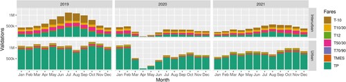
According to the available data, 2017, 2018, and 2019 were typical years in terms of the use of public bus in the study area. Taking 2019 as a reference, shows an important increase in the volume of transactions during the summer period. In contrast, since the start of the pandemic there has been a general drop in the number of transactions in all fares. In 2020, TP and T-10 – the types of fares most used by tourists – are the most affected by the pandemic. Finally, since the beginning of the pandemic, there is a gradual recovery in the use of public bus. However, this recovery has not been the same in all areas managed by the ATMCdT.
Figure 2. Temporal distribution of transactions carried out on ATMCdT buses between 2019 and December 2021. This bar plot shows the significant differences between journey transactions on urban and interurban bus lines.
2.3. Cartographic methods
To show the uneven recovery of the ATMCdT public bus ridership, the two main maps have combined the use of different cartographic techniques, namely graduated circles, bivariate choropleths, and sparklines. These methods were used to represent the spatio-temporal variations in the total number of transactions at each bus stop, that is, without distinguishing between types of fares.
The main maps were created at relatively large scales (regional and urban scales) but showing all bus stops at the same scale would hinder map readability. Because of this, it was necessary to aggregate the data spatially using different administrative units. This was done by calculating the interannual percentual variations in the total number of transactions by month and bus stop. In the case of interurban stops, the transactions were aggregated by municipalities, while the data for urban stops were aggregated by neighbourhoods. After this process was completed, the data was ready for mapping by combining different thematic layers.
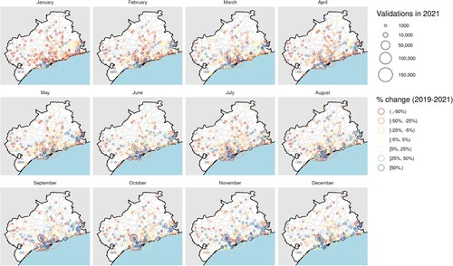
First, graduated circle maps show spatial heterogeneity and contrasts in an area very clearly. To facilitate the temporal analysis, a faceted map was created, that is, a set with a simple map for each month but with a common legend. We experimented with different colour palettes and symbols, aiming to avoid overlapping issues by means of transparencies or symbols with no fill colour (see ). Although graduated circle maps make it easy to understand the uneven geographical distribution of smart card transactions, these maps do not help to represent the temporal evolution of the number of transactions during the pandemic in each area in the same way.
Figure 3. An example of a graduated symbols map showing all interurban bus stops. It showcases the reduction in the use of public bus per stop and month during the first year of the pandemic. Evolution of the service recovery is not easily readable.
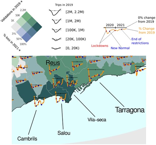
Second, the maps with overlapping sparklines show the evolution of ridership in each zone in a more readable way. Sparkline is a term for a small, high-resolution, simple-design, data-intensive graphic embedded in a context of words, numbers, and images (Tufte, Citation2006). An interesting example of the use of this type of representation with sparklines on a map is the ESRI CovidPulse Living Atlas (https://livingatlas.arcgis.com/covidpulse/), which is a dynamic map that shows the evolution of the pandemic in the United States of North America at different scales. We created these sparklines to show the loss of public bus demand within the area where ATMCdT is in charge of the fare integrated system. Each sparkline is structured from a black horizontal axis showing the base situation in 2019; four different dates are highlighted as overlapping points to indicate different phases of the management of the pandemic–red points for the beginning of application of severe restrictive measures and blue points for the relaxation of those restrictions. Finally, sparklines are sized according to the total number of journey transactions in each administrative area in 2019. This way the area enclosed between the sparkline and the horizontal axis represents the relative loss or gain in the number of transactions when compared to the situation considered normal.
Finally, the main maps – changes in urban and interurban public bus ridership – also show a base layer of bivariate choropleths to help visually clustering municipalities or neighbourhoods with similar patterns of public bus use and the magnitude of the effects of the public health emergency. The color palette was selected to contrast with the sparklines and it is also color blind safe. The class intervals were initially calculated using the Natural Jenks method but were later adjusted manually in order to clearly show the important differences between the central area of the Camp de Tarragona and the peripheral municipalities (). Upon further evaluation, it became apparent that attempting to consolidate the bivariate legends into a single legend for both maps was not a suitable approach, as it resulted in significant distortions in the patterns observed in the central areas of each map.
Figure 4. Design of the sparklines and choropleth layer legends. (Top left) Bivariate colour legend, (Top centre) key of sparkline proportional sizes and (Top right) Example of a sparkline.
3. Discussion and conclusion
In this study, we presented a new type of representation showing the recovery of the public bus service. This type of map allows one to visually analyse a large amount of information collected by AFC systems and to track the decrease and recovery of public bus use during the different phases of the COVID-19 pandemic.
The preparation of the data has been essential so that the final maps are legible and adequately show the contrast between municipalities or neighbourhoods. These types of tasks and the creation of the base visualizations have been completely automated thanks to the tools available from the R GNU platform. and the main maps show some of the territorial and mobility changes that had already been explained in the presentation of the study area. Mainly, we observed that: (1) there is a strong contrast between the use of urban and interurban bus lines, (2) there is a very pronounced summer increase in the number of journey transactions on interurban lines, (3) T-10 fares and single tickets – the most common fares among tourists – are the ones that tend to increase the most during the summer period, and (4) although the decrease in the use of public bus has affected all fares and zones, the greatest impact occurred in the areas of highest tourist activity, while in the rest of the areas there has been a noticeably faster recovery of the ridership. The latter can be seen by observing the sparklines of the elaborated maps.
Graduated symbol maps and sparklines are deemed suitable for assessing variations in public bus use during the pandemic. On the one hand, the graduated symbol maps show an overview of the spatial distribution of transactions in public transport, making it easy to identify the largest drops in bus use. However, the representation by facets requires more space and makes it difficult to establish a longitudinal view of what happened at a bus stop or a specific area. For this reason, it makes sense to combine this type of representation with the sparkline map, in which the temporal evolution of each zone can be easily interpreted–although in this case it is not feasible to represent all the stops as sparklines and it is necessary to apply a spatial aggregation by municipality (interurban services) or neighbourhood (urban services). One significant challenge inherent to our design lies in the reliance on intricate legends to represent various facets of a single variable, the number of trips. Furthermore, as we seek to push the boundaries of visual representation in our field, another avenue to explore in future research could involve the investigation of more complex symbols. For instance, the 3D symbols proposed by Zuniga et al. (Citation2012) offer an intriguing potential approach, expanding the dimensionality and depth of information that can be conveyed in our maps.
The main disadvantage of AFC data is associated with having to overcome the necessary limitations to protect the privacy of public bus users (B. Zaragozí, Trilles et al., Citation2021). Another drawback lies in the fact that this sort of data lacks specific individuals' sociodemographic information (Shoval & Ahas, Citation2016). Despite these limitations, this type of data provides a unique view, transversely and longitudinally, that no other source can provide. The main advantage of AFC data comes from the opportunity to study human mobility during a specific period and at different geographical scales, and thus is particularly suitable to assess the continuous evolution of demand in contexts of disruption (Miravet et al., Citation2021).
The limitations of this study include the fact that it is a descriptive analysis of the data on the use of public bus from the AFC of the ATMCdT. Future studies could algorithmically analyse the spatio-temporal patterns of public bus ridership variations. However, our approach was useful to better understand the characteristics of the available data. In this data extraction provided by ATMCdT, we only used the data for one year before the pandemic, while it would have been interesting to have several years to establish what a normal year means in the study area, such as Orro et al. (Citation2020) did by using a period of 5 years. The temporal resolution of the data could also have been finer. Having monthly aggregated data made it difficult to add more events of interest to understand the evolution of the pandemic from the sparklines. A weekly aggregation would better fit the available data on key issues of the pandemic (e.g. deaths, infections, number of tests or vaccination, among others). Many of these difficulties are associated with the privacy requirements of accessing this type of data.
According to previous studies (Pelletier et al., Citation2011; Sobral et al., Citation2019), we agree that the data from AFC represent an alternative data source for mobility studies to other traditional sources such as surveys, but also provide a level of detail that other more current sources such as mobility data from mobile phones cannot provide (e.g. the fare type used). While AFC data may provide a better representation of mobility through public transport systems, cross-referencing these data with mobile data and additional qualitative research on selected case studies may help circumvent the limitations from each source.
In a territory where the use of public transport is highly dependent on the tourist activity, the demand of bus services is more sensitive to disruptions in comparison to those territories where the demand is based on daily commuting (Delclòs-Alió et al., Citation2022). Moreover, as showcased by the maps, demand shocks in this context tend to acquire an asymmetric distribution. For this reason, the exploitation of continuous data provided by AFC systems is highly valuable to face scenarios like the one caused by the pandemic. The recovery of public bus demand in those services characterized by a higher proportion of tourists' use requires specific actions and accurate knowledge of users' flows. The analysis of these data, which allows total flexibility related to the time and space dimensions, is critical for public transport authorities to properly design the necessary actions to recover the pre-COVID-19 levels of users. As a final consequence, it will be possible to examine the outcomes of the policies implemented, which are also likely to yield uneven outcomes.
Software
Data processing and the cartographic treatment were carried out within the R platform, using libraries from the so-called Tidyverse (Wickham et al., Citation2019). The working environment was packaged in a docker container to facilitate the reproducibility of the analysis (B. M. Zaragozí et al., Citation2020) and both the dockerfile and the R scripts necessary to recreate the maps are available in a Github repository (https://github.com/gratet/jom2023-atm-recovery-map). Finally, the composition was manually laid out using the Inkscape software (v.1.0).
Supplemental Material
Download Zip (8.3 MB)Disclosure statement
No potential conflict of interest was reported by the author(s).
Data availability statement
Access to the AFC microdata was only obtained by means of a research cooperation agreement between the Consortium of Public Transport of Camp de Tarragona and the Research Group on Territorial Analysis and Tourism Studies (GRATET). These data are not accessible by other means.
Additional information
Funding
References
- Almlöf, E., Rubensson, I., Cebecauer, M., & Jenelius, E. (2021). Who continued travelling by public transport during COVID-19? Socioeconomic factors explaining travel behaviour in Stockholm 2020 based on smart card data. European Transport Research Review, 13(1), 31. https://doi.org/10.1186/s12544-021-00488-0
- Anton Clavé, S. (2010). Leisure parks and destination redevelopment: The case of PortAventura, Catalonia. Journal of Policy Research in Tourism, Leisure and Events, 2(1), 66–78. https://doi.org/10.1080/19407960903542326
- Anton Clavé, S., & Wilson, J. (2017). The evolution of coastal tourism destinations: A path plasticity perspective on tourism urbanisation. Journal of Sustainable Tourism, 25(1), 96–112. https://doi.org/10.1080/09669582.2016.1177063
- Chin, K., Huang, H., Horn, C., Kasanicky, I., & Weibel, R. (2019). Inferring fine-grained transport modes from mobile phone cellular signaling data. Computers, Environment and Urban Systems, 77, Article 101348. https://doi.org/10.1016/j.compenvurbsys.2019.101348
- Delclòs-Alió, X., Gutiérrez, A., Miravet, D., Tomàs-Porres, J., Vich, G., & Anton Clavé, S. (2022). Impact of the COVID-19 pandemic on tourist public transportation use and on its determinants: Evidence from a Catalan coastal destination. Tourism Management Perspectives, 44, Article 101003. https://doi.org/10.1016/j.tmp.2022.101003
- Domènech, A., Miravet, D., & Gutiérrez, A. (2020). Mining bus travel card data for analysing mobilities in tourist regions. Journal of Maps, 16(1), 40–49. https://doi.org/10.1080/17445647.2019.1709578
- Dong, H., Ma, S., Jia, N., & Tian, J. (2021). Understanding public transport satisfaction in post COVID-19 pandemic. Transport Policy, 101, 81–88. https://doi.org/10.1016/j.tranpol.2020.12.004
- Eisenmann, C., Nobis, C., Kolarova, V., Lenz, B., & Winkler, C. (2021). Transport mode use during the COVID-19 lockdown period in Germany: The car became more important, public transport lost ground. Transport Policy, 103, 60–67. https://doi.org/10.1016/j.tranpol.2021.01.012
- Gkiotsalitis, K., & Cats, O. (2021). Public transport planning adaption under the COVID-19 pandemic crisis: Literature review of research needs and directions. Transport Reviews, 41(3), 374–392. https://doi.org/10.1080/01441647.2020.1857886
- Gutiérrez, A., Domènech, A., Zaragozí, B., & Miravet, D. (2020). Profiling tourists' use of public transport through smart travel card data. Journal of Transport Geography, 88, Article 102820. https://doi.org/10.1016/j.jtrangeo.2020.102820
- Gutiérrez, A., & Miravet, D. (2016). The determinants of tourist use of public transport at the destination. Sustainability (Switzerland), 8(9), 1–16. https://doi.org/10.3390/su8090908
- Gutiérrez, A., Miravet, D., & Domènech, A. (2021). COVID-19 and urban public transport services: Emerging challenges and research agenda. Cities & Health, 5(sup1), S177–S180. https://doi.org/10.1080/23748834.2020.1804291
- Hu, T., Wang, S., She, B., Zhang, M., Huang, X., Cui, Y., Khuri, J., Hu, Y., Fu, X., Wang, X., Wang, P., Zhu, X., Bao, S., Guan, W., & Li, Z. (2021). Human mobility data in the COVID-19 pandemic: Characteristics, applications, and challenges. International Journal of Digital Earth, 14(9), 1126–1147. https://doi.org/10.1080/17538947.2021.1952324
- Jenelius, E., & Cebecauer, M. (2020). Impacts of COVID-19 on public transport ridership in Sweden: Analysis of ticket validations, sales and passenger counts. Transportation Research Interdisciplinary Perspectives, 8, Article 100242. https://doi.org/10.1016/j.trip.2020.100242
- Liu, L., Miller, H. J., Scheff, J., & Yang, C. (2020). The impacts of COVID-19 pandemic on public transit demand in the United States. PLOS ONE, 15(11), Article e0242476. https://doi.org/10.1371/journal.pone.0242476
- Miravet, D., Gutiérrez, A., & Domènech, A. (2021). Sources of data to tackle the challenges of public transport provision in seasonal tourist destinations. In L. Zamparini, (Ed.), Sustainable transport and tourism destinations, Vol. 13 of Transport and Sustainability (pp. 117–138). Emerald Publishing Limited.
- Orro, A., Novales, M., Monteagudo, Á., Pérez-López, J.B., & Bugarín, M.R. (2020). Impact on city bus transit services of the COVID–19 lockdown and return to the new normal: The case of A coruña (Spain). Sustainability, 12(17), 7206. https://doi.org/10.3390/su12177206
- Pelletier, M.-P., Trépanier, M., & Morency, C. (2011). Smart card data use in public transit: A literature review. Transportation Research Part C: Emerging Technologies, 19(4), 557–568. https://doi.org/10.1016/j.trc.2010.12.003
- Shoval, N., & Ahas, R. (2016). The use of tracking technologies in tourism research: The first decade. Tourism Geographies, 18(5), 587–606. https://doi.org/10.1080/14616688.2016.1214977
- Sobral, T., Galvão, T., & Borges, J. (2019). Visualization of urban mobility data from intelligent transportation systems. Sensors, 19(2), 332. https://doi.org/10.3390/s19020332
- Tufte, E. R. (2006). Beautiful evidence. Graphis Press.
- Vich, G., Gutiérrez, A., Delclòs-Alió, X., Tomàs-Porres, J., & Miravet, D. (2022). Presence of tourists and perceived safety from COVID-19 among local bus users: Evidence from a Mediterranean city. Transportation Research Interdisciplinary Perspectives, 14, Article 100599. https://doi.org/10.1016/j.trip.2022.100599
- Vickerman, R. (2021). Will covid-19 put the public back in public transport? A UK perspective. Transport Policy, 103, 95–102. https://doi.org/10.1016/j.tranpol.2021.01.005
- Wickham, H., Averick, M., Bryan, J., Chang, W., McGowan, L. D., François, R., Grolemund, G., Hayes, A., Henry, L., Hester, J., Kuhn, M., Pedersen, T. L., Miller, E., Bache, S. M., Müller, K., Ooms, J., Robinson, D., Seidel, D. P., Spinu, V., …Yutani, H. (2019). Welcome to the tidyverse. Journal of Open Source Software, 4(43), 1686. https://doi.org/10.21105/joss
- Zaragozí, B., Trilles, S., & Gutiérrez, A. (2021). Passive Mobile data for studying seasonal tourism mobilities: An application in a Mediterranean coastal destination. ISPRS International Journal of Geo-Information, 10(2), 98. https://doi.org/10.3390/ijgi10020098
- Zaragozí, B., Trilles, S., Gutiérrez, A., & Miravet, D. (2021). Development of a common framework for analysing public transport smart card data. Energies, 14(19), 6083. https://doi.org/10.3390/en14196083
- Zaragozí, B. M., Trilles, S., & Navarro-Carrión, J. T. (2020). Leveraging container technologies in a GIScience project: A perspective from open reproducible research. ISPRS International Journal of Geo-Information, 9(3), 138. https://doi.org/10.3390/ijgi9030138
- Zuniga, M., Pueyo, A., & Calvo, J.-L. (2012). The spanish population during the twentieth century and beyond. Journal of Maps, 8(4), 386–391. https://doi.org/10.1080/17445647.2012.744364