
ABSTRACT
The health and societal impacts of COVID-19 have created tremendous interest in the scientific community, resulting in interdisciplinary research teams that combine their expertise to provide new insights into the epidemic. However, spatial computation, exploratory data analysis, and spatial data exploration tools have yet to be integrated into these dashboards. We present a Spatial Online Analytical Platform that integrates spatial analysis tools that enable users to explore and learn more about spatial patterns of COVID-19. We present three interaction classes to support users needs. Our first class allows users to apply user-defined data classifications and custom map color choices. The second class applies a risk index across the time series, informing users of the recent temporal trends. The third class allows users to hypothesize about the presence of spatial clusters and receive results on demand. Our SOLAP platform supports the data analysis and exploration needs of big spatial-temporal data.
1. Introduction
The immediate threat of COVID-19 catalyzed interdisciplinary collaborations for researchers across the world. One of the many outcomes of these collaborations was the creation of data visualization platforms that could work with real-time COVID-19 case data. In particular, web mapping and maps became the popular medium for displaying COVID-19 data due to their ability to simplify and communicate information to a broad audience. Specifically, the John Hopkins dashboard and web mapping platform became a reliable source for official daily COVID-19 statistics for the United States (US) (CitationJohns Hopkins, 2020).
While web mapping has been available since 1989, broad use and adoption of the technology are recent (CitationCartwright & Peterson, 1999). The development of publicly accessible mapping software like Google Maps, Tableau, MapBox, and OpenLayers has made web mapping widely accessible. These software packages provide simple interfaces that allow users to visualize and manipulate spatial data, but not perform spatial analyses. Many of these systems work with pre-calculated static datasets that employ pre-determined user interfaces, limiting or restricting the ability to interact and explore spatial data. For example, most web maps do not allow users to change geographic features colors, or manipulate data classifications. Existing software packages (i.e. MapBox, Tableau, and Google Maps) are limited in that their primary function is transforming spatial data into formats that can be displayed on the web. Therefore, concepts like spatial data manipulation, spatial data exploration, and spatial computation have yet to be fully integrated.
The lack of integration of these spatial concepts does not diminish their importance in the public domain. However, there is a need for geospatial-environments that support dynamic spatio-temporal analysis and visualization. In particular, maps and mapping platforms became a common medium for the dissemination of COVID-19 data. Maps are relevant tools that policymakers may use to inform about opening and closing businesses and schools related to increasing or decreasing cases. The lack of the integration of spatial processes limits our spatial understanding and the public’s and policymakers’ ability to answer important questions about how COVID-19 affects their community.
The primary contribution of our work is the development of a spatial online analysis platform designed to support spatial statistical analyses of COVID-19 data. The platform, we develop allows users to examine COVID-19 data with ad-hoc user-directed queries, which are dynamically visualized by the web mapping application. The integration of the spatial analysis tools we have combined provides a template that others could use for understanding the spatial patterns of disease.
1.1. Current state of COVID-19 dashboards
We examined 71 COVID-19 dashboards, representing 50 states and the District of Columbia, 5 Universities, 5 broadcast companies, and 10 internationally recognized sources. We classified the COVID-19 dashboards based on their interactivity levels and separated them into three groups of interactivity components (). Levels of interactivity were defined by the controls used. Basic interactive components included mouse events such as panning, and zooming in and out. Data interactive components enabled the user to customize the cartographic attributes of the map, like map color scheme and base map selection. They also allow visualizing different data sets on the same map, exporting information, and displaying statistical charts and diagrams. Exploratory components consist of more advanced features like time-series animation, spatial and/or temporal scalability, data reclassification, and visualization of pre-processed data (e.g. clustering information).
Table 1. Interactivity levels and associated map features.
Using the interactivity classification in , we classified the 71 COVID-19 dashboards (Appendix 1). Of the 71 dashboards, 7 were classified as static dashboards as they were not interactive and only provided static images. The second and largest group were those with a basic level of interactivity, as they provided at least one interactive map control. The basic group consisted of 36 dashboards. A total of 25 dashboards were identified as having intermediate levels of interactivity. The dashboards in this group supported at least one of the interactive map controls, which allowed users to interact with data items. Finally, only 3 of the 71 dashboards we reviewed were classified as having an advanced level of interactivity. These dashboards met the conditions of the basic and intermediate-level dashboards with the addition of at least one exploratory control component. This provided users some additional flexibility to understand the spatial and temporal presence of COVID-19.
shows that most dashboards and their user interfaces provided basic and intermediate levels of interactivity for users. The level of interactivity is not reflective of any particular software’s capabilities. Instead, this reflects the complexity of customizing third-party web applications, which may prohibit the integration of more sophisticated front-end libraries and back-end processes to support higher levels of interactivity. It also suggests that much of the effort to create the dashboards was spent on collecting data and loading it into the environment. Additional effort and tools would be needed to create an environment that supported dynamic visualization and analysis, like Online Analytical Processing (OLAP).
Table 2. Counts of COVID-19 dashboards by interactivity classes.
2. Background
2.1. Spatial data for SOLAP
The first component of SOLAP is the data. An OLAP is supported by a data warehouse, which is a centralized repository that stores integrated data. The OLAP is an entry point for accessing the data that creates new knowledge and supports decisions (CitationInmon, 1992). When spatial data is integrated into a data warehouse, we create a spatial data warehouse or Spatial Data Infrastructure (SDI). The purpose of an SDI is to promote the sharing and analysis of spatial data. To date, there are hundreds of SDIs, characterized by their spatial extent (e.g. regional or national scales) and the type of data they contain (CitationBernard et al., 2005; CitationNational Research Council et al., 1993; CitationCrompvoets et al., 2004). While many SDIs support spatial data visualization, most have not yet integrated SOLAP.
2.2. OLAP to SOLAP
The second component of an OLAP is its ability to link disparate data sets together so that they can be further analyzed to create new knowledge (CitationBédard et al., 2001, Citation2007). Spatial Online Analytical Processing (SOLAP) platforms apply these concepts to spatial data with spatial analysis methods (CitationRivest et al., 2001). In doing so, SOLAP allows users to explore and create hypotheses regarding spatial data. Bedard and colleagues explain that SOLAP platforms are meant to be client applications that interact with a spatial data warehouse and are typically represented as web mapping applications. A gap in the literature is the development of SOLAP platforms. This is because supporting interactions between big spatial data sets and web mapping applications is in its infancy (CitationBimonte et al., 2007; CitationGür et al., 2017; CitationRivest et al., 2005; CitationViswanathan & Schneider, 2011).
2.3. Exploratory spatial data analysis within the SOLAP
Exploratory Spatial Data Analysis (ESDA) techniques are a relevant extension of SOLAP methods. ESDA focuses on the development of methods and tools that provide access to all the possible views or combinations of spatial data (CitationAndrienko & Andrienko, 1999; CitationAndrienko & Andrienko, 1999; CitationAnselin, 1998; CitationAnselin & Bao, 1997; CitationBatty & Xie, 1994; CitationGlymour et al., 1997). Geoda and GeoVista are two ESDA applications that combined traditional desktop GIS software with ESDA methods (CitationAnselin et al., 2010; CitationTakatsuka & Gahegan, 2002). A critique of these applications is that they lack the computational power necessary for big spatial data analysis. There are a few SDI platforms that have the computational infrastructure to support ESDA for big data spatial. Arizona State University’s Decision Theater and University of Illinois cyberGIS (CitationGarson, 2009; CitationWang, 2010) are two platforms that offer robust tools for performing complex spatial analyses in near real-time to answer complex problems.
2.4. COVID dashboards that support ESDA
We also identified two systems that have integrated an ESDA approach with COVID-19 data. The first uses the space-time scan statistic to prospective detect for daily COVID-19 case clusters (CitationCOVID-19 Scan, 2021; CitationHohl et al., 2020; CitationKulldorff, 2001). The web map application provides a slider bar that allows users to easily choose a day and visualize if there are any clusters. The second project is the US COVID Atlas project, which has incorporated many of Geoda’s spatial computational capabilities. The US COVID Atlas project supports visualization and analysis of multiple COVID-19 variables (i.e. cases, deaths, and cluster detections) (CitationKolak et al., 2021). Our work contributes to this growing research area by integrating the ability for dynamic user queries and allowing for additional user-directed visualizations.
3. Methods
The COVID-19 SOLAP platform has two components: the front end and the back end (). The front end uses a web framework to provide interaction and geovisualization. The back end is a collection of tools, scripts, and microservices that supply data (light blue) and provide spatial analysis methods (dark blue).
Figure 1. COVID-19 SOLAP platform.
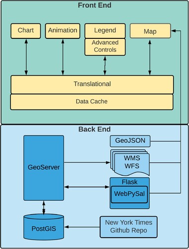
3.1. Front end
Our front end web application is built in React, using its component-based capabilities (CitationFaceBook, 2013). React utilizes state to store data and makes it available across the entire application by passing the state between the different components. State in our application has two purposes: visualization management and data management. Visualization management means that the web application is aware of the data type and its properties when loaded from external sources (i.e. COVID-19 case data or COVID-19 cluster data).
Visualization management also applies to the color scheme in that it can be applied within the mapping application. Visualization management includes the number, types, and color of breaks used to display data on the OpenLayers web map (CitationOpenLayers, 2006). The second reason we used state is for data management, as it allows us to manage access to the large time-series dataset efficiently. Our application progressively loads portions of the entire 18 months of daily COVID-19 data. Progressive loading allows for quick, responsive interactions on the website. Older or historical data can be loaded on-demand as the user requests.
3.2. Back end
3.2.1. Database
PostgreSQL is an open-source relational database that has supported spatial data types since its initial release of PostGIS in 2001. PostgreSQL is a widely used database that can store, edit, and analyze spatial data. For this study, we used PostgreSQL 12.4 with PostGIS version 3.0.
3.2.2. Geoserver
GeoServer version 2.16.2 is an open-source mapping server that enables the editing and sharing of geospatial data on the web. Its purpose is to render spatial data using Open Geospatial Consortium (OGC) standards (CitationBoundless Spatial, 2021; CitationHenderson, 2014). GeoServer’s Web Feature Service (WFS) and customized web services using database views or queries were used in this study.
3.3. Data
3.3.1. COVID-19 data
This study uses the COVID-19 data published by the New York Times GitHub repository (CitationNew York Times, 2020). The dataset contains daily COVID-19 cases and mortalities in the United States at both State and County geographic levels. Each geographic feature can be linked to a spatial dataset with Federal Information Processing Standards (FIPS) codes.
3.3.2. Spatial data
We used Environmental Systems Research Institute (ESRI) shapefiles for both the county and state geographic datasets to visualize the spatial data on a web map. Data were obtained from the US Census Bureau (CitationUS Census Bureau, 2020). The shapefiles are a proprietary ESRI format that contains geometry, FIPS codes, and additional attributes.
3.4. Spatial analysis
3.4.1. Local Indicators of Spatial Association
The Local Indicator of Spatial Association (LISA) is a broadly used spatial statistical measure used in spatial epidemiology (CitationKareiva, 1990; CitationTilman, 1994). We applied the LISA statistic to identify daily clusters of COVID-19 cases and deaths for every state and county in the United States. LISA identifies local or fine-scale patterns of spatial association. In doing so, it computes the correlation between every geographic feature on the map (e.g. county) and its neighborhood (e.g. adjacent counties) based on Queen’s proximity. Therefore, each county’s neighborhood is all adjacent counties. This same definition of the neighborhood is applied to states where Hawaii and Alaska are islands with no adjacent neighbors.
Local Moran’s I values range between −1.0 and +1.0, where a value of +1.0 indicates high similarity, a value of −1.0 indicates dissimilarity and a value of 0 indicates no relationship. LISA values are assigned to each geographic feature (county or state). Additionally, LISA values are classified into one of four categories: high-high, high-low, low-high, and low-low, which describes its relationship with its neighbors. For example, the high-high categorization refers to a feature with a high value surrounded by neighbors with similar high values. Lastly, each geographic feature’s LISA value significance is determined through Monte Carlo simulation. We present only geographic features with statistically significant values less than 0.05 (95% of confidence level).
3.4.2. Load calculated daily LISA cluster results
Due to the COVID-19 database being updated daily, we developed an automated data-loading process in Python 3.7. The process consists of three automated steps. First, we extracted the raw data from the New York Times’ COVID-19 GitHub repository and loaded the non-spatial COVID-19 tables (e.g. county and state) into the PostgreSQL database. Next, the US Census geographic files (i.e. county and state) are joined to their appropriate non-spatial COVID-19 tables. This process allows us to publish publicly accessible spatial datasets and perform the LISA cluster detection analysis. The third and last step uses the PySal library to perform the LISA on daily COVID-19 data (CitationRey & Anselin, 2010). This process generated a total of eight LISA datasets for each day. The datasets consist of daily and cumulative COVID-19 cases and mortalities at both state and county levels. The resulting eight LISA cluster datasets are loaded into the PostgreSQL database.
3.4.3. Dynamic web process of user-defined LISA
While the LISA process is run daily, it is insufficient to meet the needs of all users. For example, if a user wants to know if there was a cluster of cases last week, our process cannot answer this question. What is needed is a dynamic and interactive process that supports the on-demand requests of users. To address these issues, we integrated WebPySal as a Web Processing Services (WPS). The WPS(s) are consumable cloud-based services used to publish geospatial processes. Our WPS uses WebPySal, the PySal Python library wrapped in a Python Flask microservice and publicly exposed via Apache HTTP. The WPS receives a post request, which contains detailed eXtensible Markup Language (XML) instructing the type of geospatial process that will occur. The WPS accepts this XML specification and returns the results which are consumed and displayed in our web application.
4. Results
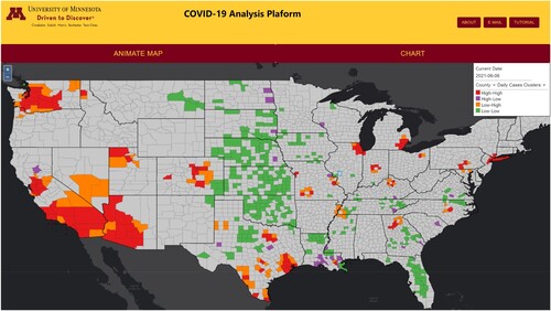
We describe three interactive workflows capable within the COVID-19 SOLAP platform (). Our SOLAP platform is designed to provide a flexible user interface that allows users to employ the full capabilities of a SOLAP, which includes exploring the data and using spatial analysis tools to learn more about the spatial and temporal presence of COVID-19 in the United States.
Figure 2. Visualization of COVID-19 data with the SOLAP platform.
4.1. Intermediate and advanced interactions
4.1.1. Webmap and legend interactions
The web map and the legend are tightly linked in our application. The legend is the primary interactive component. Any changes in the legend are automatically reflected in the web map. The legend is also the starting place where the user begins interactions with the webmap. The legend allows the user to choose the date of information viewed, the geographic scale (i.e. county or state), and the data presented on the web map (i.e. cumulative and daily options for cases, mortality, and clusters) (). According to our initial classification, these legend-based interactions are exploratory components and are considered intermediate and advanced levels of interaction ().
Figure 3. Interactive legend.
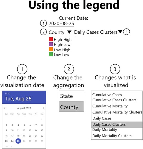
4.1.2. Advanced legend interactions
The choice of the data classification scheme can influence the interpretation of maps (CitationMonmonier, 2018). Our platform offers a collection of data classifications to could improve a user’s understanding of the data. The advanced legend interactions were created for users who want to explore the data further and avoid potential misinterpretations. This feature was developed because some dashboards were unable to be responsive to a dataset that had large amounts of variation in the number of cases or deaths. This resulted in some dashboards using classification schemes and break values derived from historical data that were no longer appropriate for the current values.
The advanced legend features are an example of basic exploratory data analysis techniques supported in the platform. We support the following data classification strategies for numeric data: natural breaks, quantiles, or equal intervals. For each classification strategy, the user can choose the number of breaks or data classes present and the color visualized. If these classification strategies are inadequate, they may define their classes. For numeric data classes, we added the capability that a user could add and remove them dynamically. We do not allow users to add or remove data classes for categorical data, but they can change their colors.
4.2. Spatial analysis processing
Knowledge creation and hypothesis testing are critical roles of analytical platforms. The advanced level of interactions we presented (e.g. legend-based interactions) essentially works with static data. Therefore, while they are unique, they have limited capabilities to create new knowledge. To address this limitation, we introduced additional collaborative processing capabilities of GeoServer and PostGIS.
A limitation of maps is that they can only display spatial information over a single defined period. Therefore, understanding the temporal patterns of COVID-19 can be challenging to understand with maps. Many health officials were using the positivity rate defined as the percentage of positive cases over a 10 or 14-day period (CitationDowdy & D’Souza, 2020). Public health officials use this temporal measure to understand if a region’s cases are increasing or decreasing over time. However, there are no publicly available datasets of positivity rates at the county geographic scale. While the Centers for Disease Control does publish some COVID testing data, it is only available as total tests for each week. As the SOLAP used daily data it was not able to be integrated. Additionally, a limitation of the positivity rate is that it is a temporal measure that assumes each geographic feature to be independent. However, since COVID-19 is spread through human transmission, adjacent regions are likely to impact the spread of the disease. To address this gap, we developed the COVID-19 severity index, which could reflect both the temporal and spatial trends over a defined time. Neither the positivity rate nor the COVID-19 severity index are statistically significant findings. To account for fluctuations in the data we implemented a 14-day temporal window.
The severity index allows users to choose a specific date and the resulting map highlights the geographical features, which have a trend over the previous 14 days (COVID-19’s incubation period). The trend is identified by examining the frequency of the geographic feature being a member of a high-high or high-low cluster from the LISA analysis in the last two weeks. Each geographic feature is classified based on its frequency of being a member of a daily LISA statistical analysis. The trend we identify is not statistically significant and should not be considered the same as the spatiotemporal LISA cluster analysis (CitationGao et al., 2019).
A geographic feature that is classified as ‘very high importance’ has a trend of being a feature that is statistically significant all 14 days. Geographic features that are ‘high importance’ have been a cluster at least 70% of the time (9 days), but not all 14 days. A feature of ‘medium importance’ has been a cluster for less than 70%, and higher than 30% of the time. Those that are classified as ‘low importance’ have been statistically significant less than 30% of the time (4 days). While all features are processed, we do not visualize features that were not clusters of disease for the last 2-weeks; these features are considered non-applicable.
4.3. Dynamic cluster analysis
The LISA measure is a well-known and widely used method to assess spatial auto association. Our review of COVID-19 dashboards described that two other groups had integrated spatial statistical tools into their platforms (CitationHohl et al., 2020; CitationKolak et al., 2021). To the best of our knowledge, our COVID-19 SOLAP platform is the first to provide dynamic cluster analysis for the COVID-19 case data. We provide an interface that allows a user to determine for a previously unknown day or time range if a cluster existed.
5. Spatiotemporal analysis of COVID-19
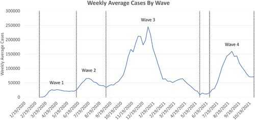
The benefit of the dashboard is that it allows for the analysis of the spatiotemporal trends of COVID-19 to be calculated and visualized in real-time. In this paper, we provide a wave analysis that is produced from the dashboard. We used the SOLAP to visualize the temporal COVID-19 trends and identified specific waves. We examined the intensity of COVID-19 cases during each wave, by identifying percentage clusters of cases that are high-high or high-low. Additionally, we explored the spatiotemporal trends of the disease by region and by waves and illustrated that with our SOLAP platform. We defined the COVID-19 waves as the following ().
Wave 1 from 3/19/2020 to 6/19/2020
Wave 2 from 6/20/2020 to 9/18/2020
Wave 3 from 9/19/2020 to 5/9/2021
Wave 4 from 7/19/2021 to 10/9/2021
Figure 4. COVID-19 7-day average daily cases depicted with waves.
Using the dynamic cluster analysis tool, we aggregated the data for each wave and detected the high-high and high-low clusters within each wave. The disease incidence was calculated as the sum of cases over the time period divided by the total population. The results of the first wave of COVID-19 are shown in Map. During wave 1, the Northeast region of the United States (US) was among the intense with the arrival of European travelers. Additionally, the cluster analysis demonstrates that the epicenters for the first wave were in coastal population centers like New York and New Orleans. The most intense areas of COVID-19 cases were in the Northeast region, which included over 40% of the counties in this region (). We also identify that large numbers of cases were also found in less populated areas in the Midwest and West.
Map. The map of spatial high-high and high-low clusters of COVID-19 aggregated by each wave.
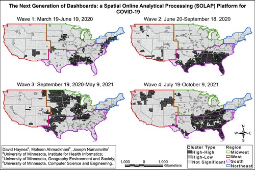
Figure 5. Percentage of high-high and high-low clusters by the US regions and by waves.
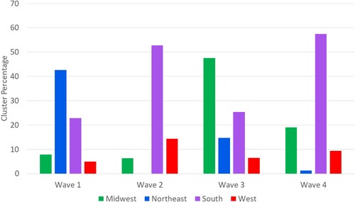
The second wave of COVID-19 was determined to be from June 2020 to September 2020. During this phase, aggressive public policies like physical distancing, mask-wearing mandates, and the switching from in-person to remote for most workers were implemented. Our analysis shows that these policies resulted in the percentage of clusters in the Northeastern region of the US dropping from over 40% to 0%. However, the policies implemented were not consistent across the US. In particular, counties in the southern portion of the United States had a large number of counties classified as being a member of high-high clusters. For example, the states of Texas, Florida, Louisiana, Georgia, Alabama, and South Carolina had many of their counties identified as being a statistically significant cluster over this time period. The entire south region was reported to have over 176 million cases and the second largest number of cases were found in the West regions. The COVID cases that were identified to be statistically significant were primarily in rural areas.
The third wave occurred during the winter of 2020. It was the most intensive wave in the study period with over 5 billion reported COVID-19 cases (). During this wave, the Midwest became an area of interest. Our results show that 47% of counties in the Midwest were identified as being a member of a high-high or high-low cluster. The South region of the United States had an overall decline as only 25% of all counties were determined to be a statistically significant cluster. However, both the West and Northeast had overall increases in the number of cases.
Lastly, we analyzed the fourth wave of the reported COVID-19 data. In this wave, the COVID-19 vaccine was released. The most vulnerable populations began to receive vaccinations. Nationally, the rates of COVID-19 decreased (). This coincided with the reduction of infections and the percentage of clusters in the Midwest and Northeast regions dropped by roughly 28% and 13%, respectively. However, the South region had a significant resurgence of clusters rising from about 25% to 58% of the counties labeled as significant hotspots. The West also reached its highest share of counties (12.2%) defined as statistically significant clusters.
This descriptive analysis shows a clear benefit of the SOLAP platform for health researchers and decision-makers. Additionally, since we use the dynamic cluster analysis tool, it is possible to test various hypotheses and different dates. This makes the platform useful for researchers interested in learning spatiotemporal aspects of disease data in real-time.
6. Limitations
A limitation of the existing platform is that we use data from the New York Times repository for these analyses. There are maybe discrepancies between this data source and official reports. The platform’s architecture could be extended to support additional data sources. We also have some software limitations. We have written custom components that were built for the mapping application and may not be generic enough to support other mapping applications. Our project follows the open science guidelines in that it uses publicly accessible datasets and open-source software. The last software limitation is the use of our Web Processing Service, WebPySal. The Flask wrapper for PySAL has not been regularly maintained. Therefore, it is unlikely that researchers would be able to integrate this service into their dashboards easily. While the LISA statistic is widely used, a limitation is that it identifies spatial clusters, which are determined by the values of each feature compared to its adjacent neighbors. The COVID severity index could be improved provide statistically significant spatio-temporal clusters by implementing the spatio-temporal LISA statistic or using a False Discovery Rate to account for multiple hypothesis tests (CitationGao et al., 2019; CitationNoi et al., 2022).
7. Discussion
The development and introduction of a COVID-19 SOLAP platform are unique and significant contributions to the public health and spatial computation literature. This collaborative work combines public health experts, health geographers, and computational scientists to create a new platform that addresses many limitations of current COVID-19 dashboards. In particular, the architecture implemented could support the frequently changing needs of health researchers without making substantial changes to the interface.
The COVID-19 SOLAP architecture provides the characteristics needed to facilitate the broader adoption of spatial analysis methods within existing web applications. For example, the PostGIS library provides an extensive list of spatial analysis capabilities that could be combined with GeoServers query capabilities. This would allow future researchers to go beyond the OLAP’s current aggregation and querying capabilities. Additionally, Our SOLAP demonstrates how spatial analysis can be integrated within a web mapping application with both the dynamic cluster and temporal severity index. The SOLAP also demonstrates that advanced spatial computation measures can be accomplished by integrating with features within GeoServer and WPS. Lastly, we demonstrate areas where advanced spatial computation is needed by employing our framework on a dynamic spatial dataset. Our current SOLAP architecture uses a single PostgreSQL server to support spatial computation. However, it could become more robust in other cloud computing environments.
Our future work considers enhancing both the user interface design as well as the computational abilities of the SOLAP. The user interface continues to be guided by UI/UX and no-code principles that create an approachable interface for novice and advanced users. We also seek to increase the capabilities for users to have additional data visualization capabilities that are linked to the computational platform. Spatial computation for large datasets remains a complex issue. Our future work will address this by increasing the ability to perform complex spatial analyses on cyberinfrastructure.
Software
The technology used to develop the SOLAP utilized the following software: PostgreSQL with PostGIS and GeoServer, Python 3.7, and its libraries PySAL and Flask. The web framework consisted of React. ColorBrewer 2.0 JavaScript library was used for visualization.
Geolocation
United States of America.
Acknowledgments
I would like to acknowledge the many students in the GIS 5577 course who participated in the initial development of this concept. The content is solely the responsibility of the authors and does not necessarily represent the official views of the National Institutes of Health.
Data availability statement
The data that support the findings of this study are openly available at the New York Times Github Repository, https://github.com/nytimes/covid-19-data The SOLAP can be accessed at (https://smartcommunityhealth.github.io/solap-template/). Code for the platform is available upon request.
Disclosure statement
No potential conflict of interest was reported by the author(s).
Additional information
Funding
References
- Andrienko, G., & Andrienko, N. (1999). Interactive maps for visual data exploration. International Journal of Geographical Information Science, 13(4), 355–374. https://doi.org/10.1080/136588199241247
- Andrienko, G., & Andrienko, N. (1999). Knowledge-based visualization to support spatial data mining. In International symposium on intelligent data analysis (pp. 149–160).
- Anselin, L. (1998). Exploratory spatial data analysis in a geocomputational environment. In Geocomputation, a primer (pp. 77–94). Wiley.
- Anselin, L., & Bao, S. (1997). Exploratory spatial data analysis linking SpaceStat and ArcView. In Recent developments in spatial analysis (pp. 35–59). Springer.
- Anselin, L., Syabri, I., & Kho, Y. (2010). GeoDa: An introduction to spatial data analysis. In Handbook of applied spatial analysis (pp. 73–89). Springer.
- Batty, M., & Xie, Y. (1994). Research Article. Modelling inside GIS: Part 1. Model structures, exploratory spatial data analysis and aggregation. International Journal of Geographical Information Systems, 8(3), 291–307. https://doi.org/10.1080/02693799408902001
- Bédard, Y., Merrett, T., & Han, J. (2001). Fundamentals of spatial data warehousing for geographic knowledge discovery. Geographic Data Mining and Knowledge Discovery, 2, 53–73.
- Bédard, Y., Rivest, S., & Proulx, M.-J. (2007). Spatial. Online analytical. Processing (SOLAP): Concepts, architectures, and solutions. In Data warehouses and OLAP: Concepts, architectures, and solutions (pp. 298–319). Idea Group Inc.
- Bernard, L., Kanellopoulos, I., Annoni, A., & Smits, P. (2005). The European geoportal—One step towards the establishment of a European Spatial Data Infrastructure. Computers, Environment and Urban Systems, 29(1), 15–31. https://doi.org/10.1016/S0198-9715(04)00049-3
- Bimonte, S., Tchounikine, A., & Miquel, M. (2007). Spatial OLAP : Open issues and a web based prototype.
- Boundless Spatial. (2021). Geoserver. http://geoserver.org/about/
- Cartwright, W., & Peterson, M. P. (1999). Multimedia cartography. In Multimedia cartography (pp. 1–10). Springer.
- COVID-19 Scan. (2021). Coronavirus clustering using scan statistics. https://covid19scan.shinyapps.io/covid19scan/
- Crompvoets, J., Bregt, A., Rajabifard, A., & Williamson, I. (2004). Assessing the worldwide developments of national spatial data clearinghouses. International Journal of Geographical Information Science, 18(7), 665–689. https://doi.org/10.1080/13658810410001702030
- Dowdy, A., & D’Souza, G. (2020). COVID-19 testing: Understanding the “percent positive”. John Hopkins Bloomberg School of Public Health, Covid-19 School of Public Health Experts, 10(8).
- FaceBook. (2013). React. In A JavaScript library for building user interfaces. https://reactjs.org/
- Gao, Y., Cheng, J., Meng, H., & Liu, Y. (2019). Measuring spatio-temporal autocorrelation in time series data of collective human mobility. Geo-Spatial Information Science, 22(3), 166–173. https://doi.org/10.1080/10095020.2019.1643609
- Garson, G. D. (2009). Computerized simulation in the social sciences: A survey and evaluation. Simulation & Gaming, 40(2), 267–279. https://doi.org/10.1177/1046878108322225
- Glymour, C., Madigan, D., Pregibon, D., & Smyth, P. (1997). Statistical themes and lessons for data mining. Data Mining and Knowledge Discovery, 1(1), 11–28. https://doi.org/10.1023/A:1009773905005
- Gür, N., Nielsen, J., Hose, K., & Pedersen, T. B. (2017). GeoSemOLAP: Geospatial OLAP on the Semantic Web made easy. In Proceedings of the 26th international conference on World Wide Web companion (pp. 213–217.
- Henderson, C. (2014). Mastering GeoServer. Packt Publishing Ltd.
- Hohl, A., Delmelle, E. M., Desjardins, M. R., & Lan, Y. (2020). Daily surveillance of COVID-19 using the prospective space-time scan statistic in the United States. Spatial and Spatio-Temporal Epidemiology, 34, 100354. https://doi.org/10.1016/j.sste.2020.100354
- Inmon, W. H. (1992). Building the data warehouse. John Wiley & Sons, Inc.
- Johns Hopkins. (2020). Coronavirus COVID-19 global cases. https://gisanddata.maps.arcgis.com/apps/opsdashboard/index.html#/bda7594740fd40299423467b48e9ecf6
- Kareiva, P. (1990). Population dynamics in spatially complex environments: Theory and data. Philosophical Transactions of the Royal Society of London. Series B: Biological Sciences, 330(1257), 175–190. https://doi.org/10.1098/rstb.1990.0191
- Kolak, M., Lin, Q., Halpern, D., Paykin, S., Martin-Cardoso, A., & Li, X. (2021). US COVID Atlas. https://theuscovidatlas.org/map
- Kulldorff, M. (2001). Prospective time periodic geographical disease surveillance using a scan statistic. Journal of the Royal Statistical Society Series A: Statistics in Society, 164(1), 61–72. https://doi.org/10.1111/1467-985X.00186
- Monmonier, M. (2018). How to lie with maps. University of Chicago Press.
- National Research Council, Division on Earth and Life Studies, Commission on Geosciences, Environment and Resources, Mapping Science Committee. (1993). Toward a coordinated spatial data infrastructure for the nation. National Academies Press.
- New York Times. (2020). Covid-19-data. https://github.com/nytimes/covid-19-data
- Noi, E., Rudolph, A., & Dodge, S. (2022). Assessing COVID-induced changes in spatiotemporal structure of mobility in the United States in 2020: A multi-source analytical framework. International Journal of Geographical Information Science, 36(3), 585–616. https://doi.org/10.1080/13658816.2021.2005796
- OpenLayers. (2006). OpenLayers. In OpenLayers (6.0.1). https://openlayers.org/
- Rey, S. J., & Anselin, L. (2010). PySAL: A Python library of spatial analytical methods. Handbook of Applied Spatial Analysis, 175–193. https://doi.org/10.1007/978-3-642-03647-7_11
- Rivest, S., Bédard, Y., & Marchand, P. (2001). Toward better support for spatial decision making: Defining the characteristics of spatial on-line analytical processing (SOLAP). GEOMATICA-OTTAWA, 55(4), 539–555.
- Rivest, S., Bédard, Y., Proulx, M.-J., Nadeau, M., Hubert, F., & Pastor, J. (2005). SOLAP technology: Merging business intelligence with geospatial technology for interactive spatio-temporal exploration and analysis of data. ISPRS Journal of Photogrammetry and Remote Sensing, 60(1), 17–33. https://doi.org/10.1016/j.isprsjprs.2005.10.002
- Takatsuka, M., & Gahegan, M. (2002). GeoVISTA Studio: A codeless visual programming environment for geoscientific data analysis and visualization. Computers & Geosciences, 28(10), 1131–1144. https://doi.org/10.1016/S0098-3004(02)00031-6
- Tilman, D. (1994). Competition and biodiversity in spatially structured habitats. Ecology, 75(1), 2–16. https://doi.org/10.2307/1939377
- US Census Bureau. (2020). US cartographic boundary shapefiles. https://www.census.gov/geographies/mapping-files/time-series/geo/carto-boundary-file.html
- Viswanathan, G., & Schneider, M. (2011). On the requirements for user-centric spatial data warehousing and SOLAP. In International conference on database systems for advanced applications (pp. 144–155).
- Wang, S. (2010). A CyberGIS framework for the synthesis of cyberinfrastructure, GIS, and spatial analysis. Annals of the Association of American Geographers, 100(3), 535–557. https://doi.org/10.1080/00045601003791243