
ABSTRACT
Previous research has highlighted the limitations encountered in representing the dynamism of language use and contacts. Here, linguistic landscapes from five towns in Northern Sweden are the point of departure for investigating novel perspectives through the geovisualization of multilingualism, with the ultimate aim of understanding how languages in our surroundings help construct public spaces. As an outcome, a web GIS application, based on 6865 thematically analyzed photographs, was developed as an interactive resource for visualizing and sharing the data and enabling new modes of analysis and new research questions. The article describes the data collection and curation processes, app development using GIS software and software-as-a-service, the eventual app design and interaction, and the update and maintenance plans, as well as discussing challenges and considerations related to temporalities, spatialities, and technicalities. The web GIS has potential applications in spatial analysis, research communication, and education.
1. Geovisualization of multilingualism
The challenge of visualizing multilingualism has been discussed in previous research, which has noted the limitations encountered in fairly representing the dynamism of language use and contacts (CitationFoka et al., 2020; CitationLuebbering et al., 2013a, Citation2013b). Linguistic landscapes, referring to how languages materialize in our surroundings, provide a particularly interesting and relevant perspective from which to visualize written languages.
Mapping, as a research practice, has been the subject of debates and critiques. Recent research highlights the challenges that mapping encounters in a digital age. Perspectives such as critical cartography, counter-maps, and decolonial movements (CitationBellone et al., 2020) urge us to reconsider what maps create, represent, and exclude. Maps have regained popularity since digital tools and technologies have brought new and better ways to create modes of geographical visualization. In this context, CitationBargués-Pedreny (2018) has invited us to challenge ‘the idea that maps are representational systems,’ instead thinking of maps ‘as useful navigational tools, which are not representative of a world but enable people to reach destinations and relate phenomena’ (p. 139).
The advent of new digital tools has significantly impacted the field of geovisualization, and the availability of software tools has contributed to the growth and popularity of geovisualization methods. These tools allow for the visual exploration of geospatial data using static, animated, and interactive cartographic products. These new tools are being developed to facilitate interacting with and searching geovisualizations, enhancing the user experience. Furthermore, the advent of new digital tools has not only enhanced geovisualization capabilities, but also revolutionized how we perceive and use maps. Thanks to enriched details and opportunities to build interactive and personalized maps, new digital tools and geovisualizations are transforming maps from static, representational systems into dynamic, interactive, and personalized navigational tools (CitationDodge et al., 2009; CitationHüffer et al., 2023).
This article discusses the methodological aspects of how to recreate the experience of walking along a street and interacting (see CitationPurschke, 2021) with the languages encountered on signs, when presenting research data. It presents the efforts and reflections of our research group in finding a mode of data visualization in the project ‘The language of place-making: A mixed-method analysis of linguistic landscapes,’ whose geographical scope is Northern Sweden. The main data consist of 6865 photos of outdoor signs from the urban centers of five small or medium-sized towns in the 2019–2021 period. The main purpose of the project was to investigate how languages as they materialize in our surroundings contribute to the making of public spaces. As a project outcome, a web app, as an interactive resource for visualizing and sharing the data, was generated. This app also became a departure platform for new modes of analysis and new research questions. In line with, for example, the urban geolinguists CitationWilliams and van der Merwe (1996), we explore how to use GIS in studying multilingualism with a focus on written languages (for a comparison with GIS studies of spoken multilingualism, see, e.g. CitationNikolova Veselinova & Booza, 2009). Previous research has underscored the value and potentials of web services for the study of linguistic landscapes when suitably drawing on analytical frameworks from linguistic landscape studies (CitationAndroutsopoulos, 2021; CitationPurschke, 2021). The limitations and complexity of such services are also emphasized in the literature, primarily due to the level of specialized training that such systems and tools often require (CitationGaiser & Matras, 2021) and to the challenges of translating linguistic concepts into a smartphone app for data collection and annotation (CitationAndroutsopoulos, 2021).
In this article, we will describe the choices made in the process of developing the app, addressing the challenges identified in previous research and the issues that arose along the way. The article also presents examples of the applications and uses of such an app. We hope and believe that this application of GIS in the study of multilingualism will be of relevance and interest to other researchers exploring linguistic representation, spatial analysis, and data visualization in general.
2. A web experience
Our ‘web experience’ is based on a state-of-the-art web platform for geographical information systems (GIS); since the turn of the century, GIS has evolved into a system of cloud-based web services to collect, present, and analyze spatial data efficiently, universally, and interactively (CitationFu, 2022). Below, we explain the workflows for data collection and app development, and provide insights into how to interact with the app as well as issues pertaining to its update and maintenance.
2.1. Data collection and curation
The photographic data were collected from January 2019 to March 2021, following a census of all written signs installed outdoors in five urban localities in Northern Sweden (Norrland). Here, ‘sign’ was defined as an item that contains written language, i.e. orthographic text either alone or together with other symbols and images (CitationCocq et al., 2020). The sites, namely, Umeå, Kramfors, Pajala, Jokkmokk, and Sorsele, were selected to reflect varying demographic and socioeconomic conditions of Norrland in terms of number of inhabitants, percentage of inhabitants from other countries, tourism, global industry, and trade. Linguistic landscapes are more noticeable in urban areas than in smaller settlements such as villages, where signage is less prevalent. The selected sites vary in population size, ranging from a few thousand to nearly a hundred thousand inhabitants. These sites serve as regional centers within their respective municipalities, which are local administrative regions in Sweden. Each site is an administrative area for at least one of the national minority languages, i.e. Finnish, Meänkieli, and Sámi. These municipalities are recognized as responsible for promoting and supporting minority languages according to the Swedish Act on National Minorities and Minority Languages (CitationCocq et al., 2020).
The survey resulted in 6865 photos listed on a spreadsheet according to their filenames. Each photo was then assigned linguistic (i.e. monolingual, multilingual, and language) and contextual (i.e. placement, medium, publisher, and content) attributes and coded by the relevant values it bears (see for a full list and translations). The photos were taken with a Ricoh WG-6 camera, which allowed for spatiotemporal tagging; the resulting metadata helped locate the photos on a map via the GeoTagged Photos to Points geoprocessing tool of the ArcGIS Pro software by Esri. The tool not only locates the photos according to their metadata-informed x-y-z coordinates but also stores the photos as attachments for each related point feature. The geographically displayed point data layer was linked to the coded attribute table based on the common filename field. This helped data curation, reducing the number of included photos to 6294 due to coordinate errors (n = 481), indoor placement (n = 47), or being duplicates or having accidentally captured non-linguistic content (n = 103).
Table 1. Photographed sign attributes and their values identified for LingGIS.
Besides the primary dataset based on the collected photos, other relevant data could be included in a web GIS map/app. For showcasing purposes, we have retrieved information on the birthplaces of the resident populations in our study areas as of 2020. Such data are summarized into vector grids and are available from Statistics Sweden’s (SCB) geodata portal. We used the Swedish Agricultural University’s Geodata Extraction Tool (maps.slu.se) to obtain the data in a shapefile format native to ArcGIS Pro. The use of the tool is intended to demonstrate how our app can facilitate the visual inspection of any correlations among the languages represented on the photos and the global origins of the residents in our linguistic landscapes (see Section 4.1).
2.2. App development
Esri’s geospatial cloud architecture allows the software-based (in this case, ArcGIS Pro) layers of the web GIS to be shared. At the core of this is the portal ArcGIS Online (AGOL), which is a software-as-a-service (SaaS) without any additional hardware needed to store, manipulate, and visualize the data online. The main workflow for web app development initially requires the creation of a web map to which the hosted layers can be added and configured before further importing. Here we have added the photo (foton och data) and population (befolkning efter födelseland) layers and set the symbologies of the photo location points to be clustered and population grids to be graduated by color. As for popup configurations, fields irrelevant to the end user (e.g. OBJECTID and attachment path) were removed. Moreover attachments (i.e. the original photos) were enabled for the photo locations, whereas pie charts were embedded in the population grid popups to visualize the breakdown of birthplace locations (note that the occasional inconsistency between the sum of the components and the actual Totalt field stems from SCB’s original data). Finally, the Streets (Night) basemap, provided by AGOL, was set as the default to ensure sufficient figure–ground contrast on the web map. These configuration settings were maintained once the web map was imported to a web app.
As CitationFu (2022) noted, web maps form the bridge between the layers and the final app(s) to be shared. AGOL has a range of ready-to-use and configurable platforms to choose from when moving from the map to the app interface. In our case, we chose the sophisticated Experience Builder (EB), which allows for the creation of desktop and mobile apps in a dashboard fashion, such as the COVID-19 Dashboard created by Johns Hopkins University (CitationDong et al., 2020), popularized during the pandemic.
2.3. App design and interaction
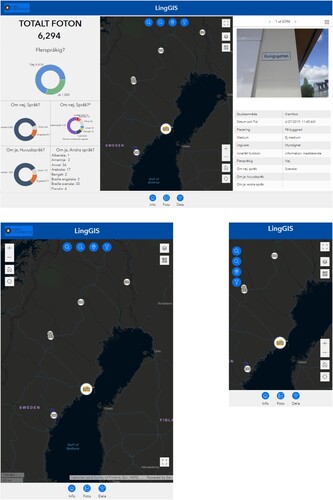
The web experience created in EB is based on a single web page, with a fixed splash window containing welcome information. The main page layout consists of three columns with the initially created web map in the center, dynamic texts and charts on the left, and a Feature Info widget that reflects the popups of the photos in the map on the right. The smaller screen versions of the experience are based on only the central column of the web map to save space (see ).
Figure 1. The main interface of the LingGIS web experience as viewed on 1280 × 800 monitor (above), 601 × 962 tablet (left), and 360 × 640 phone (right) screens.
The map’s enabled tools provide the user with options for zooming, default extent, full-screen display, basemap change, layer list and legend, and location finder. Moreover, additional widgets help filter the photo features according to their attributes. This enables the user to navigate the landscape from various perspectives, i.e. context or languages. Results of any filter selection are immediately reflected in the map, charts (note that those values remaining below a threshold of 4% are grouped under the Other category), dynamic texts, and Feature Info. The user can also zoom to or highlight any feature displayed on the Feature Info widget via the action buttons in the top-right corner. Alternatively, feature information can be retrieved by clicking on the photo points on the map and viewing the popup windows – which is the only way to view individual feature information on the mobile versions of the app. Likewise, clicking on the population grids will also display map popups with birthplace information and its visualization within pie charts. Both the desktop and mobile versions of the publicly shared app can be experienced on https://linggis.humlab.umu.se/ (alternative link at https://arcg.is/1W9Cvv0).
2.4. Updates and maintenance
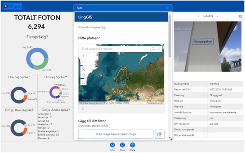
The LingGIS web experience is intended to remain a living app by allowing enrichment through user-generated content. This will be possible through the Foto widget, found in the footer of the app (see ), which lets third parties locate and add their photos and describe their linguistic and contextual information, consistent with the attribute table of the main app’s photo layer, through an ArcGIS Survey123 form that can also be separately shared with a link or a QR code. The submitted content is initially screened by the project team on the separate dataset of the Survey123 platform, and, if suitable, is appended to the original photos’ feature layer hosted on AGOL. Other updates, such as value changes/corrections for existing feature attributes, can also be handled in the Data view of the AGOL-hosted feature layer.
Figure 2. The survey widget, Foto, lets users locate and upload photos and their linguistic and contextual attributes to an ArcGIS Survey123 dataset.
3. Challenges and considerations
During the process of developing the application and exploring the map, the research team encountered challenges and identified limitations in the spatio–temporal representation. The reflections below present these main challenges and suggest possible ways to mitigate the limitations.
3.1. Temporality
The data collected during the fieldwork were cross-sectional, reflecting a specific moment and how the linguistic landscape was at the time of documentation (selected to represent an everyday weekday experience). Dynamism and variation over time were therefore not captured. The visualization must address this explicitly to avoid the risk of generalization (‘This is what the linguistic landscape of Jokkmokk looks like.’). On our map, we provide information about the time of documentation (i.e. day and time); moreover, our coding also includes information about the placement of a sign (e.g. on a building façade or park bench). This helps the map user to understand the expected temporality of signs. Permanent signs, for example, conveying the names of shops and companies, fixed on the wall of a building with no medium (e.g. ‘Apotek’ [pharmacy] or ‘ICA’ [one of Sweden’s two largest food retailers]) can be expected to remain the same at the same place at another documentation time over a relatively long time span. Temporary signs are usually presented on movable media such as sandwich boards, posters, and notes on a billboard. These might change, be moved somewhere else, or disappear within a short period.
Additional aspects that could be addressed in further research could be renewed documentation of the same places at another time or over a longer period (e.g. a year, which would cover movements and changes such as tourism effects). Data collected through crowdsourcing (see Section 2.4) could also help illustrate several particular moments and thereby capture potential dynamism, for instance, in documenting and mapping temporary signs.
3.2. Spatiality
Our interaction with the map at an early stage revealed a shortcoming of GPS accuracy. Although all documentation photos were taken outdoors (for methodological and ethical reasons), several photos placed on the digital map appear as if they were inside buildings (in relation to the base map). This is particularly the case for the data collected in Umeå. The misplaced photos seemed at first to be randomly distributed, but we noticed that this issue was overrepresented in the case of signs in display windows. This misplacement could be caused by the reflection in the window. This lack of accuracy – sometimes up to 10 meters – also seemed to occur to a greater extent when the photographer was near a higher building or between buildings, where one can assume that the GPS signal was poor due to shadowing, i.e. the ‘urban canyon effect’ (CitationMisra & Enge, 2010). This inconsistency might also be because not all building footprints were perfectly digitized on the basemap(s) (CitationBrovelli & Zamboni, 2018).
A consequence of this lack of accuracy is that we cannot be sure that the signs are correctly placed (not only indoors when they should be outdoors, but also along the street, etc.). Considering these limitations, we opted for the following solutions. In the case of our analysis, photo misplacement on the map did not affect the results, since the coding scheme clearly specified where the signs were placed. Even in the case of spatial analysis in relation to socioeconomic variables (see Section 4.1), we concluded that a 5–10 meter deviation would not affect the results to a noticeable extent, since the aggregation grids have relatively coarse resolutions of 250 m and 1 km inside and outside the urban areas, respectively. Therefore, we decided not to correct the erroneous positions on the map, but clarified this aspect in the user instructions, i.e. explained that all signs were photographed outdoors and that a certain inaccuracy occurred.
3.3. Technicality
Web GIS and its use in the humanities and linguistics is a fairly new methodology, and the associated challenges are particularly demanding in this era of rapidly evolving development platforms. In our app development attempts, we initially started by using AGOL’s predecessor platform, Web AppBuilder (WAB), but then felt the urge to move on to the more recently launched Experience Builder (EB). EB did not have its full current functionalities during its first launching period, and moreover it was much more complex to learn compared with the ease of using WAB. WAB, however, is not as customizable as is EB, and with its enhanced functionality, EB gives researchers almost complete flexibility to produce a custom-built app, with nearly no coding skills required. For those researchers with programming skills, there is a developer edition of the EB for even more enhanced customization, based on ArcGIS API for JavaScript 4.x, React Redux framework, Bootstrap 4 (for the user interface), and HTML5.
4. Applications
Our principal aim with the web app was to investigate how to better visualize multilingualism as it can be experienced in selected municipalities. Our project was also intended to explore what new modes of analysis could arise through working with a large dataset. This section presents three possible application areas in research, communication, and education.
4.1. Spatial analyses
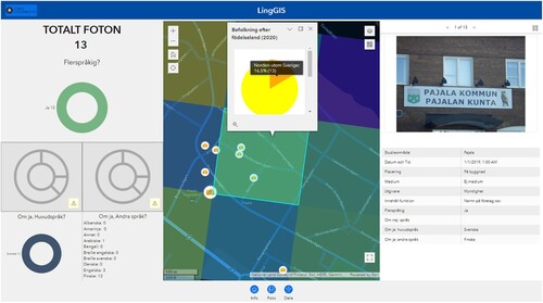
Our web experience is partly capable of spatial analytics, beyond just data collection, visualization, and exploration. Due to the current limited functionality of EB in terms of geoprocessing widgets, our showcase approach has been based on the opportunity for the visual inspection of any correlations among the population grids and the linguistic information. For instance, when we filter the map for ‘Finnish as secondary language,’ we find out that 13 of the 42 relevant photos were found in central Pajala, where one grid has a relatively high presence (16.5%) of residents born in a Nordic country other than Sweden, which can be assumed to be the immediate bordering neighbor, Finland (see ). Surely, such analytical attempts can be improved by including more potentially correlated microdata, such as daytime population attributes (e.g. birthplaces of the daytime population, such as those who work within the population grids) and more advanced analyses such as statistical correlation, the output layers of which could be hosted online and added to our experience. Even then, we should note our limitations, as many visible languages in Sweden could also be national minority languages not necessarily related to foreign-born backgrounds. Likewise, some businesses may prefer certain languages for their facility names (e.g. Italian for pizzerias), whereas their workforces may have much different ethnic/linguistic backgrounds.
Figure 3. A snapshot of the LingGIS web experience, indicating some correlation between the use of Finnish as secondary language and the relatively high presence of residents born in a Nordic country other than Sweden in the Swedish town of Pajala, bordering Finland.
4.2. Communication with stakeholders
LingGIS as a visualization model enables us to communicate our research and share the results with stakeholders. For instance, municipalities can gain an overview of the types, forms, and places of signs in official minority languages, and of how these might differ among areas, cities, quarters, etc. The map can thus identify places where extra visibility would be beneficial, inform policy recommendations on the display of languages on signs (e.g. on public buildings and in public spaces), and inform organizational learning and decision choices by the actors engaged in language policies in municipalities.
In the case of national minority languages, the practical implications of the data collected in this project and visualized through LingGIS stem from the empirically based findings about the use of languages. The mapping of language use has been requested by authorities to inform the decision-making process concerning official city names in Sámi (along with Swedish names). The use of the language is part of the basis for authority decisions on official names – see, for instance, ‘Ubmeje’ as an example described by CitationAndersson (2020) or other municipalities in the region as described by CitationEdlund (2018). In fact, Swedish authorities (particularly the Institute of Language and Folklore) pay great attention to whether or not a name is in current use, rather than relying on historical accounts of Sámi presence, in recommending the adoption of a Sámi name. LingGIS provides documentation of the use of Sámi languages and place names, and can therefore provide a basis for naming decisions and processes.
4.3. Pedagogical and educational aspects
A place is shaped by people through action by and interaction among, for example, locals, tourists, and immigrants, creating a dynamic environment that is in constant negotiation (CitationAppadurai, 1996). Written public signs in a place can be said to contribute to this dynamic environment, so the languages used contribute to the place-making. The visualization of linguistic landscapes can be a tool with which to develop an understanding and awareness of multilingualism in public spaces. CitationMalinowski (2022) suggested that we should cultivate new forms of civic awareness, action, and activism by seeing the public as important in linguistic landscape studies and by giving back to society. We believe that this could have a beneficial impact in educational contexts, for instance, in shedding light on the presence of multilingualism and the variety of linguistic groups in the urban landscape.
The LingGIS app includes a widget for uploading user content, which could be used by students to document languages used on signs and to map their surroundings as a way of developing awareness and a deeper understanding of public spaces (e.g. areas of a city or a school). This could permit further comparisons between places or between different periods, possibly allowing a fuller, more complex analysis of the linguistic landscape. This feature was developed as a user-friendly function that does not require specialized training (cf. CitationGaiser & Matras, 2021) to make it accessible to any group of students or other users. Communication about the map and the possible modes of contribution has been initiated by the research group behind LingGIS. Researchers, teachers, and PhD students will be invited to contribute photos from various areas, as a mode of enhancing the data already visualized, and for the purpose of exploring additional areas. Contributions will be moderated by the LingGIS research group.
5. Discussion
LingGIS presents a new digital geospatial dataset of multilingual signs from various urban environments. Through this study, we created a web GIS application in order to explore novel modes of visualizing multilingualism in line with recent research perspectives in critical cartography and counter-maps (CitationBellone et al., 2020; Nikolova Veselinova & Booza, Citation2009). Our aim was also to suggest news ways of rendering the dynamism of language use (cf. CitationAndroutsopoulos, 2021; CitationLuebbering et al., 2013a; CitationPurschke, 2021) by various agents in society.
The value of such a web application is conferred by the multiple specific applications in which the data can be used, such as those illustrated here. In addition, this GIS method also offers multiple ways of combining linguistic landscape data with various register-based resources – a valuable feature not available in other similar applications (CitationAndroutsopoulos, 2021; CitationPurschke, 2021). It would be possible, for instance, to connect existing data to longitudinal data that would enable the user to see how a location has changed over time. This would add valuable information, because a place always has a history that does not come across in a snapshot: the social, economic, and institutional context may change over time, and the sign we observed at a certain time may have its roots in a bygone geographical context.
Furthermore, a web application such as LingGIS can enable investigation of the relationships between a sign’s characteristics and its geographic range. A sign is installed in a place that has a certain social, economic, and institutional composition (i.e. aggregate characteristics of individuals, service functions, etc.), but this composition is probably sensitive to the size of the search radius (i.e. how large the place where the sign is located is assumed to be) and to what flows of passers-by are expected. This could be analyzed in LinGIS by adding and overlaying more layers with socioeconomic microdata, wherever available.
Last but not least, in line with open science principles, LingGIS contributes by sharing an extensive dataset of multilingual signs, and by providing access to the data and their characteristics through the map and the repository through this article. Such open science approach is also complemented by enabling appendages by third parties, hence advancing citizen science, as supported elsewhere (CitationPurschke, 2021).
6. Conclusions
As illustrated here, the process of developing a web app based on data collected in our research project has entailed not only choices to be made regarding the functionalities of the map created, but also insights into the quality and limits of the data. Features for uploading photos, and for the addition of statistics and information about the origin of the residents within a certain area, can be applied to analyze the representation and (in)visibility of specific languages in a certain area. The information and statistics can be visualized in popup windows on the map. The map can also be extended/updated through the addition of new photos and contextual information by future users of the map. Such processes can be handled as seamlessly as possible through image-to-text conversion algorithms and AI-assisted recognition of metadata, especially when big data inputs are in play.
The challenges encountered during the development process and some of the limitations of the data and the web app include that the geo-tagged photos lack GPS accuracy in certain cases, leading to uncertainty as to exact sign positions. Another challenge has been using a new digital methodology, which is rapidly evolving and requires flexibility in the development process in order to adapt to new and better tools. Future efforts should also look into open-source alternatives to the Experience Builder to enable Web GIS development without any commercial costs.
Regarding language representation and visibility (CitationCocq et al., 2022), this project revealed differences between language skills existing within a local population, as reflected by demographic register data, and languages observed in the linguistic landscape. Just as there are many languages not seen in public space, there are emerging signs of hybrid language use (CitationGranstedt et al., 2024), which is an area of research that merits more careful investigation. We believe that the geovisualization methodologies presented here provide valuable opportunities for sharing and learning that would be beneficial for future innovative research. Moreover, there are many possible applications of Web GIS for communication with stakeholders and in education, and we hope that our experiences and reflections can inspire colleagues and students to investigate new visualization methods for finding successful modes of representing multilingualism.
Software
The photo locations as well as their tabular data, curated on a spreadsheet editor, were initially mapped in Esri’s ArcGIS Pro software. The layer was then shared to be hosted on a web map by the sister SaaS, ArcGIS Online (AGOL). The web map was further developed into an app using the Experience Builder platform. Finally, ArcGIS Survey123 was used to enable data submission by third parties.
Disclosure statement
No potential conflict of interest was reported by the authors.
Data availability statement
The data is publicly available at https://www.arcgis.com/home/item.html?id=32829361537e49aab0a6b4c54e545f4b#data
Additional information
Funding
References
- Andersson, D. (2020). Indigenous place-names in (post)colonial contexts: The case of Ubmeje in northern Sweden. Scandinavian Studies, 92(1), 104–126. https://doi.org/10.3368/sca.92.1.0104
- Androutsopoulos, J. (2021). Linguistic-Landscape-Forschung mit dem Smartphone: Möglichkeiten und Grenzen der Webapplikation LinguaSnappHamburg. In H. F. Marten, & E. Ziegler (Eds.), Linguistic Landscapes im deutschsprachigen Kontext: Forschungsperspektiven, Methoden und Anwendungsmöglichkeiten im Unterricht und Sprachmarketing (pp. 37–62). Peter Lang.
- Appadurai, A. (1996). Modernity at large: Cultural dimensions of globalization. University of Minnesota Press.
- Bargués-Pedreny, P. (2018). Mapping without the world and the poverty of digital humanitarians. In P. Bargués-Pedreny (Ed.), Mapping and politics in a digital age (pp. 135–148). Routledge.
- Bellone, T., Engel-Di Mauro, S., Fiermonte, F., Armano, E., & Quiquivix, L. (2020). Mapping as tacit representations of the colonial gaze. In D. Specht (Ed.), Mapping crisis: Participation, datafication and humanitarianism in the age of digital mapping (pp. 17–37). University of London.
- Brovelli, M. A., & Zamboni, G. (2018). A new method for the assessment of spatial accuracy and completeness of OpenStreetMap building footprints. ISPRS International Journal of Geo-Information, 7(8), 289. https://doi.org/10.3390/ijgi7080289
- Cocq, C., Granstedt, L., Lindgren, E., & Lindgren, U. (2020). Developing methods for the study of linguistic landscapes in sparsely populated areas. GERUM Geografisk Arbetsrapport.
- Cocq, C., Granstedt, L., Lindgren, E., & Lindgren, U. (2022). Multilingualism in the north: From Baklava to Tre Kronor. Languages, 7(2), 124. https://doi.org/10.3390/languages7020124
- Dodge, M., Kitchen, R., & Perkins, C. R. (2009). Rethinking maps. Routledge.
- Dong, E., Du, H., & Gardner, L. (2020). An interactive web-based dashboard to track COVID-19 in real time. The Lancet Infectious Diseases, 20(5), 533–534. https://doi.org/10.1016/S1473-3099(20)30120-1
- Edlund, L.-E. (2018). Minority language place-names: A practice-oriented study of the establishment of the South Sámi Kraapohke in Swedish Lapland. Names, 66(3), 1–10.
- Foka, A., Cocq, C., Buckland, P. I., & Gelfgren, S. (2020). Mapping socio-ecological landscapes: Geovisualization as method. In S. Dunn, & K. Schuster (Eds.), Routledge research methods handbook: Digital humanities (pp. 203–217). Routledge.
- Fu, P. (2022). Getting to know Web GIS. Esri Press.
- Gaiser, L. E., & Matras, Y. (2021). Using smartphones to document linguistic landscapes: The LinguaSnapp mobile app. Linguistics Vanguard, 7(1), 20190012. https://doi.org/10.1515/lingvan-2019-0012
- Granstedt, L., Cocq, C., Lindgren, E., & Lindgren, U. (2024). Hybrid language use in urban landscapes of northern Sweden. In S. Henricson, V. Syrjälä, C. Bagna, & M. Bellinzona (Eds.), Sociolinguistic variation in urban linguistic landscapes (pp. 37–50). Studia fennica linguistica.
- Hüffer, P., Degbelo, A., & Koukouraki, E. (2023). Designing search engines for interactive web-based geovisualizations. AGILE : GIScience Series, 4(27), 1–7.
- Luebbering, C. R., Kolivras Korine, N., & Prisley, S. P. (2013a). Visualizing linguistic diversity through cartography and GIS. The Professional Geographer, 65(4), 580–593. https://doi.org/10.1080/00330124.2013.825517
- Luebbering, C. R., Kolivras Korine, N., & Prisley, S. P. (2013b). The lay of the language: Surveying the cartographic characteristics of language maps. Cartography and Geographic Information Science, 40(5), 383–400. https://doi.org/10.1080/15230406.2013.809892
- Malinowski, D. (2022). Resurfacing the public: An inquiry into the civic power of schools and learning in linguistic landscape studies [keynote]. Semiotic Landscapes in Educational Spaces, Hamburg, Germany.
- Misra, P., & Enge, P. (2010). Global positioning system: Signals, measurements, and performance (revised 2nd ed.). Ganga-Jamuna Press.
- Nikolova Veselinova, L., & Booza, J.C. (2009). Studying the multilingual city: A GIS-based approach. Journal of Multilingual and Multicultural Development, 30(2), 145–165. https://doi.org/10.1080/01434630802582476
- Purschke, C. (2021). Crowdscapes: Participatory research and the collaborative (re)construction of linguistic landscapes with Lingscape. Linguistics Vanguard, 7(s1), 20190032. https://doi.org/10.1515/lingvan-2019-0032
- Williams, C. H., & van der Merwe, I. (1996). Mapping the multilingual city: Research agenda for urban geolinguistics. Journal of Multilingual and Multicultural Development, 17(1), 49–66. doi:10.1080/01434639608666259