
ABSTRACT
How is undocumented migration typically mapped in contemporary cartography? To answer this question, we conduct an iconological dissection of what could be seen as the epitome of the cartography on undocumented migration, the map made by Frontex – the EU’s border agency. We find that, rather than a scientific depiction of a migratory phenomenon, its cartography peddles a crude distortion of undocumented migration that smoothly splices into the xenophobic tradition of propaganda cartography – and stands in full confrontation with contemporary geographical scholarship. We conclude with an urgent appeal for more scientifically robust, critical and decidedly more creative cartographies of migration.
The world’s cartographic straightjacket
Over the last decades, the ‘territorial trap’ (Agnew Citation1994) – an excoriation of the theoretical assumption of ‘the state’ as the fundamental unit of analysis in international relations – has fuelled some of the most fruitful research in social studies – perhaps most notably in the fields of critical geopolitics (Ó Tuathail Citation1996, vi, 9), mobility studies (e.g. Lorimer Citation2005; Sheller and Urry Citation2006; Cresswell Citation2011) and border studies (e.g. van Houtum and van Naerssen Citation2002; Newman Citation2010). However, we argue that, although the concept of the territorial trap entails an implicit allusion to maps (Agnew Citation1999), the self-reinforcing way in which this trap influences political cartography and derives from it – by informing foreign policy and shaping international politics – remains underexposed and undertheorized (van Houtum Citation2012; Walters Citation2010).
This is all the more remarkable given that maps are perhaps the most alluring artefacts of geography and the most persuasive descriptions of world politics (Kwan Citation2004). They are not merely a reflection of power but power itself: visual statements and narratives about the political topics they picture or, in other words, visual discourses. Their production is ‘controlled, selected, organised, and redistributed’ by procedures of exclusion that establish what is reasonable, true and acceptable to say – or depict – and what is not (Foucault Citation1981, 52–53). In cartography, these procedures of exclusion have adopted the form of a repertoire of signs which serve to simplify, categorize and narrate political phenomena to the effect of luring the reader with a tempting promise of immediate access to expert knowledge. The map’s godlike overview of seemingly inscrutable global dramas make war and conflict, migration, terrorism and other perplexing political issues appear intelligible to non-specialists (Henrikson Citation1999, 95–96). Although this expertise at a glance is a mirage, it is hard to overstate its usefulness to educators, politicians, advertisers, journalists, social media users and anyone tempted to communicate overwhelmingly complex politics in a neat depiction. Such beguiling intelligibility is enhanced by maps’ illusory lack of authorship and deceptive iconographic simplicity – which pass for objectivity and common sense. Maps’ snapshot-from-nowhere character endows them with the ability to be regarded as trustworthy synopses of global geopolitics, which makes them a daunting propaganda tool to shape the phenomena that they depict (Harley Citation1989; Monmonier Citation1991).
In this article we critically analyse the maps that we use to represent the people moving across the world’s borders without the official visa documents (‘visas’ for short) or, as they are perhaps more widely known, ‘undocumented migrants’ (van Houtum and Pijpers Citation2007, 292). To exemplify how a specific cartographic iconography persistently promotes the territorial trap, thus translating ethnocentric worldviews onto a political map, we zoom in on a highly influential map which typifies the cartographic representation that Frontex – the EU’s border agency – makes of undocumented migration to the EU. We use this single map as an epitomical illustration of our general argument about the cartography of undocumented migration.
In order to examine this map, we rely on an iconological method (Warburg Citation1932; Panofsky Citation1955; Gombrich Citation1972; Müller Citation2011), i.e. the assumption that the map’s visual composition – signs such as arrows, colours, borders, legend and inscriptions, projection, orientation, etc. – and subject matter – the map’s topic, which in this case is undocumented migration to the EU – can be interpreted both as a discourse in itself as well as a broader cultural manifestation (Kitchin, Perkins, and Dodge Citation2009). We distinguish three fundamental flaws on the Frontex map: the grid, the arrows and the framing effect of encirclement. We discuss how these distortions reflect the general perception of undocumented migration across the EU – its myths, if you will – and how they influence the political debate on the EU’s borders and identity. In the last part of the paper we discuss the decisive influence of this sort of cartography and reflect on alternative maps of migration and their potential.
The migration map and its discontents
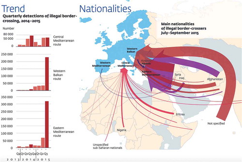
The map below () shows the dominant cartographic depiction of undocumented migration used by the European Border and Coast Guard Agency – better known as Frontex – in what they suggestively call their ‘quarterly risk analysis’, i.e., an overview of the alleged ‘threats’ that the EU faces along its external borders. Curiously, even though the map is updated every three months, its visual composition remains roughly the same, see, for example, , which maps the height of the refugee-protection crisis.
Figure 1. The Frontex map of 2017.
Source: Frontex: https://tinyurl.com/yy3qelf9
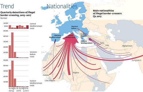
Figure 2. The Frontex map of 2015.
Source: Frontex: https://tinyurl.com/y6o38jq3
In isolation, this migration map might look insignificant: an aleatory image confined to one among numerous technical analyses by a murky border-control agency (Cetti Citation2014). However, seen as part of the assemblage of narratives, practices and images that render its visualization meaningful – i.e., its iconological dimension – we argue that this cartography puts together a peculiarly telling discursive mosaic. Rather than mere decorative illustrations, political maps of this sort are of unparalleled import: they stand as cultural testimonies that allow us to peek into the naked worldview of their makers like few other documents do (Kristof Citation1960, 45; Harley Citation1988a, Citation1988b, Citation1989; Wood Citation1992; Agnew Citation1998, 15–34; Wintle Citation1999, Citation2009; Pickles Citation2004, 25–72; Kitchin and Dodge Citation2007; Monmonier Citation2018; Brotton Citation2013; Branch Citation2014; Moore and Perdue Citation2014; Bueno-Lacy and van Houtum Citation2015).
The striking power wielded by this map – hereafter ‘the Frontex map’ – becomes vividly manifest once one realizes that it is by no means a stand-alone exception but rather the canonical variation of a much larger and persistently recurrent discourse (Foucault Citation1981, 56–58). This map has become the ‘normal’ and ultimately hegemonic cartographic representation of its subject matter: the geopolitics of undocumented migration to the EU. Variations of this map – which largely preserve the characteristic elements of its visual arrangement – or the political geography it narrates – have found their way into European societies through education (Wigen Citation2005), academia (van Reekum and Schinkel Citation2016; De Haas Citation2008), NGO’s (Canadian Red Cross Citation2015) and media. Concerning the latter, regardless of their ideological bent, all types of mass-communication channels – from the most reliable journalistic platforms to the most disreputable tabloids – have reproduced a similar cartographic proposition to ‘explain’ the misleadingly labelled ‘refugee crisis’ in Europe, thus turning the cartographic layout chosen by Frontex into the predominant template of most maps on undocumented migration across the EU (e.g., Welt Citation2011; Daily Mail Citation2013; Steininger Citation2013; Pabst Citation2013; Adams, Citation2014; Adams Citation2015; Cieschinger Citation2015; Constantini Citation2015; Heck and Leijendekker Citation2015; Lyman Citation2015; Maxwill Citation2015; Neefs Citation2015; Schmidt Citation2015; Reimann Citation2015; Typosthes Citation2015; Alameda and Gutiérrez Garrido Citation2016; Booth Citation2016; Hasselbach Citation2016; Khakshouri Citation2016; The Economist Citation2016; Beauchamp Citation2017; Gutiérrez and Jara Citation2017; Hauswedell Citation2017; AEDH Citation2018; Kingsley Citation2018). Yet, we argue, this is a template with severe flaws. To this we will turn now.
1. The grid
The first inadequacy of this kind of mapping refers to the uncritical use and normalization of the underlying grid of nation states, which the migration map under discussion here regrettably shares with the overwhelming majority of our political maps – from school primers to Google Maps (Farman Citation2010, 877–878) – even though this grid's geographical foundations have been sustaining mounting scholarly critique (e.g., Harley Citation2001). In fact, some of the most exceptional geographical research in recent times has been inspired by an opposition to the nationalistically essentialist epistemologies that make the grid look natural. Today, the understanding of borders as social constructs has encouraged theorization on how space is produced (e.g., Lefebvre Citation1974, Citation1992; Massey Citation1995, Citation2005, Citation2012, Citation2013), historized (e.g., Agnew Citation1998, 35–50; Klinke Citation2012), imagined (Said Citation1978; Gregory Citation1995), and how the resulting geo-chronological imaginations exert a colossal geopolitical influence on some of the most dramatic turns in history (Ó Tuathail Citation1996).
As a result, borders are today dominantly theorized as ceaselessly mutating socio-political dynamics liable to multiple interpretations rather than as immovable grid lines (e.g., Paasi Citation1998; van Houtum and van Naerssen Citation2002; Wastl-Walter Citation2011): hence the shift from talking about borders – as a noun – to talking about b/ordering – as a continuous verb (van Houtum and van Naerssen Citation2002; van Houtum Citation2005; Newman Citation2006). This discursive shift in border studies has coincided with a revolution in migration and mobility studies that has become known as the ‘mobility turn’ (Lorimer Citation2005; Sheller and Urry Citation2006, 2011; Cresswell Citation2011). A core critique of this turn counters the prevailing cartographic assumption that people are largely static entities and instead theorizes how all manifestations of human mobility – far from natural phenomena caused by ungovernable forces – are shaped instead by “constellations of power” that exert a great deal of influence over “the creation of identities and the microgeographies of everyday life” (Cresswell Citation2011, 551).
These discursive trends have also percolated theoretical cartography since the 1970s (Pickles Citation2004, 25–72; Monmonier Citation2007; Kitchin Citation2014). The poststructuralist reflections on imaginative geographies (e.g., Said Citation1978; Harvey Citation1990; Gregory Citation1994, Citation1995, Citation2004; Castree Citation2001; Kitchin and Kneal Citation2001; Springer Citation2011), as well as the schools of critical and radical cartography (e.g., Harley and Woodward Citation1987; Harley Citation1988a, Citation1989; Wood Citation1992; Wintle Citation1999, Citation2009; Branch Citation2014), critical geopolitics (e.g., Ó Tuathail Citation1994; Dalby and Ó Tuathail Citation1998) and critical border studies (e.g., Agnew Citation1999; van Houtum Citation2012; Sidaway Citation2015) have exposed the many ways in which maps simultaneously reveal and exert surreptitious yet forceful manifestations of power – most conspicuously in the rapacious conduction of statecraft (Pickles Citation1992; Unger Citation2002; Gregory Citation2011a, Citation2011b; Campos-Delgado Citation2018). However, an unfortunate offshoot of this bulging body of cartographic critique – in spite of its doubtless merits – has been the conflation of political cartography with propaganda cartography to such an extent that it has engendered a sort of ‘map-phobia’ – an aversion to mapmaking – among academic geographers (Wheeler Citation1998). Alas, the most knowledgeable experts in mapmaking have been discouraged to create better maps and this has held back the production of alternative, non-essentialist cartographies (Perkins Citation2003, 341; Moore and Perdue Citation2014, 896) – which could help explain why grid-thinking still reigns unchallenged in political cartography.
The Frontex Map emphasizes the flawed logic of the national grid by visualising Europe devoid of human beings. We see boxes of static nation states without (the movements of) their populations while a mass of gigantic red lines symbolizing undocumented migrants cross their borders, seemingly disrupting the grid’s natural order. This conscious deletion of human beings is what we have earlier described as a form of ‘cartographic cleansing’ (van Houtum Citation2012). In this world without humans, their overwhelming diversity is dissolved into homogeneous nation states whose borders are supposed to confine the movement of the populations they contain (Hall Citation1992). This visual layout reinforces the fictitious notion of the state as either the legitimate representative of its people or as the effective ruler of its territory (Risse Citation2011, 1–35) – an exaggeration of most states’ legitimacy and power as well as a visual chicanery to conceal inter- and intra-state blends and divisions (De Genova Citation2013; LiveLeak Citation2012; Agnew Citation1994; Wimmer and Glick Schiller Citation2002; Harley Citation1989; Ó Tuathail Citation1994; Walby Citation2003; Parker and Vaughan-Williams Citation2009, 586; Brotton Citation2013, 289–326; Branch Citation2014).
Moreover, by relying on this ‘classic grid’, the Frontex map de facto reproduces and validates a national biopolitics that, by design, creates regimes of political control over foreign bodies – following the anxious rationale that their infiltration across the state’s boundaries may destabilize its imagined community (Foucault Citation1978-79; Anderson Citation1983). By normalizing nativity’s ‘myth of origins’ (Elden Citation2013, 21–52), the national grid’s visual logic has an implicit predisposition to breed anxiety for the non-native. The map’s grid seems to suggest that, if people are ‘natural’ inhabitants of the country where they were born, then it follows that migrants – a politically constructed category – are unnatural intruders in countries other than their own. This logic is a propitious breeding ground for all sorts of xenophobic prejudices (Pupavac Citation2008; Esses, Medianu, and Lawson Citation2013; Gorodzeisky and Semyonov Citation2015; De Genova Citation2017). Tellingly, the only people shown on the Frontex map are represented by menacing arrows, i.e., those who throw into disarray the ‘natural b/order’ of the national grid – making them by default an exceptional abnormality (van Houtum and van Naerssen Citation2002; van Houtum Citation2010). This fear of foreigners is further aggravated by the Frontex map’s sole emphasis on undocumented migrants under the header ‘Quarterly detections of illegal border-crossing, 2015–2017’, which conflates undocumented migration with a criminal offense to the ‘organic’ unity of the state – i.e., the natural ‘purity’ of a country’s own history and people (Kristof Citation1960, 21–8; Foucault Citation1978-79; Bashford Citation2004).
What is conveniently ignored by the Frontex map is the paradox that, more often than not, asylum seekers can legally apply for refugee status only by ‘irregularly’ entering the EU - whose protection they seek (Black Citation2003; Nyers Citation2010; van Houtum and Lucassen Citation2016; Manby Citation2017). The illegalization of undocumented migrants is a conscious political construct that begins with the denial of legal travelling documents – i.e., a visa – to potential asylum seekers in their home countries, thus leaving them no alternative other than entering the EU without the unobtainable visa. Such discrimination is officially codified in the EU’s positive and negative Schengen list: a ranking of nationalities that assesses the desirability of the migrants it allows into its borders. Individuals holding passports identifying them as what the EU considers to be the ‘wrong place of birth’ – a total of 135 countries out of 195 – face near-zero chances of being granted a visa for the EU (van Houtum Citation2010; Schuster Citation2011; Jansen Citation2016). This constitutes a clear discrimination on the basis of the accident of birth and thus a contravention of Articles 1, 2 and 21 of the Charter of Fundamental Rights of the EU as well as of Article 1 of the Universal Declaration of Human Rights, which states that ‘all human beings are born free and equal in dignity and rights’ (UN Citation1948). In other words, the EU is trying to convince us that it needs to violate its core humanistic principles in order to defend them (Dubernet Citation2018; Cusumano Citation2019). In contrast to what we could more fairly call undocumentalised migrants, those born in countries on the positive Schengen list – predominantly rich countries – can travel without much effort to the EU in the comfort of a plane and without a visa. In contrast, the near deprivation of legal migration channels for those born in countries on the Schengen blacklist has created a smuggling industry worth over 1 billion euros a year – roughly as big as the border industry trying to stop it (The Migrants’ Files Citation2015). Thus, refugees’ smugglers are a consequence of the discriminatory EU border regime and not the other way around (van Liempt and Sersli Citation2012; Ehrkamp Citation2016, 4).
Yet, instead of recognizing that this industry is a product of its own deficient border policy (Neal Citation2009) – and hence has created an auto-immune reaction in the EU’s border regime – the EU keeps peddling an official rhetoric that tries to invent its own reality by pretending that undocumented migrants are a problem caused by human smugglers and traffickers. Frontex’s and the EU’s rhetoric of cracking down on ‘trafficking’ and ‘smuggling’ as well as their advocacy of ‘voluntary repatriation’ is an attempt to shift the blame over to far less decisive geopolitical players than themselves. The implicit dependance between the EU and the smugglers has led to a shocking fatality rate among undocumented migrants travelling to the EU – over 30 thousand since 1993 (The Migrants’ Files Citation2015) –, making the EU’s external border the deadliest on the planet (van Houtum Citation2010; van Houtum and Bueno-Lacy Citation2017). Hence, the toughest border is not barbed wire or concrete walls but the oxymoronic paper border of the EU’s visa regime, which has turned the EU into a de facto ‘paper fortress’ (van Houtum and Lucassen Citation2016). What is at stake here is thus not the absence of a border that protects the EU from the arrival of unwanted “illegals’’ – as extreme nationalists and populists often suggest – but precisely the opposite. We are witnessing the effective closure of EU’s paper border, i.e., the absence of legal channels that is creating this miscalled ‘illegal’ migration – while those who help them, including the NGOs that rescue them from drowning, are criminalised – only aggravates undocumented migration, trafficking, smuggling, suffering and death.
It is worrying to realize that the reasons of migration, the causes of its irregularity, and the own repelling policies are entirely missing from Frontex's cartographic representation of undocumented migration. Instead, through its simplistic, dehumanised and static grid, the Frontex’s map offers a visual normalisation and essentialisation of a self-made EUropean b/order in which those who cross it are pictured as unforeseen and abnormal lawbreakers and a danger for the ‘natural’ order of the EU.
2. The arrows
The binary antagonism between desired normal fixity and unwanted abnormal mobility that the Frontex map promotes is brought to a climax by what is arguably its most striking feature: its converging crimson arrows. To be sure, in the semiotics of maps, the arrow has long been the favoured and unchallenged symbol to represent movement because of its undisputed navigational practicality: it depicts information about the initiation, route and destination of movement; a path that is followed in order to get from A to B. However, an arrow has also another, more clandestine and less scrutinized existence: it can turn into one of the most forceful symbolical devices when its use is extrapolated from the purely navigational to the political; when instead of a directional device it takes the role of a frightening metaphor (Boria Citation2008, 281). It takes but a rapid glance at the Frontex map to realize that the colour, direction and shape of its arrows constitute an allegory alerting the viewer about multitudes of “unwanted bodies” invading the EU and bringing with them unspecified threats - a connotation that splices into the prevalent xenophobic discourse that portrays asylum seekers as a “security, economic and hygiene threat” for European populations (El Refaie Citation2001, Citation2003; Abid, Manan, and Abdul Rahman Citation2017).
The significance of this Frontex map for European policymaking and the European discourse on immigration can be better grasped by comparing it to maps that rely on a similar iconography to depict ‘incoming risks’. From a cartographic perspective, what makes the arrows on the Frontex map particularly eye-catching is that such alarm-raising arrows have traditionally appeared in propagandistic and military maps. A straightforward example is a Dutch map of the invasion of the Netherlands and Belgium by Nazi Germany (see ).
Figure 3. ‘Invasion map’ (1940).
Source: https://tinyurl.com/y4qerpaf
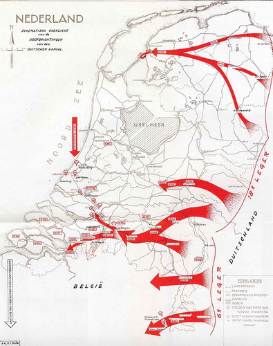
This invasion map – randomly chosen from a vast collection of invasion maps – elucidates how propaganda and military cartography rely on a plain and eye-catching visual composition to represent either the strength of a country’s military actions or its vulnerability at the hands of a powerful threat. This visual design does not pursue scientific accuracy but rather the schematic efficiency of an oversimplified diagram to deliver a simple message: an existential confrontation between friends and foes.
One would expect the Frontex map – given its avowed civilian and humanist mission – to rely on more nuanced, evidence-based and sophisticated iconographic techniques to represent the complexity of undocumented mobilities as accurately as possible in order to serve as the cartographic basis for the kind of humanitarian policymaking it is supposed to foster in matters related to the EU’s external borders. It is disquieting to realize that this is far from being the case: the Frontex map shows the same penchant for the friend-vs-foe visual composition typical to invasion cartography. Unlike scientific maps, the Frontex map does not aim at representing a body of scholarship; rather, its design serves as justification of its aggressive purpose: to exaggerate the threat posed by undocumented migrants in order to cultivate political support for even tougher borders.
In other words, we can recognize in the Frontex map a propagandistic use of arrows – analogous to that of military invasion cartography – to symbolize an imagined, gigantic, imminent and violent conquest of Europe by global masses of undocumented migrants. Furthermore, the continuity of the arrows on the Frontex map wrongly assumes that all migrant journeys have the bull’s eye fixed on the EU from start to finish and that all border crossings along the apocryphal migrant routes invented by the arrows can be lumped together under the same category of ‘illegal’ or ‘irregular’ migration. The map ignores the fact that a good number of countries in the arrows’ way – and thus in the migrants’ way – are actually legally crossed; that certain countries in the Economic Community of West African States (ECOWAS) exercise very little border control on migration; that not all migration routes are geared towards the EU and that, those which are, not always end up there. In other words, the cartographic iconography is deeply ideological: it amounts to the imposition of a Eurocentric vision of undocumented migration and its concomitant spatial imagination.
What is more, undocumented migration is often anything but a straight line. The information that a straight, unidirectional arrow may convey about, say, a tourist’s place of origin, traveling route, destination as well as motivations, emotions, intentions and overall ease of mobility cannot be extrapolated to the distressing experience of undocumented migration. Straight lines capture neither the distress of sleeping rough in makeshift tents and unknown cities as part of unavoidable stops that might last months or years; nor the perpetual anguish at the prospect of being found and either imprisoned or deported; nor the anxiety of life-threatening journeys across deserts and seas; nor the languishment in overcrowded detention centres where the endurance of rape, slavery and overall corporeal abuse is an all-too real possibility (Amnesty International Citation2016). The smooth continuity and straightness of the arrows on the Frontex Map promote geographical and temporal distortions that misrepresent the harrowing experience of undocumented migrants, making it look as if they would make the choice to go from a point of departure to a point of destination with the same nonchalance as any middle-class tourist. This, as we know from all disciplines researching this phenomenon of human mobility, is a downright contradiction of the prolonged and serpentine zigzag journeys that undocumented migrants undertake (van Houtum Citation2012; Schapendonk Citation2012; Schapendonk and Steel Citation2014). The unidirectionality, homogeneity and ‘illegality’ of undocumented migration represented by these converging arrows encircling Europe is thus flawed on a very basic scientific level.
Admittedly, yet arguably not less worryingly, the use of invasion cartography to represent (undocumented) migration has a more widespread political impact that extends far beyond whatever audience Frontex's risk analyses might reach, for it is also widely reproduced by official school atlases. An unambiguous example is the Dutch ‘Big Bos Atlas’ (De Grote Bosatlas), which is the unchallenged reference for geography courses all throughout the Dutch educational system (see ).
Figure 4. ‘Dutch School Map’: ‘Origin’ of asylum seekers in Europe.
Source: De grote Bosatlas, 2015
Part of an obligatory study material in Dutch primary and high schools, this map of the refugee crisis reproduces the political cartography of the Frontex map together with its propagandistic invasion arrows and the effect of civilisational encirclement that they produce. Although the convergence of such visual language may appear inconsequential, textbooks’ specialists – like the Georg Eckert Institute for International Textbook Research – well know that these educational artefacts are most people’s first and only approach to their national identities and thus to prejudices about other nationalities of the world: they are the basis of most people’s geopolitical imaginations (Gregory Citation1994, Citation1995; The Economist Citation2012). The Frontex map, widely used in policy and media circles, splices into this tradition of representing undocumented migration through the iconography of invasion, which pushes the latter's use to new extremes. A telling illustration of the latter is the Manichaean colour coding of its arrows: blue for one’s own side and red for 'enemy' forces. Colour is one of cartographers’ most powerful tools to convey a message and it would be naïve to assume that Frontex cartographers are unaware of this. Colour has been shown to ‘activate different motivations and consequently enhance performances on different types of cognitive tasks’ – i.e., tasks that require a great deal of conscious mental activity such as decision- and policy-making. The blue/red opposition is a common trope used in cartography to signify antagonism: red is a colour associated across cultures with abnormality, danger, warning, sexual promiscuity, anger and fear (e.g., Elliot et al. Citation2007; Feltman and Elliot Citation2011; Hupka et al. Citation1997, 166; Gerend and Sias Citation2009) while blue is a colour ‘often associated with openness, peace, and tranquillity (e.g., ocean and sky)’ (Mehta and Zhu Citation2009, 1226). Contrastingly, the baby blue with which the EU represents itself communicates an innocence, peacefulness and vulnerability that masks its own powerful policies – such as its military interventions in Afghanistan and Libya as well as its exacerbation of conflicts through enormous exports of arms and military technology to repressive regimes in Africa, the Middle East and Asia; its agricultural protectionism and discriminatory visa policy, all of which significantly contribute to push people out of their devastated or impoverished countries to seek refuge in the EU (Walters Citation2010).
Although the arrows’ unidirectionality, straightness and colour already make the baseless suggestion of an invasion, their hugeness is possibly even more troubling. We know that undocumented migrants coming to the EU represent only a minority of global migrants. According to the UN Population Fund (UNFPA), only 3.3% of the world’s population lives outside their country of birth, which means that more than 96% of humanity is not a migrant. Of these roughly 250 million migrants, there are approximately 20 million from non-EU countries who reside in the EU (about 3.7% of the EU’s total population). Of these immigrants living in the EU, between 335,000 (Sabbati and Poptcheva Citation2015, 3) and 3.8 million are ‘irregular migrants’ (IOM Citation2015, 12) – a disputed figure given the stealthy sort of migration that it tries to measure. Be that as it may, it means that undocumented migrants make up only between 0.1 and 0.7% of the EU’s total population. Hardly the numbers of an invasion.
Moreover, there are around 70.8 million forcibly displaced people worldwide – many of which are undocumented migrants (UNHCR Citation2019). This means that even if we assume the highest estimate of undocumented migrants for the EU, it would still be hosting only around 5.5% of the world’s total. The implication is that, unlike the Frontex map so boldly suggests, almost 95% of all undocumented travellers in the world do not go to the EU at all but to countries close to their own instead. Although this utilitarian logic should not be a reason for the EU to default on its foundational principles, these numbers paint a remarkably different picture than the one offered by the Frontex map: not only does the EU receive a small fraction of the total global population of undocumented migrants – and thus asylum seekers – but their numbers do not amount to a considerable demographic pressure for the EU by any measurement.
Yet, even though the arrows on the Frontex map stand for thousands of undocumented migrants – which bulged to over a million in 2015 – their size is as large as Spain, France, Germany or Britain. In other words, the number of migrants is depicted as such an exaggeration that the arrows make them look as if they could take over the EU. Compare, for instance, the numbers of undocumented migrants represented by the Frontex map with those of yearly tourists visiting Europe (van Houtum and Boedeltje Citation2009; Coldwell Citation2017; Burgen Citation2018). France alone receives over 80 million tourists a year (UNWTO Citation2017, 6). What kind of gargantuan arrowheads would that number warrant using the scale employed by the Frontex map? Should the daily traffic of consumers, tourists, politicians, soldiers, civil servants, traders, investors, business people, rich migrants (aka expats) and other migrants travelling to the EU – or within it – be also visualised, the Frontex map would render a less selective and deceitful representation of our mobile and relational world. Such relatively simple visual comparisons could prevent undocumented migration from being decontextualized as a unique phenomenon and, instead, they could paint a fuller picture of a world where far more people other than refugees are also on the move.
3. The frame
The third and final fallacious element that we wish to draw attention to is the frame of the map. The choice to highlight the EU on a Frontex map is of course not illogical. Yet, as it is often the case with models – such as maps – what is left out is as important as what is represented. The Frontex map fails to deliver any kind of global – let alone historical – comparative perspective that may allow us to see that undocumented migrants coming to the EU represent a small fraction of overall global migration. On the contrary, the intimidating arrows demand the onlooker to believe that the EU – one of the richest regions in the world commanding an increasingly militarized border system – is at the mercy of destitute armies pouring from all around the world. From the very bottom of Africa and the farthest corners of Asia, the Frontex map shows a multitude of colossal arrows travelling unimpeded across the Afro-Asian landmasses to reach the EU. Their sheer length and profusion suggest that vast populations of entire continents are coordinately moving into the EU in one single motion that converges at three bottlenecks along its external borders. Although most arrows seem to have specific countries as their point of origin, it is not very clear how rigorous this might be. The source of some arrows is lost beyond the margins of the map, leaving the onlooker to assume that some of these migratory routes might stem from ‘somewhere in the far east’, thus implying that what matters about this map is not the specificity of its details but its broader message: the migratory movements that its arrows represent might as well come from everywhere around the world – especially the world of less affluent Muslims and Africans – with the EU as their sole destination. This framing technique is known as encirclement: a rhetorical and visual trope intended to exaggerate the threat posed by unwanted foreigners and thus justify more aggressive policies towards them which is, unsurprisingly, an all-time favourite of the xenophobic movements in both Europe and the US (Jaret Citation1999).
Although all cartography is political (Harley Citation1988a), this kind of propaganda cartography – especially in opposition to scientific cartography – arose during the first half of the 20th century and ripened in the US as well as in Fascist Italy and Nazi Germany between the 1920’s and 1940’s (Herb Citation1997; Schulten Citation1998; Boria Citation2008). This tradition peaked in Germany nurtured by a public discourse that persistently constructed the geopolitical imagination of a German state surrounded by imminent military threats and a German people that, scattered beyond its borders and oppressed by unfriendly European states, longed for its protection (Mazower Citation1997). This fear of encirclement (Einkreisung) was purposefully used as a propaganda strategy to justify the pursuit of a space of security for the Europe-wide German diaspora (i.e., Lebensraum) through the mobilisation of the German state into total war (Sywottek Citation1976, 140–141, 194–201).
The subject matter of encirclement is characterized by a cartographic layout that, we argue, at its most basic follows three b/ordering and othering techniques (van Houtum and van Naerssen Citation2002): 1) it borders an ‘endangered’ political project and places it at the centre, thus suggesting an urgent and inescapable focus as well as a need to protect its vulnerability (Henrikson Citation1999, 102–103); 2) it orders its own territory by demarcating its borders and by inscribing details on it that differentiate it from others with the aim of nurturing self-identification and co-opting allegiance to a political project, thereby silencing internal differences and suggesting a spurious territorial homogeneity and cohesiveness; 3) it ‘others’ its periphery as a nameless and seemingly endless zone consisting of threatening symbolic devices – such as arrows, troops, planes, or tanks – that have no precise source and thus seem to come from everywhere to encroach upon their target.
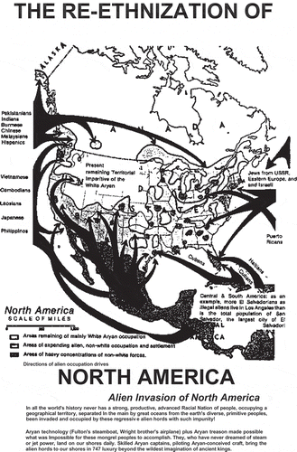
To give another example, below, the ‘White Supremacist Map’ (see ) – authored by a leading right-wing terrorist in the US – shows the American white-supremacist narrative about an invasion by ‘primitive peoples’ (Miles, Citationn.d.; Ferber and Kimmel Citation2000; van Houtum and Bueno-Lacy Citation2017, 92–93). What we see is an imminent encirclement of the US by an invasion of immigrants who, symbolized by elephantine arrows stemming from all around the world, are made to look inexorably poised to change its virtuous racial configuration for the worse.
Figure 5. ‘White Supremacist Map’.
Source: Miles (Citationn.d.) The Birth of a Nation: Declaration of the Existence of a Racial Nation within Confines of Hostile Political State. Cohoctah, MI: Mountain Church
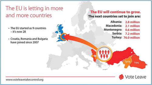
It is disturbing to see that the Frontex map is an heir to this tradition of threatening encirclement. It should be considered an extremist cartographic composition, for a visual argument that presents a set of invading arrows surrounding a defenceless EU paints a hopeless situation that calls upon viewers to support any measure – regardless of how extreme – to shield them from this existential threat. Unsurprisingly, a visual arrangement that promotes the narrative of ‘civilisational survival’ within the context of undocumented migration squarely reproduces one of the core tropes of the xenophobic politics of today: ‘white genocide’ or ‘race suicide’ (Perry Citation2004). These white-supremacist conspiracy theories have coalesced into ‘the grand replacement theory’ (Camus Citation2012), which postulates that white populations in Europe and the US are being purposefully replaced by non-white immigrants with antagonistic cultures and high birth rates who have been allowed in by political elites whose openness to the world amounts to treachery. Such superstition has reached the mainstream with the publication of books that rail against the cultural degradation of Europe, the US or the West as a consequence of immigration (e.g., Buchanan Citation2002, Citation2011; Sarrazin Citation2010). Eurosceptic neo-nationalists – the ‘alt-right’ – are using the unfortunate contemporary resonance that this message has among EU populations to bring back their brand of ethno-exclusionary politics (van Houtum and Bueno-Lacy Citation2017). Brexit is the most patent success of such Euroscepticism: it was promoted by a campaign that relied on a variation of the same invasion cartography and the same iconography evoking white supremacist tropes (Kent Citation2016) (see ).
Figure 6. ‘Brexit Map’.
Source: (Kent Citation2016)
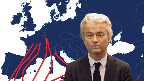
A last and pristine example of the hegemony enjoyed by the fallacious cartographic layout of undocumented migration epitomized by the Frontex map is a propaganda video made by Geert Wilders – a Dutch EUrosceptic and Islamophobic politician. In this video, he lambastes Muslim and African immigration while promoting the classical racist tropes of overpopulation by dark, culturally threatening and impoverished immigrants, a discourse that he crystallizes in a map of Europe that reproduces the same cartographic design of the Frontex map (see ).
Figure 7. The migration map of Geert Wilders.
Source: https://tinyurl.com/yymy2zuf
We would say, to say the least, that the harmony between official EUropean cartography and anti-EU cartography should raise a thousand red flags among EU policymakers and geographers responsible for visualizations of undocumented migration like the one seen on the Frontex Map.
Alternative maps
Until now, alternative maps that deviate from the Frontex iconography are still scarce, and their use is largely confined to small circles where ‘radical’ cartography has broken some ground (see Casas et al. Citation2017). Nevertheless, there is a slowly growing collection of brave and inspiring attempts to come up with different cartographic visualisations of undocumented migration. It would be beyond the scope of this article to mention and analyse each and all of them. However, we will briefly discuss three trends that we see as very promising – namely, counter-mapping, deep mapping and mobile mapping.
First, there is a growing body of what is called counter-mapping. Counter-maps are checks on power whose aim is to contest the oppressive message, application and implications of hegemonic cartographic depictions. Counter-maps point to the crucial importance of cultivating an iconological expertise among political cartographers. Countering the economic, social and political misstatements of traditional cartography requires a new cartographic canon as well as a moral compass to guide it. Interesting cases in point are atlases made by largely non-academic collectives such as the Atlas of Radical Cartography (Mogel and Bhagat Citation2008), the Manual of Collective Mapping by the Buenos-Aires-based “Iconoclasistas” (Citation2016), This is not an Atlas by the “Kollektiv Orangotango” (Citation2018) and “The Decolonial Atlas” (Citation2014). What these works share is that they include collectively made maps that sacrifice the spatial precision and pretended objectivity of traditional cartography for the creative distortion, strident authorship and critical statements of a visual design intended to expose either the false assumptions or dishonest motivations pervasive in hegemonic maps. Their counter-maps aim at emancipating the map by radically humanising it, which implies consciously bringing to light the geographical information that matters to the people whose existence and interests traditional cartography usually invisibilizes. Such maps depict, for example, asymmetric power struggles (e.g., silenced indigenous land claims or the incidence of sexual harassment in a city) and unspoken routes (e.g., the secret detention centres and unlawful kidnapping routes used by the US as part of its endless ‘war on terrorism’; walking routes designed to avoid surveillance cameras when moving through a city; safe immigration passages for undocumented immigrants, etc.). Despite their powerful narratives and new cartographic designs, these maps have so far gained relatively little academic – let alone political – attention.
Similarly, in the field of undocumented migration there is also some inspiring work, like the superb counter-map made by Heller and Pezzani (Citation2017), who made an impressive video of a boat with 72 migrants on board that, at the height of the war on Libya in 2011, was left to drift for 14 days even though it was within NATO’s maritime surveillance area. Another collective worth mentioning is Migreurop, a collection of migration scholars who periodically publish an Atlas of migration in Europe whose most recent version contains a brief critique of the Frontex map – much in line with our analysis.
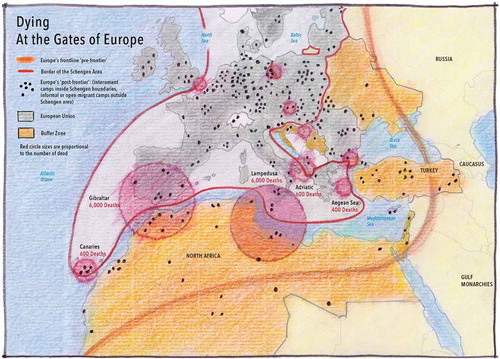
Furthermore, the French cartographer Philippe Rekacewicz (a collaborator of Migreurop) has published compelling critical and radical maps on migration – many of them in Le Monde diplomatique (see and ). Unlike the Frontex map, his maps depict the power relations of undocumented migration to the EU in a manner that better reflects the state-of-the-art scientific research on it. The first map offers a global synopsis of how the EU’s visa regime limits most of the rest of the world’s population from legally travelling to the EU. The second map displays the deadly aftermath of this paper border regime along the EU’s external borders and within Schengen. Rather than a vulnerable EU being ‘overrun’ by undocumented migrants, these ‘counter Frontex maps’ show that the EU is part of a system of visas, detention centres and biopolitical border controls that discriminates, dehumanises, illegalises and willingly endangers undocumented migrants (see also van Houtum Citation2010; Cobarrubias Citation2019).
Figure 8. Counter Frontex Maps: ‘The geography of an unwanted humanity’, by Rekacewicz (Citation2014).
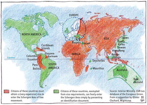
Figure 9. Counter Frontex map: ‘The forbidden world’, by Rekacewicz (Citation2014).
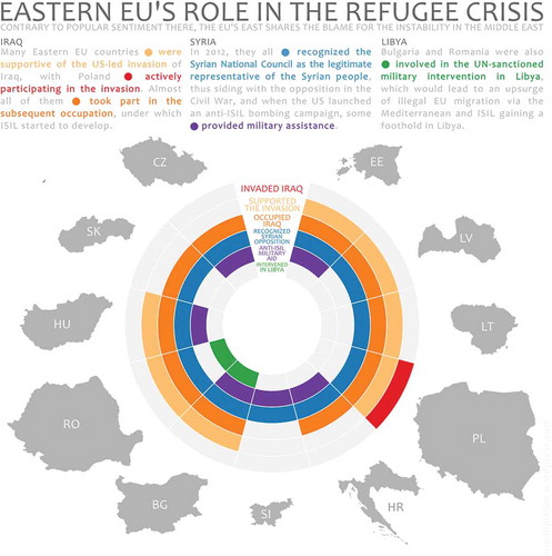
Another interesting example of counter-cartography is the map by Arnold Platon, an independent mapmaker (see ). Platon’s map is intended as a geopolitical statement on undocumented migration. He shows the often-unrepresented connection between the wars supported by (eastern) EU Member States and the provenance of refugees which those same states now refuse to accept. It shows how those states that today refuse to accept refugees coming to the EU from Iraq, Syria and Libya are the same that supported the geopolitical actions that led to these countries’ instability, collapse and the flight of their population. His map is thus a critique of the hypocrisy behind those EU Member States’ opposition to the creation of a comprehensive asylum system across the EU (Karolewski and Benedikter Citation2018), especially since they supported the very war that has led scores of undocumented migrants to seek asylum in the EU. Showing such unacknowledged geopolitical relations is one of the most forceful ways in which counter-maps speak truth to power. It is an example of how a cartographer can make a dent in the dominant visualization of a pressing geopolitical issue by crafting a mordant political message with the use of radical cartographic techniques.
Figure 10. ‘Radical Map’: Make war, expect migration, by Platon (Citation2016).
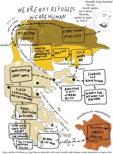
A second promising trend that we identify is deep-mapping, which is concerned with the humanisation of space to give a rich, situational, consciously relational and subjective account of place-related emotions in order to counter the ‘cartographic cleansing’ of human beings shown on hegemonic maps (van Houtum Citation2012) – such as the dehumanising cartography used to represent mobility and migration (Dodge Citation2016, 2–3; Mekdjian Citation2015; Campos-Delgado Citation2018).
A powerful example of this kind of mapping is the deep-map made by Mustafa, a Syrian refugee, who retraced his journey from Syria to France (see ). Unlike traditional cartography, Mustafa’s cartographic composition provides a telling personal account of the physical and mental hardship that an undocumented migrant must endure during a typical journey. Depicted by the Frontex map, Mustafa’s individual story – as well as the plight of the millions of undocumented migrants to which his story could be extrapolated – would become a faceless pixel in a big threatening arrow moving towards the EU. Against this narrative, Mustafa has pictured a world in which it is him – not the EU – who faces uncertainty and fear, hardship and hostility.
Figure 11. The journey of Mustafa, by Migreurop (Citation2017).
The third trend we distinguish is mobile mapping, which stresses the dynamic, relational and convoluted paths of human interaction by geo-positioning data harvested through mobile means, such as mobile phones, social media, cameras, satellites, open source mappings and film (Mekdjian Citation2015; Caquard Citation2011, Citation2013, Citation2014). Rather than a priori departing from the nation-state template, mobile maps tend to focus on representing unfixed mobilities, networks and connections. A good illustration in the case of undocumented migration is the ‘Migration Trail Project’, a map that retraces the journeys of undocumented migrants to the EU with help of interactive visualisations and podcasts.
There is also a growing number of documentaries and movies that have taken migrants and their plights as their subject matter. The dynamism of these ‘motion pictures’ is increasingly blurring the distinction between two-dimensional cartographic ‘still lives’ and cinematic road-trip movies. A good example is Human Flow, by the Chinese artist Ai Weiwei, which ‘maps’ the profoundly personal human impact and desperate search for safety, shelter and justice that plagues the experience of undocumented migrants. The mobile maps that undocumented migrants show in this film reveal that, rather than a straight and unbroken line, their movement is of a highly uncertain, contextual and trial-and-error nature haunted by jarring anxiety and waiting periods (see Cobarrubias Citation2019).
This short overview of encouraging cartographic strands can of course only be a rough description of the most promising alternative mappings of undocumented migration. But it shows that there are multiple opportunities for bold new visual designs beyond what within mainstream cartography is traditionally underrepresented or even misrepresented when it comes to visualising undocumented mobilities.
Conclusion
Political maps confront us with the fundamental paradox of cartography: although they are perhaps the most immediate evocation of geography, they are also some of its most anti-geographical artefacts, for they conceal at least as much as they reveal – and often much more (Wood Citation2003; Monmonier Citation2018). The implication is that every single political map should be acknowledged as a political statement.
The Frontex map of undocumented migration we have analysed in detail is a case in point: it presents itself as an objective truth on the basis of which border policies along the EU’s external borders can be formulated. Yet, its arrangement of iconographic choices creates an image of undocumented migration that bears little resemblance with this geopolitical phenomenon. Its science is wrong and its politics are perverse: the overall message of the Frontex map is a nativist diagnosis about the perils of ‘non-native’ immigration and a subtle yet violent recommendation to fix it. This is not a trivial matter. For, the relevance of this particular map is that, unfortunately, it does not represent a rarity but the norm, not only in cartography but in the larger discourse and ‘spectacle industry’ that undocumented migration has become (De Genova Citation2011; Jones Citation2016).
Whether the Frontex map shows purposeful ideology or subconscious prejudice is something we cannot unequivocally assert. Either way, the viewer is ultimately exposed to a visual composition in which a threatening invasion of migrants is taking over a defenceless EU. This reproduces a disreputable trope of evil against innocence: red versus blue. This is the classical dichotomy of ‘friend vs foe’ on which the worst kind of ethnocentric violence is usually constructed (Schmitt Citation1932). Although this is not a new discourse, it echoes a biopolitical discourse whose presence is troubling to recognize in the official cartography of the EU. Regardless of how unintentional the Frontex map’s iconography might be or how unaware onlookers might be about its discursive heritage, these accidents do not make the map’s potentially unintended message less striking nor its geopolitical implications less meaningful (Harley Citation2001). The Frontex map is namely part of the discursive mechanisms through which the EU is trying to justify the outsourcing of its refugee-protection responsibilities to unscrupulous authoritarian regimes in Turkey and North Africa (Bialasiewicz Citation2012; Zoeteweij and Turhan Citation2017), thus contributing to the creation of slave markets and the bulging graveyard at the bottom of the Mediterranean. The Frontex map is thus yet another attempt to normalize the spaces of exception multiplying across the EU and eroding its liberal-democratic principles (Agamben Citation2005; De Genova and Peutz Citation2010; van Houtum and Bueno-Lacy Citation2017). The EU and its Member States are trying to conceal their humanitarian irresponsibility and overall mismanagement of EUrope’s borders behind the travesty of a patronizing high ground: that it would better for undocumented migrants if they would not take the dangerous journey to begin with; and that human traffickers and smugglers are to blame for undocumented migration. As if the flight undertaken by undocumented migrants was much of a choice or less of a right and as if the trafficking and smuggling of migrants was not an industry propelled by the very border regime that the EU has put in place. We have earlier referred to this intertwining of cartography and geopolitics as cartopolitics (van Houtum Citation2012, Citation2013; Bueno-Lacy and van Houtum Citation2015): a political discourse that relies on cartography to b/order geography and thus to b/order history, culture and people through the geographical imaginations that maps arouse. By manufacturing perceptions of all-encompassing geographical scale, cartographic artefacts implant in people’s heads a mediated reality – ideas of the world people acquire not through first-hand experience but through representations that other people have made of it.
Most migration maps seem to remain stuck in a mindset that sets the idealized native against the menacing non-native and which, for the most part, ‘shows a persistent disconnect between the mainstream academic-applied cartographic research and the contemporary concerns of most human geographers’ (see also: Dodge and Perkins Citation2008; Hennig Citation2015; Dodge Citation2016, 1). What the iconography of the invasion-like cartography of migration seems to shamelessly proclaim are discourses that we assume many policymakers, news anchors, intellectuals, academics, school teachers and other public commentators would find uncomfortable or impossible to admit in spoken or written words – either because it would endanger their positions or because they are entirely unaware of them. Perhaps this ignorance is where maps derive their power from and what makes their study an indispensable yet underdeveloped endeavour. Not only might they alter our perception of the world but they might puppeteer us into reproducing the scenes of a theatre play in which powerful interests want to make us act a part without us even being aware of our ability to change the script.
We have shown how the current mapping of undocumented migration amounts to blatant cartographic malpractice, tendentious science and ruinous policymaking for the EU. In other words, this is the kind of ‘science’ society needs to be defended against (Feyerabend Citation1975). So, we would argue that it is time for us geographers and cartographers to emancipate the map of undocumented migration from its own territorial trap. There is a need for a post-representational political cartography that takes into account the map’s cognitive dimension: why do our political maps look like they do, what do they say about the politics of the phenomena they represent and how do they influence them? (Dodge Citation2016, 7). We make a plea for more radical mapmaking (Wood Citation2003; Crampton and Krygier Citation2006; van Houtum Citation2013), and for a more philosophically, morally and iconographically sophisticated conception of the cartography of (undocumented) migration.
Even though in the short run we might be unable to create a better border management regime for undocumented migrants due to stubborness and political constraints, at least the cartography of migration could avoid taking the side of unscrupulous politicians. To accomplish this we need to understand the cognitive and political effects of cartographic design choices (Robinson Citation1952; Caquard Citation2013, Citation2014). As Ladis Kristof already said in 1960, ‘Men have already learned to distrust words and figures, but they have not yet learned to distrust maps’ (Citation1960, 45). For, the geography we visualise is more than a set of technical cartesian coordinates on a paper or a screen: it can be a cartopolitical trap with very real consequences.
Correction Statement
This article has been republished with minor changes. These changes do not impact the academic content of the article.
Disclosure statement
No potential conflict of interest was reported by the authors.
References
- Abid, R. Z., S. A. Manan, and Z. A. Abdul Rahman. 2017. “‘A Flood of Syrians Has Slowed to a Trickle’: The Use of Metaphors in the Representation of Syrian Refugees in the Online Media News Reports of Host and Non-host Countries.” Discourse & Communication 11 (2): 121–140. doi:10.1177/1750481317691857.
- Adams, P. 2014. “Migration Surge Hits EU as Thousands Flock to Italy.” BBC. https://tinyurl.com/y3czcmpt
- Adams, P. 2015. “7 gráficos para conocer los puntos calientes de la migración en el mundo.” BBC. https://tinyurl.com/y63xfada
- AEDH. 2018. “Has the European Union Achieved a ‘control of Migratory Flows’?” AEDH. https://tinyurl.com/yxr2akbj
- Agamben, G. 2005. State of Exception. Chicago: University of Chicago Press.
- Agnew, J. 1994. “The Territorial Trap: The Geographical Assumptions of International Relations Theory.” Review of International Political Economy 1 (1): 53–80. doi:10.1080/09692299408434268.
- Agnew, J. 1998. Geopolitics: Revisioning World Politics. New York: Routledge.
- Agnew, J. 1999. “Mapping Political Power beyond State Boundaries: Territory, Identity, and Movement in World Politics.” Millennium 28 (3): 499–521. doi:10.1177/03058298990280030701.
- Alameda, D., and O. Gutiérrez Garrido. 2016. “Ruta de los migrantes hacia la UE.” El País. https://tinyurl.com/y3t7477w
- Amnesty International. 2016. “Refugees and Migrants Fleeing Sexual Violence, Abuse and Exploitation in Libya.” Amnesty International. https://tinyurl.com/z8e63u4
- Anderson, B. 1983. Imagined Communities: Reflections on the Origin and Spread of Nationalism. London: Verso.
- Bashford, A. 2004. Imperial Hygiene: A Critical History of Colonialism, Nationalism and Public Health. New York: Palgrave Macmillan.
- Beauchamp, Z. 2017. “9 Maps and Charts that Explain the Global Refugee Crisis.” Vox. https://tinyurl.com/y2g4edgo
- Bialasiewicz, L. 2012. “Off-shoring and Out-sourcing the Borders of Europe: Libya and EU Border Work in the Mediterranean.” Geopolitics 17 (4): 843–866. doi:10.1080/14650045.2012.660579.
- Black, R. 2003. “Breaking the Convention: Researching the ‘illegal’ Migration of Refugees to Europe.” Antipode 35 (1): 34–54. doi:10.1111/anti.2003.35.issue-1.
- Booth, W. 2016. “Greece Was once the Fast Lane to Europe for Refugees. Now It’s a Grim Waiting Room.” The Washington Post. https://tinyurl.com/yxkd9465
- Boria, E. 2008. “Geopolitical Maps: A Sketch History of a Neglected Trend in Cartography.” Geopolitics 13 (2): 278–308. doi:10.1080/14650040801991522.
- Branch, J. 2014. The Cartographic State. Cambridge: Cambridge University Press.
- Brotton, J. 2013. A History of the World in Twelve Maps. New York: Viking.
- Buchanan, P. 2002. The Death of The. West. New York: Thomas Dunne Books.
- Buchanan, P. 2011. Suicide of a Superpower. New York: Thomas Dunne Books.
- Bueno-Lacy, R., and H. van Houtum. 2015. “Lies, Damned Lies & Maps: The EU’s Cartopolitical Invention of Europe.” Journal of Contemporary European Studies 23 (4): 477–499. doi:10.1080/14782804.2015.1056727.
- Burgen, S. 2018. “‘Tourists Go Home, Refugees Welcome’: Why Barcelona Chose Migrants over Visitors.” The Guardian, June 25. https://tinyurl.com/y9lz38yn
- Campos-Delgado, A. 2018. “Counter-Mapping Migration: Irregular Migrants’ Stories through Cognitive Mapping.” Mobilities 13 (4): 408–504. doi:10.1080/17450101.2017.1421022.
- Camus, R. 2012. Le Grand Remplacement. San Francisco: Blurb.
- Canadian Red Cross. 2015. “Refugee Crisis: How and Why We’re Helping.” Canadian Red Cross. https://tinyurl.com/y2phkfoz
- Caquard, S. 2011. “Cartography I: Mapping Narrative Cartography.” Progress in Human Geography 37 (1): 135–144. doi:10.1177/0309132511423796.
- Caquard, S. 2013. “Cartography II: Collective Cartographies in the Social Media Era.” Progress in Human Geography 38 (1): 141–150. doi:10.1177/0309132513514005.
- Caquard, S. 2014. “Cartography III: A Post-representational Perspective on Cognitive Cartography.” Progress in Human Geography 39 (2): 225–235. doi:10.1177/0309132514527039.
- Casas, M., S. Cobarrubias, C. Heller, and L. Pezzani. 2017. “Clashing Cartographies, Migrating Maps.” ACME 16 (1): 1–33.
- Castree, N. 2001. “Commodity Fetishism, Geographical Imaginations and Imaginative Geographies.” Environment and Planning A: Economy and Space 33 (9): 1519–1525. doi:10.1068/a3464.
- Cetti, F. 2014. “Border Controls in Europe: Policies and Practices outside the Law.” State Crime Journal 3 (1): 4–28. doi:10.13169/statecrime.3.1.0004.
- Cieschinger, A. 2015. “In Europa angekommen - und dann?” Spiegel Online. https://tinyurl.com/ktlcw5n
- Cobarrubias, S. 2019. “Mapping Illegality: The i-Map and the Cartopolitics of “migration Management” at a Distance.” Antipode 51 (3): 770–794. doi:10.1111/anti.2019.51.issue-3.
- Coldwell, W. 2017. “First Venice and Barcelona: Now Anti-tourism Marches Spread across Europe.” The Guardian, August 10. https://tinyurl.com/y33t48fr
- Constantini, L. 2015. “Miles de menores huyen solos hacia Europa.” El País. https://tinyurl.com/y58nubdv
- Crampton, J. W., and J. Krygier. 2006. “An Introduction to Critical Cartography.” ACME: An International E-Journal for Critical Geographies 4 (1): 11–33.
- Cresswell, T. 2011. “Mobilities I: Catching Up.” Progress in Human Geography 35 (4): 550–558. doi:10.1177/0309132510383348.
- Cusumano, E. 2019. “Migrant Rescue as Organized Hypocrisy: EU Maritime Missions Offshore Libya between Humanitarianism and Border Control.” Cooperation and Conflict 54 (1): 3–24. doi:10.1177/0010836718780175.
- Daily Mail. 2013. “Desperate Migration of Europe’s Unemployed, as the Jobless Masses Head North to Britain and Germany in Search of Work.” Maily Online. https://tinyurl.com/y2f4gh7s
- Dalby, S., and G. Ó Tuathail, eds. 1998. Rethinking Geopolitics. London: Routledge.
- De Genova, N. 2011. “Spectacle of Terror, Spectacle of Security.” In Accumulating Insecurity: Violence and Dispossession in the Making of Everyday Life, edited by S. Feldman, C. Geisler, and G. A. Menon, 141–165. London: University of Georgia Press.
- De Genova, N. 2013. “We are of the Connections’: Migration, Methodological Nationalism, and ‘militant Research.” Postcolonial Studies 16 (3): 250–258. doi:10.1080/13688790.2013.850043.
- De Genova, N. 2017. “The “migrant Crisis” as Racial Crisis: Do Black Lives Matter in Europe?” Ethnic and Racial Studies 41 (10): 1765–1782. doi:10.1080/01419870.2017.1361543.
- De Genova, N., and N. Peutz. 2010. The Deportation Regime: Sovereignty, Space, and the Freedom of Movement. Durham: Duke University Press.
- De Haas, H. 2008. “The Myth of Invasion: The Inconvenient Realities of African Migration to Europe.” Third World Quarterly 29 (7): 1305–1322. doi:10.1080/01436590802386435.
- Dodge, M. 2016. “Cartography I: Mapping Deeply, Mapping the Past.” Progress in Human Geography 41 (1): 1–10.
- Dodge, M., and C. Perkins. 2008. “Reclaiming the Map: British Geography and Ambivalent Cartographic Practice.” Environment and Planning A 40 (6): 1271–1276. doi:10.1068/a4172.
- Dubernet, C. 2018. “Qui est vulnérable ? Une analyse critique du discours public de l’agence européenne Frontex.” Revue européenne des migrations internationales 34 (2): 205–227. doi:10.4000/remi.11181.
- Ehrkamp, P. 2016. “Geographies of Migration I: Refugees.” Progress in Human Geography 41 (6): 1–10.
- El Refaie, E. 2001. “Metaphors We Discriminate By: Naturalized Themes in Austrian Newspaper Articles about Asylum Seekers.” Journal of Sociolinguistics 5 (3): 352–371. doi:10.1111/josl.2001.5.issue-3.
- El Refaie, E. 2003. “Understanding Visual Metaphor: The Example of Newspaper Cartoons.” Visual Communication 2 (1): 75–95. doi:10.1177/1470357203002001755.
- Elden, S. 2013. The Birth of Territory. Chicago: University of Chicago Press.
- Elliot, A. J., M. A. Maier, A. C. Moller, R. Friedman, and J. Meinhardt. 2007. “Color and Psychological Functioning: The Effect of Red on Performance Attainment.” Journal of Experimental Psychology 136 (1): 154–168. doi:10.1037/0096-3445.136.1.154.
- Esses, V. M., S. Medianu, and A. S. Lawson. 2013. “Uncertainty, Threat, and the Role of the Media in Promoting the Dehumanization of Immigrants and Refugees.” Journal of Social Issues 69 (3): 518–536. doi:10.1111/josi.2013.69.issue-3.
- Farman, J. 2010. “Mapping the Digital Empire: Google Earth and the Process of Postmodern Cartography.” New Media & Society 12 (6): 869–888. doi:10.1177/1461444809350900.
- Feltman, R., and A. J. Elliot. 2011. “The Influence of Red on Perceptions of Relative Dominance and Threat in a Competitive Context.” Journal of Sport & Exercise Psychology 33: 308–314. doi:10.1123/jsep.33.2.308.
- Ferber, A. L., and M. Kimmel. 2000. “Reading Right: The Western Tradition in White Supremacist Discourse.” Sociological Focus 33 (2): 193–213. doi:10.1080/00380237.2000.10571165.
- Feyerabend, P. 1975. “How to Defend Society against Science.” Radical Philosophy 11 (1): 3–9.
- Foucault, M. 1978-79. Naissance de la biopolitique. Paris: Gallimard.
- Foucault, M. 1981. L’Ordre du Discours. Paris: Gallimard.
- Gerend, M. A., and T. Sias. 2009. “Message Framing and Color Priming: How Subtle Threat Cues Affect Persuasion.” Journal of Experimental Social Psychology 45: 999–1002. doi:10.1016/j.jesp.2009.04.002.
- Gombrich, E. H. 1972. “Aims and Limits of Iconology.” In Symbolic Images, edited by Gombrich EH, 1–25. London: Phaidon.
- Gorodzeisky, A., and M. Semyonov. 2015. “Not Only Competitive Threat but Also Racial Prejudice: Sources of Anti-immigrant Attitudes in European Societies.” International Journal of Public Opinion Research 28 (3): 331–354. doi:10.1093/ijpor/edv024.
- Gregory, D. 1994. Geographical Imaginations. London: Blackwell.
- Gregory, D. 1995. “Imaginative Geographies.” Progress in Human Geography 19 (4): 447–485. doi:10.1177/030913259501900402.
- Gregory, D. 2004. The Colonial Present: Afghanistan, Palestine, Iraq. Malden, MA: Blackwell.
- Gregory, D. 2011a. “From a View to a Kill: Drones and Late Modern War.” Theory, Culture & Society 28 (7–8): 188–215. doi:10.1177/0263276411423027.
- Gregory, D. 2011b. “The Everywhere War.” The Geographical Journal 177 (3): 238–250. doi:10.1111/geoj.2011.177.issue-3.
- Gutiérrez, I., and Y. Jara. 2017. “DATOS | Así han cambiado en los últimos meses las rutas migratorias hacia Europa.” El Diario. https://tinyurl.com/y4flopez
- Hall, S. 1992. “The West and the Rest: Discourse and Power.” In The Indigenous Experience: Global Perspectives, edited by R. C. A. Makka and C. Andersen, 165–173. Toronto: Marquis Book Printing .
- Harley, J. B. 1988a. “Maps, Knowledge, and Power.” In Geographical Thought: A Praxis Perspective, edited by G. Henderson and M. Waterstone, 129–148. London: Routledge.
- Harley, J. B. 1988b. “Silences and Secrecy: The Hidden Agenda of Cartography in Early Modern Europe.” Imago Mundi 40: 57–76. doi:10.1080/03085698808592639.
- Harley, J. B. 1989. “Deconstructing the Map.” Cartographica 26 (2): 1–20. doi:10.3138/E635-7827-1757-9T53.
- Harley, J. B. 2001. The New Nature of Maps: Essays in the History of Cartography. Baltimore, MD: John Hopkins University Press.
- Harley, J. B., and D. Woodward. 1987. The History of Cartography. Chicago: University of Chicago Press.
- Harvey, D. 1990. “Between Space and Time: Reflections on the Geographical Imagination.” Annals of the Association of American Geographers 80 (3): 418–434. doi:10.1111/j.1467-8306.1990.tb00305.x.
- Hasselbach, C. 2016. “Are the Visegrad States Sealing off the EU?” Deutsche Welle. https://tinyurl.com/y2kff6r4
- Hauswedell, C. 2017. “Surge in Migrant Arrivals in Spain.” Deutsche Welle. https://tinyurl.com/yytdxkdd
- Heck, W., and M. Leijendekker. 2015. “Dit is wat je moet weten om de vluchtelingencrisis te begrijpen.” NRC. https://tinyurl.com/y323m2j6
- Heller, C., and L. Pezzani. 2017. “Drifting Images, Liquid Traces: Disrupting the Aesthetic Regime of the EU’s Maritime Frontier.” AntiAtlas Journal 2. https://tinyurl.com/y3dtxety
- Hennig, B. 2015. “Geographic Visualization in Social Sciences: Draw More Maps!” Blog post, February 9. https://tinyurl.com/y4oh5hqs
- Henrikson, A. K. 1999. “The Power and Politics of Maps.” In Reordering the World: Geopolitical perspectives on the 21st Century, edited by G. Demko and W. B. Wood, 94–116. Boulder, CO: Westview Press.
- Herb, G. H. 1997. Under the Map of Germany: Nationalism and Propaganda 1918–1945. London: Routledge.
- Hupka, R. B., Z. Zaleski, J. Otto, L. Reidl, and N. V. Tarabrina. 1997. “The Colors of Anger, Envy, Fear, and Jealousy: A Cross-cultural Study.” Journal of Cross-cultural Psychology 28 (2): 156–171. doi:10.1177/0022022197282002.
- Iconoclasistas. 2016. Manual of Collective Mapping. https://tinyurl.com/yx8o63wg
- IOM. 2015. Global Migration Trends: Fact Sheet. IOM’s Data Analysis Centre. https://tinyurl.com/y543ygxs
- Jansen, B. 2016. “Access Denied: An Analysis of the Discourse Constituting the Common Visa Policy of the Schengen Area.” Master’s thesis. https://tinyurl.com/y4r3mkb2
- Jaret, C. 1999. “Troubled by Newcomers: Anti-Immigrant Attitudes and Action during Two Eras of Mass Immigration to the United States.” Journal of American Ethnic History 18 (3): 9–39.
- Jones, R. 2016. Violent Borders: Refugees and the Right to Move. New York: Verso.
- Karolewski, I. P., and R. Benedikter. 2018. “Europe’s Migration Predicament: The European Union’s Refugees’ Relocation Scheme versus the Defiant Central Eastern European Visegrád Group.” Journal of Inter-Regional Studies: Regional and Global Perspectives 1: 40–53.
- Kent, A. 2016. “Political Cartography: From Bertin to Brexit.” The Cartographic Journal 53 (3): 199–201. doi:10.1080/00087041.2016.1219059.
- Khakshouri, J. 2016. “Im Camp der Kinder.” Blick. https://tinyurl.com/yxhu7vx4
- Kingsley, P. 2018. “Migration to Europe Is down Sharply. So Is It Still a ‘crisis’?” New York Times. https://tinyurl.com/y5kcdh5h
- Kitchin, R., C. Perkins, and M. Dodge. 2009. “Thinking about Maps.” In Rethinking Maps: New Frontiers in Cartographic Theory, edited by M. Dodge, R. Kitchin, and C. Perkins, 1–25. Abingdon: Routledge.
- Kitchin, R. 2014. “From Mathematical to Post-representational Understandings of Cartography: Forty Years of Mapping Theory and Praxis in Progress in Human Geography.” Progress in Human Geography 030913251456294. doi:10.1177/0309132514562946.
- Kitchin, R., and J. Kneal. 2001. “Science Fiction or Future Fact? Exploring Imaginative Geographies of the New Millennium.” Progress in Human Geography 25 (1): 19–35. doi:10.1191/030913201677411564.
- Kitchin, R., and M. Dodge. 2007. “Rethinking Maps.” Progress in Human Geography 31 (3): 331–344. doi:10.1177/0309132507077082.
- Klinke, I. 2012. “Chronopolitics: A Conceptual Matrix.” Progress in Human Geography 37 (5): 673–690. doi:10.1177/0309132512472094.
- Kollektiv Orangotango. 2018. This is not an Atlas. A Global Collection of Counter-Cartographies. Bielefeld: Transcript.
- Kristof, L. 1960. “The Origins and Evolution of Geopolitics.” The Journal of Conflict Resolution 4 (1): 15–51. doi:10.1177/002200276000400103.
- Kwan, M. P. 2004. “Beyond Difference: From Canonical Geography to Hybrid Geographies.” Annals of the Association of American Geographers 94 (4): 756–763.
- Lefebvre, H. 1974. “La production de l’espace.” L’Homme et la société 31 (1): 15–32. doi:10.3406/homso.1974.1855.
- Lefebvre, H. 1992. Elements De Rhythmanalyse. Paris: Syllepse.
- LiveLeak. 2012. “Map of Europe: 1000 AD to Present Day.” LiveLeak. https://tinyurl.com/yyersvkw
- Lorimer, H. 2005. “Cultural Geography: The Business of Being ‘more-than-representational’.” Progress in Human Geography 29 (1): 83–94. doi:10.1191/0309132505ph531pr.
- Lyman, R. 2015. “Route of Migrants into Europe Shifts toward Balkans.” The New York Times. https://tinyurl.com/yxalf623
- Manby, B. 2017. “‘Papers Please?’: The Importance of Refugees and Other Forcibly-displaced Persons Being Able to Prove Identity.” The World Bank. https://tinyurl.com/yyf4ymgu
- Massey, D. 1995. Spatial Divisions of Labour: Social Structures and The Geography of Production. New York: Routledge.
- Massey, D. 2005. For Space. London: Sage.
- Massey, D. 2012. “Power-geometry and a Progressive Sense of Place. ” In Mapping the Futures: Local Cultures, Global Change (Futures: New Perspectives for Cultural Analysis), edited by J. Bird, B. Curtis, T. Putnam, and L. Tickner. London: New Perspectives for Cultural Analysis).
- Massey, D. 2013. Space, Place and Gender. Hoboken, NJ: John Wiley & Sons.
- Maxwill, P. 2015. “Amnesty prangert Polizeiwillkür auf dem Balkan an.” Spiegel Online. https://tinyurl.com/plzfr6h
- Mazower, M. 1997. “Minorities and the League of Nations in Interwar Europe.” daedalus 126 (2): 47–63.
- Mehta, R., and R. J. Zhu. 2009. “Blue or Red? Exploring the Effect of Color on Cognitive Task Performances.” Science 323 (5918): 1226–1229. doi:10.1126/science.1169144.
- Mekdjian, S. 2015. “Mapping Mobile Borders: Critical Cartographies of Borders Based on Migration Experiences.” In Borderities and the Politics of Contemporary Mobile Borders, edited by A. L. Amilhat Szary and F. Giraut, 204–224. London: Palgrave MacMillan.
- Migreurop. 2017. Atlas des Migrants en Europe. Approches critiques des politiques migratoires. Paris: Armand Colin.
- Miles, R. E. n.d. The Birth of a Nation: Declaration of the Existence of a Racial Nation within Confines of Hostile Political State. Cohoctah, MI: Mountain Church.
- Mogel, L., and A. Bhagat, eds. 2008. An Atlas of Radical Cartography. Los Angeles: Journal of Aesthetics & Protest Press.
- Monmonier, M. 1991. How to Lie with Maps. Chicago: University of Chicago Press.
- Monmonier, M. 2007. “Cartography: The Multidisciplinary Pluralism of Cartographic Art, Geospatial Technology, and Empirical Scholarship.” Progress in Human Geography 31 (3): 371–379. doi:10.1177/0309132507077089.
- Monmonier, M. 2018. How to Lie with Maps. Chicago: University of Chicago Press.
- Moore, A. W., and N. A. Perdue. 2014. “Imagining a Critical Geopolitical Cartography.” Geography Compass 8 (12): 892–901. doi:10.1111/gec3.v8.12.
- Müller, M. 2011. “Iconography and Iconology as a Visual Method and Approach.” In The SAGE Handbook of Visual Research Methods, edited by E. Margolis and L. Pauwels, 283–297. London: SAGE.
- Neal, A. W. 2009. “Securitization and Risk at the EU Border: The Origins of FRONTEX.” JCMS 47 (2): 333–356.
- Neefs, E. 2015. “Mensensmokkelaars zijn opnieuw aan zet”. De Standaard. https://tinyurl.com/y4xgvqmm
- Newman, D. 2006. “The Lines that Continue to Separate Us: Borders in Our Borderless World.” Progress in Human Geography 30 (2): 143–161. doi:10.1191/0309132506ph599xx.
- Newman, D. 2010. “Territory, Compartments and Borders: Avoiding the Trap of the Territorial Trap.” Geopolitics 15 (4): 773–778. doi:10.1080/14650041003717541.
- Nyers, P. 2010. “No One Is Illegal between City and Nation.” Studies in Social Justice 4 (2): 127–143. doi:10.26522/ssj.v4i2.998.
- Ó Tuathail, G. 1994. “(dis)placing Geopolitics: Writing on the Maps of Global Politics.” Environment and Planning D: Society and Space 12 (5): 525–546. doi:10.1068/d120525.
- Ó Tuathail, G. 1996. Critical Geopolitics: The Politics of Writing Global Space. London: Routledge.
- Paasi, A. 1998. “Boundaries as Social Processes: Territoriality in the World of Flows.” Geopolitics 3 (1): 69–88. doi:10.1080/14650049808407608.
- Pabst, S. 2013. “Escaping to Europe - No Matter the Price.” Deutsche Welle. https://tinyurl.com/yxlkl9lt
- Panofsky, E. 1955. Meaning in the Visual Arts: Papers in and on Art History, 26–54. Garden City, NY: Doubleday.
- Parker, N., and N. Vaughan-Williams. 2009. “Lines in the Sand? Towards an Agenda for Critical Border Studies.” Geopolitics 14 (3): 582–587. doi:10.1080/14650040903081297.
- Perkins, C. 2003. “Cartography: Mapping Theory.” Progress in Human Geography 27 (3): 341–351. doi:10.1191/0309132503ph430pr.
- Perry, B. 2004. “‘White Genocide’: White Supremacists and the Politics of Reproduction.” In Home-Grown Hate, edited by Abby L. Ferber, 85–105. London: Routledge.
- Pickles, J. 1992. “Texts, Hermeneutics and Propaganda Maps.” In The Map Reader: Theories of Mapping Practice and Cartographic Representation, edited by T. J. Barnes and J. S. Duncan, 400–406. London: Routledge.
- Pickles, J. 2004. A History of Spaces: Cartographic Reason, Mapping and The Geo-coded World. London: Routledge.
- Platon, A.. 2016. Eastern’s EU role in the refugee crisis. Arnold Platon’s website. Accessed March 30: https://tinyurl.com/yxcq49u8
- Pupavac, V. 2008. “Refugee Advocacy, Traumatic Representations and Political Disenchantment.” Government and Opposition 43 (2): 270–292. doi:10.1111/j.1477-7053.2008.00255.x.
- Reimann, A. 2015. “Wer sind die Flüchtlinge? Woher kommen sie?” Der Spiegel Online. https://tinyurl.com/kxjguur
- Rekacewicz, P. 2014. “Mapping Europe’s War on Immigration.” Le Monde diplomatique. https://tinyurl.com/yx8q5f3w
- Risse, T., ed. 2011. Governance without a State?: Policies and Politics in Areas of Limited Statehood. New York: Columbia University Press.
- Robinson, A. H. 1952. The Look of Maps. Madison, WI: University of Wisconsin Press.
- Sabbati, G., and E. M. Poptcheva. 2015. “Irregular Immigration in the EU: Facts and Figures.” European Parliament Research Service. https://tinyurl.com/yxq2co2n
- Said, E. 1978. Orientalism. New York: Pantheon.
- Sarrazin, T. 2010. Deutschland schafft sich ab: Wie wir unser Land aufs Spiel setzen. München: Deutsche Verlags-Anstalt.
- Schapendonk, J. 2012. “Turbulent Trajectories: African Migrants on Their Way to the European Union.” Societies 2 (2): 27–41. doi:10.3390/soc2020027.
- Schapendonk, J., and G. Steel. 2014. “Following Migrant Trajectories: The Im/Mobility of Sub-Saharan Africans En Route to the European Union.” Annals of the Association of American Geographers 104 (2): 262–270. doi:10.1080/00045608.2013.862135.
- Schmidt, C. 2015. “De nieuwe route naar Europa loopt via Rusland naar Finland.” Trouw. https://tinyurl.com/yyd3adls
- Schmitt, C. 1932. Der Begriff des politischen. München: Duncker U. Humboldt.
- Schulten, S. 1998. “Richard Edes Harrison and the Challenge to American Cartography.” Imago Mundi: The International Journal for the History of Cartography 50 (1): 174–188. doi:10.1080/03085699808592886.
- Schuster, L. 2011. “Turning Refugees into ‘illegal Migrants’: Afghan Asylum Seekers in Europe.” Ethnic and Racial Studies 34 (8): 1392–1407. doi:10.1080/01419870.2010.535550.
- Sheller, M., and J. Urry. 2006. “The New Mobilities Paradigm.” Environment and Planning A 38 (2): 207–226. doi:10.1068/a37268.
- Sidaway, J. D. 2015. “Mapping Border Studies.” Geopolitics 20 (1): 214–222. doi:10.1080/14650045.2014.985172.
- Springer, S. 2011. “Violence Sits in Places? Cultural Practice, Neoliberal Rationalism, and Virulent Imaginative Geographies.” Political Geography 30 (2): 90–98. doi:10.1016/j.polgeo.2011.01.004.
- Steininger, A. 2013. “Wege nach Europa.” Tagesschau. https://tinyurl.com/y562gbmr
- Sywottek, J. 1976. Mobilmachung für den totalen Krieg. Opladen: Westdeutscher Verlag.
- The Economist. 2012. “It Ain’t Necessarily So.” The Economist, October 13. https://tinyurl.com/yxllcmzr
- The Economist. 2016. “Migration to Europe: Travelling in Hope.” The Economist, October 22. https://tinyurl.com/y67fnkg2
- The Migrants’ Files. 2015. The Money Trails. https://tinyurl.com/y426bpjm
- Typosthes. 2015. “Ο χάρτης του προσφυγικού δράματος!” Typosthes. https://tinyurl.com/yxbetzls
- UN. 1948. “Universal Declaration of Human Rights.” https://tinyurl.com/y3xelaw9
- Unger, D. C. 2002. “Maps of War, Maps of Peace: Finding a Two-state Solution to the Israeli-Palestinian Question.” World Policy Journal 19 (2): 1–12. doi:10.1215/07402775-2002-3001.
- UNHCR. 2019. “Figures at a Glance.” UNCHR. https://tinyurl.com/y4jz466g
- UNWTO. 2017. UNWTO Tourism Highlights 2017 Edition. https://tinyurl.com/yxgooz43
- van Houtum, H. 2005. “The Geopolitics of Borders and Boundaries.” Geopolitics 10 (4): 672–679. doi:10.1080/14650040500318522.
- van Houtum, H. 2010. “Human Blacklisting, the Global Apartheid of the EU’s External Border Regime.” Environment and Planning: D, Society and Space 28 (6): 957–976.
- van Houtum, H. 2012. “Remapping Borders.” In Companion to Border Studies, edited by T. M. Wilson and D. Hastings, 405–418. Chichester: John Wiley & Sons .
- van Houtum, H., and F. Boedeltje. 2009. “Europe’s Shame: Death at the Borders of the EU.” Antipode 41 (2): 226–230. doi:10.1111/anti.2009.41.issue-2.
- van Houtum, H., and L. Lucassen. 2016. Voorbij Fort Europa: een nieuwe visie op migratie. Amsterdam: Atlas Contact.
- van Houtum, H., and R. Bueno-Lacy. 2017. “The Political Extreme as the New Normal: The Cases of Brexit, the French State of Emergency and Dutch Islamophobia.” Fennia: International Journal of Geography 195 (1): 85–101. doi:10.11143/fennia.64568.
- van Houtum, H., and R. Pijpers. 2007. “The European Union as a Gated Community: The Two-faced Border and Immigration Regime of the EU.” Antipode 39 (2): 291–309. doi:10.1111/anti.2007.39.issue-2.
- van Houtum, H., and T. van Naerssen. 2002. “Bordering, Ordering and Othering.” Tijdschrift Voor Economische En Sociale Geografie 93 (2): 125–136. doi:10.1111/tesg.2002.93.issue-2.
- van Houtum, H. J. 2013. “Van Atlas Naar Hermes. Pleidooi Voor Een Bevrijding Van De Cartografie.” Geografie. Vaktijdschrift Voor Geografen 22: 96–97.
- van Liempt, I., and S. Sersli. 2012. “State Responses and Migrant Experiences with Human Smuggling: A Reality Check.” Antipode 45 (4): 1029–1046. doi:10.1111/j.1467-8330.2012.01027.x.
- van Reekum, R., and W. Schinkel. 2016. “Drawing Lines, Enacting Migration: Visual Prostheses of Bordering Europe.” Public Culture 29 (1): 27–51. doi:10.1215/08992363-3644385.
- Walby, S. 2003. “The Myth of the Nation-State: Theorizing Society and Polities in a Global Era.” Sociology 37 (3): 529–546. doi:10.1177/00380385030373008.
- Walters, W. 2010. “Anti-Political Economy: Cartographies of “illegal Immigration” and the Displacement of the Economy.” In Cultural Political Economy, edited by J. Best and M. Paterson, 113–138. London: Routledge.
- Warburg, A. 1932. Gesammelte Schriften. Leipzig and Berlin: BG Teubner.
- Wastl-Walter, D. 2011. The Routledge Research Companion to Border Studies. Surrey: Ashgate.
- Welt, D. 2011. “Infografik: Wichtige Flüchtlingswege nach Europa.” Die Welt. https://tinyurl.com/y3ev957k
- Wheeler, J. O. 1998. “Mapphobia in Geography? 1980–1996.” Urban Geography 19 (1): 1–5. doi:10.2747/0272-3638.19.1.1.
- Wigen, K. 2005. “Cartographies of Connection: Ocean Maps as Metaphors for Inter-Area History.” In The Nation, Europe and the World, edited by H. Schissler and Y. N. Soysal, 138–154. New York: Berghahn Books.
- Wimmer, A., and N. Glick Schiller. 2002. “Methodological Nationalism, the Social Sciences, and the Study of Migration: An Essay in Historical Epistemology.” The International Migration Review 37 (3): 576–610. doi:10.1111/j.1747-7379.2003.tb00151.x.
- Wintle, M. 1999. “Renaissance Maps and the Construction of the Idea of Europe.” Journal of Historical Geography 25 (2): 137–165. doi:10.1006/jhge.1999.0111.
- Wintle, M. 2009. The Image of Europe: Visualizing Europe in Cartography and Iconography Throughout the Ages. New York: Cambridge University Press.
- Wood, D. 1992. The Power of Maps. New York: Guilford Press.
- Wood, D. 2003. “Cartography Is Dead (thank God!).” Cartographic Perspectives 45: 4–7. doi:10.14714/CP45.497.
- Zoeteweij, M. H., and O. Turhan. 2017. “Above the Law - beneath Contempt: The End of the EU-Turkey Deal?” Swiss Review of International and European Law 27 (2): 151–166.
- The Decolonial Atlas. 2014. “This is a growing collection of maps based on the premise that cartography is not as objective as we are made to believe.” Website of the Decolonial Atlas, October. https://decolonialatlas.wordpress.com/