
ABSTRACT
This article explores the complex interplay between the visual, numerical and verbal elements of data visualisation and their role in shaping policy concerns. Focusing on the aesthetic and temporal dimensions of statistical graphics and drawing on the notion of diagram in the Deleuzian sense, the article emphasises the performative nature of data visualisation. More specifically, it explores how data visualisation suggests, rather than reveals, particular visions of educational pasts, presents and futures. Based on an analysis of graphs and charts selected from recent UNESCO and OECD reports, the article discusses the practices of the datafication of time and temporalisation and the beautification of data, which together produce ‘beautiful evidence’. This evidence informs education policies and practices and affects the way education can be seen, known and acted upon.
Data visualisation: past, present and future at a glance?
Data visualisation has become an integral part of education governance and is said to have grown significantly in scope over the past few decades. From tracking the performance of individual students to monitoring the overall success of education systems, data visualisation is seen as a powerful tool for informing policy at both global and local levels. By providing an eye-catching and easy-to-understand representation of numerical data, it facilitates the identification of patterns and trends over time, enables calculations about the future, shapes policy agendas and communicates complex information in a way that is considered both informative and aesthetically pleasing (Nash et al., Citation2022; Segaran & Hammerbacher, Citation2009; Tufte, Citation2006).
While the last decade has seen a growing interest in understanding the role of data and numbers in education governance (Ball, Citation2015; Lindblad et al., Citation2018; Madsen, Citation2021; Piattoeva & Boden, Citation2020), visualisations of numerical data have received considerably less attention. This seems remarkable, given that a lot of educational data is presented in graphs, charts, diagrams and other forms of visualisation. As Beer (Citation2019) argues, data visualisation further promotes ‘numerical thinking’ by functioning as both an ideology and as a carrier of ideology. However, unlike numbers presented in tables, visualisations have a pronounced aesthetic dimension that is not only reflected in the choice of colour and the size of visual shapes, but also in the spatial organisation of data (Ratner & Ruppert, Citation2019). As this article shows, they also have a less noticeable yet ubiquitous temporal dimension. We argue that these dimensions need to be explored if we are to deepen our understanding of education governance.
Although the widespread use of data and pictures of numbers (Tufte, Citation2001) in governance tends to be discussed as something new, these practices date back at least two hundred years. In fact, scattered examples of statistical graphics can be found as early as the tenth century (Friendly & Wainer, Citation2021; Kruja et al., Citation2002). Yet, the shift ‘from words to pictures’ in the social sciences is associated with the name of William Playfair. In his book entitled The Commercial and Political Atlas, Playfair used what we today call time-series charts to trace England’s trade from 1550 onwards. In one case, when the data was incomplete, Playfair constructed a bar chart, noting that it was more inferior in utility than those encompassing some portion of time (p. 101). Explaining the value of ‘giving form and shape’ (p. 3) to otherwise abstract ideas, Playfair argued that it made it easier for people to grasp the information and retain it for longer regardless of their native language (p. 3). He further argued that pictures present the data directly to the eye, thereby giving ‘a more simple and permanent idea of the gradual progress and comparative amounts, at different periods’ (pp. ix-x). This makes it easier to discover unseen trends, patterns and variations without having to study the details. This feature, Playfair believed, would be of special value to ‘men of great rank, or active business’ (p. 4) struggling with information overload. In this way, he explicitly linked data visualisation to the issues of power and decision making.
The fact that time charts were amongst the earliest forms of statistical graphics should come as no surprise. To a large extent, the emergence of time charts was facilitated by the establishment of the line as the standard visual metaphor for historical time (Rosenberg & Grafton, Citation2010). Indeed, the modern timeline, divided into equal spaces representing certain portions of time, was invented by Joseph Priestley (Citation1769) just a few decades before Playfair wrote his Atlas. The linear metaphor, so intuitive and simple, has fundamentally reshaped the ways we think about and imagine time in that it portrays historical time as ordered, uniform and irreversible, thus embodying the idea of progress that gained prominence in the eighteenth century (Rosenberg & Grafton, Citation2010). The timeline allowed Playfair to visualise the interplay between different phenomena by transforming historical dates into statistical data and words and numbers into pictures. These transformations not only made the past, present and future visible at a single glance – a feature of which Priestley (Citation1769) was particularly proud – but also conveyed the impression that time could be used as a factor for examining the past and the present and for anticipating the future (see Playfair, Citation1786, p. 25).
Initially disdained by contemporaries (Friendly & Wainer, Citation2021), Playfair’s graph with two counterposed axes became one of the most recognisable ways of visually representing and quantifying the relations between time and other phenomena (Rosenberg & Grafton, Citation2010). Moreover, as mentioned above, data visualisation has become firmly entrenched in science, politics and everyday life (Engebretsen & Kennedy, Citation2020; Nash et al., Citation2022) and is increasingly used as calculative device to govern all societal spheres, including education (Decuypere, Citation2016; Decuypere & Vanden Broeck, Citation2020; Lewis, Citation2018; Williamson, Citation2016). Such a widespread use of data visualisation is understandable. Data is believed to reveal hidden connections and present them in pictures so that we can see them. As Willard Brinton (Citation1919, p. 363) declared over 100 years ago, graphic methods ‘for portraying quantitative facts’ save ‘the most valuable thing in the world – time’. By providing an immediate and more intuitive access to knowledge, data visualisations enable rapid, real-time analytics, which is highly valued in an increasingly fast-paced world (Beer, Citation2019).
This brief historical excursion shows that: 1) the first types of data visualisations were time charts showing trends and quantitative relationships in, over or across time(s), 2) data visualisation practices are based on the idea of accelerating decision making and are thus already embedded in a certain temporal order, and 3) the perception of time as linear has its roots in the ways time was depicted and spatially organised in the very first charts. To elaborate further on these initial observations and explore the temporal and aesthetic dimensions of data visualisation, this article examines how specific configurations of pictorial, numerical and verbal elements of data visualisations work together to suggest particular visions of educational pasts, presents and futures and thereby shape the objects of governance. In doing so, the article brings together and extends the insights from a growing body of literature into the impact of temporal, aesthetic and affective dimensions of data visualisations on how education is understood and governed (Jarke & Macgilchrist, Citation2021; Kennedy & Engebretsen, Citation2020; Kennedy & Hill, Citation2018; Ratner & Ruppert, Citation2019; Webb et al., Citation2020).
The article is organised as follows. The next section presents the theoretical framework and argues that data visualisations can be conceptualised as diagrams that suggest, rather than reveal, policy problems. It also introduces the notions of temporalisation and beautification of data, arguing that these practices underlie and reinforce the diagrammatic capacity of data visualisation. We then turn to methodological considerations, including the selection of empirical sources and their analysis. In the following sections we examine what can be considered a ‘pure’ diagram that suggests the need for accelerated educational development on the basis of re-temporalised and beautified data. Two graphs are also considered, in which a specific visualisation and temporalisation of data breaks the calendar flow of time to shape specific governance concerns. We then focus on how data visualisations deal with missing data. This also shows how the beautification of data gaps makes the educational past appear linear, shared and amenable to comparison. Finally, we summarise the key points by focusing on the performative effects of data visualisations. In particular, we discuss how educational pasts, presents and futures are constantly invented (cf. Hobsbawm, Citation1992) on the basis of ‘beautiful’ evidence.
Beyond representation: a diagrammatic perspective on data visualisation
As noted above, Playfair and his contemporaries laid down important conditions that made it possible to transform complex phenomena into data presented in pictures, from which patterns of the past could be easily identified and the future predicted. For Playfair (Citation1786), the ability to convey information in a clear, consistent and complete manner without compromising ‘truth and accuracy’ (p. i, italics in the original) was one of the key qualities of charts. For him, data visualisation was more than a technique for displaying information in a graphical format. It was about revealing the ‘truths’ that were not readily apparent from numbers and tables.
The belief in the ability of statistical graphics to make truth claims is closely tied to the broader process of datafication, through which social phenomena, things and events are transformed into quantitative data that can be collected, analysed and used to control and govern various domains, including education (Van Dijck, Citation2014; Williamson, Citation2016). The paradigm-shifting transformation of historical dates into numerical data described above is one example of datafication, through which time has become amenable to quantification and statistical analysis. Such datafication of time allows the present to be created out of data from the past and be steered towards what the data envisions. In the context of data visualisation, datafication can also refer to various techniques for visualising the duration and flow of time based on the availability of data, rather than the calendar division of time into years, months, days and so on.
With the ‘aura of truth, objectivity, and accuracy’ (Boyd & Crawford, Citation2012, p. 663), statistical graphics transform messy and ‘noisy’ data into ‘beautiful’ evidence (Halpern, Citation2015; Tufte, Citation2006). It is considered ‘beautiful’ because it relies on a combination of scientific and artistic ways of seeing and representing the world (Ambrosio, Citation2015), appeals to the senses and mind of the viewer, and provides a simple, compact, elegant and efficient solution to a task (Cambrosio et al., Citation1993; Segaran & Hammerbacher, Citation2009; Steele & Iliinsky, Citation2010; Tufte, Citation2006). In this sense, data visualisation has a diagrammatic capacity to suggest, rather than reveal, problems and their solutions (McCosker & Wilken, Citation2014).
In line with this, we approach data visualisation using the notion of a diagram.In the conventional sense, a diagram is a schematic figure that is used to illustrate theorems, ideas or display statistics (Zdebik, Citation2012). It consists of lines, shapes and symbols to communicate relationships between various elements, entities, data points, concepts, processes and structures in a simplified manner (Bender & Marrinan, Citation2010; Zdebik, Citation2012). In this understanding, a diagram has an illustrative or representational function, with each of its elements or symbols carrying a fixed and predefined meaning. In contrast, Deleuze (Citation1988) perceived a diagram as a non-representational concept (see also Zdebik, Citation2012). When discussing Foucault’s (Citation1991) ‘diagrams of power’, Deleuze argued that:
[…] Every diagram is intersocial and constantly evolving. It never functions in order to represent a persisting world but produces a new kind of reality, a new model of truth. It is neither the subject of history, nor does it survey history. It makes history by unmaking preceding realities and significations, constituting hundreds of points of emergence or creativity, unexpected conjunctions or improbable continuums. It doubles history with a sense of continual evolution. (Deleuze, Citation1988, p. 35)
This understanding of the notion of the diagram extends its meaning beyond simple depiction. Deleuze regarded a diagram as ‘a machine that is almost blind and mute, even though it makes others see and speak’ (p. 34). In other words, it is not a static representation of the world, but constantly reshapes it by creating new realities and truths. From this perspective, diagrams are performative and relational, rather than representational (see also Drucker, Citation2013). As the passage above suggests, diagrams can make and unmake history by highlighting un(fore)seen connections and continuities. They do not merely reflect or mirror the world, but actively participate in creating and reshaping it by suggesting what needs to be done to solve particular problems. In this way, diagrams serve as powerful tools for advocating certain viewpoints or agendas.
Approaching data visualisations as diagrams in the Deleuzian sense involves problematising the belief that statistical graphics are accurate, objective and transparent. This belief equates seeing with knowing and the visible with the real. However, diagramming involves focusing on the most general, regular and ideal manifestations of the object, while filtering out noise, imperfections, messiness and discontinuities (Daston & Galison, Citation2010; Foucault, Citation1983; Latour, Citation2017; Lynch & Woolgar, Citation1990). To capture this, in this article we develop the concepts of temporalisation and beautification of data. These concepts refer to a variety of practices that aim to highlight some patterns and connections over others in order to make the message clear and elegant. This involves simplifying complexities and enhancing the aesthetic qualities of data presentation in ways that allow viewers to easily identify the problem and make informed decisions. We argue that together these practices form ‘beautiful evidence’ that affects the way educational pasts, presents and futures can be seen, known and acted upon.
It should be noted that this approach has not been chosen to simply argue that data visualisation is a construction or based on manipulated data. Rather, it was chosen because it invites critical engagement as an increasingly important part of educational governance and considers its implications for how we understand education.
Materials and analysis
In this article we analyse the visualisations of statistical data used by international agencies such as the United Nations Educational, Scientific and Cultural Organization (UNESCO) and the Organisation for Economic Cooperation and Development (OECD) in their reports on education. Both organisations see education as a key to solving global problems and seek to assist national governments in achieving this task. Using a variety of data presented in numbers, tables, geometric shapes, arrows, bars and vectors, they create compelling narratives about what can be learned from the past to act in the present and prepare for the future (see, e.g. OECD, Citation2020a). Both organisations are part of the global policy network and, as such, have become influential forecasters of the future (Mertanen & Brunila, Citation2022).
This article is also part of a larger research project in which we have collected UNESCOFootnote1 and OECD global and regional reports on education from 1946 and 1998 onwards. Here, we focus on the most recent publications, from 2019 to 2023. It should also be noted that the examples analysed below are diverse in nature and were selected for their illustrative value rather than their representativeness. In fact, the most common types of graphical statistics display percentages of two variables and do not explicitly mention time, except in headings indicating the year or period for the data shown. In contrast, in the examples analysed below, the temporal dimension manifests itself in peculiar ways. These examples enabled us to flesh out how different constellations of aesthetic and temporal dimensions of data visualisation shape policy problems and suggest solutions.
In analysing the selected empirical sources, we have paid attention to how the visual elements of the figures work together with words and numbers to convey evidence and preferred policy objectives. Since statistical graphics are meant to be read with an accompanying text, we also examined the texts for each figure. In this way, we were able to compare the pictorial with the textual and illuminate details that were not readily apparent.
Beautification and temporal ordering of data in visualisations of educational pasts, presents and futures
Timeless data and the need for speed
In this section we examine a diagram that reflects the ideas discussed in the previous two sections. The diagram was published in OECD’s (Citation2019) concept note The Future of Education and Skills 2030 and depicts the race between education and technology (). The underlying data comes from a study by Goldin and Katz (Citation2010) and covers developments in the United States from 1890 to 2005. Although the source of the data is indicated below the figure, the diagram itself does not provide any contextual information. Instead, the data is re-temporalised, i.e. the specific dates associated with the original data points are removed and reorganised into broader time categories, such as past, present and future, as shown by the arrow at the bottom. In the absence of specific dates, the depicted trends, problems and solutions gain a sense of universality, in that they are both temporal and timeless. Moreover, the removal of all the data points makes the lines and curves look perfectly flat and smooth. Such beautification makes the visualised trends appear clear and compelling.
Figure 1. The race between technology and education.Footnote2 Source: OECD (Citation2019, p. 7).
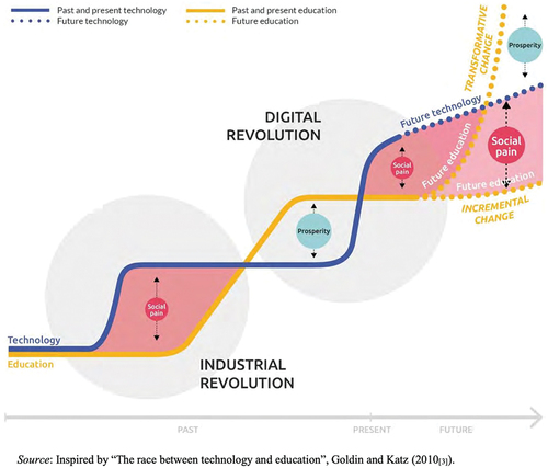
The arrow at the bottom of the figure depicts time as something that moves forward (from the left to the right) in a strictly uninterrupted linear fashion. This visualisation of time is virtually devoid of the present, portraying it as a small point separating the past from the future. At the same time, the figure creates considerable ambiguity as to what counts as the present: 2005 as the last year of data collection, 2010 as the year when Golding and Katz’ study was published, 2019 as the year of publication of the OECD report, or 2023 as we write this article? This ambiguity is remarkable, given that other elements of the diagram indicate that the present is the decisive moment when action should be taken.
The centerpiece of the figure consists of two lines showing the development of technology and education as a successive process divided by the industrial and digital revolutions into periods of ‘prosperity’ and ‘social pain’. In the absence of a more precise timeline, it is impossible to say when one period ends and the other begins, or what happened in-between. It is also unclear what the notions of ‘prosperity’ and ‘social pain’ mean, whether they are based on empirical observations or are simply affective projections of utopian and dystopian discourses about the futureFootnote3 (cf. Popkewitz, Citation2022).
The performativity of this diagram does not lie in the precise data and definitions, but in its ability to persuade through a visual shape that is recognisable from genetic engineering. Indeed, the regularly intersecting lines form a figure reminiscent of the structure of deoxyribonucleic acid, or DNA. This simple and familiar double-helix model allows the diagram to make statements about the past, present and future of education in a way that is both aesthetically and scientifically compelling.
The main message unfolds at the dotted ends of the lines, which represent desired and feared future scenarios. The desired scenario is one of transformative change, in which education outpaces technology to bring about ‘prosperity’. The feared scenario is one of incremental change, which, as the figure suggests, would inevitably increase ‘social pain’. Despite the ambiguity of the terms, it is made clear that ‘social pain’ is caused by the slow development of education. Reflecting a belief in the transformative power of education, the diagram signals that education, not technology, can solve societal problems. The key point is straightforward: in order to keep pace with the demands of the future and achieve prosperity, educational development must be speeded up. The implied solution thus presupposes acceleration and calls on national governments to act quickly to solve the problem that is yet to come.
As a specific temporal order, acceleration emphasises efficiency, productivity and the pursuit of constant progress, with implications for education and other domains of modern societies (Rosa, Citation2013; Rosa & Scheuerman, Citation2009; Virilio, Citation1986). The underlying assumption is that a faster progress in education can bring about positive social, economic and individual transformations. The imperative to accelerate is also reinforced in the text accompanying the figure, which states that ‘meaningful and relevant changes in education are urgently needed to achieve more inclusive and sustainable development for all, not just for the privileged few’ (OECD, Citation2019, p. 6). However, while pointing to the urgent need for transformative change in education to overcome social and economic inequalities, the diagram does not provide any precise indication of time, thus making the need for speed a constant concern for national governments.
Importantly, the diagram offers no alternatives. The promise of prosperity and the danger of increasing social pain operate precisely through their extremes, following the logic of the DNA structure, where lines can never run parallel or converge. This visual model forces a dichotomy in which something has to be superior in order to maintain the idea of a ‘race’ between education and technology. In this, the aesthetic appeal and intuitive logic of the DNA model reinforces the persuasive power of the diagram by presenting the entanglements of fears and hopes as predetermined and timeless.
Broken times: beauty before data
As indicated above, the article focuses on reports published between 2019 and 2023. Many of the collected reports are devoted to assessing the impact of the global coronavirus outbreak on education and providing guidance for recovery. Like other crises caused by wars, conflicts or natural disasters, the pandemic introduced a new calendar by dividing the passage of time into periods before and after. It also markedly slowed down the flow of time during the pandemic.
The graph shown in , below, is one of many examples reflecting these trends. It is taken from the joint UNESCO, UNICEF and World Bank report called The State of the Global Education Crisis: A Path to Recovery (UNESCO, UNICEF, & The World Bank, Citation2021b). Based on data from the state of São Paulo in Brazil, the figure shows fifth graders’ scores in mathematics as measured by the National Basic Education Assessment System. The data is plotted biennially and the blue score line shows uneven but steady progress from 2011 to 2019.
Figure 2. São Paulo: timeline for 5th grade students in maths, national basic education assessment system (SAEB) vs. sample evaluation. Source: UNESCO, UNICEF, & The World Bank (Citation2021b, p. 16).
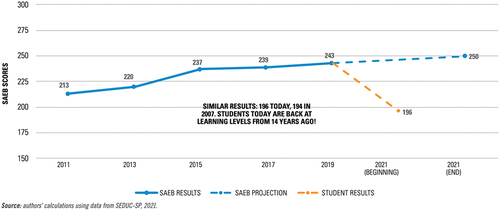
Similar to the previous diagram, conveys its key message in the dashed ends of the score line displaying the actual and simulated scenarios. The orange dashed line depicts the actual scenario and shows a significant drop in student performance compared to the pre-pandemic period. Student scores at the beginning of 2021 were also well below expectations indicated by the blue dashed line. The conclusion is highlighted in the text in the centre of the figure, which claims that in Citation2021 students had the same results as in Citation2007, which means that learning progress is ‘back at learning levels from 14 years ago!’ Arguably, the text goes far beyond mere contextual information or data description in that it actively guides the viewer to see a 14-year learning loss, even though the graph itself only covers a decade’s worth of data. By invoking data that is not shown on the graph, the text manipulates the viewer’s perception of the problem, thereby suggesting that the pandemic ‘has eliminated a decade or more of steady learning progress’ (UNESCO, UNICEF, & The World Bank, Citation2021b, p. 16, italics added). Since failed or even eliminated progress disrupts the fundamental idea of time as linear and irreversible, it is not surprising that the report identifies the urgent need to restore progress as a critical challenge for education in São Paulo and elsewhere.
Furthermore, the timeline at the bottom of is a prime example of temporalisation, where certain moments or periods of time are prioritised over others through the specific selection, organisation and visualisation of data. In this case, this is done by visually emphasising the pandemic period. In fact, the space between 2011 and 2013 is visually larger than that between 2017 and 2019, and roughly equal to that between the beginning and end of 2021. While the irregular intervals between other years can be dismissed as a technical inaccuracy, the visual stretching of the pandemic period seems to be intentional. This spacing gives the impression of a significant slowing down of time, with one year of the pandemic corresponding to at least two years of the ‘normal’ time flow. In addition to portraying 2021 as a ‘privileged’ year, the graph reinforces the perception of it as a time of crisis and urgency, when action must be taken to regain the lost time and recover progress in educational development.
It should be emphasised that the example in , which illustrates how the specific temporalisation and visual organisation of data help to prioritise certain governance concerns, is not an isolated case. Nor are visualisations that break the calendar flow of time limited to COVID-19 and other crises. Consider, for instance, the time-chart in , below. This is taken from the OECD (Citation2020b, p. 16) report entitled What Students Learn Matters: Towards 21st Century Curriculum, which examines the different lags between future needs and current curricula. Drawing on secondary data, illustrates changing trends in the composition of tasks required for work.
Figure 3. Trends in types of tasks required for work. Source: OECD (Citation2020b, p. 16).
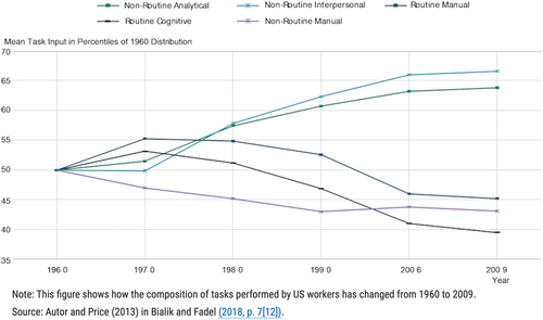
On closer examination, two things stand out in this figure. First, there is a note at the bottom indicating that the graph shows the composition of tasks performed by American workers from 1960 to 2009. As in , this contextual information is not explicitly reflected in the graph’s title, which can give the impression that the depicted trends are universal. Second, the graph depicts the flow of time in a distinct manner. While the data from 1960 to 1990 is presented on a decade-by-decade basis, the subsequent period covers 16 years (1990–2006), while the last one contains data for only 3 years (2006–2009). Nevertheless, the intervals on the time axis are evenly spaced. This visual organisation not only datafies time by arranging it according to data availability, but also beautifies the data by making time intervals look equal and comparable. This affects the perception of the patterns being visualised and makes the changes between 1990 and 2006 appear more dramatic than they may have been.
Beauty in absence? Missing data and the shaping of temporal continuity
In this section we examine two examples of how data visualisations deal with missing data by visually beautifying the gaps for the sake of cross-spatial or cross-temporal comparison.
is taken from a report by (UNESCO, UNICEF, & The World Bank, Citation2021a, p. 25) on COVID-19 Learning Losses in the Middle East and North Africa (MENA). It presents a bar chart illustrating the level of digital connectivity, defined as access to both a device and the internet, in six selected MENA countries. The data used in the figure is based on a survey that predates the COVID crisis, but is nonetheless described as ‘the most reliable data currently available’ (p. 25).
Figure 4. Digital connectivity per education level in the Middle East and North Africa. Source: UNESCO et al (Citation2021a, p. 25).
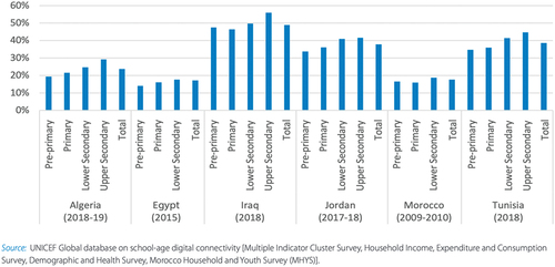
Referring to this figure, the report discusses the varying levels of internet access across the region and emphasises that nine countries had internet rates below 70%, which presumably affected students’ possibilities to participate in remote and hybrid learning during the pandemic (p. 24). As with , the text and conclusions in the report refer to data that is not displayed in the graph. In this case, the conclusion refers to nine countries, while the bar chart shows data from only six.
It is particularly noteworthy that the data for the six countries shown in ranges from 2009 to 2019. Despite such significant time gaps, the data for each country is placed on the same horizontal line. Although the accompanying text acknowledges that ‘the situation may have improved in recent years’ (UNESCO et al., Citation2021a, p. 25), the figure encourages readers to compare countries with each other. In essence, by co-presenting the data regardless of critical temporal differences, the figure emphasises the primacy of ‘comparative reasoning’ (Popkewitz, Citation2022) and significantly broadens the view of what counts as relevant evidence from which conclusions can be drawn.
Our final example comes from the regional monitoring report conducted by UNESCO in collaboration with UNICEF and ECLAC,Footnote4 which evaluates the progress of the countries in Latin America and the Caribbean towards achieving the education goals outlined in the United Nation’s 2030 Agenda. , below, is featured in a section of the report that focuses on Sustainable Development Goal 4.2 (SDG4.2), which pertains to early childhood education (ECE). It shows the gross early childhood enrolment ratio in the region from 2000 to 2020. This indicator compares the number of children enrolled in a specific level of education to the population of children who should be enrolled at that level based on their age.
Figure 5. Gross early childhood enrolment ratio in a) pre-primary education and b) early childhood educational development (SDG4) Latin America and the Caribbean 2000–2020. Source: UNESCO et al (Citation2022, p. 44).
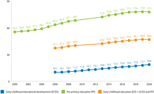
The numbers displayed in the figure are calculated for the entire ECE, presented in the orange line and separately for early childhood educational development (ECED) and pre-primary (PP) education, shown in the blue and green lines respectively.Footnote5 For example, the orange line indicates that in Citation2019, less than half (46.6%) of the population in Latin America and the Caribbean attended some form of educational institution. Of these, 77.5% of children over the age of 3 and 18.6% of children aged 0 to 2 attended preschool, as suggested by the green and blue lines. Comparing these indicators over time, UNESCO et al (Citation2022, pp. 44–45) conclude that the region has seen a sustained increase in the number of children attending ECE programmes over the past 20 years. However, here and elsewhere in the report, they also express concern about a ‘marked deceleration’ (p. 16) in this growth. If deceleration is seen as a problem, acceleration becomes the obvious solution. As the executive summary emphasises, accelerating progress is essential if the education goals of Agenda 2030 are to be achieved (UNESCO et al, Citation2022).
It is also worth noting that the graph connects individual data points for every two years, starting from 2000 for pre-primary education (shown in the green line) and from 2006 for early childhood educational development and the entire ECE. Nevertheless, the conclusion of continuous growth over the past 20 years is applied to the entire ECE (UNESCO et al., Citation2022, p. 44), even though the data visualised covers a period of 14 years. This illustrates a recurring pattern in which the accompanying text not only describes the graph, but also guides the reader’s interpretation by referring to non-visualised data and trends.
Note also that the green and orange lines do not contain any data points between 2009 and 2013. These omissions may be due to the unavailability of data for this period. However, instead of making this explicit by breaking the lines, the inconvenient data gaps are filled with a straight line, which contrasts with other periods shown as a series of abruptly connected short line segments. Such beautification not only compensates for the missing data, but also conveys a sense of temporal continuity, thus making the past appear linear and progress between 2009 and 2013 even smoother than in other periods.
Conclusion
Data visualisation has assumed a central role in education governance. Combining quantitative, verbal and visual elements, it is intended to enable stakeholders to better understand and engage with educational data and to support effective and evidence-based decision making. Since Playfair, data visualisation has gained scientific credibility because it is associated with objective knowledge and indisputable facts. As a result, graphs, charts and diagrams serve as powerful tools of persuasion and authoritative ways of knowing.
In contrast to this widely held view, which equates quantitative data with truth, this article draws on Deleuze (Citation1988) and Foucault (Citation1983) to stress the diagrammatic capacity of data visualisations to suggest rather than reveal or represent. Rather than simply showing educational phenomena, diagrams render the invisible visible and have the potential to shape new connections, facts and truths. They also prioritise particular perspectives, issues and concerns, thereby configuring and reconfiguring the pasts, creating divergent presents and unfolding future possibilities and potential trajectories. Emphasising this performative, problem-posing nature of diagrams, this article has explored how pictorial, numerical and verbal aspects of data visualisations interact to suggest particular visions of educational pasts, presents and futures and shape the objects of governance.
Our analysis indicates that the past, present and future of education are subject to continuous invention through datafication and the temporalisation and beautification of data. Datafication transforms social phenomena, including time, into measurable, quantified entities that can be subjected to comparison, even when comparison is not always warranted (e.g. ). By encouraging comparative thinking, diagrams mould the desires of individuals or nations to compete, self-regulate and take timely action. Datafication also involves structuring and displaying time based on the availability of data (e.g. and ) to highlight specific concerns and areas for improvement, to which decision makers should be attentive.
Temporalisation involves singling out specific historical events or periods and assigning them special political value as ‘milestones’, ‘landmarks’, ‘turning points’ or ‘times of crisis’ (cf. Benjamin, Citation1974; see also Lindroos, Citation1998). This can be done by visually highlighting or stretching a particular point or period of time while shrinking others (). Temporalisation can also involve removing data points from their original temporal context and presenting the underlying data as timeless and universal to enhance the explanatory and predictive power of the diagram, thereby rendering certain policy concerns as global and continuously relevant ().
Arguably, beautification can be considered a central feature of data visualisation. By this term we refer to various practices aimed at enhancing the aesthetic qualities of data presentation in order to make the message evident and visually appealing (cf. Ratner & Ruppert, Citation2019). After all, the primary purpose of statistical graphics is to make it easier to see patterns, connections and regularities in data over time at a single glance, so that the areas requiring attention and action can be quickly identified. To achieve this, it is necessary to ‘clean’ the data, filter out the details, simplify complexities and elegantly present trends and relations in terms of the colour and size of visual shapes and their spatial organisation. These ideas were already in place in the eighteenth century when the graphic representation of time as a line and the first time-series charts were introduced as new means of quantifying and visualising time in relation to other phenomena. Beautification manifests itself in a variety of visual techniques, such as appealing to familiar scientific visual models, smoothing curves and lines by removing data points (), smoothing out uneven time periods ( and ), parallelling data from different time periods (), or masking missing data with smooth lines (). Through these techniques, beautiful pictures of numbers construct particular visibilities and knowledge about education (cf. Beer, Citation2019).
Together, the practices of datafication, temporalisation and beautification contribute to the production of ‘beautiful’ – or perhaps more accurately, beautified – evidence to inform educational practices and policy decisions. This is done not only through the graphics, but also through the accompanying texts that direct the gaze to what is to be seen. Indeed, in three of the five examples analysed in this article, the texts refer to data that is not shown in the actual figures.
The solutions offered by the analysed diagrams imply an expansion or contraction of the idea of the present. This, of course, has an impact on which data is ‘filled by the presence of the now’ (cf. Benjamin, Citation1974, XIV) and which issues are presented as requiring attention and immediate action. Furthermore, these solutions are imbued with a sense of urgency, pointing to the need to act quickly to keep up with an accelerating world. Accordingly, incremental change is seen as problematic, as are any time lags, slowdowns, periods of stagnation and deceleration. Facilitated by the visualisation of time as linear and unidirectional, these temporal orders suggest the notions of progress and temporal continuity and that the future should be different from the past and can be pre-improved by transforming past problems into solution-oriented actions in the present. These temporal orders, in turn, are based on the implicit assumption that visions of desirable futures and purposes of education are collectively held.
Finally, by highlighting problems, potential crises or optimistic scenarios, data visualisations create an affective connection with the audience by prompting a call to actively change what is considered problematic or to sustain ‘good’ things (Gutiérrez, Citation2020; Kennedy & Hill, Citation2018; Popkewitz, Citation2022). Hence, understanding how fears, hopes, dreams and desires are woven into data visualisations is critical in order to understand their broader impact on public perception and decision-making. This article has provided a glimpse into this issue, but it is clear that further research is needed on the topic.
Disclosure statement
No potential conflict of interest was reported by the author(s).
Additional information
Notes on contributors
Tatiana Mikhaylova
Tatiana Mikhaylova is a Senior Lecturer in Education at the University of Gävle, Sweden. Her research interests include education history, policy, politics, and governance. She is a member of the research groups STEP (Uppsala University) and SEEDS (University of Gävle) and editor of the Nordic Journal of Studies in Education Policy.
Daniel Pettersson
Daniel Pettersson is Professor in Education at the University of Gävle, Sweden. His research interests include curriculum theory, comparative education, and the history of education. He is scientific leader of the research groups STEP (Uppsala University) and SEEDS (University of Gävle) and chief editor of the Nordic Journal of Studies in Education Policy.
Notes
1. Some are produced in collaboration with other international agencies, such as UNICEF and the World Bank.
2. Hereafter, the titles of the charts and graphs replicate those in the original.
3. The concept of ‘social pain’ is not mentioned in the original study by Goldin and Katz (Citation2010). ‘Prosperity’ is mentioned twice, but only in passing and without any detailed discussion of its meaning.
4. ECLAC stands for the Economic Commission for Latin America and the Caribbean.
5. ECE is commonly divided into two levels, including early childhood development education (ECED), which is directed at children ages 0 to 2 years, and pre-primary education (PP), which serves children from 3 years of age to the start of primary school (UNESCO et al., Citation2022).
References
- Ambrosio, C. (2015). Objectivity and representative practices across artistic and scientific visualization. In A. Carusi, A. S. Hoel, T. Webmoor, & S. Woolgar (Eds.), Visualization in the age of computerization (pp. 118–144). Routledge.
- Ball, S. J. (2015). Education, governance and the tyranny of numbers. Journal of Education Policy, 30(3), 299–301. https://doi.org/10.1080/02680939.2015.1013271
- Beer, D. (2019). The data gaze: Capitalism, power and perception. SAGE.
- Bender, J. B., & Marrinan, M. (2010). The culture of diagram. Stanford University Press. https://doi.org/10.1515/9780804773256
- Benjamin, W. (1974). Über den Begriff der Geschichte. In R. Tiedemann & H. Schweppenhäuser (Eds.), Gesammelte Schriften: Vol. 1.2 (pp. 691–709). Suhrkamp.
- Boyd, D., & Crawford, K. (2012). Critical questions for big data: Provocations for a cultural, technological, and scholarly phenomenon. Information, Communication & Society, 15(5), 662–679. https://doi.org/10.1080/1369118X.2012.678878
- Brinton, W. C. (1919). Graphic methods for presenting facts. The Engineering Magazine Company.
- Cambrosio, A., Jacobi, D., & Keating, P. (1993). Ehrlich’s “beautiful pictures” and the controversial beginnings of immunological imagery. Isis, 84(4), 662–699. https://doi.org/10.1086/356636
- Daston, L., & Galison, P. (2010). Objectivity. Zone Books.
- Decuypere, M. (2016). Diagrams of europeanization: European education governance in the digital age. Journal of Education Policy, 31(6), 851–872. https://doi.org/10.1080/02680939.2016.1212099
- Decuypere, M., & Vanden Broeck, P. (2020). Time and educational (re-)forms-inquiring the temporal dimension of education. Educational Philosophy and Theory, 52(6), 602–612. https://doi.org/10.1080/00131857.2020.1716449
- Deleuze, G. (1988). Foucault P. Bové, S. Hand, (Ed. Trans.). University of Minnesota Press.
- Drucker, J. (2013). Diagrammatic writing. New Formations, 78(78), 83–101. https://doi.org/10.3898/nEWF.78.04.2013
- Engebretsen, M., & Kennedy, H. (Eds.). (2020). Data visualization in society. Amsterdam University Press. https://doi.org/10.1515/9789048543137
- Foucault, M. (1983). This is not a pipe H. James, ( Trans.). University of California Press.
- Foucault, M. (1991). Discipline and punish: The birth of the prison A. Sheridan, ( Trans.). Penguin.
- Friendly, M., & Wainer, H. (2021). A history of data visualization and graphic communication. Harvard University Press.
- Goldin, C. D., & Katz, L. F. (2010). The race between education and technology. Belknap.
- Gutiérrez, M. (2020). How interactive maps mobilize people in geoactivism. In M. Engebretsen & H. Kennedy (Eds.), Data visualization in society (pp. 441–456). Amsterdam University Press. https://doi.org/10.1515/9789048543137-030
- Halpern, O. (2015). Beautiful data: A history of vision and reason since 1945. Duke University Press. https://go.exlibris.link/hQSTmHk7
- Hobsbawm, E. (1992). Introduction: Inventing traditions. In E. J. H. In & T. O. Ranger (Eds.), The invention of tradition (pp. 1–14). Cambridge University Press.
- Jarke, J., & Macgilchrist, F. (2021). Dashboard stories: How the narratives told by predictive analytics reconfigure roles, risk and sociality in education. Big Data & Society, 8(1), 1–15. https://doi.org/10.1177/20539517211025561
- Kennedy, H., & Hill, R. L. (2018). The feeling of numbers: Emotions in everyday engagements with data and their visualisation. Sociology, 52(4), 830–848. https://doi.org/10.1177/0038038516674675
- Kruja, E., Marks, J., Blair, A., & Waters, R. (2002). A Short Note on the History of Graph Drawing. In P. Mutzel, M. Jünger, & S. Leipert (Eds.), Graph Drawing. GD 2001. Lecture Notes in Computer Science (Vol. 2265). Springer.
- Latour, B. (2017). Visualization and cognition: Drawing things together. Logos, 27(2), 95–151. https://doi.org/10.22394/0869-5377-2017-2-95-151
- Lewis, S. (2018). PISA “yet to come”: Governing schooling through time, difference and potential. British Journal of Sociology of Education, 39(5), 683–697. https://doi.org/10.1080/01425692.2017.1406338
- Lindblad, S., Pettersson, D., & Popkewitz, T. S. (Eds.). (2018). Education by the numbers and the making of society: The expertise of international assessments. Routledge.
- Lindroos, K. (1998). Now-time image-space: Temporalization of politics in Walter Benjamin’s philosophy of history and art. University of Jyväskylä.
- Lynch, M., & Woolgar, S. (1990). Representation in scientific practice (Vol. 1). MIT Press.
- Madsen, M. (2021). The configurative agency of metrics in education: A research agenda involving a different engagement with data. Journal of Education Policy, 36(1), 64–83. https://doi.org/10.1080/02680939.2019.1682679
- McCosker, A., & Wilken, R. (2014). Rethinking “big data” as visual knowledge: The sublime and the diagrammatic in data visualisation. Visual Studies (Abingdon, England), 29(2), 155–164. https://doi.org/10.1080/1472586X.2014.887268
- Mertanen, K. & Brunila, K. (2022). Fragile utopias and dystopias? Governing the future(s) in the OECD youth education policies. Globalisation, Societies and Education (Ahead of Print), 1–12. https://doi.org/10.1080/14767724.2022.2121687
- Nash, K., Trott, V., & Allen, W. (2022). The politics of data visualisation and policy making. Convergence: The International Journal of Research into New Media Technologies, 28(1), 3–12. https://doi.org/10.1177/13548565221079156
- OECD. (2019). OECD the future of education and skills 2030. OECD Publishing. https://www.oecd.org/education/2030-project/contact/OECD_Learning_Compass_2030_Concept_Note_Series.pdf
- OECD. (2020a). Back to the future of education: Four OECD scenarios for schooling. OECD Publishing. https://doi.org/10.1787/178ef527-en
- OECD. (2020b). What students learn matters: Towards a 21st century curriculum. OECD Publishing. https://doi.org/10.1787/d86d4d9a-en
- Piattoeva, N., & Boden, R. (2020). Escaping numbers? The ambiguities of the governance of education through data. International Studies in Sociology of Education, 29(1–2), 1–18. https://doi.org/10.1080/09620214.2020.1725590
- Playfair, W. (1786). The commercial and political atlas: Representing, by means of stained copper-plate charts, the exports, imports, and general trade of England, at a single view, to which are added, charts of the revenue and debts of Ireland, done in the same manner by James Corry. Sewell.
- Popkewitz, T. S. (2022). International assessments as the comparative desires and the distributions of differences: Infrastructures and coloniality. Discourse: Studies in the Cultural Politics of Education, 43(3), 460–482. https://doi.org/10.1080/01596306.2021.2023259
- Priestley, J. (1769). Description of a chart of biography. In J. T. Rutt (Ed.), The theological and miscellaneous works of Joseph Priestley (Vol. 24, pp. 1817). G. Smallfield.
- Ratner, H., & Ruppert, E. (2019). Producing and projecting data: Aesthetic practices of government data portals. Big Data & Society, 6(2), 1–16. https://doi.org/10.1177/2053951719853316
- Rosa, H. (2013). Social acceleration: A new theory of modernity. Columbia University Press. https://doi.org/10.7312/rosa14834
- Rosa, H., & Scheuerman, W. (Eds.). (2009). High-speed society: Social acceleration, power, and modernity. Pennsylvania State University.
- Rosenberg, D., & Grafton, A. (2010). Cartographies of time: A history of the timeline. Princeton Architectural Press.
- Segaran, T., & Hammerbacher, J. (Eds.). (2009). Beautiful data: The stories behind elegant data solutions. O’Reilly Media, Incorporated.
- Steele, J., & Iliinsky, N. P. N. (Eds.). (2010). Beautiful visualization: [looking at data through the eyes of experts]. O’Reilly.
- Tufte, E. R. (2001). The visual display of quantitative information (2. ed.). Graphics Press.
- Tufte, E. R. (2006). Beautiful evidence. Graphics Press LLC.
- UNESCO, ECLAC, & UNICEF. (2022). Education in Latin America and the Caribbean at a crossroads: Regional monitoring report SDG4 – education 2030. UNESCO. https://en.unesco.org/sites/default/files/full_report_regional_monitoring_report_sdg4-e2030.pdf
- UNESCO, UNICEF, & The World Bank. (2021a). COVID-19 Learning Losses. Rebuilding Quality Learning for All in the Middle East and North Africa. https://unesdoc.unesco.org/ark:/48223/pf0000380118?locale=en
- UNESCO, UNICEF, & The World Bank. (2021b). The state of the global education crisis: A path to recovery. A joint UNESCO, UNICEF, and World Bank report. https://documents1.worldbank.org/curated/en/416991638768297704/pdf/The-State-of-the-Global-Education-Crisis-A-Path-to-Recovery.pdf
- Van Dijck, J. (2014). Datafication, dataism and dataveillance: Big Data between scientific paradigm and ideology. Surveillance & Society, 12(2), 197–208. https://doi.org/10.24908/ss.v12i2.4776
- Virilio, P. (1986). Speed and politics: An essay on dromology. Semiotext(e).
- Webb, P. T., Sellar, S., & Gulson, K. N. (2020). Anticipating education: Governing habits, memories and policy-futures. Learning, Media and Technology, 45(3), 284–297. https://doi.org/10.1080/17439884.2020.1686015
- Williamson, B. (2016). Digital education governance: Data visualization, predictive analytics, and “real-time” policy instruments. Journal of Education Policy, 31(2), 123–141. https://doi.org/10.1080/02680939.2015.1035758
- Zdebik, J. (2012). Deleuze and the diagram: Aesthetic threads in visual organization. Continuum.