Abstract
Place branding strategies play a significant role in the professional composition of landscape imagery, including the depiction of “natural” landscapes. In this paper, Brand Blue Mountains, a brand currently implemented in the Blue Mountains region (Australia), is discursively analyzed. The brand sets out an all-encompassing “Vision” defining the identity, values and personality of the World Heritage listed Blue Mountains landscape, summarized in the tagline Elevate Your Senses. This “vision” is visually translated into a strictly coordinated and copyrighted suite of logos, graphic design, color, fonts and various photographic styles. Analysis reveals that the degree of control that place brand strategists seek to exert over the visual expression of landscape identity is significant. A highly selective narrative of positive nature-based sensory experience is constructed through the holistic application of contemporary visual media. The brands' communications strategy naturalizes and reinforces a particular market-friendly version of place. The framework that brands set for the representation of landscapes overall amounts to an exercise in calculated aesthetics, whereby the form and content of landscape images of various kinds is measured to achieve the greatest market differentiation and impact which technologies allow. The result of this calculated aesthetic system, with its taglines, saturated color, careful composition and magazine-format brevity, is a reduction in the complexity of landscape representations and a perpetuation of nature stereotypes.
Introduction
BRAND: The totality of images, ideas and reputations of the organization [or place] in the minds of the people who come into contact with it. (Blue Mountains Tourism Limited [BMTL], Citation2004, p. 46)
Place branding encompasses a range of strategies which deal with the management and marketing of places. These strategies address both visual and non-visual communications in a bid to express consistent, memorable and marketable place identities. As such, place branding strategies play a significant role in the composition of landscape imagery, including “natural” environments. Although the use of nature and landscape imagery in advertising and marketing is not new, the way in which such imagery is systematically coordinated by a number of professionals – brand strategists, tourism managers, graphic designers and photographers – within an overarching brand “totality” puts this imagery in a new context. How do place brand strategies do this, and what are the visual communications that result?
To explore these questions, this paper presents a detailed illustrative case study of one such branded landscape: the Blue Mountains region of New South Wales, Australia. Brand Blue Mountains (BBM) was commissioned by local government authority Blue Mountains City Council in 2004, and is still being implemented today. As an area of recognized natural beauty and ecological significance, the Blue Mountains have a long history of visual representation and tourism marketing, of which BBM is the most recent manifestation.
The main BBM document referenced throughout this paper is the Brand Manual (BMTL, Citation2004), the official in-house guide that defines the brand from its overall “Vision” through to every detail of its expression and management. The Manual sets out key landscape values and motifs and prescribes how these should be communicated through a coordinated suite of logos, graphic design, color, fonts and photography.
The paper is divided into three parts. Firstly, place branding is defined and the key elements of place branding practice, as described within recent literature in the field, are summarized. Secondly, Brand Blue Mountains is presented, starting with a background to the brand (context) before presenting a summary of the brand's key characteristics (content). This is followed by a detailed analysis of its visual communications components, before concluding with an account of how these are coordinated and controlled. Finally, the role of visual communications within BBM is critically discussed, highlighting the implications of place branding within discourses of landscape and nature.
Place Branding
Place branding is “the creation of a recognizable place identity and the subsequent use of that identity to further other desirable processes, whether financial investment, changes in user behavior or generating political capital” (Kavaratzis, Citation2005, p. 334). It is a pervasive, strategic tool used to establish and manage the meaningful sets of relations between things, people, images, texts and physical environments, typically with a view to increasing their market appeal. As an emerging specialization within the branding profession, place branding applies the same kind of techniques used to brand consumer products or companies to the promotion of places.
Branding is characterized by several fundamental strategies, which are applicable whether selling a soft drink, a corporation, a National Park, a city or a nation. The following summary identifies the generic characteristics of the branding process and briefly notes the implications of applying them to places, especially so-called natural landscapes (see also Arvidsson, Citation2006; Lury, Citation2004).
First, brands use market research to generate and test marketable narratives. While this may produce more targeted and effective communications, it also means messages may be composed to meet the perceived tastes of selected market demographics at the expense of other possible messages and audiences.
Second, brands are based on projecting uniqueness – identifying or constructing a point of difference with the intention of making one place stand out from others. This has implications for the kinds of landscape narratives and meanings that are conveyed through brands. A place with important ecological or cultural features may be inherently valuable and unique but may not necessarily be brandable; typically this means being unique by being the rarest, largest, oldest, newest, most accessible and so on. According to the literature, in an information-rich world messages must be simplified, straightforward and continually self-reinforcing in order to effectively gain mindshare. Place brand specialist Simon Anholt has described how he has exercised such selectivity in practice:
On more than one occasion, I have been faced with the tricky task of gently explaining to a very proud and very patriotic minister that the world will not be enthralled by the fact that […] over sixty species of wild grass grow along his eastern coastline. (Citation2004, pp. 36–7)
Because place branding “provides a base for identifying and uniting a wide range of images […] in one marketing message” (Kavaratzis, Citation2004, p. 63, emphasis added), a single message cannot pick up on subtle nuances; in such a discourse coastal grasses are not suitable fodder for constructing place image.
Third, branding theory espouses the need for products and companies to express internally consistent values and images. Brands are reductive in their push to reinforce key messages. Anholt suggests “one of the best known functions of brands is to act as convenient, everyday shorthand for what a product or company stands for: why not for a city or country too? Both are handy reductions for far more complex and contradictory realities” (Citation2004, p. 29). Advocates suggest brands make life easier by simplifying the many messages we receive and by introducing “a certain order or coherence to the multiform reality around us” (Mommaas, Citation2002, p. 34). Critics assert this approach can lead to stereotypical or “simple-minded” place constructs (Gold & Revill, Citation2004, p. 206).
Fourth, branding discourse asserts that the place identities they construct arise from the qualities of the places they are applied to. Branding consultants regularly describe a process of interpreting existing characteristics of place, defining their task as one of discovering, interpreting, expressing and accentuating an existing identity or essence (see Anholt, 2004, p. 34; Morgan & Pritchard, Citation2004, p.64). However, such claims are problematic, since to achieve a marketable and coherent identity only certain characteristics of place will be included and others excluded.
Fifth, brands are typically emotive and expressive – appealing to the hearts as well as to the minds of consumers. This reflects the “increased focus among marketers on differentiation through relationships and emotional appeals, rather than through discernible, tangible benefits” (Morgan & Pritchard, 2004: p. 61). Brands emphasize qualitative aspects, defining and then continuously attributing particular values (wild, enlivening, exotic, pure, vibrant, authentic and so on) to that which is being branded.
Sixth, brands emphasize interactivity – being a part of something – particularly through the notion of experience (Lindstrom, Citation2005; Schmitt, Citation1999). In place branding terms, this manifests itself through a concern with the senses, activities and movement. Notably, branding's concern for emotiveness, values and experiences make landscapes very brandable, as they readily lend themselves to being interpreted as possessing certain qualities (e.g. “natural” or “pure”) and they can be directly experienced in space and time (Hankinson, cited in Kavaratzis, Citation2005, p. 338; Middleton, Citation2001, p. 355).
Finally, branding strategies are based on the notion of holistic communications, extending beyond conventional advertising to encompass a variety of coordinated communicative acts. Brand narratives are communicated via a range of “surfaces, screens and sites” (Lury, Citation2004, p. 50): print media surfaces such as those produced by photographers, copyrighters and graphic designers; television and computer screens produced by web designers, cinematographers, directors and so on; and physical sites designed by architects, landscape architects and planners.
Case Study: Brand Blue Mountains
Background
The Blue Mountains region of NSW, located 50 km west of Sydney, consists of over one million hectares of dramatic sandstone escarpments and eucalypt dominated forests of ecological and cultural significance. The Indigenous people of the region – the Gundungurra, Darug and Wiradjuri – have deep associations with this country stretching back over 22,000 years. For colonial settlers this rugged landscape has in turn been perceived as “barren,” a “recreational haven” (Hartig, Citation1987) and most recently as a World Heritage listed wilderness. Unlike other iconic mountain peaks that are typically encountered from below, the Blue “Mountains” – which are actually escarpments – are unique in that they are accessed via ridge tops and plateaus, and are engaged with from above. Inaccessible topography has protected the vast majority of this landscape from permanent human development; however, a corridor of settlements has been established. The City of the Blue Mountains consists of approximately 73,000 residents distributed across 110 km of ridgeline in 27 towns and villages (Blue Mountains City Council [BMCC], Citation2011). Currently, tourism is the region's primary industry.
The Blue Mountains have a long history of visual representation (Porter & Bull, forthcoming). Throughout the late nineteenth to early twentieth centuries, the Blue Mountains became one of the most important sites where Australians and tourists engaged with the “bush” (woodland), a trend consistent with the rise of mass tourism in other mountain landscapes such as the Lake District in England and Yosemite in the USA. A legacy of accompanying place names, written histories, myths, artworks and advertisements – and especially photographic images – have imbued the Blue Mountains landscape with meaning and contributed to its presence in the cultural imagination. Guidebooks, souvenir books, postcards, maps and newspaper advertisements reflected and influenced the social activities and aesthetic tastes of the day. According to estimates, over 100 different editions of guidebooks, the same number of souvenir books, and somewhere in the order of 5000 postcards have been produced since the 1880s, which when multiplied by the number of print runs amounts to millions of images (Smith, Citation1998, p. 93). The content of these historic documents vary, sometimes featuring images of the scenery from lookouts and bush walks, and sometimes emphasizing man-made attractions. The formal characteristics of these materials also vary, from elaborate black and white etchings and drawings in the 1880s through to kitsch calendars on sale today.
Constructing BBM
By the twenty-first century, the Blue Mountains were no longer attracting the impressive tourist numbers they had enjoyed a century earlier. In a 2004 study commissioned by the local government tourism body Blue Mountains Tourism Limited (BMTL), a consultant team attributed the decline in visitor interest to a lack of awareness about the kinds of nature experiences the landscape offered, arguing that “the scenery, activities and facilities are as good, if not better than before,” but that the perception of the place was the problem, as “potential customers” found the landscape “increasingly unappealing or irrelevant” (Global Tourism & Leisure [GTL], Citation2004, p. 2). The popularity of the landscape had waned in part due to the earlier success of repeated industry promotions, which had reduced this particular landscape to a well-trodden post-card cliché of scenic panoramas and touristy tea rooms. In response, Blue Mountains City Council commissioned London-based place branding specialists Acanchi to devise BBM, a communications strategy comprehensively outlining how the region could be represented. Sydney-based design firm Infographics developed the visual identity of the brand based on Acanchi's strategic plan.
The strategy was developed over an 18-month period, which included market research and on-site consultation. According to Acanchi:
Capturing the essence of the Blue Mountains in a single image was a primary goal of the Brand Blue Mountains branding project; an icon which created an immediate resonance with its primary target markets while being single-minded, compelling and unique. (BMTL, Citation2004, p. 11)
Blue Mountains Tourism Limited (BMTL) owns copyright for the brand and manages its dissemination, most visibly through the official Visit Blue Mountains website (www.visitbluemountains.com.au). To see the brand exclusively as a tourism initiative, however, would be to underestimate its ambition and reach. The brand is intended to not only support tourism and business, but also to function as a “rallying call” for the entire Blue Mountains community to “achieve its economic and social goals” (BMTL, Citation2004, p. 7). As such, the brand has been implemented by numerous parties, including Blue Mountains City Council, non-government organizations and private businesses who signed up as “brand partners” and thereby agreed to collectively promote the brand message. By 2012, BBM had around 200 partners, ranging from schools and resorts through to local tradespeople and other small businesses (Blue Mountains Business Advantage [BMBA], Citation2012). In short, the brand's strategic aim is to “unite tourism, business, council and community under a common branding” (BMTL, Citation2004, p. 5).
The all-encompassing Blue Mountains identity which Acanchi defines for all to follow is “Upness,” which it explains as: “A uniquely Australian perspective on being ‘UP’; seeing environment, culture, community and commerce as a continuum of experience and engagement. This is a challenge to dated, traditional views of the BM and [sic] to bring understanding to ‘a higher level’” (BMTL, Citation2004, p. 25).
By equating the mountains with upness, Acanchi fashions a connection between the environment's unique defining spatial characteristic – topographical height as experienced from an escarpment – and the activities and sensations it can afford. This relentlessly positive “essence” is then expressed in more detail in the following ways (BMTL, Citation2004, pp. 6–8):
Brand Positioning: Experience Australia / NSW / Business at another level
Brand Personality: Intelligent and Responsible; Fertile, Imaginative and Vibrant; Unique, Eternal and Wholesome; Earth Centered and One with nature
Brand Values: Integrity and Purity; Creativity; Diversity; Spirit of Achievement; Community Spirit; Sustainability
Tag line (tourism): Elevate Your Senses
Although claiming to be new, this construct perpetuates a well-rehearsed romantic association between mountain landscapes and nature, purity, health, sensory pleasure, timelessness and spiritual rejuvenation and enlightenment (for a full discussion of such associations, see Scharma, Citation1995).
To communicate these landscape concepts in today's media environment, a 46-page Brand Manual (“the Manual”) prescribes a variety of visual and typographic devices to deliver the brand message. The Manual articulates the brand concept before illustrating the visual branding activities to be undertaken by BMTL and brand partners. The Manual “directs how communications messages are crafted, how a visual design is created and how photography is shot, to deliver a consistent and motivating message” (BMTL, Citation2004, p. 7).
The translation of brand concept to brand image is made explicit through detailed explanations, instructions and examples of the main visual elements to be used. BBM is quick to point out that it is more than just a rubber-stamp image or a single logo, and is based upon an integrated, comprehensive communications strategy “which uses a variety of visual and typographic devices to deliver its message” (BMTL, Citation2004, p. 11). It explicitly details the content and form of all visual imagery as part of the brand strategy. As a document intended for the use of BMTL and its stakeholders, the Manual is a guide to the internal workings of place branding in relation to landscape concepts and how they are articulated.
Visualizing the Brand: Global Elements (Logo, Colors, Fonts, and Graphic Layout)
BBM sets out to shift public perception from what its creators believe is a “traditional, mono-dimensional view” (BMTL, Citation2004, p. 25) of the landscape. To achieve this, it employs a communications strategy that it claims differs visually and conceptually from existing marketing and photographic conventions for the region. The brand's graphic design repertoire of signature, typeface, color palette and page layout, known collectively as “global elements,” interprets existing landscape characteristics and pictorially represents these in commercialized graphic form.
The most recognizable and regularly applied global element is the “signature,” consisting of a graphic element (logo) and a typemark (). The logo component of the signature is made up of two sub-graphics that the Manual names “Flora” and “Escarpment” (BMTL, Citation2004, p. 21), along with a green ribbon-like gestural mark that is reminiscent of a ridge top road. The typemark element consists of the words “blue mountains” carefully composed according to color (blue), font and boldness. The letters comprising the word “blue” are horizontally misaligned to give the impression of a rising and falling horizon. Thus, in its overall composition, the brand signature is a landscape in itself; a miniaturized, abstracted graphic and typographic evocation of form and character.
Figure 1. (Color online) Using the Blue Mountains Signature (permissible logo variations). Source: BMTL (Citation2004, p. 12).
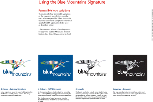
Although the signature is sufficiently abstract to allow multiple subjective interpretations, it is intended to be read in part as a landscape: “[it] will mean different things to different people […] Many people see natural elements such as the escarpment, the ridgelines and floral elements. Others see creativity, celebration and our community spirit” (BMTL, Citation2004, p. 11).
The signature is designed to be either reproduced in full or adapted and applied to suit different publications and contexts. BMTL makes frequent use of part of the signature (“sub-graphics”) in their publications, further abstracting the already-abstract landscape motifs into cropped dashes of color. Their web pages animate the floral sub-graphic so that it appears to grow up the screen in an eye-catching ascending gesture. In this way, the logo infuses representations with a consistently recognizable set of colors and forms. The partial or cropped logos engage the mind of the potential consumer to see a portion of a sign and actively recall and construct the whole. For a successful logo, a mere glimpse of its colors on page or screen will suffice to signify Blue Mountains, as consumers who are familiar with the brand only require a reminder for recognition to occur. Logos are “markers of the edge between the aesthetic space of an image or text and the institutional space of a regime of value which frames and organizes aesthetic space” (Frow, cited in Lury, Citation2004, p. 13). The institutional space of BMTL and its network of brand partners are marked by the Blue Mountains brand signature, an aesthetic expression that depicts the physical space upon which this brand is then projected.
Color is a major element used in BBM. The Manual establishes a color palette which it characterizes as being directly derived from the natural landscape it symbolizes. An illustration shows how the varied features of the landscape were used to inform the brand colors (). The accompanying text explains this palette:
… is drawn from the colors of the regional environment, and from the four seasons. The grid below [the palette] shows schematically what the grid at the left [the photographs] shows literally … the Blue Mountains glow with colors both vibrant and muted, complementary and contrasting. (BMTL, Citation2004, p. 19)
Figure 2. (Color online) The color palette. Source: BMTL (Citation2004, p. 18).
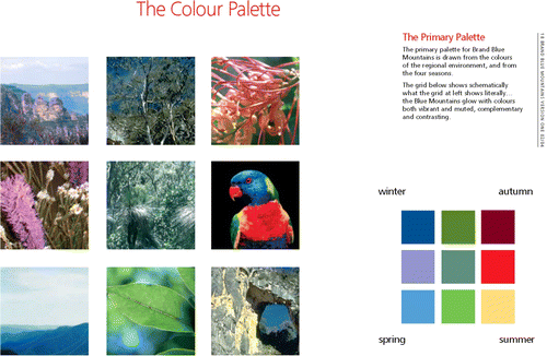
The selection of particular elements of the landscape to represent the regional environment and the seasons are necessarily limited in range, reproducing a stereotypical, traditional range of iconic birdlife, gum leaves, floral details and mountain views. Although described as muted and vibrant, the primary palette emphasizes boldness and saturated color in a way that owes more to the attention-seeking boldness of web pages than the hazy blue of the horizon. What is credited as indicating a year-round regional spectrum is necessarily a limited interpretation of color in the landscape. Local historian Jim Smith argues that the mountains “have many more than four” seasons, with migratory patterns and the flowering of specific plants marking numerous climatic and temporal cycles for those attentive enough to read them (Smith, Citation1988, p. 200), a level of subtlety and intimate knowledge of the landscape that remains unrepresented. Ultimately, the many colors and seasons of the landscape are selectively distilled as a highly regulated palette suited to the surfaces of twenty-first century marketing.
Font styles are determined by the Manual and are intended to communicate the brand personality. The Blue Mountains Brand has its own corporate font, Frutiger, which is described as being “contemporary […] friendly and communicative [… and] legible” (BMTL, Citation2004, p. 22). The authors claim that the font “gives the City a distinctive personality in its marketplace” (BMTL, Citation2004, p. 22). Other complementary fonts are specified for headings (Rotis Semi Sans) and for in-house publications such as reports and faxes (Arial). This level of specification indicates the control and continuity demanded by the branding process, which attempt to promote their idea of place identity to the letter, literally, by prescribing the visual appearance of text.
The brand provides rules for the content of text as well as its visual appearance. The Manual requires that “Copy and design must be integrated into the communication to deliver on the wider brand positioning” (BMTL, Citation2004, p. 11). This rule is followed in the headings used in BMTL marketing publications, which exude “upness” with phrases such as “welcome up” and “feels different up here” (BMTL, Citation2004, p. 36) ().
Figure 3. (Color online) Examples of brand graphic layout, typography and “elevated” copy. Source: BMTL (Citation2004, p. 36).
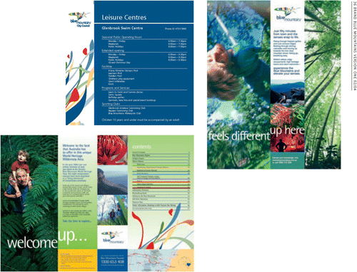
The way in which the various elements are composed is as strictly scripted as the elements themselves. Layout guidelines specify how a sense of upness is to be conveyed by graphic composition (BMTL, Citation2004, p. 35). It is argued that typography and layout “play a powerful role in the creation of brand equity” (BMTL, Citation2004, p. 35). Stepped type and an “ascending” vignette (see the layout of words in ) are used to visually reinforce the upness message (BMTL, Citation2004, p. 35). The Manual states that these devices, when combined with visually standardized content, create an “authentic experience of the BM offering” (BMTL, Citation2004, p. 35).
Visualizing the Brand: The Photographic Strategy
Photographers in the Blue Mountains and the distributors of their images have been powerful and selective mythmakers. (Snowden, Citation1988, p. 156)
Landscape photography has a rich history in the Blue Mountains, and BBM is the latest mythmaker to use photography to shape perceptions of this environment. The history of photography of the Blue Mountains is a significant topic in its own right, having been the subject of academic research and literature (Burke, Citation1988; Falconer, Citation1997; Snowden, Citation1988;Thomas, 2004). Whether critiquing the commercialization of the landscape through images, celebrating these images, or drawing artistic inspiration from them, all agree that photography has both reflected changing perceptions of the landscape and informed them. Since the 1860s, shifts here in landscape photography generally reflect the shifts in landscape perception as well as changes in photographic technologies that allowed new visions to be captured and distributed, consistent with Cosgrove's assertion that “the aesthetic conventions of landscape have been continuously reinforced by developments in mechanical and prosthetic vision” (Citation2003, p. 257).
Early Blue Mountains photography was influenced by sublime mountain photography, which was in turn influenced by landscape painting traditions. It has been argued that the early experiences of photographers wishing to recreate such compositions were generally frustrated by the Blue Mountains terrain with its characteristic valleys and escarpments instead of towering peaks (Thomas, Citation2004, pp. 225–226). As infrastructure and technologies changed around the turn of the nineteenth century, so photographic images changed with them. Scenic lookouts on cliff tops were developed and promoted, and the panoramic elevated view was established as the pictorial norm, particularly for amateur photographers. During the mountains’ busiest tourism decades prior to WWII, standard commercial imagery generally consisted of expansive panoramas from elevated viewpoints, capturing distinctive sandstone formations or waterfalls. Some images featured diminutive figures in the foreground, however increasingly the typical view itself was free of human presence, thus “creating and preserving and distributing an ideology of nature untouched” (Snowden, Citation1988, p. 137).
It is within this historical context that the Manual specifies photographic techniques aimed at reflecting the brand's own “unique Blue Mountains experience and perspective” (BMTL, Citation2004, p. 25). The Manual stipulates a range of commercial landscape imagery composed with the stated aim of changing the existing cultural image of the place. Four photographic styles form part of the “visual richness” of the brand strategy: Dynamic perspective, Intelligent Experiences, Macro Details and Standard Panoramic. These will now be described and analyzed in detail.
The primary photographic style stipulated in the Manual, “Dynamic perspective,” describes how images will “[a]lways show people engaging with the natural environment in ways that challenge the traditional understanding of the [Blue Mountains] offering” (BMTL, Citation2004, p. 27). Images of people actively engaging with the environment should be shown in extreme perspective, characterized by acute angles, subjects viewed from above, below or contrapuntally (). The strategy literally encourages the viewer to perceive the mountains from an unconventional point of view; for example, the Manual features a photograph of a man with a boy perched on his shoulders, peering up from a forest of tree ferns – a combination of elevated viewpoint and elevated content.
Figure 4. (Color online) Examples of the “Dynamic Perspective” photographic strategy. The two non-photographic images (top left and center right) are reproductions of paintings by William Robinson. Source: BMTL (Citation2004, p. 26).
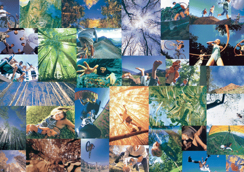
This compositional approach has been inspired by the vertiginous experiences the landscape affords, and “by the paintings of the celebrated Australian artist, William Robinson” (BMTL, Citation2004, p. 27) (). The appropriation of a recognized Australian landscape painter's perspectival approach is significant. Robinson's distinctive “multi viewpoint” style (Robinson, cited in Klepac, Citation2001, p. 105) has been described as one where “the viewer is drawn into the natural world as an active participant” (National Gallery of Australia [NGA], Citation2006). Unlike panoramic detached views, his work evokes the sensory qualities of immersive landscape experience. Robinson states, “I am trying to achieve the non-static, the total relationships of moving elements, as we would sense, as we do, when we are in the landscape itself” (cited in Klepac, Citation2001, p. 105).
Such descriptions align with the experiential and sensory intent of the brand; several defining aspects of Robinson's landscape painting are, however, more difficult to reconcile with the brand and the landscape image BMTL constructs. First, Robinson's landscape paintings are not of the Blue Mountains, but are based on his intimate knowledge of his surroundings in Queensland, many hundred kilometers north. Robinson has been described as a regional painter because his work “is absolutely an art of place,” and he lives in the landscape he paints, a fact “central to his work” (Fern & Robinson, Citation1995, p. 17 and 59). The brand's self-defined aim to communicate what makes the Blue Mountains “unique” can be interpreted as inconsistent with an outside artist's interpretation of a remote landscape.
Second, the character of Robinson's vertiginous multi viewpoint evokes aesthetic responses antithetical to the upbeat tone of the brand. Fink makes the connection between Robinson's work and Edmund Burke's notion of the sublime – a view more associated with anguish than upness and which “is often more grotesque than beautiful” (Citation2001, pp. 13–14). Such distinctions highlight the ambiguity of the language of landscape and of semiotic interpretation in general. The brand's vertiginous compositional style, intended to convey a sense of upness, could readily descend into signifying freefall: the relative certainty of the picturesque panorama is abandoned for the distortions of a less familiar and disorienting point of view.
Third, appropriating an original landscape expression in one medium and re-presenting it in another can also be problematic. In this case, the scale of Robinson's large landscape painting is at odds with the format of tour guidebooks and magazines. Size is important to Robinson's works (Fern & Robinson, Citation1995, p. 52), which rely on their grand scale to envelop the viewer and heighten the sense of being within the landscape. The scale of photography reproduced for BMTL is necessarily much reduced, as is its impact.
Finally, and perhaps most importantly, Robinson's compositional style cannot be dissociated from the content of his landscapes, which has little to do with the expressed intention of the brand strategy. Robinson:
is that most deeply unfashionable thing – he is a religious artist. This is not to say that his art can be reduced to an expression of faith alone; but to ignore the faith underpinning the work is to miss its animating principle. (Fink, Citation2001, p. 13)
Robinson's work is a religious meditation and celebration. His work may be stylistically contemporary; however, the ideas expressed through that choice of style are traditional. By appropriating a personal and deeply religious landscape painting style for mass distribution in the global marketplace, the brand strategy negates and evacuates the original meaning in an individual artist's work and secularizes it. The branded landscape constructs a form of commerce-friendly nature-based spirituality to appeal to a wide market. As BMTL manager Kerry Fryer explains: “one of the things that came very strongly [in the market research] was the emotional aspect or the spiritual aspect that had nothing to do with religion – going to nature” (Fryer, personal communication, 2005).
The brand presents spirituality as a generic “oneness with nature” that is neither Christian, nor, notably, is it Aboriginal. The absence of Aboriginal spirituality in the brand further reveals its limited evocation of the “spiritual aspect” of landscape that Fryer makes reference to, and indicates the wider problem of representing an imagined “unified community.” Any sense of the spiritual qualities of this landscape as understood by its original inhabitants has been treated with ambiguity historically (see Smith, Citation1991; Thomas, Citation2004); the brand contributes to a tradition of the marginalization of Aboriginal landscape meaning and experience by neglecting such associations.
This is arguably to the detriment of the brand's own aims, since Aboriginal stories associated with the Blue Mountains are ones which encourage “an engagement with country” (Thomas, Citation2004, p. 92) on a deep experiential and localized level. Nevertheless, complex Aboriginal narratives do not lend themselves to the tagline brevity of brand communications, as they fail to fit into a three-word phrase. Nor do they find stylistic expression in a visual compositional convention or motif. In short, the BBM photographic strategy of “Dynamic Perspective” illustrates the brand's tendency to selectively misappropriate some landscape narratives and overlook others. It also reflects a conservative bias, since despite its claims to “show landscapes in non-traditional ways” the brand nevertheless conforms to the well-established tradition of portraying nature as an aesthetic object to be consumed. The claim that the BBM landscape is “non-traditional” is accurate in the unintended sense that the perspective of the traditional owners is overlooked.
The second photographic style for the brand, called “Intelligent Experiences” (BMTL, Citation2004, pp. 28–29), demonstrates how the brand is intended to change people's engagement with the landscape by emphasizing relationships between people and the natural environment (). Intelligent Experiences photography
seeks to visually demonstrate an equal weighting of human beings with the natural environment. People take the foreground and dynamically engage with nature in uplifting, positive ways; touching, breathing, embracing, eating, relaxing, enjoying. Just as Dynamic Perspective is inspired by the overwhelming experience of “looking out / up / down,” Intelligent Experiences balance the impact of the natural world on individuals, couples, families, culture, cuisine, hospitality, adventure, spirituality and so on. (BMTL, Citation2004, p. 29)
Figure 5. (Color online) “Intelligent Experiences” photographic strategy. Source: BMTL (Citation2004, p. 29).
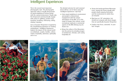
The strategy of representing the wilderness as populated is one that signifies a departure from the norm. The brand delivers a “motivating message” intended to entice people into the landscape by making their potential presence explicit (BMTL, Citation2004, p. 7). In the discourse of place branding, an uninhabited place is a failed product; thus the need to produce imagery of the landscape product being successfully and happily inhabited and therefore consumed. An uninhabited wilderness may presuppose our presence, but an inhabited, branded wilderness demonstrates exactly what experiences are on offer. The photographic strategy thus:
Gives equal weighting to environment and people to demonstrate engagement with the unique atmosphere of the BM [Blue Mountains]. It is in this range of images that cultural, social, recreational, spiritual or commercial aspects of the BM offering may be drawn out [… The strategy] Shows the landscape / Views / “Mountain Icons” sharing the frame equally with people clearly enjoying themselves and the environment in which they are situated. (BMTL, Citation2004, p. 29, emphasis added)
The Manual predetermines for brand partners both the content of landscape photography and its composition within the picture frame. The semiotic connection between signified and signifier is spelled out. Here, the “equal weighting” of human activity and nature is signified through the two subjects “sharing the frame equally.” Similarly, the dynamic perspective and intelligent experiences approaches emphasize movement through a combination of content (active figures) and form (dynamic composition). Examples include photos of a young woman riding a mountain bike near the edge of a vertical cliff, others feature a group of young couples bush walking.
Although this strategy introduces people into the photographic landscape, the human element of the images is limited to the transitory physical presence of a small number of individuals, itself a limited view of what an inhabited landscape entails. Most visitors to the Blue Mountains National Park follow the extensive network of walking tracks that cover the landscape. Those shown in BMTL brochures and web pages, however, are depicted in untouched wilderness without a walking track in sight. The fact that only a few people are seen at any one time in these images reinforces the idea of the landscape as a wilderness without disturbance, despite the fact that the National Park walking tracks have historically been traversed by large groups of people, and that walks along some of the easy tracks near population centers and major lookouts are used by tens of thousands of walkers every year.
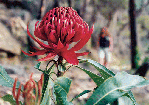
The brand's third photographic strategy, “Macro Details,” stipulates that communications should use close-up photographic views of landscape color and texture (). Macro photographs of vegetation are intended to evoke how “the senses are engaged by the closeness of the natural world” while acting as a “Showcase for the flora / textures of the region.” By zooming in on elements of the environment, it is suggested that the brand will provide “a fresh look at detail […] presenting the landscape in all its uniqueness and beauty” while “giv[ing] marketing material extra depth” (BMTL, Citation2004, p. 33). This approach lends itself to current photographic and image reproduction technologies capable of powerful magnification and high resolution. Further, it is stated that Macro Details, and indeed all Blue Mountains brand photography, should employ crisp focus and saturated imagery (BMTL, Citation2004, pp. 25–33), thus moving away from hazy romantic notions of a Picturesque misty mountain landscape. Like the logo, they should be vibrant and bold. This representational strategy marks a significant move away from traditional depictions of an imposing landscape, a mysterious-yet-familiar panorama considered too distancing and remote for today's marketplace.
Figure 6. (Color online) Example of “Macro Detail” photographic strategy. Source: BMTL (Citation2004, p. 2).
The brand's fourth photographic strategy, “Standard Panoramic,” employs traditional panoramic views with a contemporary twist. The Manual recommends that if panoramic landscape imagery is used, it feature “NEW views of BM at different times of the day” (BMTL, Citation2004, p. 31, emphasis in the original). The two example panoramas in the Manual are atypical of picturesque panoramas in some ways, as a rainbow appears in one image, the horizon is absent in another, and neither image is framed by vegetation. These images nevertheless retain some traditional characteristics of panoramic composition, with people shown in the foreground and off to one side of the frame, their scale diminished in relation to the vast landscape beyond.
Overall, the brand's photographic strategy intends to signify elevation on “environmental, cultural, spiritual and commercial levels" (BMTL, Citation2004, p. 25). Despite the potential depth of these multiple levels of signification, the ability of commercial photographic composition to represent a full range of environmental, cultural and spiritual perspectives is limited. The strategy emphasizes variety – viewpoints, times of day, scales, activities in the landscape – while at the same time strictly determining what that variety must and must not include. Some stylistic innovations introduce a level of intimacy with the natural landscape, partially reversing the twentieth-century dominance of the panorama. However, by limiting the compositional variety and content of landscape images, the brand institutionalizes a new “mono-dimensional view” rather than expanding upon the existing one.
Applying the Vision: Controlling the Image
The Manual is a management tool intended to guide the visual communication of the brand by numerous partners. Brand manager BMTL is intent on having as many expressions of the brand as possible. Businesses are actively recruited to join the branding effort, for example a membership campaign begun in late 2006 ran the line “Get behind the brand and the brand will get behind you” (BMBA, Citation2012). Once businesses and other partner organizations are recruited, they are required to follow the rules of the Manual to the letter. Like a franchiser, brand owner BMTL has the legal capacity to enforce copyright, controlling any unauthorized or non-conforming application of the brand: “All copyright and intellectual property associated with the brand and the elements of the brand belong to BMTL” (BMTL, Citation2004, p. 38). A section of the Manual dedicated to stipulating the all-important copyright and managerial conditions states: “Where brand elements are used by brand partners, these must be approved by BMTL. Artwork must be submitted for approval, and where design elements such as the sub-graphic are used, a separate application and approval from BMTL is required” (BMTL, 204, p. 38).
BMTL also detail how they will implement brand control within their tourism plan. Objective 1.1.7 requires BMTL to “[r]egularly audit the content of the key image influencers of third parties and attempt to modify this where it is out of alignment with the optimal branding defined in the brand style guide [Manual]” (GTL, Citation2004, p. 9).
The Manual leaves little room for error or interpretation, as its highly prescriptive instructions spell out how the logos, fonts and photographs are to be reproduced uniformly by all. For example, the standard application of the color palette is controlled by accompanying instructions for color reproduction, whether in print, on-screen, embroidery and even wall paint (BMTL, Citation2004, pp. 19–20). Examples of correct and incorrect applications are illustrated, with the text insisting that variations must “NEVER” (BMTL, Citation2004, p. 12, emphasis in the original) be made (). This control is justified by BMTL on the grounds that incorrectly applied visual communications “will weaken or damage the integrity and impact of the identity” of the brand (BMTL, Citation2004, p. 15).
Brand management seeks a consistent and mutually reinforcing image of the Blue Mountains landscape distributed by multiple organizations, thus raising the prospect of a uniform landscape of ideas. Whereas in the past local business operators were free to describe the landscape as they saw fit, they are now being requested to reiterate predetermined, dominant themes. It should be acknowledged that it is unlikely that one brand could enforce a “single-minded” visual image across an entire community (unlike a single organization or company brand). A systematic audit of all landscape imagery being produced in the Blue Mountains since 2004 is beyond the scope of this study. However, amid the many examples of conforming logos and layouts, some brand partners appear to have broken the pictorial rules, for example by persisting in using photography featuring traditional panoramas and iconic views. Furthermore, others outside the brand continue to independently produce landscape ideas and images; being a brand partner is voluntary, so many businesses have their own communications strategies, and local artists and tourists continue to depict the environment in their own ways – from blogged photographs through to exhibitions and fiction – without a brand to prescribe how they do so. Nevertheless, BBM's aim to create a consistent and repetitive place image is in itself significant, and is brought closer to realization through a legally enforceable (copyright) system of brand management.
Conclusion
This analysis has shown that BBM communicative strategies seek to systematically control the image of the Blue Mountains landscape. The brand Manual is specific about the “desired outcome(s)” of the strategy in terms of all image composition and content (BMTL, Citation2004, p. 27). In this system, the natural environment is never a neutral pictorial element, but is employed instrumentally as a means of promoting a “single-minded, compelling and unique” version of the place to outsiders and to locals alike.
The brand selectively interprets existing characteristics of the landscape as well as importing others, with the resulting combination conforming to the perceived desires of targeted market demographics. The strategy makes use of the symbolic potential of the landscape to translate abstract concepts – “values,” “personality,” and “sustainability” – into tangible place images. It comprehensively specifies how the landscape is represented in terms of color, texture, form, temporality, human interaction and experience, personality and narrative conventions, spelling out what messages the various image styles or content are intended to convey. It marks a conscious departure from the traditional depictions of an imposing landscape, rejecting distant panoramas and over-familiar iconic sites in favor of more immediate, people-focused narratives. Together the logo, color scheme and highly prescriptive photography combine to communicate the upbeat, landscape-led place identity.
The imagery produced by the brand reflects characteristics of the Blue Mountains’ natural environment, but it equally reflects the demands of the existing media environment. Evocations of the landscape vary depending on the specific qualities of the medium used, with the specific qualities of various media being exploited for their own greatest effect. Logos demand boldness, copywriting demands brevity, photographic composition exploits zoom lenses and high-resolution reproduction quality, and color is standardized to suit current printing and digital technologies. Overall the Blue Mountains landscape is rendered colorful and condensed.
Central to BBM is the notion of an elevated landscape, which is used to metaphorically – and then translated visually – to reflect abstract concepts such as business prosperity, community spirit and emotional states as well as promoting the natural landscape setting. This implies that socio-cultural constructs (i.e. community values and economic competitiveness) constitute a natural extension of the elevated landscape, reifying associations between the landscape and notions such as nature, purity, emotional elevation, financial / business elevation, and community unity. Insisting that a place construct is seemingly “natural” lends an air of inevitability to the work, concealing the selective process involved.
Although BBM challenges certain pictorial stereotypes of an uninhabited scenic mountain landscape, the portrayal of the environment as naturally pure and uplifting perpetuates existing conventional notions of the mountains as a retreat from contemporary life. The BBM strategy simplifies the image of a region which is characterized by a rich pattern of human settlements surrounded by National Park areas. While the environmental benefits and challenges that arise from this park proximity continue to be enjoyed and negotiated by residents and local government, it is difficult to gain a sense of this complexity from the landscape representations prescribed by BMM.
The emphasis given to the “naturalness” of the landscape by BBM implicitly denies and negates important cultural landscape associations such as the history of Aboriginal occupation and the recent efforts to reconcile and acknowledge traditional ownership of land. The absence of Aboriginal narratives, along with the appropriation of William Robinson's visual style – without his artistic content – serve as examples of how the brand's visual communications are bright and bold on the surface but lacking depth. It seems that as long as brands insist on being “single-minded” there will be little room for anything other than a natural and secular Blue Mountains, as complex narratives and tensions are incompatible with branding aims and structures.
In summary, the framework that the brand sets for the representation of the landscape is an exercise in calculated aesthetics, whereby the form and content of landscape images of various kinds is measured to achieve the greatest differentiation and impact which technologies allow. The result of this calculated aesthetic system, with its taglines and magazine-format brevity, is a reduction in the complexity of landscape representations and a perpetuation of nature stereotypes. The declaration of an all-encompassing “Vision” for the region, the all-purpose tagline Elevate Your Senses, and the drafting of principles relating to the region's identity, values and personality are all intended to guide perceptions of the region toward a single coherent, repetitive – and relentlessly positive – theme. When “new” landscape concepts and compositional forms are introduced which seek to promote a more sensorily engaged experience of nature, these do not challenge the underlying value system that presents the landscape as an object for consumption.
This description of BBM, and of place branding as a practice in general, foregrounds its highly ideological character, as ideologies “offer ordered, simplified versions of the world; they substitute a single certainty for a multiplicity of ambiguities; they tender to individuals both an ordered view of the world and of their own place within its natural and social systems” (Baker, Citation1992, p. 4)
Attempting to order and control the expression of identity is place branding's raison d'être. The degree of planning and control that place brand strategists invest in the visual communication of brand identity is significant. This attempt at control and indeed legal ownership of expressions of landscape challenges the very notion of landscape as a subjective, and hence individually “owned,” concept: In 1836 Ralph Waldo Emerson (Emerson, cited in Mitchell, Citation1994, p. 15) remarked that “landscape has no owner,” thus distinguishing the exchange value of land-as-property from the poetic / symbolic property of landscape as a cultural expression. However, in the twenty-first century, the exercise of intellectual property rights by place brand managers makes this distinction less clear. Brand managers cannot copyright the idea of a landscape, but can copyright the material expression of that idea in the form of words, logos and photographs.
Alternatively, for the full potential of human-nature relations to be visually communicated, place branding strategies will have to be more flexible in their interpretation of “identity,” and not quite so single-minded. After all, nature and place cannot be reduced to a singular essence. It is not the role of a single authority to prescribe the meaning of place for all, regardless of its content or expression.
The colorful logos and carefully composed photographs of place branding must form part of a much wider visual spectrum, one capable of constructing a truly unique version of nature and the possibilities it holds. By definition it is impossible to have an unmediated landscape or a pure “nature”, as these are cultural constructs to begin with. In this sense the landscape is not more or less mediated, not more or less authentic, only more or less consistently constructed and enforced. Ultimately, it is with a diverse variety of depictions of natural environments – not standardized visual communications strategies – that “compelling” and “unique” places will emerge.
Additional information
Notes on contributors
Nicole Porter
Nicole Porter, Ph.D., is faculty member at the University of NottinghamRelated Research Data
References
- Anholt , S. 2004 . “ Nation-brands and the value of provenance ” . In Destination branding: Creating the unique destination proposition , 2nd ed. , Edited by: Morgan , N. , Pritchard , A. and Pride , R. 26 – 39 . Oxford : Elsevier Butterworth-Heinemann .
- Arvidsson , A. 2006 . Brands: Meaning and value in media culture , London : Routledge .
- Baker , A. R. 1992 . “ Introduction: On ideology and landscape ” . In Ideology and landscape in historical perspective , Edited by: Baker , A. R. and Biger , G. 1 – 14 . Cambridge : Cambridge University Press .
- Blue Mountains Business Advantage (BMBA) 2012 . BMBA official web site. Retrieved May, 2012, from http://www.bluemountainsadvantage.com.au
- Blue Mountains City Council (BMCC) . 2011 . BMBA official web site. Retrieved January, 2011, from http://www.bmcc.nsw.gov.au/
- Blue Mountains Tourism Limited (BMTL) . 2004 . Brand Blue Mountains manual (Version 2) . Katoomba : BMTL .
- Burke , A. 1988 . “ Awesome cliffs, fairy dells and lovers silhouetted in the sunset: A recreational history of the Blue Mountains, 1870–1939 ” . In The Blue Mountains: Grand adventure for all , Edited by: Stanbury , P. 99 – 117 . Sydney : Leura, Second Back Row Press, The University of Sydney .
- Cosgrove , D. 2003 . “ Landscape and the European sense of sight—eyeing nature ” . In Handbook of cultural geography , Edited by: Anderson , K. , Domosh , M. , Pile , S. and Thrift , N. 249 – 268 . London : Sage .
- Falconer , D. 1997 . The service of clouds , Sydney : Picador .
- Fern , L. and Robinson , W. 1995 . William Robinson: Roseville east , NSW : Craftsman House in association with G + B Arts International .
- Fink , H. 2001 . Light years: William Robinson and the creation story . Artlink , 21 ( 4 ) : 12 – 17 .
- Global Tourism & Leisure (GTL) . 2004 . Blue Mountains regional three year tourism plan and implementation program, 2004–2007 . Katoomba : BMTL .
- Gold , J. R. and Revill , G. 2004 . Representing the environment , New York : Routledge .
- Hartig , K. 1987 . Images of the Blue Mountains: Research monograph series , Sydney : University of Sydney Department of Geography .
- Kavaratzis , M. 2004 . From city marketing to city branding: Towards a theoretical framework for developing city brands . Place Branding , 1 ( 1 ) : 58 – 73 . doi: 10.1057/palgrave.pb.5990005
- Kavaratzis , M. 2005 . Place branding: A review of trends and conceptual models . The Marketing Review , 5 ( 4 ) : 329 – 342 . doi: 10.1362/146934705775186854
- Klepac , L. 2001 . William Robinson: Paintings 1987–2000 , Roseville , NSW : Beagle Press .
- Lindstrom , M. 2005 . Brand sense: Build powerful brands through touch, taste, smell, sight, and sound , New York : Free Press .
- Lury , C. 2004 . Brands: The logos of the global economy , New York : Routledge .
- Middleton , V. 2001 . Marketing in travel and tourism , 3rd ed. , Oxford : Butterworth-Heinemann .
- Mitchell , W. J. T. 1994 . “ Imperial landscape ” . In Landscape and power , Edited by: Mitchell , W. J. T. 5 – 34 . Chicago : University of Chicago Press .
- Mommaas , H. 2002 . “ City branding: The necessity of socio-cultural goals ” . In City branding: Image building and building images , Edited by: Patteeuw , V. , Hauben , T. and Vermeulen , M. 34 – 47 . Rotterdam : NAi .
- Morgan , N. and Pritchard , A. 2004 . “ Meeting the destination branding challenge ” . In Destination branding: Creating the unique destination proposition , 2nd ed. , Edited by: Morgan , N. , Pritchard , A. and Pride , R. 59 – 78 . Oxford : Elsevier Butterworth-Heinemann .
- National Gallery of Australia (NGA) . 2006 . Masterpieces for the Nation Fund New Acquisition. Retrieved March, 2013, from http://nga.gov.au/AboutUs/press/masterpieces.cfm
- Porter , N. , & Bull , C. ( in press ). Conceptualizing, representing and designing nature: Cultural constructions of the Blue Mountains’, Australia . In E. Carr , Eyring , S. & Wilson R. G. Public nature: Scenery, history and park design . Charlottesville , VA : University of Virginia Press .
- Scharma , S. 1995 . Landscape and memory , London : Harper Collins .
- Schmitt , B. 1999 . Experiential marketing: How to get customers to sense, feel, think, act, and relate to your company and brands , New York : Free Press .
- Smith , J. 1998 . Blue Mountains national park walking track heritage study , Sydney , NSW : National Parks and Wildlife Service .
- Smith , J. 1988 . “ Blue Mountains myths and realities ” . In The Blue Mountains: Grand adventure for all , Edited by: Stanbury , P. 185 – 202 . Leura , Sydney : Second Back Row Press; The University of Sydney .
- Smith , J. 1991 . Aboriginal legends of the Blue Mountains , Wentworth Falls , NSW : Jim Smith .
- Snowden , C. 1988 . “ The take-away image: Photographing the Blue Mountains in the nineteenth century ” . In The Blue Mountains—Grand adventure for all , Edited by: Stanbury , P . 133 – 156 . Leura , Sydney : Second Back Row Press; The University of Sydney .
- Thomas , M. 2004 . The artificial horizon: Imagining the Blue Mountains , Carlton , Vic. : Melbourne University Press .