Abstract
A significant Geographic Information Science (GIS) issue is closely related to spatial autocorrelation, a burning question in the phase of information extraction from the statistical analysis of georeferenced data. At present, spatial autocorrelation presents two types of measures: continuous and discrete. Is it possible to use Moran's I and the Moran scatterplot with continuous data? Is it possible to use the same methodology with discrete data? A particular and cumbersome problem is the choice of the spatial-neighborhood matrix (W) for points data. This paper addresses these issues by introducing the concept of covariogram contiguity, where each weight is based on the variogram model for that particular dataset: (1) the variogram, whose range equals the distance with the highest Moran I value, defines the weights for points separated by less than the estimated range and (2) weights equal zero for points widely separated from the variogram range considered. After the W matrix is computed, the Moran location scatterplot is created in an iterative process. In accordance with various lag distances, Moran's I is presented as a good search factor for the optimal neighborhood area. Uncertainty/transition regions are also emphasized. At the same time, a new Exploratory Spatial Data Analysis (ESDA) tool is developed, the Moran variance scatterplot, since the conventional Moran scatterplot is not sensitive to neighbor variance. This computer-mapping framework allows the study of spatial patterns, outliers, changeover areas, and trends in an ESDA process. All these tools were implemented in a free web e-Learning program for quantitative geographers called SAKWeb© (or, in the near future, myGeooffice.org).
1. Introduction
Statistical spatial analysis encompasses an expanding range of methods which address different spatial problems such as image classification (Goovaerts Citation2002), image pattern recognition (Sánchez-Yáñez et al. Citation2003), spatial interpolation (Aguilar et al. Citation2005), hydrology (Cai and Wang Citation2006), ecology (Uuemaa et al. Citation2008), crops research (Ping et al. Citation2004), socio-economic trend modeling (Anselin et al. Citation2004), geographic information science (Goodchild Citation2008), and so on. Each of these methods focuses on a particular aspect, but what emerges is something that is clearly identifiable as spatial statistics, raw geographical data correlated by statistical methods, something that can be located at the base of new emerging disciplines such as geoforensics (Ruffell and McKinley Citation2008) and crime mapping (Chainey and Ratcliffe Citation2005).
On the basis of the recent proposal formulated by Shupeng and van Genderen (Citation2008), Digital Earth modeling requires five phases: data extraction, information extraction, knowledge extraction, modeling, and decision making. This paper deals with the second phase, introducing the need to convert a spatial analysis (ignoring the special characteristics of spatial data) to a more robust and reliable form of spatial data mining, taking into account spatial dependence (autocorrelation) and spatial heterogeneity (association). In fact, spatial analysis should be centered on the search for patterns within spatial phenomena, involving understanding, prediction and simulation where location, time, and geometry are significant.
With regard to the concept of spatial autocorrelation, how can it be defined? A concise and accurate definition, quoting Getis (Citation2008), is given by Hubert et al. (Citation1981): ‘Given a set S containing n geographical units, spatial autocorrelation refers to the relationship between some variable observed in each of the n localities and a measure of geographical proximity defined for all n(n−1) pairs chosen from n.’ So spatial autocorrelation gives us an idea of the degree to which a set of features tends to be clustered together or evenly dispersed over the Earth's surface. It is necessary to point out that the assumption of the existence of spatial independence would create a chaotic basis for natural phenomena in Digital Earth modeling. Most real world patterns take something between a random and clustered form. Longley et al. (Citation2001) quotes, ‘Hell might be a world without spatial dependence since it would be impossible to live there in any practical and meaningful way.’
It is against this background that the ability to handle spatial autocorrelation measures has been taken as the subject of this paper. The main goal is to propose an enhanced methodology for obtaining the Moran scatterplot (from this point called the Moran location scatterplot), by integrating the optimal definition of the W vicinity matrix in algorithmic form, and for clarifying the uncertainty regions generated by the conventional Moran scatterplot (the issue of true and false outliers). It is crucial to offer the same measuring methodology for spatial autocorrelation with regard to lattice and point data and, as expected, two types of spatial datasets (Pb for continuous data and San Diego housing costs for areal data) will be included in our study. A second contribution of this article is the introduction of a new Exploratory Spatial Data Analysis (ESDA) tool called the Moran variance scatterplot, thought out as a way of testing stationarity in spatial data analysis by exploring neighborhood homogeneity/heterogeneity. This mapping framework allows the study of spatial patterns, outliers, changeover areas, and trends in an ESDA process. All these tools have been implemented in the e-Learning software for quantitative geographers called SAKWeb©.
After this introductory section (1), the article is divided into five main sections: (2) the state-of-the-art of spatial autocorrelation topics; (3) development of the proposed methodology, that is, a description of the new approach, where the proposed mapping framework is described in detail; (4) presentation of three case studies to illustrate some of the advantages provided by the proposed methodology; (5) results obtained and discussion on the case studies with respect to application of the new approach, in addition to a detailed discussion of the search for true and false outliers and the uncertainty issue; and finally, (6) main conclusions.
2. Spatial autocorrelation: reflections
From a merely statistical point of view, according to Cressie (Citation1993), if georeferenced data present any type of spatial autocorrelation, the use of n spatially correlated data would lead to a variability in the observed variable lower than it should be, wrong prediction intervals, and a scenario of artificially reduced uncertainty. With independent data, the two-sided 95% confidence interval for the mean µ is , but with n positive correlated samples (Cov(i,j)=σ2×ρ∣i−j∣) Cressie (Citation1993) proved that the previous interval (with a ρ=0.26 correlation factor and n=10) equals
, which leads to a wider confidence interval. Moreover, the estimated variance of the mean with a population of n samples is not σ2/n but σ2/n′, where n′=n/[1+2{ρ/(1−ρ)}{1−(1/n)}−2{ρ/(1−ρ)}2(1−ρ
n−1)/n], which can be interpreted as the number of equivalent independent observations. If n=10 and the spatial autocorrelation equals 0.26, then n′=6.2, that is, six independent observations achieve approximately the same accuracy as 10 correlated samples. Hence, spatial autocorrelation works like a variance inflator factor: by decreasing spatial dependency or increasing distance between sample points and prediction intervals move from a platykurtic to leptokurtic profile.
Diagnoses are playing an increasingly vital role in spatial analysis, according to Griffith (Citation1993), and kriging describes the best linear unbiased estimator (BLUE) in the sense of least variance. Kriging can also be the best unbiased estimator (BUE), if data respect a Normal distribution. When compared with deterministic interpolators, there are major differences, e.g. the former provides uncertainty assessment, anisotropy detection, and methodology assumptions. Yet, it is the variogram, a spatial autocorrelation measure that is the key stone of kriging and underlies its success.
In this sense, spatial autocorrelation could be defined as a measure of the true masked information content in spatial data or a measure to help spatial interpolation and simulation. Briefly, spatial autocorrelation indices are categorized into two distinct groups:
-
A distance view for observations data, a geostatistical approach based on kriging where spatial interaction is conceptualized as a continuous distance metric function: the variogram. It also focuses on spatial prediction. Therefore, the variogram represents the two faces of the same coin: spatial description and spatial prediction.
-
A neighboring view for lattice data, where the correlation interaction is concerned with phenomena aggregations of discrete regions among adjacent areas. Neighbors, for instance, are defined as spatial units with a common boundary or within a given critical distance (no interaction occurs further away). One possibility for the W neighborhood matrix content is w ij =1, if the i and j regions are adjacent to or below the cutoff distance, and zero otherwise (binary contiguity). w ii equals zero in every case. Another contiguity option for regular grids is the Rook–Bishop–Queen approach. Under the Rook criterion, areas are neighbors if they share borders, not vertices. Under the Queen criterion, regions are neighbors if they share either a border or vertices. By exclusion, Bishop only considers neighbors if they are connected by vertices. Contrary to contiguity-based weights, distance-based weights are based on the distance between points (used for irregular units). Distance bands are created by drawing a radius around each point and counting every point within the pre-defined radius as a neighbor. Inverse distance weighting (
with k=1, 2, 3 …) is another option. K nearest neighbors (KNN) is also a distance-based methodology where k refers to the number of neighbors. It is computed as the distance between a point and the k number of nearest neighbor's points. It is often applied where areas have different sizes, to ensure that every location has the same number of neighbors, independently of how large the neighboring areas are.
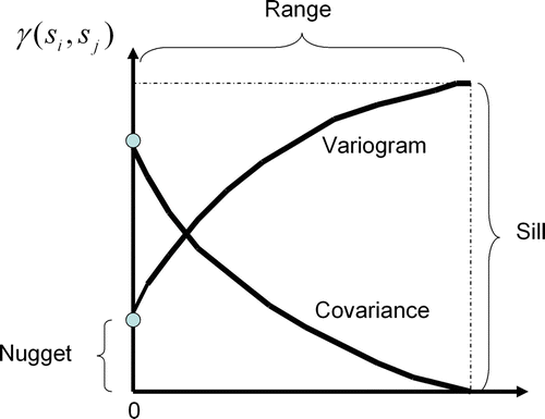
Variography quantifies spatial autocorrelation on all scales by summarizing the degree of similarity between data values for all possible observation pairs as a distance function. The upper limit is the sill, which implies no spatial dependence between data points because all variances are invariant with the sample separation distance. As expected, the higher the sill, the higher the prediction variance. Even so, the interpolation maps would look the same. The nugget-effect represents the error measurement and the spatial variation at distances much shorter than sample spacing which cannot be resolved. That is, the nugget-effect measures the extent of the lack of a microscale model. The separation distance at which samples are spatially auto-correlated is the range. Inevitably, stronger spatial autocorrelation increases the variogram range and provides a fairly smooth map since kriging weights become less powerful with respect to closer samples. On the contrary, as the range becomes shorter, more variation is expected.
Regarding the second group, currently, there is much experimentation and debate on how the W matrix should be constructed (Getis Citation2008) in order to properly embody the distance or other spatial relationships between spatial units. In fact, whatever spatial autocorrelation index is used, it is very sensitive to the neighborhood matrix utilized (Getis and Ord Citation1992, Fotheringham and Ding Citation1992). Iterative methods have recently been developed to optimize the W matrix definition, e.g. that presented by Aldstadt and Getis (Citation2006), called A Multidirectional Optimum Ecotope-Based Algorithm (AMOEBA), which finds the critical number of links to be considered in the W calculation. The result is (1) a vector that identifies those spatial units that are related and unrelated to contiguous spatial units and (2) a matrix of weights whose values are a function of the relationship of the ith spatial unit with all other nearby spatial units for which there is a spatial association (Aldstadt and Getis Citation2006).
Autoregressive (AR) models expand the standard linear model regression with an additional term that accounts for patterns that are not predicted by local variables but are instead related to the neighborhood residuals. One live example is given by Lee (Citation2005) regarding the watershed analysis in the Neuse River Basin, NC, USA. It is based on the hypothesis that the spatially weighted sum of water quality in neighboring stations affects the water quality of each monitoring station (indirect effect), as do the standard explanatory variables of pollution sources (direct effects). The spatial AR model became y=ρWy+X1β1+X2β2+ϵ, where y represents the water quality indicator vector, W is a weight matrix, X1 is the pollution sources matrix, X2 is the land cover matrix and stream characteristics, ρ is a spatial autocorrelation parameter, and ϵ is a random error vector. The model specifies that the spatially weighted sum of neighbor water qualities affects the nutrient level of each downstream monitoring unit, as do the general covariates of pollution sources and heterogeneous characteristics in each geographical unit. According to Lee (Citation2005), it states that the realization of y at hydrologic unit i is a function of its realization of X at i, plus realization of y at hydrologic unit j, plus an error.
This spatial autoregression model plus spatial autocorrelation measures provides another linkage with geostatistics: the spatial interpolation issue (Griffith and Cssilag Citation1993, Griffith and Layne Citation1999). This means that the estimation of absent spatial data can be undertaken by spatial autoregressive, kriging and spatial autocorrelation. For instance, a high degree of spatial autocorrelation suggests an equally likely chance of predicting neighboring values. On the contrary, a low value reveals a low level of spatial data redundancy. According to these authors, seven relationships among these three concepts emerge: (1) spatial autocorrelation is a mandatory condition of kriging and spatial autoregression models; (2) spatial autocorrelation seeks spatial identification while spatial regression and kriging seek spatial prediction; (3) the variance–covariance matrix is included within spatial regression and kriging; (4) once a variogram is computed, kriging can be used for spatial interpolation. With spatial regression models, spatial interpolation can be regarded as an interactive re-estimation solution fashioned with updated variable imputations based on R2 and IC decision parameters in maximum likelihood estimator (MLE) and ordinary least square (OLS) procedures; (5) kriging is primarily applied with continuous regions while spatial autoregression involves aggregations of phenomena into discrete regions such as ward units; (6) spatial AR methods assume that spatial interpolation follow an underlying trend plus random residuals. However, kriging can presume two other views: (A) if universal kriging is assumed then spatial interpolation is interrelated with a background trend and (B) if ordinary kriging (OK) is chosen then spatial interpolation is consistent with the samples global average plus random residuals; and (7) because kriging is an exact spatial interpolator (if no samples measurement error is applied), AR residuals can be used for a reasonable reality approximation test (join-count statistics or localized autocorrelation diagnostic statistic (LADS), for instance). For Clark and Hosking (Citation1986), the chance to verify existing patterns among residuals provides a key information source on possible assumption violations, variable transformations, outliers, trends surface and inappropriate formulations for raw data.
Among the global neighboring view indexes, the Moran's I statistic (Cliff and Ord Citation1973) is the most widely used measure of and test for spatial autocorrelation (Getis Citation2008). According to Florax and Rey (Citation1996), Moran's I seems to retain better statistical power than any other spatial autocorrelation test in the presence of W misspecification. Recently, it has even been used as a measure of texture in object-oriented image classification to segment imagery into homogeneous regions based on the spectral and spatial properties of neighboring pixels (Emerson et al. Citation2005).
Moran's I is calculated with the following formula:
From Equation (Equation1), Moran's I is evaluated by measuring the covariance between attributes at each place and near sites toward the overall mean. If both neighboring values are above or below the mean (similar high–high or low–low values), the product is positive, reflecting the presence of a similar spatial autocorrelation. Otherwise, the product of the two mean deviations will be negative (unrelated high–low and low–high values), indicating a non-positive situation.
In a certain way, this index is the modified Pearson coefficient (covariance versus variance) for a single variable including the W matrix. Theoretically, its output domain varies between +1.0 for perfect positive correlation (a clumped pattern) to −1 for perfect negative correlation (a checkerboard pattern). If no spatial autocorrelation exists, that is a random pattern, the expected value for Moran's I equals E(I)=−1/(n−1) where n is the sample size (Wong and Lee Citation2005). Obviously, this value will tend toward zero as the sample size increases.
However, the Moran's I index tries to summarize a complete spatial distribution in a single number. As a global index, it can suppose a serious flaw in dealing with large spatial datasets: it can hide spatial heterogeneity or local patterns of spatial clustering. This was the main reason for the development of Local Indicators of Spatial Association (LISA), normally referred to as the local version of Moran's I and Geary's C (Anselin Citation1995). In this way, Anselin (Citation1995) also indicates the Moran scatterplot, a neighborhood view approach, to visualize and identify the degree of spatial instability, based on the bivariate regression coefficient of the spatial lagged variable (W x along the y-axis), against the original variable (x along the x-axis). The four quadrants centered on the global mean are composed of the x-axis, deviations of the original variable with respect to the global mean, and the y-axis, average neighborhood weight deviations with respect to the global mean. As expected, this scatterplot is divided into four association neighborhood layout: the upper right quadrant (high values above the mean surrounded by high values); the lower left (low values surrounded by low values); the upper left (low values surrounded by high values); and the lower right (high values surrounded by low values). All these global and local spatial autocorrelation tools, and much more, were implemented in a free software program named GeoDa™, designed to serve as a graphical, user-friendly introduction to spatial analysis for non-GIS specialists (Anselin et al. Citation2006).
The Moran scatterplot can be deemed a very effective visual diagnostic tool for ESDA processes intended for the common GIS user. Yet, some shortcomings remain, e.g. problems with the W matrix construction, the fuzzy concept of neighborhood and the uncertainty around the Moran scatterplot axes (related to uncertainty about the mean estimation and W matrix definition).
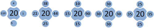
On the other hand, it is worth noting the inability of the conventional Moran scatterplot to measure heteroskedasticity among spatial data because all deviations are computed with respect to the neighborhood average. This procedure reduces neighbor locations to the single mean, whose variability among them and between the central site and its vicinity are totally lost. With regard to the five cases presented in , for instance, the neighbor average is around 30 in spite of the homogeneity lacking among them. According to the conventional Moran scatterplot, the plot would always be the same and so would not provide a solution to this problem. This issue should be taken into account by introducing a new ESDA tool. It is necessary to highlight the importance of properly detecting heteroskedastical regions. For example, we may consider OLS (Carl Gauss's standard linear regression for fitting data where the squared residuals have their least value) and MLE (another of Ronald Fisher's regression procedures: briefly, for a fixed set of data and underlying probability model, MLE picks the values of the model parameters that make the data ‘more likely’ than any other values of the parameters would). These tools are biased with heteroskedastical regions because of systematic regional differences, spatial drifts, and irregular spatial units (Anselin Citation1992). In addition, with OK, locating unpredictable and unstable regions becomes central because of stationary assumptions validation.
Figure 1. Layout of four-neighbor combinations, with all yielding the same neighbor average. The spatial heteroskedasticity question is not resolved by the conventional Moran scatterplot.
3. Development of the proposed methodology
3.1. Moran location scatterplot: fundamentals
The first element of our proposal is a procedure to construct the W matrix. As we mentioned before, binary contiguity is well suited to delimited regions. However, areal data has two major restrictions: (1) quite often, the variability between regions relies on political boundaries, that is, its polygonal shape does not depend on the variable under study; (2) the no-variability assumption within the considered region can be a problem, too. In truth, we use areal data because it is simple and convenient in terms of GIS management. However, much of the traditional sampling used in geostatistics or crime events, for instance, does not have defined boundaries (point data). It seems that, if we would like to use a lattice spatial autocorrelation measure with point data that possibility does not exist (and vice versa). This means that it is not feasible to assess the Moran scatterplot, for instance, with sample data. The challenge, then, is to overcome this division barrier with a mixed approach.
According to our proposal, the neighborhood matrix is set up by the covariogram contiguity where each weight w ij is based on the variogram model for that particular dataset (the distance view). As expected, the sum of all weights should equal one. At first, the variogram range indicates vicinity boundaries. Thus, if the distance between the location and its neighbor is larger than the variogram range (), then that particular neighbor is not included in the weighted vicinity average (the neighborhood view).
Figure 2. The contiguity plot of the covariogram, variogram, and their close relationship: γ(h)=sill–cov(h). Anisotropic phenomena can also be modeled by using different distances for the major and minor range in a perpendicular layout. As expected, closer samples hold higher weights than distant ones.
The neighborhood concept can be considered a fuzzy problem, as well. We must bear in mind that there are a lot of factors that may change the definition of the W matrix (e.g. traveling time, boundary length, the rush hour factor, migration flows, and vehicle speeds). Yet, if spatial distance between samples is the only factor to be taken into account, then the variogram becomes the best tool available to understand this constraint and make this methodology suitable for defining the W matrix.
There are no setup rules, either, to compute the best radius neighborhood. For Wong and Lee (2005), the choice of geographical weights for spatial statistical modeling is not a clear issue, although it is mostly an ad hoc matter. In fact, it is governed, primarily, by convenience or convention if the Rook and Queen option is chosen: it is symmetric, its diagonal is zero and the row sum indicates the total number of neighbors for each area unit, while its division by two equals the total number of shared joins. Florax and Rey (Citation1996) have studied the statistical power impact of W misspecification within spatial econometric models: (1) both under (omitting true spatial dependence adjacencies) and over-specification (including false spatial dependence adjacencies) produce an increase in the mean squared error; (2) over and under-specification within AR models results in an inflated variance estimation of 10%; (3) a smaller sample size magnifies differences created by geographical W matrices; (4) in the presence of weak positive spatial autocorrelation, over and under-specification makes little difference; and (5) in a moderate case, under-specification appears to be more seriously affected, while, in the presence of strong spatial autocorrelation, complications become worse with over-specification.
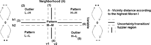
It is clear that these different weights lead to an assortment of Moran's I and Moran scatterplot results. Additionally, the W neighborhood matrix is not influenced by the region value because the W calculation does not include sample or region values. For Negreiros (Citation2004; Citation2009), by choosing different neighborhood limits for the same layout, the Moran scatterplot observations can only exchange vertical positions between quadrants I and IV or II and III whose maximum amplitude is, on average, 15% of the overall mean (). According to his study, the stronger the Moran's I, the better the Moran scatterplot highlights the different patterns, outliers and uncertainty/transition regions.
Figure 3. Overall picture of the Moran scatterplot showing the uncertainty regions, high–high, medium–medium, and low–low patterns, positive outliers (1), (3), (4), and (6), negative ones (5) and (2), and the Moran's I impact on the Moran scatterplot.
Therefore, the neighborhood range for construction of the W matrix should be determined in an adjustment mechanism context, because spatial autocorrelation is scale-dependent, that being the keystone/the first fundamental of our approach. For example, working on the Gross Domestic Product (GDP) per capita dataset for African countries and varying the covariogram range in an iterative process, Negreiros (Citation2004) found that the strongest Moran's I equaled +0.6092, corresponding to a covariogram range of 20 miles. For the same dataset, the binary contiguity approach only obtained a Moran's I of +0.3891. So a higher Moran's I is expected with an interactive methodology and, thus, spatial patterns and outliers can be enhanced more effectively. In this way, with regard to geocomputation, after the covariogram contiguity has been set up, SAKWeb© maps the Moran scatterplot for the highest Moran's I encountered according to different distances where the maximum active lag distance equals the variogram range. The lag distance is set up by the software itself (it divides the variogram of the whole range by 10, the default value, which may be changed). The purpose is to find the interval distance that maximizes Moran's I without exceeding the variogram range because the distance at which the curve levels off indicates the scale of the spatial pattern (Skinner and Child Citation2000). Since nature quite often pursues a positive spatial autocorrelation pattern, it is also important to fulfil the need for a cutoff criterion for continuous data. The prevalence of smaller radii is expected. Nevertheless, the short-range danger of omitting a good percentage of the original samples can be real because of the lack of neighbors for their assessment. A possible initial default value for the first range considered for Moran's I assessment is one and a half times the mean nearest distance. On the basis of the highest Moran's I value, the variogram range will be set up according to this new distance.
The second enhancement provided by our approach is connected with its final layout. Concerning the conventional Moran scatterplot, the measure of spatial autocorrelation plots the number of observations by means of four-quadrant mapping but it forgets the true location of each sample. It is quite often difficult to visualize them in space unless an additional location map with brushing and linking capabilities is installed. Thus, if each quadrant is plotted on the basis of the coordinates for each sample and highlighted according to their categorization, then this new design may lead to a more explicit ESDA tool than the conventional one. Therefore, the goal of the Moran location scatterplot is to plot all sample sites in the same four-quadrant layout, while emphasizing each sample according to its classification.
The third contribution to improving the conventional Moran scatterplot regards the introduction of uncertainty regions. That uncertainty is linked to two main factors: the sample variation that falls within each quadrant in the Moran scatterplot owing to variations in variogram modeling and range (ambiguity in the construction of the W matrix) and the uncertainty associated with the mean estimation itself. According to our approach, the main reward for choosing the neighborhood radius with the highest Moran's I is the reduction in uncertainty samples for the fuzzy region as a result of the neighborhood mean cutoff value and W matrix specification uncertainty. This will be demonstrated in the section devoted to results and discussion. Regarding the second factor of uncertainty, a non-parametric approach based on estimating functions theory was used for the mean estimation, following the proposal of Aguilar and Mills (Citation2008), and was especially thought to deal with non-normal distributions (very common in georeferenced datasets). Equations (Equation2) and (Equation3) detail the formulas governing estimation of the confidence intervals.
After computing the uncertainty values or confidence intervals for mean estimation, the fuzzy limits around the Moran scatterplot axes can be set up. depicts the introduction of uncertainty regions. For instance, points 1, 2 and 3 are located in quadrant II and, therefore, the traditional Moran scatterplot identifies them as negative outliers. However, if we look carefully at those points, taking the uncertainty fringes into account, they are characterized by three different situations:
-
Case 1 represents an average sample surrounded by high neighborhood values; this means that this sample is a false negative outlier or a shift region between a positive and negative pattern.
-
Case 2 exemplifies a high and true negative outlier.
-
Case 3 represents a very low sample value whose neighborhood is slightly above the overall mean; this indicates that this sample is a false negative outlier or a shift region between a negative and positive pattern.
The same can be said of points 4, 5 and 6, located in quadrant IV:
-
Case 4 represents an average sample surrounded by very low neighborhood values; this implies that this sample is a false positive outlier or a shift region between a negative and positive pattern.
-
Case 5 exemplifies a high and true positive outlier.
-
Case 6 reveals a very high sample value whose neighborhood is slightly below the overall mean, that is, this sample represents a false positive outlier or a shift region between a positive and negative pattern.
As with GIS boundaries, the neighborhood mean cutoff must be converted from a clear-cut issue to a fuzzy area for those points that are close to both axes and are reflected in the v1−v2 and h1–h2 limits of .
3.2. Moran location scatterplot: algorithm description
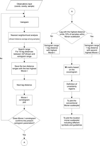
To sum, the SAKWeb© algorithm for constructing the Moran location scatterplot is as follows (flowchart depicted in ):
-
A variogram model is set up, based on the available data. If continuous spatial data is presented then the coordinates and their values will be used. Otherwise, all available polygons (countries, wards, regions, and states) should be represented by a single point whose coordinates must be inside that polygon. Quite often, the geographic mean/median coordinates may be used, although with U-shaped polygons, for instance, these procedures will lead to a centroid outside the region considered, a no-sense situation.
-
The global Moran's I is computed for 10 lag distances. Their search range is between 3/2 of the average distance among samples (a nearest neighborhood analysis parameter) and the previous variogram range. It should be kept in mind that all these initial default parameters can be changed by the user. The purpose is always to identify the best positive autocorrelation scale.
-
If the highest Moran's I encountered corresponds to a very small distance that does not process more than 90% of all samples (initial default value) within the Moran scatterplot, then the second highest Moran's I is computed (and so on). The corresponding cutoff distance is, therefore, defined as the neighborhood boundary of each observation.
-
In accordance with Tobler's Law (Tobler Citation1970), the W matrix is based on the best covariogram contiguity in Step 1, while the neighborhood variogram range is defined by the distance indicated in Step 2. It is important to stress that the goal of this W misspecification is not to create a better approach than conventional (e.g. binary or AMOEBA) approaches. The aim is to mix two spatial autocorrelation types, areal and point data, by using the same algorithm.
-
Four uncertainty limits (h1, h2, v1, and v2) should be defined. In accordance with SAKWeb©, they are computed in the manner explained in Section 3.1.
-
Optionally, a traditional Moran scatterplot may be plotted.
-
The Moran location scatterplot is drafted but, in this case, on the basis of the Cartesian coordinates of the available data and a pre-defined symbol code:
-
A red star symbolizes a medium pattern (the neighborhood and the sample itself are similar to the overall mean).
-
The first scatterplot in the top right hand corner corresponds to quadrant I, where the dark blue plots represent positive patterns while the green squares are uncertainty regions due to the cutoff mean (the higher these points are on the vertical axis and the closer they are to it, the greater the slope trend becomes within the shift pattern). The red diamonds indicate uncertainty samples due to W matrix misspecification (points located on the horizontal axis, closer to the h1 boundary of ).
-
With quadrant II, the dark blue circles represent negative outliers and the green squares suggest false negative outliers (as in the corresponding situation in quadrant I, these points represent shift patterns). The red diamonds identify uncertainty points as a result of W matrix uncertainty.
-
With quadrant III, the dark blue circles represent a negative pattern and the green squares are uncertainty regions (the lower these points are on the vertical axis and the closer they are to the neighborhood mean, the larger the slope within the transition pattern). The red diamonds show points of ambiguity.
-
With quadrant IV, the dark blue symbols are true negative outliers and the green squares suggest false positive outliers. A red diamond reveals a transition sample.
-
Figure 4. Flowchart for the SAKWeb© Moran location scatterplot.
3.3. Moran variance scatterplot
A common way to test stationarity is the variogram cloud. In fact, pairs of points with large variance at small distances reflect mean and variance discontinuity. The mean–variance computation in a moving window context can also help to find spatial heterogeneity. This paper introduces the Moran variance scatterplot, a new ESDA tool, based on the common orthogonal x−y−z chart. The basic idea is to test the second moment of the Moran scatterplot, that is, the simple variance (the difference in the weighted square distance). Here, the x-axis equals the variable itself while the y-axis (Equation (Equation6), left) reflects the neighborhood homogeneity/heterogeneity between the sample and its neighbors (similar to the traditional variance). The z-axis represents the neighborhood homogeneity/heterogeneity among neighbors (Equation (Equation6), right).
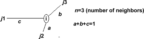
Let us consider one general central point with three neighbors whose W weights are a, b and c (). The sum of the three equals one. If binary contiguity is assumed for the W misspecification, those three weights are equal. If a distance decay contiguity is assessed, then all weights are dissimilar (a>b>c). As expected, the final result for the Y_axis and Z_axis becomes different: the closer the neighbors to the central point, the greater the weighted square difference becomes within both mathematical expressions. According to the layout of , the computation of both axes for point i, using Equation (Equation6), becomes as follows: Y_axis i =(c×(i−j 1)2+a×(i−j 2)2+b×(i−j 3)2)/3; Z_axis i =(a×(j 1−j 2)2+b×(j 1−j 3)2+c×(j 2−j 1)2+b×(j 2−j 3)2+c×(j 3−j 1)2+a×(j 3−j 2)2)/6.
Figure 5. Theoretical four-sample layout for analysis of the weight impact on the Moran variance scatterplot.
If assessment of the Y_axis is a relatively peaceful matter, the Z_axis formula raises one issue: each square difference is summed twice with different weights. For instance (j 2−j 1)2 and (j 1−j 2)2 are weighted by factors a and c. Using these three neighbors for the same general point i, the impact analysis of the binary and distance decay W misspecification within the Z_axis is that shown in Equation (Equation7). According to this, three major conclusions can be drawn: (A) distance decay and binary contiguities lead to different results; (B) each square difference is equally weighted with the binary contiguity approach; and (C) no contiguity pattern can be found regarding the magnitude of Z_axis values.
In order to highlight these patterns, a cutoff value should be set up by the user: the smaller the threshold, the greater the number of outliers, high variability regions, and medium central-neighbors. It is plausible to suggest that the number of observations classified as a stable region will be less. In addition, if these highlighted outliers do not completely match those stressed by the Moran location scatterplot then the cutoff value must be shifted to a lower or higher point.
Returning to , an analysis of its corresponding numbers, as shown in , yields the following observations: Case I represents a highly unpredictable region; Case II indicates some stability over the area (the smaller the y-axis, the more constant the region); Case III characterizes a medium–high change zone, with stationarity possibly at risk; Case IV corresponds to a negative outlier situation in a stable region where all neighbors are equal and, among the five cases, represents the geostatisticians' preferred situation for interpolation, for instance; and Case V is slightly more erratic than the previous situation. This information is shown as a graphic in by means of the Moran variance scatterplot. It is worth noting that, to avoid a 3D view, the 2D graphic has been displayed, removing the original x-axis. Thus, the renewed x-axis represents the mean variance between the central site and its neighbors, while the y-axis corresponds to the mean variance among all neighbors. In addition, this Moran variance scatterplot can contain the sample number (thereby helping to locate it on the map) or the original value, giving its magnitude with regard to the total mean.
Figure 6. 2D-view of the Moran variance scatterplot corresponding to the five cases presented in .
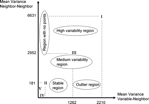
Table 1. The Moran variance scatterplot for the five theoretical situations of .
4. Case studies
4.1. GS+ distribution dataset for lead (Pb)-contaminated soil
To illustrate continuous spatial data, the Pb contamination (µg/g) default dataset (128 samples) of the GS+® commercial geo-software from Gamma Design® was used. The mean, standard deviation, skewness, and kurtosis are 0.382, 0.206, 1.1, and 2.74, respectively, denoting that the contaminant content of this soil follows a positive, slightly non-normal, and asymmetric distribution. The best variogram fitted model for the available dataset was spherical (R 2=94.5%), represented by the following mathematical expression:
4.2. Housing costs dataset for San Diego, USA
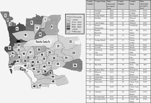
The city of San Diego, CA, is not a homogeneous region where reasonably small sections of the metropolitan area follow a distinct spatial autocorrelation trend (). Because Rancho Santa Fe is the richest suburban area, with house prices nearly three times higher than those of the next highest district, La Jolla, its value was removed because of the lack of robustness in the spatial autocorrelation statistics (Getis and Ord Citation1992). This situation might be regarded as a restrictive sampling issue. It should also be noted that this lattice data were transformed to point data by using the centroids of each ward. The total housing costs mean equals 192,810 dollars per square foot while variance, skewness, and kurtosis are 5523, 0.83, and 0.20, respectively. The best variogram fitted model was an exponential one (R 2=80.8%), represented by the following expression:
Figure 7. The layout map for the San Diego housing costs dataset.
4.3. Soil organic matter dataset for Nebraska, USA
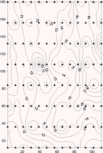
The soil organic matter dataset for North Platte, Nebraska (Clark and Harper Citation2000) was used to show that the Moran variance scatterplot can be applied to residuals in a detrend operation exposing errors (homoskedasticity in space), one of the main classical statistical assumptions.
The mean, variance, skewness, and kurtosis of the original dataset were 13.5, 6.17, 0.35, and 0.13, respectively. shows the contour map from sampling points interpolated by means of Mulquadric Radial Basis Functions (Aguilar et al. Citation2005).
Figure 8. Contour map for the Nebraska soil organic matter dataset. Black triangles represent sampling points.
5. Results and discussion
5.1. Using a Moran location scatterplot to identify true and false outliers
On the basis of the soil-Pb continuous dataset described in Section 4.1, the iterative algorithm detailed in Section 3.2 yielded a top Moran's I of +0.3812 for a seven-unit range. However, smaller values were found for shorter distances, e.g. +0.14 (for a three-unit lag distance), +0.16 (four-unit), +0.28 (five-unit), and +0.34 (six-unit). gives the layout of the Moran location scatterplot produced by SAKWeb© for a 15-unit range (Moran's I=+0.37) and, since this last range does not exclude any observations (nine were omitted for the seven-unit range), the new variogram range for the W matrix construction was thus set up. Accordingly, all samples farther away than this will be assigned a zero weight.
Figure 9. The Pb dataset mapping by the Moran location scatterplot. Filled squares represent location and type of spatial autocorrelation classification (depending on the corresponding quadrant) for each sample.
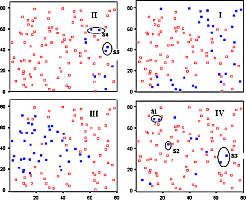
From , it is clear that two dissimilar patterns emerge from quadrants I and III, while quadrants II and IV present a random design. Some of these samples are true outliers in need of inspection, while others are false outliers because they belong to changeover regions. It is worth remembering that a negative Moran's I highlights repulsive spatial relationships (quadrants II and IV), while positive ones fall into quadrants I and III (high–high and low–low patterns). Since major interpolation processes are particularly sensitive to true outliers (Aguilar et al. Citation2005), it is important to locate them (removal is a questionable option) as well as possible. In this sense, the following findings can be highlighted:
-
Positive group S1 (records 92 and 93) shows 0.49 and 0.4 µg/g contamination values, while its four direct neighbors' average is (0.26+0.30+0.15+0.19)/4=0.225 µg/g.
-
Positive group S2 (record 56) indicates a soil Pb-content of 0.41 µg/g, while its four natural neighbors' average is (0.23+0.25+0.14+0.15)/4=0.1925 µg/g.
-
Negative group S4 (records 67 and 82) registers 0.17 and 0.32 µg/g, while its four inherent neighbors' average is (1.14+0.72+0.71+0.94)/4=0.877 µg/g.
From a visual point of view, it is clear that those samples are situated among lower (groups S1 and S2) and higher (group S4) spatial clusters. It is worth noting that the algorithm implemented is able to detect false outliers located in transitional regions by computing the neighborhood average according to the different directions. This is what occurs with the S3 (positive–negative) and S5 (negative–positive) sample groups:
-
Group S3: its records (40 and 48) show a 0.42 and 0.44 µg/g contamination level, respectively. Its five close neighbors present two different averages according to their location: (0.29+0.13)/2=0.21 µg/g, in the north, and (0.61+0.52+0.54)/3=0.556 µg/g, in the south.
-
Group S5: its records (54 and 59) exhibit 0.30 and 0.29 µg/g, respectively. Its seven closest neighbors have three different averages: (0.94+0.52+0.49)/3=0.65 µg/g, in the north; (0.54+0.42)/2=0.48 g/g, in the south; and (0.13+0.39)/2=0.26 µg/g, in the east.
As we mentioned before, another problem regarding the conventional Moran scatterplot is the uncertainty issue. This uncertainty, motivated by mean estimation (fuzzy regions around the mean), was presented and discussed in Section 3.1 (see ). But what happens with the sample variation that falls within each quadrant as the variogram range diverges? It can clearly be deemed a source of uncertainty in Moran's I computation. Regarding the Pb dataset, for instance, the number of samples for quadrants I and III increased from 66 to 78, with a range of 15 instead of 40. Hence, we reduce the uncertainty in detecting outliers by choosing the neighborhood radius with the highest Moran's I and so decrease the fuzzy region resulting from ambiguity in the construction of the W matrix.
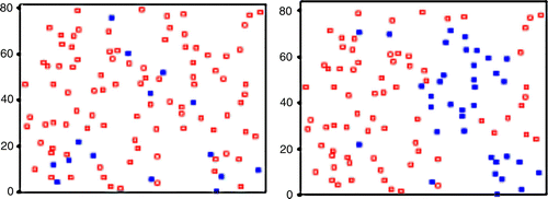
The next step is to locate the samples in space. Following computation of the fuzzy boundaries, as described in Section 3.1 (uncertainty around the mean value), depicts the effect of selecting non-optimal ranges for W matrix definition. As expected, fewer samples located in the shift region were found for the optimal range (, left) than for a non-optimal one (, right). Therefore, the samples that are subtracted from those in the fuzzy region will reveal outliers, trends, and patterns with a certain level of reliability. Samples that are classified in a particular quadrant but border another quadrant are also given prominence. It should be noted, as well, that the number of shift observations increases with a lower Moran's I. Hence, the total number of true outliers decreases as the shrinking of spatial patterns becomes real. Since our algorithm computes the Moran's I with the highest value, this combination of the variogram-Moran's I–Moran scatterplot can reach a deeper level of knowledge concerning the detection of local spatial pockets, trends, true outliers, and transition samples by selecting the best spatial W matrix definition. It would be advisable to underline that a zero Moran's I produces a random and dispersed outcome throughout the quadrants, the least favorable circumstance for anyone whose aim is spatial interpolation. So, the highest and lowest Moran's I will lay out the extreme positions that locations may hold on the Moran scatterplot.
Figure 10. Effect of range misspecification in Moran's I calculation. Filled squares represent samples that lie within the uncertainty regions for the optimal range (I=+0.37, left) and a non-optimal range (I=+0.08, right).
5.2. Case study review: application of Moran location scatterplot and Moran variance scatterplot to the San Diego dataset
On the basis of the W matrix, whose weights are computed by the corresponding variogram model (Equation (Equation9) with a range of 5.91), the global Moran's I for a distance of 5.91 km equals +0.2631, a close value to that of the binary W matrix approach (with 1's if there is a common border between two wards, 0's otherwise). It should be noted that the districts of Jamul (34) and El Cajon East (23), in , are not considered neighbors, according to the covariogram contiguity, because their centroid distances are greater than the range. However, Coronado (43) has four natural neighbors (Hill Crest (29), Downtown (40), Ocean Beach (41), and Point Loma (42)), as against the zero weight of the binary contiguity. Nonetheless, we must bear in mind that the latter situation is not usual. Indeed, most datasets do not respect this pattern. According to our experience, covariogram contiguity usually presents a wider neighborhood radius than the binary approach, thus yielding greater Moran's I values.
The proposed Moran location scatterplot was used in an exploratory analysis of the San Diego housing costs case (see Section 4.2), producing the following findings ():
-
High-cost housing is located along the sea coast (Encinitas-1, Cardiff-2, Solana Beach-3, Del Mar-4, Lake Hodges-5, La Jolla-11, Ocean Beach-41, and Point Loma-42) or in the northern area of San Diego city (Poway-8 and Scripps Ranch-9).
-
Five changeover regions (Rancho Bernardo-7, Clairemont-13, Beaches-14, Del Cerro-19, and Chula Vista West-45) are revealed by the green squares in quadrants I and II.
-
The green squares in quadrant III (Mission Valley East-28, College-26, and Mission Valley West-17) indicate average housing with low vicinity costs (uncertainty regions due to W matrix misspecification). It should be noted that quadrant IV does not show any counties.
-
Two positive outliers were found: Hillcrest-29 and Bonita-35.
-
Three negative outliers are revealed by the layout of quadrant II: Bay Park-15; Downtown-40; and Otay Mesa-47.
-
A pattern of low-cost housing can be found in the center and south-east of San Diego city.
-
Counties 18 (Tierrasanta), 27 (Kensington), and 45 (Chula Vista West) in quadrant III and IV represent uncertainty regions due to W matrix uncertainty.
Figure 11. The Moran location scatterplot view of the four quadrants of the San Diego dataset (part II). There is a clear improvement in this spatial autocorrelation measure when compared with the traditional one (part I).
It should be noted that provides a visual presentation of these conclusions thanks to the color code applied to the true location of each sample. The software developed labeled, automatically, every sample with its corresponding role (negative or positive outlier, uncertainty region, positive or negative pattern). This final layout, together with the inclusion of Moran's I iterative optimal search and uncertainty, can be considered the main advantage of this new approach to the conventional Moran scatterplot.
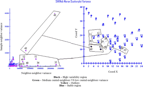
Regarding stationary assumptions, and as a complementary exploratory analysis, the final layout of the Moran variance scatterplot is shown in . La Jolla (11), University City (12), Clairemont (13), Bonita (35), Paradise Hills (36), and Downtown (40) are stressed as positive and negative district outliers/outlier districts while Point Loma (42) and Coronado (43) reflect a heteroskedasticity region. Study of the Moran variance scatterplot depicted in reveals the following findings:
-
Point Loma (42)=338 (thousand dollars per square foot) and Coronado (43)=374→Ocean Beach (41)=229, Hillcrest (29)=225, Downtown (40)=175, and Bay Park (15)=152→Two close dissimilar spatial patterns.
-
La Jolla (11)=398→Beaches (14)=249, Ocean Beach (41)=229, and University City (12)=201→True positive outlier.
-
University City (12)=201→La Jolla (11)=398, Beaches (14)=249, Clairemont (13)=192, MiraMesa (10)=162, and Kearny Mesa (16)=138→Shift region (false outlier).
-
Bonita (35)=297→Chula Vista West (45)=184, Chula Vista East (44)=165, Lemon Grave (32)=137, and Paradise Hills (36)=117→True positive outlier.
-
Paradise Hills (36)=117→Bonita (35)=297, Chula Vista West (45)=184, Chula Vista East (44)=165, Lemon Grove (32)=137, and Center San Diego (48)=126→True negative outlier.
-
Downtown (40)=175→Coronado (43)=374, Hillcrest (29)=225, Bay Park (15)=152, North Park (30)=152 and Logan Heights (38)=84→Shift region (false outlier).
Figure 12. The Moran variance scatterplot for the San Diego dataset.
The scatter map also reveals a strong-medium location bias. Compared with the Moran scatterplot, some counties hold the same classification. But La Jolla, for instance, does not follow this trend, a positive pattern according to the Moran scatterplot. Its position is located at the lower left limit of the conventional Moran scatterplot, suggesting a quasi-region of quadrant IV and, hence, revealing the main weakness of the latter methodology (a clear-cut division issue associated with the lack of common features for the four edges of each quadrant). In fact, points located at each corner of each quadrant have different features in spite of their mapping in the same quadrant. The Moran variance scatterplot does not suffer from this consideration. Nevertheless, the larger part of the San Diego region, according to the Moran variance scatterplot, reveals a moderate-strong stationarity, although the ability to distinguish positive and negative patterns is not covered by this tool, an issue only covered by the Moran location scatterplot. Consequently, the analysis provided by both ESDA tools should be deemed as complementary and not mutually exclusive.
5.3. Using a Moran variance scatterplot to locate variability among residuals in a detrend operation
With the soil organic matter dataset for North Platte, Nebraska (see Section 4.3), a linear detrend was carried out with EcoSSe® software, since the Moran's I correlogram and the variogram denoted a pure nugget-effect situation, as observed in . That is, no spatial structure was detected. Theoretically, the first-order polynomial applied to the original data should be such that its residuals present similar values, thus originating a smooth surface (errors of homoskedasticity in space). If this is not the case, a higher order polynomial should then be used.
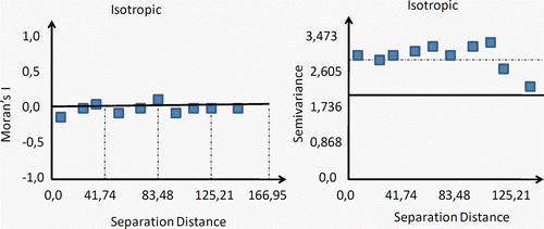
Figure 13. On the left: Moran's I correlogram where the vertical axis represents the coefficient of autocorrelation (−1 to 1), while the horizontal axis is the separation distance. On the right: variogram representation. Both graphs relate to the Nebraska soil organic matter dataset.
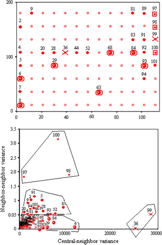
The Moran variance scatterplot was applied to locate variability among residuals in order to validate the stationary assumptions of kriging theory and ANOVA assumptions. According to , five clearly different groups emerged:
-
Both negative outliers, 99 (−6.05 ppm) and 36 (−6.3 ppm), are shown with a
 symbol. It is better to recheck these samples.
 -
Three medium–high erratic residuals are identified: 100 (−0.9 ppm), 98 (1.57 ppm), and 97 (0.67 ppm). The stationary assumption may be at risk and, therefore, the worst interpolation results are to be expected (
 ).
). -
Seven residuals (6, 8, 29, 63, 68, 84, and 93) are pointed out as a stable pattern among neighbors with some degree of changeability against the central error (
 ).
). -
Sixteen residuals (2, 4, 5, 7, 9, 20, 28, 44, 52, 81, 83, 89, 91, 92, 94, and 101) reveal a low–medium variability pattern (
 ).
). -
All other residuals have a constant variability (
 ).
).
Figure 14. The Moran variance scatterplot applied to the first polynomial residuals for the Nebraska soil organic matter dataset. Top: view corresponding to location of sampling points, including a code referring to their local variability (see text). Bottom: Moran variance scatterplot.
Confirmed by ANOVA residuals (the lower, the better), the linear trend might not be quite suitable for this dataset (a quadratic one may be more appropriate) if a detrend operation is considered. As we observed in the previous section, the ability to recognize positive and negative patterns can only be accomplished by the Moran scatterplot. Accordingly, the results offered by this ESDA tool may be considered a compulsory complement of those obtained with the Moran location scatterplot.
6. Conclusions
Although mathematics will always have its limitations when describing georeferenced data, because the Earth has singular and complex processes, new applied space formulations are becoming crucial. This happens because in Digital Earth modeling there should be room to study spatial distribution phenomena and their correlations. For example, the choice of the appropriate model is essential if reasonable results are to be obtained. A word coined by Matheron (Citation1965), kriging takes into account the trend of each vicinity point for prediction but emphasizes the apparently contradictory aspects of regionalized variables: a random local process versus a large-scale structured one. However, it also assumes that a surface holds a constant mean and variance, spatial autocorrelation exists, and samples follow a Gaussian distribution. The more severely these assumptions are violated, the less accurate interpolation and simulation results become.
Thus, traditional statistics must be reformulated to properly account for spatial autocorrelation and spatial heterogeneity within georeferenced data. In addition, users now have the ability to collect and explore large amounts of georeferenced data. The current problem is how to use them in a rational and efficient way.
As shown here, the neighborhood view of spatial autocorrelation measures can provide a valuable ESDA tool for the recognition of atypical locations, trends, transitional regions, and spatial patterns. Overcoming the division barrier between spatial autocorrelation measures regarding areal and point spatial data is an example of its effectiveness. To deal with both issues properly, two new ESDA tools have been developed and presented in the course of this paper. In short, the proposed algorithm introduces an iterative computation process for a selected vicinity range based on the highest global Moran's I, where the W matrix is defined on the basis of the covariogram contiguity. After the range is defined, the Moran location scatterplot associates all these issues, following four assertions: (1) it is possible to create a single methodology for lattice and point data; (2) the covariogram sets up the W matrix to reflect Tobler's Law; (3) the Moran's I correlogram indicates the best range for the covariogram, a boundary definition issue; (4) the conventional Moran scatterplot is replaced by an easier-to-understand layout termed a Moran location scatterplot, where patterns, true–false outliers and transitional regions are stressed. Moreover, the new procedure to compute Moran scatterplots deals with the introduction of uncertainty regions. That uncertainty is linked to two main factors: the ambiguity in the construction of the W matrix and the mean estimation's own uncertainty.
As a complementary ESDA tool for the Moran location scatterplot, our methodology proposes to compute the so-called Moran variance scatterplot. It deals with the homogeneity/heterogeneity of observations in relation to their neighborhood and, thus, underlies the second moment of the conventional Moran scatterplot. Furthermore, the Moran variance scatterplot is presented here as a valuable extension of the Moran location scatterplot in that it helps to reveal outliers and stable and changeable regions. Specifically, both axes represent the variability between the central sample and its neighbors and among neighbors, respectively (a [0 … 1] standardization of both axes is under consideration for myGeoffice©). Specifically, as Section 5.3 shows, it is beneficial to detect variability among residuals in a detrended procedure to test the fitness of the polynomials.
7. Notes on the contributors
João Negreiros received his Ph.D. degree from ISEGI-New University of Lisbon, Portugal, in 2004. For several years, he taught several computer matters at ISIG, ISEGI-UNL, Lusófona and ISLA such as Operating Systems, Hypermedia and Information Systems. Currently, he is taking a Post-Doc in Web programming for geostaticians applications at Almeria University, Spain.
Marco Painho received his Ph.D. degree from the University of Santa Barbara, USA, in 1992. At present, he is the president of ISEGI-UNL. His main lines of investigation include Geographical Information Systems (GIS), Spatial Decision Support Systems and E-learning. Author of several Portuguese and international publications, he is also a peer-review of main GIS journals and magazines all over the world.
Fernando J. Aguilar received his Ph.D. degree from Cordoba University, Spain, in 1997. He is currently a Senior Lecturer of the Almería Polytechnic High School at Almería University, Spain, working with the Department of Agricultural Engineering and being the leader of several modules like Computer Aided Design and Computer Aided Engineering. His field interest are related to digital elevation models, remote sensing, digital photogrammetry and GIS.
Manuel A. Aguilar received his Ph.D. degree from Cordoba University, Spain, in 2001. He is currently a Senior Lecturer of the Almería Polytechnic High School at Almería University, Spain, working with the Department of Agricultural Engineering. His fields of interest are close-range, satellite and classic digital photogrammetry, as well as generation and quality control of DEMs.
References
- Aguilar , F.J. and Mills , J.P. 2008 . Accuracy assessment of LiDAR-derived digital elevation models . The Photogrammetric Record , 23 ( 122 ) : 148 – 169 .
- Aguilar , F.J. 2005 . Effects of terrain morphology, sampling density, and interpolation methods on grid DEM accuracy . Photogrammetric Engineering & Remote Sensing , 71 ( 7 ) : 805 – 816 .
- Aldstadt , J. and Getis , A. 2006 . Using AMOEBA to create a spatial weights matrix and identify spatial clusters . Geographical Analysis , 38 ( 4 ) : 327 – 343 .
- Anselin , L. 1992 . SpaceStat tutorial – a workbook for using SpaceStat in the analysis of spatial data , Urbana-Champaign, IL : University of Illinois .
- Anselin , L. 1995 . Local indicators of spatial association – LISA . Geographical Analysis , 27 : 93 – 115 .
- Anselin , L. 2004 . “ Econometrics for spatial models: recent advances ” . In Advances in spatial econometrics , Edited by: Anselin , L. 1 – 25 . Berlin, , Germany : Springer-Verlag .
- Anselin , L. 2006 . GeoDa™: an introduction to spatial data analysis . Geographical Analysis , 38 : 5 – 22 .
- Cai , X. and Wang , D. 2006 . Spatial autocorrelation of topographic index in catchments . Journal of Hydrology , 328 ( 3–4 ) : 581 – 591 .
- Chainey , S. and Ratcliffe , J. 2005 . GIS and crime mapping , New York, , USA : Wiley .
- Clark , I. and Harper , W. 2000 . Practical Geostatistics 2000 , Columbus, OH : Ecosse North America .
- Clark , W. and Hosking , P. 1986 . Statistical methods for geographers , 528 New York : John Wiley .
- Cliff , A.D. and Ord , J.K. 1973 . Spatial autocorrelation , London, , UK : Pion .
- Cressie , N. 1993 . Statistics for spatial data , New York, , USA : John Wiley .
- Emerson , C.W. 2005 . A comparison of local variance, fractal dimension, and Moran's I as aids to multispectral image classification . International Journal of Remote Sensing , 26 ( 8 ) : 1575 – 1588 .
- Florax , R. and Rey , S. 1996 . “ The impacts of misspecified spatial interaction in linear regression models ” . In New directions in spatial econometrics , Edited by: Anselin , L. and Florax , R. 111 – 135 . Berlin, , Germany : Springer-Verlag .
- Fotheringham , A. and Ding , Y. 1992 . The integration of spatial analysis and GIS . Computers, Environment and Urban Systems , 16 : 3 – 19 .
- Getis , A. 2008 . A history of the concept of spatial autocorrelation: a geographer's perspective . Geographical Analysis , 40 : 297 – 309 .
- Getis , A. and Ord , J.K. 1992 . The analysis of spatial association by use of distance statistics in geographical analysis . Geographical Analysis , 24 ( 3 ) : 189 – 206 .
- Goodchild , M.F. 2008 . Statistical perspectives on geographic information science . Geographical Analysis , 40 : 310 – 325 .
- Goovaerts , P. 2002 . Geostatistical incorporation of spatial coordinates into supervised classification of hyperspectral data . Journal of Geographical Systems , 4 : 99 – 111 .
- Griffith , D. 1992 . What is spatial autocorrelation? Reflections on the past 25 years of spatial statistics . L'space Geographic , 3 : 265 – 280 .
- Griffith , D. and Layne , L. 1999 . A casebook for spatial statistical data analysis: a compilation of analyses of different thematic data sets , 506 New York : Oxford University Press .
- Griffith , D.A. and Csillag , F. 1993 . Exploring relationships between semivariogram and spatial autoregressive models . Regional Science , 72 ( 3 ) : 283 – 295 .
- Hubert , L.J. 1981 . Generalized procedures for evaluating spatial autocorrelation . Geographical Analysis , 13 : 224 – 232 .
- Lee , H. , 2005 . Spatial econometric analysis of a watershed utilizing geographic information systems: water quality effects of point and non-point pollution sources in the Neuse River Basin , NC. PhD Thesis. North Carolina State University, Raleigh, NC, USA .
- Longley , P. 2001 . Geographical information systems and science , Chichester, NY : John Wiley .
- Matheron , G. 1965 . Les variables régionalisées et leur estimation , Paris, , France : Masson .
- Negreiros , J. , 2004 : SAKWeb© – spatial autocorrelation and kriging web . PhD Thesis. ISEGI-UNL, Lisbon .
- Negreiros J.G. Spatial neighborhood matrix computation: inverse distance weighted versus binary contiguity GI-Forum 2009 conference Car A. Stroble J. Geospatial Crossroad Salzburg, , Austria 2009 154 157
- Ping , J.L. 2004 . Exploring spatial dependence of cotton yield using global and local autocorrelation statistics . Field Crops Research , 89 ( 2–3 ) : 219 – 236 .
- Ruffell , A. and McKinley , J. 2008 . Geoforensics , London, , UK : Wiley-Blackwell .
- Sánchez-Yáñez , R.E. 2003 . One-class texture classifier in the CCR features space . Pattern Recognition Letters , 24 : 1503 – 1511 .
- Shupeng , C. and van Genderen , J. 2008 . Digital Earth in support of global change research . International Journal of Digital Earth , 1 ( 1 ) : 43 – 65 .
- Skinner , K. and Child , R. 2000 . Multivariate analysis of the factors influencing changes in Colorado grasshopper abundances . Journal of Orthoptera Research , 9 : 103 – 109 .
- Tobler , W. 1970 . A computer movie simulating urban growth in the Detroit region . Economics Geography , 46 ( 2 ) : 234 – 240 .
- Uuemaa , E. 2008 . Spatial correlograms of soil cover as an indicator of landscape heterogeneity . Ecological Indicators , 9 ( 6 ) : 783 – 794 .
- Wong , D.W.S. and Lee , J. 2005 . Statistical analysis of geographic information with ArcView GIS and ArcGIS , Hoboken, NJ : John Wiley .