Abstract
The digital representation of disaster situations into maps, mainly based on remotely sensed observations, is becoming a widely used instrument for emergency management. Thousands of maps are being produced all over the world and big attention is paid by international institutions, such as the World Bank, the United Nations and the European Commission to these tools. The quality of crisis maps is a crucial element to ensure effectiveness in the disaster response chain, but it is often neglected with respect to the need for a rapid delivery. In this paper a sample of crisis maps produced between 2005 and 2010 by world leader providers has been evaluated through around 40 parameters assessed by visual analysis and extracted from the validation protocol designed at the Joint Research Centre (JRC) of the European Commission. The maps turned out to be in most cases clearly readable, but some gaps and inconsistencies have been singled out, due to the lack of international standard references. The results are analysed in detail and some remarks are presented.
1. Introduction
Crisis maps derived from satellite observations are digital representations of the earth surface for situations related to disaster events. In the last decades crisis maps have contributed significantly in disaster management, reaching different actors, from fire brigades, to national civil protections, to over-national institutions, such as the World Bank, the United Nations and the European Commission. This has been evident in particular for dramatic events like the Indonesian tsunami of December 2004 and the Haiti earthquake of January 2010. During crises the exchange of information among the different users, which are independent one from the other, is crucial to allow everyone to contribute to the emergency operations. An effective data exchange is possible only if the information is clear, complete and supplied together with metadata. When fundamental details are missing from geographic data, such as scale and information sources’ resolution, or when it is incomplete, for example when the legend is not clear enough, often it is not possible to exploit them, e.g. for integration with other layers into Geographic Information Systems (GIS).
The aim of this paper is to analyse the quality of a representative number of crisis maps, produced between 2005 and 2010 by five world leader service providers and available for Internet download, identifying and computing a measure of their shortcomings, usually consequence of the compromises due to time constraints. The paper also examines if the weaknesses are acceptable from a cartographic point of view, since it can happen for example that the level of detail of the information sources is not compatible with the map scale.
In general the quality of data is defined as ‘fitness for use’ and some parameters commonly used to measure it are positional and thematic accuracy, consistency and completeness [see US National Committee Digital Cartographic Data Standards Task Force, (DCDSTF Citation1988)]. According to Borrough and McDonnell (Citation2000) the factors which affect spatial data quality are: currency, completeness, consistency, accessibility, accuracy and precision, sources of errors in data (e.g. choice of original data model or processing) and sources of errors in derived data and in the results of modelling and analysis. These quality parameters have been taken into account in the validation protocol (Broglia et al. Citation2010, Corbane et al. Citation2011a) for Crisis Maps that has been developed at JRC and applied in the framework of SAFER FP7 (Services and Applications For Emergency Response, http://safer.emergencyresponse.eu) project. The protocol is based on a set of quantitative and qualitative parameters that have been grouped into four categories: reliability of the information content, consistency of the information support, usability of the product and efficiency of the service. To be applied and to be able to assess all its parameters, the validation protocol requires available reference data (e.g. ground truth), in order to compute, for example, thematic and positional accuracy, and the knowledge of the framework in which the map has been developed, in order to know the specifications that the map had to fulfil. The protocol has been fully applied for small numbers of crisis maps for single crisis events (Corbane et al. Citation2011a, Citation2011b). The purpose of this paper is to explore the crisis map production over five years, through the analysis of a large number of maps, considering an extensive and cost-effective approach instead of an in-depth approach. With such large number of maps, distributed all over the world, it would have not been possible to assess spatial and thematic accuracy for a significant number of maps and to know the specific requirements for which they had been produced. The aim of this paper is to assess a subset of quality parameters and to explore the minimal requirements which are necessary in a map to allow its use and moreover its integration into a GIS. Some examples of these minimum requirements are the possibility to understand the geographic position of the disaster, its temporal reference and the map basic metadata, such as scale and accuracy. To verify that these elements are present on the map is fundamental in particular if one considers that during crises there is a huge exchange of data among users and that these maps are available on the Internet for free download. In this perspective a checklist including around 40 entries has been specifically designed, deriving it from the JRC validation protocol.
The novelty of this analysis is that no measure of the quality of crisis maps is available on a large sample of maps. Only the evaluation of the accuracy of single products can be found. In scientific literature the important role of crisis mapping based on satellite products is described. In Allenbach et al. (Citation2005) the huge map production realised in the framework of the International Charter ‘Space and Major Disasters’ is presented. In particular the Charter's operational procedure, the different types of maps that can be produced with respect to the available satellite platforms are treated. In addition the sensitive matter of the time constraints related to rapid mapping are discussed. The same topic is examined in Voigt et al. (Citation2007); in this paper, in addition to considerations about rapid map production and the importance of the International Charter, some examples of applications are presented. In particular some constraints in the choice of processing algorithms for rapid mapping are addressed: whenever time is an issue, an algorithm which allows the best compromise between reliability and processing time must be chosen. For some of the examples it is explained how the positional accuracy has been improved with image ortho-rectification to meet the accuracy requirements. In van den Broek et al. (Citation2009) different approaches for damage assessment for satellite based crisis maps are described.
In Schöning et al. (Citation2009) the topic moves towards the media used to improve the communication of spatial information in crisis response, thanks to the joint use of mobile digital devices and paper maps. Dymon (Citation2003) discusses the critical issue linked to emergency maps interpretation, due to the non-availability of standards for their production. In particular the paper focuses on the non-homogeneity of map symbols, proposing the development of a set of shared symbols. From a different point of view the same topic is discussed in Konečný et al. (Citation2011), where an experiment to assess the map usability with respect to different map backgrounds is described.
From this short review of scientific publications about crisis maps it is possible to see that there are papers about the map production and about their readability, but there are no overall assessments of the quality of maps. The accuracy of single maps or algorithms is discussed, but there is no overview of the quality assessment of the characteristics of a large number of maps.
It is well known that the main characteristics of topographic maps are standardised in terms of legend content and representation and in terms of accuracy with respect to the scale, at least at local level (American Society for Photogrammetry and Remote Sensing (ASPRS) Specifications Standards Committee Citation1990), and, at European level, the INSPIRE directive (http://inspire.jrc.ec.europa.eu/) has already defined the specifications for base maps. However the same specifications are not yet available for thematic maps, in particular for satellite based thematic maps. At European level, in the next future, an important contribution will be provided by the INSPIRE directive, with the Annexes II and IIIFootnote1 specifications (concerning for example land cover, land use, natural risk zones), but for the time being no explicit references are available for thematic maps legend definition. In addition to this, crisis maps are a specific subset of thematic maps which are produced with critical time constraints, to allow end-users, such as National Civil Protections, to have in the shortest lapse of time a ‘measure’ of the disaster extent or impact. Some compromises have to be made to be able to deliver data in a very short time. In general these compromises are accepted by the users (Carrion et al. Citation2011), if the lack in quality does not overcome a certain threshold, which is difficult to set and which can be dependent from the case and from the user.
2. The sample of Crisis Maps produced over 2005–2010
As a starting point for considering the crisis map production, the Indonesian Tsunami of December 2004 as been taken into account and, as an end point, the Haiti earthquake of January 2010. These events are two catastrophic crises that have caused a very big international effort to provide help to the affected population.
Five world leader service providers have been taken into account. These providers, through their websites, make their map production publicly available: those public maps, covering the time period under study, have been downloaded and considered as the population of crisis maps under evaluation for this paper. The authors decided not to analyse the differences among the service providers, but to focus on the population of maps itself.
The total amount of downloaded maps is 2009. The maps have been classified with respect to the type of crisis and the year of production (see ).
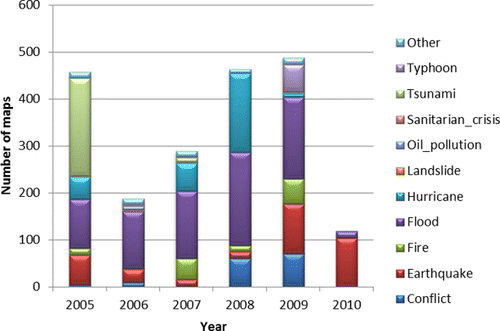
There are only four maps regarding the Indonesian Tsunami event that have been produced already in December 2004, the most part has been issued at the beginning of 2005. The 2004 maps have not been included in the graphs by year (, , and ). On it is possible to see that the Indonesian Tsunami maps represent almost half of 2005 production. It is also possible to notice that the type of event that induced the greatest map production is Flood (38% of downloaded maps), followed by Earthquake and Hurricane (16% and 14% of downloaded maps, respectively).
For the analysis presented in the following it is important to take into account that, for 2010, the Haiti Earthquake maps only have been downloaded, so the 2010 map production is not fully considered.
Out of the population of downloaded maps, a sample of 500 maps ( and ) has been randomly extracted: this has been considered a significant sample (25% of total) to perform a quality analysis of the crisis map production. The random extraction has been performed with the R software, considering a uniform distribution within the population of maps. The uniform distribution has been chosen because the interest of the analysis was to explore the population of maps, considered as a whole.
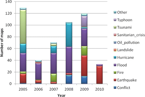
Comparing (showing the whole population of maps) with (showing only the sampled maps) it is possible to notice that the sample reflects the population behaviour.
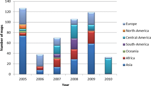
Looking at the spatial distribution () of the sampled maps it is possible to see that there is no homogeneous behaviour over time: in 2005 and 2009 there is a predominance of maps regarding Asia (58% and 50% of the maps of the year respectively), which is not shown in other years. Asia is in general represented in most of the maps: 37% of total, over the five years.
3. The quality assessment checklist
The quality of spatial data is related to their ‘fitness for use’ and can be affected by several factors, which include reliability of the information content, consistency of the information support, usability of the product and efficiency of the service, according to JRC validation protocol. The purpose of this paper is to explore the minimal set of requirements needed to allow the map interpretation and its integration into a GIS. The work consists in a visual evaluation of the main characteristics of the maps, the thematic and positional accuracies have not been computed, for the lack of reference data and for the impossibility to know the context and the specific requirements for each map.
To reach this aim an ad hoc checklist has been designed for a rapid and cost-effective investigation of the quality of maps over time. Among all the parameters presented in the JRC validation protocol, only the ones that can be evaluated by a visual analysis, hence assessing the maps without any ground truth, have been taken into account and eventually adapted to the purpose. In particular, the attention has been focused on map readability and usability.
In , the complete list of the fields that have been checked on each map is presented.
The map evaluation, based on the checklist, has been performed by 12 trained experts, inside the team. The maps have been explored in digital format, on desktop personal computers. To ensure homogeneity in terminology and to reduce mistakes in data entry, most of the fields have been filled using a drop-down list, through a web interface, and a guide has been provided to the evaluators and discussed with them.
4. Quality check of 500 crisis maps and results
The 500 maps sample has been distributed to the 12 evaluators, who have filled the 43 entries checklist (see ). The evaluators have different backgrounds (five have experience in GIS, five in Remote Sensing, one in Urban Geography and one in Human Perception), all working in a team dealing with crisis events and damage assessment. To ensure a consistent evaluation, the checklist parameters have been preliminarily presented and discussed with the evaluators to agree on a common approach. Moreover the whole assessment has been revised by two evaluators (one being author of this article) to avoid mistakes and possible inconsistencies; nevertheless from it is possible to acknowledge that the majority of parameters is not liable to the subjective judgment of the evaluator. Preliminary results had already been presented in (Carrion et al. Citation2010). In the next paragraphs the results of the assessment are presented, to explore the main map characteristics.
Table 1. List of 43 parameters considered for the map quality check. The parameters in bold have been considered for the global evaluation of the map quality (see Section 4.6.).
4.1. Analysis of the completeness of information describing the event
One of the most important aspects of map readability is the possibility to clearly understand the main information regarding the event. An effective and very short summary of the event information should be shown in the title and eventually in the subtitle: the geographical area of interest, the date of event or of the image used as information source, and the type of thematic content. In this study the information of the title has been considered complete when all three above mentioned parameters are present. The title is complemented by the interpretation text, which contains further details about the event and about the map production. The contingency table representing the completeness of title and the presence of the interpretation text is shown in .
Table 2. Contingency table representing the completeness of title and the presence of the interpretation text on the map.
For only 31% of the maps, the information in the title is complete and the interpretation text is present. The percentage of maps goes to 53% when the interpretation text is present and the information in the title is at least partially complete. It is surprising that in general 43% of maps miss the interpretation text. This could be explained by the fact that some service providers consider the map itself as self-explanatory. According to the opinion of end-users from humanitarian field (World Food Program, oral communication) often during emergencies the time pressure does not allow reading carefully the text displayed on a map, hence it is very important that the map is self-explanatory, even if the added value of the interpretation text is undisputed. For best practice both aspects should be taken into account: the biggest effort should be put in place to allow the reader to understand the main map content just in a glance, e.g. working on the representation of map layers and legend, and the possibility to deepen the understanding should be given providing a short but exhaustive interpretation text.
4.2. Analysis of map readability: contrast and symbology
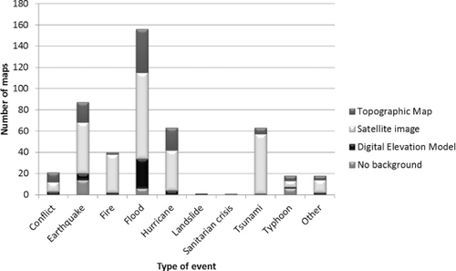
The map readability involves many aspects; it has been possible to explore only a few of them in the study presented in this paper, such as the quality of contrast and the differentiation among symbols. Usually crisis maps are characterised by a main thematic layer representing the impact area (e.g. flooded area or burnt area), together with some reference layers, such as roads and cities, and, on the background, in most of the cases, there is a topographic map or a satellite image, while in a few specific cases a digital elevation model.
More than half of the sample of maps (53%) presents a good readability in terms of quality of contrast between background and thematic entity and ease in differentiating symbols and 89% of maps presents fair or good values (see ). In general it seems that the map readability is quite high.
Table 3. Contingency table representing the quality of contrast between background and thematic entities with respect to the ease in differentiating the symbols.
Often crisis maps display a satellite image as a background. This can be convenient because most of the maps are produced from satellite images and often no other layers, such as topographic maps, are available, in particular in developing Countries. Nevertheless, when possible, the use of a topographic map is preferable, because it has an interpreted content, where only the pertinent elements to each representation scale are shown.
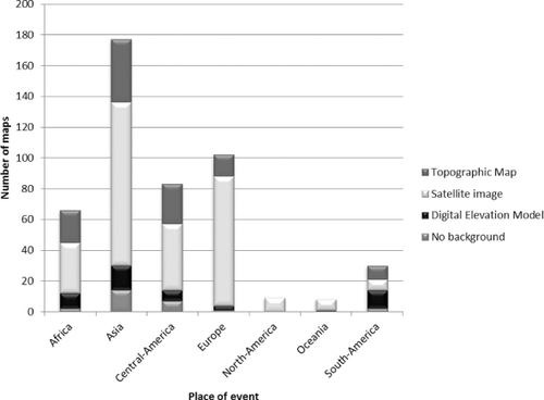
In view of the importance of the type of background for map readability this aspect has been checked. In general, only 23% of the 500 checked maps displays a Topographic map as a background, while most of maps (61%) display a satellite image as a background. Considering the type of map background with respect to the type of event () it is possible to observe that for fires almost all maps (90% of maps of fires) display a satellite image as a background, the same occurs for maps of tsunamis (89%). The presence of DEMs as a background is significant only for flood events, namely they are used in 18% of the flood maps.
In the type of map background with respect to the place where the event occurred is shown. It is possible to notice that the type of layer used as background does not change significantly with respect to the place of the event. One could expect that in some Countries, for example in Europe or in North America, the availability of topographic maps is much higher and that this could facilitate their use. On the contrary, in it is possible to see that in Europe and North America the use of satellite images as background is even higher than in other continents.
4.3. Analysis of consistency of map scale and resolution of EO information source
The spatial accuracy is of great importance when evaluating a map. Every user, using a map can expect to go in the field with a GPS in hand and to find in a specific location the same coordinates that he can read on the map. For sure it is impossible to avoid a positional error: this error should be compatible with the map scale and should be acceptable for the user.
The positional error can be quantified by assessing the positional accuracy with a number of points with known coordinates. This kind of assessment is not applicable for the evaluation presented in this paper, because of the large number of maps considered and because of the lack of reference data.
However if the map accuracy is not declared (see section 4.5) its level of detail can be deduced from the value of the declared scale. Indeed, according to cartographic standards, the declared scale should correspond to a given planimetric accuracy (USGS Citation1947, American Society for Photogrammetry and Remote Sensing (ASPRS) Specifications Standards Committee Citation1990). This has been defined for topographic maps, but since there are no different definitions regarding thematic maps, these standards should be considered as a reference or guideline for any kind of map, at least respecting the order of magnitude of the accuracy required for a specific scale. If, for special reasons (e.g. explicit users' requirements, problems due to data availability or time constraints), these guidelines cannot be fulfilled, it should be clearly mentioned on the map, otherwise a misuse of the map can occur. Besides – of course – it has been checked if the declared scale and/or the scale bar are shown.
The criterion chosen to check the consistency between scale and information sources resolution is the following: the half of the image pixel size must be less or equal than the planimetric accuracy required by NMAS standards (USGS Citation1947). It is in agreement with the assumption that it is possible to orthorectify the images with an accuracy equal to half the image spatial resolution (Congalton and Green Citation2009). Anyway, assuming that this is always possible is quite optimistic. This approach has been chosen to use cartographic standards as reference but also to take into account that they have been conceived for topographic map production and not for satellite based thematic maps' production. Images with pixel size lower than 5 m have not been taken into account since their positional accuracy can vary because of many different factors (Congalton and Green Citation2009), so in this case it is not possible to apply a general rule of thumb to relate pixel size and orthorectification spatial accuracy. Other maps have been excluded, if no satellite images were used or if the image resolution information was not available. As a result, only 169 maps have been checked for the consistency between the resolution and the scale: it has been found that for 22% of maps (out of 169 maps), the declared scale was too large with respect to the resolution of the image used to produce them. This means that, for the subset of 169 maps for which this evaluation has been performed, a user going in the field can find a positioning error greater than the one expected, for one map out of five.
Moving to a fundamental level, considering the whole sample of 500 maps, 12% of the maps miss the declared scale, however the scale bar is practically always present. The declared scale is necessary to quantify the level of detail of the map, if no indication of the spatial accuracy is provided on the map.
Out of 500 maps, nine maps (2%) miss both the declared scale and the scale bar, among these, four maps have at least a complete graticule of the coordinates, but the other five miss also the graticule, therefore on those maps it is impossible to measure any spatial item.
4.4. Analysis of semantic definition of the legend
The semantic definition of thematic maps is an open issue, the only available references for land use are FAO land cover classification system [LCCS (Di Gregorio and Jansen Citation2005)] and, for Europe, Corine Land Cover (http://www.eea.europa.eu/publications/COR0-landcover) and the specifications of INSPIRE directive (http://inspire.jrc.ec.europa.eu/) which will become operational in the next future (Annex I specifications, regarding mainly base maps, have already been issued, but the ones of Annexes II and IIIFootnote 2 regarding for example land cover, land use and natural risk zones are still under test, but already publicly available for download). For the time being the choice of the names of the items for crisis maps is up to service providers' experience and it can be subjective. On maps it is possible to see different definitions of thematic layers which are not coded or standardised and which, if not properly explained, can lead to misunderstandings. For example the meaning of ‘damaged area’ or ‘flood traces’ are not obvious and they can be differently interpreted if they are not accompanied with clear definitions (e.g. impact area: the area in which the percentage of damaged buildings with respect to the total number of buildings per map unit exceeds a given threshold). The presence of a clear definition of the map legend semantic has been checked on the sample of maps. The results are shown in .
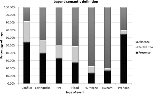
In 54% of the maps the legend semantic definition is missing, this means that the meaning of the legend items has not been considered as straightforward, while only in 30% of cases the semantic information has been considered complete. More attention should be paid on an explicit definition of the legend items, where possible referring to publicly available definitions or giving ad-hoc definitions or quantitative measures, even if approximate. A big effort should be made at international level to overcome this issue. INSPIRE directive will play a key role in defining and giving the guidelines for the implementation of general map standards at the European level.
4.5. Presence of metadata
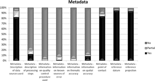
The presence of some information regarding the metadata (see ) has been checked, since the user should be aware about the quality and the characteristics of the product that he has in hand. From the cartographic point of view, the presence of the declaration of the reference datum and projection is fundamental, together with the possibility to read the coordinates on the map thanks to the proper graticule. On the 500 sampled maps it has been assessed that:
none of the maps presented all the metadata elements that have been checked and only 1% of the maps misses all the elements;
6% of the maps misses reference datum or reference projection;
almost all maps miss information about processing steps, information on quality control procedure used, information on known sources of error, thematic and spatial accuracy;
almost all maps present information about a point of contact.
4.6. Evaluation of the quality of maps and of its evolution over time
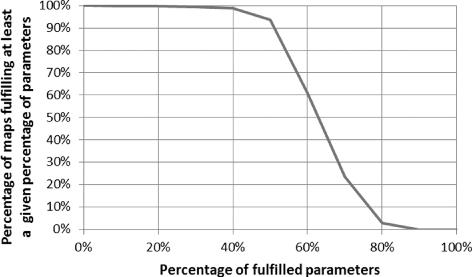
The presented results explore different map characteristics, but do not give a global idea of the quality of the maps. To provide a measure of quality, based on the performed analysis, therefore considering only visual checks, the number of parameters fulfilled by the 500 maps has been computed. For this purpose 25 parameters have been selected from the checklist (the ones in bold in ), taking into account those describing the quality of the maps, that can be considered as fulfilled or not fulfilled (e.g. ‘Completeness of title’ is ‘fulfilled’ if it has ‘Yes’ value). Then for each map the number of fulfilled parameters has been counted. shows the percentage of maps fulfilling at least a given percentage of the chosen parameters. It is possible to observe that almost all maps (94%) fulfil at least 50% of the twenty-five considered parameters, but the number of maps drops dramatically when looking for higher percentages of fulfilled parameters: 24% of maps fulfils at least 70% of parameters and only 3% fulfils at least 80%.
It has been presented in (Carrion et al. Citation2010) for a first sample of 255 maps that it was not possible to single out a significant evolution of fulfilment of the explored parameters over time. This result has been confirmed on the enlarged sample of 500 maps, in particular considering the evolution of the single parameters results on the examined maps. For this reason in the previous paragraphs the evaluation of parameters has been provided considering the whole explored period and not by year.
To give e general idea on the evolution over time of the evaluated maps, from the perspective of the parameters considered in this paper, the percentage of fulfilled parameters has been computed by year. In the percentage of maps fulfilling a given percentage (50%, 60%, 70% and 80%) of parameters by year, together with the regression line, is shown. A very slight positive trend is visible in all lines, a bit higher for 60% and 70% of parameters (it is important to note that the 2010 sample is the less numerous, see ).
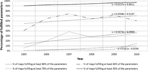
The trend does not show a significant improvement, at least regarding the parameters explored in this study. Since research is being performed and new sources of information are available, one can expect that the accuracy and the number of typologies of provided products have increased, but from this study it seems that no growing attention has been paid to the quality parameters that have been checked.
4.7. Summary of the results
The main results presented in the previous paragraphs can be summarised in the following. In general, the main map content has been considered easily readable, in terms of layers and symbology interpretation, but not all the details regarding the represented event were always clearly shown and 43% of maps missed the interpretation text. It is not common (23% of maps) that maps display a topographic map as a background, instead of, for example, a satellite image (61%), even if the topographic map is preferable as an interpreted content, specifically designed at a certain scale. For a subset of the map sample (169 maps) it has been possible to check the consistency between the map scale and the resolution of the information sources: one map out of five turned out to be produced from images with a too coarse resolution with respect to map scale.
The legend semantic definition, which is not yet adequately standardised for thematic maps and in particular for crisis maps, has not been considered clear enough for half of the 500 maps.
Metadata regarding some basic cartographic information, such as reference datum and projection and information on the used data sources are almost always present, while more detailed information on the map production (processing steps) and quality (thematic and positional accuracy, known sources of error, quality control procedure used) are almost never present.
5. Conclusions
In this paper five years' crisis map production, from 2005 to 2010, has been explored through a sample of 500 maps out of 2009 downloaded from five world leader service providers' websites. The maps have been visually checked by a trained group, considering a subset of the validation protocol for crisis maps that has been developed at the JRC.
The aim of this work was to give an overview of crisis maps production evaluating a large sample of maps with a set of visually assessed parameters. It is evident that many of the shortcomings that have been singled out can be related to the time constraints which crisis maps service providers have to face, or to specific agreements with the end-users for whom the maps were designed, but in some cases probably more attention could be paid to the map itself, as a cartographic product, to avoid for example inconsistencies between image resolution and map scale.
Metadata are crucial to allow the user understanding if the map is suitable for the purpose, where as ‘user’ not only the user for whom the map has been designed should be considered, but every user who can access the map (available for Internet download), in particular during a crisis, when a significant data exchange occur among different actors. At least a qualitative idea should be given about the map accuracy and reliability (e.g. spatial and thematic accuracy), since it can be impossible to obtain quantitative estimates of those parameters at the time of map production.
The results presented in this paper should raise the attention of the map providers to the cartographic value of crisis maps and encourage them to focus more efforts in trying to provide exhaustive information to the users to allow an efficient use and integration of the maps into their own GIS.
Nowadays data are exchanged in digital format, a big effort is being done to embed metadata into data (e.g. GML or shapefiles); the same attempt could be done for raster images representing maps, enlarging for example the information embedded in the file header: many details regarding maps can be very useful for an experienced user (e.g. processing steps), if not all the information is worth it to be put on the map, it should nevertheless be included in accessible metadata.
In view of the increasing interest that the international community involved in crisis management has in crisis maps, it is desirable that some effort should be put in the improvement in the map as a cartographic product and not only in the map content.
Acknowledgements
The authors wish to thank the ISFEREA team (GlobeSec Unit, IPSC, JRC of the European Commission) for its contribution to the map assessment, in particular, in alphabetical order: Arend De Haas, Christiane Weber, Daniela Poli, Emanuele Angiuli, Giovanna Trianni, Ivano Caravaggi, Lauren Rizzo, Patrizia Tenerelli and Roberta Castoldi.
Notes
1. INSPIRE Annex I, II and III specifications: http://inspire.jrc.ec.europa.eu/index.cfm/pageid/2/list/7, URL Accessed on March, 2012.
2. See Footnotenote 1.
References
- Allenbach, B., et al., 2005. Rapid EO disaster mapping service: added value, feedback and perspectives after 4 years of charter actions. International Geoscience and Remote Sensing Symposium (IGARSS), 6, 4373–4378.
- American Society for Photogrammetry and Remote Sensing (ASPRS) Specifications Standards Committee, 1990. ASPRS accuracy standards for large-scale maps. Photogrammetric Engineering and Remote Sensing, 56 (7), 1068–1070.
- Borrough, P.A. and McDonnell, R.A., 2000. Principles of geographical information systems. Oxford: Oxford University Press.
- Broglia, M., et al., 2010. Validation protocol for emergency response geo-information products. JRC Scientific and Technical Reports, Luxembourg, Office for Official Publications of the European Communities, EUR Number: 24496 EN, ISBN 978-92-79-16428-6, doi:10.2788/63690
- Carrion, D., et al., 2010. Preliminary results after a formal quality assessment of a sample of the last five years' Crisis Maps production. In: 2nd international workshop on validation of geo-information products for crisis management, Ispra (VA), Italy: European Commission.
- Carrion, D., et al., 2011. Crisis maps validation and user requirements: an experience in SAFER project. Gi4DM, Antalya – Turkey: ISPRS.
- Congalton, R. and Green, K., 2009. Assessing the accuracy of remotely sensed data: principles and practices. 2nd ed. Boca Raton, FL: CRC/Taylor & Francis, 183.
- Corbane, C., Carrion, D., and Broglia, M., 2011a. Development and implementation of a validation protocol for crisis maps: reliability and consistency assessment of burnt area maps. International Journal of Digital Earth, 4 (S1), 8–24.
- Corbane, C., et al., 2011b. Comparison of damage assessment maps derived from very high spatial resolution satellite and aerial imagery produced for the Haiti 2010 Earthquake. Earthquake Spectra, 27 (S1), S199–S218.
- DCDSTF, 1988. The proposed standard for digital cartographic data. The American Cartographer, 15, 9–140.
- Di Gregorio, A. and Jansen, L.J.M., 2005. Land cover classification system- classification concepts and user manual-Software version (2). Environment And Natural Resources Series, 8, Food and Agriculture Organization of the United Nations Rome, 208.
- Dymon, U.J., 2003. An analysis of emergency map symbology. International Journal of Emergency Management, 1 (3), 227–237.
- Konečný, M., et al., 2011. The usability of selected base maps for crises management – users' perspectives. Applied Geomatics, 1–10. doi:10.1007/s12518-011-0053-1
- Schöning, J., et al., 2009. Improving the communication of spatial information in crisis response by combining paper maps and mobile devices. Bonn. 5424 LNCS, 57–65.
- USGS, 1947. United States National Map Accuracy Standards, USA [online]. Available from: http://nationalmap.gov/standards/pdf/NMAS647.PDF [Accessed March 2012].
- van den Broek, B., et al., 2009. Rapid mapping and damage assessment. In: B. Jasani, M. Pesaresi, S. Schneiderbauer, and G. Zeug, eds. Remote sensing from space: supporting international peace and security. Berlin: Springer Science + Business Media B.V., 261–286.
- Voigt, S., et al., 2007. Satellite image analysis for disaster and crisis-management support. IEEE Transactions on Geoscience and Remote Sensing, 45 (6), 1520–1528.