
Abstract
This paper reports on the results from a qualitative expert survey of members of the international geospatial community to elicit their view of Henry (Harry) Beck's iconic 1931 representation of the London Underground. It begins by providing a background to the publishing era when Beck's representation was developed under the ‘umbrella’ of the design style adopted by the London Passenger Transport Board to promote the image of ‘the new’ and contemporary Britain. It then outlines Beck's representation and his quest to develop a clearer and more understandable graphic information resource. This is followed by an overview of representative views from the design community about Beck's representation. Finally, it provides the results of research undertaken with an informed international cartographic community to determine whether they viewed the product as a map or a diagram. It is important to understand how Beck's representation is viewed from the perspective of the geospatial community. If it works as a map, albeit one where geography is generally abandoned, relative positions are favoured over the absolute and azimuth is distorted, then the view that successful (geo)communication artefacts must be linked to map designs that focus on precise and true representations of geographic information can be questioned.
Introduction
In the early 1930s, London was considering the future of its mode of transportation. In 1931 inner London's population was already a hefty 4,397,003 people and Greater London had a population of 8,110,358 (Exploring 20th Century London Citationn.d.). In 1933, the London Passenger Transport Board was established under the London Passenger Transport Act 1933 (British Government Citation1933). It was responsible for the operation of railways (including the London Underground railway), tramways, buses and coaches for the ‘London Passenger Transport Area’ that radiated from Charing Cross station, with an approximate radius of 30 miles (48 km; Cooke Citation1964).
The London Passenger Transport Board promoted public transport for coherence and efficiency. It actively promoted London's public transportation so that it appealed to the general psyche of Londoners at the time, which saw them seeking the new, the avant-garde. This was reflected in the design of things like the London Underground stations, buses and train rolling stock, the graphics that promoted the transportation system and the fact that it was part of contemporary London of the time (Garland Citation1994).
In considering Beck's representation, it is important to place his graphics within the family of artwork and communications artefacts by the London Passenger Transport Board, under the leadership of Frank Pick (1878–1941), publicity officer for the organisation. Pick actively solicited artwork that would promote the ideas of modernism and many pieces of artwork were offered to Pick for possible publication to promote this image. This was the genre of artwork from the London Transport Board that Londoners had become used to. It confirmed their belief that they were in a city that was part of the electric age. And, the London Passenger Transport Board's publicity campaign reflected the British modern consciousness of the time. It showed the outward trappings that reconfigured the spirit of place, of London, around the emerging concept of the information economy (Elsaessen Citation2000). This concept of ‘the city as a machine’ and the ‘machine aesthetic’ was already established in the formal languages of the avant-garde (Elsaessen Citation2000). Beck's representation of the Underground fitted this to a tee.
Distorted representations and GeoVisual Analytics
Usually, the representational output from GeoVisual Analytics processing is a formal map or 3D/4D diagram, linked faithfully to the real geography. This accords well to the formal processing and the associated representational artefacts that are generated to visualise the outcomes of computer processing data. However, it is argued, ‘just’ producing a representation that accords to the real geography of the area or region being investigated does not guarantee a product that best conveys geographic information. Sometimes, even if accuracy in certain elements of geography is sacrificed to offer greater communication effectiveness, an alternative representational methodology might prove to be more useful than a ‘standard’, mainstream artefact.
Perhaps the best example here, where geography is distorted, but a better representation of the information being depicted occurs, is the cartogram. By distorting the map, and with due consideration that the depiction of geography is compromised, a more useful representation is delivered.
This contribution is offered to the GeoVisual Analytics community to provoke thought about what constitutes the ‘best’ representational format. Do representations of geography always have to be as accurate as possible in all dimensions to be useful, and usable? Cartograms have generally been accepted as distorted representations of geography – that work. Other graphic communication methods that distort geography do exist, like metromaps, and in particular metromaps in the Beck genre also deserve a closer look to ascertain their usefulness.
In undertaking this qualitative research, much literature was obtained from non-scientific journals and publications. As the author sought background information from outside the ‘mainstream’ geospatial community, access to these alternative documentation resources provided much rich information about how Beck's representation is viewed more widely than just the geospatial community. As well, it provided an insight about how his design has influenced other important designers in the development of their own metromaps. By not restricting the literature used to just that from the scientific geospatial community, it was envisaged that a more useful paper would be provided.
Beck's representation of the London Underground
Henry C. (Harry) Beck (1903–1974) was employed as an engineering draughtsman at the London Underground Signals Office. In 1931, he proposed to his employer a completely new representation of the London Underground, which ignored the geography above ground and concentrated on ‘mapping’ the lines, stations and interchanges below ground. His design was completed whilst he was laid off during a period of austerity (Garland Citation1994).
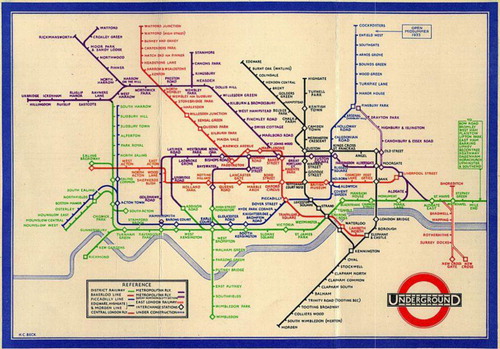
When the London Passenger Transport Board introduced the first printed version of Beck's representation in 1933 – a trial pocket version () – it was an outstanding success, with 850,000 copies of the map in circulation within two months after its introduction (Garland Citation1994). This success is seen by Elliman (Citation2006, 172) to be due to the fact that: ‘Beck's London Underground map offered an image of organisational clarity, brilliantly presenting the increasingly chaotic city as an object of coherence’. Beck's representation of the London Underground changed forever how representations of urban underground railway systems were presented.
Source: http://britton.disted.camosun.bc.ca/beck_map.jpg
Image in the public domain (a UK artistic work other than a photograph, which was made available to the public more than 70 years ago).
It was all about lines and connections. And, it was these connections and the simple information graphics that made the artefact ‘work’ irrespective of whether the user is a seasoned London commuter or a tourist arriving at the British capital for the first time.
Previous maps of the Underground were tied to the geography of London above ground. They slavishly sought to ensure that everything was ‘geographically correct’. This impacted on the communication effectiveness of the product.
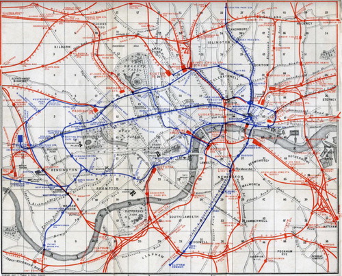
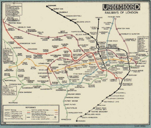
Pre-Beck depictions of the central London elements of the Underground resulted in extremely crowded graphics, whereas the lines at the outer extents of the Underground system appeared as sparse, relatively empty spaces. These maps acknowledged the geographical reality above ground, but, in so doing, compromised the graphic effectiveness of the representation as a usable tool for planning and navigation. This can be seen in an early map of the system by Karl Baedeker from 1907 () and the 1926 version of the London Underground Map by F.H. Stingemore (). Beck's representation replaced the Stingemore map of 1927.
Source: http://upload.wikimedia.org/wikipedia/commons/3/32/Baedeker_London_1907.jpg.
Image in the public domain (copyright has expired).
Source: http://homepage.ntlworld.com/clive.billson/tubemaps/1926.html.
Image in the public domain (a UK artistic work other than a photograph, which was made available to the public more than 70 years ago).
It must be noted that there were many previous attempts to represent the individual lines of the London Underground schematically. However, Beck's representation was the first attempt to depict the entire London Underground system with a design that was more schematic than geographic.
Beck's representation moved away from the concept that transportation maps had to position the underground geography according to the above-ground geography or to follow the actual geographical route of the lines. By representing the system with a regular pattern of generally horizontal, vertical or diagonal lines, his new artefact depicted more clearly the relative locations of the different lines and the sequence of stations. Beck's fictional underground geography did bear a close resemblance to the real geography above ground, but Beck sought freedom from the strict geographically imposed demands accepted by previous London Underground map designs. Beck focused on the lines, stations and interchanges.
By distorting geography, Beck made the artefact more usable and an effective communicator about how to move about in London. According to Hadlaw (Citation2003), what Beck did was to set aside geographic space in favour of graphic space.
His design had certain rules imposed:
Only horizontal, vertical or 45° lines
Centre of map enlarged – at the expense of the outlying suburbs
Distinctive interchange symbol
Stations denoted by ‘tickmarks’
Distinctive colours for lines
Street detail not shown (Roberts Citation2005)
Dense stations in central areas
Circle line (not circular)
The need for diagonals
No clear interchange convention
The need to incorporate additional lines (Roberts Citation2005)
Most other major cities with metros use a modified version of Beck's ideas. Some work very well and have spawned good maps in their own right. For example, George Salomon's New York City Transit Authority (NYCTA) map, 1958, has underlying links to Beck's design. (See map at: http://www.aiga.org/the-mostly-true-story-of-helvetica-and-the-new-york-city-subway/.)
Map or diagram
The definition of ‘map’ has been developed by many individuals and organisations (for an extensive approach to definitions of the word ‘map’, 1649–1996, see Andrews Citation1996). For this paper, two definitions are put forward – from the International Cartographic Association (ICA) and by authors David Woodward and G. Malcolm Lewis (Citation1998).
The ICA (Citation2003) has approached the definition of a ‘map’ over many years through its Commission on the Theory of Cartography. Its current definition of a map is:
a map is a symbolised image of geographical reality, representing selected features or characteristics, resulting from the creative effort of its author's execution of choices, and is designed for use when spatial relationships are of primary relevance.
graphic representations that facilitate a spatial understanding of things, concepts, conditions, processes, or events in the human world.
About both maps and diagrams, Meyer (Citation1997, 231) has said that:
Glances organize. Charts convey information symbolically. Maps depict-large-scale reality on comprehensively smaller scales. Illustrations render the abstract imaginable. … Diagrams, a hybrid of all four, employ elements of each. Whether symbolic or realistic, they depict reality in organised ways on manageable scales that seek to make complicated spatial or systematic concepts as understandable as possible.
So, what is it? Map or diagram, or something else altogether?
Soliciting views on Beck's representation from the international ‘mapping’ community
When Ken Garland, author of the book Mr Beck's Underground Map (Citation1994), was interviewed by Time Out London (Carrier Citation2007), he noted that, in his discussions with Beck, Beck always insisted that his work be called a diagram. However, the research undertaken that is reported here had as its focus to determine the contemporary view of Harry Beck's work by the international mapping community.
To determine how Beck's representation is viewed – as a map or diagram – a survey was conducted. A total of 83 individuals who are prominent in their fields, internationally, were canvassed. They were asked to answer just two questions:
‘Is Beck's representation of the London Underground rail system a map or diagram?’ and why? (in just one sentence).
Requests for information totals and their countries are provided in and 66 responses were received.
Table 1. Countries and requests.
Of these responses to the first question, the perception of what Beck's artefact was differed. The interpretations saw the artefact as map, diagram, map and diagram, cartogram, drawing, schema, schematic map, schematic diagram, network map, map (topological) and diagrammatic map.
A breakdown of the ‘popularity’ of the polling is provided in .
Table 2. Popularity poll.
It should be noted that the survey included responses from members of the international ‘drawing’ community, who work with maps or draw representations of geography from a non-cartographic viewpoint. Whilst only a small number of responses were received, the respondents generally did not see Beck’s artefact just as a drawing. The majority saw it as a map (4 of 7), then map and drawing (2 of 7) and then drawing (1 of 7).
The ‘map’ received the greatest number of ‘votes’. However, the reason why it is considered to be a map varies. Therefore, it is important to include a summary of the written appended comments received. Also, whilst just one sentence justifying the answer to the first question was requested, many respondents wrote much more than this. However, only their first sentence is included here, for space disallows including all of the complete responses. Also, it includes comments from respondents who saw Beck's artefact as some type of map.
The following sections provide comments from the survey. Whilst the ‘map’ case was supported with the most ‘votes’, all of the useful comments from each of the respondents are provided here for completeness and usefulness. The number of points listed for each category should not be read as an indicator of the ranking of that particular element.
Those who saw Beck's representation as a ‘map’ supported their view with these comments:
the stations or underground network nodes depicted are represented in a spatial framework;
it has geography in it even though not to scale and distort;
maps are systems to structure and order information by their spatial component, which is true in this case as well;
this representation (map) depicts spatial information that supports knowledge retrieval for gaining insight that can trigger directed action;
it is a topological map and not a diagram as it allows for the visualisation of space, something a diagram does not necessarily do;
it represents some characteristic of space using a system of encoded marks;
its purpose is to communicate connectivity and aid in navigation;
two main requirements of a map are fulfilled: topology and spatial relation;
although topologically distorted it locates stations via their (relative) geospatial data;
any diagram depicting spatial information is a map;
it contains (geo)spatial info, although distorted;
spatial relations make it a map;
it is a reduced and simplified representation and abstraction of geographic reality, projected onto a plane (display screen or paper);
it depicts relationships among locations at geographical scale;
it represents a spatial distribution, it is linked to real geographical space by means of the underground stops, since their relative positions are maintained, and finally, abstraction and simplification are inherent concepts to any map;
it refers to two dimensions of geographical space, if only in a rather schematic way;
it contains geographic information like base map elements (river), changing points and line orientation according to cardinal directions;
it is designed to allow people to get from one known point to another known point using routes that are topologically correct;
it is still anchored to the underlying geography, particularly in the representation of the Thames;
it is a map because it functions as such;
while its representation is highly generalised and its symbology very abstract – characteristics akin to many diagrams – its primary function is nevertheless associated with personal navigation through a spatially complex system lying beyond our immediate comprehension; and
it portrays the geographic reality of the connections of the London Underground transit system.
those kinds of network plans are ‘topograms’ (composed from the words topologie and diagram);
I will go for a performative definition – it is a map if it is used as one;
the deployment of the image is what matters, as a relational and spatial tool, not any necessary representational qualities;
the only thing different about [it] is that it has an extreme amount of generalisation … but it still serves a spatial function so it is still a map;
if a diagram helps understanding spatial distribution by providing topologically correct information, I would call it a map;
it clearly encompasses the key elements of a successful map – it uses clear symbology and text to show linkages (topology), exchanges and differences between lines, enabling users to navigate very effectively through the system;
it may be a diagram by definition, but is used as a map, so it is a map.
because it is about the distribution of geographic network and its relative geographic correctness;
it is in the group of objects we generally accept as being maps; it conforms with the idea that it is a graphic representation where spatial relationship is being represented;
it is a (although geographically distorted) topologically correct representation of space;
[it] is a particular kind of map for two reasons: first, because that is how people refer to it when they use it and second, that is what people use it for: to orient themselves in this mapping between two largely exclusive spatial experiences: the street and the Tube;
a map because it has some quality of reliable correlation with real space and geography;
because of its emphasis on communicating spatial relationships between different parts of a bigger system, whereas diagrams are not always so specifically concerned with space; and
[it] inadvertently also maps urban consciousness, in that it metaphorically preferences movement and connection points reflecting urban mind spaces that began to emerge with trains, planes and now technology.
it bears no real relationship to either location or direction other than in a most general sense nor does it have a meaningful scale;
[it] was thus called to preserve the historic use of ‘map’ in the title as in earlier editions by other authors who most usually also included geographical features, which Beck's did not, with the exception of a stylized River Thames;
[it] was a clear and stylized representation of the London Underground network, and he used a map as starting point for this ‘stylization’ to keep a spatially correct (but not cartographically exact) location of stops within the city;
it does not show geography (except a very generalised outline of the river);
it is a two-dimensional geometric symbolic visual representation of information;
the actual geography is not important; and
[it] explains the relationship between the parts of the whole without reference to accurate measurement – it is a diagrammatic not cartographic drawing.
the differentiation about geography and geometry (map and diagram) that I like is the one by Franco Moretti [Citation2005; winner of the 2013 National Book Critics Circle Award for criticism (Rothman Citation2014); who actually borrowed it from another Italian academic]: the map is about the geographic location while the diagram is about the connection between entities. … if I had to place Beck's map on a continuum map/diagram, it would probably be somewhere in the centre, but closer to the diagram, since we travel often through more than two stations, we consider most of the stations as being part of a diagram instead of being part of a map.
it is both, because a map is a special kind of a diagram.
it is both a map and a diagram. Any diagram that shows topology can be called a map (so every map is a diagram, but not every diagram is a map);
a map because it represents the spatial relationship between places and a diagram because it does so in following linear, abstract conventions of explanation; and
it is both, depending on the intention of the reading or use. It is a diagram of a network system – a railway – and articulates the paths of the various lines within the network. It is a ‘loose’ map of places for although not geographically correct, it situates different places in relation to each other via the life line of London – the Tube.
Summary
If we look at the ‘language’ of Beck's representation, we can see that it:
Shapes the mental image of the city. Barber and Board (Citation1993) said that other maps of the London Underground ‘look unfamiliar and therefore suspect, even wrong’. (see Vertesi Citation2008 for a report on users representations of urban space using Beck's artefact);
Gives prominence to lines and connections;
Focuses information depicted on the geography below ground; and
Provides the tool to ‘see’ a route, stations and interchanges.
No graphic designer would work in this rigid rule driven way with type, so why the bias for maps? How can designers who automatically reach for tradition know whether they really have shown a network in the best possible way? (Roberts Citation2010).
Summarising the comments of the ‘map’ respondents, they see it as a map, as determined by:
Spatial relations making it a map;
It has geography;
The system is represented in a spatial framework;
It structures and orders information by their spatial component;
It shows a topologically correct representation of space; and
It locates stations via their (relative) geospatial data;
It is a map because it functions as such and
It's a map if it is used as one.
It is a map, a schematic map to be precise. It is a map since it has geography in it even though not to scale and distorted.
I view it clearly as a map because it represents some characteristic of space using a system of encoded marks. It underpins one of the very basic functions of a map (to locate yourself and to journey plan/navigate) so it not only has the structure of a map; it fulfills the purpose of a map.
I'll go for a performative definition. It's a map if it's used as one.
my view is that maps are a radial category with no firm boundaries and that I don't think that it is up to cartographers to set any bounds – maps are what people believe them to be.
Why has Beck's representation of the London Underground system been used as an exemplar approach?
When considering how underground rail transportations in cities have been represented there are two recognised examples where the geography above ground has been disregarded so as to provide a clearer and more understandable navigation and planning tool. The most well known is Beck's representation, the topic of this paper. Less known is the Berlin S-Bahn (Stadtschnellbahn) representation of 1931 ().
Source: http://www.schmalspurbahn.de/netze/Netz_1931_klein.gif.
Image in the public domain (copyright has expired).
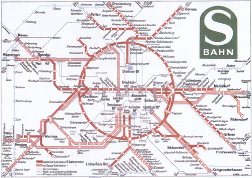
The 1931 representation uses the central ‘ring’ diagram to link the core stations. This design element was done 50 years before the Moscow underground representation, which is perhaps the representation that comes to mind when this circular core element is discussed (Ovenden Citation2007). It had a number of similarities to Beck's map: geography above ground was limited to station names; and the radiating lines were depicted using lines that were horizontal, vertical or at 45°. And, this representation replaced the earlier, less formal representation of the Berlin U-Bahn (Untergrundbahn) of 1930, in a similar way that Beck's map replaced Stingemore's map.
Did Beck see the Berlin map before his design was developed? Considering the era, it can be assumed that beck had not travelled to Germany, and therefore had most probably not seen the Berlin S-Bahn representation. Also, considering Beck's background as an Electrical Draughtsman, his original concept for representing the Underground owes much to the regular drawings he would have made in his day-to-day occupation. Reflecting on his original design, drawn in two pages of an exercise book (Garland Citation1994), it clearly shows how a draughtsman from the Signal Engineer's Office of the London railroads might develop a simple representation along these lines.
(Beck's drawing is now part of the Victoria and Albert Museum, London, collection – no. E.814-1979. It formed part of the Modernism: Designing a New World 1914–1939 exhibition, 6 April – 23 July 2006. http://www.vam.ac.uk/vastatic/microsites/1331_modernism/highlights_19.html)
Beck's London Underground diagram/map is the exemplar communication artefact that designers refer to when they acknowledge the origins of their designs. The ‘Sydney Suburban and City Underground Railway map (Commissioner for Railways, New South Wales) of 1939 used similar design principles as Beck's representation (Dobbin Citation2011), George Salomon's map of 1958 and Massimo Vignelli's later map from 1972 (Vignelli Citation2007) for the (NYCTA owe much to Beck's design. And the designers of the recent (April 2014) concept for re-drawing the metromap for the city of Melbourne, Australia, pay due respect to their use of Beck's design as a guiding influence (Milman Citation2014). All use a simplified depictions of the system, and all lines are drawn horizontal, vertical or at 45°.
It is interesting to note that Berlin's current U and S-Bahn maps, designed by Erik Spiekermann, have underlying links to Beck's design, and not to that of Berlin's S-Bahn representation. Of this, Spiekermann has said:
My Berlin transit diagram owes a lot to Beck. … It works very well for the Tube. It never pretends to work for other types of journeys. The only reason people are using it for everything else is that is appears to be so simple, hiding the whole complexity of London underneath those few lines and angles (The Independent Citation2011).
Why does it work?
About this, Avelar and Hurni (Citation2006, 227) have commented:
There are significant differences between making accurate conventional maps and making schematic transport maps. For schematic maps, it is desirable to distort elements beyond the traditional distortions required for cartographic reasons, in order to omit unnecessary details for transport users and make the maps more readable for quick way finding tasks. In a schematic transport map, map-makers can still indulge their ability to innovate, since a schematic map is partly a representation of reality and partly a product of its maker. The map designer's function is not to supply a quick fix but to be prepared for a long-term project – what appears at first to be a stylish cartographic design, in the opinion of the map-maker, may not be comprehensible enough for large numbers of transport users.
it is still important to note the Tube Map's divergence from a classic geographical projection or even from urban experience, if only because this contrast reveals one of the map's most significant and pervasive practices, and its importance for the study of representation in science: that is, it is through familiarity with this iconic image that topology and topography become intertwined, enmeshed and confused in everyday practices of interaction.
Hadlaw (Citation2003) says that the actual success of the map lies in the fact that both the map and the underground users shared the same sensibility, and it was comprehensive because of the logic that underpinned the design, which was ‘coherent with their experience, as modern individuals, of a historically particular time and space’ (26). Here, neither good map design nor an intimate knowledge of the ‘place’ of the underground was responsible for better understanding of how the map ‘worked’, but an ‘agreement’ about the underpinning logic.
Tufte (Citation2002) noted:
The Underground Map … perfectly attuned to their particular data, so focused on their data sets. They do not serve, then, as good practical generic architectures for design; indeed, revisions and knock-offs have usually been corruptions or parodies of the originals.
What were critical to Beck's design were connections – the interchanges between the various lines. His concept was to ignore what was above ground (it did not matter where you were in the ‘Tube’ and travelling from, say, Piccadilly to Cockfosters on the Piccadilly line) it was important to know which line to use, where to board the train and where to alight. As stated by Ken Garland in an interview for the BBC Design Classics series of television documentaries made in Citation1985: it was the connections that mattered.
Conclusion
Humans develop mental maps of environments, real or imaginary. The map provides a graphic description of a selection of reality that shows a selection (usually made by the cartographer) from reality has been classified, generalised and scaled to show the relative positions of objects to one-another. The quandary is therefore: do the ‘elements’ of a map need to be placed according to absolute geographical positions, one that is defined by latitudes and longitudes, grid squares, street directory pages, etc., ‘above ground’.
What was seen from the various outlooks on Beck's representation of the London Underground was that there was really no exact answer, even amongst those from the mapping community canvassed. The map was the most common answer but not ‘the’ answer. Each individual had their own interpretation of what the artefact is, and they were able to justify their view. They all saw it as an effective communication tool, which is a tribute to the Beck's design – affected in 1931, published for the first time in 1933 and still the model for an effective, useful and usable graphic product.
Beck's representation engages the user due to its overall design aesthetics. Just as when the map was first released, and it was accepted due to the fact that it conveyed information about the London Underground system effectively and it had the look-and-feel of ‘the new’, the avant-garde and it reflected modernism. It is perhaps this acceptance of and engagement with Beck's 1931 design that made it work as a printed map in 1933 and continues to work six decades later in the current London Underground map and maps of other railway systems that use designs influenced by the work of Harry Beck.
Acknowledgements
The author wishes to thank the anonymous reviewers who provided valuable feedback and suggestions, which have improved the paper.
References
- Anderson, M., ed. 1997. Reasoning with Diagrammatic Representations II, Papers from the 1997 Fall Symposium, Technical Report FS-97-03. Menlo Park, CA: AAAI Press.
- Andrews, J. H. 1996. “What Was a Map?” Cartographica 33 (4): 1–11.
- Avelar, S., and L. Hurni. 2006. “On the Design of Schematic Transport Maps.” Cartographica 41 (3): 217–228. doi:10.3138/A477-3202-7876-N514.
- Barber, P., and C. Board. 1993. Tales from the Map Room. London: BBC Books.
- BBC. 1985. Design Classics – The London Underground Map.
- British Government. 1933. London Passenger Transport Act 1933. London: British Government. http://www.legislation.gov.uk/ukpga/Geo5/23-24/14.
- Carrier, D. 2007. “Harry Beck and London's Iconic Tube Map.” Time Out London, April 17. http://www.timeout.com/london/things-to-do/harry-beck-and-londons-iconic-tube-map-1.
- Cooke, B. W. C., ed. 1964. “The Why and the Wherefore: London Transport Board.” Railway Magazine, vol. 11, no. 761, p. 739. Westminster: Tothill Press.
- Dobbin, C. 2011. London Underground Maps: Art, Design and Cartography, Farnham: Lund Humphries.
- Elliman, P. 2006. “Signal Failure.” In Else/Where Mapping, edited by J. Abrams and P. Hall, 238–245. Minneapolis: University of Minnesota Design Institute.
- Elsaessen, T. 2000. Metropolis. London: BFI.
- Exploring 20th Century London. n.d. http://www.20thcenturylondon.org.uk/server.php?show=nav.41.
- Garland, K. 1994. Mr. Beck's Underground Map: A History. Harrow Weald: Capital Transport.
- Hadlaw, J. 2003. “The London Underground Map: Imagining Modern Time and Space.” Design Issues 19 (1): 25–35. doi:10.1162/074793603762667674.
- ICA (International Cartographic Association). 2003. A Strategic Plan of the International Cartographic Association, 2003–2011 – Revised Version (16p). Durban: International Cartographic Association.
- The Independent. 2011. “Rethinking the Tube Map: A Design for Strife – This Britain, UK.” Monday, August 15. http://www.independent.co.uk/news/uk/this-britain/rethinking-the-tube-map-a-design-.
- Lowe, R. K. 1993. “Diagrammatic Information: Techniques for Exploring Its Mental Representation and Processing.” Information Design Journal 7 (1): 3–17. doi:10.1075/idj.7.1.01low.
- Meyer, E. K. 1997. Designing Infographics. Indianapolis, IN: Hayden Books.
- Milman, O. 2014. “Melbourne Rail Network Map Gets a Splash More Colour in Overhaul.” The Guardian, April 21. http://www.theguardian.com/world/2014/apr/21/melbourne-rail-network-map-gets-a-splash-more-colour-in-overhaul.
- Moretti, F. 2005. Graphs, Maps, Trees: Abstract Models for a Literary Theory. London: Verso.
- Ovenden, M. 2007. Metro Maps of the World. Harrow Weald: Capital Transport.
- Roberts, M. 2005. Underground Maps after Beck. Harrow Weald: Capital Transport.
- Roberts, M. 2010. “Knots and Geography.” Eye Magazine, February 17. http://www.eyemagazine.com/blog/post/knots-and-geography.
- Rothman, J. 2014. “An Attempt to Discover the Laws of Literature.” The New Yorker, March 20. http://www.newyorker.com/online/blogs/books/2014/03/franco-moretti-and-the-science-of-literary-criticism.html.
- Tufte, E. 2002. “London Underground Maps (+Worldwide Subway Maps).” Blog, January 11. http://www.edwardtufte.com/bboard/q-and-a-fetch-msg?msg_id=00005W.
- Vertesi, J. 2008. “Mind the Gap: The London Underground Map and Users’ Representations of Urban Space.” Social Studies of Science 38 (1): 7–33. doi:10.1177/0306312707084153.
- Vignelli, M. 2007. Vignelli: From A to Z. Mulgrave: The Images Publishing Group.
- Woodward, D., and G. M. Lewis. 1998. The History of Cartography. Vol. 2, Book 3: Cartography in the Traditional African, American, Arctic, Australian, and Pacific Societies. Chicago: The University of Chicago Press.