
ABSTRACT
Geodashboards are often designed with explanatory elements guiding users. These elements (e.g. legends or annotations) need to be carefully designed to mitigate split attention or information integration issues. In this paper, we report expert interviews followed by a controlled experiment where we compare two interface designs with a focus on the split attention effect: (1) a multiple-legend layout with explanatory elements located next to each view, and (2) a single-legend layout with all explanatory elements gathered in one place. Different legend layouts did not affect the performance, but affected user satisfaction. 75% of the participants preferred the multiple-legend layout, and rated it with a higher usability score, mainly attributing this preference to the proximity of legend elements to the view of interest. Eye tracking data strongly and clearly verifies that participants indeed make use of the proximity: With the single-legend, the majority of eye-movement transitions were between the single-legend and the closest view to the legend, whereas with multiple-legend participants have shorter and more frequent legend visits, as well as more transitions between legends and views. Taken together, the design lesson we learned from this experiment can be summarized as ‘split the legend elements, but make it close to the explained elements’.
1. Introduction
Analytical dashboards (Kraak et al. Citation2020), in the form of coordinated and multiple views (CMVs), are commonly used to facilitate the visual exploration of multidimensional geographical data to support decision-making processes (Andrienko et al. Citation2020). Such dashboards are an alternative to showing multiple data components in separate displays or when they cannot be effectively shown in a single display (Edsall Citation2003). CMVs consist of multiple views connected with coordinated interaction techniques such as brushing and linking (Rahman Citation2017). Such interaction techniques enhance selection across multiple data displays, as well as filtering, conditioning or common symbolization (Andrienko et al. Citation2020). Coordinated data display integrate various visualization types – such as maps, graphs, plots, and charts (Roberts Citation2007) – which provide users with various perspectives and insights into data (Andrienko et al. Citation2020). While beneficial, visual analytics dashboards with CMVs might provide too much information, thus requiring additional cognitive effort and attentional processing compared to a single display (Chandler and Sweller Citation1991; Baldonado, Woodruff, and Kuchinsky Citation2000). This is similar to the geospatial data; even though geovisual analytics dashboards with CMVs enable insights into composite datasets, some users may find them difficult and discouraging due to visual complexity and a high cognitive load. To decode multiple visual displays effectively and efficiently, and to interpret them in the knowledge generation process, a well-considered legend design is of utmost importance (Dykes, Wood, and Slingsby Citation2010).
Typically, explanatory elements such as legends or annotations help understand how to interpret information and work with a tool, e.g. for decoding map symbols, or selecting a data subset in a complex parallel coordinate plot (PCP). Therefore, when developing a geodashboard, legend-like display elements should be designed carefully, and, ideally, backed up by empirical evidence. The insights into how to guide users regarding symbology and interaction on a geovisual analytics dashboard are difficult to separate, since the two are closely interrelated, i.e. visualization can be a means to interaction (Çöltekin et al. Citation2019) and interactions might require visualizing for discoverability.
Given the above, to contribute to the body of knowledge on the design of legend layouts for geovisual analytics tools, we designed and empirically evaluated two ways of organizing legend-like elements on a geodashboard. Such elements can be organized either as separate multiple legends scattered around the interface or as a single legend. Multiple legends could be located within (or next to) each corresponding view, whereas a single legend could act as a ‘control panel’, with legend-like elements collected from all data displays and grouped in one place. While these two legend layouts are conceptually contradictory, they both have strengths. In the first solution (multiple legends), users may benefit from the proximity of the legends to the data displays of interest. In turn, the second approach (single legend) follows the recommendation of Schnürer, Sieber, and Çöltekin (Citation2015) on functional grouping within an interface. However, to the best of our knowledge, the GIScience domain lacks comparative studies that would provide scientists, practitioners, designers and mapmakers with empirical evidence that would help gain a good understanding of which approach is helpful and desired by geodashboard users.
In sum, we aim to increase our understanding of how legends and legend-like display elements can be successfully designed in the context of geodashboards. The knowledge gained from this empirical study will contribute towards developing design recommendations that effectively support users in decision-making with visual analytics tools.
2. Previous work
2.1. Legend design for geovisual analytics tools
Geospatial dashboards (or geodashboards) provide insights into geographically referenced data sets (Bernasocchi, Çöltekin, and Gruber Citation2012). Referring to Badard and Dubé (Citation2009), Jing et al. (Citation2019) define a geodashboard as ‘a web-based interactive interface that is supported by a platform combining mapping, spatial analysis, and visualization with proven business intelligence tools’ (2).
In the era of big data and smart cities, geodashboards are expected to handle increasingly more complex data, including real-time data. The ability to process and present complex mutli-variate real-time data is of critical importance to decision-making processes for well-informed and timely actions, e.g. in an air traffic control room or an emergency management situation (Björkbom et al. Citation2013). Currently, geodashboards are applied in a wide scope of use cases such as urban area management (Stehle and Kitchin Citation2020), geospatial dataset quality and provenance (Figgemeier, Henzen, and Rümmler Citation2021) or global pandemic development (Dong, Du, and Gardner Citation2020). Dashboards continue to evolve. Besides technological developments, analytical models, as well as data-driven and indicator-driven managerialism (Jing et al. Citation2019), there is still an active need for investigating optimal techniques to visualize multivariate data from a cognitive point of view (Schnürer et al. Citation2020). Visualization types and design have been studied extensively from the perspectives of user evaluation (Koua, MacEachren, and Kraak Citation2006; Opach and Rød Citation2014) and selection principles (Few Citation2006; Pappas and Whitman Citation2011). Similarly, an interface design was also considered often in previous work (Çöltekin, Pettit, and Wu Citation2015; Rahman Citation2017; Çöltekin et al. Citation2019; Popelka et al. Citation2019; Andrienko et al. Citation2020), but explanatory elements are often overlooked.
It has been empirically demonstrated that explanatory elements are of high importance for users: Those who ‘learn’ dashboards focus their visual attention on explanatory elements for the longest time and most frequently (Golebiowska, Opach, and Rød Citation2020). The proper design of legend elements is highly important to prevent distraction and splitting user attention (Opach, Gołębiowska, and Fabrikant Citation2014), and subtle changes in the legend organization can affect user performance in map-reading tasks (Çöltekin et al. Citation2017). In light of the previous work and based on an empirical evaluation, Popelka et al. (Citation2019) offer recommendations for designers of geovisual analytics tools, among which they posit that a legend is an important feature. This is further confirmed by efforts where researchers offer new solutions for where to place explanatory elements in an interactive environment (Dykes, Wood, and Slingsby Citation2010). Jing et al. (Citation2019), bringing the explanatory elements also in focus, examine layout patterns applied in dashboards i.e. row-column array, menu style, and filter style. The Row-column array pattern is helpful for an overview of key data parameters (Kraak et al. Citation2020), a menu style can offer an in-depth analysis of specific themes, whereas the filter style is beneficial for synthetic analyses (Jing et al. Citation2019). The menu and filter styles can contain separate control panels that support important data handling by a user, making analyses and filtering of data presented in other parts of the interface more discoverable. Such separate control panels can also serve as explanatory elements that support a user. Lewis, Haroz, and Ma (Citation2006) empirically evaluated the impact of multiple views layouts (evenly divided, with a large primary view surrounded by smaller views and user-controlled). The authors were surprised by the lack of impact of multiple views layout on user performance though a ‘single-legend’ i.e. a control panel with explanatory elements was also constantly present between tested layouts, which makes it difficult to surmise a comparative outcome.
While considering explanatory elements for geodashboards (i.e. dashboards with map displays), design recommendations can be largely built on traditional cartography, in which the legend design has been investigated by a vast volume of research. Map legends are discussed in (nearly) every cartography handbook (e.g. Robinson et al. Citation1995; Slocum et al. Citation2022). Also, empirical research has repeatedly addressed legend design in maps (e.g. Li and Qin Citation2014; Gołębiowska Citation2015; Çöltekin et al. Citation2017; Edler et al. Citation2020). The geodashboards also require properly designed legends since these types of tool visualize spatial data. An explanation is, therefore, needed for graphic encoding and applied interaction, and these explanatory elements need to be designed within an interface. However, geodashboards (or CMV geovisualizations) differ from traditional maps. Including only one legend while geodashboards consist of several views can create a conflict in design decisions: Would each view need its own legend or legend-like explanatory elements, or is it sufficient to have a single legend?
A single legend aiming at explaining several data displays, to some extent, may resemble a common legend of multiple maps of a geographical atlas. Such a single shared legend acts like an index of symbols, meant to help users decode the visual language used on many maps included in the atlas. Similar solutions have been examined also in digital atlases. For instance, after an empirical evaluation of five graphical user interfaces designed for a digital atlas, Schnürer, Sieber, and Çöltekin (Citation2015) recommended functional grouping and clustering tools instead of scattering them across the layout. This recommendation was formulated based on the outcome of a single-view layout evaluation; however, grouping explanatory elements instead of scattering them across a geodashboard potentially provides advantages. First of all, access to all explanatory elements in one place limits the need for seeking explanations in various places, and thus, directs the user’s attention to one place, and decreases the risk of omitting important parts of the guidance. Grouping also emphasizes the approach of a coherent tool with closely connected elements (views). As demonstrated empirically (Golebiowska, Opach, and Rød Citation2017), users treat a coordinated geovisualization as a whole and refer to different views of a geodashboard at different stages of a single task. However, grouping explanatory elements may cause split attention, which is not the case in the alternative solution, i.e. with multiple legends located in several parts of the interface to assist individual views of dashboards.
2.2. Split attention
Having multiple visual displays (such as in visual analytics dashboards) may bring a risk of split attention, i.e. a challenge and impairment in learning that requires integrating information from different sources (Mayer Citation2001). Harrower (Citation2007) pointed out that the integration can happen as a spatial contiguity effect (for materials separated by space) or a temporal contiguity effect (across time). The integration causes an additional cognitive effort and requires the use of working memory, which has limited capacity. Miller’s (Citation1956) seminal paper ‘magical number seven ± two’ defines the number of unique items that can be held in working memory as seven plus minus two, depending on people’s cognitive abilities and context. For statistical maps that contain arbitrary classes, cartography experts recommend binning the data using seven classes, which can be traced back to Miller’s (Citation1956) paper. More recent work on attention and visual experience suggests that this number might be closer to four (Rensink Citation2002).
Split attention occurs with visual displays that require looking at two or more things. Not only multiple-view visualizations, but a visualization with captions and annotations (Kalyuga, Chandler, and Sweller Citation1999), or a map with a legend can also lead to split attention. As shown empirically (Chandler and Sweller Citation1991; Mayer Citation2001), multimedia is most effective if the assisting material (e.g. images, explanations) is located close to each other, and related to each other in a clear way. It is, therefore, postulated that the explanatory material should be physically integrated (e.g. labels and instructions should be placed directly on a graph instead of a legend), visually clued on linking (Griffin and Robinson Citation2015) and/or located close to each other. This recommendation is in line with one of the Gestalt principles (Moore and Fitz Citation1993; Yigitbasioglu and Velcu Citation2012; Soegaard Citation2016; Ye, Xue, and Lin Citation2021) i.e. proximity. The proximity principle suggests that elements located close to each other are perceived as a group that belongs together.
Split attention was also empirically investigated concerning spatial data presentation of different kinds (e.g. Brügger, Fabrikant, and Çöltekin Citation2017; Schnürer et al. Citation2020). Outcomes from these studies partially confirm the recommendation on proximity that mitigates the effort of split attention. For example, for bicycle maps showing elevation change, when additional information was incorporated in one map (intrinsic symbolization) participants performed faster and gave more accurate responses than extrinsic symbolization which splits the information into separate elements (Brügger, Fabrikant, and Çöltekin Citation2017). In a study about 3D pie-charts that integrate two variables (proportion and magnitude) vs. split side-by-side 2D charts, Schnürer et al. (Citation2020) find an advantage of proximity only for map-related tasks. In the same study, identifying maximum values and estimating proportions was easier with a split display (two side-by-side 2D charts) for the participants than with 3D charts.
Given that split attention is a threat to multiple views displays manifested in different settings and contexts, we investigate it in this paper in connection to legend design in geodashboards.
3. User studies
While our overarching goal is to investigate the role of legend design in geodashboards, in this study we focus on two specific types of legend layouts () in a controlled lab experiment. We selected climate data as our focus, and software called ClimRes as our baseline visual analytics environment due to its rich interface, which was developed to explore and analyze insurance data in connection with climate change (https://www.ntnu.edu/geography/climres, Opach and Rød Citation2018). Before the controlled experiment, we conducted in-depth expert interviews to understand and document the processes involved in the context of our experiment. In this section we present the expert interviews that inform our experiment design and the experiment design itself.
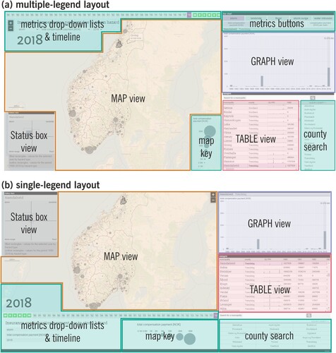
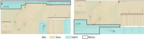
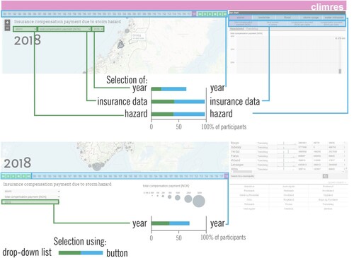
Figure 1. The tested tool with a multiple-legend layout (a) and a single-legend layout (b). Legend elements are marked with green areas: map key, metrics buttons, metrics drop-down list & timeline, county search (please refer to online colour version of the figure).
3.1. Expert interviews
We conducted a series of semi-structured interviews with insurance experts to better understand how they work, and thus, develop the experimental stimuli and tasks with a degree of ecological validity. Specifically, we designed the interviews to learn how spatio-temporal insurance compensation data are typically analyzed and to investigate the most important characteristics and patterns searched by experts when analyzing data. Consequently, we interviewed four experts (2 females and 2 males) from the largest insurance companies in Poland, each with over 10-year experience in data analysis, data science, and business intelligence. We conducted the interviews online, and sessions lasted approximately 45 min each. In the first stage of the interview, we asked interviewees about their professional duties; the data types they analyze, their purpose for conducting the analysis, and which visualizations they use to support their work. In the second stage, experts examined the ClimRes interface and offered us insights on what they considered ‘representative tasks’ linking the ClimRes interface to their work. Based on the insights from the interviews (elaborated in Section 3.2.4 Tasks), we finalized the design of the controlled experiment.
3.2. Controlled experiment
3.2.1. Study design
Inspired by previous work, we hypothesized that, in a multiple-legend layout ((a)), the proximity of legends to relevant views would bring benefit as it should limit split attention, should chunk the explanations into smaller pieces of information, and thus reduce the effort to retrieve information from a single, merged legend. The redundancy, i.e. repeating the information presented in a visualization, has been discussed with regard to its advantages and disadvantages (Shortridge and Welch Citation1982). There is empirical evidence regarding the positive consequences of redundancy, and it is successfully used in e.g. effective accenting in visual storytelling (Roth Citation2021; Song et al. Citation2022). The multiple-legend layout follows the recommendation on proximity of explanatory elements to the explained elements (Mayer Citation2001) and explicitly chunks into pieces information brought by explanatory elements, and, therefore, might be helpful for the limited capacity of working memory.
Conversely, an alternative hypothesis is that the effort connected with integrating information from explanatory elements scattered all over the interface would negatively affect user performance (and user attitude) toward the multiple-legend layout, thus a single legend may be recommendable. This approach in interface design results in functional grouping recommended by Schnürer, Sieber, and Çöltekin (Citation2015) and follows the solution applied in geographical atlases. Grouping all explanatory elements in one place may improve searching for a needed element since, instead of gazing all over the interface, a user might refer to the same place. This solution avoids redundancy but, by gathering in one place many elements, does not take advantage of chunking information to support its handling.
Given the above hypotheses, our main independent variables in this experiment are the two layouts of the same tool with multiple legends and a single legend (). We also included the task type as an independent variable. As dependent variables, we collected objective metrics (response time, response accuracy, and eye-tracking), as well as subjective (confidence, preference, system usability scale). We used a mixed factorial design where layout and task types were within-subject factors, and a free exploration task was a between-subject factor. For the within-subject factors (where each participant solved the same question twice, using the two legend layouts), to prevent the learning or fatigue effect, the task order was randomized using a balanced Latin square. Therefore, the order of tasks was systematically rotated between participants to counterbalance any order effects such as learning or fatigue: A particular task appeared equally often in each order (first, second, etc.) in the sequence of tasks, and a particular task preceded another task the same number of times. Similarly, the stimuli (i.e. the two layouts) were rotated too. Every next task was solved with a different layout than the one used in the preceding task. Moreover, layout type (multiple-legend or single-legend) was randomized for the free examination task, as well as the sequence of presented layout during the training session.
3.2.2. Materials: stimuli and instruments
In the interviews, experts stated that they regularly use visualizations of different kinds (including interactive ones) to explore multivariate spatio-temporal data, as well as to present and report conducted analyses. Accordingly, we designed our multiple- and single-legend layouts in two modified versions of the ClimRes geodashboard (Opach and Rød Citation2018). The coordinated multiple views in these layouts support the examination of insurance compensation payments due to losses caused by extreme events in Norway: storms, floods, water intrusions, landslides, and storm surges. Insurance data include number of claims, total compensation payment, compensation payment per capita, and compensation payment per claim. All indices are presented annually in the 38-year period (1980–2018). Both interfaces consist of three views: a thematic map (choropleth or proportional symbol map, depending on the presented metric type), a bar graph, and a table. Additionally, a status box view presents data for multiple extreme events once. The two tested layouts keep the same functionality in terms of exploration of the same spatio-temporal data; however, they differ regarding the location and organization of explanatory elements within the interface (green areas in (a,b)). The data can be explored by selecting metrics: type of extreme events, type of insurance data, and year. The selection can be conducted using drop-down lists and/or buttons. Furthermore, a user can select a particular county from the list and can search for a municipality using a search box. The thematic map is assisted with a map key explaining the symbolization on the map: hues when presenting a choropleth map and circle sizes when presenting a proportional circle map.
A multiple-legend layout ((a)) has explanatory elements scattered across the interface, located close to corresponding views, i.e. map key and drop-down lists with metrics located within a map view; metric buttons are located directly above the graph view. As a result, the same functionality is replicated in different views. For example, the selections of extreme event type and insurance data are located within the map view (as drop-down lists) and next to the graph view (as buttons). In the single-legend layout ((b)), explanatory elements are gathered in a separate panel placed at the bottom of the interface. Metrics for extreme event type and insurance data can be selected using only drop-down lists.
The stimuli were presented on a 17″ screen size with 1920 × 1980 resolution. The tasks were presented in the Chrome web browser, questions were displayed next to the tested tool. The eye movement data were collected using a TobiiX120 eye tracker with the recording resolution set to 120 Hz. Data analysis was conducted using TobiiStudio 3.3.2 and SPSS 28.
3.2.3. Participants
In total, 42 participants took part in the study (aged 23–30, average 25.7 years old, SD 1.96), counterbalanced for biological sex (52% female and 48% male). All of them were graduate students in geoinformatics at the Faculty of Geography and Regional Studies, University of Warsaw, Poland, holding at least a Bachelor’s degree in geography. Almost half of the participants (45%) were geoinformatics majors and completed most of the courses, whereas 55% of participants already completed an MSc in geoinformatics. 95% declared that they worked with interactive maps, and among this group, 57% used and made maps at work whereas 24% used maps at work (but, did not make maps). None of the participants was familiar with the tested tool. Participants were screened for color vision deficiency with Ishihara color plates (Lee and Honson Citation2003). One participant had color vision deficiency, but because their responses did not deviate from other participants, they were not excluded from further data analysis.
3.2.4. Tasks
In the course of the experiment, each participant used the ClimRes tool, elicited necessary information, and answered eight questions () representing four task types classified by Knapp (Citation1995): identify, locate, compare, and associate. The eight tasks were designed to refer to configurations corresponding to a seminal triad framework by Peuquet (Citation1994): (1) explore objects that are present at a given location at a given time (when + where→what); (2) explore times that a given object occupied a given location (where + what→when); and (3) explore locations occupied by a given object at a given time (when + what→where). Additionally, to eventually investigate the spontaneous use of the tool, and for training purposes, participants conducted a 3-minute free exploration task (Yarbus Citation1967) at the beginning of the study. Based on the expert interviews, we modified our predefined questions to (1) reflect a search for temporal patterns (, Task 5), especially searching for a reference time point (Task 6), (2) search for spatial patterns (Tasks 7 and 8), and (3) searching for extreme values or anomalies (Tasks 3 and 4).
Table 1. Task types and questions used in the study.
3.2.5. Procedure
Experiment sessions took place in the eye-tracking lab at the Faculty of Geography and Regional Studies, University of Warsaw. The overview of the procedure is depicted in . The study was approved by the Ethics Board at the Faculty of Geography and Regional Studies, University of Warsaw.
Figure 2. The procedure of the empirical study.
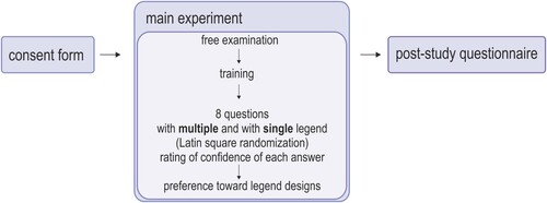
Upon arrival, participants signed a consent form, were introduced to the eye tracking setup, and were given an explanation of the general purpose of the study. After calibrating the eye tracker, the participants were randomly assigned one of the two legend-layout versions for the 3-min free exploration task. This allowed participants to get experience with the tool. Following this, participants were explicitly trained to use ClimRes (and the two legend layouts in alternating order) for approximately 10 min to correct for any differences in experience using similar software. The training procedure was standardized for all participants. After the training session, participants solved the set of eight tasks () twice (in randomized order): with multiple- and single-legend layouts (in alternated order). Directly after responding to each question, participants rated their confidence in their answer (1: ‘I am not confident in my response’ to 5 ‘I am confident in my response’). After answering all questions, participants were asked to state their preferred layout and justify their choice verbally. In the end, participants filled in the questionnaires for the system usability scale (SUS, Brooke Citation1996) and for demographic and background information. After completing the entire experiment, we gave participants a coffee voucher as a thank-you gift for participation.
4. Data analysis
We analyzed the collected data using mostly quantitative, and some qualitative, methods. We excluded some of the data from the analysis reported in this paper. Specifically, we excluded the data from the free examination task as they exceed the scope of this study, and we excluded two eye movement recordings with data loss higher than 30% where both participants had specific eye vision deficits. In the same vein, we examined outliers, and found none, neither in response accuracy nor in response time.
After the data verification phase, we analyzed the SEE (Satisfaction, Effectiveness, and Efficiency) performance, i.e. the standard usability metrics (ISO 9241-11:2018 Citationn.d.). We report participants’ response accuracy as effectiveness, response time as efficiency, response confidence, layout preference as well as the SUS ratings as (direct or indirect) satisfaction metrics. SUS is a widely known and often applied tool, including in geovisualization contexts (e.g. Çöltekin et al. Citation2009), to measure user attitudes and system preferences. The participants filled out a validated Polish translation of the SUS that was made according to the procedure of psychological test adaptation (Borkowska and Jach Citation2017). Furthermore, we analyzed eye movement data that we collected to get insights into visual attention on relevant areas of the interface (i.e. legends and views) through participants’ fixation duration, the number of visits in AOIs, visit duration, and transitions between AOIs. Eye tracking has been widely used in many disciplines spanning several decades, including GIScience and human–computer interaction (e.g. Jacob and Karn Citation2003; Çöltekin et al. Citation2009; Bragger et al. Citation2022), and has been recognized as a useful approach for examining (geo)visualizations, whether they are static (Kuchinke et al. Citation2016; Edler et al. Citation2020) or interactive (Golebiowska, Opach, and Rød Citation2017). The ‘mind-eye hypothesis’ (Nielsen and Pernice 2010) posits that people tend to look at things they are thinking about, i.e. cognitive processes are connected with eye movements, thus interpreting visual behavior could give insights into information processing (Just and Carpenter Citation1976). In eye-tracking terminology, fixation is a long-enough gaze duration where the nervous system is able to capture the visual information, whereas during saccadic movements most information is discarded (Holmqvist et al. Citation2011; Duchowski Citation2017). Fixations are often used as a measure of cognitive processing, for instance, it is often assumed that more fixations may indicate a less efficient search strategy, whereas longer fixations may indicate difficulty with the display (e.g. if a label or a symbol is not easy to decipher) or, conversely, objects that are interesting (e.g. if a specific area packs all the relevant information) (Çöltekin et al. Citation2009; Rayner Citation2009). Fixation duration measures the sum of the duration of each fixation within an AOI. Since fixation thresholds are not fully established (vary between 50 and 500 milliseconds in the related work, as reported by Bojko Citation2006 and Çöltekin et al. Citation2009), visit counts are also used as a statistical measure. Visit count measures the number of ‘visits’ within an AOI, whereas a visit is defined as the time interval between the first fixation on the AOI and the end of the last fixation within the same active AOI where there have been no fixations outside the AOI. Visit duration measures the duration of each visit within an AOI. Total visit duration measures the duration of all visits within an AOI (Tobii Studio User’s Manual Citation2016).
We also examined the frequency of use of interactive elements and qualitatively analyzed participants’ verbal justification when indicating the preferred layout.
4.1. Performance and confidence analyses
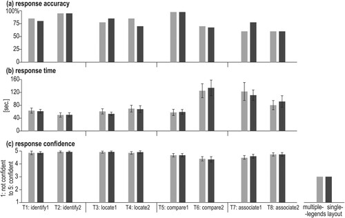
In general, response accuracy was high ((a)), ranging from 60.0% (T8_associate2) up to 97.5% (T5_compare1) ((a), see Table 2 for details). Both identify tasks (T1–2), both locate tasks (T3–4) and T5_compare1 yielded an accuracy of 70% and higher. For more complex tasks, such as both associate tasks (T7–8) and T6_compare2, response accuracy was under 70%.
Figure 3. Participants’ average performance and confidence by legend layout.
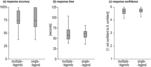
Figure 4. Participants’ average performance and confidence by task (error bars: ± 2SEM).
We observed no statistically significant differences in participant performance (accuracy and speed) or confidence when we compared the measures for multiple-legend vs. single-legend layout ().
Comparing multiple-legend vs. single-legend conditions, for the data shown in , McNemar’s test for related samples (df = 1, N = 40) showed no statistically significant difference (p > 0.05) for response accuracy (see Suppl. mat. Table 1 for details). Similarly, a Wilcoxon signed-rank test did not yield significant differences neither for response time (all tasks: p > 0.05), and showed small effect sizes (r < 0.02) (see Suppl. mat. Table 1 for details), nor for confidence (p > .05, small effect size r < .02). In sum, we observed no main effects of multiple- and single-legend conditions when we examined participants’ performance and confidence with them.
At the task level, we did not see an effect of the two display types (). also shows that participants were highly confident about the given responses (the mean level of confidence for all tasks was above 4 where the maximum was 5). Our analyses based on exploratory variables (biological sex, expertise, and age) did not yield statistically significant differences in accuracy or confidence.
4.2. Eye-tracking analysis
We divided both multiple- and single-legend layouts into Areas of Interest (AOI) representing Views (the three panels where the data are presented: map, graph, and table), and Legends (display elements where symbology and interactive functions were explained). In the multiple-legend layout, AOI Legend was fragmented and scattered across the display (green-turquoise areas in left) compared to the single-legend layout ( right). However, in both layouts, the total area of Legends and Views had similar shares in the screen space. AOI Views consisted of three views (a map, a graph, and a table) and a status box that covered 68.0% of the interface area in the multiple-legend layout and 69.3% in the single-legend layout. AOI Legend consisted of an attribute selection control panel (the type of hazard, the type of insurance data, and the year), a map key and a county list. AOI Legend is covered in the multiple-legend layout, 30.5% of the interface space, and 29.1%, in the single-legend layout.
Figure 5. The AOIs distinguished in multiple- (left) and single-legend (right) layouts.
Furthermore, due to the redundancies of interactive control elements in the multiple-legend layout (buttons and drop-down lists that repeat to set displayed metrics), we also considered a third AOI type we called ‘AOI Metrics’ for: WHAT? attributes (the type of extreme events causing the damage and type of insurance data) and WHEN? attributes (the year of paying the compensation). AOI Metrics covered 19.7% of the interface area in the multiple-legend layout and 14.3% in the single-legend layout. The share of AOI Metrics in the former was higher because of using buttons and lists to control the same map features. This redundancy did not appear in the single-legend layout, in which the AOI Legend included the AOI Metrics as well as a list of counties and a map key (explanation of symbology of graduated symbols and choropleth maps). In both layouts, the search box for municipalities was excluded from AOIs because this is not a critical element changing between the two tool versions. Furthermore, it had a small size and was located next to the information-rich labels of its neighboring views.
4.2.1. Visual attention toward AOI Views and AOI Legends
First, we analyzed the main effects of legend type (multiple layout vs. single layout) based on selected eye movement metrics aggregated for all eight tasks (, see Table 2 in Supplementary materials for details).
Figure 6. Differences in the eye movement metric for tasks 1–8 between multiple- and single-legend layouts (Error bars ±2SE; ***p < .001).
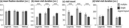
Mean fixation duration ((a)) is similar for all AOIs while solving the entire set of eight tasks using the two layouts (Wilcoxon signed-rank test p > .05, small effect size r ≤ .20). However, the length of visits and visit frequency are visibly different for the two layouts: Mean visit duration for each AOI ((b)) is longer for the single-legend layout than for the multiple-legend layout (Wilcoxon signed-rank p < .001, large effect size r > .80). Conversely, the number of visits for each AOI ((c)) is higher for the multiple-legend layout than for the single-legend layout (p < .001, medium effect size .60 < r < .80). Added together, shorter visit duration but more visits for the multiple-legend layout (and the opposite for the single-legend layout), the total visit duration ((d)) for the two layouts is comparable (p > .05) (see Suppl. mat. Table 2 for details). Of course, when two effects are canceling each other out, the finer analyses (mean visit duration and visit count) are more informative.
Given the above, we further analyzed mean visit duration and visit count at the task level ().
Figure 7. Mean visit duration and visit count for each given task (error bars ±2SE; *p < .05; **p < .01; ***p < .001).
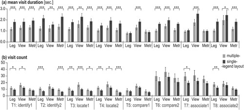
As shown in , Wilcoxon signed-rank test showed consistent differences between mean visit duration and visit count for multiple- and single-legend layouts in the analytical tasks ((a)): identify (tasks 1–2) and locate (tasks 3–4). In those four tasks, the mean visit duration for all three AOIs (Legends, Views, and Metrics) was significantly longer when working with the single-legend layout than with the multiple-legend layout (with majority p ≤ .001) and with a moderate effect size (r > .5), ((a), see Table 3 in Suppl. mat. for details). In turn, the number of visits ((b)) in most of the analyzed AOIs for the four analytical tasks (tasks 1–4) was significantly higher when using the multiple-legend layout than the single-legend layout ((b), see Table 4 in Suppl. mat. for details). The only exception is AOI Metrics when solving task 1 and AOI Views when solving task 2: these AIOs were visited the similar number of times when using multiple- and single-legend layouts.
More complex tasks, i.e. compare (tasks 5 and 6) and associate (tasks 7 and 8), did not give such a clear pattern for all AOIs. Concerning mean visit duration ((a)), tasks 6 and 8 were solved with significantly longer visits in each of the three tested AOIs when using single- than multiple-legend layout ((a), Suppl. mat. Table 3). Whereas tasks 5 and 7 noted significantly longer mean visit duration only for AOI Views. Regarding visit counts, only AOI Legends received significantly more visits (p < .05; small effect size: .03 < r < .5) in tasks 7 and 8 for the multiple-legend layout. For the rest of the AOIs, no statistically significant differences were observed between the two tested legend layouts when solving tasks 5–8 ((b), Suppl. mat. Table 4).
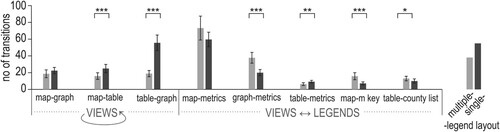
4.2.2. Transitions between views and legends
For all tasks, when using the multiple-legend layout, on average, a participant moved his/her attention from legends to views (and opposite) 159 times (SD = 67.4), whereas significantly fewer frequent – 117 times (SD = 34.4) when solving the tasks using the single-legend layout (Wilcoxon signed-rank test Z = 3.387, p < .001, r = .54). The number of transitions between particular interface elements within AOI Views and AOI Legends (), while solving tasks 1–8, indicates that the majority of transitions were conducted between the map view and its control elements for setting the metrics (the type of hazard, insurance data, and the year) ().
Figure 8. Transitions between elements of the interface in the multiple-legend layout (a) and the single-legend layout (b) (for clarity, the average number of transitions fewer than two are not presented). Own elaboration using a Circos Table Viewer (Krzywinski et al. Citation2009).
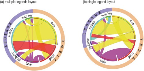
As shown in , in the single-legend layout, the transitions between metrics and the graph were less frequent than in the multiple-legend layout (compare the width of the red ribbon in ). Another difference between the two legend layouts is the frequency of transitions between the table view and the graph view. The two views are visited one after the other less frequently when using the multiple-legend layout, in which the views were separated with the municipality search box. In the single-legend layout, the views were located next to each other.
The share of transitions from/to legend elements is higher for the multiple-legend layout than for the single-legend layout (compare the purple and orange outlines in ). Transitions between elements within Views are more frequent in the single-legend layout than in the multiple-legend layout, whereas transitions between Views and Legends elements are more frequent when using the multiple-legend layout.
Differences in the average number of transitions between particular views (map-table and table-graph) for the tested layouts, and between pairs of a view and an explanatory element (graph-metrics, table-metrics, map-map key, and table-county list) were statistically significant ( and see Table 5 in the Supplementary material for details). On the other hand, transitions between the graphic displays of data, map and graph (the core of visualization), as well transitions between map and metrics (the highly important elements for geodashboards) were not significantly affected by the change in the layout.
Figure 9. The average number of transitions between and within AOIs Views and Legends (error bars ±2SE; *p < .05; **p < .01; ***p < .001).
4.2.3. The use of redundant elements
In the two layouts we tested, participants were offered control elements of the same purpose: Buttons (marked with blue in ) and drop-down lists (marked with green in ).
Figure 10. The way of setting the attributes from redundant interface elements. The missing share of 100% indicates the participants who failed in selecting the needed attributes and/or decided to keep the default settings.
In the multiple-legend layout, such redundancy refers to the selection of year – when? and also what? attributes, i.e. the type of hazard and type of insurance data ( top). In the single-legend layout only temporal settings (when? attribute) functionality is repeated within the interface ( bottom). Animated scan graphs and screen recordings were analyzed to verify which control elements were used more often. It turned out that participants used both options of selecting attributes for all eight tasks. Participants make use of all available ways of selecting appropriate datasets. Similarly, when selecting date attributes with the multiple-legend layout, participants used both available options ().
Figure 11. The use of redundant elements, buttons and drop-down lists, in the multiple-legend layout.
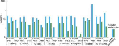
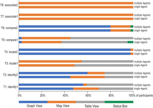
Although task types did not affect preferences regarding the tool’s control elements, the use of specific views to retrieve information necessary to provide answers differed between task types (). Notably, the change in legend layout did not affect the view used for getting the searched information; there were tasks answered using the same views by all participants. Associate tasks (T7–8) were answered by acquiring information from the map view, whereas task T4 (locate) was answered mostly by acquiring information from the graph view. Other tasks were answered in a heterogeneous way. Participants were adjusting explored views to the type of data search in particular tasks (and to their customs and preferences), but the use of elements for setting data (buttons and drop-down lists) was not so differently used between tasks.
Figure 12. The views from which the searched information was acquired.
4.3. Layout preference and SUS
After solving all tasks, we asked participants to indicate which layout they preferred. Most of participants (75%) indicated that they preferred the multiple-legend layout ().
Figure 13. Participants’ layout preference after solving the given tasks.

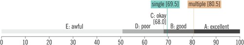
Participants’ preference for multiple-legend layout is in line with the outcomes of the SUS questionnaire (): The multiple-legend layout scored on average 80.5, and the single-legend layout 69.5. 80.5 is considered between ‘good’ and ‘excellent’, and 69.5 ‘good’, both exceeding the cutoff value of 68, above which systems are considered acceptable from a usability perspective (Bangor, Kortum, and Miller Citation2008).
Figure 14. SUS scores for multiple- and single-legend layouts.
We also asked the participants to justify their preferences by selecting criteria from a predefined list as well as by verbally expressing their motivation behind their choice. Each participant could provide several criteria. It turned out that some of the criteria were similarly perceived as favoring both layouts. The selection of either the single-, or the multiple-legend layout was justified similarly often due to being comfortable and providing an easy way to find information ().
Figure 15. Criteria of selection declared while indicating preferred layout. Make note that the percentage regarding the two layouts referred to a different number of participants (75% of participants indicated multiple- and 25% of participants indicated a single-legend layout). Each participant could select several criteria.
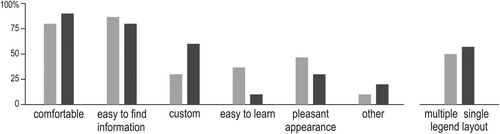
Other criteria differed in the share of given explanations in justifications of the multiple- and the single-legend layouts. Participants more often indicated that they had gotten customized to the single-legend layout. Whereas the multiple-legend layout was declared more often as having a pleasant appearance. While providing other criteria, participants commented on various elements of the layout. We analyzed this think-aloud protocol for two aspects: (1) if particular elements of the tested layouts were evaluated positively or negatively, (2) what adjectives participants used when describing the two layouts ().
Figure 16. Criteria of layout evaluation reported by participants.
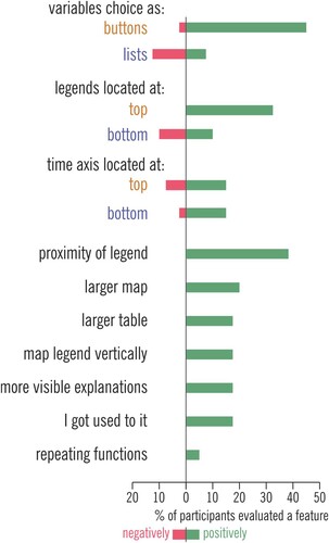
While comparing different layout solutions applied in the single- and the multiple-legend layouts, 45% of participants commented about their preference for selecting variables using buttons rather than from the drop-down list. The second most often discussed feature (37.5%) was the proximity of legends to explained contents. It referred to functions of selecting variables, changing other tool settings as well as map legend. Some participants explicitly admitted they did not mind repeating functions and explanations within the tool’s layout if it resulted in a closer location of legend to the explained elements. Participants also declared they preferred the location of the legend at the top of the layout (32.5% of participants) instead of the bottom part (preferred by 10%, and at the same time, the other 10% of participants declared they did not want legend at the bottom of the layout). Part of the participants justified the preference at the top of the layout by referring to their previous customs acquired while using other types of software. Participants also appreciated a vertical legend for the proportional symbol map, clearly visible explanations, and solutions they had already gotten used to from other software.
5. Discussion
We investigated the effects of two interface designs on user performance and preferences in a controlled experiment: with a multiple-legend layout and with a single-legend layout. From a performance perspective, neither our main hypothesis (that multi-legend design would have been superior as it might remedy split attention) nor our alternative hypotheses (that information integration would be easier with the single-legend design) are supported by the data. Given that the overall response accuracy is high (60–98%), we might have a ceiling effect that masks possible differences. Furthermore, we tested the legend elements at certain locations. While our design does facilitate discussing the hypotheses driven by the split-attention phenomenon, the location of the legend elements might be a moderating factor and should be examined in a future study. However, our performance-related findings are in line with Lewis, Haroz, and Ma’s (Citation2006) findings, who compared various arrangements of multiple views (yet with a constant design and location of the control panel) and reported no differences in users performance, suggesting that perhaps from a pure performance point of view, layout arrangement might not be always critically important.
Interestingly, despite the lack of performance differences, there was a loud-and-clear difference in participants’ opinions and preferences regarding the two layouts in favor of the multiple-legend layout (75% preferred it). Also, the multiple-legend layout scored higher (80.5/100, ‘excellent’) in the (subjectively rated) SUS whereas the single-legend layout was just above (69.5/100 ‘good’) the usability threshold (68/100). Taken together, these outcomes confirm the fingers of an earlier static map legend study (Gołębiowska Citation2015): Changes in legend design might not affect performance metrics, but they affect subjective opinions and the process of task solving.
Eye movement data – specifically differences in the visit counts, their mean duration and the number of transitions between views and legends – provided insights that we believe explain why participants favor the multiple-legend design even if it did not particularly affect their performance. For simple analytical tasks (T1–T4) with limited alternatives to search for information, the effect of the layout was clear with statistically significant differences between eye movement metrics obtained from the two legend layouts (). For more complex tasks (T5–T8), where there were multiple alternative ways to solve the task, we observed no clear differences in the patterns in visual behavior. Interestingly, the change in legend layouts resulted not only in different visual attention patterns on legend elements but also in data displays (views) which were not altered in the two layout designs (i.e. they had similar locations in the visual interface, covered similar screen space etc.).
The multiple-legend led to more transitions than the single-legend between data views and their corresponding legends, i.e. to get the information from legends, participants made more frequent yet shorter visits than while using the single-legend layout. We interpret this as a sign of ‘comfort’ with the solution: Information was nearby where it was needed, and easy to check, thus participants did exactly that. With the single-legend layout, participants exhibited more transitions between different views (). In this case, participants focused more on data views (i.e. the map, the graph, and the table), possibly interpreting the visuospatial information from these without going to the legend so often which required a longer ‘gaze travel’, or simply because there were fewer distractors (scattered legends).
As and demonstrate, the majority of gaze transitions took place between the map and ‘metrics buttons’ and drop-down lists located next to the map. This might be an expression of the crucial role of a map while visualizing spatial data in geodashboards. Moreover, it can be seen that for the multiple-legend layout, the metrics are also often viewed directly before or after reading the graph module located immediately below the buttons. Therefore, most likely, the proximity of these elements affected how visual attention was distributed.
Given the above, the eye movement data demonstrate the advantage of proximity between legends and explained elements over gathering all explanatory elements in one place. Also taking into account that participants repeatedly declared proximity as one of the reasons for their preference toward the multiple-legend design. These outcomes support earlier recommendations by Chandler and Sweller (Citation1991), motivated by split attention problems due to spatial contiguity (Moreno and Mayer Citation1999). Similarly, our findings are in line with Brügger, Fabrikant, and Çöltekin’s (Citation2017) and Schnürer et al.’s (Citation2020) observations regarding side-by-side (split) vs. integrated views, all of which also have parallels to Gestalt’s principle on proximity (Rahman Citation2017).
The single-legend layout – common in traditional paper atlases – turned out to be the less favorable solution among the two tested geodashboard interfaces. We thus confirm Dykes, Wood, and Slingsby’s (Citation2010) observation that static vs. interactive legends need different design considerations, i.e. knowledge and guidelines for static map legends might not directly apply when designing geovisual analytics environments. The functional grouping recommended by Schnürer, Sieber, and Çöltekin (Citation2015) was formulated based on the study of single view interface, though in our case single-legend was not better than multiple-legend layout. Not surprisingly, participants’ average visit duration in the legend panel of the single-legend layout was longer than in the multiple-legend layout. One composite legend consisting of several explanatory elements can be more challenging to process due to limited working memory (Miller Citation1956) compared to the layout with multiple legends with explanatory elements split into explicit chunks of information in different locations. Even though the participant performance did not differ with the two layouts, their information processing strategy was largely affected by these designs. The multiple-legend layout resulted in redundancy with elements located next to different views. In the tested tool there were buttons and drop-down lists serving for selecting hazards, the type of insurance data and the year. This redundancy was not perceived as a disadvantage by participants, they make use of both ways of selection in every tested task. Some of them explicitly declared it was a helpful solution to have the functionality repeated between views. Our findings thus further confirm the position that information redundancy can have positive consequences (Roth Citation2021; Song et al. Citation2022), in this case, on a geodashboard.
6. Conclusions and outlook
A geodashboard built with multiple coordinated visualizations is a complex software environment that is challenging for a user, thus legend elements are important, especially if they are conveniently usable due to spatial contiguity. In this study, we evaluated the usability of two approaches to layout design: multiple- and single-legend layouts. The results of the conducted empirical study suggest advantages for multiple-legend layouts, which we mainly attribute to the proximity of the legend to the view of interest, even if the legend elements are scattered in various parts of the interface. The proximity of legends to the corresponding views was convenient for users as they could quickly refer to it when needed. Therefore, multiple-legend layouts can be recommended when designing geodashboard legend, guided by the proximity to the explained elements. Gathering legend elements from various data views into a single legend, as in paper atlases, was not preferred by users. Functional grouping in the contexts of multiple views was not preferred and was evaluated worse than the multiple-legend layout. The fact that 75% of the participants preferred the multiple-legend design (and rated it higher in the system usability score) gives a clear message regarding the subjective user experience.
Like every empirical study, ours also features certain methodological limitations. One example is engaging specific participants and employing one specific tool as a study material. Therefore, to gain a better, more versatile insight into the guidance of geodashboard design, collected results can be supplemented with additional investigating including other users and tested tools. As a future direction, a controlled lab experiment with experts from the insurance industry (target the user group for a tool such as ClimRes) vs. non-experts or novices (such as students and graduates in geoinformatics in our experiment) could be interesting. While we interviewed experts and this helped us better understand the context, we believe a comparative study between experts and non-experts would yield interesting differences in interpretation and information processing strategies. Furthermore, our experiment could be extended by testing other tools with different design settings and functionality to examine generalizability. In other words, further research is needed to investigate whether our findings also concern other geodashboards in general and other CMV tools in particular. We also find that the location of legend within a layout deserves further investigation. Participants discussed the top versus the bottom of the screen as the best location for buttons and important features.
Geodashboards are used for the exploration of rich data sets in a wide scope of applications. With appropriate interface design the exploration and analysis can be more efficient and more convenient for users, therefore we believe the investigation of layout design from multiple perspectives would be beneficial in improving user experience, desirability/user acceptance of the solutions, and lead to more effective decision support.
Supplemental Material
Download MS Word (29.3 KB)Data availability statement
The data that support the findings of this study are available from the corresponding author upon reasonable request.
Disclosure statement
No potential conflict of interest was reported by the author(s).
Additional information
Funding
References
- Andrienko, N., G. Andrienko, G. Fuchs, A. Slingsby, C. Turkay, and S. Wrobel. 2020. Visual Analytics for Data Scientists. Cham: Springer Nature.
- Badard, T., and E. Dubé. 2009. “Enabling Geospatial Business Intelligence.” Open Source Business Resource 9: 25–31.
- Baldonado, M. Q. W., A. Woodruff, and A. Kuchinsky. 2000. “Guidelines for Using Multiple Views in Information Visualization.” In AVI ‘00 Proceedings of the Working Conference on Advanced Visual Interfaces, 110–119. New York: ACM.
- Bangor, A., P. T. Kortum, and J. T. Miller. 2008. “An Empirical Evaluation of the System Usability Scale.” International Journal of Human-Computer Interaction 24 (6): 574–594. doi:10.1080/10447310802205776.
- Bernasocchi, M., A. Çöltekin, and S. Gruber. 2012. “An Open Source Geovisual Analytics Toolbox for Multivariate Spatio-Temporal Data in Environmental Change Modelling.” ISPRS Annals of the Photogrammetry, Remote Sensing and Spatial Information Sciences I-2: 123–128. doi:10.5194/isprsannals-I-2-123-2012.
- Björkbom, M., J. Timonen, H. Yigitler, O. Kaltiokallio, J. M. Vallet, M. Myrsky, J. Saarinen, et al. 2013. “Localization Services for Online Common Operational Picture and Situation Awareness.” IEEE Access 1: 742–757. doi:10.1109/ACCESS.2013.2287302.
- Bojko, A. 2006. “Using Eye Tracking to Compare Web Page Designs: A Case Study.” Journal of Usability Studies 3 (1): 112–120.
- Borkowska, A., and K. Jach. 2017. “Pre-Testing of Polish Translation of System Usability Scale (SUS).” In Information Systems Architecture and Technology: Proceedings of 37th International Conference on Information Systems Architecture and Technology – ISAT 2016 – Part I, edited by L. Borzemski, A. Grzech, J. Świątek, and Z. Wilimowska, 143–153. Cham: Springer International Publishing.
- Bragger, L., L. Baumgartner, K. Koebel, J. Scheidegger, and A. Çöltekin. 2022. “Interaction and Visualization Design Considerations for Gaze-Guided Communication in Collaborative Extended Reality.” ISPRS Annals of the Photogrammetry, Remote Sensing and Spatial Information Sciences. doi:10.5194/isprs-annals-V-4-2022-205-2022.
- Brooke, J. 1996. “SUS: A ‘Quick and Dirty’ Usability Scale.” In Usability Evaluation in Industry, edited by P. W. Jordan, B. Thomas, B. A. Weerdmeester, and A. L. McClelland, 189–194. London: Taylor and Francis.
- Brügger, A., S. I. Fabrikant, and A. Çöltekin. 2017. “An Empirical Evaluation of Three Elevation Change Symbolization Methods Along Routes in Bicycle Maps.” Cartography and Geographic Information Science 44 (5): 436–451. doi:10.1080/15230406.2016.1193766.
- Chandler, P., and J. Sweller. 1991. “Cognitive Load Theory and the Format of Instruction.” Cognition and Instruction 8 (4): 293–332. doi:10.1207/s1532690xci0804_2.
- Çöltekin, A., A. Brychtová, A. L. Griffin, A. C. Robinson, M. Imhof, and C. Pettit. 2017. “Perceptual Complexity of Soil-Landscape Maps: A User Evaluation of Color Organization in Legend Designs Using Eye Tracking.” International Journal of Digital Earth 10 (6): 560–581. doi:10.1080/17538947.2016.1234007.
- Çöltekin, A., S. Christophe, A. Robinson, and U. Demšar. 2019. “Designing Geovisual Analytics Environments and Displays with Humans in Mind.” ISPRS International Journal of Geo-Information 8 (12): 572. doi:10.3390/ijgi8120572.
- Çöltekin, A., B. Heil, S. Garlandini, and S. I. Fabrikant. 2009. “Evaluating the Effectiveness of Interactive Map Interface Designs: A Case Study Integrating Usability Metrics with Eye-Movement Analysis.” Cartography and Geographic Information Science 36 (1): 5–17. doi:10.1559/152304009787340197.
- Çöltekin, A., C. Pettit, and B. Wu. 2015. “Geovisual Analytics: Human Factors.” International Journal of Digital Earth 8 (8): 595–598. doi:10.1080/17538947.2015.1047173.
- Dong, E., H. Du, and L. Gardner. 2020. “An Interactive Web-Based Dashboard to Track COVID-19 in Real Time.” The Lancet Infectious Diseases 20 (5): 533–534. doi:10.1016/S1473-3099(20)30120-1.
- Duchowski, A. T. 2017. Eye Tracking Methodology: Theory and Practice. Cham: Springer.
- Dykes, J., J. Wood, and A. Slingsby. 2010. “Rethinking Map Legends with Visualization.” IEEE Transactions on Visualization and Computer Graphics 16 (6): 890–899. doi:10.1109/TVCG.2010.191.
- Edler, D., J. Keil, M.-C. Tuller, A.-K. Bestgen, and F. Dickmann. 2020. “Searching for the ‘Right’ Legend: The Impact of Legend Position on Legend Decoding in a Cartographic Memory Task.” The Cartographic Journal 57 (1): 6–17. doi:10.1080/00087041.2018.1533293.
- Edsall, R. M. 2003. “Design and Usability of an Enhanced Geographic Information System for Exploration of Multivariate Health Statistics.” The Professional Geographer 55 (2): 146–160. doi:10.1111/0033-0124.5502003.
- Few, S. 2006. Information Dashboard Design: The Effective Visual Display of Data. Edited by C. Wheele. Sebastopol, CA: O’Reilly Media.
- Figgemeier, H., C. Henzen, and A. Rümmler. 2021. “A Geo-Dashboard Concept for the Interactively Linked Visualization of Provenance and Data Quality for Geospatial Datasets.” AGILE: GIScience Series 2: 1–8. doi:10.5194/agile-giss-2-25-2021.
- Gołębiowska, I. 2015. “Legend Layouts for Thematic Maps: A Case Study Integrating Usability Metrics with the Thinking Aloud Method.” The Cartographic Journal 52 (1): 28–40. doi:10.1179/1743277413Y.0000000045.
- Golebiowska, I., T. Opach, and J. K. Rød. 2017. “For Your Eyes Only? Evaluating a Coordinated and Multiple Views Tool with a Map, a Parallel Coordinated Plot and a Table Using an Eye-Tracking Approach.” International Journal of Geographical Information Science 31 (2): 237–252. doi:10.1080/13658816.2016.1191636.
- Golebiowska, I., T. Opach, and J. K. Rød. 2020. “Breaking the Eyes: How Do Users Get Started with a Coordinated and Multiple View Geovisualization Tool?” The Cartographic Journal 57 (3): 235–248. doi:10.1080/00087041.2019.1660513.
- Griffin, A. L., and A. C. Robinson. 2015. “Comparing Color and Leader Line Highlighting Strategies in Coordinated View Geovisualizations.” IEEE Transactions on Visualization and Computer Graphics 21 (3): 339–349. doi:10.1109/TVCG.2014.2371858.
- Harrower, M. 2007. “The Cognitive Limits of Animated Maps.” Cartographica: The International Journal for Geographic Information and Geovisualization 42 (4): 349–357. doi:10.3138/carto.42.4.349.
- Holmqvist, K., N. Nyström, R. Andersson, R. Dewhurst, H. Jarodzka, and J. Van de Weijer. 2011. Eye Tracking: A Comprehensive Guide to Methods and Measures. Oxford: Oxford University Press.
- Jacob, R. J., and K. S. Karn. 2003. “Eye Tracking in Human-Computer Interaction and Usability Research: Ready to Deliver the Promises.” In The Mind's Eye: Cognitive and Applied Aspects of Eye Movement Research, edited by H. Deubel and J. R. Hyönä, 573–605. North-Holland: Elsevier Science.
- Jing, C., M. Du, S. Li, and S. Liu. 2019. “Geospatial Dashboards for Monitoring Smart City Performance.” Sustainability 11 (20): 5648. doi:10.3390/su11205648.
- Just, M. A., and P. A. Carpenter. 1976. “Eye Fixations and Cognitive Processes.” Cognitive Psychology 8 (4): 441–480. doi:10.1016/0010-0285(76)90015-3.
- Kalyuga, S., P. Chandler, and J. Sweller. 1999. “Managing Split-Attention and Redundancy in Multimedia Instruction.” Applied Cognitive Psychology 13 (4): 351–371. doi:10.1002/(SICI)1099-0720(199908)13:4.
- Knapp, L. 1995. “A Task Analysis Approach to the Visualization of Geographic Data.” In Cognitive Aspects of Human-Computer Interaction for Geographic Information Systems, 355–371. Dordrecht: Springer. doi:10.1007/978-94-011-0103-5_25.
- Koua, E. L., A. MacEachren, and M. J. Kraak. 2006. “Evaluating the Usability of Visualization Methods in an Exploratory Geovisualization Environment.” International Journal of Geographical Information Science 20 (4): 425–448. doi:10.1080/13658810600607550.
- Kraak, M.-J., R. E. Roth, B. Ricker, A. Kagawa, and Le G. Sourd. 2020. Mapping for a Sustainable World. New York: United Nations, International Cartographic Association.
- Krzywinski, M., J. Schein, İ Birol, J. Connors, R. Gascoyne, D. Horsman, S. J. Jones, and M. A. Marra. 2009. “Circos: An Information Aesthetic for Comparative Genomics.” Genome Research 19 (9): 1639–1645. doi:10.1101/gr.092759.109.
- Kuchinke, L., F. Dickmann, D. Edler, M. Bordewieck, and A.-K. Bestgen. 2016. “The Processing and Integration of Map Elements During a Recognition Memory Task Is Mirrored in Eye-Movement Patterns.” Journal of Environmental Psychology 47 (9): 213–222. doi:10.1016/j.jenvp.2016.07.002.
- Lee, D. Y., and M. Honson. 2003. “Chromatic Variation of Ishihara Diagnostic Plates.” Color Research & Application 28 (4): 267–276. doi:10.1002/col.10161.
- Lewis, D., S. Haroz, and K.-L. Ma. 2006. “Layout of Multiple Views for Volume Visualization: A User Study.” In ISVC 2006, LNCS 4292, edited by G. Bebis, 215–226. Berlin: Springer-Verlag. doi:10.1007/11919629_23.
- Li, Z., and Z. Qin. 2014. “Spacing and Alignment Rules for Effective Legend Design.” Cartography and Geographic Information Science 41 (4): 348–362. doi:10.1080/15230406.2014.933085.
- Mayer, R. E. 2001. Multimedia Learning. Cambridge: Cambridge University Press.
- Miller, G. A. 1956. “The Magical Number Seven, Plus or Minus Two: Some Limits on Our Capacity for Processing Information.” Psychological Review 63 (2): 81–97. doi:10.1037/h0043158.
- Moore, P., and C. Fitz. 1993. “Gestalt Theory and Instructional Design.” Journal of Technical Writing and Communication 23 (2): 137–157. doi:10.2190/G748-BY68-L83T-X02J.
- Moreno, R., and R. E. Mayer. 1999. “Cognitive Principles of Multimedia Learning: The Role of Modality and Contiguity.” Journal of Educational Psychology 91 (2): 358–368. doi:10.1037/0022-0663.91.2.358.
- “ISO 9241-11:2018 Ergonomics of Human-System Interaction – Part 11: Usability: Definitions and Concepts.” n.d.
- Opach, T., I. Gołębiowska, and S. I. Fabrikant. 2014. “How Do People View Multi-Component Animated Maps?” The Cartographic Journal 51 (4): 330–342. doi:10.1179/1743277413Y.0000000049.
- Opach, T., and J. K. Rød. 2014. “Do Choropleth Maps Linked with Parallel Coordinates Facilitate an Understanding of Multivariate Spatial Characteristics?” Cartography and Geographic Information Science 41 (5): 413–429. doi:10.1080/15230406.2014.953585.
- Opach, T., and J. K. Rød. 2018. “Developing a Dashboard Visualizing Compensation Data on Damages Caused by Extreme Events.” Kart Og Plan 78 (3): 207–220.
- Pappas, L., and L. Whitman. 2011. “Riding the Technology Wave: Effective Dashboard Data Visualization.” In Symposium on Human Interface, 249–258. Berlin: Springer. doi:10.1007/978-3-642-21793-7_29.
- Peuquet, D. J. 1994. “It’s About Time: A Conceptual Framework for the Representation of Temporal Dynamics in Geographic Information Systems.” Annals of the Association of American Geographers 84 (3): 441–461. doi:10.1111/j.1467-8306.1994.tb01869.x.
- Popelka, S., L. Herman, T. Řezník, M. Pařilová, K. Jedlička, J. Bouchal, M. Kepka, and K. Charvát. 2019. “User Evaluation of Map-Based Visual Analytic Tools.” ISPRS International Journal of Geo-Information 8 (8): 363. doi:10.3390/ijgi8080363.
- Rahman, A. 2017. Designing Dashboards as Geo-Visualization Tool for Origin-Destination Data. Enschede: University of Twente.
- Rayner, K. 2009. “The 35th Sir Frederick Bartlett Lecture: Eye Movements and Attention in Reading, Scene Perception, and Visual Search.” Quarterly Journal of Experimental Psychology 62 (8): 1457–1506. doi:10.1080/17470210902816461.
- Rensink, R. A. 2002. “Internal vs. External Information in Visual Perception.” In Proceedings of the 2nd International Symposium on Smart Graphics – SMARTGRAPH ‘02, 63–70. New York: ACM Press. doi:10.1145/569005.569015.
- Roberts, J. C. 2007. “State of the Art: Coordinated & Multiple Views in Exploratory Visualization.” In Proceedings of the Fifth International Conference on Coordinated and Multiple Views in Exploratory Visualization, 61–71. Los Alamitos: CPS.
- Robinson, A. H., J. L. Morrison, P. C. Muehrcke, A. J. Kimerling, and S. C. Guptill. 1995. Elements of Cartograhy. 6th ed. New York: Wiley.
- Roth, R. E. 2021. “Cartographic Design as Visual Storytelling: Synthesis and Review of Map-Based Narratives, Genres, and Tropes.” The Cartographic Journal 58 (1): 83–114. doi:10.1080/00087041.2019.1633103.
- Schnürer, R., M. Ritzi, A. Çöltekin, and R. Sieber. 2020. “An Empirical Evaluation of Three-Dimensional Pie Charts with Individually Extruded Sectors in a Geovisualization Context.” Information Visualization 19 (3): 183–206. doi:10.1177/1473871619896103.
- Schnürer, R., R. Sieber, and A. Çöltekin. 2015. “The Next Generation of Atlas User Interfaces: A User Study with ‘Digital Natives’.” In Modern Trends in Cartography – Lecture Notes in Geoinformation and Cartography, 23–36. doi:10.1007/978-3-319-0w7926-4_3.
- Shortridge, B. G., and R. B. Welch. 1982. “The Effect of Stimulus Redundancy on the Discrimination of Town Size on Maps.” The American Cartographer 9 (1): 69–78. doi:10.1559/152304082783948277.
- Slocum, Terry A., Robert B. McMaster, Fritz C. Kessler, and Hugh H. Howard. 2022. Thematic Cartography and Geovisualization. 4th ed. Boca Raton, FL: CRC Press.
- Soegaard, M. 2016. “Gestalt Principles of Form Perception.” In The Glossary of Human-Computer Interaction. https://www.interaction-design.org/literature/book/the-glossary-of-human-computer-interaction/gestalt-principles-of-form-perception.
- Song, Z., R. E. Roth, L. Houtman, T. Prestby, A. Iverson, and S. Gao. 2022. “Visual Storytelling with Maps: Maps: An Empirical Study on Story Map Themes and Narrative Elements, Visual Storytelling Genres and Tropes, and Individual Audience Differences.” Cartographic Perspectives 100: 10–44. doi:10.14714/CP100.1759.
- Stehle, S., and R. Kitchin. 2020. “Real-Time and Archival Data Visualisation Techniques in City Dashboards.” International Journal of Geographical Information Science 34 (2): 344–366. doi:10.1080/13658816.2019.1594823.
- Tobii Studio User’s Manual. 2016. Accessed January 23, 2023. https://connect.tobii.com/s/studio-downloads?language=en_US.
- Yarbus, A. L. 1967. Eye Movements and Vision. New York: Plenum Press.
- Ye, Z., C. Xue, and Y. Lin. 2021. “Visual Perception Based on Gestalt Theory.” In Advances in Intelligent Systems and Computing, IHSI 2021, edited by D. Russo, T. Ahram, W. Karwowski, G. di Bucchianico, and R. Taiar, 792–797. Cham: Springer Nature. doi:10.1007/978-3-030-68017-6_118.
- Yigitbasioglu, O. M., and O. Velcu. 2012. “A Review of Dashboards in Performance Management: Implications for Design and Research.” International Journal of Accounting Information Systems 13 (1): 41–59. doi:10.1016/j.accinf.2011.08.002.