Abstract
Building simulation outputs are inherently complex and numerous. Extracting meaningful information from them requires knowledge which mainly resides only in the hands of experts. Initiatives to address this problem tend either to provide very constrained output data interfaces or leave it to the user to customize data organisation and query. This work proposes a conceptual data model from which meaningful dynamic thermal simulation information for building design decision-making may be constructed and presented to the user. It describes how the model was generated and can become operational, with examples of its applications to practical problems. The paper therefore contains useful information for software developers to help in specifying and designing simulation outputs which better respond to building designers’ needs.
1. Introduction
The aim of this paper is to describe a conceptual data model from which dynamic thermal simulation information for building design decision-making may be generated. Providing such information to the building designer is a challenge that has been addressed in the past by the design of new software and interface/outputs, mainly from an engineering or project management perspective. In this paper we follow an approach based on considering primarily the needs of the user. This focus on the user is inspired by the practice of Interaction Design (Cooper, Reimann, and Cronin Citation2007; Rogers, Sharp, and Preece Citation2011) and represents a new approach toward the problem of enabling a wider range of design professionals to make use of simulation software in the design of low energy buildings.
The paper is a follow on to a previously published paper in this journal (Bleil de Souza and Tucker Citation2014) which proposed and described a framework within which thermal simulation post-processed information meaningful to building design decision-making may be generated. The framework explored what information is relevant to designers and how it can be generated. It did not address in detail how to manage and use data representation and data display systems meaningful to design decision-making. The current paper describes in detail a conceptual data model to address these issues. This conceptual model is a high-level description of the entity classes and the associations between pairs of these classes, which together order the data to effectively communicate simulation results to building designers. Conceptual data models are used in Computer Science to organise information prior to the development of database/database management systems. The framework and conceptual data model are developed by considering building designers as the ultimate simulation tool users either directly or indirectly when supported by consultants, and are therefore developed to fit the building designer's ‘modus operandi’.
1.1. A summary of the framework
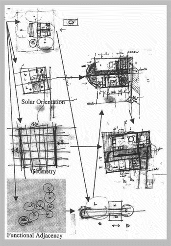
Extensive discussions about appropriate descriptions of the building designer's ‘modus operandi’ can be found in the building design literature.Footnote1 One of the most famous descriptions is provided by Schon (Citation1984, Citation1988, [Citation1983] Citation1991). According to Schon, designers solve problems by ‘reflecting in action’ through ‘a conversation with the materials of the situation’. This means designers gradually discover the problem while attempting to propose solutions to it. A key aspect of this process is that it necessarily involves experiments. These experiments can be of the following three types: (i) exploratory experiments, in which action is undertaken only to see what follows; (ii) move-testing experiments, used to assess moves depending on the changes produced and whether the designer likes the changes produced; and (iii) hypothesis-testing experiments, used to discriminate among competing alternatives generally not used to reach a final solution but to constantly reframe the problem through a new hypothesis to be tested.
These experiments are not controlled (not allowing phenomena to be isolated or variables to be separated). More importantly, these experiments are generally used to transform the situation from ‘what it is’ to something the designer likes better (Schon [Citation1983] Citation1991). This means the design process is a constant work in progress which only stops when designers decide this is the case ().
Figure 1. A snapshot of a ‘reflection in action’ through ‘a conversation with the material of the situation’ (Akin Citation2001). Image from Elsevier.
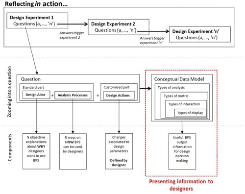
Simulation outputs need to be ‘in tune’ with these experiments. They need to provide answers to the different ‘what if’ situations generated within these experiments. The framework extracted from these ‘what if’ situations questions about performance. It also proposed a structure to set up specific questions about performance, so that these questions can be embedded in sequences of moves directed by reflection in action ().
Figure 2. An illustration of the framework produced in Bleil de Souza and Tucker (Citation2014).
Since only five aimsFootnote2 and five analysis processesFootnote3 were identified and confirmed in a survey and interviews with building designers, around 20 standard questions were developed (see Bleil de Souza and Tucker Citation2014 for a full list of questions). Examples of questions are: ‘How sensitive is this building to [design action]?' How does this building perform with [design action]? Designers are expected to be able to select which standard question(s) and (sets) of design action(s) best fit the design experiment they are undertaking. Examples of design actions include: different types of shading devices, different glazing ratios, a specific type of external wall panel system, etc.
1.2. The conceptual data model
The framework paper outlined the need for a conceptual data model to be developed. This current paper explores in detail how the conceptual data model for presenting simulation information for design decision-making (dashed box in ) was generated and how it can become operational. It specifically focuses on the type and relationship among data as well as representation systems building designers need to make decisions. This conceptual data model does not focus on data management or on proposing a database structure. It is a starting point for constructing a database/database management system in which entities, their attributes and relationships are described without using a formal language and independently of any choice of database technology.
The conceptual data model, like the framework, emerged form a process of Participatory Action Research (PAR) and Thematic Analysis of design work produced by 140 novice designers. All types of analysis, metrics, interaction with data and data displays were extracted from the 140 design journals. Principles of Information Visualization and dynamic thermal modelling were used to filter and quality assure these entity classes. Associations between pairs of entity classes were explored based on pairwise comparison used to identify appropriate and inappropriate combinations of relevant data for design decision-making.
Pairwise comparisons are used to ensure that all possibilities of how the output is constructed have been considered, as opposed to simply assuming that the user will be satisfied for example with a list of figures or one type of chart. Therefore, the conceptual data model is intended to enable software developers to strike a balance between providing too much and not enough information for design decision-making. Examples are provided to illustrate and discuss the potential and capabilities of the model. The full design and implementation of a database/database management system is outside the scope of this study as is the interface to enable building designers to manage it.
The participatory methods used to produce the conceptual data model also provide its validation, as the model emerges from the identified needs of the user. A further stage of validation will only become relevant when (and if) the conceptual model is developed and implemented into a working system.
2. Background
2.1. Representation systems
Previous initiatives which explored output data to inform design decision-making mainly focused on expanding the scope of representation systems to describe and compare building performance. Simple examples of these can be found in most ‘user friendly’ simulation software to date (NREL Citation2013; AutoDesk Ecotect Citation2014; IES Citation2014, etc.). In these tools, some performance metrics can be displayed on top of 2D and 3D views designers are used to manipulate (plans, section, elevation, perspectives, etc.). These initiatives also include the development of integrated thermal performance metrics (e.g. comfort, hours of overheating, etc.) and more elaborate types of 3D representation systems (examples of virtual reality images, movies, etc. can be seen in Evins et al. Citation2012; Struck et al. Citation2012, etc.).
Ways to display comparisons with benchmarks, notional buildings, regulatory targets and other design options were extensively explored in the simulation literature (Papamichael et al. Citation1999; Papamichael Citation1999a, Citation1999b; Soebarto and Williamson Citation2001; Prazeres Citation2006; Prazeres and Clarke Citation2003, Citation2005 to cite a few). Examples provided by these authors range from Multi-Criteria Evaluation strategies to complex output interfaces with highlights to facilitate data interpretation. They generally focus on comparing different models and/or different performance metrics for a single model. The way comparisons are structured is appropriate to describe behaviour against targets but not very useful to describe behaviour of different design alternatives. When assessing different design alternatives, designers need to be reminded in a clear and straightforward way which design parameters were changed and by how much, in order for these changes to be associated with changes in building behaviour.
This issue seems to be addressed by some initiatives which explore the integration of parametric tests to existing simulation tools. As in parametric tests the focus lie on understanding the consequences that changing design parameters have into simulation results, comparisons are sometimes displayed mainly linked with these changes (Chlela et al. Citation2009; Ochoa and Capeluto Citation2009; Pratt and Bosworth Citation2011; Petersen and Svendsen Citation2012, to cite a few). However, when this is the case, information seems to be quite restricted in terms of how users can navigate through output data. Researchers provide generally one or two representation systems they believe are the most appropriate ones to display this kind of information. They tend not to query their suitability in terms of the way users interact with data and derive meaning from it.
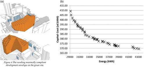
When simple generative forms are used to produce design advice, output information tends to be more ‘user friendly’. Scripts to produce them output geometrical boundaries that respond to certain performance criteria (Marsh and Haghparast Citation2004; Ochoa and Capeluto Citation2009, to cite a few). These boundaries further combined with legislation requirements and site constraints, provide clear visual guidance to explore building form in the early design stages ((a)). However, the same can rarely be said when more elaborate optimization routines are applied to produce design advice. In these cases, even though users are generally provided with a Pareto front graph to query on best design alternatives ((b)), queries tend not to be displayed in a user friendly format (See Nguyen, Reiter, and Rigo Citation2014 for a review of optimisation and building performance analysis). This means the user needs to post-process information that comes from optimization routines into something (s)he can understand to then query the content of this information.
Figure 3. (a) Visual guidance to explore building form produced from simple generative forms (Marsh Citation2005) vs. (b) Pareto graphs resultant from optimization studies (Brownlee and Wright Citation2012).
In general, users want to avoid having to understand and deal with the complexities involved in generating information they use in their everyday activities: They want this information to be readily available. Building designers are no different. They do not want to deal with simulation output post-processing to be able to use this information for design decision-making.
These examples of outputs illustrate that while researchers and developers continue to propose and integrate new representation systems, comparative displays, parametric tests and different types of analysis algorithms to existing tools , there is a lack of a comprehensive overview or system that collects all these proposals and explores more general ways of ordering information. Therefore, a framework to post-process and shape simulation information for building designers to use was proposed by the authors. This current paper builds on this framework and explores the construction of a conceptual data model to be transformed into a database/data management system of meaningful simulation outputs to design decision-making. Once developed, this database/data management system, potentially accessible through a user friendly interface, would guide designers to query simulation output data while undertaking design experiments. The database of outputs is not seen as exhaustive but could accept new additions, especially in data metrics and displays, following new research developments in these areas. This approach to structuring simulation software output information using a database/data management system can in theory be extended to any user, who could include building engineers and consultants needing different types of analysis and results on which to base design decisions.
2.2. Databases
Current databases, when used to organise simulation output information, do not have a format to recall information that meets building designers’ needs (Mahdavi, Bachinger, and Suter Citation2005; Stravoravdis and Marsh Citation2005; to cite a few). More specifically, they do not provide readily available information to be recalled on the following main aims designers have when using BPS (Building Performance Simulation) for design decision-making: (i) understanding a specific performance result; (ii) exploring a specific design strategy; (iii) meeting a target; (iv) assessing a specific product and (v) optimising.Footnote4
However, they are widely used by building designers particularly as nowadays Building Information Modelling (BIM) systemsFootnote5 are part of everyday design activities. They are also widely used by the building simulation community to organise simulation input information (materials, constructions and schedules)Footnote6 and to benchmark building simulation results by comparing them with case studies.Footnote7 They are starting to be used to facilitate parametric analysis (Turrin, von Buelow, and Stouffs Citation2011), meaning they are not only appropriate to structure simulation results but also that their use is common among designers and the simulation community. They are powerful tools for data management and enable choices to be pre-defined/customised, potentially facilitating knowledge sharing among practices and knowledge transfer to beginners and/or newcomers.
The purpose of the data model described in this paper is therefore to structure and represent simulation output data through a database/data management system. However, exploring simulation output data relevant to design decision-making is seen independently of proposing a simulation output data interface. It is essential that this exploration happens prior to the development of an interface as any interface should focus on different user experiences in interacting with data and machines rather than on the data itself.
3. Analysis and methods
This work starts by using a PAR approach. In this approach designers are invited to propose what they think are appropriate building thermal physics information for building design decision-making. The advantages of using this type of approach is that beneficiaries themselves propose a solution to their own problems eliminating the needs for further tests. Examples of meaningful information for design decision-making, from a designer's viewpoint, are extracted from a sample of 140 design journals. These journals narrate all steps used to solve a design problem which included thermal comfort, energy efficiency and the testing of passive design strategies (a summary of one of these journals is presented in Annex 1). The data set is limited to the design of an office building envelope in which heat balance calculations were undertaken using simplified methods. Hand calculations were used, instead of any kind of software, to prevent any bias by existing user interfaces to interfere with proposals. Those sorts of calculations were also seen as an efficient mechanism to facilitate knowledge transfer of building thermal physics concepts to designers.
A Thematic Analysis is applied on this empirical data sample. Thematic Analysis, a common research method from the Social Sciences, consists of investigating recurrent themes in a data set so that a phenomenon can be described (Bryman Citation2008). A Thematic Analysis should not be confused with a statistical analysis. It comprises identifying and recording recurrent themes from all the data in a data set so the conceptual data model can present all relevant possibilities regardless of how frequently they are used.
This successive data querying and filtering also involves reviewing the information generated from simplified methods. If this information is to be produced by dynamic thermal simulation tools, it should comply with the dynamic, systemic, nonlinear and stochastic nature of building thermal physics phenomena. This compliance is achieved by using dynamic thermal modelling principles to revise and adapt metrics and analysis methods used in the data sample. Metrics or quantities used to measure building behaviour are changed (e.g. air temperatures are replaced by environmental/operative temperatures, metrics related to simplified heat balance breakdowns are eliminated, etc.). Appropriate analysis methods to post-process BPS data into a format which match design aims are proposed in replacement of the simplified ones found in the data sampleFootnote8 (e.g. simplified heat balance breakdown results are replaced by elimination parametric tests to explain main causes of building behaviour, etc.).
Information Visualization principles (Schneiderman Citation1996; Card, Mackinlay, and Shneiderman Citation1999; Spence Citation2007; Mazza Citation2009; Ward, Grinstein, and Keim Citation2010) are used to codify displays and organise subcategories of interactions with data. Displays are described by a pseudo-code to facilitate data manipulation. Interaction with data is explored according to proposed by Schneiderman (Citation1996) who states that users should be provided with the ability to:
Obtain an overview of the data to get a broad understanding of a phenomena;
Zoom into areas of specific interest and filter out unwanted data;
Ask for a specific type of detailed information;
Retrace previous steps (retrace history);
Compare and relate information.
Overviews and zooms, become instances of the conceptual data model class of ‘types of interaction with data’ whereas the remaining three types of interaction with data are embedded in the conceptual data model structure.
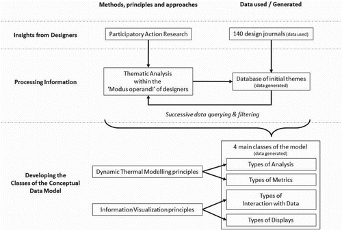
The different methods, principles and approaches of this research together with the data they used or generated are summarised in . Details involved in defining each class of the conceptual data model and the list of data which belongs to them are explained in Section 4.
Figure 4. Summary of how the conceptual data model classes emerged.
Pairwise comparisons are used to explore appropriate combinations of relevant data for design decision-making. Pairwise comparisons are a common analysis method used in the Social Science, Psychology and Artificial Intelligence to undertake comparative judgement between pairs of data (David Citation1988). In computer science, they are also used to undertake internal validation of software development. In this conceptual data model, they illustrate if a combination is preferred or not.
The four classes of the conceptual data model enable six pairwise comparisons to be explored (). Comparisons were numbered according to the sequence of operation indicated in . Preferred combinations discussed in detail in Section 5 come mainly from the data set, polished by information from the literature on BPS software. However, preferred combinations reported in Section 5 should not be seen as exhaustive and could be further developed/refined and even made specific to each different design practice. They could be open to being customized by each different practice depending on the building typologies they generally deal with, types of contracts undertaken, specific ways they organise design teams, etc.Footnote9 Section 5 is therefore intended to illustrate how pairwise comparisons are used to relate the four classes of the conceptual data model for ‘generic’ types of low energy design problems.
Figure 5. Relationships between the conceptual data model and the framework developed in Bleil de Souza and Tucker (Citation2014).
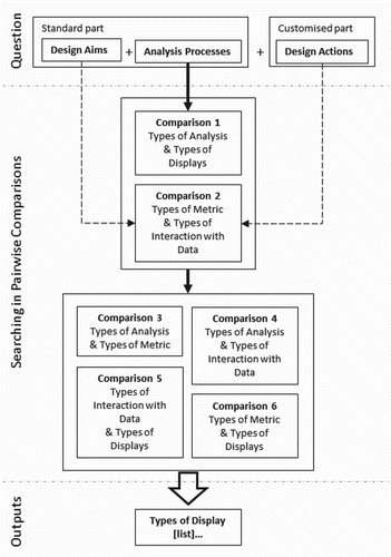
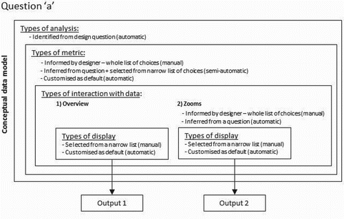
illustrates the relationship between the conceptual data model and a design question from the framework proposed in Bleil de Souza and Tucker (Citation2014). The analysis process in a question narrows down the search in preferred combinations in comparison 1. Types of display not appropriate to respond to the type of analysis in the question are automatically eliminated from a future list of choices. Aims and actions can be used to infer a selection of ‘metrics’ and ‘types of interaction with data’ potentially available to answer the question. The dashed arrows () indicate a separate study would be necessary to determine if this selection could be at least partially automated. In case this selection should be manual, it would be necessary to determine the best user interface and database/database management system to present this information for designers to select.
Once metrics and types of interaction with data are chosen, a search in preferred combinations in comparison 2 can be undertaken. Comparisons 1 and 2 would provide all the necessary constraints to automate searches in the remaining comparisons. The aim of the search is to output a narrow list of types of display to represent the answer to the question. Choices of displays should preferably be provided rather than a single display option.
4. Defining classes of the conceptual data model
The classes of the conceptual data model are discussed in this section. They were initially listed in Bleil De Souza and Tucker (Citation2013) but are described here in terms of the data model. A definition for each class is provided followed by an explanation about how it is defined based on information from the data set, principles of dynamic thermal modelling and Information Visualization. Recommended lists of instances for each class are provided based on the empirical data set in combination with information from the literature and BPS software output interfaces. These lists of instances are not supposed to be exhaustive.
4.1. ‘Types of analysis’ class
Definition: ‘Types of analyses’ are a class which describes and defines how building designers would use dynamic thermal simulation tools to inform or assess design decisions. They are important procedures or algorithms to extract design advice or undertake performance queries in BPS output data. Controlling different types of analysis is seen as the most important aspect of integrating BPS tools throughout the building design process.Footnote10 provides a list of the five types of analysis instances which belong to this class together with the purpose in using each of these analysis instances to inform design decision-making.
Table 1. Types of analysis to be included in the conceptual data model (from Bleil de Souza and Tucker Citation2014).
Data evidence: Information from the data set reports mainly descriptive and comparative types of analysis instances. Many comparisons focus on understanding the contribution of each of the heat balance component in the overall building behaviour. They are used to understand causes of building performance and provide some information on where to act to improve it. Comparisons with targets and standards and comparisons among different design alternatives are also common. Elimination parametric is used to illustrate the influence of internal gains in overall heating and cooling demands. Sensitivity tests are sometimes undertaken to experiment with window areas and window material properties. Optimization routines are sometimes used to explore shading device form.
Each analysis instance reported in the data set was critically assessed using dynamic thermal modelling principles to ensure the dynamic, systemic, nonlinear and stochastic nature of building thermal physics phenomena would be preserved. Analysis instances to explain building behaviour based on simplified methods, (e.g. comparing heat balance breakdowns) were replaced by elimination parametric tests as suggested by SERI (Citation1985).Footnote11 Main causes of building behaviour could be provided with five tests eliminating the following variables one at a time: internal gains, ventilation losses and gains, solar gains, fabric conduction losses or gains and fabric storage. Specific causes of building behaviour could be provided with more detailed tests: (i) eliminating usage-related variables one at a time (people, artificial lighting, equipment and ventilation loses or gains) or (ii) eliminating building-related variables one at a time (window conduction, wall conduction, roof conduction, floor conduction, window mass, wall mass, roof mass, floor mass, solar, infiltration).
4.2. ‘Types of metrics’ class
Definition: ‘Types of metrics’ are a class which describes and defines the different quantities associated with building behaviour relevant to design decision-making. These quantities need to be capable of being represented as time series, summarised and aggregated as appropriate enabling designers to see when exactly heating, cooling and artificial lighting are needed through structured searches for overheating and under heating patterns at typical and peak days (as recommended by SERI Citation1985).Footnote12 provides a list of the metric instances which belong to this class.
Table 2. Metrics relevant to display meaningful information to design decision-making (from Bleil de Souza and Tucker Citation2014).
Data evidence: The data set included mainly metrics used to describe overall building performance (e.g. heating and cooling demands, temperatures, etc.). A second common set of metrics is used to understand causes behind this performance in attempt to gain insights on where to act in the building to improve its behaviour (e.g. heat balance breakdowns). More specific metric instances are used to assess specific design intents (e.g. shading and lighting metrics are also used to assess if a desired type of atmosphere is achieved in some of the internal spaces). Metrics instances in the data set can be grouped into: comfort-related metrics (air temperatures, daylight factors and illuminance levels), solar-related metrics (incident solar radiation on windows and data related to shading) and energy-related metrics (heating and cooling demands, heating/cooling degree hours, electric energy consumption and heat balance breakdowns).
Some of these metric instances are adjusted to be more precise in delivering the information requested (e.g. air temperatures are replaced by environmental/operative temperatures to provide a better indication of comfort; heating, cooling and lighting energy consumption are replaced by heating, cooling and lighting energy consumed per fuel type to account for other sources of energy supply). Metric instances related to heat balance breakdowns are eliminated (see discussion in Section 4.1). New metric instances related to comfort and passive building behaviour are introduced (e.g. PMV and working hours operating without HVAC respectively). A series of metric instances related to cost are suggested (following SERI Citation1985; Waltz Citation2000; Franconi Citation2011, to cite a few).
4.3. ‘Types of interaction with data’ class
Definition: ‘Types of interaction with data’ are a class which describes and defines possibilities involved in and afforded by manipulating thermal simulation post-processed output information. The instances defined for this class are the following: Overviews, zoom into different time frames, zoom into different location/orientationFootnote13 and zoom into parameters potentially related to design actions.
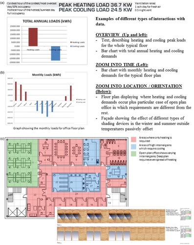
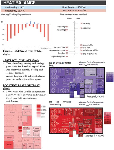
Data evidence: Information from the data set was organised into the different types of interaction with data instances reported in Section 3. Overviews and different types of zoom were used to gather insights about how designers query information relevant to design decision-making. Overviews provide data summaries ((a)). Zooms into different time frames are generally used to increase understanding about a specific type of behaviour ((b)). Zoom into different building locations, façade orientations and construction assemblages are instrumental to design decisions. They are generally displayed using performance metric instances represented on top of plans, elevations and sections ((c)).
Figure 6. Examples from types of interaction with data found in the data set.
Types of interaction with data should be explicitly organised to facilitate data query, minimise visual noise and reducing the ‘cognitive load by removing unnecessary information from displays’ (Lidwell, Holden, and Butler [Citation2003] Citation2010). Further empirical studies would be necessary to conclude if precise definitions of overviews and zooms can be generalised or if they need to be addressed on a case-by-case basis (e.g. would looking at energy use in a specific time frame, for instance the summer period, be considered an overview or zoom into time? The answer to this might potentially depend on the type of project, personal preferences, etc.). Proposing ‘progressive disclosure’Footnote14 would also involve investigations to indicate whether these can be generalised or need to be addressed in a case-by-case basis.
4.4. ‘Types of data display’ class
Definitions: ‘Types of data displays’ are a class which describes or defines the different ways of representing useful information for design decision-making. An indicative notation system in the form of a pseudo-code is developed. This provides a synthetic and clear description of each display instance facilitating their manipulation in the conceptual data model structure as well as their interpretation by computer programmers.
Data evidence: The empirical data set is rich in information display instances especially to connect performance information with design parameters (). Representation systems can be of two types: (i) Location based, in which performance metrics are displayed on top of commonly used building design displays (e.g. plans, sections, elevations, etc.); (ii) Abstract, in which performance is displayed in a non-spatial way through graphs, tables, text, etc. In the first case, the aim is to inform where a specific parameter or performance result would occur or which specific building design element is mainly responsible for causing specific resultant behaviour. The second case seems to be more useful when highlight strategies are adopted to help interpret information (e.g. ranks, ranges and differences between two or more options or between an option and a target).
Figure 7. Examples of different types of data display proposed by building designers.
Display instances from the data set were identified, classified and had indicative pseudo-code assigned to specify their content. In this pseudo-code a display instance is defined by a name followed by its attributes. The names for each display instance come from the literature of Information Visualization (specifically Wright Citation2007; Mazza Citation2009; Ward, Grinstein, and Keim Citation2010). The respective attributes are listed in together with examples of how important information can be highlighted. The list of highlights is far from exhaustive and does not include interactive highlights (such as brushing, etc.). only informs how things can be highlighted – NOT what information can be highlighted. The way information can be highlighted depends on the display instance used to represent it, whereas the type of information to be highlighted depends on the aims behind an analysis.
Table 3. Different data displays and their respective pseudo-code with highlights (examples of how targets can be highlighted are provided in brackets on the highlight column).
5. Exploring pairwise comparisons of the conceptual data model
This section examines the preferred combinations of each of the six pairwise comparisons of the conceptual data model. Preferred combinations are not exhaustive and should in theory be customizable. Preferred combinations in each comparison are described following the sequence of operations outlined in . Principles underlying each combination are outlined together with comments for combinations that should not be allowed. While many of the combinations presented in Tables – are allowed in theory, they would be limited in practice by the simulation software being used, and therefore also provide a means by which any particular software can be assessed as to its functionality in terms of provision of outputs.
Table 4. Comparison 1: types of analysis and types of data display.
Table 5. Comparison 2: types of metric and types of interaction with data.
Table 6. Comparison 5: types of interaction with data and types of data display.
Table 7. Comparison 6: types of metric and types of data display.
5.1. Comparison 1: types of analysis and types of data displays
Preferences for combining these two classes are illustrated in with the following principles underlying them:
Descriptive analyses can be represented using the vast majority of display instances and provide more possibilities for different metrics to be compared without cluttering.
Elimination parametric tests, sensitivity tests and comparative analysis can be represented using similar display instances as they all involve comparing different models. Comparisons can be emphasized through data grouping (e.g. grouped bar charts), data superimposition (e.g. superimposed histograms or line graphs) and/or by increasing data density (e.g. dense tables).
Data from sensitivity tests can be summarised through special display instances called Tornado charts. These are modified bar charts with ranked data categories listed vertically generally used to illustrate the relative importance of each variable of a sensitivity test.
Optimization data are generally summarised through Pareto front graphs which could be a useful interface to further query optimization results. The term ‘After zoom’ in refers to potential types of displays to be presented after querying the Pareto Front graphs. Zooming into a specific point of the Pareto graph could lead to display instances suitable to represent descriptions. Zooming into a specific region of the Pareto graph could lead to display instances suitable to represent comparisons. Histograms, used to illustrate how often values for each specific design parameter being optimised were used in optimisation tests, could assist in identifying the most important contributors to building performance.
All analysis instances, with the exception of descriptive ones, when displayed as 2D contour plots or as 2D surface views, could be represented as small multiples (i.e. showing multiple 2D displays, one for each different model being compared).
5.2. Comparison 2: types of metrics and types of interaction with data
Preferences for combining these two classes are illustrated in with the following principles underlying them:
Comfort and energy-related metric instances are relevant to be displayed in all types of interaction with data. At an overview level, they are useful to quantify and benchmark overall building behaviour. At a zoom level, they improve understanding on when, where and potentially why performance is happening.
The time and space dependency of shading/solar-related metrics make them more appropriate to be displayed preferably when zooming into data.
Cost -related metrics are suitable to be displayed at an overview level but could also be displayed at zoom level in fine tuning, resolving conflicting design objectives or whatever other analogous circumstance.
5.3. Comparison 3: types of analysis and types of metrics
Preferences for combining these two classes of the conceptual data model are not reported in a table because any metric instance can be used in any analysis instance.
5.4. Comparison 4: types of analysis and types of interaction with data
Preferences for combining these two classes of the conceptual data model result in all combinations being possible due to the principles listed below.
All analysis instances should enable interaction with data at an overview level to convey data summaries. Specifically in the case of elimination parametric tests, main causes of building behaviour could be provided at an overview level reporting the following variables: internal gains, ventilation losses and gains, solar gains, fabric conduction losses or gains and fabric storage.
All analysis instances should also enable interaction with data at all zoom levels to improve understanding on when and where performance is happening as well as on what is causing it. Specifically in the case of elimination parametric tests, causes of building behaviour could be provided by zooming into parameters potentially related to design actions reporting: (i) usage-related variables (people, artificial lighting, equipment and ventilation loses or gains) or (ii) building-related variable losses or gains (window conduction, wall conduction, roof conduction, floor conduction, window mass, wall mass, roof mass, floor mass, solar, infiltration). This same type of zoom should also be enabled in optimizations if designers wish to use optimization results to explore which design parameters are the most important contributors to building performance.
5.5. Comparison 5: types of interactions with data and types of data displays
Preferences for combining these two classes are examined considering principles of Information Visualization. In these principles, excellence in data display follows from communicating complex ideas with clarity, precision and efficiency (Tufte Citation1983). Representation systems should avoid data distortion, encourage comparisons, provide coherence to large data sets and display the data such that the substance of it, what it represents, is brought into focus rather than means and methods behind representations. Comparisons should be controlled to a small number of displays for many variables (5 being a good number) and multiple small views of states in a single variable (small multiples) (Lidwell, Holden, and Butler [Citation2003] Citation2010).
Following these criteria, only display instances considered most appropriate for the different types of interaction with data are marked as preferred. This means fields not filled with an ‘✓’ might be prone to data cluttering compromising the speed and effectiveness of results interpretation. Fields filled with ‘small multiples’ indicate multiple displays of the assigned type. Preferences for combining these two classes are illustrated in and discussed below:
Overviews should convey data summaries and broad indications of performance with clarity. The preferred display instances for these should deal with caution with data density and data superimposition (fields related to superimposed and dense types of displays were not filled with a ‘✓’).
Zooms into different time frames (seasonal, monthly, typical days, etc.) are preferred to be displayed using instances which emphasize when performance needs to be improved. Performance profiles are suitable to be illustrated using line graphs. Performance data aggregated over a specific time frame are suitable to be illustrated through bar charts or tables.
Zooms into different types of location/orientation could be provided directly through spatial representation systems (2D surface views, contour plots, etc.). They could also be provided through abstract display instances, having at least one nominal variable to represent location/orientation (bar charts, arrow diagrams, etc.).
Zooming into design parameters potentially related to different design actions are generally presented by display instances which emphasize comparing performance data summaries for different models. Although this means display instances in this case might be very similar to the ones requested for overviews, more in depth information can be provided through data superimposition and data density increase (e.g. dense tables and superimposed histograms). Information could be complemented by 2D contour plots or surface views displayed as small multiples providing a performance summary of the impact of design variables potentially related to design actions in space.
Further studies would be necessary to explore potential useful combinations of different zoom instances. Are these more efficiently managed when directly combined (e.g. when zooming in time and location/orientation happen simultaneously) or are they are better managed if undertaken in sequence (e.g. zooming in time first and from there proceed to zooming into location/orientation)? Further explorations of combining different zooms could be used to refine preferred combinations and provide a user defined structure to request details on demand.
5.6. Comparison 6: types of metrics and types of data displays
Cost-related metric instances were excluded from this combination. These instances require the application of financial value techniques and classical investment analysis methods to be processed and have an appropriate display instance attributed to them, which are beyond the scope of this study. The following principles of what is preferable in this pairwise comparison are outlined based on information from :
‘Thermal energy delivered to the space’ and ‘energy use at the meter’ can be represented using the majority of display instances listed. 2D contour plots should only be available for displaying these metrics if energy results enable simulations to be undertaken at a sub-zone level.
‘Time exceeding glare index’, ‘working hours operating in a passive mode’ and ‘working hours not requiring artificial lighting’ are similar metric instances. They are counts of the number of times a phenomenon occurs as expected and can be represented using most display instances depending on the level of data interaction required. As these metrics are not time dependant, they are not appropriate to be represented by line graphs or carpet plots.
Temperatures and comfort indices mainly involve quantifying phenomena at a time instant. They can be represented either connected to this time instant when appropriate (e.g. 2D graphs for temperatures) or summarised using statistics (e.g. tables, histograms, box plots, etc.). Results can be plotted in 2D surface views to highlight where potential problems could be expected.
‘Transmitted solar radiation’, ‘shading on floor plan in %’ and ‘daylight illuminance’ are location-based metric instances and should preferably be displayed through 2D contour plots and 2D surface views. The latter two metrics can also be summarised using histograms or tables and displayed in relation to time instants in carpet plots. ‘Transmitted solar radiation’ can also be summarised in tables and displayed in relation to time instants using 2D line graphs. ‘Shaded surfaces’ are generally represented in 2D surface views to better convey the geometric representation of a shading pattern.
Zooms should also be enabled at a metric instance level so that users could query for example the heating and cooling portions of thermal energy delivered to the spaces, discriminate uncomfortable hours due to overheating and under-heating in comfort indices, etc. Zooms of this type were not explored in detail in to avoid information overload.
6. Discussion
6.1. Operation of the model
Operation of the model involves linking the design questions asked to the data produced as output (). As there are a limited number of questions it would be possible to supply these on one or more on-screen menu's to be manually selected. in theory also provides a template to interpret design questions which could be hand-coded on a natural language type of interface. A question/answering system would need to be developed to recognize a design input question as an instance of the template:
<Design Aim> <Analysis Process> <Design Action>
Once the system has found a matching template, it could recall a specific script to run simulations and the necessary ancillary tools (e.g. optimization routines) and/or procedures (e.g. automatic elimination parametric tests) to generate the data to answer the question automatically. The 20 questions developed are already a list of potential variations for the template question. They could be all hand-coded individually, simplifying the question answering system to focus only on identifying the different types of design actions for the different types of questions listed. The design of this kind input interface and the details related to the question/answering system are a problem of software implementation and beyond the scope of this study.
Generating answers to these questions would involve structuring modelling and simulations assumptions as well as writing scripts to identify patterns in results (e.g. identify discomfort, hours of overheating, flag zones in which it would happen and help the user to improve performance by displaying the causes of the problem, etc.) Many of these types of patterns could be automatically identified and reported to the users in a simplified way, through integrated performance metrics, simple text format (e.g. stating what is causing a problem), indicated in plan (e.g. where a problem is happening) etc. A full exploration about this part of the work is however addressed in Tucker and Bleil de Souza (Citation2013) and further developed in detail in Tucker and Bleil de Souza (Citation2014).
Presenting answers to these questions would involve developing a database/database management system to enable manual, semi-automatic and totally automatic searches in preferred combinations of the 6 aforementioned pairwise comparisons (). The search would start by automatically identifying the ‘type of analysis’ in a question to eliminate all but one specific column from (Comparison 1). Metrics and different types on interaction with data would eliminate most but a few fields in (Comparison 2). The selection of metrics could be done in three different ways as, already outlined in Section 3 and suggested in . Types of interaction with data should be provided preferably at an overview level first (as suggested by Information Visualization literature and in interview with designersFootnote15). The selection of different types of zooms could either be done manually or automatically and the interface should allow both ways to happen.
Figure 8. Further filtering system applied to the conceptual data model.
Based on information from comparisons 1 and 2, preferred combinations of the remaining 4 pairwise comparisons could then be automatically identified. Results to be reported to designers would only include combinations which are marked as ‘preferred’ in all pairwise comparisons. Designers would be provided with a list of relevant displays to represent a selection of few metrics in specific types of interaction with data to choose how to best answer their design question. Additional information about manual, semi-automatic and automatic types of data selection illustrated in provide an extra filtering system to reduce the amount of choices to be presented to designers. The model should also enable combinations of different types of data selection to be customised (e.g. a practice could wish to always output an overview of the minimum rate of return on investment as the first metric to inform or assess design decisions). Customization could be set up by users and/or automated via the use of a Machine Learning system. Supervised learning could be used in this case to store and analyse user specific preferences, presenting a reduced number of visualization options every time a new query is made. The context of a question would need to be represented as a feature vector (e.g. encoding what kind of simulation the user has performed) together with a record what aspects of the output the user has previously wanted to see. These would enable the system to learn with the users what would be the most appropriate metrics and visualization options to each different type of query, potentially reaching a point in which choices are no longer presented if not specifically requested. The design and implementation of this supervised learning system and the development of this database/database management system are again a problem of software implementation and beyond the scope of this study.
6.2. Examples
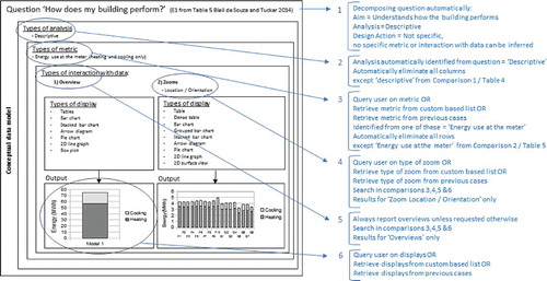
shows an example of the conceptual data model application in practice. It shows a question detached from a specific context with ‘answers’ coming from preferred combination discussed in Section 5. It provides a graphical explanation of the application of the model in practice together with a detailed list of procedures to be follow step-by-step, which start from how a question can be decomposed and finish with how the number of visualization options can be reduced. As it is not possible to infer which kind of metric or zoom users could potentially like to see in an ‘answer’ for this question, these would need to be manually informed by designers, retrieved from a custom-based list or from previous cases. Lists of display choices would then be provided to enable the requested BPS output to be presented. The designers would then select the type of display (s)he is more comfortable dealing with. If a custom-based system is in place, this part could automated and a single display or an extremely reduced list of displays could be presented. As it was already noted in Section 3, ultimate display choices are a matter of personal preference.
Figure 9. Example 1 (explained): applications of the conceptual data model applications in practice.
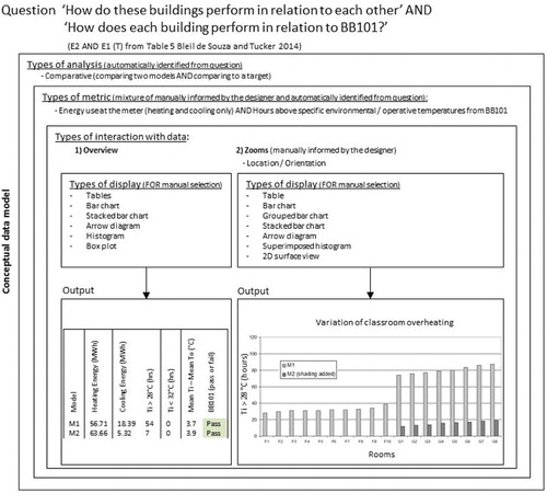
illustrates an application of the conceptual data model when a question is attached to a very specific context: exploring the design of shading devices for a school building in the UK. As school buildings in the UK need to comply with BB101 overheating targets, simply comparing different design alternatives does not provide enough information for designers to make decisions. These comparisons are more meaningful if bounded by the targets. As BB101 specify allowable hours of overheating,Footnote16 this metric could be automatically identified from the question whereas a second metric to assist in decision-making could be provided by the designer or customized as default for school building assessment. Lists of displays choices would then be restricted to offer an ‘answer’ to these two questions simultaneously, as provided in Example 2 (). In this case the user has selected a zoom to individual classroom overheating using a metric of ‘hour > 28°C’. This example illustrates a case in which interpreting questions and setting up preferred combinations could be customized based on a specific building typology. As suggested in Section 3, customization could also be enabled in different practices depending on the types of contracts they undertake, specific ways they organise design teams, etc. such that questions that are often asked can be saved along with the preferred outputs and choices.
Figure 10. Example 2: applications of the conceptual data model applications in practice.
Having simulation output data information meaningful to design decision-making in a hierarchical data structure and within lists, facilitates choices and the retracing of previous steps in querying results. It also facilitates setting up interfaces in which users can customise their own preferences either through the use of supervised machine learning techniques and/or by manually saving them to be retrieved in different projects. The hierarchical structure also facilitates the request for ‘details on demand’ to be further explored through simultaneous and/or sequential zooms, as discussed in Section 5.5.
Another feature of this model is that lists, especially list of metrics and list of displays, are not supposed to be exhaustive but to be constantly enriched by software developers based on further research and interactions with designers. New additions could vary from less conventional types of displays (kinematic, haptic, etc.) up to comprehensive metrics which could couple performance with other types building design metrics (e.g. proportion systems, ergonomics, rules of construction assemblage, etc.). Before release to the users, every new addition should be assessed in terms of preferred combinations as illustrated in this work.
7. Conclusions and future work
This paper proposed a conceptual data model to present meaningful dynamic thermal simulation information for design decision-making. It explained how the model was generated and how it could become operational, followed by examples of its applications to practical problems. Rather than following a conventional statistical analysis on user preferences which would not cope with the idiosyncrasies of the design problems, different types of clients, different types of design practices, etc.; the authors proposed a totally custom-based approach.
In this approach, the first priority was to identify and make available a full and exhaustive range of meaningful simulation outputs for building designers, rather than having the software manufacturer decide for them on a reduced set of representations. Having this full range potentially available opens up the possibility of different designers/users being able to choose how they wish to analyse performance and view/interact with results.
This full range of possibilities was initially explored through a Thematic Analysis on building designers’ work. Dynamic thermal modelling and Information Visualization principles were then applied to further organise simulation output information. A filtering system was added to reduce what could be a long list of output data. This filtering system started by analysing pairwise combinations of simulation output data to exclude those which are irrelevant or not allowed. A second layer of filtering is applied when designers ask a question from which aims, analysis processes and potentially design actions and metrics are extracted to narrow down the visualization choices once again.
A third layer of filtering is then to be applied by the user through one or more of the following options:
Enabling the manual selection of specific elements of the conceptual data model (e.g. the selection of a single metric) so that the list of visualization options can be narrower.
Enabling the designer, or his/her consultant, to select and save preferred outputs such that these are always made available when specific preferred combinations are selected (e.g. a practice could wish to always output an overview of the minimum rate of return on investment as the first metric to inform or assess any design decision).
Enabling machine learning techniques to be implemented so that the database/database management system could learn from each user what are his/her preferred outputs. Supervised Learning could be used in this case to store and analyse user specific preferences, presenting a reduced number of visualization options every time a new query is made. The context of a question would need to be represented as a feature vector (e.g. encoding what kind of simulation the user has performed) together with a record what aspects of the output the user has previously wanted to see. These would enable the system to learn with the users what would be the most appropriate metrics and visualization options to each different type of query, potentially reaching a point in which choices are no longer presented if not specifically requested.
The number of choices can be therefore limited by each different user considering their specific needs, rather than by finding a stereotypical user and assuming what he/she wants. Possibilities of data display will always be reduced, depending on the question asked and if a customised and/or learning systems is in place. In case a learning system is in place, it is expected that options will reduce according to an increase in the number of queries. This is because, the larger the number of examples the system has stored, the more it can learn with them and reduce the number of display options presented to the user.
The model was validated and tested throughout its construction by using a set of different methodological approaches to extract concrete and relevant data for design decision-making from designers themselves. Validation in this case happens in a different way and can be summarised by the three following stages/steps:
PAR: Contrarily to other methods, in which the researcher proposes a solution to a problem and test this solution with his/her potential beneficiaries, in PAR the beneficiaries themselves propose concrete solutions to their own problems. This being the case, testing what is proposed by beneficiaries with beneficiaries themselves becomes redundant, especially when the sample comprises more than a 100 participants.
Elimination and filtering: Quality assurance in terms of the physics contained in the solutions produced by designers was guaranteed by checking proposals in terms of them fitting or violating dynamic thermal modelling principles. Solutions which violated these principles were eliminated and/or adapted to fit them.
Pairwise comparisons: These comparisons were used to ‘fine tune’ quality assurance procedures by examining every combination of types of analysis, types of metrics, types of interaction with data and types of data display in pairs. They were also used to manage information association and are a common procedure used to do internal validation of software development.
The need to organise and better present relevant thermal simulation outputs for design decision-making is constantly highlighted in the literature but is expressed in practical terms in many software initiatives in a disarticulated and disjointed format. The conceptual data model is a meaningful resource for software developers to structure output interfaces because it deals with information only, independent of a specific database or database management system format. This gives developers freedom to choose how they wish to design a database/database management system which best fit their different software structures.
As it is totally custom-based, the conceptual data model proposed can be expanded and further developed to include different simulation software users as this could be easily managed in a database/database management system environment. A range of users could thus gain access to the power and accuracy of complex simulation tools, which thereby could facilitate the design of low energy and low carbon buildings.
This conceptual data model is not supposed to be directly accessed by building designers, that is, it is not supposed to be a user friendly simulation output interface for building designers. It should be understood as a comprehensive structure for software developers to produce appropriate simulation output interfaces for design decision-making. Future work should involve: (i) exploring appropriate database/database management systems for implementation of the model; (ii) refine preferred combinations, metric and display instances in the model to include issues related to communicating information to clients, investors and passing information to the construction site; (iii) explore different types of user experiences in interacting with this type of data.
Acknowledgements
The authors are grateful to ESRU research team (important collaborators in this project), especially Dr Jon Hand, Dr Paul Strachan and Prof. Joe Clarke for their important questions and support. The authors are also grateful to Dr Steven Schockaert the insightful discussions about the computer science and software development/implementation side of this work.
Additional information
Funding
Notes
1. Schon (Citation1988, [1983] Citation1991) are classics with more examples presented in Lawson ([Citation1980] Citation1997), Rowe (Citation1987) to cite a few.
2. Five aims from Bleil de Souza and Tucker ([1980] Citation2014) are: (i) understanding a specific performance result, (ii) exploring a specific design strategy, (iii) meeting a target, (iv) assessing a specific product and (v) optimizing.
3. Analysis processes are described in detail in .
4. These limited number of aims and their relevance to design decision making were extensively explored in (Bleil de Souza and Tucker Citation2014). Even though most of these aims require multiple simulations or needs third party tools to be achieved, parts of them are now possible to be extracted directly from BPS software. Open Studio (NREL Citation2013) and Design Builder (Tindale Citation2013) provide some examples of easy configuration or semi-automatic parametric tests, indicating software developers are gradually understanding simulation packages alone are not enough to cover user needs.
5. Databases are a powerful feature in BIM software such as AutoDesk Revit (Citation2014), Graphisoft (Citation2014), Bentley (Citation2014), etc.
6. Databases with simulation input data can be found in Tindale (Citation2013), ESRU, ESP-r (Citation2013), NREL (Citation2013), IES (Citation2014), to cite a few.
7. Databases to benchmark simulation results can be found in Knight, Marsh, and Bleil de Souza (Citation2006) and Knight et al. (Citation2007).
8. Details involving this replacement are discussed in Section 4.1.
9. Custom-based information, rather common in BIM systems, could possibly enable context based and potentially more efficient BPS results retrieval.
10. See Bleil de Souza and Tucker (Citation2014) ‘further insights and criticism’ for interviews with designers on this topic.
11. Breakdowns from BPS are difficult to interpret especially when designers want to know where to act on the fabric and/or relate fabric and solar radiation to improve building behaviour. Identifying the main contributors in the air heat balance breakdown could be initially informative. However, tracing information further in the inside and outside surface heat balance breakdowns is not an easy task – if at all possible.
12. The six ‘key’ days suggested by SERI (Citation1985) would enable designers to get a broader understanding of when energy is needed without being overloaded by large amounts of time series graphs with potentially minimal and/or meaningless extra information to ‘be digested’.
13. Location and orientation are words designers understand. They were therefore used to replace the simulation jargon of ‘zone’ and ‘aspect’.
14. ‘A strategy for managing information complexity in which only necessary or required information is displayed at any given time’ (Lidwell, Holden, and Butler [Citation2003] Citation2010).
15. See Bleil de Souza and Tucker (Citation2014) for details on interviews with designers.
16. BB101 specifies maximum environmental/operative temperatures allowed for schools in the UK: maximum of 120 h above 26°C, no hours above 32°C and 0 h where mean ‘ti’- mean ‘to’ is greater than 5°C. Even though this metric is not directly listed in (Section 4.2), this table is not supposed to be exhaustive. A series of metrics related to specific performance targets could be further included there to cover most of the current legislation and building regulations.
References
- Akin, O. 2001. “Variants in Design Cognition.” In Design Knowing and Learning: Cognition in Design Education, edited by C. Eastman, M. McCracken, and W. Newstetter, 105–124. Atlanta: Elsevier.
- AutoDesk Ecotect 2014. AutoDesk Ecotect Analysis. AutoDesk, USA. Accessed January 2014. http://usa.autodesk.com/ecotect-analysis/.
- AutoDesk Revit 2014. AutoDesk Revit. AutoDesk, USA. Accessed January 2014. http://www.autodesk.co.uk/products/autodesk-revit-family/overview/.
- Bentley. 2014. Microstation. Accessed January 2014. http://www.bentley.com/en-gb/Products/MicroStation/.
- Bleil de Souza, C., and S. Tucker. 2013. “Thermal Simulation Software Outputs: What do Buildnig Designers Propose?” 13th international conference of the International Building Performance Simulation Association, 470–477. Chamebry: INES (CEA, University of Savoie, CNRS).
- Bleil de Souza, C., and S. Tucker. 2014. “Thermal Simulation Software Outputs: A Framework to Produce Meaningful Information for Design Decision Making.” Journal of Building Performance Simulation 8 (2): 57–78. doi: 10.1080/19401493.2013.872191
- Brownlee, A., and J. Wright. 2012. “Solution Analysis in Multi-objective Optimization.” Proceedings from the 1st building simulation and optimization conference, Loughborough, 317–324.
- Bryman, A. 2008. Social Research Methods. New York: Oxford University Press.
- Card, S. K., J. D. Mackinlay, and B. Shneiderman. 1999. Readings in Information Visualization: Using Vision to Think. San Diego, CA: Morgan Kaufmann Publishers.
- Chlela, F., A. Husaunndee, C. Inard, and P. Riederer. 2009. “A New Methodology for the Design Building of Low Energy Buildings.” Energy and Buildings 41 (7): 982–990. doi: 10.1016/j.enbuild.2009.05.001
- Cooper, A., R. Reimann, and D. Cronin. 2007. About Face 3: The Essentials of Interaction Design. Indianapolis, IN: John Wiley & Sons.
- David, H. A. 1988. The Method of Paired Comparisons. New York: Oxford University Press.
- ESRU, ESP-r. 2013. Energy System Research Unit – ESRU. ESP-r. Accessed October 2013. http://www.esru.strath.ac.uk/Programs/ESP-r.htm
- Evins, R., D. Knott, P. Pointer, and S. Burgess. 2012. “Visual Data Exploration in Sustainable Building Design.” First building simulation and optimization conference, Loughborough, September 10–11, 301–308.
- Franconi, E. 2011. “Introducing a Framework for Advancing Building Energy Modelling Methods and Procedures.” Building simulation 2011, 12th international IBPSA conference, K 8-K 15, Sydney.
- Graphisoft. 2014. ArchiCAD Graphisoft. Accessed January 2014. http://www.graphisoft.com/archicad/.
- IES. (2014) Integrated Environmental Solutions. Accessed January 2014. http://www.iesve.com/.
- Knight, I., C. Bleil de Souza, J. L. Alexandre, and A. Marsh. 2007. “The AUDITAC Customer Advising Tool (CAT) to assist the Inspection and Audit of Air Conditioning Systems in Buildings.” Proceedings Clima 2007 conference, Finland, June 2007. ISBN: 978-952-99898-2-9.
- Knight, I., A. Marsh, and C. Bleil de Souza. 2006. “The AUDITAC Customer Advising Tool (CAT) Website and Stand-alone Software”. European Commission Grant Agreement EIE/04/104/S07.38632, December. http://www.cardiff.ac.uk/archi/research/auditac/advice_tool.html.
- Lawson, B. [1980] 1997. How Designers Think: The Design Process Demystified. 4th ed. Burlington: Architectural Press (1st edition 1980).
- Lidwell, W., K. Holden, and J. Butler. [2003] 2010. Universal Principles of Design. Revised and Updated edition. Beverly, MA: Rockport Publisher (1st Edition 2003).
- Mahdavi, A., J. Bachinger, and G. Suter. 2005. “Towards a Unified Information Space for the Specification of Building Performance Simulation Results.” Building simulation ‘05, 9th international IBPSA conference, 671–676. Montreal: Beausoleil-Morrison and Bernier (Eds.).
- Marsh, A. J. 2005. “A Computational Approach to Regulatory Compliance Procedures.” Building simulation 2005, 9th international IBPSA conference, Montreal, 717–724.
- Marsh, A. J., and F. Haghparast. 2004. “The Application of Computer-optimized Solutions to Tightly Defined Design Problems.” 21st Passive and low energy architecture conference (PLEA 2004), Eindhoven.
- Mazza, R. 2009. Introduction to Information Visualization. London: Springer-Verlag London.
- Nguyen, A. T., S. Reiter, and P. Rigo. 2014. “A Review on Simulation-based Optimization Methods Applied to Building Performance Analysis.” Applied Energy 113: 1043–1058. doi: 10.1016/j.apenergy.2013.08.061
- NREL (National Renewable Energy Laboratory). (2013, October 6). Commercial Buildings Research and Software Development. Accessed from Open Studio: http://openstudio.nrel.gov/.
- Ochoa, C. E., and I. G. Capeluto. 2009. “Advice Tool for Early Design Stages of Intelligent Facades Based on Energy and Visual Comfort Approach.” Energy and Buildings 41 (5): 480–488. doi: 10.1016/j.enbuild.2008.11.015
- Papamichael, K. 1999a. “Application of Information Technologies in Building Design Decisions.” Building Research and Information 27: 20–34. doi: 10.1080/096132199369624
- Papamichael, K. 1999b. “Product Modeling for Computer-aided Decision-making.” Automation in Construction 8 (3): 339–350. doi: 10.1016/S0926-5805(98)00081-8
- Papamichael, K., H. Chauvet, J. La Porta, and R. Danbridge. 1999. “Product Modelling for Computer-aided Decision Making.” Automation in Construction 8 (3): 339–350. doi: 10.1016/S0926-5805(98)00081-8
- Petersen, S., and S. Svendsen. 2012. “Method and Simulation Program Informed Decisions in the Early Stages of building Design.” Energy and Buildings 42 (7): 1113–1119. doi: 10.1016/j.enbuild.2010.02.002
- Pratt, K. B., and D. E. Bosworth. 2011. “A Method for the Design and Analysis of Parametric Building Energy Models.” Building simulation ‘11, 12th international IBPSA conference, Sydney, 2499–2506.
- Prazeres, L. M. R. 2006. “An Exploratory Study about the Benefits of Targeted Data Perceptualisation Techniques and Rules in Building Simulation.” unpublished PhD, Energy Systems Research Unit, University of Strathclyde.
- Prazeres, L., and J. A. Clarke, 2003. “Communicating Building Simulation Outputs to Users.” Building simulation ‘03, 8th international IBPSA conference, edited by Augenbroe and Hensen, Eindhoven, the Netherlands, August 11–14.
- Prazeres, L., and J. Clarke. 2005. “Qualitative Analysis on the Usefulness of Perceptualization Techniques in Communicating Building Simulation Outputs.” Building simulation ‘05, 9th international IBPSA conference, 961–968. Montreal: Bernier, Beausoleil-Morrison (Eds.).
- Rogers, Y., H. Sharp, and J. Preece. 2011. Interaction Design: Beyond Human-Computer Interaction. 3rd ed. Chichester: John Wiley & Sons.
- Rowe, P. 1987. Design Thinking. London: The MIT Press.
- Schon, D. A. 1984. “Problems, Frames and Perspectives on Designing.” Design Studies 5 (3): 132–136. doi: 10.1016/0142-694X(84)90002-4
- Schon, D. A. 1988. “Designing: Rules, Types and Worlds.” Design Studies 9 (3): 181–190. doi: 10.1016/0142-694X(88)90047-6
- Schon, D. A. [1983] 1991. The Reflective Practitioner: How Professionals Think in Action. Aldershot: Ashgate Publishing Limited (1st edition 1983).
- Schneiderman, B. (1996). “The Eyes Have It: A Task by Data Type Taxonomy for Information Visualizations.” 1996 IEEE symposium on visual languages, Boulder, CO, 336–343.
- SERI (Solar Energy Research Institute). 1985. The Design of Energy-responsive Commercial Buildings. New York: John Wiley and Sons Publication.
- Soebarto, V. I., and T. J. Williamson. 2001. “Multi-criteria Assessment of Building Performance: Theory and Implementation.” Building and Environment 36 (6): 681–690. doi: 10.1016/S0360-1323(00)00068-8
- Spence, R. 2007. Information Visualization: Design for Interaction. Harlow: Prentice Hall.
- Stravoravdis, S., A. J. Marsh. 2005. “A Proposed Method for Generating, Storing and Managing Large Amounts of Modelling Data Using Scripts and On-line Databases.” Building simulation ‘05, 9th international IBPSA conference, 1185–1190. Montreal: Beausoleil-Morrison and Bernier (Eds.).
- Struck, C., R. Bossart, Urs-Peter Menti, and M. Steiner. 2012. “User-centric and Contextualised Communication of Integrated System Performance Data.” BauSim 2012, Fourth German-Austriasn IBPSA conference, Berlin University of the Arts.
- Tindale, A. (2013, October 6). Design Builder. Accessed from Design Builder: http://www.designbuilder.co.uk/
- Tucker, S., and C. Bleil de Souza. 2013. “Thermal Simulation Software Outputs: Patterns for Decision Making.” 13th International conference of the International Building Performance Simulation Association, 396–403. Chamebry: INES (CEA, University of Savoie, CNRS).
- Tucker, S., and C. Bleil de Souza. 2014. “Thermal Simulation Software Outputs: Patterns for Design Decision Making.” Journal of Building Performance Simulation. doi:10.1080/19401493.2014.991755.
- Tufte, E. 1983. Visual Display of Quantitative Information. 6th ed. Cheshire, CT: Graphic Press.
- Turrin, M., P. von Buelow, and R. Stouffs. 2011. “Design Explorations of Performance Driven Geometry in Architectural Design Using Parametric Modeling and Genetic Algorithms.” Advanced Engineering Informatics 25 (4): 656–675. doi: 10.1016/j.aei.2011.07.009
- Waltz, J. P. 2000. Computerized Building Energy Simulation Handbook. Lilburn: The Fairmont Press.
- Ward, M., G. Grinstein, and D. Keim. 2010. Interactive Data Visualization: Foundations, Techniques and Applications. Natick, MA: A K Peters.
- Wright, H. 2007. Introduction to Scientific Visualization. London: Springer.
Appendix. A sample of a summary of one of the design journals from the data sample