
 ?Mathematical formulae have been encoded as MathML and are displayed in this HTML version using MathJax in order to improve their display. Uncheck the box to turn MathJax off. This feature requires Javascript. Click on a formula to zoom.
Abstract
In building energy simulation (BES), internal loads are typically defined as hourly schedules based on occupant-related ‘activities’ assigned to each building zone. In this paper, a data-centric bottom-up functional data analysis model is used to examine how activities in a building correlate with energy demand for plug loads and lighting. Functional principal component analysis and hierarchical clustering of the principal component scores have been used to explore the links between the data and zone activity. The results show that plug loads show limited links to activity to the extent that the activity determines the variability of the data. The lighting loads show little correlation with zone activity but instead are determined primarily by the building control system. A novel methodology is proposed for the generation of stochastic load data for input into BES. This methodology has been developed into a tool for stochastic load generation which is available online.
1. Introduction
The behaviour of occupants in buildings and their impact on the internal loads has been the focus of a substantial body of research over the past few years (Yan and Hong Citation2018). By using the emerging understanding of the drivers of occupant behaviour in simulation, it is hoped that occupant behavioural interventions can be designed which will lead to energy demand reductions.
Building performance simulation tools typically require hourly schedules for occupancy, lighting and plug loads as input for each building zone (Ouf, O’Brien, and Burak Gunay Citation2018). Accurate specification of internal loads has long been a topic of research, primarily with the aim of reducing the discrepancy between as-designed and observed operational energy demand (van Dronkelaar Citation2018). It is important to specify the zone internal loads as accurately as possible as they have a direct impact on the sizing of renewable energy systems and HVAC systems (Sheppy, Torcellini, and Gentile-Polese Citation2014). Monitored data can provide a fundamental basis, but historically internal loads have not been monitored in a way which can be directly used as input into building energy simulation (BES) tools, but instead have been aggregated either spatially or by end-use. The comprehensive study on which the schedules prescribed in the ASHRAE handbook are based (Abushakra et al. Citation2001) uses data from 32 buildings but for only 8 buildings were the lighting and plug loads monitored separately and these were monitored for the whole building, not at a building zone level.
More recent studies have sought to ascertain whether deterministic or stochastic models are better for use in BES. The study by Mahdavi, Tahmasebi, and Kayalar (Citation2017) highlighted the need for better models of plug loads for building performance simulation and demonstrated that while simple models may be adequate for predictions of aggregate demand, probabilistic methods are better at capturing the time dynamics. For existing buildings, top-down data-driven models have been used successfully to infer realistic synthetic load profiles (O’Brien, Abdelalim, and Burak Gunay Citation2019; Wang et al. Citation2016).
At the design stage, it is still common practice to apply default schedules of internal loads as prescribed by a nation’s building standards as they are quick and straightforward to apply (O’Brien et al. Citation2017). A recent comprehensive review of occupant-related aspects of international building energy codes and standards highlighted the considerable variations across the standards as regards occupancy, lighting and equipment power density values, and illustrated the different schedules used across 15 different countries for an office zone (O’Brien et al. Citation2020). The paper highlights the outdated nature of the schedules and makes recommendations for multiple occupant scenarios to be simulated to represent the range of possibilities.
In the UK, there are currently two popular approaches for the specification of occupant based internal loads for non-domestic buildings. The first approach is the National Calculation Methodology (NCM) which provides templates for use in compliance calculations (Building Research Establishment Citation2016). The approach includes an activities database which lists peak energy density and diversity schedule for different types of activity e.g. office, food preparation, in different types of non-domestic building e.g. school, hospital. It is quick and straightforward to use, but it is quite outdated and gives no estimate of the uncertainty in the values. A more recent approach has been set out by the Chartered Institution of Building Services Engineers (Citation2013). This much more detailed audit-based approach is aimed at getting a better estimate of the possible energy demand at the design stage and stresses the need for a range of values to be considered. However, the approach is time-consuming and the uncertainty calculated is a direct consequence of the assumptions made.
At the same time, there is currently a boom in the availability of disaggregated energy demand data fuelled by the increasing proliferation of smart meters in the residential sector (Wang et al. Citation2019), and the mandatory requirements for sub-metering in the commercial sector incorporated in the Building Regulations for England and Wales in the UK (Clements Citation2020). This increasing proliferation of energy sub-metering has the potential to revolutionize the way in which occupant-driven demand can be simulated. New tools for incorporating operational energy data directly into dynamic BES are being developed e.g. (Integrated Environmental Solutions Citation2019). This represents a significant advancement for an operational building and offers a way to incorporate stochastic demand data which can potentially improve simulation of the time dynamics and quantification of its variability (Mahdavi, Tahmasebi, and Kayalar Citation2017). Given these advancements it is timely to consider how best to leverage metered energy data for use in building simulation.
In particular, we can use the data to challenge whether the traditional ‘activity-based’ approaches such as the NCM are still appropriate, particularly when predicting actual demand. The use of activity as an identifier is an attractively simple approach but there is little foundation to the assumption that all spaces housing similar activities have similar energy demand. Laboratories are a case in point – a laboratory may house very specific high-tech equipment with a high energy demand, or just low-tech and low demand items, yet both are nominal ‘laboratories’. And while traditional working practices might yield similar schedules from one zone to another for certain activities such as offices, flexible working practices can mean that even similarly occupied spaces can generate very different demand profiles.
This paper uses a new data-centric methodology to explore the main hypothesis that occupant-related internal loads are less related to zone nominal activity per se, but more directly related to the nature of the demand quantified through key performance metrics. Furthermore, we suggest that by using data as the basis for a model, a better representation of the demand can be achieved. Using monitored electricity consumption data from four non-domestic buildings, we use a functional data analysis (FDA) approach to uncover an underlying structure to the data in terms of functional principal components (PCs) that are the same across all data samples. Each data sample – in this case a 24 h demand profile – is then characterized by the unique set of PC weightings or ‘scores’ that relate the PCs to the sample and we find that scores for similar demand profiles are similar. This transformation of the data samples into discrete values means we can use statistical techniques for the analysis of model outputs. Here we use hierarchical clustering of the scores to investigate the similarities in demand from different building zones and hence the correlation between zone activity and energy demand. This novel approach provides a deeper understanding of the similarities in demand across spaces in different buildings.
The characterization of the demand by the scores facilitates the generation of sample data by taking a random sample of the scores for use in conjunction with the PCs. This approach has been developed into a new tool for the calculation of sample stochastic energy demand for plug loads and lighting. At the design stage where no monitored data are available, the tool may be used by making use of the clusters of scores identified in the clustering analysis. Where operational monitored data are available there are two options; (a) score distributions may be extracted by projecting the data onto existing PCs, or (b) if the demand profile is substantially different from the plug load data, new PCs may be generated. The tool is available for download and includes these three options (Ward Citation2020).
In the following section, we present a concise description of the methodology used in this study together with the data and illustrate how sample demand may be generated. In Section 3 we present the results of a hierarchical clustering of the PC scores and discuss the implications of the clustering in relation to the definition of zone activity. Section 4 describes the development of the tool for the generation of sample stochastic data for plug loads and lighting and compares the outputs of the tool against test data.
The discussion centres on the practical applicability of the tool and finally conclusions are drawn as to the way in which the tool may be of most use in BES.
2. Development of the methodology
At the heart of this study lies a desire to interpret increasingly available sub-monitored electricity consumption data to improve our understanding of the way in which demand is influenced by the function of a building space. Not only this, but we wish to create a model which is usable beyond the scope of the data on which the model is based. To this end, the monitored data have been deconstructed in a way which allows us to explore the fundamental variations in features of the data.
Such a deconstruction is possible using a Functional Data Analysis (FDA) approach and in particular Functional Principal Component Analysis (FPCA). Put simply, in FDA it is assumed that data points are representative of an underlying continuous function. The FDA approach used here was originally developed for the analysis of SONAR data (Tucker, Wu, and Srivastava Citation2013) and its application to plug loads for a single multi-zone building has been described in detail by the authors (Ward et al. Citation2019). Similar to principal component analysis (PCA) for discrete data, FPCA describes for a set of functions, F, how each individual member of that set, φ(t) ∈ F, can be expressed as the sum of a mean, µ(t), together with a weighted sum of i Principal Components, νi(t). The general equation can be expressed as:
(1)
(1)
The mean and PCs are the same across all members of F; differences between members of F arise as a result of different values for the weightings or ‘scores’, αi.
In this study, hourly metered electricity consumption values are assumed to be representative of an underlying continuous function of time. We consider a data sample to be hourly values of demand over a 24 h period. FPCA of the data samples is used to generate sets of scores for each zone which are used to explore differences between the zones.
The main steps of the analysis are illustrated in Figure and are summarized as follows:
Data are acquired from building sub-meters and the zone area attributable to each sub-meter is calculated based on drawings and building metering strategies.
The data are cleaned and packaged into data samples consisting of 24 hourly values starting at 1am and finishing at midnight, normalized by zone area.
For each zone, the data are normalized again by subtracting the median weekday base load and dividing by the median weekday load range thereby making the data non-dimensional and resulting in a data set for each zone for which the median demand varies between 0 and 1, with a non-zero variance at every hour.
Normalized data samples for each of the zones are compiled into one single training data set that contains all the data for the zones of interest. This forms the input data in Figure .
It is useful to separate out the amplitude (magnitude of load) from the phase (timing of load) and describe each data sample in terms of an amplitude function together with a warping function that describes the phase. To do this, all the data samples are aligned to a common mean, µ(t). In the alignment process, each data sample is decomposed into an aligned amplitude function and a warping function that maps that aligned amplitude function to the original data. This is the most computationally intensive part of the process, requiring a dynamic programming algorithm to find the minimum distance between the mean and the data samples.
A FPCA is performed on both the aligned amplitude functions and the warping functions separately. The outputs of this stage are functional PCs νi(t) for both amplitude and phase – the same across all data samples – together with the unique sets of scores for amplitude and phase for each data sample. The amplitude functions are then expressed in the form of Equation (1). The warping functions are expressed in a similar form, but in this instance the mean function is zero, as the warping function describes the deviation of the data sample from the common mean, µ(t).
Figure 1. Schematic illustration of base methodology.
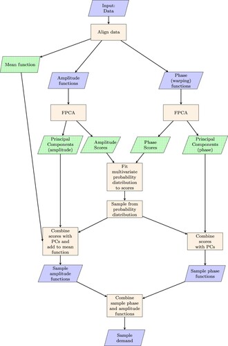
This approach identifies the underlying structure of the data – in terms of the functional PCs – and yields score sets that can be used in conjunction with the PCs to re-generate each data sample. The outputs are indicated with a dotted infill in Figure .
One aim of this study is to generate stochastic sample data for use in BES. These samples should not just be a replication of previous data, but instead should be a projection of possible future demand based on previous demand. Using the model described above, new data samples are created by taking a random sample from the distribution of scores and using them in conjunction with the PCs to generate sample normalized data which are then re-combined with the median load range and base load. This is done on a zone-by-zone basis and requires a probability distribution to be fitted to the sets of scores for each zone. When the entire data set is considered, the scores for different PCs are uncorrelated. However, when subsets of the data are examined – for example looking at individual building zones – correlations are observed between the scores for different PCs and these need to be taken into account when fitting a probability distribution. To this end, the steps required for the generation of sample data are as follows (illustrated in Figure ):
For each zone, combine the amplitude and phase scores for the data samples into an array and fit a multivariate probability distribution – here a multi-dimensional copula has been used to describe the dependence structure between distributions of scores for different PCs (Nelsen Citation2007). This approach has been implemented in MATLAB using the MATLAB function copulafit. This requires the data to be first transformed to the copula scale by using a kernel estimator of the cumulative distribution function and a Gaussian copula has been specified as this gives less weight to the outlying scores (The Mathworks Inc. Citation2014).
Take random samples of scores – each sample score set contains scores for each PC – from the fitted distribution.
Combine the randomly sampled score sets generated for each zone with the PCs to generate sample amplitude and warping functions.
Combine the sample amplitude and warping functions to generate sample normalized demand.
The sample normalized demand is then transformed back to the appropriate magnitude using the median weekday base load and load range for each zone.
Application of the approach to example data is described in the following sections.
2.1. Data
Four buildings from within the University of Cambridge building stock have been selected, owing to their good spatial distribution of sub-meters for plug loads and lighting with relatively reliable data monitoring. The buildings are all research offices with associated services and additional facilities. For example, building 4 houses a museum in addition to the research office and laboratories (Table ). Across the four buildings we have access to data for two lecture theatres, two canteen kitchens, museum storage and display space, a server room, five laboratories and numerous spaces that are mixed-use office, circulation and communal space. The terminology used hereafter refers to the building (1–4) and the metered zone, numbered sequentially. Dominant activities have been nominally used to categorize each zone, for example, Zone 4.16 is a mix of common room (49%) and classroom (32%) with the remainder circulation and storage space, and has been nominally identified as communal space. The spaces attributable to the majority of the electricity meters do not correlate to a single activity, but there are a few exceptions, notably the server room and laboratories with specialist equipment.
Table 1. Building and metering information.
Hourly electricity consumption data were acquired for each building for a period of around 12–18 months dependent on availability. These data were taken from the building electricity sub-meters for plug loads and lighting which record data hourly. The data were cleaned by removing zero days and days with excessive ‘spikes’ in the data – in general it was the case that excessive values occur after a period of zero values, facilitating discrimination between errors and genuine increased operational demand. The data were normalized by the area nominally covered by each sub-meter to estimate hourly energy density values and were then re-normalized using the median weekday base load and load range as described above.
Across the four buildings, 54 plug-load meters and 45 lighting meters were used as a training data set for the FPCA and development of the model as described below. The remaining 10 plug-load meters and 9 lighting meters were retained as a test data set and used to test the model as described in Section 4.
2.2. Functional principal component analysis
Functional PCs have been extracted for plug loads using data for the 54 training zones across all four buildings. Figures and show the first four PCs for plug loads for phase and amplitude respectively. In each of these plots, the mean demand profile is shown as the solid black line. The consequence of adding the PC to the mean function with a positive unit score is shown as the solid red line, and a negative unit score as the dotted red line. The number in brackets at the top of each plot shows the fraction of the variance in the data samples explained by each PC. The first phase PC shown in Figure is a shift in time, with a positive score giving an earlier start and end to the day and a negative score giving the opposite. Similarly, a positive score for PCs X2 and X3 is indicative of a stretching of the day with respect to the mean, while a negative score gives a squashing. For PC X2 the stretch is more significant at the end of the day, whereas for PC X3 the stretch affects both the start and end, and has more of an impact on the timing of the peak. PC X4 is again a shift in time, but with the start and end times kept approximately constant i.e. the shift in the timing of the peak is greater than the change in the timing of the start and end of the day – it is primarily a sway. In practical terms, these PCs reflect the collective occupant-related load patterns in time. For example, positive scores for PCs X1 and X3 would result in an early start time and a longer working day if other score values are close to zero. The first four phase PCs account for 63% of the variability across all the warping functions.
Figure 2. Plug Loads: first 4 Principal Components for phase, X. The impact of adding each PC to the mean function is shown using a + ve (solid red) or -ve (dotted red) score.
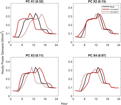
Figure 3. Plug Loads: first 4 Principal Components for amplitude, Y. The impact of adding each PC to the mean function is shown using a + ve (solid red) or -ve (dotted red) score.
The first amplitude PC shown in Figure relates directly to the load range. It must be remembered that the data have been normalized with respect to the median base load and load range, so this PC reflects the variation of the load range relative to the mean demand across all zones. PC Y2 affects primarily the base load, with a positive score giving a low base load and a negative score a high base load relative to the mean. PCs Y3 and Y4 affect, respectively, the variation in the base load across the day and the relative variation between morning and afternoon. Again, considering an example, positive scores for PCs Y3 and Y4 with all other scores close to zero would result in distinct peaks in the morning and afternoon with a noticeable reduction at midday. The first four amplitude PCs account for 48% of the variability across the aligned amplitude functions. Higher PCs account for decreasing proportions of the variability and tend to represent more localized effects.
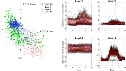
The PCs are the same across all the data, whereas each data sample has a unique set of scores for the phase and amplitude PCs. As explored in detail in a previous paper (Ward et al. Citation2019), the scores are indicative of zone-specific demand, with each zone having a distinctive score distribution. To understand this, consider Figure . The scatter plot shows the scores for the first amplitude PC (Y1) plotted against the scores for the first phase PC (X1) for the weekday plug loads of four zones from different buildings in the training data. The weekday normalized plug loads for each of the four zones are also shown on the right of the figure, with the data shown in black and the mean and 90% confidence limit (CL) for the data indicated in red. Considering first Zone 3.2, the demand is flat with no consistent diurnal variation. The scores (+) are in the lower right quadrant of the scatter plot i.e. positive scores for PC X1 and negative scores for PC Y1. Comparing against Figures and , this suggests a shift in the day to an earlier start and a low load range, consistent with the observed demand. Higher PCs contribute to flatten the shape further so that the start time is not a significant feature of the demand. By comparison, the other three zones all show a significant diurnal variation. Zone 1.8 shows a wide variability in the base load and some days showing a low load range, other days with a significant peak. This variability is reflected in the variability of the scores (shown as •), which show a wide spread in PC Y1 for samples with a negative value for PC X1 indicating a shift to a later start time than the mean, but with a variable load range. Zone 4.6(□) shows much less variability in PCs X1 and Y1 reflecting the fairly regular demand, whereas the scores for Zone 2.1 (.) are scattered across the figure reflecting the variability in timing.
Figure 4. Scores for first phase and amplitude PCs, with normalized electricity consumption for each zone.
2.3. Generation of stochastic sample data
The approach described at the beginning of Section 2 has been used to generate sample data as illustrated in Figure .
Figure 5. Plug Loads: sample data generated from scores sampled from probability distribution used in conjunction with PCs.
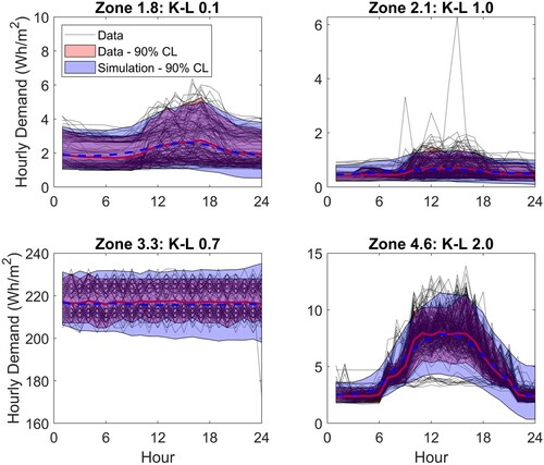
The figure shows sample plug loads generated for four zones from the training dataset compared against the monitored data. These four zones have been chosen to illustrate the approach and comprise one zone from each of the four buildings, with different activities and different demand profiles. For each zone, the monitored data are shown as black dotted lines and the 90% CL of the data is shown as a red shaded area, with the mean demand indicated as a solid red line. The 90% CL of the sample data is indicated as the blue shaded area – this represents 500 samples – with the mean as a solid blue line. Good agreement is seen for all four zones, with the variance of the samples only slightly exceeding the variance of the data. The variance of the sample data at the end of the day tends to be wider than observed in the data – see, for example, Zone 4.6. This can arise when opposing amplitude PCs do not fully cancel at the end of the day, which in turn is dependent on the sampled scores and the extent to which the correlation between scores is identifiable from the training data set.
A measure of how well the generated samples represent the observed data is given by the Kullback-Leibler (K-L) divergence value (Duchi Citation2014). The K-L divergence is nonnegative and values closer to zero imply better agreement; values are given in Figure for the simulations of each of the four zones. The lowest value of 0.1 is observed for Zone 1.8 for which the mean and variance of the sample data match the monitored data quite closely. Looking across all zones in the training data set, the median K-L divergence is 1.3 and the 90% confidence limit is from 0.2 to 4.6. The higher values tend to be associated with zones that show a small variance in the monitored data at the end of the day, similar to Zone 4.6.
2.4. Data mapping
The previous sections describe the analysis steps required to derive the functional PCs and generate sample data. When new data are obtained it is not necessary to re-run the full analysis again; new data samples may be mapped to the set of existing PCs and scores extracted for each PC. This provides direct comparability against the existing dataset and is much quicker computationally.
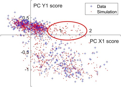
Data mapping can also be used to model different loads if they have similar demand profiles. Here this approach has been used for analysis of lighting power demand by projecting the monitored lighting data samples onto the entire set of PCs generated for the plug loads (as illustrated for the first four PCs in Figures and ). Figure shows the results for generating sample lighting loads using scores derived from this mapped approach for four example zones. For Zones 1.8, 2.1 and 4.6 the lighting meter covers the same area as the plug loads meter. For Building 3 however there are fewer lighting sub-meters and the example shown here – Zone 3.10 – is a larger area encompassing Zone 3.3. Compared against the plug loads results (Figure ) the K-L divergence values are higher, with the highest value observed for Zone 2.1. These higher values are primarily due to the high variance of the generated samples compared against the monitored data, which in turn arises from sampled scores lying in less densely populated regions of the score space. Figure illustrates the scores for the first principal components for phase and amplitude for Zone 2.1. The scores for the data are shown as blue crosses and while the most dense area of the space lies centred around [0, 0.25], there are also a substantial number of data points in the lower right quadrant. The samples drawn from the fitted copula (red dots) mimic this well, but there is a region of scores highlighted in red where the simulation outputs a number of data samples yet in the data there are only a few points. Outliers like these give rise to the wider variance observed in the sample data when compared against monitored data. This can be an issue if unfeasible sample demand profiles are generated but if necessary limits can be imposed and unrealistic demand profiles removed.
Figure 6. Lights: sample data generated from scores sampled from probability distribution used in conjunction with PCs.
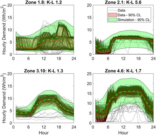
Figure 7. Scores for the first phase and amplitude components for lighting, Zone 2.1. The highlighted area shows sampled scores that fall outside the score space defined by the data.
3. Clustering
Each building zone has its own distinctive pattern of demand. The sets of scores for each zone show distinct distributions that are related to the demand profiles. Similarities between score sets are therefore indicative of similarity in demand profile. We have used clustering to identify those zones that have the most similar sets of scores and therefore the most similar demand profiles. We then compare the nominal activity associated with each zone to see whether the zones with the most similar demand also have similar nominal activities.
In this study, an agglomerative hierarchical clustering approach has been used. This works by looking first at pairs of zones to see which zones are closest to each other, then at each subsequent iteration similar clusters merge with the next closest clusters until all the clusters have been sorted. The hierarchical clustering method identifies the zones that are most similar but the optimal number of clusters is fundamentally subjective. If we group zones together we lose the definitive specification of each individual zone, but we gain flexibility in that if we wish to match a new dataset to the most similar existing dataset it is much easier if there are fewer example datasets to choose from. The question is how to group zones given the stochastic and time-varying nature of demand? In order to assess the optimal clustering for our purposes we generate sample data from a range of clustering options and compare the K-L divergences and the KPIs for the monitored and sample data. This allows us to identify the minimum number of clusters that give a sufficient description of the data.
3.1. Plug loads
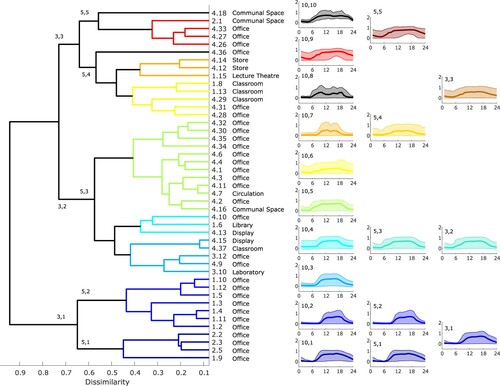
Using the Wasserstein distance as a measure of the distance between the sets of scores for each zone (Aslansefat Citation2020), hierarchical clustering for the plug load scores generates the dendrogram illustrated in Figure . We have chosen an initial dissimilarity value of 0.5, this gives 12 coloured clusters spanning the entire dataset with predominantly office space at the bottom to the server room in its own cluster at the top. There is a cluster of communal spaces in the middle and the laboratories typically appear towards the top. These results are reasonably consistent with the definition of activities in buildings; zones with similar activity are clustered together in the dendrogram. However, this does not apply across all zones. Zones 4.10 and 3.7 are office spaces yet appear at the top of the figure, clustered with laboratories, and Zone 2.1 is a communal space which again appears towards the top of the dendrogram rather than in the middle.
Figure 8. Dendrogram for plug loads and normalized monitored data. The dendrogram shows the hierarchical relationship between zones with zones linked together according to similarity. On the right hand side the normalized monitored data have been plotted by cluster grouped in 12, 7 and 4 clusters.
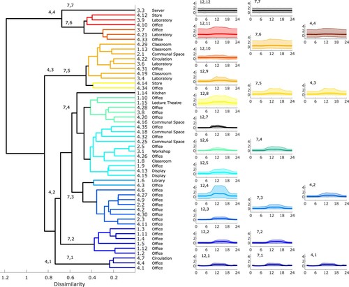
Figure also shows the 90% CL of the normalized monitored plug loads for each cluster in three columns, corresponding to different numbers of clusters; the first column shows the plug loads for the 12 clusters identified in the dendrogram on the left. There is a progression from quite well-defined demand with a daily schedule and low variance in cluster 12,1 at the bottom, to the flat demand of the server room in cluster 12,12 at the top. In between the demand gradually increases in the load range and the clarity of the diurnal variation reduces as you progress from cluster 12,1 to 12,12. There are a few clusters which do not fit quite so well along this progression, notably cluster 12,4 which has a much wider variance than clusters 12,3 or 12,5. This is due to the small size of the cluster; the demand for Zone 1.6 is very variable and as this cluster only has two members the outlying demand dominates.
We can choose the number of clusters; for example, if we select 7 clusters, clusters 7,1, 7,2 and 7,7 are the same as clusters 12,1, 12,2, and 12,12, but clusters 7,3–7,6 combine clusters 12,3–12,11 as indicated in the figure. Reducing to 4 clusters merges still further, although cluster 4,1 is the same as 12,1. The progression in the variability of the data is more clear for both 7 and 4 clusters – and this suggests a way of defining internal loads that is linked to quantifiable metrics rather than zone activity.
Our proposition is to characterize the differences across zones by the expected variability in the demand, specifically the variation from day to day. For example, an office zone with regular 9am–5pm use would be simulated using scores from the clusters towards the bottom of the dendrogram, whereas a classroom with irregular demand might be simulated using scores from one of the more variable clusters such as 7,5.
To develop the proposed methodology into a usable design tool it is necessary to determine the optimal number of clusters. In this instance, the optimal number is the minimum number that gives sufficient variation for the user to be able to characterize the expected variability of the data, yet gives a good representation of the shape of the data samples and good agreement between the data and key performance indicators (KPIs) of internal loads. So essentially we need a mechanism to choose between 7 or 4 clusters to represent internal loads across building zones. We do so by comparing data samples generated from the clustered scores against the monitored data. Figure shows for three of the zones the comparison between the monitored data and sample data generated using scores from both 7 and 4 clusters. We show the outputs generated using 12 clusters for comparison. The three zones are all taken from cluster 4,2, but are all in different clusters when using 7 or 12 clusters. Shown in the figure are the data, the mean and 90% CL of the data in red, and the mean and 90% CL of the simulations, coloured as per Figure . Also given is the K-L divergence value; we expect the K-L divergence value to be higher for simulations generated from lower number of clusters, indicating a less good agreement, but the question is whether the increase is acceptable.
Figure 9. Comparison of demand reconstructed from scores and generated from clusters. The monitored data are shown as black dotted lines with the mean and 90% CL highlighted in red. The model output 90% CL is shown coloured according to the variability selected (Figure ).
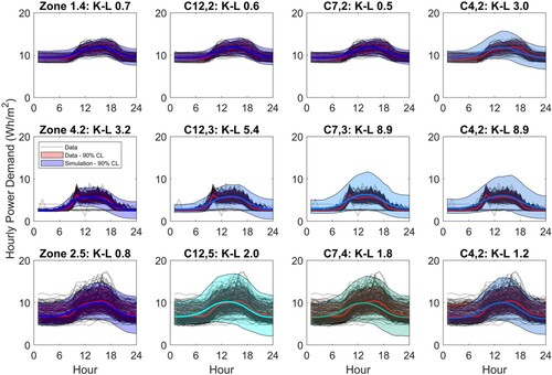
Contrary to our expectations the three zones do not all show a pattern of increasing K-L divergence value as the number of clusters decrease: For Zone 1.4, the K-L divergence values increase with 4 clusters. For Zone 4.2 there is no change and the value for Zone 2.5 in fact reduces for 4 clusters. These are just 3 samples from the 54 zones; if we consider all zones, 34 out of the 54 zones either have no change or have lower K-L divergence values with 4 clusters when compared to data samples generated from 7 clusters.
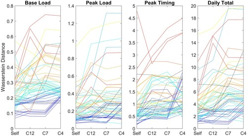
We also need to consider the KPIs, specifically the base load, the peak load, the daily total and the timing of the daily peak. The probability distributions of each of the KPIs have been compared against the monitored data by calculating the Wasserstein distance between the generated sample and monitored data distributions. Figure shows for each of the KPIs the variation in the Wasserstein distance for 7 and 4 clusters (for completeness we include also the outputs for the 12 clusters). Note that the distance is measured in units of the quantity considered, so the higher values for daily total demand compared against base load do not mean the agreement is worse for the daily total. Similar to the K-L divergence values, we expect the Wasserstein distance to increase as the number of clusters drops, signifying a less good agreement. However, it is clear from the figure that not all zones show this increase and for many zones the Wasserstein distance shows little variation or is even lower for 4 clusters than for 7. If we take out the zones for which there is no change from 7 to 4 clusters, we find that for the base load 24 out of the 41 zones exhibit a reduced Wasserstein distance for samples generated from 4 clusters compared against 7 clusters. For peak load and daily total the number is 22 for both. However, for the timing of the peak only 11 show an improvement for the reduced number of clusters, suggesting a higher number of clusters would give a better range in terms of the timing of the peak demand. The increases are typically small with the exception of cluster 7,2, shown in blue, for which the Wasserstein distance increases from values around 0.5 to values of over 2 with 4 clusters. In terms of the timing of the peak this translates to a change from a mean time of 3pm for cluster 7,2 to 1.45pm for cluster 4,2.
Figure 10. Wasserstein distance for KPIs.
Taking the K-L divergence results and the KPIs into account, these results suggest that there is insufficient evidence to justify using a more complex model based on 7 clusters when compared against a simpler model based on 4 clusters. Although the timing of the peak could warrant an increased number of clusters, the difference is quite small and the potential benefit is outweighed by the preferred simplicity of the 4-cluster model. In addition, it is possible to adjust the timing of the peak as explained later in Section 4.1.3. For this reason, the tool for sample load generation of plug loads described in Section 4 is based on 4 clusters.
3.2. Lighting
We have performed the same analysis for the lighting loads. Figure shows on the left-hand side the clusters arising from a hierarchical clustering of the scores. A total of 10 clusters are identified, and while there are some similarities between this and the plug load clustering, what stands out is that the zones within a building typically cluster together. For example, with the exception of the communal space, Zone 2.1, all of the zones from building 2 are clustered together in cluster 1, cluster 2 contains half of the zones from building 1 and both zones from building 3 are in cluster 3. The remaining clusters are almost exclusively zones from building 4. There appears to be less connection with activity than observed for the plug loads, with the exception of the classrooms and lecture theatre which do appear linked. As there are fewer lighting sub-meters covering larger areas with more diverse use, it is more difficult to draw conclusions concerning activity. The link with the building is not a surprise. The different buildings have different operation strategies; while for building 1 the cellular office design means that a large proportion of the office lighting was manually operated at the time the data were collected, by comparison in building 4 the majority of the lighting is either centrally controlled or operated according to occupant sensors. The office areas of building 2 are operated manually, whereas the occupancy sensors are deployed in the corridors. Similarly, the orientation and facade design of a building will have a much more significant impact on lighting loads than plug loads, as increased levels of natural light reduce the need for artificial lighting during the day.
Figure 11. Dendrogram for lighting and normalized monitored data. The dendrogram shows the hierarchical relationship between zones with zones linked together according to similarity. On the right hand side the normalized monitored data have been plotted by cluster grouped in 10, 5 and 3 clusters.
On the right-hand side of Figure , the monitored data from each of the clusters are plotted. The progression in the variability of the data from the bottom cluster to the top is less obvious than observed for the plug loads, and there are clear exceptions – cluster 10,7 shows quite a well-defined diurnal variation when compared against the clusters on either side.
As for the plug loads we have checked whether 5 or 3 clusters will give a sufficiently good representation of the data for the purposes of generating sample scores. Looking first at the K-L divergence between the monitored data and sample data generated from the clusters we find that the K-L divergence is smaller for the 3-cluster model than the 5-cluster model for only 3 zones in clusters 3,1 and 3,3 (clusters 5,3 and 3,2 are the same). Equally, looking at the KPIs there is overwhelming evidence that 5 clusters give better results than 3 clusters; for the base load, 16 out of 25 clusters show a smaller Wasserstein distance for 5 clusters compared against 3, and for the peak load, peak timing and daily total the numbers are 14, 15 and 20, respectively. As a result, 5 clusters have been used in the development of the lighting load sample generation tool described below.
4. A tool for generation of sample data
The data-centric methodology described in Section 2 may be applied in different ways depending on the context and availability of data. There are three approaches which may be used:
Full analysis as described in Section 2, generating PCs and scores specific to the dataset studied.
Mapped analysis as described in Section 2.4 – the data are projected onto an existing set of PCs and the mapped scores are used as a basis for the generation of sample data.
Design approach – if no data are available stochastic sample data may be generated using score sets derived from existing similar datasets.
Where data are plentiful and the form of the demand is significantly different from previously analysed demand profiles, option (1) is the best approach. This is computationally intensive, particularly in the alignment of the data to a common mean for which the run-time is dependent on the size of the dataset. However, it is the only approach that generates PCs that describe the structure of the data if existing PCs are not adequate.
For data that exhibit a similar form to the plug loads data used here, a better approach is option (2) as it is efficient computationally and yields scores that can be directly compared against the existing dataset if necessary.
Options (1) and (2) are used when data are available. However, the methodology may be used even without operational data i.e. in design (option (3)), if there is some way to quantify where in the score space it is expected that the internal loads for the building zone under consideration will lie. This is not trivial and the best approach is to use demand from similar zones in existing buildings to define the scores. As we have shown in Section 3, similarity is dependent on different quantities for different internal loads – the variability of the data for plug loads and the control scenario for lighting. Here, the clustering of zones described in the previous section has been taken as an indication of similarity and has been used in the development of the design tool. The aim has been to create a simple method for the generation of annual stochastic internal loads for input into a BES. The tool is written in MATLAB and can be downloaded from github (Ward Citation2020). The repository includes a simple example application as well as MATLAB code for the three options described above i.e. full analysis, mapped analysis for retrofit and design.
The details of how to use the code are given in the Appendix. Application of the tools for plug loads and lighting in the design context is described below. The mapped analysis is also tested to simulate a retrofit study and an example illustrates how the results are improved if monitored data are available.
4.1 Design tool
At the design stage, the tool may be used by specifying the expected average base load and load range together with an estimate of the expected variability of the data. This variability index is based on the results of the clustering described above. For plug loads, it is on a scale of 1–4 where 1 is the least variable and 4 the most. For lighting, the scale is 1–5 but is more directly related to the operational control strategy. In the following sections, application of the models to test zones is described.
4.1.1. Plug loads
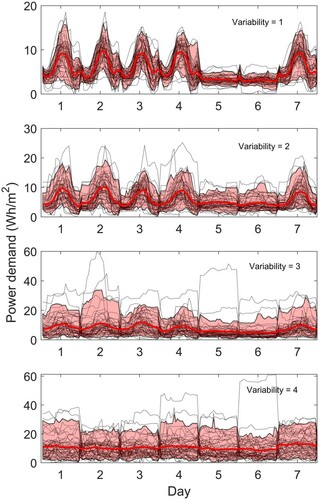
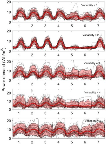
Using a mean base load of 3 Wh/m2/h and a mean load range of 8 Wh/m2/h, the tool generates the plug load data illustrated in Figure for the year 2019 i.e. a non-leap year. The figure shows how these results change if a different assumption of variability is made – from 1 at the top to 4 at the bottom. The progression from a relatively well-defined diurnal variation to a near-constant demand is clear.
Figure 12. Sample weekly data, variability from 1 (top) to 4 (bottom). Sample data are calculated for 2019 and start on a Tuesday. Black dotted lines show the individual weekly demand profiles and the mean and 90% CL are highlighted in red.
The model has been applied to 10 test zones reserved from the original data set and not used in the model development. These are detailed in Table . The first step in running the model is to define the base load and load range for the zone of interest. In this instance we have the benefit of monitored data, but if we did not have the data we could estimate the quantities based on the NCM (Building Research Establishment Citation2016) or TM54 (Chartered Institution of Building Services Engineers Citation2013), or could use monitored data from other similar building zones. The table shows the mean demand from zones with similar activity from the training data set and the values recommended in the NCM. It is clear from the table that the NCM base load is lower than both the observed value for the test zones and the mean observed value from all similar activity zones within the training data set. The NCM recommended load range is significantly higher for the office zones and the classroom but lower than observed for the lecture theatre. The laboratories in the test data set have significantly lower demand than the mean observed demand in the training data set, and a higher base load and lower load range than the NCM would suggest. This highlights a problem with existing activity-based methodologies – designating a space by activity gives insufficient information to characterize its demand.
Table 2. Test zone information: base load and load range from the test data compared against the mean values for zones with similar activity in the training dataset and the NCM activity database values (Building Research Establishment (Citation2016)). Also given is the assumed variability used for generation of sample data.
The third column in Table gives the variability assumed for use in the generation of sample data. The results are shown for weekday data in Figure . In each plot, the monitored data are shown as black dotted lines and the 90% confidence limits of the data are shown as a red shaded area with the mean as a solid red line. The mean and 90% confidence limits of the model results are shown coloured according to the colours used in Figure corresponding to the variability selected. The K-L divergence is also given above the plots for each of the test zones. The variability has been specified by considering the activity of the zone and the location in the clusters of similar activity spaces. Some prior knowledge has been utilized, for example, Zone 4.5 has been assumed to be similar to the zones in cluster 4,1 as it is a similar space from the same building. Equally, the variability for two laboratories has been assumed to be different owing to the nature of the activities that occur in each zone. The K-L divergence values indicate a good agreement for the majority of zones, the exception being Zone 4.24, for which a high K-L divergence of 8.5 is calculated, owing to the variability of the simulated base load being much higher than observed. As discussed further below in Section 4.1.3, it is possible to modify the sample data by factoring the scores according to design conditions.
Figure 13. Model outputs for 10 test zones calculated using known base load and load range and assumed variability as given in Table . The monitored data are shown as black dotted lines with the mean and 90% CL highlighted in red. The model output 90% CL is shown coloured according to the variability selected (Figure ).
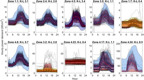
A comparison of the KPIs is shown in Figure and detailed in Table . Considering the base load and peak hourly demand, for the majority of zones the median values are in good agreement between the data and the model output. This is to be expected as we have used the monitored values as detailed in Table . For several of the zones, e.g. zones 4.5 and 4.24, a greater degree of variability is predicted by the model than observed in the data, reinforcing the observations from Figure . The timing of the peak is a function of the level of variability selected for each zone, but the median timing predicted by the model is in good agreement with the data for the first 7 zones considered. Zone 4.23 has the greatest difference between the median peak time in the data and predicted by the model despite having one of the smallest K-L values. This is primarily due to the relatively flat nature of the demand which makes predicting the timing of the peak particularly difficult – and less important. The daily total demand shows a good agreement between the model and the data across the majority of the zones, the exception being Zone 4.24 as a direct consequence of the high predicted base load.
Figure 14. Plug load model outputs for 10 test zones calculated using known base load and load range and assumed variability as given in Table , comparison of KPIs.
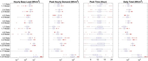
Table 3. Plug load model outputs for 10 test zones calculated using known base load and load range and assumed variability as given in Table , numerical comparison of KPIs.
4.1.2. Lighting loads
The tool for the calculation of stochastic sample lighting loads has a choice of 5 levels of variability. Using a mean base load of 3 Wh/m2/h and a mean load range of 8 Wh/m2/h, the tool generates lighting demand profiles as shown in Figure for each of the 5 options, with a variability of 1 at the top to 5 at the bottom. When compared against the plug loads, the progression is less clear-cut. This is a result of the monitored zones typically having mixed lighting control strategies – for example, the zones in cluster 5,1 have manual switched lighting in office areas and occupancy sensors in corridors – so using a variability of 1 corresponds to this type of mix. A variability of 2 gives a more well-defined diurnal variation – this corresponds to a cluster in which the lighting in the zones is almost exclusively manually operated. The output for variability 3 and 4 are quite similar, with a slightly flatter mean profile and increased variance for variability 4 compared against 3. Looking at the zones in cluster 5,4 these are predominantly classrooms, a lecture theatre and storage – hence with intermittent occupation. By comparison, cluster 5,3 is comprised primarily of office space, so although the lighting may be controlled using occupant sensors there is a higher likelihood of occupancy during the working day. Using a variability of 5 gives a lighting profile that is only slightly different at the weekend than during the week this corresponds to spaces that are occupied intermittently 7 days a week. Given these results, we suggest the choice of variability should be as follows:
Predominantly manual operation with some areas controlled by the occupancy sensor
Manual operation
Occupancy sensor – high occupancy
Occupancy sensor – low occupancy
Occupancy sensor, occupancy 7 days a week
Figure 15. Lighting: sample weekly data calculated with a mean base load of 3 Wh/m2 and a mean load range of 8 Wh/m2, variability from 1 (top) to 5 (bottom). The data are calculated for 2019 and start on a Tuesday. Black dotted lines show the individual weekly demand profiles and the mean and 90% CL are highlighted in red.
Using this approach we have used the tool to generate sample demand for 9 test zones as detailed in Table . The table gives the monitored mean base load and load range for each of the zones, together with the mean values from zones with similar activity in the training data set and the values suggested in the NCM. The first point to note is that the NCM suggests a base load of zero for all activity types. Looking at the monitored data this is clearly unrealistic, although desirable. Looking at the monitored load ranges, there is no identifiable consistency in the data across activity types, and some considerable differences between the test zones and the training data, for example, the test Lecture theatre has almost double the load range of the Lecture theatre in the training data.
Table 4. Test zone information: base load and load range from the test data compared against the mean values for zones with similar activity in the training data set and the NCM activity database values. (Building Research Establishment Citation2016).
The weekday sample data generated for the 9 test zones using the tool are presented in Figure with the corresponding KPIs in Figure . As for the plug loads the monitored weekday data are shown in black with a red solid line indicating the mean demand and the red shaded area covering the 90% confidence limit of the data. The model outputs are coloured according to the variability selected corresponding to the cluster colours shown in Figure . As a general point the mean demand generated by the tool is typically in good agreement with the data. There are a couple of exceptions, however, notably Zone 4.39 as reflected in the K-L divergence value of 6.6. The lighting demand for Zone 4.39 is unlike any other profile in the training data set, hence it is unsurprising that the generated samples are different from the observed data. This is also reflected in the KPIs in Figure and Table which show a less good agreement between the monitored data and the simulation for this zone.
Figure 16. Lighting: model outputs for 9 test zones calculated using known mean base load and load range and assumed variability as given in Table . The monitored data are shown as black dotted lines with the mean and 90% CL highlighted in red. The model output 90% CL is shown coloured according to the variability selected (Figure ).
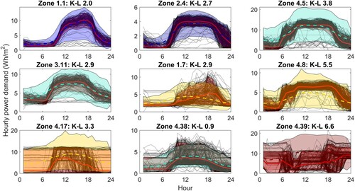
Figure 17. Lighting: comparison of KPIs for model outputs for 9 test zones calculated using known mean base load and load range and assumed variability as given in Table .
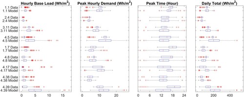
Table 5. Lighting: numerical comparison of KPIs for model outputs for 9 test zones calculated using known mean base load and load range and assumed variability as given in Table .
Another observation from Figure is that for the majority of the zones, with the exception of Zone 4.38, the variance of the samples is much greater than the variance of the monitored data, particularly in the middle of the day. This is because lighting loads tend to be well defined, particularly if manually switched or operated using occupancy sensors with high occupancy, whereas outliers in the sampled scores can give rise to a higher variance in the simulation results. This increase in variance in peak demand can also be seen in Figure . The variance in base load and daily total demand is also typically greater than observed in the data.
4.1.3. Options
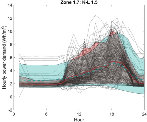
Given that the PCs reflect features of the data, it is possible to manipulate the scores in order to enhance or modify specific features, such as the timing of the peak demand. Take for example the lighting in Zone 1.7. Figures and show that the sample data generated assuming a variability of 4 do not predict the timing of the peak demand late in the day as observed in the data, but instead predict it to be typically around noon. Looking at the PCs in Figures and it seems that if we want a peak late in the day we need the score for PC X1 to be negative. If we map the data for Zone 1.7 to the PCs, we find that the mean score for PC X1 is −0.88, compared against the mean score for the samples generated by the model for cluster 4 of −0.17. In other words, one could adjust the scores for the model to give a better representation of the scenario. We can also adjust the sharpness of the peak by modifying the score for PC X3, and adjust the load range through PC Y1. Figure shows the impact of making the scores for both PC X1 and PC X3 more negative and increasing the score for PC Y1 by 0.5. The model now gives a much better representation of the data and the K-L divergence is reduced from 2.9 to 1.5.
Figure 18. Lighting: Zone 1.7 with X1 and X3 scores shifted by −2. The monitored data are shown as black dotted lines with the mean and 90% CL highlighted in red. The model output 90% CL is shown in blue.
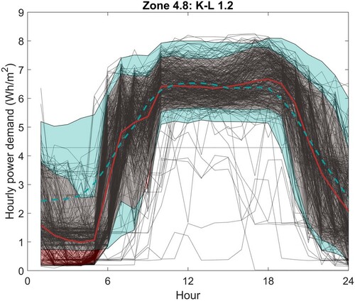
It is also possible to impose limits on the data samples. This is useful when the model is generating values that are not plausible, such as peaks in lighting demand that exceed the installed capacity. Figure shows the impact of both adjusting the scores and imposing an upper limit of 8.5 Wh/m2/h and a lower limit of 5.0 Wh/m2/h from 10:00 to 18:00 h. The adjusted model gives a much better representation of the data and again the K-L divergence reduces from 5.5 to 1.2.
Figure 19. Lighting: Zone 4.8 with X1 and X3 scores shifted, limits imposed. The monitored data are shown as black dotted lines with the mean and 90%CL highlighted in red. The model output 90% CL is shown in blue.
4.2. Retrofit tool
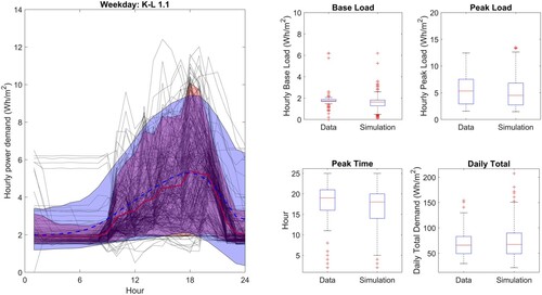
If monitored data are available it is much better to use the monitored data rather than rely on an estimated variability. To illustrate this, the retrofit procedure has been applied to the lighting demand in Zone 1.7. The monitored data have been mapped to the PCs and the mapped scores are used as a basis for the generation of sample scores.
The results are shown in Figure . A much better agreement is observed between the model output and the data with the K-L divergence reducing to 1.1 from 2.9 and better agreement is seen across the KPIs. This clearly indicates the improvement achievable if monitored data are available.
Figure 20. Retrofit model results for lighting Zone 1.7. In the left plot the monitored data are shown in black with the mean and 90% CL highlighted in red; the mean and 90% CL of the simulation results are shown in blue. The box plots show the KPI comparison.
5. Discussion
The preceding sections describe the development and application of a tool for estimation of sample stochastic plug loads and lighting for input into a BES. The tool gives stochastic sample data which are a good representation of reality as judged by a comparison of the predicted demand profiles and the KPIs such as the base load, peak load, daily total and the timing of the peak.
The study has highlighted a number of practical issues that are worth considering in more depth. The first is normalization of the data. For this study, the nominal floor areas per meter have been used in order to be consistent with the input potentially required for BES. Normalization of energy demand by floor area, whilst standard, is not always robust and must be applied with caution. For example, the electrical load of a server room depends on how the servers are stacked and can vary significantly even for similar floor areas. Equally, the use of floor area for an office canteen can yield very different normalized energy demand dependent on whether the kitchen is considered on its own or the eating areas are included.
Normalization of the data by area also depends upon there being a clear metering strategy which is interpretable in terms of the areas served by each sub-meter. Historically, metering has been sparse with sometimes only a single meter per building. The advent of sub-meters has made data-centric modelling feasible as exemplified here and we are fortunate to have data from a number of sub-metered buildings available for analysis, particularly as we have been able to link activities to building zones as it is more common to see sub-metering over spaces which are mixed-use. Pre-processing of the data is still a lengthy process, however, particularly if there is a need to identify the building zones that correspond to each meter. Metering strategies are not always kept up to date post-installation; hopefully with the advent of Building Information Modelling and digital twin technology, the future use of data will become more central to the focus of design teams going forwards. If this becomes the case, the nature and design of sub-metering will become a critical component of the design and care should be taken to ensure that the desired data are able to be extracted in a straightforward manner.
We have chosen to normalize the data a second time by subtracting the median weekday base load and dividing by the median weekday load range, resulting in a data set that comprises just the schedules. The reasons for this are two-fold; first, from a methodological viewpoint, it is beneficial to ensure all the data lie on a similar scale as the differences between schedules are easier to interpret when not masked by differences in magnitude. Thus normalization of the data in this way facilitates more straightforward applicability beyond the building zones on which the model is trained. Second, from an application viewpoint, it is more straightforward to estimate base load and load range at the design stage of a building than it is to characterize the load schedule. This is particularly the case for lighting which may be well defined during the design process. For plug loads, the process may be more involved as described in the TM54 methodology (Chartered Institution of Building Services Engineers Citation2013).
The dependency of the outputs on assumed mean base load and load range means that accurate estimates of these values are extremely important. These parameters have a significant impact on the KPIs, not only on the base load and peak load but also on the daily total. Tables and show the values currently included in the NCM in addition to the mean values taken across zones with similar activity types across the training data set. Considering the plug loads, for all test zones and activities the base loads are higher than included in the NCM. The same is true for lighting for which the NCM gives a zero base load. While it should be stressed that the NCM is intended to be used for compliance calculations and not design, it is important to appreciate that the loads specified in the NCM are unrealistic, particularly base loads; care should be taken to define base loads as realistically as possible. The choice of variability will affect these KPIs less, but will have a greater effect on the K-L divergence between the simulation and the real data and on the timing of the peak.
The purpose of identifying which building zones are attributed to each sub-meter has been driven in this study by the desire to understand to what extent the activity in each zone determines the internal loads. The clustering of the scores for plug loads presented in Figure suggested there are some links with activity but only to the extent that the activity determines the likely variability of the data. This explains why some activities are more easily characterized in terms of their demand than others; for example, two open-plan offices are quite likely to have similar demand profiles if the occupants conform to traditional ways of working i.e. a 9–5 day. By comparison, two laboratories can be completely different, dependent on the nature of the work. As a result, the tool developed makes no reference to activity, but instead the schedules are determined by the expected variability of the demand.
The lighting demand is even less linked to the zone activity. Instead, the system control strategy is more significant – this may be manual, centrally controlled on timers or centrally controlled via sensors e.g. for occupancy or daylight. The tool for the generation of lighting demand schedules is based upon clusters which arise as a result of similarity in control strategy; we typically found that zones from the same building clustered together. So it seems clear that the use of activity as a determining factor for lighting loads is unjustified.
The tool generates stochastic demand profiles and can be used as a design tool even if we have no additional information relating to the expected demand for a building zone. However, there may be situations where we have additional information; this is particularly the case for lighting where we may know the maximum installed power demand, but even for plug loads there may be cases when we know in detail the plug loads for a zone – for example, a server room, or a laboratory – or a classroom where we may know the expected timetable. In this instance, the tool output can be adjusted by manipulation of the scores and by imposing limits on the calculated profiles. In Section 4.1.3 we highlighted the potential for improvement of the comparison between the tool and the data by performing these manipulations. Although this is one of the benefits of this approach, care must be taken not to be too prescriptive at an early design stage as it is better to encompass a higher degree of uncertainty to be refined as the design progresses.
If monitored data are available, it is straightforward to map the data to the PCs and to use the mapped scores as a foundation for the generation of sample data. This process may be used for example in a retrofit study as described in Section 4.2; in that instance using existing data gives considerably more accurate simulated demand than using the design tool.
The ability of the PCs derived from one data set to represent a different data set is dependent to some extent on the similarity in the form of the data. In this study, the lighting and plug loads are sufficiently similar in form that mapping the lighting data to the PCs derived from the plug loads does not worsen the comparison between generated samples and the monitored data. The form of the data arises as a result of the collective occupant behaviour; where there are fewer occupants or individual dominant appliances it is likely that the data would present as far more stochastic. In this case and particularly if the variability is on a timescale which is less than hourly, the PCs derived here may not adequately represent that variability.
Stochastic demand profiles are such that each day is different from the previous one, and each time the tool is run a different set of results is achieved. This lends itself to the exploration of the impact of uncertainty in the internal loads on the energy demand of the building as a whole. For building energy code purposes, a more consistent approach is required, and repeatability and comparability across simulations are essential requirements. Another stochastic input into BES – weather data – is defined somewhat differently from the static activity-based internal loads; typical annual data are provided together with future scenarios for analysis of long-term or extreme performance (Chartered Institution of Building Services Engineers (Citation2014)). These data are based on many years of historic data that have been used to generate typical weather files and as a basis for the prediction of future weather scenarios. It would seem desirable to be able to follow a similar approach for uncertain internal loads. However, generation of ‘typical’ internal loads is not as straightforward as producing typical weather data owing to the difference in variability of demand across the many different building and zone types and the lack of sufficient data at present. With more data taken from across a wide range of building zones this methodology could be used to develop stochastic internal load profiles that could be deemed to be sufficiently ‘typical’ for incorporation into building energy codes and design standards.
6. Conclusions
In this study, we have presented a data-centric methodology for the calculation of stochastic plug loads and lighting loads for input into a BES, and have investigated the extent to which the loads should be defined according to the expected zone activity. We have also developed and tested a tool for the generation of stochastic sample data.
FDA and in particular FPCA have been used to extract a structure for plug loads and lighting daily demand data. With this structure, each day of data reduces to a unique set of scores that define the contribution of each PC for each data sample. Hierarchical clustering of the sets of scores for each zone has been used to explore how loads are related to ‘activity’ as defined in the UK NCM activities database. Different clusters were derived for plug loads and lighting; the plug load clusters show some links to activity, but only to the extent that the activity determines the variability of the data. The lighting loads are more closely linked to the control strategy of the building, and there is little or no link to the zone activity. It seems appropriate, therefore, for plug load and lighting demand schedules to be developed separately, with plug loads specified according to the degree of variability expected in the data and lighting schedules according to the control strategy.
The FDA model has been shown to generate sample demand in good agreement with the individual zone demand in each cluster. There will always be outlying demand profiles; a useful feature of this model is that as new data becomes available, it can be mapped to the existing set of PCs and thus add to the database of scores. It can thus provide a mechanism to incrementally update our knowledge of internal loads and to extend the analysis to other types of non-domestic building and activity.
A tool has been developed for the generation of stochastic loads for plug loads and lighting, based on analysis of four buildings from a university building stock. The formulation of the tool in terms of the variability of the data rather than activity per se means that there is scope for its application to other building types. However, it will be beneficial in future studies to draw on a wider data set to explore the applicability of the tool to other zone and building types, particularly for activity types for which we have few examples.
The accuracy of the method in terms of how well it represents reality requires good estimates for average base load and load range which can be taken from relevant monitored data where available. At the design stage, if all that is known is the zone demarcation and the space use type then those estimates must be based on assumptions concerning the equipment density and lighting loads carried out using an approach such as given in Chartered Institution of Building Services Engineers (Citation2013). Estimation of average parameters is more simple and requires fewer assumptions than generating schedules and quantifying the uncertainty in the demand. That said, the robustness of the approach at the design stage needs to be fully explored and this will be attempted in future research.
The facility to generate annual hourly stochastic sample data provides an initial step towards the potential future specification of typical stochastic internal load profiles in much the same way as typical weather profiles are prescribed today.
Acknowledgements
This study is supported by an EPSRC I-case PhD studentship with Laing O’Rourke (grant number 1492758) and by the AI for Science and Government (ASG), UKRI’s Strategic Priorities Fund awarded to the Alan Turing Institute, UK (EP/T001569/1). Grateful thanks are extended to the University of Cambridge Estates Management and Living Labs teams for making the data available for this study.
Disclosure statement
No potential conflict of interest was reported by the author(s).
Additional information
Funding
References
- Abushakra, B., A. Sreshthaputra, J. S. Haberl, and D. E. Claridge. 2001. “Compilation of Diversity Factors and Schedules for Energy and Cooling Load Calculations, ASHRAE Research Project 1093-RP, Final Report.” Energy Systems Laboratory, Texas A&M University Accessed 2014-12-09. http://repository.tamu.edu/handle/1969.1/2013.
- Aslansefat, Koorosh. 2020. “ECDF-based Distance Measure Algorithms.” Accessed: April 29, 2020, https://www.github.com/koo-ec/CDF-based-Distance-Measure.
- Building Research Establishment. 2016. National Calculation Methodology (NCM) Modelling Guide (for buildings other than dwellings in England). Technical Report.
- Chartered Institution of Building Services Engineers. 2013. Evaluating Operational Energy Performance of Buildings at the Design Stage. TM54.
- Chartered Institution of Building Services Engineers. 2014. Design Summer Years for London. TM49.
- Clements, Derek. 2020. The Impact of sub-Metering Requirements on Building Electrical Systems Design. Technical Report. Kansas State University.
- Duchi, John. 2014. “Derivations for Linear Algebra and Optimization.” https://web.stanford.edu/ jduchi/projects/general notes.pdf.
- Integrated Environmental Solutions. 2019. “Website.” https://iesve.com/software/ergon. Accessed: 2019-01-31.
- Mahdavi, Ardeshir, Farhang Tahmasebi, and Mine Kayalar. 2017. “Prediction of Plug Loads in Office Buildings: Simplified and Probabilistic Methods.” Energy and Buildings 129: 322–329.
- The Mathworks Inc. 2014. MATLAB and Statistics Toolbox Release 2014a. Natick, MA.
- Nelsen, Roger B. 2007. Introduction to Copulas. New York: Springer.
- O’Brien, William, Aly Abdelalim, and H. Burak Gunay. 2019. “Development of an Office Tenant Electricity Use Model and Its Application for Right-Sizing HVAC Equipment.” Journal of Building Performance Simulation 12 (1): 37–55.
- O’Brien, William, Isabella Gaetani, Sara Gilani, Salvatore Carlucci, Pieter-Jan Hoes, and Jan Hensen. 2017. “International Survey on Current Occupant Modelling Approaches in Building Performance Simulation.” Journal of Building Performance Simulation 10 (5–6): 653–671.
- O’Brien, William, Farhang Tahmasebi, Rune Korsholm Andersen, Elie Azar, Verena Barthelmes, Zsofia Deme Belafi, Christiane Berger, et al. 2020. “An International Review of Occupant-Related Aspects of Building Energy Codes and Standards.” Building and Environment 179: 106906.
- Ouf, Mohamed M., William O’Brien, and H. Burak Gunay. 2018. “Improving Occupant-Related Features in Building Performance Simulation Tools.” Building Simulation 11: 803–817.
- Sheppy, Michael, Paul Torcellini, and Luigi Gentile-Polese. 2014. “An Analysis of Plug Load Capacities and Power Requirements in Commercial Buildings.” In ACEEE Summer Study on Energy Efficiency in Buildings, NREL.
- Tucker, J. Derek, Wei Wu, and Anuj Srivastava. 2013. “Generative Models for Functional Data Using Phase and Amplitude Separation.” Computational Statistics & Data Analysis 61: 50–66. Accessed 2016-06-14. http://linkinghub.elsevier.com/retrieve/pii/S0167947312004227.
- van Dronkelaar, Chris. 2018. “Quantifying and Mitigating Differences Between Predicted and Measured Energy Use in Buildings.” PhD diss., University College London.
- Wang, Q., G. Augenbroe, J. H. Kim, and L. Gu. 2016. “Meta-modeling of Occupancy Variables and Analysis of Their Impact on Energy Outcomes of Office Buildings.” Applied Energy 174: 166–180. Accessed 2016-05-06. http://linkinghub.elsevier.com/retrieve/pii/S0306261916304913.
- Wang, Yi, Qixin Chen, Tao Hong, and Chongqing Kang. 2019. “Review of Smart Meter Data Analytics: Applications, Methodologies and Challenges.” IEEE Transactions on Smart Grid 10 (3): 3125–3148.
- Ward, R. M. 2020. “FDA-for-BES.” https://github.com/EECi/FDA-for-BES.
- Ward, R. M., R. Choudhary, Y. Heo, and J. A. D. Aston. 2019. “A Datacentric Bottom-up Model for Generation of Stochastic Internal Load Profiles Based on Space-use Type.” Journal of Building Performance Simulation 12 (5): 620–636. doi:https://doi.org/10.1080/19401493.2019.1583287.
- Yan, Da, and Tianzhen Hong. 2018. Definition and Simulation of Occupant Behaviour in Buildings, Annex 66 Final Report. Technical Report.
Appendix A. Application of model for generation of stochastic annual internal loads
The methodology described in Section 3 has been developed into a tool for generation of stochastic annual internal loads, specifically plug loads and lighting. The tool is written in MATLAB and can be downloaded from github (Ward Citation2020). In this appendix we give instructions for running the MATLAB files together with schematic diagrams that illustrate the process.
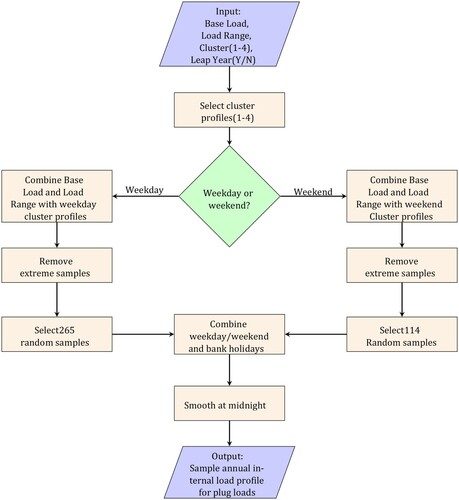
A.1. Design tool
The input required for the tool is the expected average base load and load range together with an assessment of the expected variability of the data, on a scale of 1–4 for the plug loads and 1–5 for the lighting. Within the code, sample scores are drawn from the probability distribution of scores for each cluster and are used in conjunction with the PCs to generate data samples. Each data sample is a 24 hr profile of demand and these are stitched together to form the annual sample. Weekend scores are sampled separately, using the same clusters as for weekdays; investigation of the impact of using the same clusters for weekdays and weekends confirmed that this approach was suitable. Each public holiday was also included and assumed to have the same profile as a weekend day.
The procedure for using the tool for plug loads or lighting is the same and is straightforward:
Define the base load and load range for the zone of interest,
Define the expected variability of the data,
Specify the year – for now 2019 and 2020 (leap year) are available with UK public holidays assumed to be non-working days,
Run the MATLAB code FDASimulationP.m for plug loads or FDASimulationL.m for lighting,
Assess the generated data for suitability and if necessary make adjustments, for example modify the timing of the peak demand to reflect expectations, or remove unrealistic values.
The approach is illustrated schematically in Figure A1.
Figure A1. Procedure for generation of sample plug loads; the procedure for lighting is the same except there are 5 clusters instead of 4.
A.2. Retrofit tool
If monitored electricity consumption data are available and the requirement is to generate sample demand based on the existing data – for example in a study examining the benefits of different retrofit options – then it is better to generate sample demand directly from the data. As explained in Section 4 it is quickest to project the data onto existing PCs and used the mapped scores. This also has the benefit of ensuring comparability between data sets.
The procedure for generating sample data in this case is not dependent on the type of end-use. The first step requires pre-processing of the data; in order to use the files provided it is necessary for the data to be hourly, normalized by area and re-normalized according to the weekday median base load and load range. It is also necessary to include an identifier signifying whether the data are weekday or weekend – sample data are provided in file TestData.mat with the normalized data in TestDataN.mat. These files contain data for 5 different building zones, Z1 to Z5, with 365 days of data for each zone. Also included are files BaseLoads.mat and PeakLoads.mat which contain the median weekday base loads and peak loads used in the normalization.
The file RetrofitModel.m illustrates how to project the data for a single zone onto the PCs and generate annual data samples. In the file it is necessary to select the zone of interest and ensure that the correct base load and peak load are selected. Then the MATLAB files are run in the following order:
WarpToPL.m aligns the data with the training data mean function,
MappedScores.m projects the aligned data onto the PCs and extracts the scores,
CopulaSample.m fits a copula to the scores and generate random samples for the weekday and weekend separately,
GenerateProfiles requires as input the median base load and load range identified during the normalization of the data; this routine generates sample weekday/weekend data and removes extreme samples i.e samples with negative values or samples with end of day demand more than twice the start of day demand,
GenerateAnnualDemand.m reads in the generated profiles, selects a random sample and generates annual samples including bank holidays according to the 2019 or 2020 dates (non-leap or leap year).
The generated sample appears in MATLAB file AnnualDemand.mat and is also saved to file AnnualDemand.csv for ease of input into a BES (AnnualDemandL.mat for the leap year data).
The approach is illustrated schematically in Figure A2.
Figure A2. Procedure for generation of stochastic sample loads from existing data.
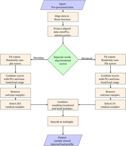
A.3. Base model
This is the model used to generate PCs and scores directly from the training data. As for the retrofit model, the data must be formatted and normalized. The file BaseModel.m illustrates how to align the data to a common mean and to calculate PCs and scores. The example given in the repository uses just the weekday data and generates sample weekday data for the 5 test zones. The MATLAB files are run in the following order, and the entire process is illustrated schematically in Figure .
Warp.m aligns the data to a common mean function, this process requires the dynamic programming algorithm in directory DP which must either be in the same directory as the run files or the path must be added to MATLAB,
CalcPCs.m calculates the PCs for phase and amplitude and the scores that can be used in conjunction with the PCs to re-generate each of the data samples,
CopulaSample.m fits a copula to the scores and generates random score samples for the weekday samples,
GenerateProfiles.m takes as input the sample scores together with the median base load and load range identified during the normalization of the data; this routine generates sample weekday/weekend data and removes extreme samples i.e samples with negative values or samples with end of day demand more than twice the start of day demand.