
 ?Mathematical formulae have been encoded as MathML and are displayed in this HTML version using MathJax in order to improve their display. Uncheck the box to turn MathJax off. This feature requires Javascript. Click on a formula to zoom.
ABSTRACT
Standardized test scores are often used to measure students’ academic success. Although factors that affect student success involve teaching techniques, classroom dynamics, and study skills, there are other factors outside the classroom that could influence students’ overall academic performance. Oftentimes, these factors are overlooked or easily deemed uncontrollable by educators. Prior studies have identified and examined such factors; however, for this analysis, we will use Geographic Information Systems (GIS) to analyse and display spatial patterns of these external factors, such as household income and average household size, which were not previously possible. Utilizing GIS and variations of demographic and lifestyle data allows us to take a closer look into understanding the factors that positively or negatively correlate with academic achievement. We use a sample of 2015–2016 Scholastic Assessment Test (SAT) scores from the California Department of Education and location-based household spending, socioeconomic, and demographic data from Environmental Systems Research Institute, also known as Esri, to develop statistical models in order to understand factors that influence SAT scores. Our results indicate that two parent households and spending on health insurance have a positive effect on student academic achievement. In addition, students that are surrounded by educational businesses score higher on the SAT. We also learn that diversity, household size, and multigenerational households have negative impacts on students’ SAT scores.
Introduction
As the geographical academic achievement gap continues to grow, the gap between the rich and poor widens too (Reardon Citation2011). For many decades, researchers have attempted to understand this trend with most studies finding that students with lower socioeconomic status tend to perform worse than those with higher socioeconomic status (Aikens and Barbarin Citation2008; Reardon Citation2011). Scholars have used U.S. administrative data and longitudinal surveys to discover that factors including median income, parental education, and family structure influence students’ academic success (Ladd Citation2012). It is more common for students who live in lower socioeconomic environments to have limited English language and critical thinking skills (Ladd Citation2012). In addition, some of these students may be at risk of increasingly high movement rates – forcing children to experience disruptive transfers in and out of schools (Ladd Citation2012). In contrast, children from more affluent families have access to tools to improve their cognitive outcomes, whereas those from less affluent families may not have adequate access to extracurricular activities, books, or computers, and this difference in access to resources has been related to academic success.
Students who partake in activities such as sports, leisure reading, and online video games fare well in academics (Craft Citation2012; Posso Citation2016; Duff, Tomblin, and Catts Citation2015). Steven Craft (Citation2012) conducted a study to understand the links between extracurricular activities and academic success. The author used a sample of students’ grade point averages (GPAs), Scholastic Assessment Test (SAT) scores, and school attendance records from Georgia High School. He then administered a survey to gather data pertaining to students’ participation in extracurricular activities. The results of his study show that high school sports, music clubs, and sponsored campus organizations all positively influence students’ GPAs. According to another study by Alberto Posso (Citation2016), playing online games that allow the users to exercise an assortment of skills, like critical thinking and problem solving, can result in higher maths, reading, and science scores. Posso’s (Citation2016) study indicated that students who played online games almost every day scored better in maths, reading, and science than the average person who didn’t play online games every day. Apart from online gaming, a separate study done by Duff, Tomblin, and Catts (Citation2015) shows that leisure reading can positively impact the way students perform academically. Students that read books and newspapers more frequently tend to be more verbally intelligent and more exposed to a variation of words that appear on the SAT. While the research described above is very informative and essential to learning what affects students’ academic performances, none of these studies focused on an aggregated effect of location specific household spending, demographic, and socioeconomic condition of students achieving academic success. In this paper, we aim to address this gap.
Typically, school catchments are strongly geographically based around each school location. Hence, students’ performance in each school could be driven by geographical variation, which begs the question: Is scholastic achievement a product of the geographic area in which students reside? Specifically, the question we seek to address is: What household spending, demographic, and socioeconomic factors influence students’ scholarly achievements? We argue that a spatial analysis will allow us to better understand the role of demographic and lifestyle choices on student academic achievement. In particular, spatial analysis provides a unique perspective to analysing these relationships by enabling us to detect patterns visually through a combination of spatial data sources. Sources such as the U.S. Census reports and American Community Surveys provide detailed information on how Americans live, ranging from spending habits to language proficiencies. With such specific data, we will be able to understand the role of demographic and lifestyle choices on academic success more accurately with a holistic approach.
Students’ academic success can be measured by looking at their performance on standardized exams such as the SAT (Camara and Echternacht Citation2000). The purpose of these exams is to predict college freshmen GPAs; thus, providing undergraduate admission boards with a common metric to use to compare applicants (The Princeton Review Citation2018). Studies have already identified a positive relationship between SAT scores and academic achievement in post K-12 education. In addition, the SAT has repeatedly been used to predict high school student’s readiness for college level courses by institutions all over the country. GPAs are also reliable indicators of academic success, but are not easily accessible in the public domain (Bridgeman, McCamley-Jenkins, and Ervin Citation2000; California Department of Education 3 Citation2017). Based on the SAT’s historical accuracy with predicting college readiness, we decided to use the SAT as an indicator of student success. We use a sample of average SAT scores from public high schools in California as a metric to measure student success at each school. We study various geospatial attributes such as consumer spending, household demographics, and socioeconomic factors at each location of the schools selected in the sample.
Materials and methods
Data sample
We restrict our study to the state of California in the United States. To measure students’ academic performance from different locations, we use publicly accessible school level data from the California Department of Education DataQuest (California Department of Education 1 Citation2017). Latitude and longitude coordinates for all 1,070 charter, magnet, and public schools during the 2015–2016 academic school year are collected from the California Department of Education School Directory (Citation2017). SAT results from the 2015–2016 academic school year is collected for each of the schools and tabulated based on the number of students in grade 12, number of students who took the SAT, and the overall SAT score (California Department of Education DataQuest Citation2017). Because the SAT is a standardized exam, we do not anticipate a significant variation between the year-to-year test score data. For this reason, we use SAT results from a single academic school year to measure students’ academic performance.
We use the Environmental Systems Research Institute’s (Esri) data to conduct our geospatial analysis that allows researchers to choose from an array of very specific data attributes to apply to their research (Appendix A). Esri hosts its geographical demographic and lifestyle data from a combination of third-party resources, such as U.S. Census reports and American Community Surveys (Esri Citation2018) which can be found on its cloud-based platforms like ArcGIS Online (Esri ArcGIS Online Citation2018). Using ArcGIS Online, we created a one-mile radius buffer ring around each of the schools within our sample. We geo-enriched each buffer ring with demographic and socioeconomic data using ArcGIS Online (Citation2018). The demographic and socioeconomic attributes we use to geo-enrich the buffer rings are chosen based on prior studies that investigate factors of academic achievement. For example, ‘The Influence of Reading on Vocabulary Growth: A Case for a Matthew Effect,’ written by Dawna Duff, explores the effects of leisure reading on student academic performance; thus, in our study, we included attributes relating to household spending on items like books and test preparation materials (2015). Other studies have examined the relationship between student academic success and participation in extracurricular activities, which led us to consider analysing variables such as spending on musical instruments and recreation membership fees (Posso Citation2016). In addition, psychologists have conducted studies on how various family dynamics, such as parent marital status and number of siblings, influence the way students perform in school (Downey Citation1995; Cobb-Clark and Moschion Citation2013; Augustine and Raley Citation2013). Hence, our study includes investigating various family demographics including family size and parental marital status. We also include variables related to health, such as spending on health insurance, school meals, alcohol, and pets, because of the plethora of studies that analyse how health related variables such as the ones we chose influence academic achievement (Taber, Leyva, and Persoskie Citation2015; Trammel Citation2017). Lastly, we chose variables that relate to the school surroundings – wealth demographics, businesses nearby related to education, and diversity, all of which have been investigated before (Chang Citation2011; Reardon Citation2011; Ratcliffe Citation2015). A complete list of the attribute data that we sourced using this method is listed in (Esri 2 Citation2017). A detailed description of each of the geo-enriched variables used for our analysis can be found in Appendix B.
Table 1. List of geo-enriched variables from Esri’s cloud database for a one-mile buffer radius from school locations.
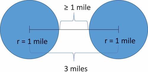
The enriched data attributes at different locations could be dependent on one another. For example, when comparing values to different locations, nearby locations may be more similar in value than those in further locations (Sui Citation2008). To ensure independence within the enriched data attributes, we computed the spatial autocorrelation of each variable with itself using Global Moran’s I (Goodchild Citation1986). For each combination of geographical points in our sample, we calculate the weight, which is defined as the inverse of the distance among the geographical points. Using these inverse distances, we compute Global Moran’s I for each of the features in our study and found that all the values ranged from 0 to 0.3. To ensure that our geo-enriched buffer rings do not overlap one another, we calculate the distance between each school and only select school locations that are at least three miles apart from one another []. After this selection, the remaining sample consists of 490 school locations out of 1,070 locations originally sourced from the California Department of Education school directory. In the reduced sample, we experienced an improvement in the spatial autocorrelation for which the Global Moran’s I value ranged from 0 to 0.1, indicating data independence within our sample. We then proceed to perform data exploration and regression analyses to identify geographical factors that could significantly affect students’ academic performance.
Figure 1. Visual representation of distance between each of the school locations in the sample. One-mile buffer from the centre of each circle represents the geo enrichment area for each location.
Procedure and design
Data exploration
We perform several exploratory analyses, as follows, to understand the data variables and the spatial interdependence in the data sample.
Outlier analysis
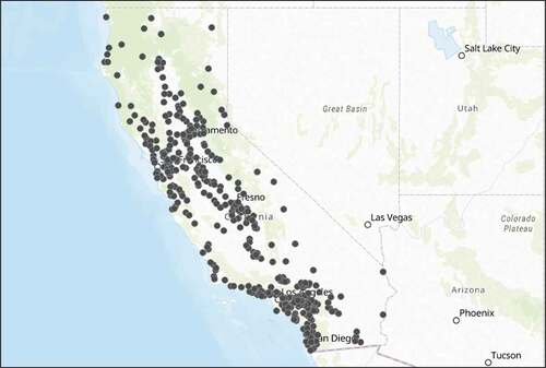
After observing the distributions of all the variables within our dataset, we noticed that there were several outliers that could heavily affect our regression results. Instead of removing outliers individually from each of the different variable distributions, we calculate the Mahalanobis distance to identify the multivariate outliers. The Mahalanobis distance, otherwise known as the generalized squared interpoint distance, takes into account the correlation values of the data and calculates the distance between each point and the multivariate centroid (SAS Institute Inc Citation2010). Data points in which the Mahalanobis distance is greater than the upper control limit (UCL) were flagged as outliers and excluded from further analysis. The sample size upon this final selection is 408 schools whose spatial distributions are shown in .
Figure 2. Distribution of 408 public, magnet, and charter high schools located in California that are at least three miles apart from one another.
Hot spot analysis
We use the hot spot analysis, which relies on Getis-Ord Gi* statistics, to assess each feature within the context of neighbouring features (ArcGIS Pro 1 Citation2018). Using this technique, we can determine if the spatial clusters in the study area are statistically significant and therefore worth investigating further. The conceptualization of spatial relationship in the hot spot analysis is chosen to be ‘Fixed Distance Band,’ which uses a critical fixed distance to allow for the selection of a particular neighbourhood to be included in the calculation of spatial weight. The Incremental Spatial Autocorrelation tool (Global Moran’s I) is applied in selecting the critical (threshold) distance (ArcGIS Pro 2 Citation2018). It measures spatial autocorrelations for series of distances with their corresponding z-score. The significant critical distance is selected based on z-scores and p-values which depict the intensity of the clustering. The last step in the hotspot analysis is to test the hypothesis after computing Getis-Ord Gi* statistics for each feature. High positive z-scores with statistically significant p-values translate to intense clusters of high SAT scores, otherwise known as hot spots. High negative z-scores with statistically significant p-values translate to intense clusters of low SAT scores, otherwise known as cold spots. Z-scores near zero indicate no apparent spatial clustering (ArcGIS Pro 1 Citation2018).
Geodemographic analysis
Esri’s geodemographic system, called Tapestry Segmentation, assigns a tapestry segment for any given area based on its demographic and socioeconomic data (Esri ArcGIS Online Citation2018). This system divides America’s neighbourhoods into 67 distinctive groups based on their socioeconomic and demographic composition (Esri 5 Citation2017). Various industries use tapestry segmentation to describe a community and uncover spatial patterns that could link to unknown issues within a neighbourhood (Appendix C). In this current analysis, we analyse tapestry data from high and low performing school locations, measured by their average SAT score, to understand the characteristics defining these types of communities.
Statistical analyses
Stepwise multilinear regression
In order to develop a better understanding of the different demographic and socioeconomic factors that affect student academic achievement, we perform a stepwise multiple linear regression analysis using the sample data. Before performing the statistical analysis, we partition the data, where 60% is designated to training the model and the remaining 40% is used to validate the model. We develop a formal hypothesis that demographic, socioeconomic and spending habit variables have a significant effect on students’ SAT scores. In order to test this hypothesis, a stepwise regression model is developed in which SAT scores is the dependent variable. A combination of 23 geo-enriched variables such as household spending habits, demographics, and socioeconomic data are used as independent variables within the model.
Geographically weighted regression
We perform a Geographically Weighted Regression (GWR) analysis using the geographical non-stationary (i.e. demographic and socioeconomic) variables to explore and test the model obtained from the multilinear regression by allowing the relationship between independent and dependent variables to vary by locality. The shape and extent of the neighbourhood analysed in the model is selected with a Golden Search option that is based on minimizing the value of Akaike Information Criterion (AICc). When the Golden Search option is chosen, the algorithm determines the best values for the distance band or number of neighbours’ parameter using the golden section search method. The algorithm first starts by searching for the maximum and minimum distances and then tests the AICc at various distances between the maximum and minimum incrementally. The minimum distance is the distance at which every feature has at least 20 neighbours. If there are less than 1,000 features, the maximum distance is selected at the distance where every feature has half the number of features as neighbours and the minimum distance is then selected at the point where every feature has at least five percent of the features as neighbours in the dataset (ArcGIS Pro 4 Citation2018). With this selection choice, the lowest AICc values are used to determine the most appropriate number for the ‘Distance Band’ or ‘Number of neighbors’ parameters (ArcGIS Pro 3 Citation2018).
Results
Data exploration
Hot spot analysis
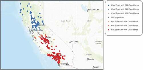
identifies clusters of high and low performing schools within our sample. It shows that the majority of SAT score hot spot clusters are centred around the San Francisco area, in addition to San Diego and Orange County in southern California. The cold spots are mostly in the southern and central parts of the state. By observing the visual representation of the hot spot analysis, it is evident that there exists an academic performance gap between the northern and southern parts of California. There is also a visible disparity between high and low performing schools in San Diego and Los Angeles County within southern California. From the sample, only 15.5% of the students in the cold spot locations scored above the state average SAT score of 1450, while 75.5% of the students in the hot spot locations scored above the state average. – display hot spot analyses performed on the average household size, spending potential index on health insurance, number of multigenerational households, number of husband-wife households, number of educational services, and diversity index, respectively. By visually analysing the hot spot maps, we can infer that there are distinctive characteristics belonging to northern and southern California that affect students’ scholarly outcomes.
Figure 3. Hot spot analysis on SAT scores for each school within the sample, performed through ArcGIS online, demonstrates the academic achievement gap between the northern and southern part of the state. There is also a visible disparity between high and low performing schools in San Diego and Los Angeles County within southern California.
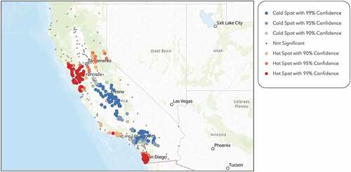
Figure 4. Hot spot analysis on average household size within a one-mile radius of each school within the sample, performed through ArcGIS Online, shows that southern and central California families are significantly larger than northern California families.
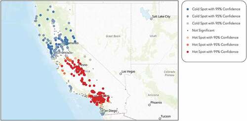
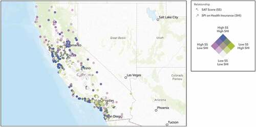
Figure 5. Hot spot analysis on SPI on health insurance within a one-mile radius of each school within the sample, performed through ArcGIS Online, shows that southern California and bay area spend significantly more money on health insurance than central California.
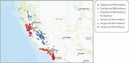
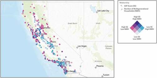
Figure 6. Hot spot analysis on number of multigenerational households within a one-mile radius of each school within the sample, performed through ArcGIS Online, shows that southern California has a significant number of multigenerational households.
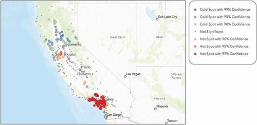
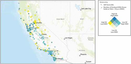
Figure 7. Hot spot analysis on number of husband-wife households within a one-mile radius of each school within the sample, performed through ArcGIS Online, shows that southern California and the bay area have a significant number of two parent households.
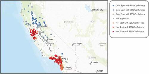
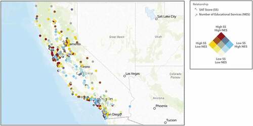
Figure 8. Hot spot analysis on number educational services within a one-mile radius of each school within the sample, performed through ArcGIS Online, shows that both the bay area and Los Angeles County have a significant number of educational services.
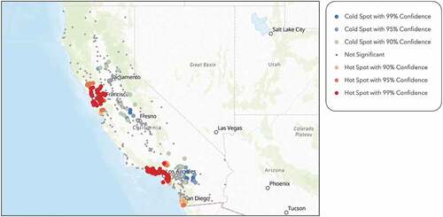
Figure 9. Hot spot analysis on diversity index within a one-mile radius of each school within the sample, performed through ArcGIS Online, shows that southern California is much more diverse than northern California.
Descriptive statistics of the geo-enriched data suggested differences between the hot and cold spots within sample. The average income for households within the cold spots is $69,686, which is significantly lower than the average income for hot spot households of $105,664. It is more likely for students to be affected by poverty in cold spot clusters than hot spot clusters. Not only is there a drastic difference between income levels, but also in the type of households. Schools located in the cold spot areas are surrounded by nearly 20% more non-nuclear family structures, such as single parent and multigenerational households, than schools located in the hot spot areas. High performing students within the hot spot clusters come from areas that are less diverse in terms of ethnic backgrounds and have greater financial ability to support children (Esri Tapestry Segmentation 1A Citation2018). Cold spot regions are more diverse, more prone to poverty, and home to more multigenerational households.
Geodemographic analysis
As mentioned in the geodemographic analysis methods, Esri’s tapestry segmentation system classifies American neighbourhoods into one of the 67 segments (tapestries) they have created. These tapestries provide insight into the socioeconomic and demographic characteristics of each neighbourhood. The tapestry segmentations of top three scoring schools are ‘Top Tier’, ‘Urban Chic’, and ‘Pacific Heights’, all of which have very similar traits such as high socioeconomic backgrounds and a more luxurious family lifestyle. The typical median income for people living in these geographical areas range from $93,300-$173,200 (Esri Tapestry Segmentation 1A Citation2018; Esri Tapestry Segmentation 2A Citation2018; Esri Tapestry Segmentation 2C Citation2018). ‘Top Tier’, ‘Urban Chic’, and ‘Pacific Heights’ families tend to be financially capable of giving their children opportunities to grow outside of the classroom. In addition, attaining a college degree is very common amongst its population (Esri 5 Citation2017; Esri Tapestry Segmentation 1A Citation2018; Esri Tapestry Segmentation 2A Citation2018; Esri Tapestry Segmentation 2C Citation2018). ‘Top Tier’ and ‘Urban Chic’ have little ethnic and racial diversity within their communities; however, ‘Pacific Heights’ exceeds the average diversity index by 11% (Esri Tapestry Segmentation 1A Citation2018; Esri Tapestry Segmentation 2A Citation2018; Esri Tapestry Segmentation 2C Citation2018)
The bottom three performing schools in the sample fall under the following tapestries, ‘International Marketplace’, ‘Urban Villages’, and ‘Valley Growers.’ These three segments share the same type of attributes, such as low income, high number of multigenerational households, and lower education attainment levels (Esri 5 Citation2017; Esri Tapestry Segmentation 7B Citation2018; Esri Tapestry Segmentation 7E Citation2018; Esri Tapestry Segmentation 13A Citation2018). The median income around these school locations ranged from $35,300-$62,300 (Esri Tapestry Segmentation 7B Citation2018; Esri Tapestry Segmentation 7E Citation2018; Esri Tapestry Segmentation 13A Citation2018). The tapestries describe highly diverse neighbourhoods as places that are just starting to become more developed. There are typically more multigenerational households and blue-collar workers within the area (Esri 5 Citation2017; Esri Tapestry Segmentation 7B Citation2018; Esri Tapestry Segmentation 7E Citation2018; Esri Tapestry Segmentation 13A Citation2018). Students living in these neighbourhoods may not have the same opportunities as other students to participate in summer programmes, local sport leagues, or private music lessons. Lastly, graduating from high school, let alone college, is not common among these communities (Esri 5 Citation2017).
Based on the tapestry segmentations of the top and bottom scoring schools within our sample, we found that low performing schools tend to be located in lower socioeconomic areas and the higher performing schools tend to be located in the higher socioeconomic areas. By comparing the similarities and differences from each tapestry in this qualitative analysis, we infer that variables such as income and education attainment do play a role in students’ academic success.
Statistical analyses
Stepwise multilinear regression
A stepwise multiple linear regression eliminated 17 insignificant variables, leaving six statistically significant household spending and demographic predictors that explain our model with a R-squared value of 0.752 as shown in . Because multivariate analysis assumes that there is no correlation between the predictive variables, it is necessary to confirm any cases of multicollinearity. If a model experiences multicollinearity, it can produce a biased coefficient estimate and a decrease in the power of the model itself (Yoo et al. Citation2014). Multicollinearity is accessed through verifying the variance inflation factorFootnote1 (VIF). indicates the VIF of each of the six significant variables in the full regression model. With VIF’s less than 7, we assume that multicollinearity is not an issue in our model. Based on our sample data, the regression model, consisting of six independent variables, portrays an intriguing picture of overall students’ academic performance.
Table 2. Final regression model effects of independent variables in stepwise multilinear regression analysis.
Interestingly, the ‘diversity index,’ explained in Appendix B, negatively affects SAT scores (). The model implies that there is a negative correlation between SAT scores and students living in more diverse communities (). The regression model also suggests that the increase in household size will have a negative impact on SAT results ( and ). Similarly, students coming from multigenerational households also see lower SAT results ( and ). On the other hand, increased spending on health insurance will lead to higher SAT results ( and ). Two additional positively correlated predictor variables are number of husband-wife households and number of education-related businesses. Our model suggests that students who come from families with two parents will also have a more positive experience in their academic outcomes ( and ). Moreover, students who attend schools surrounded by education-related businesses, such as universities, community colleges, and public libraries, are more likely to perform better academically ( and ).
Table 3. Effect summary of significant independent variables and its interpretation in stepwise multilinear regression model.
Figure 10. The map illustrates the negative relationship between SAT scores and average household sizes within a one-mile radius of each school location.
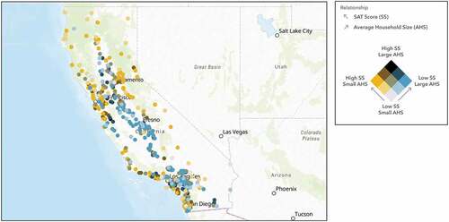
Figure 11. The map illustrates the positive relationship between SAT scores and spending on health insurance within a one-mile radius of each school location.
To test the stability of our model, we created additional validation sets, using a random seed, from the sample (N = 408) and performed the stepwise multilinear regression analysis to compare with our previous results. For each additional validation sample, the same six variables shown in EQ (1) remained statistically significant in predicting SAT scores with very similar R-squared values that ranged from 0.68 to 0.75. The distribution of the residuals (the differences between predicted and actual SAT scores) is normally distributed with the mean value close to zero.
Geographically weighted regression
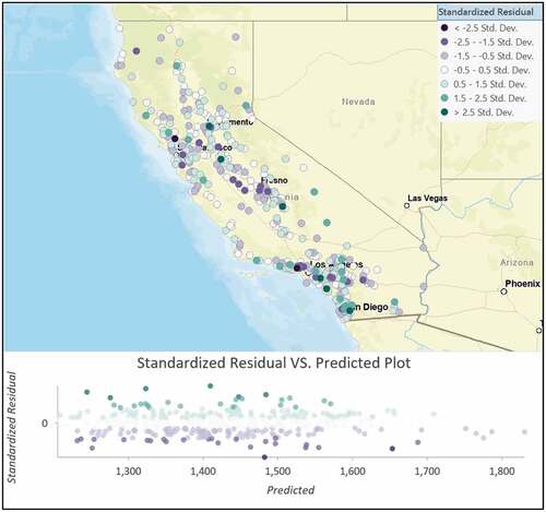
Because the stepwise multilinear regression does not consider spatial relationships, we used a Geographically Weighted Regression (GWR) to explore any potential geographical relationship (Brunsdon, Fotheringham, and Charlton Citation1996). We developed a GWR model to predict SAT scores using the same six independent variables obtained from the stepwise regression model by incorporating the dependent and explanatory variables of features within the neighbourhood of each target feature. The shape and extent of each neighbourhood is analysed based on the neighbourhood type and the neighbourhood selection method. We selected the ‘Golden Search’ option as the Neighbourhood Selection Method, which specifies that the size of the neighbourhood is determined by the number of neighbourhoods used. Due to the spatial densities between our features, the number of neighbourhoods used in the analysis was allowed to vary in spatial extent. Where features are dense, the spatial extent of the neighbourhood is smaller; where features are sparse, the spatial extent of the neighbourhood is larger (Brunsdon, Fotheringham, and Charlton Citation1996). Features that are farther away from the regression point were given less weight and thus have less influence on the regression result for the target feature. Features that are closer to the regression point would have more weight in the regression equation. The weights are determined using an adaptive kernel, which is a distance decay function that determines how quickly the weights decreases as the distance increases. The obtained GWR results, performed through ArcGIS Pro, gave us very consistent predictions of average SAT scores with a R-squared of 0.708 and AICc = 4686.133, as shown in . In addition, the distribution of standardized residuals, shown in , confirms the robustness of our model obtained from the stepwise multilinear regression.
Table 4. Geographically weighted regression (GWR) model diagnostics.
Discussion
We investigated geospatial factors such as demographic and socioeconomic data, as well as, consumer spending habits that could be related to students’ scholarly success. To measure academic performance, we used high school SAT scores in California from the 2015–2016 school year. Our unique approach to this study provided in-depth insights, suggesting location specific measures to reduce performance gaps between schools in different communities.
A geospatial analysis allowed us to visually detect patterns quantitatively through a combination of data sources offered by Esri, which has been proven to be the best available in the industry. From our data, we were able to visually identify the locations of high and low performing school clusters in California, which led us to further study these communities through geodemographic tapestries and statistical analyses (). Through the stepwise multilinear regression, we identified different variables associated with demographic, socioeconomic, and household spending that have significantly influence students’ academic success (). Factors that demonstrated a positive effect on academic performance are spending on health insurance, two parent households, and access to educational entities. These positive characteristics shown in the regression models are more evident in tapestries such as Top Tier, Urban Chic, and Pacific Heights. On the contrary, International Marketplace, Urban Villages, and Valley Growers tapestry share characteristics like above average amounts of multigenerational living situations and higher diversity, both of which are shown to have negative impacts on students’ scholarly achievement.
In the following sections, we will discuss the implications of the relationships between dependent and independent variables obtained from our model and visually study these relationships using maps. We also compare our findings with previous studies.
Average household size
Family structure is an instrumental part of a student’s ability to perform well in school. Our model suggests that the larger families have a negative impact on student academic achievement. confirms our regression results and illustrates the negative correlation between SAT scores and family size through the colour-coded gradient. Yellow represents school locations with high SAT scores and small household sizes. Blue represents low SAT scores and larger household sizes. Black represents both high SAT scores and larger household sizes. Lastly, white represents both low SAT scores and small household sizes. In conjunction to our results, sociologists have confirmed a strong inverse relationship between number of siblings and academic performance (Cobb-Clark and Moschion Citation2013). Reasons underlying these shortcomings are that parents have finite resources and as sibship increases within a family, resources are diluted which means not all siblings will equally benefit from the limited resources that could improve educational outcomes (Downey Citation1995). Downey’s (Citation1995) study suggests that families with multiple siblings experience a decrease in many variables such as parents’ educational expectations, money saved for college, and cultural activities.
Spending potential index on health insurance
In our prediction model, we learned that spending on health insurance is statistically significant in predicting high SAT scores. confirms our regression results and illustrates the positive correlation between SAT scores and the spending on health insurance through the colour-coded gradient. Light purple represents school locations with high SAT scores and lower spending on health insurance. Green represents low SAT scores and higher spending on health insurance. Blue represents both high SAT scores and high spending on health insurance. Lastly, white represents both low SAT scores and low spending on health insurance. Subscribing to health insurance helps alleviate the overall cost of medical expenses. Studies have found that people who pay for health insurance feel more comfortable going to the doctor for medical attention (Taber, Leyva, and Persoskie Citation2015). While medical care costs remain high for families with no health insurance, they are less likely to seek medical care (Taber, Leyva, and Persoskie Citation2015). Students who have health insurance have the resources to learn more about preventative care – informing students how to maintain their physical and mental health. Academic research also shows that students that are physically and mentally healthy are more likely to reach academic success (National Center for Chronic Disease Prevention and Health Promotion Citation2014). Healthy students tend to have a more positive outlook on education and better cognitive skills and attitudes (National Center for Chronic Disease Prevention and Health Promotion Citation2014). Thus, it is imperative that school educators help close the gap and give students and families, with or without health insurance, the proper information they need on how to stay healthy.
Number of multigenerational households
Non-nuclear family dynamics, such as multigenerational households, negatively affect students’ academic performance. confirms our regression results and illustrates the negative correlations between the average SAT score at a school and the number of multigenerational households through the colour-coded gradient. Pink represents school locations with high SAT scores and low counts of multigenerational households. Blue represents low SAT scores and high counts of multigenerational households. Navy-blue represents both high SAT scores and high counts of multigenerational households. Lastly, white represents both low SAT scores and low counts of multigenerational households. Studies find that this particular living situation does not improve academic performance (Ratcliffe Citation2015). Researchers have analysed the effects of living in residences similar to multigenerational households and revealed that those particular households have fewer resources and are generally the ones who need the most support (Augustine and Raley Citation2013). Factors associated with multigenerational households are immigration, health and disability issues, and economic conditions, all of which reduce the resources these students could use towards their academic and personal growth. (Bethell Citation2011). Several solutions for school districts with a high number of multigenerational households could be to enhance their English as a Second Language programmes, create affordable after-school activities to help students focus more on their academics, and administer parent workshops to demonstrate the importance of education and provide tactics for parents on how they can help their children succeed.
Figure 12. The map illustrates the negative relationship between SAT scores and the number of multigenerational households within a one-mile radius of each location.
Number of husband-wife households
Our study also shows that family dynamics, such as two parent households, differentially impact students’ academic performance. confirms our regression results and illustrates the positive correlation between SAT scores and the number of two parent households through the colour-coded gradient. Yellow represents the school locations with high SAT scores and low counts of two parent households. Aqua blue represents low SAT scores and high counts of two parent households. Dark blue represents both high SAT scores and high counts of two parent households. Lastly, beige represents both low SAT scores and low counts of two parent households. Studies show that the environment in which students are raised affects the student’s interests in academics (Qaiser, Hussain, and Akhtar Citation2012). In support of our findings, most studies conclude that students who live in households with two parents perform academically better than those who live in single parent households (Musah and Fuseini Citation2014). A possible explanation for this relationship is that single parents might have lower parental involvement with the student’s academic life than those that live with two parents (Musah and Fuseini Citation2014). Typically, in a nuclear family with two parents, both parents play a role in the child’s academic career. Given that both parents have a healthy relationship with one another, the child will live in conditions that allow the child to grow individually and academically, whereas single parent households are more likely to be income insecure, use inconsistent discipline, and decrease parental control which could lead to less interest and discipline when it comes to academics (Amadi and Segun Citation2018).
Figure 13. The map illustrates the positive relationship between SAT scores and the number of two parent households within a one-mile radius of each school location.
Number of educational services
We also discovered that the presence of education-related establishments and businesses, such as schools, colleges, and educational support services, have a positive relationship with SAT scores. confirms our regression results and illustrates the positive correlation between SAT scores and the number of education services through the colour-coded gradient. Yellow represents school locations with high SAT scores and low counts of educational services. Blue represents low SAT scores and high counts of educational services. Red represents both high SAT scores and high counts of educational services. Lastly, beige represents both low SAT scores and low counts of educational services. However, as we took a look at a large-scale view of the two-layered map of these two variables, we saw that the positive relationship did not hold true in the Los Angeles County area. For many of those communities, we saw a high number of educational establishments corresponding to schools with low SAT results. It is our understanding that dominating factors such as presence of multigenerational households, single parent families, and diversity in the area may be reducing the expected positive effect from the presence of the larger number of schools and educational establishments within the Los Angeles County area. We strongly believe that further research is necessary to understand this anomaly.
Figure 14. The map illustrates the positive relationship between SAT scores and the number of educational services within a one-mile radius of each school location.
Diversity index
In contrast to our expectation, the diversity index is negatively correlated with SAT scores. confirms our regression results and illustrates the negative correlation between SAT scores and the diversity index through the colour-coded gradient. Blue represents school locations with high SAT scores and a low diversity index. Orange represents low SAT scores and a high diversity index. Brown represents both high SAT scores and a high diversity index. Lastly, beige represents both low SAT scores and a low diversity index. In support of our results, Eve and Handelsman (Citation2010) concluded that student diversity in an educational setting fosters creativity and innovation as well as critical thinking. Other studies conclude that having students participate in cross-racial interaction can also lead to personal growth, leadership skills, and academic achievement (Bowman Citationn.d.; Chang Citation2011; Konan et al. Citation2010; Rodriguez et al. Citation2004). Contrary to these observations, our results show that diversity index within a one-mile radius of a given school is negatively correlated to student academic success, resulting in increase of the performance gap between schools. Our results are in line with the finding of Eve and Handelsman (Citation2010) who also discussed how diversity can result in less cohesiveness or less effective communication within the classroom. Our result may also suggest that our dependent variable, SAT scores, may not be completely tied to the academic performance within a diverse community. We believe that students in diverse settings could be more focused on other activities not relating to academics, such as sports and music. Hence, we suggest that future studies should be undertaken to measure academic success contributing from leadership, creativity, and unconventional thinking abilities.
Figure 15. The map illustrates the negative relationship between SAT scores and the diversity index within a one-mile radius of each school location.

Figure 16. Standardized residual distribution from geographically weighted regression model. A lack of distinct structure across the map confirms robustness of the prediction model. Some prediction outliers are seen near Los Angeles county that may need further investigation.
Based on our research, we find that different demographics value different measures of academic success, which means that the SAT may not necessarily be the only measure for academic performance. In, ‘A Mathematician Reads the Newspaper,’ by John Allen Paulos (Citation2013), he examines SAT scores and argues that ‘the [SAT] test is “biased,” but only toward the educationally prepared, the physically healthy, and psychologically receptive.’ In conjunction with Paulos’s argument, Olaf Jorgenson (Citation2012) expresses his concerns and argues that standardized test scores do not measure a student’s creative ability to ‘explain, debate, elaborate, present, rebut, or improvise.’ Tests like the CST, CAHSEE, and SAT do not look at the students’ ‘perseverance, resiliency, and determination’ (Jorgenson Citation2012). As recent as this year, the College Board is investigating SAT results from different locations and is currently working on rolling out a new scoring opportunity called ‘Adversity Index’ (Coleman Citation2019). The new adversity index’s intent is to understand the demographic and socioeconomic environment in which a student comes from. According to the CEO of College Board, David Coleman (Citation2019), they want to attempt to understand which students are resourceful and how students have been able to overcome the problem of scarce resources to excel academically. By implementing the new adversity index, the SAT will further standardize the exam and implement a more holistic performance evaluation process.
We understand that not all demographics, socioeconomics, and spending habits data are considered in our study. Thus, future investigations could incorporate more data attributes for a better model. We also restricted our enrichment of demographic and socioeconomic data to a one-mile buffer ring. The tradeoff for limiting the size of our buffer ring gave us access to a larger sample and greater statistical power. With that being said, subsequent studies could include data from schools across different states and widen the enrichment buffer ring to make the sample more realistically representative of the entire country. Furthermore, we observed not all regions in California follow a similar trend in dependencies. Hence, we believe additional research and investigation should be conducted to understand this anomaly.
Because our study illustrated visible gaps between low and high performing students, we concluded that location relevant metrics do have a compelling effect on overall academic performances and school systems should embrace this. In order to bridge the academic performance gap, it is important for community leaders and school educators to be more proactive about helping students earlier in their academic careers. While it is possible for this gap to potentially be the results of other factors that were not considered in the study, such as cultural influences of parents, available technological opportunities to complement in-school education, student interactions with teachers, teachers’ competencies, and students’ overall motivation to do well in school, we believe our results will help develop better public policies to enhance overall academic performances in educational institutions.
Notes
1. A statistical driver quantity that defines how much the standard error is inflated (Pardoe Citation2018).
References
- Aikens, N., and O. Barbarin. 2008. “Socioeconomic Differences in Reading Trajectories: The Contribution of Family, Neighborhood, and School Contexts.” Journal of Educational Psychology 100: 235–251. doi:10.1037/0022-0663.100.2.235.
- Amadi, E., and I. Segun. 2018. “The Influence of Family Social Status on Academic Performance of Senior Secondary Students: A Review.” International Journal of Innovative Social & Science Education Research 6 (1): 25–29. https://www.researchgate.net/publication/323522704_The_Influence_of_Family_Social_Status_on_Academic_Performance_of_Senior_Secondary_Students_A_Review
- ArcGIS Pro 1. 2018. How Hot Spot Analysis (Getis-Ord Gi*) Works. Environmental Systems Research Institute. http://pro.arcgis.com/en/pro-app/tool-reference/spatial-statistics/h-how-hot-spot-analysis-getis-ord-gi-spatial-stati.htm
- ArcGIS Pro 2. 2018. Spatial autocorrelation (global moran’s I). Environmental Systems Research Institute. http://desktop.arcgis.com/en/arcmap/10.3/tools/spatial-statistics-toolbox/spatial-autocorrelation.htm
- ArcGIS Pro 3. 2018. Geographically weighted regression (GWR). Environmental Systems Research Institute. http://desktop.arcgis.com/en/arcmap/10.3/tools/spatial-statistics-toolbox/geographically-weighted-regression.htm
- ArcGIS Pro 4. 2018. How geographically weighted regression (GWR) works. Environmental Systems Research Institute. https://pro.arcgis.com/en/pro-app/tool-reference/spatial-statistics/how-geographicallyweightedregression-works.htm#GUID-A5307DAE-12AF-41C2-831B-10192ECB6CE4
- Augustine, J. M., and R. K. Raley. 2013. “Multigenerational: Households and the School Readiness of Children Born to Unmarried Mothers.” Journal of Family Issues 34 (4): 431–459. doi:10.1177/0192513X12439177.
- Bethell, T. 2011. Family matters: multigenerational families in a volatile economy. Generations United. https://www.gu.org/app/uploads/2018/05/SignatureReport-Family-Matters-Multigen-Families.pdf
- Bowman, B. T. (n.d.). “Cultural diversity academic achievement.” North Central Regional Educational Laboratory. https://files.eric.ed.gov/fulltext/ED382757.pdf
- Bridgeman, B., L. McCamley-Jenkins, and N. Ervin. 2000. “Predictions of freshmen and grade point average from the revised and recent recentered SAT I: reasoning test.” College Board Research Report No. 2000-1. New York: College Entrance Examination Board.
- Brunsdon, C., A. S. Fotheringham, and M. E. Charlton. 1996. “Geographically Weighted Regression: A Method for Exploring Spatial Nonstationarity.” Geographical Analysis 28: 281–298. doi:10.1111/j.1538-4632.1996.tb00936.x.
- California Department of Education 1. 2017. “Analysis, measurement, and accountability reporting division dataquest.” 2015-2016 SAT. Accessed September 2017. https://www.cde.ca.gov/ds/sp/ai/
- California Department of Education 2. 2017. “Data from: california school directory (Dataset)”. Accessed September 2017. https://www.cde.ca.gov/schooldirectory/
- California Department of Education 3. 2017. “Data from: student records & transcripts (Dataset)”. https://www.cde.ca.gov/re/di/st/
- Camara, W., and G. Echternacht. 2000. The SAT [R] I and high school grades: utility in predicting success in college. Research notes. New York, NY: College Entrance Examination Board. https://files.eric.ed.gov/fulltext/ED446592.pdf
- Chang, M. J. 2011. Quality matters: achieving benefits associated with racial diversity. Kirwan Institute for the Study of Race and Ethnicity. http://kirwaninstitute.osu.edu/wp-content/uploads/2011/11/Mitchell-Chang_final_Nov.-1-2011_design_3.pdf
- Cobb-Clark, D., and J. Moschion. 2013. The impact of family size on school achievement: test scores and subjective assessments by teachers and parents. Melbourne Institute of Applied Economic and Social Research. https://sole-jole.org/14033.pdf
- Coleman, D. 2019. “College Board CEO Talks SAT Adversity Score.” CBS News, May 17.
- Craft, S. W. 2012. “The impact of extracurricular activities on student achievement at the high school level.” PhD diss., University of Southern Mississippi, 543. https://aquila.usm.edu/dissertations/543
- Downey, D. 1995. “When Bigger Is Not Better: Family Size, Parental Resources, and Children’s Educational Performance.” American Sociological Review 60 (5): 746–761. doi:10.2307/2096320.
- Duff, D., J. B. Tomblin, and H. Catts. 2015. “The Influence of Reading on Vocabulary Growth: A Case for A Matthew Effect.” Journal of Speech, Language, and Hearing Research 58 (3): 853–864. doi:10.1044/2015_JSLHR-L-13-0310.
- Esri. 2018. “Environmental Systems Research Institute.” https://www.Esri.com/en-us/home
- Esri 1. 2012. Vendor accuracy study: 2010 estimates versus census 2010. Environmental Systems Research Institute. Accessed 1 November 2018. https://www.esri.com/~/media/Files/Pdfs/library/brochures/pdfs/vendor-accuracy-study.pdf
- Esri 2. 2017. Esri demographics: methodology statements. Environmental Systems Research Institute. https://www.Esri.com/data/Esri_data/methodology-statements
- Esri 3. 2012. “GIS for law enforcement.” Esri White Paper. https://www.esri.com/library/whitepapers/pdfs/gis-for-law-enforcement.pdf .
- Esri 4. 2011. “A better way to protect schools: california city builds tactical response application.” ArcNews. Accessed 01 November 2018. http://www.esri.com/news/arcnews/winter1011articles/a-better-way.html
- Esri 5. 2017. Tapestry segmentation: the fabrics of america’s neighborhoods. Environmental Systems Research Institute. http://www.ESRI.com/library/brochures/tapestry-segmentation.pdf
- Esri 6. 2018. Esri diversity index. Environmental Systems Research Institute. http://downloads.esri.com/esri_content_doc/dbl/us/J10170_US_Diversity%20Index_2018.pdf
- Esri 7. 2017. Esri consumer spending methodology 2017. Environmental Systems Research Institute. http://downloads.esri.com/esri_content_doc/dbl/us/J9945_2017_US_Consumer_Spending_Data.pdf
- Esri 8. 2018. Census and ACS. Environmental Systems Research Institute. https://doc.arcgis.com/en/esri-demographics/data/census-acs.htm
- Esri 9. 2018. Updated demographics. Environmental Systems Research Institute. https://doc.arcgis.com/en/esri-demographics/data/updated-demographics.htm
- Esri ArcGIS Online. 2018. “ArcGIS online [Software].” https://www.arcgis.com/home/index.html
- Esri Tapestry Segmentation 13A. 2018. 13A international marketplace. Environmental Systems Research Institute. http://downloads.esri.com/esri_content_doc/dbl/us/tapestry/13A_InternationalMarket_TapestryFlier_G79488_2-18.pdf
- Esri Tapestry Segmentation 1A. 2018. 1A top tier tapestry. Environmental Systems Research Institute. http://downloads.esri.com/esri_content_doc/dbl/us/tapestry/1A_Top_Tier_TapestryFlier_G79488_2-18.pdf
- Esri Tapestry Segmentation 2A. 2018. 2A urban chic tapestry. Environmental Systems Research Institute. http://downloads.esri.com/esri_content_doc/dbl/us/tapestry/2A_UrbanChic_TapestryFlier_G79488_2-18.pdf
- Esri Tapestry Segmentation 2C. 2018. 2C pacific heights tapestry. Environmental Systems Research Institute. http://downloads.esri.com/esri_content_doc/dbl/us/tapestry/2C_PacificHeights_TapestryFlier_G79488_2-18.pdf
- Esri Tapestry Segmentation 7B. 2018. 7B urban villages. Environmental Systems Research Institute. http://downloads.esri.com/esri_content_doc/dbl/us/tapestry/7B_UrbanVillages_TapestryFlier_G79488_2-18.pdf
- Esri Tapestry Segmentation 7E. 2018. 7E valley growers. Environmental Systems Research Institute. http://downloads.esri.com/esri_content_doc/dbl/us/tapestry/7E_ValleyGrowers_TapestryFlier_G79488_2-18.pdf
- Eve, F., and J. Handelsman. 2010. Benefits and challenges of diversity in academic settings. Women in Science & Engineering Leadership Institute https://wiseli.engr.wisc.edu/docs/Benefits_Challenges.pdf
- Goodchild, M. F. 1986. Spatial Autocorrelation. Norwich: Geo Books.
- Jorgenson, O. 2012. “What We Lose in Winning the Test Score Race.” National Association of Elementary School Principals 91 (5): 12–15.
- Konan, P. N., A. Chatard, L. Selimbegović, and G. Mugny. 2010. “Cultural Diversity in the Classroom and Its Effects on Academic Performance: A Cross-National Perspective.” Social Psychology 41 (4): 230–237. doi:10.1027/1864-9335/a000031.
- Ladd, H. F. 2012. “Education and Poverty: Confronting the Evidence.” Journal of Policy Analysis and Management 31: 2. doi:10.1002/pam.21615.
- Musah, A., and M. N. Fuseini. 2014. “Influence of Singe Parenting on Pupils’ Academic Performance in Basic Schools in the WA Municipality.” International Journal of Education Learning and Development 1 (2): 85–94. https://www.researchgate.net/publication/305513980_INFLUENCE_OF_SINGLE_PARENTING_ON_PUPILS’_ACADEMIC_PERFORMANCE_IN_BASIC_SCHOOLS_IN_THE_WA_MUNICIPALITY
- National Center for Chronic Disease Prevention and Health Promotion. 2014. “Health and academic achievement.” Division of Population Health. https://www.cdc.gov/healthyyouth/health_and_academics/pdf/health-academic-achievement.pdf
- Pardoe, I. 2018. “12.4 – detecting multicollinearity using variance inflation factors.” The Pennsylvania State University Lecture Notes Online. https://onlinecourses.science.psu.edu/stat501/node/347/
- Paulos, J. A. 2013. A Mathematician Reads the Newspaper. New York, NY: Basic Books.
- Posso, A. 2016. “Internet Usage and Educational Outcomes among 15-Year-Old Australian Students.” International Journal of Communication 10 (2016): 3851–3876. https://ijoc.org/index.php/ijoc/article/view/5586/1742
- Qaiser, S., et al. 2012. “Effects Of Family Structure on The Academic Performance Of Students at Elementary Level in Karak.” Journal Of Sociological Research 3 (2): 236. doi: 10.5296/jsr.v3i2.2358.
- Ratcliffe, C. 2015. Child poverty and adult success. The Urban Institute. https://www.urban.org/sites/default/files/publication/65766/2000369-Child-Poverty-and-Adult-Success.pdf
- Reardon, S. F. 2011. “The Widening Academic Achievement Gap between the Rich and the Poor: New Evidence and Possible Explanations.” In Whither Opportunity. Rising Inequality and the Uncertain Life Chances of Low-Income Children, edited by R. Murnane and G. Duncan. (91-112).New York: Russell Sage Foundation Press.
- Rodriguez, J. L., E. B. Jones, V. O. Pang, and C. D. Park. 2004. “Promoting Academic Achievement and Identity Development among Diverse High School Students.” The High School Journal 87 (3): 44–53. doi:10.1353/hsj.2004.0002.
- SAS Institute Inc. 2010. “Outlier analysis.” JMP Statistical Discovery. https://www.jmp.com/support/help/14-2/outlier-analysis.shtml
- Seo, J. 2015. “An evaluation of esri’s tapestry segmentation product in three southern california communities: manhattan beach, santa monica, and venice beach.” Master’s thesis. University of Southern California.
- Sui, D. 2008. “First Law of Geography.” In Encyclopedia of Geographic Information Science, edited by K. K. Kemp, 147. Thousand Oaks, CA: SAGE Publications, Inc. doi:10.4135/9781412953962.n68.
- Taber, J. M., B. Leyva, and A. Persoskie. 2015. “Why Do People Avoid Medical Care? A Qualitative Study Using National Data.” Journal of General Internal Medicine 30 (3): 290–297. doi:10.1007/s11606-014-3089-1.
- The Princeton Review. 2018. “What Is the SAT?” https://www.princetonreview.com/college/sat-information
- Trammel, J. 2017. “The Effect of Therapy Dogs on Exam Stress and Memory.” Anthrozoos 30 (4): 607–621. doi:10.1080/08927936.2017.1370244.
- Yoo, W., R. Mayberry, S. Bae, K. Singh, Q. Peter, and J. W. Lillard. 2014. “A Study of Effects of MultiCollinearity in the Multivariable Analysis.” International Journal of Applied Science and Technology 4 (5): 9–19. https://www.ncbi.nlm.nih.gov/pmc/articles/PMC4318006/
Appendix A.
For this study, we looked into various geospatial data vendor options. Researchers have performed a blind study to compare five major data vendors by how accurate they are at a country, state, census tract, and block group level (Esri 1 Citation2012). Of the five vendors, the Environmental Systems Research Institute (Esri) had the lowest precision scores by geography, distinguishing itself as the most accurate data provider (Esri 1 Citation2012). Based on this reference, we decided to use Esri’s data to conduct our studies.
Enrichment data is provided by Esri. Esri has a data development team that consists of economists, statisticians, demographers, geographers, and analysts who all create the datasets which include annual demographic updates, Tapestry Segmentation, Consumer Spending, Market Potential, and Retail MarketPlace (Esri 7 Citation2017).
Appendix B.
Data Collection Methodology
Household spending habits represent the consumer spending within a given area. It is a mixture of surveys from the Bureau of Labour Statistics that focus on consumer expenditure (Esri 7 Citation2017). The data is specific to different types of products and services. The spending habit variables are not measured in dollar amounts. The spending potential index (SPI) is calculated for each of these variables by Esri. Esri generates the SPI by taking the ratio of the average spending habit at a local level and the national level (Esri 7 Citation2017). Below are the specific average household spending habits observed within our study.
Socioeconomic variables are related to income, education, and occupation. Esri gathers socioeconomic data from the U.S. Census and American Community Survey (Esri 8 Citation2018). These are the socioeconomic variables considered in our study.
Demographic variables are related to household size and family dynamic. Esri constructs its own demographic data annually. The bases of their datasets are combined administrative records and other private sources (Esri 2 Citation2017; Esri 6 Citation2018; Esri 9 Citation2018). These are the demographic variables observed in the paper.
Appendix C.
Businesses, such as insurance companies, use location-based data to improve their marketing campaigns, channels of distribution, and relationships with customers (Esri 3 Citation2012). City planners and law enforcement officials also benefit significantly from geospatial data to develop emergency response routines within their communities and jurisdictions. For example, in the city of Rancho Cucamonga, California, law enforcement uses geographic information systems (GIS) to protect schools by developing quick response safety routines for active shooter situations (Esri 4 Citation2011). By acquiring general geospatial data, as the tapestry segments provide, police and firefighters can efficiently execute responses to emergencies in a timely manner, enhancing the overall safety within a community (Seo Citation2015).