
 ?Mathematical formulae have been encoded as MathML and are displayed in this HTML version using MathJax in order to improve their display. Uncheck the box to turn MathJax off. This feature requires Javascript. Click on a formula to zoom.
ABSTRACT
Massive and rapid testing is crucial for containing the spread of COVID-19. Health and policy planners must ensure that access to and uptake of SARS-CoV-2 testing is adequate and equitable. This study measures the spatial accessibility to testing sites in Florida at the census tract level at the end of May 2020, using the 2-step floating catchment area method that integrates both driving and walking modes. Accessibility scores were found to be heterogeneous across geographic regions and among different groups of people. In particular, many rural areas were in a testing desert. While people in larger cities tended to have better accessibility to testing, many did not have adequate accessibility at that time due to both capacity limitations and spatial factors. In particular, people without access to private vehicles and the elderly faced disadvantages in accessibility to testing sites even in urban areas. However, Black and low-income groups were disproportionally concentrated in neighbourhoods with above-average accessibility due to their closer proximity to testing sites. These results suggest that increased efforts are needed to reach vulnerable populations, including the elderly and those without private vehicles.
1. Introduction
COVID-19 first appeared in the United States in the state of Washington in January 2020 (Holshue et al. Citation2020). On 10 March 2020, the World Health Organization (WHO) declared a global pandemic due to widespread infection of the novel coronavirus COVID-19 internationally. The early state of the response to COVID-19 in the U.S. was hampered by multiple challenges and issues, particularly the availability of diagnostic testing for the novel coronavirus (Sharfstein, Becker, and Mello Citation2020). In the absence of a vaccine or effective treatment for COVID-19, massive and rapid testing for SARS-CoV-2 nucleic acid or antigen is crucial to halting transmission and death, especially with pre-symptomatic transmission responsible for up to 44% of infections (He et al. Citation2020). Testing is also a fundamental aspect of the United States SARS-CoV-2 Surveillance Plan that uses multiple surveillance systems and epidemiological networks, in collaboration with state, local and academic partners, to monitor the progression and impact of SARS-CoV-2 spread in the United States (cdc.gov/coronavirus/2019-ncov/hcp/testing-overview.html). Extensive testing efforts have been key to some of the lowest fatality rates in the world (Johns Hopkins University, 2020).
Testing strategies are key to ameliorating economic and social hardship, concentrating resources and allowing more targeted interventions (Kavanagh et al. Citation2020). More importantly, as economies reopen, insufficient testing relinquishes control of COVID-19, because new viral clusters elude detection and spark new outbreaks. International evidence continues to emerge about ethnic and racial disparities in COVID-19 morbidity and mortality (Garg Citation2020). For example, in Florida, Blacks comprise 16% of the population but represent 22% of COVID-19 cases. Similarly, Hispanics make up 26% of the population but represent 46% of cases (covidtracking.com/race/dashboard). The disparity is largely attributable to social determinants of health (Dodds and Fakoya Citation2020). Moreover, rural areas have older populations and more people with underlying health conditions than suburban and urban communities (Pender et al. Citation2019), both of which make rural communities and older adults uniquely susceptible to COVID-19 (Henning-Smith Citation2020; CDC Citation2020). Rural areas also contain significant racial and ethnic diversity and rural counties with a majority of Black or Indigenous residents had higher rates of premature death, food insecurity and unemployment and lower median incomes before COVID-19 (Henning-Smith et al. Citation2019). While one would expect COVID-19 case counts to be lower in rural areas due to lower population density, there is a greater potential for the medically vulnerable among rural populations to succumb to the virus due to underlying conditions and lack of access to care (Souch and Cossman Citation2020). SARS-CoV-2 infections are also more severe and fatal in older adults with plausible reasons that include changes to the immune cell repertoire, the epigenome, inflammasome activity, biological clocks, and covalent modifications of human and viral proteins (Mueller, McNamara, and Sinclair Citation2020).
Health and policy planners must ensure that access to and uptake of SARS-CoV-2 testing is adequate and equitable across all economic and social gradients (Dodds and Fakoya Citation2020). In this study, we collected the locations and estimated the testing capacities of all testing sites in Florida at the end of May 2020. We applied the 2-step floating catchment area (2SFCA) method to calculate the accessibility score for all 4245 census tracts in Florida. Using the spatial lag regression model and bivariate local Moran’s I, we further investigated the potential inequality issues among car ownerships, races, ethnicities, income levels, and ages. The goal of this study was to identify any disparities in accessibility to testing during the early stage of the pandemic in order to guide future efforts for allocating testing resources in an equitable manner.
2. Methods
2.1. Data collection
We documented the spatial distribution of COVID-19 testing sites in Florida as of 29 May 2020. Locational and attribute information for the testing sites were obtained from three sources to ensure completeness: GoodRx (https://www.goodrx.com/blog/drive-thru-coronavirus-testing-near-me/), Google Maps (https://www.google.com/maps), and The Florida Division of Emergency Management (FDEM) (https://floridadisaster.org/covid19/testing-sites/). A total of active 294 testing sites were identified in Florida at that time, which had almost doubled compared with the number in early April. Among them, 214 testing sites were located at existing medical or health-care facilities, such as hospitals, clinics, urgent care centres, pharmacies, and medical laboratories. The remaining 80 testing sites were temporarily assembled at public open spaces, such as stadium parking lots, public parks, and universities. At that time, only 35 sites accepted anyone requesting testing. The other sites were only available to those who met CDC, state, or local criteria, such as first responders, health-care providers, people with certain symptoms of COVID-19, those exposed to known cases, and high-risk groups without symptoms. In most cases, appointments were required prior to testing.
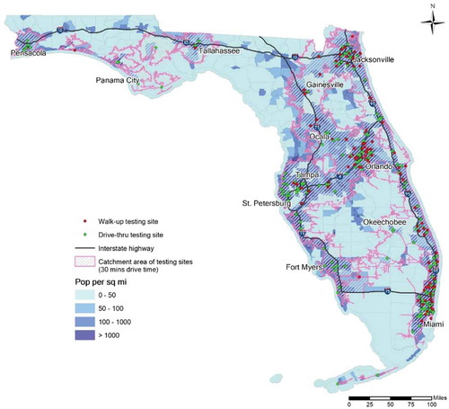
At the end of May, COVID-19 testing sites generally concentrated in urban areas, while many small cities or townships also provided more limited testing services (). Although distance largely determines spatial accessibility, another key characteristic is whether these testing sites were drive-through or walk-up. Among the 294 sites, 172 were drive-through only, which means people were tested without leaving their cars. The benefits of this testing approach included both increased speed in testing and a safer hygienic environment, but the downside was the exclusion of people without access to private vehicles. The remaining testing sites were walk-up, where people were tested in an indoor or outdoor facility. People could access these sites with or without a personal vehicle, either by driving, walking, cycling, or using public transportation. Walk-up testing sites were more heavily clustered in large metropolitan areas compared to drive-through sites. Based on these locations, we delineated the catchment area of 30-min drive time using a geographic information system, or GIS (ArcGIS Pro, ESRI Inc.). Comparing it with the population density distribution (), the catchment area overlapped well with the densely populated areas. In fact, nearly 20 million residents, or roughly 96% of the entire Florida population, resided within the catchment area. Among them, 18.6 million had access to a private vehicle, which means they had a certain degree of accessibility to COVID-19 testing services. Nevertheless, the plausibly decent coverage of the catchment area may not have guaranteed adequate accessibility to everyone. Therefore, it is necessary to measure the accessibility in a scientific and systematic way to better understand spatial patterns of accessibility.
Figure 1. Testing sites distribution, catchment area, and population density in Florida
2.2. Estimating testing capability
According to the Florida Department of Health (FDOH), 149,315 COVID-19 tests were administered in Florida during the last week of May 2020. On average, each of the 294 testing sites conducted 508 tests. However, there was no public information on the actual number of tests performed at each site, nor did we know whether these sites had reached their capacity. The data source at the finest available level records the total daily testing number of each county’s residents. To obtain a close-to-reality estimation of testing site capacities, we referred to this county-level testing number with certain assumptions. At the time of conducting this study, Florida was deeply troubled by this pandemic and the COVID-19 testing was far from sufficient. Numerous news reports highlighted the logistical problems of distributing the testing resources, such as damaged samples, shortage of supply, and long turnaround time of results (Johnston Citation2020; Elwood and Goodman Citation2020). Therefore, our assumption is the actual number of performed tests represents the capacity of individual testing sites, given the scarcity of the testing resources and huge demand-to-supply ratio.
We use a GIS approach to estimate the number of tests performed at each site based on distance. We delineate the service area of each site using 30-min driving distance, as suggested by the US Department of Health and Human Services (DHHS) as a rational threshold of seeking primary care (Wang and Luo Citation2005). If a county had testing sites and it was overlapped with the service area of
sites from neighbouring counties, we divided its total testing number
by (
as the share per site. However, if a county had zero testing site and it was not overlapped with the service area of any site, we allocated its testing number
to the nearest county that administered testing. We performed the calculation for all the counties to allocate their reported testing numbers to the corresponding sites. For a testing site that took shares from
counties (
), we sum them up as the capacity of that site. Although these numbers are likely not exact, compared to the size of the population in Florida, they reasonably estimate relative testing capabilities at that point in time.
2.3. Measuring spatial accessibility with the 2SFCA method
We adopted the 2-step floating catchment area (2SFCA) method to calculate the accessibility score for each of the 4245 census tracts in Florida. The 2SFCA method was introduced by Luo and Wang (Citation2003) and has been widely used to explore spatial accessibility to numerous types of facilities, such as primary health-care physicians (McGrail and Humphreys Citation2014), food (Dai and Wang Citation2011), greenspace (Xing et al. Citation2020), among numerous others (Chen and Jia Citation2019). The 2SFCA is a popular method, as it incorporates both supply and demand into its measure of spatial accessibility (Hu and Downs Citation2019). In the context of COVID-19 testing sites, the first step of 2SFCA was to identify the demand population that lived within a threshold travel time () from a given testing site
, and then to calculate the supply-to-demand ratio
for that site with EquationEquation (1)
(1)
(1) .
is the testing capability of site
, as estimated in the previous section.
is the population of census tract
, whose centroid falls within the catchment of site
. In other words, the travel time
from
to
is no greater than the threshold travel time
. We considered two primary travel modes, namely driving and walking, for people with and without access to private vehicles, respectively. As suggested by DHHS, 30-min drive time is a rational threshold of seeking primary care and it has been commonly used for measuring the corresponding accessibility (Luo and Wang Citation2003; Wang and Luo Citation2005; Lee et al. Citation2016). Therefore, we also set
as 30 minutes for people who drive to the testing sites. With respect to the walking mode, 0.25 miles is often used as an acceptable walking distance that people prefer walking rather than driving in the U.S. (Atash Citation1994). Yang and Diez-Roux (Citation2012) found the mean and median values of walking duration for all purposes were 14.9 and 10 minutes. However, people who walk to get tested are more likely to have no access to private vehicles, considering staying in the car has a lower risk of getting exposed to the disease. The scarcity of walk-up sites and the necessity of getting tested would also lead to a longer-than-usual walking distance. On the other hand, having symptoms are usually a required criterion for making appointments of testing. Thus, a rather long walk would be unrealistic for people whose mobility has been compromised. After consulting the domain experts at the local Office of Emergency Management, who have the first-hand experience of running the testing sites, we decide to set
as 15 minutes for people who walk to get tested.
We further derived two variants of EquationEquation (1)(1)
(1) to tailor for drive-through sites and walk-up sites. For drive-through sites, we calculated
with EquationEquation (2)
(2)
(2) , where
is the population with access to a car and their drive time to site
(
) is no greater than
. For a walk-up site, we calculated its
with EquationEquation (3)
(3)
(3) , which integrated both driving and walking options, since the sites could be accessed both with and without vehicles. EquationEquation (3)
(3)
(3) considers not only the car-accessible population living within 30-min drive time, but also the car-less population
living within 15-min (
) walk time.
The second step of 2SFCA is to calculate the accessibility score for each census tract
, using EquationEquation (4)
(4)
(4) . It sums the supply of all testing sites whose drive-time and/or walk-time catchment area contained the census tract
, weighted by the population with and without cars. The final accessibility scores for each tract are then scaled from 0 to 100 in order to aid in the interpretation of relative accessibility.
2.4. Socio-economic analysis of accessibility
We further examined the socioeconomic factors that may correlate with accessibility using regression analysis. We chose accessibility as the dependent variables and selected a list of independent variables from the 2014–2018 American Census Survey 5-year estimates at the census tract level. Population density was selected as an explanatory variable to represent the degree of urbanization. To examine the potential inequality issues, we selected several representative independent variables that covered race, ethnicity, income, and age. We included the percentages of three non-white races, namely Black (African Americans), Asians, and Native (American Indian and Alaska Native). The percentage of Hispanic population was included to represent ethnicity. The variable Income represented the median household income, and the variable Elderly represents the percentage of population that was at least 65 years old. The variable ‘No car’ represented the percent of households that did not have access to private vehicles in that census tract. We first calculate the weighted average accessibility of each certain population group based on the 2SFCA accessibility score . In EquationEquation (5)
(5)
(5) ,
is average accessibility score of the population group
in Florida.
is the population of group
in census tract
, and
is the total number of census tracts.
In addition, we adopted the spatial lag regression model to conduct the analysis, because spatial accessibility measures are usually strongly spatially autocorrelated (e.g. Dai Citation2011; Moniruzzaman and Páez Citation2012; Wang et al. Citation2016). A spatial lag of accessibility was added to the linear regression model as an independent variable to account for spatial autocorrelation between neighbouring tracts which were expected to have similar measures of accessibility. Specifically, the spatial lag of an ad hoc census tract is calculated by integrating the accessibilities of its neighbour tracts using a spatial weight matrix . In this study, we used the Queen contiguity to define neighbour relationship and to calculate
.
To further explore patterns in spatial accessibility relative to socio-economic factors, we calculated the exploratory spatial statistic called bivariate local Moran’s (Anselin, Syabri, and Smirnov Citation2002) to compare the spatial distributions of demographics with accessibility. The indicator is calculated with EquationEquation (6)
(6)
(6) :
where is the bivariate local Moran’s
of a given census tract
; the two variables
and
have been standardized to have their mean equals zero and variance equals one;
is the spatial weight between tract
and tract
;
is a scaling factor. This indicator essentially measures the association between variable
at tract
and variable
at all nearby tracts, identifying where socio-economic variables show a spatial pattern in accessibility. For instance, it can assess whether a Black-concentrated census tract is surrounded by tracts with high or poor accessibility. We used the bivariate local Moran’s I to explore the relationships between spatial accessibility with race (Black, Asian), income, and age (elderly). The regression and spatial autocorrelation analyses were applied using the latest version of the GeoDa software package (Anselin Citation2019).
3. Results
3.1. Geographic patterns of accessibility
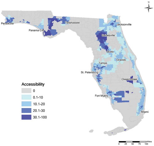
Accessibility values scaled from 0 to 100 are shown in . There were 577 (13.6%) tracts that had accessibility values of 0, indicating no testing facilities were located within either a 30-min commute or 15-min walking time. Most of these tracts were located in rural areas, as they jointly accounted for only 4% of the population. Another obvious pattern is that most tracts in the largest cities did not have very high relative accessibility. The four largest metropolitan areas, namely Miami-Fort Lauderdale-West Palm Beach, Tampa-St. Petersburg-Clearwater, Orlando-Kissimmee-Sanford, and Jacksonville, all had relatively mediocre accessibility. In particular, none of the tracts in Orlando-Kissimmee-Sanford had an accessibility score higher than 20, which indicated they were in the lower quintile for the state. In contrast, some small or medium cities received the highest scores, including Gainesville, Ocala, Panama City, and Okeechobee. The tract that had the highest accessibility score was located at Marathon in the Florida Keys.
Figure 2. Accessibility to COVID-19 testing sites at census tract level in Florida
3.2. Examining inequality
lists the weighted average 2SFCA accessibility score of each population group, calculated by EquationEquation (5)(5)
(5) . Black, Asian, Hispanic, and the population in poverty have an above-average accessibility score, while White, Native, and Elderly are below the average. The average scores offer a simple description of whether a certain population group tends to live in a neighbourhood that has better or worse accessibility to testing. However, it lacks statistical significance to back up the observations. As the calculation is based on aggregated data at the census tract level, which may lead to the ecological fallacy, i.e. the interferences about the group differ from the real experience of individuals (Robinson Citation1950). Especially for health-care services in the U.S., ecological fallacy commonly exists for certain minority groups who disproportionally live near the city centres but do not enjoy better accessibility (Ikram, Hu, and Wang Citation2015). Additional analysis is needed to provide more in-depth investigations.
Table 1. Weighted average 2SFCA accessibility score of each population group
reports the results of the spatial regression analysis. The pseudo R2 value for the spatial lag model was 0.74, which indicates a healthy goodness-of-fit and strong predictive power. This is expected as spatial accessibility measures are usually strongly spatially autocorrelated, since neighbouring tracts are generally located in close proximity to the same facilities (e.g. Kuai and Zhao Citation2017), the significance of the other predictors is useful to understand disparities by socio-economic factors.
Table 2. Spatial regression results (rounded to the nearest 0.001)
According to , census tracts that had a higher population density tended to have significantly better accessibility in general (p < 0.001). However, this finding partially conflicts with our earlier observation from the map in , where big cities with very high population density did not excel in accessibility. To further investigate the relationship, we break broke the dataset into several parts based on sorted population density. Then, we ran Pearson’s correlation analysis between population density and accessibility. For half of the census tracts that had a lower than medium population density, there exists a strong positive correlation between the two variables, as the Pearson’s correlation was 0.288 (p < 0.001). For the other half, the Pearson’s correlation was −0.017 (p = 0.45), suggesting an insignificant negative correlation. For the quarter of the census tracts that had the highest population density, the Pearson’s correlation was −0.067 (p = 0.031), which suggests a weak but significant negative correlation. To summarize, the positive coefficient in the regression result is likely due to the long tail of census tracts that have zero or very low accessibility, which corresponds to the rural areas that are sparsely populated. For urbanized regions, an increase in population density does not correspond to an increase in accessibility. In other words, a sparsely populated area is likely to have inferior access to testing relative to population size, whereas a highly populated area does not necessarily have excellent accessibility.
The regression results show that people without a car had a significant disadvantage to spatially access to testing sites. Every 1% increase of no-car households resulted in a reduction of accessibility by a factor greater than 10. Although the opening of many walk-up testing sites helped mitigate the situation, it appeared to be far from sufficient. First, the number of walk-up sites was still too small as nearly 60% of the sites were drive-through only. Second, the public transit system that no-car people heavily rely on became even more unreliable during the pandemic. Third and probably most importantly, the walk-up sites did not prioritize or reserve spots for people without cars, which forced these people to ‘compete’ with the majority who could drive to the sites. In short, the people without access to private vehicles were much more likely to find themselves living in the desert of testing, even if they were not physically distant from the testing sites.
Based on the regression results, Native Americans and Hispanic were found nonsignificant in explaining accessibility. Black, Asian, and low-Income were found to have positive relationships with better spatial access, whereas Elderly had a negative relationship. Every 1% increase of Black and Asian population corresponds to 1.361 and 8.739 increase of accessibility, respectively. Every 1% increase in Elderly population corresponds to 1.655 decrease in accessibility. Every ten thousand increase in the median house income corresponds to a mere 0.1223 increase in accessibility.
Despite these findings, spatial distribution played an important role in accessibility that was masked by the global model. For example, Black residents were more likely to live in dense urban areas, especially city centres where many testing sites were located. On the other hand, Asian residents rarely resided in rural areas, so they avoided being in the desert of testing. illustrates these patterns using bivariate local Moran’s , where Black, Asian, Income, and Elderly are variable
in each figure and accessibility is always variable
. In each map, the bivariate local Moran’s
of all census tracts were aggregated as the global indicator Moran’s
listed in the legend. In all four maps, Moran’s
values were either slightly above or below zero with the sign consistent with the coefficients in . Given that Moran’s
values range between −1 and +1, it is fair to say that no significant spatial association between any of these four variables and accessibility is found for the entire state. However, a conservative global pattern does not exclude the relevant local patterns. All categories but the ‘Not Significant’ are significant local patterns of the bivariate spatial association. For example, a red tract in ) belongs to the ‘High-High’ category, which means the tract has a high percentage of Black and it is located in a local area with great accessibility.
Figure 3. Bivariate local Moran’s I result maps of (a) Black (b) Asian (c) Income (d) Elderly versus Accessibility
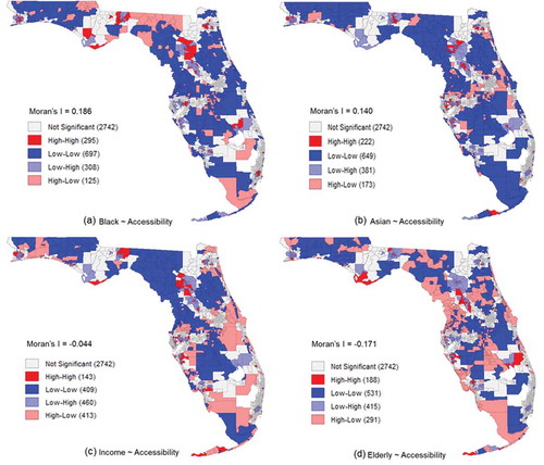
) has 295 ‘High-High’ tracts, the most among four maps. Many of these red tracts were located near city centres, including those in Miami, Tampa, Jacksonville, and Gainesville. This confirms our early hypothesis that some Black residents in the downtown areas received better accessibility scores. ) also has the least ‘High-Low’ patterns, which indicates fewer black communities were located at the areas in areas with poor accessibility. ) reveals that Asians had a different spatial pattern than Black residents, despite both their regression coefficients being positive. Asians did not have a heavy presence in city centres, for example, the centre of Miami is shown as ‘Low-High’. However, they also did not favour living in rural areas, as the ‘High-High’ and ‘High-Low’ patterns were typically not far from the urban areas.
) shows that Income had many opposite patterns to Black. For example, the ‘High-High’ patterns in ) at the centres of Miami, Tampa, and Jacksonville flipped to ‘Low-High’ as compared to percent Black in ). The situation in Gainesville is mirrored as the east side changed from ‘High-High’ to ‘Low-High’ and the west side changed from ‘Low-High’ to ‘High-High’. Along the Atlantic coast, there are many ‘High-Low’ patterns that indicate the wealthy areas received poor accessibility. The Elderly has its own unique distribution pattern, i.e. away from city centres and near the beaches. ) shows the prevalence of ‘High-Low’ patterns along the Atlantic and Gulf coasts. It also shows many ‘Low-High’ patterns in dense urban areas.
4. Discussion and conclusion
Our major findings are explained as follows. First, the degree of urbanization had a clear but non-linear relationship with spatial accessibility. Both the accessibility map in and the regression result of the explanatory variable Pop Density indicate that rural areas had the worst accessibility as they were located far from testing sites. However, when the population density reached a certain level, further increases in density slightly decreased the accessibility as more people were competing for the limited number of testing sites that had restricted testing capacities. Therefore, we observed that big cities typically had mediocre accessibilities while some small or medium cities were doing the best.
Second, people without access to cars had significant disadvantages, even when located near many testing sites. Despite the opening of some walk-up sites, they were far from adequate as only a small number of people could access them by walking. The disadvantage is not solely due to limited mobility. The drive-through sites excluded the people without cars, but the walk-up sites did not prioritize them, either. Even if people without cars live close to a site, they still needed to compete with a large number of car owners.
Third, no clear inequality patterns have been found regarding race, ethnicity, and income. Native Americans and Hispanics were found insignificant. Black, Asian, and the low-Income residents had a positive relationship with accessibility to testing sites. The classical ecological fallacy may stand in the way of making inferences about the actual accessibility of individuals from the aggregated results. The spatial distribution of each population group is another important factor, according to the results of the bivariate local Moran’s . Specifically, Black and the low-income populations tended to live close to the city centres, where many testing sites were located. Asians rarely lived in the less-developed areas, so they avoided being in the desert of testing. Another reason is due to the positive correlation between Black, Income, and No Car. Although the multicollinearity was not severe enough to remove variables from the regression model, a certain degree of the variances was explained by the variable No Car. Therefore, the seemingly better accessibility that Black and low-income residents received is built upon the condition that they owned cars. In other words, a black or low-income family without private vehicles still faced huge disadvantages in access to testing sites.
Lastly, there are alarming signs about access to testing for the elderly population. People who are 65 years old or above account for 20.5% of the total population in Florida, but they disproportionally accounted for 27.4% of the total COVID-19 cases (FDOH data as of 31 May 2020), faced disadvantages in access to testing sites. This again is partly due to their spatial distributions as they favoured living far from the cities or along the coasts where testing sites were scarce.
Based on our findings, we have the following suggestions. First, dramatically increase the testing capability statewide. According to FDOH, the daily testing number per site was merely 74 during the last week of May 2020, months after the disease was reported in the state. It is still far from sufficient to contain the spread of COVID-19, especially given that the state is facing huge challenges as it reopens the economy. Capability can be expanded by increase testing capacity at existing sites and adding new ones. Second, more attention is needed for people who do not have cars and the elderly. More testing resources should be distributed to care for these disadvantaged people. The walk-up sites can consider prioritizing or reserving spots for people without cars. Some vehicle-based mobile testing facilities can be dispatched to car-scarce communities, retirement communities, and nursing homes, even on a rotating based to promote accessibility. Special transit schedules could also potentially help bridge these people to the walk-up sites. Third, the rural residents who currently live in the desert of testing should not be left behind. Besides the above-mentioned mobile testing facilities, the state can also consider adding temporary sites that operate some days of a week to serve the rural communities. Lastly, new testing technologies may be the game-changer, for example, the easy-to-use self-testing kits. However, before such revolutionary solutions become readily accessible for the vast majority, increasing and scientifically allocating the testing sources are still the reasonable solutions, especially when at-home solutions might incur economic costs that cannot be met by disadvantaged populations.
Despite identifying patterns in spatial accessibility, the study still has some limitations. For instance, we did not comprehensively consider all transport modes, e.g. public transit, ride-hailing services, largely because it is unclear if symptomatic or potentially positive persons should use those modes of travel when trying to minimize the spread of COVID-19. Also, our assumptions of the 30-min drive time and 15-min walk time may be arbitrary and not suitable for everyone, especially the people who want to get tested are more likely to have symptoms that affect their mobility. The way of estimating individual site’s testing capacity is an imperfect solution due to the limitation of publicly available data. Finally, we did not incorporate a distance decay factor into the analysis. We made this decision, because accessibility to COVID-19 testing in Florida during May 2020 was limited as much by capacity as spatial proximity. In other words, testing appointments were difficult to obtain, so being located anywhere within a site’s catchment area based on travel mode was likely sufficient to enable access. However, if demand for frequent, repeated COVID-19 testing becomes a reality as capacities increase, then gravity-based accessibility models will play an important role in measuring accessibility as they pandemic continues.
In terms of future work, we plan to build more applied studies that help mitigate COVID-19 crisis based on the accessibility. Ensuring equity in spatial accessibility is the first step, but it does not guarantee proportional testing numbers or hospitalized numbers. Therefore, we need to fill the gap between the accessibility to testing sites and other aspects of the fight against COVID-19.
Disclosure statement
No potential conflict of interest was reported by the authors.
Additional information
Funding
References
- Anselin, L. 2019. “GeoDa Workbook.” https://geodacenter.github.io/documentation.html
- Anselin, L., I. Syabri, and O. Smirnov. 2002. “Visualizing Multivariate Spatial Correlation with Dynamically Linked Windows.” In Proceedings, CSISS Workshop on New Tools for Spatial Data Analysis. Santa Barbara, CA, May.
- Atash, F. 1994. “Redesigning Suburbia for Walking and Transit: Emerging Concepts.” Journal of Urban Planning and Development 120 (1): 48–57. doi:https://doi.org/10.1061/(ASCE)0733-9488(1994)120:1(48).
- CDC. 2020. “People Who are at Higher Risk for Severe Illness.” cdc.gov/coronavirus/2019-ncov/need-extra-precautions/people-at-higher-risk.html
- Chen, X., and P. Jia. 2019. “A Comparative Analysis of Accessibility Measures by the Two-step Floating Catchment Area (2SFCA) Method.” International Journal of Geographical Information Science 33 (9): 1739–1758. doi:https://doi.org/10.1080/13658816.2019.1591415.
- Dai, D. 2011. “Racial/ethnic and Socioeconomic Disparities in Urban Green Space Accessibility: Where to Intervene?” Landscape and Urban Planning 102 (4): 234–244. doi:https://doi.org/10.1016/j.landurbplan.2011.05.002.
- Dai, D., and F. Wang. 2011. “Geographic Disparities in Accessibility to Food Stores in Southwest Mississippi.” Environment and Planning. B, Planning & Design 38 (4): 659–677. doi:https://doi.org/10.1068/b36149.
- Dodds, C., and I. Fakoya. 2020. “Covid-19: Ensuring Equality of Access to Testing for Ethnic Minorities.” BMJ m2122. doi:https://doi.org/10.1136/bmj.m2122.
- Elwood, K., and C. K. Goodman. 2020. “Overwhelmed South Florida Doctor Stood between Coronavirus Test Results and the People Who Desperately Wanted Them.” South Florida Sun Sentinel, May. https://www.sun-sentinel.com/coronavirus/fl-ne-coronavirus-test-results-delays-20200530-lp4ib7alwvalnexltjkdddkue4-story.html
- Garg, S. 2020. “Hospitalization Rates and Characteristics of Patients Hospitalized with Laboratory-confirmed Coronavirus Disease 2019—COVID-NET, 14 States, March 1–30, 2020. MMWR.” Morbidity and Mortality Weekly Report 69. doi:https://doi.org/10.15585/mmwr.mm6915e3.
- He, X., E. H. Lau, P. Wu, X. Deng, J. Wang, X. Hao, Y. C. Lau, et al. 2020. “Temporal Dynamics in Viral Shedding and Transmissibility of COVID-19.” Nature Medicine 26 (5): 672–675. doi:https://doi.org/10.1038/s41591-020-0869-5.
- Henning-Smith, C. 2020. “The Unique Impact of COVID-19 on Older Adults in Rural Areas.” Journal of Aging & Social Policy 1–7. doi:https://doi.org/10.1080/08959420.2020.1770036.
- Henning-Smith, C. E., A. M. Hernandez, R. R. Hardeman, M. R. Ramirez, and K. B. Kozhimannil. 2019. “Rural Counties with Majority Black or Indigenous Populations Suffer the Highest Rates of Premature Death in the US.” Health Affairs 38 (12): 2019–2026. doi:https://doi.org/10.1377/hlthaff.2019.00847.
- Holshue, M. L., C. DeBolt, S. Lindquist, K. H. Lofy, J. Wiesman, H. Bruce, C. Spitters, et al. 2020. “First Case of 2019 Novel Coronavirus in the United States.” New England Journal of Medicine 382 (10): 929–936. doi:https://doi.org/10.1056/NEJMoa2001191.
- Hu, Y., and J. Downs. 2019. “Measuring and Visualizing Place-based Space-time Job Accessibility.” Journal of Transport Geography 74: 278–288. doi:https://doi.org/10.1016/j.jtrangeo.2018.12.002
- Ikram, S. Z., Y. Hu, and F. Wang. 2015. “Disparities in Spatial Accessibility of Pharmacies in Baton Rouge, Louisiana.” Geographical Review 105 (4): 492–510. doi:https://doi.org/10.1111/j.1931-0846.2015.12087.x.
- Johnston, K. 2020. “Nearly 35,000 Coronavirus Tests in Florida Cannot Be Processed.” Tampa Bay Times, May. https://www.tampabay.com/news/health/2020/05/21/more-than-1700-completed-covid-19-tests-damaged-in-transit/
- Kavanagh, M. M., N. A. Erondu, O. Tomori, V. J. Dzau, E. A. Okiro, A. Maleche, I. C. Aniebo, U. Rugege, C. B. Holmes, and L. O. Gostin. 2020. “Access to Lifesaving Medical Resources for African Countries: COVID-19 Testing and Response, Ethics, and Politics.” The Lancet 395 (10238): 1735–1738. doi:https://doi.org/10.1016/S0140-6736(20)31093-X.
- Kuai, X., and Q. Zhao. 2017. “Examining Healthy Food Accessibility and Disparity in Baton Rouge, Louisiana.” Annals of GIS 23 (2): 103–116. doi:https://doi.org/10.1080/19475683.2017.1304448.
- Lee, C. S., A. Morris, R. N. Van Gelder, and A. Y. Lee. 2016. “Evaluating Access to Eye Care in the Contiguous United States by Calculated Driving Time in the United States Medicare Population.” Ophthalmology 123 (12): 2456–2461. doi:https://doi.org/10.1016/j.ophtha.2016.08.015.
- Luo, W., and F. Wang. 2003. “Measures of Spatial Accessibility to Health Care in a GIS Environment: Synthesis and a Case Study in the Chicago Region.” Environment and Planning. B, Planning & Design 30 (6): 865–884. doi:https://doi.org/10.1068/b29120.
- McGrail, M. R., and J. S. Humphreys. 2014. “Measuring Spatial Accessibility to Primary Health Care Services: Utilising Dynamic Catchment Sizes.” Applied Geography 54: 182–188. doi:https://doi.org/10.1016/j.apgeog.2014.08.005.
- Moniruzzaman, M., and A. Páez. 2012. “Accessibility to Transit, by Transit, and Mode Share: Application of a Logistic Model with Spatial Filters.” Journal of Transport Geography 24: 198–205. doi:https://doi.org/10.1016/j.jtrangeo.2012.02.006.
- Mueller, A. L., M. S. McNamara, and D. A. Sinclair. 2020. “Why Does COVID-19 Disproportionately Affect Older People?” Aging 12: 10. doi:https://doi.org/10.18632/aging.103344.
- Pender, J., T. Hertz, J. Cromartie, and T. Farrigan. 2019. “Rural America at a Glance.” (No. 1476-2020-044).
- Robinson, W. S. 1950. “Ecological Correlations and the Behavior of Individuals.” American Sociological Review 15 (3): 351–357. doi:https://doi.org/10.2307/2087176.
- Sharfstein, J. M., S. J. Becker, and M. M. Mello. 2020. “Diagnostic Testing for the Novel Coronavirus.” Jama 323 (15): 1437–1438. doi:https://doi.org/10.1001/jama.2020.3864.
- Souch, J. M., and J. S. Cossman. 2020. “A Commentary on Rural‐urban Disparities in COVID‐19 Testing Rates per 100,000 and Risk Factors.” The Journal of Rural Health. doi:https://doi.org/10.1111/jrh.12450.
- Wang, F., and W. Luo. 2005. “Assessing Spatial and Nonspatial Factors for Healthcare Access: Towards an Integrated Approach to Defining Health Professional Shortage Areas.” Health & Place 11 (2): 131–146. doi:https://doi.org/10.1016/j.healthplace.2004.02.003.
- Wang, H., L. Tao, F. Qiu, and W. Lu. 2016. “The Role of Socio-economic Status and Spatial Effects on Fresh Food Access: Two Case Studies in Canada.” Applied Geography 67: 27–38. doi:https://doi.org/10.1016/j.apgeog.2015.12.002.
- Xing, L., Y. Liu, B. Wang, Y. Wang, and H. Liu. 2020. “An Environmental Justice Study on Spatial Access to Parks for Youth by Using an Improved 2SFCA Method in Wuhan, China.” Cities 96: 102405. doi:https://doi.org/10.1016/j.cities.2019.102405.
- Yang, Y., and A. V. Diez-Roux. 2012. “Walking Distance by Trip Purpose and Population Subgroups.” American Journal of Preventive Medicine 43 (1): 11–19. doi:https://doi.org/10.1016/j.amepre.2012.03.015.