
 ?Mathematical formulae have been encoded as MathML and are displayed in this HTML version using MathJax in order to improve their display. Uncheck the box to turn MathJax off. This feature requires Javascript. Click on a formula to zoom.
ABSTRACT
Many studies have proven that human movement patterns are strongly impacted by individual socioeconomic and demographic background. While many efforts have been made on exploring the influences of age and gender on movement patterns using social media, this study aims to analyse and compare the movement patterns among different racial-ethnic and economic groups using social media (i.e. geotagged tweets) from the U.S. top 50 populated cities. Results show that there are significant differences in number of activity zones and median travel distance across cities and demographic groups, and that power-laws tend to be captured in both spatial and demographic aspects. Additionally, the analysis of outbound-city travels demonstrates that some cities have slightly stronger interaction with others, and that economically disadvantaged populations and racial-ethnic minorities are more restricted in long distance travels, indicating that their spatial mobility is more limited to the local scale. Lastly, an economically-segregated movement pattern is discovered – upper-class neighbourhoods are mostly visited by the upper-class, while lower-class neighbourhoods are mainly accessed by the lower-class – but some racial-ethnic groups can diversify this segregated pattern in the local scale.
1. Introduction
Human mobility study is an important research thrust in GIScience and significant for a broad range of applications, such as public health and disaster management (Song et al. Citation2014; Chen and Po Kwan Citation2015). In particular, examining human movement patterns (González, Hidalgo, and László Barabási Citation2008) is boosted by several reasons. First, the characteristics of human movement patterns strongly influence urban formation, evolvement, and future planning (Waddell Citation2002; Gao, Janowicz, and Couclelis Citation2017). Second, a better understanding of the movement patterns can assist in controlling the spreading of contagious diseases among certain groups of individuals (Longini et al. Citation2005). Third, the collective movement analysis (i.e. movement analysis of a specific group of individuals) can not only provide insights in travel modelling (Leutzbach Citation1988), but also diagnose the traffic-related abnormal events at a large scale (e.g. city, nation-wide, and international level), which outperforms the computer-vision-based simulation utilized specifically for the crowd behaviour analysis in a smaller, localized scale (Andrade, Blunsden, and Fisher Citation2006; Mehran, Oyama, and Shah Citation2009; Peng et al. Citation2012).
Human movement patterns at different geographic scales are strongly influenced by the socioeconomic and demographic background (SDB; e.g. employment status, household income, gender, and race-ethnicity) (Bagrow and Ru Lin Citation2012; Huang and Wong Citation2016). Meanwhile, human mobility is also highly constrained by transport accessibility, commuting facilities, as well as urban spatial structure (Black and Conroy Citation1977). This is because different SDB groups implicate different adaptabilities to these facilities and built-in environment, resulting in diversified movement patterns. For example, Dong et al. (Citation2006) proposed an activity-based accessibility measure, which reflected that SDB is significant in differing human accessibility, including the aspects of the number of vehicles per household, transportation mode, house location preferences, etc. Similarly, Crane (Citation2007) measured and explained commute trends for the entire United States from 1985 through 2005, and found that men’s and women’s commute distances converged slowly and commute times diverged. Additionally, Blumenberg and Shiki (Citation2007) examined the commute mode choice of California’s foreign-born population and, more specifically, the relationship between length of residency in the U.S. and transit usage rates, and their results revealed that recent immigrants – regardless of race-ethnicity – were significantly more likely to commute by transit than native-born adults.
Traditionally, the data of research in human movement patterns based on different SDB groups are collected from surveys, travel diary, or carry-on GPS devices to represent general patterns of local or national population displacement (Marion and Horner Citation2007; Kwan Citation2008; Antipova, Wang, and Wilmot Citation2011; Chen et al. Citation2011). Nowadays, social media has become a popular data source to support the analysis of human mobility due to its exclusive advantages, such as its accessibility to the public, a large amount of participants, high spatiotemporal resolutions, and global coverage (Hasan, Zhan, and Ukkusuri Citation2013; Huang and Wong Citation2016; Luo et al. Citation2016). However, previous studies in human mobility using social media mostly focused on individual behaviour analysis, e.g., detecting daily frequent trajectory (Simini et al. Citation2012). Only a few revealed collective travel characteristics of different SDB groups (Candia et al. Citation2008; Huang and Wong Citation2016; Longley, Adnan, and Lansley Citation2015; Wang et al. Citation2018). Although race-ethnicity has been recognized as a relatively sensitive field for research, yet it is important to dig in deeper based on these findings, especially when few studies have explored the extent how social media data can help investigate human travel patterns and further explored the travel patterns of different racial-ethnic groups. In addition, previous works using social media data did not reveal the interaction between economic and racial-ethnic factors, and which factor can better explain the diverse patterns of different groups. To fill this research gap, this study will reveal, analyse, and compare the movement patterns among different racial-ethnic and economic groups using social media data from the U.S. top 50 populated cities. In summary, four main contributions are achieved in this work:
The collective movement patterns of each racial-ethnic and socioeconomic status (SES) group are examined in detail and compared together, providing valuable insights of how race-ethnicity and SES status contribute to the diversity of the collective movement patterns and how significant their influences can be;
The spatial variability of movement patterns among the U.S. top 50 populated cities is also displayed. Additionally, we find that some cities have slightly stronger interaction with others;
We synthesize a massive amount of social media data integrated with GIS data (e.g. the U.S. census tracts, land use/land cover information) to infer home locations and SES for the social media users. The data processing techniques and comprehensive analysis framework shed light on how big social media data and GIS could jointly provide knowledge in human movement patterns; and
Our methodology of deriving and analysing collective movement patterns is applicable to social media data (e.g. geotagged tweets) and beyond, such as cell phone location data and travel diaries with carry-on GPS devices. Therefore, the methodology workflow will provide a useful prototype and reference for future work of human mobility studies using any point-based data source.
2. Related works
This research uses Twitter as the data source. Existing studies (Morstatter et al. Citation2013) show that Twitter data are capable of providing snapshots of human daily trajectory at a macro scale (e.g. more than 500 million registered users publishing 400 million tweets per day in 2013), a coverage that is impossible for using the traditional survey approach. Therefore, using tweets as the social media data for human mobility research is justifiable. To identify the individual trajectory using social media data (e.g. geo-tagged tweets), existing studies start off detecting individual’s activity zones, and location types (e.g. home and work) that the individual frequently visits. In such studies, data are often collected and analysed at the daily level. For example, Huang, Cao, and Wang (Citation2014) proposed an approach that relied on a spatial clustering method to determine major activity sites. Since these major sites are frequently visited, the spatiotemporal points recording the locations of tweets are likely clustered around these sites. Similarly, Huang and Wong (Citation2016) used the density-based spatial clustering of applications with noise (DBSCAN) algorithm to create spatial clusters based on the geo-tags of tweets for each Twitter user as activity zones. To explore the individual trajectory from online footprints, a representative point (e.g. the median centroid) for each activity zone will be identified and geo-located (Huang et al. Citation2016). Note that although the geo-tags of tweets can be faked or spoofed, yet these studies applied spatial clustering methods at an individual level to avoid noises or outliers as well as to obtain the frequently visited locations.
To infer the economic status of each activities zone, GIS data (e.g. median house values by U.S. census tracts) are leveraged. As for predicting the home location for each twitter user, land use/land cover data are integrated to identify the residential areas. After detecting the home location for each twitter user, all other activity zones can be delineated to represent movement patterns of the individual (Shen, Po Kwan, and Chai Citation2013). To further explore the activity space, Huang and Wong (Citation2016) observed the activity zones (representative locations), the distance between home and activity zones, and the standard deviational ellipse to summarize the movement patterns of each tweeter.
However, these studies primarily focused on examining movement behaviours and patterns at the individual level. Candia et al. (Citation2008) described that many studies had unfolded the daily movement pattern based on the predicted daily trajectory, but few of them studied the demographic group travel patterns. For example, Huang and Wong (Citation2016) developed an approach to determine Twitter users’ home and work locations first to infer the SES of individuals and examined the activity patterns of different SES groups. Although they illustrated how individual travel patterns could be detected by identifying the spatiotemporal clustering zones in the travel trajectory, yet their results mainly emphasized on exploring the collective movement patterns among different SES groups. In another research about comparing the level of ethnic segregation in residence in London using Twitter data, Longley, Adnan, and Lansley (Citation2015) created ten ethnic classes as study groups, including White British, Indian, Black African, Chinese, etc. They observed that activity patterns of those classified as White British, White Irish, and White Other ethnic groups were scattered throughout the whole city. However, for certain ethnic groups, different areas of high tweeting activities could be identified. Besides, the Bangladeshis were found as the most segregated group of Twitter users, and their level of segregation relative to other groups intensified during weekdays and at weekends. Additionally, Wang et al. (Citation2018) found a highly consistent travel pattern (e.g. the average travel distance and the number of neighbourhoods spread in the metropolitan region) across the neighbourhoods with different race and income characteristics in the U.S. 50 largest cities using Twitter data. However, this finding contradicts with previous urban and transportation studies – the mobility of the economically disadvantaged and the racial-ethnic minorities is more restricted (Murakami and Young Citation1997; Giuliano Citation2005; Paulley et al. Citation2006; Järv et al. Citation2015). Therefore, more efforts should be made on revealing as well as verifying the collective movement patterns of different economic and racial-ethnic groups.
Despite the emerging popularity of using social media data in human movement studies, we regconize the fact that social media data have inherent biases. For example, a Twitter report from the Pew Research Center (Wojcik and Hughes Citation2019) studied five socioeconomic and demographic factors of the users, including age, education, income, gender, and race-ethnicity, and it concluded that the U.S. adult Twitter users were younger, more highly educated and wealthier than the overall U.S. adult population. Specifically, 29% of the U.S. Twitter adults ages 18–29 (vs. 21% nationwide) are on the social network, more than triple of online adults ages 65 and older (i.e. 8%, vs. 20% nationwide). Therefore, our user database more likely captures the younger generation, and the collective mobility patterns that we unfold in this research may not reflect the patterns of the older generation well. Another finding from the report is that 41% of Twitter users surveyed earn a household income about $75,000 (vs. 32% nationwide), while only 23% of people on Twitter earn less than $30,000 annually (vs. 30% nationwide). Fortunately, we are able to obtain a substantial amount of Twitter users in this research, and therefore can still capture the diversity of economic statuses (e.g. lower-class, middle-class, and upper-class). The detailed demographics of different groups after data processing have been shown in from Section 4.2, proving that the sampled population of lower-class group is sufficient. In addition to the socioeconomic and demographic biases in social media data, there is another concern related to data coverage – there could be no internet signal in remote areas (e.g. at the peak of a mountain), and therefore geo-tagged tweets may not be generated in those areas, meaning the locations in some remote areas cannot be captured into daily trajectories if Twitter data are utilized. However, this concern could be partially relieved if the urban areas are the study cases, since urban areas likely have a better coverage of mobile network.
Table 1. Prediction results of the surname-based Census Model
Table 2. Sampled valid users of different groups
3. Methodology
Figure 1. The workflow to collect, process and analyse Twitter data to explore the spatiotemporal characteristics of different economic and racial-ethnic groups.
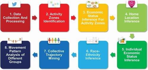
The workflow consists of eight main procedures (): (1) Data Collection and Processing – The tweets are harvested globally, and stored in spatial database. Next, we process the data by filtering the tweets within the U.S. top 50 populated cities and the Twitter users with valid first names and last names for the subsequent race-ethnicity inference; (2) Activity Zones Identification – Spatial clustering algorithm is applied to create spatial clusters for the geo-tagged tweet points as the activity zones for each twitter user; (3) Economic Status Inference – The ACS data from U.S. Census are used to infer the economic status of each activity zone; (4) Home Location Inference – Each twitter user’s home location is considered as the activity zone whose median centroid is located within residential areas as well as having the largest total number of daily inter-zone travels (i.e. the daily travels ‘into’ and ‘out of’ this activity zone) among all activity zones; (5) Individual Economic Status Inference – The economic status of each twitter user is inferred based on the economic status of the predicted home location (see Section 3.3 and 3.4); (6) Race-Ethnicity Inference – A surname-based Census Model infers individual race-ethnicity using last names; (7) Collective Trajectory Mining – All twitter users with inferred race-ethnicity and economic status are aggregated into one of the 18 different groups (6 races-ethnicities x 3 economic statuses); and (8) Movement Pattern Analysis – For each group, we examine the average number of activity zones, the spatial variability and demographic differences of travel distances, and the urban mobility spread in different economic destinations.
3.1. Data collection and processing
The top 50 populated cities across US were chosen as the study cases due to three reasons. First, to highlight the significance of race-ethnicity on collective mobility patterns, the studied population should have sufficient variation in race-ethnicity. As the population of racial-ethnic minorities is often under-represented, this population needs to be ‘oversampled’. For example, Washington DC has 49% Non-Hispanic Black or African American, 43.6% Non-Hispanic White, 5.0% others (including Non-Hispanic American Indian and Alaska Native, Non-Hispanic Native Hawaiian and Other Pacific Islander), and 3.1% Non-Hispanic Asian; Among these, there were 8.3% Hispanic or Latino origin and 1.6% Non-Hispanic Two or More Races according to the 2008 Census (estimates); Chicago also has a diverse race-ethnicity composition based on the results of the 2010 Census, including 31.7% Non-Hispanic White, 32.9% Non-Hispanic Black or African American, 5.5% Non-Hispanic Asian and Native Hawaiian and Other Pacific Islander, 2.7% Non-Hispanic Two or More Races, and 0.5% Non-Hispanic American Indian. Thus, these 50 cities shall include enough ethnic-minority population. Second, most cities have relatively distinctive neighbourhood characteristics. For example, in both Chicago and Washington DC, there is a northwest affluent quadrant and a southeast deprived quadrant. Since residential segregation has strong correlations with SES and race-ethnicity, such clearly fragmented urban landscape facilitates the analysis of the roles of SES and race-ethnicity in affecting movement patterns. Third, most populated cities have a relatively larger population adopting ICT, including the use of Twitter. Thus, it is more likely to identify sufficient Twitter users for our case study by using the U.S. top 50 populated cities. Only tweets with a geo-tag are used. Based on the predicted home locations inferred from the geo-tagged tweets, we selected the Twitter users who live in those 50 cities.
To collect the data, we first used the Twitter’s streaming application programming interface (API) to harvest geo-tagged tweets globally. Overall, more than 344 million geo-tagged tweets were collected for 18 months (from December 2013 to May 2015), among which over 110 million are located within the bounding box of the U.S. continent. Since we will infer race-ethnicity for each Twitter user using surnames, we filtered the Twitter users based on their user names and the number of tweets and deleted the invalid ones that: (1) were identified as organizations (e.g. companies, advertisements), (2) provided insufficient information to be considered as having valid names (i.e. only one word in the user name field, only one letter in the first name or last name, or containing non-English words), and (3) posted more than 10 thousand tweets during the timespan. Finally, we identified ~1 million unique twitter users with valid first names and last names, who posted more than 37 million tweets within the U.S top 50 populated cities. These filtered tweets and twitter users will be used for the subsequent analysis.
3.2. Activity zones identification
To differentiate various movement patterns at an individual level, the locations that a Twitter user visits equal to or more than 4 times are considered as activity zones (Huang and Wong Citation2016). To detect these locations, the geo-tagged tweets from each individual will be grouped as different spatial clusters (Huang, Cao, and Wang Citation2014). While some tweet points were included to form the clusters, dispersed points associated with rare events or activities that deviated from the regular patterns were excluded. Similar to previous works (Huang and Wong Citation2016; Wang et al. Citation2018), we will also apply DBSCAN algorithm to create the spatial clusters for each Twitter user. DBSCAN needs two input parameters: 1) the upper-bound distance (eps) for each point to be clustered into any existing group; and 2) the minimum number of points (minpts) for a group to be considered as one valid cluster. In order to obtain a satisfying result of spatial clustering, we referred to previous studies (Borah and Bhattacharyya Citation2004; Birant and Kut Citation2007; He et al. Citation2014) and conducted exploratory experiments using self-adjusted DBSCAN. The optimal result is obtained when the eps value is set as 50 metres, and the minpts as 4.
3.3. Economic status inference for activity zones
With spatial clusters (i.e. activity zones) detected from the geo-tagged tweets, the movement patterns can be explored at an individual level. In particular, each activity zone will be represented by the median centroid of the zone, the point with the minimum total Euclidean distance to all other points in this zone. The economic status of each activity zone is inferred by the economic status of the census tract that the median centroid of this zone is spatially-within. Specifically, the economic status includes lower-class, middle-class, and upper-class, corresponding to the median house values of all census tracts within a city – lower-class tracts with median house value less than the average median house value of the city minus one standard deviation, upper-class tracts with median house value more than the average median house value of the city plus one standard deviation, and middle-class tracts in between. Both census tracts and urban areas data were downloaded from ACS (5-year) 2010–2014. This classification method is supported by the work of Huang and Wong (Citation2016), which classified these tracts in the same manner and compared the classification results of two variables – the median house value and median household income of census tracts, and they found that while the income variable could not clearly distinguish the middle-class community with the other two communities, the house value variable could reasonably discriminate the three types of communities. For further exploration of the movement patterns among different racial-ethnic and economic groups, the number of tweets in each activity zone as well as the number of activity zones of each individual will also be recorded.
3.4. Home location inference
We assume that an individual leaves and returns home more frequently than any other activity zones in a daily manner. Therefore, the home location of each Twitter user will be considered as the activity zone whose median centroid is spatially within residential areas referring to the National Land Cover Database (NLCD) as well as having the largest total number of daily inter-zone travels (i.e. the daily travels ‘into’ and ‘out of’ this activity zone) among all activity zones (Huang and Wong Citation2016). Additionally, the cluster size (i.e. the number of tweets in an activity zone) will be utilized to break the tie. To obtain the total number of daily in-out travels for each cluster, tweets are first sorted based on the local posted time for each day. Since each tweet has been labelled the cluster that it belongs to, the total in-times and out-times for each day will be calculated for each cluster. Finally, the total number of daily in-out travels for each cluster is the sum of all days within the whole time span.
3.5. Individual economic status and race-ethnicity inference
The economic status of each Twitter user will be inferred based on the economic status of the predicted home location, which is determined with the methods described in Section 3.3 and 3.4. Next, this study will utilize the surname-based Census Model to infer individual race-ethnicity information. In fact, there is a rich history of literature using associations between surnames and races-ethnicities in curated sources such as census data to infer races-ethnicities, which is known as the surname-based Census Model (Lauderdale and Kestenbaum Citation2000; Tucker Citation2005; Ambekar et al. Citation2009). Result validation utilizes the ground truth dataset from 297 Twitter users by manually identifying the apparent ethnicity based on the profile photo of each user. For the subsequent analysis, the Twitter users whose race-ethnicity and economic status are successfully inferred will be the final targeted population.
3.6. Collective trajectory mining
Individual trajectories will be aggregated based on the predicted group, i.e. one of the predefined race-ethnicity and economic status groups. Specifically, this study includes six race-ethnicity classes: 1) Non-Hispanic White, 2) Non-Hispanic Black or African American, 3) Non-Hispanic Asian and Native Hawaiian and Other Pacific Islander, 4) Non-Hispanic American Indian and Alaska Native, 5) Non-Hispanic Two or More Races, and 6) Hispanic or Latino origin, by referring to the classification from the U.S. Census Bureau’s Frequently Occurring Surname list in 2010, with each surname corresponding to its race-ethnicity probability distribution (Comenetz Citation2016). The economic status includes lower-class, middle-class, and upper-class (Huang and Wong Citation2016), which corresponds to the economic statuses of the twitter users. With the cross-classification of economic status and race-ethnicity, we will examine 18 (6 races-ethnicities x 3 economic statuses) different groups in total for this study.
3.7. Movement pattern analysis
After detecting the home location for each Twitter user, all other activity zones can be delineated to represent movement patterns of the individual (Shen, Po Kwan, and Chai Citation2013). One of the significances of the research is to detect the differences of movement patterns among different racial-ethnic and economic groups. Many studies have unfolded the daily movement patterns based on the predicted daily trajectory, but few of them realized the importance of the collective travel patterns (Candia et al. Citation2008). This work will fill this gap by investigating movement pattern discrepancies based on economic statuses and races-ethnicities. As mentioned in Section 3.6, we will examine 18 different groups in total for this study. First, at the exploratory stage, the destination distributions for each group can be mapped out vividly by aggregating Twitter users into groups. For a statistical exploration and comparison of the movement patterns, we will observe the spatial variabilities and demographic differences in: 1) number of activity zones, 2) travel distances, and 3) outbound-city travels (i.e. travels beyond boundaries of the Urban Areas defined by the U.S. Census). In particular, power-law model will be applied to depict the goodness of fit on the Probability Density Functions (PDF) of the number of activity zones and travel distances in a log-log plot (Noulas et al. Citation2012; González, Hidalgo, and László Barabási Citation2008; Brockmann, Hufnagel, and Geisel Citation2006). Maximum-Likelihood Estimation technique has been used to estimate the parameters of the power-laws. The relation is measured as follow:
Moreover, the urban mobility spread in different economic destinations will also be analysed and visualized. Then we will examine in depth for each demographic group in both New York and Los Angeles, since these two largest cities provide more data for the race-ethnicity minorities.
4. Results and analysis
4.1. Ethnicity prediction results and validation
The validation utilizes the ground truth dataset from 297 Twitter users, which were obtained by manually identifying the apparent ethnicity based on the profile photo of each Twitter user. Specifically, we randomly collected 99 Non-Hispanic Whites, 67 Non-Hispanic Black or African Americans, 57 Non-Hispanic Asians and Native Hawaiians and Other Pacific Islanders, 16 Non-Hispanic American Indian and Alaska Natives, and 58 Hispanics or Latinos origin from the users’ database. The metrics for validation include precision (i.e. the ratio of correctly predicted positive observations to the total predicted positive observations, which equals to TP/(TP+FP)), recall (i.e. the ratio of correctly predicted positive observations to all observations in actual class, which equals to TP/(TP+FN)), and F1 score (i.e. the weighted average of precision and recall, which equals to 2 * (Recall * Precision)/(Recall + Precision)).
According to the prediction results from , the Census Model performs well with high metrics values (e.g. the precisions with a range from 89.4% to 98.3%) as well as multiple subdivisions of racial-ethnic groups. The reason why the Census Model works well might be due to the fact that the race-ethnicity distribution of Twitter users is similar to the one of the U.S. population. For example, the Pew Research Center reported in 2014 that 27% of Non-Hispanic Black or African American and 25% of Hispanic or Latino origin were Twitter users, along with 21% of Non-Hispanic White, which indicates that there is no significant difference in Twitter preference among different racial-ethnic groups.
4.2. Demographics of different groups
shows the population of sampled valid users of each studied group after the data processing steps from section 3 (e.g. with valid first name and last name, last name listed in the 2010 U.S. Census Bureau’s Frequently Occurring Surname, home location predicted, and economic status inferred). The sampled distribution of lower-class, middle-class, and upper-class is 5.6%, 79.6%, and 14.8%, compared with the country level 14.8%, 64.2%, and 21.0%, respectively, reported by the 2014 U.S. Census Bureau’s Income and Poverty in the United States. Although the comparison shows that more middle-class Twitter users have been captured while the lower-class and upper-class are less represented, yet we are still able to obtain a significant amount of population from the lower-class and upper-class groups. As for the race-ethnicity aspect, the sampled distribution of Non-Hispanic White, Non-Hispanic Black or African American, Non-Hispanic Asian and Native Hawaiian and Other Pacific Islander, Non-Hispanic American Indian and Alaska Native, Non-Hispanic Two or More Races, Hispanic or Latino origin is 63.5%, 11.0%, 5.1%, 0.8%, 1.3%, and 18.3%, which is similar to the nationwide one with 62.2%, 12.4%, 5.4%, 0.7%, 2.0%, and 17.4%, respectively, from the U.S. Census ACS 2010–2014.
4.3. Tweeting density of different groups
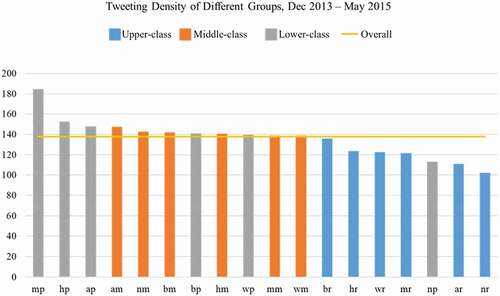
The tweeting density of one group, defined as the tweeting frequency divided by the population of the group, indicates the average number of tweets posted by each individual from one group within the 18 months. shows that the tweeting density ranges from 102 (Non-Hispanic American Indian and Alaska Native + Upper-class) to 185 (Non-Hispanic Two or More Races + Lower-class), and the overall level (i.e. mean) is 138 with standard deviation as 19. All groups are within the ±2 standard deviations of the mean value except for the group Non-Hispanic Two or More Races + Lower-class. Therefore, although the tweeting density among different racial-ethnic and economic groups slightly varies, we can still conclude that the twitter posts can capture similar amounts of activity zones among different racial-ethnic and economic groups.
In particular, lower-class and middle-class groups share a more similar tweeting density with an average value of 144 and 140, respectively, while upper-class groups (average 123) have a lower tweeting density (17% less than lower-class groups). As for the racial-ethnic factor, the average values from different racial-ethnic groups range from 136 to 142. Thus, there is not much difference among the racial-ethnic groups.
Figure 2. Tweeting density of different groups. Each group is represented by two characters with the first one indicating race-ethnicity, and the second one for economic status. Specifically, the corresponding relationships are w – Non-Hispanic White, b – Non-Hispanic Black or African American, a – Non-Hispanic Asian and Native Hawaiian and Other Pacific Islander, n – Non-Hispanic American Indian and Alaska Native, m – Non-Hispanic Two or More Races, and h – Hispanic or Latino origin respectively; r – upper-class, m – middle-class and p – lower-class. For example, wr represents the group of Non-Hispanic White and Upper-class.
4.4. Movement pattern analysis
4.4.1. Activity zones
underlines the decreasing trend of the probability as the number of activity zones increases. In , the good power-law least squares fit (red dash curve, 1.71 ≤ β ≤ 2.04 with ) of the data suggests that the distribution of the number of activity zones can be well described by a power law, and different cities tend to represent different shapes. Information about other U.S. cities is depicted in Supplementary Figure 1. We also observe spatial variabilities in the distributions from ) – Dallas, TX and Los Angeles, CA are more likely to have a larger number of activity zones compared to Philadelphia, PA with a significant lower one. The observation confirms the hypothesis that human movements are impacted by the geographic environment.
Figure 3. Power-law fit for the distributions of the number of activity zones (a) and the PDF of number of activity zones (b–k) for the residents in the U.S. top 10 populated cities with most tweets.
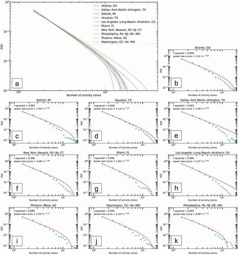
Figure 4. Average number of activity zones for different groups.
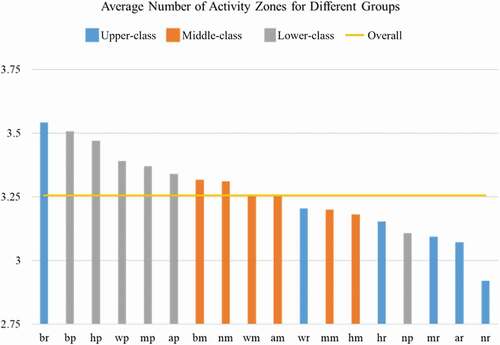
indicates the Demographic differences in the number of activity zones. In general, lower-class groups have more activity zones than upper-class groups. The average number of activity zones for lower-class groups is 3.42, along with middle-class groups 3.25 and upper-class groups 3.23. This could be due to the fact that upper-class groups post less tweets (see Section 4.3), making their activity zones less likely to be captured. However, for the racial-ethnic factor, the average numbers of activity zones range from 3.20 for Non-Hispanic Two or More Races and Hispanic or Latino origin to 3.36 for Non-Hispanic Black or African American. With the same tweeting density (140) of these three racial-ethnic groups, it indicates that Non-Hispanic Black or African American have 5% more activity zones than Non-Hispanic Two or More Races and Hispanic or Latino origin.
Meanwhile, the groups (Non-Hispanic Black or African American + Upper-class and Non-Hispanic Black or African American + Lower-class), whose tweeting densities are both at the average level (see Section 4.3), have the most average number of activity zones among all groups. Within both upper-class and lower-class groups, race-ethnicity has more impacts on the variations of the average number of activity zones.
Figure 5. The PDF of activity zone numbers for different groups.
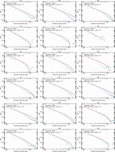
Figure 6. Power-law fit for the distributions of number of activity zones for different groups (only groups with sufficient tweets are shown).
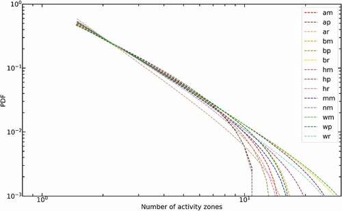
In , the good power-law least squares fit (red dash curve, 1.46 ≤ β ≤ 2.44 with ) of the data suggests that the distribution of the number of activity zones can be also well described by a power law, and different groups tend to represent different shapes. underlines the decreasing trend of the probability as the number of activity zones increases for all groups. We also observe demographic differences in the distributions. For example, the Non-Hispanic Asian and Native Hawaiian and Other Pacific Islander + Upper-class group, has the largest probability of smaller numbers of activity zones, while the probability drops significantly as the number of activity zones increases until it reaches 10. Another finding is that the groups Non-Hispanic White + Middle-class, Non-Hispanic Black or African American + Upper-class, Hispanic or Latino origin + Lower-class, Non-Hispanic White + Upper-class, and Hispanic or Latino origin + Middle-class more likely have a larger number of activity zones, while the groups Non-Hispanic American Indian and Alaska Native + Middle-class and Non-Hispanic Asian and Native Hawaiian and Other Pacific Islander + Lower-class have a significant lower probability. This observation confirms the hypothesis that human movements are impacted by the factors of race-ethnicity and economic status.
4.4.2. Travel distances
Figure 7. Twitter users’ travels from predicted homes to other activity zones among the U.S. top 50 populated cities (> 500 km travels excluded).
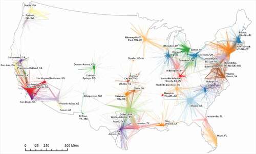
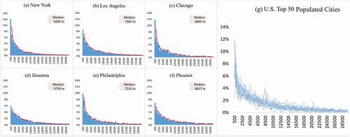
Figure 8. The travel distance distributions for individuals’ daily activity zones in the U.S. top 6 populated cities (a-f) and travel distance distributions of the U.S. top 50 populated cities (g).
This study defines the travel distance as the Euclidean distance from the predicted home location to a non-home activity zone of a Twitter user. The inter-city interactions are represented by the travels from the predicted home to other activity zones of each Twitter user. With all travels less than 500 km among the U.S. top 50 populated cities, the spatial variability of the spread destinations can indicate the different interactions among those cities (). For example, New York has strong connections with Boston, Washington DC and Philadelphia, and Los Angeles shows a similar pattern with Las Vegas, San Diego, Long Beach, and the Bay Areas. Smaller, inland cities such as Omaha and Albuquerque are less connected to other cities.
From ), we can observe a uniform pattern of travel distance distributions among the U.S. top 50 populated cities, fitting a decreasing long-tail curve. Particularly, the median travel distance for New York City is 6,245 m ()); Los Angeles is 7,362 m ()); Chicago is 6,807 m ()); Houston is 9,729 m ()); Philadelphia is 7,233 m ()); and Phoenix is 8,827 m ()). This finding shows that a larger proportion of residents from public-transit-friendly cities, e.g., New York City and Chicago, can travel shorter distances compared with those from car-dependent cities, e.g., Houston. Note that some cities (e.g., Los Angeles), which have built and enhanced public transportation systems and bike lane networks in the last decade, offer strong alternatives to driving cars, and cut down on the residents’ travel distances as well.
indicates the decreasing trend of the probability as travel distance increases for the U.S. top 10 populated cities with most tweets. In , the good power-law least squares fit (red dash curve, 0.99 ≤ β ≤ 1.22 with ) of the data suggests that the distribution of travel distances can be well described by a power law, and different cities tend to represent different shapes, confirming previous works on human mobility research (Noulas et al. Citation2012; Alessandretti, Aslak, and Lehmann Citation2020). The power-law fit pattern could arise from aggregating the displacements across geographic units in different sizes (neighbourhoods, communities, cities, metropolitans, etc.). Information about other U.S. cities is depicted in Supplementary Figure 2. We also observe spatial variability in the distributions from ) – New York, NY, Philadelphia, PA, and Los Angeles, CA more likely have smaller travel distances compared to other cities such as Houston, TX and Phoenix, AZ.
Figure 9. Power-law fit for the distributions of travel distances (a) and the PDF of travel distances (b-k) for the residents in the U.S. top 10 populated cities with most tweets.
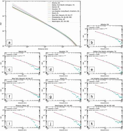
Figure 10. Median travel distances for different groups.
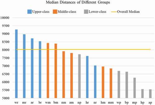
indicates more detailed findings of the median travel distances among different racial-ethnic and economic groups. Generally speaking, lower-class groups travel shorter distances to their activity zones than upper-class and middle-class groups, especially for the ones that are race-ethnicity minorities such as Non-Hispanic Asian and Native Hawaiian and Other Pacific Islander as well as Hispanic or Latino origin. Specifically, the median travel distance of lower-class groups is 6240 m, along with middle-class groups 8034 m and upper-class groups 8872 m. That is, lower-class groups are 42% shorter in median travel distance than upper-class groups. This finding supports the theories from previous urban and transportation studies – economically disadvantaged population has less disposable income, and they have to rely on public transportation more than the affluent people, and their mobility is therefore more restricted (Murakami and Young Citation1997; Giuliano Citation2005; Paulley et al. Citation2006). Although the race-ethnicity factor can differ in these theories, such as Non-Hispanic American Indian and Alaska Native + Upper-class having shorter median travel distances than the Non-Hispanic American Indian and Alaska Native + Lower-class, yet the abnormality might be due to the insufficient amount of social media users identified in this minor race-ethnicity group.
Among different racial-ethnic groups, the median distances are 8450 m, 8304 m, 7760 m, 7682 m, 7153 m, 6868 m for Non-Hispanic White, Non-Hispanic Black or African American, Non-Hispanic American Indian and Alaska Native, Non-Hispanic Asian and Native Hawaiian and Other Pacific Islander, Non-Hispanic Two or More Races, Hispanic or Latino origin, respectively. Therefore, the racial-ethnic groups of Non-Hispanic White as well as Non-Hispanic Black or African American travel longer median distances than other racial-ethnic minorities, which might indicate that racial-ethnic minorities have a lower social status in relation to their daily use of space and limited integration into society. Particularly, the median travel distance of Non-Hispanic White is 23% longer than that of Hispanic or Latino origin, 18% longer than that of Non-Hispanic Two or More Races, 10% longer than that of Non-Hispanic Asian and Native Hawaiian and Other Pacific Islander, 9% longer than that of Non-Hispanic American Indian and Alaska Native.
Figure 11. Travel distance distribution of different racial-ethnic and economic groups (< 30 km).
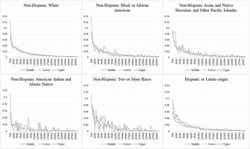
The travel distance distributions (<30 km) among different groups are displayed in . There are three distinguished patterns: 1) the Non-Hispanic White group has the most stable pattern of the travel distance distribution – less people travel if the distance increases; 2) lower-class groups from the six ethnicities generally have a larger proportion in shorter distance travels (<0.5 km); and 3) the proportion changes along with the increase of travel distance from lower-class groups are more fluctuated and erratic than the ones from upper-class and middle-class groups, especially for the racial-ethnic minorities such as Non-Hispanic Asian and Native Hawaiian and Other Pacific Islander, Non-Hispanic American Indian and Alaska Native, and Non-Hispanic Two or More Races. This finding indicates that race-ethnicity and economic status can contribute to significant differences in human movement patterns.
Figure 12. The PDF of travel distances for different groups.
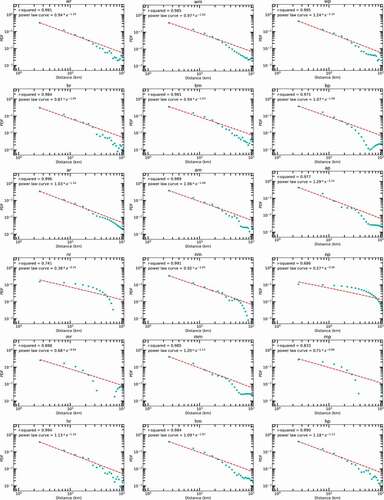
In , the good power-law least squares fit (red dash curve, 0.59 ≤ β ≤ 1.16 with ) of the data suggests that the distribution of travel distances can be well described by a power law, and that different groups tend to represent different shapes. Since it is possible to represent a probability distribution as a truncated power function where β is greater than 1 (otherwise the tail has infinite area), will display only groups with 1 ≤ β.
Figure 13. Power-law fit for the distributions of travel distances for different groups (only groups with 1 ≤ β are shown).
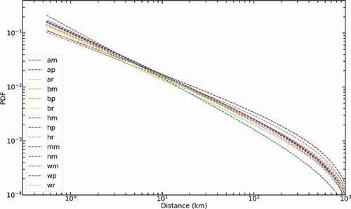
underlines the decreasing trend of the probability as travel distances increases for all groups. We also observe demographic differences in the distributions. For example, the group Non-Hispanic White + Lower-class has the largest probability of smaller travel distances, while the probability drops significantly as the travel distance increases. Another finding is that the groups Non-Hispanic Asian and Native Hawaiian and Other Pacific Islander + Lower-class and Non-Hispanic American Indian and Alaska Native + Middle-class are more likely to travel with longer distances and less likely to travel with smaller distances compared with other groups.
4.4.3. Spatial and demographic differences in outbound-city travels
Figure 14. Percentage of outbound-city travels of the U.S. top 6 populated cities (a), and of different groups from the U.S. top 6 populated cities (b).
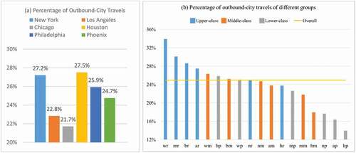
To further explore the mobility differences in longer distance travels, the outbound-city travels (i.e. travels beyond boundaries of the Urban Areas defined by the U.S. Census) are extracted out to learn the spatial variability and demographic differences. ) shows the percentage of outbound-city travels of the U.S. top 6 populated cities. Specifically, New York (27.2%) and Houston (27.5%) have more outbound-city travels, which could indicate their slightly stronger interaction with other cities, while Los Angeles (22.8%) and Chicago (21.7%) have less outbound-city travels.
) displays the percentage of outbound-city travels of different groups from the U.S. top 6 populated cities. Obviously, lower-class groups (average 22%) contribute less outbound-city travels than upper-class groups (average 32%) and middle-class groups (average 24%), and the overall mean percentage is 24%. Particularly, the lower-class groups from the racial-ethnic minorities such as Non-Hispanic American Indian and Alaska Native, Non-Hispanic Asian and Native Hawaiian and Other Pacific Islander, and Hispanic or Latino origin have much lower percentages, while the lower-class groups from Non-Hispanic White and Non-Hispanic Black or African American reach the overall mean percentage. Similar to lower-class groups, middle-class groups from Non-Hispanic White and Non-Hispanic Black or African American have the highest percentages of outbound-city travels. In addition, the Hispanic or Latino origin + Middle-class group shows a relatively low percentage. This finding strongly proves that economically disadvantaged and racial-ethnic minorities are more restricted in long distance travels, indicating their spatial mobility is more limited into the local scale.
4.4.4. Urban mobility spread in different economic destinations
Figure 15. Percentage of different economic groups travelling to upper-class, middle-class, and lower-class communities in the U.S. top 50 populated cities (a), and percentage of different racial-ethnic and economic groups travelling to upper-class, middle-class, and lower-class communities in the U.S. top 50 populated cities (b).
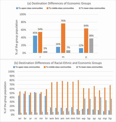
) displays an economically segregated movement pattern among different economic groups in the U.S. top 50 populated cities – upper-class neighbourhoods are mostly visited by the upper-class, while lower-class neighbourhoods are mainly accessed by the lower-class. Specifically, 45% of the upper-class have access to upper-class neighbourhoods as their activity zones, compared to 16% of the middle-class and 12% of the lower-class; 38% of the lower-class travel to lower-class neighbourhoods as their activity zones, while only 5% of the upper-class and 7% of the middle-class visit lower-class neighbourhoods. With race-ethnicity as consideration in ), there is no much difference in the national scale.
Figure 16. Percentage of different racial-ethnic and economic groups travelling to upper-class, middle-class, and lower-class communities in New York.
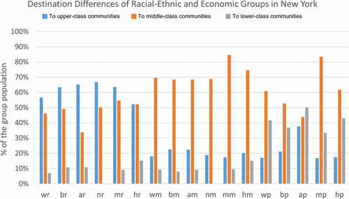
takes New York City as an example to show the percentage of different racial-ethnic and economic groups travelling to upper-class, middle-class, and lower-class communities. The economically-segregated travel pattern in New York City is overall similar to the national pattern. R-to-r travels range from 52% (Hispanic or Latino origin + Upper-class) to 67% (Non-Hispanic American Indian and Alaska Native + Upper-class), and all are higher than the national level (45%). P-to-r travels range from 17% (Non-Hispanic Two or More Races + Lower-class) to 38% (Non-Hispanic Asian and Native Hawaiian and Other Pacific Islander + Lower-class), and all are higher than the national level (12%) as well. This finding indicates that the upper-class communities are more likely to be accessed in New York City.
Particularly, among all lower-class groups, the Non-Hispanic Asian and Native Hawaiian and Other Pacific Islander + Lower-class group shows the best accessibility to the upper-class communities (38%) as well as to the lower-class communities (50%). While mapping out their trajectories to visualize the destinations (), we can see that they are more likely to work in Manhattan CBD, and that there is a residential cluster in Downtown Flushing. Surprisingly, this discrepancy between home and work locations can refer to the concept of ‘spatial mismatch’ – the mismatch between housing market segregation/discrimination and the employment and earnings of the racial-ethnic minority Non-Hispanic Black or African American (Holzer Citation1991; Kain Citation2004). Kain (Citation2004) added that serious restrictions on the residential choices of Chicago and Detroit Black residents negatively affected their welfare, such as housing market discrimination on housing prices, home-ownership and educational opportunities. Specifically, the continued Black segregation and the resulting concentration of Black children in low-achieving schools accounted for a large part of the Black–White achievement gap. Therefore, this ‘spatial mismatch’ phenomenon deserves more attention when it shows up for the Non-Hispanic Asian and Native Hawaiian and Other Pacific Islander + Lower-class group in New York.
Figure 17. Inner-city travels from home to activity zones of Non-Hispanic Asian and Native Hawaiian and Other Pacific Islander + Lower-class group in New York.
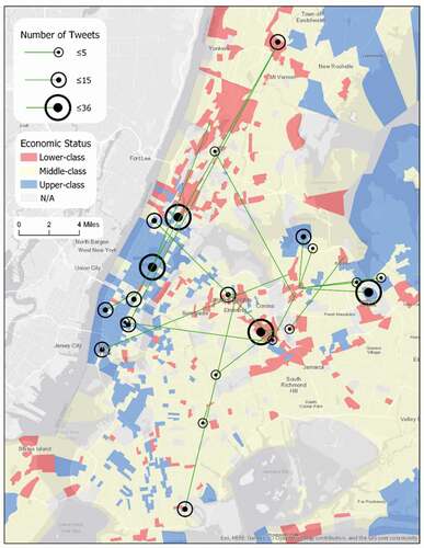
Figure 18. Percentage of different racial-ethnic and economic groups travelling to upper-class, middle-class, and lower-class communities in Los Angeles.
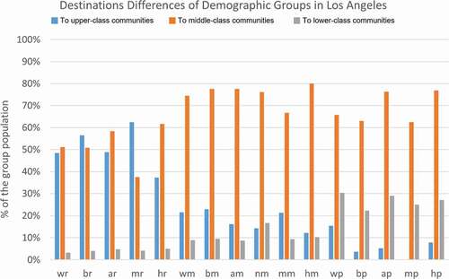
takes Los Angeles as an example to show the percentage of different racial-ethnic and economic groups travelling to upper-class, middle-class, and lower-class communities. The segregated travel pattern in Los Angeles is also overall similar to the national pattern. For r-to-r travels, only the Hispanic or Latino origin + Upper-class group (37%) is lower than the national level (45%). P-to-p travels range from 22% (Non-Hispanic Black or African American + Lower-class) to 30% (Non-Hispanic White + Lower-class), and all are lower than the national level (38%). Meanwhile, for p-to-r travels, only the Non-Hispanic While + Lower-class group (15%) is higher than the national level (12%), and other lower-class groups are much lower than 12%.
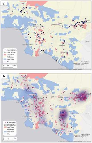
The locations of homes ()) and activity zones ()) of the Non-Hispanic While + Lower-class group are shown in detail. The majority of home locations are clustered in the lower-class census tracts in the southern middle areas of Los Angeles as well as in Pomona and Ontario. Clearly, there is an economically segregated residential pattern in Greater Los Angeles. Most activity zones are in the vicinity of home locations, and there are two apparent activity zone clusters in Ontario and Fullerton (the neighbourhoods near California State University – Fullerton). In addition to these two clusters, activity zones are dispersedly located at the middle-class census tracts that are close to the home locations, and a few of them are in more affluent neighbourhoods such as Beverly Hills, Santa Monica, Huntington Beach, etc., which explains why this group has a higher proportion of going to the upper-class community.
Figure 19. Movement patterns of Non-Hispanic White + Lower-class group in Los Angeles (a. Home locations; b. Activity zones).
5. Conclusion and discussion
This study aims to summarize and compare the movement patterns among different racial-ethnic and economic groups using social media from the U.S. top 50 populated cities. Results show that there are significant differences in number of activity zones and median travel distance across cities and demographic groups, and that power-laws tend to be captured in both spatial and demographic aspects. Specifically, lower-class groups are 42% shorter in median travel distance than upper-class groups, and the median travel distance of Non-Hispanic White is 23% longer than that of Hispanic or Latino origin, 18% longer than that of Non-Hispanic Two or More Races, 10% longer than that of Non-Hispanic Asian and Native Hawaiian and Other Pacific Islander, 9% longer than that of Non-Hispanic American Indian and Alaska Native. Additionally, based on the analysis of outbound-city travels, we find that some cities have slightly stronger interaction with others, and that economically disadvantaged populations and racial-ethnic minorities are more restricted in long distance travels, indicating that their spatial mobility is more limited into the local scale. Lastly, economically-segregated movement pattern is discovered – upper-class neighbourhoods are mostly visited by the upper-class, while lower-class neighbourhoods are mainly accessed by the lower-class – but some race-ethnicity groups can diversify this segregated pattern in the local scale. Another major significance of this study is that our novel methodology for the analysis of collective movement patterns is applicable to social media data (e.g. geo-tagged tweets) and beyond, such as cell phone location data and travel diaries with carry-on GPS devices. Therefore, the methodology workflow will be a significant prototype in future for exploring the collective movement patterns using any point-based data source.
However, due to the source of the data and the methodology to process the data, this research may potentially have several limitations and some of them could be improved in future work. First, the proposed name-ethnicity prediction model can be improved by considering the potential impacts from spatial residential segregation related to race-ethnicity, since the local race-ethnicity distribution could be a considerably influential variable for individual race-ethnicity prediction. For example, Fiscella and Fremont (Citation2006) combined geocoding and surname analysis and were able to show promise for estimating ethnicity. Second, the semantic knowledge or purpose of each travel (e.g. go shopping) can be inferred to reveal more meaningful travel patterns at both individual and collective levels. This work only utilized the residential areas from the NLCD data to infer the home location for each twitter user. In future, we can infer other types of activities (e.g. work, shopping, and eating) for the detected activity zones by using the NLCD data as well as different open-source datasets (e.g. OpenStreetMap), both of which describe highly-developed areas as commercial zones, open areas described as recreation zones (e.g. parks, golf courts, playfields, etc.), as well as transitions between activity zones (Huang and Wong Citation2016). Therefore, we could integrate more activity types to study movement patterns. Third, the segregated movement patterns across different groups (e.g. activity zones, travel distances, in- and out-bound city travels, percentages of visiting different economic destinations) indicate that we could further derive novel spatial segregation indices to quantity the segregation levels using social media data, in which the geographic space would be extended from residential places to activity zones.
Supplemental Material
Download MS Word (1.2 MB)Disclosure statement
No potential conflict of interest was reported by the author(s).
Supplementary material
Supplemental data for this article can be accessed here.
Additional information
Funding
References
- Alessandretti, L., U. Aslak, and S. Lehmann. 2020. “The Scales of Human Mobility.” Nature 587 (7834): 402–407. doi:https://doi.org/10.1038/s41586-020-2909-1.
- Ambekar, A., C. Ward, J. Mohammed, S. Male, and S. Skiena. 2009. “Name-Ethnicity Classification from Open Sources.” Proceedings of the ACM SIGKDD International Conference on Knowledge Discovery and Data Mining, 49–57. doi:https://doi.org/10.1145/1557019.1557032.
- Andrade, E. L., S. Blunsden, and R. B. Fisher. 2006. “Modelling Crowd Scenes for Event Detection.” Proceedings - International Conference on Pattern Recognition 1: 175–178. doi:https://doi.org/10.1109/ICPR.2006.806.
- Antipova, A., F. Wang, and C. Wilmot. 2011. “Urban Land Uses, Socio-Demographic Attributes and Commuting: A Multilevel Modeling Approach.” Applied Geography 31 (3): 1010–1018. doi:https://doi.org/10.1016/j.apgeog.2011.02.001.
- Bagrow, J. P., and Y. Ru Lin. 2012. “Mesoscopic Structure and Social Aspects of Human Mobility.” PLoS ONE 7 (5): 3–8. doi:https://doi.org/10.1371/journal.pone.0037676.
- Birant, D., and A. Kut. 2007. “ST-DBSCAN: An Algorithm for Clustering Spatial-Temporal Data.” Data & Knowledge Engineering 60 (1): 208–221. doi:https://doi.org/10.1016/j.datak.2006.01.013.
- Black, J., and M. Conroy. 1977. “Accessibility Measures and the Social Evaluation of Urban Structure.” Environment and Planning A: Economy and Space 9 (9): 1013–1031. doi:https://doi.org/10.1068/a091013.
- Blumenberg, E., and K. Shiki. 2007. “Transportation Assimilation: Immigrants, Race and Ethnicity, and Mode Choice.” Transportation Research Board 86th Annual Meeting, 2007-1-21 to 2007-1-25. Washington DC, United States.
- Borah, B., and D. K. Bhattacharyya. 2004. “An Improved Sampling-Based DBSCAN for Large Spatial Databases.” Proceedings of International Conference on Intelligent Sensing and Information Processing, ICISIP 2004, June 2018, 92–96. doi:https://doi.org/10.1109/icisip.2004.1287631.
- Brockmann, D., L. Hufnagel, and T. Geisel. 2006. “The Scaling Laws of Human Travel.” Nature 439 (7075): 462–465. doi:https://doi.org/10.1038/nature04292.
- Candia, J., M. C. González, P. Wang, T. Schoenharl, G. Madey, and A. László Barabási. 2008. “Uncovering Individual and Collective Human Dynamics from Mobile Phone Records.” Journal of Physics A: Mathematical and Theoretical 41 (22): 1–16. doi:https://doi.org/10.1088/1751-8113/41/22/224015.
- Chen, J., S. Lung Shaw, H. Yu, F. Lu, Y. Chai, and Q. Jia. 2011. “Exploratory Data Analysis of Activity Diary Data: A Space-Time GIS Approach.” Journal of Transport Geography 19 (3): 394–404. doi:https://doi.org/10.1016/j.jtrangeo.2010.11.002.
- Chen, X., and M. Po Kwan. 2015. “Contextual Uncertainties, Human Mobility, and Perceived Food Environment: The Uncertain Geographic Context Problem in Food Access Research.” American Journal of Public Health 105 (9): 1734–1737. doi:https://doi.org/10.2105/AJPH.2015.302792.
- Comenetz, J. 2016. “Frequently Occurring Surnames in the 2010 Census.” United States Census Bureau, October 1–8.
- Crane, R. 2007. “Is There a Quiet Revolution in Women’s Travel? Revisiting the Gender Gap in Commuting.” Journal of the American Planning Association 73 (3): 298–316. doi:https://doi.org/10.1080/01944360708977979.
- Dong, X., M. E. Ben-Akiva, J. L. Bowman, and J. L. Walker. 2006. “Moving from Trip-Based to Activity-Based Measures of Accessibility.” Transportation Research Part A: Policy and Practice 40 (2): 163–180. doi:https://doi.org/10.1016/j.tra.2005.05.002.
- Fiscella, K., and A. M. Fremont. 2006. “Use of Geocoding and Surname Analysis to Estimate Race and Ethnicity.” Health Services Research 41 (4 I): 1482–1500. doi:https://doi.org/10.1111/j.1475-6773.2006.00551.x.
- Gao, S., K. Janowicz, and H. Couclelis. 2017. “Extracting Urban Functional Regions from Points of Interest and Human Activities on Location-Based Social Networks.” Transactions in GIS 21 (3): 446–467. doi:https://doi.org/10.1111/tgis.12289.
- Giuliano, G. 2005. “Low Income, Public Transit, and Mobility.” Transportation Research Record 1927 (1): 63–70. doi:https://doi.org/10.1177/0361198105192700108.
- González, M. C., C. A. Hidalgo, and A. László Barabási. 2008. “Understanding Individual Human Mobility Patterns.” Nature 453 (7196): 779–782. doi:https://doi.org/10.1038/nature06958.
- Hasan, S., X. Zhan, and S. V. Ukkusuri. 2013. “Understanding Urban Human Activity and Mobility Patterns Using Large-Scale Location-Based Data from Online Social Media.” Proceedings of the ACM SIGKDD International Conference on Knowledge Discovery and Data Mining. doi:https://doi.org/10.1145/2505821.2505823.
- He, Y., H. Tan, W. Luo, S. Feng, and J. Fan. 2014. “MR-DBSCAN: A Scalable MapReduce-Based DBSCAN Algorithm for Heavily Skewed Data.” Frontiers of Computer Science 8 (1): 83–99. doi:https://doi.org/10.1007/s11704-013-3158-3.
- Holzer, H. J. 1991. “The Spatial Mismatch Hypothesis: What Has the Evidence Shown?” Urban Studies 28 (1): 105–122. doi:https://doi.org/10.1080/00420989120080071.
- Huang, Q., and D. W. S. Wong. 2016. “Activity Patterns, Socioeconomic Status and Urban Spatial Structure: What Can Social Media Data Tell Us?” International Journal of Geographical Information Science 30 (9): 1873–1898. doi:https://doi.org/10.1080/13658816.2016.1145225.
- Huang, Q., G. Cao, and C. Wang. 2014. “From Where Do Tweets Originate? - A GIS Approach for User Location Inference.” Proceedings of the 7th ACM SIGSPATIAL International Workshop on Location-Based Social Networks, LBSN 2014 - Held in Conjunction with the 22nd ACM SIGSPATIAL GIS 2014, c, 1–8. doi:https://doi.org/10.1145/2755492.2755494.
- Huang, Q., Z. Li, J. Li, and C. Chang. 2016. “Mining Frequent Trajectory Patterns from Online Footprints.” Proceedings of the 7th ACM SIGSPATIAL International Workshop on GeoStreaming, IWGS 2016, October. doi:https://doi.org/10.1145/3003421.3003431.
- Järv, O., K. Müürisepp, R. Ahas, B. Derudder, and F. Witlox. 2015. “Ethnic Differences in Activity Spaces as A Characteristic of Segregation: A Study Based on Mobile Phone Usage in Tallinn, Estonia.” Urban Studies 52 (14): 2680–2698. doi:https://doi.org/10.1177/0042098014550459.
- Kain, J. F. 2004. “A Pioneer’s Perspective on the Spatial Mismatch Literature.” Urban Studies 41 (1): 7–32. doi:https://doi.org/10.1080/0042098032000155669.
- Kwan, M. P. 2008. “From Oral Histories to Visual Narratives: Re-Presenting the Post-September 11 Experiences of the Muslim Women in the USA.” Social and Cultural Geography 9 (6): 653–669. doi:https://doi.org/10.1080/14649360802292462.
- Lauderdale, D. S., and B. Kestenbaum. 2000. “Asian American Ethnic Identification by Surname.” Population Research and Policy Review 19 (3): 283–300. doi:https://doi.org/10.1023/A:1026582308352.
- Leutzbach, W. 1988. Introduction to the Theory of Traffic Flow. Vol. 47. New York, NY, United States: Springer Verlag. https://trid.trb.org/view/280129
- Longini, I. M., A. Nizam, S. Xu, K. Ungchusak, W. Hanshaoworakul, D. A. T. Cummings, and M. Elizabeth Halloran. 2005. “Containing Pandemic Influenza at the Source.” Science 309 (5737): 1083–1087. doi:https://doi.org/10.1126/science.1115717.
- Longley, P. A., M. Adnan, and G. Lansley. 2015. “The Geotemporal Demographics of Twitter Usage.” Environment & Planning A 47 (2): 465–484. doi:https://doi.org/10.1068/a130122p.
- Luo, F., G. Cao, K. Mulligan, and X. Li. 2016. “Explore Spatiotemporal and Demographic Characteristics of Human Mobility via Twitter: A Case Study of Chicago.” Applied Geography 70: 11–25. doi:https://doi.org/10.1016/j.apgeog.2016.03.001.
- Marion, B., and M. W. Horner. 2007. “Comparison of Socioeconomic and Demographic Profiles of Extreme Commuters in Several US Metropolitan Statistical Areas.” Transportation Research Record 2013 (1): 38–45. doi:https://doi.org/10.3141/2013-06.
- Mehran, R., A. Oyama, and M. Shah. 2009. “Abnormal Crowd Behavior Detection Using Social Force Model.” 2009 IEEE Computer Society Conference on Computer Vision and Pattern Recognition Workshops, CVPR Workshops 2009, 1, 935–942. IEEE. doi:https://doi.org/10.1109/CVPRW.2009.5206641.
- Morstatter, F., J. Pfeffer, H. Liu, and K. M. Carley. 2013. “Is the Sample Good Enough? Comparing Data from Twitter’s Streaming API with Twitter’s Firehose.” Proceedings of the 7th International Conference on Weblogs and Social Media, ICWSM 2013, 8 - 11 July. Cambridge, MA, United States, 400–408. https://www.scopus.com/record/display.uri?eid=2-s2.0-84892704954&origin=inward&txGid=4b5761f540efb435bb1edd26dc9b5f68
- Murakami, E., and J. Young. 1997. “Daily Travel by Persons with Low Income.” Nationwide Personal Transportation Survey Symposium. Tampa, FL, United States. https://nhts.ornl.gov/1995/Doc/lowinc.pdf
- Noulas, A., S. Scellato, R. Lambiotte, M. Pontil, and C. Mascolo. 2012. “A Tale of Many Cities: Universal Patterns in Human Urban Mobility.” PLoS ONE 7 (5). doi:https://doi.org/10.1371/journal.pone.0037027.
- Paulley, N., R. Balcombe, R. Mackett, H. Titheridge, J. Preston, M. Wardman, J. Shires, and P. White. 2006. “The Demand for Public Transport: The Effects of Fares, Quality of Service, Income and Car Ownership.” Transport Policy 13 (4): 295–306. doi:https://doi.org/10.1016/j.tranpol.2005.12.004.
- Peng, C., X. Jin, K. Chun Wong, M. Shi, and P. Liò. 2012. “Collective Human Mobility Pattern from Taxi Trips in Urban Area.” PLoS ONE 7 (4): e34487. doi:https://doi.org/10.1371/journal.pone.0034487.
- Shen, Y., M. Po Kwan, and Y. Chai. 2013. “Investigating Commuting Flexibility with GPS Data and 3D Geovisualization: A Case Study of Beijing, China.” Journal of Transport Geography 32: 1–11. doi:https://doi.org/10.1016/j.jtrangeo.2013.07.007.
- Simini, F., M. C. González, A. Maritan, and A. László Barabási. 2012. “A Universal Model for Mobility and Migration Patterns.” Nature 484 (7392): 96–100. doi:https://doi.org/10.1038/nature10856.
- Song, X., Q. Zhang, Y. Sekimoto, and R. Shibasaki. 2014. “Prediction of Human Emergency Behavior and Their Mobility following Large-Scale Disaster.” Proceedings of the ACM SIGKDD International Conference on Knowledge Discovery and Data Mining, 5–14. doi:https://doi.org/10.1145/2623330.2623628.
- Tucker, D. K. 2005. “The Cultural-Ethnic-Language Group Technique as Used in the Dictionary of American Family Names (DAFN).” Onomastica Canadiana 87 (2): 71–84.
- Waddell, P. 2002. “UrbanSim: Modeling Urban Development for Land Use, Transportation, and Environmental Planning.” Journal of the American Planning Association 68 (3): 297–314. doi:https://doi.org/10.1080/01944360208976274.
- Wang, Q., N. Edward Phillips, M. L. Small, and R. J. Sampson. 2018. “Urban Mobility and Neighborhood Isolation in America’s 50 Largest Cities.” Proceedings of the National Academy of Sciences of the United States of America 115 (30): 7735–7740. doi:https://doi.org/10.1073/pnas.1802537115.
- Wojcik, S., and A. Hughes. 2019. “Sizing Up Twitter Users.” Pew Research Center, 22. https://www.pewinternet.org/wp-content/uploads/sites/9/2019/04/twitter_opinions_4_18_final_clean.pdf