
ABSTRACT
The COVID-19 pandemic has resulted in more than 600 million confirmed cases worldwide since December 2021. Cardiovascular disease (CVD) is both a risk factor for COVID-19 mortality and a complication that many COVID-19 patients develop. This study uses Twitter data to identify the spatiotemporal patterns and correlation of related tweets with daily COVID-19 cases and deaths at the national, regional, and state levels. We collected tweets mentioning both COVID-19 and CVD-related words from February to July 2020 (Eastern Time) and geocoded the tweets to the state level using GIScience techniques. We further proposed and validated that the Twitter user registration state can be a feasible proxy of geotags. We applied geographical and temporal analysis to investigate where and when people talked about COVID-19 and CVD. Our results indicated that the trend of COVID-19 and CVD-related tweets is correlated to the trend of COVID-19, especially the daily deaths. These social media messages revealed widespread recognition of CVD’s important role in the COVID-19 pandemic, even before the medical community started to develop consensus and theory supports about CVD aspects of COVID-19. The second wave of the pandemic caused another rise in the related tweets but not as much as the first one, as tweet frequency increased from February to April, decreased till June, and bounced back in July. At the regional level, four regions (Northeast, Midwest, North, and West) had the same trend of related tweets compared to the country as a whole. However, only the Northeast region had a high correlation (0.8–0.9) between the tweet count, new cases, and new deaths. For the second wave of confirmed new cases, the major contributing regions, South and West, did not ripple as many related tweets as the first wave. Our understanding is that the early news attracted more attention and discussion all over the U.S. in the first wave, even though some regions were not impacted as much as the Northeast at that time. The study can be expanded to more geographic and temporal scales, and with more physical and socioeconomic variables, with better data acquisition in the future.
1. Introduction
Cardiovascular disease (CVD) is the leading cause of mortality globally (Virani et al. Citation2020), and in the United States (U.S.), it is the underlying cause of more than one-third of total deaths in the country (Ali and Newman Citation2009). Clinical data indicate a high prevalence of pre-existing CVD among COVID-19 patients (Clerkin et al. Citation2020; Wang et al. Citation2020; Nishiga et al. Citation2020). In addition, COVID-19 susceptibility is strongly related to CVD (Clerkin et al. Citation2020; Zheng et al. Citation2020).
Twitter is a popular online social media platform allowing users to tweet and interact with short messages, images, and videos in real-time. Statistics show that one-third of people with a social media profile use Twitter (Hu et al. Citation2020; Gohil, Vuik, and Darzi Citation2018), and as of January 2021, Twitter has 353 million active users (Kemp Citation2021). The massive volume of tweets makes it a handy source to analyse people’s opinions, sentiments, and mobility (Mackey et al. Citation2017; Jurdak et al. Citation2015; Tumasjan et al. Citation2010).
Researchers have applied Twitter data in various health research for topic analysis, surveillance, engagement, intervention, and more (Sinnenberg et al. Citation2017). For example, Francis (Citation2019) analysed the conversations and resonance triggered by a disclosure tweet about an artist’s mental suffering. Researchers have developed a disease surveillance system and monitored real-time flu and cancer tweets (Lee, Agrawal, and Choudhary Citation2013). Upon that, some scholars looked at the tweets with location tags, or geotags, to tackle health-related questions. For instance, geotagged tweets were used to understand the effect of climate and seasonality on depression (Yang, Mu, and Shen Citation2015) or monitor seasonal influenza’s spatial and temporal aspects (Tsou et al. Citation2013). Tweets with location information can be insightful to reveal not only the temporal aspect of our chosen topic but also the geographical perspective of the phenomena.
This study aims to identify the spatiotemporal patterns and correlations of CVD and COVID-19 related tweets with COVID-19 daily cases and deaths at the national, regional, and state levels. We proposed and validated the feasibility of using Twitter users’ registration state as a proxy of tweeting location, especially when geotagged tweets are limited. We analysed the geographical and temporal aspects embedded in the related tweets during the early stage of this pandemic.
2. Methods
2.1 Study area
The U.S. has the largest number of Twitter users (62.55 million) (Clement Citation2020). When our data collection ended on August 1, 2020, the U.S. had more than a quarter of confirmed COVID-19 cases and more than one-fifth of deaths worldwide, although its population was only 4.25% of the world population (World Health Organization Citation2021). There were intensive debates in the U.S. on the mandate of masks and face coverings, whether COVID-19 is real or a hoax, and shelter-in-place orders, among others, right before the 2020 presidential election (Woolfolk Citation2020; Chen et al. Citation2021). All the information influenced people’s perceptions and responses to COVID-19.
2.2 Data collection
We applied for and received approval to collect historical full-archive data to use the Twitter premium application programming interface (API), allowing users to query full-archive tweets since 2006 (Twitter Inc Citation2020a). We used Python code to collect original English tweets mentioning both one of the COVID-related keywords and one of the CVD-related keywords () from February 1 to August 1 2020 (Coordinated Universal Time or UTC) using Search Tweets API (Twitter Inc Citation2020b). The CVD keywords were generated from the top five cardiac diagnoses on ICU admission (Wunsch et al. Citation2011). Although the number of retweets can show the impact of the original tweets, we only collected original tweets, which provide a more personal understanding and interpretation of this topic. The original tweets include not only the initial tweets posted by a user but also quotes (tweets quoting existing tweets) and replies. We limited the language to English to ensure a consistent language and context environment for data collection and processing. We did not specify the geographic extent when collecting data but zoomed into the U.S. for temporal, geographical, and content analyses. In total, we collected 131,674 original tweets satisfying all the above criteria over six months.
Table 1. Tweets searching keywords.
2.3 Temporal and geographical data analyses
We processed the collected tweets for temporal and geographical analyses. The general research design is shown in . We converted the data from UTC (until August 1) to Eastern Time (E.T.) to fit the U.S. timeframe better. After the conversion, the data had full coverage from February 1 to July 31 E.T. In general, only a tiny portion (1–2%) of the tweets are geotagged (Twitter Developer Citation2020). Since the pandemic, people’s travel plans and activity spaces have changed dramatically due to the social distancing requirement and shelter-in-place orders (Schaper Citation2020). The U.S. Transportation Security Administration reported significantly fewer travellers through airports in 2020, with about a 50% decrease in March and a 95% decrease in early April (Nguyen and Animashaun Citation2020), compared with the previous year. Knowing this background information, we assumed that people were still in the same state as they registered for Twitter accounts and further justified the situation as follows. Each tweet is associated with a user, which may provide location information when he/she registers. In our data, there were 38,932 tweets generated by users whose profiles indicated living in the U.S. Among them, 1,172 tweets had meaningful geotags (excluding geotags such as poolside). We compared the state information from the geotags with that from users’ profiles and found that 89.68% of the users matched their registration state with the geotagged state. The percentage exceeded 90% if we consider Washington D.C. as part of Virginia or Maryland, as people who work in D.C. may live in the nearby states.
Additionally, only 2.3%-2.4% of Americans moved out of state yearly based on the 2010–2020 5-year American Community Survey data (U.S. Census Bureau, Citation2022). Due to the two reasons of sample geotag checking and the migration rate, we used the registration state as a proxy for the location information of the tweet during our study time. We extended the geotagged tweet group using the registration state as the tweeting location. The following analyses were based on the tweets with geotags in the U.S. or generated by users registered in the U.S.
Figure 1. Research design.
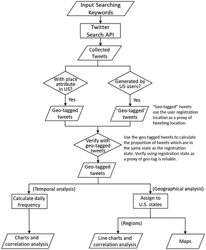
The goal of the temporal analysis is to track the volume changes of tweets mentioning the related terms over time and evaluate them as the pandemic evolved. We plotted the histogram of daily tweets. We also downloaded and processed data on COVID-19 for the newly confirmed cases and deaths in the U.S. (Ritchie et al. Citation2020) and observed weekly oscillations between weekdays and weekends. Next, we followed the general method of the 7-day moving average (Centers for Disease Control and Prevention Citation2020; World Health Organization Citation2021) to obtain the smoothed value. For the smoothed values, we also calculated Spearman’s rank correlation coefficient between tweet count, newly confirmed cases (new cases), and newly confirmed deaths (new deaths). Spearman correlation measures the non-linear association between two variables (Lehman Citation2005). In the range of −1 to 1, the correlation coefficient’s sign indicates the direction of the association, and higher value means observations have a higher correlation between the two variables. Then we used the min-max normalization on the smoothed tweet count, new cases, and new deaths to transfer them into 0–1 scale, and visualized the temporal trends.
After further assigning tweets to the state or state-equivalent level and excluding the tweets that cannot be assigned, we visualized the monthly tweet count by the state to see the geographical trend. We also created a map with each state’s tweet count per 100,000 people to net out the population influence.
We applied the same methods at the regional level using the same set of variables – tweet count, new cases, and new deaths for four regions (Midwest, Northeast, West, and South) (U.S. Census Bureau Citation2021). We conducted 7-day average smoothing, Spearman’s rank correlation coefficients, rate by population, min-max normalization, and visualization.
3. Results
We collected 131,674 original tweets mentioning both COVID-19 and CVD-related keywords by 102,206 unique users worldwide. Only 2,741 (2.08%) of the collection were geotagged. Among them, users of 1,172 geotagged tweets had their registration location in the U.S. After justifying that about 90% of geotags were the same as the states that users registered, we used the registration state as a proxy of the tweeting location. Of all collected tweets, 44,967 (34.15%) are either geotagged in the U.S. or generated by a user registered in the U.S. However, users would be assigned to the U.S. centroid location in Kansas if they did not provide a more specific location other than the country in registration. We excluded tweets assigned to the U.S. centroid and those whose geotags cannot locate a state. We consider the remaining tweets to be assigned to a state based on either geotag or user registration information as geo-specific tweets. While analysing the data, we noticed some users intended to have exactly the same tweet but mentioned (@) different Twitter users over 400 times a day. We removed the highly duplicated tweets generated by the same user on the same day to keep the unique tweet that provided new information. The following results are based on the 34,610 geo-specific tweets with geotags in the U.S. or generated by U.S. users. To check the false positives in the data, we sampled 1% of tweets and manually reviewed them. Out of 350 tweets, only one (0.3%) is unrelated to COVID-19 and CVD. The tweet is about George Floyd and shared a news article about George Floyd, COVID-19, and CVD.
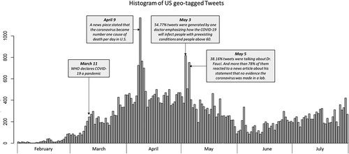
The temporal trend of tweet frequency (before removing duplicate tweets) is shown in . We can see a noticeable increase around March 11 when WHO declared COVID-19 a global pandemic (WHO Citation2020). The overall peak during the six months was on April 9 when a news piece came out and caught much attention by stating that COVID-19 became the number one cause of death per day in the U.S., surpassing heart disease and cancer (Impelli Citation2020). Another peak was around early May. On May 3, a doctor posted 448 tweets (54.77% of the tweets we collected that day), emphasizing how COVID-19 would infect people with pre-existing conditions, such as heart disease, and people over 60 years old, while young people will likely not have severe symptoms. On May 5, more than one-third of the tweets were about Dr. Fauci. Among them, more than 78% talked about his statement that coronavirus was not made in a lab (Akpan and Jaggard Citation2020).
Figure 2. Histogram of geotagged tweets in the U.S.
After removing highly duplicated tweets, we applied the 7-day moving average method and smoothed tweets, new cases, and new deaths. We calculated Spearman’s rank correlation coefficient between them. indicated a high correlation (coefficient = 0.88) between smoothed tweet count and new deaths. The coefficients were more than 0.60 between smoothed tweet count and new cases, and between smoothed new cases and new deaths.
Table 2. Correlation coefficients between smoothed tweet count, new cases, and new deaths of COVID-19 in the U.S.
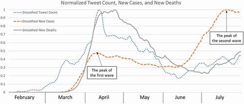
shows that the normalized (value range: 0–1) tweet count (dotted line) and new cases (dashed line) have similar and increasing trends from February to mid-April to reach the peak and a decreasing trend till mid-June before the second wave of new cases and tweeting. However, reflected by the tweet count, the second increase of new cases from mid-June to mid-July did not ripple much in the Twitter community, reflecting the pandemic fatigue phenomenon. During the six months, the temporal pattern of tweet count synchronized more with the change in the death toll (solid line).
Figure 3. Normalized tweet count, new cases, and new deaths of COVID-19 in 2020.
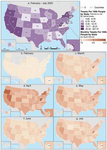
Geographically, we visualized tweet count per 100,000 population () at the state level. West coast states, New York, Massachusetts, West Virginia, and Washington DC, stand out for the entire data collection period (). From February to April, there is a clear trend that more states were having related geotagged tweets and with increasing frequency. Then the intensity decreased from April to June and bounced back with more tweets in July.
Figure 4. Geotagged tweets per 100,000 population by state (in Total and by Month).
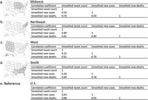
Regionally, the correlation coefficient varies between variables (). Generally, the regional coefficient of tweets and deaths (0.61–0.81) were all lower than the national value of 0.88 ( or ). The coefficient between the tweet count and new cases ranges from 0.25 (West) to 0.89 (Northeast), compared to the national value of 0.63. For the coefficient between new cases and deaths, all regions have higher values (0.78–0.90) than the national value (0.65), except for Midwest (0.59). The Northeast region had a high correlation (0.81–0.9) between all three pairs of variables.
Figure 5. Correlation coefficients between smoothed tweet count, new cases, and new deaths of COVID-19 across regions.
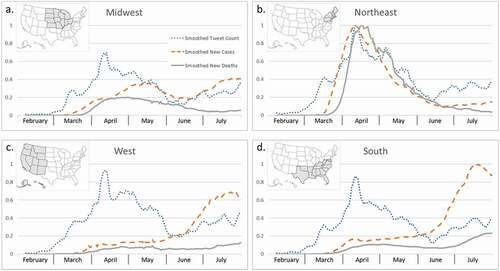
By plotting the normalized variables (), we see similar trends of smoothed tweet count (dotted line) across four regions. The Northeast had a leading magnitude over the West, South, and Midwest. For the new cases (dashed line), the Northeast had its peak in early April and a decreasing trend starting in May. Comparing that, the South and West had their peak time in July, and the magnitude of the South is comparable to the Northeast’s April peak. Midwest had a much smaller magnitude than the other regions but with two humps in May and July. In terms of new cases and deaths (solid line), the Northeast was hit the hardest and earliest in April. While the engagement of tweeting (magnitude and trend of smoothed tweet count) was similar for the Northeast and West, the trend and magnitude of the case and death were quite different.
Figure 6. Line charts of normalized tweet count, new cases, and new deaths of COVID-19 across regions.
4. Discussion
Twitter is a real-time platform where people or organizations share their opinions, advice, and facts to reach a broader audience. This study presents an analysis of COVID-19 and CVD tweets during the early stage of the pandemic (February 1 to 1 August 2020) when we faced an unknown new virus that spread fast and dramatically influenced our lives. We used users’ registration location as a proxy of tweeting location to enlarge our dataset of geotagged tweets at the state level and analysed the geographical and temporal intensity of COVID-19 and CVD-related tweets. According to our analysis, the trend of related tweets is highly similar to that of COVID-19 new cases and deaths of the first wave in the U.S. The second wave caused another rise in the related tweet but not as much as the first one, and statistically, the tweet count has a higher correlation coefficient (0.88) with the daily death toll than the new cases. Regionally, they had different magnitudes and trends for tweet count, cases, and deaths. While all regions had similar trends of tweet counts for the country, only the Northeast region had a high correlation (0.81–0.9) between all three variables (tweet count, new cases, and new deaths). This could be related to the fact that the Northeast region, especially New York City, was the epicentre of the COVID-19 outbreak in the U.S. during the Spring of 2020 (Bialek et al. Citation2020) and the rising cases and deaths led to escalating debates on social media during the same time period. For the second wave of confirmed new cases, the major contributors, the South and West regions, did not ripple as many related tweets as the first wave. Our understanding is that the national level news attracted more attention and discussion all over the U.S. in the first wave, even though some regions were not impacted as much as the Northeast U.S.
We proposed and validated the feasibility of using Twitter users’ registration state as a proxy of tweeting location. This location approximation can be a helpful GIS solution for social media analysis, especially when the geotagged tweets are usually very limited. This framework can be extended to broader research projects which aim to use real-time and accessible tweets for geographical and temporal analysis. This framework can provide new and complementary perspectives promptly compared to data sources that need a long time to collect or conduct clinical experiments. In addition, the synchronized trend of tweets, new cases, and new deaths at the national level echoes past research (Lee, Agrawal, and Choudhary Citation2013; Liu and Young Citation2018), which suggested that Twitter could be used as a surveillance platform to monitor health-related topics such as disease, mobility, and more. We also observed that the second wave of confirmed cases did not ripple much in the Twitter community, reflecting the pandemic fatigue phenomenon. A possible explanation is that people were used to the pandemic norm or even became paralysed and powerless about the number of cases and deaths. This trend also mirrored the five-stage of grief (Kübler-Ross model), or a more recent adaption called the cycle of acceptance, which indicates most people go over denial, anger, depression, bargaining, and eventually reach acceptance after receipt of bad news (Kübler-Ross Citation1969; Mortazavi et al. Citation2020).
However, using social media for health communication during the pandemic has not always provided users with the best health information. A recent study by Kathleen Jamieson (Jamieson and Albarracín Citation2020) showed that social media provided the most misinformation concerning the pandemic than any other communication channel. The quality of health information provided is critical for those populations, like those with CVD, who are particularly vulnerable to COVID-19, and is important for disease prevention before the medical community realizes the link between CVD and COVID-19. While social media is a powerful and well-utilized channel for health communication, it appears to need some regulation to curb misinformation and improve health information dissemination. A recent study (Jamieson and Albarracín Citation2020) mentioned a similar idea that social media exposure correlates with a higher level of misinformation. The study further recommends social media platforms’ efforts to blunt misinformation from where it starts.
There are some limitations of our study. First, we used acronyms, such as CAD, to collect tweets. There may be multiple possibilities of the full names, such as coronary artery disease, which we are looking for, and computer-aided design, which is a skill or software. In this sense, there may be some unrelated tweets being collected. In our case, the percentage of unrelated tweets is very low since we used two sets of searching keywords for both COVID-19 and CVD. Second, as we limited the tweet to contain keywords from both COVID-19 and CVD, there were only 1,172 actual geotagged tweets. Although we justified using user registration location as the proxy and expanded the group of geotagged tweets, there is still some uncertainty in the data. The amount of collected data also constrained our analysis to the state level, or we will have a small sample size problem (Jones and Moon Citation1991). A more detailed analysis can be done using a big sample size of geotagged tweets. In addition, although Twitter provides precise GPS coordinates (if users opt in for the service), users can choose their geotag location subjectively. Due to the lack of ground truth, the challenges of validating contribute to data uncertainty. Third, we observed how information might be misinterpreted and disseminated among Twitter users, but we did not compare Twitter messaging with other social media platforms. Future research could analyse how health information is communicated, changed, and perceived over time and space via social media platforms. Scholars have done research understanding the relationship between COVID-19 dynamics with the environmental and demographic characteristics of different places, including Italy, Spain, and the U.S. (Coccia Citation2020; Oto-Peralías Citation2020; Abolfazl, Vahedi, and Rivera Citation2020). It will be interesting to extend the correlation analysis to include socioeconomic status, and health measures, such as ICU availability, disease prevalence, vulnerable population proportion, and more. Due to data limitations, we only presented the temporal variation of COVID-19 and CVD related tweets at the state level, and the spatial variation between tweets, cases, and deaths at the region level. In future work, we are interested in expanding the analyses to more geographic and temporal scales with the acquisition of better data.
Acknowledgments
We thank the National Institutes of Health (NIH) for providing funding for our research. We thank Twitter for allowing researchers to use APIs to collect data for research. We appreciate all the team members for their expertise, perseverance, and assistance throughout our study and their help writing the manuscript.
Disclosure statement
No potential conflict of interest was reported by the author(s).
Additional information
Funding
References
- Abolfazl, M., B. Vahedi, and K. M. Rivera. 2020. ”GIS-Based Spatial Modeling of COVID-19 Incidence Rate in the Continental United States.” The Science of the Total Environment 728: 138884. Elsevier B.V. doi:10.1016/j.scitotenv.2020.138884.
- Akpan, N., and V. Jaggard. 2020. “Fauci: No Scientific Evidence the Coronavirus Was Made in a Chinese Lab.” National Geographic. https://www.nationalgeographic.com/science/article/anthony-fauci-no-scientific-evidence-the-coronavirus-was-made-in-a-chinese-lab-cvd.
- Ali, Y., and A. B. Newman. 2009. “The Burden of Cardiovascular Disease in the Elderly: Morbidity, Mortality, and Costs.” Clinics in Geriatric Medicine 25 (4): 563–577. doi:10.1016/j.cger.2009.07.007.
- Bialek, S., V. Bowen, N. Chow, A. Curns, R. Gierke, A. Hall, M. Hughes, et al. 2020. ”Geographic Differences in COVID-19 Cases, Deaths, and Incidence — United States, February 12–April 7, 2020.” MMWR: Morbidity and Mortality Weekly Report 69: 545–550. doi:10.15585/mmwr.mm6915e4.
- Centers for Disease Control and Prevention. 2020. “COVID Data Tracker.” https://covid.cdc.gov/covid-data-tracker/#datatracker-home
- Chen, E., H. Chang, A. Rao, K. Lerman, G. Cowan, and E. Ferrara. 2021. “COVID-19 Misinformation and the 2020 U.S. Presidential Election Research Questions.” Harvard Kennedy School Misinformation Review 1 (7). doi:10.37016/mr-2020-57.
- Clement, J. 2020. “Leading Countries Based on Number of Twitter Users as of July 2020 (In Millions).” Statista. https://www.statista.com/statistics/242606/number-of-active-twitter-users-in-selected-countries/
- Clerkin, K. J., J. A. Fried, J. Raikhelkar, G. Sayer, J. M. Griffin, A. Masoumi, S. S. Jain, et al. 2020. ”Coronavirus Disease 2019 (COVID-19) and Cardiovascular Disease.” Circulation 2019: 1648–1655. doi:10.1161/CIRCULATIONAHA.120.046941.
- Coccia, M. 2020. ”Factors Determining the Diffusion of COVID-19 and Suggested Strategy to Prevent Future Accelerated Viral Infectivity Similar to COVID.” The Science of the Total Environment 729: 138474. Elsevier B.V. doi:10.1016/j.scitotenv.2020.138474.
- Francis, D. B. 2019. ”‘Twitter is Really Therapeutic at Times’: Examination of Black Men’s Twitter Conversations Following Hip-Hop Artist Kid Cudi’s Depression Disclosure.” Health Communication 36 (4): 448–456. Routledge. doi:10.1080/10410236.2019.1700436.
- Gohil, S., S. Vuik, and A. Darzi. 2018. “Sentiment Analysis of Health Care Tweets: Review of the Methods Used.” JMIR Public Health Surveill 4 (2): e43. doi:10.2196/publichealth.5789.
- Hu, T., B. She, L. Duan, H. Yue, and J. Clunis. 2020. “A Systematic Spatial and Temporal Sentiment Analysis on Geo-Tweets.” IEEE Access 8: 8658–8667. doi:10.1109/ACCESS.2019.2961100.
- Impelli, M. 2020. “Coronavirus Becomes Number One Cause of Death per Day in U.S., Surpassing Heart Disease and Cancer.” Newsweek, April 9. https://www.newsweek.com/coronavirus-becomes-number-one-cause-death-per-day-us-surpassing-heart-disease-cancer-1495607
- Jamieson, K., and D. Albarracín. 2020. “The Relation Between Media Consumption and Misinformation at the Outset of the SARS-CoV-2 Pandemic in the US.” Harvard Kennedy School Misinformation Review 1 (April): 1–22. doi:10.37016/mr-2020-012.
- Jones, K., and G. Moon. 1991. “Medical Geography.” Progress in Human Geography 15 (4): 437–443. doi:10.1177/030913259101500405.
- Jurdak, R., K. Zhao, J. Liu, M. Aboujaoude, M. Cameron, and D. Newth. 2015. “Understanding Human Mobility from Twitter.” PLoS ONE 10: 1–16. doi:10.1371/journal.pone.0131469.
- Kemp, S. 2021. “Digital 2021: Global Digital Overview Report.” https://datareportal.com/reports/digital-2021-global-overview-report.
- Kübler-Ross, E. 1969. On Death and Dying. London: Routledge.
- Lee, K., A. Agrawal, and A. Choudhary. 2013. “Real-Time Disease Surveillance Using Twitter Data:Demonstration on Flu and Cancer.” Proceedings of the ACM SIGKDD International Conference on Knowledge Discovery and Data Mining Part F1288: 1474–1477. doi:10.1145/2487575.2487709.
- Lehman, A. 2005. JMP for Basic Univariate and Multivariate Statistics: A Step-By-Step Guide. United States: SAS Press.
- Liu, S., and S. D. Young. 2018. ”A Survey of Social Media Data Analysis for Physical Activity Surveillance.” Journal of Forensic and Legal Medicine 57: 33–36. Elsevier Ltd. doi:10.1016/j.jflm.2016.10.019.
- Mackey, T. K., J. Kalyanam, T. Katsuki, and G. Lanckriet. 2017. “Twitter-Based Detection of Illegal Online Sale of Prescription Opioid.” American Journal of Public Health 107 (12): 1910–1915. doi:10.2105/AJPH.2017.303994.
- Mortazavi, S. S., S. Assari, A. Alimohamadi, M. Rafiee, and M. Shati. 2020. “Fear, Loss, Social Isolation, and Incomplete Grief Due to COVID-19: A Recipe for a Psychiatric Pandemic.” Basic and Clinical Neuroscience Journal 11 (2): 225–232. doi:10.32598/bcn.11.covid19.2549.1.
- Nguyen, B. T., and C. Animashaun. 2020. “How the Coronavirus is Disrupting US Air Travel, in 2 Charts.” Vox. https://www.vox.com/the-goods/2020/4/20/21224080/coronavirus-air-travel-decline-charts
- Nishiga, M., D. W. Wang, Y. Han, D. B. Lewis, and J. C. Wu. 2020. ”COVID-19 and Cardiovascular Disease: From Basic Mechanisms to Clinical Perspectives.” Nature Reviews: Cardiology 17 (9): 543–558. Springer US. doi:10.1038/s41569-020-0413-9.
- Oto-Peralías, D. 2020. “Regional Correlations of COVID-19 in Spain.”
- Ritchie, H., E. Ortiz-Ospina, D. Beltekian, E. Mathieu, J. Hasell, B. Macdonald, C. Giattino, C. Appel, and M. Roser. 2020. “Coronavirus Pandemic (COVID-19) – the Data.” Our World in Data. https://ourworldindata.org/coronavirus-data#cases-and-deaths
- Schaper, D. 2020. “Coronavirus Fears Lead to Canceled Flights and Concerns Within the Travel Industry.” NPR, March 4. https://www.npr.org/2020/03/04/812026357/coronavirus-fears-lead-to-canceled-flights-and-concerns-within-the-travel-indust
- Sinnenberg, L., A. M. Buttenheim, K. Padrez, C. Mancheno, L. Ungar, and R. M. Merchant. 2017. “Twitter as a Tool for Health Research: A Systematic Review.” American Journal of Public Health 107 (1): e1–8. doi:10.2105/AJPH.2016.303512.
- Tsou, M.-H., O. Leal Neto, R. Nagar, Q. Yuan, C. C. Freifeld, M. Santillana, A. Nojima, R. Chunara, and J. S. Brownstein. 2013. “The Complex Relationship of Realspace Events and Messages in Cyberspace: Case Study of Influenza and Pertussis Using Tweets.” Journal of Medical Internet Research 15. doi:10.2196/jmir.2705.
- Tumasjan, A., T. Sprenger, P. Sandner, and I. Welpe. 2010. “Predicting Elections with Twitter: What 140 Characters Reveal About Political Sentiment.” Proceedings of the Fourth International AAAI Conference on Weblogs and Social Media, 178–185. doi:10.1074/jbc.M501708200.
- Twitter Developer. 2020. “Tutorials: Tweet Geospatial Metadata.” Twitter Developer. https://developer.twitter.com/en/docs/tutorials/tweet-geo-metadata
- Twitter Inc. 2020a. “Introducing Twitter Premium APIs.” https://developer.twitter.com/en/premium-apis
- Twitter Inc. 2020b. “Premium Search APIs.” https://developer.twitter.com/en/docs/tweets/search/api-reference/premium-search
- US Census Bureau. 2021. Geographic Levels. Washington DC: US Census Bureau. https://www.census.gov/programs-surveys/economic-census/guidance-geographies/levels.html
- US Census Bureau. 2022. 2010–2020 5-Year American Community Survey. https://data.census.gov/cedsci
- Virani, S. S., A. Alonso, E. J. Benjamin, M. S. Bittencourt, C. W. Callaway, A. P. Carson, A. M. Chamberlain, et al. 2020. ”Heart Disease and Stroke Statistics-2020 Update: A Report from the American Heart Association.” Circulation 141: E139–596. doi:10.1161/CIR.0000000000000757.
- Wang, D., B. Hu, C. Hu, F. Zhu, X. Liu, J. Zhang, B. Wang, et al. 2020. ”Clinical Characteristics of 138 Hospitalized Patients with 2019 Novel Coronavirus–Infected Pneumonia in Wuhan, China.” JAMA - Journal of the American Medical Association 323 (11): 1061–1069. doi:10.1001/jama.2020.1585.
- WHO. 2020. “WHO Director-General’s Opening Remarks at the Media Briefing on COVID-19 - 11 March 2020.” https://www.who.int/dg/speeches/detail/who-director-general-s-opening-remarks-at-the-media-briefing-on-covid-19—11-march-2020
- Woolfolk, J. 2020. “Coronavirus: Why are We at War Over Face Masks?” The Mercury News, June 15. https://www.mercurynews.com/2020/06/13/coronavirus-why-are-we-at-war-over-face-masks/
- World Health Organization. 2021. “WHO Coronavirus (COVID-19) Dashboard.” https://covid19.who.int/
- Wunsch, H., D. C. Angus, D. A. Harrison, W. T. Linde-Zwirble, and K. M. Rowan. 2011. “Comparison of Medical Admissions to Intensive Care Units in the United States and United Kingdom.” American Journal of Respiratory and Critical Care Medicine 183 (12): 1666–1673. doi:10.1164/rccm.201012-1961OC.
- Yang, W., L. Mu, and Y. Shen. 2015. ”Effect of Climate and Seasonality on Depressed Mood Among Twitter Users.” Applied Geography 63: 184–191. Elsevier Ltd. doi:10.1016/j.apgeog.2015.06.017.
- Zheng, Y. Y., Y. T. Ma, J. Y. Zhang, and X. Xie. 2020. ”COVID-19 and the Cardiovascular System.” Nature Reviews: Cardiology 17 (5): 259–260. Springer US. doi:10.1038/s41569-020-0360-5.