
ABSTRACT
The role of cartography in environmentally-sustainable development is twofold: first, useful and usable maps enable sense making and decision making about environmental processes, impacts, and protections; second, maps themselves, as digital tools, can be more energy efficient in minimizing our impact on the environment. In this paper, we elevate this energy awareness as a key design consideration for maps and introduce a novel conceptual framework for considering the carbon footprint of the content, form, and use of maps. We first systematically investigate how specific map design decisions impact the energy consumption of digital devices. We then discuss the possible ways that digital maps can be greener, outlining a series of ‘big questions’ about the content, form, and use context of maps needing future research to realize greener maps. Finally, we assert that green cartography requires not only novel techniques to design green maps but also greater attention to shaping individual, organizational, and social attitudes towards environmentally-friendly maps.
Introduction
The role of cartography in environmentally-sustainable development is twofold. First, useful and usable maps communicate information about environmentally-sustainable development, enabling sense making and decision making about environmental impacts and protection. Sustainable development is now an international, cross-disciplinary research and policy initiative encapsulating many of the most urgent challenges facing our environmental, social, and economic systems, and the 17 United Nations Sustainable Development Goals (SDGs) are one notable international effort currently underway (United Nations General Assembly Citation2015). Maps and visualizations can communicate what we already know about sustainable development in regard to, for example, urbanization (e.g., Sluter et al. Citation2018), water pollution (e.g., Lan et al. Citation2020; Ruas and Pham Citation2015), weather-driven hazards (e.g., Pappenberger, Cloke, and Baugh Citation2019), climate change vulnerability and environmentally-sustainable development (e.g., De Sherbinin et al. Citation2019; Fish Citation2020), and public health (e.g., Chow et al. Citation2021; Kumar et al. Citation2021). Additionally, maps and visualizations can illustrate the potential outcomes of actions and policies supporting sustainable development, such as reductions in greenhouse gas emissions or poverty mitigation (Green Citation2012). Further, interactive maps and visualizations can support exploratory visual analysis of large datasets on sustainable development to gain new insights and generate alternative solutions (MacEachren Citation1994; A. Robinson Citation2017). Recently, Kraak et al. (Citation2020) collaborated with the International Cartographic Association (ICA) and United Nations to develop and synthesize practices for making useful and usable maps and visualizations of the United Nations SDG indicator datasets. We believe that cartographers are well-positioned to contribute many more valuable insights, methods, and case studies to help understand and achieve environmentally-sustainable development.
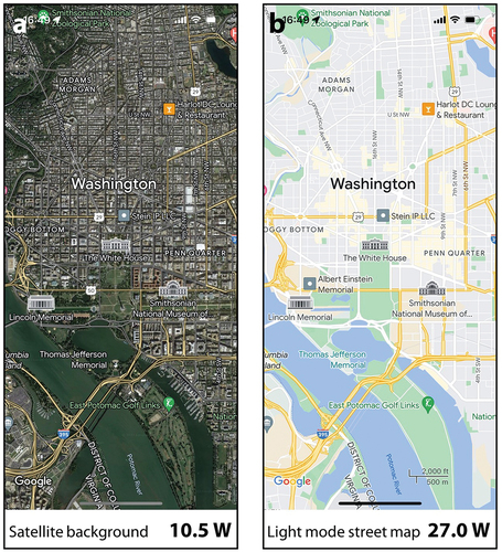
Second, maps themselves, as increasingly digital tools, are consumed across a range of devices, but attention rarely has been paid to the energy consumption of digital maps. Here, we first roughly estimate the energy consumption of digital maps on displays. Emerging organic light-emitting diode (OLED) displays are rapidly replacing traditional liquid crystal displays (LCDs) for energy efficiency because each pixel in an OLED self-illuminates (Abraham Citation2019; Webb Citation2008). Dong and Zhong (Citation2012) proposed a model for estimating the energy consumption in watts (W, one joule per second) of a pixel based on the red, green, and blue components of the pixel colour on OLED displays. Throughout this article, we use this model to estimate the energy consumed to display maps. As shown in , on a 2,340 × 1,080 pixel OLED cellphone screen, the power consumed by a single Google Maps render with a satellite background is 10.5 W, and that consumed by a light mode street map is 27.0 W. Although the power consumed by a single digital map is not high, the cumulative energy consumed is enormous when considering the large user population. For example, the average number of yearly active users of Google Maps is more than 1 billion, and the average use time per user is approximately 30.4 hours per year (Verto Analytic Citation2020; Russell Citation2023). Taking the energy consumption of the light mode street map in as a reference, it is estimated that the total annual energy of Google Maps is 820.8 million kWh, which is equivalent to the electricity consumption of 255,538 people in 2021 (EIA Citation2023; The World Bank Citation2023) or the release of approximately 410.4 million kgCO2e of greenhouse gases (Belkhir and Elmeligi Citation2018). In addition to display energy, digital maps consume energy in data processing and network transmission, further increasing electricity consumption and greenhouse gas emissions. Of course, Google Maps represents only the tip of the iceberg in the actual global use of digital maps. While the estimates above are conservative, they demonstrate the substantial global impact that displaying digital maps has on energy consumption and the resulting carbon footprint.
Figure 1. Estimation of the energy consumption of a Google map with a satellite background (a) and that of a light mode street map (b) on a 2,340 × 1,080 pixel OLED screen.
We argue that ‘green’ should be a new cartographic design consideration to minimize the impact of digital maps on the environment. The global information and communication technology (ICT) industry accounted for approximately 2% of global greenhouse gas emissions in 2008 (Mingay and Pamlin Citation2008), exceeded 3% in 2020 (Su, Wang, and Tang Citation2023), may exceed 6% in 2030 (Malmodin and Lundén Citation2018), and could even reach 23% in 2030 under a worst-case scenario (Andrae and Edler Citation2015). The seriousness of this trend in the global information technology (IT) industry has led to a new research and development focus: green computing, which encourages the efficient creation, use, and disposal of information and computing resources to limit their deleterious impact on the environment (Williams and Curtis Citation2008). Approximately one-quarter of ICT-related greenhouse gas emissions come from the production and disposal of computing hardware (e.g., materials and manufacturing), with the remaining three-quarters derived from the energy required to use the software deployed on these technologies (Webb Citation2008). Therefore, green computing specifically calls for new energy-aware frameworks and techniques for designing applications and data services that reduce energy consumption and resulting greenhouse gas emissions. Importantly, calls for green computing also include efforts to shape environmentally-friendly attitudes among individuals, organizations, and society at large that lead to greener behaviours and policies regarding ICT in practice (Dalvi-Esfahani et al. Citation2020). In this context, we assert that digital maps should be more energy-aware, and we use the term green cartography to describe map design and use with a specific concern for being low-carbon, resource-efficient, and socially-inclusive. We do not singularly prioritize greenness over other map design concerns, such as aesthetics, usability, and user preferences. Instead, we encourage making a trade-off between the carbon footprint and existing map design decisions to mitigate the impact of those decisions on our environment.
Emergent research in ICT on green computing includes important work on green computing architecture (e.g., cooling techniques for data centres), energy-saving display solutions and interfaces (e.g., changing the screen’s brightness and contrast at the device level), and low-carbon attitudes (e.g., users turning off screens when they leave) (see Williams and Curtis Citation2008 for a review). In comparison, the discussion of green cartography in the literature and industry remains relatively limited, focusing on several efforts to make green colour schemes and dimming modes. For instance, Chuang, Weiskopf, and Möller (Citation2009) developed an energy-aware colour scheme that reduces energy consumption on digital maps. Further, Hoarau (Citation2011) discussed design considerations for adapting any digital map colour scheme to save energy while preserving embedded semantic relationships. Roth et al. (Citation2018) discuss responsive design strategies using darker basemaps to save battery life when viewing digital maps on mobile devices. Recently, Han, Wu, and Roth (Citation2021) operationalized concepts from Hoarau (Citation2011) and Roth et al. (Citation2018) into a semantically-enriched method for adapting colour palettes to optimally reduce energy consumption while preserving the differentiation, association, and ordering of symbols in the resulting maps.
While this sample of research on green cartography primarily focuses on colour, the energy consumed by digital maps is impacted by a range of additional design decisions, such as projection, generalization, symbolization, visual hierarchy, and the user interface. Further, in cartography and computer science, many efforts are underway to develop algorithms and toolkits to enhance map rendering (e.g., Wu et al. Citation2018), geographic data compression (e.g., Marchetti et al. Citation2018), and spatial indexing (e.g., Xia, Yang, and Li Citation2018). However, most discussions in geographic information science and technology (GIS&T) similarly lack consideration of energy consumption and the resulting carbon footprint. In an early work, we explored possible research opportunities for the design and use of energy-aware maps (Wu, Lv, and Yuan Citation2022). However, how specific map design decisions impact energy consumption on digital devices remains unknown.
In this article, we align cartographic design decisions with their relative energy consumption to enable cartographers and visual designers to explicitly consider the carbon footprint of their design choices, with the ultimate goal of promoting more environmentally-sustainable mapping. In the next section, we analyse how map design decisions impact the energy consumption of digital maps and the resulting carbon footprint, working through cartographic considerations related to the map content, form, and use context. We then set an initial agenda comprising nine ‘big questions’ facing research and development of green cartography.
How do map design decisions impact the carbon footprint?
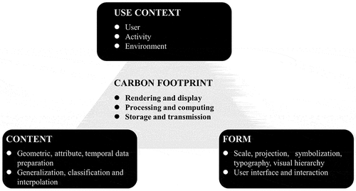
We identify three broad sets of cartographic design and use considerations relevant to all digital maps: content, form, and the use context (adapted from Kelly Citation2020). Here, content refers to the underlying geospatial datasets and services employed by the digital map, including generalized vector or raster descriptions of geographic phenomena and the attribute and temporal data attached to locational data to enrich their description (Peuquet Citation1994). Form refers to the visual appearance of a digital map, including the projection, symbolization, typography, and overall visual hierarchy (see Kraak et al. Citation2020 for a review of techniques). For simplicity, we classify graphic user interfaces as part of form in the following discussion, despite a noted distinction between representation (considerations on form for all maps, digital or otherwise) and interaction (new user-generated enablements and constraints afforded by digital devices) (Roth et al. Citation2017). Use context refers to the diversity of user groups and use case scenarios by and for which digital maps are employed. Griffin et al. (Citation2017) characterize use context in four components the user, the user’s activity, and use environment, and the map design mediated by the user-activity-environment context. We then add a fourth, novel dimension to anchor green cartography (see ) the resulting carbon footprint derived from content, form, and the use context. To simplify ICT subsectors, we distinguish three primary energy-intensive categories of operations – rendering/display, processing/computing, and storage/transmission – and analyse the carbon footprint of digital maps in terms of those three broader operations.
Figure 2. A conceptual framework for green cartography consisting of four dimensions: content, form, use context, and carbon footprint.
In the following, we analyse how the content, form, and use context of digital maps impact their energy consumption and the resulting carbon footprint.
How does map content impact the carbon footprint?
Maps always are based on a topic, with content selected based on the region of interest, theme, representation scale and resolution, and target audience (Robinson et al. Citation1984; Kraak et al. Citation2020). Generally, content impact displaying, computing, storage, and transmission will be analysed specifically, as we scoped in Section 1. Preparation of geometric, attribute, and temporal data certainly consumes energy on data processing and storage. We narrow our discussion to the following three general operations on map content.
Map generalization
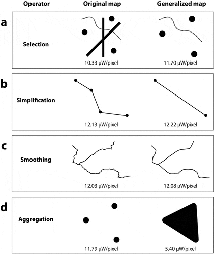
Map generalization impacts the visual look of maps. Cartographers often apply map generalization to modify the details of features and the overall information density. Map generalization operators, such as selection, simplification, smoothing, and aggregation, change the density and area of map objects that need to be displayed. Some aggregation operators, such as aggregation from point to area or aggregation from line to area, dramatically increase the area of map objects that need to be displayed. We compared the energy consumption of four map generalization operators on four simple black and white maps. As shown in , selection, simplification, and smoothing operators do not necessarily reduce energy consumption; in contrast, those operators may introduce a brighter negative background that consumes more energy (figure-ground organization will be addressed in Section 3.12). In contrast, aggregation reduce the bright negative space and therefore reduce energy consumption.
Figure 3. A comparison of the energy consumption of four map generalization operators: (a) selection; (b) simplification; (c) smoothing; and (d) aggregation.
In addition to traditional map generalization operators, cartographers use overview+detail techniques (e.g., the fisheye technique, other schematized maps) to control the displayed information density based on the user’s focus and interest. These techniques also impact the geometric details and/or overall information density and therefore impact the energy consumption on display.
Map generalization also is computationally-intensive and, therefore, energy hungry. Map generalization involves computationally-intensive geometric analysis, such as self-intersection checking. Map generalization may also involve multiple features (e.g., administrative regions with shared boundaries) or even feature classes (e.g., contours and rivers). Considerable energy is needed for computing in these cases, and this consumption increases with the total number of generalized features.
Classification
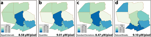
Classification impacts the visual look of maps. Breaking raw data into groups, classification helps to communicate generalized patterns. A series of classification methods are crafted for different data distributions. As shown in , we examined four common classification methods (equal intervals, quantiles, standard deviations, and natural breaks) on the same testing dataset (simulated population data) to make a choropleth map. Applying the same colour scheme, those four classification methods lead to noticeable differences in energy consumption.
Figure 4. A comparison of the energy consumption of four common classification methods. From left to right: equal intervals, quantiles, standard deviations, and natural breaks.
Classifications themselves could be computationally-intensive. Standard deviation classification requires detailed information on the distribution of data values. Natural breaks classification needs to compute and compare metrics for multiple classification alternatives, such as similarity within a class and dissimilarity across classes. Fitting the distribution of data and iteratively finding optimal breaks also relies on an item count, suggesting that a nontrivial amount of energy could be needed to classify large datasets.
Interpolation
Interpolation also impacts the visual look of maps. A series of interpolation methods are suggested to estimate the attributes of uncovered sites by using a limited number of samples. They often are used to create contiguous surfaces in isarithmic maps. They all follow Tobler’s law of geography, but employ different quantitative approaches for considering spatial autocorrelation. For instance, inverse distance weighting (IDW) weights the influence of neighbouring points according to distance, but the kriging model considers the rate at which the variance between points changes with distance, called the variogram (Lam Citation1983; Myers Citation1994). As shown in , we examined four common interpolations (IDW, kriging, natural neighbour, and spline) on the same stimulated samples, making four thematic maps. Clearly, they derive different estimated values, resulting in different energy consumption when displaying the results.
Figure 5. A comparison of the energy consumption of four common interpolation methods: (a) IDW; (b) kriging; (c) natural neighbour; and (d) spline.
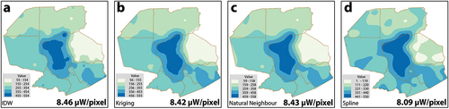
Further, similar to classification, interpolation methods themselves could be computationally-intensive. Among them, kriging interpolation involves multiple complex subprocesses, such as exploration analysis and variogram development. More energy is needed for computation, especially when the number of points is large.
How does map form impact the carbon footprint?
Scale and projection
The visual appearance and user interface of map directly impact map energy consumption. According to Dong and Zhong’s (Citation2012) energy estimation model, energy consumption is linearly correlated with the number of pixels (i.e., the display size and resolution), one kind of device ‘scale’ commonly described in ICT. However, the cartographic scale as computed through a representative fraction is non-linear across zoom levels, making energy consumption by cartographic scale irregular based on the mapped features and therefore difficult to predict.
Map projections introduce geometric distortions into the map, and therefore fundamentally impact the visual look of digital maps and their carbon footprint in at least two ways. First, different map projections introduce notably different geometric distortions. As shown in , we examine nine map projections on a simple world map with the same map scale (1:470,000,000). The energy consumption (excluding the background in white) to display the map varies greatly when different map projections are applied. For example, the Mercator projection introduces sizable areal distortion in the higher-latitude regions, resulting in a much larger graphic for display. The energy consumption of applying the Mercator projection is four times greater than that of applying the equal-area Goode, Behrmann, and sinusoidal projections, when holding cartographic scale constant.
Figure 6. A comparison of the energy consumption of nine map projections on a simple test map with an assumed viewport (all maps are at the same cartographic scale of 1:470,000,000 and have a resolution of 1,770 × 1,600 pixels): (a) stereographic, conformal projection; (b) mercator, conformal projection; (c) hotine, conformal projection; (d) aitoff, arbitrary projection; (e) patterson, arbitrary projection; (f) robinson, arbitrary projection; (g) goode, equal-area projection; (h) behrmann, equal-area projection; and (i) sinusoidal, equal-area projection.
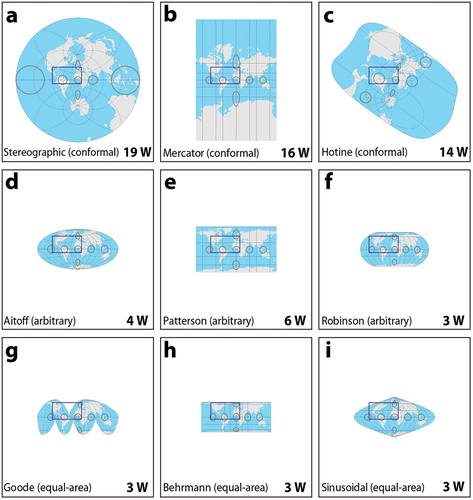
Second, map projections impact the size and distribution of negative space around the map, specifically negative space that exists in the map display but does not exist on the Earth’s surface. For example, for an assumed viewport (the rectangle in ), while the Mercator projection and Patterson projection do not introduce negative space, Goode and the sinusoidal projection do; the negative space in the Goode projection is much larger than that in the sinusoidal projection. Such negative space when rendered in light colours plays a critical role in the energy consumed by the display, particularly for maps at a national or global scale.
In addition to the abovementioned traditional projections, cartographers also have proposed a series of methods to create purposefully deformed or reoriented map views to emphasize certain aspects of the data or enhance the user experience (e.g., perspective view, 360-degree panoramic view, egocentric view, bird’s-eye view, and pedestrian view). These views also introduce areal and length distortions on both the figure and the ground, impacting energy consumption on display.
Further map projections consume considerable computing energy when rendered in real-time on digital devices. Many map projections are computationally-expensive, as the Earth’s surface is an ellipsoid that needs sophisticated methods to deal with geometric issues, such as areal and length distortions, that are more computationally-expensive than dealing with regular geometry in Euclidean space. Further, wayfinding applications often employ egocentric, bird’s-eye, and pedestrian views for navigation that are updated as the user is moving, adding to the computational-intensity and overall energy consumption.
Map projections and map views also impact data transmission. In practice, the real geographic coverage of the map always exceeds the size of the display screen, namely, the viewport that defines the regions to query map data. Viewports for the same screen size may vary among different map projections and views, resulting in different volumes of map data that need to be transmitted (e.g., different numbers of cities within the same viewport). In an oblique perspective view, the view angle and the near and far clipping planes define the viewport. The longer the distance from the viewer to the far clipping plane, the more data are involved in transmission. Theoretically, the ultimate pitch angle can be 90 degrees; however, in that case, the far clipping plane would be infinitely far, introducing an extremely large geographic region that would require data transmission.
Symbolization
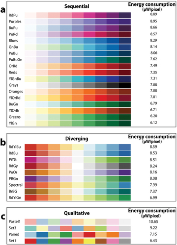
Colour directly impacts the visual appearance of maps and therefore impacts the energy consumption required to display maps. Brewer, Hatchard, and Harrower (Citation2003) classify colour schemes into three main groups: qualitative, sequential, and diverging. As shown in , we estimated the energy consumption of colour schemes from Colorbrewer2.org, selecting those colour schemes that have nine colours to consistently compare the energy consumption. The estimation revealed that the three least energy-consuming schemes used 30%, 20%, and 30% less energy than the most energy-consuming scheme in the sequential, diverging, and qualitative colour scheme groups, respectively.
Figure 7. Energy consumption of nine-class colour schemes from colorbrewer.Org: (a) sequential; (b) diverging; and (c) qualitative.
Cartographic conventions on colour selection also influence the resulting maps’ energy consumption. When crafting map colour, designers tend to follow certain conventions, typically blue for water bodies; blue is often selected for low (cool) and red for high (hot) values (e.g., in weather maps); bright colours in diverging schemes to encode values further away from the central break. To evaluate these conventions of colour selection, we estimated the energy consumption of all colours over the entire HSV colour space. shows that darker, primitive colours (i.e., red, green, blue) consume less energy. As we mentioned before, blue and white are very commonly used in maps; blue is the most energy-hungry primitive colour and white is the most energy-hungry mixed colour.
Figure 8. Estimation of the energy consumption of colours over the HSV colour space: (a) all colours; and (b) colour value and saturation transitions for sequential and diverging schemes.
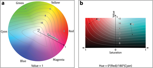
Further, designers often modify the colour value and/or saturation in sequential and diverging schemes to encode ordinal and numerical data. indicates the most energy-saving colour transitions for sequential and diverging schemes in choropleth and isoline maps. For colour c1, gradients on saturation help to save energy; for c2, gradients on value help to save energy.Using both saturation and value to create a sequential scheme consumes more energy than adjusting them separately, but such redundant symbolization is common in map design to improve discriminability.
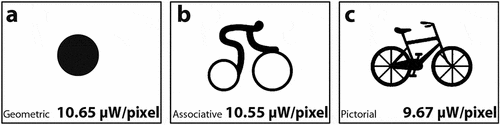
Beyond colour, iconic symbols directly impact the visual appearance of maps and therefore impact their energy consumption. Map symbols can be divided into three types according to their iconicity: geometric symbols, associative symbols, and pictorial symbols (Robinson et al. Citation1984). shows an example of three bike symbols at those three levels of iconicity with black figures and white ground. Even though the pictorial symbol exhibits a relatively complex shape, as black consumes less colour, the pictorial symbol consumes the least amount of energy.
Figure 9. A comparison of the energy consumption of the three symbols at different iconicities: (a) geometric; (b) associative; (c) pictorial.
Symbol rendering also consumes considerable computing energy. Taking the cartographic representation of roads as an example, roads often are emphasized with dark edges for high visual contrast and styled with rounded caps to avoid sharp turns; the road width typically is scaled according to the zoom level and the distance to the viewer to make roads visible at all zoom levels without too many visual conflicts with surrounding features (Vaaraniemi, Treib, and Westermann Citation2011; Wu et al. Citation2018). Map graphics increasingly are tessellated into vector tilesets that enable additional drawable primitives including outline strokes, rounded caps, and tapered widths, all of which intensifies computation for display rendering. Further, different features layers require conventional cartographic solutions, such as detecting intersections among road networks (including multicoloured and different functional roads) to symbolize crossroads and junctions, again introducing additional computing power to handle overlap and blending. Finally, additional computing of high-resolution digital evaluation models (DEMs) is needed to match roads and other features to the underlying terrain when using satellite or topographic basemaps.
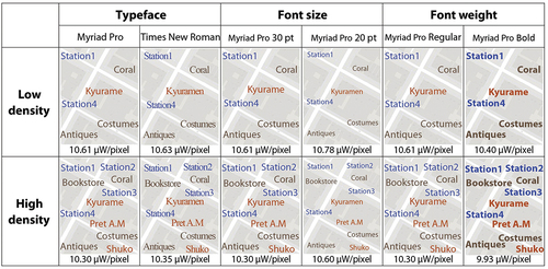
Typography
Similar to symbols, typography impacts the visual look of maps and therefore impacts their energy consumption. Typography, including typeface, font size, and font weights (e.g., roman vs. bold), helps to distinguish features, and typography also is a critical visual element to craft map style. As shown in , different typefaces, font sizes, and font weights lead to different levels of energy consumption.
Figure 10. An estimation of energy consumption on typography with different typefaces, font sizes, and weights exhibiting low and high label densities.
In addition to typography, label placement also consumes considerable energy in computing. Label placement is a long-standing challenge in cartography, as it requires balancing the density and shape of features and the character length of labels while considering placement ranking and association with features to ensure legibility and avoid ambiguity. It is therefore computationally-intensive to find a satisfying solution, and especially intensifies to modify the solution in real-time as the user interacts with the map or moves in the landscape.
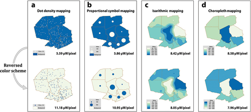
Thematic maps
While classification and interpolation impact the energy consumption of thematic maps, different thematic map types also may lead to different energy consumption. Cartographers developed a series of thematic map types to accommodate different spatial distributions (e.g., continuous vs. discrete) and spatial changes (e.g., abrupt and smooth) of mapping phenomena. Generally, dot density mapping is suggested to depict discrete and smooth themes, proportional symbol mapping for discrete and abrupt themes, choropleth mapping for continuous and abrupt themes, and isarithmic mapping for continuous and smooth themes (Kraak et al. Citation2020). As shown in , applying those four mapping methods (i.e., dot density mapping, proportional symbol mapping, isarithmic mapping, density and choropleth mapping) to the same underlying data (simulated population data) resulted in very different amounts of energy consumption. In this test using a blue‒green colour scheme (see ), the dot density map consumes the least and the choropleth map consumes the most. Inverting the colour scheme, the dot density map consumes the most and the choropleth map consumes the least. Energy consumption by thematic map type certainly varies with different data distributions, classification schemes, etc., but our test still suggests that visual elements, such density, dimensionality, size, value, etc., intrinsic to specific thematic map types greatly impact the resulting energy consumption.
Figure 11. A comparison of the energy consumption of four types of symbolization: (a) dot density mapping; (b) proportional symbol mapping; (c) isarithmic mapping; and (d) choropleth mapping.
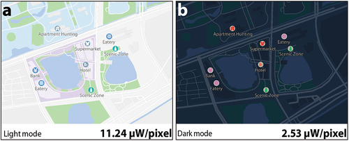
Visual hierarchy
Visual hierarchy plays a critical role when consuming energy on display. Cartographers manipulate the visual hierarchy to emphasize the relative importance of features. Important symbols (figures) rise forward, and less-important symbols (ground) recede into the background. Generally, there are two extremes of figure-ground separation regarding visual hierarchy: bright ground with darker figures (often called light mode) and darker ground with bright figures (called dark mode). In light mode, the areas surrounding emphasized features and the background tend to be light and therefore tend to be more energy-hungry. We examined those two modes with the same underlying data and same brightness and contrast screen settings. As shown in , the sample map in light mode consumes almost four times as much energy as the sample map in dark mode. We found that background colour plays a critical role in energy consumption, as the relative number of pixels dedicated to ground in a given map design necesssarily exceeds pixels allocated to figure. Beyond those two common modes, colour and brightness contrast among map elements also play an important role in display energy consumption.
Figure 12. A comparison of the energy consumption of dark mode and light mode with the same map data and same screen setting in terms of brightness and contrast: (a) light mode; (b) dark mode.
User interface and interaction
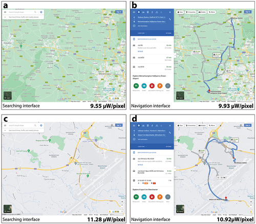
The impacts of the user interface and interaction on the energy consumption of displays are threefold. Currently, digital maps tend to have at least some interactivity, with users often expecting ‘slippy’ map functionality with the operators pan, zoom, and retrieve (Roth Citation2013). Further, visual affordance and feedback (e.g., highlighting, tooltips, breadcrumbs, etc.) in the design are often necessary to help users discover the interaction operators and perceive the state of the interaction (Roth, Ross, and MacEachren Citation2015). Each additional operator and operator affordance/feedback increases the mutability of the map display, and accordingly the energy consumed by the display. Second, many interaction operators allow the user to change the map content itself (e.g., search, filter, calculate) or map styling (e.g., reexpress, resymbolize, overlay) which changes the visual hierarchy and information density and thus the energy needed to render the new map. Third, the screen footprint and visual design of user interface controls also impacts the level of energy consumed on digital maps. As shown in , activation of he Google Maps navigation interface increases energy consumption ue to the mostly white background. However, the cumulative effect of different interface designs on energy consumption might differ based on how the map also is updated as a result of the interaction, as shown in .
Figure 13. A comparison of the energy consumption of maps with different interfaces: searching interface (a) and (c); navigation interface (b) and (d).
Interaction operators that change the map content often trigger backend data access and query operations, which consume extra energy through data processing and transmission. For instance, panning and zooming require querying of data previously out of view, particularly for ‘hamburger’ cartography where custom vector layers are overlaid slippy basemaps. Filter and calculate interaction operators also may require advanced spatial analysis operations, such as spatial buffers and joins, again triggering computing- and I/O-intensive database queries. A common use case is navigation with routing services, which requires extremely computationally-intensive road network analysis. For example, when using a quad-tree to retrieve map tiles, its algorithm complexity is O (log N); when using Dijkstra’s shortest path algorithm for routing, its algorithm complexity could be O (N2) (Xu and Zhou Citation2016).
How does the map-use context impact the carbon footprint?
Griffin et al. (Citation2017) identified a series of use context considerations for map design. In the following, we follow their framework with several extensions to discuss how the map-use context impacts the energy consumption of digital maps.
User characteristics
User characteristics impact map content selection and map form design, particularly for general-purpose digital maps that need to be accessible for the widest range of user abilities and preferences possible. First, spatial ability impacts content selection, potentially leading to different levels of energy consumption. For example, users navigating in an unfamiliar environment may rely on the map more, and therefore need more overall map content and maps with more iconic symbols and dense labels. Further, experienced or expertized readers can derive meaning from highly abstracted basemaps, such as contour maps, while less-experienced readers may prefer realistic representations, such as colour-shaded terrain maps.
Second, disability can impact the energy-aware solutions used to reduce consumption. For instance, approximately 10% of the male population and 1% of the female population have some form of colour vision impairment (Ware Citation2019), and colour vision acuity declines for everyone with age. Additionally, users with myopia may require maps with relatively larger icons and labels. Visual variables, such as colour and size, therefore, should be carefully designed so that they are accessible to audiences with visual impairment. Further, interfaces and interactions also are impacted by disability. For example, map designers can support auditory or tactical modalties for interactive input and display, such as voice control, keyboard navigation, and other spatial and embodied interactions (Roth et al. Citation2024).
Third, user preferences can have a substantial impact on the ultimate energy consumption of a digital map. For instance, colours have different cross-cultural and regional implications, with some energy-aware colour schemes losing important connotative meaning (Wu, Sun, and Li Citation2021). Users’ preferences also may evolve over time through education or training. For example, children may prefer highly saturated colours while their visual perception develops ith this preference shifting towards more muted colours in adulthood.
Environmental conditions
Many environmental factors also impact optimal map content and form. First, the environmental lighting conditions impacts the requisite contrast needed to effectively discriminat the map design. For example, mobile digital maps can be used in indoor and outdoor, with different brightness and audio levels needed as the user moves between environments.
Second, there are a range of environmental signage, obstacles, and other artifacts that split the user’s attention away from the map. For example, users should only glance briefly at digital maps supporting navigation while driving, requiring a potentially energy-hungry visual hierarchy with multimodal output to deliver essential information quickly and reliably. In the worst case scenario, the digital map might acutal distract users from environmental hazards, jeopardizing their personal safety (Roth et al. Citation2018).
A third environmental factor is the device on which the digital map is displayed. The size and resolution of the screen display directly impacts the demand for energy from the device. While maps on mobile devices tend to be small in size, maps on static devices (such as desktops and especially display walls) continue to increase in their available size and energy demand. However, while mobile maps consume less energy on display due to their smaller size, they may be equipped with additional sensors, such as GPS, barometer, comparss, gyroscope, etc. These sensors enrich map content and the overall user experience, but also require energy collecting, processing, and displaying the sensed information. For example, maps on smartphones draw from these sensors to enable egocentric views using oblique projections that reposition forward as up on the map as the user moves (Meng Citation2005), all of which requires considerable additional energy.
Activity
Map-use activity describes the main user tasks performed with a map (e.g., wayfinding, data exploration), with the complexity of the activity typically impacting the resulting energy consumption. First, different map-use activities require different kinds of content, and require updates to this content at different frequencies. For instance, wayfinding by automobile is improved with traffic information updated in real-time, which has an energy cost with the data collection, processing, transmission, and real-time display rendering.
Second, the map-use activity also influences the map form. The given activity determines if the reference or thematic maps are more apropriate, if thematic how many maps are needed to support storytelling, analysis, exploration, etc., and how complex the interface needs to be for users to change supplied maps (after MacEachren Citation1994).
Third, the map-use activity involves another important factor in energy consumption: the time duration of usage. For example, checking a weather map may take just a few seconds, navigation while driving may last an hour or more, and real-time traffic maps at an urban all centre may be used around the clock.
Future research directions
As we present in , we organize the discussion of green cartography into four dimensions: content, form, use context and carbon footprint. Accordingly, there are three major strategies to make greener maps: (1) reorganize the map content to save energy; (2) adjust the map form to reduce energy; and (3) refine the map-use context to be energy-aware. In the following, we explore some possible ways of designing greener maps with each strategy.
Reorganize map content to save energy
Big Question 1: How can maps be generalized to save energy?
Considerable efforts have been made for map generalization from the perspective of quality (e.g., topology preservation [Sun Citation2013]) and algorithm efficiency (e.g., hardware acceleration [Renhart Citation2010]), but discussion from the perspective of energy consumption is limited. There are two key differences between the existing discussion of map generalization and the discussion of energy-awaremap generalization. First, energy-aware generalization requires consideration not just of the input geospatial data (as typical with automated generalization), but also of the output map render, and therefore requires generalization techniques that cross both content and form. In other words, removing map features does not necessarily reduce energy consumption, but removing bright pixels does. So, how can map generalization operators be applied to reduce energy while considering both mapping data and map design decisions? Second, map generalization for energy reduction in itself is computationally-expensive. Therefore, what is the optimal trade-off between the extra energy cost of applying energy-aware generalization techniques against the actual intended reduction of energy consumption?
Big Question 2: How can the geography of the map be used to save energy?
As discussed above, vector tiling techniques are now widely used to generalize ‘slippy’ web maps that support panning, zooming, and detail retrieval across multiple scales (Sack and Roth Citation2017), however rendering and storing custom tiles across 20+ scales for the entire world is computationally-intensive and requires large amounts of energy. The total tile count exponentially increases with the zoom level, reaching 5,162,405,825,568 unique tiles at zoom level 21. Geographic patterns of map-use behaviour can be used to reduce the total tiles that are rendered and the amount of storage space needed for these tiles. For example, only 32.7%, 6.7% and 0.9% of tiles contain map-like geographic features at zoom levels 14, 16, and 18 (Wiki Citation2020). In other words, the majority of tiles are ‘blank’, containing nothing of interest and suggesting an opportunity to design an energy-aware geospatial data model for vector tiling that considers the geography of interest for a given map-use context.
We identify at least two subquestions warranting further investigation: (1) how can geographic patterns of map use be leveraged to render only tiles of interest? (2) how can specific map locations or regions be prioritized for map tiling under time (e.g., first response, real-time decision making), bandwidth (e.g., emergency or wilderness use contexts), and energy constraints (e.g., low battery mode)?
Big Question 3: How can the similarity among map content be used to save energy?
Similarity among map features also can be used to remove redundancy to the end of saving energy. Similarity widely exists in geospatial data (McIntosh and Yuan Citation2005; Schwering Citation2008), suggesting that redundancy also widely exists in geospatial data processing and rendering. For instance in proportional symbol mapping, point features in the same group share the same shape and colour, but point features in different groups still share the same symbol shape. Wu et al. (Citation2020) proposed a similarity-enhanced method to comprehensively predict and avoid computational and data redundancies in early stages of the visualization pipeline to improve the energy efficiency of the ultimate map render. Beyond computational and data redundancies in map rendering, redundancy also exists in tiling maps between adjacent zoom levels. For instance, when tiles are loaded at a certain zoom level, any unchanged tiles at adjacent scales are disposable.
We identify at least two subquestions warranting further investigation: (1) How can similarity be used to remove data redundancies among tiles to minimize storage needs? (2) How can similarity across scales be used for progressive transition between zoom levels?
Adjust map form to save energy
Big Question 4: How can the visual and dynamic variable syntactics be extended to save energy?
Visual variable syntactics presents a knowledge structure for using visual variables, such as shape, size, colour hue, color value, etc., to encode the underlying data’s level of measurement (Bertin Citation1967/1983/1983; MacEachren Citation1995). Cartographers similarly organize dynamic variables, which include display date, duration, order, rate-of-change, frequency, and synchronizatio, based on qualitative versus quantitative information (DiBiase et al. Citation1991; MacEachren Citation1995). However, the carbon footprint for each visual and dynamic variable has not been addressed within these syntactical frameworks. For instance, Dong and Zhong (Citation2012) found that energy consumption is linearly correlated with the size of a symbol, but not with its orientation or shape. Further, colourless (darker) and compact graphics (occupying fewer pixels) generally consume less energy. Understanding the relative carbon footprint for each visual and dynamic variable in a range of map use contexts could lead to an enhanced, energy-aware syntactics informing the selection of different sign vehicles during design.
Accordingly, we identify four subquestions needed for an energy-aware syntactics of the visual and dynamic variables (1) Can the energy consumption of each visual and dynamic variable be predictably calculated across map use contexts? (2) How should the visual and dynamic variables be recoupled to the data level of measurement or other design considerations to save energy? (3) How can iconic symbols reduce their carbon footprint while retaining unique cultural meanings and pluralistic design practices? (4) How can established colour schemes and symbol sets be modified to save energy?
Big Question 5: How can thematic maps be redesigned to save energy?
As shown in , applying different thematic mapping techniques, such as dot density, proportional symbol, isarithmic, and choropleth, to the same underlying data results in substantially different amounts of energy consumption. The choice of thematic map canonically is related to the spatial distribution (e.g., continuous vs. discrete) and variation (e.g., abrupt and smooth) of the mapped phenomena, but the carbon footprint for each technique also needs consideration. The Further, design decisions within each thematic map type (e.g., classification, normalization, scaling, interpolation) also require research on their energy consumption in order to realize greener thematic maps.
We identify two subquestions warranting further investigation: (1) How do data characteristics such as distribution, density, dimensionality, etc., impact the energy consumed by thematic maps? (2) How should recommendations for selecting and designing different thematic map types be revised to save energy?
Big Question 6: How can map interfaces and interactions be designed to save energy?
Energy-aware interfaces in general have received much attention in computer graphics (e.g., Harter et al. Citation2004; Iyer et al. Citation2003; Ranganathan et al. Citation2006). One common strategy is to selectively dim the screen according to the interaction context: when the user is off the interface, the screen can be dimmed (Dalton and Ellis Citation2003); elements and regions that are out of focus in the interaction can be dimmed (Moshnyaga and Morikawa Citation2005); and elements and regions that are less relevant to the interaction can also be dimmed (Harter et al. Citation2004). Accordingly, such interface dimming solutions need to be adapted to digital map interfaces often used actively while moving through the depicted environment.
The interface can also be adapted to reduce energy consumption. For instance, the interface style, such as the light or dark mode, can be refined to save energy. Further, the interface scope and freedom also can adapt to constrain energy-hungry interaction operators, or reduce the number of ways a given operator can be performed (Roth et al. Citation2017).
Moreover, interaction with operators involves computing, data retrieval, and transmission. How can the energy consumption of interaction operators be estimated? UI designers should take this into consideration, especially in multilayered UIs where some operators are hidden to start.
However, what is the optimal compromise between energy-aware map interfaces and the utility, usability, and satisfaction of the user experience?
Refine the map-use context to save energy
Big Question 7: How can the carbon footprint be reduced in different map-use contexts?
In practice, content and form can be adapted with consideration of the map-use context. Mathematically, many efforts treat the adaptation process as an optimization problem between the total energy saved and factors. For instance, Chuang, Weiskopf, and Möller (Citation2009) and Wang et al. (Citation2012) model energy consumption as a cost function. More recently, Han, Wu, and Roth (Citation2021) formalized the problem of adjusting the map colour to save energy as a constrained searching problem: energy consumption is organized as the objective function, and maintaining the semantic relationship is modelled as the search constraints. More carbon footprint considerations are discussed in Section 3, such as visual hierarchy, symbolization and typography.
When compromising among content, form, and the carbon footprint, two general types of solutions can be identified based on which consideration should be weighed more. First, the specific map-use context may impact the direction and level of trade-offs between content and form; the relevant context factors may be the top concern rather than the carbon footprint. For example, when using maps in a cooperative context in which multiple users need to share a common map, if individual users use maps with different visual look adjustments, undesired misunderstandings may be introduced; in detection tasks that change (e.g., finding new restaurants in a navigation map), the different information densities in differently compromised maps may also lead to incorrect conclusions. In this case, consistency is needed and should be prioritized over energy savings. Thus, a question arises as to how to make a trade-off between content, form, and the carbon footprint based on a specific map-use context.
Second, we believe that users should have the freedom to choose their priorities when making a trade-off between content, form and the carbon footprint based on their specific needs and preferences; however, energy reduction can still be a prioritized objective, especially when battery life is quite limited. Imagine that you have arrived in an unfamiliar city, and now, you desperately need to use your navigation maps, but the device will be out of power. In this case, energy consumption should be minimised, as with deep power down mode. Accordingly, what considerations for energy-aware map content and form can be exposed to users as customizable settings?
Big Question 8: How does energy-aware design impact digital map reading?
Energy-aware maps can absolutely help to save energy, but they may not contribute to improving the quality of maps. Generally, energy-aware maps tend to be darker, as black consumes the least amount of energy. Light and dark modes may set up quite different background moods for map reading; they may also provoke different emotions with map reading. Taking white and black as two extremes, white feels fresh and clean, which may evoke a sense of youth and modernity, and black feels mysterious and even ominous. Energy-aware colour, symbolization, and typography design also influence the aesthetics of maps. Those affective and aesthetic influences should be carefully addressed, as they influence our cognition and behaviour (Wassiliwizky and Menninghaus Citation2021), even though they are introduced as byproducts. One question is how green maps influence readers’ affective and aesthetic responses.
Further, energy-aware design also influences visual perception. While people with impaired vision tend to perform better in dark mode (Sloan Citation1977), general user performance is better in light mode (but is also associated with long-term costs, such as myopia) (Aleman, Wang, and Schaeffel Citation2018). Studies in ergonomics and vision show that the light mode can obtain a greater depth of field (a narrower depth of field leads to more blurring) and better performance on visual acuity and glance-reading tasks (Dobres, Chahine, and Reimer Citation2017; Piepenbrock et al. Citation2013). Do greener maps hinder or improve map-reading fatigue? Do greener maps hinder or improve their glanceability for quick use? Generally, how do energy-aware maps impact our perception and the quality of map communication, and what decline in performance is acceptable to offset carbon emissions?
Big Question 9: How can the attitude of using energy-aware maps be improved to save energy?
Thus far, we have discussed making energy-aware maps and the quality of green maps without considering individual, organizational, and social attitudes towards using green maps. Although the energy consumption of a single map-use activity is rather small, it will accumulate over billions of computing devices. In other words, environmentally-friendly organizational and social practices are needed, suggesting a gap between the method of making green maps and the end user’s attitude towards using green maps. For example, we may be asked in a supermarket whether we prefer paper or plastic bags to carry our purchased items, as paper and plastic bags have different, generally-known impacts on the environment. How do we cultivate such paper-or-plastic, awareness for digital maps, and shift attitudes towards the greener options for map design and use?
Individuals’ attitudes towards a thing will influence their behaviour and cognition regarding the thing (Breckler Citation1984; Jain Citation2014). Green attitudes have drawn much attention in social psychology and, recently, in IT. For example, Ojo et al. (Citation2019) discussed ‘how do individual, organizational, and social factors influence employees’ green information technology (GIT) beliefs and their attitude towards GIT practices’. To that end, attitudes towards energy-aware maps can be considered in terms of three aspects: the effect of green maps (e.g. ‘I feel pleasure/sadness when I use green maps’), behaviour related to green maps (e.g. ‘I use energy-saving mode as the default’), and cognition related to green maps (e.g. ‘I believe that energy-saving maps can help to reduce greenhouse gas emissions and therefore contribute to environmental sustainability’).
Accordingly, two subquestions can be identified: (1) How can individual, organizational, and social attitudes be shaped to bridge the gap between designing and using greener maps? (2) How can emotions towards, behaviours with, and reasoning about energy-aware maps be improved to enable uptake of greener maps?
As summarized in , we explored nine possible big research questions on how to make green maps with detailed subquestions. Beyond this outline, we believe that more questions could be pursued for green cartography.
Table 1. Summary of big questions and subquestions on how digital maps can be greener.
Summary
As environmentally-sustainable development is now an urgent concern worldwide, we introduced a four-dimensional conceptual framework that encourages aligned map design for energy awareness. As we present in , we proposed a content-form-use context-carbon footprint conceptual framework to investigate how map design decisions impact energy consumption. We find that almost all map design decisions are linked with energy consumption, from map content organization (e.g., generalization, classification, sampling) to design (e.g., projection, symbols, colour, typography, visual hierarchy, interface and interaction) to use context (e.g., target users, devices, environments, and map-use activities).
We then discussed the possible ways in which digital maps can be greener, with three major strategies: (1) reorganizing the map content to save energy; (2) redesigning the map form to reduce energy; and (3) refining the map-use context to reduce energy. We outlined nine research questions regarding the above three major ways of being greener, including a number of detailed subquestions that, taken together, represent an emergent research agenda for green cartography.
To summarize, the carbon footprint should be considered a critical dimension to design maps; digital maps, as a digital tool, can also play an important role in increasing environmental responsibility. We assert that green cartography not only requires novel techniques to be greener but also requires that more attention be paid to shaping environmentally-friendly attitudes and individual, organizational and social behavioural change regarding designing, publishing and using digital maps. A number of allied fields are now taking up green computing, and we argue that cartography must follow suit. The research agenda and constituent ‘big’ research questions presented here offer some of many important ways that cartography can directly contribute to environmentally-sustainable development.
Acknowledgements
We wish to express my sincere appreciation to the anonymous reviewers for their valuable feedback and constructive comments, which greatly improved the quality of this paper.
Disclosure statement
No potential conflict of interest was reported by the author(s).
Data availability statement
Data available upon request from the authors.
Correction Statement
This article has been corrected with minor changes. These changes do not impact the academic content of the article.
Additional information
Funding
References
- Abraham, L. 2019. “Where do we go from here? Understanding mobile map design.” Master’s thesis, University of Wisconsin-Madison. UW-Madison Department of Geography. http://digital.library.wisc.edu/1793/79642.
- Aleman, A., M. Wang, and F. Schaeffel. 2018. “Reading and Myopia: Contrast Polarity Matters.” Scientific Reports 8 (1): 10840. https://doi.org/10.1038/s41598-018-28904-x.
- Andrae, A. S. G., and T. Edler. 2015. “On Global Electricity Usage of Communication Technology: Trends to 2030.” Challenges 6 (1): 117–157. https://doi.org/10.3390/challe6010117.
- Belkhir, L., and A. Elmeligi. 2018. “Assessing ICT Global Emissions Footprint: Trends to 2040 & Recommendations.” Journal of Cleaner Production 177:448–463. https://doi.org/10.1016/j.jclepro.2017.12.239.
- Bertin, J. 1967/1983. Semiology of Graphics: Diagrams, Networks, Maps. translated by W. J. Berg. Madison, WI: University of Wisconsin Press. ( translated by).
- Breckler, S. J. 1984. “Empirical Validation of Affect, Behavior, and Cognition as Distinct Components of Attitude.” Journal of Personality and Social Psychology 47 (6): 1191–1205. https://doi.org/10.1037/0022-3514.47.6.1191.
- Brewer, C. A., G. W. Hatchard, and M. A. Harrower. 2003. “ColorBrewer in Print: A Catalog of Color Schemes for Maps.” Cartography and Geographic Information Science 30 (1): 5–32. https://doi.org/10.1559/152304003100010929.
- Chow, T. E., Y. Choi, M. Yang, D. Mills, and R. Yue. 2021. “Geographic Pattern of Human Mobility and COVID-19 Before and After Hubei Lockdown.” Annals of GIS 27 (2): 127–138. https://doi.org/10.1080/19475683.2020.1841828.
- Chuang, J., D. Weiskopf, and T. Möller. 2009. “Energy Aware Color Sets.” Computer Graphics Forum 28 (2): 203–211. https://doi.org/10.1111/j.1467-8659.2009.01359.x.
- Dalton, A. B., and C. S. Ellis. 2003. “Sensing User Intention and Context for Energy Management.” Proceedings of the 9th conference on Hot Topics in Operating Systems. HotOS 151–156. http://dl.acm.org/citation.cfm?id=1251054.1251080.
- Dalvi-Esfahani, M., Z. Alaedini, M. Nilashi, S. Samad, S. Asadi, and M. Mohammadi. 2020. “Students’ Green Information Technology Behavior: Beliefs and Personality Traits.” Journal of Cleaner Production 257:120406. https://doi.org/10.1016/j.jclepro.2020.120406.
- De Sherbinin, A., A. Bukvic, G. Rohat, M. Gall, B. McCusker, B. Preston, A. Apotsos, et al. 2019. “Climate vulnerability mapping: A systematic review and future prospects.” Wiley Interdisciplinary Reviews Climate Change 10 (5): e600. https://doi.org/10.1002/wcc.600.
- DiBiase, A., T. M. Tse, I. Schnittger, L. Wexler, E. B. Stinson, and H. A. Valantine. 1991. “Frequency and Mechanism of Bradycardia in Cardiac Transplant Recipients and Need for Pacemakers.” The American Journal of Cardiology 67 (16): 1385–1389. https://doi.org/10.1016/0002-9149(91)90469-2.
- Dobres, J., N. Chahine, and B. Reimer. 2017. “Effects of Ambient Illumination, Contrast Polarity, and Letter Size on Text Legibility Under Glance-Like Reading.” Applied Ergonomics 60:68–73. https://doi.org/10.1016/j.apergo.2016.11.001.
- Dong, M., and L. Zhong. 2012. “Power Modeling and Optimization for OLED Displays.” IEEE Transactions on Mobile Computing 11 (9): 1587–1599. https://doi.org/10.1109/TMC.2011.167.
- EIA. 2023. Accessed April 8, 2023. https://www.eia.gov/international/data/world/electricity/electricity-consumption?pd=2&p=0000002&u=0&f=A&v=mapbubble&a=&i=none&vo=value&&t=C&g=00000000000000000000000000000000000000000000000001&l=249-ruvvvvvfvtvnvv1vrvvvvfvvvvvvfvvvou20evvvvvvvvvvnvvvs0008&s=315532800000&e=1609459200000.
- Fish, C. S. 2020. “Cartographic Content Analysis of Compelling Climate Change Communication.” Cartography and Geographic Information Science 47 (6): 492–507. https://doi.org/10.1080/15230406.2020.1774421.
- Green, M. A. 2012. “Mapping Inequality in London: A Different Approach.” The Cartographic Journal 49 (3): 247–255. https://doi.org/10.1179/1743277412Y.0000000018.
- Griffin, A. L., T. White, C. Fish, B. Tomio, H. Huang, C. R. Sluter, and P. Picanço. 2017. “Designing Across Map Use Contexts: A Research Agenda.” International Journal of Cartography 3 (Suppl.1): 90–114. https://doi.org/10.1080/23729333.2017.1315988.
- Han, Y., M. Wu, and R. E. Roth. 2021. “Toward Green Cartography & Visualization: A Semantically-Enriched Method of Generating Energy-Aware Color Schemes for Digital Maps.” Cartography and Geographic Information Science 48 (1): 43–62. https://doi.org/10.1080/15230406.2020.1827040.
- Harter, T., S. Vroegindeweij, E. Geelhoed, M. Manahan, and P. Ranganathan. 2004. “Energy-aware user interfaces: an evaluation of user acceptance.” Proceedings of the SIGCHI conference on Human factors in computing systems 199–206. https://doi.org/10.1145/985692.985718.
- Hoarau, C. 2011. “Reaching a Compromise Between Contextual Constraints and Cartographic Rules: Application to Sustainable Maps.” Cartography and Geographic Information Science 38 (2): 79–88. https://doi.org/10.1559/1523040638279.
- Iyer, S., L. Luo, R. N. Mayo, and P. Ranganathan. 2003. “Energy-Adaptive Display System Designs for Future Mobile Environments.” Proceedings of the 1st international conference on Mobile systems, applications and services 245–258. https://doi.org/10.1145/1066116.1189045.
- Jain, V. 2014. “3D MODEL OF ATTITUDE.” International Journal of Advanced Research in Management and Social Sciences 3 (3): 1–12.
- Kelly, M. 2020. “Feminist Mapping: Content, Form, and Process.” PhD diss., University of Wisconsin–Madison.
- Kraak, M. J., R. E. Roth, B. Ricker, A. Kagawa, and G. L. Sourd. 2020. Mapping for a Sustainable World. New York, NY: United Nations/International Cartographic Association. https://digitallibrary.un.org/record/3898826?ln=en.
- Kumar, A., Y. Kalra, W. W. Guan, V. Tibrewal, R. Batta, and A. Chen. 2021. “COVID-19 Impact on Excess Deaths of Various Causes in the United States.” Annals of GIS 28 (4): 457–478. https://doi.org/10.1080/19475683.2021.1982001.
- Lam, N. S. N. 1983. “Spatial Interpolation Methods: A Review.” The American Cartographer 10 (2): 129–150. https://doi.org/10.1559/152304083783914958.
- Lan, Y., W. Tang, S. Dye, and E. Delmelle. 2020. “A Web-Based Spatial Decision Support System for Monitoring the Risk of Water Contamination in Private Wells.” Annals of GIS 26 (3): 293–309. https://doi.org/10.1080/19475683.2020.1798508.
- MacEachren, A. 1994. “Visualization in Modern Cartography: Setting the Agenda.” In Visualization in Modern Cartography, edited by D. R. Alan MacEachren and F. Taylor, 1–12. Elsevier. https://doi.org/10.1016/B978-0-08-042415-6.50008-9.
- MacEachren, A. M. 1994. “Visualization in Modern Cartography: Setting the Agenda”. In Visualization in Modern Cartography, In edited by A. M. MacEachren and D. R. F. Taylor, 1–12. Pergamon 28 (1). https://doi.org/10.1016/B978-0-08-042415-6.50008-9.
- MacEachren, A. M. 1995. How Maps Work: Representation, Visualization, and Design. New York, NK: Guilford Press.
- Malmodin, J., and D. Lundén. 2018. “The Energy and Carbon Footprint of the Global ICT and E&M Sectors 2010–2015.” 5th International Conference on Information and Communication Technology for Sustainability, Toronto, ON, Canada, May 14-18. https://doi.org/10.2991/ict4s-16.2016.25.
- Marchetti, Y., H. Nguyen, A. Braverman, and N. Cressie. 2018. “Spatial Data Compression via Adaptive Dispersion Clustering.” Computational Statistics & Data Analysis 117:138–153. https://doi.org/10.1016/j.csda.2017.08.004.
- McIntosh, J., and M. Yuan. 2005. ““Assessing Similarity of Geographic Processes and Events.” Transactions in GIS 9 (2): 223–245. https://doi.org/10.1111/j.1467-9671.2005.00214.x.
- Meng, L. (2005). Egocentric Design of Map-Based Mobile Services. The Cartographic Journal, 42(1), 5–13. https://doi.org/10.1179/000870405X57275.
- Mingay, S., and D. Pamlin 2008. “Assessement of Global Low-Carbon and Environmental Leadership in the ICT Sector, by Gartner and WWF.” Gartner Inc. Tillgänglig Online. Accessed October 14, 2021. https://www.fujitsu.com/downloads/SVC/fs/whitepapers/assessmentenvironmental-leadership-gartner.pdf.
- Moshnyaga, V. G., and E. Morikawa. 2005. “LCD Display Energy Reduction by User Monitoring.” Proceedings of the International Conference on Computer Design 94-97. IEEE. https://doi.org/10.1109/ICCD.2005.69.
- Myers, D. E. 1994. “Spatial Interpolation: An Overview.” Geoderma 62 (1–3): 17–28. https://doi.org/10.1016/0016-7061(94)90025-6.
- Ojo, A. O., M. Raman, and A. G. Downe. 2019. “Toward Green Computing Practices: A Malaysian Study of Green Belief and Attitude Among Information Technology Professionals.” Journal of Cleaner Production 224 (24): 246–255. https://doi.org/10.1016/J.JCLEPRO.2019.03.237.
- Pappenberger, F., H. L. Cloke, and C. A. Baugh. 2019. “Cartograms for Use in Forecasting Weather-Driven Natural Hazards.” The Cartographic Journal 56 (2): 134–145. https://doi.org/10.1080/00087041.2018.1534358.
- Peuquet, D. J. 1994. “It’s About Time: A Conceptual Framework for the Representation of Temporal Dynamics in Geographic Information Systems.” Annals of the Association of American Geographers 84 (3): 441–461. https://doi.org/10.1111/j.1467-8306.1994.tb01869.x.
- Piepenbrock, C., S. Mayr, I. Mund, and A. Buchner. 2013. “Positive Display Polarity is Advantageous for Both Younger and Older Adults.” Ergonomics 56 (7): 1116–1124. https://doi.org/10.1080/00140139.2013.790485.
- Ranganathan, P., E. Geelhoed, M. Manahan, and K. Nicholas. 2006. “Energy-Aware User Interfaces and Energy-Adaptive Displays.” Computer 39 (3): 31–38. https://doi.org/10.1109/MC.2006.89.
- Renhart, Y. 2010. Fast Map Rendering for Mobile Devices. Gothenburg: University of Gothenburg.
- Robinson, A. 2017. Geovisual Analytics. edited by John P. Wilson. The Geographic Information Science & Technology Body of Knowledge (3rd Quarter 2017 Edition). https://doi.org/10.22224/gistbok/2017.3.6.
- Robinson, A. H., J. L. Morrison, P. C. Muehrcke, A. J. Kimerling, and S. C. Guptill. 1984. Elements of Cartography. New York: John Wiley and Sons.
- Roth, R. E. 2013. “Interactive Maps: What We Know and What We Need to Know.” Journal of Spatial Information Science 6 (6): 59–115. https://doi.org/10.5311/JOSIS.2013.6.105.
- Roth, R. E., A. Çöltekin, L. Delazari, B. Denney, A. Mendonça, B. Ricker, J. Shen, Z. Stachoň, and W. Mingguang. 2024. “Making Maps & Visualizations for Mobile Devices: A Research Agenda for Mobile-First and Responsive Cartographic Design.” Journal of Location Based Services. doi:10.1080/17489725.2023.2251423.
- Roth, R. E., A. Çöltekin, L. Delazari, H. F. Filho, A. G. Riffin, A. H. All, J. Korpi, et al. 2017. “User Studies in Cartography: Opportunities for Empirical Research on Interactive Maps and Visualizations.” International Journal of Cartography 3 (sup1): 61–89. https://doi.org/10.1080/23729333.2017.1288534.
- Roth, R. E., K. S. Ross, and A. M. MacEachren. 2015. “User-Centered Design for Interactive Maps: A Case Study in Crime Analysis.” ISPRS International Journal of Geo-Information 4 (1): 262–301. https://doi.org/10.3390/ijgi4010262.
- Roth, R. E., S. Young, C. Nestel, C. Sack, B. Davidson, J. Janicki, and G. Zhang. 2018. “Global landscapes: Teaching globalization through responsive mobile map design.” The Professional Geographer 70 (3): 395–411. https://doi.org/10.1080/00330124.2017.1416297.
- Ruas, A., and H. Pham. 2015. “Symbolization and Generalization to Map Water Pipe Data Flow and Water Quality at Different Scales.” The Cartographic Journal 52 (2): 149–158. https://doi.org/10.1080/00087041.2015.1119465.
- Russell, E. 2023. “9 Things to Know About Google’s Maps Data: Beyond the Map. Google Cloud.” Accessed September 5, 2023. https://cloud.google.com/blog/products/maps-platform/9-things-know-about-googles-maps-data-beyond-map.
- Sack, C. M., and R. E. Roth. 2017. “Design and evaluation of an Open Web Platform cartography lab curriculum.” Journal of Geography in Higher Education 41 (1): 1–23. https://doi.org/10.1080/03098265.2016.1241987.
- Schwering, A. 2008. “Approaches to Semantic Similarity Measurement for GeoSpatial Data: A Survey.” Transactions in GIS 12 (1): 5–29. https://doi.org/10.1111/j.1467-9671.2008.01084.x.
- Sloan, L. L. 1977. Reading Aids for the Partially Sighted: A Systematic Classification and Procedure for Prescribing. Baltimore, MD: Williams & Wilkins.
- Sluter, C. R., S. P. Camboim, A. L. Iescheck, L. B. Pereira, M. C. Castro, M. M. Yamada, and V. S. Araújo. 2018. “A Proposal for Topographic Map Symbols for Large-Scale Maps of Urban Areas in Brazil.” The Cartographic Journal 55 (4): 362–377. https://doi.org/10.1080/00087041.2018.1549307.
- Sun, S. 2013. “An Optimized Rubber-Sheet Algorithm for Continuous Area Cartograms.” The Professional Geographer 65 (1): 16–30. https://doi.org/10.1080/00330124.2011.639613.
- Su, J., W. Wang, and S. Tang. 2023. “The Spatial Spillover Effect of ICT Development Level on Regional CO2 Emissions.” Scientific Reports 13 (1): 7690. https://doi.org/10.1038/s41598-023-34573-2.
- United Nations General Assembly. 2015. Transforming Our World: The 2030 Agenda for Sustainable Development. New York, NY: United Nations.
- Vaaraniemi, M., M. Treib, and R. Westermann. 2011. “High-Quality Cartographic Roads on High-Resolution DEMs.” Journal of WSCG 19:41–48. https://hdl.handle.net/11025/1248.
- Verto Analytic. 2020. “Leading US Map and Navigation Smartphone Apps, Ranked by Monthly Unique Users.” Aug 2019. Accessed September 5, 2023. https://www.insiderintelligence.com/chart/234831/leading-us-map-navigation-smartphone-apps-ranked-by-monthly-unique-users-aug-2019.
- Wang, J., X. Lin, and C. North. 2012. GreenVis: Energy-Saving Color Schemes for Sequential Data Visualization on OLED Displays. Virginia Polytechnic Institute & State University. http://infovis.cs.vt.edu/sites/default/files/WANG.pdf.
- Ware, C. 2019. Information Visualization: Perception for Design. Cambridge, MA: Morgan Kaufmann.
- Wassiliwizky, E., and W. Menninghaus. 2021. “Why and How Should Cognitive Science Care About Aesthetics?” Trends in Cognitive Sciences 25 (6): 437–449. https://doi.org/10.1016/j.tics.2021.03.008.
- Webb, M. 2008. “SMART 2020: Enabling the Low Carbon Economy in the Information Age. The Climate Group.” Accessed October 15, 2021. https://www.sustainabilityexchange.ac.uk/files/enabling_the_low_carbon_economy_in_the_information_age_1.pdf.
- Wiki. 2020. Accessed October 15, 2020. https://wiki.openstreetmap.org/wiki/Zoom_levels.
- Williams, J., and L. Curtis. 2008. “Green: The New Computing Coat of Arms?” IT Professional 10 (1): 12–16. https://doi.org/10.1109/MITP.2008.9.
- The World Bank. 2023. Accessed April 8, 2023. https://data.worldbank.org/indicator/SP.POP.TOTL?end=2021&start=2021.
- Wu, M., T. Chen, K. Zhang, Z. Jing, Y. Han, M. Chen, H. Wang, et al. 2018. “An Efficient Visualization Method for Polygonal Data with Dynamic Simplification.” ISPRS International Journal of Geo-Information 7 (4): 138. https://doi.org/10.3390/ijgi7040138.
- Wu, M., G. Lv, and L. Yuan. 2022. “Green Cartography and Energy-Aware Maps: Possible Research Opportunities.” In New Thinking in GIScience, 197–205. Singapore: Springer. https://doi.org/10.1007/978-981-19-3816-0_22.
- Wu, M., G. Lv, and K. Zhang. 2020. “A Similarity-Based Approach for Improving the Efficiency of Drawing Spatiotemporal Point Features.” The Cartographic Journal 57 (1): 57–69. https://doi.org/10.1080/00087041.2018.1500767.
- Wu, M., Y. Sun, and Y. Li. 2021. “Adaptive Transfer of Color from Images to Maps and Visualizations.” Cartography and Geographic Information Science 49 (4): 289–312. https://doi.org/10.1080/15230406.2021.1982009.
- Xia, J., C. Yang, and Q. Li. 2018. “Using Spatiotemporal Patterns to Optimize Earth Observation Big Data Access: Novel Approaches of Indexing, Service Modeling and Cloud Computing.” Computers, Environment and Urban Systems 72:191–203. https://doi.org/10.1016/j.compenvurbsys.2018.06.010.
- Xu, X., and J. Zhou. 2016. “Fast Implementation of City Optimal Path.” Proceedings of 2016 6th International Conference on Machinery, Materials, Environment, Biotechnology and Computer. https://doi.org/10.2991/mmebc-16.2016.2.