
ESTIMATING CROWD SIZE, both a priori and in real-time, is an essential element for planning, and maintaining, crowd safety in places of public assembly. Where major, city wide events are planned, there is often an associated bragging right and marketing hype that surrounds the estimated crowd size. In this article, we outline how to estimate crowd sizes, using crowd dynamics, and why the numbers are important to get right.
TIMES SQUARE
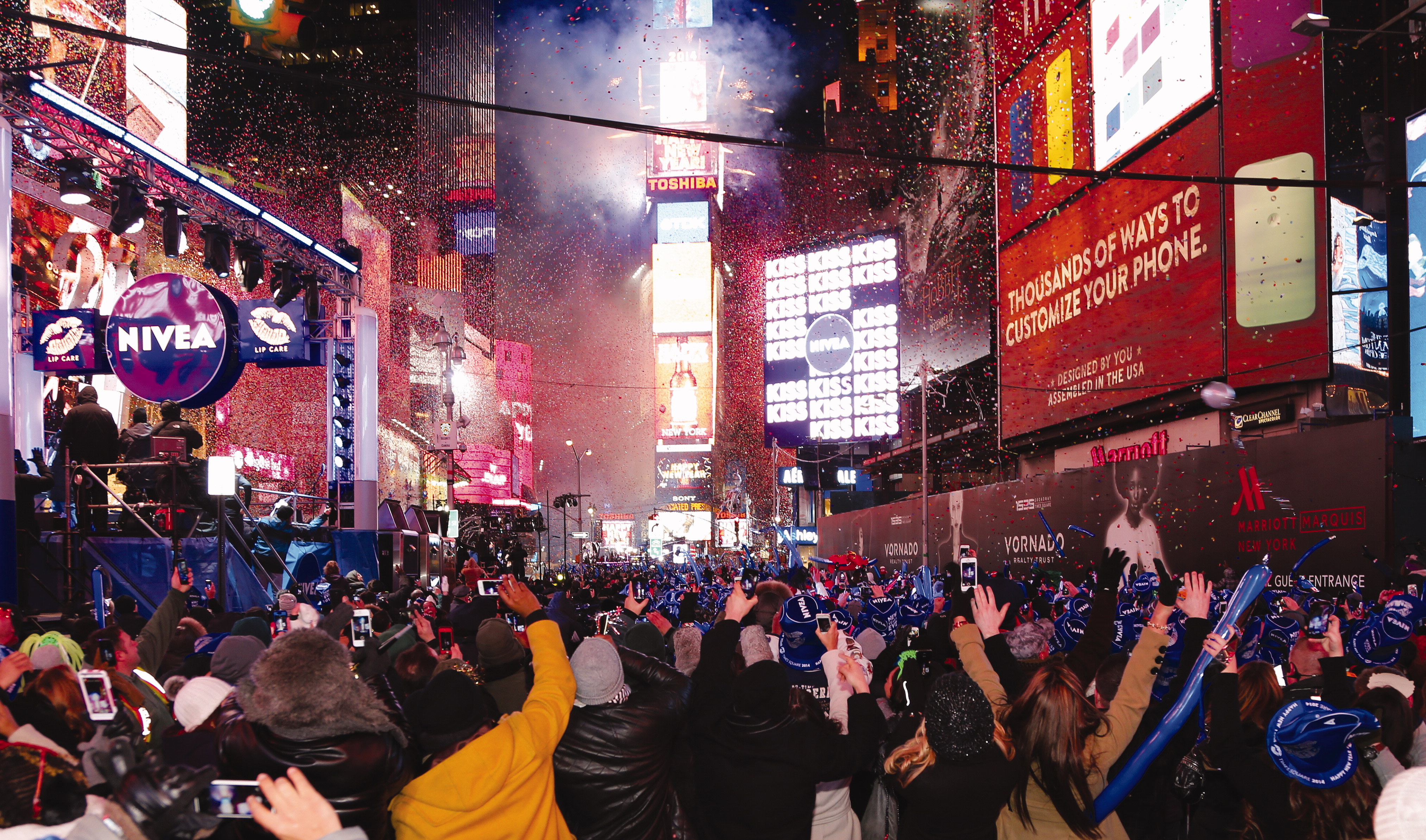
Late December 2016, I was asked by the Washington Post to assist with an article on the number of people attending the New Year Event in Times Square. They were claiming that over 2,000,000 people would be present in Times Square at the midnight moment. I was asked to evaluate the ‘safe’ capacity, and outline the methodology of how to evaluate capacity for this kind of major, city centre event. The article appeared on the 31st Dec 2016. Overestimating the crowd size is a common issue, and several cities have similarly overestimated their actual crowd attendance, which leads to further exaggeration and upwards estimates. Why is this a problem? Does it really matter?
How do you estimate attendance?
Let us consider the fundamentals of crowded spaces and the human ellipse. The projected area of an average person is approximately 50 cm × 30 cm (taking a 95-percentile average). If we assume close packing, in a row-by-row and orderly manner, then between 4 and 5 (average) people per square metre would be reasonable. (In the UK Guide to Safety at Sports Grounds, the maximum packing density of a viewing area is defined as 4.7 people per square metre).
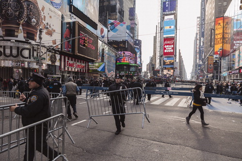
Using this as an approximation, we can easily define the area capacity of any place of public assembly. It is simply the area times 4.7 (people per square metre) as a maximum value. Of course, we need to factor safety into this, such as having walkways and barriers to prevent overcrowding at any specific point in the system, as seen in . As an estimate for area, we can use Google Earth Pro, which gives the total area available in Times Square as 8,557 square metres.
Figure 1 Preparing for new year celebrations in times square
Assuming this area could be packed to 4.7 people per square metre, the maximum capacity would be 4.7 × 8,557 square metres, i.e. 40,218 people. Of course, this does not include any safety considerations.
Crowd safety considerations
You simply do not pack people into these kinds of spaces like sardines. Barriers are used to create pens, between the pens there are spaces for emergency vehicles and crowd management/police/security. There are stages and other infrastructure in place. Places of public assembly also need monitoring for security as crowds can be a terrorist target, specifically for large public events such as Times Square at New Year.
As can be seen from various site images, there is evidence of planning for crowd safety and crowd management. There are barriers, with contingency spaces and media reports of controlled filling, pen-by-pen, to prevent any dangerous overcrowding. This means that the maximum capacity is less than 40,218 and far less than the Mayor’s public relations claim of 2,000,000 people.
Overestimating the crowd size is a common issue, and several cities have similarly overestimated their actual crowd attendance, which leads to further exaggeration and upwards estimates
Evaluating crowd capacity
Over the last 30 years of developing crowd safety and risk analysis tools, there is one recurring theme, one common set of questions I get asked. ‘If I don’t know how many people are coming to my event, how do I plan for crowd safety?’ You generally only need four fundamental bits of information to evaluate the answer to that question.
Routes – what direction will the crowd approach/depart the event space?
Areas – what areas are available for the crowd?
Movement – over what period of time do the crowds arrive/leave the site
People – what do you know of the profile of the crowd?
We call this a RAMP Analysis (Routes, areas, movement, people/profile), and use this for planning, risk assessment and evaluating real-time events. We can illustrate this using a well-known example from one of our projects.
TRUMP INAUGURATION
Following the Washington Post analysis of New Year in Times Square (2016/17), we were approached by the New York Times to give them some background on crowded spaces, and specifically, to estimate how many people were at Abraham Lincoln’s inauguration (in 1861, from a few historical images). Using the density count from those images, projecting the area using Google Earth Pro and anthropomorphic data from historical records (people were approximately 20% smaller back then), we could estimate, from very limited data, that there were approximately 250,000 people present. The New York Times then asked if we could do this in real-time for the Trump inauguration in 2017.
We had a few days to prepare for a real-time analysis and check the available data. Firstly, the areas for the crowds were shown on the White House websites. Including the screening points we had images of the main viewing area. There were routing maps published, how to get to the Washington Mall, with updates on any congestion/delays.
We knew we would also have live car park data posted on various social media sites. We also knew the Washington Metro would publish transit data at approximately 11am and we were monitoring social media for reports of any problems accessing the metro. Social media can be a useful indicator of the mood/profile of the crowd moving towards the site. This provided three independent sources of information for processing: car park fill rates, metro utilisation, reports of any delays. Coupled with the live TV coverage, showing the Mall filling, we had corroborating evidence that would support any real-time evaluation of crowd size.
The initial problem was the reality gap, a ‘huge’ reality gap, between the claims that there will be 3,000,000 people at the inauguration and the available area, packing density and transport capacity. We can make a simple a priori approximation for this. The ‘claims’ vastly exceeded the capacity, a story we were all too familiar with from other major events.
Inauguration crowd estimates (a priori)
The ticketed area for the inauguration was 65,000 square metres and the mall area was a little over 200,000 square metres. These spaces do not pack to capacity as people are viewing large screens and people leave spaces to facilitate viewing. For example, an aerial fireworks display would typically pack to 1–2 people per square metre and viewing large screens 2–3 people per square metre, etc.
When politician argue against facts, mathematics always wins in the end
Even at maximum safe capacity (4.7 people per square metre), this gives a maximum capacity of 1,245,500, far less than the claims of 3m. When politician argue against facts, mathematics always wins in the end.
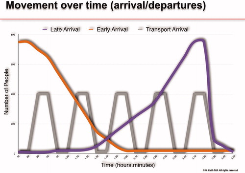
At this stage in the project, we had the basic information sources, all gathered within 12 hours. My colleague, Marcel Altenburg, and I set up 4 computers, recording the various live video feeds from the major news channels, had the New York Times reports on the site, taking photographs of key locations and data feeds from social media (including reports from the Secret Service of any queueing issues – there were none). Metro and Car park data provide a valuable insight as their filling rates are a pre-cursor to crowd movements. To explain that, we need to look at the ‘M’ in the RAMP Analysis, Movement over time. There are three fundamental arrival profiles for major events, early, transport limited, or late. To illustrate these, the ideal curves shown in give us a reference guide.
Figure 2 Three fundamental arrival profiles for major events
The initial problem was the reality gap, a ‘huge’ reality gap, between the claims that there will be 3,000,000 people at the inauguration and the available area, packing density and transport capacity
For example, the early arrival rate would be typical of a celebrity appearance, where getting the best position, close to the front of stage, is governed by how early you arrive on site. A late arrival event is typical of fireworks and football matches, where the transport capacity, parking, seating arrangements, are all well-travelled, and times are known in advance. The transport limited events, such as the Sydney Olympics, where you can only access the site via trains or buses, are a flatter, maximum transport capacity arrival profile. In essence, knowing what the curve looks like, how the transport system operates, can provide valuable insights to large scale events in city centres. We have deployed real-time fill predictors on a number of city-wide events. It’s not exactly rocket science, and the analysis of the network, the routes people take to the site, and (in many cases) reducing the options for ingress, to condition behaviour for egress (typically the crowd will exit using their ingress routes) are all part of the crowd sciences, using RAMP analysis.
For the inauguration, we didn’t know how this crowd might arrive on the site, but we had the video feeds from the Washington Memorial, which allowed us to monitor the crowd build up over time. We had live feeds from the car parks and the social media reports from the metro (no congestion). Using all three inputs, video, car parks and the Secret Service social media reports of site access, we had a clear image of how this site was filling in real-time. The curve was low, flat, not exponential, observed over several hours (from 6 hours prior to the speech at noon Washington time). To cut short a long afternoon of data gathering, analysis of area build up, car park fill rates, the results are presented in , which shows the relative areas from the Obama Crowds and Trump Crowds.
Figure 3 Areas occupied at the obama and trump inaugurations. Image © 2017 DigitalGlobe, Google
After 5 hours of monitoring the arrivals, the cars parks, measuring the areas (every 30 minutes, we assessed how much more area was occupied/filling with people), we had a clear image of the ‘M’ in the RAMP analysis. Low, flat, non-exponential and 1/3rd of the Obama Crowd, 37% of the metro ridership, 1/3rd of the number of buses in transit, 1/3rd of the occupied area.
we had front page on the New York Times with the, now famous, image of the Obama/Trump crowd comparison
Media reports
Following the Lincoln Article, we had front page on the New York Times with the, now famous, image of the Obama/Trump crowd comparison. In real-time, working with the reporters and photographers from the New York Times we estimated this crowd was 1/3rd of the number of people (using the occupied area) compared to the Obama Inauguration (claimed as the inauguration crowd record) at 11.15am, 45 minutes before the speech, knowing the arrival profile/curve was key to understanding the event fill rate.
This image was circulated around the world, with over 100,000 retweets in the first few hours of its production.
CAN YOU DO IT AGAIN, TOMORROW?
The project was complete, though the story continued to the following day when we were asked to count the crowds for the Women’s March, on the 21st January.
Using the RAMP analysis, now with only a few hours of preparation, we were able to estimate the numbers at the Women’s March at 470,000 (at 2.00pm, just prior to the march starting). Again, this made the headlines (now three times in the same week).
We didn’t know at the time that another organisation was crowd counting, using high resolution images (from hot air balloons) and physically counting heads. This took their team over a week to complete and their count at 2.45pm (during the march) was 440,000 +/- 50,000 people attending.
In real-time, we had a confidence level of +/- 5% based on the correlation of bus data, metro data, fill rates (occupied areas) and photographs from the New York Times photographic team (13 photographers around the site at various locations). The final estimate was that, approximately, three times the number of protesters attended the march than attended the Trump inauguration.
CROWD COUNTING – AGAIN, AND AGAIN
We have been asked to evaluate crowd sizes at a wide range of events, from the Super bowl victory parade (720,000 not the 3,200,000 they claimed), the recent New Year celebration in Times Square (not the 2,000,000 they claimed) to name a few examples from 2018, and as part of our MSc in Crowd Safety and Risk Analysis at MMU, we task the international students with evaluating famous events and estimating actual attendance against the political claims. Typically, crowds are vastly over estimated, 5 to 10 times more than the site can accommodate. So, why is crowd counting important?
Realistic crowd counts are essential to provide the balance of safety and security, to balance the experience with the expectations, and to maintain the resources necessary to sustain future events. It is essential to get those numbers right
Assume you are the event planner for a city-wide event, and you need to provide security, screening, safety considerations, toilets, food and beverage, etc. If the resources coped with a crowd of size x, but the Council think the crowd was of size 10x, then they have an unrealistic view of the capability of resources, which may impact future events. Realistic crowd counts are essential to provide the balance of safety and security, to balance the experience with the expectations, and to maintain the resources necessary to sustain future events. It is essential to get those numbers right.
In April 2018 the College of Policing, having worked closely with me in its development, introduced mandatory training in policing events for all Public Order/Public Safety commanders and their advisors. The training provides a full day of crowd science content, giving them knowledge and understanding of key crowd science tools before providing the opportunity to test their learning in bespoke scenarios. The understanding of crowd science, developed by completing the course, enables commanders and advisors to recognise potential crowd safety issues at the planning stage of an operation, which in turn allows them to highlight any risk and where appropriate put measures in place to mitigate it.
Additional information
Notes on contributors
G. Keith Still
Keith Still is Professor of Crowd Science at Manchester Metropolitan University (UK) where he developed and delivers an online MSc programme in Crowd Safety and Risk Analysis. His work focusses on the use of planning tools for places of public assembly and major events. Keith has consulted on some of the world’s largest and most challenging crowd safety projects.
Keith has developed and taught a wide range of short courses for all groups involved with the planning, licencing and management of public spaces which draw on his extensive experience of planning major events, his various research projects and application of crowd safety and risk analysis over the last 30 years.