ABSTRACT
Many cities, countries and transport operators around the world are striving to design intelligent transport systems. These systems capture the value of multisource and multiform data related to the functionality and use of transportation infrastructure to better support human mobility, interests, economic activity and lifestyles. They aim to provide services that can enable transportation customers and managers to be better informed and make safer and more efficient use of infrastructure.
In developing principles, guidelines, methods and tools to enable synergistic work between humans and computer-generated information, the science of visual analytics continues to expand our understanding of data through effective and interactive visual interfaces.
In this paper, we describe an application of visual analytics related to the study of movement and transportation systems. This application documents the use of rapid, 2D and 3D web visualisation and data analytics libraries and explores their potential added value to the analysis of big public transport performance data. A novel approach to displaying such data through a generalisable framework visualisation system is demonstrated. This framework recalls over a year’s worth of public transport performance data at a highly granular level in a fast, interactive browser-based environment.
Greater Sydney, Australia forms a case study to highlight potential uses of the visualisation of such large, passively-collected data sets as an applied research scenario. In this paper, we argue that such highly visual systems can add data-driven rigour to service planning and longer-term transport decision-making. Furthermore, they enable the sharing of quality of service statistics with various stakeholders and citizens and can showcase improvements in services before and after policy decisions. The paper concludes by making recommendations on the value of this approach in embedding these or similar web-based systems in transport planning practice, performance management, optimisation and understanding of customer experience.
1. Introduction
As our cities are increasingly growing up and out, an understanding of the effective mobility of people and goods is a global challenge. In a time of “Smart Cities” (Batty, Citation2013) – a prerequisite of urban planning and management is the generation of raw input of data about the city – coming from a series of sensors, devices, digital services and products. The resulting corpus of data is the foundation of many other services and products, created by public and private institutions and companies that might build new and alternate solutions to existing methods. As such, there is an opportunity to harness this big data to further develop public transport management systems that improve network performance and customer experience.
In a public transport data context, we are seeing the emergence of dashboards and apps to support such endeavours on real-time data generated by the network. Dashboards which can track and visualise long-term trends with high spatial and temporal granularity “can provide useful ‘evidence-base’ for planning decisions” (Engin et al., Citation2019, p.7.). There are opportunities to support this outcome by making better use of these growing public transport data assets using advanced visual analytics platforms that go beyond traditional indicator dashboards.
This paper explores the potential applications of a passively-collected, real-time big data set comprising 850,000,000 data points obtained through open data feeds for Greater Sydney, representing one year of public transport performance. In this research, we explore the application of an existing number of visual analytics techniques that can be used to provide insights into this complex multi-dimensional data. The paper concludes by making recommendations in how visual analytics platforms can assist both transport operators and customers in decision-making to help improve safety, efficiency and overall customer experience.
1.1. Background
An understanding of movement – be it by humans, goods, transport systems, environmental systems or biological systems, is relied upon in many domains within society and business. The widespread adoption of and storage of GPS data continues to provide an immense amount of data on location and movement. When combined with other sensors, derived metrics and attributes, these movements have even more detailed information. New methods of visualisation and algorithmic processes to perform data analysis continue to extend the scope of the transport planning profession, creating roles for planner-analysts and data scientists who can extract knowledge from these large data volumes. Movement data poses several challenges in this regard, of which modern visual analytics techniques and new software tools can address. See, for example, the work of Andrienko, Andrienko, Bak, Keim, and Wrobel (Citation2013), who have developed a full taxonomy for the visualisation of movement data.
Despite these advances in visual analytics, Andrienko, Andrienko, Chen, Maciejewski, and Zhao (Citation2017) discuss the lack of adoption in the urban transport sector of the latest techniques. Visual analytics, described as the “science of analytical reasoning facilitated by interactive visual interfaces” (Thomas & Cook, Citation2006), focuses on developing human-computer methods and procedures for analysis, knowledge building and problem-solving. It is an applied research discipline that aims at creating methods of practical utility for different application domains, one of which is transport.
The reporting of real-time vehicle movement data has well-known, significant benefits for many types of transport system users – such as for emergency response, road authorities/users and public transport agencies/users. The field of transport monitoring from real-time data is well-established, and numerous commercial and academic initiatives have looked at developing these systems in the past few decades (Anwar, Odoni, & Toh, Citation2016; Marsden & Bonsall, Citation2006; Mesbah, Currie, Lennon, & Northcott, Citation2012). Studies with the focus on visual analytics of more volumetric spatiotemporal transport data have had fewer instances or are underdeveloped. These, however, are still recognised in academic literature, such as the work of Fredrikson, North, Plaisant, and Shneiderman (Citation1999), Ferreira, Poco, Vo, Freire, and Silva (Citation2013) and Cao et al. (Citation2018).
In public transportation – measures such as the on-time performance of a fleet, vehicle speeds and crowdedness can be derived from GPS data, on-vehicle counting systems and ticketing data produced by a service operators’ fleets of vehicles. In many cases now, this information is available in the form of data feeds within an open API service for software developers, analysts, citizens and civic services to use free of charge. In the case of Australian cities, this open data commonly appears in customer-facing journey planning web applications and stop-based waiting time boards. In the US, additional to this, there are several examples of operators providing aggregate online “scorecard” dashboards of derived metrics from this and similar data, such as Massachusetts’s Bay Back On Track platform (MBTA, Citation2018). Such dashboards form part of government transparency and performance monitoring initiatives. In a similar vein, a small number of public transport activist groups in the US have successfully mobilised this information. The NYC Bus Turnaround Coalition (Citation2018), for example, utilises similar data in a novel way in order to advocate, from the bottom-up, improvements of services and highlight where things have consistently performed below a certain standard. These examples show the potential of what these data feeds can now offer that they have been archived consistently over time, and how they can be used to improve general understanding of movement patterns and how to optimise them.
Beyond these unique examples, there still needs to be comprehensive work which allows transport planners and other professionals to regularly engage in this public transport performance data in a more structured and comprehensive manner; given its widespread availability. It can be useful for a variety of purposes – allowing an understanding of customer experience, uptake and the potential benefits of previous planning and policy endeavours at a highly granular level both geographically and temporally. Information derived continuously collected data, rather than cross-sectional survey data, can generate a more robust picture of the network and how it has changed over time. For example, archived forms of this data have shown promise in informing longer-term service planning and past policy analysis, such as demonstrated through prototypes and analysis applied to the city of San Francisco (Erhardt, Citation2016; Erhardt, Lock, Arcaute, & Batty, Citation2017).
With such a deluge of data, endeavours to enable these retrospective analyses are mired by their volume, structure, completeness, noise and other pitfalls associated with the use of big data sets. As such, high levels of aggregation are generally required to support planning and decision-making. The accessibility of such data is further hindered through required levels of digital literacy and development time to wrangle raw data into meaningful information and, further, into actionable insights and knowledge (Janssen, Charalabidis, & Zuiderwijk, Citation2012; Pettit, Lieske, & Leao, Citation2016). As such, applications are designed to perform limited sets of tasks and set key performance indicators. This, in turn, reduces the capability for exploratory analysis and insights mining available through rapid, interactive interfaces which are inherent to a visual analytics approach.
Following a review of the use of big data in public transportation research, Welch and Widita (Citation2019, p.17.) conclude with a call for “more studies on effectively managing and utilising large amounts of data available to transit agencies and decision-makers”, as well as “more studies proposing methods to easily process data from multiple sources and provide user-friendly output”. This is echoed through a review which found there currently exists a paucity of “participatory urban dashboards”, which allow users to both understand and influence how data is displayed to inform urban decision-making (Lock, Bednarz, Leao, & Pettit, Citation2019).
This paper thus presents a series of visualisation techniques applied in a real-world scenario to create a framework which enables the exploration of these large, continuously broadcast public transport performance datasets. This framework is realised and demonstrated through a series of prototype visualisations which highlight recent advances in data visualisation and interaction capabilities of geospatial data through several open-source initiatives. These are KeplerGL, an open-source geo-analytics tool (Uber, Citation2019b), DeckGL – a WebGL data visualisation framework (Uber, Citation2019a) and seaborn (Waskom, Citation2019) – a Python data visualisation library.
The following sections will outline the research questions and the case study utilised for this research. It then discusses the data source – in particular, its features and availability of similar formats throughout the world. It will then present the method to harvest, arrange and visualise the big transport data over an annual period. Finally, it will show the results on applying the framework to this data and reflect on challenges and suggested improvements to developing this approach further.
1.2. Research questions
As identified in the literature review, there is a paucity of data-driven approaches developed and applied for harnessing the deluge of transport data becoming available. Thus, the research question this work addresses is “How can we effectively apply visual analytics to the exploration of high-dimensional, continuously-collected public transport performance data feeds?”. In addressing this question, this research applies a set of visual analytics approaches to the context of Greater Sydney, Australia. A set of four target visual analytics tasks under the research question and are outlined in . These will be investigated through the Sydney case study.
Table 1. Visual analytics tasks and use case
1.3. Case study
This research takes a case study approach in developing and applying a number of novel visual analytics approaches in the Metropolitan, or Greater, Sydney context. Greater Sydney’s current population is close to 5 million and is projected to increase to above and beyond 8.5 million by 2066 (Australian Bureau of Statistics, Citation2018). This rapid growth is putting increasing pressure in the existing transport infrastructure, and there is over A$100 billion in infrastructure projects planned to support this population growth across Australia (DOIRDaC, Citation2019). The government transport authority, Transport for New South Wales (hereafter, TfNSW), manages transport services across the Greater Sydney and the remainder of the State. Increasingly, TfNSW is following a global trend of adopting a New Public Management (NPM) structure which focuses on “customer service” (as opposed to “public service”) as a primary deliverable in the transport network. Several goals within the NSW Transport Legislation Amendment Act 2011 (NSW) follow this. These goals include: “to put the customer first”, “to focus on performance and delivery” and to deliver “social benefits for customers, including greater inclusiveness, accessibility and quality of life” (AUSTLII, Citation2011, p. 3–5).
Under such a model, providing a link towards the performance of the transport network and the value that is experienced by customers is critical to its success. This is especially true with the growing presence of ridesharing companies, such as Uber, Ola and DiDi. These newer operators are heavily targeting the customer experience and provide feedback mechanisms instantly through trips through new mobile methods. For example, the “Star Rating” system – where every single trip and driver receives a score, and feedback across multiple comfort and experience factors are also able to be obtained. However, for public urban transportation systems – it is not feasible to request feedback from the community for every single trip possible – resulting in skewed information most likely occurring when things are drastically wrong (or, sometimes, right). This is an unfortunate shortcoming of this model, which hinders their competitive performance against more agile, emerging rideshare companies in creating and responding to data-driven customer experience metrics.
One of the further challenges in such a customer-centric model is potentially in the way that citizenship is considered. Citizen’s needs may not be directly addressed under the internal Key Performance Indicators (KPIs) of such models. One of the primary features of the NPM is in identifying and setting targets, and the continual monitoring of performance against key metrics. Depending on how these are met and structured, adhering to them may disregard the more nuanced elements of designing and operating and an effective (and equitable) public transport system. The selection of indicators, parameters and weighting can potentially be a non-objective process, in that indicators can favour particular user groups or serve a purpose for one particular organisation. Further, KPI analyses can be reductionist since they simplify the complexity and multidimensional picture of the city (Kitchin, Lauriault, & McArdle, Citation2015). By allowing access to the visualisation of raw data, we create a more transparent means for dialogue on transport performance that is less sensitive to the rigid structuring of KPIs and the potentially limiting effects and simplification through over-aggregation.
2. Method
2.1. Outline
This section outlines the steps required to transform the data into an appropriate format for analysis and visualisation. Firstly, it covers the data collection environment. Secondly, it covers the environment set up for the exploratory visual analysis of this dataset.
2.2. Data
2.2.1. General transit feed specification (GTFS)
The primary data used for this research was collected from the real-time GTFS feed of TfNSW. The GTFS is an open data format for public transport timetables and their associated geographic information which has now been successfully adopted as a standard throughout many major cities throughout the world. This data format shows where public transport services are expected to be at any one point of time.
The GTFS-RT is an extension of the GTFS which provides real-time updates about the current fleet to application developers (i.e. where services are in reality at any particular moment of time). For this study, the GTFS-RT feed was used as it is accessible from TfNSW through an API available through the organisation’s Open Data Hub and Developer Portal (Transport for New South Wales, Citation2019). This API source alone describes discrete spatial events in the network for any particular moment. Depending on the operator, these locations are regularly updated at intervals which may vary from a few seconds to a few minutes. When continuously collected, movement trajectories can be compiled for full days, months and years of these discrete events extending the utility of this data set and offer extensions of the API beyond the initial design which caters for real-time information and journey planning purposes. For this research, the feed, for all transport modes in NSW, was queried and collected every minute for a period of twelve months from April 2018 to April 2019.
TfNSW has split the GTFS-RT into two API services – vehicle positions and real-time alerts. The “Vehicle Positions API” contains the current, updated continuously, vehicle positions for buses, ferries, light and heavy rail (suburban and regional). This also includes descriptive attributes such as vehicle speed, vehicle crowdedness (currently bus only, but beginning to reach other modes), vehicle location, and service information – such as trip ID, head-sign (direction) and timestamp.
The “Public Transport – Real-time Alerts API” contains real-time alerts at either stop, trip, or service line level in GTFS-RT format for all modes. These delay alerts were concurrently collected for each vehicle in the network. Over time, the data from both APIs was joined based on their trip identifiers and matching timestamp information. This provides a comprehensive inventory of where services are located at a regular interval augmented with their performance information.
Again, these APIs were queried every minute for the study period. This approximates to around 525,600 individual snapshots of every minute of the entire network in NSW over the full year. This, in turn, led to over 850 million individual unique GPS points of vehicle locations tagged with performance information. The challenge is thus in identifying intelligent ways to wrangle this information into digestible formats while preserving its potential detail of unique occurrences and events.
Data is generated globally that can support similar research. At present, static GTFS is available and well-distributed as a standard across over 500 cities more prominently in the Global West including North America, Europe and Oceania. To a lesser extent, there is also the adoption of this standard across transport operators in larger cities in South America and South-East Asia. In regards to GTFS-RT, these real-time data feeds are available in a more select but growing amount of cities and agencies around the world such as in San Francisco (BART), Boston (MBTA), Portland (TriMet) in the U.S., Montreal (AMT), Vancouver (TransLink) and Calgary (Calgary Transit) in Canada, the Netherlands (OVapi), the U.K. (London Smartbus), Auckland in New Zealand (Auckland Transport) and Queensland in Australia (Translink).
Attempts to visualise this specific data standard have used various techniques. One such technique is “stringlines” – a method that plots time-distance and often coloured with additional performance metrics. Stringlines have historically and continue to be a useful method to diagnose phenomena such as bus and train bunching and gaps in service for network managers. The concept of real-time stringlines can use similar data and has been applied in research to train services for New York City Transit (Suchkov, Boguslavsky, & Reddy, Citation2015). Real-time information for GTFS-RT has also been visualised globally through platforms such as TRAVIC (Bast, Citation2014). The authors of the TRAVIC platform suggested further work on statistics and replays from historic GTFS-RT data could enrich the utility of the platform. Other studies such as Lock and Erhardt (Citation2015) use a similar big data set (AVL/APC data) – employing charts and 2D maps as primary visualisation method for comparing transport performance and structure in San Francisco for the bus network over several years.
2.2.2. Data pipeline
This work aims to extend these approaches enabling more comprehensive visual analytics to occur on the large historical data. The following highlights an overview of the infrastructure that used to acquire, store and process API data continuously over time. Both vehicle positions and vehicle delays were queried over 12 months through a series of Python scripts developed for this research which are run continuously as “queriers” every minute on a cloud-based Linux server. These resulting API query results were stored within a long-term data store and a real-time data store. The real-time data store would be the traditional method of displaying this GTFS-RT data, which only requires recent results from the API, while this study focuses on the long-term data store.
Figure 1. Data processing workflow
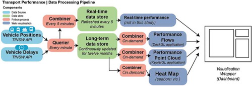
The long-term data store, once populated, is then queried through the second set of Python scripts developed for this research, “combiners”, which index, translate, clean and reformat the raw data into appropriately structured formats for each individual visualisation format – which are described in Section 2. 3. The results of these “combiners” are then queried by the scripts/processes that render these unique visualisation formats.
Due to the size of the data, combiners using this approach would ideally be run at a lower frequency – for example, once every 24 hours at night or once a week, in order to provide regular but longitudinal performance updates within these visualisations. For this study we are using a snapshot of the combined datasets which contain 12 months of previous data.
2.3. Visualisation framework
In this section, we outline a number of visualisation methods and explore how these can be used to communicate the various dimensions of the big transport data sets previously described. Such visualisation methods could ultimately underpin widgets which could comprise a transport visual analytics dashboard containing, as illustrated in . Previous research by Pettit et al. (Citation2012) have developed a taxonomy of visualisation methods for understanding urban spaces. However, such methods have not been applied specifically to transport big data. In this research, we develop a framework for supporting the visualisation of transport big data.
Figure 2. Illustration of features of a long-term performance monitoring dashboard integrating current and continuously collected real-time data
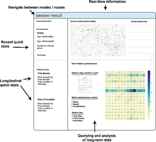
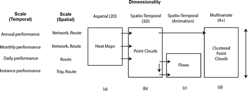
When interacting with the transport big data, the viewer (transport manager, operations planner or civic group) may want to investigate annual, monthly, daily or individual trip level details. They may also want to investigate alternate spatial scales – from the entire network, individual routes and individual trip patterns of those routes. As such, the framework should allow exploration of a variety of temporal, spatial and feature attributes through a variety of visualisation components. These visualisation components are described in through letters a-d, and the following sections will describe the purpose of each component.
Figure 3. Outline of visualisation methods employed in the work
2.3.1. Aspatial data (2D)
a) Heat maps
The first component of the framework is based on Shneiderman’s (Citation2003) mantra “Overview first, zoom and filter, then details on demand”. We begin by visualising the data at a lower dimensionality, codified visually as heat maps. Heat maps are graphical representations of data that use colour-coded systems in order to assist in the quick identification of trends. The primary purpose of heat maps is to better visualise the volume of locations/events within a dataset and assist in directing viewers towards areas on data visualisations that have significantly high or low values. For this visualisation component, the Python library “seaborn” (Waskom, Citation2019) is used to generate heat maps on any given spatial or temporal query within the framework in regards to the entire network over time or specific routes. In order to render users’ queries as heatmaps in seaborn this component requires the raw data feed to be combined and aggregated into a Python numpy/pandas “dataframe” format (McKinney, Citation2010).
2.3.2. Spatio-temporal data
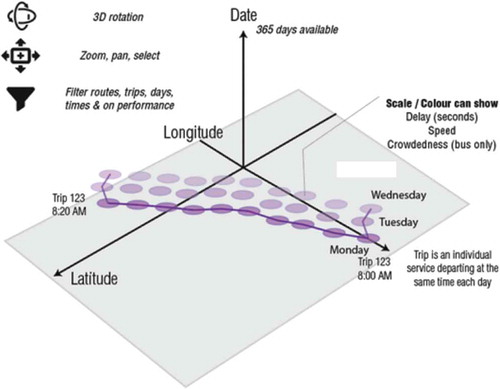
b) Point clouds
In order to add further detail, the second component visualises the data in geographic space. We visualise the data in a way influenced by the Space-Time Cube (STC) format. The STC is an effective technique to visualise patterns in spatio-temporal data – appearing as early as the 1970 s (Kraak & Kveladze, Citation2017). Kristensson et al. (Citation2007) compared the STC with static 2D representations, finding users benefit from STC representations when analysing more complex spatiotemporal patterns. In visualising an STC, the cube’s horizontal plane represents geographic space, and the vertical axis represents time. Individual components of the STC can be coloured in a similar way to the heat map. Similar methods are also discussed in the form stacked trajectories in work by Tominski, Schumann, Andrienko, and Andrienko (Citation2012), in more fluid interactive, immersive (VR) techniques by Filho, Stuerzlinger, and Nedel (Citation2019), and in augmented reality techniques by Lock, Bednarz, and Pettit (Citation2019).
For this study – the platform we used significantly increases the scale of the data, introduces the capability to filter rapidly and style STCs on the fly than traditional desktop GIS software. As such, we can filter through space, time and performance information rapidly – we will call the method in this context “Performance Point Cloud” (PPC). The PPC is visualised in a 3D and shareable web environment. This is made possible by the open-source KeplerGL (Uber, Citation2019b) library. KeplerGL is a “customisable geospatial toolbox” and “high-performance web-based application for the visual exploration of large-scale geolocation datasets”. KeplerGL uses WebGL, which is a library that enables plugin-free real-time interactive 3D web graphics and is supported by major browsers such as Safari, Chrome, Edge and Firefox – see the work of Khronos Group (Citation2019). highlights the components of the interactive PPC. The PPC is flexible in that it can visualise single instance, individual routes, trips as well as provide a visual summary of the entire network’s performance. In order to create PPCs, the data pipeline transforms individual queries of data to be created into “.geojson” formats for input into KeplerGL.
Figure 4. Visualisation concept of PPC
c) Animated flows
The third element of the framework considers that trajectory datasets can also be represented through animation. Animation of these flows can be coloured by individual routes, modes or performance variables to gain an understanding of the general movement patterns of individual trips in the network. It can also allow a “rewind” to any trip in the whole data set – to focus on how a specific set of trajectories traversed space in a particular time. Multiple studies have compared STC to animation, finding that STC is more effective for visual analytics as a user can form a mental picture of the relationship between data points when the data is not moving. Tversky, Morrison, and Betrancourt (Citation2002) found that extra cognitive load is required to perceive and understand animation (in comparison to static map) and challenge the ability to extract information from them efficiently. Andrienko and Andrienko (Citation2007) compared animation and STC and found that in situations with few numbers of objects and shorter periods keep the utility of animation higher than STC. As such, animation is presented following STC, at a reduced scale for interaction within the framework. It is shown to be a subset by which to see daily/instance performance as a next step after interrogating the PPC. For these animations, the DeckGL library was used (Uber, Citation2019a). Significant reformatting of the data needs to take place to create a format ready for this visualisation approach – individual trips stored as arrays containing their position for every second of the day, along with label information (such as route, level of congestion, speed, delay). Further, interpolation techniques need to be considered to smooth animation effects. These arrays then need to be compiled given a query of specific trip or route pattern for specific days into appropriate “.geojson” formats to be read by DeckGL.
2.3.3. Multivariate phenomena
d) Clustered performance point clouds
One of the most fundamental modes of data and information discovery is through simply organising data into sensible groupings. While the rapid filtering of data can be achieved by a user using the PPC method, there are algorithmic approaches which can assist in this process when dealing with many multiple grouping criteria at once. Cluster analysis methods, for example, are able to group objects according to a measure of perceived instrinsic characteristics of characteristics or similarity. These techniques can be used to classify data in order to assist in identifying patterns across many multiple variables of information.
Clustering as a method is a form of unsupervised machine learning, which involves uncovering hidden structures beyond what we may be able to identify immediately. Clustering has had extensive applications in the spatial sciences, for example, in geodemographic classification (Adnan, Longley, Singleton, & Brunsdon, Citation2010), and hotspot detection (Nakaya & Yano, Citation2010). Although spatial clustering methods are well developed, spatio-temporal clustering is still an emerging research frontier (Atluri, Karpatne, & Kumar, Citation2018). Spatio-temporal clustering methods that are some of the most widely used include ST-DBSCAN (Birant & Kut, Citation2007) and space-time scan statistics (STSS) – Cheng and Adepeju (Citation2013).
Clustering has previously been applied to similar trajectory data for presentation purposes (Adrienko & Andrienko, Citation2011), and for delay of an individual railway line in a Danish case study (Cerreto, Nielsen, Nielsen, & Harrod, Citation2018). In this context it is applied to identifying typologies of areas and routes with similar underlying transport performance across a large temporal, spatial scale as well as a high number of routes. As such, the focus is on techniques which can effectively cluster across these performance variables – leaving the visual analytics task to process the spatial components of the data.
For each public transport route, the number of trips over the annual period was counted using the following variables in order to obtain groupings: number of delayed trips (whether or not a trip was delayed 20 minutes at any point in time), capacity of route (number of trips that recorded as many seats available, few seats available and standing room only), day of week and hour of day. This results in each route receiving 1,008 dimensions with the common distance measurement of “number of trips”. A summary of these can be found in .
Table 2. Summary of performance variables used for cluster analysis, calculated for every route
Clustering across these many variables, routes which have similar characteristics defined by their frequencies by the time of day, span of hours, total number of trips, crowdedness and delay are grouped as similar and labelled. In our example, a route that is crowded in the mornings only should be classified differently to a route that is crowded all day. A route that is crowded and delayed on weekends should not ideally be placed with a route that is delayed on weekdays.
For this task, the k-means algorithm (Lloyd, Citation1982) was employed as one of the most widely documented and thus likely algorithms applied in this context at present. It should be noted that there are likely many algorithms and parameters that could be used on this approach, with the focus here being on the visualisation of well-established clustering method outcome rather than developing novel clustering techniques. It is envisioned that enabling such visual analytics can, in turn, eventually allow us to also refine clustering techniques on similar datasets in future for maximum utility in this context.
The resulting clusters are then visualised using the STC method as previously described. Each of the approximately 850,000,000 data points can then fall into a discrete number of n clusters specified by the k-means algorithm. The required data format for these are the same as PPC, including an extra variable with cluster labels.
3. Results
The results section will describe each of the four visualisations within the framework outlined in the previous section. It will then discuss how these assist the visual analytics task and example use cases in a transport and operational planning sense. Supplementary material of these results can be found in Appendices 1 & 2. As part of the open-source nature of the data and tools demonstrated in this work, samples of the processed data are shared (see Lock, Citation2020).
3.1. Heat maps
While heat maps are a simple visualisation technique, these highlight the possibilities given through interrogating historical real-time transport performance data. The full data set can be aggregated through heat maps to provide summaries for any given day, month, or year for the entire network or for specific routes – as specified in . In turn, these provide a gateway to lead users to more specific information about performance through the next visualisation technique – or may provide sufficient overview to start off with.
shows an example output of a heatmap that can be generated for monthly rail performance, by route. shows an example output of a heatmap for bus, by route. The darker the blue colour, the higher per cent of all trips which experienced a delay for over 20 minutes. The heat map successfully shows an overview of total network performance and individual routes. It shows routes which consistently perform in particular ways (horizontally) while demonstrating potential effects of specific incidents for particular months (vertically). For example, in we can observe routes performing well relative to all others (CGF and OLY) as well as a noticeable difference in delay for CTY in comparison with all other routes. We can also see for example times of year which may have an impact on performance (for example, December where most routes achieve their maximum delay).
Figure 5. Heatmap – Rail delays (defined as per cent of trips delayed 15 minutes at any part of the journey). Additional heatmap example found in Appendix 2,
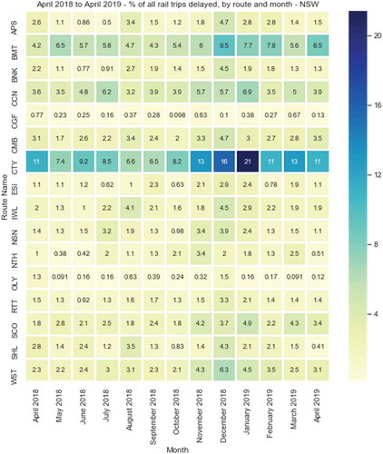
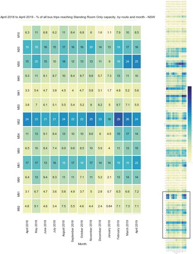
Figure 6. Heatmap – Bus delays overview (defined as per cent of trips delayed 15 minutes or more at any part of the journey)
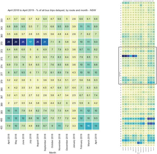
In we can see the potential impacts of a service change or external interference on “BMT” route – which has been verified through TfNSW sources (Transport for NSW, Citation2018a). In there is a significant shift in the performance of bus route 370. This is a particularly well-known route in Sydney which has a reputation in the city for not running on time, having many media articles generated about it in the popular press and social media groups dedicated the public expressing their frustrations and other feelings about it. While the rationale behind these initiatives is also apparent through the data – the user can clearly observe that change has occurred to this service – which has not appeared in the media. This is possibly due to new timetabling related to the privatisation of many bus routes which were in the same region as the 370, which began just two months before (Transport for NSW, Citation2018b).
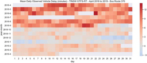
By providing an expanded view of the heatmap for all routes, such as on the right of , we can begin to identify routes which have relative lower/higher values than others. Users can observe, for example – are things getting better or worse? To what extent are other routes similar to this route? In we can see a view of the 370 in the heatmap in much more detail. Here, specific days of the year which achieved low or high levels of performance can be identified more easily. Further, we can get a sense of the underlying data sample – with for example seeing in June and July 2018 that there is data missing which may impact calculations for those months. We can also see by the blue colouring that the service changes have led to services potentially running early than running late in December 2018/January 2019.
Figure 7. Heatmap – Individual average route delays, detailed daily view for Route 370
3.2. Point clouds
The PPC expands on the heat map concept by showing trips in their geographic context. highlights several outputs of the PPC. For the previous example of the 370 route, we can see the similar performance trends in geographic context in Part A of the image. This also highlights that the patterns are largely temporal (change on the X,Y-axis) rather than having a robust spatial relationship (which would be highlighted by trends going up the Z-axis).
Figure 8. (top-left) Unfiltered performance point cloud – bus route 370 (top-right) Filtered performance point cloud – delayed trips on bus route 370 (bottom) Performance point cloud – annual rail data
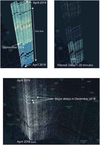
Variables such as vehicle speed show the inverse relationship, where services stay consistent across Z but inconsistent across X and Y. Users can apply filters dynamically from the data, zoom and rotate to areas of interest. An example of filtered by a custom performance metric is in Part B of the image which highlights individual moments where a trip was delayed over 20 minutes. For this case, we can see a clear and visible reduction in these at a particular moment of space and time.
Part C of the image shows the use case for the rail data. For example, we can see there were numerous days with very high relative delays in December 2018, which were partially visible in the Heat Map in and now highlighted in their geographic context.
Data can be filtered dynamically to highlight these again to make them more evident to users. In particular, through filtering the data, these can be identified on days which experienced significant disruption that year – including New Year’s Eve/Day and several severe storms which involved “giant hail”, “damaging wind” and “intense bursts of rain” (Bureau of Meteorology, Citation2018). It is worth noting that during this exercise, a high number of delays identified cross-checked with extreme weather events – which are annotated in Appendix 1, . The extent by which the Z scales up can be toggled to stretch the data up or down closer to the map to align more clearly with stations and other pieces of geographically contextual information.
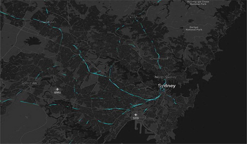
3.3. Animations
Network flows were visualised as animations that can be played back for any particular day and service. A screenshot of one particular moment of a day’s worth of rail flows can be seen in . These can be colour coded by route – but could also be colour-coded by performance variables such as speed, crowdedness and delay.
Figure 9. Screenshot of individual day’s rail flow animations developed in DeckGL
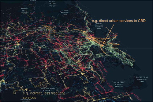
3.4. Clustering
A clustering approach can be found in . The image describes bus trips in Sydney – coloured and categorised by their k-means clusters. Each cluster is placed above the other on the Z-axis, so as to be able to understand the structure of each without the points heavily overlapping. In this example, the clustering approach has been able to identify different typologies of bus services – for example we can see indirect, less frequent services in yellow and we can see more direct urban services to/from Sydney’s CBD in orange. Users could potentially explore the typologies identified through altering variables within clusters, or clustering algorithm parameters such as the k component of k-means (pictured as 10).
Figure 10. View of clustered point cloud
4. Discussion
By example of Greater Sydney, we illustrate use cases of how many aspects of long-term transport performance assessment can be investigated using large-scale, repurposed, single source of GTFS-RT data across a framework of visualisation techniques that can be developed in open-source tools and coding languages. This approach allows the understanding of extreme events, identification of patterns, comparison before and after changes to the network or policy as well as an understanding of the similarity between different public transport services. This approach is in contrast to the traditional form which this data would be used, for real-time displays and navigation. Through an urban indicator approach, this real-time information would be displayed in a highly aggregated manner, usually against pre-defined performance metrics or on waiting time boards with little context of historical performance. This thus extends the remit of how it may be possible to analyse and monitor this network in more granular ways in addition to these display methods available.
One of the highlights of this work was the sheer volume of geolocated data points that are capable of being viewed in the browser environment – which up to 8 million data points for the visualisation of performance point clouds until performance issues were experienced. Open-source, shareable web data viewers such as KeplerGL provide useful viewers for high-volume geospatial data in three dimensions. However, it is worth noting that the processing in order to create this data view through combiners for any given query of the full set of data points was not trivial. While libraries such as Python’s seaborn were well-suited and documented for heat maps, such approaches had to be finely customised for both the PPCs in KeplerGL as well as for the animations in DeckGL. The ability to analyse geospatial clusters rapidly in such detail also further opens up the possibility to fine-tune clustering techniques and reveal new sets of urban typologies and classifications that can be adopted by transport planners.
Understandably one of the challenges with this work was that the KeplerGL library utilised is still under active development – having been only recently released in mid-2018 with (at the time of writing) approximately 30 contributors (and only approximately five visibly active contributors on their GitHub repository, again, at this time). Methods such as colouring features were limited to using quantile and quantised scales – which have clear disadvantages in particular when dealing with outliers. Various other ways of clustering values such as Jenks breaks or user-specific breaks would be highly useful in such techniques – which are standard features in various desktop GIS platforms such as ArcGIS and QGIS.
While we demonstrate and recommend these as use cases, there are many extensions and further considerations to take into account for this work. As it stands, this approach frames a series of disparate interfaces which could be required to be linked programmatically; ideally into a singular interface – as illustrated in . Such interfaces could be developed using visualisation literacy tests such as developed by Lee, Kim, and Kwon (Citation2017) and usability studies such as by Russo, Lanzilotti, Costabile, and Pettit (Citation2018) in order to further develop how these techniques can best be arranged for specific end-users for specific tasks.
Further, use cases can be developed for specific users beyond this general framework. For example, a member of the public may be interested in alternate aspects of these visualisations – such as real-time information about journey times and disruptions; or probabilities of disruptions due to weather events and historical data. Further, transport operators may want to include additional visualisations in this framework, such as those that commonly appear in their workflows – such as the bus and train bunching examples mentioned using GTFS-RT in New York described earlier in this paper. A version of visualisations provided that performs the same analysis across multiple lines across the same corridor for buses (and other similar modes which corridor-based assessment would be useful) is also recommended as future work. These corridor-based analyses may also assist in understanding the behaviour of corridors where many route unique identifiers exist and similar routes can be grouped together.
Using more sensitive big transport data, such as smart card data, could also allow investigation of additional, yet related, techniques for internal use by operators and planners. For example, Space-Time Prisms (STPs) can also be used as a spatio-temporal analysis technique, which relate to locations that can be reached in a particular time interval. This is useful when studying detailed spatio-temporal feeds such as boardings and alightings of public transport users and understanding how activities can be similarly grouped together to inform network design decisions (Faroqi et al., Citation2018).
The current prototype version is designed for presenting our visualisations are only of a single city and only for the year 2018–19. By continuing to run these pipelines over time, this time scale and data set would grow even larger. Since the data used is an open standard, many of the processes used can be directly be transferred to cities around the world. The separate analysis of different cities may reveal further information about how performance differs between cities and even allow benchmarking against global standards.
While a high volume of data was able to be retrieved, there are still some potential challenges with the data itself. The large spatial scale and the sheer volume of data is a big challenge in its own right – particularly in organisations which have not traditionally adopted the processes and management systems in order to support its use. The GTFS-RT does not include scheduled services which do not have real-time information – thus comparisons between this need to be made from the static GTFS for a full picture of the results if there are gaps in coverage. Furthermore, real-time data is not always accurate – various issues such as connectivity and GPS issues can affect the data feed. GTFS-RT validation tools are available to operators to ameliorate issues that may arise from these. Further adoption of GTFS-RT to support monitoring as a continuous, rather than real-time, data source would assist in developing a shared understanding of this and for the tools used to generate and validate feeds to be developed even further. It is also worth considering the adaptive design of GTFS in regard to understanding the performance of future transport modes. Organisations such as the Rocky Mountain Institute (Crane & Rucks, Citation2016) are pioneering new initiatives to ensure GTFS feeds continue to develop and interoperate in increasingly complex urban transport environments – such as in the implementation of Mobility as a Service (MaaS) and autonomous vehicles (AVs). As well as newly structured feeds, we also need to update our visual analytics techniques and workflows to match potential changes in these mobility services.
Further steps of this work would also focus on combining insights from the visual analytics approach directly into other emerging software applications used in transport planning. For example, tools such as Remix (Citation2018) provide interactive, web-based methods of assessing current transport networks and sketch-planning of future networks. Tools such as Conveyal Transport Analyst also allow sketch-planning of accessibility benefits of current and future proposed projects (Conveyal, Citation2019; Lock, Pinnegar, Leao, & Pettit, Citation2020). Integrating these present and future planning tools with robust ways to interrogate past sensor data is a next step forward. Our approach can be generalised and transferred to other application fields that have to deal with spatial, temporal and high-dimensional data. This could include complex geospatial application areas, such as health, property, crime and retail.
Further work would be to further understand the end-user (customer) experience by combining this operations-focused data with other contextual data – such as social media and sentiment data. In that sense, we can extrapolate the historical data on public transport performance and public sentiment towards the city’s transport back to the real-time dashboards which monitor performance, such as in dashboard widgets contained in platforms such as the London (Gray, O’Brien, & Hügel, Citation2016) or Sydney (C. Pettit, Lieske, & Jamal, Citation2017) city dashboards. Such extensions will enable further understanding and identification of service performance levels experienced by citizens.
5. Conclusion
In Australian and many other cities, today’s transportation systems are still primarily defined by four-seated, privately owned vehicles, individually driven, fossil-powered which are unused for significant amounts of times. Present societal and governmental trends, emerging technologies, and new tech-enabled transport businesses suggest that the current system can change dramatically, in part, supported by a better understood public transport system. As we continue to invest heavily in transport infrastructure, big data methods such as these can allow us to further monitor medium and long-term performance outcomes as a result of these initiatives.
The outcomes of this research are threefold. Firstly, it describes how to effectively collect and use a generalisable and globally adopted set of public transport data which is continuously updated. Secondly, it establishes a framework by which transport operators, planners and other users can view and integrate this data at a granular scale. Thirdly, it implements this framework in a real-world case study – showcasing applied results for Greater Sydney. This research has demonstrated how big transport data – 850,000,000 data points can be made available for rapid interpretation through a data pipeline that enables a number of visualisation methods including heatmaps, point clouds, animations and clustering. While these techniques are well-established as theory, these applications specifically aim to highlight current data and methods that apply these in practice.
The research also highlights some of the potential challenges in processing data for these individual visualisation methods and the need for data to be continuously collected and updated for longitudinal analysis to occur. Further, there is a need for understanding the most critical queries analysts would need in order to optimise visual analytics systems whilst also still enabling exploratory data analysis. Overall, this study has indicated that large-scale visual analytics of open-source generalised global transportation feeds is possible and recommended to be deployed by transport agencies. Further, the case study is innovative in its length, state-wide geographic coverage and coverage of multiple modes.
Data availability statement
Real-time data used for this study is available as open data through the Transport for NSW open dataportal for future replications. For historically-collected big data sets, the author has published this data as open source through the following reference with documentation. See: Lock, Oliver (2020), “High-volume public transport vehicle locations(rail, bus, ferry and light rail) and performance metrics for Sydney dated from March 2018 to April 2019 (GTFS Real-time)”, Mendeley Data, v1http://dx.doi.org/10.17632/gstfpzg339.1.
Disclosure statement
No potential conflict of interest was reported by the authors.
References
- Adnan, M., Longley, P. A., Singleton, A. D., & Brunsdon, C. (2010). Towards real-time geodemographics: Clustering algorithm performance for large multidimensional spatial databases. Transactions in GIS, 14(3), 283–297.
- Adrienko, N., & Andrienko, G. (2011). Spatial generalization and aggregation of massive movement data. IEEE Transactions on Visualization and Computer Graphics, 17(2), 205–219.
- Andrienko, G., Andrienko, N., Bak, P., Keim, D., & Wrobel, S. (2013). Visual analytics of movement. Berlin, Heidelberg: Springer Science & Business Media.
- Andrienko, G., Andrienko, N., Chen, W., Maciejewski, R., & Zhao, Y. (2017). Visual analytics of mobility and transportation: State of the art and further research directions. IEEE Transactions on Intelligent Transportation Systems, 18(8), 2232–2249.
- Andrienko, N., & Andrienko, G. (2007). Designing visual analytics methods for massive collections of movement data. Cartographica, 42(2), 117–138.
- Anwar, A., Odoni, A., & Toh, N. (2016). BusViz. Transportation Research Record: Journal of the Transportation Research Board, 2544(2544), 102–109.
- Atluri, G., Karpatne, A., & Kumar, V. (2018). Spatio-temporal data mining: A survey of problems and methods. ACM Computing Surveys, 51(4), 1–37.
- AUSTLII. (2011). Transport Legislation Amendment Act 2011 No 41. Retrieved from http://classic.austlii.edu.au/au/legis/nsw/num_act/tlaa2011n41372.pdf
- Australian Bureau of Statistics. (2018). 3222.0 - Population Projections, Australia, 2017 (base) - 2066. Canberra. Retrieved from https://www.abs.gov.au/
- Bast, H. (2014). Real-time movement visualization of public transit data. Proceedings of the 22nd ACM SIGSPATIAL International Conference on Advances in Geographic Information Systems, Dallas, Texas.
- Batty, M. (2013). Big data, smart cities and city planning. Dialogues in Human Geography, 3(3), 274–279.
- Birant, D., & Kut, A. (2007). ST-DBSCAN: An algorithm for clustering spatial-temporal data. Data & Knowledge Engineering, 60(1), 208–221.
- Bureau of Meteorology. (2018). December 2018 - Weather Archive. Sydney. Retrieved from http://www.bom.gov.au/climate/current/month/nsw/archive/201812.sydney.shtml
- Cao, N., Lin, C., Zhu, Q., Lin, Y. R., Teng, X., & Wen, X. (2018). Voila: Visual anomaly detection and monitoring with streaming spatiotemporal data. IEEE Transactions on Visualization and Computer Graphics, 24(1), 23–33.
- Cerreto, F., Nielsen, B. F., Nielsen, O. A., & Harrod, S. S. (2018). Application of data clustering to railway delay pattern recognition. Journal of Advanced Transportation, (2018, 1–18.
- Cheng, T., & Adepeju, M. (2013). Detecting emerging space-time crime patterns by prospective STSS. Geocomputation, (77), 4.
- Conveyal. (2019). Conveyal Access Analyst. Retrieved from https://www.conveyal.com/
- Crane, J., & Rucks, G. (2016). A consortium approach to transit data interoperability. Retrieved from http://www.rmi.org/Consortium_Approach_ITD
- DOIRDaC. (2019). Delivering the right infrastructure for a growing nation. Canberra. Retrieved from https://investment.infrastructure.gov.au/files/budget-2019-20/Building-Our-Future-Delivering-the-Right-Infrastructure-for-a-Growing-Nation-2019.pdf
- Engin, Z., Dijk, J. V., Lan, T., Longley, P. A., Treleaven, P., Batty, M., & Penn, A. (2019). Data-driven urban management : Mapping the landscape. Journal of Urban Management, (May), 1. doi:10.1016/j.jum.2019.12.001
- Erhardt, G. D. (2016). Fusion of large continuously collected data sources : Understanding travel demand trends and measuring transport project impacts. Retrieved from http://discovery.ucl.ac.uk/1505994/1/Erhardt_Thesis-Final.pdf
- Erhardt, G. D., Lock, O., Arcaute, E., & Batty, M. (2017). A big data mashing tool for measuring transit system performance. Seeing cities through big data (pp. 257–278). doi:10.1007/978-3-319-40902-3_15
- Faroqi, H., Mesbah, M., Kim, J., & Tavassoli, A. (2018). A model for measuring activity similarity between public transit passengers using smart card data. Travel Behaviour and Society, 13, 11–25.
- Ferreira, N., Poco, J., Vo, H. T., Freire, J., & Silva, C. T. (2013). Visual exploration of big spatio-temporal urban data: A study of new york city taxi trips. IEEE Transactions on Visualization and Computer Graphics, 19(12), 2149–2158.
- Filho, J. A. W., Stuerzlinger, W., & Nedel, L. (2019). Evaluating an Immersive Space-Time Cube Geovisualization for Intuitive Trajectory Data Exploration. IEEE Transactions on Visualization and Computer Graphics, 1. doi:10.1109/tvcg.2019.2934415
- Fredrikson, A., North, C., Plaisant, C., & Shneiderman, B. (1999). Temporal, geographical and categorical aggregations viewed through coordinated displays: A case study with highway incident data. Proceedings of the 1999 Workshop on New Paradigms in Information Visualization and Manipulation in Conjunction with the 8th ACM Internation Conference on Information and Knowledge Management, NPIVM 1999, 26–34. doi:10.1145/331770.331780
- Gray, S., O’Brien, O., & Hügel, S. (2016). Collecting and visualizing real-time urban data through city dashboards. Built Environment, 42(3), 498–509.
- Janssen, M., Charalabidis, Y., & Zuiderwijk, A. (2012). Benefits, adoption barriers and myths of open data and open government. Information Systems Management, 29(4), 258–268.
- Khronos Group. (2019). WebGL - OpenGL ES for the Web. Retrieved from https://www.khronos.org/webgl/
- Kitchin, R., Lauriault, T. P., & McArdle, G. (2015). Knowing and governing cities through urban indicators, city benchmarking and real-time dashboards. Regional Studies, Regional Science, 2(1), 6–28.
- Kraak, M. J., & Kveladze, I. (2017). Narrative of the annotated Space–Time Cube – Revisiting a historical event. Journal of Maps, 13(1), 56–61.
- Kristensson, P. O., Dahlback, N., Anundi, D., Bjornstad, M., Gillberg, H., Haraldsson, J., … Stahl, J. (2007). The trade-offs with space time cube representation of spatiotemporal patterns, 1–15. Retrieved from http://arxiv.org/abs/0707.1618
- Lee, S., Kim, S. H., & Kwon, B. C. (2017). VLAT: development of a visualization literacy assessment test. IEEE Transactions on Visualization and Computer Graphics, 23(1), 551–560.
- Lloyd, S. P. (1982). Least Squares Quantization in PCM. IEEE Transactions on Information Theory, 28(2), 129–137.
- Lock, O. (2020). High-volume public transport vehicle locations (rail, bus, ferry and light rail) and performance metrics for Sydney dated from March 2018 to April 2019 (GTFS Real-time), Mendeley Data. 10.17632/gstfpzg339
- Lock, O., Bednarz, T., Leao, S. Z., & Pettit, C. (2019). A review and reframing of participatory urban dashboards. City, Culture and Society. doi:10.1016/j.ccs.2019.100294
- Lock, O., Bednarz, T., & Pettit, C. (2019). HoloCity–exploring the use of augmented reality cityscapes for collaborative understanding of high-volume urban sensor data. In The 17th International Conference on Virtual-Reality Continuum and its Applications in Industry. doi:10.1145/3359997.3365734
- Lock, O., & Erhardt, G. D. (2015). Keeping track—The fusion of large, automatically collected transport data in capturing long-term system change. In Australian Institute of Traffic Planning and Management (AITPM) National Conference, 2015, Brisbane, Queensland, Australia. https://trid.trb.org/view/1371463
- Lock, O., Pinnegar, S., Leao, S. Z., & Pettit, C. (2020). The making of a mega-region: evaluating and proposing long-term transport planning strategies with open-source data and transport accessibility tools. In Handbook of Planning Support Science. doi:10.4337/9781788971089.00039
- Marsden, G., & Bonsall, P. (2006). Performance targets in transport policy. Transport Policy, 13(3), 191–203.
- MBTA. (2018). MBTA performance dashboard. Retrieved from http://www.mbtabackontrack.com/performance/index.html#/home
- McKinney, W. (2010). Data structures for statistical computing in Python. In S. van der Walt & J. Millman (Eds.), Proceedings of the 9th Python in Science Conference (pp. 51–56). Austin, Texas.
- Mesbah, M., Currie, G., Lennon, C., & Northcott, T. (2012). Spatial and temporal visualization of transit operations performance data at a network level. Journal of Transport Geography, 25, 15–26.
- Nakaya, T., & Yano, K. (2010). Visualising crime clusters in a space-time cube: An exploratory data-analysis approach using space-time kernel density estimation and scan statistics. Transactions in GIS, 14(3), 223–239.
- NYC Bus Turnaround Coalition. (2018). Bus Turnaround NYC - Bus report cards. Retrieved from http://busturnaround.nyc/#bus-report-cards
- Pettit, C., Lieske, S. N., & Jamal, M. (2017). CityDash: visualising a changing city using open data. In S. Geertman, A. Allan, C. Pettit, & J. Stillwell (Eds.), Planning support science for smarter Urban futures (pp. 337–353). Cham: Springer International Publishing. doi:10.1007/978-3-319-57819-4_19
- Pettit, C., Widjaja, I., Russo, P., Sinnott, R., Stimson, R., & Tomko, M. (2012). Visualisation support for exploring urban space and place. International Society for Photogrammetry and Remote Sensing.
- Pettit, C. J., Lieske, S. N., & Leao, S. Z. (2016). Big bicycle data processing: From personal data to urban applications. ISPRS Annals of the Photogrammetry, Remote Sensing and Spatial Information Sciences, 3(July), 173–179.
- Remix. (2018). Remix: How today’s cities design their transportation future. Retrieved from https://www.remix.com/
- Russo, P., Lanzilotti, R., Costabile, M. F., & Pettit, C. J. (2018). Towards satisfying practitioners in using Planning Support Systems. Computers, Environment and Urban Systems, 67, 9–20.
- Shneiderman, B. (2003). The eyes have it: A task by data type taxonomy for information visualizations. The craft of information visualization (pp. 364–371). doi:10.1016/B978-155860915-0/50046-9
- Suchkov, B., Boguslavsky, M., & Reddy, A. (2015). Development of a real-time stringlines tool to visualize subway operations and manage service at New York City transit. Transportation Research Record (Vol. 2538). doi:10.3141/2538-03
- Thomas, J. J., & Cook, K. A. (2006). Visualization Viewpoints: A Visual Analytics Agenda. IEEE Computer Graphics and Applications, 26(February), 10–13.
- Tominski, C., Schumann, H., Andrienko, G., & Andrienko, N. (2012). Stacking-Based Visualization of Trajectory Attribute Data.
- Transport for New South Wales. (2019). TfNSW open data hub and developer portal. Retrieved from https://opendata.transport.nsw.gov.au/
- Transport for NSW. (2018a). December 2018 - Fleet update. Retrieved from https://www.transport.nsw.gov.au/system/files/media/documents/2018/Fleet-Update-Newsletter-December-2018.pdf
- Transport for NSW. (2018b). Transit systems boosts Inner West bus services. Retrieved from https://www.transport.nsw.gov.au/news-and-events/media-releases/transit-systems-boosts-inner-west-bus-services
- Tversky, B., Morrison, J. B., & Betrancourt, M. (2002). Animation: Can it facilitate? International Journal Human-Computer Studies Schnotz & Kulhavy, 57, 247–262.
- Uber. (2019a). deck.gl. Retrieved from https://deck.gl/#/
- Uber. (2019b). Kepler.GL. Retrieved from https://kepler.gl/#/
- Waskom, M. (2019). seaborn: Statistical data visualization. Retrieved from https://seaborn.pydata.org/
- Welch, T. F., & Widita, A. (2019). Big data in public transportation: A review of sources and methods. Transport Reviews, 54–63.
Appendix 1
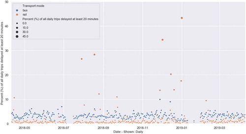
The following supplementary material outlines some additional visualisation and information of this longitudinal sample – the per cent of delayed trips for each day in the 12-month sample. Here, a delay is defined as the trip being delayed at any one point of time 20 minutes or more. The percent shown (Y axis) is the proportion of total daily trips that hit this delay criteria. The X axis shows the day of the year.
In general, the per cent daily delayed rail trips was below 5% (closer to 1–3%) whereas bus closer to 5% (4–6%). Rail also experiences higher extremes – i.e. there were 11 days where above 10% of the rail network experienced a delay. This was most extreme in December 2018 where large proportions of the network were significantly delayed.
Figure A1. Distribution of delayed trips over 12-month sample – highlighting extreme events
Appendix 2
This supplementary material outlines capacity information, which is available for the bus mode only, but can later be introduced to other modes by transport operator into the GTFS-RT feed. The Metrobus “M” routes are high frequency, high capacity bus routes in Sydney which have historically been linked to growth centres and employment centres in the city. The ridership and capacity information of these M Routes can be found summarised through the following visualisation.
Figure A2. Heat map view – bus crowdedness; Metrobus “M” Routes