
 ?Mathematical formulae have been encoded as MathML and are displayed in this HTML version using MathJax in order to improve their display. Uncheck the box to turn MathJax off. This feature requires Javascript. Click on a formula to zoom.
ABSTRACT
Access to technologies, infrastructures and their related services are essential for raising global living standards and human well-being. Several of the United Nations’ Sustainable Development Goals (SDGs) deal with providing access to technologies and service infrastructures to the share of global population so far excluded. At the same time, the SDGs, foremost SDG 10 on reducing inequalities within and among countries, promote a more equitable world, both in terms of inter- as well as intra-national equality. To support monitoring progress towards the SDGs, this paper aims to (1) improve measures of international inequality in terms of basic technologies and infrastructure services associated with the SDGs by explicitly taking into account non-access; and (2) to estimate the international inequality of selected SDG technologies and infrastructure services. It does so by advancing, testing, and applying improved measures of international inequality. The paper shows the discrepancies between accounting and not accounting for non-access from an inequality perspective for international inequality for selected technologies (e.g. mobile phones) and infrastructure services (e.g. electricity). By accounting for non-access on the national level, international inequality estimates are improved. Accounting for non-access leads to changes in country rankings, which the development community uses to measure progress in human development.
Introduction
Access to technologies, infrastructures and their related services are essential for raising global living standards and human well-being (Alkire and Santos Citation2014; Rao and Min Citation2017). Income alone is not a sufficient measure. Several of the United Nations’ Sustainable Development Goals (SDGs) adopted in 2015, such as SDGs 6 and 7 on water and energy, respectively, deal with providing access to technologies and service infrastructures to the share of global population so far excluded from energy and water access (UN Citation2015). ‘Technology’ features prominently in the UN 2030 Agenda, being the third most used noun besides ‘country’ and ‘development’, and being mentioned in half of the SDGs. At the same time, the SDGs, foremost SDG 10 on reducing inequalities within and among countries, promote a more equitable world, both in terms of inter- as well as intra-national equality, and emphasize the challenge of doing so in a sustainable manner. Policy makers, scientists and civil society will closely monitor progress of actions to attain the SDG in the coming years. To this end, measuring access and inequalities with regard to technologies and service infrastructures is a prerequisite.
This paper aims at achieving the following two objectives: (1) to improve measures of international inequality by explicitly taking into account non-access [a methodological objective] and (2) to estimate international inequality of basic technologies and services associated with the SDGs [an empirical objective]. It does so by advancing, testing, and applying improved measures of international inequality. The paper shows the discrepancies between accounting and not accounting for non-access from an inequality perspective for international inequality for selected technologies (e.g. mobile phones) and infrastructure services (e.g. electricity) that are key for human development and that feature in the SDGs.
International inequality deals with inequality across countries, usually based on national averages – income (e.g. GDP) per capita in the case of economic inequality, which has been studied most thoroughly (see for example Milanovic Citation2013, Citation2016). Global inequality accounts for inequality across the whole world population, also accounting for inequality within countries. To compensate the existing lack of such granular data across the whole world population, researchers tend to derive global inequality measures by combining measures of between and within country inequality (Atkinson Citation1970; Bourguignon and Morrisson Citation2002; Pinkovskiy and Sala-i-Martin Citation2009; Milanovic Citation2013, 2016). Sala-i-Martin (Citation2006), for example, uses population-weighted national average income per capita data and integrate them with individual within-country income distributions (in quintiles) derived from microeconomic income surveys.
By accounting for non-access on the national level, one aspect of within-country inequality is considered and international inequality estimates are improved in this analysis. Accounting for non-access leads to changes in country rankings, which the development community uses to measure progress in human development (UNDP Citation2005).
Section 2 provides a literature review. Section 3 describes the methodology applied. Section 4 presents results and their interpretation. Section 5 details the conclusions.
Literature review
With the SDGs, a multidimensional perspective on poverty has been adopted. Traditional income-based measures of poverty are broadened, to also include access to basic services and amenities. The SDGs focus on an improved outcome of human well-being, calling for critical goods and services to be distributed more equally, both across countries but also within. Access to various technologies and infrastructures feature directly in the SDG targets or among the indicators used to track their progress (UN Citation2015; United Nations Economic and Social Council Citation2017).Footnote1
In this manuscript, the following definitions are used when referring to technologies and infrastructure services:
End-use technologies (household or individual's): These are consumer goods such as TVs, radios, PCs, cars, mopeds or bicycles households or individuals own.
Infrastructures services: Access to and use of infrastructure services, for example, electricity, drinking water supply, sanitation, or the Internet.
Material deprivation and human well-being
The enabling role of the services provided by technologies and infrastructures for human development has been acknowledged by several measures of multi-dimensional poverty, such as the Multi-dimensional Poverty Index (MPI) (Alkire and Robles Citation2017; Alkire and Santos Citation2014),Footnote2 the Social Progress Indicator (SPI)Footnote3 and the Individual Deprivation Measure,Footnote4 currently under development. Rao and Min (Citation2017) define material prerequisites for decent human wellbeing on household and community levels, which are based on a range of essential infrastructures and technologies. While these focus on developing countries, multi-dimensional deprivation is also measured in developed countries, typically through a battery of indicators covering ownership of goods. Townsend (Citation1979) influenced the debate in both Britain and the EU (Aaberge and Brandolini Citation2014). The EU Statistics on Income and Living Conditions (EU SILC)Footnote6 look at affordability of mortgage/rent payments, utility bills, holidays, food, unexpected financial expenses and some technologies (EUROSTAT Citation2016) (). Smith et al. (Citation2015) mention that the inability to consume socially perceived necessities (e.g. consumer durables, affordability of social activities, or adequate diet) due to a lack of economic resources should ideally be covered by their English indices of deprivation. As data on material deprivation are missing, they use income as proxy, complemented by a range of non-income domains (employment, education, crime, access to housing and services, and environment). Multi-dimensional poverty indices focus on tracking the delivery of access to basic services to the poorest shares of population.
Table 1. Infrastructures and technologies used to track multi-dimensional poverty and deprivation.
Measuring inequality in technologies and infrastructure services
A large part of inequality measurement research is concerned with distribution of resources over an entire population. A subset of inequality research focuses on the shares of population at the lower and top ends of the distribution (Alvaredo et al. Citation2013; Piketty and Saez Citation2003). Data availability often poses a challenge, especially at the upper end of the distribution, while access data have become more available and can enhance inequality measures. This paper aims to capture the role of non-access in measuring inequality.
Research on income inequality is well-established (Milanovic Citation2016; Piketty Citation2014; Stiglitz Citation2012), with a large body of literature examining the causes (Acemoglu Citation2002; Acemoglu and Robinson Citation2000; Bennett and Nikolaev Citation2016, Citation2017; Bergh and Nilsson Citation2010; Sokoloff and Engerman Citation2000; Stiglitz Citation2012) and consequences of inequality (Alesina and Perotti Citation1996; Easterly Citation2007; Neckerman and Torche Citation2007).
The role of technology in income inequality has been explored, however, inequality in technologies has not been a significant issue that has been investigated in itself systematically. Income, wealth and technology ownership and infrastructure use are correlated (see, for example, Steckel, Rao, and Jakob Citation2017 for infrastructures or Cruz-Jesus, Oliveira, and Bacao Citation2018 and Cruz-Jesus et al. Citation2017, on the digital divide) but knowledge on how this relationship holds across different indicators and countries is scarce. Literature on the digital divide on differences in access and utilization of information and communication technologies (ICT, such as personnel computers (PCs), (mobile) phones, radios, television sets (TV) or the Internet) has identified several additional drivers, such as education, urbanization, innovation capacity (Lee, Hong, and Hwang Citation2017; Pick and Nishida Citation2015; Skaletsky et al. Citation2016), or regulatory and sociopolitical characteristics of a country (Guillén and Suárez Citation2005). Access rates to infrastructures vary across countries of similar economic development, with urban areas showing higher access levels, but seem to follow a sequence (from water via sanitation, electricity and telephony) with countries with lower income inequality achieving higher access rates for basic infrastructures (Steckel, Rao, and Jakob Citation2017). Rao and Ummel (Citation2017) show that other drivers than income, such as identity, can influence ownership of household appliances and that the influence of income differs by appliance and by region. Wu, Zheng, and Wei (Citation2017) argue that inequality in energy is systematically different from income inequality and that it can provide additional insights on consumption inequality. Differences in electrification rates across countries have been related to the urbanization rate, education level, and the availability of renewable energy sources, with weaker links to per capita GDP and funding availability (Magnani and Vaona Citation2016).
A challenge when only income is investigated lies, for example, in the prices of the relevant basket of goods people can afford, which is not reflected (Reddy and Lahoti Citation2015). Consumption provides better information than income on real disparities (see for example Global Consumption and Income ProjectFootnote7). Affordability, availability and accessibility of technologies and infrastructures are issue which income inequality does not capture. End-use technologies and infrastructure service consumption are ways to assess concrete examples of consumption and utility to consumers.
Larger inequalities are expected if technologies and infrastructures are examined, showing not only disparities in human development and the distribution of resources across the world but also related to development perspectives of a society as a whole. Inequalities in general purpose technologies such as ICTs and electricity are not only related to basic needs but also affect the productivity of an economy, which can contribute to the widening of income differentials across countries (Lee, Hong, and Hwang Citation2017).
Assessments of international inequalities in infrastructure and technologies focus on access versus non-access and average national per capita consumption/ownership. Further detail on the distribution of technologies and infrastructure services, such as information on multiple ownership, extensive consumption and non-access, is less prominent. The Demographic and Health Service Program (USAID Citation2017), for example, collects and monitor data such as households possessing a private car, motorcycle, TV, mobile phone or refrigerator. The World Bank's World Development Indicators (World Bank Citation2017) provide national averages for electricity consumption or mobile phones per capita, among others. These data often constitute the basis for country rankings and comparisons (Sachs et al. Citation2017; World Bank Citation2017). Again, income levels alone are not a valid proxy for assessing human development. Accounting for other areas of human advances, such as life expectancy or education can result in substantial rank changes across countries (UNDP Citation2005).
For infrastructures, such as improved sanitation, improved water, electricity and internet (see ), access rates (Equations (1) and (2)) are most commonly used for inter-national comparisons and country rankings (ITU Citation2016; USAID Citation2017; WHO Citation2018; World Bank Citation2017). National access rates usually provide information either on the share of households or population with access to an infrastructure (e.g. improved sanitation facility). Household surveys often provide the data basis and are scaled by household size to determine the number of the population who has access.
Access rates:(1)
(1)
(2)
(2)
Access rates only provide binary information (% of households with or without access to electricity). Neither do they account for the extent of service usage (e.g. kWh) or quality (e.g. service availability), thus underestimating inequality. Households that have access to the national electricity grid might suffer from black- or brown-outs. Also, access to the infrastructure does not necessarily imply that a household has the economic means to afford either the electricity, or the appliances for which it would need the electricity, leading to suppressed demand. Hence, even households that are connected to the grid can suffer from energy poverty, which is key for assessing inequality. In response, Bhatia and Angelou (Citation2015) have for example proposed a new multi-tier framework, going beyond binary access/non-access metrics for electricity and cooking energy. Average infrastructure service provision levels (e.g. kWh/capita, bits per second/capita, Equation (3)) provide national per capita averages which can be used for international comparison and rankings but which ignore intra-national inequality including non-access or low-levels of access. In some cases, the average service units are only given per service user (ITU Citation2016, Equation (4)), thus excluding non-users. While this provides information on the distribution across users, it neglects the share of population without access.
Per capita rates (national averages):(3)
(3) Per user rates:
(4)
(4)
End-use technologies most often used to assess improvements in development include telephones (nowadays mostly mobile phones), radios, televisions, personnel computers, fridges, washing machines, (motor-)bikes, and cars (see ). As with infrastructures, access rates are also used for end-use technologies, e.g. the share of households with a television set or the share of population using the internet (ITU Citation2016; USAID Citation2017). Per capita technology rates underestimate inequality as they are based on country averages where non-access or multiple ownership (e.g. two cars per household) is usually not accounted for. International comparisons involving country rankings are often based on national average per capita rates (Sachs et al. Citation2017).
Gini coefficient and Lorenz curve
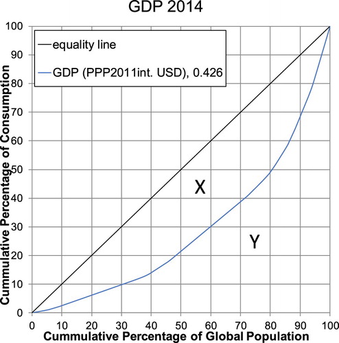
None of these measures provide further detail on the distribution beyond access or country averages. For this, other measures are applied in inequality research, such as the Gini coefficient and Lorenz curves. The Gini coefficient and its geographic interpretation in the form of the Lorenz curve (Lorenz Citation1905) are a measure of goods distribution between population groups. shows a Lorenz curve of GDP per capita (PPP, 2014), where on the horizontal axis, the cumulative percentage of population countries is ranked in ascending order of their average national per capita income. On the vertical axis, the respective cumulative income is shown. If income were distributed evenly, the Lorenz curve would match the 45° line. The respective Gini coefficient is the ratio of the segment between the 45° line of equality and the Lorenz curve (X) over the total segment under the 45° line (X + Y):(5)
(5) A Gini of 0 denotes perfect equality, the higher the Gini (maximum = 1), the further away the Lorenz curve is from the 45° line. In the case of highest inequality (Gini = 1), one group or person owns everything and the Lorenz curve would raise vertically at the end of the x-axis. The Lorenz curve is a useful and important visualization tool as different Lorenz curves can have the same Gini coefficient (a common critique of the Gini).
Figure 1. Global Lorenz curve for GDP per capita (2014) based on a sample of 42 countries. Data Source: World Bank (Citation2017).
Originally, the Gini coefficient and Lorenz curve were developed to measure income inequality. The Gini can be calculated from a variety of different underlying indicators. The literature shows many examples of the Gini coefficients and Lorenz curves being used for assessing the inequality of domains other than income, such as: house size (Kohler et al. Citation2017), happiness (Bennett and Nikolaev Citation2017) solid waste arising from material resource use (Druckman and Jackson Citation2008), historical (Groot Citation2010) and future (Zimm and Nakicenovic Citation2019) carbon emissions, material indicators (e.g. domestic extraction, domestic material consumption and material footprint) and indicators measuring the intensity with which human society uses terrestrial ecosystems (Teixidó-Figueras et al. Citation2016), education (Sauer and Zagler Citation2014; Vinod, Yan, and Xibo Citation2001), health (Williams and Cookson Citation2000), spatial inequity in transportation (Jang et al. Citation2017), internet bandwidth (Hilbert Citation2016), mobile phones, radios and bikes (Bento Citation2016), energy (Wu, Zheng, and Wei Citation2017) and electricity (Jacobson, Milman, and Kammen Citation2005).
In the application of the Gini coefficient for comparing the distribution of GDP across countries, everyone has – as little as it might be – some income.Footnote8 Hence, a Lorenz curve of international income inequality based on GDP per capita usually starts in the origin (see ). In contrast, non-access or non-ownership is an issue for technologies and infrastructures. Looking at income alone underestimates inequality in human development, especially at the lower end of the distribution. Everyone has income, but not everyone owns goods or has access to infrastructures. If national averages of consumption or ownership are used in international inequality assessments, the population without access is overlooked, leading to underestimating international inequality (see Hilbert Citation2016 and Bento Citation2016). Accounting for non-access can also lead to different country rankings. Depending on the distribution, either the lower end (the groups possessing very little or without access) or the upper end (groups owning or consuming a lot) will influence the Gini coefficient and Lorenz curve more. This paper seeks to improve the measurement for international inequality at the lower end, which is crucial for understanding how to achieve the SDGs.
Method and data
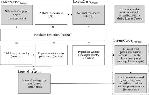
This paper is proposing to use the Gini coefficient and Lorenz curve as established measures of inequality across countries. It proposes to calculate the Gini based on combining access rates and national average per capita rates to improve measuring inequality, accounting for non-access. Hence, all technology items or service consumption in a country, e.g. TVs or kWhs, are only shared by the population living in households with TVs or electricity and not by the total population of a country.
To derive this ‘combined’ Lorenz curve, the following steps are taken (see ): First, the population (p) without access in each country (i) is calculated via the national household (Equation (1)) or population access rate (Equation (2)). This is summed up to a global total of individuals without access: . This is used as the first share of cumulative population of the country ranking in the Lorenz curve. Next, all items in a country are shared across owners/users only. Then all countries are ranked in increasing order according to their national ownership/usage per capita with access, such as the national averages per owner/users, (see Equation (2)) to complete the improved LorenzCurveCombined. Hence, all those with access in a country have the same level of access. By doing so, within country-distribution is accounted for in a very basic way as two groups are created, whereas previously only homogenous national groups were used. The national average of the owners/users is higher than the original overall national average. If there is a share of population without access, the Lorenz curve will not start in the origin but on the x-axis at the share of total population without access. Accounting for non-access therefore pushes the Lorenz curve to the right, increasing the Gini coefficient. This approach provides a more detailed view on the lower end of the distribution, which influences the Gini coefficient and in some cases also the country ranking.
Figure 2. Data and methodology to derive different Lorenz curves and respective Gini coefficients. (Note: the overview is given for population access rate. In the case of household access rates these are multiplied by household number and average household size per country.)
To compare the impact of accounting for non-access, a set of Lorenz curves and Gini coefficients for each infrastructure service and end-use technology will be shown (). The Lorenz curves are generated by arranging countries in ascending order based on different underlying indicators (e.g. national average kWh per capita). Because of the different national shares of population without access, the impact of accounting for non-access varies across countries and indicators.
Table 2. Gini coefficients, underlying indicators and characteristics of related Lorenz curves.
This paper proposes to measure the effect of accounting for non-access by the following factor, as the GiniAverage is most commonly applied when international inequality is measured:(6)
(6) The Gini Correction Factor (Equation (6)) estimates by how much the GiniAverage differs from the GiniCombined. As the GiniAverage is usually smaller than the GiniCombined, the Gini Correction Factor assesses by how much the commonly used GiniAverage underestimates inequality compared to the improved measure of the GiniCombined put forth in this contribution.
provides the infrastructures and end-use technologies assessed for international inequality (see the Appendix for descriptive statistics). The chosen infrastructures and end-use technologies are commonly used in the development community to assess progress in human development (see , e.g. Alkire and Santos Citation2014; Rao and Min Citation2017). Many of these are also part of the list of indicators proposed by the Inter-Agency and Expert Group on SDG Indicators (IAEG-SDGs) (United Nations Economic and Social Council Citation2017) and are being used to track the progress of SDG implementation (UN Citation2016). For mobility as well as information and communication technologies, a range of end-use technologies serve as proxies. Most of these are linked to increasing affluence and living standards and enable their owners to actively participate in society and the economy.
Table 3. Indicators included in the analysis of inter-national inequality and their link to the SDGs.
The analysis includes a set of around 40 countries () from different regions and development stages. The major economies of all continents (except Australia) are included, such as the United States, Brazil, China, India, Russia, South Africa, Germany or the United Kingdom but also least developed countries, such as Bangladesh or Uganda. These countries have been selected because of data availability across technology and infrastructure indicators. In 2014, these countries represented around 5.7 billion people or 80% of world population.
Table 4. Countries included in the analysis.
The data is country-level data, including national averages and data on access rates (population with/without access) based on household surveys. Most household surveys in developing countries do not cover multiple ownership or extent of service use (kWh) but only collect information on particular issues, such as access to electricity.
Results and interpretation
This paper argues that traditional average country-level measures on technology access and inter-national inequality underestimate the degree of inequality. The next section applies the improved measure, which accounts for non-access when calculating the Gini coefficient, to a range of different end-use technologies and services. It shows differences in international inequality and makes a comparison to traditional approaches.
Infrastructure services
and provide international Lorenz curves and respective Gini coefficients for the most recent years with data available for electricity consumption (kWh) and Internet bandwidth (bits/sec). Electricity is more equally distributed than Internet bandwidth.
Figure 3. Infrastructure Lorenz curves based on access only (dashed), user averages (small dots), country averages (dotted) and combined (country averages accounting for non-access, solid) for (a) electricity and (b) Internet bandwidth, incl. Gini coefficients.
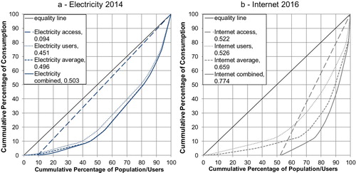
Table 5. Gini coefficients and correction factors for electricity, Internet bandwidth and GDP.
One can clearly see, that the LorenzCurveUsers (dotted) and LorenzCurveAverage (dashed) both start in the origin as they do not account for non-access. The LorenzCurveAccess (straight dashed) and LorenzCurveCombined (solid) do not start in the origin, as they are shifted to the right along the x-axis by the share of population without access. The LorenzCurveAccess is a straight line as it is based on a binary indicator, everyone with access has the same amount of access. Lorenz curves, which are closer to the line of equality (45° line) are more equal. The LorenzCurveUsers are more equal than the LorenzCurvesAverage as the total amount of consumption (e.g. bits/sec) is shared among a smaller group of people (e.g. 3 billion users versus 5.8 billion population). Accounting for non-access increases inequality, as LorenzCurveCombined is being pushed to the right, further away from the line of equality.
The global spread in electricity consumption (kWh) is very wide (249–12,972 kWh per person with access, or 99–12,972 kWh per person). Accounting for the 9.4% of population without access in the countries does not change the Gini coefficient significantly (+1.4%, from 0.496–0.503) as it is dominated by the large spread in consumption and the majority of countries already achieved close to 100% electrification. Our reduced country set underestimates inequality as developing countries are underrepresented. In 2014, the share of global population without access to electricity was estimated at 14.7% (World Bank and Sustainable Energy for All (SE4ALL) Citation2014), around 5% more than in the country sample used in this analysis. For that sample, the bottom 50% consumed less than 15% of electricity, while the top 10% consumed more than 65% in 2014.
The global spread in Internet bandwidth (bits/sec) is even wider (1,741–449,137 bits/sec per person with access, or 226–425,782 bits/sec per person), but more than 50% do not have access (ITU Citation2016). If non-access is accounted for, the Gini increases by around 17%, from 0.66 to 0.77. In 2016, 70% of global population accounted for only 10% of Internet bandwidth, while the top 10% consumed 40%. Again, the reduced country sample used underestimates inequality as developing countries are underrepresented. Applying the same approach to a country set with a coverage of 196 countries and 7.3 billion people (ITU Citation2016), Internet bandwidth (bits/sec) shows a Gini of 0.82 and non-access of 54.19% compared to 0.77 and 52.22% for the 43 countries and 5.8 billion people of the reduced sample set.
Not only does inequality increase when non-access is accounted for, the rankings of countries within the Lorenz curves also change, sometimes considerably. Countries with larger shares of non-access move up in the ranking:
Electricity: Rank differences (up to six positions changes) occur for countries, which do not have close to 100% electrification rates (e.g. Tanzania moves down from position 1 to 7, Ghana moves up from 6 to 3).
Internet: The country rankings change more significantly than electricity as no country has 100% access. The majority of countries moves only one or two ranks up or down. Examples of countries with particular larger changes, are: Vietnam from 29 to 34, Pakistan from 5 to 10, Kenya from 17 to 29, Korea from 31 to 23, Jordan from 9 to 4, China down from 13 to 8.
This paper argues that looking at inequalities in infrastructure services and technologies provides a valuable addition beyond assessments covering income inequality only. Both electricity and the Internet show higher Gini coefficients than GDP (PPP), the difference for the Internet is 0.35. Electrification, electricity consumption and economic development are closely linked (Rao and Min Citation2017) but electricity consumption is less equally distributed than GDP. In 2014, the richest 20% gained more than 50% of global GDP (PPP) and consumed more than 50% of global electricity. Yet, the poorest 20% accounted for less than 7% of cumulative GDP and less than 2% of cumulative kWhs. In the case of Internet bandwidth, the difference in distribution to GDP is even more pronounced. In 2016, the top 20% consumed more than 80% of global bandwidth, the top 10% more than 55%, and the top 2% around 15%.
End-use technologies
and provide global Lorenz curves and respective Gini coefficients for selected end-use technologies. To our knowledge, these are the first estimates of global inequality for these technologies. Here LorenzCurvesUsers are omitted as the spread in number of items owned is smaller. This is because a household or individual typically owns only a limited number of devices.
Figure 4. Technology Lorenz curves based on access only (dashed), country averages (dotted) and combined (country averages accounting for non-access, solid) for (a) motorized vehicles, (b) mobile phones, PCs and (c) TVs and (d) PCs, incl. Gini coefficients.
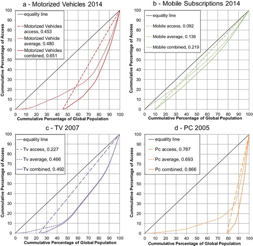
Table 6. Gini coefficients and correction factors for end-use technologies.
For motorized vehicles, we combined car and motorbike or moped ownership. The leap from no individual motorized transport to some kind of individual motorized transport (such as a two-wheeler) is more substantial from a convenience and service point of view than the step from a two wheeler to a car. This notion is also reflected in multi-dimensional poverty and deprivation measures (see ). We thus treat the ownership of cars, motorbikes or moped equally. Depending on which vehicle type dominated in a country, we used the data for that vehicle type. This led to 19 countries with motorbikes/mopeds (mainly developing countries), and 25 countries with cars (see ).
The GiniCombined increases from mobile phones (0.22), via TV sets (0.49), motorized vehicles (0.65) to its highest level for PCs (0.87). In the case of motorized vehicles, more than 45% of global population do not have access. This increases the Gini by more than 30%, compared to a traditional country-average distribution curve and resulting inter-country Gini. If only cars are looked at, inequality is even higher: with the global Giniaccess at 0.73 and Ginicombined at 0.77. In the case of mobile phones, the adjusted Lorenz curves suggests that only 10% do not have access. Except for mobile phones, the Gini coefficients for technologies are worse than for GDP (0.43).
The Gini Correction Factor is a measure of bias, showing how much the Gini coefficient increases once non-access is accounted for. The Ginicombined increases by + 61% (mobile subscriptions), +36% (motorized vehicles), +25% (PCs), and + 5% (TVs), if access is taken into account (compared to the GiniAverage). We can see that more granular technologies (e.g. mobile phones and TVs) are more equally distributed than lumpy technologies such as motorized vehicles or PCs (Wilson et al. in preparation). For GDP no Ginicombined, nor GiniAccess and hence no Gini Correction Factor exists as every household has at least some income.
The rank changes are more significant for technologies than for the examined infrastructure services:
Motorized vehicles: Motorized vehicles show the strongest changes in rankings. Nearly all countries are affected by at least several ranks. Extreme examples are countries with very low access rates: Peru (18–33), Colombia (20–32) and El Salvador (6–17) with very low access and Vietnam (down from 29 to 20), Lebanon (to 11) and Republic of Kora (33–26) are countries with very high access rates.
Mobiles: Nearly all countries are affected by rank changes of several positions. Some extreme examples are Mexico (9–29), Venezuela (14–42), and Tanzania (2–26), due to relatively low household mobile phone penetration rates (</ = 60%) in these countries.
PC: Again, the ranking changes across nearly all countries, often by double-digit positions. Very extreme examples are least developed countries such as Bangladesh (7–36) and Uganda (5–40), Senegal (11–30), and India (10–31).
TV: Rank changes are not as significant for TVs and mostly stay within two to four positions. Many developed countries do not change ranks, as they have close to full access.
Limitations and further research
This analysis comes with a rage of caveats that merit further investigation, but has demonstrated that existing methods of assessment tend to underestimate international inequality. Therefore this paper calls for more detailed analyses of inequalities in technologies and infrastructures. The following limitations of this study and aspects for further research are noted.
First, the technologies and infrastructures sampled are different in terms of their costs, degree of technological maturity, as well as degree on reliance/interdependency with other infrastructures. The internet and mobile phones are infrastructures and technologies that are more recent than electricity networks or TVs. They are also interdependent. Electricity (not necessarily from the grid) is a precondition for the use of mobile phones or TVs. Internet bandwidth can only be used if electricity, an Internet connection and an Internet compatible device, such as a smart phone or computer, are available. Also, the data analyzed were available only for different years, with earlier years (TV and PCs) generally displaying higher degrees of inequality compared to later years.
Second, our country set has a sampling bias, despite including all continent and development regions. Developing countries are underrepresented, underestimating inequality. The Gini coefficients would be higher by 0.01–0.05 as the share of population without access is underestimated by 1.5–5.5% across the indicators, in comparison to a larger country set covering close to all countries worldwide.
Third, based on available data only access to infrastructure services and end-use technologies is assessed, ignoring inequalities in quality of these technologies and services provided (e.g. reliability of electricity supply, definition on what constitutes access, old/second hand vs. new cars, type/safety/power equipment, etc.). This paper looks at the number of technology items and not the value of the items (e.g. cars). Looking at the value (USD) of different items could provide a proxy for quality and will likely lead to higher inequality. This also underestimates real disparities.
Fourth, average national household sizes are assumed and no differentiation is made between (multiple) owners and non-owners, underestimating inequality. In reality, poorer households tend to be larger. Since access to the technologies is scaled via household sizes, this increases access levels in developing countries, where a single technology item delivers access to more people. This again contributes to underestimating inequality.
Fifth, in this analysis all people living in a household with access to a technology, are assumed to benefit from the access. This approach ignores any issues of power and control within households especially for rival goods or goods that require ability/capacity to ‘use’ (e.g. having a driving license), and cultural norms. This also underestimates inequality.
Sixth, our inequality assessment is based on national-level average data and does not consider inequalities related to multiple ownership/service us within countries beyond access, which can be severe.
Seventh, while the Gini coefficient and Lorenz curve are well known, widely used and well understood, other inequality indices (e.g. Atkinson Index, Entropy Index or Absolute Gini) should also be used to assess inequality in technologies and infrastructure services. Depending on the research question and available date, these might be well suited in certain realms allowing for more in-depth analyses. It should also be noted that inequality can be reduced by intense users using less but also by non-users gaining access or users at the lower end increasing usage. The absolute consumption level thus needs to be kept in mind.
Overall, this merits further research on how to improve measuring inequalities in infrastructures and technologies.
Conclusion
Access to technologies and infrastructure services are crucial for human well-being. The SDGs call for reducing inequalities within and between countries and for improving human well-being, in view of a multi-dimensional poverty approach that goes beyond simply considering income alone. While international inequalities in income are well studied, inequalities in technology and infrastructures have received less attention.
This paper argued that current measurements underestimate international inequality in technology and infrastructure services as they rely on national averages and ignore non-access. The paper proposed to improve international Gini coefficients and Lorenz curves for technologies and infrastructure services by explicitly accounting for non-access, thus improving inequality measures especially at the lower end of the distribution. This improved measure was tested for selected infrastructure services and end-use technologies, which feature in the SDGs and which are used to track progress in human development.
The paper provided the first improved Lorenz curves and Gini coefficients for international inequality for technologies such as motorized vehicles and infrastructure services such as Internet bandwidth. Accounting for non-access leads to higher international inequality and considerable changes in country rankings. The larger the share of population without access, the stronger the effect. The paper also showed that international inequalities in infrastructures and technologies are higher than inequalities in income.
Further work on inequalities in technologies and infrastructure services is called for, from accounting multiple ownership, via applying other indices, to adding more granular analysis with regards to the heterogeneity of households as well as of technologies and infrastructures.
Acknowledgements
The author thanks Arnulf Grubler, Nebojsa Nakicenovic, Narasimha Rao and Charlie Wilson for valuable discussions and comments during the design of the research and during the writing of this manuscript. The author's work was supported by the International Institute for Applied Systems Analysis (IIASA) within the World in 2050 (TWI2050) initiative.
Disclosure statement
No potential conflict of interest was reported by the author.
ORCID
Caroline Zimm http://orcid.org/0000-0001-5603-1015
Notes
1 SDG targets and indicators: Basic services in households (SDG 1.4.1), Improved water source (SDG 6.1.1); Improved sanitation (SDG 6.1.2); Electricity (SDG 7.1.1); Internet-fixed broadband subscriptions (SDG 17.6.2); Internet – proportion of population (SDG 17.8.1). Transport and media technologies can be seen as proxies for access to mobility and communication crucial to participate in society and the economy. In addition, SDG 10 is a more conventional income-based inequality goal: ‘Reduce inequality within and among countries’. This further refers to income inequality (SDG 10.1), social, economic and political inclusion of all (SDG 10.2.), and equal opportunities and reduced inequalities of outcome (SDG 10.3).
2 Multi-dimensional Poverty Index, http://ophi.org.uk/
3 Social Progress Imperative, www.socialprogressimperative.org
4 Individual Deprivation Measure, http://www.individualdeprivationmeasure.org/
5 See Rao and Min (2017).
6 EU Statistics on Income and Living Conditions, http://ec.europa.eu/eurostat/statistics-explained/index.php?title=Glossary:Severe_material_deprivation_rate
7 Global Consumption and Income Project, http://gcip.info/about
8 Income measures often fail to account for the imputed value of transfers-in-kind, leading to potential overestimating inequality (Danziger, Haveman, and Plotnick Citation1981). It is conceivable that some people have zero income but receive sufficient in-kind transfers to sustain their livelihood. In such cases, measured income would be zero. It is also possible for individuals to have negative income. These aspects are not sufficiently reflected when ranking countries according to GDP per capita, which is the most commonly used indicator to show international inequality.
References
- Aaberge, R., and A. Brandolini. 2014. “Multidimensional Poverty and Inequality.” Discussion Papers. Statistics Norway 792. https://www.ssb.no/en/forskning/discussion-papers/_attachment/210834.
- Acemoglu, D. 2002. “Technical Change, Inequality, and the Labor Market.” Journal of Economic Literature 40 (1): 7–72. doi: 10.1257/jel.40.1.7
- Acemoglu, D., and J. A. Robinson. 2000. “Why did the West Extend the Franchise? Democracy, Inequality, and Growth in Historical Perspective.” The Quarterly Journal of Economics 115 (4): 1167–1199. doi: 10.1162/003355300555042
- Alesina, A., and R. Perotti. 1996. “Income Distribution, Political Instability, and Investment.” European Economic Review 40 (6): 1203–1228. doi:10.1016/0014-2921(95)00030-5.
- Alkire, S., and G. Robles. 2017. “Multidimensional Poverty Index – Summer 2017: Brief Methodological Note and Results.” O. P. a. H. D. Initiative OPHI MPI Methodological Notes University of Oxford.
- Alkire, S., and M. E. Santos. 2014. “Measuring Acute Poverty in the Developing World: Robustness and Scope of the Multidimensional Poverty Index.” World Development 59 (Supplement C): 251–274. doi:10.1016/j.worlddev.2014.01.026.
- Alvaredo, F., A. B. Atkinson, T. Piketty, and E. Saez. 2013. “The Top 1 Percent in International and Historical Perspective.” Journal of Economic Perspectives 27 (3): 3–20. doi:10.1257/jep.27.3.3.
- Atkinson, A. B. 1970. “On the Measurement of Inequality.” Journal of Economic Theory 2: 244–263. doi:10.1016/0022-0531(70)90039-6.
- Bennett, D., and B. Nikolaev. 2016. “Economic Freedom amd Happiness Inequality. Friends or Foes?” Contemporary Economic Policy 35 (2): 373–391. doi:10.1111/coep.12190.
- Bennett, D. L., and B. Nikolaev. 2017. “On the Ambiguous Economic Freedom–Inequality Relationship.” Empirical Economics 53: 717–754. doi:10.1007/s00181-016-1131-3.
- Bento, N. 2016. “Calling for Change? Innovation, Diffusion, and the Energy Impacts of Global Mobile Telephony.” Energy Research & Social Science, 84–100. doi:10.1016/j.erss.2016.06.016.
- Bergh, A., and T. Nilsson. 2010. “Do Liberalization and Globalization Increase Income Inequality?” European Journal of Political Economy 26: 488–505. doi: 10.1016/j.ejpoleco.2010.03.002
- Bhatia, M., and N. Angelou. 2015. Beyond Connections: Energy Access Redefined. ESMAP Technical Report;008/15. Washington, DC: World Bank.
- Bourguignon, F., and C. Morrisson. 2002. “Inequality among World Citizens: 1820-1992.” American Economic Review 92 (4): 727–744. doi: 10.1257/00028280260344443
- Cruz-Jesus, F., T. Oliveira, and F. Bacao. 2018. “The Global Digital Divide.” Journal of Global Information Management 26 (2): 1–26. doi:10.4018/JGIM.2018040101.
- Cruz-Jesus, F., T. Oliveira, F. Bação, and Z. Irani. 2017. “Assessing the Pattern Between Economic and Digital Development of Countries”. Information Systems Frontiers 19 (4): 835–854. doi:10.1007/s10796-016-9634-1.
- Danziger, S., R. Haveman, and R. Plotnick. 1981. “How Income Transfer Programs Affect Work, Savings, and the Income Distribution: A Critical Review.” Journal of Economic Literature 19 (3): 975–1028.
- Druckman, A., and T. Jackson. 2008. “Measuring Resource Inequalities: The Concepts and Methodology for an Area-Based Gini Coefficient.” Ecological Economics 65 (2): 242–252. doi:10.1016/j.ecolecon.2007.12.013.
- Easterly, W. 2007. “Inequality Does Cause Underdevelopment: Insights From a new Instrument.” Journal of Development Economics 84: 755–776. doi: 10.1016/j.jdeveco.2006.11.002
- EUROSTAT. 2016. “Glossary: Material Deprivation.” European Union. Accessed April 18, 2018. http://ec.europa.eu/eurostat/statistics-explained/index.php?title=Glossary:Severe_material_deprivation_rate.
- Groot, L. 2010. “Carbon Lorenz Curves.” Resource and Energy Economics 32 (1): 45–64. doi:10.1016/j.reseneeco.2009.07.001.
- Guillén, M. F., and S. L. Suárez. 2005. “Explaining the Global Digital Divide: Economic, Political and Sociological Drivers of Cross-National Internet Use.” Social Forces 84 (2): 681–708. doi:10.1353/sof.2006.0015.
- Hilbert, M. 2016. “The Bad News is That the Digital Access Divide is Here to Stay: Domestically Installed Bandwidths among 172 Countries for 1986–2014.” Telecommunications Policy 40 (6): 567–581. doi:10.1016/j.telpol.2016.01.006.
- IEA Statistics. 2014. “Electric Power Consumption (kWh per capita).” 2 January 2018. OECD/IEA. http://www.iea.org/statistics/statisticssearch/.
- ITU. 2014. World Telecommunication/ICT Indicators Database. Geneva: International Telecommunication Union.
- ITU. 2016. “ICT Facts and Figures 2016.” International Telecommunication Union. http://www.itu.int/en/ITU-D/Statistics/Documents/facts/ICTFactsFigures2016.pdf.
- Jacobson, A., A. D. Milman, and D. M. Kammen. 2005. “Letting the (Energy) Gini out of the Bottle: Lorenz Curves of Cumulative Electricity Consumption and Gini Coefficients as Metrics of Energy Distribution and Equity.” Energy Policy 33 (14): 1825–1832. doi:10.1016/j.enpol.2004.02.017.
- Jang, S., Y. An, C. Yi, and S. Lee. 2017. “Assessing the Spatial Equity of Seoul’s Public Transportation Using the Gini Coefficient Based on its Accessibility.” International Journal of Urban Sciences 21 (1): 91–107. doi:10.1080/12265934.2016.1235487.
- Kohler, T. A., M. E. Smith, A. Bogaard, G. M. Feinman, C. E. Peterson, A. Betzenhauser, et al. 2017. “Greater Post-Neolithic Wealth Disparities in Eurasia Than in North America and Mesoamerica.” Nature, doi:10.1038/nature24646. https://www.nature.com/articles/nature24646#supplementary-information.
- Lee, S.-O., A. Hong, and J. Hwang. 2017. “ICT Diffusion as a Determinant of Human Progress.” Information Technology for Development 23 (4): 687–705. doi:10.1080/02681102.2017.1383874.
- Lorenz, M. O. 1905. “Methods of Measuring the Concentration of Wealth.” Journal of the American Statistical Association 9. doi:10.2307/2276207.
- Magnani, N., and A. Vaona. 2016. “Access to Electricity and Socio-Economic Characteristics: Panel Data Evidence at the Country Level.” Energy 103: 447–455. doi:10.1016/j.energy.2016.02.106.
- Milanovic, B. 2013. “Global Income Inequality in Numbers: in History and Now.” Global Policy 4 (2): 198–208. doi:10.1111/1758-5899.12032.
- Milanovic, B. 2016. Global Inequality: A New Approach for the Age of Globalization. Cambridge, MA: The Belknap Press of Harvard University Press.
- NationMaster. 2017a. “Countries Compared by Media > Personal computers > Per capita. 2004-2005.” http://www.nationmaster.com/country-info/stats/Media/Personal-computers/Per-capita.
- NationMaster. 2017b. “Countries Compared by Media > Televisions per 1000 2003.” http://www.nationmaster.com/country-info/stats/Media/Televisions-per-1000.
- Neckerman, K. M., and F. Torche. 2007. “Inequality: Causes and Consequences.” Annual Review of Sociology 33 (1): 335–357. doi:10.1146/annurev.soc.33.040406.131755.
- OICA. 2014 . “World Vehicles in Use.” 2 January 2018. Organisation Internationale des Constructeurs d’Automobiles/International Organization of Motor Vehicle Manufacturers. http://www.oica.net/category/vehicles-in-use/.
- Pew Research. 2015. “Car, Bike or Motorcycle? Depends on Where You Live.” Pew Research. http://www.pewresearch.org/fact-tank/2015/04/16/car-bike-or-motorcycle-depends-on-where-you-live/.
- Pick, J. B., and T. Nishida. 2015. “Digital Divides in the World and its Regions: A Spatial and Multivariate Analysis of Technological Utilization.” Technological Forecasting and Social Change 91: 1–17. doi:10.1016/j.techfore.2013.12.026.
- Piketty, T. 2014. Capital in the Twenty-First Century. Cambridge, MA: The Belknap Press of Harvard University Press.
- Piketty, T., and E. Saez. 2003. “Income Inequality in the United States, 1913-1998.” The Quarterly Journal of Economics 118: 1–41. doi: 10.1162/00335530360535135
- Pinkovskiy, M., and X. Sala-i-Martin. 2009. Parametric Estimations of the World Distribution of Income (No. w15433). Cambridge, MA: National Bureau of Economic Research. doi:10.3386/w15433.
- Rao, N. D., and J. Min. 2017. “Decent Living Standards: Material Prerequisites for Human Wellbeing (Journal Article).” Social Indicators Research, doi:10.1007/s11205-017-1650-0.
- Rao, N. D., and K. Ummel. 2017. “White Goods for White People? Drivers of Electric Appliance Growth in Emerging Economies.” Energy Research & Social Science 27 (Supplement C): 106–116. doi:10.1016/j.erss.2017.03.005.
- Reddy, S., and R. Lahoti. 2015. “Is the Devil in the Details? Estimating Global Poverty.” 8 January 2018. Institute for New Economic Thinking. https://www.ineteconomics.org/perspectives/blog/is-the-devil-in-the-details-estimating-global-poverty.
- Sachs, J., G. Schmidt-Traub, C. Kroll, D. Durand-Delacre, and K. Teksoz. 2017. SDG Index and Dashboards Report 2017. New York: Bertelsmann Stiftung and Sustainable Development Solutions Network (SDSN).
- Sala-i-Martin, X. 2006. “The World Distribution of Income: Falling Poverty and … Convergence, Period.” The Quarterly Journal of Economics 121: 351–397. doi:10.1162/qjec.2006.121.2.351.
- Sauer, P., and M. Zagler. 2014. “(In)equality in Education and Economic Development.” Review of Income and Wealth 60: S353–S379. doi:10.1111/roiw.12142.
- Skaletsky, M., R. D. Galliers, D. Haughton, and O. Soremekun. 2016. “Exploring the Predictors of the International Digital Divide.” Journal of Global Information Technology Management 19 (1): 44–67. doi:10.1080/1097198X.2016.1134171.
- Smith, T., M. Noble, S. Noble, G. Wright, D. McLennan, and E. Plunkett. 2015. “The English Indices of Deprivation 2015. Technical report.” London. https://assets.publishing.service.gov.uk/government/uploads/system/uploads/attachment_data/file/464485/English_Indices_of_Deprivation_2015_-_Technical-Report.pdf.
- Sokoloff, K. L., and S. L. Engerman. 2000. “History Lessons: Institutions, Factor Endowments, and Paths of Development in the New World.” Journal of Economic Perspectives 14 (3): 217–232. doi:10.1257/jep.14.3.217.
- Steckel, J. C., N. D. Rao, and M. Jakob. 2017. “Access to Infrastructure Services: Global Trends and Drivers.” Utilities Policy 45: 109–117. doi:10.1016/j.jup.2017.03.001.
- Stiglitz, J. E. 2012. The Price of Inequality. First edition. New York: W.W. Norton.
- Teixidó-Figueras, J., J. K. Steinberger, F. Krausmann, H. Haberl, T. Wiedmann, G. P. Peters, et al. 2016. “International Inequality of Environmental Pressures: Decomposition and Comparative Analysis.” Ecological Indicators 62 (Supplement C): 163–173. doi:10.1016/j.ecolind.2015.11.041.
- Townsend, P. 1979. Poverty in the United Kingdom: A Survey of Household Resources and Standards of Living. Middlesex: University of California Press.
- UN. 2015. Transforming our World: the 2030 Agenda for Sustainable Development. New York: United Nations General Assembly.
- UN. 2016. Progress Towards the Sustainable Development Goals. New York: Report of the Secretary-General. Supplementary Information.
- UNDP. 2005. Human Development Report 2005. New York: United Nations Development Programme.
- United Nations Economic and Social Council. 2017. Report of the Inter-Agency and Expert Group on Sustainable Development Goal Indicators’ S. Commission. New York: UN E/CN.3/2017/2.
- USAID. 2017. “The DHS Program.” Demographic and Health Survey (DHS). Accessed January 2, 2018. https://dhsprogram.com/What-We-Do/Survey-Types/DHS.cfm.
- Vinod, T., Wang Yan, and Fan Xibo. 2001. “Measuring Education Inequality – Gini Coefficients of Education.” Policy Research Working Paper Series. https://ideas.repec.org/p/wbk/wbrwps/2525.html.
- WHO. 2018. “ Global Health Observatory (GHO) data.” http://www.who.int/gho/en/.
- Williams, A., and R. Cookson. 2000. “Equity in Health.” In Handbook of Health Economics Vol. 1B, edited by Aj Culyer, and J. P. Newhouse, 1863–1910. Amsterdam: Elsevier Science.
- Wilson, C., N. Bento, and A. Grubler. in preparation. Benefits of granular technologies.
- World Bank, & Sustainable Energy for All (SE4ALL). 2014. “Access to Electricity (% of population).” 2 January 2018. SE4ALL Global Tracking Framework led jointly by the World Bank, International Energy Agency, and the Energy Sector Management Assistance Program. https://data.worldbank.org/indicator/EG.ELC.ACCS.ZS.
- World Bank. 2017. “World Development Indicators.” https://data.worldbank.org/data-catalog/world-development-indicators.
- WRS. 2017. “Word Road Statistics.” International Road Federation.
- Wu, S., X. Zheng, and C. Wei. 2017. “Measurement of Inequality Using Household Energy Consumption Data in Rural China.” Nature Energy 2 (10): 795–803. doi:10.1038/s41560-017-0003-1.
- Zimm, C., and N. Nakicenovic. 2019. “What are the Implications of the Paris Agreement for Inequality?” Climate Policy, 1–10. doi:10.1080/14693062.2019.1581048.