
Abstract
This paper examines how data journalism producers encode their audiences’ user experience – or how they construct meaning within the parameters of a user interface. We argue that interfaces enact data journalists’ perceptual image of their audience, and are therefore a meaningful object of study to explore: (a) the relationship between data reporters and their publics; (b) the tensions that emerge from that relationship; and (c) how those tensions are negotiated. Our combined evaluation of producer and artefact perspectives is based on interviews with 12 data journalism producers in legacy UK newsrooms, and interaction design, and multimodal discourse analysis of 12 stories produced by our informants. Findings suggest that data journalism producers’ efforts to create content that resonates with their audiences have resulted in the diversification of data journalism formats, and a more mature view of interactivity, with producers striving to offer experiences in whose meaning negotiation the reader takes centre stage. The reader is perceived as a co-creator of meaning through the expectation of either physical interaction or cognitive immersion. Yet, the paternalistic element, even in the most discovery-/reader-driven stories, remains stronger, manifesting in a carefully crafted experience and pointing to journalism producers’ traditional self-perception as gatekeepers of information.
Introduction
Since its rise in popularity in the late 2000s, data-driven digital journalism has brought a renewed promise of interactivity by allowing audiences to delve into databases with ease in search of personalised stories. In this context, the potential of interactivity is both editorial and commercial. On the one hand, enabling the public to crowdsource, sort and compare data in various forms lends credence to journalistic discourses of truthfulness, reliability and public interest commitment, which are crucial to its existence (Broersma Citation2010). These are further legitimised by the use of countable measurements as a prototype for truthful discourse (Mattelart Citation2005), and the perceived neutrality of computational methods and technologies inherent in data journalism processes (Borges-Rey Citation2016). On the other hand, data journalism is perceived as a commercial opportunity to innovate and “create a distinctive online offering” (Usher Citation2016, 142), which, it is deemed, would increase its attractiveness to both audiences and advertisers.
However, as data journalism matures, diversifies, and moves from the margins to the centre of journalism practice, academic interest seems to be shifting from ontological, epistemological and identity issues to a need to understand data journalism’s “rituals of meaning-making” (Broersma Citation2010, 16, 19) and its impact on society. This requires that we look at data journalism as both a socio-discursive practice and the material product of that practice. Because meaning is not created in a vacuum, but constructed through the encounter of producer and audience, there is a demand to investigate how the “imagined audience” (Litt Citation2012) factors in the production of data journalism artefacts. “Imagined” connotes a certain lack of control on the producers’ part, their control being relinquished the moment a data journalism story is published. We argue that a more useful concept to explore in an era of increased audience quantification and measurement is that of the constructed audience – or the various ways newsroom audiences are conceptualised and configured in the encoding process. “Constructed”, in this context, refers to the ways data journalism producers try to predict, during the design process, what user experience (UX) pathways have the potential to generate audience engagement.
This paper examines how UX design choices are encoded in the interfaces of data journalism stories and how audiences are constructed in the process of data journalism production.
The study aims to answer the following research questions:
RQ1: How is the audience constructed in the process of encoding data journalism user experiences?
RQ2: How are the producer-audience tensions negotiated in, and beyond, the interface of data journalism artefacts?
Knowing the Reader: Between Embodied and Constructed Audiences
Recent data journalism studies have emphasised the increasing centrality of UX design thinking to journalism practice (Appelgren Citation2017; Borges-Rey Citation2016). This evidences journalists’ efforts to understand their audiences and provide informational experiences that resonate strongly with them. Zamith (Citation2018) finds “a hereto unprecedented level of quantification in constructing audiences” (422), noting that metrics “are now factored to some extent into journalistic attitudes, behaviours, content, discourses, and ethics” (419). As analytics become central to evaluating journalism performance, and audience measurement tools become more sophisticated, newsrooms now get an increasingly granular feedback on how their audiences engage with content. However, the literature paints a rather paradoxical picture of the way journalism audiences have been, and are being, constructed.
Anderson (Citation2011) notes a distinct tension between a growing rhetoric of “active”, “empowered”, “generative” audiences on one hand, and an “increased reliance on news metrics” on the other. The rise of filtering and personalised content (including targeted advertising) reinforces the view that digital media “has deepened and extended the commodification of audiences” (Champion Citation2015, 39). While news organisations increasingly invoke the rhetoric of “engagement” and “personalisation”, they “build traceable relationships”, thus reducing their imagined audience to “a set of monitored and recorded characteristics in order to extract economic value” (Carlson Citation2018, 411). This discrepant view of audiences as both embodied, active individuals and measurable commodities points to what appears to be an ever-widening gap between professional narratives and actual practice (Ferrer-Conill and Tandoc Citation2018).
A similar discrepancy is observed in the widespread newsroom rhetoric of “interactivity” – seen as giving control to the audience to “explore” the narrative for themselves, and to “dive deep into a specific subject or take a cursory look” through tactile navigation (Usher Citation2016, 194). By positioning the “viewer” within the artefact, interactivity demands that they “play an active role in the negotiation of the ‘reality’ being conveyed” (Aston and Gaudenzi Citation2012, 126). The user is given “controlled freedom” (Usher Citation2016, 194) within a computer interface, which supposedly enhances the UX and thus, through analysis of audience interactions, offers a deeper understanding of the audience.
Research on digital media interactivity, however, suggests that the capacity of users to interact with the medium is limited by a finite set of finely tuned options (Dewdney and Ride Citation2014; Lister et al. Citation2009; Manovich Citation2001) that are mediated by discourses of product design and audience tracking. Studies investigating interactivity in data journalism have conceptualised it primarily in terms of the levels of afforded tactile control and agency. Earlier, predominantly quantitative, content analyses of data journalism stories produced between 2012 and 2016 found that these projects were either “largely superficial and non-remarkable” (Knight Citation2015), or “defaulted to deploying interactivity for interactivity’s sake” (Young, Hermida, and Fulda Citation2018). That was because the production tools used by early-day data journalists, which afforded a degree of interactivity, tended to be unsophisticated, third-party software solutions (Young, Hermida, and Fulda Citation2018; Loosen, Reimer, and Silva-Schmidt Citation2017, Borges-Rey Citation2016). While early data journalism was the product of “trial-and-error evolution”, Loosen, Reimer and Silva-Schmidt (Citation2017) found a tendency for certain semiotic modes and interactive functions to stabilise “into ‘typical combinations’ as they reoccurred frequently over the years” (14).
Appelgren’s investigation of interactive features and signs of personalisation in data journalism emphasises the “filtering”, curatorial function of journalism as one “naturally making decisions for the audience” (2017, 3). A data journalistic project, Appelgren observes, is “a choice architecture provided by journalists and developers, where the design nudges people to explore the storyline” (6–7). Appelgren notes that while the early examples of data journalism used to have a high level of interactivity, there is evidence that this has now been replaced by “an illusion of interactivity” and a more author-driven, paternalistic design approach offering “only limited possibilities for the audience to make choices” (Appelgren Citation2017, 14). In a rare scholarly attempt to understand the rationale for the rather constrained audience agency offered recently, Young, Hermida, and Fulda (Citation2018) found that the trend towards limited interactivity might be explained by journalists’ experience of a low audience interest in sophisticated interactivity, offered by audience analytics. Drucker et al. point out that only an estimated 10–15% of website visitors use the interactive features of data-driven stories (2018, 226).
UX Design in Journalism: Configuring the User Experience, Configuring the Audience
Kress and van Leeuwen (2001) define design as “the shaping of available resources into a framework which can act as the ‘blueprint’ for production” (50). Journalism UX design is shaped by various creative tensions – between authorship and participation, freedom and control, representation and agency, navigational choice and a coherent UX. These are complicated further by the instability inherent in interactive texts – being “not securely encoded for all audiences to decode in the same way”, which demands that producers relinquish control over their reception and interpretation (Lister et al. Citation2009, 23). This explains why producers invest increasing time and resources in “configuring the user” through UX design practices such as prototyping and usability testing to try to envisage “the kinds of behaviours that they want their environment to afford, whilst simultaneously understanding that they can neither wholly predict nor control what users will do within” (Lister et al. Citation2009, 25).
Recent studies of UX in journalism suggest that mapping the user journeys, and ensuring that the purpose and meaning of data journalism stories are clear, should be a priority for news producers, especially those experimenting with storytelling formats. Greussing and Boomgaarden (Citation2018) found that the presence of visual aesthetics in novel forms of digital journalism contributes to “meaningful learning from news by initiating positive attitudes towards the interface” (1), but too many design embellishments could pose a cognitive load on individuals and hinder their absorption, or depth of user engagement with the content. Similarly, Yael et al. (2017) conclude that readers tend to value news visualisations only when they are “coherently integrated into a news story and thus fulfil a function that can be easily understood” (1), an observation which highlights the importance of digital and data literacy. Drucker et al. (2018, 214) recommend that in order to communicate with their audiences effectively, data journalism producers need to consider their readers’ data and visual literacy, background knowledge, and design expectations, or familiarity with the format.
The literature on UX in data-driven storytelling suggests that designers use a number of rhetorical strategies to offer powerful audience experiences. Hullman and Diakopoulos (Citation2011)’s study of framing effects in narrative visualisation found that InfoVis (information visualisation) designers apply certain subtle “information presentation manipulations” (2239), such as anchoring, filtering, omission, contrast, classification, visual metaphor and metonymy, among others, and through editorial judgement and design choices, communicate meaning both denotatively and connotatively, thus activating different personal and cultural viewing codes when interpreted by audiences. Narrative visualisation design involves techniques of persuasion, which “prioritize particular interpretations”, thereby “significantly affect[ing]” how end users decode a message (Hullman and Diakopoulos Citation2011, 2231). A potentially opaque and obscure part of communicative intentions lies under the hood of the interface, which is rhetorical: “in effect an argument is made because of the way in which possible user actions are structured” (Nash Citation2014, 58–59). These observations are particularly pertinent to journalism, which has a distinct “truth regime”. In making design choices and editorial decisions, journalists mould the UX and thus, what can and cannot be known. This requires an exploration of any connotative meanings of data journalism stories, which may not be necessarily visible in a traditional content analysis. It also requires that we adopt an approach that not only transcends the manifest content of artefacts, but also goes beyond an exploration of the interface, to consider data journalism producers’ and/or audience perspectives.
Methodology
To investigate how data journalism producers, through their UX design choices, shape data journalism artefacts and construct the audience experience, we look at the process of encoding from two perspectives – that of producer and artefact, by analysing two layers of user-experience design – the context of production and the interface. Our underlying epistemological position is that data journalism UX design practices afford certain communicative opportunities that embody world views and values. However, we believe that an analysis of producers’ perspectives in data journalism UX design, without an in-depth look at the manifest content, or the interface of the realised artefacts, would be incomplete. Therefore, a combination of producer and artefact insights offers a fuller picture of the process of encoding data journalism experiences, shining a light on how the audience is constructed both at, and beyond, the interface of data journalism. In this context, we employ a multi-method research design consisting of interviews with 12 digital newsworkers in UK newsrooms (), and interactive and multimodal discourse analysis of 12 data journalism artefacts.
Table 1. List of interview informants.Table Footnotea
The Producer Perspective: “Audience First” Rhetoric
The socio-discursive aspect of production is explored through in-depth semi-structured interviews carried out in March 2018 with heads or deputy heads of digital journalism (NW1, NW6, NW7), digital editors (NW2, NW5, NW10, NW11) data journalists (NW3, NW4, NW9), and graphic designers and developers (NW12, NW8) in six legacy newsrooms in the UK (the BBC, The Guardian, the Financial Times, the Telegraph, the Wall Street Journal EMEA, and The Times). We focused on mainstream news organisations considered to be at the cutting edge of digital innovation in the UK. Participants were selected purposively and through the snowball sampling method (Becker Citation1963) through which the researcher asks participants to nominate further interviewees. The selection followed three parameters – the informants had to work on the digital production side for a legacy news organisation operating in the UK; they had to have a history of producing data journalism on a regular basis, and there had to be a good mix of technical, editorial and managerial roles. The informants were asked about: (1) their production process, newsroom resources, and factors driving production decisions; (2) their UX design efforts, including how they view their relationship with their audience and measure audience engagement; (3) their views of interactivity; (4) examples of stories that have been a success – how and why they were created; (5) whether, and how, media convergence is reconfiguring editorial norms and practice.
Interviews lasted between 60 and 90 min, and the 115 pages of transcribed material were hand-coded and analysed using the method of constructivist grounded theory (Charmaz Citation2006) – an inductive, theory-neutral approach to qualitative data analysis, whose aim is to offer a conceptual understanding of the studied data. To analyse the interview data, we performed open coding, which allowed us to sensitise the emerging concepts, followed by focused coding, to find patterns among the data sets, and finally, axial coding, whereby we searched for coherence and connections between the explicated categories. Through constant comparison between the data, the codes and the patterns, it became apparent that developments mentioned by all informants, such as the rise of content for mobile platforms, the increased importance of audience analytics, and the move towards customised delivery of content were all driven by an “audience first” approach. Thus, Audience first emerged as an overarching concept, signifying the rhetoric invoked by data journalism producers about the crucial role that reader considerations play in UX design decisions. This then led to an analytical quest to discover how this view of the audience manifests in the data journalism artefacts, or how audiences are constructed in the process of encoding data-journalism UXs.
The Artefact Perspective: Discursive Audience Construction at the Level of the Interface
The emerging insights from the interviews were then triangulated through a mix of multimodal and interaction design analysis of data journalism artefacts. 12 data journalism stories () were selected because our informants viewed them as examples of their practice, which allowed for artefact observations to be combined with interview data, offering a richer analysis. Following calls for a more situational, contextually sensitive approach to journalism studies (Witschge et al. 2018), the corpus represents a range of data journalism formats, of varying levels of interactivity and cognitive immersion to give an account of the multiplicity and nuances of UX design practice.
Table 2. Corpus of data journalism artefacts.
We draw on Jancsary, Höllerer and Meyer’s (2015) approach to analysing multimodal material consisting of a combination of verbal and visual semiotic modes, which we found appropriate for the examination of data journalism artefacts, because it looks both at, and beyond, the denotative functions of manifest content to try to unearth insights about its underlying communicative purpose and authorial intent. In our case, when juxtaposed with interview data observations, it allows us to test the rhetoric invoked by our informants. We began by characterising the format of each artefact in the corpus and developing a taxonomy of data journalism formats (). Given the small corpus analysed, we cannot claim that these are established data journalism genres, or that this taxonomy gives a complete picture of the full diversity of data journalism. Future research could build on our corpus, and explicate genre characteristics in a more systematic way and in more depth.
Table 3. Taxonomy of data journalism formats.
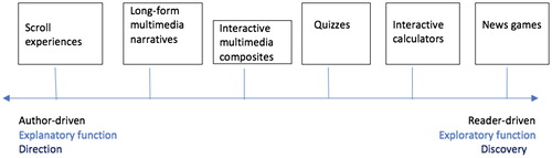
Next, to analyse user interactivity and examine the anticipated audience agencies in each data journalism story, we placed the artefacts in the corpus on an author-reader continuum (), employing Segel and Heer’s interactive design approach to data visualisations (2010). Segel and Heer’s method was appropriate for two reasons:
It helps explicate what had emerged from the interviews as a central concern in data journalism UX design – the balance between author-driven and reader-driven approaches, which also sheds light on how audiences are constructed by means of their “position within the artefact” (Aston and Gaudenzi Citation2012).
A couple of our informants (NW1, NW2) explicitly pointed out that this approach informed editorial UX design practice more broadly.
Figure 1. Author-driven/reader-driven UX design, function and semantic operations of data journalism stories.
We then selected one data journalism artefact as a case study for qualitative multimodal discourse analysis. This particular choice of artefact was dictated by the fact that, as an example of the interactive multimedia composite format, it sits midway on the proposed author-reader continuum (), balancing the explanatory and exploratory functions, thus demonstrating how author-reader design tensions are negotiated. We analysed its genre, visual aesthetics, structure, and composition, of semiotic modes, seeking to elucidate how its form and function shapes its operation and “constructed” audience reception. We place a strong emphasis on the dominant features and syntagmatic structure of the artefact, and on how the different semiotic modes within cohere. Capturing the manifest content, composition and layout of the artefact also goes further, to suggest latent meanings transcending the interface. Combined with producers’ interview data, we thus get an in-depth picture of the discourse semantics and rhetorical structures employed.
From a methodological perspective, our study offers a novel approach to analysing the process of encoding UXs, by combining semi-structured interviews with multimodal discourse analysis, and interactive design analysis, of artefacts. Such multi-method research design answers calls within journalism studies for more nuanced investigations of complex situations and phenomena (Witschge et al. 2018; Carlson et al. Citation2018). Our findings combine producer and artefact analysis insights, where appropriate, to offer a rich, contextually sensitive and nuanced picture of data journalism UX design practice.
Data Journalism’s Discursivity
As mentioned, we found that data journalism producers invoke the “audience first” rhetoric when reflecting on their UX design practice, which led us to analyse the interview data along two discursive dimensions: (1) how data journalism producers perceive their function in relation to their audience, and (2) how they “construct” the image of the audience.
Discursive Codes of Data Journalism Function
All the informants perceive their function as “storytelling” or “telling stories with data”. Every single interviewee stressed the centrality of the story to the UX design process. NW12 said that the “old cliché of the story was central to UX design” while NW10 pointed out that “it’s always about the story.” “Telling a good, important story” (NW11), using “visual storytelling techniques to tell enhanced multimedia stories” (NW5), and “heightening the UX” (NW9) are central to UK data journalism newsworkers’ self-perception.
The “illuminating” function, which reflects journalism’s truth rhetoric (Broersma, Citation2010), is also a discursive thread that runs across the datasets. Newsworkers see their function as “telling a story about the truth of the world” (NW2), “trying to extract things that are truthful” and “uncovering interesting truths in datasets” (NW11). They also perceive their mission as explanatory and educatory, reflected in phrases such as “enhancing understanding” (NW3), “aiding ease of understanding” (NW9), “testing knowledge” (NW2), “educating the readership” (NW4), “helping the reader” (NW6, NW7) and “serving our readers” (NW8). NW3, for example, said: “Our job is to use the tools in our toolbox to enhance the understanding and what they get from a story, and often showing them something is a way of helping them understand it.” NW4 stressed that data journalists could help enhance readers’ digital and data literacy so that they are able to comprehend complicated charts and data analyses.
While newsworkers invoke the “audience first” rhetoric, they perceive themselves as curators, reflecting journalism’s traditional “filtering” function. NW1, NW7, NW9, NW10 said that there is evidence that audiences demand editorially filtered news and a curated UX. “People come to us for the analysis,” said NW10. And NW1 explained that editorial selectivity is what journalism is about:
… we save users’ time by finding, by sorting the wheat from the chaff; if we don’t do that, we’re just dashboard creators, which is chucking information at readers, and we’re not actually providing the service that you’re paying for.
Discursive Codes of Audience Construction
Our informants employ rhetoric of audience engagement through personal and social resonance when speaking about their relationship with their audiences, manifesting in the following discursive codes:
Personal Relevance
The quest for “relevant, audience-friendly and user-focused experiences” (NW3) has created the requirement for “personalisation” in UX design. Personal relevance calculators, offering “find-yourself-in-the-story low-level personalisation” (NW5), were one of the dominant formats mentioned by the informants. But while audience values were frequently invoked, some newsworkers also admitted that personalisation was contingent on the publication’s registration wall, allowing different versions of the story to appear, depending on whether you’re a registered or non-registered reader, or a subscriber.
Empathy
Generating “empathy and emotional understanding” (NW2) and “emotion” (NW5) is a rhetoric frequently mentioned by our informants, which reflects the perceived “storytelling” function of data journalism. The informants spoke of the need to “engage” audiences by offering “personal and relatable stories” (NW5), by “immersing them in the story so that they just dive into it” (NW6), and “involving readers through sensory experiences” (NW12).
Impact and Public Interest
Another discourse widely employed is that of “impact and public interest”. “We’re moving in the direction of impact and engagement,” said NW5. And NW3 pointed out that they sought wide public resonance, informing all sections of the public, and that journalism was a force for good in a post-truth era. NW2 said that while social impact was not a deliberately sought effect, it was something that could possibly result from a strong piece of storytelling on a topic that is socially important and resonates with the audience.
“Pushing the Boat Out”: Data Journalism’s Diversification
The New York Times’ Deputy Graphics Editor Archie Tse famously proclaimed that the days of interactivity for interactivity’s sake were gone, urging digital journalism producers to think twice before they consider adding a layer of interactivity to their stories. He argued: “if you make the reader click or do anything other than scroll, something spectacular has to happen” (2016). Tse’s “words of wisdom” were widely cited by our informants. In line with this, we observed a notable reluctance across the six newsrooms with regards to talking about interactivity as a means of audience engagement, but also a certain tension related to the concept that we believe deserves analytical attention. Some data journalism producers now consider interactivity “a distraction” (NW4), while others point out it is “a big investment that is sometimes unrewarded” (NW11). Consequently, the internal threshold for interactivity is getting higher: any UX interaction that is more complex than a scroll or a swipe must be justified.
Yet, data journalism producers are not completely moving away from interactivity, with all our informants agreeing that it is instead getting more sophisticated. NW6 said interactivity was “unconstrained, experimental and creative”, offering the potential for “new ways of storytelling”. Journalists and editors reserve interactivity for “richer experiences” (NW2) such as news games and “find-yourself-in-the-story pieces” (NW5). NW10 pointed out that the stories that tend to perform best with audiences are those where the team “have really pushed the boat out”, such as the Could you be an assistant referee? game, indicating that format experimentation is ultimately worth the effort as audiences appreciate novel forms of storytelling.
As they push the boundaries of technology, legacy news organisations in the UK are investing more resources in delivering customised UXs. The data journalism UX design process tends to be collaborative, involving editorial, design and web development functions following the “data analysis-data reporting-design-build” paradigm. UX design usually takes place between a project’s inception and development phases. It often involves the creation of prototypes and wireframes, which are then coded, styled and user tested. The process is editorially rather than aesthetically driven, and “always collaborative” (NW10), with reporters being involved from start to finish.
The analysis of both interview data and artefacts produced by UK newsrooms in 2017 and 2018 suggests a move beyond (albeit not away from) interactivity and a diversification of data journalism. The story examples mentioned by the informants include a breadth of formats (). While some, e.g., Financial Times’ Uber Game and Telegraph’s Born Equal, Treated Unequally, are experimental one-off pieces, the majority have been designed on top of existing wireframes and content templates, which enables reproduction and points to their stabilisation as data journalism formats. These observations indicate a marked shift from early data journalism stories, which were characterised by lack of sophistication (Knight Citation2015; Appelgren Citation2017; Young et al. Citation2018), and rare or non-existent personalisation options or gamified experiences (Loosen et al. Citation2017).
Nearly all our respondents indicated a preference for clean, minimalistic visual experiences, in part due to evidence of low engagement with interactive features, which they get from audience analytics, but also due to production-cycle pressures and the need to design for multiple platforms. Mobile adoption has transformed audience consumption habits and demands, with visual, static, card-stack formats now preferred to clickable graphics and maps. As they get evidence of increasing amounts of traffic from mobile consumption, all the informants report that they have adopted a “mobile first” mind-set to comply with the imperatives of the small screen, and if something doesn’t work on a smart phone, they “just don’t do it” (NW5, NW11). Providing a good quality UX and making it uniform across devices takes priority over aesthetics.
But while the informants demonstrated a broad understanding of their audience needs, enabled by user testing and sophisticated analytics, they identified user studies as one of the blind spots of their practice and something that they would like to do more of. NW1 explained: “Other than in the marketing and the product departments of a news organisation, there isn’t really this detailed look at reception and user feedback on a story-level basis. It’s usually the product as a whole.”
The Data Journalism Interface: Between Author and Reader Control
Our analysis of data journalism interfaces and their producers’ perspectives indicates that the balance between author-driven and reader-driven design is a central concern in data journalism production in the six newsrooms studied. NW1 explained that the typical narrative structure of a data journalism story was a trade-off between the two design approaches, following Shneiderman’s design mantra “overview first, zoom and filter, then details on demand” (1996). NW12 admitted that despite their efforts, controlling the user journey, especially when the story is a mix of multiple semiotic modes, was a challenge, as readers tend to “create their own narrative”. The best way to mitigate this is to prompt the reader or direct their attention, such as “using the mini-series ‘cliff-hanger’ approach, which is to just make it impossible for someone to not want to read the next thing or to play a video” (NW12).
NW11 said that since the early days of data journalism, there had been a move from a more open, exploratory approach to a more explanatory, author-driven approach. To test that observation, we draw on Segel and Heer’s (2010) approach to narrative, and place a range of six data journalism formats that we are proposing () on a spectrum between “author-driven” and “reader-driven” design (). Segel and Heer’s (2010) identify the properties of the author-driven approach as “linear ordering of scenes, heavy messaging and no interactivity”, while the reader-driven approach is characterised by “no prescribed ordering, no messaging and free interactivity”. To these, we have added the “explanatory” vs “exploratory” functions and the semantic operations “direction” vs “discovery”.
Our comparative analysis () found that, while some data journalism formats display a tendency towards either end of the reader-author and exploratory-explanatory continuum, with different UX priorities, there is a preference for a balance between the direction and discovery functions, which is supported by interview data observations. Furthermore, none of the story formats were exclusively exploratory or explanatory, or reader or author driven, which reinforces Thudt et al.’s observations that data-driven storytelling supports both exploration and explanation in various degrees (2018). All the stories in our corpus, however, are driven by the discursive codes of journalistic function discussed above, seeking to illuminate, filter information and ultimately, tell a rich, powerful story. Even the most exploratory, discovery-driven stories, such as news games, maintain a strong paternalistic element, achieved through painstakingly crafting the UX.
Table 4. UX design comparative analysis.
The Reader as Construct-ed/-ing Narrative
UX design draws on “abstract” semiotic resources, which exist paradigmatically and are “capable of being realised in different materialities” (Kress and Theo van Leeuwen 2001, 6). Our findings suggest that paradigmatic choices in UK data journalism involve, for example, “playing through three or four alternatives at the same time of how to present something” (NW9), including what colours and type of visualisation to use, whether to include annotations, and how to craft the headline and standfirst of a story.
To examine how data journalism UX design choices enact discursive constructions of the audience and how these operate at the level of manifest content, we analysed the aesthetics, layout, composition, but also functionality and operation of Day Zero: how is Cape Town running out of water? produced by the Guardian.
Day Zero: How Cape Town is Running Out of Water
The story plays on the Guardian’s strengths as a news brand – specifically, its focus on “impactful, relatable topics” (NW6). The piece, classified herein as an interactive multimedia composite due to its balance between static and interactive elements, and multiple verbal and visual semiotic modes, illustrates the dramatic impact of global warming on Cape Town’s water supplies.
The story opens with a full-screen satellite image of the Theewaterskloof dam and the story title overlaid in red and white writing on black background – an example of typographic emphasis framing (Hullman and Diakopoulos Citation2011) heightened through stark colour contrast.
The piece makes use of the popular technique of scroll to create surprise and suspense and encourage the audience to keep reading. Each scroll reveals different details of the story, creating the perception of a dynamic flow. The first scroll, for instance, makes an overlay text box appear, explaining that the dam has been an important source of water supply for Cape Town for decades. Scrolling down further transitions to a more recent satellite image, which shows the reservoir nearly half-depleted, highlighting the effect several years of severe drought have had on it.
The piece is characterised by visual salience. This is not accidental: the vivid, emotive, empathy-framing qualities of visual content in news media are well documented (Robinson Citation2002; Powell et al. Citation2015). Coincidentally, NW6 described what their team at the Guardian does as “visual storytelling”.
The foregrounding image is followed by a dozen short paragraphs of text, which are broken up by two static data visualisations, strategically placed to illustrate and reinforce the textual narrative. Thus, we observe a congruence between the messages conveyed by the visual and the verbal modes. The verbal element of the article only contains 460 words. The writing is pithy and dramatic, opening with a stark message: “Day Zero is looming for Cape Town.” The seriousness of Cape Town’s water shortage is highlighted through phrases conveying desperation – e.g., “the scramble for water”, “reports of fights break out in the lengthy queues”. This is followed by a rhetorical question: “How did one of the wealthiest cities in Africa find itself in this position?” The use of UN and climate change scientists’ source quotes frames drought as a serious global environmental issue, denoted by phrases such as “warning”, “worried”, and “predicament”, and punctuated by the ominous prediction that this is “just a glimpse of things to come.”
A radial data visualisation illustrates how much rainfall levels have dropped since 2015, comparing it to the 40-year average, suggesting that severe drought has only exacerbated in recent years. The choice of visualisation type is apt, as its circular shape conveys clearly and at a glance the cyclical, seasonal nature of rainfall in that part of the world. In the second visualisation, static maps of the four reservoirs Cape Town relies on for its water supply are juxtaposed to illustrate how much they’ve all shrunk since 2014 – the additive effect of this juxtaposition portrays this phenomenon as not merely limited to a single dam.
As readers scroll through to the end, they learn that Capetonians have had their water usage restricted to 50 L a day. “How far do 50 litres of water go?”, ask the authors next. Readers are presented with eight small stylised icons representing everyday activities, from showering to washing your car, and prompted to select from them to see “how you would fare in water-stressed Cape Town”, thus invoking the discourse of personal relevance. As readers delve into the detail by selecting and/or unselecting options, they quickly discover that a mere 5-min shower uses 45 L of water, which nearly equals the Cape Town daily cap. The interaction approach, which allows for multiple options to be selected, connotes the cumulative effect of water overuse, causing the reader to rethink their own water usage and consider the wider impact of their actions on the environment.
Thus, the strife of water-deprived Capetonians, as conveyed through the stark colour contrast in the headline, framed through dramatic writing, illustrated by salient full-screen satellite images and clear, easy-to-comprehend data visualisations, and personalised through interactive icons, is a metonymic reflection of a wider issue of public interest: global warming. The piece seeks to create impact by personally challenging readers about how much water they use, combining the explanatory and exploratory functions and, thus, both directing the reader and letting them discover details for themselves.
The rhetorical strategies manifest in the analysed artefact – typographic emphasis through stark colour contrast, short sentences, dramatic writing, use of expert quotes, reveal-as-you-scroll, visual salience, congruence between text and visualisations, metonymy, and personalisation – inhere discourses of personal relevance, impact and empathy, thus supporting interview data observations. The sought effect is achieved through a blend of verbal and visual semiotic modes, with interactivity acting as an extra layer of augmentation operating above and beyond the two, giving the reader the freedom to either dip or dive into the created space. Balancing the explanatory and exploratory function, and direction and discovery, the interface thus anticipates that the reader actively co-constructs the story narrative both cognitively and haptically, while preserving the coherence and integrity of the storyline by leaving the interactive element optional.
Conclusion, Limitations and Future Research
Our study sheds light on the relationship between journalists and their audiences, and the perceived social function of data journalism from the perspective of the data journalism producer. This relationship could be explored further and more fully in user reception studies where researchers could unpack the full process of meaning negotiation and real effect on the public, from the perspective of the audience.
Our findings suggest that, in their efforts to engage audiences and reclaim their authority as a trusted voice in the misinformation-infused public sphere, the legacy newsrooms in our study are diversifying their data journalism output. We offer a classification of data journalism formats we have observed and invite researchers to update, and build on, our corpus to evaluate developments in data journalism over time.
We also found that the image of the audience is constructed discursively through a multimodal realisation of visual and verbal semiotic modes, whose blending and composition act as framing devices, often but not always augmented by a layer of (mostly optional) interactivity. Through analysing the discursive constructions of the audience, we can discern typical journalistic rhetoric of public service, wider social resonance, impact and truthfulness, with journalists seeking to engage with their audience both cognitively and, increasingly, affectively.
Our data analysis, however, presents a notable contradiction in journalists’ construction of the audience in UX design, which future studies should seek to unpack. Despite reporting a move away from interactivity, data journalism producers were seen to offer experiences in whose meaning negotiation the reader takes centre stage. This “audience first” approach somewhat paradoxically co-exists with increased efforts to control the UX and guide the reader through the narrative, invoking the traditional gatekeeping role of journalism.
Hence, we argue, interactivity is still a useful analytical concept for examining the relationship between journalism and its audience, which calls for its reconceptualisation in the journalism studies literature.
Acknowledgments
The authors would like to thank the interview informants for their time and generosity, and are indebted to the anonymous reviewers for their insightful suggestions to improve this article.
Disclosure statement
No potential conflict of interest was reported by the authors.
Funding
This work was supported by ERSC and Scottish Graduate School of Social Science interdisciplinary award.
Related Research Data
References
- Anderson, C. W. 2011. “Between Creative and Quantified Audiences: Web Metrics and Changing Patterns of Newswork in Local US Newsrooms.” Journalism 12 (5): 550–566.
- Appelgren, Ester. 2017. “An Illusion of Interactivity: The Paternalistic Side of Data Journalism.” Journalism Practice 12 (3): 1–18.
- Aston, Judith and Sandra Gaudenzi. 2012. “Interactive Documentary: Setting the field.” Studies in Documentary Film 6 (2): 125–139.
- Becker, Howard. S. 1963. Outsiders: Studies in the Sociology of Deviance. New York: Macmillan.
- Borges-Rey, Eddy. 2016. “Unravelling Data Journalism.” Journalism Practice 10 (7): 833–843.
- Broersma, Marcel. 2010. “Journalism as Performative Discourse. The Importance of Form and Style in Journalism.” In Journalism and Meaning-Making: Reading the Newspaper, edited by Verica Rupar, 15–35. NY: Hampton Press.
- Carlson, Matt. 2018. “Confronting Measurable Journalism.” Digital Journalism 6 (4): 406–417.
- Carlson, Matt, Sue Robinson, Seth C. Lewis, and Daniel A. Berkowitz. 2018. “Journalism Studies and its Core Commitments: The Making of a Communication Field.” Journal of Communication 68 (1): 6–25.
- Champion, Katherine. 2015. “Measuring Content Diversity in a Multi-platform Context.” The Political Economy of Communication 3 (1): 39–56.
- Charmaz, Kathy. 2006. Constructing Grounded Theory: A Practical Guide through Qualitative Analysis. London: SAGE.
- Dewdney, Andrew, and Peter Ride. 2014. The Digital Media Handbook. 2nd ed. Abington: Routledge.
- Drucker, Steven, Samuel Huron, Robert Kosara, Jonathan Schwabish, and Nicholas Diakopoulos. 2018. “Communicating Data to an Audience.” In Data-Driven Storytelling, edited by Nathalie Henry Riche, Christophe Hurter, Nicholas Diakopoulos, and Sheelagh Carpendale, 211–231. Boca Raton: A K Peters/CRC Press.
- Ferrer-Conill, Raul, and Edson C. Tandoc Jr. 2018. “The Audience-Oriented Editor.” Digital Journalism 6 (4): 436–453.
- Greussing, Esther, and Hajo G. Boomgaarden. 2018. “Simply Bells and Whistles?” Digital Journalism 7 (2): 273–293.
- de Haan, Yael, Sanne Kruikemeier, Sophie Lecheler, Gerard Smit, and Renee van der Nat. 2017. “When Does an Infographic Say More Than a Thousand Words?” Journalism Studies 19 (9): 1293–1312.
- Hullman, Jessica, and Nick Diakopoulos. 2011. “Visualization Rhetoric: Framing Effects in Narrative Visualization”. IEEE Transactions on Visualization and Computer Graphics. 17 (12): 2231–2240.
- Jancsary, Dennis, Markus A. Höllerer, and Renate Meyer. 2015. “Critical analysis of visual and multimodal texts.” In Methods of Critical Discourse Analysis, edited by Ruth Wodak, and Michael Meyer, 180–204. London: Sage.
- Knight, Megan. 2015. “Data Journalism in the UK: A Preliminary Analysis of Form and Content.” Journal of Media Practice 16 (1): 55–72.
- Kress, Gunther R., and Theo van Leeuwen. 2001. Multimodal Discourse: The Modes and Media of Contemporary Communication. London: Hodder Education.
- Lister, Martin, Jon Dovey, Seth Giddings, Iain Grant, and Kieran Kelly. 2009. New Media: A Critical Introduction. 2nd ed. NY: Routledge.
- Litt, Eden. 2012. “Knock, Knock. Who's There? The Imagined Audience.” Journal of Broadcasting & Electronic Media 56 (3): 330–345.
- Loosen, Wiebke, Julius Reimer, and Fenja De Silva-Schmidt. 2017. “Data-driven Reporting: An On-going (R) Evolution? An Analysis of Projects Nominated for the Data Journalism Awards 2013–2016.” Journalism 1–18.
- Manovich, Lev. 2001. The Language of New Media. Cambridge, MA: MIT Press.
- Mattelart, Armand. 2005. The Information Society: An Introduction. London: Sage.
- Nash, Kate. 2014. “Clicking on the World: Documentary Representation and Interactivity.” In New Documentary Ecologies, edited by Kate Nash, Craig Hight, and Catherine Summerhayes, 50–66. Basingstoke: Palgrave Macmillan.
- Powell, Thomas E., Hajo G. Boomgaarden, Knut De Swert, K. and Claes de Vreese. 2015. “A Clearer Picture: The Contribution of Visuals and Text to Framing Effects.” Journal of Communication 65: 997–1017.
- Robinson, Piers. 2002. The CNN Effect: The Myth of News, Foreign Policy and Intervention. London: Routledge.
- Shneiderman, Ben. 1996. “The Eyes Have It: A Task by Data Type Taxonomy for Information Visualizations.” Proceedings of the IEEE Symposium on Visual Languages, IEEE. Washington DC: 336–343.
- Segel, Edward, and Jeffrey Heer. 2010. “Narrative Visualization: Telling Stories with Data.” IEEE Transactions on Visualization and Computer Graphics 16 (6): 1139–1148.
- Thudt, Alice, Jagoda Walny, Theresia Gschwandtner, Jason Dykes, and John Stasko. 2018. “Exploration and Explanation in Data-Driven Storytelling.” In Data-Driven Storytelling, edited by Nathalie Henry Riche, Christophe Hurter, Nicholas Diakopoulos, and Sheelagh Carpendale, 60–83. Boca Raton: A K Peters/CRC Press.
- Tse, Archie. 2016. “Why We Are Doing Fewer Interactives.” Presentation at the 2016 Malofiej Infographics World Summit. https://github.com/archietse/malofiej-2016.
- Usher, Nikki. 2016. Interactive Journalism. Hackers, Data, and Code. Champaign: University of Illinois Press.
- Witschge, Tamara, C.W. Anderson, David Domingo, and Alfred Hermida. 2018. “Dealing with the Mess (we Made): Unraveling Hybridity, Normativity, and Complexity in Journalism Studies.” Journalism 1–9. doi:10.1177/2F1464884918760669
- Young, Mary Lynn, Alfred Hermida, and Johanna Fulda. 2018. “What Makes for Great Data Journalism? A Content Analysis of Data Journalism Awards Finalists 2012–2015.” Journalism Practice 12 (1): 115–135.
- Zamith, Rodrigo. 2018. “Quantified Audiences in News Production.” Digital Journalism 6 (4): 418–435.