
Abstract
The current Oxford English Dictionary defines a neighbourhood as ‘[a] district or portion of a town, city, or country, esp. considered in reference to the character or circumstances of its inhabitants’. However, a large part of quantitative urban analysis relies on administrative boundaries, such as postcodes, as an approximation of true neighbourhoods. This regional graphic explores the possibility of redefining internal boundaries of a city through the combination of new sources of data, statistics and computation. Using the language of a sample of georeferenced tweets in the Dutch city of Amsterdam, in combination with a regionalization algorithm that groups similar continuous areas, the official postcodes are redrawn into those based on their spoken characteristics. The result is a very different urban landscape that is likely to encapsulate better substantive differences between parts of the city.
Keywords:
The Oxford English Dictionary (OED) defines a neighbourhood as ‘[a] district or portion of a town, city, or country, esp. considered in reference to the character or circumstances of its inhabitants’ (OED, Citation2015). In fact, this emphasis on the character, or feel, of a delimited area is what makes it stand out from the rest of the city. Most of urban research is concerned with phenomena that occur within these neighbourhood boundaries and, as such, such definitions are crucial to the analysis. However, more often than not, issues with data aggregation and availability result in the use of administratively defined boundaries. Such delineations, although widespread, are unlikely to capture the distribution of socio-economic questions and, in doing so, are prone to introduce some of the biases geographers have long been concerned with, like the modifiable areal unit problem (MAUP) (Openshaw & Taylor, Citation1981).
In recent years there has been an explosion of new sources of data suitable for urban analysis (Arribas-Bel, Citation2014). The rise of smart devices has essentially made each of their owners a sensor constantly generating data; businesses that used to keep analogue records of their activities are moving online, leaving a (sometimes accessible) digital trace; and governments are releasing in an open format many of the datasets they have kept internal for many years. Although with their own challenges (e.g. sample selection), these sources afford fine granularity over space and time, and they can represent phenomena traditional data typically do not capture. Such characteristics, combined with the appropriate statistical methodologies and the increase in computing power, open the door for new applications and combinations with more traditional sources that promise to bring truly new insights into the functioning of cities.
This regional graphic explores the possibility of redefining neighbourhood boundaries through the combination of new sources of data, statistics and computation. In particular, a set of georeferenced tweets collected for the Dutch city of Amsterdam in 2012–13 is aggregated at the five-digit postcode (PC5) level, about 1100 units, and tabulated by language of the message. This is then used to feed the automated zoning procedure (AZP) (Openshaw, Citation1977, 1978a, Citation1978b) algorithm. The AZP is a regionalization technique that aggregates continuous areas into a prespecified number groups, or regions, maximizing an objective function that typically relates to internal consistency, such as the within-group variance. In this case, PC5s are grouped into 81 regions, coinciding with the amount of administratively defined four-digit postcodes (PC4s). By doing so, neighbourhoods are delineated not following administrative rules but based on how similar is the pattern of languages tweeted.
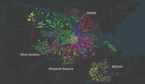
Figure displays the administrative aggregation of PC5 into PC4 using a different colours for buildings in each of the delineated areas. This is a geography routinely used in urban research and policy. The partition is very structured, ordered and evenly distributed over space. This is practical for the use for which it was originally designed, postal delivery, but it is unlikely to capture the underlying socio-economic structures that such applications are interested in. Similarly, Figure presents the AZP output. As it becomes apparent by comparing both maps, the Twitter-based, language-driven neighbourhoods are much more irregular, uneven and generally ‘messier’. However, they are also better at incorporating the internal structure of the city, as it relates to languages spoken in different parts of Amsterdam, and the different individuals speaking them. A more rigorous and in-depth analysis is beyond the scope of this paper, which is only intended to demonstrate the potential of these new approaches. However, the overall pattern seems to match local knowledge well. Unlike in the PC4 map, the popular district of the Nine Streets (Negen Straatjes), for example, is not only entirely grouped in the same neighbourhood, but also connected to much of the city centre and old canals area, stretching even into Museum Square, and reflecting its popularity among tourists and, thus, its similarity in language diversity. At the same time, the largely consistent nature of the north part of the city is captured by the fact that instead of 10 PC4s, the AZP arranges it in mostly three areas: one for the more residential part (in red), and two for the trendy post-industrial (purple) and still industrial (green) parts around the NDSM wharf, connected with the areas across the water. Equally, a similar grouping occurs in the peripheral part of Bijlmer, where the artificially created seven PC4s are grouped into a larger one.
Figure 1. 4-Digit postcodes.
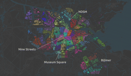
Figure 2. Twitter defined neighborhoods.
Software, data and acknowledgements
Data were processed using Python and the IPython NotebookFootnote 1 ; tweet language was identified with the ccld (chromium compact language detectorFootnote 2 ); the spatial clustering algorithm was run using clusterpyFootnote 3 ; graphics were created using QGIS.Footnote 4 The layer of water bodies comes from the Dutch dataset ‘TOP10NL’ provided by public mapping services (PDOK)Footnote 5 ; the street layer is from OpenStreetMapFootnote 6 ; the building units were extracted from the public building registry (BAG)Footnote 7 using bag_boxFootnote 8 ; the boundaries of four- and five-digit postcodes were accessed through GeoPlazaFootnote 9 ; and the raw set of tweets was downloaded from WorldMapFootnote 10 in April 2013.
Supplementary material
The underlying research materials for this article can be accessed at https://github.com/darribas/spoken_postcodes_rsrs.
Acknowledgment
The author gratefully acknowledges the advice provided by Juan Carlos Duque. Any remaining error remains the sole responsibility of the author.
Notes
References
- Arribas-Bel, D. (2014). Accidental, open and everywhere: Emerging data sources for the understanding of cities. Applied Geography , 49 , 45–53.10.1016/j.apgeog.2013.09.012
- Openshaw, S. (1977). A geographical solution to scale and aggregation problems in region-building, partitioning and spatial modelling. Transactions of the Institute of British Geographers , 2 (4), 459–472. http://www.jstor.org/stable/622300?seq=1#page_scan_tab_contents 10.2307/622300
- Openshaw, S. (1978a). An empirical study of some zone-design criteria. Environment and Planning A , 10 , 781–794.10.1068/a100781
- Openshaw, S. (1978b). An optimal zoning approach to the study of spatially aggregated data. In Ian Masser & Peter J. B. Brown (Eds.), Spatial representation and spatial interaction (pp. 95–113). US: Springer.
- Openshaw, S. , & Taylor, P. (1981). The modifiable areal unit problem. Quantitative geography: A British view , 9 , 60–69.
- Oxford English Dictionary . (2015). neighbourhood – neighborhood, n. Retrieved May 22, from http://www.oed.com/view/Entry/125931?redirectedFrom=neighborhood